Dual MACD CrossWhat Is This Indicator?
This indicator is a visual tool for reading changes in market momentum.
Instead of giving buy or sell orders, it helps you see when the market’s short-term behavior starts to differ from its underlying direction. Think of it as a way to observe shifts in mood rather than make automatic decisions.
What Do the Lines Mean?
You will see three visual elements:
The thin green line represents the market’s short-term momentum.
It reacts quickly to recent price changes and shows what the market is doing right now.
The thicker white line represents the market’s reference trend.
It moves more slowly and reflects the broader, more stable direction of the market.
The yellow dotted line is the zero baseline.
It does not generate signals. Its only purpose is to help you visually judge whether momentum is generally positive (above zero) or negative (below zero).
How Should This Indicator Be Read?
The key is the relationship between the green and white lines.
When the green line is above the white line, short-term momentum is stronger than the market’s reference trend.
When the green line is below the white line, short-term momentum is weaker.
The indicator is not concerned with how high or low the lines are by themselves.
What matters is how they interact.
What Do the Triangle Markers Mean?
The small triangle markers highlight moments of transition.
An upward triangle appears when the green line crosses above the white line.
This suggests that short-term momentum is beginning to outperform the broader trend.
A downward triangle appears when the green line crosses below the white line.
This suggests that momentum is weakening relative to the broader trend.
These markers are attention points, not commands. They indicate potential change, not certainty.
Why Is the Zero Line Important?
The zero line provides context.
A crossover that happens above the zero line occurs while the market is already in a relatively strong state.
A crossover below the zero line happens in a weaker environment and may represent a failed move or an early attempt at reversal.
The same crossover can mean very different things depending on its position relative to zero.
What Is This Indicator Best Used For?
This indicator is best used to:
Observe early signs of trend changes
Compare short-term momentum versus underlying direction
Confirm what you are already seeing in price action or other indicators
It is not designed to:
Predict tops or bottoms precisely
Act as a standalone buy/sell system
Measure overbought or oversold conditions
A Simple Analogy
Imagine driving a car.
The green line is how hard you are pressing the accelerator.
The white line is your current speed.
The yellow zero line is the difference between moving forward or backward.
The triangles mark moments when acceleration begins to change the car’s actual movement.
The indicator helps you notice when effort starts to translate into direction.
The Right Way to Use It
This indicator does not tell you what to do.
It encourages you to ask better questions:
Is momentum starting to lead or lag?
Is this change supported by price structure?
Does the broader context confirm or contradict this signal?
Used this way, it becomes a tool for awareness, not prediction.
If you’d like, I can also provide:
A one-paragraph version for documentation
A training script for beginners
Or a minimal tooltip-style explanation for sharing with others
Dönemler

Institutional Cycle Intelligence SystemInstitutional Cycle Intelligence System: Architecture, Algorithms, and Application:
Abstract
The Institutional Cycle Intelligence System (ICIS) version 2.0 is a sophisticated Pine Script indicator designed to bridge the gap between retail technical analysis and quantitative hedge fund methodologies. Unlike standard oscillators (RSI, MACD) that rely on fixed lookback periods, ICIS utilizes Digital Signal Processing (DSP) and spectral analysis to dynamically identify, extract, and synthesize market cycles. This document details the system’s specialty, the mathematical underpinnings of its seven algorithms, and a strategic guide for its application in trading.
Part 1: The Specialty & Philosophy
1.1 The Problem with Static Indicators
Traditional technical indicators suffer from a fatal flaw: Stationarity Assumption. A 14-period RSI assumes the market’s "rhythm" is consistently relevant to 14 bars. However, financial markets are non-stationary; cycle lengths expand and contract based on volatility, liquidity, and macroeconomic events. A market might be oscillating on a 10-day cycle one month and shift to a 24-day cycle the next. Static indicators fail to adapt to these phase shifts, leading to false signals.
1.2 The ICIS Solution: Adaptive Spectral Analysis
The ICIS allows traders to visualize the market not as a linear trend, but as a composite of waves (frequencies). Its specialty lies in its "Ensemble Approach." Rather than relying on a single mathematical model, ICIS runs seven distinct advanced cycle detection algorithms simultaneously.
1.3 The "Intelligent" Consensus Engine
The core innovation of this script is the Intelligent Mode. It does not simply average the outputs of the seven models. Instead, it employs an adaptive weighting mechanism:
Normalization: It converts the raw output of each model into a standardized Z-score (standard deviation units) to ensure apples-to-apples comparison.
Scoring: It calculates a "Consistency Score" for each model. If a model is producing erratic, noisy signals, its weight is reduced. If a model detects a high-amplitude, clean sine wave, its weight is increased.
Synthesis: It fuses these weighted inputs into a single "Composite Signal" that represents the highest probability cycle currently driving price action.
Part 2: Algorithmic Deep Dive
The ICIS incorporates seven distinct methodologies drawn from physics, engineering, and econometrics. Understanding these algorithms is key to trusting the signals.
2.1 Ehlers Bandpass + Hilbert Transform
Origin: Digital Signal Processing (DSP).
The Logic: This model acts like a radio tuner. It filters out low-frequency trends and high-frequency noise, isolating a specific bandwidth of market data.
The Mechanism:
Bandpass Filter: Allows only frequencies within the user-defined cycle ranges (Short, Medium, Long) to pass through.
Hilbert Transform: A mathematical operation that shifts the signal by 90 degrees to create an analytic signal. This allows for the precise calculation of the instantaneous phase (where we are in the wave) and amplitude (how strong the wave is).
Strength: Excellent for identifying clean, sine-wave-like market behavior in ranging markets.
2.2 MESA Adaptive Cycle (Maximum Entropy Spectral Analysis)
Origin: Geophysical oil exploration.
The Logic: MESA provides high-resolution frequency estimation even when the data sample is short (a common limitation in trading).
The Mechanism: It uses a "Homodyne Discriminator." It measures the phase change of price relative to itself over time. By calculating the rate of phase change, it derives the dominant cycle period.
Strength: Highly responsive to rapid changes in market cycle length. It adapts faster than Fourier-based methods.
2.3 Autocorrelation Periodogram
Origin: Statistical Time Series Analysis.
The Logic: Markets often rhyme. Autocorrelation measures the similarity of the price series to a lagged version of itself.
The Mechanism: The script runs a loop testing lags from 5 to 150 bars. If price today correlates highly with price 20 days ago, it identifies a 20-day cycle.
Strength: The most robust method for confirming that a cycle actually exists physically, rather than being a mathematical artifact.
2.4 Empirical Mode Decomposition (EMD)
Origin: The Hilbert-Huang Transform (NASA).
The Logic: Markets are non-linear and non-stationary. EMD does not force data into sine waves (like Fourier). instead, it treats price like a rope made of different strands.
The Mechanism:
Sifting: It identifies local highs and lows to create upper and lower envelopes.
Mean Extraction: It subtracts the mean of these envelopes from the data to extract an "Intrinsic Mode Function" (IMF).
Residuals: It repeats this process to separate high-frequency noise (Short Cycle) from medium variations and long-term trends.
Strength: The "Holy Grail" of adaptive analysis. It handles trend reversals and sudden volatility spikes better than any linear filter.
2.5 Goertzel Power Spectrum
Origin: Telecommunications (used in decoding touch-tone phone sounds).
The Logic: A highly optimized version of the Discrete Fourier Transform (DFT). It scans specific frequencies to see which one has the most "Power" (Energy).
The Mechanism: The script calculates the Goertzel energy for various periods. The period with the highest energy is deemed the "Dominant Cycle" and is used to drive the oscillator.
Strength: Extremely precise at identifying the exact length of the current cycle (e.g., distinguishing between a 20-day and a 22-day cycle).
2.6 Singular Spectrum Analysis (SSA)
Origin: Meteorology and climatology.
The Logic: SSA decomposes a time series into principal components: Trend, Oscillatory (Cycle), and Noise.
The Mechanism: While a full SSA requires heavy matrix algebra (difficult in Pine Script), this implementation simulates SSA using weighted lag windows to separate eigen-components. It reconstructs the time series using only the oscillatory components.
Strength: Unrivaled noise reduction. It produces the smoothest "zero-lag" oscillators in the system.
2.7 Wavelet Multi-Resolution Analysis
Origin: Quantum Physics and Image Compression.
The Logic: Standard Fourier analysis loses time information (it tells you a frequency exists, but not when). Wavelets analyze both Frequency and Time simultaneously.
The Mechanism: The script passes price through a cascade of high-pass and low-pass filters (Haar-like decomposition).
Detail Coefficients: Capture high-frequency noise and short cycles.
Approximation Coefficients: Capture the underlying trend and long cycles.
Strength: Excellent for identifying "regime changes" where the market shifts from trending to ranging.
Part 3: Using the Code & Interface
3.1 Input Parameters
Model Selection: Defaults to "Intelligent" (recommended). You can switch to individual models (e.g., "EMD") to isolate their specific view.
Cycle Period Ranges:
Short (5-20): Captures swing trading noise and rapid reversals.
Medium (20-50): The primary swing cycle (often aligns with monthly flows).
Long (50-150): The structural trend cycle.
Advanced Settings:
Bandwidth (0.3): Controls how "wide" the filter is. Lower values = cleaner but lagging; Higher values = noisier but faster.
Signal Threshold (0.5): The level the oscillator must breach to be considered a "Strong" signal.
3.2 Visual Components
The Oscillators (Main Chart):
Red Line (Short): The fast heartbeat of the market.
Teal Line (Medium): The tradeable swing.
Blue Line (Long): The tidal direction.
Purple Line (Composite): The weighted average of all cycles. This is your primary trigger.
The Info Table: Displays the current exact period (in bars), phase (in degrees), and trend direction for all three cycle tiers. It also shows the "Confluence Score" (how many cycles agree).
Background Color: Changes dynamically based on cycle alignment.
Green: Bullish Confluence (2 or 3 cycles pointing up).
Red: Bearish Confluence (2 or 3 cycles pointing down).
Part 4: Trading Strategy & Application
The ICIS is designed to identify Turning Points and Trend Continuations.
4.1 The "Phasing" Concept
Understanding Phase is crucial. The script calculates phase in degrees (0° to 360°):
0° - 90° (Accumulation): The cycle has bottomed and is accelerating upward. Best time to enter.
90° - 180° (Markup): The cycle is mature but still rising. Hold positions.
180° - 270° (Distribution): The cycle has topped and is accelerating downward. Best time to short/sell.
270° - 360° (Decline): The cycle is mature in its downtrend. Hold shorts or cash.
4.2 Trade Setups
Setup A: The "Triple Confluence" Entry (Trend Following)
This is the safest signal, indicating all distinct time horizons are aligned.
Condition: The Short, Medium, and Long cycle lines are ALL sloping upwards.
Visual: Background turns bright Green.
Trigger: The Composite (Purple) line crosses above the Signal Threshold (+0.5).
Exit: When the Short Cycle (Red) crosses below the Medium Cycle (Teal).
Setup B: The "Cycle Bottom" (Reversal)
This catches the absolute low of a move.
Condition: The Long Cycle (Blue) is trending UP (Trend support).
Trigger: The Composite line is deeply negative (below -0.8) and crosses back ABOVE zero.
Validation: Wait for the "Cycle Bottom" circle marker to appear on the chart.
Stop Loss: Below the recent swing low.
Setup C: The "Divergence" Play (Advanced)
Condition: Price makes a Lower Low.
Indicator: The Composite Oscillator makes a Higher Low.
Logic: Momentum on the cyclical level is shifting bullish despite price action.
Execution: Enter on the first candle where the Composite line turns green (slopes up).
4.3 Interpreting the Information Table
The table is your dashboard.
Period: If the "Medium Period" is drastically changing (e.g., jumping from 20 to 50), the market is in a chaotic transition. Reduce position size.
Strength: Shows the cycle amplitude. If Strength < 20%, the market is chopping/sideways. Do not trade trend strategies. If Strength > 60%, the cycle is dominant; use aggressive targets.
Part 5: Optimization & Best Practices
5.1 Timeframes
While the math works on any timeframe, ICIS is computationally heavy and optimized for:
4H / 1D: Best for Swing Trading. The cycle periods (20-40 bars) align well with monthly/quarterly flows.
15m / 1H: Good for Intraday, but requires adjusting the "Short Cycle" inputs to be more sensitive (e.g., Min 5, Max 15).
5.2 Handling "Repainting" vs. "Recalculation"
This script uses max_bars_back and causal filters where possible. However, EMD and SSA are inherently adaptive.
Fact: The Phase calculation uses the Hilbert Transform, which requires a few bars of future data to be perfectly precise (theoretical limit).
Mitigation: The script uses a causal approximation of the Hilbert Transform (nz(src ) etc.) to minimize repainting.
Rule: Do not trade on the current forming bar. Wait for the bar to close to confirm the cycle direction.
5.3 Combining with Price Action
ICIS tells you the Time (When to trade), but Price Action tells you the Level (Where to trade).
Use ICIS to time the entry.
Use Support/Resistance or Supply/Demand zones to place the order.
Example: Price hits a Demand Zone + ICIS signals "Cycle Bottom" + Confluence turns Green = High Probability Trade.
Conclusion
The Institutional Cycle Intelligence System version 2.0 represents a paradigm shift from lagging indicators to predictive cycle modeling. By intelligently fusing seven different mathematical models, it cancels out the weaknesses of individual algorithms (like EMD's end-effect issues or Fourier's spectral leakage).
Summary of Workflow:
Check the Table: Is Cycle Strength high? Are cycles aligned?
Check the Background: Is it Green (Bullish) or Red (Bearish)?
Wait for the Composite Trigger: Cross of Zero or Cross of Threshold.
Execute: With defined risk based on market structure.
This tool provides the retail trader with the "X-Ray vision" into market structure typically reserved for quantitative trading desks.

Statistical Reversion FrameworkIntroduction and Core Philosophy
The Statistical Reversion Framework constitutes a sophisticated quantitative trading instrument designed to identify high-probability mean reversion opportunities across financial markets. Unlike traditional technical indicators that rely on a single dimension of market data, this framework adopts a multi-faceted approach, synthesizing statistical probability, volume profile analysis, institutional money flow proxies, and standard technical momentum into a singular composite score. The core philosophy driving this script is the concept of confluence through heterogeneity; by combining uncorrelated or loosely correlated market factors—such as price deviation (statistics), participant commitment (volume), and macro sentiment (intermarket data)—the algorithm aims to filter out the noise inherent in standard oscillators and isolate moments where market pricing has deviated unsustainably from its intrinsic equilibrium. This tool is specifically engineered to detect market extremes—tops and bottoms—where the probability of a counter-trend move or a snap-back to the mean is mathematically significant. It operates on the premise that while asset prices can remain irrational in the short term, they are bound by statistical variance and mean-reverting properties over longer horizons, particularly when institutional flows and volume exhaustion patterns align with those statistical extremes.
Methodology: The Composite Scoring Architecture
The underlying methodology of the framework relies on a weighted composite scoring system. Rather than generating binary buy or sell signals based on a threshold crossover, the script calculates a granular score ranging from zero to one hundred for various market dimensions. These dimension-specific scores are then weighted according to user-defined inputs to produce a final "Composite Score." This approach allows for a nuanced assessment of market conditions; a setup might have extreme statistical deviation but lack volume confirmation, resulting in a lower confidence score than a setup where price, volume, and macro factors all align. The algorithm normalizes all input data into a standardized scale, typically converting raw values—such as Z-Scores or volume ratios—into a zero-to-ten ranking before aggregating them. This normalization process is critical because it allows the algorithm to compare apples to oranges mathematically, treating a standard deviation of 3.0 and a Relative Strength Index (RSI) of 20 as compatible inputs within the same equation. By summing these normalized values and applying regime-based confidence adjustments, the framework produces a dynamic signal that adapts to the volatility and trend intensity of the current market environment.
Algorithmic Component I: Statistical Analysis via Multi-Timeframe Z-Scores
The backbone of the framework is the Statistical Component, which utilizes the Z-Score (or Standard Score) to quantify the degree of price deviation. The Z-Score measures how many standard deviations the current price is from its moving average. A crucial aspect of this algorithm is its fractal nature; it does not rely on a single lookback period. Instead, it computes Z-Scores across three distinct timeframes—Daily, Weekly, and Monthly—and within each timeframe, it calculates deviations for short, medium, and long-term periods. For instance, on the daily timeframe, it assesses deviation from 50-day, 200-day, and 500-day means simultaneously. This multi-timeframe approach is designed to filter out ephemeral noise. A price move that appears extreme on a 10-day basis but is normal on a 200-day basis is likely a trend pull-back rather than a reversal. Conversely, when the Z-Scores across daily, weekly, and monthly timeframes all register values beyond significant thresholds (such as 2.0 or 3.0 standard deviations), it indicates a rare fractal alignment where the asset is historically overextended on all relevant scales. The algorithm aggregates these nine distinct Z-Score data points to form the "Statistical Score," heavily rewarding scenarios where multiple timeframes show directional alignment, as these synchronized deviations often precede powerful mean-reversion events.
Algorithmic Component II: Volume Signature and Participation Analysis
While statistical deviation highlights where the price is, the Volume Component analyzes the conviction behind the move to determine if a reversal is imminent. This section of the code employs several sophisticated logic gates to identify specific volume signatures known as Capitulation and Exhaustion. The algorithm compares current volume against a 50-day moving average to generate a volume ratio. It then correlates this ratio with price action. For example, the script identifies "Capitulation" when price collapses significantly (more than 2%) on volume that is at least three times the average. This specific signature—panic selling—often marks the psychological wash-out necessary for a market bottom. Conversely, the script detects "Volume Exhaustion" when prices drift without conviction on extremely low volume, indicating a lack of participant interest in pushing the trend further. Furthermore, the algorithm integrates On-Balance Volume (OBV) analysis, specifically looking for divergences. It detects subtle shifts where the price makes a new low, but the OBV makes a higher low, signaling that smart money is accumulating positions despite the falling price. This divergence logic is automated using pivot-based high/low detection arrays, adding a layer of foreshadowing that price-only indicators often miss.
Algorithmic Component III: Institutional Proxy and Intermarket Correlations
The Institutional Component distinguishes this framework from standard retail indicators by incorporating intermarket data that serves as a proxy for macro sentiment and institutional flow. The script pulls data from extraneous tickers—specifically the VIX (Volatility Index), Government Bond Yields (10-year and 2-year), Copper, Gold, and the Dollar Index (DXY). The logic here is grounded in fundamental market mechanics. For instance, the script analyzes the VIX to gauge market fear; however, it applies a contrarian logic. An extremely high VIX (panic) coincident with a low equity price is scored as a bullish factor, while a complacently low VIX at market highs is viewed as bearish. Similarly, the algorithm analyzes the Yield Curve (the spread between 10-year and 2-year yields). A steepening or flattening curve provides context on economic expectations, influencing the score based on whether the environment is "risk-on" or "risk-off." The Copper/Gold ratio is utilized as a barometer for global economic health; rising copper relative to gold suggests industrial demand and growth, confirming bullish setups, whereas falling copper prices signal contraction. By integrating these non-price variables, the framework ensures that a trade signal is not just technically sound but is also supported by the broader macroeconomic undercurrents that drive institutional capital allocation.
Algorithmic Component IV: Technical Momentum and Structure
The final layer of input comes from standard Technical Analysis, which serves to fine-tune the timing of the entry. This component aggregates readings from the Relative Strength Index (RSI), Moving Average Convergence Divergence (MACD), Bollinger Bands, and Support/Resistance proximity. While Z-Scores measure linear distance from the mean, the RSI and Bollinger Bands measure the velocity and elasticity of that move. The algorithm assigns higher scores when RSI hits extreme levels (below 20 or above 80) and when price action pierces the outer bounds of the Bollinger Bands. Additionally, the MACD is monitored for histogram reversals and signal line crosses that align with the mean reversion bias. A unique feature of this component is the proximity logic, which calculates how close the current price is to a 50-period high or low. If a statistical extreme coincides with a retest of a major structural support level, the technical score is maximized. This ensures that the trader is not catching a falling knife in a void, but rather identifying a reversal at a location where technical structure provides a natural floor or ceiling for price.
Regime Detection and Confidence Adjustment
A critical vulnerability of mean reversion strategies is that they can suffer severe drawdowns during strong, unidirectional trending markets (momentum regimes). To mitigate this, the framework incorporates a Regime Detection module using the Average Directional Index (ADX) and volatility thresholds. The script calculates the ADX to measure trend strength regardless of direction. If the ADX is above a certain threshold (default 25), the market is classified as "Trending." The script then cross-references this with volatility data to classify the environment into regimes such as "Crisis," "Trending," "Range," or "Mean-Revert." This classification is not merely cosmetic; it actively influences the final output through a "Regime Confidence" multiplier. If the system detects a strong trending regime, it dampens the Composite Score, requiring extraordinary evidence from the other components to trigger a signal. Conversely, if the market is detected as "Mean-Revert" or "Low-Vol Range," the confidence multiplier boosts the score, making the system more sensitive to reversion signals. This adaptive logic helps protect the trader from fading strong breakouts while aggressively capitalizing on ranging markets.
Usage Instructions and Dashboard Interpretation
Traders utilizing this framework should primarily interact with the on-screen Dashboard, which provides a real-time summary of all computed metrics. The dashboard is organized hierarchically, with the "Composite Score" and "Signal Status" at the top. A Composite Score above 70 is generally considered actionable, with scores above 85 representing "Exceptional" setups. The Dashboard is color-coded: green hues indicate bullish/oversold conditions suitable for buying, while red hues indicate bearish/overbought conditions suitable for selling or shorting. Traders should look for "Confluence" across the rows. Ideally, a robust signal will show a high Statistical score (indicating price is cheap/expensive), a high Volume score (indicating capitulation or accumulation), and a supportive Institutional score. If the Composite Score is high but the Institutional score is low, the trader should proceed with caution, as the macro environment may not support the trade.
The chart visuals provide immediate entry triggers. "Strong Bottom" (Green Triangle) and "Strong Top" (Red Triangle) shapes appear when the Composite Score breaches the high threshold and Z-Scores are at extremes. These are the primary execution signals. Smaller "Potential" markers indicate developing setups that may require lower timeframe confirmation. Additionally, specific volume icons (Diamonds) will appear to denote Capitulation or Climax events. A trader should ideally wait for the candle to close to confirm these signals. The alerts configured in the script allow the trader to be notified of these events remotely. For risk management, because this is a mean reversion tool, stop-losses should typically be placed below the swing low of the capitulation candle (for longs) or above the swing high of the climax candle (for shorts), anticipating that the statistical extreme marks the distinct turning point. By systematically waiting for the Composite Score to align with the visual signals and verifying the regime context on the dashboard, the trader effectively filters out low-probability trades, engaging only when statistics, volume, and macro-economics align.

TZ - India VIX Volatility ZonesTZ – India VIX Volatility Zones is a long-term volatility analysis indicator designed to visually map important India VIX regimes using clearly defined horizontal zones and labels.
The indicator highlights how market volatility cycles between complacency, normal conditions, elevated risk, and panic phases. These zones are based on historical behavior of India VIX and help traders understand when risk is underpriced or overstretched.
This tool is especially useful for:
Index traders
Options sellers and buyers
Risk management and regime filtering
Long-term volatility study
How It Works
The script plots static, historically significant volatility zones on the India VIX chart and visually separates them using shaded bands and labels.
Volatility Zones Explained
1.Extreme Low Volatility (VIX 8–10)
Indicates market complacency and underpriced risk. Often precedes volatility expansion.
2.Low Volatility (VIX 10–13)
Stable market conditions with controlled movement.
3.Normal Volatility (VIX 13–18)
Healthy market behavior and balanced risk.
4.High Volatility (VIX 18–25)
Rising uncertainty and increased intraday swings.
5.Panic Zone (VIX 25–35+)
High fear environment, usually during major events or crises.
How Traders Can Use This Indicator
Identify volatility regimes before choosing option strategies
Avoid aggressive short-volatility trades during extreme zones
Prepare for volatility expansion during low-VIX phases
Use as a market risk context tool alongside price action
This indicator does not provide buy/sell signals. It is designed for contextual analysis and decision support.
Best Usage
Apply on India VIX (NSE:INDIAVIX)
Works best on Weekly and Monthly timeframes
Can be combined with index charts for volatility-based risk assessment
Disclaimer
This indicator is for educational and analytical purposes only.
It does not constitute financial advice or trade recommendations.
Users should apply proper risk management and confirm signals using additional analysis.

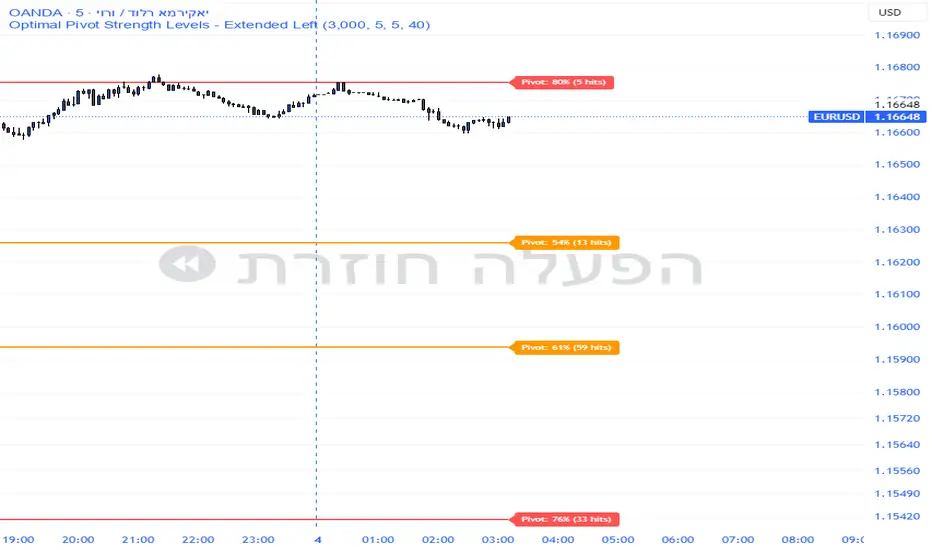
Pivot Edge ProOverview
Smart Pivot Analytics is a highly accurate technical analysis tool designed to identify and validate significant price levels. Unlike standard pivot indicators that only mark recent highs, this tool backtests each identified pivot against thousands of historical candlesticks to calculate its real-world “success rate.”
Key Features
Historical Backtesting: The indicator scans up to 4,900 historical columns to find every instance where price interacted with a specific pivot level.
Strength Score (%): Each level is assigned a percentage score based on its reversal rate. It calculates how many times the price has successfully reached and rejected the level, providing a statistical “hit rate.”
Dynamic Hit Counter: Displays the exact number of times a level has been tested (hit), helping traders distinguish between new levels and established “old” levels.
Smart Filtering: To keep the chart clean, the indicator automatically filters out weak levels and prevents “clutter” by merging levels that are too close together.
Infinite Left Projection: Lines extend left to infinity, allowing traders to see the historical significance of a level across the entire price history at a glance.
How to Trade with It
Red Levels (High Power > 75%): These are “Top Reaction Zones”. Expect a strong price rejection or significant breakout when these levels are tested.
Orange Levels (Medium Power): Suitable for profit targets or as secondary confirmation for entering a trade.
Encounter: Use these levels in conjunction with your existing strategy. When a high power pivot aligns with your entry signal, the probability of a successful trade increases significantly.
Technical Parameters
Lookback Period: Defines how far back in history the script calculates power.
Touch Radius: The "sensitivity" of the level (how close the price has to get to be considered a "hit").
Minimum Strength: A filter to show only the most reliable levels.
TCI Time Oracle - Intraday
🟢 Green Zone — Opening & Closing Liquidity Window
Time:
Opening Green: ~9:15 – 9:30 AM
Closing Green: ~3:15 – 3:30 PM
Market Character:
Highest liquidity of the day
Overnight positions unwind / fresh positions initiate
Strong directional intent often revealed
Smart money sets the day’s bias
Trading Insight:
Best zone for trend bias identification
Option premiums react fastest here
Not ideal for late entries, but excellent for confirmation
🔵 Blue Zone — Midday Compression / Algo Control
Time: ~11:15 AM – 12:00 PM
Market Character:
Volatility contraction
Algo-driven price control
Time decay dominates options
Fake breakouts and mean reversion
Trading Insight
Worst zone for aggressive option buying
Best for range scalping or staying flat
Institutions wait, retailers get chopped
🔴 Red Zone — Institutional Expansion / Trap Zone
Time: ~1:15 PM – 2:00 PM
Market Character:
Sudden volatility expansion
Institutional orders hit the market
Trend acceleration or sharp reversal
Options see rapid delta & gamma shift
Trading Insight:
High probability trend continuation or trap creation
Strong zone for directional option trades
Requires strict risk management
Big Picture Takeaway
Green sets the intent
Blue compresses and traps
Red expands and delivers the real move
This time-zone behavior is exactly why one strategy cannot work all day. Edge comes from trading the right setup in the right time window.

Sector Rotation ULTIMATE: 7 Narrativas IndependientesSector Rotation ULTIMATE: Crypto Narrative Rotation (7 Independent Sectors)
Advanced indicator displaying the relative strength of major crypto sectors through 7 independently normalized lines (0-100):
• Layer1 (ETH, SOL, BNB, TON, etc.) - Pink
• Enterprise (XRP, HBAR, XLM, QNT, VET) - Yellow
• DeFi (UNI, AAVE, MKR, LDO, CRV, etc.) - Cyan
• Memecoins (SHIB, DOGE, PEPE, WIF, FLOKI, BONK) - Green
• AI (TAO, FET, ICP, GRT, etc.) - Orange
• L2 / Scalability (ARB, OP, MATIC, STRK) - Purple
• RWA + Infra (ONDO, LINK) - Brown
Each sector sums the dominance of its top coins (40 total) and is normalized independently so the lines cross constantly, revealing real capital rotations.
- Colored fills to visually highlight the leading sector
- Works perfectly on any timeframe (clean daily data, no intraday noise)
- Ideal for spotting altseason, sector rotations, and entry timing
Use on CRYPTOCAP:TOTAL. The definitive narrative oscillator for 2026!
#Crypto #Altcoins #SectorRotation #DeFi #Memecoins #AI #RWA

4MA / 4MA[1] Forward Projection with 4 SD Forecast Bands4MA / 4MA Projection + 4 SD Bands + Cross Table is a forward-projection tool built around a simple moving average pair: the 4-period SMA (MA4) and its 1-bar lagged value (MA4 ). It takes a prior MA behavior pattern, projects that structure forward, and wraps the projected mean path with four Standard Deviation (SD) bands to visualize probable future price ranges.
This indicator is designed to help you anticipate:
Where the MA structure is likely to travel next
How wide the “expected” future price corridor may be
Where a future MA4 vs MA4 crossover is most likely to occur
When the real (live) crossover actually prints on the chart
What you see on the chart
1) Live moving averages (current market)
MA4 tracks the short-term mean of price.
MA4 is simply the previous bar’s MA4 value (a 1-bar lag).
Their relationship (MA4 above/below MA4 ) gives a clean, minimal read on trend alignment and directional bias.
2) Projected MA path (forward curve)
A forward “ghost” of the MA structure is drawn ahead of price. This projected curve represents the indicator’s best estimate of how the moving average structure may evolve if the market continues to rhyme with the selected historical behavior window.
3) 4 Standard Deviation bands (predictive future price ranges)
Surrounding the projected mean path are four SD envelopes. Think of these as forecast corridors:
Inner bands = tighter “expected” range
Outer bands = wider “stress / extreme” range
These bands are not a guarantee—rather, they’re a structured way to visualize “how far price can reasonably swing” around the projected mean based on observed volatility.
4) Vertical projection lines (most probable cross zone)
Within the projected region you’ll see vertical lines running through the bands. These lines mark the most probable zone where MA4 and MA4 are expected to cross in the projection.
In plain terms:
The projected MAs are two curves.
When those curves are forecasted to intersect, the script marks the intersection region with a vertical line.
This gives you a forward “timing window” for a potential MA shift.
5) Cross Table (top-right)
The table is your confirmation layer. It reports:
Current MA4 value
Current MA4 value
Whether MA4 is above or below MA4
The most recent BUY / SELL cross event
When a real, live crossover happens on the actual chart:
It registers as BUY (MA4 crosses above MA4 )
Or SELL (MA4 crosses below MA4 )
…and the table updates immediately so you can confirm the event without guessing.
How to use it
Practical workflow
Use the projected SD bands as future range context
If price is projected to sit comfortably inside inner bands, the market is behaving “normally.”
If price reaches outer bands, you’re in a higher-volatility / stretched scenario.
Use vertical lines as a “watch zone”
Vertical lines do not force a trade.
They act like a forward “heads-up”: this is the most likely window for an MA crossover to occur if the projection holds.
Use the table for confirmation
When the crossover happens for real, the table is your confirmation signal.
Combine it with structure (support/resistance, trendlines, market context) rather than trading it in isolation.
Notes and best practices
This is a projection tool: it helps visualize a structured forward hypothesis, not a certainty.
SD bands are best used as forecast corridors (risk framing, range planning, and expectation management).
The table is the execution/confirmation layer: it tells you what the MAs are doing now.

Price Range CHoCH Alert🎯 Smart Money Concept (SMC) indicator that monitors a specific price level and alerts only when price touches that level AND
subsequently creates a Change of Character (CHoCH).
Key Features:
• Set a custom price level to monitor
• Detects CHoCH/BOS based on pivot highs/lows
• Alerts ONLY when: Price touches level → CHoCH occurs
• Visual confirmation with level line and status table
• Configurable tolerance for precise level targeting
• Works for both bullish and bearish scenarios
Perfect for:
✓ Institutional level trading
✓ Key support/resistance breakouts
✓ Liquidity grab confirmations
✓ Structure break validation
Simply set your target price level and let the indicator watch for the perfect SMC setup!

LJ Parsons Adjustable expanding MRT Fib Version 2Based on premium/discount/fair-value levels the indicator will expand with the market by settable dates.
The levels are not fib based as such but are resonant levels within an multiplicative /12 log scale using the LJ Parsons Market resonance hypothesis.

Turtle MTF Donchian plus ATR What you’re looking at
This indicator is a Turtle-style breakout system:
Donchian Channels = breakout levels (entry signals)
ATR = how far to place your Stop Loss and Take Profit (or Donchian exit if you turn that on)
And it can do it on a different timeframe than your chart (MTF).
Step-by-step: how it works
1) You choose your “Signal Timeframe”
In settings:
Signal Timeframe = 1 → signals are based on 1 minute
5 → based on 5 minute
60 → 1 hour
D → daily
✅ You can be on a 1m chart but set signals to D if you want only swing signals.
2) It builds the Donchian breakout levels
It calculates:
Donchian High = the highest high of the last entryLen candles (default 20), excluding the current candle
Donchian Low = the lowest low of the last entryLen candles, excluding current candle
Those two lines are your breakout “walls”.
3) It waits for a REAL breakout (fresh cross)
A long setup triggers only when:
price crosses ABOVE the Donchian High (not just stays above)
A short setup triggers only when:
price crosses BELOW the Donchian Low
✅ This reduces spam signals.
4) It calculates ATR on the same signal timeframe
ATR is volatility. Bigger ATR = bigger stop/target.
Defaults:
ATR length = 20
5) It creates your Entry / SL / TP levels automatically
When a LONG triggers:
Entry = Donchian High
Stop Loss = Entry − (SL mult × ATR)
(default SL mult is 2 → so 2×ATR stop)
Take Profit (if you’re using TP mode) = Entry + (TP mult × ATR)
When a SHORT triggers:
Entry = Donchian Low
Stop Loss = Entry + (SL mult × ATR)
Take Profit = Entry − (TP mult × ATR)
6) It prints it on the chart (easy mode)
When a signal happens it will:
Drop a label that says LONG or SHORT
Show the numbers:
Entry
SL
TP (or Donchian exit level)
Draw horizontal lines for Entry / SL / TP (latest signal only)
7) It can use “true Turtle exit” if you want
If you turn ON:
Use Turtle Exit Rule
Then it does NOT use a fixed TP.
Instead it says:
Long: exit when price breaks below the Donchian exit low (default exitLen = 10)
Short: exit when price breaks above the Donchian exit high
That’s the classic “let winners run” vibe.
8) Alerts (Option A)
You can set alerts for:
Turtle Long
Turtle Short
Those alerts are simple and reliable (no dynamic text).
How YOU would use it (quick examples)
If you trade 1m intraday
Chart: 1m
Signal Timeframe: 1
Try entryLen: 40–60 (less choppy than 20)
ATR: 14–20
SL: 2×ATR
If you want daily swings too
Chart: 1m (for execution)
Signal Timeframe: D (for direction/entries)
That gives you swing breakouts while you watch intraday.


PivotStrike Pro 1M + Time-Anchored Pivots
# PivotStrike Pro 1M — Supertrend Style + Time-Anchored Pivots
**PivotStrike Pro 1M (PSP1M-ST)** blends a fast Supertrend-style trend engine with **time-anchored major S/R pivots** that stay locked to the candles as you scroll and zoom. It’s designed for **clear, one-shot Buy/Sell flips** on the 1-minute chart while keeping your chart readable and decisive during strong moves.
## What it does
* **Supertrend Rails (non-repainting on close)**
Green rail sits **below** price in uptrends; red rail sits **above** price in downtrends. When the regime flips, you get a **single Buy or Sell flag**—no re-printing on the same bar.
* **Time-Anchored S/R Pivots**
Confirms **major swing highs/lows** using left/right pivot windows and anchors each level to the bar’s timestamp. Lines extend to the right and **remain aligned with price** when you zoom.
* **Simple, production-ready alerts**
Built-in alerts for Buy/Sell flips so you can route to notifications or bots.
## Why it’s different
* **One-shot signals** you can trust at regime change (no clusters of duplicate arrows).
* **Locked pivots** using `xloc=bar_time`, so support/resistance doesn’t drift when you change the view.
* **HTF option** for the Supertrend engine if you want to smooth 1-minute noise.
## Inputs (quick guide)
* **Indicator Timeframe**: leave blank for chart timeframe (1M), or choose a higher TF to smooth (e.g., 3M/5M).
* **ATR Period / ATR Multiplier**: default **10 / 3.0** (same feel as classic Supertrend).
* **Source**: HL2 (default).
* **Change ATR Method**: RMA(TR) on; toggle off to use `ta.atr`.
* **Show Buy/Sell Signals / Highlighter**: visual preferences.
* **Major S/R (Pivots)**: enable, choose left/right bars (defaults 8/8), line count, style, and transparency.
## Recommended 1M presets
* **ATR Period 10**, **Multiplier 3.0**, **Source HL2**, **Highlighter ON**, **Signals ON**.
* If the rail feels too tight/loose: nudge Multiplier **2.5–3.5**.
* Live scalping? Keep timeframe on **Chart**. Want fewer flips? Try **3M/5M** engine via *Indicator Timeframe*.
## How to read it
* **Trend**: Follow the rail—green below = uptrend bias; red above = downtrend bias.
* **Buy/Sell**: Acts at the **confirmed regime flip**. Use pivots to assess nearby S/R for entries, partials, or stop placement.
* **Pivots**: Recent highs (red lines) and lows (green lines). Breaks/holds around these areas often mark continuation vs. fade zones.
## Alerts
* **PSP1M-ST: BUY / SELL** — triggers on confirmed flips.
Tip: Pair with a simple “rail touch/close beyond” rule in your strategy if you want automation.
## Repainting & HTF notes
* The rail and flags **do not repaint after bar close** on the chart timeframe.
* If you pick a **higher Indicator Timeframe**, the engine only finalizes when that **HTF bar closes** (normal behavior). For pure 1M confirmation, leave the timeframe blank.
## Best practices
* Use pivots to avoid chasing into resistance/support.
* Combine with volume or session filters (e.g., avoid lunch chop).
* Scale risk by distance to the rail; trail behind the rail for simple exits.
> **Disclaimer**: This script is for educational use only. Markets carry risk. Always test and manage risk before trading.

Strategy Scanner (H4 Trend + Clouds)Here is a trend-following strategy I coded for the H4: it first filters the overall direction via the EMA 200, waits for a precise price correction in the recharge zone (between EMA 13 and 32), and only validates the entry if the Stoch RSI confirms an extreme extension (< 10 or > 90) to maximize the chances of a rebound. With a comprehensive tool designed for Trend Following and Pullback traders. It combines Short-Term Momentum, Long-Term Structure, and Multi-Timeframe (MTF) analysis into a single, clean indicator.
aza
@aza 92i

NQ Geometric Trading System NQ Geometric Trading System
Advanced confluence indicator for NQ futures implementing Michael S. Jenkins' geometric methodology.
Core Features:
Automatic spike detection (9:30-9:35) captures institutional footprint
Geometric levels from opening range using Jenkins ratios (R_50, R_25, R_67, extensions)
Rising zero angles provide dynamic time+price support/resistance
Fibonacci time windows highlight natural reversal periods
Weighted confluence algorithm (spike levels = 2x, others = 1x)
Real-time dashboard displays score 0-10 and signal strength
Customizable alerts for high-probability setups
How It Works:
System automatically detects opening spike extremes, calculates geometric ratios from 9:30-10:00 range, projects zero angles rising at 0.75 points/minute, and highlights Fibonacci time windows. When multiple factors align, dashboard shows confluence score with color-coded signals (Strong 5+, Trade 4, Watch 3).
Optimized For:
NQ/MNQ scalping and day trading on 1-5 minute timeframes. Works best during regular trading hours with timezone set to Exchange.
Customizable:
15+ parameters including angle rate, confluence threshold, price tolerance, time windows, and visual settings. Default optimized for NQ but adaptable.
Requirements:
Chart timezone must be "Exchange" or "America/New_York" for proper spike/range detection.
Perfect for traders seeking mechanical, objective signals based on proven geometric principles.

50SMA bounceScans stocks that closed above Weekly 10SMA and previous week closing below the weekly 10SMA

Global Sessions Pro NY/London/Tokyo - O/C/H/LGLOBAL SESSIONS PRO — NY / LONDON / TOKYO
Session Opens, Highs, Lows, Midpoints, Closes, Ranges & Killzones
OVERVIEW
Global Sessions Pro is a comprehensive session-mapping indicator designed for traders who rely on market structure, session context, and time-based behavior.
The indicator automatically plots New York, London, and Tokyo sessions, including:
• Session Open, High, Low, Midpoint, and Close
• Prior session levels projected forward
• Session range boxes
• Right-side labeled price levels (clearly identified)
• Stacked session summary labels (no overlap)
• Optional killzones and overlap windows
• Breakout alerts (prior or current session levels)
The script is fully timezone-aware, DST-safe, and works on any chart timeframe.
KEY FEATURES
SESSION MAPPING
For each session (NY / London / Tokyo), the indicator can display:
• Open
• High
• Low
• Midpoint (High + Low) / 2
• Close
Each level is drawn with its own horizontal line and optional right-side label, so there is never confusion about which line represents which level.
SESSION RANGE BOXES
Optional shaded boxes highlight the true session range as it develops in real time.
These are useful for visualizing:
• Compression vs expansion
• Relative session volatility
• Strength or weakness between sessions
Opacity and visibility are fully configurable.
RIGHT-SIDE LEVEL LABELS
Each session level can be labeled on the right edge of the chart, showing:
• Session name (NY / Lon / Tok)
• Level type (O / H / L / M / C)
• Optional price value
Examples:
NY H: 18234.25
Lon L: 18098.50
Tok M: 18142.75
This eliminates ambiguity when multiple session levels overlap or share similar colors.
SESSION SUMMARY LABELS (AUTO-STACKED)
At the top of each session range, an optional summary label displays:
• Session name
• Open / High / Low / Close
• Total range (points)
• Range in ticks
• ATR multiple
Summary labels are automatically stacked vertically using ATR-based or tick-based spacing, preventing overlap even when multiple sessions occur close together.
PRIOR SESSION LEVELS
The indicator can project prior session levels into the next session, including:
• Prior High and Low
• Optional prior Open, Close, and Midpoint
These levels are commonly used for:
• Support and resistance
• Liquidity sweeps
• Mean reversion
• Failed breakouts
Projection length is configurable and safely capped to comply with TradingView drawing limits.
KILLZONES AND SESSION OVERLAPS
Optional background shading highlights key institutional windows:
• London Open
• New York Open
• London / New York overlap
These zones help identify high-probability volatility windows and time-based trade filters.
All killzones respect the selected session timezone basis.
ALERTS
Built-in alerts are available for:
• Break of prior session high
• Break of prior session low
• Break of current session high
• Break of current session low
Alerts can be configured to trigger on wick or close.
Alert logic is written using precomputed crossover detection to ensure historical consistency and avoid missed or false alerts.
TIMEZONE AND SESSION HANDLING (IMPORTANT)
SESSION TIME BASIS OPTIONS
The indicator supports three session-time modes:
Market Local (DST-aware) – Recommended
• New York uses America/New_York
• London uses Europe/London
• Tokyo uses Asia/Tokyo
• Automatically adjusts for daylight saving time
UTC (Fixed)
• Sessions are interpreted strictly in UTC
• Best for crypto or non-DST workflows
• Requires manual adjustment during DST changes
Custom Timezone
• Define a single custom timezone for all sessions
This ensures sessions display correctly regardless of the chart’s timezone.
DEFAULT SESSION TIMES
(Default values assume Market Local (DST-aware) mode)
Tokyo: 09:00 – 15:00
London: 08:00 – 16:30
New York: 09:30 – 16:00
These defaults are optimized for cash and index trading.
FX traders may adjust session windows as needed.
BEST USE CASES
This indicator is particularly effective for:
• Index futures (ES, NQ, RTY, DAX, FTSE)
• Forex session-based strategies
• Time-based breakout systems
• Liquidity sweep and mean-reversion models
• London Open and New York Open trading
• Multi-session market context analysis
PERFORMANCE AND SAFETY NOTES
• All future-drawn objects are capped to comply with TradingView limits
• Crossover logic is evaluated every bar to prevent calculation drift
• Old session drawings are automatically culled to reduce chart clutter
• Works on all intraday and higher timeframes
RECOMMENDED SETTINGS
For most traders:
• Session Time Basis: Market Local (DST-aware)
• Show Open / High / Low / Midpoint: ON
• Prior Session Levels: ON
• Summary Labels: ON
• Killzones: ON
• Alerts: ON (Close-based)
FINAL NOTES
This indicator is designed to provide objective session structure without opinionated trade signals. It works best as a context layer combined with your own execution rules, confirmations, and risk management.
If you trade time, structure, and liquidity, this script provides the framework.

SMC Confluence Suite [Pure Score Alerts]🚀 The Missing Link in SMC Trading: Timing & Confluence
Knowing "Where" to trade (Order Blocks/FVG) is only half the battle. Knowing "When" to pull the trigger is what separates amateurs from professionals.
The SMC Confluence Suite is a sophisticated Market Scoring Engine designed to validate your trade setups. It acts as a "Market Weather Station," analyzing Structure, Momentum, Extension, and Volatility in real-time to generate a single Confidence Score (0-100).
🧠 How It Works (The Logic)
This indicator processes 5 key dimensions to calculate a Long and Short Score:
Structure: Is the trend Bullish, Bearish, or in a Pullback?
Momentum: Analyzes RSI and divergence (Bull/Bear Div).
Extension (The Dux Logic): Detects if price is "Parabolic" (Overheated) or at a "Discount". It prevents FOMO buying at the top.
Rotation: Analyzes Volume Churn. Is the volume supporting the move, or is it stalling (distribution)?
Mood: A synthesis of market sentiment (Greed vs. Fear).
📊 The Dashboard
Long/Short Score:
> 80 (Aggressive 🚀): Market is priming for a strong move (Setup B / Unicorn).
60 - 80 (Standard ✅): Healthy trend, safe for Pullbacks (Setup C / Golden Swing).
< 40 (No Entry ⛔): Weak market or dangerous conditions.
Warning Flags:
PARABOLIC 🔥: Price moved too fast. Score resets to 0 to prevent chasing.
HIGH CHURN 🌪️: High volume but no price movement. Potential reversal.
✨ Key Features in V8.1
Score Trace (History): See historical scores printed directly on the chart (above/below candles). This allows you to backtest: "Did my winning trade have a high score?"
Asset Modes: optimized settings for Crypto, Stocks, and Metals (Gold/Silver).
Pure Alerts: Simplified alert system. Get notified only when Score > 80 (The "Sniper" moment).
💡 How to Trade (The Strategy)
Use this script alongside an SMC Structure indicator (like the SMC Strategy Companion).
Setup B (Breakout): Requires Score > 80 + High Volatility.
Setup C (Pullback): Requires Score > 60 + No "Parabolic" warning.
Kill Switch: If the Dashboard shows "PARABOLIC" or "CHURN", cancel all entries immediately.

VN Stock Risk + RS CombinedDescription
This script is a cycle-based risk and relative strength indicator designed for the Vietnam stock market.
It combines:
Market Risk (long-term cycle & trend extension)
Relative Strength (RS) versus VN-Index
The goal is to identify stocks that are not overheated and are outperforming the broader market.
How it works
The indicator calculates:
Risk score (0–1) using:
Deviation from long-term cycle SMA
Price distance from 40-week MA
Medium-term flow (20W / 40W MA)
Relative Strength (RS):
Stock price divided by VN-Index price
Compared to RS 40-week MA
How to use
Timeframe: Weekly only
Green zone: Low risk + RS above MA → accumulate / hold
Yellow zone: Mixed signals → wait
Red zone: High risk or weak RS → avoid / reduce exposure
Rule of thumb:
Buy stocks with lower risk than VN-Index and RS above its 40-week MA.
Intended use
Mid-to-long-term investing
Portfolio allocation
Avoiding market tops
❌ Not for day trading or scalping

Altcoin Risk + RS vs BTC1. What is this indicator?
The Altcoin Risk + RS vs BTC indicator is a cycle-based investment tool, designed to answer one key question:
“Is this altcoin both relatively strong and not overheated?”
It combines two essential dimensions of decision-making:
Risk (cycle & valuation) – Is the price too extended?
Relative Strength (RS) – Is capital flowing into this altcoin instead of Bitcoin?
This indicator is not for short-term trading.
It is optimized for mid-to-long-term positioning, portfolio allocation, and avoiding cycle tops.
2. Core concepts
2.1 Risk Component – “Is the altcoin overheated?”
The Risk score (0 → 1) measures how far the altcoin has moved relative to its own historical growth path.
It combines three elements:
Deviation from long-term cycle SMA (2–3 years)
→ Measures long-term valuation vs cycle trend
Log distance from 20-week moving average
→ Identifies bull vs bear regime
Trend momentum (50-day / 50-week MA)
→ Captures acceleration or exhaustion
Interpretation:
Risk Level Meaning
Low (≤ 0.3) Undervalued / accumulation
Medium (0.3–0.6) Healthy trend
High (≥ 0.8) Overheated / distribution
2.2 Relative Strength (RS) vs Bitcoin – “Is it beating BTC?”
Relative Strength is calculated as:
RS = Altcoin Price / Bitcoin Price
Then compared to its 40-week moving average.
Interpretation:
RS Condition Meaning
RS > MA40 Altcoin outperforming BTC
RS < MA40 BTC stronger (alt underperforming)
This ensures you only buy altcoins that are actually attracting capital, not just rising because BTC is rising.
3. Combined logic (the key idea)
An altcoin is attractive only when BOTH conditions are true:
✅ Condition 1 – Risk filter
Altcoin Risk < Bitcoin Risk
→ The altcoin is not more overheated than BTC
✅ Condition 2 – Relative Strength filter
RS > RS 40W MA
→ The altcoin is outperforming BTC
4. Indicator signals (visual meaning)
Background Color Meaning Action
🟢 Green Low risk + strong RS Accumulate / DCA
🟡 Yellow Mixed conditions Wait / monitor
🔴 Red High risk or weak RS Avoid / reduce
5. How to use it correctly (step-by-step)
Step 1 – Timeframe
Weekly chart only
Daily or lower timeframes will generate noise
Step 2 – Asset selection
Best suited for:
ETH
SOL
BNB
KAS
AVAX
❌ Not recommended for meme coins or illiquid assets
Step 3 – Capital allocation
Focus only on green-zone altcoins
Ignore “interesting narratives” if the indicator is red
Step 4 – Portfolio discipline
Increase exposure when green appears after a long red/yellow period
Reduce exposure when risk turns red, even if price is still rising
6. What this indicator is NOT
❌ Not a scalping tool
❌ Not a top/bottom picker
❌ Not predictive of short-term price movements
It is a risk management and capital allocation framework.
7. Typical mistakes to avoid
Using it on daily charts
Buying altcoins with high RS but very high risk
Ignoring Bitcoin risk context
Applying it to hype-driven meme coins

Strategy Scanner (H4 Trend)
Here is a trend-following strategy I coded for the H4: it first filters the overall direction via the EMA 200, waits for a precise price correction in the recharge zone (between EMA 13 and 32), and only validates the entry if the Stoch RSI confirms an extreme extension (< 10 or > 90) to maximize the chances of a rebound.
aza
@aza 92i

Equinox & Pluto & Mercury Signals 2010-2035 (Final Verified)An auxiliary indicator that displays Pluto direct/retrograde, vernal equinox/autumnal equinox, and Mercury retrograde on a daily chart.

InCrypto WatermarkInCrypto Watermark
A customizable overlay indicator that displays essential trading information directly on your TradingView charts. This tool helps traders quickly access key market data without cluttering the chart interface.
KEY FEATURES:
• Symbol Information: Displays current trading pair and active timeframe
• Price Display: Optional current price with smart precision formatting
• Price Change: Optional price change percentage over 24 bars with color-coded indicators
• Date & Time: Multiple format options for date (DD/MM/YYYY, MM/DD/YYYY, YYYY-MM-DD, DD.MM.YYYY) and time (HH:MM, HH:MM:SS)
• Custom Text: Customizable title and subtitle text
• Full Customization: Adjustable positioning, colors, sizes, alignment, and opacity for all elements
• Visibility Controls: Show/hide individual elements independently
• Background Options: Customizable background color, opacity, and optional borders
SETTINGS:
The indicator is organized into logical groups:
- Text Content: Title and subtitle customization
- Visibility: Individual show/hide controls for each element
- Watermark Position: Flexible placement options
- Symbol Info Position: Separate positioning controls
- Cell Size: Width and height adjustments
- Title/Subtitle/Symbol Info Settings: Color, size, alignment, and opacity controls
- Background Settings: Background color, opacity, and border options
USE CASES:
• Chart branding for trading groups or channels
• Quick reference for essential trading information
• Professional-looking charts for screenshots
• Multi-timeframe analysis assistance
TECHNICAL DETAILS:
• Pine Script v6
• Overlay indicator
• Works on all TradingView-supported markets and timeframes
• Real-time updates
HOW TO USE:
1. Add the indicator to your chart
2. Customize title and subtitle in Text Content settings
3. Adjust positioning for watermark and symbol info sections
4. Enable/disable individual information elements as needed
5. Fine-tune colors, sizes, and opacity to match your chart style
The indicator automatically adjusts price precision based on the asset's price level. Price change is calculated over 24 bars of the current timeframe (not 24 hours).
DISCLAIMER:
This indicator is for informational purposes only. It does not constitute investment advice, financial advice, trading advice, or any other type of advice. Past performance does not guarantee future results. Always conduct your own research and risk management before making trading decisions. Trading involves substantial risk of loss and is not suitable for every investor.
