Volume ComparisonThis script allows for the comparison of current volume to the past 10 days of volume at the same time of day. Currently the only time frame options available are 15m and 30m. The bar coloring is related to if the volume is > the avg_vol and the close is > or < the previous close.
FYI because volume data trickles in over time and the bar coloring relies on close data this will operate on a 1 bar delay.
Still an interesting study that I will probably add more features to in the future.
Currently it only works on assets that are only traded during normal hours (stocks, futures , etc. NOT crypto, but if I get some interest I may add crypto in the future).
Thanks all for your support!
Much Love
xoxo
-Snoop
Comparison

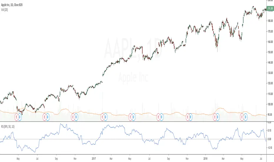
Relative StrengthRelative strength is a ratio between two assets, most often a stock and a market average (index). This implementation uses the method described here and the second method described here to calculate its value: "To calculate the relative strength of a particular stock, divide the percentage change over some time period by the percentage change of a particular index over the same time period". This indicator oscillates around zero. If the value is greater than zero, the investment has been relatively strong during the selected period; if the value is less than zero, the investment has been relatively weak. The period and the comparative symbol can be set in the settings for the indicator (the defaults are 50 and SPX), there you can also find an option to turn on a moving average.
Security Tracker - BronzeThis Indicator will be the most simple form of this code, with Silver and Gold versions to come.
Tracked Security - BTCUSD in this example but can be changed anything.
Index - Current Security / Tracked Security
Inverse Index - (1 / Index)
(Current Security = ETHUSD in this example)
Works across all periods and Securities.
Can format lines and colours, but won't be appropriate to plot all three lines at once.
Easily see currency pair without cluttering up your chart or requiring another chart (especially for members with free subscriptions).
Can be BTC vs SNP...if you wanted, something which you couldn't find in the standard list.
I have experimented with several combinations, but if there are any issues, let me know.

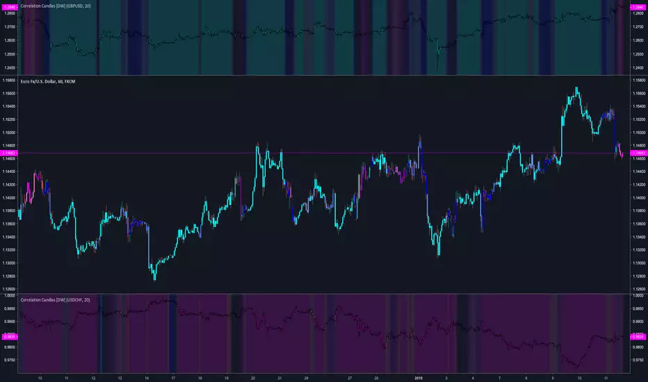
Correlation Candles [DW]This is a simple study designed to visualize price correlations between securities.
Price relation viewer - add percent change of two symbols (BETA)This script is very much beta!
This is a simple script to visualize how two symbols move in relation to each other. For example if the underlying symbol is a 2x Gold ETF (meaning the ticker moves at 2x the spot price of gold---if gold goes up 3% this ticker should go up 6%) and the comparison symbol is an 2x inverse gold ETF (at gold up 3% this should move down 6%). If these ETFs were 100% accurate at tracking the price of gold then this tool would report a value of zero at all times.
Day 1
Ticker - $10
Comparison - $10
Day 2
Ticker - $12
Comp - $11
This tool value - |20%| + -|10%| = 10%
It uses a short simple moving average to smooth things out a bit (see inputs). It is important to keep your axis scale in mind when using this! Two symbols that are always near zero mean they are offsetting each other very well but the value displayed might range from 0 to 0.005, but the graphed area can make it look extreme if autoscaled.
This is a tool with very specific uses : comparing how one digital currency moves in relation to bitcoin's price, comparing how gold moves in relation to silver, etc.
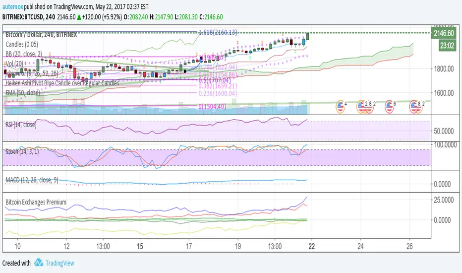
Bitcoin Exchanges PremiumThis is a % premium vs average BTCUSD price. In other words, how much % more are exchanges selling bitcoin at compared to normal BTCUSD price?
Blue: Korea
Red: Japan
Yellow: China
Green: USD Exchanges including Bitfinex, Poloniex, Coinbase, and Bitstamp
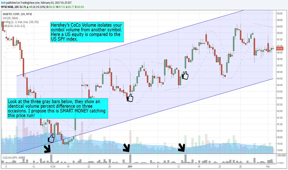
Hersheys CoCo VolumeCoCo Volume shows you volume movement of your symbol after subtracting the movement from another symbol, preferrably the sector or market the stock belongs to.
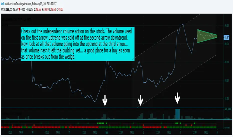
My latest update to my CoCoVolume Indicator. It calculates today's volume percent over the 60 period average for both your symbol and index, and displays that difference. If the percent is over the max it highlights the color, showing BIG action for that stock.
The last version was calculating the percent volume difference from yesterday to today for the stock and index and displaying the difference. The prior method had large swings on low volume stocks... this one shows the independent volume action much better. The default values will suit most stocks.
You can set three variables...
- the index symbol, default is SPY
- the period for averaging, default is 60
- the max volume percent, default is 500
Good trading!
Brian Hershey
Hersheys CoCo VolumeThis simple but powerful indicator takes the volume changes from another symbol and removes them from your symbol, so you can compare stock/market or stock/sector or sector/market relationships.
When used together with Hersheys CoCo Bars, you get a very unique view of what's going on!
Good trading!
Brian Hershey
Hersheys CoCo BarsThis is my latest attempt to show price movement differences between symbols. I want to see the buying and selling pressure... is that price movement going with the market or is it moving alone? It's VERY interesting to watch this indicator and see how things play out!
In my previous versions the arrows on the chart were too much clutter, while the single row of color under the chart was not enough info. Also, I removed the calculations to build a world index because the correlation between US and world markets is a hard nut to crack, plus it took many seconds to calculate.
So here is "CoCo Bars", which clearly show price moves with or against another symbol. The default symbol is the US index SPY. The coolest thing here is there are three rows of data in ONE INDICATOR! Many thanks to user rollas for helping with that code.
"CoCo" stands for correlation coefficient, which is what I was studying when I got the idea for this project.
GREEN bars in row #1 = Symbol up, US up, Symbol up more than US
RED bars in row #2 = Symbol down, US down, Symbol down more than US
In rows 1 and 2 the color intensity is based on the biggest difference, light, medium and dark colors.
green/red colors in bottom row are a 7 period average of the sum of price changes of both symbol and index, green = positive, red = negative
Enjoy, and good trading!
Brian Hershey
Hersheys CoCoThis is my variation of the Correlation Coefficient and I call it "Hershey's CoCo". The indicator identifies very specific Stock, Sector and Market pressures on whatever symbol you are evaluating.
If interested, follow me and send me requests to evaluate your stock or sector as I refine this tool.
***********************************************
Price movement does not happen in isolation.
Stocks are held by various "containers" that can be traded independently and can affect the price of each stock. The most important of those containers are Sector and Market, while others include Industry, MarketCap and others.
For example, Market is simply the top level representation of all stocks, or the sea that carries, or sinks, all ships. You can monitor this level by looking at various indexes, ETFs and/or Funds. I use "VTI", the Vanguard Total Stock Market ETF.
Sectors can be monitored using any number of containers, like Vanguard Sector Index Funds or ProShares Ultra Sector Indexes. I use the S&P SPDR Sector Funds. A list of those are listed below.
Most of the techniques and indicators that deal with correlation and sector/market comparisons are not very detailed. Many simply overlay one price series over another, while you tediously follow the price lines from left to right trying to judge movement.
Another critical piece missing from other compare tools is normalizing each data series. Hershey's CoCo does this, so you can have confidence that the alerts you see are based on accurate comparisons at every level.
***********************************************
So let's get to the details! Hershey's CoCo currently compares 2 containers, so for this discussion we'll do Stock to Sector. You'll see arrows above and below some ticks of the price chart, plus a faint red or green background color.
Very Bull = Blue Arrow = Stock and Sector prices are up, Stock price up more
Bull = Green Arrow = Stock and Sector prices are up, Sector price up more
Bear = Red Arrow = Stock and Sector prices are down, Sector price down more
Very Bear = Black Arrow = Stock and Sector prices are down, Stock price down more
Neutral = No Arrow = Stock and Sector price movement equal
Arrow Length = Strength (the longer the arrow the bigger the difference)
Green Background = Bull = Above zero Simple Moving Average of all arrow values
Red Background = Bear = Below zero Simple Moving Average of all arrow values
To review, the Blacks and Blues are the HEAVIEST pressure... the LONGER the STRONGER!
