Koma-Indikator v2272,19
USD
+0,35
+0,13%
Apple, Inc. engages in the design, manufacture, and sale of smartphones, personal computers, tablets, wearables and accessories, and other varieties of related services. It operates through the following geographical segments: Americas, Europe, Greater China, Japan, and Rest of Asia Pacific. The Americas segment includes North and South America. The Europe segment consists of European countries, as well as India, the Middle East, and Africa. The Greater China segment comprises China, Hong Kong, and Taiwan. The Rest of Asia Pacific segment includes Australia and Asian countries. Its products and services include iPhone, Mac, iPad, AirPods, Apple TV, Apple Watch, Beats products, AppleCare, iCloud, digital content stores, streaming, and licensing services. The company was founded by Steven Paul Jobs, Ronald Gerald Wayne, and Stephen G. Wozniak in April 1976 and is headquartered in Cupertino, CA.
Es sind noch 14 Min. für die Script-Bearbeitung übrig
in dieser Minute
Koma-Indikator v2
Zu Favoriten hinzufügen
Auf Chart verwenden
0
0
Functional Overview: Koma-Indikator V2
This indicator is a specialized analytical tool for Smart Money Concepts (SMC) trading. It is designed to automatically identify trend reversals, liquidity pools, and order flow shifts within the chart.
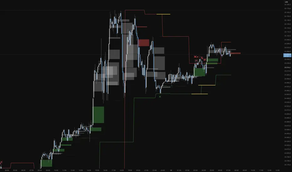
1. Liquidity Identification (BSL/SSL)
Major Range: The script automatically calculates significant highs and lows based on the "Major Lookback" period.
Buy-Side & Sell-Side Liquidity: These levels are plotted as red (BSL) and green (SSL) lines, serving as primary targets where the market often "hunts" for liquidity.
2. Sweep Detection (Liquidity Grabs)
The indicator detects when the price briefly exceeds a major high or low but closes back within the range.
Visuals: These potential reversal points are marked with an "X" icon above or below the candle (Sweep H/L).
3. Automated Market Structure Shifts (MSS)
The core logic tracks direction changes on two distinct levels:
Major MSS (Bold Yellow Line): Signals a significant trend reversal following a liquidity sweep. This is the primary confirmation for a new trend.
Minor MSS (Dotted Yellow Line): Highlights smaller structural breaks within a trend—ideal for aggressive "Sniper" entries on lower timeframes.
4. Dynamic Fair Value Gaps (FVG) & iFVGs
FVG Recognition: The indicator automatically draws boxes for bullish (green) and bearish (red) price imbalances.
Change in Delivery (iFVG): When a price candle closes through an existing FVG box, the box turns gray. This signals an Inverted FVG (iFVG), indicating that the order flow has officially shifted in the new direction.
5. Customization (Inputs)
Sensitivity: Users can adjust the lookback periods for both Trend (Major) and Entries (Minor) to suit different assets or timeframes.
Visual Hierarchy: All colors, line widths, and box lengths are configurable to maintain a clean and professional chart layout.
Trading Application:
By automating the "grunt work" of structural analysis, this tool allows you to focus on the trade execution:
Locate Liquidity: Identify BSL/SSL lines.
Watch for the Sweep: Look for the "X" marks.
Confirm the Shift: Wait for the yellow MSS lines.
Execute via Order Flow: Use the gray iFVG boxes as your Point of Interest (POI).
Geschütztes Skript
Dieses Script ist als Closed-Source veröffentlicht. Sie können es kostenlos und ohne Einschränkungen verwenden – erfahren Sie hier mehr.
Phantomas1
Haftungsausschluss
Die Informationen und Veröffentlichungen sind nicht als Finanz-, Anlage-, Handels- oder andere Arten von Ratschlägen oder Empfehlungen gedacht, die von TradingView bereitgestellt oder gebilligt werden, und stellen diese nicht dar. Lesen Sie mehr in den Nutzungsbedingungen.
Skript bearbeiten
Minimieren
Schließen
Koma-Indikator v2
Functional Overview: Koma-Indikator V2
This indicator is a specialized analytical tool for Smart Money Concepts (SMC) trading. It is designed to automatically identify trend reversals, liquidity pools, and order flow shifts within the chart.
1. Liquidity Identification (BSL/SSL)
Major Range: The script automatically calculates significant highs and lows based on the "Major Lookback" period.
Buy-Side & Sell-Side Liquidity: These levels are plotted as red (BSL) and green (SSL) lines, serving as primary targets where the market often "hunts" for liquidity.
2. Sweep Detection (Liquidity Grabs)
The indicator detects when the price briefly exceeds a major high or low but closes back within the range.
Visuals: These potential reversal points are marked with an "X" icon above or below the candle (Sweep H/L).
3. Automated Market Structure Shifts (MSS)
The core logic tracks direction changes on two distinct levels:
Major MSS (Bold Yellow Line): Signals a significant trend reversal following a liquidity sweep. This is the primary confirmation for a new trend.
Minor MSS (Dotted Yellow Line): Highlights smaller structural breaks within a trend—ideal for aggressive "Sniper" entries on lower timeframes.
4. Dynamic Fair Value Gaps (FVG) & iFVGs
FVG Recognition: The indicator automatically draws boxes for bullish (green) and bearish (red) price imbalances.
Change in Delivery (iFVG): When a price candle closes through an existing FVG box, the box turns gray. This signals an Inverted FVG (iFVG), indicating that the order flow has officially shifted in the new direction.
5. Customization (Inputs)
Sensitivity: Users can adjust the lookback periods for both Trend (Major) and Entries (Minor) to suit different assets or timeframes.
Visual Hierarchy: All colors, line widths, and box lengths are configurable to maintain a clean and professional chart layout.
Trading Application:
By automating the "grunt work" of structural analysis, this tool allows you to focus on the trade execution:
Locate Liquidity: Identify BSL/SSL lines.
Watch for the Sweep: Look for the "X" marks.
Confirm the Shift: Wait for the yellow MSS lines.
Execute via Order Flow: Use the gray iFVG boxes as your Point of Interest (POI).
Fortfahren
Grafik Desenleri
Entry / TP / SL Alert Bands (Simple & Stable)Entry / TP / SL Alert Bands – Invite-Only Version
Description
This tool plots customizable Entry, Take-Profit, and Stop-Loss reference levels, along with two alert bands derived as a percentage of the distance between Entry→TP and Entry→SL. The bands update immediately when inputs are adjusted and remain constant across the chart. This is useful for traders who want to visually monitor when price approaches key zones associated with their pre-defined trade plan.
Core Features
• Manual Entry, TP, and SL input fields
• Long or Short mode
• Upper alert band = a user-defined % of the distance toward TP
• Lower alert band = a user-defined % of the distance toward SL
• Optional visibility controls for Entry, TP, SL lines
• Alerts for:
– Price crossing the upper band
– Price crossing the lower band
– Price crossing either band
• Works on any symbol and any timeframe
• Alerts use TradingView’s built-in alertcondition() system
How It Works
The script computes the absolute distance between Entry→TP and Entry→SL, then applies user-defined percentages to determine where the alert bands should be drawn. If TP/SL are reversed relative to Entry for the selected direction, the relevant band may be invisible (e.g., negative or invalid distance). Proper TP/SL placement is required for intended use.
Notes
• This tool does not generate buy/sell signals.
• This tool does not provide financial advice.
• Proper risk management, independent decision-making, and verification of all settings are required.
⸻

ema200 filler═══════════════════════════════════════════════════════════════
TRADINGVIEW INDICATOR DESCRIPTION
═══════════════════════════════════════════════════════════════
TITLE: EMA 200 Filler - Visual Trend Indicator
SHORT DESCRIPTION:
Instantly see trend direction with color-coded shading between price and the 200 EMA. Green above = bullish, Red below = bearish.
═══════════════════════════════════════════════════════════════
MAIN DESCRIPTION
═══════════════════════════════════════════════════════════════
🎨 SEE THE TREND AT A GLANCE
This elegant indicator fills the space between price and the 200-period Exponential Moving Average (EMA) with color-coded shading, making trend direction instantly obvious without any analysis required.
✨ KEY FEATURES:
• Visual Trend Clarity - Green fill = bullish zone, Red fill = bearish zone
• EMA 200 Line - The institutional trader's favorite trend indicator
• Dynamic Shading - Fill automatically adjusts as price moves
• Clean Design - Semi-transparent fills won't clutter your chart
• Zero Configuration - Works perfectly right out of the box
• Universal Application - Works on any timeframe, any asset
📊 WHAT YOU SEE:
🟢 GREEN SHADED AREA
→ Price is ABOVE the 200 EMA
→ Bullish trend in effect
→ Look for LONG opportunities
🔴 RED SHADED AREA
→ Price is BELOW the 200 EMA
→ Bearish trend in effect
→ Look for SHORT opportunities
🔵 BLUE LINE = 200 EMA
→ The dividing line between bull and bear zones
→ Major support/resistance level
→ Institutional trend filter
💡 WHY THE 200 EMA MATTERS:
The 200-period EMA is one of the most widely watched technical indicators by:
✓ Institutional traders and hedge funds
✓ Day traders and swing traders
✓ Algorithmic trading systems
✓ Technical analysis professionals
When millions of traders watch the same level, it becomes a self-fulfilling prophecy - making it incredibly powerful for entries, exits, and stop placement.
🎯 TRADING APPLICATIONS:
✓ **Trend Filter** - Only take longs in green, shorts in red
✓ **Trend Confirmation** - Strong trends stay on one side for extended periods
✓ **Reversal Signals** - Watch for crossovers when price crosses the 200 EMA
✓ **Support/Resistance** - 200 EMA acts as dynamic support in uptrends, resistance in downtrends
✓ **Stay Out Zones** - Avoid trading when price chops around the 200 EMA (mixed colors)
📈 PERFECT FOR:
✓ Swing traders who need clear trend direction
✓ Day traders using the 200 EMA as a filter
✓ Beginners who want simple trend identification
✓ Multi-timeframe analysis (check higher timeframe trend)
✓ Anyone who wants cleaner charts with instant trend clarity
⚙️ WORKS WITH:
• All asset classes (stocks, forex, crypto, commodities, indices)
• All timeframes (1-minute to monthly charts)
• Combines perfectly with other indicators
• No special settings required - just add and trade
🌟 CLEAN & PROFESSIONAL:
• Semi-transparent fills (70% opacity) - won't hide candles or other indicators
• White price line for clear visibility
• Blue EMA line - industry standard color
• Minimalist design philosophy
🚀 INSTANT SETUP:
1. Add indicator to chart
2. Start trading with the trend
3. That's it - no configuration needed!
The simplest way to visualize trend direction. When you see green, think bullish. When you see red, think bearish. Trading doesn't get more straightforward than this.
═══════════════════════════════════════════════════════════════
CATEGORIES:
• Trend Analysis
• Moving Averages
• Overlays
TAGS:
ema, ema 200, moving average, trend indicator, trend filter, visual indicator, exponential moving average, 200 ema, trend following, color coded, bullish bearish
═══════════════════════════════════════════════════════════════
QUICK START GUIDE
═══════════════════════════════════════════════════════════════
🚀 QUICK START - EMA 200 Filler
──────────────────────────────────────────────────────────────
STEP 1: ADD TO CHART
──────────────────────────────────────────────────────────────
1. Open TradingView
2. Load any chart (stocks, forex, crypto - anything!)
3. Click "Indicators" button at top
4. Search: "EMA 200 Filler"
5. Click to add
You're done! No settings to adjust.
──────────────────────────────────────────────────────────────
STEP 2: UNDERSTAND THE COLORS
──────────────────────────────────────────────────────────────
The indicator fills the space between PRICE and the 200 EMA:
🟢 GREEN FILL = BULLISH ZONE
• Price is above the 200 EMA
• Uptrend is active
• Bias: Look for LONG entries only
🔴 RED FILL = BEARISH ZONE
• Price is below the 200 EMA
• Downtrend is active
• Bias: Look for SHORT entries only
🔵 BLUE LINE = 200 EMA
• The trend dividing line
• Acts as support in uptrends
• Acts as resistance in downtrends
──────────────────────────────────────────────────────────────
STEP 3: BASIC TRADING RULES
──────────────────────────────────────────────────────────────
📈 RULE #1: TRADE WITH THE COLOR
In GREEN zone:
→ Only look for LONG setups
→ Buy dips toward the 200 EMA
→ Avoid shorting against the trend
In RED zone:
→ Only look for SHORT setups
→ Sell rallies toward the 200 EMA
→ Avoid longing against the trend
──────────────────────────────────────────────────────────────
🎯 RULE #2: USE THE 200 EMA AS SUPPORT/RESISTANCE
In GREEN (uptrend):
→ 200 EMA acts as SUPPORT
→ Price bouncing off 200 EMA = buy opportunity
→ Price breaking BELOW 200 EMA = trend change warning
In RED (downtrend):
→ 200 EMA acts as RESISTANCE
→ Price rejecting at 200 EMA = sell opportunity
→ Price breaking ABOVE 200 EMA = trend change warning
──────────────────────────────────────────────────────────────
⚠️ RULE #3: AVOID THE CHOP ZONE
When price keeps crossing the 200 EMA (color changing frequently):
→ Market is RANGING, not trending
→ Stay out or reduce position size
→ Wait for a clear trend to establish
──────────────────────────────────────────────────────────────
STEP 4: TRADING STRATEGIES
──────────────────────────────────────────────────────────────
✅ STRATEGY #1: TREND FOLLOWING (PULLBACK ENTRIES)
Wait for GREEN zone (bullish trend):
1. Price pulls back toward the 200 EMA (blue line)
2. Look for bullish reversal candle near 200 EMA
3. Enter LONG
4. Stop below 200 EMA
5. Hold while in green zone
Example:
• Chart shows green shading
• Price dips to 200 EMA and bounces
• Enter long at bounce confirmation
• Stop 5-10 pips below 200 EMA
• Exit when price crosses back below 200 EMA (turns red)
──────────────────────────────────────────────────────────────
✅ STRATEGY #2: BREAKOUT TRADING (TREND CHANGE)
Watch for color change (crossover):
GREEN → RED (bearish reversal):
1. Price crosses below 200 EMA
2. Fill turns from green to red
3. Enter SHORT on next pullback to 200 EMA
4. Stop above 200 EMA
5. Ride the new downtrend
RED → GREEN (bullish reversal):
1. Price crosses above 200 EMA
2. Fill turns from red to green
3. Enter LONG on next pullback to 200 EMA
4. Stop below 200 EMA
5. Ride the new uptrend
──────────────────────────────────────────────────────────────
✅ STRATEGY #3: HIGHER TIMEFRAME FILTER
Use this indicator on a HIGHER timeframe as a filter:
Example for day trading:
• Add indicator to DAILY chart
• Check the color: Green or Red?
• Switch back to your trading timeframe (5m, 15m, etc.)
• Only take trades in the direction of daily trend
If daily = GREEN → Only take longs on lower timeframes
If daily = RED → Only take shorts on lower timeframes
This keeps you aligned with the bigger trend!
──────────────────────────────────────────────────────────────
STEP 5: REAL TRADING EXAMPLES
──────────────────────────────────────────────────────────────
📊 EXAMPLE #1: LONG ENTRY IN UPTREND
Chart: SPY on 1-hour timeframe
Indicator: Green fill (price above 200 EMA)
Setup:
• Price at 450, 200 EMA at 445
• Green shading shows bullish trend
• Price pulls back to 446 (near 200 EMA)
• Bullish hammer candle forms at 200 EMA
Trade:
→ Enter LONG at 446.50
→ Stop at 444.50 (below 200 EMA)
→ Target: Previous high at 452
→ Risk: 2 points | Reward: 5.50 points = 2.75:1 R/R
──────────────────────────────────────────────────────────────
📊 EXAMPLE #2: SHORT ENTRY IN DOWNTREND
Chart: EUR/USD on 4-hour timeframe
Indicator: Red fill (price below 200 EMA)
Setup:
• Price at 1.0850, 200 EMA at 1.0900
• Red shading shows bearish trend
• Price rallies to 1.0895 (near 200 EMA)
• Bearish rejection candle at 200 EMA
Trade:
→ Enter SHORT at 1.0890
→ Stop at 1.0910 (above 200 EMA)
→ Target: 1.0820 (recent support)
→ Risk: 20 pips | Reward: 70 pips = 3.5:1 R/R
──────────────────────────────────────────────────────────────
📊 EXAMPLE #3: AVOID THE CHOP
Chart: Bitcoin on 15-minute timeframe
Indicator: Color keeps changing (green/red/green/red)
Observation:
• Price crossed 200 EMA 4 times in 2 hours
• No clear trend established
• Whipsaw action
Action:
→ STAY OUT - wait for clear trend
→ Check higher timeframe for direction
→ Come back when one color dominates
──────────────────────────────────────────────────────────────
STEP 6: PRO TIPS
──────────────────────────────────────────────────────────────
💡 **Combine with Price Action**
Don't just enter because it's green - wait for bullish candle patterns (hammer, engulfing, etc.) at the 200 EMA for high-probability setups.
💡 **Respect the 200 EMA**
The longer price stays on one side, the stronger that side becomes. A stock green for months has strong bullish momentum.
💡 **Watch Volume at Crossovers**
When price crosses the 200 EMA with HIGH volume = strong signal
Low volume crossover = might be false breakout
💡 **Use Multiple Timeframes**
• Daily chart = overall trend direction
• 4H chart = swing trade setups
• 1H chart = day trade entries
Always align smaller timeframe trades with larger timeframe color!
💡 **Strongest Setups = Clean Trends**
Best trades happen when:
• Chart stays ONE color for extended period
• Price respects 200 EMA as support/resistance
• No frequent crossovers
──────────────────────────────────────────────────────────────
COMMON QUESTIONS
──────────────────────────────────────────────────────────────
❓ "What if price crosses the 200 EMA frequently?"
→ That's a ranging market. Stay out or trade smaller size. Wait for a clear trend.
❓ "Can I change the colors?"
→ Not in this version, but green/red is universal and intuitive.
❓ "Does this work on all timeframes?"
→ Yes! But longer timeframes (4H, Daily) tend to give cleaner signals.
❓ "Should I always use the 200 EMA?"
→ The 200 is the institutional standard. Stick with it for consistency.
❓ "What about the 50 or 20 EMA?"
→ You can add those separately. This indicator focuses on the proven 200 EMA.
──────────────────────────────────────────────────────────────
THE GOLDEN RULE
──────────────────────────────────────────────────────────────
🟢 GREEN = GO LONG (or stay long)
🔴 RED = GO SHORT (or stay short)
🔄 FREQUENT CHANGES = STAY OUT
It's that simple. The trend is your friend - this indicator just makes it impossible to miss!
──────────────────────────────────────────────────────────────
Happy Trading! 📈
──────────────────────────────────────────────────────────────

FX Session High/Low Bands - Last 5 EST DaysFX Session High/Low Bands – Last 5 EST Days is a powerful market-structure indicator that automatically plots the true high and low ranges of the Asian, London, and New York trading sessions — without clutter or manual marking.
Each session’s high and low are calculated in real time using New York (EST) session boundaries, then projected as clean dotted bands across the chart. Only the last five trading days are displayed, keeping your chart focused on the most relevant liquidity and reaction levels.
These session bands help traders instantly identify:
• Key intraday support and resistance
• Liquidity highs and lows targeted by later sessions
• Range expansion vs compression
• High-probability breakout, fade, and continuation zones
Color-coded session levels make it easy to distinguish between Asia, London, and New York at a glance, while automatic session detection ensures accuracy across all timeframes.
Ideal for forex and index traders who rely on session-based price behavior, institutional liquidity concepts, and repeatable intraday structure.
Stop guessing where the session levels are.
Trade with precision using the levels the market actually respects.

CE-PE-S/RThis Indicator Purely we design for option traders to do in intraday, here you can view both CE & PE Support & Resistance.
You have to chose same strike CE & PE
Yellow Line will give as a pivot Point
Red Line are we consider as a Target or Resistance
Green Line are we Consider as a Sellers Target or Support Line.
Above Yellow we consider Strong Up.


Vel-SIGThis pine script will give you an idea about the markets are in trending or rangebound. based on this you can take your decision whether you can buy or sell or right option.

Explosive Candle Detector [CodeAlchemyLab]Explosive Candle Detector
This indicator identifies potential high-momentum trading opportunities by detecting explosive candles that form after consolidation periods (base candles).
How It Works:
The indicator uses a two-candle pattern system:
Base Candle (Boring): A consolidation candle where the wicks are larger than the body, indicating indecision and potential accumulation/distribution by smart money. This represents a compression phase where price is being absorbed.
Explosive Candle: A momentum candle that appears immediately after a base candle, with a size at least 50% larger than the base candle. This represents an expansion phase where price breaks out with strong directional movement.
Features:
• Detects bullish explosive candles (green markers below candle)
• Detects bearish explosive candles (red markers above candle)
• Highlights base candles with background color
• Customizable explosive threshold (default: 50% size increase)
• Clean visual signals for easy pattern recognition
Trading Applications:
• Supply and Demand zone identification
• Breakout confirmation signals
• Momentum trade entries
• Order block detection
• Smart money accumulation/distribution phases
Best Used With:
Support/resistance levels, trend analysis, and volume confirmation for optimal trade setups.
Parameter:
Boring Candle Parameters:
1. Min wick ratio (0.6 = 60%): The total wicks (upper + lower) must be at least 60% of the candle's total range. Higher values = more wick required, meaning the candle is more "indecisive" with long wicks.
2. Max body ratio (0.4 = 40%): The body must be at most 40% of the candle's total range. Lower values = smaller body required, confirming the candle is mostly wicks with a small body.
Example: If candle range is 100 pips, wicks must be ≥60 pips and body must be ≤40 pips.
──────────────────────────────────────────
Explosive Candle Parameters:
3. Min size vs Boring (1.5 = 150%): The explosive candle must be at least 1.5x (or 50% bigger) than the boring candle's range. If boring candle is 100 pips, explosive must be ≥150 pips.
4. Min body ratio (0.5 = 50%): The explosive candle's body must be at least 50% of its total range. This ensures it's a strong directional move with a large body, not just wicks.
──────────────────────────────────────────
In Simple Terms:
• Boring candle = Big wicks, small body (consolidation/indecision)
• Explosive candle = Big body, much larger than boring candle (strong directional move)


VIX-SPX Quant Pro SystemQuantitative Analysis of Historical VIX Dynamics and Daily Predictive Frameworks for Volatility ForecastingThe financial ecosystem of the twenty-first century is increasingly governed by the measurement and management of risk, with the Cboe Volatility Index (VIX) serving as the primary benchmark for expected equity market turbulence.1 Originally proposed in the late 1980s by financial economists Menachem Brenner and Dan Galai, the concept of a "Sigma Index" was intended to provide a standardized, frequently updated measure of volatility that could facilitate the creation of futures and options for hedging purposes.3 In 1993, the Chicago Board Options Exchange (CBOE) implemented this vision, launching the VIX based on the implied volatility of eight S&P 100 at-the-money options series.1 The subsequent transformation of the VIX in 2003—shifting its underlying to the S&P 500 (SPX) and adopting a model-free methodology developed in conjunction with Goldman Sachs—marked its transition into the "fear gauge" recognized today by market participants worldwide.2Understanding the movement of the VIX historically and developing an equation to predict its daily levels requires a deep synthesis of data infrastructure, mathematical modeling, and an appreciation for the structural mechanics of the options market. The index does not measure historical or statistical volatility in the traditional sense; rather, it reflects the market's expectation of 30-day forward-looking volatility, as conveyed by current SPX option prices.5 This predictive capacity stems from the fact that implied volatility represents the consensus view of professional traders regarding the probability and magnitude of future price movements, adjusted for the insurance premiums they are willing to pay for downside protection.8Historical Data Infrastructure and Tracking MethodologiesTo track VIX movement historically with high fidelity, an analyst must rely on robust data pipelines that provide not only the index levels but also the underlying components of its calculation. Financial time-series data is prone to gaps, timestamp inconsistencies, and errors in Open-High-Low-Close (OHLC) reporting, necessitating the use of specialized vendors that normalize these datasets.10Evaluative Framework for Historical Data ProvidersHistorical tracking of the VIX is most effective when utilizing APIs that offer long-term datasets with high granular resolution. The choice of provider often dictates the scope of analysis, with some catering to end-of-day (EOD) historical research while others provide the tick-level detail required for high-frequency algorithmic modeling.10API ProviderData DepthFrequency SupportBest ForTagX Stock Market API10+ Years1m, 5m, 15m, EODQuant research and backtesting 10EOD Historical Data (EODHD)30+ YearsEOD, 1m, 5m, 1hLong-term trend analysis 11Polygon.ioReal-time & HistTick-level, 1m, EODU.S. algorithmic trading 10Alpha Vantage20+ YearsDaily, IntradayPrototyping and academics 10Yahoo Finance (yfinance)VariableDaily, WeeklyQuick prototyping/casual use 11DatabentoExtensiveHigh-frequency tickLow-latency precisive analysis 11FRED (St. Louis Fed)Since 1990Daily CloseMacroeconomic modeling 16Beyond the broad providers, official sources like the CBOE DataShop provide the most authoritative historical files, including EOD calculation inputs from May 9, 2022, to the present.17 These files contain every strike price, weight, and contribution used to derive the last published VIX value of each day, which is critical for those seeking to understand why the index moved during specific volatility regimes.17 For researchers investigating older data, the St. Louis Fed’s FRED database maintains the VIXCLS series, providing daily closing values dating back to January 1990, alongside historical data for other volatility benchmarks.4The VIX Calculation Methodology: A Deep DiveThe ability to predict VIX levels daily relies on a fundamental understanding of its mechanical derivation. Contrary to common misconceptions, the VIX is not calculated using the Black-Scholes-Merton model to solve for individual implied volatilities.19 Instead, it employs a model-free formula that captures a weighted sum of variance estimates across a broad range of strike prices.19Mathematical Formula and Strike SelectionThe VIX methodology targets a constant 30-day maturity by interpolating between two tenors of SPX options.19 These "near-term" and "next-term" expirations must have more than 23 days and less than 37 days to maturity.7The core equation for the variance of each tenor ($\sigma^2$) is expressed as:$$\sigma^2 = \frac{2}{T} \sum_i \frac{\Delta K_i}{K_i^2} e^{RT} Q(K_i) - \frac{1}{T} \left( \frac{F}{K_0} - 1 \right)^2$ BMV:IN this calculation:$T$ is the time to expiration (calculated precisely in minutes).19$F$ is the forward index level derived from option prices.7$K_i$ is the strike price of the $i^{th}$ out-of-the-money (OTM) option.19$\Delta K_i$ is the strike price interval, calculated as half the difference between the strikes on either side of $K_i$.20$Q(K_i)$ is the midpoint of the bid-ask quote for strike $K_i$.7$R$ is the risk-free interest rate.19$K_0$ is the first strike price below the forward index level $F$.19Once the variances for the two tenors are calculated, they are linearly interpolated to find the 30-day variance, the square root of which is multiplied by 100 to yield the VIX index value.19Historical Dynamics: Mean Reversion and Asymmetric CorrelationThe development of predictive equations must be grounded in the structural behavior of volatility. The VIX possesses two distinct characteristics that differentiate it from traditional equity assets: it is bounded at both ends and demonstrates powerful mean reversion.26The Central Tendency PrincipleThe VIX gravitates toward a long-term average of approximately 19.5.23 Statistical research establishes that in any given month, the VIX tends to move about 30% of the distance between its current level and its long-term average.30 This "speed of mean reversion" is a critical constant in predictive equations, as it provides a directional bias when volatility deviates significantly from the norm.8The Inverse Correlation with EquitiesThe relationship between the S&P 500 and the VIX is strongly negative, with a historical correlation coefficient typically ranging from -0.70 to -0.80.27 This link is essentially a reflection of the "leverage effect," where price declines increase financial risk and investor fear, driving up option premiums.33 Interestingly, while the two move in opposite directions 80% of the time, the remaining 20% often features positive co-movement.34Technical Roadmaps and Actionable Calculation RulesFor intraday SPX trading on the 3-minute timeframe, mathematical findings can be translated into the following actionable study logic:Rule 1: The "Rule of 16" Intraday RangeThe Rule of 16 converts annualized VIX into a daily expected move by dividing the VIX level by 16.35 For a 3-minute timeframe, this expectation must be scaled by the square root of the number of bars in a trading day (130 bars for a standard 390-minute session):$$Expected Move_{Bar} = \frac{VIX}{16 \cdot \sqrt{Bars_{Day}}}$ MIL:IF the current SPX candle breaks outside these dynamic bands, it signals an "excess volatility" event likely driven by institutional hedging flow.35Rule 2: VIX/VXV Ratio ExhaustionThe spread between 1-month and 3-month volatility identifies when fear is overextended.33Warning Zone (Short SPX): Ratio > 1.0 (Short-term fear > Long-term expectation).38Exhaustion Zone (Long SPX): Ratio > 1.25 (Near-term panic is at its zenith).38Rule 3: Bollinger Band "Rubber Band" ReversionWhen the VIX stretches more than 30% above its 20-period moving average and closes back inside its upper Bollinger Band, it signals a "snap back" where equity prices typically rally as fear recedes.Pine Script V6: Actionable VIX-SPX Signal System (Overlay)This script implements the findings as an overlay for the S&P 500 (SPX) chart. It provides Long/Short ✖ crosses and dynamic "Expected Move" bands based on the VIX.
Synthesis of Daily Calculation MethodologyTo conclude the predictive framework, the following table summarizes the real-time calculation methodology for daily levels.StepActionPractical Formula / ThresholdObjective1Establish Baseline$V_{base} = V_t + $Quantify mean reversion pressure 82Equity Shock Adj$V_{adj} = V_{base} - (0.82 \cdot R_{SPX,t})$Incorporate leverage effect and correlation 243Technical FilterPlot vs. Upper Bollinger Band (+2SD)Identify overextension/exhaustion points 404Range BoundApply Rule of 16 ( TVC:VIX / 16$)Set daily SPX fluctuation targets 35Through the systematic integration of these components, market analysts can transition from reactive observation of market fear to proactive navigation of risk-neutral volatility expectations, effectively utilizing the VIX as a forward-looking beacon for equity market outcomes.2

Liquidity Sweep Guardian (Universal % or point based)
Liquidity Sweep Guardian - Complete User Guide
## Overview
The **Liquidity Sweep Guardian** is a visual warning system designed to prevent premature counter-trend trades (fades) near Previous Day High (PDH) and Previous Day Low (PDL) levels. This indicator helps you avoid one of the most common trading mistakes: fading too early before liquidity sweeps complete.
---
## 🎯 Core Trading Principle
### **THE GOLDEN RULE: Don't Fade Until It's Unlocked**
Price often **accelerates into key levels** to sweep liquidity before reversing. Trading against this momentum is extremely dangerous.
**The Process:**
1. **Danger Zone** (Red/White Box) = ⚠️ **DO NOT FADE** - Sweep likely incoming
2. **Sweep Occurs** (Triangle marker appears) = Price penetrates the level
3. **Reclaim Happens** (Price returns above/below level) = Level is tested
4. **🔓 UNLOCKED** (Gold border, green label) = **NOW you may CONSIDER a fade**
> **Important:** "UNLOCKED" means you may now *consider* a fade setup. It is NOT a trade signal itself. You still need your entry confirmation, risk management, and trade plan.
---
## 📊 Visual Elements Explained
### 1. **Danger Zone Boxes (Red Border by Default)**
**Two types of zones around PDH/PDL:**
- **Outer Danger Zone** (White fill): ±75pts (or 0.30%) around the level
- Indicates proximity to a key level where sweeps commonly occur
- Yellow/cautious trading zone
- **Inner Critical Zone** (Black fill): ±25pts (or 0.10%) around the level
- Highest probability area for liquidity sweep traps
- Avoid fading here at all costs
**What to do:**
- When price enters these zones, **wait and watch**
- Do not initiate counter-trend positions
- Allow the sweep to play out
### 2. **Unlocked Zones (Gold Border #ffeb3b)**
When a zone turns **gold/yellow** with green fill:
- The level has been swept AND reclaimed
- The liquidity grab is complete
- You may now look for fade opportunities with proper confirmation
### 3. **PDH/PDL Lines**
- **PDH Line** (Red): Previous Day High with price label
- **PDL Line** (Green): Previous Day Low with price label
- These are your key reference levels for the session
### 4. **Sweep Labels**
**Triangle Markers (SWEEP):**
- **Green Triangle** = Clean sweep (10-25pts penetration)
- **Orange Triangle** = Extended sweep (25-50pts penetration)
- **Red Triangle** = Deep penetration (50+ pts) - likely continuation, not reversal
**Warning Labels:**
- **⚠️ DEEP CONTINUATION?** = Penetration too deep, probably NOT a reversal setup
**Unlock Labels:**
- **🔓 LONG UNLOCKED** = PDL swept and reclaimed, may consider long fades
- **🔓 SHORT UNLOCKED** = PDH swept and reclaimed, may consider short fades
---
## ⚙️ Settings Guide
### **Calculation Mode**
**Use Percentage Mode (Default: ON)**
- ✅ **Enabled**: Universal mode - works on NQ, ES, RTY, stocks, crypto, forex
- ❌ **Disabled**: Fixed points mode - for specific instruments only
**When to use each:**
- **Percentage Mode**: Trading multiple instruments, or instruments with varying price levels
- **Fixed Points Mode**: Single instrument focus (e.g., only trading NQ at current levels)
### **Danger Zone Settings**
**Percentage Mode (Default for Universal Use):**
- **Danger Zone**: 0.30% each side (≈75pts on NQ@25,000)
- **Critical Zone**: 0.10% each side (≈25pts on NQ@25,000)
**Fixed Points Mode (For NQ Specifically):**
- **Danger Zone**: 75 points each side
- **Critical Zone**: 25 points each side
**Adjustment Tips:**
- For more volatile instruments: Increase percentages/points
- For less volatile instruments: Decrease percentages/points
- For higher timeframes: Use wider zones
- For lower timeframes: Use tighter zones
### **Sweep Classification**
**What defines a "real" sweep:**
- **Minimum**: 10pts / 0.04% - Shallow penetration may not grab enough liquidity
- **Optimal**: 10-25pts / 0.04-0.10% - "Goldilocks zone" for reversal setups
- **Extended**: 25-50pts / 0.10-0.20% - Deeper sweep, less reliable
- **Continuation**: 50+pts / 0.20%+ - Too deep, likely NOT reversing
**Max Bars for Reclaim**: 5 bars (default)
- Price should reclaim the level relatively quickly
- If it takes too long, the sweep may have failed
### **Visual Customization**
**Box Settings:**
- **Left Extension**: 60 bars (how far back the box extends)
- **Right Extension**: 50 bars (how far forward the box extends)
**Toggle Options:**
- Show/Hide Danger Zone Boxes
- Show/Hide PDH/PDL Lines
- Show/Hide Price Labels on lines
- Show/Hide Sweep Labels
- Show/Hide Unlock Labels
### **Color Customization**
All colors are fully customizable:
- Danger Zone Fill & Border
- Critical Zone Fill & Border
- Unlocked Zone Fill & Border
- PDH/PDL Line Colors
- PDH/PDL Label Colors
- Border Widths (1-5 pixels)
- Line Widths (1-5 pixels)
---
## 🎓 Trading Strategy Examples
### **Example 1: Long Setup at PDL**
1. **Morning**: Price approaches PDL (danger zone appears)
2. **Don't Fade Yet**: Price enters critical zone - resist urge to buy
3. **Sweep**: Price drops 15pts below PDL (green triangle appears)
4. **Reclaim**: Price closes back above PDL within 3 bars
5. **🔓 UNLOCKED**: Gold border + "LONG UNLOCKED" label appears
6. **Trade Setup**: Now look for bullish confirmation (order flow, structure, etc.)
### **Example 2: Avoiding a Trap at PDH**
1. **Afternoon**: Price rallies into PDH danger zone
2. **Temptation**: You want to short here (it "looks toppy")
3. **Sweep**: Price breaks 50pts above PDH (red triangle + ⚠️ warning)
4. **Continuation**: Deep penetration suggests continuation, not reversal
5. **Result**: No unlock occurs, price keeps running higher - trap avoided!
### **Example 3: Failed Unlock (No Trade)**
1. Price sweeps PDL by 12pts (green triangle)
2. Price struggles to reclaim PDL, stays below for 10+ bars
3. No "UNLOCKED" label appears
4. **Correct Action**: Do not fade - sweep failed to reclaim
---
## 📱 Alerts
The indicator includes built-in alerts for:
- **Entering Danger Zones**: Get warned when price approaches PDH/PDL
- **Sweep Detection**: Know immediately when a level is swept
- **Unlock Signals**: Get notified when fade setups become available
- **Continuation Warnings**: Alert when penetration suggests continuation
**To Set Alerts:**
1. Right-click indicator → "Add Alert"
2. Select desired alert condition
3. Configure notification preferences
---
## ⚠️ Important Disclaimers
### **What This Indicator IS:**
✅ A visual warning system to prevent premature fades
✅ A tool to identify when liquidity sweeps have completed
✅ A framework for counter-trend trade timing
### **What This Indicator IS NOT:**
❌ A complete trading system
❌ An entry signal generator
❌ A guarantee of trade success
❌ A substitute for proper risk management
### **Always Remember:**
- "UNLOCKED" = You may CONSIDER a fade (not a signal to trade)
- You still need your own entry confirmation
- You still need proper stop placement
- You still need position sizing and risk management
- Not every unlock leads to a successful trade
- Market context and order flow still matter
---
## 🔧 Recommended Settings by Instrument
### **NQ (Nasdaq-100 E-mini Futures)**
- Mode: Percentage or Fixed Points
- Percentage: 0.30% / 0.10% (default)
- Fixed Points: 75pts / 25pts (default)
### **ES (S&P 500 E-mini Futures)**
- Mode: Percentage
- Danger: 0.25% / Critical: 0.08%
- Or Fixed Points: 15pts / 5pts
### **RTY (Russell 2000 E-mini Futures)**
- Mode: Percentage
- Danger: 0.35% / Critical: 0.12%
- Or Fixed Points: 8pts / 3pts
### **Stocks (High Volume Large Caps)**
- Mode: Percentage (recommended)
- Danger: 0.20-0.40% / Critical: 0.08-0.15%
- Adjust based on ATR and volatility
### **Crypto (BTC, ETH)**
- Mode: Percentage (essential)
- Danger: 0.40-0.60% / Critical: 0.15-0.20%
- Higher volatility requires wider zones
---
## 💡 Pro Tips
1. **Use on Higher Timeframes**: Works best on 5min, 15min, 1hr charts
2. **Combine with Order Flow**: Use with footprint/delta for confirmation
3. **Watch Volume**: Strong volume on sweep = better reversal potential
4. **Consider Time of Day**: Sweeps during RTH often more reliable
5. **Multiple Timeframes**: Check if higher TF also shows unlock
6. **Don't Force Trades**: Not every session produces clean setups
7. **Journal Results**: Track which unlock types work best for you
8. **Respect Continuation Signals**: When indicator says "too deep," listen
---
## 🆘 Troubleshooting
**Q: Box isn't showing up**
A: Check that "Show Danger Zone Boxes" is enabled in Visual Settings
**Q: No price on labels**
A: Enable "Show Price Labels on Lines" in Visual Settings
**Q: Zones seem too tight/wide**
A: Adjust Danger Zone % or points based on current volatility
**Q: Getting too many/too few unlocks**
A: Adjust sweep classification thresholds (min/max penetration)
**Q: Want thicker/thinner lines**
A: Adjust line widths in "PDH/PDL Line Colors" section
**Q: Colors not matching my chart theme**
A: Fully customize all colors in the color settings groups
---
## 📚 Additional Resources
- Study price action around PDH/PDL on your instruments
- Learn about liquidity sweeps and stop hunts
- Understand market structure and order flow
- Practice identifying setups on replay/historical data
- Keep a trading journal of unlock scenarios
---
*Remember: The best trade is often the one you don't take. This indicator helps you avoid the trades you shouldn't take, so you can focus on the ones you should.*


Oracle Trade And Smart Probability أداة تحليل فني مصممة لمساعدة المتداول على قراءة حركة السعر واتخاذ قرارات أكثر انضباطًا، مع التركيز على إدارة الصفقة قبل الإشارة.
يعرض المؤشر إشارات دخول وخروج مع نظام إدارة صفقة مرئي يشمل:
- سعر الدخول
- الوقف الثابت
- الوقف المتحرك
- الهدف
جميع الإشارات والتنبيهات تصدر بعد إغلاق الشمعة فقط، لضمان ثبات الإشارة وعدم تغيّرها لاحقًا.
المؤشر أداة تحليل فني تعليمية وتحليلية فقط، ولا يُعد توصية استثمارية أو دعوة للبيع أو الشراء.
التداول في الأسواق المالية ينطوي على مخاطر وقد يؤدي إلى خسارة رأس المال.
المستخدم يتحمل كامل المسؤولية عن قراراته، ومطوّر المؤشر غير مسؤول عن أي خسائر مباشرة أو غير مباشرة ناتجة عن استخدامه.
لا يُنصح باستخدام المؤشر بشكل منفرد، ولا يناسب جميع الفواصل الزمنية أو جميع أساليب التداول.
يُفضّل استخدامه ضمن خطة تداول واضحة تشمل:
- تأكيد الاتجاه من فريم زمني أعلى
- وقف خسارة ثابت
- إدارة مخاطرة لا تتجاوز 1–2% لكل صفقة
يدعم المؤشر إرسال التنبيهات لإشارات الدخول والخروج وتحديثات إدارة الصفقة.
كما يمكن ربطه بأنظمة تداول آلي خارجية عبر Webhook من قبل المستخدمين ذوي الخبرة، دون تحمّل المطوّر أي مسؤولية عن نتائج هذا الربط.
جميع حقوق الملكية الفكرية محفوظة.
يُمنع نسخ أو إعادة توزيع أو إعادة استخدام هذا المؤشر أو أي جزء منه دون إذن صريح من المطوّر.
A technical analysis tool designed to assist traders in reading price action and making more disciplined trading decisions, with a strong focus on trade management before signals.
The indicator provides entry and exit signals with visual trade management, including:
- Entry price
- Fixed stop
- Trailing stop
- Target
All signals and alerts are generated only after candle close to ensure signal stability and avoid repainting behavior.
This indicator is for educational and analytical purposes only and does not constitute financial advice or a recommendation to buy or sell.
Trading in financial markets involves risk and may result in capital loss.
Users are fully responsible for their trading decisions, and the developer is not liable for any direct or indirect losses.
The indicator should not be used as a standalone decision-making tool and may not be suitable for all timeframes or trading styles.
It is recommended to use it as part of a structured trading plan that includes:
- Higher timeframe confirmation
- Fixed stop-loss
- Risk management limited to 1–2% per trade
The indicator supports alerts for entries, exits, and trade management updates.
Advanced users may connect alerts to external automated trading systems via webhook at their own responsibility.
All intellectual property rights are reserved.
Unauthorized copying, redistribution, or reuse of this indicator or any part of it is strictly prohibited.

Position Calculator---
# Position Calculator
Calculates the optimal position size with a fixed profit/loss ratio based on opening, stop-loss, and take-profit levels. Determines the direction of the position based on the opening and stop-loss settings.
Initial use requires manual setting of opening, take-profit, and stop-loss. Afterward, you can manually drag the price line to set values and the system will automatically calculate position information.
---
# 仓位计算器
通过开仓、止损、止盈计算固定盈亏比适合的开仓数量,根据开仓和止损判断开仓方向。
首次使用需要手动设置开仓、止盈、止损,之后可以手动拖拽价格线设置值然后自动计算仓位信息。

Cave Diving 3 Lines System
🤿 Cave Diving Dashboard - A Deep Dive into Market Structure
## The Cave Diving Analogy
Imagine you're a cave diver exploring underwater caverns. As you descend deeper, you encounter different layers of the cave system:
- **The Surface (Internal Levels)** - Where you currently are, constantly shifting with each breath
- **The First Chamber (De Novo Levels)** - Your last known safe position, recently established
- **Deep Caverns (External Levels)** - Ancient, untouched chambers deeper in the system
Just as a cave diver must constantly monitor their position relative to these reference points, traders must track price action against key structural levels.
---
## 🎯 Understanding the Three-Tiered System
### 📍 **INTERNAL LEVELS** (Current 15m Candle)
*Your real-time position in the market*
**Internal High** 🟡 - The highest point reached in the current unfinished 15-minute candle
**Internal Low** 🟢 - The lowest point reached in the current unfinished 15-minute candle
**Think of these as:**
- Your current depth while actively diving
- They update continuously as price moves
- Status shows "Updating" when actively changing, "Intact" when stable
- These are NOT trade levels—they're awareness zones
**Key Insight:** When Internal Low drops below De Novo Low, you're in **Situation A** (bearish pressure building)—the indicator highlights this with red coloring.
---
### 🎯 **DE NOVO LEVELS** (Previous Closed 15m Candle)
*Your most recent confirmed safe zone*
**De Novo High** 🔵 - The high of the last completed 15-minute candle
**De Novo Low** 🟣 - The low of the last completed 15-minute candle
**Etymology:** "De Novo" = Latin for "from new" or "anew"—these are freshly established reference points
**Think of these as:**
- The last solid ground you stood on
- Your most recent confirmed position
- The bridge between where you are (Internal) and where you've been (External)
**Status Tracking:**
- **⬆️ Upgrade** - Level moved favorably (Higher high for resistance, Higher low for support)
- **⬇️ Downgrade** - Level moved unfavorably (Lower high, Lower low)
- **= Same** - No structural change from previous candle
**Trading Significance:**
- Primary reference points for intraday structure
- Breaking De Novo levels often signals directional commitment
- Can merge with External Level 1 when they align (shown as "DN🟰Ext1")
---
### ⛽🤿 **EXTERNAL LEVELS** (Unmitigated Historical 15m Levels)
*Deep liquidity pools waiting to be discovered*
**External High 1 & 2** 🟢🔵 - The two most recent unmitigated 15m highs
**External Low 1 & 2** 🟠🌸 - The two most recent unmitigated 15m lows
**Think of these as:**
- Untouched chambers in the cave system
- Liquidity pools that smart money is targeting
- Levels that "remember" and attract price
**What Makes a Level "Unmitigated"?**
- **Highs**: Price has NOT yet traded through them (broken above)
- **Lows**: Price has NOT yet swept them (broken below)
- Once touched, they're "mitigated" and removed from tracking
- The indicator automatically maintains the two most recent unmitigated levels
**Why "External"?**
They exist outside your current candle structure—historical reference points that institutions use for:
- Stop loss placement
- Profit taking targets
- Liquidity hunting zones
---
## 🎨 Color Coding System
### HIGHS (Resistance/Targets) - Cool Colors
- 🔵 **Ext High 2** - Light Blue (Distant target)
- 🟢 **Ext High 1** - Lime Green (Primary target)
- 🔵 **De Novo High** - Cyan (Recent resistance)
- 🟡 **Internal High** - Lemon Yellow (Current ceiling)
### LOWS (Support/Stops) - Warm Colors
- 🟢 **Internal Low** - Lime (Current floor)
- 🟣 **De Novo Low** - Purple (Recent support)
- 🟠 **Ext Low 1** - Orange-Red (Primary stop zone)
- 🌸 **Ext Low 2** - Pink (Distant support)
---
## 📊 Dashboard Breakdown
### The Table Shows:
1. **Level** - Which level you're tracking
2. **Price** - Exact price of the level
3. **Pts** - Distance from current price (+ above, - below)
4. **Status** - Current state or role of the level
### Special Features:
- **⏰ Countdown Timer** - Shows time remaining until next 15m candle close (next De Novo update)
- **⚠️ Proximity Alerts** - Bottom row warns when within threshold distance of key levels (default: 25 points, adjustable)
---
## 🎯 Trading Applications
### **For Buyers (Going Long):**
- **Entry Zone**: Between De Novo Low and Ext Low 1
- **Stops**: Below Ext Low 1 (or Ext Low 2 for wider stops)
- **Targets**: De Novo High → Ext High 1 → Ext High 2
- **Confirmation**: Internal Low holds above De Novo Low
### **For Sellers (Going Short):**
- **Entry Zone**: Between De Novo High and Ext High 1
- **Stops**: Above Ext High 1 (or Ext High 2 for wider stops)
- **Targets**: De Novo Low → Ext Low 1 → Ext Low 2
- **Warning**: Watch for Situation A (Internal Low < De Novo Low)
### **Risk Management:**
- **DN🟰Ext1** status means De Novo = External 1 (tighter range, use caution)
- Proximity alerts help you avoid chasing price into resistance/support
- "Updating" status on Internal levels = active volatility
- "Upgrade/Downgrade" signals = structural shift in progress
---
## ⚙️ Customization Options
### Lookback Period
- Default: 500 candles (searches 125 hours of 15m data)
- Increase for more historical External levels
- Decrease for focus on recent structure
### Proximity Threshold
- Default: 25 points
- Set based on your instrument's average range
- Lower = tighter alerts (for scalping)
- Higher = strategic warnings (for swing trading)
### Visual Customization
- Line thickness (1-5)
- Line style (Solid/Dashed/Dotted)
- All colors fully customizable
- Show/hide lines independently
---
## 🧭 The Cave Diving Mindset
**Never dive deeper than you can safely return from.**
In trading terms:
- Know your Internal position (real-time awareness)
- Respect your De Novo levels (recent structure)
- Hunt for External liquidity (where the targets are)
- Always have an exit plan (stops below Ext Lows, above Ext Highs)
The market, like a cave, has structure. This indicator illuminates that structure across three timeframes of reference, helping you navigate with precision rather than guessing in the dark.
---
## 🎓 Key Takeaways
1. **Internal** = Real-time, unfinished, awareness only
2. **De Novo** = Just confirmed, primary reference, updates every 15m
3. **External** = Historical, unmitigated, high-probability targets/stops
4. **Upgrades/Downgrades** = Trend signals
5. **DN🟰Ext1** = Structural alignment (tighter range)
6. **Situation A** = Bearish warning (Internal < De Novo Low)
---
## 📝 Credits
*"In cave diving, you plan your dive and dive your plan. In trading, you plan your levels and trade your levels."*
**Indicator:** Cave Diving Dashboard - Part 1: Price Levels
**Timeframe:** Optimized for 15-minute structure on any chart timeframe
**Philosophy:** Structure first, price second. Know where you are, where you've been, and where the liquidity waits.
---
Happy Diving! 🤿📈

KORVEX TRADING - S&PKORVEX Keylevel Must-Move Trading is a precise approach focused on identifying Must-Move-Levels to generate high-quality trades at clearly defined Keylevels. The strategy targets reversals and pullbacks at prominent Keylevels, resulting in a high hit rate with fewer, but highly qualitative signals.
Core Idea & Market Logic
KORVEX is not a classic continuous-signal indicator, but a targeted Must-Move finder for GOLD, DAX, S&P500, and EURUSD.
The strategy aims to trade reversals and pullbacks at clearly identifiable Keylevels (Daily High/Low, Previous High/Low, Daily Pivot, relevant Fibonacci zones such as 0.5, 0.618, 0.786).
Trading primarily takes place on the M15 timeframe, optionally also on M30 or H1, to find the best combination of signal quality and trading time.
Advantages of the Strategy
Fewer, but high-quality trades instead of continuous trading, which strengthens discipline and focus.
The use of clear Keylevels increases the probability of sustainable moves and reduces the risk of erroneous trades.
Combining technical levels with Fibonacci zones provides an objective decision basis and prevents subjective interpretations.
This approach creates a clear market logic based on quality and precise entries – ideal for traders aiming for sustainable results with fewer, but targeted trades.

Multi-Period Opening Range [ORB]Multi-Period Opening Range Indicator
A comprehensive Opening Range (OR) tool for traders who want to track multiple timeframe ORs simultaneously with complete visual customization.
📊 WHAT IS OPENING RANGE?
The Opening Range is the high and low price established during a specific period at the start of a trading session. Professional traders use these levels as critical support/resistance zones throughout the day.
✨ KEY FEATURES
Five Customizable OR Periods:
5-Minute OR : 9:30-9:35 AM EST (Quick scalping reference)
15-Minute OR : 9:30-9:45 AM EST (Standard OR period)
30-Minute OR : 9:30-10:00 AM EST (Extended morning range)
1-Hour OR : 9:30-10:30 AM EST (Full morning session)
Overnight OR : 6:00-7:00 PM EST (After-hours reference)
Complete Visual Customization:
Individual Toggle Controls : Turn each OR period on/off independently
Custom Colors : Set unique colors for each timeframe's lines and fills
Adjustable Line Thickness : Choose from 1-5 pixel width
Label Styles : "5Min OR-High" or simple "OR-High" format
Label Background Options : Choose colored backgrounds or clean text-only labels
Label Sizes : Tiny, Small, Normal, or Large text
Smart Display Options:
OR-High, OR-Mid, OR-Low : Each level clearly labeled with price tooltips
Midpoint Toggle : Show/hide dashed midpoint line
Fill Toggle : Enable/disable shaded area between levels
Historical Ranges : Show/hide previous session ORs
Line Extension : Set projection distance (0-1440 minutes, default 5 min)
Color-Coded Labels : Semi-transparent backgrounds match each OR theme (optional)
🎨 DEFAULT COLOR SCHEME
Active by Default:
5-Min OR : Red lines (no fill)
1-Hour OR : Sky blue lines (no fill)
Overnight OR : Brown lines with shaded fill
Disabled by Default:
15-Min OR (Purple) - enable when needed
30-Min OR (Orange) - enable when needed
📈 HOW TO USE
Setup:
Add to any intraday timeframe (1min, 5min recommended)
Enable your preferred OR periods
Customize colors for visual distinction
Set line extension (default 5 minutes)
Trading Applications:
Breakout Trading : Enter when price breaks OR-High/Low
Range Trading : Trade between levels during consolidation
Support/Resistance : Use multiple ORs as confluence zones
Risk Management : Set stops beyond OR levels
Session Analysis : Compare OR widths to gauge volatility
Advanced Techniques:
Watch for false breakouts returning inside range
Combine with volume for confirmation
Use overnight OR for pre-market sentiment
Layer multiple ORs for high-probability zones
⚙️ CUSTOMIZATION OPTIONS
Display Settings:
Show/hide historical ranges, midpoint lines, and fills
Line thickness: 1-5 pixels (default: 1)
Label size: Tiny to Large
Label style: With period prefix or generic
Label background: With background or no background
Extend lines: 0-1440 minutes (default: 5)
Per-Period Controls:
Each OR has independent settings for enable/disable, line color, fill color, and transparency.
💡 PRO TIPS
Start with 5-min and 1-hour ORs only
Use distinct colors for each timeframe
Keep historical ranges OFF for cleaner charts
Adjust extension: 5-10 min for active trading, 60+ for planning
Combine OR breakouts with volume spikes
Use overnight OR to understand after-hours action
Wait for clean breakouts with volume confirmation
🔧 TECHNICAL SPECS
Timezone : America/New_York (EST/EDT)
Compatible Timeframes : Any intraday under 1 day
Optimal Timeframes : 1-minute, 5-minute charts
Real-Time Updates : Dynamic line extension with new bars
📌 BEST PRACTICES
Use on liquid instruments (ES, NQ, SPY, QQQ)
Wait for volume-confirmed breakouts
Place stops beyond OR levels you're trading
Size positions based on OR width
Respect 1-hour OR as major support/resistance
🎯 IDEAL FOR
Day traders, scalpers, futures traders (ES/NQ/YM), equity traders (SPY/QQQ), and anyone using Opening Range methodology in their trading strategy.
Note: For educational purposes. Practice proper risk management and combine with your complete trading strategy.

REKIK Divergence for Many Indicators avec Filtres CompletsHere is my new year gift for the community, Digergence for Many Indicators v4. I tried to make it modular and readable as much as I can. Thanks to Pine Team for improving Pine Platform all the time!
How it works?
- On each candle it checks divergences between current and any of last 16 Pivot Points for the indicators.
- it search divergence on choisen indicators => RSI , MACD , MACD Histogram, Stochastic , CCI , Momentum, OBV, VWMACD, CMF and any External Indicator!
- it checks following divergences for 16 pivot points that is in last 100 bars for each Indicator.
--> Regular Positive Digergences
--> Regular Negative Digergences
--> Hidden Positive Digergences
--> Hidden Negative Digergences
- for positive divergences first it checks if closing price is higher than last closing price and indicator value is higher than perious value, then start searching divergence
- for negative divergences first it checks if closing price is lower than last closing price and indicator value is lower than perious value, then start searching divergence

Average Trading Range info box (today and historical)One small informational box, in the upper right of your chart to provide trading range information.
Line one (historical) tells you the trading range over a configurable period of time as a $ amount and as a %.
The second line (today) tells you where these values are today and the final line tells you as a %, where the values are today as a percentage of the configurable first line (14 days etc).
The third line changes color when you are 75% of the way to the historical value and red when you are at over 100% of the historical value.
Big DC scripts

Metaltek5_EMA'sThis M5_EMA's script plots the 1,2,3,5,13,50,200,800 EMA's in bright and bold contrasting colors for easy viewing. Each plot can be toggled on/off individually. It can also be run in both the lower indicator and upper overlay sections of the chart.
Enhanced OB [promuckaj]THE ENHANCED ORDER BLOCK
Someone could think what is EOB, it should be just ordinary order block but that’s far from the truth. Sometime the classic order blocks work like a charm, then more often it doesn’t work.
If we expecting lower prices to kick in bearish and we see them create a bullish candle leaving a decent sized wick on the bottom, we want to wait for the next candle to completely close below the bullish candle.
When we see this, it should be our signal to sell the market. When price does this, it is a clear indication that price want to continue lower.
Once EOB is confirmed, look to enter short during the next candles PO3. Usually it’s going to go up but all you need is to wait that very next bar to confirm-respect our new formed EOB.
There is many ways to play this and anticipate some of the liquidity below as your safe TP target. Just imagine to use EOB from HTF on LTF. If you can then this indicator is for you, because it is exactly what is doing, it plots EOB from HTF, with lines that clearly present the last two HTF bars (bars that form the EOB), together with EOB zone of interest – from where we want to see price to pullback and respect the narrative – in this example that we are going down.
So let’s take a look how the same example (30min TF) will be on lower timeframe, for example on 1min.
... or maybe on 30 seconds timeframe.
So let’s try to play this example, with any kind of entry model. For example here we have practically the same scenario, green bar with red closed below, after price tap into EOB zone from HTF.
In this example we can anticipate entry at the pullback in LTF EOB zone, or simply from the FVG formed in the EOB confirmation bar, that is the proof that this zone will hold and push us further lower.
For target as our TP we could use simple internal structure and nearest liquidity left behind.
Easy and quick 4.6R trade.
Or if we would like to go further, this could be even better RR.
Practically almost 10R.
Let’s switch back now to 30min TF, to see how this actually look on respective timeframe of our EOB.
I hope it is more then clear, how this could be used.
There is option to change colors, lines and size of labels, including option to mark the FVG that is a part of EOB, if there is.
Also alerts is there, so you will not miss any new EOB that form on your HTF.
Enjoy !

Double Cross Strategy - directional color plus golden crossCandle color changes to dark green when opening below 9/20 SMAs when 9 is below the 20 and closes above.
Candle color changes to dark red when opening above the 9/20 SMAs when the 9 is above the 20 and closes below.
Candle color changes to yellow when either of the above occurs plus crosses the vwap.

QTheory [SSMT]QTheory –
This indicator is built on Quarterly Theory (developed by Daye)
🔹 Quarterly Theory
Markets often unfold in repeating quarterly cycles (Q1–Q4) across multiple timeframes — yearly, monthly, weekly, daily, 90-minute, and even micro cycles. By dividing price action into these quarters, traders can better anticipate structural shifts, accumulation/distribution phases, and liquidity runs.
🔹 Sequential SMT (SSMT)
Sequential SMT extends standard SMT (Smart Money Technique) by comparing multiple assets (such as FX majors) to identify divergences across quarters.
🔹 Features of QTheory
Automatic detection of quarterly cycles across multiple timeframes.
Visual cycle boxes & customizable dividers.
Integrated SSMT signals with divergence line visualization.
DFR (Defining Range) with Fibonacci levels.
Support for up to 5 comparison assets, with inversion options.
Auto-cycle selection for seamless multi-timeframe adaptation.
Extensive customization for colors, opacity, and signal display.
🔹 How it works
QTheory divides price data into consistent “quarters” across multiple timeframes. Within each cycle, it tracks highs, lows, and divergences, then overlays this information as boxes, dividers, and optional signals on your chart. Traders can use these visual cues to better align entries and exits with institutional market behavior patterns.
🔹 How to use it
Enable the desired cycle type (e.g., weekly, daily, 90-minute) from the settings.
Toggle boxes, dividers, and signals depending on your trading style.
Use SSMT divergences and DFR Fibs to anticipate a reversal
Compare against other assets (e.g., DXY or correlated pairs) to refine confluence.
Enable "Show Weekends" for Crypto.
⚠️ Disclaimer: This tool is for educational purposes only. It does not constitute financial advice. Always perform your own analysis and risk management.
