MomentumQ Breadth 2.0MomentumQ Breadth 2.0
The MomentumQ Breadth 2.0 is a user-friendly overlay tool that helps traders analyze market breadth directly on the price chart. It supports multiple indices, flexible time frames, and optional background coloring to highlight bullish, neutral, and bearish conditions.
How It Works:
Index Selection
Choose between major market indices for analysis:
S&P 500
NASDAQ
Dow Jones Industrial Average (DJIA)
Russell 2000
Time Period Customization
Select from different moving-average periods to suit your strategy:
5-Day
20-Day
50-Day
100-Day
150-Day
200-Day
Shorter periods react faster to changes in participation, while longer periods show broader market trends.
Dynamic Symbol Mapping
The indicator automatically selects the correct breadth symbol based on the chosen index and time period using TradingView’s request.security() function. No manual lookup is needed.
Symbols Used
S&P 500
5-Day: S5FD
20-Day: S5TW
50-Day: S5FI
100-Day: S5OH
150-Day: S5OF
200-Day: S5TH
NASDAQ
5-Day: NDFD
20-Day: NDTW
50-Day: NDFI
100-Day: NDOH
150-Day: NDOF
200-Day: NDTH
Dow Jones Industrial Average (DJIA)
5-Day: DIFD
20-Day: DITW
50-Day: DIFI
100-Day: DIOH
150-Day: DIOF
200-Day: DITH
Russell 2000
5-Day: R2FD
20-Day: R2TW
50-Day: R2FI
100-Day: R2OH
150-Day: R2OF
200-Day: R2TH
Key Features
Overlay mode displays the breadth line directly on the price chart.
Dynamic background coloring highlights key breadth zones:
Above 70 = Bearish/Overbought, 50–70 = Slightly Bearish, 30–50 = Slightly Bullish, Below 30 = Bullish/Oversold.
Fully customizable colors and transparency.
Automatic adjustment for dark or light chart themes.
Toggle background coloring on or off in the settings.
Concepts and Calculations
Market breadth measures how many stocks are participating in a market move. The indicator uses predefined symbols showing the percentage of index constituents trading above their chosen moving average. A rising breadth line indicates strong participation, while a falling line signals weakness or narrowing leadership.
How to Use
Add the MomentumQ Breadth 2.0 to your TradingView chart.
Open the settings panel.
Select your preferred index and time period.
Enable or disable background coloring as desired.
Interpret the breadth readings:
Above 70 = strong momentum (possible overbought), around 50 = neutral, below 30 = weak momentum (possible oversold).
Why It’s Useful
Shows market participation directly over price action.
Covers four major indices and six time frames.
Highlights sentiment transitions through color shading.
Helps identify overbought, oversold, or neutral conditions quickly.
Disclaimer
The MomentumQ Breadth 2.0 is for analytical purposes only and does not guarantee profitability. All trading involves risk, and market conditions can change quickly. Always use appropriate risk management. Past performance does not guarantee future results.
Thank You for Your Support
This is a free tool created to help traders visualize market breadth with clarity and flexibility. Feedback and suggestions are welcome to guide future updates.
Genişlik Göstergeleri

2-Min Strong Engulfing PatternTwo-Candle Engulfing Indicator (5-Minute Version)
This TradingView indicator detects two-candle engulfing patterns on the 5-minute timeframe. It identifies bullish and bearish reversals by analyzing the last three candles:
Bullish Engulfing: A green candle that fully engulfs the previous two red candles, signaling potential upward momentum.
Bearish Engulfing: A red candle that fully engulfs the previous two green candles, signaling potential downward momentum.
Features:
Works on the 5-minute timeframe, even if the chart is set to a different timeframe.
Plots green triangles below bullish engulfing candles and red triangles above bearish engulfing candles for easy visualization.
Built-in alert conditions notify you immediately when a pattern occurs, allowing you to react in real-time.
Lightweight and optimized for fast detection without affecting chart performance.
Use Cases:
Spot short-term reversal opportunities.
Combine with other indicators or trading strategies to confirm trends.
Receive alerts for potential entries or exits in day trading setups.

MINE CBPR Lite ✦MINE CBPR ✦ Lite is the prototype foundation of the MINE CBPR ✦ Pro —
a streamlined, publicly available version built to introduce traders to the system’s advanced Channel Breakout and Pivot Reversal logic.
It retains the essential structural detection engine of the Pro version while simplifying its layers, allowing anyone to experience precise market reversals without complex filters or heavy computation.
Designed for clarity and accessibility, it provides actionable reversal insights across all markets — from crypto futures to indices and stocks.
As the official prototype, MINE CBPR ✦ Lite represents the first step toward the full CBPR ✦ Pro experience.
Test the Lite version, experience its structure, and take your trading further with the complete Pro edition.
When you upgrade to MINE CBPR ✦ Pro, you’ll unlock twice the number of signals, enhanced structural intelligence, and exclusive features of the full CBPR system — all with permanent lifetime access to the indicator.
Experience the complete power of CBPR ✦ Pro, built for precision, performance, and total market adaptability.

My Smart Volume Profile – Fixed
Title: 🔹 My Smart Volume Profile – Fixed
Description:
Lightweight custom Volume Profile showing POC, VAH, and VAL levels from recent bars. Highlights the value area, marks price touches, and supports optional alerts.
Developer Note:
Created with precision and simplicity by Magnergy


MARA + IREN / BTC Divergence Monitor (v6, fixed)This indicator tracks the relative performance of two major Bitcoin miners — MARA (Marathon Digital Holdings) and IREN (Irene Energy) against Bitcoin (BTC). It calculates smoothed ratios (Miner Price ÷ BTC Price) for each miner and automatically detects divergences and convergences between them.

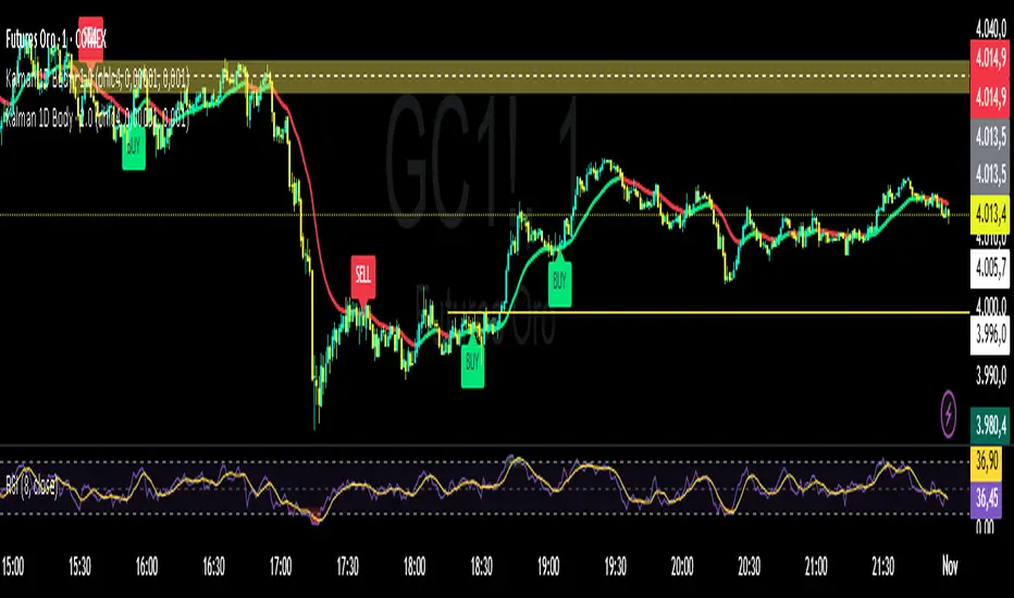
Kalman Filter by TwisterTrades(1D + Body Condition)
## 🧭 **Kalman Filter (1D + Body Condition)
This script implements a **true 1-dimensional Kalman Filter** applied to price data — not a simple moving average.
The Kalman Filter is a **Bayesian optimal estimation algorithm**, designed to separate **market noise** from the **true underlying trend** by dynamically adapting its sensitivity at every new bar.
Unlike **EMA**, **SMA**, or **VWAP**, which use fixed weighting formulas, the Kalman Filter **learns** how much to trust the current price based on how noisy and volatile the market is.
The result is a **smoother and smarter curve** that follows the real market direction while rejecting random fluctuations.
---
### ⚙️ **How It Works**
1. **Prediction:** The filter assumes the trend continues (predicts the next value).
2. **Update:** It compares the prediction with the actual price and updates its estimate based on:
* **Q (Process Noise):** how much the true trend can change.
* **R (Measurement Noise):** how noisy or unreliable the current price is.
3. The **Kalman Gain (K)** adjusts automatically — it becomes more responsive when volatility increases and more stable when the market is calm.
---
### 🎯 **Signals Logic**
The script generates **BUY** and **SELL** labels based on a combination of:
* **Trend direction:** whether the Kalman line is turning up or down.
* **Body confirmation:** the candle body closes entirely **above** or **below** the Kalman line.
**🟩 BUY signal:**
* Trend is turning bullish (line turning green).
* Candle body closes fully **above** the Kalman line.
**🟥 SELL signal:**
* Trend is turning bearish (line turning red).
* Candle body closes fully **below** the Kalman line.
You can enable alerts for both conditions:
```text
Kalman Filter: BUY signal detected (body above filter)
Kalman Filter: SELL signal detected (body below filter)
```
---
### 🔊 **Understanding Noise and Signals**
* **Noise** refers to short-term, random fluctuations in price (e.g. stop-hunts, low-volume spikes, or microstructure volatility).
* **Signal** refers to consistent, directional movement that carries information about the real trend.
The Kalman Filter works as a **signal extractor** — removing meaningless movements while keeping true directional momentum.
If the line is smooth and consistent, it means the market’s directional “signal” is clear.
If the line oscillates frequently, it means **noise dominates** — and trading signals should be taken with caution.
---
### ⏱️ **Recommended Timeframes and Parameters**
The strength of the filter depends on how noisy your timeframe is.
Here’s how to adjust it for different use cases:
| Purpose | Timeframe | Q (Process Noise) | R (Measurement Noise) | Description |
| ----------------------------- | --------- | ----------------- | --------------------- | --------------------------------------- |
| **Scalping / Microstructure** | 1m – 3m | 0.001 | 0.05 | Reacts faster, filters tick-level noise |
| **Intraday Bias / Trend** | 5m – 15m | 0.0001 | 0.01 | Balanced reactivity and smoothness |
| **Swing / Macro Bias** | 1H – 4H | 0.00001 | 0.001 | Very stable, great for clean trend bias |
💡 **Pro tip:**
* If the filter lags too much → increase **Q** slightly.
* If it reacts too much (too noisy) → increase **R** slightly.
* Always backtest adjustments visually for your market’s volatility (e.g. XAU/USD or NAS100).
---
### 📈 **Comparison with Other Indicators**
| Indicator | Adaptivity | Noise Filtering | Reactivity | Ideal Use |
| -------------------- | ---------------- | --------------- | ------------- | ---------------------------- |
| **SMA** | ❌ Fixed weights | ❌ Poor | ⚠️ Slow | Clean long trends |
| **EMA** | ⚠️ Semi-adaptive | ⚠️ Medium | ✅ Fast | Intraday direction |
| **VWAP** | ⚠️ Volume-based | ⚠️ Moderate | ✅ Good | Session-level bias |
| **Kalman Filter 1D** | ✅ Fully adaptive | ✅ Excellent | ✅ Intelligent | Any noisy or volatile market |
---
### 📊 **Usage Tips**
* Use the Kalman Filter as a **directional bias tool**, not a signal generator alone.
* Combine it with **price action**, **volume**, or **market structure** to confirm entries.
* Works exceptionally well on assets with **high noise and volatility** (e.g. XAU/USD, NASDAQ, BTCUSD).
* You can use the Kalman line instead of EMA50 or EMA100 — it provides a cleaner trend estimate without lagging as much in choppy conditions.
---
### ⚠️ **Disclaimer**
The Kalman Filter is not a predictive tool but a **state estimator** — it helps reveal the *true underlying direction* by filtering out noise.
It should be used together with sound risk management and a clear trading plan.
Addikro_V1📌 Description – Trend+Entry+Risk Indicator
This indicator combines statistically proven trading concepts into a complete trading framework:
✅ Trend Filter (EMA200)
All trades follow the higher-timeframe trend. Trend direction is clearly visualized.
✅ Entry Signals (you can choose):
EMA Crossover (EMA50 crossing EMA200) — classic trend-following entry
Breakout of recent highs/lows (20-bar range) — optionally only valid after a pullback to EMA50
✅ ATR-Based Risk Management:
Dynamic Stop Loss (SL) and Take Profit (TP1/TP2) levels using ATR
The last entry is saved — SL/TP lines stay visible on the chart
Optional position size suggestion based on % risk of account
✅ Smart Filters for Higher Accuracy:
RSI filter: e.g., only long if RSI > 50
Volume filter: signal only if volume is above SMA × multiplier
✅ Fixed Chart HUD (Table Overlay):
Displays live information anchored to the chart (does not move with candles)
Shows: Trend direction, entry mode, RSI, ATR, SL/TP multiplier, position size suggestion
Position can be set: top-left / top-right / bottom-left / bottom-right
✅ Signals & Alerts:
Visual arrows on the chart for long/short signals
Custom alert conditions included (works with mobile, email, webhook, bots)
🎯 Why this indicator works
It follows the same logic used by many successful systematic and hedge fund strategies:
Trend direction + statistically solid entries + strict risk management → no repainting, no guessing, no emotion.

Jitendra Volume Pro / Fixed RangeHello All,
This script calculates and shows Volume Profile for the fixed range. Recently we have box.new() feature in Pine Language and it's used in this script as an example. Thanks to Pine Team and Tradingview!..
Sell/Buy volumes are calculated approximately!.
Options:
"Number of Bars" : Number of the bars that volume profile will be calculated/shown
"Row Size" : Number of the Rows
"Value Area Volume %" : the percent for Value Area
and there are other options for coloring and POC line style
Enjoy!
Jitendra Sankpal
Bull Run Galaxy
2.11.2025
Orb DivergenceOrb Divergence is a market reversal indicator that visually highlights moments when price momentum is ready to shift direction.
It detects hidden energy imbalances within price movements and identifies potential trend turning points formed by these accumulations.
The indicator displays colored orbs and clear “UP / DOWN” signals to mark upcoming reversals in a simple and intuitive way.
Rather than focusing on short-term reactions, it emphasizes key zones where market momentum may truly change.
Designed as a visual compass, Orb Divergence helps you spot the moments when the market takes a breath — and prepares to turn.
For a deeper and more data-driven approach to market structure and reversal dynamics, you may also want to explore Teometric Demand Model V3;

Cipher B Free | WaveTrend (v6)Uh.. I call this.. Mona Lisa kek. Tried creating my own version of Cipher B with Grok. Feel free to tweak to your heart's content

NDOG & NWOG CustomFully customizable - Select how many NDOG and NWOG you want to see!
Now is possibile to select a color for current NDOG and current NWOG and a different color for old ones!

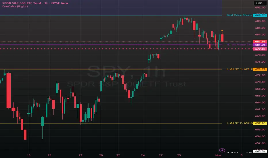
DreCalcsWhat is DreCalcs?
DreCalcs is a proprietary algorithmic framework designed to map true structural pivots in price — independent of emotion, bias, or conventional indicator noise.
Unlike typical retail indicators that lag or overfit, DreCalcs uses volatility-adjusted mathematics to define the precise price zones where large participants (institutional liquidity) are most likely to engage. These zones—labeled as BPS (Best Price Short), Half Zones, Momentum Targets, and Volatility Bands—allow traders to anticipate directional moves, manage risk objectively, and remove emotional decision-making.
Each level within DreCalcs serves a distinct purpose:
- BPS (Best Price Short / Long): The algorithm’s most statistically significant mean-reversion or rejection point—often where strong reversals begin.
- Half Zones (Half1 / Half2): Structural midpoint targets derived from prior impulse ranges; used to scale in/out of positions.
- Hi/Low Vol Sell/Buy Targets: Adaptive volatility-driven extensions that identify exhaustion points or continuation zones in momentum trends.
- WeeksHigh / WeeksLow: Dynamic references for short-term bias confirmation.
The script automatically updates these levels daily and weekly, ensuring traders always have current, data-backed pivot zones. It can be applied across timeframes, but its power is most visible on daily and weekly charts, where institutional order flow becomes clear.
Core Purpose:
DreCalcs removes emotion from trading by converting market chaos into measurable, repeatable structure—allowing traders to focus on probability, not prediction.
Usage Philosophy:
Structure > Emotion.
Data > Opinion.
Reaction > Prediction.
On Balance VolumeThis indicator provides an implementation of the classic On Balance Volume (OBV) momentum indicator, enhanced with a built-in divergence detection engine.
Key Features:
Full Divergence Suite (Class A, B, C): The primary feature is the integrated divergence engine. It automatically detects and plots all three major types of divergences:
Regular (A): Signals potential trend reversals.
Hidden (B): Signals potential trend continuations.
Exaggerated (C): Signals weakness at double tops/bottoms.
Divergence Filtering and Visualization:
Price Tolerance Filter: Divergence detection is enhanced with a percentage-based price tolerance (pivPrcTol) to filter out insignificant market noise, leading to more robust signals.
Persistent Visualization: Divergence markers are plotted for the entire duration of the signal and are visually anchored to the OBV level of the confirming pivot.
Note on Confirmation (Lag): Divergence signals rely on a pivot confirmation method to ensure they do not repaint.
The Start of a- divergence is only detected after the confirming pivot is fully formed (a delay based on Pivot Right Bars).
The End of a divergence is detected either instantly (if the signal is invalidated by price action) or with a delay (when a new, non-divergent pivot is confirmed).
Multi-Timeframe (MTF) Capability:
MTF OBV Line: The OBV line itself can be calculated on a higher timeframe, with standard options to handle gaps (Fill Gaps) and prevent repainting (Wait for...).
Limitation: The Divergence detection engine (pivDiv) is disabled if a timeframe other than the chart's timeframe is selected. Divergences are only calculated on the active chart timeframe.
Integrated Alerts: Includes 12 comprehensive alerts that trigger on the start and end of all 6 divergence types (e.g., "Regular Bullish Started", "Regular Bullish Ended").
DISCLAIMER
For Informational/Educational Use Only: This indicator is provided for informational and educational purposes only. It does not constitute financial, investment, or trading advice, nor is it a recommendation to buy or sell any asset.
Use at Your Own Risk: All trading decisions you make based on the information or signals generated by this indicator are made solely at your own risk.
No Guarantee of Performance: Past performance is not an indicator of future results. The author makes no guarantee regarding the accuracy of the signals or future profitability.
No Liability: The author shall not be held liable for any financial losses or damages incurred directly or indirectly from the use of this indicator.
Signals Are Not Recommendations: The alerts and visual signals (e.g., crossovers) generated by this tool are not direct recommendations to buy or sell. They are technical observations for your own analysis and consideration.

Money Volume • Buyers vs Sellers — @tgambinoxThis indicator estimates the total amount of money traded (Volume × Price)
and splits it between buyers and sellers based on each candle’s behavior.
It displays green bars for buyers and orange bars for sellers, allowing you to see
which side of the market is concentrating the capital.
Useful for detecting flow imbalances, buying/selling pressure,
and confirming price moves alongside total monetary volume (blue line).

Smart Money vs Retail (COT Flow) 0213Smart Money vs Retail (COT Flow) 0213
Smart Money vs Retail (COT Flow) 0213
Smart Money vs Retail (COT Flow) 0213
Trend Break + MSB + Fibo Zone [v1.0] dnmSure! Here’s the English translation of your text:
---
Swings are determined based on the HH/LL structure.
If the candle close breaks the swing level, the MSB (Market Structure Break) is confirmed.
After the MSB, the last swing high/low is used to calculate the Fibonacci 0.5 and 0.618 levels.
On the chart, the 0.5–0.618 range is displayed as a colored box.
A green box appears for a bullish break, and a red box appears for a bearish break.

Market Breadth & Forward ReturnsThis indicator shows how future index performance has historically behaved after different levels of market breadth. The heatmap reveals which breadth zones have tended to precede better or worse forward returns. This is strictly a statistical conditional-expectation map, not a set of signals.
Scope
This is not meant for any arbitrary asset.
It is meant for broad indices only (S&P 500, Nasdaq 100, Dow, Russell, major sector families).
The breadth data is derived from index-level market universes.
Do not apply this on single stocks, crypto or FX. The method only makes sense with large diversified universes.
Core method
Daily breadth is normalized 0 to 100.
For each bar, six forward horizons are evaluated on the index: performance after X days.
Each observation is placed into a breadth bin.
Each bin/horizon pair has mean, variance and count computed.
Each bin/horizon mean is t-tested against zero.
Benjamini-Hochberg False Discovery Rate weighting allocates weight only to horizons where evidence exists.
Weighted horizon means are aggregated and annualized (252 trading days).
The map displays annualized conditional forward returns per breadth bin.
Why this is robust
Non-repainting. Breadth is in the past, returns are strictly future, lookahead_off.
Multiple horizons avoid single-window biases.
Variance, t-tests and FDR correction drastically reduce false positives.
Bins with poor sample size are visually suppressed to avoid over-interpretation.
How to use
Daily timeframe only.
Select the correct index family (S&P 500, Nasdaq 100, Russell…).
Bin size 5 to 10 points is a realistic range.
Min occurrences per bin ≥ 5 recommended.
FDR alpha 0.05 to 0.10 is a good working envelope.
Interpret as conditional expectations, not a forecast guarantee.
Notes
Do not use on random assets.
Do not extrapolate outside the chosen index family.
Always keep symbol and timeframe visible when publishing.
Indicator by Julien Eche

Market Trend statusBullTrading Free Indicator Series
What is the Trend State Machine?
A “trend state machine” that fuses DMI (+DI/−DI) with ADX strength. It avoids bells and whistles and answers three things with minimal rules:
1. Whether the market is range-bound (chop) or trending;
2. If trending, whether it is bullish (long) or bearish (short);
3. The trend intensity tier (Strong / Extreme / Decaying) plus a 0–100 strength score.
1-Minute Quick Start (beginners can stop here)
1. Timeframe – pick your trading anchor first
• Crypto: 5–15m
• Gold: 5m or 15m
• FX: 15–30m
2. Mode – top of the panel: set Mode = Simple.
3. Sensitivity – set Sensitivity (1 conservative – 5 aggressive). Recommended:
• Crypto: 3 (use 4 in high volatility)
• Gold: 2–3
• FX: 2–3
• Indices: 2
4. Read the card (top-right)
• Environment: Range/Invalid, Bull Trend (Watch), Bull Trend (Confirmed) (bearish equivalents apply)
• Add-ons: | Strong, | Extreme, | Decay
• Also shows ADX, Enter/Exit thresholds, ΔDI, and Score.
5. Background & lines
• Green/Red background = in trend; deeper shade = stronger.
• Orange thick line = ADX, Green = +DI, Red = −DI; shaded band between lines is the enter/exit zone.
6. Minimal execution rules
• Trade with the trend only: consider entries only when Environment = Confirmed and direction is bull/bear.
• Prioritize strength: when Strong Trend triggers or Score > 70, prefer trend-following adds / enable trailing take-profit.
• Exit: when Exit/Flip alert fires, or after Decay if ADX falls back below the enter threshold, reduce/close.
Note: In Simple mode, built-in hysteresis (Enter > Exit) cuts whipsaws significantly—no need to hand-tune thresholds.
How to Use Alerts
• Three built-in fixed alerts:
1. Trend Confirmed (Bull/Bear) — entry/add trigger
2. Strong Trend — momentum reinforcement (chase/add or tighten trailing TP)
3. Exit or Flip — scale-out/close/observe the other side
• Want dynamic messages with numbers? Check “Enable dynamic alerts (alert())” and, when creating the alert, choose Any alert() function call.
Parameter Guidance (rules of thumb)
• Sensitivity: Higher = earlier entries but more false signals; lower = later confirmation but steadier.
• Timeframe: The smaller the timeframe, the lower the sensitivity you usually need; on higher timeframes you may nudge it up.
• Combos:
• Crypto: 5m/15m + Sens 3 (4 in heavy vol)
• Gold: 5m/15m + Sens 2–3
• FX: 15m/30m + Sens 2–3
• Indices: 15m/30m + Sens 2
Pro Mode Highlights (optional)
• Threshold Mode: switch from Fixed (default) to Percentile Adaptive for better robustness across regimes/markets.
• ΔDI / Slope / Hold / Cool-down:
• ΔDI min separation filters weak price/volume divergences.
• ADX slope > threshold on entry rejects “breakouts without growing strength”.
• Min hold bars confirms before output to reduce whipsaws.
• Cool-down bars prevent immediate re-entry after exit/flip.
• MTF Aggregation: enable MTF, default 3× current timeframe, HTF weight 0.3–0.5.
• Turn on Require HTF not opposite & HTF_ADX ≥ exit threshold to effectively filter higher-TF noise.
Reading Cheat Sheet (what you see = what it means)
• Environment: Range/Invalid → Stand down; avoid counter-trend.
• Trend (Watch) → Just entered the zone; wait for Confirmed or buy the pullback with small size.
• Trend (Confirmed) → Trend-following allowed; use Score and Strong/Decay to size/manage.
• Strong Trend → Consider chasing/relaxing TP; momentum is increasing.
• Extreme → Overheated; be cautious chasing—favor trailing to lock gains.
• Decay → Momentum bending down; prepare to trim or tighten stops.
Common Pitfalls & Fixes
• Whipsaws in ranges → Lower sensitivity or move up a timeframe; in Pro mode, enable Slope filter.
• Confirmation too late → During Trend (Watch), try a probe with smaller size; add on confirmation.
• Cross-asset differences → Use Percentile thresholds and MTF weight, or adjust via market presets (Gold/FX/Index).
• Single-signal bias → Always combine Environment + Score + Strong/Decay to avoid tunnel vision.
⸻
Disclaimer: This tool is for educational and research purposes only and does not constitute investment advice or a promise of profit. Trading involves risk; you are solely responsible for your gains and losses.
BullTrading免费指标系列
趋势状态机 是什么:
一个把 DMI(+DI/-DI) 与 ADX 强度合成的“趋势状态机”。它不追求花哨,而是用最小规则输出三件事:
1. 市场当前是 震荡还是趋势;
2. 如是趋势,是 多还是 空;
3. 趋势的 强弱等级(强趋势/极端/衰减)与一个 0–100 的强度分数。
一分钟上手(新手用这个就够)
1. 时间周期:先选你交易的主周期(例:加密 5–15m;黄金 5m 或 15m;外汇 15–30m)。
2. 模式:面板最上方“模式”= 简单。
3. 敏感度:设“敏感度(1保守–5激进)”。推荐:
• Crypto:3(波动大可 4)
• Gold:2–3
• FX:2–3
• 指数/股指:2
4. 读卡片(右上角)
• 环境:震荡/无效、多头趋势(观察)、多头趋势(已确认)(空头同理)
• 附加:|强趋势、|极端、|衰减
• 同时显示 ADX、进入/退出阈值、ΔDI、评分。
5. 底色 & 线
• 绿色/红色底色=处于趋势;颜色越实=越强。
• 橙色粗线=ADX,绿色=+DI,红色=-DI;中间阴影为进入/退出带。
6. 最小执行规则
• 只顺势:环境=已确认 且方向为多/空时才考虑进场。
• 强势优先:出现 强趋势 或评分>70 时,优先做顺势加仓/启动追踪止盈。
• 退出:出现 退出/翻转 告警,或 衰减 后 ADX 再跌回进入阈值下方时,减仓/平仓。
提醒:简单模式下,脚本已内置迟滞(进入>退出),可显著减少抖动;无需再手动校准阈值。
告警怎么用
• 已内置三条固定告警:
1. 趋势已确认(多/空) — 入场/加仓触发器
2. 强趋势 — 趋势强化(可做追击或加速移动止盈)
3. 退出或翻转 — 减仓/止盈/反向观察
• 想带数值的动态文案:勾选“启用动态告警 alert()”,创建告警时选择 Any alert() function call。
参数建议(简易法则)
• 敏感度:更激进(数字大)=更早进场但更易假信号;更保守(数字小)=更迟确认但更稳。
• 时间周期:越小周期越需要降低敏感度;越大周期可略升敏感度。
• 组合:
• Crypto:5m/15m + 敏感度 3(波动大时 4)
• Gold:5m/15m + 敏感度 2–3
• FX:15m/30m + 敏感度 2–3
• 指数:15m/30m + 敏感度 2
专业模式要点(进阶可选)
• 阈值模式:从“固定阈值(默认)”切到“百分位自适应”,在大波动/换市场时更鲁棒。
• ΔDI/斜率/驻留/冷却:
• ΔDI 最小分离度 过滤弱量价背离;
• 进入需 ADX 斜率>阈值 可拒绝“强度不增”的假突破;
• 最小驻留K数 确认后再输出,减少回撤抖动;
• 冷却K数 防止来回打脸。
• MTF 聚合:勾选“启用 MTF”,默认自动 3× 当前周期,HTF 权重 0.3–0.5。
• 要求HTF不反向且HTF_ADX≥退出阈值 打开,能有效剔除逆大级别噪音。
读图速查(你看到=代表什么)
• 环境:震荡/无效 → 暂停;不要逆势开单。
• 趋势(观察) → 刚进入阈值,等待 已确认 或回踩二次确认。
• 趋势(已确认) → 允许顺势;用评分和“强趋势/衰减”微调仓位。
• 强趋势 → 追击或放宽止盈,趋势动能在增强。
• 极端 → 过热区;谨慎追高,更多用移动止盈锁定。
• 衰减 → 动能下弯,准备减仓或收紧止盈。
常见坑 & 对策
• 在震荡箱体频繁进出:降低敏感度或升周期;专业模式勾选“斜率过滤”。
• 确认太慢错过起点:在确认前的“趋势(观察)”阶段,可用更小仓位的试探单,确认后加仓。
• 不同品种差异大:用“百分位”阈值与 MTF 权重;或按市场预设(Gold/FX/Index)微调。
• 只看一个信号:至少同时看 环境状态 + 评分 + 强/衰 三个维度,避免单指标偏差。
本指标仅供教育与研究,不构成投资建议或收益承诺;交易有风险,盈亏自负。

[Leo+] Scepter Algo$ LEO ✞ MONEY MAN® $
100% FREE FOREVER!
⚠️ Disclaimer – Please Read Carefully
Not Investment Advice:
All content shared in this server—including messages, media, discussions, and resources—is intended solely for educational and informational purposes. Nothing provided here constitutes financial, investment, or trading advice.
Personal Responsibility:
You are fully responsible for your own trading and investment decisions. Always conduct your own due diligence and consult with a licensed financial advisor before making financial decisions.
Third-Party Content:
This server is not responsible for any third-party content, links, tools, or resources shared by members. Use of such content is at your own risk.
Educational Purpose:
This is a learning-focused community. All discussions and shared materials are intended to support your personal development—not to replace professional financial guidance.
By joining and participating in this server, you acknowledge and accept that you are solely responsible for any actions or strategies you choose to undertake related to investing or trading.
By continuing to engage with this community, you agree to follow all server rules and accept the terms of service.
Enjoy exploring, testing and mastering these tools, happy trading!

Indicador Técnico Avanzado sbuscamos entradas para poder comprar y vender papeles de una correcta manera

FuTech : Darvas Box (Original Theory) IndicatorFuTech : Darvas Box (Original Theory) Indicator
📈 Introduction
🔹 This indicator implements the legendary Darvas Box theory developed by Nicolas Darvas in the 1950s, which helped him turn $25,000 into $2,000,000 in just 18 months.
🔹 Unlike other box indicators, this implementation strictly follows Darvas' original methodology while adding modern technical features for enhanced usability in today's markets.
===============================================================================
📊 What Makes This Implementation Unique
🔹 This indicator stands apart from other Darvas Box implementations in several key ways:
🔹 It implements the exact "high before low" rule that Darvas used - first identifying the roof (top) of the box, then waiting for the floor (bottom) to form
🔹 It offers two distinct methods for box detection - Swing Confirmation (which waits for price confirmation) and Lookback Period (simpler approach)
🔹 It includes Darvas' critical volume confirmation requirement with customizable parameters
🔹 It incorporates Darvas' focus on strong stocks near their highs through the 52-week high filter
🔹 It provides multi-timeframe capability, allowing application to intraday, daily, weekly, or monthly charts
🔹 It features dynamic box coloring based on breakout direction (green for upward, red for downward)
===============================================================================
🔍 Technical Implementation Details
📦 Box Formation Algorithm
🔹 The indicator constructs boxes using a sophisticated algorithm that follows Darvas' original approach:
🔹 For Swing Confirmation mode:
🔸 The system identifies potential swing highs by looking for price points that are higher than the previous N bars (user-defined)
🔸 Similarly, swing lows are identified as points lower than the previous N bars
🔸 The "high before low" rule ensures a roof is established before a floor is determined
🔸 Once both parameters are locked in, the box is drawn and extended horizontally
🔹 For Lookback Period mode:
🔸 The box high is simply the highest high of the last X bars (user-defined)
🔸 The box low is the lowest low of the last X bars
🔸 This provides a simpler but still effective implementation of Darvas' concept
🚀 Breakout Detection System
🔹 The indicator employs a dual-confirmation system for breakouts:
🔹 Upward Breakout Conditions:
🔸 Price must close above the box roof
🔸 Volume must exceed the volume moving average (default 20-period) multiplied by a factor (default 1.5x)
🔸 The 52-week high filter must be satisfied (price must be within the maximum drawdown percentage from the 52-week high)
🔹 Downward Breakout Conditions:
🔸 Price must close below the box floor
🔸 No volume confirmation is required for downward breakouts (following Darvas' approach)
📊 Volume Confirmation Mechanism
🔹 The indicator calculates volume thresholds using:
🔸 Volume Average = SMA(volume, N) where N is the user-defined period (default 20)
🔸 Volume Threshold = Volume Average × Volume Factor (default 1.5)
🔸 Only when current volume exceeds this threshold is an upward breakout considered valid
📈 Uptrend Filter
🔹 The indicator implements Darvas' focus on strong stocks through:
🔸 52-week High Calculation = Highest price over the past 52 weeks
🔸 Minimum Price Requirement = 52-week High × (1 - Maximum Drawdown %)
🔸 This ensures only stocks that are not too far from their highs generate signals
===============================================================================
🎯 How to Use This Indicator
🔷 Entry Signals
🔹 Wait for a green box to appear, indicating an upward breakout
🔹 Confirm that volume was above average during the breakout (shown by the indicator)
🔹 Verify the stock is within your acceptable distance from its 52-week high
🔹 Consider entering on the next candle after confirmation
🔷 Exit Signals
🔹 Exit when a red box appears, indicating a downward breakout
🔹 Alternatively, use trailing stops below newly formed box lows
🔹 Consider partial exits at predefined profit targets while letting the remainder run
🔷 Parameter Optimization
🔹 For swing traders, use longer lookback periods (20-50 bars)
🔹 For day traders, use shorter periods (5-15 bars)
🔹 Adjust the volume factor based on the asset's typical volatility
🔹 Modify the maximum drawdown percentage based on your risk tolerance
===============================================================================
📚 Historical Context and Trading Philosophy
🔹 Nicolas Darvas developed his box theory while traveling the world as a dancer.
🔹 With limited access to market information, he relied only on price charts and telegrams.
🔹 He discovered that strong stocks tend to pause after hitting new highs, forming what he called "boxes" - sideways ranges where the stock "rests" before its next move.
🔹 By buying only when price broke above these ranges with unusually high volume, he was able to ride powerful uptrends while cutting losses quickly when the breakdown occurred.
🔹 This indicator captures the essence of Darvas' approach - focusing on strength, confirming with volume, and selling weakness quickly - while adding modern technical features to enhance its utility in today's electronic trading environment.
===============================================================================
⚙️ Calculation Summary
🔹 The indicator performs the following calculations:
🔸 Box High = Highest swing high or lookback high (depending on selected method)
🔸 Box Low = Lowest swing low or lookback low (depending on selected method)
🔸 Upward Breakout = Price > Box High AND Volume > (Volume Average × Volume Factor)
🔸 Downward Breakout = Price < Box Low
🔸 Volume Average = SMA(Volume, N) where N is the volume period
🔸 Uptrend Filter = Price ≥ (52-week High × (1 - Maximum Drawdown %))
===============================================================================
🔔 Alert Configuration
🔹 To set up alerts:
🔸 Right-click on the chart and select "Add Alert"
🔸 Choose the Darvas Box indicator as the alert condition
🔸 Select either "Breakout Up" or "Breakout Down" as the alert condition
🔸 Configure your preferred notification method
🔹 This modernizes Darvas' telegram-based approach, allowing you to receive instant notifications when potential trading opportunities occur.
===============================================================================
📈 Conclusion
🔹 This FuTech : Darvas Box (Original Theory) indicator faithfully implements Nicolas Darvas' legendary trading method while adding modern technical features.
🔹 By focusing on strength, confirming with volume, and providing clear entry and exit signals, it offers traders a structured approach to trend following that has stood the test of time.
🔹 The indicator's multiple detection methods, volume confirmation, and trend filtering make it a comprehensive tool for implementing Darvas' box theory in today's markets.
===============================================================================
🙏 Credits : Inspired by @LevelUpTools
