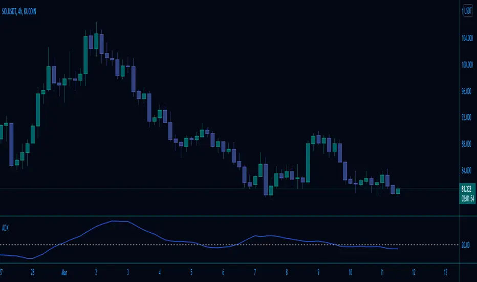
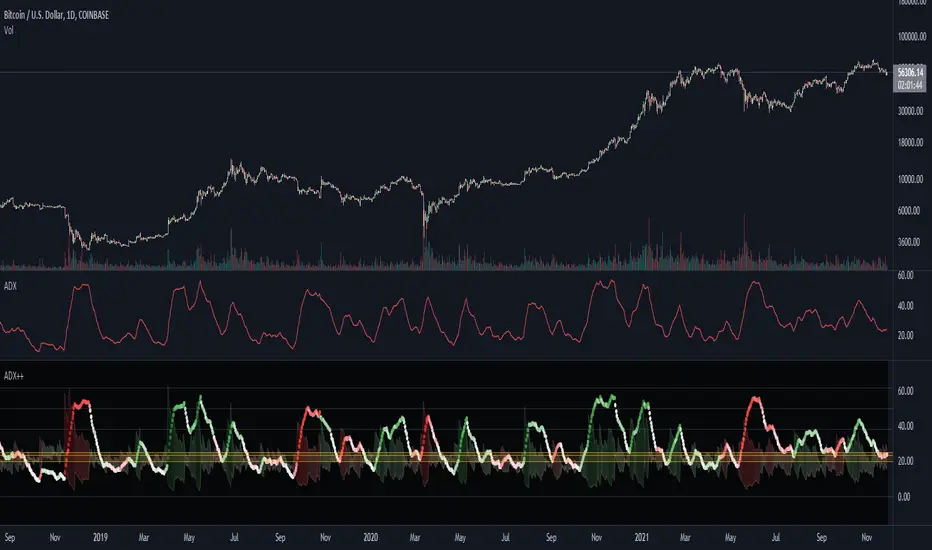
Adaptive Average Vortex Index [lastguru]As a longtime fan of ADX, looking at Vortex Indicator I often wondered, where is the third line. I have rarely seen that anybody is calculating it. So, here it is: Average Vortex Index - an ADX calculated from Vortex Indicator. I interpret it similarly to the ADX indicator: higher values show stronger trend. If you discover other interpretation or have suggestions, comments are welcome.
Both VI+ and VI- lines are also drawn. As I use adaptive length calculation in my other scripts (based on the libraries I've developed and published), I have also included the possibility to have an adaptive length here, so if you hate the idea of calculating ADX from VI, you can disable that line and just look at the adaptive Vortex Indicator.
Note that as with all my oscillators, all the lines here are renormalized to -1..1 range unlike the original Vortex Indicator computation. To do that for VI+ and VI- lines, I subtract 1 from their values. It does not change the shape or the amplitude of the lines.
Adaptation algorithms are roughly subdivided in two categories: classic Length Adaptations and Cycle Estimators (they are also implemented in separate libraries), all are selected in Adaptation dropdown. Length Adaptation used in the Adaptive Moving Averages and the Adaptive Oscillators try to follow price movements and accelerate/decelerate accordingly (usually quite rapidly with a huge range). Cycle Estimators, on the other hand, try to measure the cycle period of the current market, which does not reflect price movement or the rate of change (the rate of change may also differ depending on the cycle phase, but the cycle period itself usually changes slowly).
VIDYA - based on VIDYA algorithm. The period oscillates from the Lower Bound up (slow)
VIDYA-RS - based on Vitali Apirine's modification of VIDYA algorithm (he calls it Relative Strength Moving Average). The period oscillates from the Upper Bound down (fast)
Kaufman Efficiency Scaling - based on Efficiency Ratio calculation originally used in KAMA
Fractal Adaptation - based on FRAMA by John F. Ehlers
MESA MAMA Cycle - based on MESA Adaptive Moving Average by John F. Ehlers
Pearson Autocorrelation* - based on Pearson Autocorrelation Periodogram by John F. Ehlers
DFT Cycle* - based on Discrete Fourier Transform Spectrum estimator by John F. Ehlers
Phase Accumulation* - based on Dominant Cycle from Phase Accumulation by John F. Ehlers
Length Adaptation usually take two parameters: Bound From (lower bound) and To (upper bound). These are the limits for Adaptation values. Note that the Cycle Estimators marked with asterisks(*) are very computationally intensive, so the bounds should not be set much higher than 50, otherwise you may receive a timeout error (also, it does not seem to be a useful thing to do, but you may correct me if I'm wrong).
The Cycle Estimators marked with asterisks(*) also have 3 checkboxes: HP (Highpass Filter), SS (Super Smoother) and HW (Hann Window). These enable or disable their internal prefilters, which are recommended by their author - John F. Ehlers . I do not know, which combination works best, so you can experiment.
If no Adaptation is selected ( None option), you can set Length directly. If an Adaptation is selected, then Cycle multiplier can be set.
The oscillator also has the option to configure the internal smoothing function with Window setting. By default, RMA is used (like in ADX calculation). Fast Default option is using half the length for smoothing. Triangle , Hamming and Hann Window algorithms are some better smoothers suggested by John F. Ehlers.
After the oscillator a Moving Average can be applied. The following Moving Averages are included: SMA , RMA, EMA , HMA , VWMA , 2-pole Super Smoother, 3-pole Super Smoother, Filt11, Triangle Window, Hamming Window, Hann Window, Lowpass, DSSS.
Postfilter options are applied last:
Stochastic - Stochastic
Super Smooth Stochastic - Super Smooth Stochastic (part of MESA Stochastic ) by John F. Ehlers
Inverse Fisher Transform - Inverse Fisher Transform
Noise Elimination Technology - a simplified Kendall correlation algorithm "Noise Elimination Technology" by John F. Ehlers
Momentum - momentum (derivative)
Except for Inverse Fisher Transform , all Postfilter algorithms can have Length parameter. If it is not specified (set to 0), then the calculated Slow MA Length is used. If Filter/MA Length is less than 2 or Postfilter Length is less than 1, they are calculated as a multiplier of the calculated oscillator length.
More information on the algorithms is given in the code for the libraries used. I am also very grateful to other TradingView community members (they are also mentioned in the library code) without whom this script would not have been possible.
Ortalama Yönsel Endeks (ADX)

BTC Bot [15min] with AlertsThis is the Alert version of my BTC Bot {15min} Strategy.
This BOT is specialy designed for BTCUSDT 15 min Chart. It reacts to every Upward/Downward direction as fast as possible. It does not work well on higher time frame.
This BOT using 10 indicators to open a basic LONG/SHORT position.
1. CLOUD
2. TREND DETECTOR
3. TREND STRENGTH
4. PARABOLIC SAR
5. JMA
6. RANGE FILTER
7. ADX
8. TWAP TREND
9. FAST MA
10. MOMENTUM
This BOT also use 02 independent strategies for entering positions.
1. REVESALS ( RSI Crossovers)
2. SCALPING (It can increase net profit but it can be risky)
ADX is the main component of this BOT.
This is purely BTC 15min strategy but this BOT could be easily convert into Altcoins Scalper.

Average Directional Index W/ 20Line (adjustable)This is basically trading views standard ADX indicator
All i added was an adjustable horizontal line since i could not find one anywhere on TV.
i did not like manually adding a horizontal line every time i loaded an instance of the ADX ...
sooooo here you go
enjoy!
DMI PRO [JoseMetal]============
ENGLISH
============
- Description:
This study is a combination of all DMI components (DI+, DI- and ADX) into a simple line.
Other aspects of the indicator such as ADX levels are well known: 0-25 for weak or no trend, 25-50 for strong trend, 50-75 for very strong trend and 75-100 for extremely strong trend.
- Visual:
The ADX line takes a color depending on the trend, GREEN (BULLISH) for DI+ > DI- or RED for DI- > DI+ (BEARISH).
A signal line has been added to generate crossovers (which are marked with an arrow).
An increasing (getting stronger) ADX color is lighter when a decreasing (weaker) ADX is darker.
Also, green/red dots are shown in the top of the indicator when the ADX turns from decreasing ADX to increasing ADX, color depends on the trend (again, GREEN for BULLISH and RED for BEARISH).
- Usage:
There are some different ways to use this indicator which are similar to the DMI itself, you can just take crossovers to enter LONG or SHORT depending on the COLOR of the ADX (which shows the trend). You can enter/exit trades directly with this method when the crossover/cross under occurs respectively.
Other way (more risky) is to use the dots which may be trend continuation signals, so you can increase your position or enter a trade if you spot a nice trend (ADX higher than the minimum level).
You can also use this indicator as a trend filter for your strategy.
- Customization:
ADX levels, DMI and ADX periods, smoothing, colors... almost everything is configurable, i'll add even more if requested.
- Recommendations:
Any recommendation applied to the DMI is valid here like only entering trades if ADX is higher than 25 to ensure that you're in a trend and not in a range, 15-20 is more risky, but you can get more profits if you enter bottom/tops obviously.
============
ESPAÑOL
============
- Descripción:
Éste estudio es una combinación de todos los componentes del DMI (DI+, DI- y ADX) en una simple línea.
Otros aspectos del indicador como los niveles ADX son bien conocidos: 0-25 para tendencia débil o nula, 25-50 para tendencia fuerte, 50-75 para tendencia muy fuerte y 75-100 para tendencia extremadamente fuerte.
- Visual:
La línea ADX toma un color dependiendo de la tendencia, VERDE (ALCISTA) para DI+ > DI- o ROJO para DI- > DI+ (BAJISTA).
Se ha añadido una línea de señal para generar cruces (que se marcan con una flecha).
El color de un ADX creciente (cada vez más fuerte) es más claro cuando un ADX decreciente (más débil) es más oscuro.
Además, se muestran puntos verdes/rojos en la parte superior del indicador cuando el ADX pasa de ser decreciente a ser creciente, el color depende de la tendencia (de nuevo, VERDE para ALCISTA y ROJO para BAJISTA).
- Uso:
Hay varias formas de usar éste indicador que son similares al DMI mismo, puedes simplemente usar los cruces para entrar LONG o SHORT dependiendo del COLOR del ADX (que muestra la tendencia). Puedes entrar/salir de las operaciones directamente con este método cuando se produce el cruce al alza/cruce a la baja respectivamente.
Otra forma (más arriesgada) es utilizar los puntos que pueden ser señales de continuación de la tendencia, por lo que puede aumentar su posición o entrar en una operación si detecta una buena tendencia (ADX más alto que el nivel mínimo).
También puedes utilizar este indicador como un filtro de tendencia para tu estrategia.
- Personalización:
Niveles de ADX, períodos de DMI y ADX, suavizado, colores... casi todo es configurable, añadiré aún más personalización si lo pedís.
- Recomendaciones:
Cualquier recomendación aplicada al DMI es válida para éste indicador, como por ejemplo, sólo entrar en operaciones si el ADX es superior a 25 para asegurarte de que estás en una tendencia y no en un rango, 15-20 es más arriesgado pero puedes obtener más beneficios ya que podrías estar entrando en dips / tops.

ADeXtIt is an extended ADX and Direction Movement Index indicator with the following changes:
It shows a histogram instead of the DMI lines. If the histogram is green, the DMI+ is above DMI-, otherwise it is red.
You can specify a multiplier for the histogram values to check if values are above threshold. This way you can use the same threshold line as ADX to detect directional strength.
You can remove outliers from ATR calculations
You can use different MAs and sources for DMI and ATR calculations to make ADX more adjustable to different markets
It uses my ADExt library, so you can easily transfer your study to a strategy script.

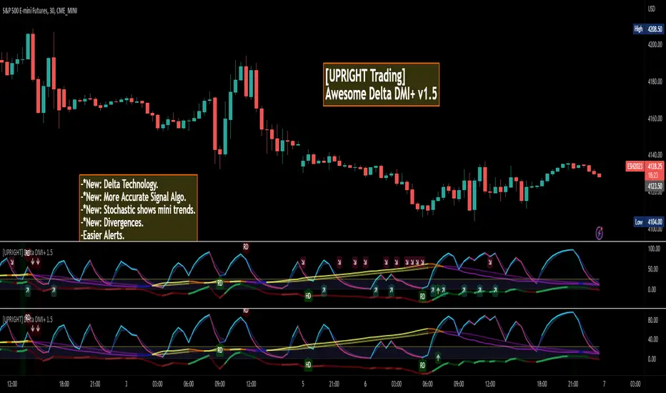
[UPRIGHT] Awesome DMI+Hello Traders,
Today I'm releasing a spin on an 'oldie but goodie'; the Directional Movement Index (DMI).
DMI is a combination of 3 different indicators developed by the famous J. Welles Wilder. DMI has 3 different plots: the ADX, +DI, and -DI. The first is the ADX (Average Directional Index), which Wilder created in 1978 to show the strength of a trend by comparing the current price with the previous price range. The other two are the +DI (positive directional indicator) and the -DI show up as two separate lines, +DI is the difference between the highest price of the current day and the highest price of the day before, and -DI does the same calculation with the current and previous day's lows.
How does it work?
When the ADX line is above 25 (as a general rule, some traders use a different threshold, +/- 5), the trend is strong. When the +DI line is above the -DI line, the asset (stock) is moving in an uptrend, and the opposite means the asset is in a downtrend.
How is this different?
Uses multiple calculations to produce signals for an indicator than normally doesn't have any.
Multiple ADX's, +DI's, and -DI's for better accuracy and clearer direction changes.
Ability to use 2 different background highlight signals and several buy/sell signals.
Fully customizable (as always), ability to turn on or off any signals, change any of the colors to suit your needs.
Added pre-filled Alerts.
The ribbons created by the fill make it easier to see the change in direction of each plot.
The chart should look like:
Cheers,
Mike
(UPRIGHT TRADING)
Blobbinger BandsBBANDS with:
- DI+/DI- coloring outer bands. If top BBand is green DI+ is on top; if top BBand is red DI- is on top.
- ADX Coloring - coloring of BBand background is relative to ADX performance. Blue = High, Red = Low, Black = Very Low, White = Extremely Low
- Basis Line Coloring - colored using Bollinger Band Width Percentile. Blue = Squeezing BBands, Red = Blasted Open BBands
- Histogram Lines - Denotes ADX Extremely Low

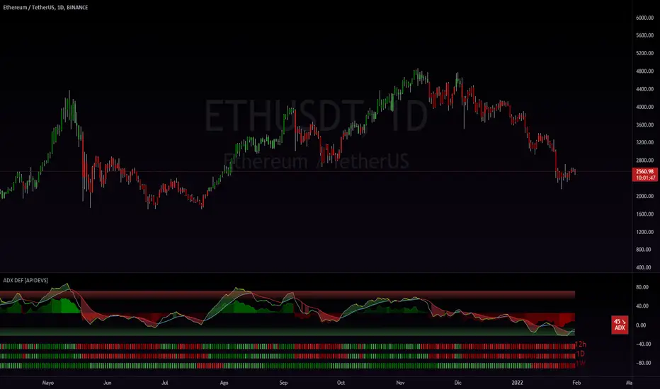
ADX DEF [APIDEVS]------------------------------------ ENGLISH -------------------------------------------------
In this version of the ADX we integrate several additional features to optimize its operation, for its construction we use the DI+ and DI- indicators and transform them into a histogram, this to mark the intensity of the steering force. We also incorporate another strength indicator called True Strengh Index or in Spanish real strength index (TSI) is a momentum oscillator that is used to identify trends and reversals. The indicator can be useful in determining overbought and oversold conditions, indicating possible trend direction changes via center line or signal line crossovers, and warning of trend weakness via divergence
With this incorporation we replace the traditional ADX with a new directional strength indicator which, in addition to marking the strength, allows to establish the reversal points, adding the possibility of showing divergences and observing the weakness of the movement in advance.
We also incorporate our ADX Multi Time-frames which we place at the bottom of the indicator to show the strength of the market in a multi-time frame. finally we add an informative panel where the value of the ADX is shown.
------------------------------------ ESPAÑOL -------------------------------------------------
En esta versión del ADX integramos varias características adicionales para optimizar su funcionamiento, para su construcción utilizamos los indicadores DI+ y DI- y los transformamos en histograma, esto para marcar la intensidad de la fuerza de la dirección. También incorporamos otro indicador de fuerza llamado True Strengh Index o en español índice de fuerza real (TSI) es un oscilador de impulso que se utiliza para identificar tendencias y reversiones. El indicador puede ser útil para determinar las condiciones de sobrecompra y sobreventa , indicando los posibles cambios de dirección de la tendencia a través de cruces de la línea central o de la línea de señal, y advirtiendo de la debilidad de la tendencia a través de la divergencia
Con esta incorporación remplazamos el tradicional ADX por un nuevo indicador de fuerza direccional el cual además de marcar la fuerza permite establecer los puntos de reversión, agregando la posibilidad de mostrar divergencias y observar la debilidad del movimiento con anticipación.
También incorporamos nuestro ADX Multi Time-frames el cual colocamos en la parte baja del indicador para mostrar la fuerza del mercado de modo multitemporal. finalmente añadimos un panel informativo donde se muestra el valor del ADX .
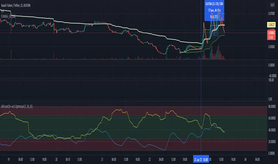
ADX and DI+ v4.5 OptimizedThis script plots VWMA(ADX) vs EMA(DI+) under pre-set time frame.
Feature:
The Main Strategy is to look for potential BUY opportunity (Intraday trading, Session trading, Swing) when EMA(DI+) colored blue, entering upward into Green zone where ADX counterpart (default colored: Yellow) is also present.
Formula plot is also helpful to understand upcoming downtrend signal when both blue and yellow lines try to make diverted bifurcation like pattern on graph.
Disclaimer - This is an indicator script and not final Buy and Sell advice.
* Originally developed by © BeikabuOyaji and further extended & optimized by Bharat @imbharat to serve above features
Momentum [SignalCave]Momentum Indicator helps you to identify potential reversal areas .
Calculation done with using Relative Strength Index (RSI), Money Flow Index (MFI) and Average Directional Movement Index (ADX) indicators.
On full strength bearish movement bars paints as light red , full strength bullish movement bars paints as light green color.
They indicates that trend can be change to opposite direction in a short period of time.
Momentum Strength have three modes which are "Aggressive, Moderate and Conservative" . You can customize the mode on settings screen.
Alerts are available for "Bullish Momentum, Bearish Momentum" conditions.
Type asset name on symbol search area.
Adjust your timeframe that you wish to track.
Click "Create Alert" .
Select one of the condition that you wish to get inform from create alert panel.
Select "Once Per Bar Close" option.
Click "Create" .

ADX DINGUE v5This is the updated script for PinceScrip V5
3x DMI and ADX indicator into 1.
You can turn on and off all 3x DMI and all 3x ADX and or customize their settings manually.
I also added my 3 line system, which is a homemade calculation from the DMI lines (P+N), and instead turns them into a single line.
There are also several options for histogram, ADX line, crosses, colors, overextended ...
---------------------
In closing, no indicator can give perfect signals, you need to use them in conjunction with other information to make better decisions.
I hope you like my indicators and that they help your trading.
If you have any questions please ask.
Thank you.

ADX_OSCILLATOR [APIDEVs]ENGLISH:
ADX (ORIGINAL VERSION)
The ADX Indicator (Average Directional Index), is a non-directional oscillator type indicator, that is, it quantifies the strength of a trend regardless of its direction. In its original version, it is made up of 3 lines that represent the direction and strength of the movement:
• A line representing the ADX indicator.
• A green line representing the bullish Direction Index (DI +).
• A red line representing the Bearish Direction Index (DI-).
When the ADX is greater than 35, the market is in a strong trend, when it is between 35 and 20 the market is in trend and when it is less than 20 it indicates that the market is in range.
ADX OSCILLATOR (OUR VERSION)
At APIDEVs we really care about improving the understanding and experience of our users, which is why, in response to multiple requests, we decided to make important modifications to the ADX, which we consider to be the most powerful indicator of strength.
For many traders it was really confusing to understand that the ADX could be bullish or bearish and at the same time have the same numerical values, so in our version of the “ADX PRO +” we added colors and different intensity levels for your better understanding, however. , many needed a more explicit indicator and it is based on this request that we decided to take a leap into the incredible and that is how the “ADX OCILLATOR” was born.
We convert the ADX into a trend oscillator, now simpler and with multiple advantages which we will proceed to list:
1. The ADX was transformed into a directional oscillator whose color is based on the crossing of (DI +) and (DI-). This modification opens the door to the replacement of the Squeeze Momentum Indicator (SQZMOM) as a directional complement to the ADX.
2. A Background was added that is activated exclusively when the market has a strong upward or downward trend, specifying through its colors and intensity the type and direction of the force.
3. The original ADX parameters were adjusted to almost eliminate completely the “no trend” condition. This condition only created confusion for traders.
4. Added a system of signals based on the direction of the oscillator and the strength of the ADX.
• When the oscillator is sloping up and the ADX is green, the LONG (L) signal is activated.
• When the oscillator slopes downward and the ADX is red, the SHORT (S) signal is activated.
5. A side panel has been enabled that visually expresses the numerical value and direction of the ADX, as well as the direction of the oscillator.
6. An alert system was enabled so that traders receive notifications on all their devices:
• It is activated when the ADX changes color.
• It is activated when the Oscillator crosses the 0 point.
• It is activated when any input signal is activated.
---------------------------SPANISH --------------------------------
ADX OSCILLATOR:
ADX (VERSIÓN ORIGINAL)
El Indicador ADX (Average Directional Index), Es un indicador de tipo oscilador no direccional, es decir, cuantifica la fuerza de una tendencia independientemente de su dirección. En su versión original está compuesto por 3 líneas que representan la dirección y la fuerza del movimiento:
1. Una línea que representa el indicador ADX.
2. Una línea verde que representa el Índice de Dirección alcista (DI+).
3. Una línea roja que representa el Índice de Dirección bajista (DI-).
Cuando el ADX es mayor a 35, el mercado está en fuerte tendencia, cuando está entre 35 y 20 el mercado esta en tendencia y cuando es menor a 20 indica que el mercado está en rango.
ADX OSCILLATOR (NUESTRA VERSIÓN)
En APIDEVs realmente nos preocupamos por mejorar la comprensión y experiencia de nuestros usuarios, es por ello por lo que atendiendo a múltiples solicitudes decidimos realizar importantes modificaciones al ADX, el cual consideramos como el más potente indicador de fuerza.
Para muchos traders era realmente confuso entender que el ADX podía ser alcista o bajista y al mismo tiempo tener los mismos valores numéricos, así que en nuestra versión del “ADX PRO+” le añadimos colores y diferentes niveles de intensidad para su mejor comprensión, sin embargo, muchos necesitaban un indicador más explícito y es en base a esta solicitud que decidimos dar un salto a lo increíble y es así como nació el “ADX OCILLATOR” .
Convertimos el ADX en un oscilador de tendencia, ahora más simple y con múltiples ventajas las cuales procederemos a enumerar:
1. Se transformó el ADX en un oscilador direccional cuyo color esta basado en el cruce del (DI+) y el (DI-). Esta modificación abre la puerta al remplazo del Squeeze Momentum Indicator (SQZMOM) como complemento direccional del ADX.
2. Se añadió un Background que se activa exclusivamente cuando el mercado posee una fuerte tendencia alcista o bajista, Especificando a través de sus colores e intensidad el tipo y dirección de la fuerza.
3. Se ajustaron los parámetros del ADX original para eliminar casi en su totalidad la condición de “no haber tendencia” esta condición solo creaba confusión en los traders.
4. Se añadió un sistema de señales basados en la dirección del oscilador y la fuerza del ADX.
• Cuando el oscilador tiene la pendiente alcista y el ADX está en verde, se activa la señal de LONG (L).
• Cuando el oscilador tiene la pendiente bajista y el ADX está en rojo, se activa la señal de SHORT (S).
5. Se habilitó un panel lateral que expresa visualmente el valor numérico y la dirección del ADX, así como también la dirección del oscilador.
6. Se habilito un sistema de alertas para que los traders reciban notificaciones en todos sus dispositivos:
• Se activa cuando el ADX cambia de color.
• Se activa cuando el Oscilador cruza el punto 0.
• Se activa cundo se activa alguna señal de entrada.

RSI Bands [APIDEVs]RSI BANDS:
It is an exclusive product of ApiDevs , this indicator selectively integrates a series of highly advanced algorithms that aim to provide the trader with an effective and profitable trading system, based on a series of conditions that project the price direction with a reasonable probability.
This indicator bears the name of “RSI Bands” , this is because we have based this trading system on the “Relative Strength Index (RSI)” , the strength of this indicator is centennial and we at APIDEVs have decided to focus our efforts on the development of powerful tools based on the favorite indicators of the afternoon.
WHAT IT HAS INCORPORATED:
1. Exponential Moving Average (EMAs): The RSI Bands has, by default, a band composed of two moving averages of 10 and 55 exponential periods, which can be modified in the indicator menu.
• Possibility of changing the value of the EMAs.
• Function was enabled to change the color and transparency of the bands.
• Visual alerts SHORT (L) and LONG (L) were added when there is the crossing of the EMAS.
• Hull Moving Average (HMA) of 100 periods was also incorporated, also modifiable for those who wish to strengthen their visual analysis. (Disabled by default)
• We also add an Exponential Moving Average (EMA) of 200 periods to mark the trend. (Disabled by default).
2. A TR (Average True Range): This indicator has two main functions in the RSI Bands, the first is to mark the trend of the asset and the second is to establish a margin of safety in price volatility, that is, a maximum estimate of the setbacks without this representing a change in the direction of the price.
3. RSI (Relative Strength Index): It was visually incorporated into the RSI Bands, the graph is obtained on the right side and its purpose is to visually indicate where the price is with respect to the RSI PRO+ indicator, offering the following improvements :
• ALERT SYSTEM: THE RSI PRO+ has the ADX incorporated into its algorithm, which allows establishing a filter that will provide reliable inputs, represented by the LONG (L) and SHORT (S) signals.
• FILTER AGAINST TREND: The signals described above will be activated according to the crossing of the RSI above the 50 point, provided that the ADX agrees with the market direction.
• Possibility of deactivating this graphical representation.
4. ADX (Average Directional Index): The ADX in this indicator is intended to estimate the strength of the movement, it is present in each part of the code, either to indicate the strength of the market or to serve as a filter against trend. In the same way, we apply certain exclusive improvements for this indicator:
• It was established as default values of the ADX that the Level Range was 10 and the Level Trend 25. This significantly changes the behavior of this indicator, almost completely eliminating the zone of disinterest that was usually considered.
• A function was activated to paint the sails the color of the ADX.
5. ADX Ocillator: Yes, we developed a Wave oscillator type ADX and incorporated it into this strategy. From this indicator, which we recommend using in conjunction with the RSI Bands, we extracted the LONG (L) and SHORT (S) signals. The ADX Oscillator is the improved version of the traditional ADX as it offers the following improvements:
• Its interpretation is much simpler.
• Allows you to set entry and exit signals during the trend change and during the price path.
• It has an integrated alert system.
STRATEGY PANEL:
This panel is an exclusive creation of APIDEVs , and its purpose is to parameterize five conditionals based on the indicators that make up our RSI strategy, giving the trader an immediate vision of the status of the asset analyzed considering this strategy. That is, we decided to transfer our experience of using this indicator on a panel that will project the price trajectory visually. It has the following characteristics:
• It can be placed anywhere on the screen through the main menu of the indicator, it can even be deactivated.
• It can be resized, we designed this to adapt to all types of screens, including those of mobile phones.
• It has an upper panel called "Project" which will calculate the percentage probability that the price has to take a direction based on all the indicators incorporated into the strategy. Their values range from (+ 100%) to (-100%).
STRATEGY PANEL PARAMETERS:
1. EMAs : This panel has 2 variables:
• LONG : If the fast EMA is above the slow EMA.
• SHORT : If the fast EMA is below the slow EMA.
2. RSI : This panel has 3 variables:
• LONG : The RSI should be bullish (green) and above the 50 point.
• SHORT : The RSI should be bearish (red) and be below the 50 point.
• RANK: (Range)this condition is activated when there is no concordance with the RSI condition and its crossing.
3. ATR : This panel has 2 variables:
• LONG : When the price is above the ATR.
• SHORT : When the price is below the ATR.
4. ADX: This panel has 3 variables:
• LONG : The ADX is green. That is, the DI + is above the DI-.
• SHORT : The ADX is red. That is, the DI- is above the DI +.
• RANK : ADX is below point 10.
It also has a numerical value that indicates the value of the ADX and two texts indicating the strength of the trend:
• Trend (bullish or bearish).
• Strong trend (bullish or bearish).
5. OSC : This panel has 3 variables:
• LONG : The oscillator slopes upward and the built-in ADX is green.
• SHORT : The oscillator slopes downward and the built-in ADX is red.
• RANK : The oscillator slopes downward and the built-in ADX is green and the opposite. In short, there is no coherence in the movement of the oscillator and the projection of the ADX.

RSI PRO+ [APIDEVS]TRADITIONAL RSI
The RSI (Relative Strength Index) is an oscillator-type indicator used by traders who perform technical analysis to estimate the status of overbought or oversold of an asset on the stock market.
This tool gives the trader the advantage of comparing supply and demand (buying and selling), therefore, we must take into account the following interpretation for its use.
If the buy and sell index are equal, the indicator takes a percentage value of 50, which indicates that the relative forces are in equity.
As its value is over 50%, it indicates that the buyer interest is higher than the seller.
When it is less than 50%, then we must know that the selling force is greater.
It also indicates that when the RSI is above 70 on the oscillator, the price is oversold, therefore, it should exit the market.
Similarly, when the RSI is below 30, the asset is oversold, so it is considered convenient to buy.
NEW RSI PRO +
The main improvement lies in the incorporation of a script that allows to visually observe the force of the movement and that this reinforces the perception of the RSI trajectory. It is for this reason that we incorporate the Average Directional Index (ADX) in this indicator so that through its logic it can provide other visual elements to help traders.
In this merger we try to maintain the original design of the RSI in order to make a clean integration that does not confuse traders with another indicator.
Improvements made:
• The coloration resulting from the crossing of the DI + and DI- of the ADX was incorporated into the line that marks point 50 of this indicator.
o When the Di + is above the DI- the trend is bullish therefore the middle line of the RSI will be painted green.
o When the Di- is above the DI + the trend is bearish therefore the middle line of the RSI will be painted green.
• Se incorporó un background de color verde para la tendencia alcista y rojo para la tendencia bajista, que se activa exclusivamente cuando el precio adquiere una fuerte tendencia. Esta característica altamente importante para la interpretación de esta nueva versión del indicador fue absorbida del ADX.
• Se añadió una función que permite evidenciar la debilidad del RSI cambiando su coloración de verde a rojo según sea el caso.
• Pensando en los usuarios más tradicionales, se incorporó una función que permite pintar el RSI de un solo color.
• Se incorporó un selector de colores que permite pintar las velas en función al ADX ó al RSI.
• Se añadió un panel lateral que indica el valor numérico que posee el ADX y el RSI.
• Como una mejora visual, se creó una banda superior e inferior que evidencian de forma mas clara el estado de sobre venta y sobre compra del oscilador.
---------------------------------- SPANISH -----------------------------------
Lógica basada en la versión original del indicador:
El RSI (Relative Strength Index), Es un indicador de tipo oscilador utilizado por los traders que realizan análisis técnicos, para estimar el estado de sobre compra o sobre venta de un activo del mercado bursátil.
Esta herramienta da al trader la ventaja de cotejar la oferta y demanda (compra y venta), por tanto, debemos tomar en cuenta la siguiente interpretación para su uso.
Si el índice de compra y venta son iguales, el indicador toma un valor porcentual de 50, lo que nos indica que las fuerzas relativas se encuentran en equidad.
Al estar su valor sobre 50%, señala que el interés comprador es mayor al vendedor.
Cuando es inferior a 50%, entonces debemos saber que la fuerza vendedora es mayor.
También indica que cuando el RSI está por encima de 70 en el oscilador, el precio esta en sobre venta, por lo tanto, se debería salir del mercado.
DE igual forma, cuando el RSI esta por debajo de 30 el activo esta sobre vendido, por lo que se estima conveniente comprar.
FOTO DEL NUEVO RSI PRO+
La mejora principal radica en la incorporación de un script que permita observar visualmente la fuerza del movimiento y que esta refuerce la percepción de la trayectoria del RSI. Es por esta razón por la que incorporamos en este indicador al Average Directional Index (ADX) para que a través de su lógica pueda proporcionar otros elementos visuales para ayudar a los traders.
En esta fusión procuramos mantener el diseño original del RSI a los fines de hacer una integración limpia que no confundiera a los traders con otro indicador.
Mejoras realizadas:
• Se incorporó en la línea que marca el punto 50 de este indicador la coloración resultante del cruce del DI+ y el DI- del ADX.
o Cuando el Di+ está por encima del DI- la tendencia es alcista por lo tanto la línea media del RSI se pintará de color verde.
o Cuando el Di- está por encima del DI+ la tendencia es bajista por lo tanto la línea media del RSI se pintará de color verde.
• Se incorporó un background de color verde para la tendencia alcista y rojo para la tendencia bajista, que se activa exclusivamente cuando el precio adquiere una fuerte tendencia. Esta característica altamente importante para la interpretación de esta nueva versión del indicador fue absorbida del ADX.
• Se añadió una función que permite evidenciar la debilidad del RSI cambiando su coloración de verde a rojo según sea el caso.
• Pensando en los usuarios más tradicionales, se incorporó una función que permite pintar el RSI de un solo color.
• Se incorporó un selector de colores que permite pintar las velas en función al ADX ó al RSI.
• Se añadió un panel lateral que indica el valor numérico que posee el ADX y el RSI.
• Como una mejora visual, se creó una banda superior e inferior que evidencian de forma mas clara el estado de sobre venta y sobre compra del oscilador.

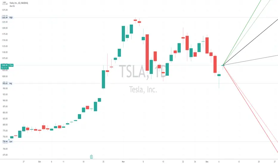
Average Gain/LossThe Average Gain/Loss indicator adds rays to show what the average trade range might be for a given ticker based on historical data.
Green lines are the average gain, red lines are the average loss and black are the overall average.
Darker lines are the average of close to close and lighter lines are the candle averages.
Default average is set to 50 bars but is adjustable in settings.
Have modification ideas for this indicator? Just let me know and I will gladly consider them!
BTCUSDTPERP MEGABOT 60min [ALERTS VERSION]BINANCE:BTCUSDTPERP
Hello, this is my alerts version of BTCUSDTPERP MEGABOT 60min
THIS BOT IS ONLY FOR BTCUSDTPERP ON BINANCEFUTURES !!!!!!!!!!!!!!!!!!!!!!!!!!!!!!!!!!!!!!!!!
This configs are only for this pair on this market,
It depends of volume , and others indicator
Bot is making amazing results at configs
TP - 4.5%
SL - 7%
Strategy using 4 indicators :
ADX
RSI
VOLUME
MACD
ADX - makes a solid view to trend without any scam wick :
Long only on green bars
Shorts only on red bars
That's helps my strategy to define a right trend
there is also a orange option for unidentified trends
RSI - value helps strategy to stop trade in right time
When RSI is overbought strategy don't open new longs
also when RSI is oversold strategy don't open new shorts
Volume - volume is the most important indicator for the strategy,
to avoid open trades on flat chart, new trades are open after a strong volume
wicks
MACD - this indicator is for define the trend
So the way this bot is working is simple
when every arguments are confirmed , then strategy open trades
Enjoy !!!

ADX Heatmap & Di's + Fib Referencial by [JohnnySnow]For quicker and easier interpretation, ADX line is displayed in a heatmap style. The more absolute difference between both DIs, the more intense the color.
Because some people use 20 ADX reference and others use 25 ADX reference to confirm the trend, I just add both as reference lines in a 'golden box'
Additionally, reference lines were added with default values set to Fib levels
ADX Screener// Identify potential trend reversals using ADX on up to 40 crypto assets.
// ADX shows the strength of a trend, not the direction.
// By monitoring the difference of ADX values between candles, you can potentially identify reversals before they happen.
// A strong trend has a 14 period ADX slope increasing .5 or more from the prior candle.
// At a minimum, a weak trend has a 14 period ADX slope of +.25 or less, and strictly it would be decreasing.
// This indicator prints one row for each asset with three columns for ADX differences one candle back each.
// The asset name is colored green or red dependent on whether +DI > -DI or not.
The market was in a down trend (-DI > +DI).
A bullish wave moved price up to EMA 8 resistance with strong ADX momentum (ADX diff of prior candle >= 0.5).
A Spinning Top showed that the trend was losing momentum (ADX diff lower than previous candle, showed the bullish wave losing momentum).
A Morning Star bearish reversal pattern draws resistance at the high of the pattern. (ADX Bullish momentum exhausted).
Symbol: -DI > +DI
2: Strong momentum
1: Losing momentum (spinning top)
0: Trend reversal (bearish engulfing pattern)

Imbalance, ADR Daily Target & ADR > 3X1 x ADR Movement Calculated on the Asian Session - Times can be altered to suit your parameters
Daily Target is set High from low of Asian Range and Low from High of Asian Range
0-3X ADR Calculated and Displayed from a point you select for the following days targets - can be set Bearish or Bullish and ADR parameters can be altered
Imbalance Finder - Can be switched on or off to show imbalance on current time frame - default is off

TASC 2021.12 Directional Movement w/Hann█ OVERVIEW
Presented here is code for the "Directional Movement w/Hann" indicator originally conceived by John Ehlers. The code is also published in the December 2021 issue of Trader's Tips by Technical Analysis of Stocks & Commodities (TASC) magazine.
Ehlers continues here his exploration of the application of Hann windowing to conventional trading indicators.
█ FEATURES
The rolling length can be modified in the script's inputs, as well as the width of the line.
█ NOTES
Calculations
The calculation starts with the classic definition of PlusDM and MinusDM. These directional movements are summed in an exponential moving average (EMA). Then, this EMA is further smoothed in a finite impulse response (FIR) filter using Hann window coefficients over the calculation period.
Background
The DMI and ADX indicators were designed by J. Welles Wilder and presented in his "New Concepts in Technical Trading Systems" book published in 1978.
Join TradingView!

BTC Dominance TrendThis simple script applies the DMI/ADX (trend) indicator to the Bitcoin Dominance Index (BTC.D) to check whether BTC is increasing its dominance or not on that day. It is meant to be applied to altcoins on medium intervals. I put it together to test the following hypothesis: On days when BTC dominance is on the rise, altcoins are harder to take off, because Bitcoin is draining the lifeblood out of them, so caution is needed when opening trades.
Olive background means BTC dominance is rising on that day, purple that it is decreasing. White background means it is not moving significantly in any direction.
You can change the resolution (i.e. apply the DMI/ADX to a different BTC.D interval), just make sure to lower the threshold as well. I hope you find a good use for it! Beware if you try to incorporate it in your strategy, it uses higher timeframe data and hence is prone to repainting.

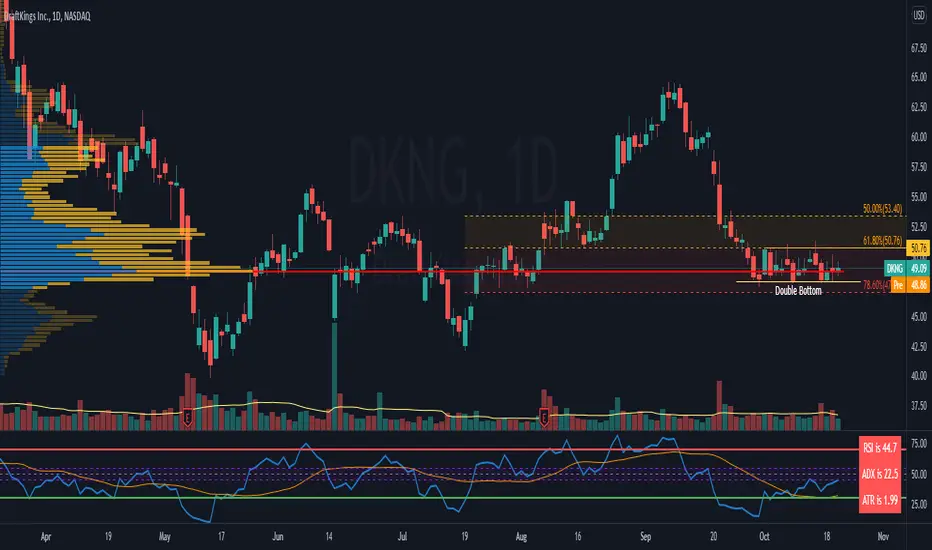
RSI c/w MA, ADX and ATR data I have added 3 items to the RSI indicator which helps me to get more information at the same time.
1) ADX value - when ADX is above 25 we have a strong trend
2) ATR Value - helps me to calculate my daily targets and stop-loss levels at a glance.
3) A simple moving average - This shows me the trend of RSI. If the price breaks a trend line and at the same time RSI crosses above the MA, it shows me a breakout has happened. In longer timeframes, it can show you in advance if you should expect a reversal in the trend.
You can turn on or off the MA as well as the ADX line.
GEMA-Indicador por Neil-------------------
DESCRIPTION
GEMA-INDICATOR is a indicator based on SMA, EMA, WMA, RMA that considers elements such as ADX, DMI, RSI, stochastic, Stoploss, Takeprofit, angles and values at present point.
HOW DOES IT WORK
The component works as an assistant to which you configure the previous elements and you see the performance that it offers you, in such a way that you pass that configuration to GEMA-INDICATOR so that you can receive alerts and do visual trading with notifications or automated trading by sending messages to platforms like 3Commas.
WHY USE IT
The resource operates with one of the most important strategies in the market, which is the price tracking line, which means that if prices go up, we follow it, if prices go down, we follow it; in this way you do not need to make large investments as is often the case with pure BOTs, which require large reserves for security orders.
HOW TO USE IT
Press the "Indicators" option, go to the "Public Library" segment, write the name "GEMA-Indicador por Neil", double click on the record in question and you will have it added in your work panel, now, it only remains to use it and configure its parameters.
-------------------
DESCRIPCIÓN
GEMA-INDICADOR en un indicador basado en SMA, EMA, WMA, RMA que considera elementos como ADX, DMI, RSI, Estocastico, Stoploss, Takeprofit, ángulos y valores a punto presente.
COMO FUNCIONA
El componente funciona como un asistente al que vas configurando lo elementos anteriores y vas viendo el rendimiento que te ofrece, de manera tal, que pases esa configuración a GEMA-INDICADOR para que puedas recibir alertas y hagas trading visual con notificaciones o trading automatizado enviando mensajes a plataformas como 3Commas.
POR QUÉ USARLO
El recurso opera con una de las estrategias mas importantes del mercado, que es la linea de seguimiento de precio, lo que significa que si los precios suben, lo seguimos, si los precios bajan, lo seguimos; de esta manera no necesita realizar grandes inversiones como suele ocurrir con los BOT puros, que exigen grandes reservas para las ordenes de seguridad.
COMO USARLO
Presione la opción "Indicadores", ubíquese en el segmento "Libreria Publica", escriba el nombre "GEMA-Indicador por Neil", haga doble clic sobre el registro en cuestión y lo tendrá agregado en su panel de trabajo, ahora, solo resta usarlo y configurar sus paramertos.
