INVITE-ONLY SCRIPT
Hersheys CoCo
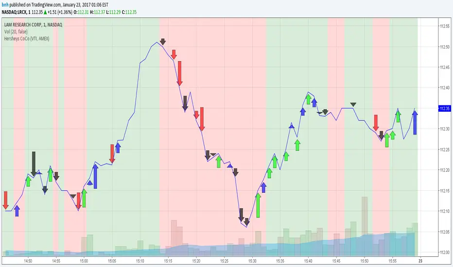
This is my variation of the Correlation Coefficient and I call it "Hershey's CoCo". The indicator identifies very specific Stock, Sector and Market pressures on whatever symbol you are evaluating.
If interested, follow me and send me requests to evaluate your stock or sector as I refine this tool.
***********************************************
Price movement does not happen in isolation.
Stocks are held by various "containers" that can be traded independently and can affect the price of each stock. The most important of those containers are Sector and Market, while others include Industry, MarketCap and others.
For example, Market is simply the top level representation of all stocks, or the sea that carries, or sinks, all ships. You can monitor this level by looking at various indexes, ETFs and/or Funds. I use "VTI", the Vanguard Total Stock Market ETF.
Sectors can be monitored using any number of containers, like Vanguard Sector Index Funds or ProShares Ultra Sector Indexes. I use the S&P SPDR Sector Funds. A list of those are listed below.
Most of the techniques and indicators that deal with correlation and sector/market comparisons are not very detailed. Many simply overlay one price series over another, while you tediously follow the price lines from left to right trying to judge movement.
Another critical piece missing from other compare tools is normalizing each data series. Hershey's CoCo does this, so you can have confidence that the alerts you see are based on accurate comparisons at every level.
***********************************************
So let's get to the details! Hershey's CoCo currently compares 2 containers, so for this discussion we'll do Stock to Sector. You'll see arrows above and below some ticks of the price chart, plus a faint red or green background color.
Very Bull = Blue Arrow = Stock and Sector prices are up, Stock price up more
Bull = Green Arrow = Stock and Sector prices are up, Sector price up more
Bear = Red Arrow = Stock and Sector prices are down, Sector price down more
Very Bear = Black Arrow = Stock and Sector prices are down, Stock price down more
Neutral = No Arrow = Stock and Sector price movement equal
Arrow Length = Strength (the longer the arrow the bigger the difference)
Green Background = Bull = Above zero Simple Moving Average of all arrow values
Red Background = Bear = Below zero Simple Moving Average of all arrow values
To review, the Blacks and Blues are the HEAVIEST pressure... the LONGER the STRONGER!
Yalnızca davetli komut dosyası
Bu komut dosyasına erişim, yazar tarafından yetkilendirilen kullanıcılarla sınırlıdır ve genellikle ödeme gerektirir. Sık kullanılanlarınıza ekleyebilirsiniz, ancak bunu yalnızca izin talep edip yazarından bu izni aldıktan sonra kullanabileceksiniz. Daha fazla bilgi için bnh ile iletişime geçin veya yazarın aşağıdaki talimatlarını izleyin.
TradingView, yazarına %100 güvenmediğiniz ve komut dosyasının nasıl çalıştığını anlamadığınız sürece bir komut dosyası için ödeme yapmanızı ve onu kullanmanızı önermez. Çoğu durumda, Topluluk Komut Dosyaları bölümümüzde ücretsiz olarak iyi bir açık kaynak alternatifi bulabilirsiniz.
Yazarın talimatları
″
Bu komut dosyasını bir grafikte kullanmak ister misiniz?
Uyarı: Erişim talebinde bulunmadan önce lütfen okuyun.
Feragatname
Bilgiler ve yayınlar, TradingView tarafından sağlanan veya onaylanan finansal, yatırım, işlem veya diğer türden tavsiye veya tavsiyeler anlamına gelmez ve teşkil etmez. Kullanım Şartları'nda daha fazlasını okuyun.