Temel veri grafikleri: Finansal metrikleri grafiklendirmeyi öğrenin
Temel analiz grafikleri ile halka açık birden fazla şirketi ve fonu finansal metriklerine göre karşılaştırabilirsiniz. Bu araç, varlıkların mevcut eğilimlerini sürdürmelerinin veya yön değiştirmelerinin altında yatan nedenleri ortaya çıkarmanıza yardımcı olur.
İÇİNDEKİLER:
- Temel analiz grafikleri nedir
- Finansal metrikler nedir
- Temel analiz grafikleri nasıl kullanılır
- Grafik ölçekleri
- Temel analiz grafikleri yönetimi
- Temel analiz grafikleri ve diğer araçlar
Temel analiz grafikleri nedir
Temel analiz grafikleri, bir şirketin piyasada adil bir şekilde değerlenip değerlenmediğini ve büyüme potansiyeline sahip olup olmadığını değerlendirmenize yardımcı olan bir temel analiz aracıdır. Bu tür bir analiz, şirket hisseleri ve yatırım fonları da dahil olmak üzere farklı varlıklara uygulanabilir.
Her iki varlık sınıfı da şirket ve fon raporları analiz edilerek incelenebilir. Bu verileri topladık ve tek bir grafikte görselleştirmeyi mümkün kıldık.
Hisseler için verileri finansal tablolardan topluyoruz. Bunlar, bir şirketin değerlemesini yönlendiren iç faktörleri anlamak için birincil bilgi kaynaklarıdır.
Fonlar için NAB raporlarını, bilgi formlarını ve temel metrikleri içeren diğer yayınlanmış verileri kullanıyoruz.
Finansal metrikler nedir
Finansal metrikler, bir şirketin hedeflerine ulaşmada ne kadar iyi performans gösterdiğini gösterir. Her işletme uzun vadeli hedefler belirler ve müşterilere mal üreterek ve hizmet sunarak bu hedeflerin peşinden gider.
Bilanço, varlıkları, yükümlülükleri ve özsermayeyi listeleyen önemli bir kurumsal rapordur. İştirakler, ana şirketin bilançosunda konsolide edilerek yön ve strateji hakkında daha geniş bir görüş sağlar. Bu durum, toplam varlıklar, özsermaye kârlılığı ve FAVÖK marjı gibi metrikleri doğrudan etkiler.
Örneğin, Meta'nın geniş misyonu "İnsanlara topluluk oluşturma ve dünyayı birbirine yakınlaştırma gücü vermek"tir. Bunu gerçekleştirmek için şirket, sosyal platformlarını geliştirir ve yeni cihazlar ve yazılımlar sunar. Meta, mıcır üreten bir işletmeyi satın alsaydı, bu durum misyonuyla pek uyuşmazdı. Bazı yatırımcılar, şirketin temel stratejisinden uzaklaştığını düşünerek hisselerini satabilirlerdi. Elbette istisnalar mevcuttur.
Bu, finansal tablo analizinin yatırımcılara ve hissedarlara neler gösterebileceğine dair sadece bir örnektir.
Bir şirketin finansal sağlığını değerlendirmek ve beklentileri hakkında daha derin bir anlayış kazanmak için temel analiz grafiklerimizi kullanarak çeşitli metrikleri ve oranları görselleştirebilirsiniz.
Temel analiz grafikleri nasıl kullanılır
Temel analiz grafiklerine erişmek için "Ürünler" açılır menüsünün üzerine gelin ve "Temel analiz grafikleri"ni seçin.

Kullanmak için, analiz etmek istediğiniz sembolü seçin ve ardından bir metrik seçin.
Platformumuzda bulunan herhangi bir sembolü ekleyebilir ve farklı metrikler arasında karşılaştırabilirsiniz. Ancak, tüm semboller ve metrikler bu analiz için uygun değildir.
Örneğin, faiz oranı hem TradingView'de bir semboldür hem de bir finansal metriktir. Kurumsal finansallardan türetilmediği için, şirket tablolarından elde edilen temel metrikler geçerli değildir. Aynı durum işsizlik oranı, GSYİH veya enflasyon oranı gibi göstergeler için de geçerlidir.
Yine de, gerekirse karşılaştırma yapmak için bu tür ekonomik verileri kurumsal verilerle birlikte görüntüleyebilirsiniz.
"İçerik görünürlüğü" menüsünde, grafiğin bilgileri nasıl sunacağını seçebilirsiniz:
- Tüm semboller - tüm metrikler: Seçilen tüm semboller için her metriği görüntüler
- 1 sembol - tüm metrikler: Seçilen bir sembol için tüm metriklere odaklanır
- 1 metrik - tüm semboller: Birden fazla sembolü seçilen bir metrik üzerinde karşılaştırır
Sadece "+ Ekle" düğmesine basarak yeni semboller ve metrikler ekleyebilirsiniz.
Ayrıca, "Fiyat grafiklerini göster" seçeneğine tıklayarak bir fiyat gösterimini etkinleştirebilirsiniz; bu, seçilen metriğin yanı sıra hisse fiyatlarını veya oranlarını da gösterir.
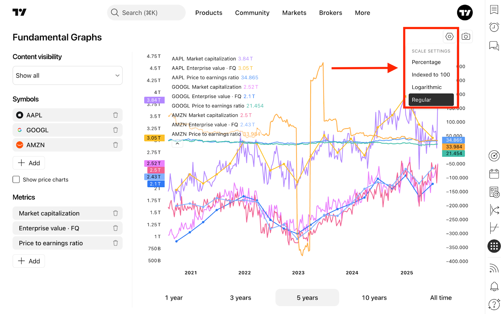
Grafik ölçekleri
Süpergrafiklerde olduğu gibi, dört farklı ölçek arasında geçiş yapabilirsiniz:
- Normal: Doğrusal bir ölçek. Mutlak fiyat değişikliklerini kullanır. 10$ ile 20$ arasındaki mesafe, 10.000$ ile 10.010$ arasındaki mesafeye eşittir
- Logaritmik: Üstel bir ölçek. Yüzde değişikliklerini kullanır. 10$'dan 20$'a (%100) olan hareket, 10.000$'dan 10.010$'a (%0,1) olan hareketten çok daha büyük görünür
- Yüzde: Başlangıç noktasına göre yüzde değişikliklerini gösteren doğrusal bir ölçek
- 100'e Endeksli: İlk değer 100'e ayarlanır ve sonraki değerler taban çizgisinden yüzde değişikliklerini yansıtır. Görünüşte ilgisiz sayıları karşılaştırmak için idealdir
Grafiğin alt kısmında, farklı ufuklarda metrikleri karşılaştırmak için zaman dilimleri seçebilirsiniz:
- 1 yıl
- 3 yıl
- 5 yıl
- 10 yıl
- Tüm zamanlar
Temel analiz grafikleri yönetimi
Temel analiz grafiklerinizi kaydedebilir, düzenleyebilir, kopyalayabilir ve paylaşabilirsiniz. Bunu yapmak için, sayfanın sol üst tarafındaki kontrol panelini kullanın; bu panel, grafik adına tıklayarak açılır. Menü, son kullanılan grafiklere hızlı erişim sağlar; tam listeyi görüntülemek için Grafiği aç... seçeneğine tıklayın.

Temel analiz grafikleri ve diğer araçlar
Temel analiz grafikleri derinlemesine analiz yapmak için güçlü bir yol sunar, ancak bunları diğer araçlarla birleştirmek daha da fazla içgörü katabilir. Örneğin, hisse senetlerine göz atmak için Hisse Takipçisini veya piyasa olaylarından haberdar olmak için Haberler bölümünü kullanın.
Sağ araç çubuğundan, diğer TradingView araçlarına erişmek için Ürünler'e tıklayın. Eğer tahvil işlemi yapıyorsanız, devlet getirilerinin şirket metrikleriyle nasıl ilişkili olduğunu görmek için Getiri eğrilerini keşfedin.

Özetle temel analiz grafikleri
Temel analiz grafikleri, finansal verileri grafiklere dönüştüren ve birden fazla varlığı yan yana karşılaştırmanıza olanak tanıyan bir görselleştirme aracıdır. Sadece zaman içinde izlemek istediğiniz finansal metrikleri seçin.
İster kârlılık oranlarını, büyüme metriklerini veya değerleme çarpanlarını analiz ediyor olun, temel analiz grafikleri hangi şirketlerin emsallerinden daha iyi performans gösterdiğini tespit etmeyi ve potansiyel yatırım fırsatlarını belirlemeyi kolaylaştırır.
Ayrıca okuyun: