TradingView Getiri Eğrileri: Tahvil oranları ve grafiklerini inceleyin
Tavhil piyasası analizine daha derinlemesine dalmanıza ve güçlü bir strateji oluşturmanıza yardımcı olmak için TradingView Getiri Eğrilerini tasarladık. Bu araç, farklı vadelere sahip tahvillerin getirilerini değerlendirmenize ve dünya çapındaki en iyi tahvil oranlarını ortaya çıkarmanıza olanak tanır.
İÇİNDEKİLER:
- Tahviller nasıl çalışır
- TradingView Getiri Eğrileri nedir
- Getiri Eğrileri ve Süpergrafikler
- Diğer TradingView tahvil araçları
Tahviller nasıl çalışır
Devlet tahvilleri, devletin cari harcamalarını finanse etmek ve yükümlülüklerini yerine getirmek için ihraç ettiği menkul kıymetlerdir. Tahvil alıcıları borç veren, devlet ise borç alan konumundadır. Devlet politikasına bağlı olarak tahvillerin bir aydan 95 yıla kadar değişen farklı vadeleri vardır.
Devlet tahvilleri, ihraççıları özel kuruluşlara göre temerrüde düşme veya ciddi türbülans yaşama olasılığı daha düşük olan devletler olduğu için düşük riskli yatırımlar olarak kabul edilir. Bazı tahviller yalnızca ihraç anında satın alınabilirken, diğerleri ikincil piyasada da bulunabilir.
Çoğu tahvil sahibi, genellikle altı ayda bir yapılan düzenli ödemelerden veya kuponlardan yararlanır. Tahvilin vadesi dolduğunda, yatırımcılara tahvilin nominal değeri geri ödenir.
Örneğin, bir yatırımcı 1000 € nominal değerli, %2,2 kupon oranlı ve 10 yıl vadeli bir tahvil satın alır. Bu, onlara 10 yıl boyunca altı ayda bir yapılan 110 €'luk iki ödeme ile yılda 220 €, toplamda ise 2.200 € kazandıracaktır. Ayrıca, tahvil vadesi dolduğunda devlet yatırımcıya 1.000 € geri öder. Bir tahvil sahibinin alacağı nihai ödeme 1.220 €'dur.
Tüm tahvillerin kupon oranı yoktur. Bunlar sıfır kuponlu tahviller olarak bilinir. Kısa vadeli tahviller — vadesi bir yıldan az olanlar — genellikle nominal değerlerinin altında bir indirimle satılır ve kısa vadeli ömürleri nedeniyle istikrarlı bir nakit akışı oluşturmazlar.
Örneğin, 100 £'luk bir yıllık bir tahvil, nominal değerine %2,52 indirimle sunulabilir. Bir yatırımcı bunu 97,48 £'a satın alır. Böyle bir tahvil vadesi dolduğunda, bir yatırımcı 100 £ alır.
Tahvillerin hisse senetleriyle ters orantılı olduğunu belirtmek gerekir. Hisse senedi fiyatları yükseldiğinde, tahvil fiyatları düşer.
Ayrıca, yeni tahviller ihraç edildikçe mevcut tahvillerin fiyatları değişir. Yeni tahvillerin kupon oranı ne kadar yüksekse, daha önce ihraç edilen tahvillerin fiyatları o kadar düşük olur.
İlginç bir şekilde, Nisan 2025, İsviçre kısa vadeli tahvillerinin — 2022'den bu yana ilk kez — negatif getiri sunmaya başladığı aydı, bu da tahvil sahiplerinin bu tahvilleri satın almak için ödediklerinden daha az para alacakları anlamına geliyordu. Bu, piyasa dalgalanmaları, küresel ekonomik belirsizlik ve negatif olsalar bile garantili getirili son derece istikrarlı menkul kıymetlere olan talebin artmasından kaynaklanıyordu.
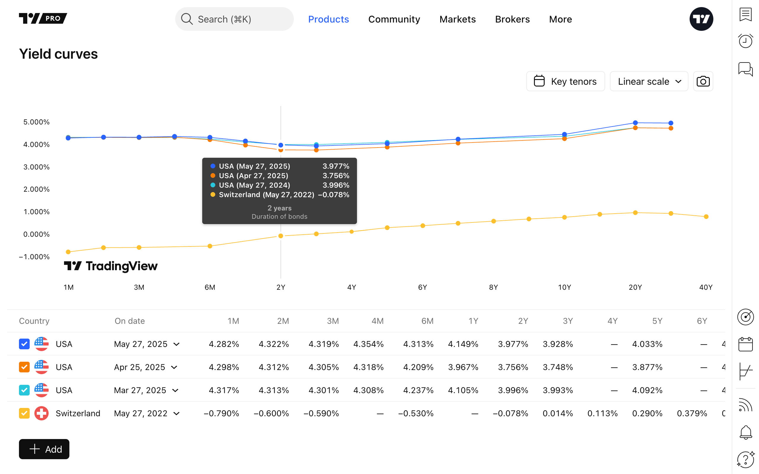
TradingView Getiri Eğrileri nedir
Tahviller düzenli olarak, bazıları haftalık olarak ihraç edilir. Çoğu tahvil likittir, yani ikincil piyasada işlem görebilirler. Daha önce ihraç edilen ve yeni tahviller arasındaki ilişkiyi anlamak için yatırımcılar, tahvil getirilerindeki değişiklikleri tek bir grafikte gösteren görsel bir araç olan Getiri Eğrilerini kullanır.
Getiri eğrileri tahvil verilerini toplar ve iki farklı ölçek türünde görüntüler:
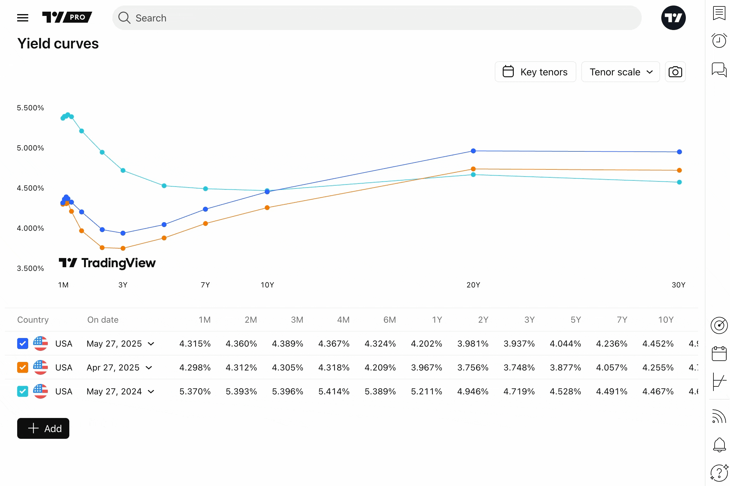
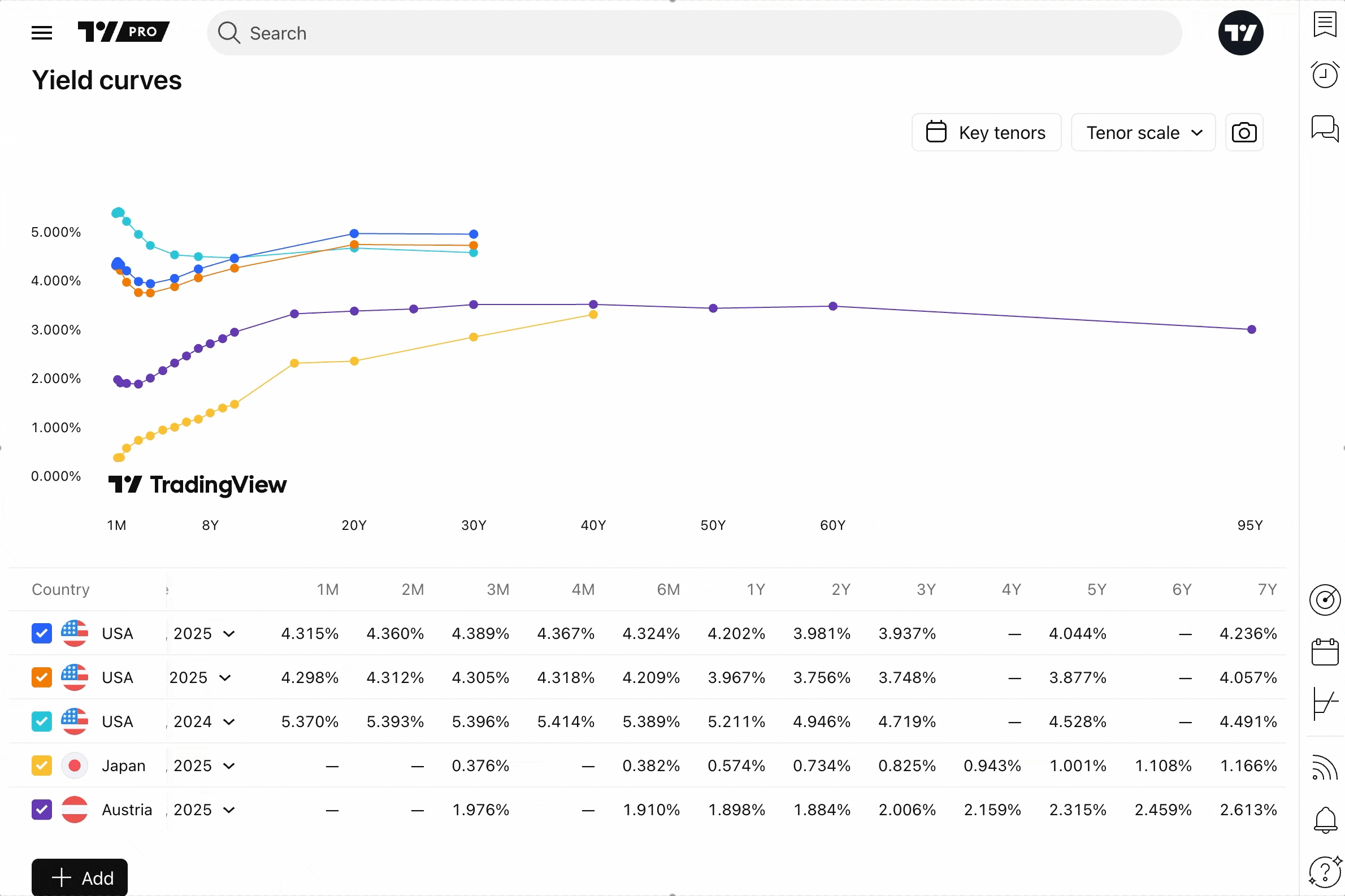
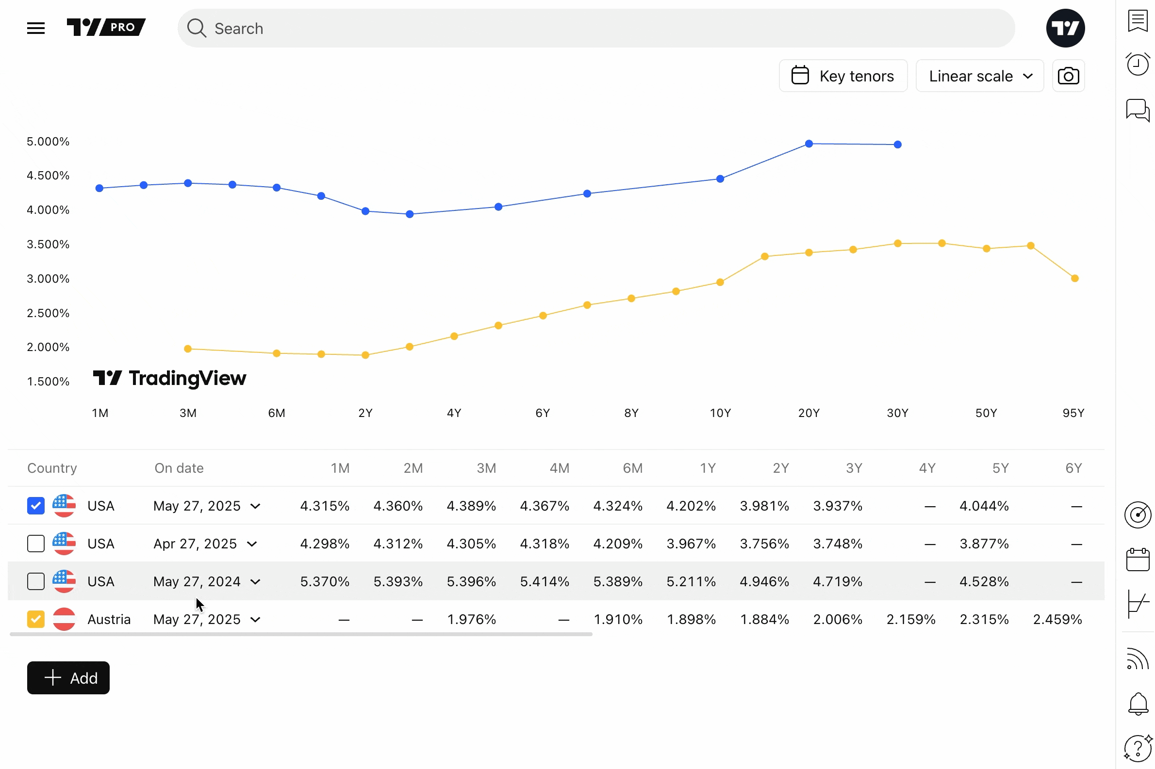
- Vade ölçeği: Tahvilleri vadelerine göre temsil etmek ve risk maruziyetlerini değerlendirmek için kullanılır. Bu ölçekteki her nokta, tahvilin süresini ve getirisini temsil eder. Vade noktaları arasındaki boşluk belirsizlik seviyesini yansıtır — boşluk ne kadar büyükse risk o kadar büyüktür
- Doğrusal ölçek: Tahvilin getirisi ve vadeye kalan süre gibi birim değişikliklerinin eşit aralıklarla gösterildiği verileri temsil eder. Tahvil ilişkileri genellikle doğrusal olmasa da, doğrusal bir ölçek yaklaşık değişiklikleri görselleştirmeye, farklı tahvillerdeki değerleri karşılaştırmaya ve genel eğilimleri belirlemeye yardımcı olur
Bu düğmenin yanında "Anahtar vadeler" bulabilirsiniz — aynı zamanda referans olarak kullanılan anahtar vadelere sahip en sık işlem gören tahvilleri görüntülemek için bunları etkinleştirin.
Yaygın olarak kabul edilen anahtar vadeler şunlardır:
- Aylar: 1, 3, 6
- Yıllar: 1, 2, 3, 5, 7, 10, 20, 30
En likit tahvilleri bulmak için bunlar arasında kolayca geçiş yapın. Bu, birçok yatırım fonu, banka, sigorta şirketi ve diğer kilit oyuncuların yakından izlediği önemli zaman noktalarını belirlemenize yardımcı olacaktır.
Getiri eğrileri sayfasındayken, önce ABD tahvilleri için verileri göreceksiniz. Varsayılan olarak, bu üç eğri, üç farklı tarihte sunulan Hazine bonolarının farklı getirilerini temsil eder: bugün, bir ay önce ve bir yıl önce.
Eğrilerde gösterilen veriler, seçilen tahviller için farklı vadelerle grafiğin altındaki sütunlarda ve satırlarda da sunulur. Bir eğriyi gizlemek için listeden seçimini kaldırmanız yeterlidir.
Farklı ülkelerin tahvillerini karşılaştırmak için "+ Ekle" düğmesine basın ve görüntülemek ve karşılaştırmak istediğiniz olanı seçin.

Yapılandırılmış verilerin sağ tarafında "Klonla" düğmesini bulun ve aynı devlet tahvili için yeni bir eğri oluşturmak üzere basın.
Önceki değerlerle karşılaştırmak istiyorsanız tahvil tarihlerini değiştirin.
Getiri eğrilerinizi ince ayar yaptıktan sonra, çalışmanızı arkadaşlarınızla, işlem yapan arkadaşlarınızla veya abonelerinizle paylaşabilirsiniz. Ölçek menüsünün yanındaki "Anlık görüntü al" düğmesini arayın.
Ve şimdi, Getiri eğrilerinin diğer TradingView araçlarıyla nasıl bağlantılı olduğunu ve tahvil evrenini keşfederken hepsini kullanarak analizinizi nasıl geliştirebileceğinizi görelim.
Getiri Eğrileri ve Süpergrafikler
Hem Getiri eğrileri hem de Süpergrafikler görsel araçlardır, ancak nasıl farklılaşırlar?
Bu iki grafiğe bakın.

Süpergrafiklerde, belirli bir tahvili (örneğin, 10 yıllık ABD Hazine bonoları) seçebilir ve zaman içindeki değişikliklerine doğrusal olarak bakabilirsiniz. Elbette, "Karşılaştır veya Sembol ekle" düğmesine basarak bir sembol de ekleyebilirsiniz, ancak burada görüntülediğiniz veriler daha çok tek bir tahvilin performansının derinlemesine incelenmesiyle ilgilidir.
Getiri eğrilerinde — doğrusal bir ölçekte bile — bir ülkenin farklı zaman dilimlerindeki tüm tahvillerini görürsünüz. Burada, 10 yıllık ABD hazine bonoları seçilen bir zaman dilimi (örneğin, bugün) için tek bir yerde bulunur.
Bir diğer önemli fark, Süpergrafiklerin geçmişi incelemenize izin verirken, Getiri eğrilerinin tahvil oranlarını geleceğe yansıtmasıdır.
Süpergrafiklerden Getiri eğrilerine erişmek için sağ araç çubuğundaki "Getiri eğrileri" düğmesini bulun.
Bölünmüş görünüm, takipçilerimiz, takvimlerimiz ve diğer TradingView ürünlerimiz için de mevcuttur. Analizinizi güçlendirmek için Bölünmüş görünüm moduna geçmek için basit adımları öğrenin.
Bununla birlikte, Süpergrafikler size bir tahvili hassas bir şekilde inceleme ve tüm değişikliklerini ayrıntılı bir şekilde inceleme gücü verirken, Getiri eğrileri ülke çapında bir tahvil karşılaştırma aracıdır.
Diğer TradingView tahvil araçları
Tahvil evreni bir boşlukta var olmaz. Tahvil piyasaları küresel ekonomiden, diğer varlıkların performansından ve çeşitli finansal oyuncuların politikalarından etkilenir.
Güncel kalmak için tahvil haberlerini takip etmek ve Ekonomik Takvimi keşfetmek isteyebilirsiniz — faiz oranlarının ne olacağını veya küresel sermayenin bir sonraki nereye yöneleceğini kim bilebilir?
Süpergrafiklerin yanı sıra, Tahvil Isı Haritası ve Tahvil Takipçisi araçlarını da keşfedebilirsiniz — tahvil temellerinin kapsamlı bir şekilde incelenmesi, sağlam bir analizi sallantılı bir analizden ayıran şeydir.
Son olarak ama en az değil — topluluğun tahviller hakkındaki fikirlerine göz atın. Diğer yatırımcıların Görüşlerine göz atın ve neler yaptıklarını keşfedin. Hatta bir iki numara bile öğrenebilirsiniz.
Özetle
Devlet tahvilleri, hisse senetleri gibi ikincil piyasada da işlem gören düşük riskli yatırımlardır. Nominal değerleri ihraç anında belirlenir ve ardından yeni tahviller sunuldukça değişir.
Tahvil ihaleleri ve dağıtımı mevcut tahvil fiyatlarını etkiler, çünkü yeni kupon oranları mevcut olanlardan daha yüksek veya daha düşük olabilir. Bu, bazı tahvil sahiplerini mevcut tahvillerini satmaya ve yeni bir dizi devlet destekli menkul kıymet satın almaya zorlayabilir.
Hem yatırımcılar hem de analistler, potansiyel olarak kârlı fırsatları belirlemek ve güvenilir aracılar aracılığıyla Süpergrafikler üzerinden işlem yapmak için TradingView Getiri Eğrilerini kullanır.
Finans analistleri küresel ekonomiyi inceler, haberleri takip eder ve finans piyasalarını neyin hareket ettirdiğini anlamak için topluluk fikirlerini izler.
Eğrileri inceleyin, diğer ürünlerimizi keşfedin ve TradingView ile tahviller hakkında güncel kalın.
Ayrıca okuyun: