Market Internals Dashboard (Time-Based Adaptive)Market Internals Dashboard (Time-Based Adaptive)
⚠️ IMPORTANT DISCLAIMER
This indicator is for CONFIRMATION purposes only and should NEVER be used as a standalone trading signal.
✅ Always test thoroughly in paper trading first
✅ Use as ONE confluence factor within your complete trading model
✅ Combine with price action, support/resistance, and your strategy rules
✅ Never enter trades based solely on this indicator
❌ Past performance does not guarantee future results
You are responsible for your own trading decisions and risk management.
📊 WHAT THIS INDICATOR DOES
This comprehensive Market Internals Dashboard monitors real-time NYSE and NASDAQ market breadth indicators to help traders identify:
Market Bias - Is the overall market bullish, bearish, or neutral?
Market Strength - How strong is the current move?
Divergences - Are internals confirming price action or warning of reversal?
Chop Zones - When to avoid trading due to choppy conditions
Extreme Levels - Overbought/oversold conditions for potential fades
Sector Rotation - Is money flowing to Value (NYSE) or Tech (NASDAQ)?
Key Market Internals Tracked:
NYSE Internals:
USI:TICK - Net advancing vs declining stocks
USI:ADD - Advance/Decline Line
USI:VOLD - Volume difference (up vol - down vol)
Volume Ratio - Up volume / Down volume
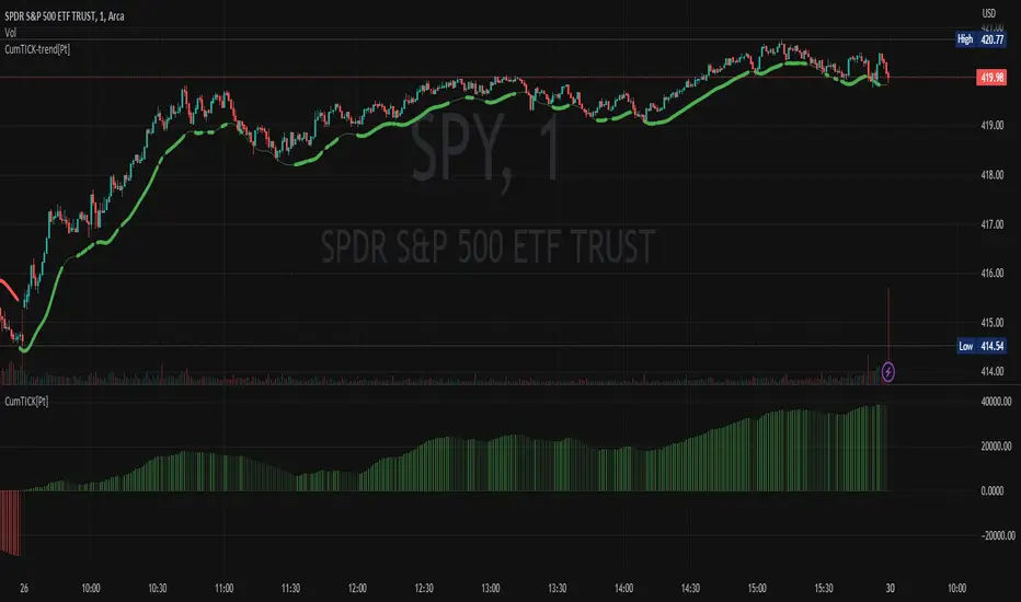
Cumulative TICK - Session momentum
NASDAQ Internals:
USI:TICKQ - NASDAQ tick indicator
USI:ADDQ - NASDAQ Advance/Decline
USI:VOLDQ - NASDAQ volume difference
NASDAQ Volume Ratio
Cumulative TICKQ
Additional Features:
TVC:VIX - Volatility index for risk sentiment
Volume Pulse - Institutional volume detection
TICK Delta - Momentum acceleration/deceleration
Adaptive Extreme Levels - Dynamic overbought/oversold zones
Fade Detection - Mean reversion opportunities
🎯 HOW THIS HELPS YOUR TRADING
1. Confirmation of Bias
If you're looking for longs, check if NYSE/NASDAQ show bullish alignment
Strong confluence when both markets agree with your directional bias
Avoid counter-trend trades when internals strongly oppose your setup
2. Timing Entries
Wait for internals alignment before entering
Use extreme levels for fade opportunities (mean reversion)
TICK Delta shows acceleration - enter on momentum confirmation
3. Risk Management
CHOP DETECTION warns when conditions are unfavorable
Reduce position size or stay flat during "DANGER ZONE" readings
Exit trades early if internals flip against your position
4. Divergence Alerts
When VOLD rises but price falls = potential bullish reversal
When VOLD falls but price rises = potential bearish reversal
Early warning system before price confirms the reversal
5. Session Context
Cumulative TICK shows session-wide bias
"Strong Bull Session" = favor longs, be selective with shorts
"Strong Bear Session" = favor shorts, be selective with longs
⚙️ SETTINGS GUIDE
📊 Dashboard Display
Dashboard Position - Choose where the dashboard appears (Top Right recommended)
Text Size - Adjust for screen resolution (Normal recommended)
Compact Mode - Shows only Overall Status + Scores (useful for small screens)
Color Settings - Customize background colors for different states:
Bullish/Bearish - Clear directional signals
Neutral - No clear bias
Chop/Warning - Avoid trading
No Data - Outside trading hours
💎 Signal Label
Show Signal Label - Diamond marker on chart when important signals trigger
The label's tooltip shows:
Aligned Bullish/Bearish
Strong market moves
Divergences
Extreme levels
Fade opportunities
📈 Market Internals Sources
Data Timeframe - ⚠️ CRITICAL SETTING
'1' minute = MAXIMUM ACCURACY (recommended for live trading)
'5' minute = Lower accuracy, saves memory
'15' minute = Lowest accuracy
💡 For real-time trading, ALWAYS use '1' minute!
RTH Only (9:30-16:00 EST) - Filters data to Regular Trading Hours only
Recommended: ON (internals are only meaningful during RTH)
Show NYSE/NASDAQ Groups - Enable/disable entire sections
Individual Indicators - Toggle specific internals on/off:
USI:TICK - Most reactive, shows immediate sentiment
USI:ADD - Confirms breadth, slower than TICK
USI:VOLD - Shows institutional money flow
Vol Ratio - Relative volume strength
VOLD Trend - Compares VOLD direction vs price direction
Vol Ratio Trend - Compares Vol Ratio vs price
⚙️ Thresholds
TICK/ADD Thresholds - Standard levels for bullish/bearish signals
NYSE TICK: 500 (conservative), 300 (aggressive)
NYSE ADD: 500 (conservative), 300 (aggressive)
NASDAQ TICK: 400 (conservative), 250 (aggressive)
NASDAQ ADD: 400 (conservative), 250 (aggressive)
VOLD Thresholds - Only for display color coding, not scoring
⚙️ Adaptive Extreme Levels
Use Adaptive Extreme Levels - 🔥 KEY FEATURE
ON = Dynamic thresholds based on recent volatility (RECOMMENDED)
OFF = Fixed extreme levels
Range Lookback (minutes) - Time window for calculating extremes
⚠️ IMPORTANT: Effective lookback depends on chart timeframe!
1min chart: max ~40min effective
5min chart: max ~200min effective
15min+ chart: full range available ✅
Recommended:
60min = Quick adaptation to changing volatility
120min = Balanced
180min = Stable (requires 5min+ chart)
Early Session Period - First X minutes after open use reduced lookback
30min = recommended (first half hour)
Prevents false extremes when range is still building
Early Session Multiplier - Reduces lookback during early session
0.50 = 50% of normal lookback (recommended)
0.25 = Very conservative
Extreme % from High/Low - How far from range extremes to trigger
0.90 = 90% of range (conservative)
0.80 = 80% of range (aggressive)
⚙️ Volume Ratio
Vol Ratio Bullish Threshold - e.g., 1.5 = up volume is 1.5× down volume
1.5 = balanced (recommended)
2.0 = more selective
Vol Ratio Extreme Threshold - For extreme signals
2.5 = very strong imbalance (recommended)
⚙️ VOLD Trend
VOLD Trend Period - Bars back for trend comparison
3 = recent trend (recommended for scalping)
5 = broader trend (swing trading)
VOLD Trend Weight - Importance in scoring
1.0 = equal to other indicators (recommended)
⚙️ Vol Ratio Trend
Same as VOLD Trend but for Volume Ratio
📊 Volume Pulse
Volume Pulse Lookback - Rolling average window
30min = balanced (recommended)
15min = sensitive to volume spikes
60min = stable, longer-term context
Shows when volume is:
🔵 Institutional (2.0×+ average)
High Volume (1.3×+ average)
Normal (0.7-1.3× average)
⚠️ Low Volume (<0.7× average)
📊 Cumulative TICK
Tracks session-wide momentum by summing all TICK readings.
Strong Bullish/Bearish - Thresholds for session bias
+3000 / -3000 = strong session bias (recommended)
Cumulative TICK Trend - Lookback - Bars on YOUR chart timeframe
On 15min chart: 3 bars = 45min trend
On 5min chart: 3 bars = 15min trend
Threshold - Minimum change for trend detection
200 = balanced (recommended)
500 = only strong trends
🔄 Fade Logic
Enable Fade Detection - Mean reversion after extremes
When TICK hits extreme (e.g., +1200) then reverses by X points, signals potential fade.
Fade Reversal Amount - How much TICK must reverse
200 = moderate fade (recommended)
300 = stronger confirmation needed
Require ADD Confluence - Fade signal needs ADD confirmation
ON = safer (recommended)
OFF = more signals, less reliable
⚙️ Hysteresis
Use Hysteresis - Prevents signal flickering
ON = recommended (smoother signals)
Hysteresis % - How much value must change to flip state
10% = balanced (recommended)
⚠️ Chop Detection
Warns when market conditions are unfavorable for trading.
TICK Range for Chop - If TICK stays within ±X for lookback period
400 = identifies tight consolidation (recommended)
ADD Threshold for Chop - If ADD is weak
300 = balanced (recommended)
Lookback Period - Bars to analyze
30 = recent conditions (recommended)
Max Score Difference for Chop - If bull/bear scores are similar
40% = identifies indecision (recommended)
Lunch Time Warning - 11:00-13:30 EST
ON = recommended (lunch chop is real!)
Chop Score Interpretation:
0-40% = 🟢 Tradeable
40-70% = 🟡 Choppy (be careful)
70-100% = 🔴 DANGER (avoid trading)
🎯 Scoring
Weights - Importance of each indicator in final score:
TICK Weight: 1.5 (most reactive)
ADD Weight: 1.5 (breadth confirmation)
Vol Ratio Weight: 1.0 (volume strength)
VOLD Trend Weight: 1.0 (trend confirmation)
Vol Ratio Trend Weight: 1.0 (trend confirmation)
Cumulative TICK Trend Weight: 1.5 (session momentum - very important!)
Strong Signal Threshold - Minimum % for "strong" signal
70% = recommended
80% = more selective
🔄 Alignment & Divergence
Min Score Difference for BIAS - How clear the bias must be
30% = recommended
50% = very clear bias required
Threshold for ROTATION Warning - When one market opposes the other
40% = balanced (recommended)
Rotation Types:
ROTATION TO VALUE = NYSE↑ NASDAQ↓ (buy financials/industrials)
ROTATION TO TECH = NASDAQ↑ NYSE↓ (buy tech stocks)
🔔 Alerts
Configure alerts for various conditions:
Aligned Bullish/Bearish (both markets agree)
Rotation Detected (sector rotation)
Strong Signals (70%+ score)
Chop/Danger (avoid trading)
Extreme Levels (overbought/oversold)
Divergences (early reversal warnings)
Fade Signals (mean reversion)
🎓 USAGE EXAMPLES
Example 1: Scalping ES during RTH
Setup:
Data Timeframe: 1 minute (max accuracy)
Chart: 5-minute ES
Looking for long scalp
Check Dashboard:
✅ Overall Status = "ALIGNED BULL"
✅ NYSE Score = 🟢 75%
✅ NASDAQ Score = 🟢 72%
✅ Market Quality = 🟢 OK (chop score <40%)
✅ Volume Pulse = High Volume or Institutional
Action: Enter long on your strategy signal with high confidence
Example 2: Avoiding Bad Trades
Setup:
Your strategy gives long signal
Price looks good
Check Dashboard:
❌ Overall Status = "🔴 AVOID - Both Choppy"
❌ NYSE Chop = 🔴 DANGER (75%)
❌ NASDAQ Chop = 🔴 DANGER (72%)
❌ TICK Range = narrow consolidation
Action: SKIP THE TRADE - Internals warn conditions are unfavorable
Example 3: Fade Opportunity
Setup:
Market pushed to extreme
Looking for reversal
Check Dashboard:
🔻 NYSE FADE SHORT signal appears
⚡ TICK was +1200 (extreme)
📉 Now reversed to +950
✅ ADD confirmed (turning negative)
Action: Consider short entry (with your reversal setup)
Example 4: Divergence Warning
Setup:
ES making new highs
You're in a long position
Check Dashboard:
⚠️ NYSE BEAR DIVERGENCE
📊 VOLD falling while price rising
🟡 Overall Status changing to "MIXED"
Action: Tighten stops or take profits - internals warn momentum fading
💡 BEST PRACTICES
DO:
✅ Test extensively before live trading
✅ Use on 5min or 15min charts for swing trades
✅ Use on 1min or 3min charts for scalping
✅ Combine with your proven strategy
✅ Respect CHOP DETECTION warnings
✅ Use Data Timeframe = 1 for accuracy
✅ Monitor Volume Pulse for institutional activity
✅ Watch for divergences as early warnings
DON'T:
❌ Trade based on internals alone
❌ Ignore chop warnings ("I'll be careful")
❌ Use Data Timeframe >5 for live trading
❌ Trade against aligned strong signals
❌ Overtrade - wait for quality setups
❌ Ignore session context (Cumulative TICK)
🔧 RECOMMENDED SETTINGS
For Day Trading (Scalping):
Data Timeframe: 1
Adaptive Extremes: ON
Range Lookback: 60 minutes
VOLD Trend Period: 3
Cumulative TICK Weight: 1.5 (important!)
Chop Detection: ON
For Swing Trading:
Data Timeframe: 5
Range Lookback: 120 minutes
VOLD Trend Period: 5
Strong Threshold: 75%
📝 NOTES
Market internals are most reliable during regular trading hours (9:30-16:00 EST)
Lunch period (11:00-13:30 EST) often shows choppy behavior
First 30 minutes after open can be erratic - use early session adjustments
Power hours (9:30-10:30 and 15:00-16:00) tend to have cleaner trends
Volume Pulse helps identify when "smart money" is active
🤝 SUPPORT
If you find this indicator helpful, please consider:
⭐ Leaving a positive review
💬 Sharing your trading experience
📈 Supporting my work with a TradingView subscription (any tier helps!)
Creating and maintaining free, high-quality indicators takes significant time and effort. Your support enables me to continue developing tools for the trading community and keep them updated. Thank you! 🙏
Remember: This is a tool, not a system. Your trading success depends on YOUR complete strategy, risk management, and discipline.
Good luck and trade safe! 🚀
TICK

TICK & ADD Market Internals SuiteOverview: This is the ultimate Market Internals tool designed for professional SPX/ES and NQ intraday traders.
Traders often monitor both TICK (for short-term timing) and ADD (for daily trend context). However, displaying them on the same chart is usually problematic due to their different scales (TICK ±1000 vs. ADD ±2000), causing chart compression.
Market Internals Suite solves this with a smart "Visual Scaling" algorithm, perfectly fusing TICK Candles and the ADD Line into a single, coherent pane.
Key Features
1.Hybrid Visualization:
· TICK (Foreground): Displayed as OHLC Candles to capture instant liquidity sweeps and wicks.
· ADD (Background): Displayed as a clean Line to show the underlying market breadth trend without clutter.
2.Smart Visual Scaling:
· To prevent chart distortion, the ADD line is visually scaled down (Default Ratio: 1.5).
· This aligns the ADD trend volatility with the TICK range, allowing you to instantly spot divergences or resonance between sentiment and trend.
3.Real-Time Data Dashboard:
· Never lose track of the actual numbers. A dashboard in the top-right corner displays the TRUE values for both TICK and ADD (unscaled).
· Customizable Text Size: You can adjust the dashboard font size (Small/Normal/Large/Huge) in the settings to fit your screen.
4.TICK Extreme Alerts:
· Visual Highlight: The chart background highlights (Green/Red) only when TICK hits the extreme ±1000 levels.
· The ADD line remains clean and alert-free to serve as a stable reference.
Strategy: Context + Timing:
1.Trend Resonance
When the ADD line trends upward and TICK candles consistently maintain levels above zero, it indicates a healthy, strong trend. This is a signal to look for trend-following long setups.
2.Divergence Analysis (The "Holy Grail" Signal)
This combination view makes spotting internal divergences incredibly easy:
· Bearish Divergence: When Price makes a New High, but the ADD line or TICK peaks make a Lower High. This suggests buying exhaustion beneath the surface and often precedes a reversal down.
· Bullish Divergence: When Price makes a New Low, but the ADD line or TICK lows make a Higher Low. This suggests that selling pressure is being absorbed, signaling a potential bounce or reversal up.

TICK Indicator with Extreme AlertsOverview:
This indicator is designed to provide intraday traders (especially those trading SPX, ES, and NQ) with a clearer NYSE TICK analysis tool featuring visual alerts. Unlike traditional TICK line charts, this indicator utilizes OHLC Candlesticks to display data, allowing you to fully view the Open, High, Low, and Close within a specific timeframe, thereby capturing instantaneous liquidity sweeps.
Core Features & Logic:
Candlestick Visualization (OHLC Candles): Uses the USI:TICK.US data source by default. The candlestick patterns allow you to clearly see if the TICK pierced key levels intraday but retraced by the close—vital information that standard line charts often miss.
Dual Key Level System: The indicator is designed with two independent reference tiers for trend observation and reversal detection:
Reference Lines (+/- 800): Marked by gray dashed lines. These represent the standard bull/bear dividing zones. When TICK sustains above +800 or below -800, it typically indicates a strong trending market.
Extreme Alerts (+/- 1000): These thresholds are used to identify extreme market sentiment (overbought/oversold conditions).
Background Highlight Alerts (Visual Alerts): To reduce screen-watching fatigue, the indicator automatically highlights the candlestick background when extreme market sentiment occurs:
Green Background: Triggered when TICK High breaks above +1000. Represents extreme buying sentiment, potentially indicating exhaustion or a short squeeze.
Red Background: Triggered when TICK Low drops below -1000. Represents extreme panic selling (Washout), often serving as a potential signal for an intraday reversal or a short-term bottom.
Custom Settings:
All thresholds (800 reference lines, 1000 alert lines) are fully adjustable in the settings.
All colors (Candles, Reference Lines, Background Alert Colors) can be customized.
Use Cases: This tool is ideal for intraday counter-trend or trend-following trading when combined with Price Action analysis and key Support & Resistance levels.

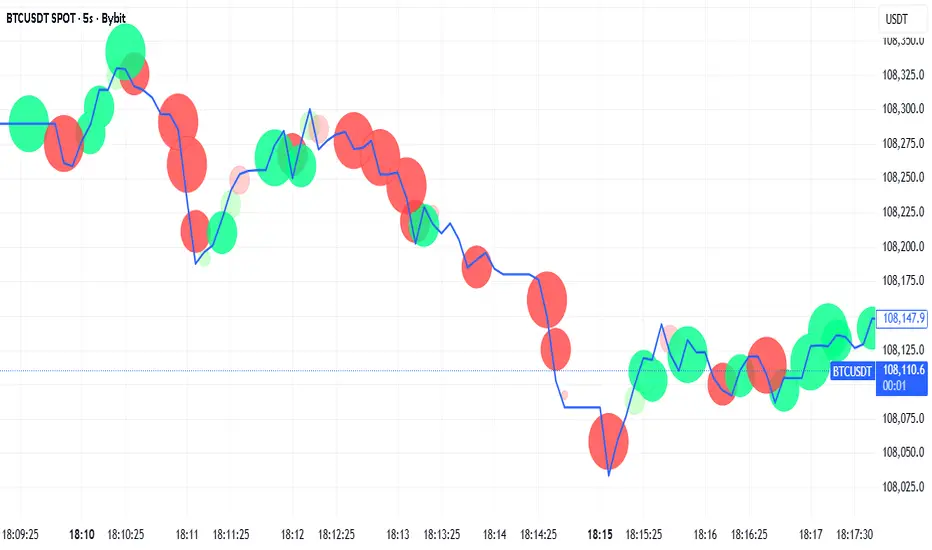
Tick-Based Delta Volume BubblesTICK-BASED DELTA VOLUME BUBBLES
OVERVIEW
A real-time order flow indicator that displays volume delta at the tick level, helping traders identify buying and selling pressure as it develops during live market hours. Unlike traditional volume delta indicators that rely on bar close data, this indicator captures actual tick-by-tick volume changes and directional bias, providing granular insight into market dynamics.
HOW IT WORKS
The indicator monitors live tick data during real-time trading by tracking volume increases between consecutive price updates. Each time volume increments, the script calculates the volume delta, determines price direction, assigns directional bias to the volume, and accumulates net delta for each bar.
This methodology is identical to the tick detection mechanism used in professional cumulative volume delta tools, ensuring accuracy and reliability.
FEATURES
Real-Time Tick Detection
- Captures genuine tick-by-tick volume flow using varip persistence
- Not estimated from OHLC data
- Processes actual market ticks as they occur
Adaptive Bubble Sizing
- Bubbles scale based on delta strength relative to a customizable moving average (default 20 bars)
- Highlights significant order flow imbalances
- Five size levels from tiny to huge
Dual Display Modes
- Normal Mode: Sized bubbles with optional volume labels positioned at bar midpoint
- Minimal Mode: Clean dots above/below bars for unobtrusive delta visualization
Flow Classification
- Aggressive Buy (bright green): Strong positive delta with greater than 1.2x strength
- Aggressive Sell (bright red): Strong negative delta with greater than 1.2x strength
- Passive Buy (light green): Moderate positive delta
- Passive Sell (light red): Moderate negative delta
Intensity Mode (Optional)
- Gray: Low intensity (less than 0.5x average)
- Blue: Medium intensity (0.5-1.0x average)
- Orange: High intensity (1.0-2.0x average)
- Red: Extreme intensity (greater than 2.0x average)
Smart Filtering
- Percentile-based filters (customizable) ensure only significant delta events are displayed
- Reduces chart clutter while highlighting important order flow
- Separate thresholds for bubble display and numeric labels
Data Collection Status
- Optional progress box in top-right corner
- Shows real-time bar collection progress
- Displays percentage completion and bars remaining
- Automatically hides when sufficient data is collected
Hide Until Ready Option
- Suppresses bubble display until the averaging period is complete
- Prevents misleading signals from incomplete data
- Default requires 20 bars before displaying bubbles
SETTINGS
Delta Average Length (1-200, default 20)
- Lookback period for calculating delta strength baseline
- Higher values = longer-term delta comparison
- Lower values = more sensitive to recent changes
Hide Bubbles Until Enough Data
- Prevents display until averaging period completes
- Ensures reliable delta strength calculations
Show Data Collection Status Box
- Displays progress indicator during initialization
- Can be disabled if you understand the warmup period
Minimal Mode
- Switches to simple dot display above/below bars
- Green dots above bars = positive delta
- Red dots below bars = negative delta
- Maintains color intensity or flow type classification
Show Bubbles
- Master toggle for bubble display
Bubble Volume Percentile (0-100, default 60)
- Minimum percentile rank required to display bubble
- Higher values = fewer, more significant bubbles
- Lower values = more bubbles displayed
Show Numbers in Bubbles
- Toggle delta value labels
- Only appears in normal mode
- Disabled automatically in minimal mode
Label Volume Percentile (0-100, default 90)
- Higher threshold for displaying numeric labels
- Typically set higher than bubble percentile
- Reduces label clutter on chart
Intensity Mode
- Switch from flow-type coloring to magnitude-based coloring
- Useful for identifying volume spikes regardless of direction
IMPORTANT NOTES
Real-Time Only: This indicator processes live tick data and does not provide historical analysis. It begins collecting data when added to a live chart.
Volume Required: Symbol must have volume data available. Will not function on symbols without volume (most forex pairs from retail brokers).
Initialization Period: Requires the specified number of bars (default 20) to calculate accurate delta strength. Use the "Hide Until Ready" option to prevent premature signals.
Market Hours: Only collects data during live market hours. Does not backfill historical data.
CREDITS
Tick detection methodology inspired by the Kioseff Trading Tick CVD indicator. This implementation adapts the same core tick-level volume delta calculation for bubble-style visualization and per-bar delta analysis.
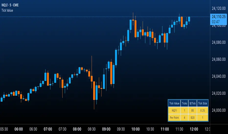
Futures Tick & Point Value [BoredYeti]Futures Tick & Point Value
This utility displays tick size, dollars per tick, and (optionally) a per-point row for the current futures contract.
Features
• Hardcoded $/tick map for common CME/NYMEX/CBOT/COMEX contracts
• Automatic fallback using pointvalue * mintick for any other symbol
• Table settings: adjustable position, text size, customizable colors
• Optional “Per Point” row showing ticks and $/point
Notes
• Contract specs can vary by broker/exchange and may change over time. Always confirm with official specifications.
• Educational tool only; not financial advice.
Tick Ratio Simulator - Advanced Market Sentiment IndicatorOverview
The Tick Ratio Simulator is a sophisticated market sentiment indicator that provides real-time insights into buying and selling pressure dynamics. This proprietary indicator transforms complex market microstructure data into actionable trading signals.
Key Features
Real-Time Sentiment Analysis: Captures instantaneous shifts in market momentum
Multi-Timeframe Adaptability: Customizable calculation periods for any trading style
Visual Clarity: Color-coded histogram with dynamic zone highlighting
Integrated Alert System: Pre-configured alerts for key market transitions
Performance Dashboard: Live metrics display for informed decision-making
Trading Applications
✓ Trend Confirmation: Validate existing trends with momentum analysis
✓ Reversal Detection: Identify potential turning points at extreme readings
✓ Entry/Exit Timing: Optimize trade execution with overbought/oversold zones
✓ Risk Management: Clear visual boundaries for position sizing decisions
Signal Interpretation
Extreme Zones (±75): High probability reversal areas
Standard Thresholds (±50): Traditional overbought/oversold levels
Zero Line Crossings: Momentum shift confirmations
Histogram Expansion/Contraction: Strength of directional bias
Customization Options
Adjustable calculation and smoothing periods
Fully customizable color schemes
Toggle histogram and reference lines
Real-time information table positioning
Alert Conditions
Four pre-built alert templates for automated notifications:
Momentum threshold breaches
Directional changes
Extreme zone entries
Custom level crossovers
Best Practices
Works exceptionally well when combined with:
Volume analysis
Support/resistance levels
Price action patterns
Other momentum oscillators
Note: This indicator uses proprietary calculations to simulate institutional-grade tick analysis without requiring actual tick data feeds. Results are optimized for liquid markets with consistent volume profiles.
For optimal results, adjust parameters based on your specific instrument and timeframe. Past performance does not guarantee future results.

VIX Filter/RSI/EMA Bias/Cum-TICK w/ Exhaustion Zone DashboardThis all-in-one dashboard gives intraday traders a real-time visual read of market conditions, combining volatility regime, trend bias, momentum exhaustion, and internal strength — all in a fully customizable overlay that won’t clutter your chart.
📉 VIX Market Regime Detector
Identifies "Weak", "Normal", "Volatile", or "Danger" market states based on customizable VIX ranges and symbol (e.g., VXN or VIX).
📊 RSI Momentum Readout
Displays real-time RSI from any selected timeframe or symbol, with adjustable length, OB/OS thresholds, and color-coded exhaustion alerts.
📈 EMA Trend Bias Scanner
Compares fast and slow EMAs to define bullish or bearish bias, using your preferred timeframe, symbol, and EMA lengths — ideal for multi-timeframe setups.
🧠 Cumulative TICK Pressure & Exhaustion Engine
Analyzes internal market strength using cumulative TICK data to classify conditions as:
-Strong / Mild Bullish or Bearish Pressure
-Choppy / No Edge
-⚠️ Exhaustion Zones — when raw TICK values hit extreme highs/lows, a separate highlight box appears in the dashboard, warning of potential turning points
All logic is customizable, including TICK symbol, timeframes, thresholds, and lookback periods.
Scalpers and day traders who want fast, visual insight into market internals, exhaustion, and trend bias.

$ADD LevelsThis Pine Script is designed to track and visualize the NYSE Advance-Decline Line (ADD). The Advance-Decline Line is a popular market breadth indicator, showing the difference between advancing and declining stocks on the NYSE. It’s often used to gauge overall market sentiment and strength.
1. //@version=5
This line tells TradingView to use Pine Script v5, the latest and most powerful version of Pine.
2. indicator(" USI:ADD Levels", overlay=false)
• This creates a new indicator called ” USI:ADD Levels”.
• overlay=false means it will appear in a separate pane, not on the main price chart.
3. add = request.security(...)
This fetches real-time data from the symbol USI:ADD (Advance-Decline Line) using a 1-minute timeframe. You can change the timeframe if needed.
add_symbol = input.symbol(" USI:ADD ", "Market Breadth Symbol")
add = request.security(add_symbol, "1", close)
4. Key Thresholds
These define the market sentiment zones:
Zone. Value. Meaning
Overbought +1500 Extremely bullish
Bullish +1000 Generally bullish trend
Neutral ±500 Choppy, unclear market
Bearish -1000 Generally bearish trend
Oversold -1500 Extremely bearish
5. Plot the ADD Line hline(...)
Draws static lines at +1500, +1000, +500, -500, -1000, -1500 for reference so you can visually assess where ADD stands.
6. Horizontal Threshold Lines bgcolor(...)
• Green background if ADD > +1500 → extremely bullish.
• Red background if ADD < -1500 → extremely bearish.
7. Background Highlights alertcondition(...)
• Green background if ADD > +1500 → extremely bullish.
• Red background if ADD < -1500 → extremely bearish.
8. Alert Conditions. alertcondition(...)
Lets you create automatic alerts for:
• USI:ADD being very high or low.
• Crosses above +1000 (bullish trigger).
• Crosses below -1000 (bearish trigger).
You can use these to trigger trades or monitor sentiment shifts.
Summary: When to Use It
• Use this script in a market breadth dashboard.
• Combine it with price action and volume analysis.
• Monitor for ADD crosses to signal potential market reversals or momentum.
TICK Extreme Levels & AlertsAutomatically draws horizontal lines at +1000 and -1000 TICK levels
Sends alerts when TICK crosses those levels (for potential scalping/reversal setups)
Strategy: How to Use TICK in Real-Time Trading
1. Confirm Market Breadth
Use TICK to confirm broad participation in the move:
• Long S&P futures or SPY? Only buy breakouts if TICK is above +600 to +1000
• Shorting? Confirm with TICK below –600 to –1000
2. Fade Extremes for Scalps
Look for reversals at extreme levels:
• Fade +1200+: market likely overbought short term → scalp short
• Fade –1200–: market likely oversold → scalp long
Use in combo with other signals (like price exhaustion, candlestick reversal, or VWAP touches)
3. Avoid Trading in the Choppy Zone
If TICK remains between –400 and +400, institutions are not committed. This is where fakeouts are common.
4. Time Entries with TICK Swings
For example:
• TICK moves from –800 to +600 = momentum shift → look for long entries
• TICK stalling around +1000 = momentum climax → partial profit or fade play

Cumulative Histogram TickThis script is designed to create a cumulative histogram based on tick data from a specific financial instrument. The histogram resets at the start of each trading session, which is defined by a fixed time.
Key Components:
Tick Data Retrieval:
The script fetches the closing tick values from the specified instrument using request.security("TICK.NY", timeframe.period, close). This line ensures that the script works with the tick data for each bar on the chart.
Session Start and End Detection:
Start Hour: The script checks if the current bar's time is 9:30 AM (hour == 9 and minute == 30). This is used to reset the cumulative value at the beginning of each trading session.
End Hour: It also checks if the current bar's time is 4:00 PM (hour == 16). However, this condition is used to prevent further accumulation after the session ends.
Cumulative Value Management:
Reset: When the start hour condition is met (startHour), the cumulative value (cumulative) is reset to zero. This ensures that each trading session starts with a clean slate.
Accumulation: For all bars that are not at the end hour (not endHour), the tick value is added to the cumulative total. This process continues until the end of the trading session.
Histogram Visualization:
The cumulative value is plotted as a histogram using plot.style_histogram. The color of the histogram changes based on whether the cumulative value is positive (green) or negative (red).
Usage
This script is useful for analyzing intraday market activity by visualizing the accumulation of tick data over a trading session. It helps traders identify trends or patterns within each session, which can be valuable for making informed trading decisions.

TICK+ [Pt]█ TICK+ – Advanced US Market Internals & TICK Distribution Tool
TICK+ is a comprehensive indicator that decodes US market internals by leveraging the TICK index—the net difference between stocks ticking up and those ticking down. Unlike many standard TICK tools that only plot raw values, TICK+ provides multiple visualization modes, dynamic moving averages, an independent MA Ribbon, a detailed distribution profile, divergence and pivot analysis, and real-time data tables. This integrated approach offers both visual and quantitative insights into intraday market breadth, trend sustainability, and potential reversals—making it an indispensable tool for trading US indices, futures, and blue‑chip stocks.
Market internals enthusiasts often consider the TICK index indispensable for trading these markets. By offering an immediate snapshot of sentiment and confirming trends through additional analytics, TICK+ gives traders a decisive edge—helping to determine whether a rally is truly supported by broad participation or if caution is warranted.
--------------------------------------------------------------------------------------------------------
█ Key Features:
► Market Internal – Multiple Display Modes:
Line Mode: Plots the TICK index as a continuous line for a clear view of real‑time values and trend direction.
Bar Mode: Uses traditional bar charts to represent the TICK index, emphasizing the magnitude of changes.
Heikin Ashi Mode: Applies the Heikin Ashi technique to smooth out fluctuations, making the underlying trend easier to discern.
Iceberg TICK Mode: Fills the area between zero and the highs in green, and between zero and the lows in red—highlighting how long the market remains in positive versus negative territory.
How It Works & Usage:
These display modes enable traders to select the visualization that best fits their analysis style. For instance, Iceberg TICK Mode highlights the duration of market strength or weakness, a critical factor for intraday directional assessment.
Comparison of Display Modes
► Dual Moving Average – Fast & Slow:
Computes two moving averages on the TICK index:
• Fast MA – reacts quickly to recent changes.
• Slow MA – confirms the overall trend.
Crossovers provide clear signals:
• Fast MA crossing above the slow MA indicates rising bullish momentum.
• Fast MA crossing below the slow MA indicates increasing bearish pressure.
How It Works & Usage:
These dual moving averages assist in detecting momentum shifts. Crossover signals can be used to time entries and exits to align with prevailing market sentiment.
Dual MA Crossover Example
► Moving Average / Smoothed MA – Smoothed & Base Moving Averages:
Calculates a Base MA and a Smoothed MA on the TICK index to reduce short‑term volatility.
Helps clarify the prevailing trend, providing additional confirmation alongside the dual moving averages.
How It Works & Usage:
These averages filter out noise and offer extra validation of the current trend, enhancing the reliability of trading signals.
Base and Smoothed MA Example
► Moving Average Ribbon – MA Ribbon:
Independently plots several moving averages together as a “ribbon,” each line customizable in length and type.
Visually reflects overall market directional strength:
• Consistent green color indicate sustained bullish conditions.
• Uniform red color indicate prevailing bearish sentiment.
How It Works & Usage:
The MA Ribbon provides a layered perspective on market internals. It enables traders to quickly gauge the robustness of a trend or identify early signs of a potential reversal.
MA Ribbon Trend and Shading
► Divergence - Pivot based – Divergence & Pivot Analysis:
Integrates divergence detection with pivot-based trendline analysis.
Identifies instances when the TICK index and price action diverge, serving as an early warning of a weakening trend.
How It Works & Usage:
Divergence signals help refine trade entries and exits by indicating potential trend reversals or adjustments in market sentiment.
Divergence Analysis
► TICK Distribution Profile – TICK Distribution Profile:
Divides the TICK index range into multiple bins to create a profile of how TICK values are distributed.
Identifies the point of control—the level where most TICK readings concentrate—relative to zero.
Allows adjustment of the lookback period to detect shifts in market bias, such as a move from a neutral zone toward extreme levels.
How It Works & Usage:
By visualizing the distribution of TICK readings, traders can monitor changes in market internals that may precede significant trend changes.
TICK Distribution Profile
► ZigZag – ZigZag:
Applies a zigzag algorithm to filter out minor fluctuations and identify significant swing highs and lows.
Highlights trend extremities and potential reversal points.
Offers an optional extension to the last bar for dynamic trend tracking.
How It Works & Usage:
The ZigZag feature helps traders focus on the major price swings that define market structure, eliminating the noise of insignificant movements.
ZigZag Example
► Pivot Trendline – Pivot Trendline:
Draws trendlines connecting pivot highs and pivot lows.
Provides settings to display only the most recent trendline or extend the last trendline.
Assists in identifying evolving support and resistance levels.
How It Works & Usage:
Pivot trendlines offer clear visual cues for key price levels and potential reversal zones, aiding in the timing of trades.
Pivot Trendline Example
► TICK Levels – TICK Levels:
Defines key thresholds for the TICK index, including neutral levels, trend zones, and overbought/oversold (OB/OS) extremes.
Highlights these levels to assist in identifying conditions that may trigger caution or present opportunities.
How It Works & Usage:
Marking these levels provides an immediate reference for assessing when the TICK index enters critical zones, guiding risk management and trade planning.
TICK Levels
► Background Color – Background Color:
Optionally changes the chart background based on TICK or moving average thresholds.
Provides additional visual cues regarding shifts in market sentiment.
How It Works & Usage:
Background color changes help reinforce key signals by immediately indicating shifts in market internals, enhancing overall situational awareness.
Background Color Example
► Data Tables – Data Table:
Displays essential market data in a single, easy-to-read table, including the TICK index source, market sentiment (e.g. Bullish, Bearish, or Neutral), trend status (such as Accelerating ⇗ or Retracing ⇘), and the current TICK value with color-coded strength.
Consolidates numerical data for a quick and precise assessment of market internals.
How It Works & Usage:
The data tables provide live, numerical feedback that complements the visual analysis, making it easy to monitor market sentiment and trend changes at a glance.
Data Table Display with Metrics
--------------------------------------------------------------------------------------------------------
█ Customization & Input Flexibility:
TICK+ offers extensive input options organized into feature‑specific groups, enabling traders to tailor the tool to various strategies:
► Market Internals Group:
Selects the primary TICK index source (with an optional custom override).
Provides a choice of display modes (Line, Bar, Heikin Ashi, Iceberg TICK) with configurable color schemes.
Includes options for iceberg overlays and highlighting.
► Moving Averages Groups (Dual, Smoothed/Base, MA Ribbon):
Dual MA group: Settings for fast and slow moving averages, including type, length, color, and crossover alerts.
Smoothed/Base MA group: Additional methods to filter out short‑term noise and confirm trends.
MA Ribbon group: Independently plots multiple moving averages as a ribbon, with full customization for each line.
► Divergence & Profile Groups:
Includes inputs for divergence detection (source, pivot lookback) and customization of the TICK Distribution Profile (lookback period, color thresholds, layout details).
► ZigZag & Pivot Trendline Groups:
Allows customization of zigzag parameters to highlight trend extremities.
Provides settings for pivot trendline appearance and behavior.
► TICK Levels & Background Colors:
Defines thresholds for neutral, trend, and extreme levels.
Offers color selections for level markers and optional background shading.
► Data Table Configuration:
Enables setting of table location, lookback intervals, and font size to present essential TICK metrics in a user‑friendly format.
--------------------------------------------------------------------------------------------------------
█ Additional Insights:
► TICK Index Fundamentals:
Monitors the net difference between stocks ticking up and down.
A positive reading indicates broader market participation, while a negative reading suggests increased selling pressure.
Understanding how long the TICK stays above or below zero is crucial for gauging intraday momentum.
► Role of Moving Averages:
Smooth out short‑term fluctuations, helping to highlight the prevailing trend.
Crossovers between fast and slow MAs can serve as clear signals for market momentum shifts.
► Interpreting the MA Ribbon:
Provides a layered perspective on market direction.
Consistent color and alignment confirm a strong trend, while variations may hint at reversals.
► Utility of the Distribution Profile:
Breaks down the TICK index into bins, identifying the point of control.
Changes in this control zone—particularly over different lookback periods—can signal potential trend changes.
► Precision of Data Tables:
Supplies live numerical feedback on key market internals, ensuring trading decisions are based on precise, real‑time measurements.
► Comparative Advantage:
Unlike many TICK tools that simply plot raw values, TICK+ provides an integrated, multidimensional analysis of market internals.
Its advanced features—ranging from unique display modes to sophisticated analytical components—make it indispensable for trading US indices, futures, and blue‑chip stocks.
--------------------------------------------------------------------------------------------------------
Disclaimer
This indicator is provided for educational and research purposes only and does not constitute financial advice. Trading involves risk, and thorough testing on historical data is recommended before applying any strategy using TICK+ in live markets.

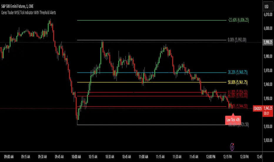
Ceres Trader NYSE Tick Indicator With Threshold AlertsThe Ceres Trader NYSE Tick Indicator provides real-time alerts for significant shifts in the NYSE Tick, empowering traders to identify potential overbought and oversold market conditions. It displays labels directly on the chart when the Tick reaches predefined thresholds, offering a clear and immediate visual representation of market sentiment.
Key Features:
Threshold-Based Alerts:
Highlights "High Tick" and "Low Tick" conditions when the Tick exceeds user-defined thresholds (default: 400 and -400).
Identifies "Extreme High Tick" and "Extreme Low Tick" conditions for more significant shifts (adjusted default: 800 and -800).
Visual Labels:
Displays colored labels directly on the price chart, indicating the type of Tick event and its value.
Green labels signal potential overbought conditions, while red labels indicate potential oversold conditions.
Low tick labels are placed below the price bar, and high tick labels are placed above the price bar for improved visibility.
Real-Time Data:
Utilizes the NYSE Tick symbol ("TICK") to provide up-to-the-minute market data.
User-Friendly Design:
Simple and intuitive design, suitable for traders of all experience levels.
How to Use:
Add the "Ceres Trader NYSE Tick Indicator with Threshold Alerts" to your TradingView chart.
Observe the colored labels that appear when the Tick reaches the specified thresholds.
Use these alerts to identify potential trading opportunities based on overbought or oversold market conditions.
Consider adjusting the threshold values within the indicator settings to align with your specific trading strategy.
TICK Indikator
English:
The TICK Indicator measures in real time the number of up ticking stocks minus the number of down ticking stocks on the New York Stock Exchange (NYSE). It can display either the current TICK value ("Normal" mode) or the cumulative TICK values over the trading day ("Cumulative" mode). Positive values indicate market strength, while negative values signal weakness. Colored bars visualize momentum: green shades for rising, red for falling values. The zero line acts as a reference between buying and selling pressure.
Interpretation:
> +1000 and/or continuos lows above 0 → strong buying pressure
< -1000 and/or continuos highs below 0 → strong selling pressure
Around 0 → balanced market
Deutsch:
Der TICK Indikator misst in Echtzeit die Anzahl der Aktien, die an der New York Stock Exchange (NYSE) steigen, minus der Anzahl der fallenden Aktien. Der Indikator kann im "Normal"-Modus den aktuellen TICK-Wert anzeigen oder im "Cumulative"-Modus die kumulierten TICK-Werte über den Tag hinweg summieren. Positive Werte deuten auf eine allgemeine Markstärke hin, während negative Werte Schwäche signalisieren. Farbige Balken visualisieren die Dynamik: grüne Töne bei steigenden, rote bei fallenden Werten. Die Nullinie dient als Referenzpunkt zwischen Kauf- und Verkaufsdruck.
Interpretation:
> +1000 und/oder mehrere aufeinander folgende Tiefs über 0 → starker Kaufdruck
< -1000 und/oder mehrere aufeinander folgende Hochs unter 0 → starker Verkaufsdruck
Nahe 0 → ausgeglichener Markt
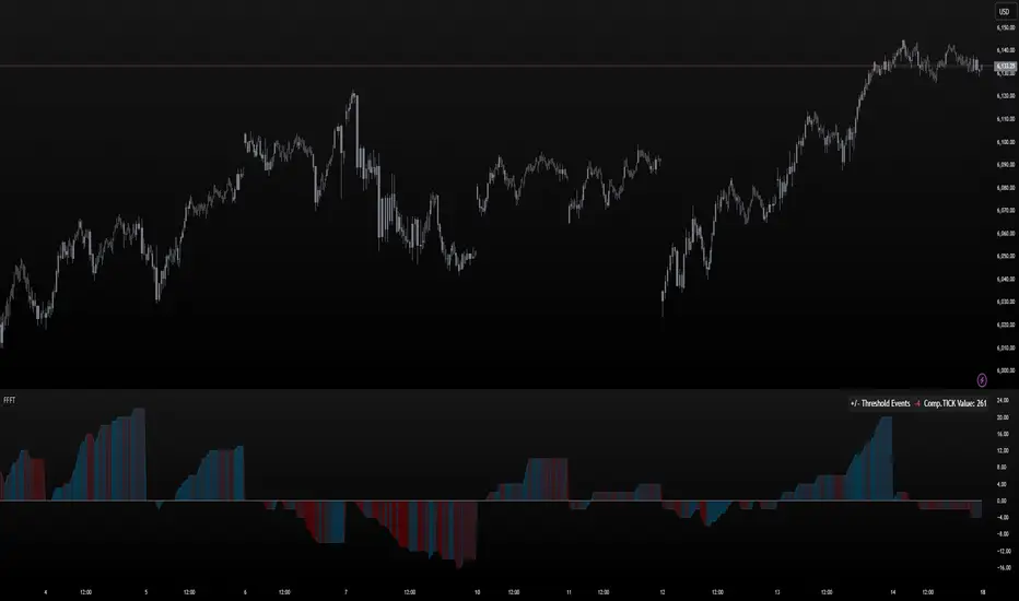
FoundryFutures Filtered Tick**Foundry Futures Filtered Tick (FFFT) – TradingView Indicator**
Overview
The Foundry Futures Filtered Tick (FFFT) is a market breadth indicator that filters out noise to track only significant tick events. Using a Custom Composite Cumulative Tick formula, it monitors buying and selling pressure during large events or waves of orders across exchanges. This gives traders a clearer view of market sentiment and momentum shifts throughout the trading day, without the distraction of minor tick movements.
Key Features
• Filters large tick events while ignoring minor fluctuations
• Tracks cumulative bullish/bearish threshold crossings ("Events") to highlight momentum shifts
• Uses dynamic color gradient visualization (red for selling, cyan for buying)
• Provides zero-line reference for directional bias
• Displays integrated real-time table for market context and large event tracking
How to Use
1. Add to favorites
2. Open chart, navigate to indicators tab > Favorites > Search "FoundryFutures Filtered Tick"
3. Apply to your chart
4. Select preferred market and begin using
Adjust Settings
• Set positive & negative thresholds to define meaningful tick events (Default +/-999)
• Customize line width and colors for better visibility if desired
• Interpret Signals above or below zero intraday as momentum shifts in sentiment across exchanges.
• Above zero & rising → Increasing bullish momentum
• Below zero & falling → Increasing selling pressure
• Frequent crossings → Potential market exhaustion or range bound activity
Risk Disclaimer & Release of Liability
Trading futures is highly speculative and involves substantial risk. The FFFT indicator does not predict market direction or guarantee profitability. It is for educational purposes only and should be used alongside proper risk management and independent analysis.
**By using this indicator, you acknowledge that:**
• You are solely responsible for your trading decisions
• Foundry Futures and its creator make no warranties or guarantees regarding accuracy or profitability
• You assume full responsibility for any financial losses incurred
• If you do not agree with these terms, do not use this indicator. Trade responsibly
Tick CVD [Kioseff Trading]Hello!
This script "Tick CVD" employs live tick data to calculate CVD and volume delta! No tick chart required.
Features
Live price ticks are recorded
CVD calculated using live ticks
Delta calculated using live ticks
Tick-based HMA, WMA, EMA, or SMA for CVD and price
Key tick levels (S/R CVD & price) are recorded and displayed
Price/CVD displayable as candles or lines
Polylines are used - data visuals are not limited to 500 points.
Efficiency mode - remove all the bells and whistles to capitalize on efficiently calculated/displayed tick CVD and price
How it works
While historical tick-data isn't available to non-professional subscribers, live tick data is programmatically accessible. Consequently, this indicator records live tick data to calculate CVD, delta, and other metrics for the user!
Generally, Pine Scripts use the following rules to calculate volume/price-related metrics:
Bullish Volume: When the close price is greater than the open price.
Bearish Volume: When the close price is less than the open price.
This script, however, improves on that logic by utilizing live ticks. Instead of relying on time-series charts, it records up ticks as buying volume and down ticks as selling volume. This allows the script to create a more accurate CVD, delta, or price tick chart by tracking real-time buying and selling activity.
Price can tick fast; therefore, tick aggregation can occur. While tick aggregation isn't necessarily "incorrect", if you prefer speed and efficiency it's advised to enable "efficiency mode" in a fast market.
The image above highlights the tick CVD and price tick graph!
Green price tick graph = price is greater than its origin point (first script load)
Red price tick graph = price is less than its origin point
Blue tick CVD graph = CVD, over the calculation period, is greater than 0.
Red tick CVD graph = CVD is less than 0 over the calculation period.
The image above explains the right-oriented scales. The upper scale is for the price graph and the lower scale for the CVD graph.
The image above explains the circles superimposed on the scale lines for the price graph and the CVD graph.
The image above explains the "wavy" lines shown by the indicator. The wavy lines correspond to tick delta - whether the recorded tick was an uptick or down tick and whether buy volume or sell volume transpired.
The image above explains the blue/red boxes displayed by the indicator. The boxes offer an alternative visualization of tick delta, including the magnitude of buying/selling volume for the recorded tick.
Blue boxes = buying volume
Red boxes = selling volume
Bright blue = high buying volume (relative)
Bright red = high selling volume (relative)
Dim blue = low buying volume (relative)
Dim red = low selling volume (relative)
The numbers displayed in the box show the numbered tick and the volume delta recorded for the tick.
The image above further explains visuals for the CVD graph.
Dotted red lines indicate key CVD peaks, while dotted blue lines indicate key CVD bottoms.
The white dotted line reflects the CVD average of your choice: HMA, WMA, EMA, SMA.
The image above offers a similar explanation of visuals for the price graph.
The image above offers an alternative view for the indicator!
The image above shows the indicator when efficiency mode is enabled. When trading a fast market, enabling efficiency mode is advised - the script will perform quicker.
Of course, thank you to @RicardoSantos for his awesome library I use in almost every script :D
Thank you for checking this out!

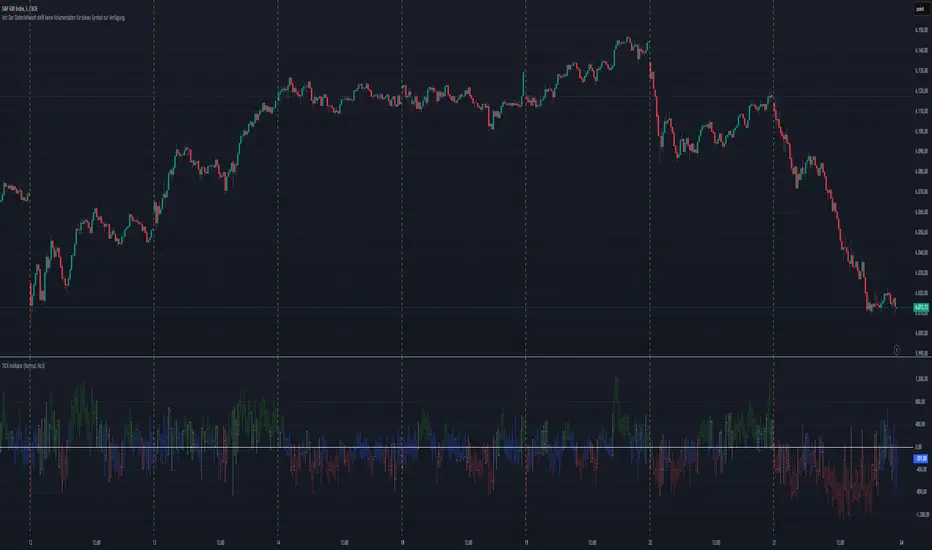
NYSE TickThe NYSE Tick indicator is a market breadth indicator used to determine short-term bullish or bearish market sentiment. The NYSE Tick index compares the number of stocks on the New York Stock Exchange that are ticking up to the number of stocks ticking down at a specific moment in time. When the NYSE Tick is hovering around the zero line, roughly the same number of stocks are ticking up as are ticking down. When the overall market is rising it will usually present on the NYSE Tick as a rise in value that will generally stay mostly above the zero line for a period of time. The opposite is true when the general market is falling and can be seen as the NYSE Tick staying mostly below the zero line. This information can be very helpful for a short-term day trader who trades a market that also follows many of these same stocks, like the E-Mini S&P 500 Futures (ES), for example. While the index can theoretically rise or fall to over ±2,000 if all stocks on the NYSE are ticking up or down at the same time, it’s generally considered an extreme movement if the NYSE Tick is ±1,000. For this reason, the indicator has default reference lines at ±1,000 and halfway marks at ±500. In order to partially smooth out the movement and make movement trends more easily read, the indicator plots the values using Heikin Ashi candles instead of the standard bars or candlesticks. The price-line value displayed is an accurate live value, however, rather than the OHLC average value of a standard Heikin Ashi candle. Since the standard hours for the NYSE are Monday – Friday, 09:30 – 16:00 EST, the indicator only plots bars during this time.

Custom Time Frame (CTF)This indicator allows users to create their own arbitrary time frames for chart analysis. It features a moving average, providing an additional layer of analysis, and offers flexibility through various open settings.
In terms of user settings and usage, the indicator provides several options. Users can choose their interval style, opting for either tick-based or time-based intervals. This flexibility allows for a more granular approach to data analysis, catering to different trading strategies and preferences. The number of ticks or the amount of time for each candle can be adjusted, enabling traders to set the granularity of the data to their liking. Color settings are also customizable, with options for setting colors for bullish and bearish indicators, adding a visual dimension to the analysis.
The average line parameters are an important aspect of this indicator. Users can adjust the length, ripple, type, color, and line width of the average line. The ripple setting, in particular, impacts the smoothness of the filter. With type II setting, the smoothing is increased, making it suitable for traders who prefer a more smoothed out moving average. Conversely, the type I setting decreases the smoothing, which might be preferred by those who want a more responsive indicator.
The use of the Chebyshev filter is a significant feature of this indicator. This filter is chosen for its high-performance smoothing capabilities with minimal data requirements. This ensures that the moving average appears quickly and accurately, which is crucial in real-time chart analysis. An important point to note is that when the moving average is enabled, it decreases the maximum number of candles that can be displayed on the chart. However, this is offset by the enhanced analytical precision provided by the moving average.
In summary, this indicator is especially beneficial for traders without access to premium accounts. It offers the capability to create low or custom time frame charts. The flexibility in settings, coupled with the inclusion of a Chebyshev filter for the moving average, makes it a versatile and valuable tool for detailed market analysis. It caters to a wide range of trading styles and strategies, making it a useful addition to any trader's toolkit.

Tick Volume Direction IndicatorTick Volume Direction Indicator
This indicator captures:
• tick volume
• tick direction
The settings are as follows:
• volume or base currency value selection.
• label distance (away from the low of the candle).
• Tick volume - on/off switch for tick volume.
• label size.
• Up tick move color.
• tick move absorbed - when the tick doesn't change position.
• Down tick move.
On the first initial load, it will have the existing volume data as "?" as tradingview doesn't have a history of each tick.
Be aware, any settings change you make will refresh the tick data from start.
This indicator is one of the best real-time ways of seeing buying and selling pressure.
Market Internals Candles AIOThis indicator provides top down review of all major market internals for NYSE (currently).
ADD - stocks price advancing or declining against prior days range
VOLD - stocks volume in advancing or declining
TRIN - momentum in the market, somewhat of a "macd" for the broad market
TICK - miniscule price fluctuations by tick measurements, up ticks vs down ticks
Each internal has been converted to a % based format in order to have them all on the same scale, otherwise this indicator couldn't exist and be useful.
Customization allows for toggling metrics information that displays ratio data, can also add % measurement in when not using price scale values.
User can also enjoy simplicity of adding built in SMAs and adjusting lengths for individual internals.
Color management is built in also, with transparency support and toggling internals off will automatically hide SMAs and metrics data.
Usage of the internals is nuanced but in general a trend assessment could be derived from this display for credit selling or directional bias, my other indicator MIT would be better for scalping utilizing the TICK histogram.
When ADD and VOLD are reading over 50% that's a strong buy trend, -50% would be a strong selling trend.
Use TRIN to see when there's a potential for overbought or oversold given price and volume broad market readings, TRIN isn't to be trusted in isolation and other information should be considered.
TICK is most useful for fading in a balanced market, or joining a trend with a TICK pullback (buy negative %s when up trending, or sell positive %s when down trending).
I hope you find this comprehensive display useful in your trading journey and don't forget to check out some of my other market internals indicators.

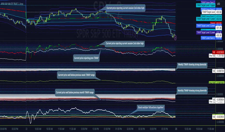
Tick Weighted Average Price %BTick Weighted Average Price %B
"TiWAP %B" is an indicator that tracks the NYSE TICK by default and plots price location in relation to the tick weighted average price based only off of extreme TICK movement. NASDAQ TICK is also supported and future updates may add others if they provide value, or if requested.
This utilizes same calculation as TiWAP indicator already published, but removes the need to have it overlaying price to keep things tidy :)
What makes this different?
Quite simply there isn't another indicator that plots weighted average price based on TICK movement as done here, this is showing the correlation between the entire markets volatile price movement and the charted security. It provides a sense of established fair value given the entire NYSE/NASDAQ, given the automated nature of the markets there's a strong correlation between highly liquid ETFs/Indexes and the whole market.
How to use
As price is affected by NYSE the study will reveal location of price as it relates to TiWAP, use location to find reversals from rejections or bounces of standard deviations.
As price is affected by market volatility look to see the weighted price adjust to actual price and combine with other trading strategies to take advantage of the data. Rejections and bounces near standard deviations as well as the weighted average price line can provide excellent trade setups, or they could be utilized in advanced options strategies such as straddles, strangles, iron condors, etc.
Anchor points can be utilized to track how the market is adjusting broad value for the week, month, quarter, etc. The higher timeframe based anchor points will need higher periods for the chart or a max bars lookback error may occur.
Sensitivity should be adjusted as changes in TICK occur, this is commonly correlated with NYSE adjustments but the tooltip provides some guidance on value selection based on current conventional wisdom.
Show Target Level Relation
Turn on "Show Target Level Relation" to observe how current price is moving in relation to previous TiWAP range. For example if %B is configured for session, enabling this feature will reveal price rejecting and reclaim aspects of previous session %B range, works on any anchorage selected so long as resolution permits.
Fill %B As Cloud
By special request, this will render %B as a sentiment cloud which will aid in quick review of price to TiWAP relation being in buy side or sell side ranges, use this to easily spot exhaustion or continuation.
Markets
TICK tracks the entire market and as such whatever the entire market is doing will most likely apply to any individual security charted so give this a shot with anything you trade and let me know your results :)
Usage Conditions
Currently I'm finding the most success with this weighted average price on various intra-day timeframes, but anchored on weekly or higher and utilizing other timeframes may net some interesting swing trading opportunities.
Special thanks to MrChach for the original idea as well as discussions and debugging sessions :)
Candle Tick SizeHello everyone!
I dont think it exists, I couldnt find it any way I searched, maybe it is part of a bigger indicator. This is a really basic code, all it does, it shows the tick/pip size of the candles forming. You can adjust on how many candles should it show. Also because the code counts the point size of the candles from high to low, you can adjust that how many ticks are in one point, like for ES and NQ 4 ticks to a point, which is the basic setting. It helps me with entrys when I calculate the contract size so my risk/reward stays pretty much the same depending on the candle size for my entrys.
TICK Strength Background ShadeThis indicator shades the background of each candle based on the strength off the current TICK.US chart. User can define the strength levels, which are by default set to 1-299 (lightest), 300-599, and 600+ (darkest). Best used on lower timeframe charts to help identify whether or not to remain in a trend, or if a trend is possibly reversing when you start to see the opposite color begin to appear following a trend.

Cumulative TICK [Pt]Cumulative TICK Indicator, shown as the bottom indicator, is a robust tool designed to provide traders with insights into market trends using TICK data. This indicator visualizes the cumulative TICK trend in the form of colored columns on a separate chart below the main price chart.
Here's an overview of the key features of the Cumulative TICK Indicator:
1. Selectable TICK Source 🔄: The indicator allows users to choose from four different TICK data sources, namely USI:TICK , USI:TICKQ , USI:TICKI , and $USI:TICKA.
2. TICK Data Type Selection 🎚️: Users can select the type of TICK data to be used. The options include: Close, Open, hl2, ohlc4, hlc3.
3. Optional Simple Moving Average (SMA) 📊: The indicator offers an option to apply an SMA to the Cumulative TICK values, with a customizable length.
4. After-hour Background Color 🌙: The background color changes during after-hours to provide a clear distinction between regular and after-hour trading sessions.
🛠️ How it Works:
The Cumulative TICK Indicator uses TICK data accumulated during the regular market hours (9:30-16:00) as per the New York time zone. At the start of a new session or at the end of the regular session, this cumulative TICK value is reset.
The calculated Cumulative TICK is plotted in a column-style graph. If the SMA is applied, the SMA values are used for the column plots instead. The columns are colored green when the Cumulative TICK is positive and red when it is negative. The shades of green and red vary based on whether the Cumulative TICK is increasing or decreasing compared to the previous value.
This is a simple yet powerful tool to track market sentiment throughout the day using TICK data. Please note that this indicator is intended to be used as part of a comprehensive trading strategy. Always ensure you are managing risk appropriately and consulting various data sources to make informed trading decisions.