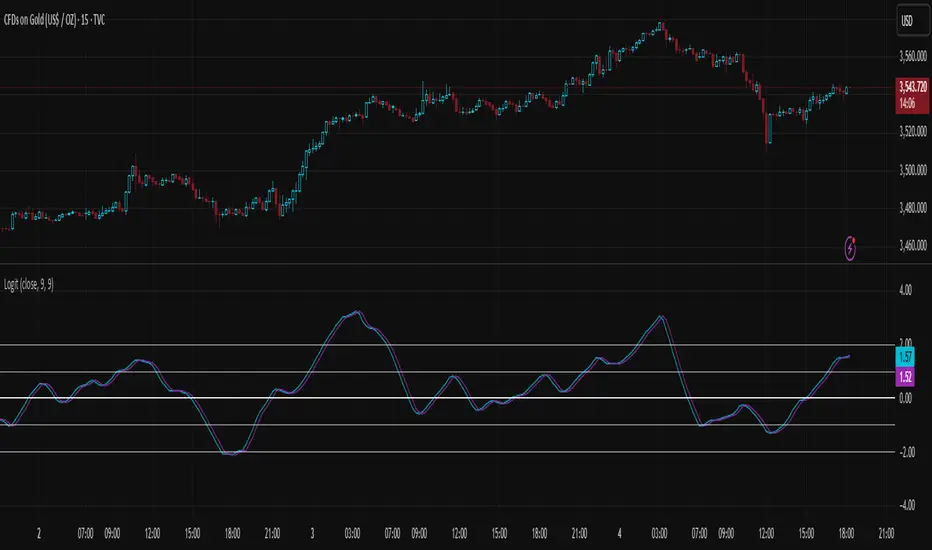
Logit Transform -EasyNeuro-Logit Transform
This script implements a novel indicator inspired by the Fisher Transform, replacing its core arctanh-based mapping with the logit transform. It is designed to highlight extreme values in bounded inputs from a probabilistic and statistical perspective.
Background: Fisher Transform
The Fisher Transform, introduced by John Ehlers , is a statistical technique that maps a bounded variable x (between a and b) to a variable approximately following a Gaussian distribution. The standard form for a normalized input y (between -1 and 1) is F(y) = 0.5 * ln((1 + y)/(1 - y)) = arctanh(y).
This transformation has the following properties:
Linearization of extremes:
Small deviations around the mean are smooth, while movements near the boundaries are sharply amplified.
Gaussian approximation:
After transformation, the variable approximates a normal distribution, enabling analytical techniques that assume normality.
Probabilistic interpretation:
The Fisher Transform can be linked to likelihood ratio tests, where the transform emphasizes deviations from median or expected values in a statistically meaningful way.
In technical analysis, this allows traders to detect turning points or extreme market conditions more clearly than raw oscillators alone.
Logit Transform as a Generalization
The logit function is defined for p between 0 and 1 as logit(p) = ln(p / (1 - p)).
Key properties of the logit transform:
Maps probabilities in (0, 1) to the entire real line, similar to the Fisher Transform.
Emphasizes values near 0 and 1, providing sharp differentiation of extreme states.
Directly interpretable in terms of odds and likelihood ratios: logit(p) = ln(odds).
From a statistical viewpoint, the logit transform corresponds to the canonical link function in binomial generalized linear models (GLMs). This provides a natural interpretation of the transformed variable as the logarithm of the likelihood ratio between success and failure states, giving a rigorous probabilistic framework for extreme value detection.
Theoretical Advantages
Distributional linearization:
For inputs that can be interpreted as probabilities, the logit transform creates a variable approximately linear in log-odds, similar to Fisher’s goal of Gaussianization but with a probabilistic foundation.
Extreme sensitivity:
By amplifying small differences near 0 or 1, it allows for sharper detection of market extremes or overbought/oversold conditions.
Statistical interpretability:
Provides a link to statistical hypothesis testing via likelihood ratios, enabling integration with probabilistic models or risk metrics.
Applications in Technical Analysis
Oscillator enhancement:
Apply to RSI, Stochastic Oscillators, or other bounded indicators to accentuate extreme values with a well-defined probabilistic interpretation.
Comparative study:
Use alongside the Fisher Transform to analyze the effect of different nonlinear mappings on market signals, helping to uncover subtle nonlinearity in price behavior.
Probabilistic risk assessment:
Transforming input series into log-odds allows incorporation into statistical risk models or volatility estimation frameworks.
Practical Considerations
The logit diverges near 0 and 1, requiring careful scaling or smoothing to avoid numerical instability. As with the Fisher Transform, this indicator is not a standalone trading signal and should be combined with complementary technical or statistical indicators.
In summary, the Logit Transform builds upon the Fisher Transform’s theoretical foundation while introducing a probabilistically rigorous mapping. By connecting extreme-value detection to odds ratios and likelihood principles, it provides traders and analysts with a mathematically grounded tool for examining market dynamics.
Statistics
Artharjan NSE Sectors Relative Strength DashboardArtharjan NSE Sectors Relative Strength Dashboard
This script provides a comprehensive dashboard for analyzing the relative strength of NSE sectors compared to a benchmark index (default: NIFTY). It is designed to give traders and investors a consolidated snapshot of sector performance, momentum, and short-term trend strength — all in one visual table.
Core Purpose
The goal is to simplify sector rotation analysis by combining relative strength, rate of change, momentum, and trend classification into a sortable, color-coded dashboard. Instead of scanning multiple charts, users can rely on this single panel for quick decision-making.
Key Features
Benchmark Comparison
Every sector is measured against the benchmark index (default: NIFTY). This allows users to spot outperforming or underperforming sectors relative to the market.
Multiple Performance Metrics
LTP % Change: Last traded price percentage change from the prior close.
RS Score: Relative strength score over a user-defined lookback.
Momentum (ROC Difference): Convergence/divergence between two ROC values for added confirmation.
ROC1 / ROC2: Short- and medium-term rate-of-change measures.
Trend Classification Engine
Each sector is tagged as Ultra Bullish, Bullish Breakout, Strong/Moderate Bullish, Neutral, Moderate/Strong Bearish, Bearish Breakdown, or Ultra Bearish. This classification is based on sectoral price behavior and candlestick relationships.
Sorting & Customization
Users can sort the dashboard by any metric (e.g., RS Score, % Change, Momentum), in ascending or descending order, to highlight what matters most for their strategy.
Table Presentation
Adjustable text size, thickness, and positioning on the chart.
Optional color-coded cells for visual cues — green shades for strength, red shades for weakness, neutral shades for sideways trends.
“Last Updated” timestamp for clarity on when the snapshot was generated.
How It Helps
This tool reduces the noise of flipping through individual sector charts. Traders can identify sector leadership, monitor momentum shifts, and catch early signs of rotation without leaving a single chart window. It acts as both a macro lens (sector overview) and a micro tool (spotting exact strength/weakness transitions).
Closing Note
This dashboard was built with a simple goal: to bring clarity to complex sectoral movements. Use it as a guiding compass while respecting your broader trading or investing framework.
With Thanks,
Rrahul Desai
@Artharjan

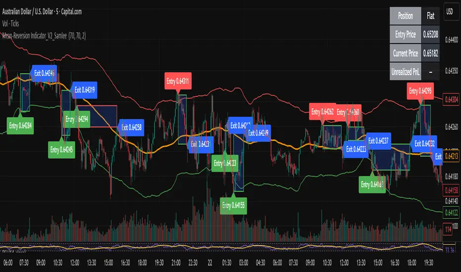
Mean-Reversion Indicator_V2_SamleeOverview
This is the second version of my mean reversion indicator. It combines a moving average with adaptive standard deviation bands to detect when the price deviates significantly from its mean. The script provides automatic entry/exit signals, real-time PnL tracking, and shaded trade zones to make mean reversion trading more intuitive.
Core Logic
Mean benchmark: Simple Moving Average (MA).
Volatility bands: Standard deviation of the spread (close − MA) defines upper and lower bands.
Trading rules:
Price breaks below the lower band → Enter Long
Price breaks above the upper band → Enter Short
Price reverts to MA → Exit position
What’s different vs. classic Bollinger/Keltner
Bandwidth is based on the standard deviation of the price–MA spread, not raw closing prices.
Entry signals use previous-bar confirmation to reduce intrabar noise.
Exit rule is a mean-touch condition, rather than fixed profit/loss targets.
Enhanced visualization:
A shaded box dynamically shows the distance between entry and current/exit price, making it easy to see profit/loss zones over the holding period.
Instant PnL labels display current position side (Long/Short/Flat) and live profit/loss in both pips and %.
Entry and exit points are clearly marked on the chart with labels and exact prices.
These visualization tools go beyond what most indicators provide, giving traders a clearer, more practical view of trade evolution.
Key Features
Automatic detection of position status (Long / Short / Flat).
Chart labels for entries (“Entry”) and exits (“Exit”).
Real-time floating PnL calculation in both pips and %.
Info panel (top-right) showing entry price, current price, position side, and PnL.
Dynamic shading between entry and current/exit price to visualize profit/loss zones.
Usage Notes & Risk
Mean reversion may underperform in strong trending markets; parameters (len_ma, len_std, mult) should be validated per instrument and timeframe.
Works best on relatively stable, mean-reverting pairs (e.g., AUDNZD).
Risk management is essential: use independent stop-loss rules (e.g., limit risk to 1–2% of equity per trade).
This script is provided for educational purposes only and is not financial advice.
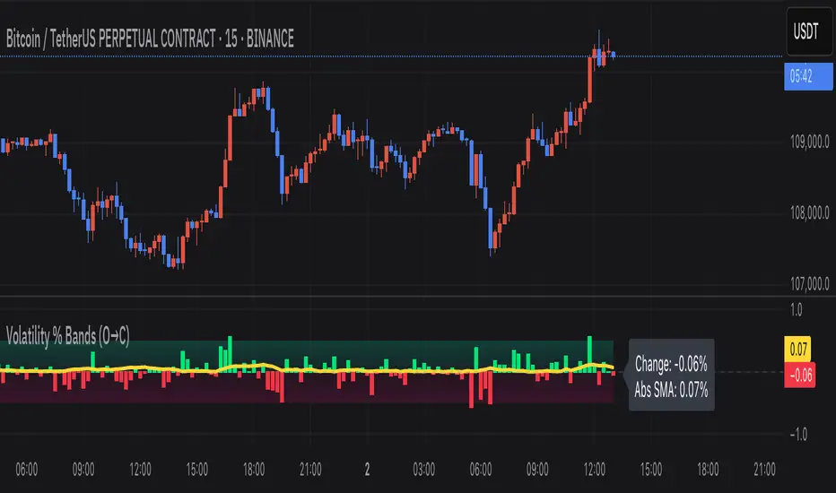
Volatility % Bands (O→C)Volatility % Bands (O→C) is an indicator designed to visualize the percentage change from Open to Close of each candle, providing a clear view of short-term momentum and volatility.
**Histogram**: Displays bar-by-bar % change (Close vs Open). Green bars indicate positive changes, while red bars indicate negative ones, making momentum shifts easy to identify.
**Moving Average Line**: Plots the Simple Moving Average (SMA) of the absolute % change, helping traders track the average volatility over a chosen period.
**Background Bands**: Based on the user-defined Level Step, ±1 to ±5 zones are highlighted as shaded bands, allowing quick recognition of whether volatility is low, moderate, or extreme.
**Label**: Shows the latest candle’s % change and the current SMA value as a floating label on the right, making it convenient for real-time monitoring.
This tool can be useful for volatility breakout strategies, day trading, and short-term momentum analysis.
Machine Learning Z-Score Buy and Sell [SS]Hey everyone,
Releasing this Z-Score based buy and sell indicator.
What it does
This indicator:
Uses Z-score and trend to identify potential buy and sell areas.
Signals those buy and sell areas and provides a target price based on the mean.
Plots the target price for buy and sell signals as a red line (for sell signals) or green line (for buy signals).
Has some "machine learning" aspects, namely, it is able to auto select its lookback length based on its analysis of the trend using Pienscript's trend correlation function iterated over multiple lengths, in order for the indicator to identify:
a) The strongest trend; and
b) The correct target price
What is Z-Score
Z-Score is a measure of the mean. Thus, this is a mean reverting type strategy, as it uses z-score to determine price's distance from the mean (or a Z-Score of 0) and then it looks at historic deviations from the mean to signal the buy and sell signals (i.e. how far has price traditionally drifted from the mean before reverting).
Z-Score is a powerful tool in this sense, and if you folow my other indicators, you will know how much I love Z-score!
How to use the indicator
If you want to use the full Machine Learning capabilities of the indicator, its best to just leave all default settings. These default settings will automatically adjust the mean target price and buy and sell signals to align with the current price action.
If you want to be more aggressive in your
Target Price; and
Signals
Then you can opt to manually input a lookback length and mean reversion standard deviation. However, I generally suggest to avoid this as you are then making your own determination of trend by qualitative assessment. It can work, but its just not suggested.
In the input menu, you will see the option to "Manually select lookback" thus over-riding the auto-determination of trend and targets.
You will also see "manual pullback" enabler and "Pullback Standard Deviation". You can set your pullback standard deviation if you want to be more aggressive. The indicator will naturally shift to conservative target prices based on a neutral mean. However, if you want to increase the aggressiveness of the target price, you can increase or decrease the pullback standard deviation.
General Tips about Manually Adjusting Pullback Target
Here are some tips if you want to manually adjust the pullback targets:
The pullback target needs to be in a standard deviation value, this can be anywhere from 0 to 4 or 0 to -4 (you can theoretically go higher but its not really realistic). You can also do decimals, so 1.5 or 1.25 etc.
To determine whether you should be doing negative or positive standard deviation, you should determine the trend. If it is a downtrend and you are looking to short the rips, you will want to select a negative number, like -1.
If it is an uptrend and you want to buy the dips, you should be selecting a positive number, like 1 or 1.5.
Again, I do suggest leaving the indicator to decide for itself, but the options are there for those who wish.
Overall strategy
This is a mean reverting strategy. So if you are a mean reversion trader, this may be of particular interest to you.
Optional
Optionally, you can have the indicator plot the target prices or not, simply toggle this functionality off or on in the settings menu.
Concluding remarks
That is the indicator in a nutshell!
I hope you enjoy it and find it helpful.
Feel free to check out my other Z-Score based indicators if you find this interesting or want to learn more about the power of Z-Score in trading!
Thanks all and safe trades!

Price-Volume RelationshipVolume is the relationship between price and performance. Set the candlestick quantity in the settings. It analyzes price and volume based on the number of candlesticks you specify to determine price expectations.

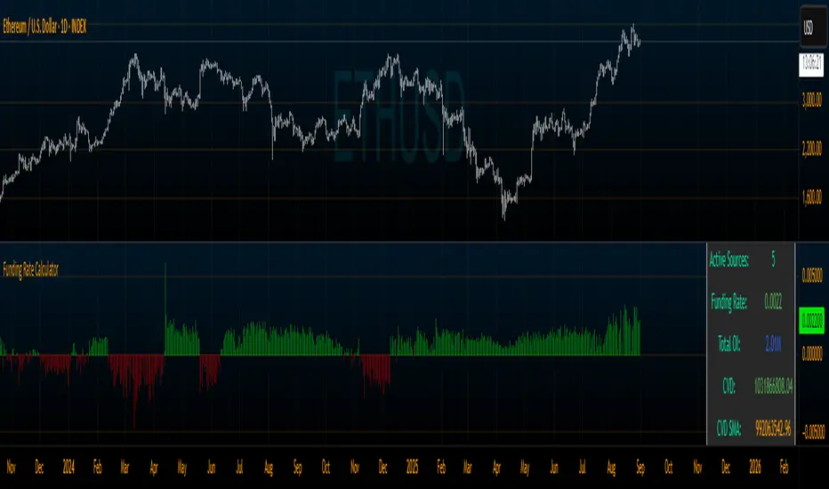
Derivative Dynamics Indicator [MarktQuant]The Derivative Dynamics Indicator is a versatile technical indicator that combines several critical metrics used in cryptocurrency and derivatives trading. It helps traders understand the relationship between spot prices, perpetual contract prices, trading volume pressure, and open interest across multiple exchanges. This indicator provides real-time visualizations of:
Funding Rate : The cost traders pay or receive to hold perpetual contracts, indicating market sentiment.
Open Interest (OI) : The total value of outstanding derivative contracts, showing market activity.
Cumulative Volume Delta (CVD) : A measure of buying vs. selling pressure over time.
Additional Data: Includes customizable options for volume analysis, smoothing, and reset mechanisms.
Key Features & How It Works
1. Metric Selection
You can choose which main metric to display:
Funding Rate: Shows the current funding fee, reflecting market sentiment (positive or negative).
CVD: Tracks buying vs. selling pressure, helping identify trend strength.
Open Interest: Displays total outstanding contracts, indicating market activity levels.
2. Volume Data Validation
The script checks if the selected chart includes volume data, which is essential for accurate calculations, especially for CVD. If volume data is missing or zero for multiple bars, it warns you to verify your chart setup.
3. CVD Calculation Methods
You can select how the CVD (Cumulative Volume Delta) is calculated:
Basic: Uses candle open and close to estimate whether buying or selling pressure dominates.
Advanced: Uses a money flow multiplier considering price position within high-low range, generally more accurate.
Tick Estimation: Uses percentage price change to estimate pressure.
You can also choose to display a smoothed version of CVD via a Simple Moving Average (SMA) to better visualize overall trends.
4. CVD Reset Option
To prevent the CVD value from becoming too large over long periods, you can set the indicator to reset periodically after a specified number of bars.
5. CVD Scaling
Adjust the scale of CVD values for better visibility:
Auto: Automatically adjusts based on magnitude.
Raw: Shows raw numbers.
Thousands/Millions: Divides the CVD values for easier reading.
Funding Rate Calculation
The indicator fetches data from multiple popular exchanges (e.g., Binance, Bybit, OKX, MEXC, Bitget, BitMEX). You can select which exchanges to include.
It calculates the funding rate by taking the mean of spot and perpetual prices across selected exchanges.
Open interest is fetched similarly and scaled according to user preferences (auto, millions, billions). It indicates the total amount of open contracts, providing insight into market activity intensity.
Visualizations & Data Presentation
Funding Rate: Shown as colored columns—green for positive (bullish sentiment), red for negative (bearish sentiment).
Open Interest: Displayed as a line, showing overall market activity.
CVD & SMA: Plotted as lines to visualize buying/selling pressure and its smoothed trend.
Information Table: Located at the top right, summarizes:
Current base currency
Number of active sources (exchanges)
Calculated funding rate
Total open interest
Current CVD and its SMA
Last delta (buy vs. sell pressure)
How to Use It
Select Metrics & Exchanges: Choose which data you want to see and from which exchanges.
Adjust Settings: Tweak CVD calculation method, SMA length, reset interval, and scaling options.
Interpret Visuals:
A positive funding rate suggests traders are paying long positions, often indicating bullish sentiment.
Negative funding rates can indicate bearish market sentiment.
Rising CVD indicates increasing buying pressure.
Open interest spikes typically mean increased market participation.
Important Notes
The indicator relies on the availability of volume data for accurate CVD calculation.
Always verify that the exchanges and symbols are correctly set and supported on your chart.
Use the combined insights from funding rates, CVD, and open interest for a comprehensive market view. This tool is designed for research purposes only.

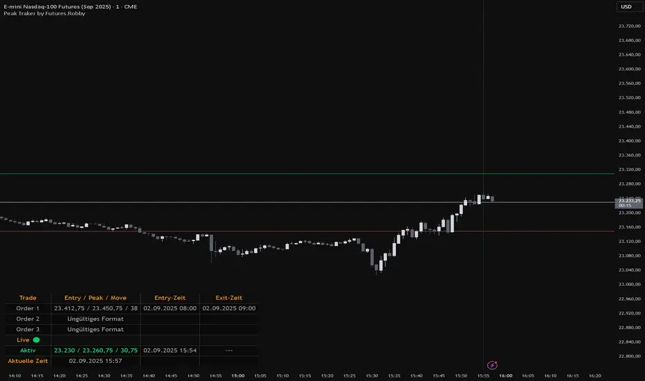
Peak Traker by Futures.RobbyOverview
Peak Tracker is a specialized tool designed to assist traders in proprietary trading challenges. Its main purpose is to help you identify and track the maximum value (the "peak") within an active trade. This is crucial for keeping an eye on your trailing drawdown and avoiding rule violations. The indicator visualizes up to three separate trade windows and provides all necessary data in a clear table.
Key Features
Trailing Drawdown Tracking: The primary function of this indicator is to accurately track the peak value from your entry point to your exit. This helps you minimize the risk of violating drawdown rules in your funding challenge.
Visual Representation: It draws vertical lines for the entry (green) and exit (red) points directly on the chart. This clearly visualizes the exact time frames that are relevant for managing your drawdown.
Dynamic Real-Time Tracking: Within an active trade window, the indicator continuously tracks the highest price reached (Peak) while the entry price (Entry) remains fixed. This allows you to calculate your current drawdown at any moment.
Clear Data Table: A customizable table provides all relevant information at a glance: Trade ID, Entry/Peak prices, and exact timestamps for entry and exit. The numbers are formatted for easy reading using the German number style (e.g., 12.345,67).
Flexible Input: The indicator supports various date and time formats (17:47:00, 2025-08-30 17:14:00, 27.08.25 15:00). The time zone is automatically converted from your local time to the chart's time for precise line placement.
How to Use
Add the indicator to your chart.
Open the indicator's settings (⚙️).
Under "Datums- und Zeit-Eingaben," enter the desired time frames for your trades.
The indicator updates in real time, showing your trade's progress.
Conclusion
This indicator is an essential tool for any trader participating in prop firm challenges who needs a precise method to monitor their trailing drawdown. It provides clarity and visual support to help you avoid rule violations and maximize your chances of success.
Simple MADSimple MAD is a lightweight and customizable indicator that calculates the Median Absolute Deviation (MAD) over a configurable period to measure market volatility. It dynamically displays Stop-Loss (SL) and Take-Profit (TP) levels based on MAD multipliers, both in absolute price and percentage terms.
The indicator includes a clean, watermark-style table with full layout controls — allowing you to adjust position, text size, alignment, and colors. It supports both manual entry price and automatic use of the latest close, making it ideal for traders who want to manage risk with precision and clarity.
Perfect for swing traders, volatility-based strategies, and anyone looking to integrate MAD into their decision-making.

Date Range Performance
Calculates total change and percentage change between two dates.
Computes average change per bar and per day.
Offers arithmetic and geometric daily %.
Supports auto mode (last N trading days) and manual date range.
Displays results as a watermark on the chart.

EMA Percentile Rank [SS]Hello!
Excited to release my EMA percentile Rank indicator!
What this indicator does
Plots an EMA and colors it by short-term trend.
When price crosses the EMA (up or down) and remains on that side for three subsequent bars, the cross is “confirmed.”
At the moment of the most recent cross, it anchors a reference price to the crossover point to ensure static price targets.
It measures the historical distance between price and the EMA over a lookback window, separately for bars above and below the EMA.
It computes percentile distances (25%, 50%, 85%, 95%, 99%) and draws target bands above/below the anchor.
Essentially what this indicator does, is it converts the raw “distance from EMA” behavior into probabilistic bands and historical hit rates you can use for targets, stop placement, or mean-reversion/continuation decisions.
Indicator Inputs
EMA length: Default is 21 but you can use any EMA you prefer.
Lookback: Default window is 500, this is length that the percentiles are calculated. You can increase or decrease it according to your preference and performance.
Show Accumulation Table: This allows you to see the table that shows the hits/price accumulation of each of the percentile ranges. UCL means upper confidence and LCL means lower confidence (so upper and lower targets).
About Percentiles
A percentile is a way of expressing the position of a value within a dataset relative to all the other values.
It tells you what percentage of the data points fall at or below that value.
For example:
The 25th percentile means 25% of the values are less than or equal to it.
The 50th percentile (also called the median) means half the values are below it and half are above.
The 99th percentile means only 1% of the values are higher.
Percentiles are useful because they turn raw measurements into context — showing how “extreme” or “typical” a value is compared to historical behavior.
In the EMA Percentile Rank indicator, this concept is applied to the distance between price and the EMA. By calculating percentile distances, the script can mark levels that have historically been reached often (low percentiles) or rarely (high percentiles), helping traders gauge whether current price action is stretched or within normal bounds.
Use Cases
The EMA Percentile Rank indicator is best suited for traders who want to quantify how far price has historically moved away from its EMA and use that context to guide decision-making.
One strong use case is target setting after trend shifts: when a confirmed crossover occurs, the percentile bands (25%, 50%, 85%, 95%, 99%) provide statistically grounded levels for scaling out profits or placing stops, based on how often price has historically reached those distances. This makes it valuable for traders who prefer data-driven risk/reward planning instead of arbitrary point targets. Another use case is identifying stretched conditions — if price rapidly tags the 95% or 99% band after a cross, that’s an unusually large move relative to history, which could signal exhaustion and prompt mean-reversion trades or protective actions.
Conversely, if the accumulation table shows price frequently resides in upper bands after bullish crosses, traders may anticipate continuation and hold positions longer . The indicator is also effective as a trend filter when combined with its EMA color-coding : only taking trades in the trend’s direction and using the bands as dynamic profit zones.
Additionally, it can support multi-timeframe confluence (if you align your chart to the timeframes of interest), where higher-timeframe trend direction aligns with lower-timeframe percentile behavior for higher-probability setups. Swing traders can use it to frame pullbacks — entering near lower percentile bands during an uptrend — while intraday traders might use it to fade extremes or ride breakouts past the median band. Because the anchor price resets only on EMA crosses, the indicator preserves a consistent reference for ongoing trades, which is especially helpful for managing swing positions through noise .
Overall, its strength lies in transforming raw EMA distance data into actionable, probability-weighted levels that adapt to the instrument’s own volatility and tendencies .
Summary
This indicator transforms a simple EMA into a distribution-aware framework: it learns how far price tends to travel relative to the EMA on either side, and turns those excursions into percentile bands and historical hit rates anchored to the most recent cross. That makes it a flexible tool for targets, stops, and regime filtering, and a transparent way to reason about “how stretched is stretched?”—with context from your chosen market and timeframe.
I hope you all enjoy!
And as always, safe trades!

New Highs - MarkerDescription:
This indicator highlights every bar that sets a new high or matches the previous high.
New Highs (ATH or Lookback Highs) are marked with a green triangle above the candle.
Equal Highs (ties) are marked with an orange triangle above the candle.
You can choose between All-Time Highs (lookback = 0) or rolling lookback highs over a user-defined number of bars.
Alerts are included for both new highs and equal highs.
Use this tool to quickly spot breakouts or double-top style patterns as they form.
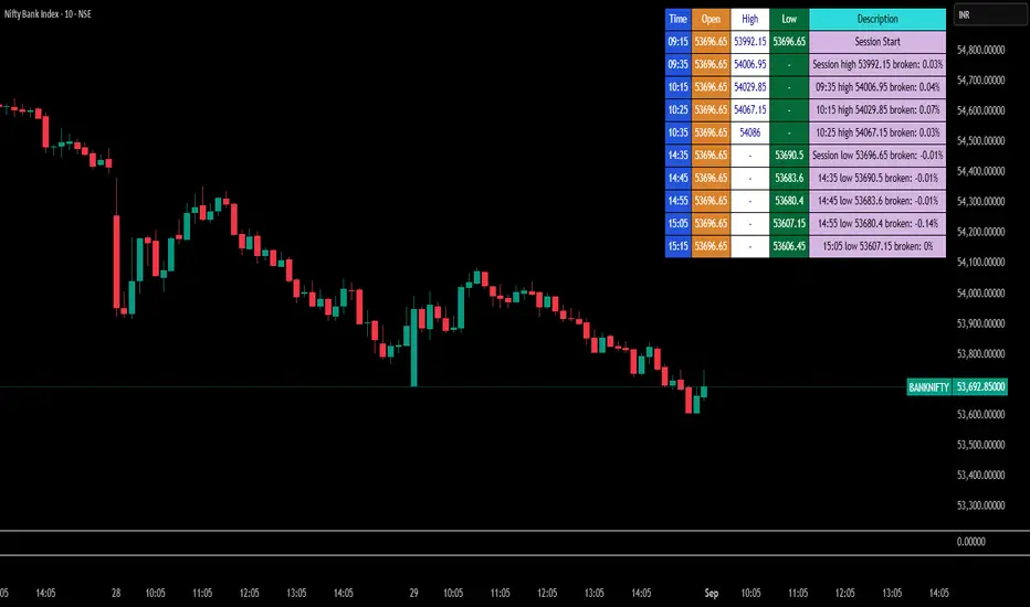
Break Point Record Table — GSK-VIZAG-AP-INDIA "Break Point Record Table — GSK-VIZAG-AP-INDIA" indicator captures key break points during each trading session and presents a clear, color-coded table overlay on the chart for quick visual reference. Specifically, it logs sessions' open price and monitors subsequent price action for notable breaks in the session high or low prices. Each break event is recorded with the time, price, and percentage change from the previous break, helping traders identify significant price movements within the session at a glance.
Key Features:
Records the session start time and opening price for context.
Tracks every intraday break above the previous session high or below the previous session low.
Calculates and displays the percentage change at each break event.
Highlights breaks with descriptive text including break time and values to aid trade decision-making.
Displays a table with columns for Time, Open, High, Low, and a Description of the event.
Uses color-coded cells to differentiate between session start, highs, lows, and break descriptions for better readability.
Maintains performance and readability by limiting the table to the latest 30 break events.
Usage & Benefits:
This indicator is ideal for intraday traders who want reliable visual cues to monitor momentum shifts and breakout/breakdown points during the trading day. By capturing these break points as discrete events and organizing the data into an easily accessible, visually intuitive table, it improves situational awareness and supports timely trading decisions.
SE – RSI Divergence Scanner (BOTH on 1h & 15m) – v6Screenar svenska mid/large cap bolag som har divergenser i 15 min och 1h timeframe samtidigt.