MTF Regime Filter II [CHE]Regime Filter II - Comprehensive Guide
Introduction
The "Regime Filter II " indicator is a tool designed to help traders identify market trends by smoothing price data and applying a color scheme to visualize bullish and bearish conditions. This guide provides a detailed explanation of the script's functionality, benefits, and how to use it effectively in TradingView.
Key Benefits
1. Trend Identification: Smooths price data to highlight underlying trends, making it easier for traders to spot potential buying or selling opportunities.
2. Visual Clarity: Uses distinct color schemes to differentiate between bullish and bearish market conditions, enhancing visual analysis.
3. Customization: Offers various settings to adjust smoothing and averaging lengths, choose between different color schemes, and set visibility for different timeframes.
4. Neutral Candle Option: Provides an option to display neutral candles for clearer visual representation when market conditions are neither strongly bullish nor bearish.
5. Timeframe Adaptability: Includes functions to determine appropriate step sizes based on different timeframes, ensuring the indicator remains accurate across various trading periods.
Script Breakdown
1. Indicator Declaration
The script starts by declaring itself as a TradingView indicator using the latest version of Pine Script. This sets up the framework for the indicator's functionality.
2. User Inputs for Smoothing and Averaging Lengths
The script allows users to input specific lengths for smoothing and averaging intervals. These inputs are crucial for determining how the price data is processed to identify trends. By adjusting these lengths, users can fine-tune the sensitivity of the indicator to market movements.
3. Color Scheme Selection
Users can choose between two color schemes: "Traditional" and "WT1 0 Rule". The selected color scheme will determine how the indicator colors the candles to represent bullish and bearish conditions. This customization enhances the visual appeal and usability of the indicator according to personal preferences.
4. Settings for Timeframe Visibility
The script includes settings that allow users to specify which timeframes the indicator should be visible on. This feature helps traders focus on the most relevant timeframes for their trading strategies. Additionally, users can set the number of recent candles to display, providing a clear view of the most recent market trends.
5. Color Definitions
The indicator defines specific colors for bearish and bullish candles. Bearish candles are colored red, while bullish candles are green. These color definitions are applied based on the selected color scheme and the calculated trend, providing a quick visual reference for market conditions.
6. Time Constants
To manage different timeframes effectively, the script uses constants that represent various time intervals in milliseconds, such as minutes, hours, and days. These constants are used to convert timeframes into a format that the script can work with to determine the appropriate step size for calculations.
7. Step Size Determination
The script includes a function that determines the step size based on the selected timeframe. This function ensures that the indicator adapts to different timeframes, maintaining its accuracy and relevance across various trading periods. The step size is calculated based on time intervals, and appropriate labels (like "60", "240", "1D") are assigned.
- For timeframes less than or equal to 1 minute, the step size is set to "60".
- For timeframes less than or equal to 5 minutes, the step size is set to "240".
- For timeframes less than or equal to 1 hour, the step size is set to "1D" (daily).
- For timeframes less than or equal to 4 hours, the step size is set to "3D" (three days).
- For timeframes less than or equal to 12 hours, the step size is set to "7D" (weekly).
- For timeframes less than or equal to 1 day, the step size is set to "1M" (monthly).
- For timeframes less than or equal to 1 week, the step size is set to "3M" (three months).
- For all other timeframes, the step size is set to "12M" (yearly).
8. Trend Calculation
The core of the indicator is its ability to calculate market trends. Here's a detailed breakdown of how the `calculateTrend` function works:
- Initialization: Variables for the middle price and scale, and summations of high/low prices and ranges, are initialized.
- Summation Loop: A loop runs over the smoothing length to calculate the sum of high and low prices and their range.
- Middle and Scale Calculation: The middle price is determined as the average of high/low sums, and the scale is calculated as a fraction of the average range.
- Normalization: The high, low, and close prices are normalized based on the middle price and scale.
- HT Calculation: The normalized prices are smoothed using a simple moving average (SMA).
- Frequency and Exponential Calculations: The frequency and related constants (a, c1, c2, c3) are calculated for further smoothing.
- Smoothed Moving Average (SMA): A smoothed moving average is computed using the HT values and exponential constants.
- WT1 and WT2 Calculation: The final smoothed values (WT1) and their average (WT2) are derived.
9. Color Application Based on Trend
Once the trend is calculated, the script applies the appropriate color to the candles based on the selected color scheme. This function ensures that the visual representation of the trend is consistent with the user’s preferences.
10. Label Plotting for Timeframes
If the option to display timeframe labels is enabled, the script plots labels on the chart to indicate the current timeframe. This feature helps users quickly identify which timeframe they are analyzing.
11. Shape Plotting Based on Trend and Color Scheme
The indicator plots shapes (squares) on the chart based on the calculated trend and selected color scheme. These shapes provide an additional visual cue for market conditions, enhancing the overall clarity of the indicator.
12. Neutral Candle Color Option
The script includes an option to set the color of neutral candles when market conditions are neither strongly bullish nor bearish. This option helps traders better visualize periods of market indecision.
Summary
The "Regime Filter II " is a powerful and customizable tool for traders, offering clear visual cues for market trends and adaptability to various timeframes. By smoothing price data and applying intuitive color schemes, it helps traders make more informed decisions. With features like adjustable smoothing lengths, multiple color schemes, and optional neutral candle displays, this indicator enhances market analysis and trading strategy development. By following this comprehensive guide, traders can effectively utilize the "Regime Filter II " indicator to enhance their market analysis and make more informed trading decisions.
Best regards
"股价站上60月线" için komut dosyalarını ara

RV - Relative Strength Index Buy/SellIntroduction
The RV - RSI B/S V1.2 indicator leverages the RSI to identify overbought and oversold conditions in the market. The RSI line color changes according to bullish, bearish, oversold, and overbought zones, helping users identify direction and avoid false trades. By plotting the RSI along with user-defined moving averages and Bollinger Bands, it offers a multi-faceted approach to analyzing market momentum.
Indicator Overview
The indicator RSI line color changes as per the bullish, bearish, oversold, and overbought zones. This helps users find out the direction and the zones. The oversold and overbought zones are colored to help users avoid false trades.
Trading Strategy
Long Trades (Bullish Setup):
Entry: A long trade is initiated when the RSI crosses from 60 up to 80.
Exit: Long trades are generally exited when the RSI is between 80 and 90.
Condition: No long trades are taken if the RSI exceeds 80.
Short Trades (Bearish Setup):
Entry: A short trade is initiated when the RSI crosses from 40 down to 20.
Exit: Short trades are generally exited when the RSI is between 20 and 10.
Condition: No short trades are taken if the RSI falls below 20.
RSI Color Coding and Interpretation
The RV - RSI B/S V1.2 indicator uses color coding to provide a visual representation of RSI values, making it easier to identify critical levels at a glance:
Green (RSI 60-80): Indicates a bullish zone where long trades can be considered.
Red (RSI > 80): Signals an overbought condition where long trades should be avoided.
Orange (RSI 20-40): Indicates a bearish zone where short trades can be considered.
Pink (RSI < 20): Signals an oversold condition where short trades should be avoided.
RSI Settings and Their Importance
RSI Length: The default length is set to 12, which is the standard period for RSI calculation. This setting can be adjusted to increase or decrease sensitivity.
Source: The source of the data for the RSI calculation is typically the closing price.
MA Type: Various moving averages can be applied to the RSI, including SMA, EMA, SMMA (RMA), WMA, and VWMA. Each type offers different smoothing properties and can be selected based on
trading preferences.
MA Length: The default length is set to 20, aligning with the RSI length for consistency.
Bollinger Bands: When using Bollinger Bands, the standard deviation multiplier is set to 2.0 by default, but it can be adjusted to suit different volatility conditions.
Disclaimer
This indicator provides valuable signals for potential trading opportunities based on RSI levels and moving averages. However, it is crucial to incorporate directional price action analysis to confirm signals and improve trading accuracy. The RV - RSI B/S V1.2 should be used as part of a broader trading strategy, considering other technical and fundamental factors.

Market Cipher B by WeloTradesMarket Cipher B by WeloTrades: Detailed Script Description
//Overview//
"Market Cipher B by WeloTrades" is an advanced trading tool that combines multiple technical indicators to provide a comprehensive market analysis framework. By integrating WaveTrend, RSI, and MoneyFlow indicators, this script helps traders to better identify market trends, potential reversals, and trading opportunities. The script is designed to offer a holistic view of the market by combining the strengths of these individual indicators.
//Key Features and Originality//
WaveTrend Analysis:
WaveTrend Channel (WT1 and WT2): The core of this script is the WaveTrend indicator, which uses the smoothed average of typical price to identify overbought and oversold conditions. WT1 and WT2 are calculated to track market momentum and cyclical price movements.
Major Divergences (🐮/🐻): The script detects and highlights major bullish and bearish divergences automatically, providing traders with visual cues for potential reversals. This helps in making informed decisions based on divergence patterns.
Relative Strength Index (RSI):
RSI Levels: RSI is used to measure the speed and change of price movements, with specific levels indicating overbought and oversold conditions.
Customizable Levels: Users can configure the overbought and oversold thresholds, allowing for a tailored analysis based on individual trading strategies.
MoneyFlow Indicator:
Fast and Slow MoneyFlow: This indicator tracks the flow of capital into and out of the market, offering insights into the underlying market strength. It includes configurable periods and multipliers for both fast and slow MoneyFlow.
Vertical Positioning: The script allows users to adjust the vertical position of MoneyFlow plots to maintain a clear and uncluttered chart.
Stochastic RSI:
Stochastic RSI Levels: This combines the RSI and Stochastic indicators to provide a momentum oscillator that is sensitive to price changes. It is used to identify overbought and oversold conditions within a specified period.
Customizable Levels: Traders can set specific levels for more precise analysis.
//How It Works//
The script integrates these indicators through advanced algorithms, creating a synergistic effect that enhances market analysis. Here’s a detailed explanation of the underlying concepts and calculations:
WaveTrend Indicator:
Calculation: WaveTrend is based on the typical price (average of high, low, and close) smoothed over a specified channel length. WT1 and WT2 are derived from this typical price and further smoothed using the Average Channel Length. The difference between WT1 and WT2 indicates momentum, helping to identify cyclical market trends.
RSI (Relative Strength Index):
Calculation: RSI calculates the average gains and losses over a specified period to measure the speed and change of price movements. It oscillates between 0 and 100, with levels set to identify overbought (>70) and oversold (<30) conditions.
MoneyFlow Indicator:
Calculation: MoneyFlow is derived by multiplying price changes by volume and smoothing the results over specified periods. Fast MoneyFlow reacts quickly to price changes, while Slow MoneyFlow offers a broader view of capital movement trends.
Stochastic RSI:
Calculation: Stochastic RSI is computed by applying the Stochastic formula to RSI values, which highlights the RSI’s relative position within its range over a given period. This helps in identifying momentum shifts more precisely.
//How to Use the Script//
Display Settings:
Users can enable or disable various components like WaveTrend OB & OS levels, MoneyFlow plots, and divergence alerts through checkboxes.
Example: Turn on "Show Major Divergence" to see major bullish and bearish divergence signals directly on the chart.
Adjust Channel Settings:
Customize the data source, channel length, and smoothing periods in the "WaveTrend Channel SETTINGS" group.
Example: Set the "Channel Length" to 10 for a more responsive WaveTrend line or adjust the "Average Channel Length" to 21 for smoother trends.
Set Overbought & Oversold Levels:
Configure levels for WaveTrend, RSI, and Stochastic RSI in their respective settings groups.
Example: Set the WaveTrend Overbought Level to 60 and Oversold Level to -60 to define critical thresholds.
Money Flow Settings:
Adjust the periods and multipliers for Fast and Slow MoneyFlow indicators, and set their vertical positions for better visualization.
Example: Set the Fast Money Flow Period to 9 and Slow Money Flow Period to 12 to capture both short-term and long-term capital movements.
//Justification for Combining Indicators//
Enhanced Market Analysis:
Combining WaveTrend, RSI, and MoneyFlow provides a more comprehensive view of market conditions. Each indicator brings a unique perspective, making the analysis more robust.
WaveTrend identifies cyclical trends, RSI measures momentum, and MoneyFlow tracks capital movement. Together, they provide a multi-dimensional analysis of the market.
Improved Decision-Making:
By integrating these indicators, the script helps traders make more informed decisions. For example, a bullish divergence detected by WaveTrend might be validated by an RSI moving out of oversold territory and supported by increasing MoneyFlow.
Customization and Flexibility:
The script offers extensive customization options, allowing traders to tailor it to their specific needs and strategies. This flexibility makes it suitable for different trading styles and timeframes.
//Conclusion//
The indicator stands out due to its innovative combination of WaveTrend, RSI, and MoneyFlow indicators, offering a well-rounded tool for market analysis. By understanding how each component works and how they complement each other, traders can leverage this script to enhance their market analysis and trading strategies, making more informed and confident decisions.
Remember to always backtest the indicator first before implying it to your strategy.
CVD Divergence Strategy.1.mmThis is the matching Strategy version of Indicator of the same name.
As a member of the K1m6a Lions discussion community we often use versions of the Cumulative Volume Delta indicator
as one of our primary tools along with RSI, RSI Divergences, Open interest, Volume Profile, TPO and Fibonacci levels.
We also discuss visual interpretations of CVD Divergences across multiple time frames much like RSI divergences.
RSI Divergences can be identified as possible Bullish reversal areas when the RSI is making higher low points while
the price is making lower low points.
RSI Divergences can be identified as possible Bearish reversal areas when the RSI is making lower high points while
the price is making higher high points.
CVD Divergences can also be identified the same way on any timeframe as possible reversal signals. As with RSI, these Divergences
often occur as a trend's momentum is giving way to lower volume and areas when profits are being taken signaling a possible reversal
of the current trending price movement.
Hidden Divergences are identified as calculations that may be signaling a continuation of the current trend.
Having not found any public domain versions of a CVD Divergence indicator I have combined some public code to create this
indicator and matching strategy. The calculations for the Cumulative Volume Delta keep a running total for the differences between
the positive changes in volume in relation to the negative changes in volume. A relative upward spike in CVD is created when
there is a large increase in buying vs a low amount of selling. A relative downward spike in CVD is created when
there is a large increase in selling vs a low amount of buying.
In the settings menu, the is a drop down to be used to view the results in alternate timeframes while the chart remains on current timeframe. The Lookback settings can be adjusted so that the divs show on a more local, spontaneous level if set at 1,1,60,1. For a deeper, wider view of the divs, they can be set higher like 7,7,60,7. Adjust them all to suit your view of the divs.
To create this indicator/strategy I used a portion of the code from "Cumulative Volume Delta" by @ contrerae which calculates
the CVD from aggregate volume of many top exchanges and plots the continuous changes on a non-overlay indicator.
For the identification and plotting of the Divergences, I used similar code from the Tradingview Technical "RSI Divergence Indicator"
This indicator should not be used as a stand-alone but as an additional tool to help identify Bullish and Bearish Divergences and
also Bullish and Bearish Hidden Divergences which, as opposed to regular divergences, may indicate a continuation.

CVD Divergence Indicator.1.mmAs a member of the K1m6a Lions discussion community we often use versions of the Cumulative Volume Delta indicator
as one of our primary tools along with RSI, RSI Divergences, Open interest, Volume Profile, TPO and Fibonacci levels.
We also discuss visual interpretations of CVD Divergences across multiple time frames much like RSI divergences.
RSI Divergences can be identified as possible Bullish reversal areas when the RSI is making higher low points while
the price is making lower low points.
RSI Divergences can be identified as possible Bearish reversal areas when the RSI is making lower high points while
the price is making higher high points.
CVD Divergences can also be identified the same way on any timeframe as possible reversal signals. As with RSI, these Divergences
often occur as a trend's momentum is giving way to lower volume and areas when profits are being taken signaling a possible reversal
of the current trending price movement.
Hidden Divergences are identified as calculations that may be signaling a continuation of the current trend.
Having not found any public domain versions of a CVD Divergence indicator I have combined some public code to create this
indicator and matching strategy. The calculations for the Cumulative Volume Delta keep a running total for the differences between
the positive changes in volume in relation to the negative changes in volume. A relative upward spike in CVD is created when
there is a large increase in buying vs a low amount of selling. A relative downward spike in CVD is created when
there is a large increase in selling vs a low amount of buying.
In the settings menu, the is a drop down to be used to view the results in alternate timeframes while the chart remains on current timeframe. The Lookback settings can be adjusted so that the divs show on a more local, spontaneous level if set at 1,1,60,1. For a deeper, wider view of the divs, they can be set higher like 7,7,60,7. Adjust them all to suit your view of the divs.
To create this indicator/strategy I used a portion of the code from "Cumulative Volume Delta" by @ contrerae which calculates
the CVD from aggregate volume of many top exchanges and plots the continuous changes on a non-overlay indicator.
For the identification and plotting of the Divergences, I used similar code from the Tradingview Technical "RSI Divergence Indicator"
This indicator should not be used as a stand-alone but as an additional tool to help identify Bullish and Bearish Divergences and
also Bullish and Bearish Hidden Divergences which, as opposed to regular divergences, may indicate a continuation.

Candle DecompositionThe Candle Decomposition indicator shows the last 2 candles in detail, with 2 levels of lower timeframes (LTF).
In this way, you can keep oversight of history, while zooming in on the last and previous candle.
This tool is meant to be used in realtime, preferentially for intraday usage.
🔶 USAGE
In this example, on the current timeframe of 15 minutes, you see the 2 latest candles, visualized through dotted lines/boxes.
The first LTF level is set at 5 minutes, the second level at 15 seconds:
(The 2 exclamation marks are just to emphasize this is the latest price which will be repainted)
The combination of 2 LTF's can be helpful in finding support/resistance levels.
These are taken in realtime, not in bar replay, so the outcome wasn't known in advance:
(blue lines were drawn manually)
After first testing resistance, the price went to the support area, bouncing back to an area of resistance and breaking it briefly.
Price turned back, and found support, after which resistance was tested once more:
Support was again tested, after which resistance was clearly broken:
A bit later (every time 1 candle further):
The following example shows 2 last candles with signs of indecision, but LTF candles show support and resistance areas:
🔶 IMPORTANT
PP = TradingView Premium / Professional Plan
BEP = TradingView Basic / Essential / Plus Plan
This publication uses second-based TF's, which is only available for PP users.
To ensure a smooth experience for BEP users, we have disabled the setting "Premium/Professional Plan" .
BEP users will get a warning when trying to use a second-based TF.
If possible, BEP users should use non-second-based TF's.
PP users have to enable the setting "Premium/Professional Plan" .
🔶 DETAILS
🔹 Timeframes
Most common timeframes can be used: 2W, W, 3D, 2D, D, 12h, 8h, 6h, 4h, 3h, 2h, 1h, 30min, 15min, 10min, 5min, 3min, 1min
When having the current chart timeframe at 1 of these TF's, you can set 1st and 2nd LTF. Choices are pré-set to ensure maximum usage of drawings:
In the image above you'll see there are gaps between candles.
The script ensures that when there are no trades, instead of attaching the next bar next to the previous, it leaves the gap visible (which is more realistic).
More in detail you can see the gaps are preserved:
(compared between white -current TF- candles, and LTF candles)
🔹 Limitations
When on a Weekly TF, and 2nd LTF is set at 4h, all drawings have enough space:
If we change the 2nd LTF to 2h, there isn't enough space for the second last candle, after which an orange coloured informational warning label will be shown:
When current chart TF is not 1 of the encoded TF's, a red warning text will be shown:
This script can be used using "Bar Replay", but very limited.
You can change the date ("Jump To..."), but "Play" is not advisable.
🔹 Code
This script uses string manipulation to convert inputs like "1 hour", "5 min", "5 sec" to usable timeframe strings like "60", "5" and "5S"
• str.contains(str , 'hour') ? str.tostring(str.tonumber(str.replace(str, ' hour', '')) * 60) : str
• str.replace(input.string( '5 sec', '' , options= ), " sec", "S")
• str.replace(str, " min", "")
Since string manipulation consumes resources, these are place in local blocks.
While inputs always will be extracted, whether it is put in an if-block or not, the string manipulation only will be executed when condition is fulfilled, in this case when we are at the right timeframe.
In following example you'll always see the '1 sec' input, on every TF, but the string manipulation will only happen when we are at a 1 minute TF:
str = ''
if timeframe.period == '1'
str := str.replace(input.string( '1 sec', '' , options= ), " sec", "S")
// output -> "5S" or "1S"
The "visible chart function" chart.right_visible_bar_time is used to reset everything when a new candle starts. This makes sure that when using "barstate.islastconfirmedhistory", the second last bar is used. Also all lines & boxes are automatically removed, starting with a fresh slate.
chT = timenow > chart.right_visible_bar_time
•••
if chT
if barstate.islastconfirmedhistory
f(4)
if barstate.islast
f(2)
If boxes/lines end up before the first bar, or after the last bar, this can be messy.
To protect ourselves against it 2 techniques are used:
math.max(0, x) is used to make sure lines & boxes don't end up before the first bar,
isOK = index < last_bar_index is used to be sure that the width of 1 candle (here index) is not wider than the total of all bars (which is the same as last_bar_index)
🔶 SETTINGS
3 columns:
Current TF: This columns shows you the chart TF where LTF settings are applicable.
1st LTF: set the timeframe of the first level LTF
2nd LTF: set the timeframe of the second level LTF
Colours can be set for 3 timeframes
Donchian Channel Trend MeterInspired by the Chande Trend Meter (this is not the Chande Trend Meter), this indicator aims to show the trend so you can make trading decisions accordingly. This is calculated by looking at Donchian Channels over a number of lengths (20, 40, 60 periods, etc.), converting them to percent, and then applying a weighting and smoothing similar to the Know Sure Thing Indicator. This results in smooth trend line that is not disturbed by large fluctuations in price action.
When the line is below 20%, you have a strong down trend. Values between 20 - 40% are a weak down trend. Values between 40 - 60% are no trend (slightly bullish or bearish if above or below 50%). Similarly, 60 - 80% is a weak uptrend, and above 80% is a strong uptrend. Trade signals can be turned on or off that correspond to crosses over 50%. It can be useful in spotting divergence.

ottlibLibrary "ottlib"
█ OVERVIEW
This library contains functions for the calculation of the OTT (Optimized Trend Tracker) and its variants, originally created by Anıl Özekşi (Anil_Ozeksi). Special thanks to him for the concept and to Kıvanç Özbilgiç (KivancOzbilgic) and dg_factor (dg_factor) for adapting them to Pine Script.
█ WHAT IS "OTT"
The OTT (Optimized Trend Tracker) is a highly customizable and very effective trend-following indicator that relies on moving averages and a trailing stop at its core. Moving averages help reduce noise by smoothing out sudden price movements in the markets, while trailing stops assist in detecting trend reversals with precision. Initially developed as a noise-free trailing stop, the current variants of OTT range from rapid trend reversal detection to long-term trend confirmation, thanks to its extensive customizability.
It's well-known variants are:
OTT (Optimized Trend Tracker).
TOTT (Twin OTT).
OTT Channels.
RISOTTO (RSI OTT).
SOTT (Stochastic OTT).
HOTT & LOTT (Highest & Lowest OTT)
ROTT (Relative OTT)
FT (Original name is Fırsatçı Trend in Turkish which translates to Opportunist Trend)
█ LIBRARY FEATURES
This library has been prepared in accordance with the style, coding, and annotation standards of Pine Script version 5. As a result, explanations and examples will appear when users hover over functions or enter function parameters in the editor.
█ USAGE
Usage of this library is very simple. Just import it to your script with the code below and use its functions.
import ismailcarlik/ottlib/1 as ottlib
█ FUNCTIONS
• f_vidya(source, length, cmoLength)
Short Definition: Chande's Variable Index Dynamic Average (VIDYA).
Details: This function computes Chande's Variable Index Dynamic Average (VIDYA), which serves as the original moving average for OTT. The 'length' parameter determines the number of bars used to calculate the average of the given source. Lower values result in less smoothing of prices, while higher values lead to greater smoothing. While primarily used internally in this library, it has been made available for users who wish to utilize it as a moving average or use in custom OTT implementations.
Parameters:
source (float) : (series float) Series of values to process.
length (simple int) : (simple int) Number of bars to lookback.
cmoLength (simple int) : (simple int) Number of bars to lookback for calculating CMO. Default value is `9`.
Returns: (float) Calculated average of `source` for `length` bars back.
Example:
vidyaValue = ottlib.f_vidya(source = close, length = 20)
plot(vidyaValue, color = color.blue)
• f_mostTrail(source, multiplier)
Short Definition: Calculates trailing stop value.
Details: This function calculates the trailing stop value for a given source and the percentage. The 'multiplier' parameter defines the percentage of the trailing stop. Lower values are beneficial for catching short-term reversals, while higher values aid in identifying long-term trends. Although only used once internally in this library, it has been made available for users who wish to utilize it as a traditional trailing stop or use in custom OTT implementations.
Parameters:
source (float) : (series int/float) Series of values to process.
multiplier (simple float) : (simple float) Percent of trailing stop.
Returns: (float) Calculated value of trailing stop.
Example:
emaValue = ta.ema(source = close, length = 14)
mostValue = ottlib.f_mostTrail(source = emaValue, multiplier = 2.0)
plot(mostValue, color = emaValue >= mostValue ? color.green : color.red)
• f_ottTrail(source, multiplier)
Short Definition: Calculates OTT-specific trailing stop value.
Details: This function calculates the trailing stop value for a given source in the manner used in OTT. Unlike a traditional trailing stop, this function modifies the traditional trailing stop value from two bars prior by adjusting it further with half the specified percentage. The 'multiplier' parameter defines the percentage of the trailing stop. Lower values are beneficial for catching short-term reversals, while higher values aid in identifying long-term trends. Although primarily used internally in this library, it has been made available for users who wish to utilize it as a trailing stop or use in custom OTT implementations.
Parameters:
source (float) : (series int/float) Series of values to process.
multiplier (simple float) : (simple float) Percent of trailing stop.
Returns: (float) Calculated value of OTT-specific trailing stop.
Example:
vidyaValue = ottlib.f_vidya(source = close, length = 20)
ottValue = ottlib.f_ottTrail(source = vidyaValue, multiplier = 1.5)
plot(ottValue, color = vidyaValue >= ottValue ? color.green : color.red)
• ott(source, length, multiplier)
Short Definition: Calculates OTT (Optimized Trend Tracker).
Details: The OTT consists of two lines. The first, known as the "Support Line", is the VIDYA of the given source. The second, called the "OTT Line", is the trailing stop based on the Support Line. The market is considered to be in an uptrend when the Support Line is above the OTT Line, and in a downtrend when it is below.
Parameters:
source (float) : (series float) Series of values to process. Default value is `close`.
length (simple int) : (simple int) Number of bars to lookback. Default value is `2`.
multiplier (simple float) : (simple float) Percent of trailing stop. Default value is `1.4`.
Returns: ( [ float, float ]) Tuple of `supportLine` and `ottLine`.
Example:
= ottlib.ott(source = close, length = 2, multiplier = 1.4)
longCondition = ta.crossover(supportLine, ottLine)
shortCondition = ta.crossunder(supportLine, ottLine)
• tott(source, length, multiplier, bandsMultiplier)
Short Definition: Calculates TOTT (Twin OTT).
Details: TOTT consists of three lines: the "Support Line," which is the VIDYA of the given source; the "Upper Line," a trailing stop of the Support Line adjusted with an added multiplier; and the "Lower Line," another trailing stop of the Support Line, adjusted with a reduced multiplier. The market is considered in an uptrend if the Support Line is above the Upper Line and in a downtrend if it is below the Lower Line.
Parameters:
source (float) : (series float) Series of values to process. Default value is `close`.
length (simple int) : (simple int) Number of bars to lookback. Default value is `40`.
multiplier (simple float) : (simple float) Percent of trailing stop. Default value is `0.6`.
bandsMultiplier (simple float) : Multiplier for bands. Default value is `0.0006`.
Returns: ( [ float, float, float ]) Tuple of `supportLine`, `upperLine` and `lowerLine`.
Example:
= ottlib.tott(source = close, length = 40, multiplier = 0.6, bandsMultiplier = 0.0006)
longCondition = ta.crossover(supportLine, upperLine)
shortCondition = ta.crossunder(supportLine, lowerLine)
• ott_channel(source, length, multiplier, ulMultiplier, llMultiplier)
Short Definition: Calculates OTT Channels.
Details: OTT Channels comprise nine lines. The central line, known as the "Mid Line," is the OTT of the given source's VIDYA. The remaining lines are positioned above and below the Mid Line, shifted by specified multipliers.
Parameters:
source (float) : (series float) Series of values to process. Default value is `close`
length (simple int) : (simple int) Number of bars to lookback. Default value is `2`
multiplier (simple float) : (simple float) Percent of trailing stop. Default value is `1.4`
ulMultiplier (simple float) : (simple float) Multiplier for upper line. Default value is `0.01`
llMultiplier (simple float) : (simple float) Multiplier for lower line. Default value is `0.01`
Returns: ( [ float, float, float, float, float, float, float, float, float ]) Tuple of `ul4`, `ul3`, `ul2`, `ul1`, `midLine`, `ll1`, `ll2`, `ll3`, `ll4`.
Example:
= ottlib.ott_channel(source = close, length = 2, multiplier = 1.4, ulMultiplier = 0.01, llMultiplier = 0.01)
• risotto(source, length, rsiLength, multiplier)
Short Definition: Calculates RISOTTO (RSI OTT).
Details: RISOTTO comprised of two lines: the "Support Line," which is the VIDYA of the given source's RSI value, calculated based on the length parameter, and the "RISOTTO Line," a trailing stop of the Support Line. The market is considered in an uptrend when the Support Line is above the RISOTTO Line, and in a downtrend if it is below.
Parameters:
source (float) : (series float) Series of values to process. Default value is `close`.
length (simple int) : (simple int) Number of bars to lookback. Default value is `50`.
rsiLength (simple int) : (simple int) Number of bars used for RSI calculation. Default value is `100`.
multiplier (simple float) : (simple float) Percent of trailing stop. Default value is `0.2`.
Returns: ( [ float, float ]) Tuple of `supportLine` and `risottoLine`.
Example:
= ottlib.risotto(source = close, length = 50, rsiLength = 100, multiplier = 0.2)
longCondition = ta.crossover(supportLine, risottoLine)
shortCondition = ta.crossunder(supportLine, risottoLine)
• sott(source, kLength, dLength, multiplier)
Short Definition: Calculates SOTT (Stochastic OTT).
Details: SOTT is comprised of two lines: the "Support Line," which is the VIDYA of the given source's Stochastic value, based on the %K and %D lengths, and the "SOTT Line," serving as the trailing stop of the Support Line. The market is considered in an uptrend when the Support Line is above the SOTT Line, and in a downtrend when it is below.
Parameters:
source (float) : (series float) Series of values to process. Default value is `close`.
kLength (simple int) : (simple int) Stochastic %K length. Default value is `500`.
dLength (simple int) : (simple int) Stochastic %D length. Default value is `200`.
multiplier (simple float) : (simple float) Percent of trailing stop. Default value is `0.5`.
Returns: ( [ float, float ]) Tuple of `supportLine` and `sottLine`.
Example:
= ottlib.sott(source = close, kLength = 500, dLength = 200, multiplier = 0.5)
longCondition = ta.crossover(supportLine, sottLine)
shortCondition = ta.crossunder(supportLine, sottLine)
• hottlott(length, multiplier)
Short Definition: Calculates HOTT & LOTT (Highest & Lowest OTT).
Details: HOTT & LOTT are composed of two lines: the "HOTT Line", which is the OTT of the highest price's VIDYA, and the "LOTT Line", the OTT of the lowest price's VIDYA. A high price surpassing the HOTT Line can be considered a long signal, while a low price dropping below the LOTT Line may indicate a short signal.
Parameters:
length (simple int) : (simple int) Number of bars to lookback. Default value is `20`.
multiplier (simple float) : (simple float) Percent of trailing stop. Default value is `0.6`.
Returns: ( [ float, float ]) Tuple of `hottLine` and `lottLine`.
Example:
= ottlib.hottlott(length = 20, multiplier = 0.6)
longCondition = ta.crossover(high, hottLine)
shortCondition = ta.crossunder(low, lottLine)
• rott(source, length, multiplier)
Short Definition: Calculates ROTT (Relative OTT).
Details: ROTT comprises two lines: the "Support Line", which is the VIDYA of the given source, and the "ROTT Line", the OTT of the Support Line's VIDYA. The market is considered in an uptrend if the Support Line is above the ROTT Line, and in a downtrend if it is below. ROTT is similar to OTT, but the key difference is that the ROTT Line is derived from the VIDYA of two bars of Support Line, not directly from it.
Parameters:
source (float) : (series float) Series of values to process. Default value is `close`.
length (simple int) : (simple int) Number of bars to lookback. Default value is `200`.
multiplier (simple float) : (simple float) Percent of trailing stop. Default value is `0.1`.
Returns: ( [ float, float ]) Tuple of `supportLine` and `rottLine`.
Example:
= ottlib.rott(source = close, length = 200, multiplier = 0.1)
isUpTrend = supportLine > rottLine
isDownTrend = supportLine < rottLine
• ft(source, length, majorMultiplier, minorMultiplier)
Short Definition: Calculates Fırsatçı Trend (Opportunist Trend).
Details: FT is comprised of two lines: the "Support Line", which is the VIDYA of the given source, and the "FT Line", a trailing stop of the Support Line calculated using both minor and major trend values. The market is considered in an uptrend when the Support Line is above the FT Line, and in a downtrend when it is below.
Parameters:
source (float) : (series float) Series of values to process. Default value is `close`.
length (simple int) : (simple int) Number of bars to lookback. Default value is `30`.
majorMultiplier (simple float) : (simple float) Percent of major trend. Default value is `3.6`.
minorMultiplier (simple float) : (simple float) Percent of minor trend. Default value is `1.8`.
Returns: ( [ float, float ]) Tuple of `supportLine` and `ftLine`.
Example:
= ottlib.ft(source = close, length = 30, majorMultiplier = 3.6, minorMultiplier = 1.8)
longCondition = ta.crossover(supportLine, ftLine)
shortCondition = ta.crossunder(supportLine, ftLine)
█ CUSTOM OTT CREATION
Users can create custom OTT implementations using f_ottTrail function in this library. The example code which uses EMA of 7 period as moving average and calculates OTT based of it is below.
Source Code:
//@version=5
indicator("Custom OTT", shorttitle = "COTT", overlay = true)
import ismailcarlik/ottlib/1 as ottlib
src = input.source(close, title = "Source")
length = input.int(7, title = "Length", minval = 1)
multiplier = input.float(2.0, title = "Multiplier", minval = 0.1)
support = ta.ema(source = src, length = length)
ott = ottlib.f_ottTrail(source = support, multiplier = multiplier)
pSupport = plot(support, title = "Moving Average Line (Support)", color = color.blue)
pOtt = plot(ott, title = "Custom OTT Line", color = color.orange)
fillColor = support >= ott ? color.new(color.green, 60) : color.new(color.red, 60)
fill(pSupport, pOtt, color = fillColor, title = "Direction")
Result:
█ DISCLAIMER
Trading is risky and most of the day traders lose money eventually. This library and its functions are only for educational purposes and should not be construed as financial advice. Past performances does not guarantee future results.
Cast ForwardThis indicator will not forecast price action. It will not predict price movement nor will it in any way predict the outcome of any trade you may take. This is not a signal for buying or selling. You must do your own back testing and analysis for trading.
Time and price are the two most important components of market data. Where was price at what time? To help visualize this question I created this indicator. It allows for the previous session data to be overlayed onto the chart offset forward 24 hours. What this means is that you have the high, (high/low)/2, and low of each candle plotted on top of your chart for the time frame of the current chart, but offset so that the data from the current candle has the data from the corresponding candle 24 hours prior lined up on the x-axis.
SMA Logic: I used the SMA (Simple Moving Average) function with a length of 1 to plot the data points without any smoothing to give the true values of the data.
For Intraday Charting
For Electronic Trading Hours:
In order to line up the data correctly, for intraday charts, I used the current chart timeframe and divided it into 1380 (number of minutes in the 23 hour futures market trading day) to set the data offset. Using the same math logic, this indicator also gives the correct correlated data on the 30 second time frame. If the chart time frame that is currently being used does not allow for correct data correlation (not a factor of 1380) it will not plot the data.
For Regular Trading Hours:
In order to line up the data correctly, for intraday charts, I used the current chart timeframe and divided it into 405 (number of minutes in the 6 hour 45 minutes New York regular session trading day, including the 15 minute settlement time) to set the data offset. This indicator also gives the correct correlated data on the 30 second time frame. If the chart time frame that is currently being used does not allow for correct data correlation (not a factor of 405) it will not plot the data.
For the Daily Chart:
This indicator plots a visualization of the 20-40-60 day IPDA data range; (The IPDA data range helps traders identify liquidity, price gaps, and equilibrium points in the market, providing insights for optimal trade entries and market structure shifts). It does this using the same SMA logic as the intraday plot. What this means is it offsets the historical data of the daily chart 20, 40, or 60 bars forward. You can plot any combination of the three on the chart at one time, but these will not show on the intraday chart. This allows for visualization of where the market will possibly seek liquidity, seek to rebalance, or seek equilibrium in the future.

RS for VPAThis is a supporting Indicator for the Volume Price Analysis Script VPA 5.0.
Purpose
To indicate the performance of the stock compared to an Index or any other selected stock. It also provides an idea about the strength of the Reference Index as well.
Description
The indicator is an unbound oscillator moving around a zero line. If the stock is strong then the values are positive and if it is weak the values are negative. If the stock is performing better (Stronger) than the Index the indicator is positive and colored green. If the stock is weaker than the Index it is negative and is colored Red.
The background indicates the strength of the Reference Index/Stock. Bullishness/up trend of the Index/Stock is indicated by yellow colour. Short term uptrend, Mid term uptrend and Long term trends are indicated by different shades of yellow varying from light to Dark. The bearishness / down trend is indicated by blue back ground.
How it Works
The relative strength is calculated by using the formula
RS = Gain of the stock / (Gain of the Ref. Index -1)
= (Stock Price today / Stock Price (N period ago)) /
(Index Price today / Index price (N period ago)) – 1
The Index strength is calculated as below
Short term trend up = 5 ema > 22 ema
Mid Term trend up = 22 ema > 60 ema
Long term trend up = 60 ema > 130 ema
Trend down = 5 ema < 22 ema
How to use
Use this indicator to assist your Price Action Analysis using VPA 5.0. When the Price action and volume indicates Bullishness, you can check if the relative strength is also supporting (Positive and in green Territory). This adds credibility to the Price action. Also check if the index is also positive (the Back ground is yellow). This makes the Price action even stronger. Ideally both the stock and index should be strong. Many time you would find the that the stock is in green territory but the index is in blue territory. This calls for some caution in evaluating the Price Action.
When the price action is positive but the relative strength is negative then one should be cautious and wait for the relative strength to turn positive before any entry decision.
Option for the Indicator
One can select the following from the setting for the indicator
1. Index or reference stock – Default is CNX 500
2. Relative Strength Calculation period – Default is 22
3. The EMA periods for the Index/Reference stock strength calculation

RVI_HTFThe "RVI_HTF" indicator is a tool designed to assist traders in analyzing market trends using the Relative Vigor Index (RVI) across different timeframes. It enables users to customize various aspects of the indicator's appearance and behavior. By monitoring the RVI on different timeframes, tracking its relationship with the moving average, and paying attention to extreme arrows above the 80 or below the 20 line, traders can anticipate potential reversals, trends, or changes in market momentum.
Above 80 Line: When the RVI moves above the 80 line, it suggests that the market may be overbought. Extreme upward arrows (indicating potential sell signals) can be a sign that a bullish trend might be reaching an exhaustion point. Traders may anticipate a possible trend reversal or pullback.
Below 20 Line: When the RVI dips below the 20 line, it implies that the market might be oversold. Extreme downward arrows (indicating potential buy signals) can be an early signal of a potential bullish reversal. Traders may anticipate an upcoming uptrend or bounce.
Crossing Above Moving Average: When the RVI crosses above its moving average on the selected timeframe, it can serve as an early indication of potential bullish strength in the market. This suggests that buying pressure may be increasing.
Crossing Below Moving Average: Conversely, when the RVI crosses below its moving average, it can signal potential bearish momentum. This indicates that selling pressure may be gaining strength.
Variables:
Timeframe (TF) Selection:
The indicator allows you to select the timeframe for the RVI calculation. You can choose from various options such as 1 minute (1), 5 minutes (5), 15 minutes (15), 30 minutes (30), 60 minutes (60), 240 minutes (240), Daily (D), Weekly (W), Monthly (M), or use "Auto" to automatically select a higher timeframe based on your current chart's timeframe.
Moving Average Type (MA_Type):
Function: Allows users to select the type of moving average used in RVI calculations.
Options: You can select from various moving average types, including:
SMA (Simple Moving Average)
EMA (Exponential Moving Average)
SMMA (Smoothed Moving Average, also known as RMA)
WMA (Weighted Moving Average)
VWMA (Volume Weighted Moving Average)
DEMA (Double Exponential Moving Average)
Moving Average Length (MA_Length):
Function: Permits users to set the number of periods for the selected moving average type.
Purpose: Controls the sensitivity of the RVI indicator. Longer lengths provide smoother results, while shorter lengths react more quickly to price changes.
Up Arrow Color (upArrowColor):
Function: Enables users to customize the color of arrows that indicate potential Overbought areas. (Only shown when the TF is same as or lower than the chart TF)
Down Arrow Color (downArrowColor):
Function: Allows users to specify the color of downward-pointing arrows signaling potential Oversold areas. (Only shown when the TF is same as or lower than the chart TF)
RVI Up Color (firstColor):
Function: Defines the color of the RVI line when it indicates a bullish condition on the higher timeframe.
RVI Down Color (secondColor):
Function: Specifies the color of the RVI line when it suggests a bearish condition on the higher timeframe.
RVI-Based Moving Average Up Color (firstColorMA):
Function: Customizes the color of the RVI-based moving average line when it indicates a bullish condition.
RVI-Based Moving Average Down Color (secondColorMA):
Function: Defines the color of the RVI-based moving average line when it suggests a bearish condition.

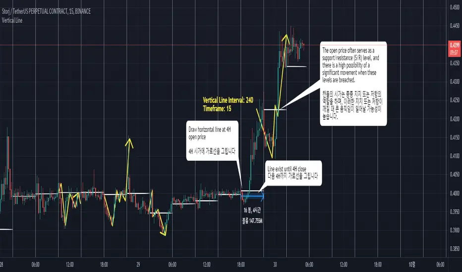
Interval Vertical Line DrawerIntroduction
The Interval Vertical Line Drawer is an indicator that assists traders in visualizing specific intervals on the chart. This script enables traders to conduct more accurate analyses across various time frames.
How It Works
This script operates by drawing vertical lines at intervals defined by the user. Users can select the interval for the vertical lines in minutes, and the script automatically places vertical lines at each interval on the chart. For instance, if a 15-minute interval is selected, vertical lines will appear at the start and end times of every 15-minute candle on the chart.
Additionally, this script includes a feature that allows drawing horizontal lines representing the open price of the candles at each vertical line. This is crucial for traders observing price action around specific times and evaluating market conditions at regular intervals.
This script is operative across diverse time frames and can be adjusted to fit various trading styles and analyses. It is efficient, user-friendly, and adaptable to the diverse needs of traders.
The open price of a candle often serves as a support or resistance, and there is a high possibility of significant movement occurring when these S/R levels are breached.
How to Use
VLInterval: Users can input the interval for the vertical lines in minutes and select from 5, 15, 30, 60, 120, 240, 1440.
visibleTimeframe: Users can select the desired time frame where the vertical lines will be visible.
Color and Style: Users can freely modify the color and style of the lines.
Apply the indicator to the chart.
Select the desired interval for the vertical lines.
Adjust the visibility and style of the lines as needed.
By adhering to these steps, traders can effectively incorporate this tool into their analysis, maximizing the utility of interval-based evaluations and observations.
소개
간격 수직 선 그리기 도구는 트레이더가 차트에서 특정 간격을 시각화할 수 있도록 도와주는 지표입니다. 이 스크립트는 트레이더들이 다양한 시간 프레임에서 더 정확한 분석을 수행할 수 있게 해줍니다.
작동 원리
이 스크립트는 사용자가 정의한 간격에서 수직선을 그리는 방식으로 작동합니다. 사용자는 분 단위로 수직선 간격을 선택할 수 있고, 스크립트는 자동으로 차트의 각 간격에 수직선을 배치합니다. 예를 들어, 15분 간격이 선택되면, 차트에는 15분봉의 시작, 종료 시간마다 수직선이 나타납니다.
더불어, 이 스크립트는 각 수직선에서의 캔들의 시가를 나타내는 수평선을 그릴 수 있는 기능도 포함하고 있습니다. 이는 트레이더가 특정 시간 주변의 가격 행동을 관찰하고 정기적인 간격으로 시장 상황을 평가하는데 중요합니다.
이 스크립트는 다양한 시간 프레임에서 작동하며, 다양한 거래 스타일과 분석에 맞게 조정할 수 있습니다. 이는 효율적이고 사용자 친화적이며, 트레이더의 다양한 필요에 적응할 수 있습니다.
캔들의 시작가는 종종 지지 또는 저항의 역할을 하며, S/R이 깨질 때 큰 움직임이 일어날 가능성이 높습니다.
사용 방법
VLInterval: 사용자는 분 단위로 수직선 간격을 입력할 수 있으며, 5, 15, 30, 60, 120, 240, 1440 중에서 선택할 수 있습니다.
visibleTimeframe: 사용자는 수직선이 보이게 될 원하는 시간 프레임을 선택할 수 있습니다.
색상과 스타일: 사용자는 선의 색상과 스타일을 자유롭게 수정할 수 있습니다.
지표를 차트에 적용합니다.
수직선의 원하는 간격을 선택합니다.
선의 가시성과 스타일을 필요에 맞게 조정합니다.
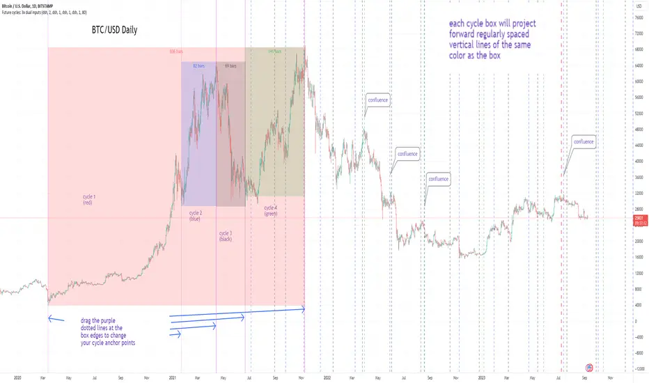
Cycles: 4x dual inputs: Swing / Time Cycles projected forward//Purpose/Premise:
To project forward vertical 'cycle' lines based on user-input anchor points, and to search for confluence.
The idea being that if several well-anchored cycles agree (i.e. we see multiple bunched vertical line confluence in the future), then this may add support to an already existing trade idea, or may indicate an increased likelihood of a shift in direction.
//Usage & notes:
~In the above chart I've anchored to obvious swing lows and swing highs in Btc/Usd from 2020-2022. You could also use fixed time-based cycles from a favored start anchor point. Bars per cycle are printed at the top of each cycle box if your're interested in time cycles. I.e. for 1, 2, 3 month cycles: for BTC you could use 30, 60, 90 bars on daily; for S&P you could use 20, 40, 60 bars on daily.
~On first loading the indicator you will be asked select 'start date', and 'end date' for each of 4 sessions (8x clicks on chart). After this you can easily reset points by clicking the indicator display line three dots>> reset points. Or you can simply drag the vertical box edges (purple lines) to change your cycle anchor points.
~Be sure the start anchor point is before the end anchor point or box/lines won't appear.
~When you drop down to low timeframes you might get bar_index error due to history available: you need then to click the three dots on indicator display line >> reset points >> 8x clicks on the chart.
~Vertical projected lines will match the color of the cycle box they origninate from.
~Lines will project into the future as far as is allowed by tradingview (500 bars max)
//Inputs:
~Time start and end dates for each cycle (change these as described above, or input manually)
~Show/hide each cycle (default is show all 4)
~Formatting options: color of forward projected lines, line width, line style, line / box / text color.
~Box transparancy: Set to 100 to make boxes invisible & declutter the chart. Set to 0 for maximum opacity. Default is 80.
thanks to @Sathyamurthie for his ideas on cycle confluence which caused me to write this.
libHTF[without request.security()]Library "libHTF"
libHTF: use HTF values without request.security()
This library enables to use HTF candles without request.security().
Basic data structure
Using to access values in the same manner as series variable.
The last member of HTF array is always latest current TF's data.
If new bar in HTF(same as last bar closes), new member is pushed to HTF array.
2nd from the last member of HTF array is latest fixed(closed) bar.
HTF: How to use
1. set TF
tf_higher() function selects higher TF. TF steps are ("1","5","15","60","240","D","W","M","3M","6M","Y").
example:
tfChart = timeframe.period
htf1 = tf_higher(tfChart)
2. set HTF matrix
htf_candle() function returns 1 bool and 1 matrix.
bool is a flag for start of new candle in HTF context.
matrix is HTF candle data(0:open,1:time_open,2:close,3:time_close,4:high,5:time:high,6:low,7:time_low).
example:
=htf_candle(htf1)
3. how to access HTF candle data
you can get values using .lastx() method.
please be careful, return value is always float evenif it is "time". you need to cast to int time value when using for xloc.bartime.
example:
htf1open=m1.lastx("open")
htf1close=m1.lastx("close")
//if you need to use histrical value.
lastopen=open
lasthtf1open=m1.lastx("open",1)
4. how to store Data of HTF context
you have to use array to store data of HTF context.
array.htf_push() method handles the last member of array. if new_bar in HTF, it push new member. otherwise it set value to the last member.
example:
array a_close=array.new(1,na)
a_close.htf_push(b_new_bar1,m1.lastx("close"))
HTFsrc: How to use
1. how to setup src.
set_src() function is set current tf's src from string(open/high/low/close/hl2/hlc3/ohlc4/hlcc4).
set_htfsrc() function returns src array of HTF candle.
example:
_src="ohlc4"
src=set_src(_src)
htf1src=set_htfsrc(_src,b_new_bar1,m1)
(if you need to use HTF src in series float)
s_htf1src=htf1src.lastx()
HighLow: How to use
1. set HTF arrays
highlow() and htfhighlow() function calculates high/low and return high/low prices and time.
the functions return 1 int and 8arrays.
int is a flag for new high(1) or new low(-1).
arrays are high/low and return high/low data. float for price, int for time.
example
=
highlow()
=
htfhighlow(m1)
2. how to access HighLow data
you can get values using .lastx() method.
example:
if i_renew==1
myhigh=a_high.lastx()
//if you need to use histrical value.
myhigh=a_high.lastx(1)
other functions
functions for HTF candle matrix or HTF src array in this script are
htf_sma()/htf_ema()/htf_rma()
htf_rsi()/htf_rci()/htf_dmi()
method lastx(arrayid, lastindex)
method like array.last. it returns lastindex from the last member, if parameter is set.
Namespace types: float
Parameters:
arrayid (float )
lastindex (int) : (int) default value is "0"(the last member). if you need to access historical value, increment it(same manner as series vars).
Returns: float value of lastindex from the last member of the array. returns na, if fail.
method lastx(arrayid, lastindex)
method like array.last. it returns lastindex from the last member, if parameter is set.
Namespace types: int
Parameters:
arrayid (int )
lastindex (int) : (int) default value is "0"(the last member). if you need to access historical value, increment it(same manner as series vars).
Returns: int value of lastindex from the last member of the array. returns na, if fail.
method lastx(m, _type, lastindex)
method for handling htf matrix.
Namespace types: matrix
Parameters:
m (matrix) : (matrix) matrix for htf candle.
_type (string) : (string) value type of htf candle:
lastindex (int) : (int) default value is "0"(the last member).
Returns: (float) value of htf candle. (caution: need to cast float to int to use time values!)
method set_last(arrayid, val)
method to set a value of the last member of the array. it sets value to the last member.
Namespace types: float
Parameters:
arrayid (float )
val (float) : (float) value to set.
Returns: nothing
method htf_push(arrayid, b, val)
method to push new member to htf context. if new bar in htf, it works as push. else it works as set_last.
Namespace types: float
Parameters:
arrayid (float )
b (bool) : (bool) true:push,false:set_last
val (float) : (float) _f the value to set.
Returns: nothing
method tf_higher(tf)
method to set higher tf from tf string. TF steps are .
Namespace types: series string, simple string, input string, const string
Parameters:
tf (string) : (string) tf string
Returns: (string) string of higher tf.
htf_candle(_tf, _TZ)
build htf candles
Parameters:
_tf (string) : (string) tf string.
_TZ (string) : of timezone. default value is "GMT+3".
Returns: bool for new bar@htf and matrix for snapshot of htf candle
set_src(_src_type)
set src.
Parameters:
_src_type (string) : (string) type of source:
Returns: (series float) src value
set_htfsrc(_src_type, _nb, _m)
set htf src.
Parameters:
_src_type (string) : (string) type of source:
_nb (bool) : (bool) flag of new bar
_m (matrix) : (matrix) matrix for htf candle.
Returns: (array) array of src value
is_up()
last_is_up()
peak_bottom(_latest, _last)
Parameters:
_latest (bool)
_last (bool)
htf_is_up(_m)
Parameters:
_m (matrix)
htf_last_is_up(_m)
Parameters:
_m (matrix)
highlow(_b_bartime_price)
Parameters:
_b_bartime_price (bool)
htfhighlow(_m, _b_bartime_price)
Parameters:
_m (matrix)
_b_bartime_price (bool)
htf_sma(_a_src, _len)
Parameters:
_a_src (float )
_len (int)
htf_rma(_a_src, _new_bar, _len)
Parameters:
_a_src (float )
_new_bar (bool)
_len (int)
htf_ema(_a_src, _new_bar, _len)
Parameters:
_a_src (float )
_new_bar (bool)
_len (int)
htf_rsi(_a_src, _new_bar, _len)
Parameters:
_a_src (float )
_new_bar (bool)
_len (int)
rci(_src, _len)
Parameters:
_src (float)
_len (int)
htf_rci(_a_src, _len)
Parameters:
_a_src (float )
_len (int)
htf_dmi(_m, _new_bar, _len, _ma_type)
Parameters:
_m (matrix)
_new_bar (bool)
_len (int)
_ma_type (string)

Bull and Bear Market '20% IndicatorThis indicator uses the somewhat crude method of calculating bear/bull markets using the following popular ' 20% rule ':
A bear market begins when an asset trades 20% below its recent high for more than two months, a bear market ends when an asset trades 20% above its recent low for one month or more.
The 1d time-frame should be used, here's why:
"A bear market begins when an asset trades 20% below its recent high for more than two months."
If we take the standard trading month to be around 20-22 days (excluding weekends), then two months would be approximately 40-44 days. This is why we set the `bearDuration` to 60 days in the script to capture the "more than two months" criteria. Using a daily timeframe, 60 bars represent roughly 3 months (since markets are not open every day due to weekends and holidays).
"...a bear market ends when an asset trades 20% above its recent low for one month or more."
This is why the `bullDuration` is set to 20 days in the script, which represents roughly one trading month on a daily timeframe.
So, to capture the mentioned bear and bull market definitions, you'd want to apply the script on a daily (1d/1D) chart.

Expected Move from RSI [SS]Publishing this experimental indicator.
What it does:
The indicator uses a user-defined lookback period on a user-defined timeframe to lookback at all instances of RSI. It breaks RSI down as follows:
RSI between
0 - 10
10 - 20
20 - 30
30 - 40
40 - 50
50 - 60
60 - 70
70 - 80
80 - 90
90 - 100
From there, it stores the ticker's move from open to high and open to low. It will then use this data to look at the current RSI based on the specified timeframe and plot the expected move based on the average move the ticker does with a similar RSI reading.
It will plot the expected range, with the high range being plotted in green and the low range being plotted in red.
It will also display an infographic that dictates the current RSI based on the selected time frame, the anticipated up move and the anticipated down move. This infographic will also tell you the strength of the relationship (correlation) RSI has with the ticker's high or low price:
From there the user can determine whether this RSI reading is traditionally bullish or bearish for the ticker. A greater down move indicates that the RSI traditionally elicits a bearish response. A greater up move indicates the inverse.
The user can also view a chart of a breakdown of the anticipated moves based on RSI. If the option to "Show Expected Move Table" is select in the settings menu, the following table will appear:
From here you can see the average up move and down move a ticker does based on its corresponding RSI reading.
NOTE: When using the table, please adjust your chart timeframe to the selected timeframe on the indicator. Thus, if you are looking at the 1 hour levels, please adjust your chart to the 1 hour timeframe to use the chart.
Additional Note: When using the table, an "NaN" means that there are no instances of the ticker being at that RSI level within the designated timeframe period. You can extend your lookback period to up to 500 candles to see if it finds additional instances of similar RSI. Otherwise, you can adjust the selected timeframe.
Uses:
The indicator can be used on all timeframes. It can help give you an idea as to whether the RSI indicates a bearish or bullish sentiment.
It can signal a potential reversal or continuation. It can also help you with determining target prices for day trades and scalp trades.
And that is the indicator. Its pretty straight forward. It is experimental and new, so feel free to play around with it and let me know your thoughts.
Safe trades everyone and thank you for reading!

RD Opening Range/Initial BalanceIntroducing the RD Opening Range/Initial Balance indicator. The opening range is the first 60 minutes of trading action for a given day (High, Mid, and Low).
The market tends to put significance in these levels, that's why we use them in our trade system.
There is also a data panel:
Today - Today's opening range value
W-Avg - This weeks average
20D CA-OH - the total number of closes above the opening range over the last 20 days (above high)
20D CA-OL - the total number of closes below the opening range over the last 20 days (below low)
* We do plan to add additional data points.
* Only the last OR has labels, we will not be adding them or an option in the future.
* Full customization in setting panel. Color of lines, background, no display of data panel and more.
How to Use
These levels act as dual magnets. They both attract price and repel price.
You use price action and rules to decipher if price is being attracted or repelled.
You will notice as you use this indicator that price respects these levels. Often when answering the 3Qs one of these levels is in play.
During the cash market these levels play a significant role in price action. Even during the Globex/Overnight session these levels are a factor.
Circle areas are examples of price reactions at OR key levels:
If you trade with the RDTS you already know how to use these levels as reaction and target zones.
For clues on which level price is being repelled or attracted I'd suggest you utilize bias and momentum indicators like the RDA.
Initial Balance vs Opening Range
Before we move on and discuss how to use this indicator I want to mention what I consider the difference between the Opening Range and the Initial Balance.
I've adopted the Opening Range verbiage for the first 60 minutes of trading even though the Opening Range is often defined as the first 15m or first 30m.
The more accurate term for the first 60m should be Initial Balance. I'm not sure exactly where this originated but I learned this term when I was heavily trading TPO-- the IB is the first 2 30m blocks of trading.
Any questions or improvements just comment below.
This script was created in by both Bhangerang (an Alpha member of the RDTS) with help by @RexDogActual as well as permission to publish.

Liquidation Levels on OIThis indicator is used to display estimated contract liquidation prices. When there are dense liquidation areas on the chart, it indicates that there may be a lot of liquidity at that price level. The horizontal lines of different colors on the chart represent different leverage ratios. See below for details.
Let me introduce the principle behind this indicator:
1. When position trading volume increases or decreases significantly higher than usual levels in a specific candlestick chart, it indicates that a large number of contracts were opened during that period. We use the 60-day moving average change as a benchmark line. If the position trading volume changes more than 1.2x, 2x or 3x its MA60 value, it is considered small, medium or large abnormal increase or decrease.
2. This indicator takes an approximate average between high, open, low and close prices of that candlestick as opening price.
3. Since contracts involve liquidity provided by both buyers and sellers with equal amounts of long and short positions corresponding to each contract respectively; since we cannot determine actual settlement prices for contract positions; therefore this indicator estimates settlement prices instead which marks five times (5x), ten times (10x), twenty-five times (25x), fifty times (50x) and one hundred times (100x) long/short settlement prices corresponding to each candlestick chart generating liquidation lines with different colors representing different leverage levels.
4. We can view areas where dense liquidation lines appear as potential liquidation zones which will have high liquidity.
5. We can adjust orders based on predicted liquidation areas because most patterns in these areas will be quickly broken.
6. We provide a density histogram to display the liquidation density of each price range.
Special thanks to the following TradingView community members for providing open-source indicators and contributing to the development of this indicator!
Liquidation - @Mysterysauce
Open Interest Delta - By Leviathan - @LeviathanCapital
Regarding the relationship with the above-mentioned open source indicators:
1. Indicator Liquidation - @Mysterysauce can also draw a liquidation line in the chart, but:
(1) Our indicator generates a liquidation line based on abnormal changes in open interest; their indicator generates a liquidation line based on trading volume.
(2) Our indicator will generate both long and short liquidation lines at the same time; their indicator will only generate a liquidation line in a single direction.
We refer to their method of drawing liquidation lines when drawing our own.
2. Indicator Open Interest Delta - By Leviathan - @LeviathanCapital obtained OI data for Binance USDT perpetual contracts in the code. We refer to their method of obtaining OI data in our code.
============= 中文版本 =============
此指标用于显示估计合约清算价格。当图表上有密集的清算区域时,表示该价格水平可能存在大量流动性。图表上不同颜色的水平线代表不同杠杆比率。详情请参见下面的说明。
让我介绍一下这个指标背后的原理:
1. 当特定蜡烛图对应的合约仓位增加量(OI Delta)显著高于通常水平时,表示在那段时间有大量合约开仓。我们使用OI Delta的60日移动均线作为基准线。如果OI Delta超过其MA60值的1.2倍、2倍或3倍,则认为是小型、中型或大型的异常OI Delta。
2. 该指标将上述蜡烛图高、开、低和收盘价的平均值作为近似的合约开仓价。
3. 由于合约涉及买方和卖方之间相互提供流动性,每个合约对应相等数量的多头和空头头寸。由于我们无法确定合约头寸的实际清算价格,因此该指标估计了清算价格。它标记了与该蜡烛图相对应的多头和空头5倍、10倍、25倍、50倍和100倍的清算价格,生成清算线。不同杠杆水平用不同颜色表示。
4. 我们可以将出现密集清算线的区域视为潜在的清算区域。这些区域将具有高流动性。
5. 我们可以根据预测到的清算区域调整自己的订单,因为根据规律,这些清算区域大部分都会很快被击穿。
6. 我们提供了密度直方图来显示每个价格范围的清算密度
特别感谢以下TradingView社区成员提供开源指标并为该指标的开发做出贡献!
Liquidation - @Mysterysauce
Open Interest Delta - By Leviathan - @LeviathanCapital
与上述开源指标的关系:
1. 指标Liquidation - @Mysterysauce也可以在图中绘制清算线,但是:
(1)我们的指标是基于open interest的异常变化生成的清算线;他们的指标是基于成交量生成的清算线
(2)我们的指标会同时生成多头和空头清算线;他们的指标仅会在单一方向生成清算线
我们的指标在绘制清算线上参考了他们绘制清算线的方式
2. 指标Open Interest Delta - By Leviathan - @LeviathanCapital在代码中获取了Binance USDT永续合约的OI数据。我们在代码中参考他们获取OI数据的方式

Automated Option Price - Black-Scholes modelPlease make sure you are plotting this indicator on DAILY bars, not doing so will lead to unintended results. Also, make sure that you keep up to date the Risk-free interest rate, which you can consult (for U.S.) on ycharts.com.
This is an indicator that is meant to be used for Options Day Trading, but it can be useful for mid-term or leaps for I also enabled the possibility for user to input manually the Strike and Expiration date. I based the calculation on the Black-Scholes model. Variables included in the calculation are:
-Stock price (S): The current price of the underlying asset (e.g., a stock).
-Strike price (K): The predetermined price at which the option can be exercised.
-Time to expiration (T): The time remaining until the option expires, expressed as a fraction of a year.
-Volatility (σ): The annualized standard deviation of the stock's returns, which is a measure of the stock's price fluctuations.
-Risk-free interest rate (r): The annualized return on a risk-free investment, often approximated by the yield on a government bond.
The only variable I excluded from the original model was the Dividend yield (q).
U S E R I N P U T S:
1. AUTOMATIC calculations enabled:
i) Strike price (K):
Automatically calculate the strike price for both call and put options based on the stock's closing price. The logic follows a set of rules to determine the strike prices which will usually be Out-of-the-Money (OTM):
-If the stock's closing price is between 1 and 60, the call strike price is rounded up to the nearest whole number, while the put strike price is rounded down to the nearest whole number.
-If the stock's closing price is between 60 and 90, the call strike price is rounded up to the nearest whole number and increased by 1, while the put strike price is rounded down to the nearest whole number and decreased by 1.
-If the stock's closing price is between 90 and 120, the call strike price is rounded up to the nearest whole number and increased by 2, while the put strike price is rounded down to the nearest whole number and decreased by 2.
-If the stock's closing price is above 120, the call strike price is rounded up to the nearest multiple of 5, while the put strike price is rounded down to the nearest multiple of 5.
By applying these rules, I just tried to ensure that the automatically calculated strike prices are tailored to the stock's price range, allowing for more accurate option pricing calculations.
ii) Time to expiration (T):
The indicator will consider this week’s expiration contracts (Friday) only when the current day/bar = Monday. If Tuesday or older it will consider the expiration date of the next week’s Friday (because we are not Theta gamblers, right?).
If you are not comfortable with above for whatever reason, you can always…
2. Enter inputs MANUALLY
First make sure you UNTICK the boxes for automatic calculation.
i) Strike price (K) – Self-explanatory
ii) Time to expiration (T) – Just make sure that the horizon you are inputting matches with the next parameter (e.g. you would not input a Monthly risk-free interest rate for a Leap).
iii) Risk-free interest rate (r) – You can pull this data from the web. Here’s the link I used to define the value that this indicator was launched with:
ycharts.com
Don’t get obsessed with updating this daily if you are using this for day trading, you will notice that weekly may be more than enough.
V O L A T I L I T Y
Not option to manually input Volatility so I’ll explain how it is calculated in this script:
I considered two measures of volatility; one is derived calculating the annualized volatility using the standard deviation of daily returns and the second one is the ATR-based annualized volatility. I then used a ‘combined’ approach with the harmonic mean and the arithmetic mean of these results which can help account for the variability in the option prices calculated with different volatility estimates, which can be more robust when dealing with outliers or skewed data. I back tested with some samples of actual option prices and found that this approach is the one that got results closer to the actual bids.
T A B L E
Nomenclature to read rows is:
Option Strike Price | Type of Option (Put or Call) @ The current Close or at 50% level of bar | Estimated Price
*The Option expiration Date showed as dd-MMM as part of the headers.
Second and third row (color 1): These will show the calculated value for the Put/Call, assuming you are buying at the CURRENT price of the stock.
Third and Fifth row (color2): These will show the calculated value for the Put/Call, assuming you buy at the 50% level of the current bar (this is the value that the contract WOULD HAVE at the 50% level of the bar).
If you plot the indicator during market hours it will obviously update as price moves, this is an intended feature.
L I M I T A T I O N S
The Black-Scholes model, like many other models, has its limitations and will oftentimes provide inaccurate option prices in all market conditions. High volatility events, such as earnings announcements, can lead to significant price fluctuations that are not fully captured by the model.
The model assumes that the stock price follows a continuous random walk with constant volatility, but in reality, volatility can change over time, and stock prices can exhibit jumps, especially around significant events like earnings announcements. This can cause the model to underestimate the true option price in such situations.
Please make sure that you first back test on the symbols you trade to ensure the information presented by this indicator will suit your trading strategy. You will find that the delta between the proposed price of the indicator versus the actual price may differ significantly in some symbols while for others it will be very close. For instance, today (13APR23), the prices for AMD, DIS, AAPL (puts only), were very close to actual bids, whereas TSLA differ significantly (but then again, take a look at the calendar and this last symbol is having earnings next week which may add a premium to the contracts)… I am sure you will get your own conclusions and applicable use cases based on the data you test with.
As always, be wise and methodical on the investment or trading decisions you make!
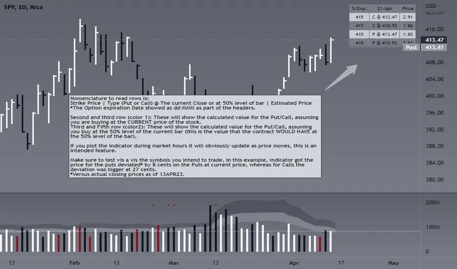
Acceleration-Based MA Slope PredictionHello traders,
I developed this indicator while working on a trading strategy using moving average slope and acceleration, and I found the concept interesting enough to share it.
Let me briefly explain this indicator.
----About White Plot----
1. Calculate the first derivative approximation at the current point of the Moving Average, and then calculate the second derivative approximation to obtain the 'Acceleration'.
2. Where the acceleration is 0, it signifies a change in the force of the moving average.
3. Therefore, by drawing a parabola based on the acceleration at that time, can depict the parabolic shape of the moving average.
This is represented as a white circle on the indicator.
4. These circles are reset at the next point where the acceleration is 0, indicating a change in the parabolic force.
If the moving average rises more sharply than the predicted value of the rising parabola, a more drastic increase is expected.
5. In this case, you can start risk management around the time the drawn parabola breaks.
(The actual MA is represented by green/red lines)
6. Before the trend changes, i.e., before the direction of the moving average changes, there is a section where the acceleration is 0, and this is represented on the chart as follows.
(The lower indicator shows the acceleration of the corresponding parabola)
----About Red Plot----
1. Calculate the first derivative approximation of the moving average value, the 'slope'.
2. Where the slope is 0, it represents the extreme point of the parabola.
3. Therefore, by using the acceleration at that point as the coefficient of the quadratic function and setting the extreme point as a vertex, we can draw a quadratic function. This is represented as a red circle on the indicator.
(Keep in mind that the actual moving average is not a quadratic function; this is a "forced" quadratic function assuming the parabola is maintained)
4. These circles are reset at the next extreme point where the slope is 0, and a new quadratic function is created.
Based on the formula obtained in the above process, you can predict the future moving average through 'offset'.
5. That is, if the x value at the current point is 'k', you can predict the moving average one candle ahead by substituting (k+1) into the quadratic function.
The predicted value at the past position is shown as a red circle.
6. The smoother the chosen moving average, the fewer extreme points will appear, and the higher the likelihood of the parabola fitting.
For the T3 set as the default value, it shows very high accuracy even when predicting about 20 candles ahead.
On the other hand, rough moving averages like SMA have limited prediction value.
(SMA 60, offset = 10)
--------
The moving average with a very high level of accuracy is JMA (Jurik Moving Average). However, since the code for this moving average is not public, I recommend those interested to check it through my code.
Additionally, I believe the code of this indicator I've uploaded has significant utility.
As an example, you can use the breaking point of the parabola predicted by the acceleration to determine when the force changes again for entries/losses. There are many other possible applications as well.
I look forward to seeing more excellent results from this indicator.
--------
안녕하세요 트레이더여러분.
이 지표는, 제가 이동평균선의 기울기와 가속도를 이용하여 매매를 하기 위한 지표를 개발하다가, 흥미로운 내용이라고 판단하여 만들게 되었습니다.
이 지표에 대해 간단히 설명드리겠습니다.
----하얀색 플롯에 대해----
1. 이동평균선이 진행되는 현재 시점에서 미분의 근사값을 구하고, 다시 한 번 미분의 근사값을 구해서 '가속도'를 얻습니다.
2. 가속도가 0이 되는 곳은, 곧 해당 이동평균선의 힘이 바뀌는 곳을 의미합니다.
3. 따라서, 그 당시 시점 기준으로 포물선을 그려낸다면, 가속도를 이용하여 해당 이동평균선의 포물선을 그려낼 수 있습니다. 이것은 지표의 하얀색점로서 표기됩니다.
4. 이 때, 이러한 점들은 다음의 가속도가 0이 되는 지점, 즉 포물선의 힘이 바뀌는 곳에서 다시 초기화됩니다.
5. 올라가고 있던 포물선에서의 예측치보다 이동평균선이 더 급하게 올라간다면, 더욱 급격한 상승이 예상됩니다. 이 경우, 그려지고있는 포물선이 깨질 때쯤부터 리스크 관리를 시작할 수 있습니다.
(녹색/빨간색의 선으로 실제 MA를 표현했습니다. 거슬리시면 '모습'가셔서 끄셔도 좋습니다. )
6. 추세가 변경되기 전, 즉 이동평균선의 방향이 바뀌기 전에는 가속도가 0이 되는 구간이 존재하고, 그것이 차트 위에 다음과같이 표현됩니다.
(하단의 지표는, 해당 포물선의 가속도을 나타냅니다)
----붉은색 플롯에 대해----
1. 이동평균선 값을 미분 근사값 즉, '기울기'를 구합니다.
2. 기울기가 0이 되는 곳은, 포물선이 극점이 되는 곳을 뜻합니다.
3. 따라서, 해당 시점의 가속도를 2차함수의 계수로 하여, 또한 해당 극점을 하나의 꼭지점으로 설정하여,이차함수를 그려낼 수 있습니다. 이것은 지표의 빨간색점으로서 표현됩니다.
(실제 이동평균선은 2차함수가 아니기에, 포물선이 유지된다는 가정 하에 "억지로"만들어낸 이차함수입니다)
4. 이 때, 이러한 점은 다음 극점이 0이 되는 곳에서 초기화되고 이차함수가 만들어집니다.
5. 위의 과정에서 얻은 식을 바탕으로 'offset'을 통해 미래의 이동평균선을 예측할 수 있습니다.
즉, 현재시점의 x값을 'k'라고 한다면, (k+1)을 이차함수에 대입하여 1캔들 앞의 이동평균선을 예측할 수 있습니다.
해당 예측치가 지나간 자리는, 빨간색점을 통해 보여집니다.
6. 선택한 이동평균선이 스무스할수록 극점은 덜 등장하게되고, 포물선의 위치가 맞아들어갈 가능성이 높습니다.
현재 디폴트값으로 설정된 T3의 경우, 약 20캔들 앞을 예측해도 매우 높은 정확도를 보여줍니다.
반면에, SMA와 같이 울퉁불퉁한 이동평균선은 가능한 예측치가 크지 않습니다.
(SMA 60, offset=10)
--------
매우 높은 수준의 정확도를 보여준 이동평균선은 JMA(Jurik Moving Average)입니다. 다만 이 이동평균선은 코드가 공개되지 않았기때문에, 관심있으신 분은 저의 코드를 통해 한번 확인해보시길 권장드립니다.
추가로, 제가 올린 이 지표의 코드는 이용가치가 높다고 생각합니다.
하나의 예시로서, 가속도로 예측한 포물선이 깨지는 곳을 기준으로, 힘이 다시 한 번 바뀌는 것을 이용해 진입/로스를 할 수 있습니다. 그 외에도 매우 다양한 활용이 가능합니다.
이 지표를 통해 더욱 좋은 새로운 결과물이 나오길 기대해봅니다.

The Flash-Strategy (Momentum-RSI, EMA-crossover, ATR)The Flash-Strategy (Momentum-RSI, EMA-crossover, ATR)
Are you tired of manually analyzing charts and trying to find profitable trading opportunities? Look no further! Our algorithmic trading strategy, "Flash," is here to simplify your trading process and maximize your profits.
Flash is an advanced trading algorithm that combines three powerful indicators to generate highly selective and accurate trading signals. The Momentum-RSI, Super-Trend Analysis and EMA-Strategy indicators are used to identify the strength and direction of the underlying trend.
The Momentum-RSI signals the strength of the trend and only generates trading signals in confirmed upward or downward trends. The Super-Trend Analysis confirms the trend direction and generates signals when the price breaks through the super-trend line. The EMA-Strategy is used as a qualifier for the generation of trading signals, where buy signals are generated when the EMA crosses relevant trend lines.
Flash is highly selective, as it only generates trading signals when all three indicators align. This ensures that only the highest probability trades are taken, resulting in maximum profits.
Our trading strategy also comes with two profit management options. Option 1 uses the so-called supertrend-indicator which uses the dynamic ATR as a key input, while option 2 applies pre-defined, fixed SL and TP levels.
The settings for each indicator can be customized, allowing you to adjust the length, limit value, factor, and source value to suit your preferences. You can also set the time period in which you want to run the backtest and how many dollar trades you want to open in each position for fully automated trading.
Choose your preferred trade direction and stop-loss/take-profit settings, and let Flash do the rest. Say goodbye to manual chart analysis and hello to consistent profits with Flash. Try it now!
General Comments
This Flash Strategy has been developed in cooperation between Baby_whale_to_moon and JS-TechTrading. Cudos to Baby_whale_to_moon for doing a great job in transforming sophisticated trading ideas into pine scripts.
Detailed Description
The “Flash” script considers the following indicators for the generation of trading signals:
1. Momentum-RSI
2. ‘Super-Trend’-Analysis
3. EMA-Strategy
1. Momentum-RSI
• This indicator signals the strength of the underlying upward- or downward-trend.
• The signal range of this indicator is from 0 to 100. Values > 60 indicate a confirmed upward- or downward-trend.
• The strategy will only generate trading signals in case the stock (or any other financial security) is in a confirmed upward- (long entry signals) or downward-trend (short entry signals).
• This indicator provides information with regards to the strength of the underlying trend and it does not give any insight with regard to the direction of the trend. Therefore, this strategy also considers other indicators which provide technical confirmation with regards to the direction of the underlying trend.
Graph 1 shows this concept:
• The Momentum-RSI indicator gives lower readings during consolidation phases and no trading signals are generated during these periods.
Example (graph 2):
2. Super-Trend Analysis
• The red line in the graph below represents the so-called super-trend-line. Trading signals are only generated in case the price action breaks through this super-trend-line indicating a new confirmed upward-trend (or downward-trend, respectively).
• If that happens, the super trend-line changes its color from red to green, giving confirmation that the trend changed from bearish to bullish and long-entries can be considered.
• The vice-versa approach can be considered for short entries.
Graph 3 explains this concept:
3. Exponential Moving Average / EMA-Strategy
The functionality of this EMA-element of the strategy has been programmed as follows:
• The exponential moving average and two other trend lines are being used as qualifiers for the generation of trading-signals.
• Buy-signals for long-entries are only considered in case the EMA (yellow line in the graph below) crosses the red line.
• Sell-signals for short-entries are only considered in case the EMA (yellow line in the graph below) crosses the green line.
An example is shown in graph 4 below:
We use this indicator to determine the new trend direction that may occur by using the data of the price's past movement.
4. Bringing it all together
This section describes in detail, how this strategy combines the Momentum-RSI, the super-trend analysis and the EMA-strategy.
The strategy only generates trading-signals in case all of the following conditions and qualifiers are being met:
1. Momentum-RSI is higher than the set value of this strategy. The standard and recommended value is 60 (graph 5):
2. The super-trend analysis needs to indicate a confirmed upward-trend (for long-entry signals) or a confirmed downward-trend (for short-entry signals), respectively.
3. The EMA-strategy needs to indicate that the stock or financial security is in a confirmed upward-trend (long-entries) or downward-trend (short-entries), respectively.
The strategy will only generate trading signals if all three qualifiers are being met. This makes this strategy highly selective and is the key secret for its success.
Example for Long-Entry (graph 6):
When these conditions are met, our Long position is opened.
Example for Short-Entry (graph 7):
Trade Management Options (graph 8)
Option 1
In this dynamic version, the so-called supertrend-indicator is being used for the trade exit management. This supertrend-indicator is a sophisticated and optimized methodology which uses the dynamic ATR as one of its key input parameters.
The following settings of the supertrend-indicator can be changed and optimized (graph 9):
The dynamic SL/TP-lines of the supertrend-indicator are shown in the charts. The ATR-length and the supertrend-factor result in a multiplier value which can be used to fine-tune and optimize this strategy based on the financial security, timeframe and overall market environment.
Option 2 (graph 10):
Option 2 applies pre-defined, fixed SL and TP levels which will appear as straight horizontal lines in the chart.
Settings options (graph 11):
The following settings can be changed for the three elements of this strategy:
1. (Length Mom-Rsi): Length of our Mom-RSI indicator.
2. Mom-RSI Limit Val: the higher this number, the more momentum of the underlying trend is required before the strategy will start creating trading signals.
3. The length and factor values of the super trend indicator can be adjusted:ATR Length SuperTrend and Factor Super Trend
4. You can set the source value used by the ema trend indicator to determine the ema line: Source Ema Ind
5. You can set the EMA length and the percentage value to follow the price: Length Ema Ind and Percent Ema Ind
6. The backtesting period can be adjusted: Start and End time of BackTest
7. Dollar cost per position: this is relevant for 100% fully automated trading.
8. Trade direction can be adjusted: LONG, SHORT or BOTH
9. As we explained above, we can determine our stop-loss and take-profit levels dynamically or statically. (Version 1 or Version 2 )
Display options on the charts graph 12):
1. Show horizontal lines for the Stop-Loss and Take-profit levels on the charts.
2. Display relevant Trend Lines, including color setting options for the supertrend functionality. In the example below, green lines indicate a confirmed uptrend, red lines indicate a confirmed downtrend.
Other comments
• This indicator has been optimized to be applied for 1 hour-charts. However, the underlying principles of this strategy are supply and demand in the financial markets and the strategy can be applied to all timeframes. Daytraders can use the 1min- or 5min charts, swing-traders can use the daily charts.
• This strategy has been designed to identify the most promising, highest probability entries and trades for each stock or other financial security.
• The combination of the qualifiers results in a highly selective strategy which only considers the most promising swing-trading entries. As a result, you will normally only find a low number of trades for each stock or other financial security per year in case you apply this strategy for the daily charts. Shorter timeframes will result in a higher number of trades / year.
• Consequently, traders need to apply this strategy for a full watchlist rather than just one financial security.

TOMMAR#TOMMAR #MultiMovingAverages #MMAR
Dear fellow traders, this is Tommy, and today I'd like to introduce you to the Multi-Moving Averages Ribbon (MMAR) indicator, which I believe to be one of the best MMAR indicators available on TradingView. Moving Averages is a popular technical analysis tool used to smooth out price data by creating an average of past price data points over a specified time period. They can be used to identify trends and provide a clearer view of price action, as well as generate buy and sell signals by observing crossovers between different moving average lines.
In the MMAR indicator, we have incorporated 12 different types of Moving Averages, including Simple Moving Averages (SMA), Exponential Moving Averages (EMA), Weighted Moving Averages (WMA), Hull Moving Averages (HMA), and Smoothed Moving Averages (SMMA), among others. This allows traders to choose the optimal type for their preferred trading commodities.
One common technique in technical analysis is using multiple Moving Averages with varying lengths, which provides a more comprehensive view of price action. By analyzing multiple Moving Averages with different timeframes, traders can better understand both short- and long-term trends and make more informed trading decisions. Some of the well-known combinations of multiple moving averages used by traders are (5, 9, 14, 21, 45), (6, 11, 16, 22, 51), [8, 13, 21, 55), (50, 100, 200), and (60, 120, 240).
Another way to gauge the strength of the market trend is to look for the arrangement of the Moving Averages. If they are in a sequential order, with the shortest on top and the longest on the bottom, it is most likely a bullish trend. On the other hand, if they are arranged in reverse order, with the shortest on the bottom and the longest on top, it is most likely a bearish trend. The 'Trend Light' in the indicator settings will automatically signal when the Moving Averages are in either an orderly or reverse arrangement.
Lastly, I have added a useful feature to the indicator: the 'MA Projection'. This feature projects and forecasts the Moving Averages in the future, allowing traders to easily identify confluence zones in future candlesticks. Please note that the projection levels may change in the case of extreme price action that significantly affects the Moving Averages.
This is free so any Tradingview users can use this indicator. Just search TOMMAR in the indicator section located on top of the chart.
#TOMMAR #MultiMovingAverages #MMAR
안녕하세요 트레이더 여러분, 토미입니다. 오늘 여러분들에게 소개드릴 지표는 다양한 길이의 이동평균선 조합을 사용할 수 있는 MMAR (Multiple Moving Averages Ribbon)입니다. 아마 제가 만든 MMAR 지표가 트레이딩뷰에서 가장 쓸만할 겁니다. 이동평균선, 줄여서 이평선은 말 그대로 특정 기간 범위 내의 주가들을 평균한 값들로 이루어진 선입니다. 제가 이평선 관련된 강의 자료는 예전에 올려드린 바 있으니 더 자세한 내용이 궁금하신 분들은 아래 링크/이미지 클릭하시길 바랍니다.
본 지표는 Simple Moving Averages (SMA), Exponential Moving Averages (EMA), Weighted Moving Averages (WMA), Hull Moving Averages (HMA), 그리고 Smoothed Moving Averages (SMMA) 등을 포함해 총 12개 종류의 이평선 지표를 사용할 수 있습니다. 또한 각 이평선의 길이들도 하나하나 일일이 설정하실 수 있습니다. 예를 들어 요즘에 자주 보이는 이평선들의 조합이 , , , , 그리고 등등이 존재하는데 여러분의 취향에 맞게 설정하여 사용하시면 됩니다.
몇 가지 주요 기능에 대해서 설명 드리겠습니다. 설정에서 ‘Trend Light’를 키면 이평선들의 정배열 혹은 역배열 여부를 쉽게 볼 수 있습니다. 이평선이 정배열일때는 맨 아래의 이평선에 초록불이, 역배열일때는 맨 위의 이평선에 빨간불이 켜지며 둘 다 아닐 땐 아무 불도 켜지지 않습니다. 또한 ‘MA Projection’을 키면 이평선들의 미래 예측 값들을 확장해줍니다. 당연히 가격 변동이 갑자기 크게 나오면 이평선 예측 확장 레벨들이 확 바뀌겠죠.
지표창에 TOMMAR 검색하시거나 아래 즐겨찾기 인디케이터에 넣기 클릭하시면 누구나 사용하실 수 있습니다~ 여러분의 구독, 좋아요, 댓글은 저에게 큰 힘이 됩니다.

RSI Multi Symbol/Time Frame DetectorThis code is an implementation of the Relative Strength Index (RSI) indicator, which is a popular momentum indicator used in technical analysis. The RSI measures the strength of an asset's price action and provides information on whether the asset is overbought or oversold. The code also calculates a moving average of the RSI and allows the user to choose the type of moving average to be calculated (SMA, EMA, SMMA, WMA, or VWMA).
The user can select from different time frames (5, 15, 60, or 240), symbols (SP:SPX, OANDA:EURUSD, or OANDA:NZDUSD), RSI lengths, and moving average types and lengths.
The code starts by defining a function called "ma" for calculating different types of moving averages. This function takes as input the source data for the moving average calculation (the RSI), the length of the moving average, and the type of moving average. The function uses a switch statement to return the appropriate calculation based on the inputted moving average type.
Next, the code calculates the RSI and its moving average. The RSI is calculated using the well-known formula for the RSI, which involves calculating the average gains and losses over a specified period of time and then dividing the average gains by the average losses. The moving average is calculated using the "ma" function defined earlier.
Finally, the code allows the user to choose the symbol and time frame to be used in the RSI calculation, as well as the length of the RSI and the moving average, and the type of moving average. The user can choose from three symbols (SP:SPX, OANDA:EURUSD, OANDA:NZDUSD) and four time frames (5, 15, 60, and 240 minutes). The code then uses the "request.security" function to retrieve the RSI calculation for the selected symbol and time frame.
Note: This code is example for you to use multi timeframe/symbol in your indicator or Strategy , also prevent Repainting Calculation