Point and Figure (PnF) ChartThis is live and non-repainting Point and Figure Charting tool. The tool has it’s own P&F engine and not using integrated function of Trading View.
Point and Figure method is over 150 years old. It consist of columns that represent filtered price movements. Time is not a factor on P&F chart but as you can see with this script P&F chart created on time chart.
P&F chart provide several advantages, some of them are filtering insignificant price movements and noise, focusing on important price movements and making support/resistance levels much easier to identify.
If you are new to Point & Figure Chart then you better get some information about it before using this tool. There are very good web sites and books. Please PM me if you need help about resources.
Options in the Script
Box size is one of the most important part of Point and Figure Charting. Chart price movement sensitivity is determined by the Point and Figure scale. Large box sizes see little movement across a specific price region, small box sizes see greater price movement on P&F chart. There are four different box scaling with this tool: Traditional, Percentage, Dynamic (ATR), or User-Defined
4 different methods for Box size can be used in this tool.
User Defined: The box size is set by user. A larger box size will result in more filtered price movements and fewer reversals. A smaller box size will result in less filtered price movements and more reversals.
ATR: Box size is dynamically calculated by using ATR, default period is 20.
Percentage: uses box sizes that are a fixed percentage of the stock's price. If percentage is 1 and stock’s price is $100 then box size will be $1
Traditional: uses a predefined table of price ranges to determine what the box size should be.
Price Range Box Size
Under 0.25 0.0625
0.25 to 1.00 0.125
1.00 to 5.00 0.25
5.00 to 20.00 0.50
20.00 to 100 1.0
100 to 200 2.0
200 to 500 4.0
500 to 1000 5.0
1000 to 25000 50.0
25000 and up 500.0
Default value is “ATR”, you may use one of these scaling method that suits your trading strategy.
If ATR or Percentage is chosen then there is rounding algorithm according to mintick value of the security. For example if mintick value is 0.001 and box size (ATR/Percentage) is 0.00124 then box size becomes 0.001.
And also while using dynamic box size (ATR or Percentage), box size changes only when closing price changed.
Reversal : It is the number of boxes required to change from a column of Xs to a column of Os or from a column of Os to a column of Xs. Default value is 3 (most used). For example if you choose reversal = 2 then you get the chart similar to Renko chart.
Source: Closing price or High-Low prices can be chosen as data source for P&F charting.
Chart Style: There are 3 options for chart style: “Candle”, “Area” or “Don’t show”.
As Area:
As Candle:
X/O Column Style: it can show all columns from opening price or only last Xs/Os.
Color Theme: different themes exist => Green/Red, Yellow/Blue, White/Yellow, Orange/Blue, Lime/Red, Blue/Red
Show Breakouts is the option to show Breakouts
This tool detects & shows following Breakouts:
Triple Top/Bottom,
Triple Top Ascending,
Triple Bottom Descending,
Simple Buy/Sell (Double Top/Bottom),
Simple Buy With Rising Bottom,
Simple Sell With Declining Top
Catapult bullish/bearish
Show Horizontal Count Targets: Finds the congestion or consolidation pattern and if there is breakout then it calculates the Target by using Horizontal Count method (based on the width of congestion pattern). It shows how many column exist on congestion area. There is no guarantee that prices will reach the target.
Show Vertical Count Targets: When Triple Top/Bottom Breakouts occured the script calculates the target by using Vertical Count Method (based on the length of the column). There is no guarantee that prices will reach the target.
For both methods there is auto target cancellation if price goes below congestion bottom or above congestion top.
trend is calculated by EMA of closing price of the P&F
Whipsaw protection:
Last options are “Show info panel” and Labeling Offset. Script shows current box size, reversal, and recommanded minimum and maximum box size. And also it shows the price level to reverse the column (Xs <-> Os) and the price level to add at least 1 more box to column. This is the option to put these labels 10, 20, 30, 50 or 100 bars away from the last bar. Labeling content and color change according to X/O column.
do not hesitate to comment.
"摩根纳斯达克100基金风险大吗" için komut dosyalarını ara

Technical Analysis - Panel Info//A. Oscillators & B. Moving Averages base on TradingView's Technical Analysis by ThiagoSchmitz
//C.Pivot base on Ultimate Pivot Points Alerts by elbartt
//D. Summary & Panel info by anhnguyen14
Panel Info base on these indicators:
A. Oscillators
1. Rsi (14)
2. Stochastic (14,3,3)
3. CCI (20)
4. ADX (14)
5. AO
6. Momentum (10)
7. MACD (12,26)
8. Stoch RSI (3,3,14,14)
9. %R (14)
10. Bull bear
11. UO (7,14,28)
B. Moving Averages
1. SMA & EMA: 5-10-20-30-50-100-200
2. Ichimoku Cloud - Baseline (26)
3. Hull MA (9)
C. Pivot
1. Traditional
2. Fibonacci
3. Woodie
4. Camarilla
D. Summary
Sum_red=A_red+B_red+C_red
Sum_blue=A_blue+B_blue+C_blue
sell_point=(Sum_red/32)*100
buy_point=(Sum_blue/32)*100
sell =
Sum_red>Sum_blue
and sell_point>50
Strong_sell =
A_red>A_blue
and B_red>B_blue
and C_red>C_blue
and sell_point>50
and not crossunder(sell_point,75)
buy =
Sum_red>Sum_blue
and buy_point>50
Strong_buy =
A_red50
and not crossunder(buy_point,75)
neutral = not sell and not Strong_sell and not buy and not Strong_buy

CCI RiderThis is my thank you to the TradingView community, for the people who are sharing their scripts, which allowed me to learn Pine Script.
So here is my first creation, feel free to experiment, modify and use it as you wish.
It is a CCI(default value is 100, can be changed), combined with an EMA of that CCI(default 21,changeable) that then colors the background according to the strength of the signal(if selected to do so).
To generate strong signals, it also uses Bollinger Bands to prevent whipsaws in high volatility situations.
The best signals are generated when the CCI crosses the limits set by the user (default is 100/-100), and is above/belov its EMA.
Exit signals are indicated, when the CCI crosses its EMA.
Unfortunately in strong trends, this exit signal is sometimes premature, using a 3x resolution of the indicator will improve this, maybe I will implement this in a later version.
I use it mostly in 15min charts and higher, I found in shorter timeframes still a lot of whipsaws, maybe experimenting with different lengths and levels will improve this.
As the Indicator allows the user to experiment with different lenghts and levels, and the colors will change according the setting, I find it a nice tool to search for the best mixture for different securities and timeframes.
See below an example of a nice signal.
I do suggest to use it in combination with other indicators.

Yield Curve Version 2.55.2Welcome to Yield Curve Version 2.55.2
US10Y-US02Y
* Please read description to help understand the information displayed.
* NOTE - This script requires 1 real time update before accurate information is displayed, therefore WILL NOT display the correct information if the Bond Market is Closed over the Weekend.
* NOTE - When values are changed Via Input setting they do take a bit to display based off all the information that is required to display this script.
**FEATURES**
* Input Features let you view the information the way YOU like via Input Settings
* Displays Current Version Title - Toggleable On/Off via Input Settings - Default On
* Plots the Yield Curve of the Bonds listed (Middle Green and Red Line)
* Displays the Spread for each Bond (Top Green and Red Labels) - Toggleable On/Off via Input Settings - Change Size via Input Settings - Default On
* Displays the current Yield for each Bond (Bottom Green and Red Labels) - Toggleable On/Off via Input Settings - Change Size via Input Settings - Default On - Large Size
* Plots the Average of the Entire Yield Curve (BLUE Line within the Yield Curve) - Toggleable On/Off via Input Settings - Default On
* Displays messages based off Yield Inversions (Orange Text) - Toggleable On/Off via Input Settings - Default On if Applicable
* Displays 2 10 Inversion Warning Message (Orange Text) - Toggleable On/Off via Input Settings - Default On if Applicable
* Plots Column Data at the Bottom that tries to help determine the Stability of the Yield Curve (More information Below about Stability) - Toggleable On/Off via Input Settings - Default On
* Plots the 7,20 and 100 SMA of the STABILITY MAX OVERLOAD (More information Below about Stability Max Overload) - Toggleable On/Off via Input Settings - Default On for 100 SMA , 20 SMA and 7 SMA
* Ability to Display Indicator Name and Value via Input Settings - Default On - Displays Stability Max Overload SMA Labels. Toggleable to Non SMA Values. See Below.
**Bottom Columns are all about STABILITY**
* I have tried to come up with an algorithm that helps understand the Stability of the Yield Curve. There are 3 Sections to the Bottom Columns.
* Section 1 - STABILITY (Displayed as the lightest Green or Red Column) Values range from 0 to 1 where 1 equals the MOST UNSTABLE Curve and 0 equals the MOST STABLE Curve
* Section 2 - STABILITY OVERLOAD (Displayed just above the Stability Column a shade darker Green or Red Column)
* Section 3 - STABILITY MAX OVERLOAD (Displayed just above the Stability Overload Column a shade darker Green or Red Column)
What this section tries to do is help understand the Stability of the Curve based on the inversions data. Lower values represent a MORE STABLE curve. If the Yield Curve currently has 0 Inversions all Stability factors should equal 0 and therefore not plot any lower columns. As the Yield Curve becomes more inverted each section represents a value based off that data. GREEN columns represent a MORE Stable Curve from the resolution prior and vise versa.
(S SO SMO)
STABILITY - tests the current Stability of the Curve itself again ranging from 0 to 1 where 0 equals the MOST Stable Curve and 1 equals the MOST Unstable Curve.
STABILIY OVERLOAD - adds a value to STABLITY based off STABILITY itself.
STABILITY MAX OVERLOAD - adds the Entire value to STABILITY derived again from STABILITY.
This section also allows us to see the 7,20 and 100 SMA of the STABILITY MAX OVERLOAD which should always be the GREATEST of ALL STABILTY VALUES.
*Indicator Labels How to use*
Indicator Labels by default are turned On and will display Name and Value Labels for Stability Max Overload SMA values. To switch to (S SO SMO) Labels, toggle "Indicator Labels / SMO SMA Labels", via Input Settings. This button allows you to switch between the two Indicator Label Display options. You must have "Indicators" turned On to view the Labels and therefore is turned On by Default. To turn all of the Indicator Labels Off, simply disable "Indicators" via Input Settings.
Remember - All information displayed can be tuned On or Off besides the Curve itself. There are also other Features Accessible Via the Input Settings.
I will continue to update this script as there is more information I would like to gather and display!
I hope you enjoy,
OpptionsOnly

Ultimate Moving Average Package (17 MA's)Included is the:
VWAP
Current time frame 10 EMA
Current time frame 20 EMA
Current time frame 50 EMA
Current time frame 10 SMA
Current time frame 20 SMA
Current time frame 50 SMA
Daily 10 EMA
Daily 20 EMA
Daily 50 EMA
Daily 50 SMA
Daily 100 SMA
Daily 200 SMA
Weekly 100 SMA
Weekly 200 SMA
Monthly 100 SMA
Monthly 200 SMA
All Daily/Weekly/Monthly MA's can be seen on intraday charts. Current time frame MA's change depending on your time frame. Obviously you dont need all 17 on your chart but you can pick the ones you like and disable the rest.

Bilateral Stochastic Oscillator - For The Sake Of EfficiencyIntroduction
The stochastic oscillator is a feature scaling method commonly used in technical analysis, this method is the same as the running min-max normalization method except that the stochastic oscillator is in a range of (0,100) while min-max normalization is in a range of (0,1). The stochastic oscillator in itself is efficient since it tell's us when the price reached its highest/lowest or crossed this average, however there could be ways to further develop the stochastic oscillator, this is why i propose this new indicator that aim to show all the information a classical stochastic oscillator would give with some additional features.
Min-Max Derivation
The min-max normalization of the price is calculated as follow : (price - min)/(max - min) , this calculation is efficient but there is alternates forms such as :
price - (max - min) - min/(max - min)
This alternate form is the one i chosen to make the indicator except that both range (max - min) are smoothed with a simple moving average, there are also additional modifications that you can see on the code.
The Indicator
The indicator return two main lines, in blue the bull line who show the buying force and in red the bear line who show the selling force.
An orange line show the signal line who represent the moving average of the max(bull,bear), this line aim to show possible exit/reversals points for the current trend.
Length control the highest/lowest period as well as the smoothing amount, signal length control the moving average period of the signal line, the pre-filtering setting indicate which smoothing method will be used to smooth the input source before applying normalization.
The default pre-filtering method is the sma.
The ema method is slightly faster as you can see above.
The triangular moving average is the moving average of another moving average, the impulse response of this filter is a triangular function hence its name. This moving average is really smooth.
The lsma or least squares moving average is the fastest moving average used in this indicator, this filter try to best fit a linear function to the data in a certain window by using the least squares method.
No filtering will use the source price without prior smoothing for the indicator calculation.
Relationship With The Stochastic Oscillator
The crosses between the bull and bear line mean that the stochastic oscillator crossed the 50 level. When the Bull line is equal to 0 this mean that the stochastic oscillator is equal to 0 while a bear line equal to 0 mean a stochastic oscillator equal to 100.
The indicator and below a stochastic oscillator of both period 100
Using Levels
Unlike a stochastic oscillator who would clip at the 0 and 100 level the proposed indicator is not heavily constrained in a range like the stochastic oscillator, this mean that you can apply levels to trigger signals
Possible levels could be 1,2,3... even if the indicator rarely go over 3.
Its then possible to create strategies using such levels as support or resistance one.
Conclusion
I've showed a modified stochastic oscillator who aim to show additional information to the user while keeping all the information a classical stochastic oscillator would give. The proposed indicator is no longer constrained in an hard range and posses more liberty to exploit its scale which in return allow to create strategies based on levels.
For pinescript users what you can learn from this is that alternates forms of specific formulas can be extremely interesting to modify, changes can be really surprising so if you are feeling stuck, modifying alternates forms of know indicators can give great results, use tools such as sympy gamma to get alternates forms of formulas.
Thanks for reading !
If you are looking for something or just want to say thanks try to pm me :)

High/Low bandsGives good idea about trend.
In last 100 days the lowest price was this.
In last 100 days the highest price was this.
Price makes new 100 days high! (uptrend)

Chaikin MF% (CMFP) w. Alerts, Bells & Whistles [LucF]This is Chaikin’s Money Flow indicator on a 0-100 scale with buy/sell signals, alerts and other bells & whistles.
It includes:
- a fast EMA (16 periods by default),
- a slow MA (64 periods by default),
- histograms,
- 3 different sorts of crosses,
- big swings identification,
- buy/sell signals on CMFP crossing back from outside user-defined levels,
- buy/sell signals on the slow MA pivots above/below user-defined levels,
- alerts on big swings and buy/sells.
This indicator started with @LazyBear code (VAPI) at:
@cI8DH then changed the scale to 0-100, which I find very useful:
I then added the rest.
The chart above shows both clean and busy versions of the indicator.
Note that the default length is 10 rather than the commonly used 20. I use CMFP in conjunction with VFI and like the fact that it is faster than VFI. The default inputs show the way I normally use this indicator, with the slow MA shown in histogram mode. I find it gives good context to the signal line. Crosses between the two are often useful.
The buy/sell signals aren’t the main attraction of this indicator, and nothing to write home about. Like the big swing markers, I think it’s more realistic to view them as pointers to potentially interesting areas on charts. Their nature makes them more suited to identifying reversals. They certainly aren’t reliable enough to turn this study into a strategy and I normally don’t use them. The levels pre-defined for the buy/sell signals on CMFP are most useful on short intervals. The buy/sell signals on the slow MA pivots work on a more complete range of intervals. Optimization for your specific instruments and intervals will improve their reliability.
As usual when defining alerts, be sure you already have defined proper inputs and that you are on the intended interval, as they will be used when triggering alerts.

3 of SlowStochastics
스토캐스틱 3개를 한번에 볼수 있습니다. 천장과 바닥은 각 100의 위치마다 존재합니다
You can see three slow stochastics at once. The ceiling and floor are located at each 100 (0 - 100 - 200- 300)

Percentage Price Oscillator (PPO)The Percentage Price Oscillator (PPO) is a momentum oscillator that measures the difference between two moving averages as a percentage of the larger moving average. As with its cousin, MACD, the Percentage Price Oscillator is shown with a signal line, a histogram and a centerline. Signals are generated with signal line crossovers, centerline crossovers, and divergences. First, PPO readings are not subject to the price level of the security. Second, PPO readings for different securities can be compared, even when there are large differences in the price.
Calculations
PPO: {(12-day EMA - 26-day EMA)/26-day EMA} x 100
Signal Line: 9-day EMA of PPO
PPO Histogram: PPO - Signal Line
While MACD measures the absolute difference between two moving averages, PPO makes this a relative value by dividing the difference by the slower moving average (26-day EMA). PPO is simply the MACD value divided by the longer moving average. The result is multiplied by 100 to move the decimal place two spots.
Interpretation
As with MACD, the PPO reflects the convergence and divergence of two moving averages. PPO is positive when the shorter moving average is above the longer moving average. The indicator moves further into positive territory as the shorter moving average distances itself from the longer moving average. This reflects strong upside momentum. The PPO is negative when the shorter moving average is below the longer moving average. Negative readings grow when the shorter moving average distances itself from the longer moving average (goes further negative). This reflects strong downside momentum. The histogram represents the difference between PPO and its 9-day EMA, the signal line. The histogram is positive when PPO is above its 9-day EMA and negative when PPO is below its 9-day EMA. The PPO-Histogram can be used to anticipate signal line crossovers in the PPO.
MACD, PPO and Price
MACD levels are affected by the price of a security. A high-priced security will have higher or lower MACD values than a low-priced security, even if volatility is basically equal. This is because MACD is based on the absolute difference in the two moving averages. Because MACD is based on absolute levels, large price changes can affect MACD levels over an extended period of time. If a stock advances from 20 to 100, its MACD levels will be considerably smaller around 20 than around 100. The PPO solves this problem by showing MACD values in percentage terms.
Conclusions
The Percentage Price Oscillator (PPO) generates the same signals as the MACD, but provides an added dimension as a percentage version of MACD. The PPO levels of the Dow Industrials (price > 20K) can be compared against the PPO levels of IBM (price < 200) because the PPO “levels” the playing field. In addition, PPO levels in one security can be compared over extended periods of time, even if the price has doubled or tripled. This is not the case for the MACD.
Limitations
Despite its advantages, the PPO is still not the best oscillator to identify overbought or oversold conditions because movements are unlimited (in theory). Levels for RSI and the Stochastic Oscillator are limited and this makes them better suited to identify overbought and oversold levels.
Source: Stockcharts
Multiple Moving AveragesThis is really simple. But useful for me as I don't have a paid account. No-pro users can only use 3 indicators at once and because I rely heavily on simple moving averages it can be a real pain.
This one indicator features:
20 MA
50 MA
100 MA
200 MA
which I find are the most useful overall. The 20 and 50 over all time frame but in particular < 1 day, the 100 and 200 at > 4 hr time frames. In general I don't use the 100 MA that much. The daily 200 MA is a critical support for many assets like stocks and cryptos. I'm by no means a pro and if you are learning I recommend becoming familiar with moving averages right at the beginning.
If you want to deactivate some of the lines, you can do it via the indicator's settings icon.

Exponential Moving Average (Set of 3) [Krypt] + 13/34 EMAsI took Krypt's script and essentially added on to it.
the 20/50/100/200 EMAs should be used together as support and resistance as normal.
Wait for price to break 200 EMA
Wait for 50 EMA to cross 200 EMA
Wait for pullback to 50 EMA to open position
20 and 100 EMAs are for extra information about moving support and resistance
and 13/34 EMAs should be used in conjunction
When 13 EMA crosses 34 EMA, open position
When price gets far from 13/34, close position (because price will attempt to revert back to mean)
This is better for scalping and swing trades than the 20/50/100/200 setup.
Twitter: @AzorAhai06
Ichimoku Cloud Score v1.0This script calculates a simple Ichimoku Score based on the signals documented here , with a few additions. Each of the score components can be individually weighted via the script inputs . The output is a plot of the normalized Ichimoku score, in the range of -100 to 100.
This script has been heavily modified from 'Ichimoku Cloud Signal Score v2.0.0 '. Credit to user 'dashed' for the initial implementation.
This has been modified with several refinements:
Clean/Organized Code
Simplified Inputs
Improved Style
Scores normalized to a range (-100, 100)
Bugfixes and Improvements
Script Inputs: i.imgur.com
Volume RatioDefinition:
Volume ratio can be obtained in a similar way to RSI.
Volume Ratio (%) = 100 - 100/(1+vr)
The parameter "vr" is defined as
vr=(A+U/2)/(D+U/2)
A=Total volume of the periods when the price advanced
D=Total volume of the periods when the price declined
U=Total volume of the periods when the price unchanged
After substitution, following expression can be derived and the denominator represents total volume of all periods.
Volume Ratio (%) = 100 x (A+U/2)/(A+D+U)
Notes:
A similar method to interpret RSI can be employed.
1) Overbought level over 70% and oversold level under 30%. These levels need to be adjusted according to the periods, time frames and issues.
2) Bullish picture over 50% line and bearish picture under 50% line.
3) Crossing oversold level to the upside can be taken as a confirmation of bullish reversal. - and vice versa for a bearish reversal.
4) After a long-term bearish market, the increase of volume can happen in the early stage of a bullish market.
5) Buying opportunity can be suggested when the volume ratio is declining and the price is either advancing or leveling off.

CCI with Volume Weighted EMA Here is an attempt to improve on the CCI using a volume weighted ema which is then plugged into the CCI formula.
Use:
The CCI with VW EMA is an oscillator that gives readings between -100 and +100. The usual use is to 'go long' with values over +100 and short on values less than -100.
Another use of this oscillator is a countertrend indicator where one sells at crosses under +100 and buys on crosses over -100.

Multi-Functional Fisher Transform MTF with MACDL TRIGGERWhat this indicator gives you is a true signal when price is exhausted and ready for a fast turnaround. Fisher Transform is set for multi-time frame and also allows the user to change the length. This way a user can compare two or more time spans and lengths to look for these MACDL divergent triggers after a Fisher exhaustion. With so many indicators, it's probably best to merge these indicators and change the Fisher and Trigger colors so you can still have a look at price action (remember to scale right after merger). I've noticed from time to time when you have Fisher 34 100 and 300 up and running on two different time frames such as 5 and 15 min charts, with MACDL triggers on the 100/300 or 34/100 you get a high probability trade trigger. However, there are rare exceptions such as when price moves in a parabolic state up or down for a long period where this indication does not work. Ideally this indicator works best in a sideways market or slow rising/descending moving market.
This indicator was worked on by Glaz, nmike and myself
LazyBear also introduced the MACDL indicator

CCI Crossover AlertThis very simple indicator will give you a blue background where the CCI crossed from below -100 to above -100, and a red background where it crossed from above 100 to below 100.

Whale Flow Trend DetectorWhat This Solves
Traditional volume indicators treat all volume equally. A retail trader buying $100 gets the same weight as an institution moving $10M. This indicator separates whale activity from retail noise to show you when the big players are actually establishing trend positions.
How It Works
Whale Detection Engine:
Identifies volume spikes 1.5x+ average with meaningful price impact
Multi-factor conviction scoring based on volume, price movement, and follow-through
Filters out retail noise and exchange glitches
Trend Flow Analysis:
Tracks cumulative whale direction over time (bullish vs bearish flow)
Shows trend regime changes when whale sentiment shifts
Flow strength meter (-100 to +100) for trend conviction
Conviction Levels:
EXTREME (🐋): Massive volume + big moves + trend alignment + confirmation
HIGH: Strong volume + decent impact + some follow-through
MEDIUM: Above-average activity with minor price impact
Why Crypto-Specific
Crypto markets offer unique advantages for whale detection:
Transparent volume data across all exchanges
24/7 trading shows true institutional vs retail patterns
Whale activity is more visible than traditional markets
No dark pools hiding large orders
Key Features
✅ Real-time whale activity detection
✅ Cumulative flow tracking for trend direction
✅ Multi-timeframe regime analysis
✅ Conviction-based signal filtering
✅ 6 comprehensive alert types
✅ Live whale activity dashboard
✅ Background regime coloring
What You See
Green triangles: Bullish whale activity
Red triangles: Bearish whale activity
Flow line: Cumulative whale sentiment (rising = bullish, falling = bearish)
Conviction labels: Details on volume ratio and price impact
Background colors: Current market regime (bullish/bearish/sideways)
Best Usage
Works on all timeframes but optimal on 4H+ where whale patterns develop.
Perfect for:
Trend following strategies
Institutional flow analysis
Regime change detection
Entry timing with whale confirmation
The Edge
While others chase every volume spike, this indicator shows you when volume actually matters. When whales move, trends follow. When whale flow shifts, regimes change.
Settings Guidance
Conservative: 2.0x volume multiplier, 0.2% min impact
Balanced: 1.5x volume multiplier, 0.1% min impact (default)
Aggressive: 1.2x volume multiplier, 0.05% min impact

MTF Ichimoku Strategy (4H & 1H) Gus81Core Idea
This is a multi-timeframe Ichimoku alignment strategy.
It looks at the 4-hour (higher timeframe) and the 1-hour (lower timeframe) charts at the same time.
Trades are only allowed when both timeframes agree that price is trending in the same direction.
• Long (Buy) if both 4H and 1H price are:
• Above the top of the Ichimoku cloud (Kumo = Senkou Span A / Senkou Span B)
• Above the Kijun-sen (baseline)
• Short (Sell) if both 4H and 1H price are:
• Below the bottom of the cloud
• Below the Kijun-sen
This ensures trades only happen when trend strength is confirmed on two timeframes.
⸻
Ichimoku Logic Used
The script manually computes Ichimoku levels instead of using ta.ichimoku():
• Tenkan-sen (Conversion Line): (9-period highest high + 9-period lowest low) / 2
• Kijun-sen (Base Line): (26-period highest high + 26-period lowest low) / 2
• Senkou Span A: (Tenkan + Kijun) / 2
• Senkou Span B: (52-period highest high + 52-period lowest low) / 2
Then it uses request.security() to fetch these values for 4H and 1H timeframes, regardless of the chart you apply it on.
⸻
Trade Execution
• Entry:
• If conditions align, a long or short order is opened.
• If an opposite position is open, the old one is closed first (“flip”).
• Stop Loss & Take Profit (dynamic):
• SL and TP are set as a percentage of the average entry price.
• Example:
• Long trade SL = avgPrice * (1 - riskSLpct/100)
• Long trade TP = avgPrice * (1 + riskTPpct/100)
• Defaults: SL = 2%, TP = 4%.
• Cooldown filter:
• Prevents new trades until cooldownBars candles have passed since the last entry (default 12 bars).
• Reduces over-trading and whipsaws.
• Optional Opposite Exit:
• If enabled, a position will close when the opposite signal appears, even if SL/TP is not hit.
⸻
Visuals on Chart
• 4H Kumo Cloud plotted in teal
• 1H Kumo Cloud plotted in orange
• Kijun lines (blue for 4H, orange for 1H)
• Background shading: green when long conditions active, red when short
• Markers: triangles below/above bars for BUY/SELL signals
⸻
Alerts
Two layers of alerts:
1. Static alertcondition() → lets you set alerts via TradingView’s UI.
2. Code-fired alerts with cooldown → sends push alerts when conditions trigger, formatted as:
Ichimoku MTF | BUY 4H+1H | EURUSD | TF:60 | Close:1.0765
This way you can link alerts directly to your phone.
⸻
Backtesting
Since it’s a strategy():
• Runs through historical bars automatically.
• You can check net profit, drawdown, win rate, profit factor in Strategy Tester.
• Date filtering is possible via inputs (defaults: Sept 2024 → Sept 2025 if toggled on).
⸻
Strengths
• Trend alignment filter: only trades in strong, multi-timeframe trends.
• MTF Ichimoku logic: reduces false signals common in single-timeframe Ichimoku.
• Risk control: built-in SL/TP and cooldown.
• Visual clarity: cloud overlays + background shading.
⸻
Limitations
• Works best in strong trending conditions (Ichimoku’s strength).
• Will whipsaw in sideways / choppy markets.
• SL/TP are fixed percentages, not volatility-adaptive.
• No position sizing logic beyond “% of equity”.
⸻
In short: This is a trend-following breakout/confirmation strategy using Ichimoku across 4H + 1H. It waits for multi-timeframe agreement above/below the Kumo and Kijun before entering trades, manages risk with SL/TP and cooldown, and is fully backtestable in TradingView.

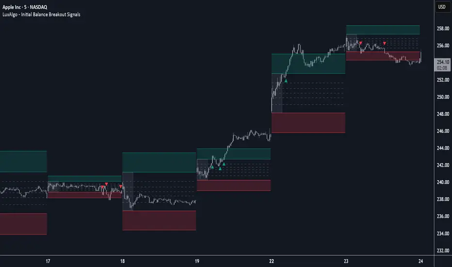
Initial Balance Breakout Signals [LuxAlgo]The Initial Balance Breakout Signals help traders identify breakouts of the Initial Balance (IB) range.
The indicator includes automatic detection of IB or can use custom sessions, highlights top and bottom IB extensions, custom Fibonacci levels, and goes further with an IB forecast with two different modes.
🔶 USAGE
The initial balance is the price range made within the first hour of the trading session. It is an intraday concept based on the idea that high volume and volatility enter the market through institutional trading at the start of the session, setting the tone for the rest of the day.
The initial balance is useful for gauging market sentiment, or, in other words, the relationship between buyers and sellers.
Bullish sentiment: Price trades above the IB range.
Mixed sentiment: Price trades within the IB range.
Bearish sentiment: Price trades below the IB range.
The initial balance high and low are important levels that many traders use to gauge sentiment. There are two main ideas behind trading around the IB range.
IB Extreme Breakout: When the price breaks and holds the IB high or low, there is a high probability that the price will continue in that direction.
IB Extreme Rejection: When the price tries to break those levels but fails, there is a high probability that it will reach the opposite IB extreme.
This indicator is a complete Initial Balance toolset with custom sessions, breakout signals, IB extensions, Fibonacci retracements, and an IB forecast. All of these features will be explained in the following sections.
🔹 Custom Sessions and Signals
By default, sessions for Initial Balance and breakout signals are in Auto mode. This means that Initial Balance takes the first hour of the trading session and shows breakout signals for the rest of the session.
With this option, traders can use the tool for open range trading, making it highly versatile. The concept behind open range (OR) is the same as that of initial balance (IB), but in OR, the range is determined by the first minute, three or five minutes, or up to the first 30 minutes of the trading session.
As shown in the image above, the top chart uses the Auto feature for the IB and Breakouts sessions. The bottom chart has the Auto feature disabled to use custom sessions for both parameters. In this case, the first three minutes of the trading session are used, turning the tool into an Open Range trading indicator.
This chart shows another example of using custom sessions to display overnight NASDAQ futures sessions.
The left chart shows a custom session from the Tokyo open to the London open, and the right chart shows a custom session from the London open to the New York open.
The chart shows both the Asian and European sessions, their top and bottom extremes, and the breakout signals from those extremes.
🔹 Initial Balance Extensions
Traders can easily extend both extremes of the Initial Balance to display their preferred targets for breakouts. Enable or disable any of them and set the IB percentage to use for the extension.
As the chart shows, the percentage selected on the settings panel directly affects the displayed levels.
Setting 25 means the tool will use a quarter of the detected initial balance range for extensions beyond the IB extremes. Setting 100 means the full IB range will be used.
Traders can use these extensions as targets for breakout signals.
🔹 Fibonacci Levels
Traders can display default or custom Fibonacci levels on the IB range to trade retracements and assess the strength of market movements. Each level can be enabled or disabled and customized by level, color, and line style.
As we can see on the chart, after the IB was completed, prices were unable to fall below the 0.236 Fibonacci level. This indicates significant bullish pressure, so it is expected that prices will rise.
Traders can use these levels as guidelines to assess the strength of the side trying to penetrate the IB. In this case, the sellers were unable to move the market beyond the first level.
🔹 Initial Balance Forecast
The tool features two different forecasting methods for the current IB. By default, it takes the average of the last ten values and applies a multiplier of one.
IB Against Previous Open: averages the difference between IB extremes and the open of the previous session.
Filter by current day of the week: averages the difference between IB extremes and the open of the current session for the same day of the week.
This feature allows traders to see the difference between the current IB and the average of the last IBs. It makes it very easy to interpret: if the current IB is higher than the average, buyers are in control; if it is lower than the average, sellers are in control.
For example, on the left side of the chart, we can see that the last day was very bullish because the IB was completely above the forecasted value. This is the IB mean of the last ten trading days.
On the right, we can see that on Monday, September 15, the IB traded slightly higher but within the forecasted value of the IB mean of the last ten Mondays. In this case, it is within expectations.
🔶 SETTINGS
Display Last X IBs: Select how many IBs to display.
Initial Balance: Choose a custom session or enable the Auto feature.
Breakouts: Enable or disable breakouts. Choose custom session or enable the Auto feature.
🔹 Extensions
Top Extension: Enable or disable the top extension and choose the percentage of IB to use.
Bottom extension: Enable or disable the bottom extension and choose the percentage of IB to use.
🔹 Fibonacci Levels
Display Fibonacci: Enable or disable Fibonacci levels.
Reverse: Reverse Fibonacci levels.
Levels, Colors & Style
Display Labels: Enable or disable labels and choose text size.
🔹 Forecast
Display Forecast: Select the forecast method.
- IB Against Previous Open: Calculates the average difference between the IB high and low and the previous day's IB open price.
- Filter by Current Day of Week: Calculates the average difference between the IB high and low and the IB open price for the same day of the week.
Forecast Memory: The number of data points used to calculate the average.
Forecast Multiplier: This multiplier will be applied to the average. Bigger numbers will result in wider predicted ranges.
Forecast Colors: Choose from a variety of colors.
Forecast Style: Choose a line style.
🔹 Style
Initial Balance Colors
Extension Transparency: Choose the extension's transparency. 0 is solid, and 100 is fully transparent.
Kaspareit VCP + TTM Squeeze ProKaspareit VCP + TTM Squeeze Pro
A combined tool for identifying volatility contractions and breakout setups. The VCP module (Volatility Contraction Pattern) detects contraction phases under trend filters, while the TTM Squeeze module evaluates compression via Bollinger Bands vs. Keltner Channels and adds a momentum oscillator. The result: clearly marked setup phases, pivot zones, and breakout signals.
What the indicator does
Detects potential VCP setups through falling ATR/True Range relative to the recent minimum, combined with a 3-step EMA trend filter.
Fixes a pivot zone above price to act as breakout reference.
Classifies TTM Squeeze compression levels in 4 colors and checks momentum.
Plots VCP potential (yellow dots), active breakouts (green dots), EMAs, pivot level, momentum histogram, and squeeze status.
Logic explained (simplified)
EMA trend filter (3-step): Close must be above EMA 50/100/200, and EMAs must be properly aligned. Only then VCP signals are valid.
VCP contraction: Current ATR compared to the lowest ATR over VCP period with tolerance factor. If volatility is sufficiently low, contraction is valid.
VCP timer: After a valid VCP, a window ( Max days after VCP ) remains active for breakout evaluation.
Pivot zone: Highest high of last Pivot lookback bars is fixed as Pivot level (red line).
Squeeze classification: Bollinger Band width vs. Keltner Channels gives 4 states: Green = no squeeze, Black = low, Red = mid, Orange = high.
Momentum: Regression-based oscillator evaluates directional impulse relative to smoothed price range.
Breakout: Valid if within active VCP window, close > pivot, EMA filter true, squeeze green, volume > previous bar, momentum > 0. Then Breakout active is marked.
Exit logic: Breakout state ends if volume < short-term average and True Range < short-term average.
Visualization & legend
EMA Short/Mid/Long: 3 lines for trend filter.
Pivot level: Red line, breakout threshold.
VCP potential: Yellow dots below candles when VCP criteria + (Momentum < 0 or Squeeze ≠ green).
Breakout active: Green dots below candles while breakout conditions hold.
Momentum histogram: Columns above chart edge if momentum > 0.
Squeeze status: Colored dots at 0-line: Orange = high, Red = mid, Black = low, Green = no squeeze.
Inputs (settings) and meaning
VCP inputs
VCP period (default 30): Window to detect ATR minimum. Larger = stricter, fewer signals.
Pivot resistance (lookback) (default 10): Bars used to fix pivot high. Lower = earlier, more sensitive levels.
Volatility tolerance (default 1.1): Factor above ATR minimum still considered “contraction.” Lower = stricter.
Volume comparison (Exit) (default 5): Length of average volume for breakout exit.
True Range comparison (Exit) (default 5): Length of TR average for breakout exit.
Max days after VCP (default 50): Time window for breakout after VCP.
EMA short/mid/long (default 50/100/200): Trend filter. Longer = smoother, fewer signals.
TTM Squeeze inputs
TTM Squeeze length (default 20): Base length for BB/KC.
Bollinger Band STD Multiplier (default 2.0): Width of BB. Higher = wider, fewer squeezes.
Keltner Channel #1/#2/#3 (default 1.5/2.0/3.0): Channel widths for low/mid/high squeeze classification.
Practical usage
Setup phase: Watch for aligned EMAs with price above all EMAs. Yellow dots = VCP potential, especially valuable if squeeze is red/orange.
Pivot observation: Red pivot level = breakout threshold.
Breakout trigger: Close above pivot, squeeze green, positive momentum, volume > previous bar → Breakout active .
Monitoring: Breakout state ends if volume and TR fall below short-term averages. This is a signal of weakening momentum , not an order exit rule.
Timeframes & markets: Works on all TFs with reliable data. Daily and H4 work well for trending stocks. For FX/CFDs, volume is tick volume.
Important notes & limitations
This is an indicator , not a strategy. It does not place orders or backtest results.
Pivot level and VCP state recalculate per bar. Pivot may move if new highs form.
Momentum histogram is scaled relative to recent range, not comparable across markets.
Squeeze colors are state labels, not trade signals. Always combine with trend filter.
No alerts included. You may add alertcondition if needed. Logic provides clear states (VCP potential, breakout active, squeeze status).
Tuning tips
See more contractions: Lower TTM length (e.g. 14–18), increase BB Mult slightly, or reduce KC Mult .
Stricter filter: Increase VCP period , lower Volatility tolerance , use longer EMAs.
Earlier breakouts: Reduce Pivot lookback , but risk more false signals.
Credits & license
VCP components: © Kaspareit-Trading.
TTM Squeeze components based on “Beardy Squeeze Pro” © Beardy_Fred.
TTM Squeeze code licensed under Mozilla Public License 2.0. License: mozilla.org
Disclaimer
This indicator is for educational and informational purposes only. It is not investment advice. Trading involves significant risk. Always test on demo accounts and use proper risk management.
Author’s notes
For questions or feedback, please send a private TradingView message with your username.

INFLECTION NEXUS - SPAINFLECTION NEXUS - SPA (Shadow Portfolio Adaptive)
Foreword: The Living Algorithm
For decades, technical analysis has been a conversation between a trader and a static chart. We apply our indicators with their fixed-length inputs, and we hope that our rigid tools can somehow capture the essence of a market that is fluid, chaotic, and perpetually evolving. When our tools fail, we are told to "adapt." But what if the tools themselves could learn that lesson? What if our indicators could adapt not just for us, but with us?
This script, INFLECTION NEXUS - SPA, is the realization of that vision. It is an advanced analytical framework built around a revolutionary core: the Shadow Portfolio Adaptive (SPA) Engine . The buy and sell signals you see on the chart are an evolution of the logic from my previous work, "Turning Point." However, this is not a simple combination of two scripts. The SPA engine so fundamentally transforms the nature of the analysis that it creates an entirely new class of indicator. This publication is a showcase of that groundbreaking, self-learning engine.
This system is undeniably complex. When you first load it, the sheer volume of information may feel overwhelming. That is a testament to the depth of its analysis. This guide is designed to be your comprehensive manual, to break down every single component, every color, every number, into simple, understandable concepts. By the end of this document, you will not only master its functions but will also possess a deeper understanding of the market dynamics it is designed to reveal.
Chapter 1: The Paradigm Shift - Why the SPA Engine is a Leap Forward
To grasp the innovation here, we must first deconstruct the severe limitations of traditional "adaptive" indicators.
Part A: The Traditional Model - Driving by the Rear-View Mirror
Conventional "adaptive" systems are fundamentally reactive. They operate on a slow, inefficient loop: they wait for their own specific, biased signal to fire, wait for that trade to close, and only after a long and statistically significant "warm-up" period of 50-100 trades do they finally make a small, retrospective adjustment. They are always adapting to a market that no longer exists.
Part B: The SPA Model - The Proactive Co-Pilot
The Shadow Portfolio Adaptive (SPA) engine is a complete re-imagining of this process. It is not reactive; it is proactive, data-saturated, and instantly aware.
Continuous, Unbiased Learning: The SPA engine does not wait for a signal to learn. Its Shadow Portfolio is constantly running 5-bar long and short trades in the background. It learns from every single 5-bar slice of market action , giving it a continuous, unbiased stream of performance data. It is the difference between reading a textbook chapter and having a live sparring partner in the ring 24/7.
Instantaneous Market Awareness - The End of the "Warm-Up": This is the critical innovation. The SPA engine does not require a 100-trade warm-up period. The learning does not start after 50 trades; it begins on the 6th bar of the chart when the first shadow trade closes. From that moment on, the system is market-aware, analyzing data, and capable of making intelligent adjustments. The SPA engine is not adapting to old wins and losses. It is adapting, in near real-time, to the market's ever-shifting character, volatility, and personality.
Chapter 2: The Anatomy of the SPA Engine - A Granular Deep Dive
The engine is composed of three primary systems that work in a sophisticated, interconnected symphony.
Section 1: The Shadow Portfolio (The Information Harvester)
What it is, Simply: Think of this as the script's eyes and ears. It's a team of 10 virtual traders (5 long, 5 short) who are constantly taking small, quick trades to feel out the market.
How it Works, Simply: On every new bar, a new "long" trader and a new "short" trader enter the market. Exactly 5 bars later, they close their positions. This cycle is perpetual and relentless.
The Critical 'Why': Because these virtual traders enter and exit based on a fixed time (5 bars), not on a "good" or "bad" signal, their results are completely unbiased . They are simply measuring: "What happened to price over the last 5 bars?" This provides the raw, untainted truth about the market's behavior that the rest of the system needs to learn effectively.
The Golden Metric (ATR Normalization): The engine doesn't just look at dollar P&L. It's smarter than that. It asks a more intelligent question: "How much did this trade make relative to the current volatility?"
Analogy: Imagine a flea and an elephant. If they both jump 1 inch, who is more impressive? The flea. The SPA engine understands this. A $10 profit when the market is dead quiet is far more significant than a $10 profit during a wild, volatile swing.
The Formula: realized_atr = (close - trade.entry) / trade.atr_entry. It takes the raw profit and divides it by the Average True Range (a measure of volatility) at the moment of entry. This gives a pure, "apples-to-apples" score for every single trade, which is the foundational data point for all learning.
Section 2: The Cognitive Map (The Long-Term Brain)
What it is, Simply: This is the engine's deep memory, its library of experiences. Imagine a giant, 64-square chessboard (8x8 grid). Each square on the board represents a very specific type of market environment.
The Two Dimensions of Thought (The 'How'): How does it know which square we are on? It looks at two things:
The Market's Personality (X-Axis): Is the market behaving like a disciplined soldier, marching in a clear trend? Or is it like a chaotic, unpredictable child, running all over the place? The engine calculates a "Regime" score to figure this out.
The Market's Energy Level (Y-Axis): Is the market sleepy and quiet, or is it wide-awake and hyperactive? The engine measures "Normalized Volatility" to determine this.
The Power of Generalization (The 'Why'): When a Shadow Portfolio trade closes, its result is recorded in the corresponding square on the chessboard. But here's the clever part: it also shares a little bit of that lesson with the squares immediately next to it (using a Gaussian Kernel).
Analogy: If you touch a hot stove and learn "don't touch," your brain is smart enough to know you probably shouldn't touch the hot oven door next to it either, even if you haven't touched it directly. The Cognitive Map does the same thing, allowing it to make intelligent inferences even in market conditions it has seen less frequently. Each square remembers what indicator settings worked best in that specific environment.
Section 3: The Adaptive Engine (The Central Nervous System)
What it is, Simply: This is the conductor of the orchestra. It takes information from all other parts of the system and decides exactly what to do.
The Symphony of Inputs: It listens to three distinct sources of information before making a decision:
The Short-Term Memory (Rolling Stats): It looks at the performance of the last rollN shadow trades. This is its immediate, recent experience.
The Long-Term Wisdom (Cognitive Map): It consults the grand library of the Cognitive Map to see what has worked best in the current market type over the long haul.
The Gut Instinct (Bin Learning): It keeps a small "mini-batch" of the most recent trades. If this batch shows a very strong, sudden pattern, it can trigger a rapid, reflexive adjustment, like pulling your hand away from a flame.
The Fusion Process: It then blends these three opinions together in a sophisticated way. It gives more weight to the opinions it's more confident in (e.g., a Cognitive Map square with hundreds of trades of experience) and uses your Adaptation Intensity (dialK) input to decide how much to listen to its "gut instinct." The final decision is then smoothed to ensure the indicator's parameters change in a stable, intelligent way.
Chapter 3: The Control Panel - A Novice's Guide to Every Input
This is the most important chapter. Let's break down what these confusing settings actually do in the simplest terms possible.
--- SECTION 1: THE DRIVER'S SEAT (SIGNAL ENGINE & BASE SETTINGS) ---
🧾 Signal Engine (Turning Point):
What it is: These are the rules for the final BUY and SELL signs.
Think of it like this: The SPA engine is the smart robot that tunes your race car. These settings are you, the driver, telling the robot what kind of race you're in.
Enable Reversal Mode: You tell the robot, "I want to race on a curvy track with lots of turns." The robot will tune the car to be agile for catching tops and bottoms.
Enable Breakout Mode: You tell the robot, "I want to race on a long, straight track." The robot will tune the car for pure speed to follow the trend.
Require New Extreme: This is a quality filter. It tells the driver, "Don't look for a turn unless we've just hit a new top speed on the straightaway." It makes sure the reversal is from a real extreme.
Min Bars Between Signals: This is the "pit stop" rule. You're telling the robot, "After you show me a sign, wait at least 10 bars before showing another one, so I don't get confused."
⚡ ATR Bands (Base Inputs):
What they are: These are the starting settings for your car before the robot starts tuning it. These are your factory defaults.
Sensitivity: This is the "Bump Detector." A low number means the car feels every tiny pebble on the road. A high number means it only notices the big speed bumps. You want to set it so it notices the important bumps (real market structure) but ignores the pebbles (noise).
ATR Period & Multiplier: These set the starting size of the "safety lane" (the green and blue bands) around your car. The robot's main job is to constantly adjust the size of this safety lane to perfectly fit the current road conditions.
📊 & 📈 Filter Settings (RSI & Volume):
What they are: These are your co-pilot's confirmation checks.
Enable RSI Filter: Your co-pilot will check the "Engine Temperature" (RSI). He won't let you hit the gas (BUY) if the engine is already overheating (overbought).
RSI Length & Lookbacks: These tune how your co-pilot's temperature gauge works. The defaults are standard.
Require Volume Spike: Your co-pilot will check the "Crowd Noise" (Volume). He won't give you a signal unless he hears the crowd roar, confirming that a lot of people are interested in this move.
🎯 Signal Quality Control:
Enable Major Levels Only: This tells your co-pilot to be extra picky. He will only confirm signals that happen after a huge, powerful move, ignoring all the small stuff.
--- SECTION 2: THE ROBOT'S BRAIN (ENGINE & LEARNING CONTROLS) ---
🎛️ Master Control:
Adaptation Intensity (dialK): THIS IS THE ROBOT'S PERSONALITY DIAL.
Turn it DOWN (1-5): The robot becomes a "Wise Old Professor." It thinks very slowly and carefully, gathers lots of data, and only makes a change when it is 100% sure. Its advice is very reliable but might come a little late.
Turn it UP (15-20): The robot becomes a "Hyper-Reactive Teenager." It has a short attention span, reacts instantly to everything it sees, and changes its mind constantly. It's super-fast to new information but might get faked out a lot.
The Default (10): A "Skilled Professional." The perfect balance of thoughtful and responsive. Start here.
🧠 Adaptive Engine:
Enable Adaptive System: This is the main power button for your robot. Turn it off, and you're driving a normal, non-smart car. Turn it on, and the robot takes over the tuning.
Use Shadow Cycle: This turns on the robot's "practice laps." The robot can't learn without practicing. This must be on for the robot to work.
Lock ATR Bands: This is a visual choice. "Locked" means the safety lanes on your screen stay where your factory defaults put them (the robot still makes changes to the signals in the background). "Unlocked" means you see the safety lanes moving and changing shape in real-time as the robot tunes them.
🎯 Learning (Global + Risk):
What they are: These are the deep-level settings for how your robot's brain processes information.
Rolling Window Size: This is the robot's "Short-Term Memory." How many of the last few practice laps should it remember? A small number means it only cares about what just happened. A big number means it remembers the last hour of practice.
Learn Rate & Smooth Alpha: This is "How big of a change should the robot make?" and "How smoothly should it make the change?" Think of it as turning the steering wheel. A high learn rate is like yanking the wheel; a low one is like a gentle turn. The smoothing makes sure the turn is graceful.
WinRate Thresholds & PnL Cap: These are rules for the robot's learning. They tell it what a "good" or "bad" outcome looks like and tell it to ignore crazy, once-in-a-lifetime events so its memory doesn't get corrupted.
--- SECTION 3: THE GARAGE (RISK, MEMORY & VISUALS) ---
⚠️ Risk Management:
What they are: These are safety rules you can give to your co-pilot for your own awareness. They appear on the dashboard.
The settings: You can set a max number of trades, a max loss for the day, and a "time out" period after a few losses.
Apply Risk to Shadow: This is an important switch. If you turn this ON, your safety rules also apply to the robot's practice laps. If you hit your max loss, the robot stops practicing and learning. It's recommended to leave this OFF so the robot can learn 24/7, even if you have stopped trading.
🗺️ Cognitive Map, STM & Checkpoints:
What it is: The robot's "Long-Term Memory" or its entire library of racing experience.
Use Cognitive Map & STM: These switches turn on the long-term and short-term memory banks. You want these on for the smartest robot.
Map Settings (Grid, Sigma, Half-Life): These are very advanced settings for neuroscientists. They control how the robot's brain is structured and how it forgets old information. The defaults are expertly tuned.
The Checkpoint System: This is the "Save Your Game" button for the robot.
To Save: Check Emit Checkpoint Now. Go to your alert log, and you will see a very long password. Copy this password.
To Load: Paste that password into the Memory Checkpoint box. Then, check Apply Checkpoint On Next Bar. The robot will instantly download all of its saved memories and experience.
🎨 Visuals & 🧩 Display Params:
What they are: These are all about how your screen looks.
You can control everything: The size and shape of the little diamonds (Entry Orbs), whether you see the purple Adapt Pulse, and where the Dashboards appear on your screen. You can change the Theme to Dark, Light, or Neon. These settings don't change how the robot thinks, only how it presents its information to you.
Chapter 4: The Command Center - Decoding the Dashboard
PANEL A (INFLECTION NEXUS): Your high-level mission control, showing the engine's classification of the current Market Context and the performance summary of the Shadow Portfolio.
PANEL B (SHADOW PORTFOLIO ADAPTIVE): Your deep diagnostic screen.
Performance Metrics: View advanced risk-adjusted stats like the Sharpe Ratio to understand the quality of the market movements the engine is learning from.
Adaptive Parameters (Live vs Base): THIS IS THE MOST CRITICAL SECTION. It shows the engine's Live parameters right next to your (Base) inputs. When the Live values deviate, the engine is communicating its learned wisdom to you. For example, a Live ATR Multiplier of 2.5 versus your Base of 1.4 is the engine telling you: "Caution. The market is currently experiencing high fake-outs and requires giving positions more room to breathe." This section is a direct translation of the engine's learning into actionable insight.
Chapter 5: Reading the Canvas - On-Chart Visuals
The Bands (Green/Blue Lines): These are not static Supertrend lines. They are the physical manifestation of the engine's current thinking. As the engine learns and adapts its ATR Period and Multiplier, you will see these bands widen, tighten, and adjust their distance from price. They are alive.
The Labels (BUY/SELL): These are the final output of the "Turning Point" logic, now supercharged and informed by the fully adaptive SPA engine.
The Purple Pulse (Dot and Background Glow): This is your visual cue that the engine is "thinking." Every time you see this pulse, it means the SPA has just completed a learning cycle and updated its parameters. It is actively recalibrating itself to the market.
Chapter 6: A Manifesto on Innovation and Community
I want to conclude with a personal note on why I dedicate countless hours to building systems like this and sharing them openly.
My purpose is to drive innovation, period. I am not in this space to follow the crowd or to re-package old ideas. The world does not need a 100th version of a slightly modified MACD. Real progress, real breakthroughs, come from venturing into the wilderness, from asking "what if?" and from pursuing concepts that lie at the very edge of possibility.
I am not afraid of being wrong. I am not afraid of being bested by my peers. In fact, I welcome it. If another developer takes an idea from this engine, improves it, and builds something even more magnificent, that is a profound win for our entire community. The only failure I recognize is the failure to try. The only trap I fear is the creative complacency of producing sterile, recycled work just to appease the status quo.
I love this community, and I believe with every fiber of my being that we have barely scratched the surface of what can be discovered and created. This script is my contribution to that shared journey. It is a tool, an idea, and a challenge to all of us: let's keep pushing.
DISCLAIMER: This script is an advanced analytical tool provided for educational and research purposes ONLY. It does not constitute financial advice. All trading involves substantial risk of loss. Past performance is not indicative of future results. Please use this tool responsibly and as part of a comprehensive trading plan.
As the great computer scientist Herbert A. Simon, a pioneer of artificial intelligence, famously said:
"Learning is any process by which a system improves performance from experience."
*Tooltips were updated with a comprehensive guide
May this engine enhance your experience.
— Dskyz, for DAFE Trading Systems

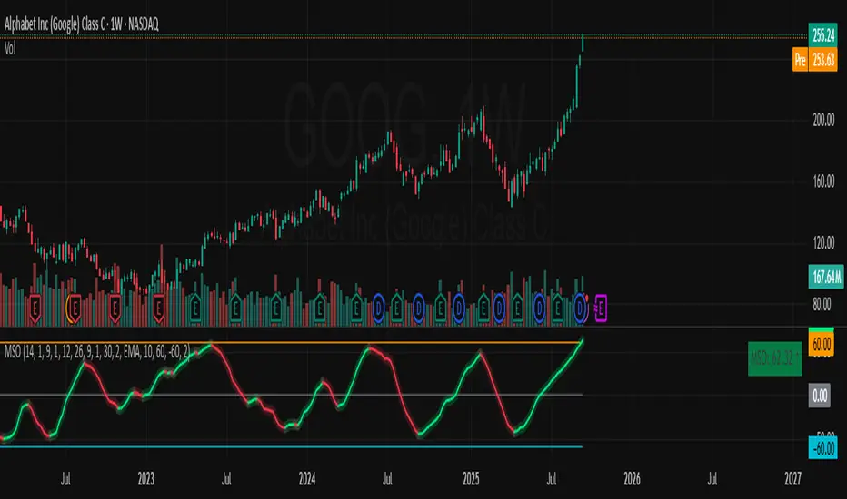
Momentum Shift Oscillator (MSO) [SharpStrat]Momentum Shift Oscillator (MSO)
The Momentum Shift Oscillator (MSO) is a custom-built oscillator that combines the best parts of RSI, ROC, and MACD into one clean, powerful indicator. Its goal is to identify when momentum shifts are happening in the market, filtering out noise that a single momentum tool might miss.
Why MSO?
Most traders rely on just one momentum indicator like RSI, MACD, or ROC. Each has strengths, but also weaknesses:
RSI → great for overbought/oversold, but often lags in strong trends.
ROC (Rate of Change) → captures price velocity, but can be too noisy.
MACD Histogram → shows trend strength shifts, but reacts slowly at times.
By blending all three (with adjustable weights), MSO gives a balanced view of momentum. It captures trend strength, velocity, and exhaustion in one oscillator.
How MSO Works
Inputs:
RSI, ROC, and MACD Histogram are calculated with user-defined lengths.
Each is normalized (so they share the same scale of -100 to +100).
You can set weights for RSI, ROC, and MACD to emphasize different components.
The components are blended into a single oscillator value.
Smoothing (SMA, EMA, or WMA) is applied.
MSO plots as a smooth line, color-coded by slope (green rising, red falling).
Overbought and oversold levels are plotted (default: +60 / -60).
A zero line helps identify bullish vs bearish momentum shifts.
How to trade with MSO
Zero line crossovers → crossing above zero suggests bullish momentum; crossing below zero suggests bearish momentum.
Overbought and oversold zones → values above +60 may indicate exhaustion in bullish moves; values below -60 may signal exhaustion in bearish moves.
Slope of the line → a rising line shows strengthening momentum, while a falling line signals fading momentum.
Divergences → if price makes new highs or lows but MSO does not, it can point to a possible reversal.
Why MSO is Unique
Combines trend + momentum + velocity into one view.
Filters noise better than standalone RSI/MACD.
Adapts to both trend-following and mean-reversion styles.
Can be used across any timeframe for confirmation.