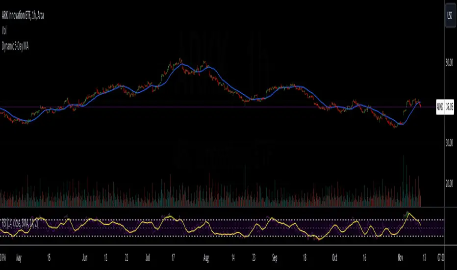
Dynamic 5-Day Moving AverageThe Dynamic 5-Day Moving Average (MA) indicator is designed to provide traders with a consistent, time-adjusted moving average line across various timeframes. This indicator is especially useful for traders who switch between multiple timeframes and want a moving average that represents a fixed 5-day period, ensuring that the MA reflects a consistent lookback period relative to the amount of trading time each candle represents.
Features:
Timeframe Adaptability: Automatically adjusts the MA period to correspond to a 5-day lookback, regardless of the selected timeframe.
Intraday Precision: For intraday charts (5m, 15m, 30m, 1h, 2h, 4h), the indicator calculates the number of periods within the 5-day span based on the chart's timeframe.
Daily and Weekly Timeframe Compatibility: Sets the period to 5 for daily charts to maintain the 5-day MA, and to 1 for weekly charts, where each candlestick represents a week's worth of trading days.
Calculation Logic:
The indicator begins by defining the total number of trading minutes in 5 days, based on a standard 6.5-hour trading day.
A dynamic period calculation function then determines the number of those intervals that fit into the 5-day minute total for the selected timeframe.
For daily charts, the period is a straightforward 5, while for weekly charts, the period is set to 1, reflecting the average of the past 5 trading days.
"半导体设备ETF" için komut dosyalarını ara
Bollinger Bands (Nadaraya Smoothed) | Flux ChartsTicker: AMEX:SPY , Timeframe: 1m, Indicator settings: default
General Purpose
This script is an upgrade to the classic Bollinger Bands. The idea behind Bollinger bands is the detection of price movements outside of a stock's typical fluctuations. Bollinger Bands use a moving average over period n plus/minus the standard deviation over period n times a multiplier. When price closes above or below either band this can be considered an abnormal movement. This script allows for the classic Bollinger Band interpretation while de-noising or "smoothing" the bands.
Efficacy
Ticker: AMEX:SPY , Timeframe: 1m, Indicator settings: Standard Dev: 2; Level 1 : off; Level 2: off; labels: off
Upper Band Key:
Blue: Bollinger No smoothing
Orange: Bollinger SMA smoothing period of 10
Purple: Bollinger EMA smoothing period of 10
Red: Nadaraya Smoothed Bollinger bandwidth of 6
Here we chose periods so that each would have a similar offset from the original Bollinger's. Notice that the Red Band has a much smoother result while on average having a similar fit to the other smoothing techniques. Increasing the EMA's or SMA's period would result in them being smoother however the offset would increase making them less accurate to the original data.
Ticker: AMEX:SPY , Timeframe: 1m, Indicator settings: Standard Dev: 2; Level 1: off; Level 2: off; labels: off
Upper Band Key:
Blue: Bollinger No smoothing
Orange: Bollinger SMA smoothing period of 20
Purple: Bollinger EMA smoothing period of 20
Red: Nadaraya Smoothed Bollinger bandwidth of 6
This makes the Nadaraya estimator a particularly efficacious technique in this use case as it achieves a superior smoothness to fit ratio.
How to Use
This indicator is not intended to be used on its own. Its use case is to identify outlier movements and periods of consolidation. The Smoothing Factor when lowered results in a more reactive but noisy graph. This setting is also known as the "bandwidth" ; it essentially raises the amplitude of the kernel function causing a greater weighting to recent data similar to lowering the period of a SMA or EMA. The repaint smoothing simply draws on the Bollinger's each chart update. Typically repaint would be used for processing and displaying discrete data however currently it's simply another way to display the Bollinger Bands.
What makes this script unique.
Since Bollinger bands use standard deviation they have excess noise. By noise we mean minute fluctuations which most traders will not find useful in their strategies. The Nadaraya-Watson estimator, as used, is essentially a weighted average akin to an ema. A gaussian kernel is placed at the candlestick of interest. That candlestick's value will have the highest weight. From that point the other candlesticks' values effect on the average will decrease with the slope of the kernel function. This creates a localized mean of the Bollinger Bands allowing for reduced noise with minimal distortion of the original Bollinger data.

Trend Line XrossTrend Line Xross (TLX) Uses User Input Points to draw trendlines and displays the exact intersection point of those trendlines.
This is the public indicator of the practical application for this intersection method included in my entry for Pinefest #1.
To determine the exact intersection point I am using the y-intercept method as seen below.
The code is notated for more information on the technical workings.
One difference to note between this version and the pinefest version is that I had to change the line drawings to use bar_index values so that I can use line.get_price() to grab the current value of the line to make alerts from.
Additionally, there are alerts built-in to this version for every type of cross on all of the visible lines.
Enjoy!

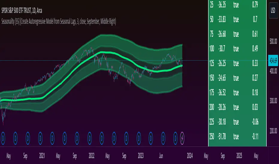
Ultimate Seasonality Indicator [SS]Hello everyone,
This is my seasonality indicator. I have been working on it for like 2 months, so hope you like it!
What it does?
The Ultimate Seasonality indicator is designed to provide you, the trader, an in-depth look at seasonality. The indicator gives you the ability to do the following functions:
View the most bearish and bullish months over a user defined amount of years back.
View the average daily change for each respective months over a user defined amount of years back.
See the most closely correlated month to the current month to give potential insights of likely trend.
Plot out areas of High and Low Seasonality.
Create a manual seasonal forecast model by selecting the desired month you would like to model the current month data after.
Have the indicator develop an autoregressive seasonal model based on seasonally lagged variables, using principles of machine learning.
I will go over these functions 1 by 1, its a whopper of an indicator so I will try to be as clear and concise as possible.
Viewing Bullish vs Bearish Months, Average Daily Change & Correlation to Current Month
The indicator will break down the average change, as well as the number of bullish and bearish days by month. See the image below as an example:
In the table to the right, you will see a breakdown of each month over the past 3 years.
In the first column, you will see the average daily change. A negative value, means it was a particularly bearish month, a positive value means it was a particularly bullish month.
The next column over shows the correlation to the current dataset. How this works is the indicator takes the size of the monthly data for each month, and compares it to the last X number of days up until the last trading day. It will then perform a correlation assessment to see how closely similar the past X number of trading days are to the various monthly data.
The last 2 columns break down the number of Bullish and Bearish days, so you can see how many red vs green candles happened in each respective month over your set timeframe. In the example above, it is over the pats 3 years.
Plot areas of High and Low Seasonality
In the chart above, you will see red and green highlighted zones.
Red represents areas of HIGH Seasonality .
Green represents areas of LOW Seasonality .
For this function, seasonality is measured by the autocorrelation function at various lags (12 lags). When there is an average autocorrelation of greater than 0.85 across all seasonal lags, it is considered likely the result of high seasonality/trend.
If the lag is less than or equal to 0.05, it is indicative of very low seasonality, as there is no predominate trend that can be found by the autocorrelation functions over the seasonally lagged variables.
Create Manual Seasonal Forecasts
If you find a month that has a particularly high correlation to the current month, you can have the indicator create a seasonal model from this month, and fit it onto the current dataset (past X days of trading).
If we look at the example below:
We can see that the most similar month to the current data is September. So, we can ask the indicator to create a seasonal forecast model from only September data and fit it to our current month. This is the result:
You will see, using September data, our most likely close price for this month is 450 and our model is y= 1.4305x + -171.67.
We can accept the 450 value but we can use the equation to model the data ourselves manually.
For example, say we have a target price on the month of 455 based on our own analysis. We can calculate the likely close price, should this target be reached, by substituting this target for x. So y = 1.4305x + -171.67 becomes
y = 1.4305(455) +- 171.67
y = 479.20
So the likely close price would be 479.20. No likely, and thus its not likely we are to see 455.
HOWEVER, in this current example, the model is far too statistically insignificant to be used. We can see the correlation is only 0.21 and the R squared is 0.04. Not a model you would want to use!
You want to see a correlation of at least 0.5 or higher and an R2 of 0.5 or higher.
We can improve the accuracy by reducing the number of years we look back. This is what happens when we reduce the lookback years to 1:
You can see reducing to 1 year gives December as the most similar month. However, our R2 value is still far too low to really rely on this data whole-heartedly. But it is a good reference point.
Automatic Autoregressive Model
So this is my first attempt at using some machine learning principles to guide statistical analysis.
In the main chart above, you will see the indicator making an autoregressive model of seasonally lagged variables. It does this in steps. The steps include:
1) Differencing the data over 12, seasonally lagged variables.
2) Determining stationarity using DF test.
3) Determining the highest, autocorrelated lags that fall within a significant stationary result.
4) Creating a quadratic model of the two identified lags that best represents a stationary model with a high autocorrelation.
What are seasonally lagged variables?
Seasonally lagged variables are variables that represent trading months. So a lag of 25 would be 1 month, 50, 2 months, 75, 3 months, etc.
When it displays this model, it will show us what the results of the t-statistic are for the DF test, whether the data is stationary, and the result of the autocorrelation assessment.
It will then display the model detail in the tip table, which includes the equation, the current lags being used, the R2 and the correlation value.
Concluding Remarks
That's the indicator in a nutshell!
Hope you like it!
One final thing, you MUST have your chart set to daily, otherwise you will get a runtime error. This can ONLY be used on the daily timeframe!
Feel free to leave your questions, comments and suggestions below.
Note:
My "ultimate" indicators are made to give the functionality of multiple indicators in one. If you like this one, you may like some of my others:
Ultimate P&L Indicator
Ultimate Customizable EMA/SMA
Thanks for checking out the indicator!
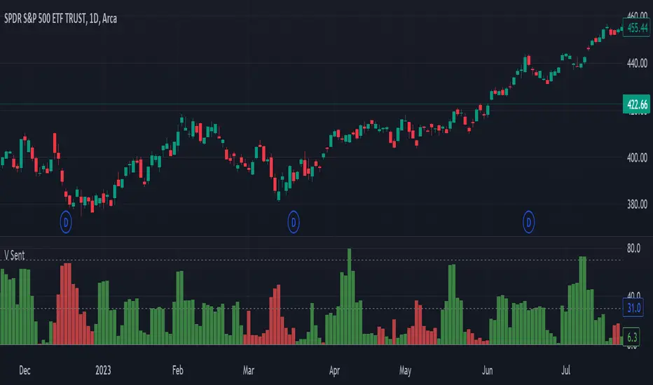
Volume SentimentIn 1994 Tushar Chande and Stanley Kroll published a epic book of modern trading indicators called "The New Technical Trader". I highly recommend it. Two indicators that stood out was the Market Thrust and Thrust Oscillator. They suggested these as alternatives to the Arms Index. Rather than using the Advancing Stocks and their associated volume, I applied their logic to individual bars.
Bar Sentiment can be defined and the difference between the low and the close relative to the bar width. Smaller values are bearish and larger one are bullish. A bullish candle would close above its mid-point. Conversely, a close below the candle mid-point is considered bearish.
With that, this script sums the bullish or bearish (as defined above) volume over a user defined number of bars. It gives a unique indication of the volume compared to typical volume indicators. It also gives the user the option to set a "High Volume" alert when the total volume is greater than the moving average. This is helpful for identify increasing activity in your security.
Enjoy and happy trading!
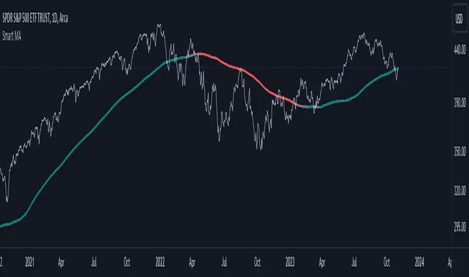
Smart MAThe Smart MA indicator is a tool designed for traders seeking insights into market trends, with its foundation rooted in moving averages. It offers two distinctive color options, with "Crossing" as the default choice and "Direction" as an alternative. Let's delve deeper into these options:
1. "Crossing" Color Option (Default):
Key Features:
Utilizes the interaction between fast and slow moving averages.
The color of the base moving average (MA) line dynamically changes based on crossovers between these moving averages.
Offers real-time visual signals for potential shifts in market sentiment.
Interpretation:
With the "Crossing" color option as the default setting, the base MA line's color responds to the interaction of the fast and slow moving averages.
A crossover where the fast MA crosses above the slow MA may prompt the base MA line to change to a bullish color (e.g., teal), indicating a potential bullish trend.
Conversely, if the fast MA crosses below the slow MA, the base MA line's color may alter to represent a bearish sentiment (e.g., red). This color shift provides a visual marker for a potential bearish trend, potentially guiding traders towards shorting opportunities.
2. "Direction" Color Option:
Key Features:
Focuses on the directional trend of the base moving average (MA).
The color of the base MA line signifies the direction in which the base MA is moving.
Aids in quickly identifying the prevailing market trend.
Interpretation:
Uptrend - Bullish Direction: When the base MA slopes upward, indicating an average price increase over the chosen base MA length, the base MA line's color may shift to a bullish hue (e.g., teal). This visual cue signals a potential uptrend, suggesting favorable long positions.
Downtrend - Bearish Direction: If the base MA slopes downward, signifying an average price decrease over the selected base MA length, the base MA line could change to a bearish shade (e.g., red). This color shift acts as an indicator of a potential downtrend, implying possible opportunities for shorting.
Customization:
Both color options allow traders to adjust the indicator's parameters, including base MA length, MA type, fast MA length, and slow MA length, to align with their trading strategies and preferred timeframes.
In summary, the Smart MA indicator, based on moving averages, provides traders with two color options: the default "Crossing" and "Direction" as an alternative. The "Crossing" option leverages fast and slow moving averages to offer real-time visual cues for dynamic market shifts. The "Direction" option simplifies trend analysis by focusing on the directional trend of the base MA. The choice between these options depends on your trading style and the depth of analysis you require. With the Smart MA indicator, you're equipped to make informed trading decisions in today's financial markets.
2 Moving Averages | Trend FollowingThe trading system is a trend-following strategy based on two moving averages (MA) and Parabolic SAR (PSAR) indicators.
How it works:
The strategy uses two moving averages: a fast MA and a slow MA.
It checks for a bullish trend when the fast MA is above the slow MA and the current price is above the fast MA.
It checks for a bearish trend when the fast MA is below the slow MA and the current price is below the fast MA.
The Parabolic SAR (PSAR) indicator is used for additional trend confirmation.
Long and short positions can be turned on or off based on user input.
The strategy incorporates risk management with stop-loss orders based on the Average True Range (ATR).
Users can filter the backtest date range and display various indicators.
The strategy is designed to work with the date range filter, risk management, and user-defined positions.
Features:
Trend-following strategy.
Two customizable moving averages.
Parabolic SAR for trend confirmation.
User-defined risk management with stop-loss based on ATR.
Backtest date range filter.
Flexibility to enable or disable long and short positions.
This trading system provides a comprehensive approach to trend-following and risk management, making it suitable for traders looking to capture trends with controlled risk.

TableLibrary "Table"
This library provides an easy way to convert arrays and matrixes of data into tables. There are a few different implementations of each function so you can get more or less control over the appearance of the tables. The basic rule of thumb is that all matrix rows must have the same number of columns, and if you are providing multiple arrays/matrixes to specify additional colors (background/text), they must have the same number of rows/columns as the data array. Finally, you do have the option of spanning cells across rows or columns with some special syntax in the data cell. Look at the examples to see how the arrays and matrixes need to be built before they can be used by the functions.
floatArrayToCellArray(floatArray)
Helper function that converts a float array to a Cell array so it can be rendered with the fromArray function
Parameters:
floatArray (float ) : (array) the float array to convert to a Cell array.
Returns: array The Cell array to return.
stringArrayToCellArray(stringArray)
Helper function that converts a string array to a Cell array so it can be rendered with the fromArray function
Parameters:
stringArray (string ) : (array) the array to convert to a Cell array.
Returns: array The Cell array to return.
floatMatrixToCellMatrix(floatMatrix)
Helper function that converts a float matrix to a Cell matrix so it can be rendered with the fromMatrix function
Parameters:
floatMatrix (matrix) : (matrix) the float matrix to convert to a string matrix.
Returns: matrix The Cell matrix to render.
stringMatrixToCellMatrix(stringMatrix)
Helper function that converts a string matrix to a Cell matrix so it can be rendered with the fromMatrix function
Parameters:
stringMatrix (matrix) : (matrix) the string matrix to convert to a Cell matrix.
Returns: matrix The Cell matrix to return.
fromMatrix(CellMatrix, position, verticalOffset, transposeTable, textSize, borderWidth, tableNumRows, blankCellText)
Takes a CellMatrix and renders it as a table.
Parameters:
CellMatrix (matrix) : (matrix) The Cells to be rendered in a table
position (string) : (string) Optional. The position of the table. Defaults to position.top_right
verticalOffset (int) : (int) Optional. The vertical offset of the table from the top or bottom of the chart. Defaults to 0.
transposeTable (bool) : (bool) Optional. Will transpose all of the data in the matrices before rendering. Defaults to false.
textSize (string) : (string) Optional. The size of text to render in the table. Defaults to size.small.
borderWidth (int) : (int) Optional. The width of the border between table cells. Defaults to 2.
tableNumRows (int) : (int) Optional. The number of rows in the table. Not required, defaults to the number of rows in the provided matrix. If your matrix will have a variable number of rows, you must provide the max number of rows or the function will error when it attempts to set a cell value on a row that the table hadn't accounted for when it was defined.
blankCellText (string) : (string) Optional. Text to use cells when adding blank rows for vertical offsetting.
fromMatrix(dataMatrix, position, verticalOffset, transposeTable, textSize, borderWidth, tableNumRows, blankCellText)
Renders a float matrix as a table.
Parameters:
dataMatrix (matrix) : (matrix_float) The data to be rendered in a table
position (string) : (string) Optional. The position of the table. Defaults to position.top_right
verticalOffset (int) : (int) Optional. The vertical offset of the table from the top or bottom of the chart. Defaults to 0.
transposeTable (bool) : (bool) Optional. Will transpose all of the data in the matrices before rendering. Defaults to false.
textSize (string) : (string) Optional. The size of text to render in the table. Defaults to size.small.
borderWidth (int) : (int) Optional. The width of the border between table cells. Defaults to 2.
tableNumRows (int) : (int) Optional. The number of rows in the table. Not required, defaults to the number of rows in the provided matrix. If your matrix will have a variable number of rows, you must provide the max number of rows or the function will error when it attempts to set a cell value on a row that the table hadn't accounted for when it was defined.
blankCellText (string) : (string) Optional. Text to use cells when adding blank rows for vertical offsetting.
fromMatrix(dataMatrix, position, verticalOffset, transposeTable, textSize, borderWidth, tableNumRows, blankCellText)
Renders a string matrix as a table.
Parameters:
dataMatrix (matrix) : (matrix_string) The data to be rendered in a table
position (string) : (string) Optional. The position of the table. Defaults to position.top_right
verticalOffset (int) : (int) Optional. The vertical offset of the table from the top or bottom of the chart. Defaults to 0.
transposeTable (bool) : (bool) Optional. Will transpose all of the data in the matrices before rendering. Defaults to false.
textSize (string) : (string) Optional. The size of text to render in the table. Defaults to size.small.
borderWidth (int) : (int) Optional. The width of the border between table cells. Defaults to 2.
tableNumRows (int) : (int) Optional. The number of rows in the table. Not required, defaults to the number of rows in the provided matrix. If your matrix will have a variable number of rows, you must provide the max number of rows or the function will error when it attempts to set a cell value on a row that the table hadn't accounted for when it was defined.
blankCellText (string) : (string) Optional. Text to use cells when adding blank rows for vertical offsetting.
fromArray(dataArray, position, verticalOffset, transposeTable, textSize, borderWidth, blankCellText)
Renders a Cell array as a table.
Parameters:
dataArray (Cell ) : (array) The data to be rendered in a table
position (string) : (string) Optional. The position of the table. Defaults to position.top_right
verticalOffset (int) : (int) Optional. The vertical offset of the table from the top or bottom of the chart. Defaults to 0.
transposeTable (bool) : (bool) Optional. Will transpose all of the data in the matrices before rendering. Defaults to false.
textSize (string) : (string) Optional. The size of text to render in the table. Defaults to size.small.
borderWidth (int) : (int) Optional. The width of the border between table cells. Defaults to 2.
blankCellText (string) : (string) Optional. Text to use cells when adding blank rows for vertical offsetting.
fromArray(dataArray, position, verticalOffset, transposeTable, textSize, borderWidth, blankCellText)
Renders a string array as a table.
Parameters:
dataArray (string ) : (array_string) The data to be rendered in a table
position (string) : (string) Optional. The position of the table. Defaults to position.top_right
verticalOffset (int) : (int) Optional. The vertical offset of the table from the top or bottom of the chart. Defaults to 0.
transposeTable (bool) : (bool) Optional. Will transpose all of the data in the matrices before rendering. Defaults to false.
textSize (string) : (string) Optional. The size of text to render in the table. Defaults to size.small.
borderWidth (int) : (int) Optional. The width of the border between table cells. Defaults to 2.
blankCellText (string) : (string) Optional. Text to use cells when adding blank rows for vertical offsetting.
fromArray(dataArray, position, verticalOffset, transposeTable, textSize, borderWidth, blankCellText)
Renders a float array as a table.
Parameters:
dataArray (float ) : (array_float) The data to be rendered in a table
position (string) : (string) Optional. The position of the table. Defaults to position.top_right
verticalOffset (int) : (int) Optional. The vertical offset of the table from the top or bottom of the chart. Defaults to 0.
transposeTable (bool) : (bool) Optional. Will transpose all of the data in the matrices before rendering. Defaults to false.
textSize (string) : (string) Optional. The size of text to render in the table. Defaults to size.small.
borderWidth (int) : (int) Optional. The width of the border between table cells. Defaults to 2.
blankCellText (string) : (string) Optional. Text to use cells when adding blank rows for vertical offsetting.
debug(message, position)
Renders a debug message in a table at the desired location on screen.
Parameters:
message (string) : (string) The message to render.
position (string) : (string) Optional. The position of the debug message. Defaults to position.middle_right.
Cell
Type for each cell's content and appearance
Fields:
content (series string)
bgColor (series color)
textColor (series color)
align (series string)
colspan (series int)
rowspan (series int)

UtilsLibrary "Utils"
A collection of convenience and helper functions for indicator and library authors on TradingView
formatNumber(num)
My version of format number that doesn't have so many decimal places...
Parameters:
num (float) : (float) the number to be formatted
Returns: (string) The formatted number
getDateString(timestamp)
Convenience function returns timestamp in yyyy/MM/dd format.
Parameters:
timestamp (int) : (int) The timestamp to stringify
Returns: (int) The date string
getDateTimeString(timestamp)
Convenience function returns timestamp in yyyy/MM/dd hh:mm format.
Parameters:
timestamp (int) : (int) The timestamp to stringify
Returns: (int) The date string
getInsideBarCount()
Gets the number of inside bars for the current chart. Can also be passed to request.security to get the same for different timeframes.
Returns: (int) The # of inside bars on the chart right now.
getLabelStyleFromString(styleString, acceptGivenIfNoMatch)
Tradingview doesn't give you a nice way to put the label styles into a dropdown for configuration settings. So, I specify them in the following format: . This function takes care of converting those custom strings back to the ones expected by tradingview scripts.
Parameters:
styleString (string)
acceptGivenIfNoMatch (bool) : (bool) If no match for styleString is found and this is true, the function will return styleString, otherwise it will return tradingview's preferred default
Returns: (string) The string expected by tradingview functions
getTime(hourNumber, minuteNumber)
Given an hour number and minute number, adds them together and returns the sum. To be used by getLevelBetweenTimes when fetching specific price levels during a time window on the day.
Parameters:
hourNumber (int) : (int) The hour number
minuteNumber (int) : (int) The minute number
Returns: (int) The sum of all the minutes
getHighAndLowBetweenTimes(start, end)
Given a start and end time, returns the high or low price during that time window.
Parameters:
start (int) : The timestamp to start with (# of seconds)
end (int) : The timestamp to end with (# of seconds)
Returns: (float) The high or low value
getPremarketHighsAndLows()
Returns an expression that can be used by request.security to fetch the premarket high & low levels in a tuple.
Returns: (tuple)
getAfterHoursHighsAndLows()
Returns an expression that can be used by request.security to fetch the after hours high & low levels in a tuple.
Returns: (tuple)
getOvernightHighsAndLows()
Returns an expression that can be used by request.security to fetch the overnight high & low levels in a tuple.
Returns: (tuple)
getNonRthHighsAndLows()
Returns an expression that can be used by request.security to fetch the high & low levels for premarket, after hours and overnight in a tuple.
Returns: (tuple)
getLineStyleFromString(styleString, acceptGivenIfNoMatch)
Tradingview doesn't give you a nice way to put the line styles into a dropdown for configuration settings. So, I specify them in the following format: . This function takes care of converting those custom strings back to the ones expected by tradingview scripts.
Parameters:
styleString (string) : (string) Plain english (or TV Standard) version of the style string
acceptGivenIfNoMatch (bool) : (bool) If no match for styleString is found and this is true, the function will return styleString, otherwise it will return tradingview's preferred default
Returns: (string) The string expected by tradingview functions
getPercentFromPrice(price)
Get the % the current price is away from the given price.
Parameters:
price (float)
Returns: (float) The % the current price is away from the given price.
getPositionFromString(position)
Tradingview doesn't give you a nice way to put the positions into a dropdown for configuration settings. So, I specify them in the following format: . This function takes care of converting those custom strings back to the ones expected by tradingview scripts.
Parameters:
position (string) : (string) Plain english position string
Returns: (string) The string expected by tradingview functions
getTimeframeOfChart()
Get the timeframe of the current chart for display
Returns: (string) The string of the current chart timeframe
getTimeNowPlusOffset(candleOffset)
Helper function for drawings that use xloc.bar_time to help you know the time offset if you want to place the end of the drawing out into the future. This determines the time-size of one candle and then returns a time n candleOffsets into the future.
Parameters:
candleOffset (int) : (int) The number of items to find singular/plural for.
Returns: (int) The future time
getVolumeBetweenTimes(start, end)
Given a start and end time, returns the sum of all volume across bars during that time window.
Parameters:
start (int) : The timestamp to start with (# of seconds)
end (int) : The timestamp to end with (# of seconds)
Returns: (float) The volume
isToday()
Returns true if the current bar occurs on today's date.
Returns: (bool) True if current bar is today
padLabelString(labelText, labelStyle)
Pads a label string so that it appears properly in or not in a label. When label.style_none is used, this will make sure it is left-aligned instead of center-aligned. When any other type is used, it adds a single space to the right so there is padding against the right end of the label.
Parameters:
labelText (string) : (string) The string to be padded
labelStyle (string) : (string) The style of the label being padded for.
Returns: (string) The padded string
plural(num, singular, plural)
Helps format a string for plural/singular. By default, if you only provide num, it will just return "s" for plural and nothing for singular (eg. plural(numberOfCats)). But you can optionally specify the full singular/plural words for more complicated nomenclature (eg. plural(numberOfBenches, 'bench', 'benches'))
Parameters:
num (int) : (int) The number of items to find singular/plural for.
singular (string) : (string) The string to return if num is singular. Defaults to an empty string.
plural (string) : (string) The string to return if num is plural. Defaults to 's' so you can just add 's' to the end of a word.
Returns: (string) The singular or plural provided strings depending on the num provided.
timeframeInSeconds(timeframe)
Get the # of seconds in a given timeframe. Tradingview's timeframe.in_seconds() expects a simple string, and we often need to use series string, so this is an alternative to get you the value you need.
Parameters:
timeframe (string)
Returns: (int) The number of secondsof that timeframe
timeframeToString(tf)
Convert a timeframe string to a consistent standard.
Parameters:
tf (string) : (string) The timeframe string to convert
Returns: (string) The standard format for the string, or the unchanged value if it is unknown.

AR Forecast Scatterplot [SS]This is a showcase indicator of my recently released SPTS library (the partner of the SPTS indicator).
This is just to show some of the practical applications of the boring statistical functions contained within the library/SPTS indicator :-).
This is an autoregressive (AR), scatter plot forecaster. What this means is it tags a lag of 1, performs an autoregressive assessment over the desired training time, then uses what it learns over that training time to forecast the likely outcome.
Its not a machine learning (I am in the process of creating one like this, but it is taking quite some time to complete), but the model needs to learn to plan the statistical coefficients that will best mimic the current trend.
As of its current state, this actually surpassed my own expectations. I can show you some QQQ examples:
Example #1:
Prediction:
Actual:
Example #2:
Prediction:
Actual:
Pretty nuts, eh?
Statistics, I'm telling you, its the answer haha.
So how do we determine the train time?
Because this is not using machine learning to control for over/under representation of datasize (again, I am making a version that does this, but its a slow process), some quick tips at determine appropriate train time is to use the Tradingview Regression tool:
When you set the parameters to align with the current, strongest trend, it is more reliable.
You will see, that it acutally is forecasting a move back to the exact top of this trend, that is because it is using the same processes as the linear regression trend on Tradingview.
You can use a bar counter indicator ( such as mine available here ) to calculate the number or bars back for your model training.
You can verify that these parameters are appropriate by looking at the Model Data table (which can be toggled on and off). You want to see both a high correlation and a high R2 value.
Quick note on colour:
Green = represents the upper confidence predictions (best case scenario)
Blue = represents the most likely result
red = represents that lower confidence (not as best case scenario)
Hope you enjoy!
Safe trades everyone!

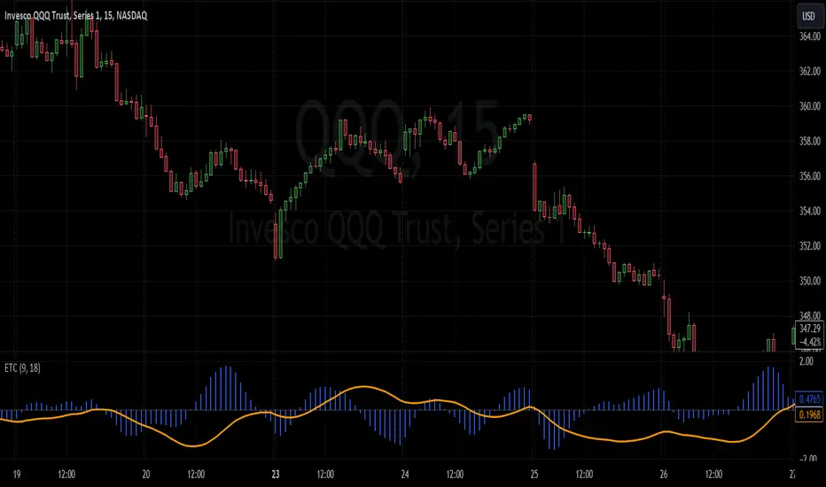
Enhanced TrixThe Enhanced Trix Confluence Oscillator involves utilizing two core components: a slow line and a difference histogram based on a shorter length. Another key aspect is the indicator using the DEMA for greater speed while the triple smoothing still provides accuracy which makes this different from the original indicator. This approach aims to rely on principles of both momentum and divergence.
The ETC aims to filter out market noise to reveal the core trend direction in both the short and medium term. A slow line is calculated using a longer time period with the double exponential moving average, which makes it less responsive to short-term price fluctuations and better at capturing longer-term momentum. It's best used to identify divergences with the asset's price, signaling potential reversals. The difference histogram serves as a more sensitive indicator for trade timing once further calibrated. It's calculated by taking the difference between the displayed length and a shorter period using the same calculation. This histogram also operates as a rate of change like the TRIX.
The slow line identifies broader trends and divergences, while the difference histogram offers a more granular view.
Triple EMA By Ozy
**Triple EMA By Ozy**
The "Triple EMA By Ozy" is a visual indicator that offers traders a clear and concise view of three exponential moving averages (EMAs) at a glance. This tool combines three common EMAs (20, 50, and 200) and additionally calculates and displays the slope angle of each EMA, allowing for a more precise identification of the current trend's direction and strength.
**Key Features:**
1. **Three EMAs in One Indicator:** The 20, 50, and 200-period EMAs are popular among traders and are crucial for identifying short, medium, and long-term trends.
2. **Slope Angle:** The indicator calculates the slope angle for each EMA, which can be indicative of the trend's strength. A positive angle suggests bullish momentum, while a negative angle indicates bearish momentum.
3. **Clear Visual Indication:** The indicator uses colors to easily distinguish between EMAs and also to identify the direction of the slope angle (green for positive, red for negative).
**How to Use:**
- An increasing angle in the EMA20 may indicate the beginning of a new short-term upward trend.
- A decreasing angle in the EMA200 might signal a long-term downtrend gaining strength.
- Crosses between the EMAs can also be points of interest, like the golden cross (EMA50 crossing above the EMA200) or the death cross (EMA50 crossing below the EMA200).
**Triple EMA By Ozy**
El "Triple EMA By Ozy" es un indicador visual que proporciona a los traders una visión clara y concisa de tres medias móviles exponenciales (EMAs) en un solo vistazo. Esta herramienta combina tres EMAs comunes (20, 50 y 200) y, además, calcula y muestra el ángulo de inclinación de cada EMA para identificar con mayor precisión la dirección y la fuerza de la tendencia actual.
**Características principales:**
1. **Tres EMAs en un solo indicador:** Las EMAs de 20, 50 y 200 períodos son populares entre los traders y son esenciales para identificar tendencias a corto, mediano y largo plazo.
2. **Ángulo de inclinación:** El indicador calcula el ángulo de inclinación de cada EMA, que puede ser un indicativo de la fuerza de la tendencia. Un ángulo positivo sugiere un impulso alcista, mientras que un ángulo negativo indica un impulso bajista.
3. **Indicación visual clara:** El indicador utiliza colores para distinguir fácilmente entre EMAs y también para identificar la dirección del ángulo de inclinación (verde para positivo, rojo para negativo).
**Cómo usar:**
- Un ángulo creciente en la EMA20 puede indicar el comienzo de una nueva tendencia al alza a corto plazo.
- Un ángulo decreciente en la EMA200 puede ser una señal de una tendencia bajista a largo plazo que está ganando fuerza.
- Los cruces entre las EMAs también pueden ser puntos de interés, como el cruce dorado (EMA50 cruza por encima de la EMA200) o el cruce de la muerte (EMA50 cruza por debajo de la EMA200).

Leading Economic Indicator (LEI)The Leading Economic Indicator (LEI) is a groundbreaking technical indicator designed to serve as a comprehensive measure of the prevailing direction of economic trends in the United States. This unique index combines two key economic indicators: the Composite Leading Indicator (CLI) from the Organization for Economic Co-operation and Development (OECD) and the Purchasing Managers' Index (PMI) from the Institute for Supply Management (ISM).
The OECD Composite Leading Indicator (CLI) is a globally recognized indicator that assesses the future direction of economic trends by analyzing various leading economic factors. The ISM PMI, on the other hand, provides insights into the business activities of both the manufacturing and services sectors. LEI merges these critical indicators into a single, holistic indicator that empowers traders and investors to grasp the broader economic outlook and the performance of essential economic sectors simultaneously.
By taking into account the CLI and PMI, LEI offers a distinctive perspective, enabling a more accurate assessment of the potential direction of US financial markets.
Usage:
To utilize LEI effectively, it is recommended to apply it on a monthly timeframe (TF Monthly). This extended timeframe is particularly beneficial for investors with a medium to long-term horizon. By focusing on longer-term trends and market stability, LEI becomes an invaluable tool in your investment strategy.
One of the primary applications of LEI is to gauge the risk of market corrections in US financial markets, including the S&P 500, Nasdaq, and Dow Jones indices. Analysts often observe the crossing of the 5-period Simple Moving Average (SMA) with the 10-period SMA. When the 5-period SMA falls below the 10-period SMA, it serves as a potential warning signal for an impending market correction. This feature provides traders with an opportunity to exercise caution and make well-informed investment decisions.
LEI, with its unique blend of the OECD CLI and ISM PMI, provides a reliable tool for assessing the US economic climate, identifying trends, and making informed decisions in the financial markets. It stands as a reference indicator, capturing the essence of economic trends and providing valuable insights to traders and investors.
Sources:
- OECD Composite Leading Indicator (CLI): www.data.oecd.org
- Purchasing Managers' Index: ISM Report on Business (PMI) www.ismworld.org

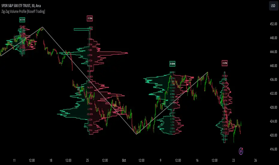
Zig-Zag Volume Profile (Bull vs. Bear) [Kioseff Trading]Hello!
Thank you @Pinecoders and @TradingView for putting polylines in production and making this viable!!
This script "Zig Zag Volume Profile" implements the polyline feature for Pine Script!
Features
Volume Profile anchored to zig zag trends
Bull vs Bear profiles!
Delta x price level
Standard POC and value area lines, in addition to separated POCs and value area lines for bull profiles and bear profiles
Up to 9999 profile rows per zigzag trend
Stylistic options for profiles
Configurable zig zag - profiles generated for small to large trends
Polylines!
This script generates Bull vs. Bear volume profiles for zig zag trends!
The zigzag indicator is configurable as normal; minor and major trend volume profiles are calculable. This indicator can be thought of as "Volume Profile/Delta for Trends''.
Up to 9999 volume profile levels (price levels) can be calculated for each profile, thanks to the new polyline feature, allowing for less aggregation / more precision of volume at price and volume delta.
Zig Zag Bull Vs Bear Profiles
The image above shows primary functionality!
Green profiles = buying volume
Red profiles = selling volume
Profiles are generated for each trend identified by the zigzag indicator.
The image above shows the indicator calculating volume delta for specific price blocks on the profile. Aggregate volume delta for the identified trend is displayed over the profile!
The image above shows Bull Profile POC lines and value area lines. Bear Profile POC lines and value area lines are also shown!
All colors and transparencies are configurable to the user's liking :D
Additionally, you can select to have the profiles drawn on contrasting sides. Bull Profile on left and Bear Profile on right.
For a more traditional look - you can select to draw the Bull & Bear profiles on the same x-point.
The indicator is robust enough to calculate on "long zig zags" and "short zig zags"; curved profiles can also be used!
The image above exemplifies usage of the indicator!
Bull & Bear volume profiles are calculated for trends on the 30-second timeframe.
The image above shows a more "utilitarian" presentation of the profiles. Once more, line and linefill colors/transparencies are all customizable; the indicator can look however you would like it to!
The image above shows key levels, the Bull vs. Bear profile, and volume delta for the current trend!
That's about it :D
This indicator is part of a series titled "Bull vs. Bear" - a suite of profile-like indicators I will be releasing over coming days. Thanks for checking this out!
Of course, a big thank you to @RicardoSantos for his MathOperator library that I use in every script.
If you have any suggestions please feel free to share!
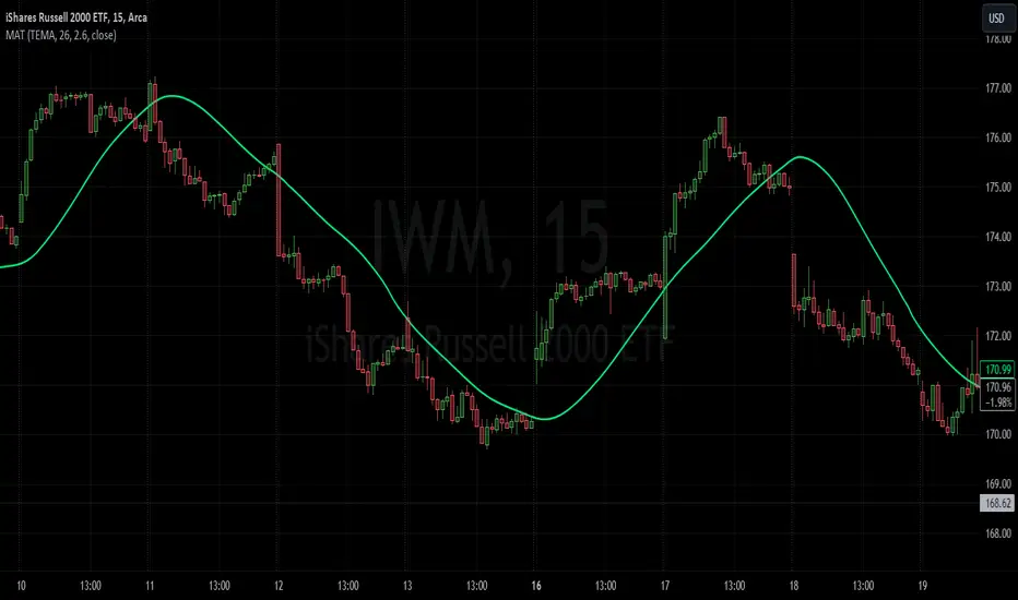
Moving Average TransformThe MAT is essentially a different kind of smoothed moving average. It is made to filter out data sets that deviate from the specified absolute threshold and the result becomes a smoothing function. The goal here, inspired by time series analysis within mathematical study, is to eliminate data anomalies and generate a more accurate trendline.
Functionality:
This script calculates a filtered average by:
Determining the mean of the entire data series.
Initializing sum and count variables.
Iterating through the data to filter values that deviate from the mean beyond the threshold.
Calculating a filtered mean based on the filtered data.
The filtered mean is then passed through a moving average function, where various types of moving averages like SMA, EMA, DEMA, TEMA, and ALMA can be applied. Some popular averages such as the HMA were omitted due to their heavy dependency on weighing specific data points.
Some information from "Time Series Analysis" regarding deviations
Definition of Anomaly: An anomaly or outlier is a data point that differs significantly from other observations in the dataset. It can be caused by various reasons such as measurement errors, data entry errors, or genuine extreme observations.
Impact on Mean: The mean (or average) of a dataset is calculated by summing all the values and dividing by the number of values. Since the mean is sensitive to extreme values, even a single outlier can significantly skew the mean.
Example: Consider a simple time series dataset: . The value "150" is an anomaly in this context. If we calculate the mean with this outlier, it is (10 + 12 + 11 + 9 + 150) / 5 = 38.4. However, if we exclude the outlier, the mean becomes (10 + 12 + 11 + 9) / 4 = 10.5. The presence of the outlier has substantially increased the mean.
Accuracy and Representativeness: While the mean calculated without outliers might be more "accurate" in the sense of being more representative of the central tendency of the bulk of the data, it's essential to note that anomalies might convey important information about the system being studied. Blindly removing or ignoring them might lead to overlooking significant events or phenomena.
Approaches to Handle Anomalies?
Detection and Removal
Robust Statistics
Transformation
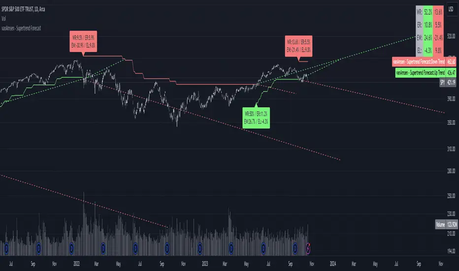
Supertrend Forecast - vanAmsenHello everyone!
I am thrilled to present the "vanAmsen - Supertrend Forecast", an advanced tool that marries the simplicity of the Supertrend with comprehensive statistical insights.
Before we dive into the functionalities of this indicator, it's essential to understand its foundation and theory.
The Theory:
What exactly is the Supertrend?
The Supertrend, at its core, is a momentum oscillator. It's a tool that provides buy and sell signals based on the prevailing market trend. The underlying principle is straightforward: by analyzing average price data and volatility over a period, the Supertrend gives us a line that represents the trend direction.
However, trading isn't just about identifying trends; it's about understanding their strength, potential profitability, and historical accuracy. This is where statistics come into play. By incorporating statistical analysis into the Supertrend, we can gain deeper insights into the market's behavior.
Description:
The "vanAmsen - Supertrend Forecast" isn't just another Supertrend indicator. It's a comprehensive tool designed to offer traders a holistic view of market trends, backed by robust statistical analysis.
Key Features:
- Supertrend Line: A visual representation of the current market direction.
- Win Rate & Expected Return: Delve into the historical accuracy and profitability of the prevailing trend.
- Average Percentage Change: Understand the average price fluctuation for both winning and losing trends.
- Forecast Lines: Project future price movements based on historical data, providing a roadmap for potential scenarios.
- Interactive Table: A concise table in the top right, offering a snapshot of all vital metrics at a glance.
Usage:
- The bullish Supertrend line adopts an Aqua hue, indicating potential upward momentum.
- In contrast, the bearish line is painted in Orange, suggesting potential downtrends.
- Customize your chart by toggling labels, tables, and lines according to preference.
Recommendation:
The "vanAmsen - Supertrend Forecast" is undoubtedly a powerful tool in a trader's arsenal. However, it's imperative to combine it with other technical analysis tools and sound risk management practices. It's always prudent to backtest strategies with historical data before embarking on live trading.
syminfo tableThis is nothing special, and it is not an indicator for investments.
I build this for my programming layout, so I can see all the output of the syminfo command.
Simply put...
It shows the commands on the left side,
and related outputs are on the right side.

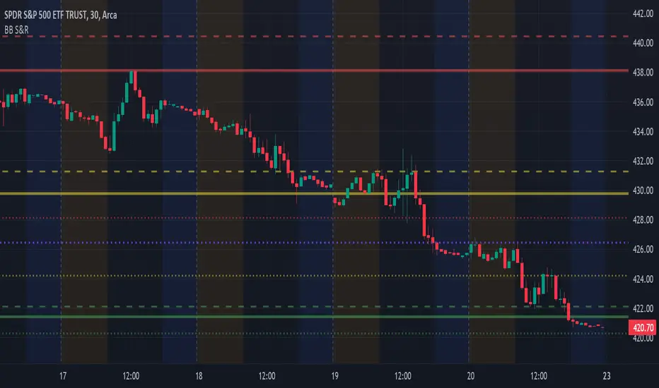
BB Support & ResistanceChoosing support and resistance can be time consuming and subjective. Personally, I don't want to spend too much time manually marking up charts. Credit to video I saw, forget the producer, that demonstrated how multi-time frame Bollinger Bands can act as support and resistance. I suggest reading up on Bollinger Bands (en.wikipedia.org) and how to trade them. This indicator draws support and resistance lines based on Bollinger Bands on three time frames. You can select 1 or all three time frames to display on your chart. Enjoy.
Drawdown Dynamics IndicatorDescription :
The Drawdown Dynamics Indicator is a straightforward tool that offers insights into three critical aspects of an asset’s financial performance: Total Max Drawdown, Rolling Period Max Drawdown, and Current Max Drawdown. Inside of the indicator, you can select to view either the rolling period max drawdown or the all-time max drawdown. This is represented by the gray line. The blue line represents the asset's current drawdown.
Rolling Period Max Drawdown is more about a snapshot view, highlighting the maximum loss from a peak to a trough for an adjustable rolling time frame. This is a feature not available with other indicators that exist on TradingView.
Total Max Drawdown gives a broad view, showcasing the all-time deepest decline in an asset’s value.
Current Max Drawdown offers a live update, focusing on the asset's present phase and how it's performing in real-time.
Practical Uses :
The utility of this indicator becomes evident when you start exploring the risks and performance metrics of assets. A notable use of this indicator is in comparing the drawdowns of a trading strategy against the inherent drawdowns of an asset. It helps in painting a clearer picture of risk and performance of both the asset and the strategy.
Risk Understanding : By comparing the strategy drawdown to the asset drawdown, traders get to understand if the risk they’re taking aligns with the asset’s natural risk behavior.
Evaluating Strategy’s Strength : If a strategy can weather the storms of the asset's natural drawdown phases and come out relatively unscathed, it can speak to its strength.
Performance Comparison : It also acts as a benchmark tool. Traders can pit different strategies against each other, using the asset’s drawdown as a baseline, to see which one manages risks better.
Disclaimer : This is not financial advice. Open-source scripts I publish in the community are largely meant to spark ideas that can be used as building blocks for part of a more robust trade management strategy. If you would like to implement a version of any script, I would recommend making significant additions/modifications to the strategy & risk management functions. If you don’t know how to program in Pine, then hire a Pine-coder. We can help!

Dynamic Sine Wave The Dynamic Sine Wave is designed to calculate a sine wave that reflects the oscillations between the highest high and lowest low points over a specified period, providing traders with a unique perspective on market trends.
Why a Sine Wave is Relevant:
A sine wave is relevant in this context because it is a mathematical function that represents periodic oscillations, making it suitable for capturing the cyclic nature of price movements in financial markets.
By using a sine wave, this indicator highlights the repetitive patterns of price highs and lows over a specified period, which can assist traders in identifying potential trend reversals or continuations.
The sine wave's amplitude and frequency are adjusted based on the highest high and lowest low points, ensuring that it adapts to market volatility and provides a dynamic representation of price action.
Overall, the "Dynamic Sine Wave" indicator offers a unique perspective on market dynamics, helping traders make informed decisions by visualizing the ebb and flow of prices.

Multiperiod Volume Pressure Indicator
Description:
The Volume Pressure Indicator is a powerful tool designed to assess market sentiment based on a combination of price and volume data. By analyzing buy and sell pressure within specific lookback periods, this indicator provides valuable insights into the intensity of market buying and selling activities. Traders can use this information to make informed decisions, especially during periods of price consolidation or trend reversal.
Key Features:
- **Multi-Period Analysis:** Utilizes multiple lookback periods (1, 2, and 4) to calculate buy and sell pressures, offering a nuanced view of market dynamics over different timeframes.
- **Pressure Calculation:** Computes buy and sell pressures based on price range and closing values, providing a comprehensive understanding of market participant behavior.
- **Color-Coded Bars:** Visualizes market sentiment by coloring bars according to the number of positive (buy pressure > sell pressure) periods observed within the specified lookback periods.
How to Use:
- **Color Coding:** Green bars represent periods where buy pressure dominates, indicating potential buying interest. Yellow bars suggest a balance between buy and sell pressures. Red bars signal periods dominated by sell pressure, indicating potential selling interest.
- **Lookback Periods:** Shorter lookback periods (e.g., 1) offer insights into immediate market sentiment, while longer periods (e.g., 4) provide a broader perspective. Analyzing multiple periods can help traders confirm trends and anticipate reversals.
Customization:
- **Lookback Periods:** Adjust the length of the lookback periods (1, 2, and 4) to match your trading style and timeframe preferences.
Disclaimer:
Trading involves risk, and past performance is not indicative of future results. Always conduct thorough analysis and apply proper risk management techniques before making trading decisions.
Usage Scenarios:
- **Trend Confirmation:** Use the indicator to confirm the strength of an ongoing trend. Consistent green bars can validate a bullish trend, while red bars may confirm a bearish trend.
- **Reversal Signals:** Look for transitions in bar colors to identify potential trend reversals. A shift from green to yellow/red or vice versa can indicate changing market sentiment.
- **Divergence Analysis:** Compare price movements with the indicator's bar colors. Divergence between price trends and bar colors may signal upcoming price movements.

DMI Based Overbought/Oversold SignalsDescription:
The Directional Movement Index (DMI) with Bollinger Bands and Moving Averages is a comprehensive technical analysis tool designed to assist traders in identifying potential market trends and reversal points. This indicator combines the power of DMI, Bollinger Bands, and Moving Averages to offer insights into market strength, volatility, and potential entry/exit points.
Key Features:
- **DMI Analysis:** Utilizes the DMI to evaluate the strength of bullish and bearish trends, aiding in trend identification and momentum assessment.
- **Bollinger Bands:** Implements Bollinger Bands on both +DI and -DI, enabling traders to gauge price volatility and potential overbought/oversold conditions.
- **Moving Averages Confirmation:** Utilizes Moving Averages for both +DI and -DI, confirming trend signals and providing additional context for trade decisions.
- **Color-Coded Signals:** Displays red boxes for potential bearish signals and green boxes for potential bullish signals, enhancing visual clarity.
How to Use:
- **DMI Signals:** Red boxes indicate potential bearish signals, suggesting caution or potential short opportunities. Green boxes suggest potential bullish signals, indicating possible long opportunities.
- **Volatility Assessment:** Bollinger Bands expansion (price moving away from the center line) can indicate increased volatility, potentially signaling significant price movements.
- **Trend Confirmation:** Moving Averages confirm the strength of the trend. When +DI or -DI is above its respective upper Bollinger Band and the Moving Average is also above, the trend is considered strong.
Customization:
- **DI Length:** Adjust the length of the Directional Index (DI) to fine-tune the sensitivity of trend signals.
- **Bollinger Bands Length:** Modify the length of Bollinger Bands to control the indicator's responsiveness to price volatility.
- **Bollinger Bands Multiplier:** Adjust the multiplier to widen or narrow the Bollinger Bands, affecting the sensitivity of overbought/oversold signals.
- **Moving Average Length:** Define the length of Moving Averages for additional confirmation of trend signals.
Disclaimer:
Trading involves risk, and past performance is not indicative of future results. Always conduct thorough analysis and apply proper risk management techniques before making trading decisions.

DMI Based Consolidation InidcatorDescription:
The Consolidation Indicator (DMI + MA) combines the power of the Directional Movement Index (DMI) and Moving Averages (MA) to help traders identify both trends and consolidation phases in the market. This versatile indicator provides valuable insights into the market's behavior, making it an essential tool for traders seeking to optimize their strategies.
Key Features:
- **Directional Movement Analysis:** Utilizes the DMI to assess the strength of bullish and bearish trends, helping traders identify trend direction and momentum.
- **Moving Average Confirmation:** Integrates Moving Averages to confirm trend signals, enhancing the reliability of trend identification.
- **Trend and Consolidation Recognition:** Displays +DI and -DI trends with color-coded boxes, allowing traders to distinguish between bullish, bearish trends, and consolidation phases.
How to Use:
- **Trend Identification:** +DI Trend box (green) indicates a bullish trend, suggesting potential buying opportunities. -DI Trend box (red) signifies a bearish trend, indicating potential selling opportunities.
- **Consolidation Phase:** When both boxes are white, the market is in a consolidation phase. During consolidation, prices often move within a range. Traders may consider range-bound strategies or wait for a clear trend signal.
Customization:
- **ADX Smoothing:** Adjust the ADX smoothing factor (lensig) to fine-tune the sensitivity of trend signals.
- **DI Length:** Set the length of the Directional Index (DI) to control the responsiveness of the indicator to price changes.
- **Moving Average Length:** Define the length of the Moving Averages for additional confirmation of trend signals.
- **Moving Average Type:** Choose from SMA, EMA, WMA, or VWMA to customize the Moving Averages based on your trading preferences.
Disclaimer:
Trading involves risk, and past performance is not indicative of future results. Always perform your analysis and consider risk management strategies before making trading decisions.
