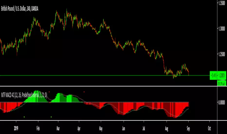
JooNim_Wave Trend_Multi Time FrameWave Trend Multi Time Frame
웨이브 트렌드 멀티타임 프레임입니다.
과매수 혹은 과매도 구간에서 자동으로 화살표가 나오게끔 설정이 되어 있습니다.
15분 / 30분 / 1시간 /4시간 / 일봉 에서의 과매수 과매도 구간을 확인하실 수 있습니다.
앞전에 올렸던 Wave Trend Multi Time Frame Indicator와 함께 사용하시면 큰 도움이 될 것이라고 예상됩니다.
하나의 단순한 지표이므로 모든 상하향 방향성을 다 맞출순 없습니다.
다른 다양한 지표와 함께 사용하심을 권장합니다.
사용이 필요하신분들은 언제든지 댓글 달아주시기 바랍니다 ^-^!
Wave trend multi-time frame.
It is set so that the arrow automatically appears in the overbought or oversold section.
15 minutes / 30 minutes / 1 hour / 4 hours / You can check the oversold section at daily wages.
It is expected to be of great help when used in conjunction with the Wave Trend Multi Time Frame Indicator previously posted.
As it is a simple indicator, it is impossible to match all directions in the up and down direction.
It is recommended to use it with various other indicators.
If you need to use, please comment anytime ^-^!
"wave" için komut dosyalarını ara

Wave MasterThis indicator will automatically paint the candles in Green/Red if they are Above/Below the inputted MA, which will also be Green when up and Red when down.
The default MA setting is 60 periods.
There's also a longer term MA pre-setted at 200 periods to give you a longer term perspective of Trend.
All of this concept is from the work of @Kazonomics


Wave Trend Arrows [Salty]This is just like WT_LB, but with arrows that increase in size to show cross over points. The larger down arrows indicate resistance for overbought levels, and the larger up arrows indicate support for oversold levels.


Wave SMA As far as i can tell there is no other SMA thats works the same, the signal line changes color if closing above or below it.


GLI / Asset Structural Trend RatioBasicly I asked AI to create a GLI to Asset trend ratio indicator.

Sazonalidade FullTitle: Seasonality Full
Description:
Unlock the "Market Memory" with Institutional Precision.
The Seasonality Full is the ultimate evolution of seasonal analysis tools. It combines the robust mathematical engine of classic institutional seasonality with a modern, data-driven dashboard.
Designed for both professional traders and serious students of the market, this version features Educational Tooltips on every setting, teaching you the "Why" behind the "How".
🔥 Key Features:
1. True Institutional Mathematics:
Trading Days Engine: Calculates seasonality based on actual trading days (252/year), ignoring weekends/holidays for perfect candle alignment.
Forced Detrending: Automatically removes long-term trend bias to isolate pure cyclical peaks and troughs. This reveals "cheap" vs. "expensive" zones regardless of the broader market trend.
2. The Sniper Dashboard (HUD): Real-time statistical validation of the seasonal pattern:
🎯 WinRate: Historical probability of a positive close for the current month.
📊 Avg/Target (Smart Volatility): Expected return dynamically adjusted to the asset's volatility profile (e.g., knows that 1% is huge for Forex but normal for Crypto).
⚠️ Risk (StdDev): Identifies if the seasonal pattern is "Stable" (reliable) or "Chaotic" (high variance).
🔍 Correlation (Pearson): The "Lie Detector". Compares the current price action against the projected seasonality.
Green: Price is respecting history (High Confidence).
Red: Price has decoupled from history (Caution).
3. Smart Visualization (Auto-Stack):
Percentage Stacking: A unique control to adjust chart layout.
0%: Overlay mode (compare relative strength).
100%: Joyplot mode (clean, stacked lines).
Dark Mode Optimized: Professional aesthetic designed for long hours of screen time.
4. Built-in Education:
Hover over the "i" icon on any setting to read a detailed explanation of its impact on the analysis. Perfect for learning while trading.
🚀 How to Use:
Use this indicator as a Directional Bias Filter:
Check Confluence: Do the 5, 10, and 15-year lines align?
Validate: Is the Correlation Positive? Is the WinRate favorable?
Execute: If the statistical bias aligns with your Price Action setup, you have a high-probability trade.
Master the cycles. Trade with the flow.

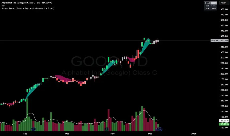
Smart Trend Cloud + Dynamic Gate (V 2.3)Smart Trend Cloud + Dynamic Gate
The Smart Trend Cloud + Dynamic Gate is a comprehensive trend-following system designed to filter out market noise and identify high-probability trend entries. Unlike simple Moving Average crossovers which often fail in ranging markets, this indicator employs a multi-stage validation system (The "Gate") combining Volume, Momentum, and Volatility filters to ensure you only trade when the market has conviction.
Key Features:
> Multi-Type Trend Cloud: Choose between HMA (Hull Moving Average), EMA, or ZeroLag EMA to define the trend baseline.
> The "Dynamic Gate" Filter: A crossover alone does not trigger a signal. The move must be validated by Relative Volume or MACD Histogram momentum within a specific window.
> Choppiness Suppression: Integrated ADX filter turns the candles gray during low-volatility consolidation zones to prevent over-trading.
> Stretch Bands: Optional ATR-based bands to highlight when price is over-extended from the mean.
> Live Dashboard: A table on the chart displaying current Trend State, Relative Volume strength, and ADX values.
How logic Works
1. Trend Definition & The Cloud The core trend is defined by the relationship between a Fast and Slow Moving Average.
Visuals: The space between these MA's forms the "Cloud". The cloud color transparency adjusts dynamically based on the strength of the trend (the spread between the MAs).
MA Options:
HMA: Best for scalping (1m/5m) due to low lag.
ZeroLag EMA: Custom calculation to reduce latency while retaining smoothness.
EMA: Standard trend following.
2. The Entry Gate (Validation) To avoid false signals during "whipsaw" price action, this script uses a logic gate. When a MA crossover occurs, it enters a "Pending" state. It only confirms a BULL or BEAR state if one of the following conditions is met within Gate Window bars:
Volume Spike: Relative Volume (Current Vol / Avg Vol) is greater than the defined threshold (default 1.2x).
Momentum Shift: The MACD Histogram confirms the direction of the trend.
3. Consolidation Filter The script calculates the ADX (Average Directional Index). If the ADX is below the Min ADX Strength threshold (default 20), the market is considered "Choppy."
Visual: Bars turn Gray.
Logic: Trend signals are suppressed until volatility expands.
4. Visual Dashboard A panel is located in the top-right corner providing real-time data:
Trend: Current State (Bull, Bear, or Chop).
Vol: Current Relative Volume (Green if > 1.0).
ADX: Current Trend Strength value.
Settings:
Trend Settings:
Adjust MA types and lengths to fit your timeframe.
Entry Gate: Toggle the Volume/Price gate on/off and adjust the Relative Volume requirement.
Consolidation: Enable/Disable the ADX filter to see all signals or only high-strength ones.
Visuals: Toggle the Cloud, Dashboard, or "Stretch Bands" (ATR bands) to declutter your chart.
Recommended Settings by Timeframe
Since different timeframes require different sensitivities to noise, here are the optimized settings for the Smart Trend Cloud:
⚡ 5 Minute Chart (Scalping)
Best for: Catching quick intraday momentum bursts while filtering chop.
MA Type: HMA (Hull Moving Average for speed)
Fast Length: 9
Slow Length: 21
Min Relative Volume: 1.3 (Requires higher volume to confirm entry)
Min ADX: 25 (Stricter chop filter)
⏱️ 15 Minute Chart (Intraday Swing)
Best for: Day trading with a balance of speed and stability.
MA Type: ZeroLag EMA (Reduces noise better than HMA)
Fast Length: 10
Slow Length: 30
Min Relative Volume: 1.2
Min ADX: 20
hrs 1 Hour Chart (Short-Term Swing)
Best for: Capturing the trend of the week.
MA Type: EMA or ZeroLag EMA
Fast Length: 12
Slow Length: 26 (Classic MACD correlation)
Min Relative Volume: 1.1
Min ADX: 20
📅 1 Day Chart (Position Trading)
Best for: Long-term trends and "Golden Cross" style entries.
MA Type: EMA (Standard Institutional Moving Average)
Fast Length: 20
Slow Length: 50
Min Relative Volume: 1.2
Min ADX: 15 (Allows for earlier entries on major trend shifts)
Alerts:
The script includes built-in alertcondition events for:
Trend Start: Bull (Valid trend detected after filtering).
Trend Start: Bear (Valid trend detected after filtering).
Access & Authorization
This is an Invite-Only script.
SK Trading System v1.6 SK Trading System v0.16 – Rule-Based Market Strategy for Precise Entries & Exits
The SK Trading System v0.16 is a comprehensive, rule-based approach to trading designed to identify market turning points using price action and Fibonacci levels. Built on over 6 years of trading experience and thousands of hours of market analysis, this system combines the power of Fibonacci retracements and extensions with structured price sequences to provide a high-probability framework for identifying trend reversals and market entries.
Key Features:
Price Action-Based: The system leverages market structure, including price highs and lows, to identify significant turning points in the market.
Fibonacci Levels: Key retracement and extension levels (0.382, 0.5, 0.618, 1.618, 2.000) are used to identify optimal entry and exit points for trades.
Clear Sequences: The strategy identifies sequences of price movements (Points 0, A, B, and C) that follow a well-defined pattern of market behavior.
Risk & Money Management: The system enforces strict risk management principles, capping loss exposure to 1-3% per trade and targeting a minimum 1:1 risk/reward ratio.
Automated Trade Setup: Automatic detection of key price levels, including the Golden Pocket zone, targets, and invalidation points.
Visual Trade Markers: Easy-to-read visual indicators, including Fibonacci zones, points of interest, and target levels, to support your trading decisions.
Why Use It:
Disciplined Approach: Follow a strict, rule-driven methodology to eliminate emotional trading and boost consistency.
Multi-Timeframe Analysis: Ideal for traders who analyze multiple timeframes, from higher timeframes for trend direction to lower timeframes for precise entry points.
Comprehensive Risk Management: The system includes built-in stop loss and take profit management to protect your capital and lock in profits.
Continuous Adaptation: The strategy can adapt to changing market conditions, ensuring you stay on the right side of the market.
Who Can Benefit:
Swing Traders: Ideal for traders looking to capture medium- to long-term price movements with high-probability setups.
Trend Followers: Perfect for those who want to trade with the prevailing trend while managing risk.
Fibonacci Enthusiasts: This strategy leverages Fibonacci retracements and extensions to find high-confluence entry and exit zones.
Maximize your trading efficiency and reduce the noise of unpredictable market moves with the SK Trading System v16. Let the system guide your trading decisions with clear, actionable signals and reliable market patterns.

Abdu Trading System 2This private indicator combines swing signals, overlays, trend tracing, and reversal zones.
It is an invite-only script and accessible only to authorized users.

Abdu Trading SystemThis private indicator combines swing signals, overlays, trend tracing, and reversal zones.
It is an invite-only script and accessible only to authorized users.

Myfxschool Trade Pick v25Introducing the MyFXSchool Leading Indicator™, a next-generation market prediction tool designed exclusively for traders who want accuracy, clarity, and early trend identification. Built using advanced price-action logic, institutional order-flow concepts, and dynamic volatility algorithms, this indicator gives you a true leading advantage—not just lagging signals.
