WAVE-PM Meow Mix (Lite) [acatwithcharts]This is a "lite" version of my WAVE-PM Meow Mix. It is limited to using just SMA and regular STDEV, resulting in a faster-loading and more stable indicator for general use.
This is an adaptation of Mark Whistler's WAVE-PM script, originally published in his book Volatility Illuminated as a MT4 script. It compares expansion and contraction of volatility on different period lengths as a leading indicator that significant trending is probable. WAVE-PM is, in of itself, a non-directional derivative of volatility, and is intended to be used in combination with other deviation-based indicators like BBands and CCI which offer directional indications.
I am posting these as invite-only and have a short list of collaborators in mind who will get access if they want it. It is not being made available to the general public as of this posting; I’m vaguely working towards eventually offering being able to offer some sort of paid indicator offering in the future.
Rather than shut the door entirely, I will say that if someone approaches me by PM with a really interesting idea on how they’d like to test this or my other indicators, I’m willing to consider giving access. I’m not giving this away just to anyone who asks and will, for my own time and sanity, probably just ignore requests by people who don't come to me already knowing what this indicator does and how they might want to use it.
"wave" için komut dosyalarını ara
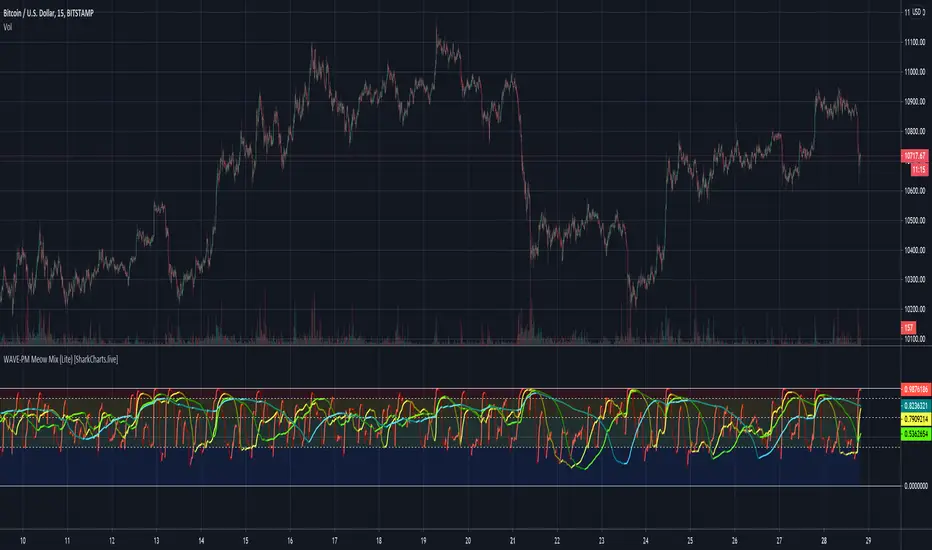
WAVE-PM Meow Mix [acatwithcharts]This is an adaptation of Mark Whistler's WAVE-PM script, originally published in his book Volatility Illuminated as a MetaTrader script. My version is inspired by the adaptation used by @astram22. It adds several additional ways to measure volatility for further experimentation.
Since the original TV script is not a public script, I'm publishing this as Invite-Only and will not be opening broad access to it.


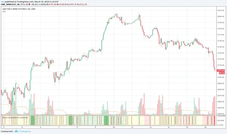
Wave Momentum IndicatorThe Wave Momentum Indicator combines elements of Weiss Wave, Hilbert Sine Wave, and a trend analysis calculation to present trending and high probability entries.
Green and red horizontal lines indicate directional volume
Background color indicates whether trading trend is bullish , bearish , or choppy (related to price expansion in a given direction)
Green / Red vertical lines indicate potential entries during a session when trend has been established for a period (building volume and entering a bullish/bearish zone) and are only their for example and not trading advice.
At a glance, when you see green verticals it's a confirmation of a bullish trend while red verticals are a confirmation of a bearish trend.
Simple usage:
Enter bullish on green vertical/background, exit on chop zone (yellow) or when bullish volume ends.
There are built in alerts for the bullish and bearish entry conditions to make alerting easier.
This indicator was designed for trading choppy sessions of the SPX via ES1! (E-Mini Futures ). Works best on the 15m and 1hr time-frames.
2 colour MACDstudy(shorttitle = "MACD WAVE TRADER", title = "2 colour MACD")
fastMA = input(title="Fast moving average", type = integer, defval = 12, minval = 7)
slowMA = input(title="Slow moving average", type = integer, defval = 26, minval = 7)
lastColor = yellow
= macd(close , fastMA, slowMA, 9)
= macd(close , fastMA, slowMA, 9)
plotColor = currMacd > 0
? currMacd > prevMacd ? white : maroon
: currMacd < prevMacd ? maroon : white
plot(currMacd, style = histogram, color = plotColor, linewidth = 3)
plot(0, title = "Zero line", linewidth = 1, color = gray)

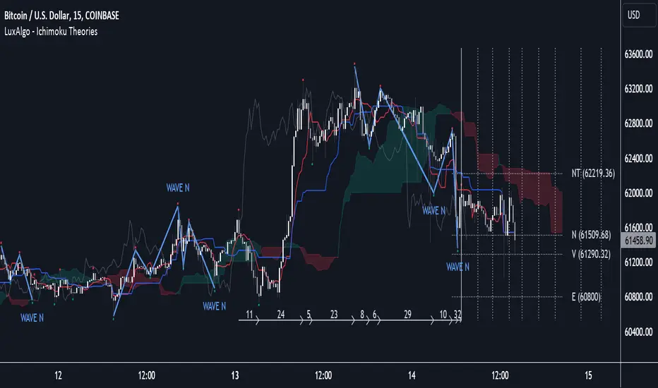
Ichimoku Theories [LuxAlgo]The Ichimoku Theories indicator is the most complete Ichimoku tool you will ever need. Four tools combined into one to harness all the power of Ichimoku Kinkō Hyō.
This tool features the following concepts based on the work of Goichi Hosoda:
Ichimoku Kinkō Hyō: Original Ichimoku indicator with its five main lines and kumo.
Time Theory: automatic time cycle identification and forecasting to understand market timing.
Wave Theory: automatic wave identification to understand market structure.
Price Theory: automatic identification of developing N waves and possible price targets to understand future price behavior.
🔶 ICHIMOKU KINKŌ HYŌ
Ichimoku with lines only, Kumo only and both together
Let us start with the basics: the Ichimoku original indicator is a tool to understand the market, not to predict it, it is a trend-following tool, so it is best used in trending markets.
Ichimoku tells us what is happening in the market and what may happen next, the aim of the tool is to provide market understanding, not trading signals.
The tool is based on calculating the mid-point between the high and low of three pre-defined ranges as the equilibrium price for short (9 periods), medium (26 periods), and long (52 periods) time horizons:
Tenkan sen: middle point of the range of the last 9 candles
Kinjun sen: middle point of the range of the last 26 candles
Senkou span A: middle point between Tankan Sen and Kijun Sen, plotted 26 candles into the future
Senkou span B: midpoint of the range of the last 52 candles, plotted 26 candles into the future
Chikou span: closing price plotted 26 candles into the past
Kumo: area between Senkou pans A and B (kumo means cloud in Japanese)
The most basic use of the tool is to use the Kumo as an area of possible support or resistance.
🔶 TIME THEORY
Current cycles and forecast
Time theory is a critical concept used to identify historical and current market cycles, and use these to forecast the next ones. This concept is based on the Kihon Suchi (translating to "Basic Numbers" in Japanese), these are 9 and 26, and from their combinations we obtain the following sequence:
9, 17, 26, 33, 42, 51, 65, 76, 129, 172, 200, 257
The main idea is that the market moves in cycles with periods set by the Kihon Suchi sequence.
When the cycle has the same exact periods, we obtain the Taito Suchi (translating to "Same Number" in Japanese).
This tool allows traders to identify historical and current market cycles and forecast the next one.
🔹 Time Cycle Identification
Presentation of 4 different modes: SWINGS, HIGHS, KINJUN, and WAVES .
The tool draws a horizontal line at the bottom of the chart showing the cycles detected and their size.
The following settings are used:
Time Cycle Mode: up to 7 different modes
Wave Cycle: Which wave to use when WAVE mode is selected, only active waves in the Wave Theory settings will be used.
Show Time Cycles: keep a cleaner chart by disabling cycles visualisation
Show last X time cycles: how many cycles to display
🔹 Time Cycle Forecast
Showcasing the two forecasting patterns: Kihon Suchi and Taito Suchi
The tool plots horizontal lines, a solid anchor line, and several dotted forecast lines.
The following settings are used:
Show time cycle forecast: to keep things clean
Forecast Pattern: comes in two flavors
Kihon Suchi plots a line from the anchor at each number in the Kihon Suchi sequence.
Taito Suchi plot lines from the anchor with the same size detected in the anchored cycle
Anchor forecast on last X time cycle: traders can place the anchor in any detected cycle
🔶 WAVE THEORY
All waves activated with overlapping
The main idea behind this theory is that markets move like waves in the sea, back and forth (making swing lows and highs). Understanding the current market structure is key to having realistic expectations of what the market may do next. The waves are divided into Simple and Complex.
The following settings are used:
Basic Waves: allows traders to activate waves I, V and N
Complex Waves: allows traders to activate waves P, Y and W
Overlapping waves: to avoid missing out on any of the waves activated
Show last X waves: how many waves will be displayed
🔹 Basic Waves
The three basic waves
The basic waves from which all waves are made are I, V, and N
I wave: one leg moves
V wave: two legs move, one against the other
N wave: Three legs move, push, pull back, and another push
🔹 Complex Waves
Three complex waves
There are other waves like
P wave: contracting market
Y wave: expanding market
W wave: double top or double bottom
🔶 PRICE THEORY
All targets for the current N wave with their calculations
This theory is based on identifying developing N waves and predicting potential price targets based on that developing wave.
The tool displays 4 basic targets (V, E, N, and NT) and 3 extended targets (2E and 3E) according to the calculations shown in the chart above. Traders can enable or disable each target in the settings panel.
🔶 USING EVERYTHING TOGETHER
Please DON'T do this. This is not how you use it
Now the real example:
Daily chart of Nasdaq 100 futures (NQ1!) with our Ichimoku analysis
Time, waves, and price theories go together as one:
First, we identify the current time cycles and wave structure.
Then we forecast the next cycle and possible key price levels.
We identify a Taito Suchi with both legs of exactly 41 candles on each I wave, both together forming a V wave, the last two I waves are part of a developing N wave, and the time cycle of the first one is 191 candles. We forecast this cycle into the future and get 22nd April as a key date, so in 6 trading days (as of this writing) the market would have completed another Taito Suchi pattern if a new wave and time cycle starts. As we have a developing N wave we can see the potential price targets, the price is actually between the NT and V targets. We have a bullish Kumo and the price is touching it, if this Kumo provides enough support for the price to go further, the market could reach N or E targets.
So we have identified the cycle and wave, our expectations are that the current cycle is another Taito Suchi and the current wave is an N wave, the first I wave went for 191 candles, and we expect the second and third I waves together to amount to 191 candles, so in theory the N wave would complete in the next 6 trading days making a swing high. If this is indeed the case, the price could reach the V target (it is almost there) or even the N target if the bulls have the necessary strength.
We do not predict the future, we can only aim to understand the current market conditions and have future expectations of when (time), how (wave), and where (price) the market will make the next turning point where one side of the market overcomes the other (bulls vs bears).
To generate this chart, we change the following settings from the default ones:
Swing length: 64
Show lines: disabled
Forecast pattern: TAITO SUCHI
Anchor forecast: 2
Show last time cycles: 5
I WAVE: enabled
N WAVE: disabled
Show last waves: 5
🔶 SETTINGS
Show Swing Highs & Lows: Enable/Disable points on swing highs and swing lows.
Swing Length: Number of candles to confirm a swing high or swing low. A higher number detects larger swings.
🔹 Ichimoku Kinkō Hyō
Show Lines: Enable/Disable the 5 Ichimoku lines: Kijun sen, Tenkan sen, Senkou span A & B and Chikou Span.
Show Kumo: Enable/Disable the Kumo (cloud). The Kumo is formed by 2 lines: Senkou Span A and Senkou Span B.
Tenkan Sen Length: Number of candles for Tenkan Sen calculation.
Kinjun Sen Length: Number of candles for the Kijun Sen calculation.
Senkou Span B Length: Number of candles for Senkou Span B calculation.
Chikou & Senkou Offset: Number of candles for Chikou and Senkou Span calculation. Chikou Span is plotted in the past, and Senkou Span A & B in the future.
🔹 Time Theory
Show Time Cycle Forecast: Enable/Disable time cycle forecast vertical lines. Disable for better performance.
Forecast Pattern: Choose between two patterns: Kihon Suchi (basic numbers) or Taito Suchi (equal numbers).
Anchor forecast on last X time cycle: Number of time cycles in the past to anchor the time cycle forecast. The larger the number, the deeper in the past the anchor will be.
Time Cycle Mode: Choose from 7 time cycle detection modes: Tenkan Sen cross, Kijun Sen cross, Kumo change between bullish & bearish, swing highs only, swing lows only, both swing highs & lows and wave detection.
Wave Cycle: Choose which type of wave to detect from 6 different wave types when the time cycle mode is set to WAVES.
Show Time Cycles: Enable/Disable time cycle horizontal lines. Disable for better performance.
how last X time cycles: Maximum number of time cycles to display.
🔹 Wave Theory
Basic Waves: Enable/Disable the display of basic waves, all at once or one at a time. Disable for better performance.
Complex Waves: Enable/Disable complex wave display, all at once or one by one. Disable for better performance.
Overlapping Waves: Enable/Disable the display of waves ending on the same swing point.
Show last X waves: 'Maximum number of waves to display.
🔹 Price Theory
Basic Targets: Enable/Disable horizontal price target lines. Disable for better performance.
Extended Targets: Enable/Disable extended price target horizontal lines. Disable for better performance.
Fibonacci Cycle Finder🟩 Fibonacci Cycle Finder is an indicator designed to explore Fibonacci-based waves and cycles through visualization and experimentation, introducing a trigonometric approach to market structure analysis. Unlike traditional Fibonacci tools that rely on static horizontal levels, this indicator incorporates the dynamic nature of market cycles, using adjustable wavelength, phase, and amplitude settings to visualize the rhythm of price movements. By applying a sine function, it provides a structured way to examine Fibonacci relationships in a non-linear context.
Fibonacci Cycle Finder unifies Fibonacci principles with a wave-based method by employing adjustable parameters to align each wave with real-time price action. By default, the wave begins with minimal curvature, preserving the structural familiarity of horizontal Fibonacci retracements. By adjusting the input parameters, the wave can subtly transition from a horizontal line to a more pronounced cycle,visualizing cyclical structures within price movement. This projective structure extends potential cyclical outlines on the chart, opening deeper exploration of how Fibonacci relationships may emerge over time.
Fibonacci Cycle Finder further underscores a non-linear representation of price by illustrating how wave-based logic can uncover shifts that are missed by static retracement tools. Rather than imposing immediate oscillatory behavior, the indicator encourages a progressive approach, where the parameters may be incrementally modified to align wave structures with observed price action. This refinement process deepens the exploration of Fibonacci relationships, offering a systematic way to experiment with non-linear price dynamics. In doing so, it revisits fundamental Fibonacci concepts, demonstrating their broader adaptability beyond fixed horizontal retracements.
🌀 THEORY & CONCEPT 🌀
What if Fibonacci relationships could be visualized as dynamic waves rather than confined to fixed horizontal levels? Fibonacci Cycle Finder introduces a trigonometric approach to market structure analysis, offering a different perspective on Fibonacci-based cycles. This tool provides a way to visualize market fluctuations through cyclical wave motion, opening the door to further exploration of Fibonacci’s role in non-linear price behavior.
Traditional Fibonacci tools, such as retracements and extensions, have long been used to identify potential support and resistance levels. While valuable for analyzing price trends, these tools assume linear price movement and rely on static horizontal levels. However, market fluctuations often exhibit cyclical tendencies , where price follows natural wave-like structures rather than strictly adhering to fixed retracement points. Although Fibonacci-based tools such as arcs, fans, and time zones attempt to address these patterns, they primarily apply geometric projections. The Fibonacci Cycle Finder takes a different approach by mapping Fibonacci ratios along structured wave cycles, aligning these relationships with the natural curvature of market movement rather than forcing them onto rigid price levels.
Rather than replacing traditional Fibonacci methods, the Fibonacci Cycle Finder supplements existing Fibonacci theory by introducing an exploratory approach to price structure analysis. It encourages traders to experiment with how Fibonacci ratios interact with cyclical price structures, offering an additional layer of insight beyond static retracements and extensions. This approach allows Fibonacci levels to be examined beyond their traditional static form, providing deeper insights into market fluctuations.
📊 FIBONACCI WAVE IMPLEMENTATION 📊
The Fibonacci Cycle Finder uses two user-defined swing points, A and B, as the foundation for projecting these Fibonacci waves. It first establishes standard horizontal levels that correspond to traditional Fibonacci retracements, ensuring a baseline reference before wave adjustments are applied. By default, the wave is intentionally subtle— Wavelength is set to 1 , Amplitude is set to 1 , and Phase is set to 0 . In other words, the wave starts as “stretched out.” This allows a slow, measured start, encouraging users to refine parameters incrementally rather than producing abrupt oscillations. As these parameters are increased, the wave takes on more distinct sine and cosine characteristics, offering a flexible approach to exploring Fibonacci-based cyclicity within price action.
Three parameters control the shape of the Fibonacci wave:
1️⃣ Wavelength Controls the horizontal spacing of the wave along the time axis, determining the length of one full cycle from peak to peak (or trough to trough). In this indicator, Wavelength acts as a scaling input that adjusts how far the wave extends across time, rather than a strict mathematical “wavelength.” Lower values further stretch the wave, increasing the spacing between oscillations, while higher values compress it into a more frequent cycle. Each full cycle is divided into four quarter-cycle segments, a deliberate design choice to minimize curvature by default. This allows for subtle oscillations and smoother transitions, preventing excessive distortion while maintaining flexibility in wave projections. The wavelength is calculated relative to the A-B swing, ensuring that its scale adapts dynamically to the selected price range.
2️⃣ Amplitude Defines the vertical displacement of the wave relative to the baseline Fibonacci level. Higher values increase the height of oscillations, while lower values reduce the height, Negative values will invert the wave’s initial direction. The amplitude is dynamically applied in relation to the A-B swing direction, ensuring that an upward swing results in upward oscillations and a downward swing results in downward oscillations.
3️⃣ Phase Shifts the wave’s starting position along its cycle, adjusting alignment relative to the swing points. A phase of 0 aligns with a sine wave, where the cycle starts at zero and rises. A phase of 25 aligns with a cosine wave, starting at a peak and descending. A phase of 50 inverts the sine wave, beginning at zero but falling first, while a phase of 75 aligns with an inverted cosine , starting at a trough and rising. Intermediate values between these phases create gradual shifts in wave positioning, allowing for finer alignment with observed market structures.
By fine-tuning these parameters, users can adapt Fibonacci waves to better reflect observed market behaviors. The wave structure integrates with price movements rather than simply overlaying static levels, allowing for a more dynamic representation of cyclical price tendencies. This indicator serves as an exploratory tool for understanding potential market rhythms, encouraging traders to test and visualize how Fibonacci principles extend beyond their traditional applications.
🖼️ CHART EXAMPLES 🖼️
Following this downtrend, price interacts with curved Fibonacci levels, highlighting resistance at the 0.236 and 0.382 levels, where price stalls before pulling back. Support emerges at the 0.5, 0.618, and 0.786 levels, where price finds stability and rebounds
In this Fibonacci retracement, price initially finds support at the 1.0 level, following the natural curvature of the cycle. Resistance forms at 0.786, leading to a pullback before price breaks through and tests 0.618 as resistance. Once 0.618 is breached, price moves upward to test 0.5, illustrating how Fibonacci-based cycles may align with evolving market structure beyond static, horizontal retracements.
Following this uptrend, price retraces downward and interacts with the Fibonacci levels, demonstrating both support and resistance at key levels such as 0.236, 0.382, 0.5, and 0.618.
With only the 0.5 and 1.0 levels enabled, this chart remains uncluttered while still highlighting key price interactions. The short cycle length results in a mild curvature, aligning smoothly with market movement. Price finds resistance at the 0.5 level while showing strong support at 1.0, which follows the natural flow of the market. Keeping the focus on fewer levels helps maintain clarity while still capturing how price reacts within the cycle.
🛠️ CONFIGURATION AND SETTINGS 🛠️
Wave Parameters
Wavelength : Stretches or compresses the wave along the time axis, determining the length of one full cycle. Higher values extend the wave across more bars, while lower values compress it into a shorter time frame.
Amplitude : Expands or contracts the wave along the price axis, determining the height of oscillations relative to Fibonacci levels. Higher values increase the vertical range, while negative values invert the wave’s initial direction.
Phase : Offsets the wave along the time axis, adjusting where the cycle begins. Higher values shift the starting position forward within the wave pattern.
Fibonacci Levels
Levels : Enable or disable specific Fibonacci levels (0.0, 0.236, 0.382, 0.5, 0.618, 0.786, 1.0) to focus on relevant price zones.
Color : Modify level colors for enhanced visual clarity.
Visibility
Trend Line/Color : Toggle and customize the trend line connecting swing points A and B.
Setup Lines : Show or hide lines linking Fibonacci levels to projected waves.
A/B Labels Visibility : Control the visibility of swing point labels.
Left/Right Labels : Manage the display of Fibonacci level labels on both sides of the chart.
Fill % : Adjust shading intensity between Fibonacci levels (0% = no fill, 100% = maximum fill).
A and B Points (Time/Price):
These user-defined anchor points serve as the basis for Fibonacci wave calculations and can be manually set. A and B points can also be adjusted directly on the chart, with automatic synchronization to the settings panel, allowing for seamless modifications without needing to manually input values.
⚠️ DISCLAIMER ⚠️
The Fibonacci Cycle Finder is a visual analysis tool designed to illustrate Fibonacci relationships and serve as a supplement to traditional Fibonacci tools. While the indicator employs mathematical and geometric principles, no guarantee is made that its calculations will align with other Fibonacci tools or proprietary methods. Like all technical and visual indicators, the Fibonacci levels generated by this tool may appear to visually align with key price zones in hindsight. However, these levels are not intended as standalone signals for trading decisions. This indicator is intended for educational and analytical purposes, complementing other tools and methods of market analysis.
🧠 BEYOND THE CODE 🧠
Fibonacci Cycle Finder is the latest indicator in the Fibonacci Geometry Series. Building on the concepts of the Fibonacci Time-Price Zones and the Fibonacci 3-D indicators, this tool introduces a trigonometric approach to market structure analysis.
The Fibonacci Cycle Finder indicator, like other xxattaxx indicators , is designed to encourage both education and community engagement. Your feedback and insights are invaluable to refining and enhancing the Fibonacci Cycle Finder indicator. We look forward to the creative applications, observations, and discussions this tool inspires within the trading community.
Goertzel Cycle Composite Wave [Loxx]As the financial markets become increasingly complex and data-driven, traders and analysts must leverage powerful tools to gain insights and make informed decisions. One such tool is the Goertzel Cycle Composite Wave indicator, a sophisticated technical analysis indicator that helps identify cyclical patterns in financial data. This powerful tool is capable of detecting cyclical patterns in financial data, helping traders to make better predictions and optimize their trading strategies. With its unique combination of mathematical algorithms and advanced charting capabilities, this indicator has the potential to revolutionize the way we approach financial modeling and trading.
*** To decrease the load time of this indicator, only XX many bars back will render to the chart. You can control this value with the setting "Number of Bars to Render". This doesn't have anything to do with repainting or the indicator being endpointed***
█ Brief Overview of the Goertzel Cycle Composite Wave
The Goertzel Cycle Composite Wave is a sophisticated technical analysis tool that utilizes the Goertzel algorithm to analyze and visualize cyclical components within a financial time series. By identifying these cycles and their characteristics, the indicator aims to provide valuable insights into the market's underlying price movements, which could potentially be used for making informed trading decisions.
The Goertzel Cycle Composite Wave is considered a non-repainting and endpointed indicator. This means that once a value has been calculated for a specific bar, that value will not change in subsequent bars, and the indicator is designed to have a clear start and end point. This is an important characteristic for indicators used in technical analysis, as it allows traders to make informed decisions based on historical data without the risk of hindsight bias or future changes in the indicator's values. This means traders can use this indicator trading purposes.
The repainting version of this indicator with forecasting, cycle selection/elimination options, and data output table can be found here:
Goertzel Browser
The primary purpose of this indicator is to:
1. Detect and analyze the dominant cycles present in the price data.
2. Reconstruct and visualize the composite wave based on the detected cycles.
To achieve this, the indicator performs several tasks:
1. Detrending the price data: The indicator preprocesses the price data using various detrending techniques, such as Hodrick-Prescott filters, zero-lag moving averages, and linear regression, to remove the underlying trend and focus on the cyclical components.
2. Applying the Goertzel algorithm: The indicator applies the Goertzel algorithm to the detrended price data, identifying the dominant cycles and their characteristics, such as amplitude, phase, and cycle strength.
3. Constructing the composite wave: The indicator reconstructs the composite wave by combining the detected cycles, either by using a user-defined list of cycles or by selecting the top N cycles based on their amplitude or cycle strength.
4. Visualizing the composite wave: The indicator plots the composite wave, using solid lines for the cycles. The color of the lines indicates whether the wave is increasing or decreasing.
This indicator is a powerful tool that employs the Goertzel algorithm to analyze and visualize the cyclical components within a financial time series. By providing insights into the underlying price movements, the indicator aims to assist traders in making more informed decisions.
█ What is the Goertzel Algorithm?
The Goertzel algorithm, named after Gerald Goertzel, is a digital signal processing technique that is used to efficiently compute individual terms of the Discrete Fourier Transform (DFT). It was first introduced in 1958, and since then, it has found various applications in the fields of engineering, mathematics, and physics.
The Goertzel algorithm is primarily used to detect specific frequency components within a digital signal, making it particularly useful in applications where only a few frequency components are of interest. The algorithm is computationally efficient, as it requires fewer calculations than the Fast Fourier Transform (FFT) when detecting a small number of frequency components. This efficiency makes the Goertzel algorithm a popular choice in applications such as:
1. Telecommunications: The Goertzel algorithm is used for decoding Dual-Tone Multi-Frequency (DTMF) signals, which are the tones generated when pressing buttons on a telephone keypad. By identifying specific frequency components, the algorithm can accurately determine which button has been pressed.
2. Audio processing: The algorithm can be used to detect specific pitches or harmonics in an audio signal, making it useful in applications like pitch detection and tuning musical instruments.
3. Vibration analysis: In the field of mechanical engineering, the Goertzel algorithm can be applied to analyze vibrations in rotating machinery, helping to identify faulty components or signs of wear.
4. Power system analysis: The algorithm can be used to measure harmonic content in power systems, allowing engineers to assess power quality and detect potential issues.
The Goertzel algorithm is used in these applications because it offers several advantages over other methods, such as the FFT:
1. Computational efficiency: The Goertzel algorithm requires fewer calculations when detecting a small number of frequency components, making it more computationally efficient than the FFT in these cases.
2. Real-time analysis: The algorithm can be implemented in a streaming fashion, allowing for real-time analysis of signals, which is crucial in applications like telecommunications and audio processing.
3. Memory efficiency: The Goertzel algorithm requires less memory than the FFT, as it only computes the frequency components of interest.
4. Precision: The algorithm is less susceptible to numerical errors compared to the FFT, ensuring more accurate results in applications where precision is essential.
The Goertzel algorithm is an efficient digital signal processing technique that is primarily used to detect specific frequency components within a signal. Its computational efficiency, real-time capabilities, and precision make it an attractive choice for various applications, including telecommunications, audio processing, vibration analysis, and power system analysis. The algorithm has been widely adopted since its introduction in 1958 and continues to be an essential tool in the fields of engineering, mathematics, and physics.
█ Goertzel Algorithm in Quantitative Finance: In-Depth Analysis and Applications
The Goertzel algorithm, initially designed for signal processing in telecommunications, has gained significant traction in the financial industry due to its efficient frequency detection capabilities. In quantitative finance, the Goertzel algorithm has been utilized for uncovering hidden market cycles, developing data-driven trading strategies, and optimizing risk management. This section delves deeper into the applications of the Goertzel algorithm in finance, particularly within the context of quantitative trading and analysis.
Unveiling Hidden Market Cycles:
Market cycles are prevalent in financial markets and arise from various factors, such as economic conditions, investor psychology, and market participant behavior. The Goertzel algorithm's ability to detect and isolate specific frequencies in price data helps trader analysts identify hidden market cycles that may otherwise go unnoticed. By examining the amplitude, phase, and periodicity of each cycle, traders can better understand the underlying market structure and dynamics, enabling them to develop more informed and effective trading strategies.
Developing Quantitative Trading Strategies:
The Goertzel algorithm's versatility allows traders to incorporate its insights into a wide range of trading strategies. By identifying the dominant market cycles in a financial instrument's price data, traders can create data-driven strategies that capitalize on the cyclical nature of markets.
For instance, a trader may develop a mean-reversion strategy that takes advantage of the identified cycles. By establishing positions when the price deviates from the predicted cycle, the trader can profit from the subsequent reversion to the cycle's mean. Similarly, a momentum-based strategy could be designed to exploit the persistence of a dominant cycle by entering positions that align with the cycle's direction.
Enhancing Risk Management:
The Goertzel algorithm plays a vital role in risk management for quantitative strategies. By analyzing the cyclical components of a financial instrument's price data, traders can gain insights into the potential risks associated with their trading strategies.
By monitoring the amplitude and phase of dominant cycles, a trader can detect changes in market dynamics that may pose risks to their positions. For example, a sudden increase in amplitude may indicate heightened volatility, prompting the trader to adjust position sizing or employ hedging techniques to protect their portfolio. Additionally, changes in phase alignment could signal a potential shift in market sentiment, necessitating adjustments to the trading strategy.
Expanding Quantitative Toolkits:
Traders can augment the Goertzel algorithm's insights by combining it with other quantitative techniques, creating a more comprehensive and sophisticated analysis framework. For example, machine learning algorithms, such as neural networks or support vector machines, could be trained on features extracted from the Goertzel algorithm to predict future price movements more accurately.
Furthermore, the Goertzel algorithm can be integrated with other technical analysis tools, such as moving averages or oscillators, to enhance their effectiveness. By applying these tools to the identified cycles, traders can generate more robust and reliable trading signals.
The Goertzel algorithm offers invaluable benefits to quantitative finance practitioners by uncovering hidden market cycles, aiding in the development of data-driven trading strategies, and improving risk management. By leveraging the insights provided by the Goertzel algorithm and integrating it with other quantitative techniques, traders can gain a deeper understanding of market dynamics and devise more effective trading strategies.
█ Indicator Inputs
src: This is the source data for the analysis, typically the closing price of the financial instrument.
detrendornot: This input determines the method used for detrending the source data. Detrending is the process of removing the underlying trend from the data to focus on the cyclical components.
The available options are:
hpsmthdt: Detrend using Hodrick-Prescott filter centered moving average.
zlagsmthdt: Detrend using zero-lag moving average centered moving average.
logZlagRegression: Detrend using logarithmic zero-lag linear regression.
hpsmth: Detrend using Hodrick-Prescott filter.
zlagsmth: Detrend using zero-lag moving average.
DT_HPper1 and DT_HPper2: These inputs define the period range for the Hodrick-Prescott filter centered moving average when detrendornot is set to hpsmthdt.
DT_ZLper1 and DT_ZLper2: These inputs define the period range for the zero-lag moving average centered moving average when detrendornot is set to zlagsmthdt.
DT_RegZLsmoothPer: This input defines the period for the zero-lag moving average used in logarithmic zero-lag linear regression when detrendornot is set to logZlagRegression.
HPsmoothPer: This input defines the period for the Hodrick-Prescott filter when detrendornot is set to hpsmth.
ZLMAsmoothPer: This input defines the period for the zero-lag moving average when detrendornot is set to zlagsmth.
MaxPer: This input sets the maximum period for the Goertzel algorithm to search for cycles.
squaredAmp: This boolean input determines whether the amplitude should be squared in the Goertzel algorithm.
useAddition: This boolean input determines whether the Goertzel algorithm should use addition for combining the cycles.
useCosine: This boolean input determines whether the Goertzel algorithm should use cosine waves instead of sine waves.
UseCycleStrength: This boolean input determines whether the Goertzel algorithm should compute the cycle strength, which is a normalized measure of the cycle's amplitude.
WindowSizePast: These inputs define the window size for the composite wave.
FilterBartels: This boolean input determines whether Bartel's test should be applied to filter out non-significant cycles.
BartNoCycles: This input sets the number of cycles to be used in Bartel's test.
BartSmoothPer: This input sets the period for the moving average used in Bartel's test.
BartSigLimit: This input sets the significance limit for Bartel's test, below which cycles are considered insignificant.
SortBartels: This boolean input determines whether the cycles should be sorted by their Bartel's test results.
StartAtCycle: This input determines the starting index for selecting the top N cycles when UseCycleList is set to false. This allows you to skip a certain number of cycles from the top before selecting the desired number of cycles.
UseTopCycles: This input sets the number of top cycles to use for constructing the composite wave when UseCycleList is set to false. The cycles are ranked based on their amplitudes or cycle strengths, depending on the UseCycleStrength input.
SubtractNoise: This boolean input determines whether to subtract the noise (remaining cycles) from the composite wave. If set to true, the composite wave will only include the top N cycles specified by UseTopCycles.
█ Exploring Auxiliary Functions
The following functions demonstrate advanced techniques for analyzing financial markets, including zero-lag moving averages, Bartels probability, detrending, and Hodrick-Prescott filtering. This section examines each function in detail, explaining their purpose, methodology, and applications in finance. We will examine how each function contributes to the overall performance and effectiveness of the indicator and how they work together to create a powerful analytical tool.
Zero-Lag Moving Average:
The zero-lag moving average function is designed to minimize the lag typically associated with moving averages. This is achieved through a two-step weighted linear regression process that emphasizes more recent data points. The function calculates a linearly weighted moving average (LWMA) on the input data and then applies another LWMA on the result. By doing this, the function creates a moving average that closely follows the price action, reducing the lag and improving the responsiveness of the indicator.
The zero-lag moving average function is used in the indicator to provide a responsive, low-lag smoothing of the input data. This function helps reduce the noise and fluctuations in the data, making it easier to identify and analyze underlying trends and patterns. By minimizing the lag associated with traditional moving averages, this function allows the indicator to react more quickly to changes in market conditions, providing timely signals and improving the overall effectiveness of the indicator.
Bartels Probability:
The Bartels probability function calculates the probability of a given cycle being significant in a time series. It uses a mathematical test called the Bartels test to assess the significance of cycles detected in the data. The function calculates coefficients for each detected cycle and computes an average amplitude and an expected amplitude. By comparing these values, the Bartels probability is derived, indicating the likelihood of a cycle's significance. This information can help in identifying and analyzing dominant cycles in financial markets.
The Bartels probability function is incorporated into the indicator to assess the significance of detected cycles in the input data. By calculating the Bartels probability for each cycle, the indicator can prioritize the most significant cycles and focus on the market dynamics that are most relevant to the current trading environment. This function enhances the indicator's ability to identify dominant market cycles, improving its predictive power and aiding in the development of effective trading strategies.
Detrend Logarithmic Zero-Lag Regression:
The detrend logarithmic zero-lag regression function is used for detrending data while minimizing lag. It combines a zero-lag moving average with a linear regression detrending method. The function first calculates the zero-lag moving average of the logarithm of input data and then applies a linear regression to remove the trend. By detrending the data, the function isolates the cyclical components, making it easier to analyze and interpret the underlying market dynamics.
The detrend logarithmic zero-lag regression function is used in the indicator to isolate the cyclical components of the input data. By detrending the data, the function enables the indicator to focus on the cyclical movements in the market, making it easier to analyze and interpret market dynamics. This function is essential for identifying cyclical patterns and understanding the interactions between different market cycles, which can inform trading decisions and enhance overall market understanding.
Bartels Cycle Significance Test:
The Bartels cycle significance test is a function that combines the Bartels probability function and the detrend logarithmic zero-lag regression function to assess the significance of detected cycles. The function calculates the Bartels probability for each cycle and stores the results in an array. By analyzing the probability values, traders and analysts can identify the most significant cycles in the data, which can be used to develop trading strategies and improve market understanding.
The Bartels cycle significance test function is integrated into the indicator to provide a comprehensive analysis of the significance of detected cycles. By combining the Bartels probability function and the detrend logarithmic zero-lag regression function, this test evaluates the significance of each cycle and stores the results in an array. The indicator can then use this information to prioritize the most significant cycles and focus on the most relevant market dynamics. This function enhances the indicator's ability to identify and analyze dominant market cycles, providing valuable insights for trading and market analysis.
Hodrick-Prescott Filter:
The Hodrick-Prescott filter is a popular technique used to separate the trend and cyclical components of a time series. The function applies a smoothing parameter to the input data and calculates a smoothed series using a two-sided filter. This smoothed series represents the trend component, which can be subtracted from the original data to obtain the cyclical component. The Hodrick-Prescott filter is commonly used in economics and finance to analyze economic data and financial market trends.
The Hodrick-Prescott filter is incorporated into the indicator to separate the trend and cyclical components of the input data. By applying the filter to the data, the indicator can isolate the trend component, which can be used to analyze long-term market trends and inform trading decisions. Additionally, the cyclical component can be used to identify shorter-term market dynamics and provide insights into potential trading opportunities. The inclusion of the Hodrick-Prescott filter adds another layer of analysis to the indicator, making it more versatile and comprehensive.
Detrending Options: Detrend Centered Moving Average:
The detrend centered moving average function provides different detrending methods, including the Hodrick-Prescott filter and the zero-lag moving average, based on the selected detrending method. The function calculates two sets of smoothed values using the chosen method and subtracts one set from the other to obtain a detrended series. By offering multiple detrending options, this function allows traders and analysts to select the most appropriate method for their specific needs and preferences.
The detrend centered moving average function is integrated into the indicator to provide users with multiple detrending options, including the Hodrick-Prescott filter and the zero-lag moving average. By offering multiple detrending methods, the indicator allows users to customize the analysis to their specific needs and preferences, enhancing the indicator's overall utility and adaptability. This function ensures that the indicator can cater to a wide range of trading styles and objectives, making it a valuable tool for a diverse group of market participants.
The auxiliary functions functions discussed in this section demonstrate the power and versatility of mathematical techniques in analyzing financial markets. By understanding and implementing these functions, traders and analysts can gain valuable insights into market dynamics, improve their trading strategies, and make more informed decisions. The combination of zero-lag moving averages, Bartels probability, detrending methods, and the Hodrick-Prescott filter provides a comprehensive toolkit for analyzing and interpreting financial data. The integration of advanced functions in a financial indicator creates a powerful and versatile analytical tool that can provide valuable insights into financial markets. By combining the zero-lag moving average,
█ In-Depth Analysis of the Goertzel Cycle Composite Wave Code
The Goertzel Cycle Composite Wave code is an implementation of the Goertzel Algorithm, an efficient technique to perform spectral analysis on a signal. The code is designed to detect and analyze dominant cycles within a given financial market data set. This section will provide an extremely detailed explanation of the code, its structure, functions, and intended purpose.
Function signature and input parameters:
The Goertzel Cycle Composite Wave function accepts numerous input parameters for customization, including source data (src), the current bar (forBar), sample size (samplesize), period (per), squared amplitude flag (squaredAmp), addition flag (useAddition), cosine flag (useCosine), cycle strength flag (UseCycleStrength), past sizes (WindowSizePast), Bartels filter flag (FilterBartels), Bartels-related parameters (BartNoCycles, BartSmoothPer, BartSigLimit), sorting flag (SortBartels), and output buffers (goeWorkPast, cyclebuffer, amplitudebuffer, phasebuffer, cycleBartelsBuffer).
Initializing variables and arrays:
The code initializes several float arrays (goeWork1, goeWork2, goeWork3, goeWork4) with the same length as twice the period (2 * per). These arrays store intermediate results during the execution of the algorithm.
Preprocessing input data:
The input data (src) undergoes preprocessing to remove linear trends. This step enhances the algorithm's ability to focus on cyclical components in the data. The linear trend is calculated by finding the slope between the first and last values of the input data within the sample.
Iterative calculation of Goertzel coefficients:
The core of the Goertzel Cycle Composite Wave algorithm lies in the iterative calculation of Goertzel coefficients for each frequency bin. These coefficients represent the spectral content of the input data at different frequencies. The code iterates through the range of frequencies, calculating the Goertzel coefficients using a nested loop structure.
Cycle strength computation:
The code calculates the cycle strength based on the Goertzel coefficients. This is an optional step, controlled by the UseCycleStrength flag. The cycle strength provides information on the relative influence of each cycle on the data per bar, considering both amplitude and cycle length. The algorithm computes the cycle strength either by squaring the amplitude (controlled by squaredAmp flag) or using the actual amplitude values.
Phase calculation:
The Goertzel Cycle Composite Wave code computes the phase of each cycle, which represents the position of the cycle within the input data. The phase is calculated using the arctangent function (math.atan) based on the ratio of the imaginary and real components of the Goertzel coefficients.
Peak detection and cycle extraction:
The algorithm performs peak detection on the computed amplitudes or cycle strengths to identify dominant cycles. It stores the detected cycles in the cyclebuffer array, along with their corresponding amplitudes and phases in the amplitudebuffer and phasebuffer arrays, respectively.
Sorting cycles by amplitude or cycle strength:
The code sorts the detected cycles based on their amplitude or cycle strength in descending order. This allows the algorithm to prioritize cycles with the most significant impact on the input data.
Bartels cycle significance test:
If the FilterBartels flag is set, the code performs a Bartels cycle significance test on the detected cycles. This test determines the statistical significance of each cycle and filters out the insignificant cycles. The significant cycles are stored in the cycleBartelsBuffer array. If the SortBartels flag is set, the code sorts the significant cycles based on their Bartels significance values.
Waveform calculation:
The Goertzel Cycle Composite Wave code calculates the waveform of the significant cycles for specified time windows. The windows are defined by the WindowSizePast parameters, respectively. The algorithm uses either cosine or sine functions (controlled by the useCosine flag) to calculate the waveforms for each cycle. The useAddition flag determines whether the waveforms should be added or subtracted.
Storing waveforms in a matrix:
The calculated waveforms for the cycle is stored in the matrix - goeWorkPast. This matrix holds the waveforms for the specified time windows. Each row in the matrix represents a time window position, and each column corresponds to a cycle.
Returning the number of cycles:
The Goertzel Cycle Composite Wave function returns the total number of detected cycles (number_of_cycles) after processing the input data. This information can be used to further analyze the results or to visualize the detected cycles.
The Goertzel Cycle Composite Wave code is a comprehensive implementation of the Goertzel Algorithm, specifically designed for detecting and analyzing dominant cycles within financial market data. The code offers a high level of customization, allowing users to fine-tune the algorithm based on their specific needs. The Goertzel Cycle Composite Wave's combination of preprocessing, iterative calculations, cycle extraction, sorting, significance testing, and waveform calculation makes it a powerful tool for understanding cyclical components in financial data.
█ Generating and Visualizing Composite Waveform
The indicator calculates and visualizes the composite waveform for specified time windows based on the detected cycles. Here's a detailed explanation of this process:
Updating WindowSizePast:
The WindowSizePast is updated to ensure they are at least twice the MaxPer (maximum period).
Initializing matrices and arrays:
The matrix goeWorkPast is initialized to store the Goertzel results for specified time windows. Multiple arrays are also initialized to store cycle, amplitude, phase, and Bartels information.
Preparing the source data (srcVal) array:
The source data is copied into an array, srcVal, and detrended using one of the selected methods (hpsmthdt, zlagsmthdt, logZlagRegression, hpsmth, or zlagsmth).
Goertzel function call:
The Goertzel function is called to analyze the detrended source data and extract cycle information. The output, number_of_cycles, contains the number of detected cycles.
Initializing arrays for waveforms:
The goertzel array is initialized to store the endpoint Goertzel.
Calculating composite waveform (goertzel array):
The composite waveform is calculated by summing the selected cycles (either from the user-defined cycle list or the top cycles) and optionally subtracting the noise component.
Drawing composite waveform (pvlines):
The composite waveform is drawn on the chart using solid lines. The color of the lines is determined by the direction of the waveform (green for upward, red for downward).
To summarize, this indicator generates a composite waveform based on the detected cycles in the financial data. It calculates the composite waveforms and visualizes them on the chart using colored lines.
█ Enhancing the Goertzel Algorithm-Based Script for Financial Modeling and Trading
The Goertzel algorithm-based script for detecting dominant cycles in financial data is a powerful tool for financial modeling and trading. It provides valuable insights into the past behavior of these cycles. However, as with any algorithm, there is always room for improvement. This section discusses potential enhancements to the existing script to make it even more robust and versatile for financial modeling, general trading, advanced trading, and high-frequency finance trading.
Enhancements for Financial Modeling
Data preprocessing: One way to improve the script's performance for financial modeling is to introduce more advanced data preprocessing techniques. This could include removing outliers, handling missing data, and normalizing the data to ensure consistent and accurate results.
Additional detrending and smoothing methods: Incorporating more sophisticated detrending and smoothing techniques, such as wavelet transform or empirical mode decomposition, can help improve the script's ability to accurately identify cycles and trends in the data.
Machine learning integration: Integrating machine learning techniques, such as artificial neural networks or support vector machines, can help enhance the script's predictive capabilities, leading to more accurate financial models.
Enhancements for General and Advanced Trading
Customizable indicator integration: Allowing users to integrate their own technical indicators can help improve the script's effectiveness for both general and advanced trading. By enabling the combination of the dominant cycle information with other technical analysis tools, traders can develop more comprehensive trading strategies.
Risk management and position sizing: Incorporating risk management and position sizing functionality into the script can help traders better manage their trades and control potential losses. This can be achieved by calculating the optimal position size based on the user's risk tolerance and account size.
Multi-timeframe analysis: Enhancing the script to perform multi-timeframe analysis can provide traders with a more holistic view of market trends and cycles. By identifying dominant cycles on different timeframes, traders can gain insights into the potential confluence of cycles and make better-informed trading decisions.
Enhancements for High-Frequency Finance Trading
Algorithm optimization: To ensure the script's suitability for high-frequency finance trading, optimizing the algorithm for faster execution is crucial. This can be achieved by employing efficient data structures and refining the calculation methods to minimize computational complexity.
Real-time data streaming: Integrating real-time data streaming capabilities into the script can help high-frequency traders react to market changes more quickly. By continuously updating the cycle information based on real-time market data, traders can adapt their strategies accordingly and capitalize on short-term market fluctuations.
Order execution and trade management: To fully leverage the script's capabilities for high-frequency trading, implementing functionality for automated order execution and trade management is essential. This can include features such as stop-loss and take-profit orders, trailing stops, and automated trade exit strategies.
While the existing Goertzel algorithm-based script is a valuable tool for detecting dominant cycles in financial data, there are several potential enhancements that can make it even more powerful for financial modeling, general trading, advanced trading, and high-frequency finance trading. By incorporating these improvements, the script can become a more versatile and effective tool for traders and financial analysts alike.
█ Understanding the Limitations of the Goertzel Algorithm
While the Goertzel algorithm-based script for detecting dominant cycles in financial data provides valuable insights, it is important to be aware of its limitations and drawbacks. Some of the key drawbacks of this indicator are:
Lagging nature:
As with many other technical indicators, the Goertzel algorithm-based script can suffer from lagging effects, meaning that it may not immediately react to real-time market changes. This lag can lead to late entries and exits, potentially resulting in reduced profitability or increased losses.
Parameter sensitivity:
The performance of the script can be sensitive to the chosen parameters, such as the detrending methods, smoothing techniques, and cycle detection settings. Improper parameter selection may lead to inaccurate cycle detection or increased false signals, which can negatively impact trading performance.
Complexity:
The Goertzel algorithm itself is relatively complex, making it difficult for novice traders or those unfamiliar with the concept of cycle analysis to fully understand and effectively utilize the script. This complexity can also make it challenging to optimize the script for specific trading styles or market conditions.
Overfitting risk:
As with any data-driven approach, there is a risk of overfitting when using the Goertzel algorithm-based script. Overfitting occurs when a model becomes too specific to the historical data it was trained on, leading to poor performance on new, unseen data. This can result in misleading signals and reduced trading performance.
Limited applicability:
The Goertzel algorithm-based script may not be suitable for all markets, trading styles, or timeframes. Its effectiveness in detecting cycles may be limited in certain market conditions, such as during periods of extreme volatility or low liquidity.
While the Goertzel algorithm-based script offers valuable insights into dominant cycles in financial data, it is essential to consider its drawbacks and limitations when incorporating it into a trading strategy. Traders should always use the script in conjunction with other technical and fundamental analysis tools, as well as proper risk management, to make well-informed trading decisions.
█ Interpreting Results
The Goertzel Cycle Composite Wave indicator can be interpreted by analyzing the plotted lines. The indicator plots two lines: composite waves. The composite wave represents the composite wave of the price data.
The composite wave line displays a solid line, with green indicating a bullish trend and red indicating a bearish trend.
Interpreting the Goertzel Cycle Composite Wave indicator involves identifying the trend of the composite wave lines and matching them with the corresponding bullish or bearish color.
█ Conclusion
The Goertzel Cycle Composite Wave indicator is a powerful tool for identifying and analyzing cyclical patterns in financial markets. Its ability to detect multiple cycles of varying frequencies and strengths make it a valuable addition to any trader's technical analysis toolkit. However, it is important to keep in mind that the Goertzel Cycle Composite Wave indicator should be used in conjunction with other technical analysis tools and fundamental analysis to achieve the best results. With continued refinement and development, the Goertzel Cycle Composite Wave indicator has the potential to become a highly effective tool for financial modeling, general trading, advanced trading, and high-frequency finance trading. Its accuracy and versatility make it a promising candidate for further research and development.
█ Footnotes
What is the Bartels Test for Cycle Significance?
The Bartels Cycle Significance Test is a statistical method that determines whether the peaks and troughs of a time series are statistically significant. The test is named after its inventor, George Bartels, who developed it in the mid-20th century.
The Bartels test is designed to analyze the cyclical components of a time series, which can help traders and analysts identify trends and cycles in financial markets. The test calculates a Bartels statistic, which measures the degree of non-randomness or autocorrelation in the time series.
The Bartels statistic is calculated by first splitting the time series into two halves and calculating the range of the peaks and troughs in each half. The test then compares these ranges using a t-test, which measures the significance of the difference between the two ranges.
If the Bartels statistic is greater than a critical value, it indicates that the peaks and troughs in the time series are non-random and that there is a significant cyclical component to the data. Conversely, if the Bartels statistic is less than the critical value, it suggests that the peaks and troughs are random and that there is no significant cyclical component.
The Bartels Cycle Significance Test is particularly useful in financial analysis because it can help traders and analysts identify significant cycles in asset prices, which can in turn inform investment decisions. However, it is important to note that the test is not perfect and can produce false signals in certain situations, particularly in noisy or volatile markets. Therefore, it is always recommended to use the test in conjunction with other technical and fundamental indicators to confirm trends and cycles.
Deep-dive into the Hodrick-Prescott Fitler
The Hodrick-Prescott (HP) filter is a statistical tool used in economics and finance to separate a time series into two components: a trend component and a cyclical component. It is a powerful tool for identifying long-term trends in economic and financial data and is widely used by economists, central banks, and financial institutions around the world.
The HP filter was first introduced in the 1990s by economists Robert Hodrick and Edward Prescott. It is a simple, two-parameter filter that separates a time series into a trend component and a cyclical component. The trend component represents the long-term behavior of the data, while the cyclical component captures the shorter-term fluctuations around the trend.
The HP filter works by minimizing the following objective function:
Minimize: (Sum of Squared Deviations) + λ (Sum of Squared Second Differences)
Where:
1. The first term represents the deviation of the data from the trend.
2. The second term represents the smoothness of the trend.
3. λ is a smoothing parameter that determines the degree of smoothness of the trend.
The smoothing parameter λ is typically set to a value between 100 and 1600, depending on the frequency of the data. Higher values of λ lead to a smoother trend, while lower values lead to a more volatile trend.
The HP filter has several advantages over other smoothing techniques. It is a non-parametric method, meaning that it does not make any assumptions about the underlying distribution of the data. It also allows for easy comparison of trends across different time series and can be used with data of any frequency.
However, the HP filter also has some limitations. It assumes that the trend is a smooth function, which may not be the case in some situations. It can also be sensitive to changes in the smoothing parameter λ, which may result in different trends for the same data. Additionally, the filter may produce unrealistic trends for very short time series.
Despite these limitations, the HP filter remains a valuable tool for analyzing economic and financial data. It is widely used by central banks and financial institutions to monitor long-term trends in the economy, and it can be used to identify turning points in the business cycle. The filter can also be used to analyze asset prices, exchange rates, and other financial variables.
The Hodrick-Prescott filter is a powerful tool for analyzing economic and financial data. It separates a time series into a trend component and a cyclical component, allowing for easy identification of long-term trends and turning points in the business cycle. While it has some limitations, it remains a valuable tool for economists, central banks, and financial institutions around the world.

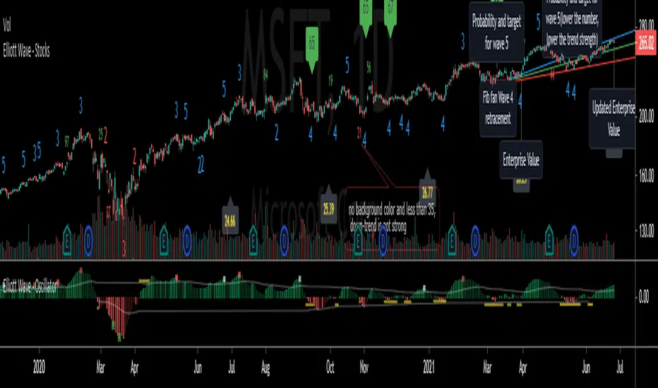
Elliott Wave with Customizable Visualization and Toggle1. Key User Inputs
a. Setting Wave 1 Start and High Points
- Wave 1 Start (Low Point): Enter the starting point (low point) of the first wave.
- Default: 10000.
- Wave 1 High (Previous High): Enter the high point (end point) of the first wave.
- Default: 11000.
b. Setting Targets and Retracement Ratios for Each Wave
- Wave 1 Target: Select the target ratio for Wave 1.
- Options: 1.0, 1.272, 1.414, 1.618, 2.0.
- Default: 1.618.
- Wave 2 Retrace: Select the retracement ratio for Wave 2.
- Options: 0.236, 0.382, 0.5, 0.618, 0.786.
- Default: 0.618.
- Wave 3 Target: Select the target ratio for Wave 3.
- Options: 1.0, 1.272, 1.414, 1.618, 2.0.
- Default: 1.618.
- Wave 4 Retrace: Select the retracement ratio for Wave 4.
- Options: 0.236, 0.382, 0.5, 0.618.
- Default: 0.382.
- Wave 5 Target: Select the target ratio for Wave 5.
- Options: 0.618, 1.0, 1.272, 1.414, 1.618.
- Default: 1.0.
c. Setting Colors and Styles for Each Wave
You can customize the color and line style of each wave:
- Wave 1 Color: Color of Wave 1 (Default: Green).
- Wave 2 Color: Color of Wave 2 (Default: Red).
- Wave 3 Color: Color of Wave 3 (Default: Blue).
- Wave 4 Color: Color of Wave 4 (Default: Purple).
- Wave 5 Color: Color of Wave 5 (Default: Orange).
- Wave 1 Line Style: Select the line style for Wave 1 (Options: Solid, Dotted, Dashed).
- Default: Solid.
- The same settings can be applied to the remaining waves.
d. Setting Wave Display Options
- You can toggle the visibility of specific waves:
- Example: Set Show Wave 1 to false to hide Wave 1 from the chart.
- Default: true (All waves are displayed).
2. Outputs and Visualization
Wave Target Lines
- The target price and retracement levels for each wave are displayed as horizontal lines on the chart.
- Selected ratios (Fibonacci ratios) are highlighted based on the user-defined style.
Labels
- Labels next to the target lines display the target price and Fibonacci ratio.
- Example: Wave 1 (1.618): 11236.54.
3. Key Calculations and Wave Explanations
a. Wave 1
- Length: Wave 1 High - Wave 1 Start.
- Target: The target price is calculated based on the selected ratio (Wave 1 Target).
- Display: The target line and label are displayed starting from Wave 1 Start.
b. Wave 2
- Retracement Length: Wave 1 Target - Wave 1 Start.
- Retracement Target: The retracement price is calculated based on the selected ratio (Wave 2 Retrace).
- Display: The retracement line and label are displayed starting from Wave 1 Target.
c. Wave 3
- Length: Same as the length of Wave 1.
- Target: The target price is calculated based on the selected ratio (Wave 3 Target).
- Display: The target line and label are displayed starting from Wave 1 Target.
d. Wave 4
- Retracement Length: Wave 3 Target - Wave 1 Target.
- Retracement Target: The retracement price is calculated based on the selected ratio (Wave 4 Retrace).
- Display: The retracement line and label are displayed starting from Wave 3 Target.
e. Wave 5
- Length: Same as the length of Wave 3.
- Target: The target price is calculated based on the selected ratio (Wave 5 Target).
- Display: The target line and label are displayed starting from Wave 3 Target.
4. Usage Examples
Trend Analysis
- Visualize the target price and retracement levels of each wave to understand upward or downward trends.
Determining Entry/Exit Points
- Plan entry and exit strategies by observing when target prices reach specific Fibonacci ratios.
Customization
- Enhance visual convenience by adjusting chart styles and colors to suit your preferences.
5. Notes and Precautions
Input Validation
- Ensure that the Wave 1 Start and Wave 1 High values match actual price ranges to achieve accurate results.
Market Conditions
- Elliott Wave Theory is a predictive tool and may differ from actual market movements.
Risk Management
- Use the results as a reference and always incorporate risk management strategies when making investment decisions.

LT Elliott Wave 2.0LT Elliott Waves 2.0 Indicator:
According to Elliott Wave Theory, price moves in 5 waves in the direction of the major trend and moves in 3 waves (ABC) when it moves against the major trend. The key purpose and value of elliott wave theory (EWT) is to provide context for chart analysis. According to the book The Elliott Wave Principle by Frost & Prechter: “This context provides both a basis for disciplined thinking and a perspective on the market's general position and outlook.” The benefit of having context is that one can identify and anticipate changes in direction.
In Elliott Wave theory, waves 1, 3, 5 and C are impulse waves (a five wave pattern that makes progress) whereas waves 2, 4, A and B are corrective waves (a three wave pattern – or combination of three waves - that moves against the direction of the larger trend). Although wave A can also be formed of 5 waves, it is commonly formed of 3 waves. Here is a brief summary of the waves:
Wave 3 tends to be the strongest and most dynamic wave – it is usually (but not always) the longest wave but it is never the shortest. Wave 4 is a corrective wave that is typically composed of 3 smaller waves (ABC) and is notorious for being messy and unpredictable in nature. Wave 5 is the final wave before a significant correction or reversal in trend and is often accompanied by divergences (e.g. negative divergences in an uptrend) and exhaustions in momentum. It is also possible for a wave 5 to form after a “blow-off top” pattern. Wave 2 is composed of 3 smaller waves (ABC) and is a retracement of wave 1 – the retracement can be shallow to moderate (23.6% to 38.2%) or deep (50%, 61.8% to 78.6%). Wave 1 is the first wave of a trend and is composed of 5 smaller waves – it usually occurs after divergences (in the prior move) and extremes in both sentiment and momentum. For example, the wave 1 of an uptrend can often begin after capitulation in the price (after a major decline), extremely pessimistic sentiment, extremely oversold momentum readings, positive divergences and sometimes accompanied by a volume breadth thrust. Waves A and C are often equal in measure. Wave A can be formed of either 5 waves or 3 waves - but more commonly it is composed of 3 waves. Wave B is always corrective and composed of 3 smaller waves. Wave C is a five wave impulse pattern.
The Elliott Wave 2.0 (or EW2) chart indicator seeks to simplify elliott wave theory (EWT) in that its main purpose is to identify the potential major trends and corrections. The indicator takes a more simple and direct approach to EWT in that it focuses more on trying to identify whether price is trending or not, and if there is a trend, then the probable wave pattern. It does this by mainly using the structure of the price chart as well as other factors such as momentum, fibonacci retracements & extensions and the relationship of price to its key averages. The indicator then takes its best guess at whether price is in a trending environment, and if so, which wave it is probably forming. This means that the wave count can often depend on the chart timeframe chosen. For example, what may appear as a major downtrend on a lower timeframe chart may potentially be a corrective drop on a much higher timeframe, due to the different price structure of the charts. To keep things simple and to avoid complexity, the indicator does not display the minor sub-waves within the major waves.
The main feature and benefit of the Elliott Wave 2.0 (EW2) indicator is that it can remove most of the subjectivity in chart and wave analysis. It also allows for flexibility in that it allows the chartist to alter the wave count and the position of the wave counts if they choose to do so (within the parameters and rules set by the indicator). As with all of technical analysis, the wave counts shown by the elliott wave indicator are NOT certain or absolute – they are only a possibility or a probability. So the risk always exists of an alternative wave count. It is for the chartist to determine the probable wave counts and limit or control the risks based on their knowledge of technical analysis and risk management.
The settings of the Elliott Wave 2.0 indicator (EW2) are fairly self-explanatory but here is a brief summary:
In the Trend Analysis Switch, the indicator is set by default to a “moderate” trend setting in that it waits for moderately significant changes in momentum before a probable wave 5 is shown (i.e. the fifth wave within the elliott five wave pattern). So for example, in an uptrend, the indicator may show a probable “wave 3” (a blue-coloured wave 3) if the path of least resistance and the likely trend is still to the upside. Once a change in momentum and trend direction occurs, then the indicator may change the wave count to a “wave 5” (a green-coloured wave 5) provided the parameters for this wave count have been met. This default “moderate” setting can be changed by the user or chartist. So if the user wants to change the wave count from a probable “wave 5” to a potential “wave 3”, then it may be possible to do so by changing the trend analysis switch from “moderate” to “strict”. The indicator will likely then display a “wave 3” count until the price reverses some more and breaks below a key support level (assuming the prior trend was up), thus changing the wave count from a “wave 3” (in blue) to a probable “wave 5” (in green). (The opposite of this example applies in downtrends.)
If the chartist decides to delay the changing of the wave count, such as delaying the change of wave 3 to a wave 5, then the “strict” option can be enabled in the trend analysis switch. If the user prefers a slightly more aggressive (or quicker) change in the trend and wave count, then the “aggressive” option can be applied. This is provided the chartist decides it is reasonable or “logical” to make the change. The EW2 indicator will only make the change IF doing so is allowed within its set parameters and rules. The trend analysis switch settings (moderate, aggressive and strict) are largely based on the relative position of price to certain key averages and crossovers, such as both short-term & long-term moving averages which can act as support and resistance.
It is important to mention here is that if any changes are made to the settings of the EW2 indicator (such as moving or modifying the wave counts), it is essential to click on “Reset settings” when changing the chart to a different symbol or timeframe. So whenever a new chart symbol or timeframe is chosen, it is recommended to apply the “reset settings” function in the indicator defaults at the bottom left of the settings section. This will refresh the settings of the indicator back to defaults.
The Elliott Wave 2.0 indicator has greater flexibility options within the settings to change the positions of certain wave counts based on the structure of the chart. This can be achieved by manually moving the wave counts in the first top-section of the EW2 settings, where it says “Move Wave Forward/Back”. By clicking the up or down arrows (on the box provided) the position of the wave count can be moved, based on the zigzag patterns of the chart. So for example, if we wanted to move the position of the historical wave 5 (shown in green on the chart), then we would hover over the box next to “Move hist wave 5 forward/back” and click up or down on the arrows. Clicking the UP arrow would move the wave count position forward on the chart while clicking the DOWN arrow would move it backward. The same can be done with other waves such as the positions of waves 1, 2, 3 and 4 – provided this is permitted by the structure on the chart and the rules set by the indicator.
In the elliott wave indicator, the potential major wave counts are shown in blue and sometimes yellow. The blue wave counts have a slightly higher probability than the yellow as the yellow will need further confirmation by the price structure and momentum.
The starting point for the wave counts is shown as a green “wave 5” – this is referred to as the “historical wave 5” as it is the likely fifth wave of the prior wave (e.g. a prior impulse or corrective wave). The historical wave 5 is the starting point where the indicator starts “counting” the waves. The indicator makes its best guess as to where to start counting from the historical wave 5, but the user has the option to change its position, if required as per the parameters set by the indicator. As a general rule, in an uptrend, the green historical wave 5 should ideally be positioned at the lowest point on the chart (such as the lowest point in the past 300 bars). The opposite applies in downtrends where the historical wave 5 should ideally be at the highest point on the chart (e.g. in the past 300 bars). It should be noted that when the position of the green historical wave 5 is changed, this usually affects the entire wave count. The position of the historical wave 5 (green) can be changed in the settings of the elliott wave indicator (as discussed above). Additionally, if needed, we can also change the label of the green historical wave 5 within the settings to a pink “C-wave” (i.e. the “C-wave” of the prior corrective wave).
As mentioned, the EW2 indicator does its best to make the optimal “guess” as to the probable position of the wave counts, using the structure and momentum on the chart. However, just like any other chart indicator, it is not perfect and it can get the position wrong at times. This is to be expected as we are dealing with an uncertain, chaotic and probabilistic environment when doing chart analysis. Therefore, where it is deemed suitable, the position of the waves - such as waves 1, 2, 3, 4 and the historical wave 5 (or “C-wave”) – can be changed in the settings. The “wider jumps” option can be enabled in the settings for bigger skips in the position of the waves when toggling the positions using the up and down arrows.
The position of most waves can also be altered by modifying the major structure (in the zigzag) using the option in the settings called “Modify major structure”. Please note that using this can sometimes change the wave count as well. This specific setting provides a drop-down menu (labelled A to F) that allows several structures to be chosen in the zigzag (within certain limits). However, in the majority of cases, only the first four options (A, B, C and D) will be required to change the structure of the zigzag. Options C and D provide the greatest variability in the zigzag structure.
One useful method to remember is that often the most effective way to modify the wave count is to adjust the positions of waves 1 and 3 (assuming the starting position of the historical green wave 5 has been decided). As long as we can place wave 1 (and by default wave 2) to a reasonable or “logical” level, the remaining wave counts and projections can usually take care of themselves. Adjusting the position of wave 3 to a logical position can also be useful in this respect. A good way to correctly determine the “wave 1” and “wave 3” of an impulse is to look at its internal structure. If both are composed of five sub-waves (i.e. if each have an internal structure of five smaller waves) then the probability is higher that we have identified the waves 1 and 3 correctly, as both waves are impulsive. The same rule can apply for wave 5. Another rule to remember is that wave 3 can never be the shortest impulse wave but it is often the longest.
One of the new and major features of the Elliott Wave 2.0 indicator are the wave 3, wave 4 and wave 5 projections. The indicator uses a number of fibonacci extensions and ratios of certain waves (e.g. waves 1 and 2) to calculate the probable wave 3 projections as well as the potential wave 5 projections. The wave 3 projections are labelled as “3” and are shown as blue horizontal lines. Wave 5 projections are labelled as “5” and are shown as cyan, green, brown or purple lines. EW2 also makes use of mainly fibonacci retracements (such as the golden ratio) for calculating the probable wave 4 projections. Wave 4 projections are shown as “4” in orange, dark blue and red. Wave 4 has a number of alternate settings which make use of RSI momentum and fibonacci levels. The alternate settings for wave 4 can be used if the user believes that wave 3 has completed and that a wave 4 correction is likely in progress or coming to an end. The setting “Wave 5 in progress” can also be used for this purpose, if the chartist believes that the wave 4 has likely completed (or coming to an end) and that a potential “wave 5” is taking shape.
The “Logarithmic fibs” setting is an option for certain charts and timeframes that require a logarithmic chart to be used. For example, higher timeframe charts (such as weekly or monthly) and very volatile price charts may benefit from a logarithmic setting and therefore logarithmic fibonacci levels. Generally, if the chartist is using a log chart for a specific symbol (or timeframe), it would be preferable to apply logarithmic fibonacci levels as well. So this function can be selected in the EW2 settings accordingly.
While most wave projections (such as waves 3, 4 and 5) will show automatically on the chart, the user can decide to remove certain projections (e.g. waves 4 and 5) to reduce the amount of text or lines on a chart. This can be done by selecting the specific “Hide wave projections” function in the settings for the waves 4 and 5. Extra projections for waves 3, 4 or 5 can be shown by selecting the option for “More projections” for each specific wave.
Another useful feature is the “Wave 3 probability decrease level” function. This draws a horizontal magenta line at a specific fibonacci extension which can act as a key level of support (or resistance) for a probable wave 3. This could be helpful when a new trend is starting and we have the beginning of what appears to be a wave 3. For example, in a new uptrend, the probable wave 3 would have to stay above this key level (shown as a magenta line) if the probability of a wave 3 is going to remain high or intact. In other words, if price were to drop below this key level (in an uptrend) then the odds of a wave 3 would be lowered significantly and downside risk could increase. The opposite applies in downtrends.
The lookback period can be decreased to make the EW2 indicator focus on the much more recent data, such as the previous 100 bars. This can be done by selecting “Use short term” in the settings. This function can be used in situations where the trend may have changed very suddenly and the user wants to focus on the more immediate chart structure.
The setting also provides an “Aggressive wave 3” option for situations that may require the wave 3 to be shown sooner, such as at the start of a new trend. This option as well as others are included for further flexibility in the wave count. When this “aggressive wave 3” option enabled, the EW2 will display a yellow “wave 3” provided the conditions have been met based on fibonacci extensions.
As mentioned, the elliott wave indicator is programmed to look for and identify potential trending or impulsive patterns, and when appropriate, corrective ABC patterns. In this sense, we are looking to simplify elliott wave theory by taking a more flexible and common-sense approach to the wave patterns. So if the price action has broken key levels of support or resistance, momentum is increasing and price is moving deliberately in a specific direction, it becomes more likely that price is in a trending environment (rather than just a correction). Therefore, the EW2 indicator will likely start by showing the initial impulsive waves 1, 2 and 3 (in blue or blue/yellow) instead of the corrective waves ABC (in pink). However, the user has the choice to change the waves from 123 to ABC by selecting “ABC corrective waves” in the settings.
The EW2 indicator also allows the option to “reverse” the probable trend (and wave count) if required. For example, if the EW2 indicator is showing a probable wave 3 or wave 5 (in blue) and price begins to pullback or move in the opposite direction to the main trend of the wave 3 or 5 – e.g. if price starts to break key support levels (e.g. after an uptrend) and then reverse lower in the opposite direction to the primary trend - then the user has the option to change the wave count in the opposite direction (e.g. downward) a bit quicker. This can be achieved by selecting the option in the settings called “Reverse probable trend”. Applying this setting will reverse the original wave count of the primary trend as set by the indicator (e.g. from up to down or vice versa) provided it is permitted by the rules of the indicator. The colours of the wave counts will change to grey instead of blue. The user can also choose where to manually place the historical wave 5 (if required). However, although this “reverse” option is provided for extra flexibility, it should NOT be used very often. It should only be applied for certain special circumstances where it is deemed appropriate to change the wave count from an uptrend to a downtrend (or vice versa). The EW2 indicator does a reasonably good job on its own of identifying most trend changes without the need for this special “reverse trend” setting.
The chartist can apply other methods of chart analysis – such as trendline breaks, oscillators, regression channels, breaks of support/resistance – to determine when a probable wave (or wave count) has likely completed. For example, technical analysis methods such as trendline breaks and support/resistance breaks can be used by the chartist to determine the probability of whether wave 4 has potentially completed or not. In an uptrend, confirmation that a probable wave such as wave 4 has completed will not come until price has taken out the highs prior to the decline (i.e. the highs before the pullback in the probable “wave 4” correction). The same applies in reverse for a downtrend: confirmation that the probable wave 4 has completed will not come until price has taken out the lows prior to the rally (in a probable wave 4 correction).
It should be remembered that the appearance of the most recent wave counts (or wave labels) shown by the indicator, by themselves do NOT mean that the specific waves in question have definitely completed or finished. The same applies with wave projections as they do NOT imply that price has to necessarily move to those specific projection levels. They are merely to provide helpful guidance and education in chart analysis. Nothing in chart analysis is certain or definite as we are dealing with a system that is chaotic, unpredictable and probabilistic. The wave label itself is simply an indication that the most recent wave is probably still in progress, not necessarily that it has completed. Chartists can apply other technical analysis tools and methods (e.g. trend lines, support/resistance breaks, moving averages and regression channels etc.) to increase the probability of when a specific wave has probably completed. The same also applies to past or “completed” wave counts (or past wave labels): they do NOT mean that the specific waves have definitely completed or finished – it is merely a possibility or probability. So the risk always exists that the wave counts may potentially be wrong, and that an alternative wave count interpretation may exist.
In certain circumstances where there are volatile conditions and charts, it is possible that the elliott wave indicator may show an “unusual” wave count. For example, it is possible that the positions of certain wave counts (such as waves 1, 2, 3 and 5) may be in the “wrong” order. This happens rarely so it is not an issue that happens very often. However, if this issue occurs, the chartist can rectify the matter by applying one of the following options: (a) moving and adjusting the position of the historical wave 5 (in green) to a more logical position, (b) applying the “use short term” setting or (c) wait a bit longer until the volatility resolves itself in time. These options can usually resolve the issue and show the wave counts in a “proper” manner. Changing to a slightly lower (or higher) timeframe can also usually resolve this issue. If any changes are made to the settings of the indicator, please reset the indicator settings back to “default” when changing to a different symbol or timeframe.
The user can also choose to enable the zigzags of the waves to be shown on the chart. This can display the wave structures and zigzags, if enabled. By default it is set to off. As mentioned previously, it may also be a good idea to reset the settings of the indicators whenever a new chart or timeframe is chosen. This then refreshes the settings back to its default.
It is important to appreciate that the elliott wave indicator generally requires between 1,500 to 2000 bars of data on the chart in order to display the wave counts adequately and appropriately. So if a chart or timeframe has less than the minimum number of historical data or bars on the chart, the wave counts may not display properly or not appear at all. Certain chart symbols and timeframes (such as the monthly timeframe) may have very limited amount of data on them. Therefore, the elliott wave indicator will likely not appear on these charts or may not display properly. In these situations, a different chart symbol or a lower timeframe with more data on it can be chosen. For example, instead of a monthly timeframe, a weekly or daily timeframe can be chosen. Similarly, if a “study error” message appears on the EW2 indicator, this can be remedied by switching to a slightly lower (or higher) timeframe. However, usually such study errors are temporary and often get resolved after a brief time.
We have allowed for further flexibility in the EW2 indicator so that the user can move the wave counts manually, if required. The chartist can manually move the position of a wave count to a specific bar (or candle) on the chart if they choose to do so. For example, if we want to move the position of wave 1 to a specific bar in the past, we would first tick the box in the indicator settings called “Manually Place Wave 1”. Then we would use the “date range” tool to find out the distance of that past bar from the current bar (e.g. 50 bars) and then input that number (50) into the box next to “Manually Place Wave 1”.
Price action, markets and their charts are non-linear and chaotic, which means that they are subject to uncertainty, variable change and being unpredictable in nature. So we must maintain a probabilistic mindset and attitude to technical analysis. Nothing is certain. Therefore, no wave count is certain or “set in stone”. Wave counts, just like the actions and emotions of human beings, are subject to change. Elliott Wave theory, just like all of technical analysis is about what is possible, what is probable and what the risks are of a particular outcome. The advantage of elliott wave theory, as explained previously, is about gaining an understanding of context and the likely big picture. The indicator is provided in good faith but we do not vouch for its accuracy.
As mentioned previously, chartists should be aware of the probabilistic and uncertain nature of price action and the markets, and therefore prepare to limit and control any potential risks.
The chart indicator can be used on the charts of the majority of markets (e.g. stocks, indices, ETFs, currencies, cryptocurrencies, precious metals, commodities etc.) and any timeframe. Nothing in this indicator, its signals or labels should be construed as a recommendation to buy or sell any market (e.g. stocks, securities, indices, ETFs, currencies, cryptocurrencies, metals, commodities etc.). The indicator is provided solely for educational purposes, to gain a better understanding of technical analysis and elliott wave theory. It should be noted that the degree of noise and randomness increases significantly on lower timeframes. So the lower the timeframe that is chosen (e.g. 15-min or lower) the greater the degree of noise and randomness and therefore the higher the frequency of false signals or whipsaws. The indicator can be applied to candlestick charts and bar charts.
If you would like access, please send me a PM on Tradingview.

LT Elliott WavesLT Elliott Waves Indicator:
According to Elliott Wave Theory, price moves in 5 waves in the direction of the major trend and moves in 3 waves (ABC) when it moves against the major trend. The key purpose and value of elliott wave theory (EWT) is to provide context for chart analysis. According to the book The Elliott Wave Principle by Frost & Prechter: “This context provides both a basis for disciplined thinking and a perspective on the market's general position and outlook.” The benefit of having context is that one can identify and anticipate changes in direction.
In Elliott Wave theory, waves 1, 3, 5 and C are impulse waves (a five wave pattern that makes progress) whereas waves 2, 4, A and B are corrective waves (a three wave pattern – or combination of three waves - that moves against the direction of the larger trend). Although wave A can also be formed of 5 waves, it is commonly formed of 3 waves. Here is a brief summary of the waves:
Wave 3 tends to be the strongest and most dynamic wave – it is usually (but not always) the longest wave but it is never the shortest. Wave 4 is a corrective wave that is typically composed of 3 smaller waves (ABC) and is notorious for being messy and unpredictable in nature. Wave 5 is the final wave before a significant correction or reversal in trend and is often accompanied by divergences (e.g. negative divergences in an uptrend) and exhaustions in momentum. It is also possible for a wave 5 to form after a “blow-off top” pattern. Wave 2 is composed of 3 smaller waves (ABC) and is a retracement of wave 1 – the retracement can be shallow to moderate (23.6% to 38.2%) or deep (50%, 61.8% to 78.6%). Wave 1 is the first wave of a trend and is composed of 5 smaller waves – it usually occurs after divergences (in the prior move) and extremes in both sentiment and momentum. For example, the wave 1 of an uptrend can often begin after capitulation in the price (after a major decline), extremely pessimistic sentiment, extremely oversold momentum readings, positive divergences and sometimes accompanied by a volume breadth thrust. Waves A and C are often equal in measure. Wave A can be formed of either 5 waves or 3 waves - but more commonly it is composed of 3 waves. Wave B is always corrective and composed of 3 smaller waves. Wave C is a five wave impulse pattern.
The Elliott Wave indicator (and addendum) seeks to simplify elliott wave theory (EWT) in that its main purpose is to identify the potential major trends and corrections. The indicator takes a more simple and direct approach to EWT in that it focuses more on trying to identify whether price is trending or not and if so, the probable wave pattern. It does this by mainly using the structure of the price chart and sometimes other factors such as divergences, momentum and the relationship of price to its key averages. The indicator then takes its best guess at whether price is in a trending environment, and if so, which wave it is probably forming. The wave count can therefore depend on the chart timeframe chosen. For example, what may appear as a major downtrend on a lower timeframe chart may potentially be a corrective drop on a much higher timeframe, due to the different price structure of the charts. To keep things simple and to avoid complexity, the indicator does not display the minor sub-waves within the major waves (probably with the exception of wave 4).
The main feature and benefit of the Elliott Wave indicator is that it can remove subjectivity in chart and wave analysis. It also for flexibility in that it allows the chartist to alter the wave count and the position of the wave counts if they choose to do so (within the parameters and rules set by the indicator). As with all of technical analysis, the wave counts shown by the elliott wave indicator are NOT certain – they are only a possibility or a probability. So the risk always exists of an alternative wave count. It is for the chartist to determine the probable wave counts and limit or control the risks based on their knowledge of technical analysis and risk management.
The settings of the Elliott Wave indicator are fairly self-explanatory but here is a brief summary:
By default the indicator is set to a strict setting (“Alt 8”) in that it waits for divergences or exhaustions in momentum before a probable wave 5 is shown (i.e. the fifth wave within the elliott five wave pattern). So for example, in an uptrend, the indicator may show a probable “wave 3” if there are no negative divergences. Once a divergence appears then the indicator may change the wave count to a “wave 5” provided the parameters for this wave count have been met. This default setting can be changed and removed if the chartist wishes to do so. So if the user wants to change the wave count from a probable “wave 5” to a potential “wave 3”, then the Alt 8 setting can be unselected (i.e. unticked) in the settings and then the Alt 1 can be selected. The indicator will then display a “wave 3” count until the price reverses and breaks below a key support level, thus changing the wave count from a “3” to a probable “5”. (The opposite of this example applies in downtrends.) A strict criteria setting is provided for charts of crypto.
The Elliott Wave indicator has options in the settings to change the positions of certain wave counts based on the structure of the chart. This is achieved by choosing the different major and minor structures based on the zigzag patterns of the chart. So the user can alter the positions of certain wave counts (if needed) by modifying the zigzag structure on the chart.
The lookback period in the settings can be increased (or decreased) to include more data on the chart, when needed. In the majority of situations the lookback period can remain at the default setting of 200 bars – but the user can decide to take into account more (or less) data by changing the lookback period to 300 (or 100 if less data is required).
In the elliott wave indicator, the potential major wave counts are shown in blue and the likely ABC counts (for wave 4) are shown in yellow. The starting point for the wave counts is shown as a green “wave 5” – this is referred to as the “historical wave 5” as it is the likely fifth wave of the prior wave. (For the most recent probable wave counts, such as ABC or 123, this is covered in the elliott wave addendum indicator).
The position of the wave counts, such as waves 1 & 2, 3, 4 and the historical wave 5 (in green) can be changed and modified to a reasonable degree. The historical wave 5 is the starting point where the indicator starts “counting” the waves. The indicator makes its best guess as to where to start counting from the historical wave 5, but the user has the option to change its position, if required as per the parameters set by the indicator. When the position of the green historical wave 5 is changed, this usually affects the entire wave count. The position of the historical wave 5 (green) can be changed by Alt6 in the settings of the elliott wave indicator. Alt4 can change the positions of waves 1 and 2 in the indicator. Alt5 can modify the position of the ABC waves within wave 4 (although by default they are set to major points on the chart). The position of wave 3 can be changed by Alt7. For wider “jumps” in the position of wave 3 and wave 5, the wider jump option can be enabled in the settings. For example, “Alt7Jump” has three ways of moving (or “jumping”) the wave 3 called J1, J2 and J3. The position of most wave counts can also be altered by modifying the major and minor structures or zigzag (which can sometimes change the wave count as well).
If the chartist decides to delay the changing of the wave count, such as delaying the change of wave 3 to a wave 5, then the option Alt10 “Delayed wave count” can be enabled. For example, if the indicator displays a probable “wave 5” on the chart, Alt10 can be enabled to change the wave count to a probable “wave 3” if the chartist decides it is reasonable or “logical” to do so. The Alt10 is similar to Alt1 in that both affect waves 3 and 5. However, Alt10 is less strict than Alt1 so it can often change the wave 5 to a wave 3 in the majority of situations. If Alt10 is enabled, it may be a good idea to ensure that the elliott wave addendum indicator is set to display an ABC wave count (instead of the 123) within the settings.
In certain circumstances where there are volatile conditions and charts, it is possible that the elliott wave indicator may show an “unusual” wave count. For example, it is possible that the positions of certain wave counts (such as waves 1, 2, 3 and 5) may be in the “wrong” order. This happens rarely so it is not an issue that happens very often. However, if this issue occurs, the chartist can rectify the matter by first increasing the lookback period (e.g. to 300) to see if this resolves the issue. If it does not, then Alt9 “temporary wave shift” in the elliott wave addendum can be enabled as this can usually resolve the issue and show the wave counts in a “proper” manner. Changing to a slightly lower timeframe can also usually resolve this issue. If Alt9 is enabled, care should be taken to unselect this option at a later date (as it is only a temporary solution).
The aggressive wave count setting (called “Aggressive 123”) is mainly for the addendum of the elliott wave indicator (i.e. EW addendum). Enabling this option can often change the wave count from an ABC to a 123 provided this is permitted by the parameters of the indicator. This option as well as others are included for further flexibility in the wave count.
The user can also choose to enable the zigzags of the waves to be shown on the chart. This can display the minor and major wave structures and zigzags, if enabled. By default it is set to off. It may also be a good idea to reset the settings of the indicators whenever a new chart or timeframe is chosen. This then refreshes the settings back to its default.
It is important to appreciate that the elliott wave indicator generally requires between 1,500 to 2000 bars of data on the chart in order to display the wave counts adequately and appropriately. So if a chart or timeframe has less than the minimum number of historical data or bars on the chart, the wave counts may not display properly or not appear at all. Certain chart symbols and timeframes (such as the monthly timeframe) may have very limited amount of data on them. Therefore, the elliott wave indicator will likely not appear on these charts or may not display properly. In these situations, a different chart symbol or a lower timeframe with more data on it can be chosen. For example, instead of a monthly timeframe, a weekly or daily timeframe can be chosen.
As mentioned, the elliott wave indicator is programmed to look for and identify potential trending patterns (as well as corrective patterns). In this sense, we are looking to simplify elliott wave theory by taking a more flexible and common-sense approach to the wave patterns. So if the price action has broken key levels of support or resistance, momentum is increasing and price is moving deliberately in a specific direction, it becomes more likely that price is in a trending environment (rather than just a correction).
If the main elliott wave indicator (i.e. LT Elliott Waves) is showing a probable wave 3, and price begins to pullback or move in the opposite direction to the main trend of the wave 3, the EW addendum may be used to display the probable ABC wave counts. These ABC wave counts could be for the likely wave 4 correction. However, if price starts to break key support levels (e.g. after an uptrend) and then reverse lower in the opposite direction (to the mentioned wave 3), then it is likely that the main indicator will change the wave count from a wave 3 to a wave 5. This can indicate that the main uptrend may have probably ended and that we are in either a large correction or a trend reversal, as shown by the EW addendum. This example can also apply in reverse for downtrends e.g. if price starts to break resistance levels and move higher after a downtrend.
We have allowed for further flexibility in the main elliott wave indicator i.e. LT Elliott Waves (and the EW addendum) so that the user can change the wave counts, if required. For example, the chartist can change the wave count from a probable wave 5 to a potential wave 3 – or a probable 123 to ABC (or vice versa) if they choose to do so. Further explanation and information is provided in the description for EW addendum. The position of the wave counts can be changed as well to a reasonable degree.
The chartist can apply other methods of chart analysis – such as trendline breaks, oscillators, regression channels, breaks of support/resistance – to determine when a probable wave (or wave count) has likely completed. For example, technical analysis methods such as trendline breaks and support/resistance breaks can be used by the chartist to determine the probability of whether wave 4 has potentially completed or not. In an uptrend, confirmation that a probable wave such as wave 4 has completed will not come until price has taken out the highs prior to the decline (i.e. the highs before the pullback in the probable “wave 4” correction). The same applies in reverse for a downtrend: confirmation that the probable wave 4 has completed will not come until price has taken out the lows prior to the rally (in a probable wave 4 correction).
It should be remembered that the appearance of the most recent wave counts (or wave labels) shown by the indicator, by themselves do NOT mean that the specific waves in question have definitely completed or finished. Nothing in chart analysis is certain or definite. The wave label itself is simply an indication that the most recent wave is probably still in progress, not necessarily that it has completed. Chartists can apply other technical analysis tools and methods (e.g. trend lines, support/resistance breaks, moving averages and regression channels etc.) to increase the probability of when a specific wave has probably completed. The same also applies to past or “completed” wave counts (or past wave labels): they do NOT mean that the specific waves have definitely completed or finished – it is merely a possibility or probability. So the risk always exists that the wave counts may potentially be wrong, and that an alternative wave count interpretation may exist.
Price action, markets and their charts are non-linear and chaotic, which means that they are subject to uncertainty, variable change and being unpredictable in nature. So we must maintain a probabilistic mindset and attitude to technical analysis. Nothing is certain. Therefore, no wave count is certain or “set in stone”. Wave counts, just like the actions and emotions of human beings, are subject to change. Elliott Wave theory, just like all of technical analysis is about what is possible, what is probable and what the risks are of a particular outcome. The advantage of elliott wave theory, as explained previously, is about gaining an understanding of context and the likely big picture. The indicator is provided in good faith but we do not vouch for its accuracy.
As mentioned previously, chartists should be aware of the probabilistic and uncertain nature of price action and the markets, and therefore prepare to limit and control any potential risks.
The indicator can be used on the charts of the majority of markets (e.g. stocks, indices, ETFs, currencies, cryptocurrencies, precious metals, commodities etc.) and any timeframe. Nothing in this indicator, its signals or labels should be construed as a recommendation to buy or sell any market (e.g. stocks, securities, indices, ETFs, currencies, cryptocurrencies, metals, commodities etc.). The indicator is provided solely for educational purposes, to gain a better understanding of technical analysis and elliott wave theory. It should be noted that the degree of noise and randomness increases significantly on lower timeframes. So the lower the timeframe that is chosen (e.g. 15-min or lower) the greater the degree of noise and randomness and therefore the higher the frequency of false signals or whipsaws. The indicator can be applied to candlestick charts and bar charts.
If you would like access, please send me a PM on Tradingview.

Volume Wave 7vFTJR20This is the new fully auto-adjusted wave volume, there is no other indicator like this, if you know richard wyckoff techniques, this indicator will facilitate each wave of your various assets.
1.0 -
A:
Most indicators use (fixed) candle count or pivo point to convert a buy or sell wave, this indicator uses the concept of candles, if candles and aggressive volume start to find regions on top or bottom, it is already close to enter a countertrend and reverse the wave.
1.1 -
-You have hundreds of options to change the wave, just changing 2 fields "Types" and "Adjustment".
Note: the indicator automatically updates the secondary wave!
For over a year I've come up with a default Types="1" and Adjustment="0.6"
Feel free to change this pattern, the range for types is huge, but particularly I use the default for 90% of assets I analyze for any timeframe.
if you find something better, leave it in the comments to share with other users.
1.2 - The option "Use weighted volume within the wave" changes the real volume within each wave to the average volume within each wave, it is a very good strategy to use in assets that do not have liquidity or in smaller timeframes.
++++++++++++++++
Usage strategy:
++++++++++++++++
*Note: it is necessary to use the financial volume indicator (standard) to identify the divergences within the waves.
2.0 - The concept of the indicator is to measure the financial volume in each wave of the asset, it adds the volume in each candle and accumulates within each wave of the indicator, in theory, the more volume within this wave, the more money involved in this region of price.
2.1 - The indicator has 2 fractal meters, a shorter wave and a longer wave, let's call the primary short wave and the secondary long wave.
*The longer wave is positioned at the bottom, it takes longer and there may be fall situations inside it, an example of this is when we are inside a B wave of an ABC within a larger time frame (ex: Diary).
2.2 - The primary wave (Short) is faster, it oscillates within the secondary wave.
2.3 - The Secondary (Long) wave takes longer, it tends to dictate the trend of the asset when the primary is in the same color as the secondary AT THE BEGINNING OF THE TREND, that is, after two secondary waves in red (sell) and a blue wave short between the two red ones, there is the "PROBABILITY" of the tendency to become an extremely buyer, this also happens in the opposite, two buyer waves have the "PROBABILITY" of becoming a seller.
Another example:
note: in the description above I mentioned a range or corrective movement, to have a healthy view, it is highly recommended to learn about what is a corrective or impulsive wave... for beginners, a quick explanation, understand that corrective is two movements( ABC) and impulsive are three in the countertrend (*3 in the trend direction and two correctives total 5 waves), so they can contain 3 waves within a blue wave within the indicator, you will need to understand this concept!
2.4 - After understanding the above concepts, take advantage of my indicators in the future I will include the aggressor volume within each buyer and seller wave.
*The secret of reversal is 3 moves with a candle with greater volume inside wave C or
end of seller flow without bars of volume greater than the average within a wave 5, these characteristics represent the end of the trend!
2.5 - I left a pre-fixed default configuration that I use, feel free to test other patterns, I tested it on various assets, mainly in futures markets for 1 year.
- I like your feedback and leave your settings and experiences in the comments.

Trend Speed Analyzer (Zeiierman)█ Overview
The Trend Speed Analyzer by Zeiierman is designed to measure the strength and speed of market trends, providing traders with actionable insights into momentum dynamics. By combining a dynamic moving average with wave and speed analysis, it visually highlights shifts in trend direction, market strength, and potential reversals. This tool is ideal for identifying breakout opportunities, gauging trend consistency, and understanding the dominance of bullish or bearish forces over various timeframes.
█ How It Works
The indicator employs a Dynamic Moving Average (DMA) enhanced with an Accelerator Factor, allowing it to adapt dynamically to market conditions. The DMA is responsive to price changes, making it suitable for both long-term trends and short-term momentum analysis.
Key components include:
Trend Speed Analysis: Measures the speed of market movements, highlighting momentum shifts with visual cues.
Wave Analysis: Tracks bullish and bearish wave sizes to determine market strength and bias.
Normalized Speed Values: Ensures consistency across different market conditions by adjusting for volatility.
⚪ Average Wave and Max Wave
These metrics analyze the size of bullish and bearish waves over a specified Lookback Period:
Average Wave: This represents the mean size of bullish and bearish movements, helping traders gauge overall market strength.
Max Wave: Highlights the largest movements within the period, identifying peak momentum during trend surges.
⚪ Current Wave Ratio
This feature compares the current wave's size against historical data:
Average Wave Ratio: Indicates if the current momentum exceeds historical averages. A value above 1 suggests the trend is gaining strength.
Max Wave Ratio: Shows whether the current wave surpasses previous peak movements, signaling potential breakouts or trend accelerations.
⚪ Dominance
Dominance metrics reveal whether bulls or bears have controlled the market during the Lookback Period:
Average Dominance: Compares the net difference between average bullish and bearish wave sizes.
Max Dominance: Highlights which side had the stronger individual waves, indicating key power shifts in market dynamics.
Positive values suggest bullish dominance, while negative values point to bearish control. This helps traders confirm trend direction or anticipate reversals.
█ How to Use
Identify Trends: Leverage the color-coded candlesticks and dynamic trend line to assess the overall market direction with clarity.
Monitor Momentum: Use the Trend Speed histogram to track changes in momentum, identifying periods of acceleration or deceleration.
Analyze Waves: Compare the sizes of bullish and bearish waves to identify the prevailing market bias and detect potential shifts in sentiment. Additionally, fluctuations in Current Wave ratio values should be monitored as early indicators of possible trend reversals.
Evaluate Dominance: Utilize dominance metrics to confirm the strength and direction of the current trend.
█ Settings
Maximum Length: Sets the smoothing of the trend line.
Accelerator Multiplier: Adjusts sensitivity to price changes.
Lookback Period: Defines the range for wave calculations.
Enable Table: Displays statistical metrics for in-depth analysis.
Enable Candles: Activates color-coded candlesticks.
Collection Period: Normalizes trend speed values for better accuracy.
Start Date: Limits calculations to a specific timeframe.
Timer Option: Choose between using all available data or starting from a custom date.
-----------------
Disclaimer
The information contained in my Scripts/Indicators/Ideas/Algos/Systems does not constitute financial advice or a solicitation to buy or sell any securities of any type. I will not accept liability for any loss or damage, including without limitation any loss of profit, which may arise directly or indirectly from the use of or reliance on such information.
All investments involve risk, and the past performance of a security, industry, sector, market, financial product, trading strategy, backtest, or individual's trading does not guarantee future results or returns. Investors are fully responsible for any investment decisions they make. Such decisions should be based solely on an evaluation of their financial circumstances, investment objectives, risk tolerance, and liquidity needs.
My Scripts/Indicators/Ideas/Algos/Systems are only for educational purposes!

[VC] Wave Chart Index V1.0V.C Wave Chart Index
Richard D. Wyckoff created the first wave chart, and he instructed students to think in waves. He was an early 20th-century pioneer in the technical approach to studying the stock market and is considered one of the five "titans" of technical analysis, along with Dow, Gann, Elliott and Merrill.
V.C Wave Chart Index is the most comprehensive version of Wyckoff's theory. It is used to measure the strength & weakness of each market move by comparative data analysis. It draws waves on the chart based on Gann Swing theory. At the end of each wave, a label shows all the cumulative data & information of the wave.
With the help of this indicator, You can measure each swing or high/low movement of the market by comparing it with previous high/low price movements. The comparison can be made by using the following data of each wave.
Price Change
Volume Change
Delta Change
Delta % Change
Buy Volume
Sell Volume
Time Spent (Bar Counter)
V.C Wave Chart Index is not only an indicator but itself a unique & comprehensive tool kit to measure & compare each move of the market. This tool enables you to see deep inside each movement of the market. It allows you to observe the nitty-gritty data of each wave at the micro-level with your nacked eyes. With the help of Delta & (C.C) Close to Close Price Change, it is now easy to apply effort & result and cause & effect theory to your analysis. (total volume, buy volume, sell volume & delta % can also be used for comparative analysis)
V.C Wave Chart Index Properties
Price Change or (P.C): Shows the price Change of the Wave
Buy Volume (B.V): Shows the Cumulative Buy Volume of the Wave
Sell Volume (S.V): Shows the Cumulative Sell Volume of the Wave
Delta Volume (∆): Shows the Cumulative Buy - Sell Volume of the Wave
Delta % ∆ : Shows the Cumulative Delta % of the wave
Total Volume (T.V): Shows the Cumulative Total Volume of the Wave
Bar Count (B.C): Shows how much time it took to Complete the Wave
Swing Price: Shows the Reversal Price of the Wave
V.C Wave Chart Index Settings & Inputs Explained
Sensitivity (%): This input helps you adjust to the wave's steepness. 0.001 is my recommended value for all time frames.
Cumulation: This input helps you to control the length & formation of the wave: ( the fewer values = more wave formations & vice versa)
Wave Color: Allow you to change the color of the wave
Draw to Latest Candle: Allow you to show/hide the latest or real-time wave & data.
Divisor: Allow you to divide extensive numeric data into small numbers to read it easily.
Align Text: Allow you to align the text.
Size Text: Allow you to change the size of the text.
Display Toal Delta: Allow you to show or hide total Delta (∆).
Display Percentage Delta (%): Allow you to show or hide Delta (∆) %.
Color Wave Buy: Allow you to change the color.
Color Wave Sell: Allow you to change the color.
Display Total Volume (T.V): Allow you to show/hide total volume
Display Buy Volume (B.V): Allow you to show/hide buy volume
Display Sell Volume (S.V): Allow you to show/hide sell volume
Display Swing Price: Allow you to show/hide swing price
Display Swing Price Change (P.C): Allow you to show/hide price change
Display Close to Close Price Change (C.C): Allow you to show/hide close to close price changes. (previous wave close to current wave close) (recommended for comparative analysis)
P.C Format: Allow you to select the price formate
C.C Format: Allow you to select the price formate
Display Bar Counter (B.C): Allow you to show/hide the bar counter
Comparative Data Analysis Example in the light of Effort & Result Theory
A short explanation of the above analysis
On Wave A , the close to close price change (C.C) is $354 . (its the distance of price that price travelled from the low of the previous wave)
and price travelled this distance with 632 Delta (Delta is an effort which is used to travel the price)
On Wave B , close to close price change (C.C) is -$359 , almost the same distance as the previous wave. But for this distance price used 47% more Delta than the last wave. ( previous Delta is 632 , but current Delta is 931 that is 47% extra)
It indicates that sellers have put more effort in Wave B than Wave A . However, they got similar results as the previous wave. In other words
More Effort & Less Result = Reversal Sign
(that's why in the above example price reversed from a support level)
* Notice that Wave B is also on a key support area/level. And on key support or resistance area, this kind of comparative analysis can give an extra edge in your analysis.
Disclaimer Note:
V.C Wave Chart Index is not a BUY/SELL signal based indicator or a holy grail trading system.
It is purely Volume, Delta and comparative analysis based indicator. Before applying this indicator to your analysis, you should know about V.S.A, Volume, Delta & Spread.
Some basic understanding of Sir Richerd Wyckoff's Theory can also be helpful.
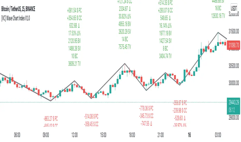
LT Elliott Wave AddendumLT Elliott Wave Addendum Indicator:
According to Elliott Wave Theory, price moves in 5 waves in the direction of the major trend and moves in 3 waves (ABC) when it moves against the major trend. The key purpose and value of elliott wave theory (EWT) is to provide context for chart analysis. According to the book The Elliott Wave Principle by Frost & Prechter: “This context provides both a basis for disciplined thinking and a perspective on the market's general position and outlook.” The benefit of having context is that one can identify and anticipate changes in direction.
In Elliott Wave theory, waves 1, 3, 5 and C are impulse waves (a five wave pattern that makes progress) whereas waves 2, 4, A and B are corrective waves (a three wave pattern – or combination of three waves - that moves against the direction of the larger trend). Although wave A can also be formed of 5 waves, it is commonly formed of 3 waves. Here is a brief summary of the waves:
Wave 3 tends to be the strongest and most dynamic wave – it is usually (but not always) the longest wave but it is never the shortest. Wave 4 is a corrective wave that is typically composed of 3 smaller waves (ABC) and is notorious for being messy and unpredictable in nature. Wave 5 is the final wave before a significant correction or reversal in trend and is often accompanied by divergences (e.g. negative divergences in an uptrend) and exhaustions in momentum. It is also possible for a wave 5 to form after a “blow-off top” pattern. Wave 2 is composed of 3 smaller waves (ABC) and is a retracement of wave 1 – the retracement can be shallow to moderate (23.6% to 38.2%) or deep (50%, 61.8% to 78.6%). Wave 1 is the first wave of a trend and is composed of 5 smaller waves – it usually occurs after divergences (in the prior move) and extremes in both sentiment and momentum. For example, the wave 1 of an uptrend can often begin after capitulation in the price (after a major decline), extremely pessimistic sentiment, extremely oversold momentum readings, positive divergences and sometimes accompanied by a volume breadth thrust. Waves A and C are often equal in measure. Wave A can be formed of either 5 waves or 3 waves - but more commonly it is composed of 3 waves. Wave B is always corrective and composed of 3 smaller waves. Wave C is a five wave impulse pattern.
The Elliott Wave indicator (and elliott wave addendum) seeks to simplify elliott wave theory (EWT) in that its main purpose is to identify the potential major trends and corrections. The indicator takes a more simple and direct approach to EWT in that it focuses more on trying to identify whether price is trending or not and if so, the probable wave pattern. It does this by mainly using the structure of the price chart and sometimes other factors such as divergences, momentum and the relationship of price to its key averages. The indicator then takes its best guess at whether price is in a trending environment, and if so, which wave it is probably forming. The wave count can therefore depend on the chart timeframe chosen. For example, what may appear as a major downtrend on a lower timeframe chart may potentially be a corrective drop on a much higher timeframe, due to the different price structure of the charts. To keep things simple and to avoid complexity, the indicator does not display the minor sub-waves within the major waves (probably with the exception of wave 4).
The main feature and benefit of the Elliott Wave indicator is that it can remove subjectivity in chart and wave analysis. It also for flexibility in that it allows the chartist to alter the wave count and the position of the wave counts if they choose to do so (within the parameters and rules set by the indicator). As with all of technical analysis, the wave counts shown by the elliott wave indicator are NOT certain – they are only a possibility or a probability. So the risk always exists of an alternative wave count. It is for the chartist to determine the probable wave counts and limit or control the risks based on their knowledge of technical analysis and risk management.
The LT Elliott Wave addendum indicator is meant to be used in combination with the main LT Elliott Waves indicator, so in this sense they supplement each other.
The settings of the LT Elliott Wave Addendum indicator (“EW addendum”) are fairly self-explanatory but here is a brief summary:
The Elliott Wave indicator has options in the settings to change the positions of certain wave counts based on the structure of the chart. This is achieved by choosing the different major and minor structures based on the zigzag patterns of the chart. So the user can alter the positions of certain wave counts (if needed) by modifying the zigzag structure on the chart.
The lookback period in the settings can be increased (or decreased) to include more data on the chart, when needed. In the majority of situations the lookback period can remain at the default setting of 200 bars – but the user can decide to take into account more (or less) data by changing the lookback period to 300 (or 100 if less data is required).
In the elliott wave addendum indicator, the most recent probable ABC waves are shown in pink and the probable 123 wave counts are shown in dark blue. The position of the wave counts can be changed and modified to a reasonable degree in the settings.
In certain circumstances where there are volatile conditions and charts, it is possible that the elliott wave addendum indicator may show an “unusual” wave count. For example, it is possible that the positions of certain wave counts (such as waves 1, 2, 3 and 5) may be in the “wrong” order. This happens rarely so it is not an issue that happens very often. However, if this issue occurs, the chartist can rectify the matter by first increasing the lookback period (e.g. to 300) to see if this resolves the issue. If it does not, then Alt9 “temporary wave shift” in the elliott wave addendum (EW addendum) can be enabled as this can usually resolve the issue and show the wave counts in a “proper” manner. Changing to a slightly lower timeframe can also usually resolve this issue. If Alt9 is enabled, care should be taken to unselect this option at a later date (as it is only a temporary solution).
The aggressive wave count setting (called “Aggressive 123”) is mainly for the addendum of the elliott wave indicator (i.e. EW addendum). Enabling this option can often change the wave count from an ABC to a 123 provided this is permitted by the parameters of the indicator. For example, if the elliott wave addendum indicator is showing an ABC wave count, it may be possible to change this wave count to a 123 wave count by enabling the “Aggressive 123” setting in the indicator. The other option is to change the wave count at the very top of the settings (where it says “Change recent ABC to 123”). This option as well as others are included for further flexibility in the wave count.
The user can also choose to enable the zigzags of the waves to be shown on the chart. This can display the minor and major wave structures and zigzags, if enabled. By default, it is set to off.
It may also be a good idea to reset the settings of the indicators whenever a new chart or timeframe is chosen. This then refreshes the settings back to its default.
It is important to appreciate that the elliott wave indicator generally requires between 1,500 to 2000 bars of data on the chart in order to display the wave counts adequately and appropriately. So if a chart or timeframe has less than the minimum number of historical data or bars on the chart, the wave counts may not display properly or not appear at all. Certain chart symbols and timeframes (such as the monthly timeframe) may have very limited amount of data on them. Therefore, the elliott wave indicator will likely not appear on these charts or may not display properly. In these situations, a different chart symbol or a lower timeframe with more data on it can be chosen. For example, instead of a monthly timeframe, a weekly or daily timeframe can be chosen.
The Elliott Wave Addendum indicator (“EW Addendum”) displays the most recent and “immediate” probable wave counts – usually after a potential wave 3 or a wave 5 of the main elliott wave indicator (i.e. LT Elliott Waves). So in this sense the EW addendum is more short term in that it focuses on the most recent price action (e.g. after a wave 5) in what may be either a possible corrective pattern (ABC) or the development of a potential new trend (123).
For example, let’s say the price has been trending up and we are seeing a probable wave 5 in the main elliott wave indicator (LT Elliott Waves), and then the price starts to reverse lower. The decline in price could either be an ABC correction or it may possibly be the beginning of a reversal or downtrend. The elliott wave addendum indicator (EW addendum) starts by showing the probable waves A, B and C of a correction (shown in pink). The EW addendum waits for the structure of the chart to develop before making its best guess at what may be an ABC pattern. However, if the price action begins to break support levels and the probability of a downward trend increases, then the wave count may change from ABC to 123 (shown in dark blue). The same principle can apply in the opposite direction: if the price has been trending down in a likely wave 5 and then suddenly price begins to reverse and move higher, at first we may see a potential ABC corrective pattern on the EW addendum indicator. However, if price continues to move up by a certain degree and break resistance levels the wave count may change on the EW addendum to a probable 123 uptrend.
The reason for why the possible ABC wave count may change to a possible 123 trending wave count is because the elliott wave indicator is programmed to look for and identify potential trending patterns (as well as corrective patterns). In this sense, we are looking to simplify elliott wave theory by taking a more flexible and common-sense approach to the wave patterns. So if the price action has broken key levels of support or resistance, momentum is increasing and price is moving deliberately in a specific direction, it becomes more likely that price is in a trending environment (rather than just a correction).
If the main elliott wave indicator (i.e. LT Elliott Waves) is showing a probable wave 3, and price begins to pullback or move in the opposite direction to the main trend of the wave 3, the EW addendum may be used to display the probable ABC wave counts. These ABC wave counts could be for the likely wave 4 correction. However, if price starts to break key support levels (e.g. after an uptrend) and then reverse lower in the opposite direction (to the mentioned wave 3), then it is likely that the main indicator will change the wave count from a wave 3 to a wave 5. This can indicate that the main uptrend may have probably ended and that we are in either a large correction or a trend reversal, as shown by the EW addendum. This example can also apply in reverse for downtrends (e.g. if price starts to break resistance levels and move higher after a downtrend).
We have allowed for further flexibility in the main elliott wave indicator (LT Elliott Waves) – including the EW addendum – so that the user can change the wave counts from a 123 to ABC (or vice versa) if they choose to do so. For example, if the EW addendum is showing a probable 123 wave count (in dark blue), the chartist can choose to change the wave counts to an ABC wave count from within the settings. Please allow up to minute or more for the change to take place as it can sometimes take some time for the modification to take effect.
The position of the wave counts (ABC or 123) can be changed as well to a reasonable degree. In the settings of the EW addendum the positions of the wave counts can be changed by applying Alt3 or by modifying the minor or major structure of the waves (or zigzags). There is also the option to modify or move the position of wave 2 (or Wave B) in Alt2 of the indicator. Please allow up to a minute or more for the change to take place as it can sometimes take some time for the modification to take effect.
The EW addendum indicator also has the option to show a probable projection for wave 4 by enabling this in the settings. This does not mean that the price has to move in the direction of that “wave 4” projection, but it is merely a guide on the basis of probabilities. The chartist can apply other methods of chart analysis – such as trendline breaks, oscillators, regression channels, breaks of support/resistance – to determine when a probable wave 4 has likely completed. However, confirmation that the probable wave 4 has completed will not come until price has taken out the highs prior to the decline (i.e. the highs before the pullback in the probable “wave 4” correction). The same applies in reverse for a downtrend: confirmation that the probable wave 4 has completed will not come until price has taken out the lows prior to the rally (in a probable wave 4 correction).
Here is a brief summary of the “aggressive 123” option in the EW addendum settings: the aggressive wave count setting is mainly for the EW addendum. Enabling this option can often change the wave count from an ABC to a 123 provided this is permitted by the parameters of the indicator. For example, if the elliott wave addendum indicator is showing an ABC wave count, it may be possible to change this wave count to a 123 wave count by enabling the “Aggressive 123” setting in the indicator. The other option is to change the wave count at the very top of the settings (where it says “Change recent ABC to 123”). This option as well as others are included for further flexibility in the wave count.
It should be remembered that the appearance of the most recent wave counts (or wave labels) shown by the indicator, by themselves do NOT mean that the specific waves in question have definitely completed or finished. Nothing in chart analysis is certain or definite. The wave label itself is simply an indication that the most recent wave is probably still in progress, not necessarily that it has completed. Chartists can apply other technical analysis tools and methods (e.g. trend lines, support/resistance breaks, moving averages and regression channels etc.) to increase the probability of when a specific wave has probably completed. The same also applies to past or “completed” wave counts (or past wave labels): they do NOT mean that the specific waves have definitely completed or finished – it is merely a possibility or probability. So the risk always exists that the wave counts may potentially be wrong, and that an alternative wave count interpretation may exist.
Price action, markets and their charts are non-linear and chaotic, which means that they are subject to uncertainty, variable change and being unpredictable in nature. So we must maintain a probabilistic mindset and attitude to technical analysis. Nothing is certain. Therefore, no wave count is certain or “set in stone”. Wave counts, just like the actions and emotions of human beings, are subject to change. Elliott Wave theory, just like all of technical analysis is about what is possible, what is probable and what the risks are of a particular outcome. The advantage of elliott wave theory, as explained previously, is about gaining an understanding of context and the likely big picture. The indicator is provided in good faith but we do not vouch for its accuracy.
As mentioned previously, chartists should be aware of the probabilistic and uncertain nature of price action and the markets, and therefore prepare to limit and control any potential risks.
The indicator can be used on the charts of the majority of markets (e.g. stocks, indices, ETFs, currencies, cryptocurrencies, precious metals, commodities etc.) and any timeframe. Nothing in this indicator, its signals or labels should be construed as a recommendation to buy or sell any market (e.g. stocks, securities, indices, ETFs, currencies, cryptocurrencies, metals, commodities etc.). The indicator is provided solely for educational purposes, to gain a better understanding of technical analysis and elliott wave theory. It should be noted that the degree of noise and randomness increases significantly on lower timeframes. So the lower the timeframe that is chosen (e.g. 15-min or lower) the greater the degree of noise and randomness and therefore the higher the frequency of false signals or whipsaws. The indicator can be applied to candlestick charts and bar charts.
If you would like access, please send me a PM on Tradingview.

GA - Trend WavesIntroduction
GA - Trend Waves (GA Waves) is a Trend Productivity Tool.
Its main purpose is to follow the trend for its entire duration, marking trend variations.
Besides, it highlights Buying and Selling Waves, and Wave Segments.
GA Waves plots the beginning of Buying and Selling Waves, including Wave Segments. It can favor the Main Trend or the Buying-Selling Wave.
This means that the Algorithm can highlight Waves Segments favoring the trend continuation. In the same way, it can highlight Wave Segments riding any wave for its entire duration.
The core of the tool is a set of mathematical functions that discretize the market behavior. These functions define the trend progression and its variations. They discretize buying-selling waves and their wave segments, for short-term and long-term tracking.
As well, the Algorithm includes the strengthens and weakness in the Bullish-Bearish Momentum.
By default, GA Trend Waves shows a colored envelope. It is around a particular curve that discretizes the main trend.
This curve is the Underlying Trend. It is not slow and it follows the trend changes with a high accuracy. The curve is green when the trend is bullish. Instead, the red color marks the curve when the trend is bearish.
The envelope around the underlying trend curve is a control tool. It has 2 important uses:
1 - It defines volatility boundaries on the Underlying Trend. The Algorithm uses these boundaries to reduce the uncertainty.
2 - It shows green and red areas highlighting Buying and Selling Waves in the trend.
Together with the Underlying Trend there is the Overlying Trend. By default, it is not visible on the chart. But it colors the price line.
The Overlying Trend is a short-term curve. It is very fast. The Algorithm uses this curve to define Wave Segments.
The Overlying Trend follows the segmentation of a buying-selling wave with high accuracy.
This accuracy is possible because each curve formula includes weighted moving averages. Each formula uses a recursive application of weighted moving averages.
Overlying and Underlying Trend takes advantages from the calculation of weighted moving averages. The advantage is the high precision even with a very short period.
Then, Overlaying and Underlying Trends are fast curves. They fit at the best their respective trend variations.
The Overlying Trend and the Underlying Trend with its envelope are Stochastic Series.
GA Trend Waves itself does not trigger an entry or an exit. But its indications highlight beginning, continuation, and ending of Buying-Selling Waves. This happens considering also the Trend Momentum and the Price Extension.
Buying-Selling Wave IN Points are the discretization of the trend variations. They show how Accumulation-Distribution Points sustain a Bullish or a Bearish Trend. These particular points mark the beginning of the new wave. In the same way, they show also the ending of the previous wave.
Buying-Selling Wave Segments are discretization of the wave variations. They show strength and weakness of the wave, changing the price line color by green or red. Besides, the Algorithm highlights Wave Segments that favor the continuation of the wave.
The user can choose to plot indications of Buying-Selling Wave Segments in 2 ways:
1 - Following the Trend Momentum.
2 - Following the Buying-Selling Wave.
For a fast trading, the user can get advantage from the opportunities that the wave can offer. But for the purpose to follow the trend, the user can ride waves, according to the trend direction.
The Overlying Trend discretize the Wave Segments, from the beginning to the end of the Wave. Instead, the Underlying Trend discretize the Bullish-Bearish Trend and its momentum.
GA Trend Waves on the Chart Pane - Main Features
GA Trend Waves in its Pane
-
Important Note
The GA Trend Waves purpose is to understand the nature of trend activity. If there is no trend, it would not be useful.
But GA Waves is an adaptive tool. It can work following Buying Waves and Selling Waves in the development of a Trading Area. Then, if the trading area is large enough, in relation to the contest, it can show relevant wave segments.
In any case, Traders should not attempt to make it work in conditions to which it does not work at the best. In this condition, the experience of the trader is the most valuable tool.
I restrict access to the tool. Use the links in my signature field to gain access to the script. Feel free to send me a PM for any question.
-
Buying-Selling Wave IN Point
GA Waves Algorithm uses a stochastic process to determinate Buying-Selling Wave IN Points. This function has a fast reaction to the trend waves. This is possible because it considers acceleration and deceleration in cyclical time patterns.
The stochastic series returns the beginning of each new wave. But the beginning of a wave is also the ending of the previous wave. Then, following a buying-selling wave, usable for trading, it shows when to exit the market.
Instead, enter the market depends on the wave conditions. Then, the Buying-Selling Wave IN Point is not enough to decide to enter the market. More parameters are necessary.
Bullish-Bearish Wave Segments
The beginning of a Wave Segment highlights the continuation of the wave. The Overlying Trend discretizes the Wave Segmentation. The Algorithm plots the wave segments on the price line. This happens coloring the curve with green or red.
GA Waves highlights the beginning of a Wave Segment according to specific conditions. The visible result is the plotting of relevant points in the chart to show the continuation of the wave. If the Price Extension is too big, the Algorithm skips to plot the wave segments that carries high risk.
Overlying and Underlying Trend Changes and Confirmation
GA Waves highlights changes of the trend using Line, Line Break, Step Line, Circles, and Crosses. The use of Line, Line Break, Step Line, and so on, marks the turning points. In particular, the Underlying Trend confirms the change of the Trend. This changing becomes useful to decide the type of investment to do and pyramiding.
Overlying and Underlying Trend with Envelope
Step Line highlighting Directions and Changes in Underlying and Overlying Trends
-
Note: I restrict access to the tool. Use the links in my signature field to gain access to the script. Feel free to send me a PM for any question.
Thank you
Girolamo Aloe
Founder of Profiting Me Finance Analytics
-
Disclaimer
Nobody in Girolamo Aloe websites and trading view profile is a Financial Advisor. Nothing therein is intended to be constructed as Financial Advice. The content on his websites is for information and educational purposes only.
Trading carries high risk. You should not invest money that you cannot afford to lose. Past performance is not an indication of future results.

Pulse FlowPulse Flow is a market structure indicator that extracts the hidden rhythm of price. It combines micro-structure detection with a rule-based trend engine, making waves and turning points visible in real time. Instead of drawing swings by hand or guessing breakouts, Pulse Flow enforces strict, objective rules for what counts as structure.
What it shows
Micro-Structure (Fractals): Internal swings are extracted from baseline crosses (EMA or ALMA). These fractals show how price oscillates inside the wave, providing context for micro pullbacks and internal breaks.
Trend (HH, HL, LH, LL): Pulse Flow uses a finite state machine (FSM) to track the current trend. Every trend represents a wave.
- Confirmed higher highs and higher lows define bullish waves.
- Confirmed lower highs and lower lows define bearish waves.
- When a wave breaks, a new wave begins. Turning points are explicitly marked as WH (wave high) and WL (wave low).
Active Range (RL & RH): The indicator continuously maintains the current range, based on closing prices rather than wicks. This ensures consistent behavior during liquidity events, where extremes are often tested intrabar.
Retracement Levels (0.50 & 0.71): Inside each active range, Pulse Flow plots the midrange and the 0.71 “optimal entry zone,” highlighting areas where pullbacks most often react.
Breakout Confirmation: A breakout is only valid if:
- The close extends beyond RL or RH by at least an ATR-based threshold.
- A second candle confirms the move.
This filters false signals and ensures structural integrity.
How it helps
Pulse Flow helps traders by taking the guesswork out of structure. Instead of debating whether a high or low should count, the indicator applies objective rules and marks every confirmed swing directly on the chart. Each wave is highlighted the moment the trend flips, so you always see where the market has turned and which direction the active wave is heading. The internal fractal structure reveals how price moves within the range, while the explicit HH, HL, LH, and LL points define the external trend. This distinction allows you to make tactical decisions on internal breaks and strategic decisions on external breaks, giving you clarity across timeframes. Because ranges are calculated using closing prices, the levels remain stable even when liquidity sweeps occur, making the indicator reliable in volatile markets. Combined with automatically plotted retracement levels, you gain a consistent framework for spotting likely reaction zones without redrawing lines or relying on subjective judgment.
How it works
Under the hood, Pulse Flow combines two engines. The pivot engine extracts micro swings by tracking how price crosses a baseline, which can be either EMA or ALMA, depending on your settings. Each cross defines a candidate high or low, and together these pivots form the fractal zigzag that represents the market’s micro-structure. On top of this, a finite state machine manages the active range. It tracks the range high and range low, validates breakouts only when price closes beyond these levels with ATR-based confirmation, and waits for a pullback before locking in the new structure. When the FSM confirms a new trend, Pulse Flow explicitly marks the turning point as a wave high or wave low. In this way, every confirmed HH, HL, LH, and LL is not a guess but the logical outcome of strict structural rules. The interaction between pivots and the FSM creates a complete and consistent map of the market’s waves, from micro oscillations to macro trend shifts.
Summary
Pulse Flow extracts micro-structure, defines waves, and highlights turning points. It shows the active range with key retracement levels and confirms breakouts with ATR + candle logic. By using closing prices to define RL/RH, it stays consistent even through liquidity sweeps.
For traders who trade based on structure, Pulse Flow is not just another tool. It is a framework: a rule-based map of how markets actually move in waves.
Fundur - Market Sentiment BIndicator Overview
The Market Sentiment B indicator is a sophisticated multi-timeframe momentum oscillator that provides comprehensive market analysis through advanced wave theory and sentiment measurement. Unlike traditional single-timeframe indicators, Market Sentiment B analyzes 11 different timeframes simultaneously to create a unified view of market momentum and sentiment.
What Makes Market Sentiment B Unique
Multi-Timeframe Convergence : The indicator combines data from 11 different periods (8, 13, 21, 34, 55, 89, 144, 233, 377, 610, 987) based on mathematical sequences that naturally occur in market cycles.
Advanced Wave Analysis : The histogram component tracks momentum waves with precise peak and trough identification, allowing traders to spot both major moves and smaller precursor waves.
Sentiment Extremes Detection : When all 11 timeframes reach extreme levels simultaneously, the indicator highlights these rare conditions with background coloring, signaling potential major reversals.
Dynamic Zone Analysis : The indicator divides market conditions into Premium (80+), Discount (20-), and Liquidity zones (40-60), providing clear context for trade entries and exits.
Core Components
1. Market Sentiment B Line (Main Signal)
The primary oscillator line that represents the averaged sentiment across all timeframes. This line uses advanced mathematical filtering to smooth out noise while preserving important trend changes.
Key Features:
Oscillates between 0-100
Color-coded: Green when rising, Red when falling
Shows divergences with colored dots
Premium zone: 80+, Discount zone: 20-
2. Momentum Waves (Secondary Signal)
A smoothed version of the Market Sentiment B line that acts as a trend-following component. This line helps identify the underlying momentum direction.
Key Features:
Blue coloring during bullish expansion (above 50 and rising)
Orange coloring during bearish expansion (below 50 and falling)
Filled areas show expansion and contraction phases
Critical 50-line crossovers signal momentum shifts
3. Histogram (Wave Analysis)
The difference between Market Sentiment B and Momentum Waves, displayed as a histogram that reveals the relationship between current sentiment and underlying momentum.
Key Features:
Green bars: Positive momentum (Market Sentiment above Momentum Waves)
Red bars: Negative momentum (Market Sentiment below Momentum Waves)
Wave height labels show the strength of each wave
Divergence patterns identify potential reversals
4. Divergence System
Advanced divergence detection that identifies both regular and hidden divergences, with special "Golden Divergences" for the strongest signals.
Types:
Regular Divergences : Price makes new highs/lows while indicator doesn't
Hidden Divergences : Continuation patterns in trending markets
Golden Divergences : High-probability reversal signals (orange dots)
5. Zone Analysis
The indicator divides market conditions into distinct zones:
Premium Zone (80-100) : Potential selling area
Liquidity Zone (40-60) : Neutral/consolidation area (highlighted in orange)
Discount Zone (0-20) : Potential buying area
Extreme Conditions : Background coloring when all timeframes align
Setup Guide
Initial Installation
Open TradingView and navigate to your desired chart
Click the "Indicators" button or press "/" key
Search for "Fundur - Market Sentiment B"
Click on the indicator to add it to your chart
The indicator will appear in a separate pane below your chart
Essential Settings Configuration
Main Settings
Show Histogram Wave Values : Enable to see wave strength numbers
Wave Value Text Size : Choose from tiny, small, normal, or large
Wave Label Offset : Adjust label positioning (default: 2)
Market Sentiment Thresholds
Only Show Indicators at Market Sentiment Extremes : Filter signals to extreme zones only
Extreme levels are automatically set at 80 (high) and 20 (low)
Small Wave Strategy
Enable Small Wave Swing Strategy : Focus on smaller, early-warning waves
Small Wave Label Color : Customize the color for small wave labels
Divergence Analysis
Show Regular Divergences : Enable standard divergence detection
Show Gold Divergence Dots : Enable high-probability golden signals
Show Divergence Dots : Show all divergence markers
Histogram Settings
Enable Histogram : Toggle the histogram display
Divergence Types : Choose which types to display (Bullish/Bearish Reversals and Continuations)
Recommended Initial Setup
Enable all main components (Histogram, Divergences, Momentum Waves)
Set wave value text size to "small" for clarity
Enable golden divergence dots for premium signals
Start with all alert categories enabled, then customize based on your trading style
Basic Trading Guide
Understanding the Zones
Premium Zone Trading (80-100)
When to Consider Selling:
Market Sentiment B enters 80+ zone
Bearish divergences appear
Histogram shows weakening momentum (smaller green waves)
Background turns red (extreme conditions)
What to Look For:
Bearish pivot signals (orange triangles pointing down)
Golden divergence dots at tops
Momentum Waves turning bearish
Discount Zone Trading (0-20)
When to Consider Buying:
Market Sentiment B enters 0-20 zone
Bullish divergences appear
Histogram shows strengthening momentum (smaller red waves)
Background turns green (extreme conditions)
What to Look For:
Bullish pivot signals (blue triangles pointing up)
Golden divergence dots at bottoms
Momentum Waves turning bullish
Liquidity Zone Trading (40-60)
Consolidation and Breakout Zone:
Orange-filled area indicates neutral sentiment
Wait for clear breaks above 60 or below 40
Use for range-bound trading strategies
Look for momentum wave direction changes
Key Signal Types
1. Zone Crossovers
Above 60 : Bullish momentum building
Below 40 : Bearish momentum building
50-line crosses : Primary trend changes
2. Divergence Signals
Golden dots : Strongest reversal signals that align accross different timeframes
Colored dots : Standard divergence warnings
Hidden divergences : Trend continuation signals
3. Histogram Patterns
Increasing green bars : Building bullish momentum
Increasing red bars : Building bearish momentum
Smaller waves : Early warning signals of deteriorating interest
Basic Entry Rules
Long Entries
Market Sentiment B in discount zone (0-20) OR
Bullish divergence confirmed OR
Break above 40 from oversold conditions OR
Golden divergence dot at bottom
Short Entries
Market Sentiment B in premium zone (80-100) OR
Bearish divergence confirmed OR
Break below 60 from overbought conditions OR
Golden divergence dot at top
Exit Rules
Exit longs when entering premium zone
Exit shorts when entering discount zone
Close positions on opposite divergence signals
Use histogram wave tops/bottoms for fine-tuning exits
Advanced Analysis Setups
Setup 1: Scalping Configuration
Purpose : Quick intraday trades focusing on small moves
Settings :
Enable Small Wave Strategy
Show indicators only at extremes: OFF
Combine multiple alerts: ON
Focus on 1-5 minute timeframes
Signals to Watch :
Small wave histogram peaks/troughs
Quick zone crossovers (40/60 line breaks)
Momentum wave direction changes
Short-term divergences
Setup 2: Swing Trading Configuration
Purpose : Medium-term trend following and reversal trading
Settings :
Show indicators only at extremes: ON
Enable all divergence types
Focus on 15-minute to 4-hour timeframes
Golden divergence alerts: HIGH priority
Signals to Watch :
Premium/discount zone entries
Golden divergence signals
Extreme condition backgrounds
Major histogram wave formations
Setup 3: Position Trading Configuration
Purpose : Long-term trend identification and major reversal spots
Settings :
Only alert in extremes: ON
Focus on golden divergences only
Use daily and weekly timeframes
Minimize noise with extreme filtering
Signals to Watch :
Extreme condition backgrounds (red/green)
Major golden divergence signals
Long-term momentum wave trends
Weekly/monthly zone transitions
Setup 4: Reversal Hunting Configuration
Purpose : Catching major market turns at key levels
Settings :
Enable all divergence types
Show golden divergence dots: ON
Extreme filtering: ON
Small wave strategy: OFF
Signals to Watch :
Multiple divergence confirmations
Golden divergence + extreme zones
All-timeframe extreme conditions
Major histogram wave exhaustion
Setup 5: Trend Following Configuration
Purpose : Riding momentum in established trends
Settings :
Momentum waves: HIGH priority
Hidden divergences: ON
Continuation patterns focus
Zone crossover alerts
Signals to Watch :
Momentum wave expansion phases
Hidden divergence continuations
Liquidity zone breakouts
Sustained momentum patterns
Alert System
The Market Sentiment B indicator features a comprehensive alert system with over 30 different alert types organized into logical categories.
Alert Categories
Market Sentiment B Line Alerts
Golden Divergences : Highest priority reversal signals
Standard Divergences : Regular divergence patterns
Bearish/Bullish Pivots : Momentum pivot points
Premium/Discount Zone : Zone entry/exit alerts
Extreme Conditions : Rare all-timeframe extremes
Liquidity Zone : 40-60 zone movement alerts
Momentum Waves Alerts
Premium/Discount Zones : 80+/20- level alerts
Liquidity Zone Movement : 40-60 zone alerts
Expansion Phases : Bullish/bearish expansion alerts
Direction Changes : 50-line crossover alerts
Cross Alerts : MSB vs Momentum crossovers
Histogram Alerts
State Changes : Bullish/bearish turns
Peak/Trough Detection : Wave top/bottom alerts
Divergence Alerts : Histogram-specific divergences
Hidden Divergences : Continuation pattern alerts
Smaller Wave Alerts : Early warning signals
Alert Configuration Tips
For Day Trading
Enable quick state change alerts
Focus on histogram and small wave alerts
Use combined alerts to reduce noise
Disable extreme-only filtering
For Swing Trading
Enable zone crossover alerts
Focus on divergence and pivot alerts
Use extreme-only filtering
Prioritize golden divergence alerts
For Position Trading
Enable only golden divergences and extreme conditions
Use extreme-only filtering
Focus on major zone transitions
Disable minor wave alerts
Trading Strategies
Strategy 1: Premium/Discount Zone Reversal
Setup : Wait for Market Sentiment B to reach extreme zones
Entry :
Long: Enter discount zone (0-20) with bullish divergence
Short: Enter premium zone (80-100) with bearish divergence
Exit : Opposite zone reached or momentum wave reversal
Risk Management : Stop loss at recent swing high/low
Strategy 2: Golden Divergence Power Plays
Setup : Wait for golden divergence dots to appear
Entry : Enter in direction opposite to divergence (reversal play)
Confirmation : Wait for momentum wave to confirm direction
Exit : When sentiment reaches opposite zone
Risk Management : Tight stops below/above divergent pivot
Strategy 3: Momentum Wave Trend Following
Setup : Identify strong momentum wave expansion phases
Entry : Enter on pullbacks to 50-line during expansion
Continuation : Hold while expansion phase continues
Exit : When expansion phase ends or opposite expansion begins
Risk Management : Trail stops using wave peaks/troughs
Strategy 4: Small Wave Early Entry
Setup : Enable Small Wave Strategy for early signals
Entry : Enter on small wave formations before major moves
Confirmation : Wait for main sentiment line to follow
Exit : When major wave forms or opposite signal appears
Risk Management : Quick exits if main indicator doesn't confirm
Strategy 5: Extreme Condition Contrarian
Setup : Wait for background color changes (extreme conditions)
Entry : Counter-trend when ALL timeframes are extreme
Confirmation : Look for early divergence signs
Exit : When background color disappears
Risk Management : Position size smaller due to counter-trend nature
FAQ & Troubleshooting
Frequently Asked Questions
Q: Why don't I see any signals on my chart?
A: Check if "Only Show Indicators at Market Sentiment Extremes" is enabled. If so, signals only appear when the indicator is above 80 or below 20.
Q: What's the difference between golden and standard divergences?
A: Golden divergences (orange dots) are higher-probability signals that meet additional criteria for strength and momentum alignment. Standard divergences are regular price/indicator disagreements.
Q: How do I reduce alert noise?
A: Enable "Only Alert In Extremes" in the alert settings, or use "Combine Multiple Alerts" to consolidate multiple signals into single messages.
Q: What timeframe works best with this indicator?
A: The indicator works on all timeframes. For day trading, use 1-15 minutes. For swing trading, use 1-4 hours. For position trading, use daily or weekly.
Q: Why are the histogram wave values important?
A: Wave values show the strength of momentum. Declining wave values (smaller peaks) often precede trend changes, while increasing values confirm trend strength.
Troubleshooting Common Issues
Issue: Indicator not loading
Solution: Ensure you're using TradingView Pro or higher
Check that max_bars_back is set appropriately
Refresh the chart and re-add the indicator
Issue: Too many alerts firing
Solution: Enable extreme-only filtering
Disable less important alert categories
Use combined alerts feature
Issue: Missing divergence signals
Solution: Check that divergence detection is enabled
Ensure you're looking in the correct zones
Verify that extreme filtering isn't hiding signals
Issue: Histogram not displaying
Solution: Check that "Enable Histogram" is turned ON
Verify histogram divergence types are enabled
Ensure the chart has sufficient historical data
Best Practices
Start Simple : Begin with basic zone trading before using advanced features
Paper Trade First : Test strategies with paper trading before risking capital
Combine with Price Action : Use the indicator alongside support/resistance levels
Respect Risk Management : Never risk more than you can afford to lose
Keep Learning : Market conditions change; adapt your usage accordingly
Performance Optimization
Use appropriate timeframes for your trading style
Enable only necessary alert types
Consider using extreme filtering during high-volatility periods
Regularly review and adjust settings based on market conditions
Conclusion
The Market Sentiment B indicator represents a sophisticated approach to market analysis, combining multiple timeframes, advanced wave theory, and comprehensive divergence detection into a single powerful tool. Whether you're a scalper looking for quick opportunities or a position trader seeking major reversals, this indicator provides the insights needed to make informed trading decisions.
Remember that no indicator is perfect, and the Market Sentiment B should be used as part of a comprehensive trading plan that includes proper risk management, fundamental analysis awareness, and sound money management principles.
Happy Trading!
Disclaimer: Trading involves substantial risk and is not suitable for all investors. Past performance is not indicative of future results. Always practice proper risk management and never trade with money you cannot afford to lose.
Optimized WaveletsThe script, High-Resolution Volume-Price Pressure Indicator with Wavelets, utilizes wavelet transforms and high-resolution data to analyze market pressure based on volume and price dynamics. The approach combines volume data from smaller timeframes (1 second) with non-linear transformation techniques to generate a refined view of market conditions. Here’s a detailed breakdown of how it works:
Key Components:
Wavelet Transform:
A wavelet function is applied to the price and volume data to capture patterns over a set time period. This technique helps identify underlying structures in the data that might be missed with traditional moving averages.
High-Resolution Data:
The indicator fetches 1-second high-resolution data for price movements and volume. This allows the strategy to capture granular price and volume changes, crucial for short-term trading decisions.
Normalized Difference:
The script calculates the normalized difference in price and volume data. By comparing changes over the selected length, it standardizes these movements to help detect sudden shifts in market pressure.
Sigmoid Transformation:
After combining the price and volume wavelet data, a sigmoid function is applied to smooth out the resulting values. This non-linear transformation helps highlight significant moves while filtering out minor fluctuations.
Volume-Price Pressure:
The up and down volume differences, together with price movements, are combined to create a "Volume-Price Pressure Score." The final indicator reflects the pressure exerted on the market by both buyers and sellers.
Indicator Plot:
The final transformed score is plotted, showing how price and volume dynamics, combined through wavelet transformation, interact. The indicator can be used to identify potential market turning points or pressure buildups based on volume and price movement patterns.
This approach is well-suited for traders looking for advanced signal detection based on high-frequency data and can provide insight into areas where typical indicators may lag or overlook short-term volatility.

Ichimoku Wave Oscillator with Custom MAIchimoku Wave Oscillator with Custom MA - Pine Script Description
This script uses various types of moving averages (MA) to implement the concept of Ichimoku wave theory for wave analysis. The user can select from SMA, EMA, WMA, TEMA, SMMA to visualize the difference between short-term, medium-term, and long-term waves, while identifying potential buy and sell signals at crossover points.
Key Features:
MA Type Selection:
The user can select from SMA (Simple Moving Average), EMA (Exponential Moving Average), WMA (Weighted Moving Average), TEMA (Triple Exponential Moving Average), and SMMA (Smoothed Moving Average) to calculate the waves. This script is unique in that it combines TEMA and SMMA, distinguishing it from other simple moving average-based indicators.
TEMA (Triple Exponential Moving Average): Best suited for capturing short-term trends with quick responsiveness.
SMMA (Smoothed Moving Average): Useful for identifying long-term trends with minimal noise, providing more stable signals.
Wave Calculations:
The script calculates three waves: Wave 9-17, Wave 17-26, and Wave 9-26, each of which analyzes different time horizons.
Wave 9-17 (blue): Primarily used for analyzing short-term trends, ideal for detecting quick changes.
Wave 17-26 (red): Used to analyze medium-term trends, providing a more stable market direction.
Wave 9-26 (green): Represents long-term trends, suitable for understanding broader trend shifts.
Baseline (0 Line):
Each wave is visualized around the 0 line, where waves above the line indicate an uptrend and waves below the line indicate a downtrend. This allows for easy identification of trend reversals.
Crossover Signals:
CrossUp: When Wave 9-17 (short-term wave) crosses Wave 17-26 (medium-term wave) upward, it is considered a buy signal, indicating a potential upward trend shift.
CrossDown: When Wave 9-17 (short-term wave) crosses Wave 17-26 downward, it is considered a sell signal, indicating a potential downward trend shift.
Background Color for Signal:
The script visually highlights the signals with background colors. When a buy signal occurs, the background turns green, and when a sell signal occurs, the background turns red. This makes it easier to spot reversal points.
Calculation Method:
The script calculates the difference between moving averages to display the wave oscillation. Wave 9-17, Wave 17-26, and Wave 9-26 represent the difference between the moving averages for different time periods, allowing for analysis of short-term, medium-term, and long-term trends.
Wave 9-17 = MA(9) - MA(17): Represents the difference between the short-term moving averages.
Wave 17-26 = MA(17) - MA(26): Represents the difference between medium-term moving averages.
Wave 9-26 = MA(9) - MA(26): Provides insight into the long-term trend.
This calculation method effectively visualizes the oscillation of waves and helps identify trend reversals at crossover points.
Uniqueness of the Script:
Unlike other moving average-based indicators, this script combines TEMA (Triple Exponential Moving Average) and SMMA (Smoothed Moving Average) to capture both short-term sensitivity and long-term stability in trends. This duality makes the script more versatile for different market conditions.
TEMA is ideal for short-term traders who need quick signals, while SMMA is useful for long-term investors seeking stability and noise reduction. By combining these two, this script provides a more refined analysis of trend changes across various timeframes.
How to Use:
This script is effective for trend analysis and reversal detection. By visualizing the crossover points between the waves, users can spot potential buy and sell signals to make more informed trading decisions.
Scalping strategies can rely on Wave 9-17 to detect quick trend changes, while those looking for medium-term trends can analyze signals from Wave 17-26.
For a broader market overview, Wave 9-26 helps users understand the long-term market trend.
This script is built on the concept of wave theory to anticipate trend changes, making it suitable for various timeframes and strategies. The user can tailor the characteristics of the waves by selecting different MA types, allowing for flexible application across different trading strategies.
Ichimoku Wave Oscillator with Custom MA - Pine Script 설명
이 스크립트는 다양한 이동 평균(MA) 유형을 활용하여 일목 파동론의 개념을 기반으로 파동 분석을 시도하는 지표입니다. 사용자는 SMA, EMA, WMA, TEMA, SMMA 중 원하는 이동 평균을 선택할 수 있으며, 이를 통해 단기, 중기, 장기 파동 간의 차이를 시각화하고, 교차점에서 상승 및 하락 신호를 포착할 수 있습니다.
주요 기능:
이동 평균(MA) 유형 선택:
사용자는 SMA(단순 이동 평균), EMA(지수 이동 평균), WMA(가중 이동 평균), TEMA(삼중 지수 이동 평균), SMMA(평활 이동 평균) 중 하나를 선택하여 파동을 계산할 수 있습니다. 이 스크립트는 TEMA와 SMMA의 독창적인 조합을 통해 기존의 단순한 이동 평균 지표와 차별화됩니다.
TEMA(삼중 지수 이동 평균): 빠른 반응으로 단기 트렌드를 포착하는 데 적합합니다.
SMMA(평활 이동 평균): 장기적인 추세를 파악하는 데 유용하며, 노이즈를 최소화하여 안정적인 신호를 제공합니다.
파동(Wave) 계산:
이 스크립트는 Wave 9-17, Wave 17-26, Wave 9-26의 세 가지 파동을 계산하여 각각 단기, 중기, 장기 추세를 분석합니다.
Wave 9-17 (파란색): 주로 단기 추세를 분석하는 데 사용되며, 빠른 추세 변화를 포착하는 데 유용합니다.
Wave 17-26 (빨간색): 중기 추세를 분석하는 데 사용되며, 좀 더 안정적인 시장 흐름을 보여줍니다.
Wave 9-26 (녹색): 장기 추세를 나타내며, 큰 흐름의 방향성을 파악하는 데 적합합니다.
기준선(0 라인):
각 파동은 0 라인을 기준으로 변동성을 시각화합니다. 0 위에 있는 파동은 상승세, 0 아래에 있는 파동은 하락세를 나타내며, 이를 통해 추세의 전환을 쉽게 확인할 수 있습니다.
파동 교차 신호:
CrossUp: Wave 9-17(단기 파동)이 Wave 17-26(중기 파동)을 상향 교차할 때, 상승 신호로 간주됩니다. 이는 단기적인 추세 변화가 발생할 수 있음을 의미합니다.
CrossDown: Wave 9-17(단기 파동)이 Wave 17-26(중기 파동)을 하향 교차할 때, 하락 신호로 해석됩니다. 이는 시장이 약세로 돌아설 가능성을 나타냅니다.
배경 색상 표시:
교차 신호가 발생할 때, 상승 신호는 녹색 배경, 하락 신호는 빨간색 배경으로 시각적으로 강조되어 사용자가 신호를 쉽게 인식할 수 있습니다.
계산 방식:
이 스크립트는 이동 평균 간의 차이를 계산하여 각 파동의 변동성을 나타냅니다. Wave 9-17, Wave 17-26, Wave 9-26은 각각 설정된 주기의 이동 평균(MA)의 차이를 통해, 시장의 단기, 중기, 장기 추세 변화를 시각적으로 표현합니다.
Wave 9-17 = MA(9) - MA(17): 단기 추세의 차이를 나타냅니다.
Wave 17-26 = MA(17) - MA(26): 중기 추세의 차이를 나타냅니다.
Wave 9-26 = MA(9) - MA(26): 장기적인 추세 방향을 파악할 수 있습니다.
이러한 계산 방식은 파동의 변동성을 파악하는 데 유용하며, 추세의 교차점을 통해 상승/하락 신호를 잡아냅니다.
스크립트의 독창성:
이 스크립트는 기존의 이동 평균 기반 지표들과 달리, TEMA(삼중 지수 이동 평균)와 SMMA(평활 이동 평균)을 함께 사용하여 짧은 주기와 긴 주기의 트렌드를 동시에 파악할 수 있도록 설계되었습니다. 이를 통해 단기 트렌드의 민감한 변화와 장기 트렌드의 안정성을 모두 반영합니다.
TEMA는 단기 트레이더에게 빠르고 민첩한 신호를 제공하며, SMMA는 장기 투자자에게 보다 안정적이고 긴 호흡의 트렌드를 파악하는 데 유리합니다. 두 지표의 결합으로, 다양한 시장 환경에서 추세의 변화를 더 정교하게 분석할 수 있습니다.
사용 방법:
이 스크립트는 추세 분석과 변곡점 포착에 효과적입니다. 각 파동 간의 교차점을 시각적으로 확인하고, 상승 또는 하락 신호를 포착하여 매매 시점 결정을 도울 수 있습니다.
스캘핑 전략에서는 Wave 9-17을 주로 참고하여 빠르게 추세 변화를 잡아내고, 중기 추세를 참고하고 싶은 경우 Wave 17-26을 사용해 신호를 분석할 수 있습니다.
장기적인 시장 흐름을 파악하고자 할 때는 Wave 9-26을 통해 큰 트렌드를 확인할 수 있습니다.
이 스크립트는 파동 이론의 개념을 기반으로 시장의 추세 변화를 예측하는 데 유용하며, 다양한 시간대와 전략에 맞추어 사용할 수 있습니다. 특히, 사용자가 선택한 MA 유형에 따라 파동의 특성을 변화시킬 수 있어, 여러 매매 전략에 유연하게 대응할 수 있습니다.
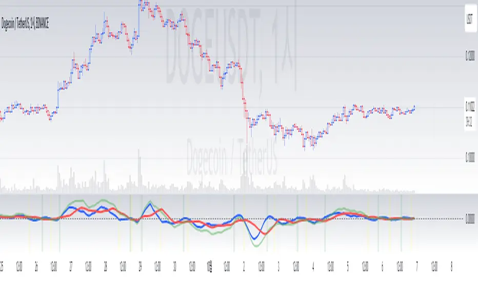
XPrecisionSwing (XPS)* XPrecisionSwing (XPS) Indicator *
Is a visual representation of the Forces of Supply / Demand in the markets in the form of UP and DOWN waves. The Supply / Demand (denoted by a number on top or below the wave line) is computed using the *MBox Precision Supply / Demand* algorithm. These numbers diligently show the forces of Supply and Demand moving price in the markets. The algorithm for computing the numbers on the top and bottom of the wave lines measures the strength of the Supply / Demand. It is this algorithm that makes this indicator unique as it gives an accurate representation of the forces pulling the market up and down. When forces oppose each other, meaning when the direction of price does not agree with the direction of the Supply or Demand it creates a divergence and an opportunity in the markets. These situations are called BUY / SELL Imbalances. Explanation about this below.
* WHAT THE SCRIPT DOES *
The XPrecisionSwing indicator draws swing waves lines going up and down. These waves lines are representative of Supply and Demand. Waves going up are Demand, while waves going down are Supply. The strength of the Supply / Demand corresponds to the number drawn either on top of the wave line or below it. The numbers drawn on the chart are powered by the *MBox Precision Supply / Demand* algorithm, which are representative of the Forces of Supply / Demand in the markets. This is not just volume added up like in a regular zig zag indicator, since volume alone does not show Supply / Demand, and regular volume will not show BUY / SELL Imbalances as depicted by XPrecisionSwing. Volume summated will not show both positive and negative numbers on the chart. Having Supply / Demand split into both positive and negative numbers allows us to see BUY / SELL Imbalances, which can be a very powerful divergence. Information on how these numbers are computed are in the "HOW IT WORKS" section.
The numbers drawn on the chart can be either negative or positive. Positive relates to Demand, while negative relates to Supply. In this manner the strength of Supply and Demand can be gauged in each wave. If the price goes up but the number is negative (More Supply) it is a divergence and called a SELL Imbalance. This means there was more Supply even though price went up. It is important to pay attention to these scenarios, as often it can be indicative of NO DEMAND. Conversely. if the price goes down but the number is positive (No Demand) it is a divergence and is called a BUY Imbalance. This means there was more Demand even though price went down. This is indicative of NO SUPPLY. As such, it now becomes possible to know when there is a sign of Supply, Demand, No Supply, No Demand, Supply Exhaustion, and Demand exhaustion. Supply occurs when the negative numbers on the charts begin to increase (more negatively). Demand occurs when the positive numbers on the chart begin to increase (more positively). A Supply Exhaustion pattern happens when the price is starting to move down more slowly, while Supply is decreasing, and Demand is increasing. This means that the behavior of the market is changing and also a signal to look to reverse positions. A Demand Exhaustion pattern happens when the price is starting to move up more slowly, while Demand is decreasing, and Supply is increasing. The behavior of the market here is also changing.
* HOW IT WORKS *
- Technical Details for the Numbers on the Swing -
The numbers on the chart represent Supply / Demand. Supply or Demand is determined by analyzing the movement of price and quantity of volume.
When price goes up and is combined with an increase in volume it is Expansion of Demand.
(Positive Numbers get larger)
However if price goes up and is combined with a decrease in volume it is Contraction of Demand.
(Positive Numbers get smaller)
When price goes down and is combined with an increase in volume it is Expansion of Supply.
(Negative Numbers get larger)
However if price goes down and is combined with a decrease in volume it is Contraction of Supply.
(Negative Numbers get smaller)
- Technical Details for the Swing -
The way XPrecisionSwing draws the swings is fractal in nature, which make it very convenient and easier to use over the traditional zig zag indicator. The traditional zig zag indicator uses a tick reversal which needs to be adjusted every time you change time frames. However, with XPrecisionSwing you do not have to change any settings every time you load a different time frame since it will adjust to any time frame you are loading. How the swing is drawn is explained below.
XPrecisionSwing uses 3 bars (by default) to define a swing
This parameter can be adjusted. Can be 1, 2, 4 bars, etc...
Swings are always drawn using High / Low of the bar
- Rules -
To start upswing, bar high needs to be higher than previous 3 candle highs
To start downswing, bar low needs to be lower than previous 3 candle lows
If in upswing, a higher high will continue the upswing
if in downswing, a lower low will continue the downswing
- Exceptions -
If outside bar (both high and low exceeds previous 3 bars) swing will continue in current direction
- Swing Confirmation -
Swing wave line in progress (unconfirmed) is denoted by a brown box around the swing number
Once the brown box disappears, that swing wave and number is confirmed
* HOW TO USE IT *
As the numbers on the down waves increase (negatively), this shows that the bears have taken control of the markets. Conversely, as the numbers on the up waves increase (positively), this shows the bulls have taken control of the markets. Whoever is in control is the direction you generally want to place your trades in. When you see an increase in Supply (numbers on down wave) accompanied with a decrease in Demand (numbers on up wave) this shows a Supply + Demand Exhaustion Pattern. This is stronger than if you only see an increase in Supply without a decrease in Demand.
- The Buy / Sell Imbalances -
If you see a positive blue number on the bottom of a DOWN Wave, this means that there was more buying than selling even though price moved down.
If you see a negative red number on the top of an UP Wave, this means that there was more selling than buying even though price moved up.
Both of these cases signify and imbalance and a divergence.
* EXAMPLE AND USE CASES *
- Sell Imbalance Example -
If you see a large negative number with a lower low on a down wave, and then the next up wave is a lower high also with a negative number it shows that there is only Supply flooding the market and no sign of Demand. This is a very powerful combo.
- Buy Imbalance Example -
If you see a large positive number with a higher high on an up wave, and then the next down wave is a higher low also with a positive number it shows that there is only Demand flooding the market and no sign of Supply. This is a very powerful combo.
- Supply Exhaustion example -
If you see price movement struggling to make newer lows and the Supply numbers on the down waves are decreasing, while the Demand numbers on the up waves are increasing this is indicative of a *Change of Behavior*, and that the market is showing signs of reversal.
- Break out on Demand example -
If you see price has been ranging and now the numbers on the UP waves begin to increase while breaking out of a previous area of resistance, it is a good sign that the movement is backed by the strength coming from the Demand.
* BUY / SELL IMBALANCE ALERTS *
The Green / Red crosses on the chart show exactly where the Buy / Sell Imbalance Alerts trigger.
These will NEVER repaint! The crosses can be hidden in Styles if you wish to.
Alerts can be set very easily with the instructions below.
1. Right Click Chart -> Add Alert...
(Ignore Caution Warning. These alerts will *ONLY* trigger on Confirmed BUY / SELL Imbalances and will NOT repaint)
2. Select Condition to be "XPrecisionSwing"
3. Select "Buy Imbalance" or "Sell Imbalance"
4. Select "Greater Than" with Value = 0
5. Options set "Once Per Bar"
6. Customize Any other Alert Options you want
* WHAT MAKES IT ORIGINAL *
XPrecisionSwing gives an inside look into the markets by showing price movements as a series of waves going up and down with their corresponding Supply / Demand numbers associated with each wave. Reading the numbers shows the strength of Supply / Demand. The bigger the number the stronger the Supply / Demand is. The smaller the number the weaker the Supply / Demand is. It becomes possible to see where Supply / Demand comes in, along with Exhaustion of Supply / Demand to spot opportunities to place trades. The Buy / Sell Imbalances show imbalances where price movement and the direction of the Supply / Demand diverge to create potential opportunities as well.
* AUTHOR *
This script is published by MBoxWave LLC
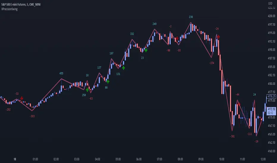
Elliott Wave - FuturesElliott Wave, indicating possible waves 2, 3, 4 and 5
Based on my Elliott Wave - Oscillator, this signals are converted into numbers displayed on chart:
Waves2, Waves3, Waves4, Waves5:
- Indicated on Chart with numbers
Fib fan Wave 4 retracement
- Blue, green and red lines for optimum retracement
Probability and target for wave 5
- Plotted when wave 4 is found
- Stays visible in chart
- Target is based on Daily Fibonnacci
- Probability: If current trend volume is bigger than previous opposite wave trend volume, probability is painted with color of trend background(for a trend to continue, value is recommended bigger than 35)
Projection Wave 4 (if wave 3 detected) and Projection Wave 5(if wave 4 detected)
- Only displayed when waves are active, else not displayed and not saved on chart
- For upside trend 2 blue target lines are displayed based on Daily Fibonnacci
- For downside trend 2 red target lines are displayed based on Daily Fibonnacci
REMINDER OF OSCILATOR USE:
Waves3: Indicated in RED Line(Upwards) and Green Line(Downwards)
- Detects wave greater than SMA
Waves4: Maximum height indicated in yellow Line
- Detects when wave greater than SMA (Wave 3 or 5) approaches wave 4 regression point
Waves5: Indicated in White Line
- Detects divergence in oscilator and price, meaning end of trend
Appreciate any suggestions, collaboration, comments or ideas.
Detects Waves 2, 3 , 4 and 5
Fib fan Wave 4 retracement
Probability and target for wave 5
Projection Wave 4 (if wave 3 detected)
Projection Wave 5(if wave 4 detected)
Alerts for Waves 2, 3, 4 and 5
Better and accurate targets for waves based on Futures
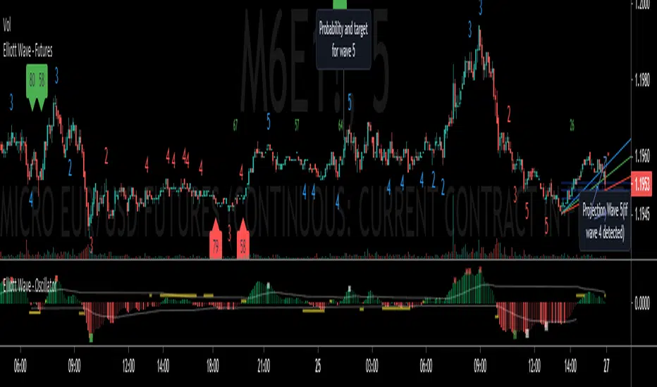
Elliott Wave - StocksElliott Wave, indicating possible waves 2, 3, 4 and 5
Based on my Elliott Wave - Oscillator, this signals are converted into numbers displayed on chart:
Waves2, Waves3, Waves4, Waves5:
- Indicated on Chart with numbers
Fib fan Wave 4 retracement
- Blue, green and red lines for optimum retracement
Probability and target for wave 5
- Plotted when wave 4 is found
- Stays visible in chart
- Target is based on Monthly Fibonnacci
- Probability: If current trend volume is bigger than previous opposite wave trend volume, probability is painted with color of trend background(for a trend to continue, value is recommended bigger than 35)
Projection Wave 4 (if wave 3 detected) and Projection Wave 5(if wave 4 detected)
- Only displayed when waves are active, else not displayed and not saved on chart
- For upside trend 2 blue target lines are displayed based on Monthly Fibonnacci
- For downside trend 2 red target lines are displayed based on Monthly Fibonnacci
Fundamentals: Enterprise Value
- Displayed when financial reports are updated to database
- Also displayed the latest calculated enterprise value with current stock price and last financial report
REMINDER OF OSCILATOR USE:
Waves3: Indicated in RED Line(Upwards) and Green Line(Downwards)
- Detects wave greater than SMA
Waves4: Maximum height indicated in yellow Line
- Detects when wave greater than SMA (Wave 3 or 5) approaches wave 4 regression point
Waves5: Indicated in White Line
- Detects divergence in oscilator and price, meaning end of trend
Appreciate any suggestions, collaboration, comments or ideas.
Detects Waves 2, 3 , 4 and 5
Fib fan Wave 4 retracement
Probability and target for wave 5
Projection Wave 4 (if wave 3 detected)
Projection Wave 5(if wave 4 detected)
Alerts for Waves 2, 3, 4 and 5
Fundamentals: Enterprise Value
Better and accurate targets for waves based on Stocks