SPY Expected Move by VIXThis indicator shows 1 and 2 standard deviation price move from the VWAP based on VIX. Implied Volatility (IV) is being used extensively in the Option world to project the Expected Move for the underlying instrument. VIX is used as a proxy for SPY's IV for 30 days.
This indicator is meaningful only for SPY but can be used in any other instrument which has a strong correlation to SPY.
"vix" için komut dosyalarını ara

Williams Vix Fix paired with Supertrend HeatmapThis script shows my mod of the powerful Williams' Vix Fix indicator paired with a modified Supertrend Heatmap, originally created by Daveatt.

Combo Williams Vix Fix (Twin version)This is a very powerful Williams' Vix Fix indicator.
My implementation of this wonderful indicator features both up and down movements. Both up & down flavors have two versions (fields tp and tp2, each having two values). Color can be reversed as desired (rev). By default colors show continuation, reversed colors show reversion (as intended originally).


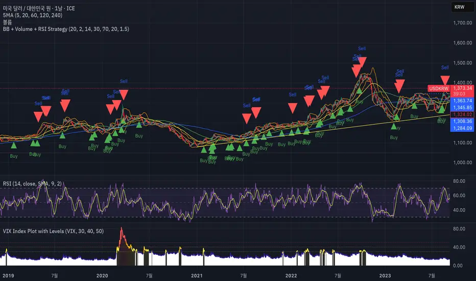
VIX Index Plot with LevelsPine Script Indicator: VIX Index Plot with Levels
This Pine Script indicator is designed for TradingView and is specifically created to plot the VIX (Volatility Index) on a separate panel below your main price chart. Its primary goal is to visually highlight periods of heightened market fear (and potential buying opportunities) by changing the VIX line color and filling the background based on specific VIX levels.
How It Works:
VIX Data Fetching:
The script fetches the VIX index data using the request.security() function. By default, it uses the "VIX" symbol, but you can change this in the indicator's settings (e.g., to "USI:VIX" if your data provider requires it). It retrieves the closing price of VIX for each bar.
Dynamic VIX Line Coloring:
The VIX line's color dynamically changes based on its current value, providing an immediate visual cue for different levels of market volatility/fear:
Red: When VIX is at or above 50. (Indicates extreme fear)
Orange: When VIX is at or above 40 (but below 50). (Indicates high fear)
Yellow: When VIX is at or above 30 (but below 40). (Indicates elevated fear)
Navy Blue: When VIX is below 30. (Indicates normal to low volatility)
Horizontal Level Lines:
Dotted horizontal lines are plotted at the 30, 40, and 50 VIX levels. These serve as clear visual markers, helping you quickly identify when VIX crosses these important thresholds. The color of these lines matches the corresponding emphasis color (yellow, orange, red).
Background Fill for Emphasis:
To further enhance visual clarity, the area below the VIX line (down to the 0-level of the VIX panel) is filled with a color corresponding to the current VIX level. This creates a prominent colored band that highlights periods of elevated fear:
Red Fill: When VIX is 50 or above.
Orange Fill: When VIX is 40 or above (but below 50).
Yellow Fill: When VIX is 30 or above (but below 40).
The fill has a slight transparency (90%) to remain subtle yet effective.
Customization:
You can easily adjust the parameters of this indicator by accessing its settings on your TradingView chart. Look for the gear icon next to the indicator name on your chart to modify:
VIX Symbol: Change the VIX symbol if needed (e.g., "VIX", "USI:VIX").
VIX Level 1 (Yellow): Adjust the threshold for the yellow emphasis (default: 30.0).
VIX Level 2 (Orange): Adjust the threshold for the orange emphasis (default: 40.0).
VIX Level 3 (Red): Adjust the threshold for the red emphasis (default: 50.0).
How to Use This Script in TradingView:
Open your TradingView chart.
Go to the "Pine Editor" tab at the bottom.
Delete any existing code in the editor (if you are replacing a previous VIX script).
Copy and paste the entire provided Pine Script code into the Pine Editor.
Click "Add to Chart" (or "Save" and then "Add to Chart").
This indicator will appear as a separate panel below your main price chart, providing you with a dynamic and intuitive visual representation of market volatility based on VIX levels. This can be a valuable tool for identifying potential market bottoms during periods of high fear.
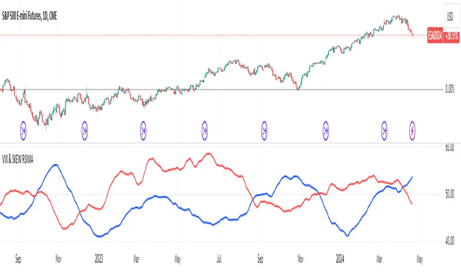
VIX and SKEW RSI Moving AveragesSKEW and VIX are both indicators of market volatility and risk, but they represent different aspects.
VIX (CBOE Volatility Index) :.
The VIX is a well-known indicator for predicting future market volatility. It is calculated primarily based on S&P 500 options premiums and indicates the degree of market instability and risk.
Typically, when the VIX is high, market participants view the future as highly uncertain and expect sharp volatility in stock prices. It is generally considered an indicator of market fear.
SKEW Index :.
The SKEW is a measure of how much market participants estimate the risk of future declines in stock prices, calculated by the CBOE (Chicago Board Options Exchange) and derived from the premium on S&P 500 options.
If the SKEW is high, market participants consider the risk of future declines in stock prices to be high. This generally indicates a "fat tail at the base" of the market and suggests that the market perceives it as very risky.
These indicators are used by market participants to indicate their concerns and expectations about future stock price volatility. In general, when the VIX is high and the SKEW is high, the market is considered volatile and risky. Conversely, when the VIX is low and the SKEW is low, the market is considered relatively stable and low risk.
Inverse Relationship between SKEW and VIX
It is often observed that there is an inverse correlation between SKEW and VIX. In general, the relationship is as follows
High VIX and low SKEW: When the VIX is high and the SKEW is low, the market is considered volatile while the risk of future stock price declines is low. This indicates that the market is exposed to sharp volatility, but market participants do not expect a major decline.
Low VIX and High SKEW: A low VIX and high SKEW indicates that the market is relatively stable, while the risk of future declines in stock prices is considered high. This indicates that the market is calm, but market participants are wary of a sharp future decline.
This inverse correlation is believed to be the result of market participants' psychology and expectations affecting the movements of the VIX and SKEW. For example, when the VIX is high, it is evident that the market is volatile, and under such circumstances, people tend to view the risk of a sharp decline in stock prices as low. Conversely, when the VIX is low, the market is considered relatively stable and the risk of future declines is likely to be higher.
SKEWVIX RSIMACROSS
In order to compare the trends of the SKEW and VIX, the 50-period moving average of the Relative Strength Index (RSI) was used for verification. the RSI is an indicator of market overheating or overcooling, and the 50-period moving average can be used to determine the medium- to long-term trend. This analysis reveals how the inverse correlation between the SKEW and the VIX relates to the long-term moving average of the RSI.
how to use
Moving Average Direction
Rising blue for VIXRSI indicates increased uncertainty in the market
Rising red for SKEWRSI indicates optimism and beyond
RSI moving average crossing
When the SKEW is dominant, market participants are considered less concerned about a black swan event (significant unexpected price volatility). This suggests that the market is stable and willing to take risks. On the other hand, when the VIX is dominant, it indicates increased market volatility. Investors are more concerned about market uncertainty and tend to take more conservative positions to avoid risk. The direction of the moving averages and the crossing of the moving averages of the two indicators can give an indication of the state of the market.
SKEW>VIX Optimistic/Goldilocks
VIX>SKEW Uncertainty/turbulence
The market can be judged as follows.
BestRegards
VIX Reference IndicatorHello everyone,
Releasing my VIX reference indicator.
What is it:
This indicator displays the current trading behaviour of the VIX.
It displays it in Z-Score Format along with identifying previous areas of reversal and displaying when the RSI is overbought or oversold on the VIX.
Who is it good for:
It is good for both day and swing traders who use the VIX in their trading plans.
It permits traders to look at different aspects of the VIX (RSI, Z-Score and Reversal areas) simultaneously while they are watching their current traded stock.
How does it work:
The indicator works by converting the VIX into a Z-Score (similar to bollinger bands).
It then plots the VIX out in Z-Score format in the indicator.
Because it is plotting the VIX based on Z-Score, it looks back to previous areas where the Z-Score led to a reversal (i.e. what was the lowest or highest Z-Score the VIX achieved in the lookback period before reversing).
It also looks at the RSI of the VIX. If the VIX RSI crosses at or above 70 (overbought), it will change the colour of the line to green. This means the VIX is overbought and will likely sell and thus, the thesis is, as the VIX sells, the stock you are trading should come up.
Below is a picture of the different aspects of the indicator:
Customaization:
Per usual, you can customize the colours and bands to your liking.
You are also able to specify the RSI length you want to look at as well as the Z-Score Reversal length and the timeframe length of the chart you are looking at.
The default settings are 75 Average Length lookback for the Z-Score Reversal and the Chart and 14 period RSI.
TIPS:
The most persuasive setups are when you get all 3 of the following:
1. A signal that supports the thesis (buy or sell) along with:
2. An RSI signal that supports the z-score signal along with:
3. The VIX trading at an extreme end of its Z-Score range
Example:
In the example above you will see the following conditions are met:
1. Z-Score historical reversal point identified (short)
2. VIX RSI is oversold (short)
3. VIX is at the bottom of its Z-Score range (short)
As always, I have done a quick tutorial video for your reference which you can see below:
Leave your questions/comments/requests below or on the video as I am always happy to get feedback on improvements and functionality.
Thank you everyone checking it out and safe trades!

VIX Composite MeterThe VIX Composite Meter is a custom trading indicator designed to help identify potential buy and sell signals based on market volatility, specifically through VIX options. The VIX, also known as the "fear gauge," measures market expectations of future volatility. This meter combines several factors — the VIX-to-SPX ratio, moving average deviation, Z-score, and momentum oscillators — to create a single, easy-to-read score that guides trading decisions.
How It Works
Composite Score: The meter calculates a composite score that ranges from 0 to 1 by weighing four metrics:
VIX/SPX Ratio: Indicates relative volatility compared to the S&P 500.
Moving Average Deviation: Shows how far the VIX is from its typical range.
Z-Score: Measures how extreme the current VIX value is relative to its historical average.
Momentum Oscillator (RSI): Helps identify overbought or oversold conditions in the VIX.
Color-Coded Signals:
Green Background: If the score drops below 0.3, the meter suggests buying VIX calls, indicating a low-volatility environment with potential for increase.
Red Background: If the score rises above 0.7, the meter suggests buying VIX puts, indicating a high-volatility environment likely to decrease.
Use Cases
Buy VIX Calls: When the meter turns green, signaling potential future volatility spikes.
Buy VIX Puts: When the meter turns red, suggesting current high volatility is expected to revert lower.
By using the VIX Composite Meter, traders can better time their entries and exits in VIX options, aligning with market conditions for potential profits in periods of changing volatility.
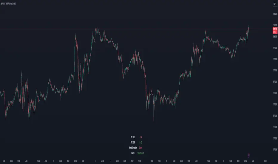
VIX Dashboard [NariCapitalTrading]Overview
This VIX Dashboard is designed to provide traders with a quick visual reference into the current volatility and trend direction of the market as measured by CBOE VIX. It uses statistical measures and indicators including Rate of Change (ROC), Average True Range (ATR), and simple moving averages (SMA) to analyze the VIX.
Components
ATR Period : The ATR Period is used to calculate the Average True Range. The default period set is 24.
Trend Period : This period is used for the Simple Moving Average (SMA) to determine the trend direction. The default is set to 48.
Speed Up/Down Thresholds : These thresholds are used to determine significant increases or decreases in the VIX’s rate of change, signaling potential market volatility spikes or drops. These are customizable in the input section.
VIX Data : The script fetches the closing price of the VIX from a specified source (CBOE:VIX) with a 60-minute interval.
Rate of Change (ROC) : The ROC measures the percentage change in price from one period to the next. The script uses a default period of 20. The period can be customized in the input section.
VIX ATR : This is the Average True Range of the VIX, indicating the daily volatility level.
Trend Direction : Determined by comparing the VIX data with its SMA, indicating if the trend is up, down, or neutral. The trend direction can be customized in the input section.
Dashboard Display : The script creates a table on the chart that dynamically updates with the VIX ROC, ATR, trend direction, and speed.
Calculations
VIX ROC : Calculated as * 100
VIX ATR : ATR is calculated using the 'atrPeriod' and is a measure of volatility.
Trend Direction : Compared against the SMA over 'trendPeriod'.
Trader Interpretation
High ROC Value : Indicates increasing volatility, which could signal a market turn or increased uncertainty.
High ATR Value : Suggests high volatility, often seen in turbulent market conditions.
Trend Direction : Helps in understanding the overall market sentiment and trend.
Speed Indicators : “Mooning” suggests rapid increase in volatility, whereas “Cratering” indicates a rapid decrease.
The interpretation of these indicators should be combined with other market analysis tools for best results.
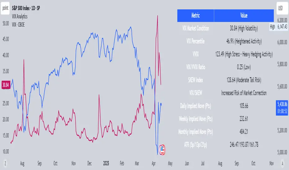
VIX AnalyticsThis script is designed to serve traders, analysts, and investors who want a real-time, comprehensive view of market volatility, risk sentiment, and implied movements. It combines multiple institutional-grade volatility indices into one clear dashboard and interprets them with actionable insights — directly on your chart.
🔍 Features Included
🟦VIX (CBOE Volatility Index)
Measures market expectation of 30-day S&P 500 volatility.
Color-coded interpretation ranges:
Under 13: Extreme Complacency
15–20: Stable Market
20–30: Moderate Risk
30–40: High Volatility
Over 40: Panic
🟪 VVIX (Volatility of Volatility Index)
Tracks the volatility of VIX itself.
Interpreted as a risk gauge of how aggressively traders are hedging volatility exposure.
Under 80: Market Complacency
80–100: Normal Environment
100–120: Caution — Rising Volatility of Volatility
Over 120: High Stress — Elevated Hedging Activity
🟨 SKEW Index
Measures the perceived tail risk of the S&P 500 — i.e., the probability of a black swan event.
Below 110: Potential Complacency
120–140: Moderate Tail Risk
Above 140: High Tail Risk
🧮 VIX/VVIX Ratio
Gauges relative fear levels between expected volatility and the volatility of volatility.
Under 0.5: Low Ratio — VVIX Overextended
Over 0.9: High Ratio — VIX Leading
📈 VIX Percentile (1-Year Range)
Shows where the current VIX sits relative to its 1-year high/low.
Under 20%: Volatility is Cheap
Over 70%: Fear is Elevated — Reversal Possible
📉 SPX Implied Point Moves
Projects expected moves in SPX using VIX-derived volatility:
Daily
Weekly
Monthly
Helps size positions or define expected price ranges based on volatility regime.
📊 ATR Values (5, 13, 21 periods)
Traditional volatility using historical prices.
Provided alongside implied data for comparison.
🧠 Unique Logic & Interpretation Layer
This script doesn’t just show raw data — it interprets it. It reads the relationship between VIX, VVIX, and SKEW to highlight:
When market volatility may be underpriced
When hidden tail risks are forming
When to be cautious of volatility expansions
How current implied movement compares to past realized volatility
✅ Use Cases
Day traders: Know when volatility is low or expanding before scalping or swinging.
Options traders: Identify whether implied volatility is cheap or expensive.
Portfolio managers: Gauge when hedging is in demand and adjust exposure.
Risk managers: Crosscheck if current volatility aligns with macro risk events.
⚙️ Settings
Customizable table placement: Move the dashboard to any corner of your chart.
No repainting or lag: Data updates in real-time using official CBOE and SPX feeds.
VIX Z-Score (Inverted)📘 Indicator: VIX Z-Score (Inverted) + Table
🔍 Overview
This indicator calculates the Z-Score of the VIX (Volatility Index) and inverts it to identify potential buying opportunities during periods of fear and caution during periods of extreme optimism. The Z-Score is smoothed and visually displayed alongside a dynamic info table.
⚙️ How It Works
VIX Data: The VIX (ticker: CBOE:VIX) is pulled in real time.
Z-Score Calculation:
𝑍
=
(
𝑉
𝐼
𝑋
−
mean
)
standard deviation
Z=
standard deviation
(VIX−mean)
Over a customizable lookback period (default: 50).
Inversion:
Since high VIX usually means fear (often a contrarian buying signal), we invert the Z-Score:
𝑍
inv
=
−
𝑍
Z
inv
=−Z
Smoothing:
An EMA is applied to reduce noise and false signals.
Clamping:
The Z-Score is linearly scaled and capped between +2 and -2 for easy visualization in the info table.
📊 Z-Score Table (Top-Right)
Range Interpretation Table Color
+1.5 to +2 Extreme fear → Buy zone 🟩 Green
+0.5 to +1.5 Moderate fear 🟨 Lime
–0.5 to +0.5 Neutral ⬜ Gray
–0.5 to –1.5 Growing complacency 🟧 Orange
–1.5 to –2 Extreme optimism → Caution 🟥 Red
The current Z-Score (clamped version) is shown in real time on the right-hand info panel.
🧠 How to Use It
+2 Zone (Table: Green):
Market fear is at an extreme. Historically, such conditions are contrarian bullish—possible entry zones.
–2 Zone (Table: Red):
Indicates extreme optimism and low fear. Often a signal to be cautious or take profits.
Middle range (±0.5):
Market is neutral. Avoid major decisions based solely on sentiment here.
🧪 Best Practices
Combine with price action, volume, or trend filters.
Works well on daily or 4H timeframes.
Not a standalone signal—best used to confirm or fade sentiment extremes.

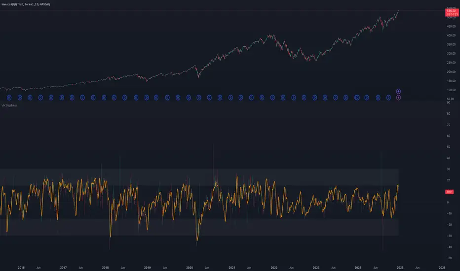
VIX OscillatorOVERVIEW
Plots an oscillating value as a percentage, derived from the VIX and VIX3M . This can help identify broader market trends and pivots on higher time frames (ie. 1D), useful when making swing trades.
DATA & MATH
The VIX is a real-time index of expected S&P 500 volatility over the next 30 days, derived from option prices with near-term expirations. Similarly, the VIX3M measures expected volatility over the next 90 days.
Dividing one by the other yields an oscillating value, normalizing the relative strength of the expected volatility. Most commonly the VIX is divided by the VIX3M. However, because the VIX is inversely correlated to market sentiment (typically), this indicator divides the VIX3M by the VIX to visually correlate the plot direction with the anticipated market direction. Further, it subtracts 1.1 from the quotient to visually center the plot, and multiplies that difference by 100 to amplify the value as a percentage:
( VIX3M / VIX - 1.1 ) * 100
This variation makes identifying sentiment extremes easier within a buy-low-sell-high paradigm, where values below zero are bearish and values above zero are bullish.
PLOTS
Two plots are used, maximizing data fidelity and convenience. Candles are used to accurately reflect the quantized math and a Linear Regression is used to simplify contextualization. If you're not familiar with what a Linear Regression is, you can think of it like a better moving average. High / Low zones are also plotted to help identify sentiment extremes.
This combination allows you to quickly identify the expected sentiment (bullish / bearish) and its relative value (normal / extreme), which you can then use to anticipate if a trend continuation or pivot is more likely.
INPUTS
Candle colors (rise and fall)
Linear regression colors and length
Zone thresholds and zero line
VIX Contango/RollThis chart looks at the front end of the VIX Term Structure (separate from the Cash VIX Term Structure), what it means simply is what the market expects VIX (30 day rolling implied) to be in the future expiry dates. Here we focus on the nearby two futures contracts VX1! and VX2! and looks at any flattening or steepening which gives us interesting insights on the risk pricing in the equity market.
We look at two ratios and see their behavior on a daily basis, alongside 4 distinct levels of -0.1, -0.05, 0.05, 0.10
1. VIX Contango : (VX2!/VX1!)-1
2. VIX Contango Roll : (VX2!/VIX) - 1
Observations :
1. Increase in these ratios is generally bullish for underlying equities, it means that the VIX Term Structure front end is steepening. And vice-versa.
2. Generally when these ratios > 0.05, it indicates bullish equities (bearish volatility). Additionally, -0.05 has seen to be some kind of support for these ratios. Note that these levels are observed only and should not be taken as a guidance of a fixed level, extreme panic can easily overshoot these levels on the downside.
Caveat : Unless PRO+ subscription, this indicator can ONLY be viewed on a daily basis.
Feel free to use and comment, if any observations.

VIX Levels V1.0This script uses the VIX spike method @timwest found, it can be applied to any equity (in the daily timeframe) that fall with VIX spikes.
(see )
What the script essentially does is looking for a VIX spike higher than certain points - and the following retracement to a certain % level. Then it draws the midline between the lowest price during the spike and the price at the retracement as a hidden market level. The thickness of the line is adjusted to the size of the VIX spike.
In the settings you can adjust:
- the length of the line
- if there should be labels to label the characteristic bars for the VIX spike (minimum, confirmation, maximum and retracement)
- if there should be triangles at the chart to show the lowest and highest price during the spike
- if there should be sidelines at the lowest and highest price
- the length of these sidelines

VIX OscillatorThis is my VIX Oscillator indicator.
About it:
This indicator takes the Z-Score of the VIX and of the current ticker you are on and presents them in the format of an oscillator.
Key parts of the indicator:
A diagram of the key elements of the indicator are displayed above.
Purple Line: Represents the Z-Score of the current Ticker.
Blue Line: Represents the Z-Score of the VIX
Green fill line: Represents bullish divergence
Red fill line: Represents bearish divergence
How to use it:
Characteristics for long entries:
- Look for recent bullish divergence (green fill line)
- Look for the ticker line (purple line) to be holding above 0 (neutrality)
- look for a bullish cross (purple line (ticker) crossing over blue line (VIX))
Characteristics for short entries:
- Look for recent Bearish divergence
- Look for the VIX line (blue line) to be holding above 0 and the Ticker
- Look for the ticker line to be holding below 0
- Look for a bearish cross (blue crossing above purple)
Some principles:
The bands represent oversold, overbought and neutral.
0 is absolute neutrality. No bias here.
Anything towards + 2.5 is considered normal, moving towards overbought (2.5 or higher).
Anything towards -2.5 is considered normal, moving towards oversold (-2.5 or lower).
+2.5 or higher is overbought.
-2.5 or lower is oversold.
As always, I have prepared a quick tutorial video for your reference of this indicator:
Please let me know your questions, comments or suggestions about this indicator below.
Thank you for checking it out!

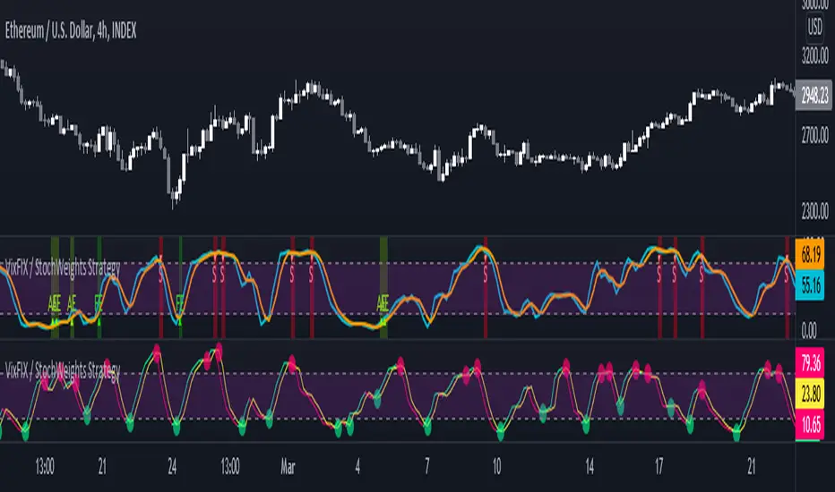
Vix FIX / Stochastic Weights StrategyThis script is based off of Chris Moody's Vix Fix Indicator modified by OskarGallard and BigBitsIO's Stochastic Weights.
This script is a compilation of several different stochastic indicators (and RSI ) where the K value of each indicator is equally weighted. The purpose of the indicator is to combine many indicators together in a fashion that weights them easier. By default, the Stochastic and Stochastic RSI are both enabled - the idea is to speed up the relatively slower Stochastic and to slow down the relatively fast Stochastic RSI . BigBitsIO's Stochastics are also available that can also be added to the weighted calculation. Only the K value is weighted, as the D value is just a moving average of the weighted K.
- Why is this modifed stochastic useful?
- To weight multiple indicators together so that you can attempt to find optimal values shared amongst the indicators. Ex: If Stochastic RSI is 100 and Stochastic is 50, K would be 75 and not particularly high. If you add in a 50 RSI , the K would be 67 in this example. If we weight indicators together that all have a high value they could potentially help find elements that align together to produce a stronger signal.
In this script we have the red "S" triangles which are Exits (overbought stochastic crosses).
Added alerts for stochastic exit signals. Alerts are Pre-Set to only Alert on Bar Close.
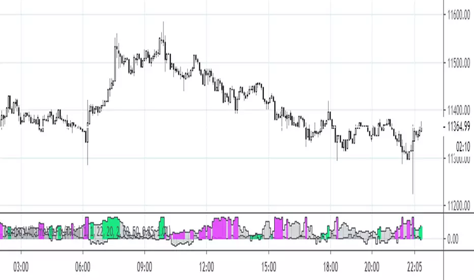
The "Williams Vix Fix" is one of the most reliable indicators in history for finding market bottoms. The Vix Fix is simply a code from Larry Williams creating almost identical results for creating the same ability the Vix has to all assets.
The VIX has always been much better at signaling bottoms than tops. Simple reason is when market falls retail traders panic and increase volatility , and professionals come in and capitalize on the situation. At market tops there is no one panicking... just liquidity drying up.
The FE green triangles are "Filtered Entries".
The AE green triangles are "Aggressive Filtered Entries".
Added Alerts to Williams Vix Fix (Aggressive Entry and Filtered Entry). Alerts are Pre-Set to only Alert on Bar Close.
Added "Ehlrers StochCCI" indicator of user @glaz
The Ehlrers StochCCI is a variation of Ehlers Stochastic RSI replaced with CCI.
The John Ehlers' article in August, 2006, "Modeling The Market = Building Trading Strategies," describes a process for extracting trend and cyclic elements from market data, then recombining them for trading purposes. He used the Stochastic RSI denoted the cyclic elements.
Added ability to show Dots when StochCCI Crosses.
Sell: fuchsia dots.
Buy: green dots.
Added alerts for (Buy / Sell) StochCCI. Alerts are Pre-Set to only Alert on Bar Close.
DISCLAIMER: For educational and entertainment purposes only. Nothing in this content should be interpreted as financial advice or a recommendation to buy or sell any sort of security or investment including all types of crypto. DYOR, TYOB.
VIX daily chang95%
This is a VIX indicator It goes with VIX MA 95%
When VIX daily change 10MA > past 200Days VIX daily change 10MA 95 Percentile than color turn to orange
Both VIX MA&95% and VIX daily change 95% turn to orange means Risk off. get out of market!

VIX MA&95%
This is a VIX indicator It goes with VIX daily change 95%
When 10 VIX MA > past 200Days 10 VIX MA 95 Percentile than color turn to orange
Both VIX MA&95% and VIX daily change 95% turn to orange means Risk off. get out of market!

VIX Contango Oscillator + Bitfinex vs Bitmex price (J)1. VIX Contango Oscillator - Profitable Observations
Summary
Introducing the VIX Contango Oscillator - putting 30, 60 and 90 day volatility expectations in one number.
Understanding the role of VIX contango is critical if you want to trade/hedge with VXX and XIV.
The monthly BLS Nonfarms Payroll report has some demonstrable effects on spot VIX levels and VIX contango.
References :
seekingalpha.com
2. Bitfinex vs Bitmex price
simply 'Bitfinex BTCUSD price' minus 'Bitmex XBTUSD price'.
