ElectroVanga v2.0The new free indicator "ElectroVanga 2.0" is better than my old indicator "ElectroVanga 1.0". Buy and sell signals.
Plots:
Red plot = hightrend
Lime plot = lowtrend
Blue plot = centertrend = (hightrend + lowtrend) / 2
Arrows:
Red arrow (down only) = market top = short entry (long exit)
Lime arrow (up only) = market bottom = long entry (short exit)
Blue arrow (up or down) = long or short entry (long or short exit) *
* If the blue arrow is against you, it is better to liquidate the position
Background:
Red background = more likely downtrend
Lime background = more likely uptrend
NA color background = 50/50
TimeFrames:
- 1D
- 1W
- 1MN
Hints:
A down arrow on a red background is a more reliable prediction than an down arrow on a lime background.
A up arrow on a lime background is a more reliable prediction than an up arrow on a red background.
The logic of this system
The price usually moves either in the upper zone (between the red plot and blue plot) or in the lower zone (between the lime plot and blue plot).
If the price is in the upper zone, then this is the uptrend. If the price is in the lower zone, then this is the downtrend.
If now the uptrend, then the red plot is the top of the market, and the blue plot is the bottom of the market.
If now the downtrend, then the blue plot is the top of the market, and the lime plot is the bottom of the market.
"top" için komut dosyalarını ara

The Always Winning Holy Grail Strategy - Not (by ChartArt)How to win all the time if 1+1 = 2
The most upvoted strategies on Tradingview are those which seemingly work 100%, but they actually don't at all because they are repainting and would not work in live trading reality. They are using the multi-time-frame strategy testing bug and thereby trade during the backtest on close prices before the bar has closed in reality.
Top list of these cheating repainting strategies:
1569 upvotes ANN Strategy
877 upvotes Vdub FX SniperVX3 Strategy
481 upvotes Get Trend Strategy
I guess there are much more strategies among the top upvoted strategies on Tradingview which cheat with a multi-time-frame close price, but three examples are enough. The ANN Strategy uses the daily close price as multi-time-frame and cheats with that. The Vdub FX SniperVX3 Strategy uses the half-day (720 minute) close price to cheat and the Get Trend Strategy uses the 160 minute bar close for repaint cheating (at least here the author of this strategy explains that his strategy is only demo and would not work, which might be the reason why it has 1000 less upvotes than the ANN Strategy. I already wrote months ago a comment underneat these strategies to explain this issue but it hasn't stopped these strategies from getting more and more upvotes and staying in the top list.
I thought this way of cheating is lame, so I invented a new way to cheat my way to seemingly reach 100% profitable trades all the time by going long if 1+1 is equal to 2. Welcome to super wide stop losses. Simply use a extreme unrealistic large stop loss and take profit after a realistic amount of pips and according to Tradingview's current backtest module you win 100% all the time. Yay! :)
My recommendation for the Tradingview team is to add a function to let the user define a stop out and margin call level and maybe set a realistic setting as default, like 100%.
Please don't trade with this strategy!

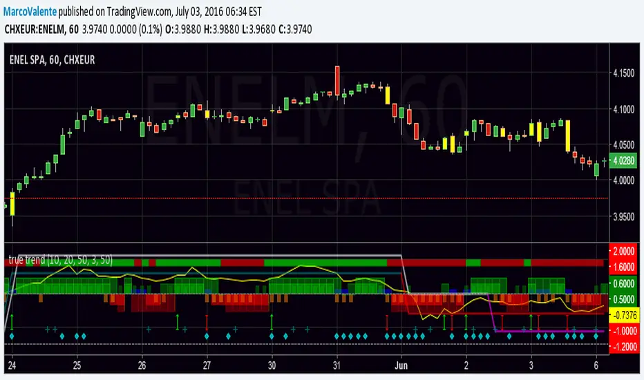
true trendEasy way to look at the Trend , but still accurate. Top bar is DI +, DI - , bars change in yellow when a swing happen, histogram show the increase/decrease of Min and Max and Open-Close; 2 lines moving between +1 and - 1 folloiwng 3 Ema crossing ; a Dot (diamond shape) appear on the botton when volatility increase and finally a " + " show when volume are much bigger the usually. Yellow line on top is Willams % and help us to find top and bottom of the market.
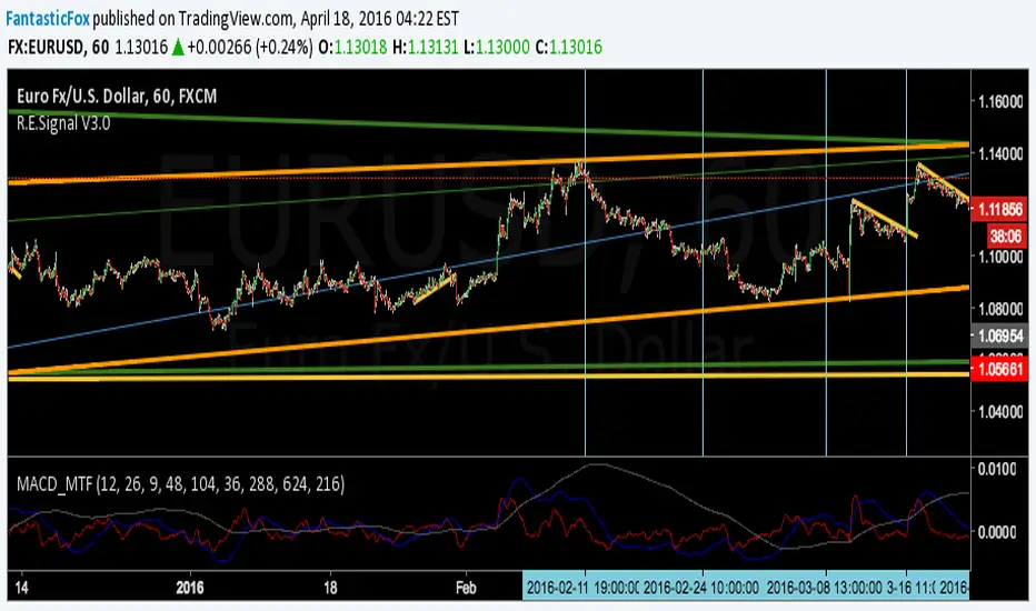
MACD MultiTimeFrame 1h4h1D [Fantastic Fox]Please insert the indicator into 1h time-frame, otherwise you need to change the lengths' inputs.
When there are tops for two of the MACDs and they are near and close* to each other, there is a big opportunity of a "Major Top" for the security, and vice versa for "Major Bottom".
This indicator can be used for tracing multi time-frame divergence. Also, it could help traders to identify the waves of Elliott Wave, and as a signal for confirmation of an impulse after a correction or retracement.
* They should be on top of each others head, not crossing each other. not necessarily touching, but not so far from each other.
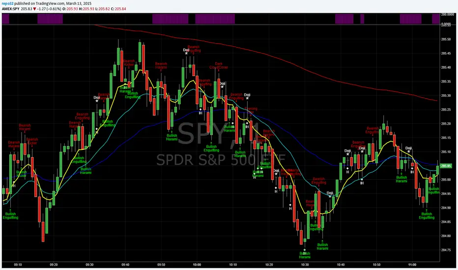
EMA_ConvergenceFirst I have to give kudos to my son who I asked to take a shot at creating this little indicator. Nice work son!
While trading, one of the things I look for is when price or certain EMA's approach another EMA. The example that I use on this 1 minute SPY chart is an 8 EMA and 20 EMA. I am looking for when the 8 and 20 are within' 3 cents of each other. Many times when they are getting close, price is approaching a top or bottom. I am looking for a candlestick reversal around that area. You may want to know when PRICE is near the 50 EMA: Use EMA 1 and 50 for that. Having it light up on top of the page, or elsewhere, makes it easier to look for the convergence when it occurs. If it lights up for a long period, price may be going sideways. I don't enter into a trade until the EMA starts separating, usually with another candlestick formation.
You are able to change the distance for convergence and two EMA's. Unfortunately you will have to adjust the convergence number up as you increase in time frames. This is designed to see when they are close, not when they cross.
The bars on top of this example are lit up purple due to the 8 and 20 EMA are within' 3 cents of each other.
If you want to overlay the price bars, instead of having it separate, just change overlay to "true"
Enjoy.
Auto Fibonacci Lines Depending on ZigZag %In the world of technical analysis, few tools are as powerful—or as misused—as Fibonacci Retracements. The Auto Fibonacci Lines Depending on ZigZag % is not just an indicator; it is a complete, automated trading system designed to eliminate subjectivity and bring institutional-grade precision to your charts.
This script automates the identification of significant market structures using a ZigZag algorithm. Once a market swing is mathematically confirmed (based on your deviation settings), it instantly projects a complete suite of Retracement and Extension levels. This allows you to stop guessing where to draw your lines and start focusing on price action.
🧠 The Logic Behind the Indicator
Understanding how your tools work is the first step to trusting them. This script operates on a three-step logic loop:
ZigZag Identification:
The script continuously monitors price action relative to the last known pivot point. It uses a user-defined Deviation % to filter out market noise. A new "Leg" is only confirmed when price reverses by this specific percentage. This ensures that the Fibonacci lines are only drawn on significant market moves, not random chop.
Automated Anchor Points:
Once a downward trend is confirmed (e.g., price drops 30% from the top), the script automatically anchors the Fibonacci tool to the Swing High (Start) and the Swing Low (End). It does this without you needing to click or drag anything.
Dynamic Cleanup:
Markets evolve. A key feature of this script is its self-cleaning mechanism. As soon as a new trend leg is confirmed, the script automatically deletes the old, invalidated Fibonacci lines and draws a fresh set for the new structure. This keeps your chart clean and focused on the now.
🎓 How to Trade This System
This indicator is color-coded to simplify your decision-making process. It moves beyond standard "rainbow" charts by categorizing price levels into three distinct actionable zones.
1. The "Reload Zone" (White Lines: 0.618 - 0.786) ⚪
Role: High-Probability Support / Entry
In institutional trading, the 0.618 (Golden Ratio) to 0.786 region is often where algorithms step in to defend a trend.
Why it works : This is the "discount" area where smart money re-accumulates positions before the next leg up.
2. The "Decision Wall" (Blue Lines: 1.382 - 1.5) 🔵
Role: Strong Resistance / Trend Check
This is a unique feature of this suite. The 1.382 and 1.5 levels often act as a "ceiling" for weak breakouts.
Strategy : If you entered in the White Zone, the Blue Zone is your first major hurdle. If price stalls here, consider securing partial profits.
Warning : A rejection from the Blue Lines often leads to a double-top formation. However, a clean break above the Blue Lines usually signals a parabolic move is beginning.
3. The "Extension Zone" (Yellow, Red, Purple > 1.618) 🟡🔴
Role : Take Profit / Exhaustion
Levels above 1.5 (starting with the 1.618 Golden Extension) are statistical extremes.
Strategy : These are Strict Take Profit levels. Do not FOMO (Fear Of Missing Out) into new long positions here. The probability of a reversal increases drastically as price climbs through these levels (2.618, 3.618, 4.618).
📐 The Mathematical Edge: Logarithmic vs. Linear
One of the most critical features of this script is the ability to toggle between Logarithmic and Linear calculations.
Why use Logarithmic?
If you are trading Crypto (Bitcoin, Altcoins) or high-growth Tech Stocks, linear Fibonacci levels are mathematically incorrect over large moves. A 50% drop from $100 is different than a 50% drop from $10.
This script calculates the percentage difference (Log Scale), ensuring your targets are accurate even during 100%+ parabolic runs.
Why use Linear?
For mature markets like Forex (EURUSD) or Indices (SPX500) where volatility is lower, Linear scaling is the industry standard.
🛠️ Configuration & Best Practices
Deviation % : This is the heartbeat of the indicator.
Swing Trading : Set to 20-30%. This filters out noise and only draws Fibs on major macro moves.
Scalping : Set to 3-5%. This will catch smaller intraday waves.
Text Place : Keeps your chart clean by pushing labels to the right, ensuring they don't overlap with the current price action.
👤 Who Is This Indicator For?
The Disciplined Trader : Who wants to remove emotional bias from their charting.
The Crypto Investor : Who needs accurate Logarithmic targets for long-term holding.
The Confluence Trader : Who combines these automated levels with Order Blocks, RSI, or Volume to find the perfect entry.
⚠️ RISK DISCLAIMER & TERMS OF USE
For Educational Purposes Only:
This script and the strategies described herein are provided strictly for educational and informational purposes. They do not constitute financial, investment, or trading advice. The "Auto Fibonacci Lines" indicator is a tool for technical analysis and should not be used as the sole basis for any trading decision.
No Guarantees:
Past performance of any trading system or methodology is not necessarily indicative of future results. Financial markets are inherently volatile, and trading involves a high level of risk. You could lose some or all of your capital.
User Responsibility:
By using this script, you acknowledge that you are solely responsible for your own trading decisions and risk management. The author assumes no liability for any losses or damages resulting from the use of this tool or the information provided. Always consult with a qualified financial advisor before making investment decisions.

Alert 2d 2Alert 2 Tops/bottoms in a Strong mommentum for other symbols
1. There is a strong wave including many same color bars.
2. There are 2 Tops/bottoms pattern inside that wave with the same dirrection.

Alert 2dAlert 2 Tops/bottoms in a Strong mommentum.
1. There is a strong wave including many same color bars.
2. There are 2 Tops/bottoms pattern inside that wave with the same dirrection.

Script Title: FX Exchange Simulator: Two Investors (Gain vs. LosDescriptionOverviewThis educational tool is designed to help traders and beginners understand the mechanics of currency exchange rates in the EUR/USD pair. It simulates two distinct investor scenarios based on the highest and lowest prices over a user-defined period (default: 100 bars).The Two ScenariosThe script compares how the direction of exchange and the timing of the trade impact final purchasing power:Investor 1 (Starting with USD - The Strategic Entry):At the Low: Converts $1,000 USD into EUR by dividing the amount by the exchange rate.At the High: Converts those EUR back into USD by multiplying.Result: Demonstrates how buying a currency when it is "cheap" (at the low) increases your total capital in dollars.Investor 2 (Starting with EUR - The Timing Error):At the Low: Panics and converts 1,000€ into USD by multiplying.At the High: Tries to recover the 1,000€ by dividing the USD back at a higher rate.Result: Demonstrates how selling a currency when it is "cheap" and buying it back when it is "expensive" leads to a significant loss of purchasing power.FeaturesDynamic Historical Analysis: Automatically finds the highest and lowest points within the selected lookback period.Step-by-Step Calculation Table: A clean, top-centered table showing the initial amount, the exchange process, the final total, and the ROI (Return on Investment) percentage.Visual Annotations: Labels on the chart pinpoint exactly where the "Minimum" and "Maximum" occurred to provide visual context for the trade simulation.Fully Customizable: Users can adjust the initial capital amount and the lookback period via the settings menu.Mathematics Behind the ScriptThe script uses the following formulas for the calculations:Profit Scenario (USD to EUR):$$\text{Total USD} = \left( \frac{\text{Initial USD}}{\text{Price}_{min}} \right) \times \text{Price}_{max}$$Loss Scenario (EUR to USD):$$\text{Total EUR} = \left( \text{Initial EUR} \times \text{Price}_{min} \right) / \text{Price}_{max}$$InstructionsAdd the script to your chart (best used on EUR/USD).Look at the labels to see where the period extremes are.Check the table at the top to see the financial outcome of both investors.Use the "Settings" to change the initial amount or the bar period to test different market cycles.DisclaimerThis script is for educational purposes only. It is intended to illustrate currency exchange mechanics and does not constitute financial advice.

Accumulation/Distribution Oscillator [MarkitTick]💡 This script presents a statistically normalized evolution of the classic Accumulation/Distribution (A/D) indicator, designed to transform unbounded volume flow into a bounded, actionable oscillator. By integrating Relative Volume (RVOL) weighting and Z-Score standardization, this tool isolates genuine institutional buying and selling pressure from market noise, offering a clear view of volume momentum regimes.
✨ Originality and Utility
The standard Accumulation/Distribution line is a cumulative total of volume flow, which often results in an unbounded line that drifts indefinitely with price trends. This makes it difficult for traders to identify overextended conditions or specific turning points.
This script solves that problem through a three-stage quantitative process:
Smart Volume Weighting: Instead of treating all volume equally, this indicator amplifies the impact of high-volume nodes using a Relative Volume (RVOL) filter. This ensures that significant institutional activity carries more weight than low-liquidity chopping.
Detrending: It subtracts a smoothed average (using ALMA, EMA, or others) from the raw A/D line to create a raw oscillator.
Normalization: Finally, it applies a Z-Score calculation to normalize the data. This bounds the oscillator around a zero mean, allowing for the application of Bollinger Bands to detect statistical extremes (2 or 3 standard deviations).
🔬 Methodology and Concepts
The calculation logic follows a strict quantitative pipeline:
● Money Flow Multiplier (MFM)
The core engine is the classic MFM calculation, which determines the location of the Close relative to the High-Low range. A Close near the High results in +1, while a Close near the Low results in -1.
● Advanced Volume Filtering
Before accumulation, the volume is processed through two filters:
RVOL Multiplier: If the current bar's volume exceeds its simple moving average (`rvol_len`), the volume is multiplied by a user-defined factor (`rvol_mult`). This emphasizes breakout candles.
Candle Strength (Optional): If enabled, weight is increased based on how close the price closes to the absolute high or low, rewarding decisive candle shapes.
● Z-Score Standardization
The script calculates the "Raw Oscillator" by subtracting a moving average (Signal Line) from the cumulative A/D Line. It then calculates the Z-Score of this raw value over a lookback period (`z_len`).
Formula: Z = (Value - Mean) / Standard Deviation
🎨 Visual Guide
The indicator renders a complex data set into an easy-to-read interface:
• The Oscillator (Line & Histogram)
The primary output is the Z-Score value.
Teal Histogram/Line: Represents Bullish momentum (Accumulation). Darker Teal indicates accelerating momentum (`osc > previous`), while lighter Teal indicates decaying momentum.
Red Histogram/Line: Represents Bearish momentum (Distribution). Darker Red indicates accelerating selling pressure, while lighter Red indicates exhaustion.
Gray: If the Trend Filter (200 EMA) or VWAP Filter is enabled and the signal opposes the trend, the histogram turns Gray to indicate a low-probability counter-trend signal.
• Bollinger Bands (Blue Bands)
These bands wrap around the oscillator line.
Upper Band: Usually set to +2 Standard Deviations. When the oscillator pierces this band, accumulation is statistically extreme (potential mean reversion or strong breakout).
Lower Band: Usually set to -2 Standard Deviations. Indicates statistically extreme distribution.
• Divergences
The script automatically detects and plots structural divergences:
Green Lines/Labels: Bullish Divergence. Price makes a Lower Low while the Oscillator makes a Higher Low.
Red Lines/Labels: Bearish Divergence. Price makes a Higher High while the Oscillator makes a Lower High.
• Multi-Timeframe (MTF) Dashboard
Located in the top right, this table displays the momentum status (BULL/BEAR) of the oscillator across three user-defined timeframes (default: 60min, 240min, Daily), allowing for fractal trend analysis.
📖 How to Use
This tool is best used for identifying trend exhaustion and hidden volume strength.
1. Trend Continuation
In a strong uptrend, look for the Histogram to remain Teal and above the Zero line. A pullback to the Zero line that bounces back up suggests buyers are stepping in to defend the trend.
2. Statistical Extremes
When the oscillator line breaks outside the Bollinger Bands, volume flow is significantly deviated from the norm.
If price is ranging, this often signals a reversal (Reversion to Mean).
If price is breaking out, this confirms strong impulse participation.
3. Divergence Reversals
A divergence is a leading signal. If price is pushing new highs but the A/D Oscillator fails to make a new high (Red Divergence Line), it indicates that the volume supporting the move is drying up, often preceding a correction.
⚙️ Inputs and Settings
● Oscillator Settings
Smoothing Type/Length: Choose between ALMA, EMA, SMA, etc., to smooth the A/D line. ALMA is default for its zero-lag properties.
ALMA Offset/Sigma: Fine-tune the responsiveness of the Arnaud Legoux Moving Average.
● Quant Filters
RVOL Lookback & Multiplier: Determines the threshold for "High Volume." Default is 1.5x average volume.
Z-Score Lookback: The period used to establish statistical significance (Default: 100).
Use VWAP/Trend Filter: Logical switches to gray out signals that contradict the macro trend (200 EMA) or the intraday mean (VWAP).
● Dashboard
Customize the three timeframes displayed in the MTF table to match your trading horizon (e.g., Scalpers might use 5m, 15m, 1h).
🔍 Deconstruction of the Underlying Scientific and Academic Framework
This indicator relies on the Law of Supply and Demand quantified through Standard Score (Z-Score) Statistics .
Standard Accumulation/Distribution is derived from the work of Marc Chaikin, positing that the proximity of the close to the high/low on high volume indicates the "smart money" flow. However, raw cumulative data suffers from heteroscedasticity (varying variance).
By applying Z-Score normalization:
Z = (x - μ) / σ
We transform the data into a standard normal distribution. This allows us to apply probability theory to volume analysis. A value of +2.0 is not merely "high"; it represents a volume flow intensity that falls within the top 2.2% of the data set (assuming normal distribution), providing a mathematically robust definition of "Overbought" or "Oversold" volume conditions.
⚠️ Disclaimer
All provided scripts and indicators are strictly for educational exploration and must not be interpreted as financial advice or a recommendation to execute trades. I expressly disclaim all liability for any financial losses or damages that may result, directly or indirectly, from the reliance on or application of these tools. Market participation carries inherent risk where past performance never guarantees future returns, leaving all investment decisions and due diligence solely at your own discretion.

Reversal RadarReversal Radar
Unified exhaustion detection across 5 distinct reversal patterns — see confluence at a glance.
What It Does
Reversal Radar consolidates 5 independent reversal detection algorithms into a single indicator with a stacked diamond visualization. When any detector fires, you see a vertical stack of diamonds — colored diamonds show which specific patterns triggered, ghost (white) diamonds show which didn't.
More colored diamonds = stronger confluence = higher conviction setup.
The 5 Detectors
Diamond Detector What It Finds
🔴 Red Liquidity Trap Pivot reversal with wick rejection, liquidity sweep, and momentum trap (fading trapped traders)
🟠 Orange Structural Divergence Pivot at new extreme with RSI divergence against major structure
🔵 Light Blue Band Rejection Full candle body outside Bollinger Bands with rejection wick
🟢 Green Panic Snap 5-bar waterfall (consecutive lower lows) snapping back during VIX spike — Long only
🟣 Purple Capitulation Engulf Bullish engulfing at lower BB with steep band decline during elevated VIX — Long only
How To Read It
Long Signals (below bar): 5-diamond stack
• Bottom to top: Liquidity Trap → Structural Divergence → Band Rejection → Panic Snap → Capitulation Engulf
Short Signals (above bar): 3-diamond stack
• Bottom to top: Band Rejection → Structural Divergence → Liquidity Trap
Ghost diamonds (faded white) = that detector did NOT fire Colored diamonds = that detector fired
Colors are consistent between long and short — same detector = same color regardless of direction.
Key Features
• Confluence visualization — instantly see how many independent patterns agree
• No parameter tweaking — all detector settings are pre-tuned and hardcoded
• VIX-aware — the two "capitulation" detectors (Panic Snap, Capitulation Engulf) only fire during elevated VIX conditions
• Session filtering — built-in BOD/EOD blocking to avoid noisy open/close periods
• MTF Bias Table — optional multi-timeframe trend bias display (5m/15m/1H/4H/D)
• Detector Legend — on-chart reference showing what each color means (adjustable size and position)
• Bollinger Bands — optional BB overlay display
Settings
Module Toggles — Enable/disable each of the 5 detectors independently:
• Enable Liquidity Trap
• Enable Structural Divergence
• Enable Band Rejection
• Enable Panic Snap (Long Only)
• Enable Capitulation Engulf (Long Only)
Session Blocking — Define trading session and minutes to block at open/close
Display — Toggle Bollinger Bands, MTF Bias Table position
Legend — Toggle detector legend, adjust position and text size (tiny/small/normal)
Best Used For
• Identifying high-probability reversal zones where multiple exhaustion signatures align
• Filtering out weak signals (single detector) vs strong setups (2-3+ detectors)
• Spotting capitulation bottoms during VIX spikes (Panic Snap + Capitulation Engulf)
• Mean reversion plays at Bollinger Band extremes
Notes
• This indicator is designed for intraday reversal trading on liquid instruments (SPY, QQQ, ES, NQ, etc.)
• The VIX-gated detectors (Panic Snap, Capitulation Engulf) are long-only by design — they're specifically tuned for capitulation bottoms
• Works best on 3m-15m timeframes
• All detector parameters are locked to tested values — this is intentional to keep the indicator simple and consistent
"When multiple exhaustion patterns converge, the market is telling you something."

Renko Velocity Meter [Chris Chapman]Here is the comprehensive copy for your Renko Velocity Meter indicator. This is structured to be used in a TradingView description, a manual, or a product listing.
Renko Velocity Meter
What is this Indicator?
The Renko Velocity Meter is a specialized momentum dashboard designed strictly for Renko Charts. Unlike standard oscillators (like RSI or MACD) which often fail on Renko due to the lack of time-based data, this tool uses "Brick Physics" to measure the actual speed and efficiency of price movement.
It answers the most critical question in Renko trading: "Is this a real trend, or just a choppy consolidation?"
Instead of giving you lagging signals, it provides a real-time Velocity Score (0-100) displayed on a dashboard directly on your chart. It automatically filters out "fake" moves and highlights high-probability "TURBO" conditions when the market enters a powerful extension phase.
How It Is Calculated
The Velocity Score is derived from a proprietary blend of three distinct mathematical checks:
1. Trend Efficiency ("The Snake Logic") The script calculates the ratio between the Net Price Move and the Total Distance Traveled over a lookback period.
High Efficiency: Price is moving in a straight line (Strong Trend).
Low Efficiency: Price is winding back and forth (Chop/Range).
2. Momentum Deviation (Auto-Brick Detection) The indicator automatically detects your specific Renko brick size (whether 2 pips, 10 points, or custom) without manual input. It then measures how many "Bricks" the price has pulled away from the baseline Moving Average.
If price is 6+ bricks away from the average, it signals a high-momentum extension.
3. HTF Trend Lock (Multi-Timeframe Filter) It internally checks a Higher Timeframe (default: 15-minute) to ensure you are trading with the dominant trend.
HTF LOCK: The Renko trend and the 15m trend are aligned (Green).
HTF MIX: The trends are conflicting. The score is automatically capped at 60 to prevent false signals.
4. The "Counter-Trend" Penalty To prevent buying tops or selling bottoms, the script instantly penalizes the score if a "Retracement Brick" forms.
Example: If the trend is UP, but a RED brick forms, the score is forced down to the "Yellow/Neutral" zone until the trend resumes.
Requirements
To use this indicator effectively, you must meet the following chart conditions:
Chart Type: Renko (This is mandatory. The math relies on fixed-size bricks).
Timeframe: Works on all timeframes, but optimized for standard scalping setups (e.g., 2-pip fixed bricks on EURUSD/Gold).
Data Feed: High-quality data is recommended. For maximum precision, use a 1-second (1s) interval setting for your Renko box generation if your TradingView plan allows it.
The Inputs (Settings)
You can customize the sensitivity of the meter to fit your specific asset class:
Trend Efficiency Period (Default: 14):
The number of bricks used to calculate how "straight" the trend is. Lower numbers make the score faster; higher numbers make it smoother.
Momentum Baseline (Default: 20):
The length of the internal Moving Average used as the "mean" price.
Max Momentum in Bricks (Default: 6):
How many bricks of extension are required to hit a "100% Score"? Increase this for volatile assets like Gold or Bitcoin.
HTF Support (Default: 15):
The Higher Timeframe used for the Trend Lock filter.
Meter Position:
Choose where the dashboard appears on your screen (Top Right, Bottom Left, etc.).
Dashboard Legend
GREEN (Score > 70): TURBO – Strong trend alignment. High probability of continuation.
YELLOW (Score 50-70): TREND – Active trend, but potentially stalling or retracing.
RED (Score < 50): CHOP – No clear direction or conflicting signals. Stay flat.
POSITION: Shows the current logic state (LONG/SHORT/FLAT).

Vector Sniper What this script does
This indicator highlights high‑energy “vector” candles and marks optional Absolute Reversal candles (possible bottoms/tops) based on wick rejection, structure, and volume. It is designed for visual context, not automatic trade entries.
How it works (core logic)
The script combines volatility, volume, and price‑structure filters:
Vector candles: Require strong candle body, high volatility (true range Z‑score), high volume (volume Z‑score), and directional delta imbalance.
Structure filters: Optional break‑of‑structure and trap detection help remove noise.
Pre‑signals: A scoring system tracks early conditions (volume, imbalance, structure proximity, and EMA/VWAP alignment) and requires persistence across recent bars.
HTF confluence (optional): Uses higher‑timeframe EMA alignment with no lookahead bias.
Absolute Reversal candles
These are designed to mark potential local tops/bottoms and require:
Long wick rejection
Small body size
Strong close back into the range
Local structural extreme
Above‑average volume
Optional EMA trend bias (to confirm exhaustion)
How to use it
Use vector candles to spot high‑momentum activity.
Use pre‑signals as early warnings before vectors appear.
Use Absolute Reversal candles for potential turning points at extremes.
Adjust thresholds per timeframe and instrument.
Notes
Designed for standard candlesticks (not Heikin Ashi / Renko / Kagi / P&F).
No performance claims or guarantees.
HTF data uses lookahead_off to avoid repainting.

Flexible S/R Channels🟩 Flexible S/R Channels is a visualization tool that draws curved support and resistance boundaries through user-defined anchor points. Unlike traditional trendlines and channels that force linear interpretation onto price action, this indicator captures the curved structures that markets frequently form—rounded tops and bottoms, parabolic advances and declines, arcing rallies and pullbacks. Three anchor points per curve define the shape; the indicator fits a smooth mathematical curve through these points and projects it forward. The approach is simple: draw what you see. Curved market structure that resists precise definition with traditional tools can now be rendered with mathematical accuracy.
The indicator bridges the gap between static drawing tools and programmable indicators. TradingView's arc tool draws curves but produces only visual pixels with no analytical value. Flexible S/R Channels creates live data series that integrate with other analysis tools. Four curve-fitting methods—Quadratic, Quadratic-Linear, Weighted Linear, and Natural Cubic Spline—accommodate different market structures. The curved levels naturally lend themselves to breakout and reversion strategies—applications left to the trader's discretion. The open-source code invites experimentation and customization.
💡 THEORY AND CONCEPT 💡
Traders have long relied on horizontal levels and diagonal trendlines to define support and resistance. Linear tools assume constant slope—a property rarely exhibited by actual market movement. When momentum accelerates or decelerates, price trajectories curve rather than hold to fixed angles. The resulting structures—parabolic advances during expansion phases, arcing pullbacks during consolidation, rounded formations at reversal points—represent changes in the rate of change itself. Traditional drawing tools cannot accommodate this variable geometry without sacrificing mathematical precision..
Flexible S/R Channels extends familiar support and resistance concepts into curved space. The approach is simple: draw what you see. When the eye recognizes a curved boundary in price action, this indicator provides the means to define it precisely. Three anchor points per curve—an initial point, an intermediate point, and a recent point—are all that is required. The indicator fits a smooth mathematical curve through these points and extends it forward as a projection.
This indicator represents a blend of human pattern recognition and algorithmic precision. Fully automated indicators make decisions without user input—efficient but detached from trader discretion. Manual drawing tools rely entirely on freehand skill—expressive but imprecise. Flexible S/R Channels occupies the middle ground. The trader identifies the curved structure; the algorithm renders it mathematically. The result is human insight expressed with computational accuracy—for traders who recognize curved structure in price action but lack precise tools to define it.
This projection is not a prediction. It is a visual hypothesis—a structured way of asking "if this trajectory continues, where would price be?" The underlying assumption is simple: like Newton's first law of motion, a trajectory in motion tends to continue unless acted upon by an external force. Future price action validates or invalidates the projection, just as it does with any trendline or channel.
TradingView offers an arc drawing tool for freehand curved lines, but these are purely visual—static pixels on a screen with no programmable value. Flexible S/R Channels bridges this gap. The fitted curves exist as data series that can generate alerts, trigger signals, and interact with other analysis tools. The visual drawing becomes operational structure.
🔁 CURVE METHODS 🔁
The indicator offers four curve-calculation methods, each producing different shapes suited to different market structures:
Quadratic — Fits a parabolic arc through the three anchor points. Best for smooth, continuous curves such as rounded tops and bottoms. It captures the natural "swing" of the market, assuming the momentum will maintain its current rate of acceleration or deceleration.
Quadratic-Linear — Uses a parabolic curve through the anchor points, then transitions to a straight line after the final anchor. Useful when curved structure gives way to linear trend continuation. This is the "bridge" between a turning market and a steady, directed move, preventing the projection from curving back on itself when the price begins to run.
Weighted Linear — Connects anchor points with straight line segments rather than a smooth curve. Suited for angular market structures with distinct inflection points. It treats the market as a series of rigid shifts, providing a clear "corridor" when the price is bouncing between sharp, diagonal levels.
Natural Cubic Spline — Produces the smoothest curve by minimizing abrupt directional changes. Ideal for organic, flowing market movements. It acts as a flexible spine that adapts to complex transitions without the rigid constraints of a fixed geometric shape.
Quadratic Fitting : A smooth, parabolic arc defines a curved resistance boundary. By fitting a mathematical path through three anchor points, the curve captures rounded structures and arcing price action that traditional linear trendlines fail to represent.
Weighted Linear Fitting : This method produces an angular, segmented path by connecting anchor points with distinct linear slopes. Unlike the continuous smoothness of a quadratic arc, the weighted linear approach creates a more jointed geometry, allowing for a precise match to market structures that exhibit sharp, localized changes in trajectory.
Natural Cubic Spline Fitting : This method creates a highly fluid, elastic curve that can accommodate complex price oscillations. In this instance, the curves define a narrowing range as support and resistance converge, highlighting the volatility compression that often precedes a significant breakout or breakdown from established structures.
🖱️ HOW IT WORKS 🖱️
1️⃣ Initial Setup
Unlike traditional indicators that calculate values automatically from price data, Flexible S/R Channels requires user-defined anchor points. This is intentional. The trader's eye is the pattern recognition engine—no algorithm can see the curved structure that experience and intuition reveal. The indicator waits for this input, then applies mathematical precision to render what the trader has identified.
The Recognition of Natural Structure : Effective analysis begins when a curved rhythm becomes visible within price action that traditional trendlines cannot satisfy. Identifying the specific swing highs and swing lows that define these boundaries is the first step in organizing a chart. By isolating three key pivots for resistance and three for support, the underlying framework of the market's trajectory is established, providing the necessary coordinates to accurately map the path.
Interactive Setup Workflow : Upon loading, the indicator prompts for the sequential selection of six points—three swing highs and three swing lows—to serve as the raw data for the calculation. While the chart remains blank during this initial phase, the curves generate instantly once the final anchor is confirmed. These points are not permanent; they appear as interactive grips that can be dragged in real time to refine the boundaries as the market structure evolves.
The indicator prompts for six sequential selections—three for resistance, three for support. The first three selections define the resistance boundary; the final three define support. This sequential grouping is distinct from zigzag-style selection patterns. Within each group, clicking order is flexible—the algorithm automatically sorts points chronologically, allowing traders to select visually prominent pivots in whatever sequence feels natural.
Structural Anchor Identification : Identifying three key swing highs and three key swing lows provides the foundation for the dual-curve geometry. These specific structural peaks and troughs serve as the coordinates for the mathematical models, ensuring that the resulting boundaries accurately reflect the underlying skeleton of the market action.
2️⃣ Interactive Adjustment
After the initial setup, all six anchor points are fully adjustable:
Points are automatically sorted chronologically regardless of selection order
Grip handles appear at each anchor location
Any point can be repositioned by clicking and dragging its grip handle
The curves recalculate instantly as points are adjusted
The algorithm produces a mathematically perfect curve based on the anchor points provided. If the result does not match the trader's vision, adjustments are immediate. This iterative refinement—see, adjust, refine—continues until the rendered curve represents what the trader sees in the price action. The user remains in control; the algorithm remains in service.
Interactive Channel Boundaries : Six user-defined anchor points—three for resistance and three for support —establish a non-linear range that moves beyond the constraints of a flat, horizontal channel. This configuration captures the arcing trajectory of the market while showing price action respecting the curved boundaries in a classic reversion pattern. By manually positioning these anchors, a dynamic dimension is added to the chart that maintains structural integrity even as the price follows a rounded path.
🛠️ SETTINGS 🛠️
Customizable Visual Feedback : Beyond the core geometry, the visualization offers various user-defined settings to tailor the chart's information density. From identifying specific price targets to toggling structural labels, these options allow the trader to adjust the level of detail to suit their personal analysis style while maintaining a clear view of the non-linear boundaries.
Configuration Options
Curve Method — Select the curve-fitting algorithm: Quadratic, Quadratic-Linear, Weighted Linear, or Natural Cubic Spline.
Projection Length — Number of bars to project the curves beyond current price action. Projections appear as dashed lines.
Visual Settings
Grip Size — Size of the draggable handles displayed at each anchor point. Set to zero to hide grips entirely.
Line Width — Thickness of the support and resistance curves.
Support Color / Resistance Color — Color settings for each curve.
Show Info Table — Toggle display of the info table showing the current curve method in the chart corner.
Advanced: Time/Price Coordinates
The settings panel includes precise time and price values for each of the six anchor points, grouped under Resistance Time/Price and Support Time/Price. These values are populated automatically when points are selected on the chart.
Adjusting anchor points by dragging the grip handles directly on the chart is faster and more intuitive. The time/price fields are available for situations requiring exact coordinate entry—such as aligning an anchor to a specific candle timestamp or a precise price level. These fields can be safely ignored unless fine-tuning is necessary.
🖼️ CHART EXAMPLES 🖼️
The Flexible S/R Channels indicator adapts to diverse market structures across multiple timeframes and instruments. Curved boundaries can define subtle momentum shifts in near-linear trends, dramatic reversals in rounding formations, or volatility compression as channels converge toward breakout points. The four curve-fitting methods accommodate different geometries—smooth parabolic arcs for continuous momentum changes, segmented linear paths for angular structures, and elastic splines for complex oscillations. Each anchor point adjustment instantly recalculates the curves, allowing iterative refinement until the rendered boundaries align with the trader's interpretation of market structure. Forward projections extend these mathematical relationships into future territory, providing visual context for hypothetical support and resistance levels if current trajectories persist.
Subtle Curve Alignment : Even in structures that appear linear, subtle curvature allows the channel boundaries to breathe with the market’s internal momentum. By utilizing three anchor points rather than two, the channel adapts to the slight acceleration of a trend, providing a more precise fit than a rigid, straight corridor.
Decelerating Momentum and Convergence : This classic rounding structure illustrates a transition where the initial wide oscillations between highs and lows begin to contract. As the boundaries converge, the curve captures the diminishing volatility and the shift in market energy, providing a clear visual representation of a trend losing its expansive momentum as it approaches a potential turning point.
Organic Trend Modeling : In an accelerating uptrend, the Natural Cubic Spline provides a highly adaptable boundary that mirrors the organic flow of momentum. This non-traditional approach allows the channel to follow complex price pulses that a standard linear trendline would likely cut through, maintaining a precise fit even as the angle of the trend shifts over time.
Non-Linear Projections : Unlike standard trendlines that converge at a fixed rate, curved projections adapt to the historical momentum of the move. This allows the indicator to map a dynamic squeeze, capturing the subtle nuances of how price action tightens toward an apex. It provides a more sophisticated view of future convergence points that traditional linear channels often fail to anticipate.
The "Draw What You See" Philosophy : Market structures are rarely perfect, and this example highlights the indicator’s ability to map unconventional rhythms. Rather than forcing price into a predefined category, the tool remains flexible enough to define any structural path the trader identifies. If you can see a trend's trajectory, the indicator can provide the mathematical framework to support it.
Comparative Projection Modeling : Using identical anchor points as above, this example demonstrates how selecting a different calculation method can alter the projected path. While the historical fit remains precise, the variation in the forward-looking trajectory allows traders to explore multiple mathematical interpretations of the same market structure, choosing the model that best aligns with the current volatility and trend behavior.
Extended Timeframe Channel Definition : This multi-year perspective demonstrates the indicator's ability to define curved channel boundaries across extended timeframes spanning hundreds of bars and multiple market cycles. The resistance curve captures the rounded distribution of swing highs while the support curve follows the accelerating base formation, creating a non-linear channel that frames long-term structural trends more precisely than traditional parallel channels or static trendlines.
Rounding Bottom Reversal and Channel Convergence : This example captures a classic rounding bottom formation—a reversal pattern that linear tools cannot adequately define. The Quadratic method produces a smooth parabolic arc through the resistance anchors, tracing the deceleration of the downtrend, the capitulation low, and the subsequent re-acceleration upward as a single continuous curve. The support boundary mirrors this momentum shift from below, creating a curved channel that narrows toward current price. This convergence represents structural compression—the boundaries tightening as volatility contracts and directional resolution approaches. Price action oscillates within these non-linear boundaries, demonstrating that channel behavior persists even when the geometry is curved rather than parallel. The projection extends both curves forward, mapping the hypothetical trajectory if the current momentum structure continues, providing visual context for potential breakout or breakdown levels as the channel reaches its apex.
Built-in Precision vs. Algorithmic Power : While TradingView offers basic curve drawing tools (shown here as dashed lines), the Flexible S/R Channels indicator elevates this concept into a functional analytical framework. By converting manual observations into mathematical models, it moves beyond mere drawing to provide a data-driven structure that can be utilized for advanced technical analysis and future Pine Script trading logic.
⚙️ TECHNICAL DETAILS ⚙️
Curve Fitting vs. Overfitting: The term curve fitting often carries negative connotations in quantitative analysis due to its association with overfitting—the practice of adjusting a model until it perfectly matches historical data, producing an illusion of accuracy that fails when applied to new data. The application here is fundamentally different. Flexible S/R Channels does not optimize parameters to maximize historical fit; it constructs a mathematical curve through user-selected anchor points, then projects that curve into unknown territory. The curve is not fitted to price data—it is fitted to structural pivots identified by the trader. The projection represents a hypothesis about trajectory continuation, not a prediction derived from statistical optimization. Future price action validates or invalidates this hypothesis in real time, exactly as it does with any trendline or channel. The anchor points remain fixed unless manually adjusted, ensuring the curve does not adapt to new data retroactively.
Non-Repainting Behavior: The indicator does not repaint historical bars. The mathematical coefficients that define each curve are calculated once—when the final anchor point is set—and stored as fixed values. These coefficients remain constant unless an anchor point is manually repositioned. The backfit polyline is drawn once using these coefficients, spanning the known range from the first to last anchor point. The plot() function applies the same coefficients to each subsequent bar, updating in real-time as new bars form but never altering previously plotted values. The projection polyline extends forward from the current bar using the same fixed coefficients, projecting a user-defined number of future bars (maximum 500). This projection redraws on each tick to maintain its position relative to the moving current bar, but the mathematical trajectory remains constant—only the starting point advances. The current bar's curve value will update tick-by-tick as price develops, which is standard real-time behavior, not repainting. Once a bar closes, all curve values on that bar are permanent. The hybrid architecture (backfit polyline for known history, plot() for unlimited real-time range, projection polyline for controlled forward extension) prevents overflow errors while maintaining non-repainting integrity across all components.
🗒️ NOTES 🗒️
The indicator renders curves based on any anchor points provided without validation. Unusual anchor placement produces mathematically accurate but potentially non-useful results. Adjustment is iterative—if the curve doesn't match expectations, reposition the anchors.
Because anchor points are stored as specific time and price coordinates, a new instance of the indicator should be added when analyzing a different chart or timeframe.
Grip handles can be hidden by setting Grip Size to zero in the settings. This is useful for clean chart screenshots or presentations where interactive elements are not needed.
Projection length can be set to zero if forward-looking curves are not desired. The indicator will still render the backfit curves through the anchor points and continue plotting in real-time without the dotted projection extensions.
Anchor points remain fixed at their selected time-price coordinates as new bars form. The curves extend forward automatically from these historical anchors, allowing observation of how projected trajectories align with developing price action.
⚠️ DISCLAIMER ⚠️
The Flexible S/R Channels indicator is a visual analysis tool designed to illustrate geometric market inertia and serve as a framework for understanding dynamic support and resistance. While the indicator generates structural channels and projected paths, no guarantee is made regarding the accuracy or profitability of these projections. Like all technical indicators, the curves and boundaries generated by this tool may appear to align with favorable trading opportunities in hindsight. However, these visualizations are not intended as standalone recommendations for trading decisions. This indicator is intended for educational and analytical purposes, complementing other tools and methods of market analysis.
🧠 BEYOND THE CODE 🧠
Flexible S/R Channels is part of a broader collection of tools designed to provide structured market analysis. This includes the Grid Bot Simulator , the Grid Bot Auto , the Grid Bot Parabolic , and the Gridbot Ping Pong . While each tool serves a distinct purpose, they all utilize dynamic anchor mechanics and non-linear boundaries to adapt to evolving market conditions.
This indicator shares the same educational philosophy as the Fibonacci Time-Price Zones and the Fibonacci Geometry Series - providing frameworks for understanding market concepts through visualization and experimentation rather than black-box signals.
The Flexible S/R Channels indicator, like other xxattaxx indicators , is designed to encourage both education and community engagement. Feedback and insights are invaluable to refining and enhancing this tool. We look forward to the creative applications, observations, and discussions this indicator inspires within the trading community.

Trinity Multi-Timeframe MA TrendUser Guide: Trinity Multi-Timeframe MA Trend - 10 MAs Indicator
Welcome to the Trinity Multi-Timeframe MA Trend indicator! This is a versatile TradingView tool designed for traders who rely on moving averages to gauge trend direction across multiple timeframes. It supports up to 10 customizable moving averages (MAs), displays their trend directions in a compact dashboard, plots the MAs on the chart with color-coded trend indications, and optionally fills the areas between consecutive MAs for visual clarity. The indicator is built to help you quickly assess alignment between short-term and long-term trends, making it ideal for multi-timeframe analysis in strategies like trend following, swing trading, or confirming entry/exit points.
The core idea is to show whether each MA is in an uptrend (price above the MA's previous value) or downtrend (price below), not only on the current chart timeframe but also on up to 5 higher timeframes. This allows you to spot trend convergence or divergence at a glance, reducing the need to switch charts manually. The indicator is fully customizable, so you can tailor it to your preferred lengths, types, and visuals without cluttering your chart.
#### Key Features
- **Multi-Timeframe Dashboard**: A resizable and repositionable table that shows trend directions (↑ for up, ↓ for down) for each enabled MA across 5 user-defined timeframes. The cells are color-coded (green for up, red for down) with subtle background shading for easy reading.
- **Customizable Moving Averages**: Up to 10 MAs, each with independent length, type (EMA, SMA, or HMA), visibility, and transparency settings. You can enable/disable individual MAs to focus on specific ones.
- **Trend-Based Coloring**: Lines and fills change color based on the trend direction of the MA (green for uptrend, red for downtrend).
- **Background Fills**: Optional fills between consecutive MAs, colored according to the faster MA's trend, to highlight crossovers or trend strength visually.
- **Direction Change Arrows**: Small up/down arrows appear on the chart when an MA changes trend direction on the current timeframe, helping spot potential reversals.
- **Dynamic and Lightweight**: The dashboard adjusts automatically if you disable MAs (rows are hidden), and the indicator won't disappear from the chart even if all plots are turned off.
- **No Repainting Option**: Uses `lookahead_on` for security calls, so trends from higher timeframes are consistent but may repaint in realtime (standard for MTF indicators).
This indicator is particularly useful for traders using Fibonacci-based lengths (like your defaults: 5, 8, 13, 21, 34, 50, 100, 144, 200, 244), which align with natural market cycles. It's flexible for any asset class, from stocks and forex to crypto.
#### How the Indicator Works
The indicator calculates 10 moving averages on the current chart timeframe. For each MA, it determines the trend direction by comparing the current value to its value two bars ago (a simple slope check). It then fetches the same trend calculation from 5 higher timeframes using `request.security`, allowing you to see if the trend is aligned across scales.
The dashboard summarizes this in a grid:
- Rows: Each enabled MA (labeled as "Type Length", e.g., "EMA 5").
- Columns: The 5 timeframes (labeled with converted names, e.g., "5m" for 5-minute, "1D" for daily).
- Cells: ↑ (uptrend, green) or ↓ (downtrend, red), with background shading for emphasis.
On the chart:
- MAs are plotted as lines with trend colors and user-set transparency.
- Fills (if enabled) shade the area between MAs, inheriting the color from the faster MA's trend.
- Arrows appear above/below bars when an MA's trend changes on the current timeframe.
#### Setting Up the Indicator
Add the indicator to your chart in TradingView, then customize via the Inputs tab. The inputs are grouped for ease:
- **Timeframes Group**: Set the 5 higher timeframes for MTF analysis (defaults: 5m, 15m, 1h, 4h, 1D). Use standard TradingView notation like "15" for 15 minutes or "D" for daily.
- **Moving Averages Group**: Adjust lengths and types for each of the 10 MAs. Start with the Fibonacci defaults, but experiment (e.g., shorter for scalping, longer for investing).
- **Visibility Group**: Toggle "Show MA#" to enable/disable individual lines on the chart. Disabling hides the row in the dashboard too.
- **Background Fills Group**: Toggle fills between MAs. These are great for visualizing ribbon-like setups but can clutter busy charts—turn off if not needed.
- **Colors Group**: Set the uptrend (default lime) and downtrend (default red) colors for lines, fills, and dashboard cells.
- **Transparency Group**: Adjust opacity for each MA line (0 = fully opaque/solid, 100 = fully transparent/invisible). Defaults start low for visibility and increase for slower MAs to reduce clutter.
- **Dashboard Group**: Choose position (e.g., "Top Right") and size (e.g., "Normal") for the table. Resize to fit your screen.
After customizing, apply and refresh the chart if needed.
#### Interpreting the Dashboard
The dashboard is the heart of the indicator—use it to confirm trend alignment:
- **Strong Uptrend Signal**: Most cells in a row (or column) show ↑ in green, indicating the MA is upward on multiple timeframes.
- **Strong Downtrend Signal**: Mostly ↓ in red.
- **Divergence**: Mixed ↑/↓ across timeframes suggests caution (e.g., short-term up but long-term down could mean a pullback).
- **Trend Flip**: Watch for rows where the current timeframe cell changes—combine with arrows on the chart for entries.
For example, if you're on a 5m chart and the dashboard shows ↑ on all timeframes for your fast MAs (e.g., MA1-MA3), it's a good buy signal in an uptrend strategy.
#### Using the Chart Plots and Fills
- **MA Lines**: Each enabled MA is plotted with its trend color. Use transparency to layer them without overwhelming the price action—faster MAs (low transparency) stand out, slower ones (high transparency) fade into the background.
- **Fills**: These highlight the space between MAs. In an uptrend, green fills expanding mean strengthening momentum. In a downtrend, red fills contracting could signal a squeeze or reversal. Disable fills if you prefer clean lines.
- **Arrows**: Up arrow (↑) means the MA turned bullish; down (↓) means bearish. These are only on the current timeframe and can be used for alerts (e.g., set TradingView alerts on crossover conditions).
To avoid double lines, ensure no other indicators are plotting similar MAs. If you disable all "Show MA#" toggles, the chart should be clean, but the dashboard remains.
#### Customization and Advanced Usage
- **Strategy Integration**: Use the dashboard for confluence. For example, enter long only when 80% of cells are ↑. Pair with oscillators like RSI for overbought/oversold filters.
- **Scalping vs. Swing**: For short-term trading, focus on fast MAs (1–5) and lower timeframes. For long-term, emphasize slow MAs (6–10) and higher timeframes.
- **HMA vs. EMA/SMA**: HMA is smoother for noisy markets; EMA for responsiveness; SMA for simplicity. Test combinations.
- **Transparency Tips**: Start with low values (0–30) for key MAs to make them prominent. Increase for others to layer without clutter.
- **Dashboard Tips**: Position in "Top Right" for quick glances. Use "Small" size on mobile or crowded screens. If the table is too wide, reduce timeframes.
- **Performance Notes**: With 10 MAs and 5 timeframes, it uses 5 security calls—efficient but may lag on very old devices. Disable unused MAs to optimize.
- **Alerts**: Set alerts on trend changes, e.g., "MA1 trend up" via TradingView's alert setup on the indicator.
#### Troubleshooting
- **No Dashboard**: Ensure at least one MA is enabled and the chart has enough bars (zoom out if needed).
- **Double Lines**: Check for overlapping indicators or duplicates. Reload the chart or TradingView.
- **Repainting**: Higher timeframe trends may repaint in realtime—use for confirmation, not sole signals.
- **Transparency Not Working**: Adjust sliders in Inputs; values above 80 make lines faint. Test on a white background chart if using dark mode.
This indicator is inspired by multi-timeframe trend analysis tools like BigBeluga's original, with these modifications for transparency, fills, extra MA lines, more MA selections and dynamic table.
Original script: Multi-Timeframe Trend Analysis
All credit to the original author: www.tradingview.com
Modifications by 34EMATRADER

Piv X# Piv X Pro - Multi-Layer Reversal Detection System
## Overview
Piv X Pro is an advanced technical analysis indicator that combines dynamic pivot detection, Williams %R momentum divergence analysis, and multiple VWAP anchoring methods to identify high-probability mean reversion opportunities. Unlike simple indicator combinations, this script implements a layered filtration system where each component validates and refines signals from the previous layer, resulting in significantly fewer but higher-quality reversal setups.
## Core Methodology
### 1. Dynamic ATR-Based Pivot Detection
The script uses an adaptive pivot detection algorithm that adjusts sensitivity based on market volatility. Instead of fixed lookback periods, pivot strength is calculated dynamically using Average True Range (ATR):
**Calculation:** `pivot_strength = max(min_strength, min(ATR / mintick * multiplier, max_strength))`
This ensures:
- More sensitive pivots in low volatility (smaller ATR)
- More significant pivots in high volatility (larger ATR)
- Automatic adaptation across different market conditions and timeframes
**Significance Filtering:** Pivots must exceed a minimum ATR distance from recent price action (default 0.3 ATR) to filter noise. This prevents minor price fluctuations from being marked as significant pivots.
**Volume Confirmation (Optional):** Pivots can optionally require volume spikes (default 1.5x average volume) to ensure institutional participation.
### 2. Williams %R Momentum Divergence Engine
The script detects classic and hidden divergences between price pivots and Williams %R oscillator readings:
**Bullish Divergence Detection:**
- Price makes a lower low (confirmed pivot low)
- Williams %R makes a higher low (momentum improving)
- Divergence occurs in oversold zone (Williams %R ≤ -80)
- Lookback range: 60 bars maximum
**Bearish Divergence Detection:**
- Price makes a higher high (confirmed pivot high)
- Williams %R makes a lower high (momentum weakening)
- Divergence occurs in overbought zone (Williams %R ≥ -20)
- Lookback range: 60 bars maximum
**Divergence-Anchored VWAPs:** When a divergence is detected, a new VWAP calculation begins from that point, tracking institutional positioning relative to the momentum shift. This provides a dynamic mean reversion target that resets at each confirmed divergence.
### 3. Confluence Scoring System
Each detected pivot receives a numerical score (0-150+ points) based on multiple independent confirmation factors:
**Scoring Components:**
- Base Pivot Detection: 10 points
- Volume Spike Confirmation: 15 points
- Higher Timeframe Trend Alignment (4H EMA): 20 points
- RSI Extreme Levels (oversold/overbought): 25 points
- Mean Reversion Distance (>2.5 ATR from HTF MA): 20 points
- Exhaustion Patterns (price move + volume spike): 10 points
- ATR Price Confirmation: 10 points
- RSI Divergence: 15 points
- Swing Failure Pattern (SFP): 15 points
- Liquidity Sweep: 10 points
- Candle Reversal Confirmation: 10 points
- Key Level Alignment (previous day/week highs/lows): 10 points
- Fair Value Gap (FVG) Fill: 10 points
- Session Weighting (London/NY sessions): 10 points
- Multi-Timeframe Pivot Confluence: 15 points
**Zone Classification:**
- Regular Zones: Score 60-89 (green/purple boxes)
- Golden Zones: Score 90+ (yellow boxes with thicker borders)
Higher scores indicate stronger confluence and higher probability setups, but no prediction is guaranteed.
### 4. Mean Reversion Distance Filter
The script calculates how far price has stretched from the higher timeframe moving average:
**Calculation:** `distance_from_htf_ma = (close - HTF_EMA) / ATR`
**Mean Reversion Condition:**
- For long setups: Price >2.5 ATR below HTF EMA when HTF trend is up
- For short setups: Price >2.5 ATR above HTF EMA when HTF trend is down
This ensures pivots are only highlighted when price is statistically stretched and likely to revert toward the mean.
### 5. Multi-Period VWAP Framework
The script provides multiple VWAP calculations for different analysis purposes:
**Extreme VWAPs:**
- Bottom VWAP: Anchored to the absolute lowest low in the lookback period (default 50 bars)
- Top VWAP: Anchored to the absolute highest high in the lookback period
**Periodic VWAPs:**
- 4D VWAP: Resets every 4 days
- 9D VWAP: Resets every 9 days
- 4H VWAP: Resets every 4 hours
- 8H VWAP: Resets every 8 hours
- Weekly VWAP: Resets at the start of each week
- Monthly VWAP: Resets at the start of each month
- Yearly VWAP: Resets at the start of each year
**Previous Period VWAPs:**
- Previous Weekly, Monthly, and Yearly VWAPs are displayed as reference levels for support/resistance
**Divergence VWAPs:**
- Bullish Divergence VWAP: Resets at each bullish Williams %R divergence
- Bearish Divergence VWAP: Resets at each bearish Williams %R divergence
### 6. IBSS Pro Mean Reversion System
An integrated scalping system that provides entry signals within high-probability pivot zones:
**Components:**
- Dual EMA System: Fast EMA (12) and Slow EMA (26) with color-coded trend visualization
- RSI Oversold/Overbought Detection: Configurable levels (default 30/70)
- Zone-Based Entry: Signals only trigger when price is within active pivot zones (0.3 ATR around confirmed pivots)
- ATR-Based Dynamic Stops: Stop losses trail with position using ATR multiplier
**Signal Generation:**
- Buy signals: RSI crosses above oversold + Fast EMA > Slow EMA + Price in pivot low zone
- Sell signals: RSI crosses below overbought + Fast EMA < Slow EMA + Price in pivot high zone
## Why This Combination is Unique
This is not a simple indicator mashup. The components work together in a specific hierarchy:
1. **Williams %R Divergence** identifies momentum shifts before price confirms the reversal
2. **Dynamic Pivots** mark actual price structure extremes with ATR-based significance filtering
3. **Confluence Scoring** quantifies setup quality using 10+ independent confirmation factors
4. **Mean Reversion Distance** confirms price is statistically stretched (>2.5 ATR from HTF MA)
5. **VWAP Framework** tracks institutional positioning and provides objective mean levels
6. **IBSS Signals** provide precise entries within high-probability zones
Each layer filters the previous one, resulting in significantly fewer but higher-quality signals than any single indicator alone. The divergence-anchored VWAPs are unique - they reset at momentum shifts rather than arbitrary time periods, providing more relevant mean reversion targets.
## How to Use This Indicator
### For Swing Trading (15m-1H Charts)
1. Wait for a major pivot to form (diamond marker appears below/above bars)
2. Check the confluence score displayed in the zone label
3. Look for Golden Zones (score 90+, yellow boxes with thicker borders)
4. Enter when price enters the pivot zone (0.3 ATR around the pivot)
5. Use the nearest VWAP level as first target
6. Set stop loss beyond the pivot zone (typically 0.5-1 ATR)
### For Scalping (5m-15m Charts)
1. Enable IBSS Pro Signals in settings
2. Wait for price to enter an active pivot zone (colored boxes appear)
3. Take IBSS diamond signals that form within zones
4. Use ATR-based stop losses (dashed lines appear automatically if enabled)
5. Exit at pivot VWAP or opposite zone edge
### Visual Elements Explained
- **White/Purple Crosses**: Williams Divergence VWAPs (momentum-based mean reversion targets)
- **Green/Red Crosses**: Bottom/Top VWAPs (absolute extreme levels)
- **Colored Boxes**: Pivot reversal zones (opacity indicates confluence score)
- **Yellow Boxes**: Golden zones (90+ score, highest probability setups)
- **Small Diamonds**: Regular pivot detections
- **Green/Red Tiny Diamonds**: IBSS scalp entry signals (if enabled)
- **White/Purple MAs**: IBSS trend filter (12/26 EMA with cloud)
- **Dotted Lines**: Structure lines connecting consecutive pivots of same type
- **Blue Dashed Lines**: Market Structure Shift (CHoCH) markers
### Recommended Settings
**Conservative (Lower Timeframes 1m-5m):**
- ATR Pivot Strength: 0.8-1.0
- Volume Threshold: 2.0
- Min Pivot Significance: 0.4-0.5
- Enable ATR Confirmation: Yes
- Real-Time Mode: Off
- Score Threshold: 80+
**Aggressive (Higher Timeframes 15m-1H):**
- ATR Pivot Strength: 0.6-0.8
- Volume Threshold: 1.5
- Min Pivot Significance: 0.3
- Enable ATR Confirmation: No
- Real-Time Mode: On
- Score Threshold: 60+
## Chart Requirements
This indicator should be used **alone on a clean chart** with:
- Standard candlestick or bar chart type (NO Heikin Ashi, Renko, Point & Figure, or Range charts)
- No other indicators overlaid (all functionality is self-contained)
- Symbol and timeframe clearly visible in chart
- Full indicator name "Piv X Pro" visible in chart legend
## Important Disclaimers
- Past performance does not guarantee future results
- All signals are probabilistic indicators, not trading guarantees
- Use proper risk management and position sizing
- Test thoroughly on demo accounts before live trading
- Higher confluence scores indicate better setups but no prediction is certain
- Mean reversion strategies work best in ranging/choppy markets; may underperform in strong trending markets
- The lookahead bias warning: HTF EMA uses `barmerge.lookahead_on` for trend filtering only (not for signal generation), which may cause historical bars to show different trend states than real-time
## Key Differentiators
Unlike basic pivot or VWAP indicators:
- **Dynamic ATR-based pivot detection** vs static lookback periods
- **Quantified confluence scoring** vs subjective interpretation
- **Mean reversion distance filtering** (>2.5 ATR from HTF MA) vs all pivots shown
- **Divergence-anchored VWAPs** vs static period VWAPs
- **Multi-layer confirmation system** (10+ independent factors) vs single signal generation
- **Integrated scalping system** that only triggers in high-probability zones
This script is open-source and available for educational purposes. Users are encouraged to understand the methodology before using it for live trading decisions.

Enhanced ATR SupertrendEnhanced ATR Supertrend - Mathematically Sound Trend Following Indicator
OVERVIEW
This is a premium version of the classic Supertrend indicator, built with mathematical rigor and enhanced features for serious traders. Unlike basic implementations, this version offers proper band trailing logic, adaptive volatility modes, and multiple ATR calculation methods.
HOW IT WORKS
The Enhanced ATR Supertrend calculates dynamic support and resistance bands based on the Average True Range (ATR). The core principle is simple but powerful:
ATR Calculation: Measures market volatility using true range (the greatest of: high-low, high-previous close, or low-previous close)
Band Construction: Creates upper and lower bands by adding/subtracting ATR × Multiplier from the HL2 (high+low average)
Trailing Logic:
Upper band can ONLY move down or stay flat (never up) during downtrends
Lower band can ONLY move up or stay flat (never down) during uptrends
This prevents premature trend reversals and whipsaws
Trend Determination:
BULLISH when price closes above the upper band
BEARISH when price closes below the lower band
Line colour changes reflect current trend state
WHY IT'S BETTER
Proper Mathematics: Correct band trailing prevents the "flickering" seen in poorly coded versions
Adaptive Volatility: Optional mode adjusts multiplier based on current vs average volatility - tightens in chaos, widens in calm markets
Multiple ATR Methods: Choose between RMA (default), SMA, EMA, or WMA smoothing
Clean Visual Design: Professional presentation with optional dashboard showing real-time metrics
OSCILLATOR MODE - SPOTTING DOUBLE TOPS/BOTTOMS
When used as an oscillator in the lower pane (remove overlay), the Supertrend's trend changes can reveal powerful reversal patterns:
Double Bottoms: When the indicator flips bullish twice at similar price levels, it often signals strong support and potential reversal zones
Double Tops: When the indicator flips bearish twice at similar levels, it identifies resistance and potential breakdown zones
The step-like visualization makes these patterns easier to spot than traditional price action

Azamet StratejiAzamet Strategy: Multi-Timeframe Williams Vix Fix & RSI Bands System
This script is a comprehensive trend-following and reversal detection system designed to identify "Extreme Fear" (Bottoms) and "Extreme Euphoria" (Tops). It combines volatility-based indicators with momentum oscillators to provide a disciplined roadmap for medium to long-term investors.
Core Logic & Methodology:
Bottom Detection (WVF Green Zone): Utilizes the classic Williams Vix Fix algorithm to spot panic-selling events. Green bars on Weekly timeframes signal high-probability long-term accumulation zones.
Top Detection (Inverse WVF Yellow Zone): A custom "Inverse WVF" logic that measures how far price has surged from its recent lows. It highlights "Yellow" zones where market greed and euphoria are at peak levels.
Confirmed Exit Mechanism: To avoid exiting too early during strong bull runs, the strategy requires a minimum of 2 bars of euphoria (Yellow bars). The final "SELL" signal is triggered only after the euphoria fades (Yellow bars end), confirming a trend reversal.
RSI Bands Targeting: Integrated LazyBear RSI Bands visualize the price level where RSI would hit 70, providing a clear dynamic resistance target on the chart.
How to Use:
BUY: Look for "AL" labels following Green WVF bars on Weekly or Daily timeframes for staggered entries.
MONITOR: Prepare for profit-taking as the price approaches the Red RSI 70 Band.
SELL: The "SAT - TREND BİTTİ" (Trend Ended) label triggers the primary exit point after the Yellow exhaustion bars disappear.
Technical Parameters:
Lookback Period: 22 (Standard for WVF)
BB Length/StdDev: 20 / 2.0 (For volatility boundaries)
Confirmation Rule: Min. 2 Yellow bars before a sell trigger.

Daily Trend Scanner Plus█ DAILY TREND SCANNER PLUS
A professional-grade trading indicator designed to help traders quickly identify intraday trend bias across multiple symbols by tracking price relationships to key technical levels: Prior Day High/Low (PDH/PDL) and Pre-Market High/Low (PMH/PML).
█ FEATURES
► Single Symbol Table
Compact 5-column table displaying PDH, PMH, PDL, PML, and Trend status for the current chart symbol. Shows green dot (🟢) when price breaks above high levels and red dot (🔴) when price breaks below low levels. Progress bars visualize how close price is to breaking key levels.
► Multi Symbol Table
Monitor up to 20 tickers simultaneously in a single table. Each row displays ticker name, price, change %, breakout dots, progress bars, and trend status. Optional columns for actual PMH/PML and PDH/PDL price values. Real-time updates for all symbols with color-coded change percentages.
► Table Sorting
- None - Displays tickers in input order
- Chg % - Sorts by daily change percentage (highest to lowest)
- Bullish - Prioritizes bullish setups at top
- Bearish - Prioritizes bearish setups at top
► PMH/PML Lines (Pre-Market High/Low)
Horizontal lines at pre-market high and low levels (4:00 AM - 9:29 AM ET). Customizable line styles, colors, labels, and optional price display.
► PDH/PDL Lines (Prior Day High/Low)
Horizontal lines at previous trading day's high and low. Uses RTH only for stocks (9:30 AM - 4:00 PM ET) and full 24-hour day for non equities.
► ORB Lines (Opening Range Breakout)
Captures high and low during the opening period with 5-minute, 10-minute, or 30-minute options. Lines persist from market open until next pre-market session.
► EMA Overlays
Three independent EMAs with customizable periods (default: 8, 20, 200). Third EMA can be switched to SMA. Multiple line styles available.
► VWAP Overlay
Volume Weighted Average Price with customizable line style, width, and color.
█ TREND LOGIC
- BULLISH: Price above BOTH Prior Day High AND Pre-Market High
Indicates strong upward momentum breaking through two resistance levels
- BEARISH: Price below BOTH Prior Day Low AND Pre-Market Low
Indicates strong downward momentum breaking through two support levels
- NEUTRAL: Price not above both highs or below both lows
Price is consolidating between key levels
█ PROGRESS BARS
Visual 5-block meter showing progress from midpoint toward target level:
▓▓▓▓▓ (80-100%) → ▓▓▓▓▒ (60-80%) → ▓▓▓▒▒ (40-60%) → ▓▓▒▒▒ (20-40%) → ▓▒▒▒▒ (0-20%)
Replaced with 🟢 or 🔴 when level is actually broken.
█ ASSET TYPE HANDLING
STOCKS:
- Pre-Market: 4:00 AM - 9:29 AM Eastern
- Prior Day: RTH only (9:30 AM - 4:00 PM Eastern)
NON-EQUITIES:
- Prior Day: Full 24-hour trading day
- Automatically detected via symbol type
█ RECOMMENDED SETTINGS
- Chart Timeframe: 10-minute recommended for multi-table accuracy
- Timeframes 60 minutes or less required for ORB functionality
- Enable extended hours on chart for accurate PMH/PML on stocks
█ USAGE TIPS
- Use Bullish sort to find strongest breakout candidates for long trades
- Use Bearish sort to find weakest stocks for short/put candidates
- Progress bars help anticipate upcoming breakouts before they happen
- Combine with ORB lines to confirm trend direction after market open
- Watch for alignment: Price above all key levels = strongest bullish signal
- PDH/PDL breaks often signal continuation of prior day's trend
- PMH/PML breaks can indicate gap-fill or trend reversal setups
█ INDICATOR SETTINGS
█ EXAMPLE OF FULL MULTI TABLE AND SINGLE TABLE
█ MULTI-TABLE SORTING
█ PMH/PML, PDH/PDL, ORB LINES
█ EMA AND VWAP OVERLAYS
█ CUSTOMIZATION

EMA 5/9 Ribbon + VWAP + Trend Filters **Description:**
This indicator combines EMA ribbon analysis with VWAP and volume-based trend filters to help traders identify high-probability entries. It is designed for clarity, providing visual signals, trend bias, and key market metrics directly on the chart.
**Key Features:**
* EMA Ribbon (5 & 9) that changes color based on trend and VWAP cross.
* Buy/Sell signals with optional “strong” signals when trend and volume confirm.
* VWAP crossover arrows (yellow) highlight stronger trends.
* Sideways detection filter to reduce signals during choppy markets.
* Adjustable ribbon and sideways background colors via settings.
* Live trend table showing:
* Current trend bias (Bullish/Bearish/Sideways)
* Bullish vs Bearish volume percentage
* ATR for volatility insight
* Optional background highlight for sideways zones.
**User Inputs:**
* EMA lengths, ATR length, volume lookback
* Sideways detection toggle and sensitivity
* Table placement options (top-right, top-center, bottom-right, bottom-center)
* Customizable colors for bullish, bearish, VWAP, and sideways zones
**Benefits:**
* Quickly visualize trend direction and momentum.
* Avoid signals during sideways or low-volatility periods.
* Makes chart analysis faster and more intuitive.
* Fully customizable to match personal trading style.
**Recommended Use:**
Best used on intraday or swing charts to confirm trend and momentum. Combine with other analysis tools (support/resistance, candlestick patterns, or additional indicators) for higher confidence trades.

SMA Reversal Sequential MTF - Pure Confirmed Final V2SMA Reversal Sequential MTF - Detailed Indicator Manual
This indicator identifies trend reversal points based on the shape of a Simple Moving Average (SMA) and monitors these signals across multiple timeframes (MTF). By synchronizing trends from various intervals, it provides a robust framework for identifying high-probability entry points.
1. Core Logic Overview
The indicator detects "peaks" and "troughs" in the SMA to identify potential reversal points.
Bullish Reversal (UP): Occurs when the SMA turns upward after a period of decline (forming a "trough").
Bearish Reversal (DN): Occurs when the SMA turns downward after a period of inclination (forming a "peak").
In addition to detecting these turns, the indicator tracks the high/low prices of the most recent reversal points on a "Confirmed Bar" basis. When the current price breaks these levels, it confirms a trend continuation or a breakout.
2. Full Description of Input Settings
Basic Settings / Main Settings
Use Short Period (5, 4, 7) / 短期設定を使用:
true: Increases sensitivity to price movements by using shorter parameters (e.g., SMA 5). Suitable for scalping.
false: Uses standard parameters (e.g., SMA 20). Suitable for day trading and swing trading.
Timeframe Visibility / 時間足表示設定
Allows individual toggling of visibility for each timeframe's labels and lines.
Show 1M to 1m / 1M〜1m表示: Individually enable or disable the calculation and display of data for Monthly (1M), Weekly (1W), Daily (Daily), 4H, 1H, 15M, 5M, and 1m timeframes.
Hide Higher TF Settings on Lower TFs / 下位足での上位設定を非表示: When enabled, this removes lower timeframe data from higher timeframe charts to reduce visual noise.
Drawing Options / 表示オプション
Show Only Current TF Labels / 現在足のラベルのみ表示: If enabled, only labels corresponding to the chart's current interval (e.g., "5" labels on a 5M chart) will be displayed.
Show Trendlines & Channels / トレンドライン&チャネルを表示: Automatically draws trendlines and parallel channels by connecting recent local reversal points on the current timeframe.
Show Sequential Labels / 転換点ラベル表示: Displays timeframe labels (e.g., "15", "1H") at the exact point where the SMA reversed.
Show Break Lines / ブレイクライン表示: Draws horizontal lines from the most recent peaks or troughs and displays a "BREAK" label when price crosses them.
Break Label Offset / ブレイク文字の右オフセット: Adjusts the horizontal distance of the "BREAK" label from the current bar for better visibility.
Additional Alert Settings / 追加アラート設定
Alert 1: Current + 2 Higher TFs Sync (Blue/Red) / アラート1: 現在・上位2つ同調:
Triggers a notification when the trend (UP/DN) of the current chart's timeframe, the next higher timeframe, and the second higher timeframe all align.
Alert 2: 4-TF Sync Including Current (Orange) / アラート2: 表示足を含む4足同調:
Triggers a notification when four consecutive timeframes (Current + 3 Higher) align in the same direction. This is considered a high-conviction signal.
3. How to Read the Dashboard (Table)
The compact table in the top-right corner displays the current trend status for key timeframes in real-time.
Blue Background (UP): Indicates price has broken the recent peak, confirming an uptrend for that timeframe.
Red Background (DN): Indicates price has broken the recent trough, confirming a downtrend for that timeframe.
Gray Background: Indicates the trend status is yet to be determined or is in a neutral state.
The table items are fixed to show 1D, 4H, 1H, 15M, and 5M from top to bottom. When all rows turn the same color, it indicates a strong market trend across the entire spectrum.
4. Key Feature: MTF Sync Alerts
The primary advantage of this indicator is its automation of manual Multi-Timeframe Analysis.
3-TF Sync: On a 15M chart, if the 15M, 1H, and 4H trends align, a small Blue (Buy) or Red (Sell) label appears on the chart.
4-TF Sync: If the alignment extends to a 4th timeframe (e.g., up to the Daily timeframe on a 15M chart), an Orange label is displayed, signaling a very strong trend confluence.
このインジケーター(SMA Reversal Sequential MTF)は、移動平均線(SMA)の形状からトレンドの転換点を特定し、それを複数の時間足(MTF)で監視・同期させることで、高精度なエントリーポイントを探るためのツールです。
以下に、すべてのインプット項目を含む詳細な説明をまとめました。
1. 概要と基本ロジック
このインジケーターは、SMA(単純移動平均線)が「山」や「谷」を作ったポイントを転換点として認識します。
上昇転換: SMAが一定期間、下降した後に上昇へ転じた(谷を作った)タイミング。
下降転換: SMAが一定期間、上昇した後に下降へ転じた(山を作った)タイミング。
これに加えて、直近の転換点の価格(高値・安値)を「確定足」で更新し、そのラインを価格がブレイクした際にトレンドの継続や転換を判定します。
2. インプット項目の詳細
基本設定 / Main Settings
短期設定を使用 (5, 4, 7):
true(チェックあり): 短期的な動きに敏感になります(SMA 5期間など)。スキャルピング向け。
false(チェックなし): 標準的な設定(SMA 20期間など)。デイトレード・スイング向け。
時間足表示設定 / Timeframe Visibility
各時間足のラベルやラインを表示するかどうかを個別に設定します。
1M〜1m表示: 月足(1M)から1分足(1m)まで、各MTFデータの計算・表示をオン/オフします。
下位足での上位設定を非表示: * 現在表示しているチャートより上位の時間足設定だけを表示し、ノイズを減らすためのスイッチです。
表示オプション / Drawing Options
現在足のラベルのみ表示: チェックすると、チャートの時間足と一致するラベル(例:5分足チャートなら「5」のラベル)のみ表示されます。
トレンドライン&チャネルを表示: 現在表示している足の直近の転換点同士を結び、トレンドラインと並行チャネルを自動描画します。
転換点ラベル表示: SMAが反転した位置に「15」や「1H」などの時間足ラベルを表示します。
ブレイクライン表示: 直近の転換点(高値・安値)から右側に水平線を引き、そこを価格が抜けた際に「BREAK」の文字を表示します。
ブレイク文字の右オフセット: 「BREAK」ラベルを右側にどれくらい離して表示するかを調整します。
追加アラート設定 / GRP_NEW_AL
アラート1: 現在・上位2つ同調 (青/赤):
「表示中の足 + 1つ上 + 2つ上」の計3つのトレンド(UP/DN)が一致した瞬間に通知します。
アラート2: 表示足を含む4足同調 (オレンジ):
「表示中の足 + 上位3つ」の計4つのトレンドがすべて一致した強力なサイン時に通知します。
3. テーブル(ダッシュボード)の見方
画面右上に表示されるコンパクトなテーブルは、各時間足の現在のトレンド状態をリアルタイムで示しています。
青背景(UP): 直近で高値をブレイクし、上昇トレンドにある状態。
赤背景(DN): 直近で安値をブレイクし、下降トレンドにある状態。
灰背景: 状態が未確定なケース。
表示項目は上位足から順に 1D(日足), 4H, 1H, 15M, 5M となっており、これらが一色に染まるタイミングが環境認識上の強いトレンドを示唆します。
4. 特徴的な機能:MTF同調アラート
このインジケーターの最大の強みは、手動でのマルチタイムフレーム分析を自動化している点です。
3足同調(SYNC): 15分足チャートであれば「15M・1H・4H」が同じ方向を向いた時にチャート上に青(買い)または赤(売り)の小さなラベルが表示されます。
4足同調(4-TF SYNC): さらに上位の足(15分足なら日足まで)が同調すると、オレンジ色のラベルが表示され、より強い根拠となります。

Market State Fear & Greed Bubble Index V1Market State Fear & Greed Bubble Index V1
📊 Comprehensive Market Sentiment Analyzer
This advanced indicator measures market psychology through a multi-dimensional scoring system, combining demand/supply pressure, trend momentum, and statistical extremes to identify fear/greed cycles and trading opportunities.
🎯 Core Features
Five-Factor Fear & Greed Score
Weighted sentiment analysis:
Demand/Supply (25%): Real-time buying/selling pressure
RSI (25%): Momentum extremes
KDJ (20%): Overbought/oversold detection
Bollinger Band % (20%): Statistical positioning
ADX Trend (10%): Trend strength confirmation
Multi-Layer Market State Detection
Extreme Fear/Greed: Statistical bubble identification
Trend Bias: Bullish/Bearish/Neutral classification
Confidence Scoring: Setup reliability assessment
Reversal Alerts: Early trend change signals
Visual Dashboard
Top-right information panel displays:
Fear & Greed Score (0-100)
Market State Classification
Trend Bias & Confidence
Signal Quality & Alerts
📈 Key Components
Fear & Greed Gauge
0-30: Extreme Fear (buying opportunities)
30-47: Fear (accumulation zones)
47-70: Neutral (consolidation)
70-90: Greed (caution zones)
90-100: Extreme Greed (selling opportunities)
Deviation Zones
Red Zone (±17.065): Critical reversal areas
Yellow Zone (±34.135): Warning levels
Blue Zone (±47.72): Statistical extremes where reversals are highly likely. These occur when asset prices are in a bubble that's about to pop.
Signal Types
Buy/Sell Labels: Primary entry/exit signals
Scalp Signals: Short-term opportunities
Bottom/Top Detectors: Extreme reversal zones
Whale Indicators: Institutional activity markers
🚀 Trading Applications
Extreme Fear Setups Conditions:
Fear & Greed Score < 34.135
BB% < 0 or < J-inverted line
RSI < 34.135
Confidence score > 68%
Bullish divergence present
Action: Accumulation positions, scaled entries
Extreme Greed Setup Conditions:
Fear & Greed Score > 68.2
BB% > 100 or > 80 with divergence
RSI > 68.2
ADX showing trend exhaustion
Multiple timeframe resistance
Action: Profit-taking, protective stops
Trend Following
Bullish Conditions:
Sentiment score rising from fear zones
DMI+ above DMI- and rising
Confidence > 75%
Volume supporting moves
Bearish Conditions:
Sentiment declining from greed zones
DMI- above DMI+ and rising
Distribution patterns
Multiple resistance failures
⚙️ Customization Options
Adjustable Parameters:
DMI Settings: DI lengths, ADX smoothing
KDJ Periods: Customizable sensitivity
BB% Range: Statistical band adjustments
Smoothing Options: Demand/Supply filtering
Alert Thresholds: Custom signal levels
Visual Customization:
Color schemes for different market states
Line thickness and style preferences
Information panel display options
Alert sound/visual preferences
📊 Signal Interpretation
Primary Signals:
Green 'B': Strong buy opportunity
Red 'S': Strong sell opportunity
White 'Scalp': Short-term trade
Trade Area: Accumulation/distribution zones
Visual Markers:
🔥: Bullish momentum building
🐻: Bear exhaustion building
🐳: Whale/institutional activity
Color-coded fills: Market state visualization
Confidence Levels:
≥80%: High reliability setups
60-79%: Moderate confidence
<60%: Low confidence, avoid or reduce size
⚠️ Risk Management Guidelines
Critical Rules:
Never trade against extreme sentiment (Extreme Fear → buy, Extreme Greed → sell)
Require multiple confirmation signals
Use confidence scores for position sizing
Avoid When:
Conflicting signals between components
Low volume participation
Confidence score < 50%
Major news events pending
Extreme volatility conditions
💡 Advanced Strategies
Sentiment Cycle Trading
Identify sentiment extremes
Wait for confirmation reversals
Enter with trend confirmation
Exit at opposite sentiment extreme
Use confidence scores and fear & greed scores to scale:
Fear & greed scores < 30 = buy area
Fear & greed score > 60 = sell area
Trend Momentum
Exit: At extreme greed with divergence
Enter: At extreme fear with divergence
📊 Market State Classification
Five Primary States:
EXTREME FEAR (BB% <0, RSI <34, Score <34)
FEAR (Score 34-47, bearish momentum)
NEUTRAL (Score 47-70, consolidation)
GREED (Score 70-90, bullish momentum)
EXTREME GREED (Score >90, BB% >100)
State Transitions:
Fear → Neutral: Early accumulation
Neutral → Greed: Trend development
Greed → Extreme Greed: Distribution
Extreme → Reversal: Trend change
🔍 Information Panel Guide
Real-Time Metrics:
FEAR & GREED: Current sentiment score
Market State: Classification and bias
Trend Bias: Bullish/Bearish/Neutral
Confidence: Setup reliability percentage
Momentum: Current directional strength
Volatility: Market condition assessment
Signal Quality: Trade recommendation
Reversal Imminent: Early warning alerts
🌟 Unique Advantages
Psychological Edge:
Quantifies market emotion through multiple indicators
Identifies bubbles before they pop
Provides statistical confidence for each setup
Combines technical extremes with sentiment analysis
Offers clear visual cues for decision making
Professional Features:
Multi-timeframe sentiment analysis
Real-time confidence scoring
Comprehensive alert system
Institutional activity detection
Clear risk/reward visualization
📚 Educational Value
This indicator teaches:
Market psychology cycles
Statistical extreme identification
Multi-indicator confirmation
Risk quantification methods
Professional trade management
Perfect for traders seeking to understand and profit from market sentiment cycles.
Disclaimer: For educational purposes. Trading involves risk. Past performance doesn't guarantee future results.

VIX Option Hedge Monitor# VIX Option Hedge Monitor
Inspired by Cem Karsan
The VIX Option Hedge Monitor is a specialized indicator designed to detect unusual hedging activity in VIX call options that may signal impending market volatility or potential market crashes. By monitoring deep out-of-the-money (OTM) VIX calls that are 1-2weeks out—typically 150-170% OTM with premiums around $0.05-$0.10—this indicator identifies when institutional players are aggressively hedging for tail risk events.
## What It Does
This indicator tracks the intraday percentage change of a specific VIX option contract from its daily opening price and provides two distinct alert levels:
- **🟠 Orange Alert (200%+ increase)**: "Increased Hedging" - Indicates elevated hedging activity
- **🔴 Red Alert (400%+ increase)**: "Crash Imminent" - Suggests extreme hedging behavior often seen before major market dislocations
## Why This Matters
Deep OTM VIX calls are typically used by institutional investors as insurance against severe market crashes. When these options suddenly spike in price, it often indicates that sophisticated market participants are positioning for significant volatility. Historically, extreme spikes in these types of options have preceded major market corrections.
## How to Use
### Initial Setup
1. **Add the Indicator**
- Open TradingView and click on "Indicators" at the top of your chart
- Search for "VIX Option Hedge Monitor"
- Click to add it to your chart
2. **Find Your VIX Option Ticker**
- Go to VIX options chain in TradingView
- Find an expiration date that is more than 1 week out but less than 4 weeks out
- Locate a call strike approximately 168% OTM (these typically trade at $0.05-$0.10)
- Note the exact option ticker symbol (e.g., VIX260121C37.0)
3. **Configure the Indicator**
- Click on the gear icon next to "VIX Option Hedge Monitor" in your indicator list
- In the "VIX Option Symbol" field, paste your option ticker
- Adjust thresholds if desired (default: 200% orange, 400% red)
- Click "OK"
### Setting Up Alerts (Recommended)
1. Click the three dots (⋮) next to the indicator name
2. Select "Add alert on VIX Option Hedge Monitor"
3. Choose your alert condition:
- "Increased Hedging Alert" for the 200% threshold
- "Crash Hedge Behavior Alert" for the 400% threshold
4. Configure how you want to receive alerts (popup, email, SMS, etc.)
5. Click "Create"
### Ongoing Maintenance
**Rolling to New Expiration:**
When your current option is within 7 days of expiration, you'll need to update to a new option:
1. Find a new VIX call option meeting the criteria (1-3 weeks out, ~168% OTM)
2. Open the indicator settings (gear icon)
3. Update the "VIX Option Symbol" field with the new ticker
4. Click "OK"
The indicator will immediately begin tracking the new option.
## Understanding the Display
### Info Table (Top Right)
- **Option**: Current option ticker being monitored
- **Current Price**: Real-time option price
- **Day Open**: Option's opening price for the current trading day
- **% Change**: Percentage increase from day open
- **Status**: Current alert level (Normal, Increased Hedging, or Crash Imminent)
### Chart Elements
- **Blue Line**: Option price movement
- **White Line**: Percentage change from daily open
- **Orange Dashed Line**: 200% threshold marker
- **Red Dashed Line**: 400% threshold marker
- **Triangle Markers**: Appear when thresholds are crossed
- **Background Color**: Changes to orange or red when alerts are triggered
## Settings & Customization
### Adjustable Parameters
**VIX Option Symbol** (Required)
- The exact ticker of the VIX option you want to monitor
- Must be updated manually when rolling to new expirations
- Example: VIX250131C00055000
**Orange Alert Threshold** (Default: 200%)
- Percentage increase from day open to trigger "Increased Hedging" alert
- Adjust higher for fewer false positives or lower for earlier warnings
**Red Alert Threshold** (Default: 400%)
- Percentage increase from day open to trigger "Crash Imminent" alert
- Represents extreme hedging behavior
**Show % Change Line** (Default: On)
- Toggle visibility of the percentage change line
**Show Price Line** (Default: On)
- Toggle visibility of the option price line
## Trading Strategy Considerations
### This Indicator Is:
- A early warning system for potential market volatility
- A tool to monitor institutional hedging behavior
- Most effective when combined with other technical and fundamental analysis
### This Indicator Is NOT:
- A standalone trading signal
- A guarantee of market crashes
- A timing tool (alerts may come hours or days before events)
### Best Practices:
1. **Don't trade solely on this indicator** - Use it as one input among many
2. **Monitor throughout the day** - Set alerts but also check manually
3. **Consider market context** - High VIX environments may see more false signals
4. **Roll options weekly** - Keep your monitored option in the 1-3 week window
5. **Track multiple strikes** - Consider monitoring 2-3 different strikes for confirmation
## Technical Notes
- The indicator uses daily open as the baseline for percentage calculations
- Price data refreshes based on your chart timeframe
- Works best on intraday timeframes (1min - 15min) for quick alerts
- Requires TradingView access to options data for the ticker you specify
## Interpretation Guide
**Normal Operation** (0-199% increase)
- Market functioning normally
- Standard hedging activity
- No action required
**Increased Hedging** (200-399% increase)
- Heightened caution warranted
- Consider reviewing portfolio hedges
- Monitor closely for further escalation
- May indicate near-term volatility concerns
**Crash Imminent** (400%+ increase)
- Extreme hedging activity detected
- Institutional players positioning for severe downside
- Consider defensive positioning
- Review stop losses and portfolio allocation
- Historical precedent suggests elevated crash risk
## Limitations
- Requires manual option ticker updates
- Cannot automatically select optimal strikes
- Low liquidity options may show erratic price movements
- False signals possible during high volatility periods
- Past performance does not guarantee future results
## Support & Updates
For questions, suggestions, or to report issues, please leave a comment on the indicator page.
## Disclaimer
This indicator is for informational and educational purposes only. It does not constitute financial advice, investment recommendations, or trading signals. Always conduct your own research and consult with a qualified financial advisor before making investment decisions. Options trading carries significant risk and may not be suitable for all investors.
---
**Version**: 1.0
**Last Updated**: January 2026
**Compatible With**: TradingView Pine Script v5
