All time Fibonacci [ Unlimited ]This indicator can help traders identify key support and resistance levels based on Fibonacci retracements. By displaying these levels on a chart, traders can use them to make informed trading decisions.
"support" için komut dosyalarını ara

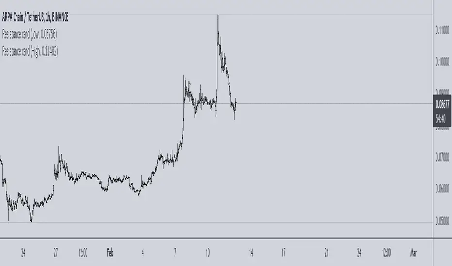
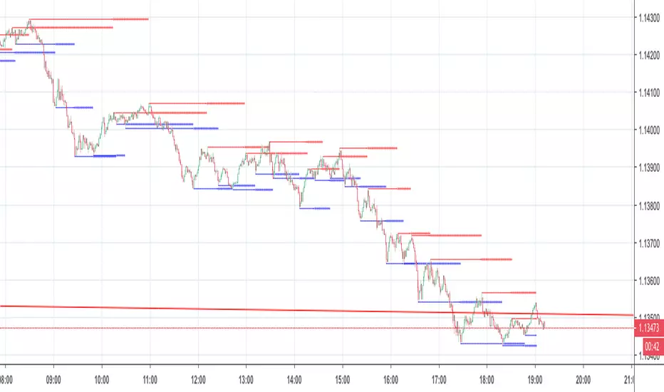
Resistance cardThis is very simple resistance card that you can make. It is recommended to be used on Daily time frame.
How to Use:
If you want to find Resistance levels (above current price), Get the pivot Low value and input in indicator settings. As you are using Low select "Low" in indicator settings, this will draw resistance lines.
If you want to find Support levels (Below current price), Get the pivot High value and input in indicator settings. As you are using Low select "High" in indicator settings, this will draw Support lines.
Magnum PivotsThis script will automatically plot levels for ES and the NQ, which this script is ONLY meant for. It will take the overnight highs and lows, from 6pm to 6am EST, and subtract/add 110 for NQ and 33 for ES, add a middle line that is the average of those two lines, and then deviations inbetween, built in support for up to 7, of deviation lines (13.75 point difference for each value on the NQ, and 4 for the ES). This lines become support/resistance depending on price action.

Margin buying pressure levelsPredicts local tops and resistance levels. Simply enter a strong support level (Settings > Liquidation Support Level), and this indicator shows you levels where margin buying pressure is likely to drop off. This is based off of the assumption that leveraged traders will likely want their liquidation point protected below a strong support level.
2x - blue
3x - green
4x - yellow
5x - orange
10x - red

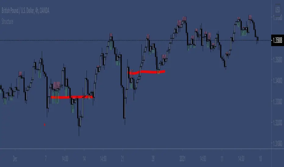
Wick Structure FinderFor those who trade structure based support and resistance methods from wicks.
Useful for break and retest trading methods. Mark out the zone and look for S/R flips.
Calculation uses 3 wicks that are next to each other to spot structure.
Includes optional filter for filtering wicks smaller than the average over X previous periods.
S&R study of different MAs and lengthsThis is a study on different moving averages across different lenghts to see which lengths or ma types have the most S&R action on them.
In the data window you can see the number of support and resistance instances for each length divided by the number of price crosses of the ma
Also you can see in time adjusted which % of the time that line acted as a S&R
Then it lets you select the best MA and length and see with the bar colors the areas where it behaved as S&R or when it didn't

sDEFI Synthetix ExchangeTradingView allows combining/summing up to a maximum of only 10 tickers in its search field. Their support staff suggested I could combine up to 40 by using Pine Script, so here it is, for a specific 'basket' of crypto tokens.
This study displays the combination of price history for Synthetix Exchange’s sDEFI index.
Tokens included in the index are COMP, MKR, KNC, SNX, ZRX, REP, LEND, REN, LRC, BNT, BAL and UMA. You will see the prices only go back as far as July 31st 2020, which is when the most recent of the compilation (UMA) started its trading history on TradingView. (The study can only display prices for days that *all* the tickers were trading.)
The price history will display as a study, below an existing chart. You will need to resize the windows, to see this study at a larger size. (Grab the window border and move it up, once you have added this study to a chart)
Unfortunately you will not be able to interact with it like a normal chart, i.e. drawing trendlines, adding moving averages, notes or annotations, etc.
May I suggest you send a support request to TradingView, asking for them to allow us to enter more than 10 (perhaps up to 40) tickers with + symbol between them, in the search field, which gives a ‘proper’ chart to analyse?
Please note that when publishing this script, I was required to choose a category from a list that does not contain a relevant category. Given that I had to choose something from the list to proceed, I used 'Support and Resistance', since chartists can see S and R levels by looking at this study.
I trust this study is useful for you sDEFI traders.

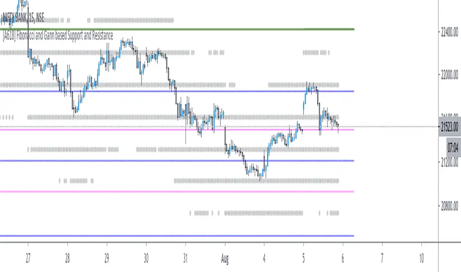
[A618] Fibonacci and Gann based Support and ResistanceThe scripts plots,
Gann and Fibonacci Levels onto the charts taking into account the price action of past 1 year,
The plots are plotted dynamically
Enjoy !
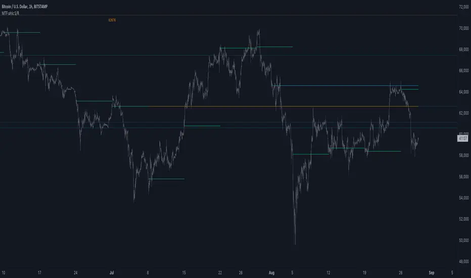
MTF ohlc S/RA very simple idea, a close (or high, low, ohlc4 or open) from a higher Time Frame
will give future Support/Resistance area's
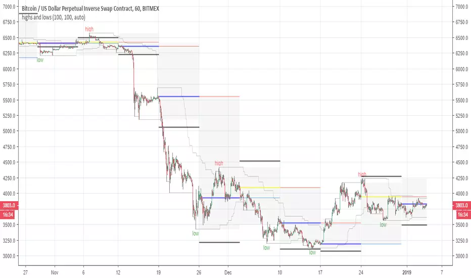
In this example of BTC/USD we see:
- Yearly close 2017 gave Resistance in June 2019
- Yearly close 2018 gave Support in March 2020
We are now pushing to the Resistance of Yearly close 2019...
Since there is a limit for the amount of lines (since it is just too much if everything is plotted)
there are different options:
- 4 different Time Frames, each can be enabled/disabled,
- TF can be chosen,
- source can be changed (close, open, high, low, ohlc4)
- Period can be changed, for example TF Month:
You can choose just to show a particular year, Month,...
You also can choose between which prices you want to see lines,
for example Monthly close, since the beginning till now, but only between $6000 - $8000:
This helps to know the closest S/R around the present price
Other example:
- Lines can be extended to the right, or not
- Labels can be enabled/disabled:
- Linewidth and brightness of the line can be changed, also the style (solid, dashed or dotted line)
Default only 2 very high TF's are enabled (3 Month = one quarter, and 1 Year)
The 3 Month has a dotted line, which helps distinguish the line against the yearly line
- Prices above 1000 are rounded since it seems distracting to see for example 6478,878654,
seems better just to see 6479, prices below 1000 are just seen as intended
Have fun!
S/R Barry, extended by PeterOSimple script showing S/R lines.
I have extended this script
What have I added precisely? I extended S/R lines. Now there are 2 most recent support lines and 2 most recent resistance lines visible on the chart at all times.
Original S/R Barry script showed only 1 support and 1 resistance lines at a time. So it was showing where the price reversed, but didn't provide value in "retest" situation. Extended version is aimed at working with these "retests".
Enjoy!
highs and lowsThis system allow you to detect the highs and the lows based on open and close and donchian channel
with this system you can easy find the resistance and the support level
good from 4 hour chart to 5 min chart
The black line are the 10% margin which you can use as you exit point or your stop once we find a low by the donochian cahannel
The system try to help you to find the target of your take profit once you decided to go either short or long
There is no alerts but they can be added if one wish to do it
one can add TP to it or change settings as he wish if want to play with code. I keep it as idea only
main scripts are made from scripts that are open in TV
15 min graph
4 hour graph
Wave Trend Arrows [Salty]This is just like WT_LB, but with arrows that increase in size to show cross over points. The larger down arrows indicate resistance for overbought levels, and the larger up arrows indicate support for oversold levels.

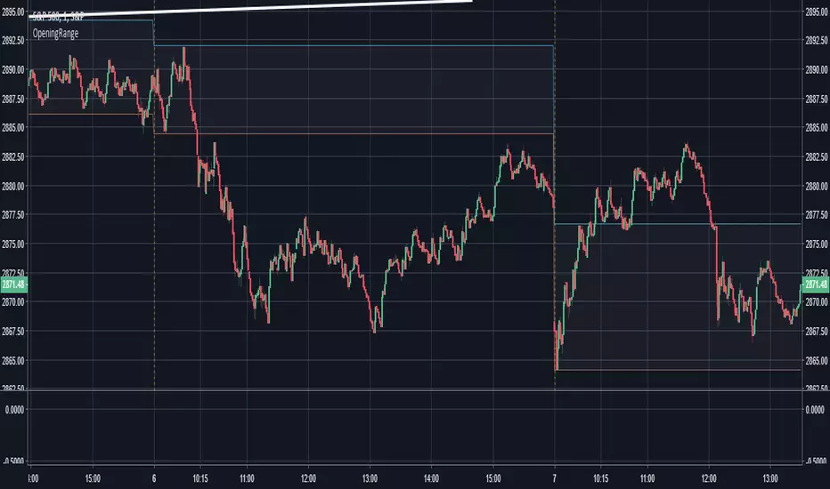
Opening Range - 30m range based on Chris Moody'sThis is a very simple 30-minute opening range script based on Chris Moody's.
It simply highlights the high and low of the opening 30-minutes of trading on a day chart.
This high/low often holds as the range for the day, or can signify an early breakout, often acting as support/resistance once the breakout occurs.
Pivot S/RThis support/resistance indicator draws a horizontal line at historical Daily swing points.
I've found this to be a very accurate indicator for determining current levels of support and resistance. Double lines and clusters of lines provide particularly strong levels.
Most of the settings are changeable.

open_is_low(VOL)Like market profile VPOC, the Virgin Open_is_Low (VOL) is a Point of Control below which price has not closed in past.
Once price closes below VOL the indicator would not paint further.
This indicator will act as Support and Resistance.

open_is_high(VOH)
Like market profile VPOC, the Virgin Open_is_High (VOH) is a Point of Control above which price has not closed in past.
Once price closes above VOH the indicator would not paint further.
This indicator will act as Support and Resistance.

open_is_high(VOH)
Like market profile VPOC, the Virgin Open_is_High (VPOC) is a Point of Control above which price has not closed in past.
Once price closes above VOH the indicator would not paint further.
This indicator will act as Support and Resistance.

Fibline GlanceThis is a set of three indicators combined into one script. The source of the three indicators comes from the tradingview user fibline (www.tradingview.com). The lines remind me of ichimoku, because at a glance, you can tell what the stock is up to. To me, the orange line does an excellent job of showing support and resistance. I'd be happy to add more to the script if anyone has any ideas.
See one of his charts:

Profit target areaUpdate.
- you can specify count of bars used to detect reversal pattern
- you can specify count of bars used to determine lowest or highest price to place support or resistance
- area between lines is filled by green - ascending, red - descending trend
To trade:
- open position using stop command on S/R
- close position using limit command on retracement line
- close position when background colour indicates trend change
(erratum: last balloon on right should say "buy limit")

Breaks and Retests - Free990Strategy Description: "Breaks and Retests - Free990"
The "Breaks and Retests - Free990" strategy is based on identifying breakout and retest opportunities for potential entries in both long and short trades. The idea is to detect price breakouts above resistance levels or below support levels, and subsequently identify retests that confirm the breakout levels. The strategy offers an automated approach to enter trades after a breakout followed by a retest, which serves as a confirmation of trend continuation.
Key Components:
Support and Resistance Detection:
The strategy calculates pivot levels based on historical price movements to define support and resistance areas. A lookback range is used to determine these key levels.
Breakouts and Retests:
The system identifies when a breakout occurs above a resistance level or below a support level.
It then waits for a retest of the previously broken level as confirmation, which is often a better entry opportunity.
Trade Direction Selection:
Users can choose between "Long Only," "Short Only," or "Both" directions for trading based on their market view.
Stop Loss and Trailing Stop:
An initial stop loss is placed at a defined percentage away from the entry.
The trailing stop loss is activated after the position gains a specified percentage in profit.
Long Entry:
A long entry is triggered if the price breaks above a resistance level and subsequently retests that level successfully.
The entry condition checks if the breakout was confirmed and if a retest was valid.
The long entry is only executed if the user-selected direction is either "Long Only" or "Both."
Short Entry:
A short entry is triggered if the price breaks below a support level and subsequently retests that level.
The short entry is only executed if the user-selected direction is either "Short Only" or "Both."
sell_condition checks whether the support has been broken and whether the retest condition is valid.
An initial stop loss is placed when the trade is opened to limit the risk if the trade moves against the position.
The stop loss is calculated based on a user-defined percentage (stop_loss_percent) of the entry price.
pinescript
Copy code
stop_loss_price := strategy.position_avg_price * (1 - stop_loss_percent / 100)
For long positions, the stop loss is placed below the entry price.
For short positions, the stop loss is placed above the entry price.
Trailing Stop:
When a position achieves a certain profit threshold (profit_threshold_percent), the trailing stop mechanism is activated.
For long positions, the trailing stop follows the highest price reached, ensuring that some profit is locked in if the price reverses.
For short positions, the trailing stop follows the lowest price reached.
Code Logic for Trailing Stop:
Exit Execution:
The strategy exits the position when the price hits the calculated stop loss level.
This includes both the initial stop loss and the trailing stop that adjusts as the trade progresses.
Code Logic for Exit:
Summary:
Breaks and Retests - Free990 uses support and resistance levels to identify breakouts, followed by retests for confirmation.
Entry Points: Triggered when a breakout is confirmed and a retest occurs, for both long and short trades.
Exit Points:
Initial Stop Loss: Limits risk for both long and short trades.
Trailing Stop Loss: Locks in profits as the price moves in favor of the position.
This strategy aims to capture the momentum after breakouts and minimize losses through effective use of stop loss and trailing stops. It gives the flexibility of selecting trade direction and ensures trades are taken with confirmation through the retest, which helps to reduce false breakouts.
Original Code by @HoanGhetti

Machine Learning-Inspired Supply & Demand Zones [AlgoPoint]This indicator is a Smart Supply & Demand Zone tool, developed with principles inspired by Machine Learning (ML). It intelligently filters out market noise, allowing you to focus only on the most significant zones where institutional order flow is likely present.
💡 How It Works: Why Is This Indicator "Smart"?
Unlike traditional indicators that only measure simple price movements, this script uses an algorithm that asks the same critical questions an experienced market analyst would to qualify a zone:
- 1. Price Imbalance: How fast and aggressively did the price leave the zone? Our algorithm measures the body size of the "departure candle" relative to the current market volatility (ATR). A zone is only considered if it was formed by an explosive move that is statistically significant, indicating a major imbalance between buyers and sellers.
- 2. Volume Confirmation: Did the "smart money" participate in this move? The script checks if the volume on the departure candle was significantly higher than the recent average volume. A spike in volume confirms that the move was backed by institutional interest, adding strength and validity to the zone.
- 3. Valid Pivot Structure: Did the zone originate from a meaningful swing high or low? The algorithm first identifies a valid pivot structure, ensuring that zones are not drawn from insignificant or random price fluctuations.
Only when a potential zone passes these three critical tests—our "quality filter"—is it drawn on your chart.
🚀 Features & How to Use
Using the indicator is straightforward. You will see two primary types of boxes on your chart:
* 🟥 Red Box (Supply Zone): An area of potential resistance where selling pressure is likely to be strong. Look for potential shorting opportunities as the price approaches this zone.
* 🟩 Green Box (Demand Zone): An area of potential support where buying pressure is likely to be strong. Look for potential long opportunities as the price pulls back into this zone.
Dynamic Zone Management
This indicator is not static; it lives and breathes with the market:
- Fresh Zone: A newly formed zone appears in its full, vibrant color. These are the highest-probability zones as they have not yet been re-tested.
- Broken / Flipped Zone: You have full control over what happens when a zone is broken! In the settings, you can choose:
- Delete Zone: The zone will be removed completely when the price closes through it.
- Show as Broken (Flip): When broken, the zone will turn gray, stop extending, and remain on your chart. This is extremely useful for identifying Support/Resistance Flips, where a broken demand zone becomes new resistance, or a broken supply zone becomes new support.
⚙️ Settings & Customization
Fine-tune the indicator to match your personal trading style via the settings menu:
- Breakout Behavior: The most powerful feature. Choose between Delete Zone and Show as Broken (Flip) to customize your chart.
- Zone Finding Logic: Control the indicator's sensitivity.
- Selective: Requires both strong imbalance and high volume. Finds fewer, but higher-quality, zones.
- Moderate: Requires either strong imbalance or high volume. Finds more potential zones.
- Sensitivity Settings: Adjust the ATR Multiplier and Volume Multiplier to make the criteria for a "strong" zone stricter or looser.
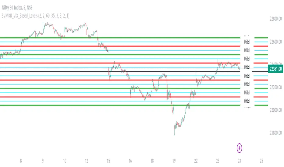
SVMKR_VIX_Based_LevelsThe "SVMKR_VIX_Based_Levels" script is a Pine Script indicator designed to assist intraday traders in identifying dynamic support and resistance levels based on the Volatility Index (VIX). Here's a breakdown of the script and its uses for intraday traders:
### Script Description:
1. **Data Retrieval**:
- The script fetches daily closing prices of the India VIX (volatility index) and a specified security using `request.security()`.
2. **Input Parameters**:
- Intraday traders can customize the indicator using input parameters such as the number of levels above and below the Pivot Day Close (PDC), line offset lengths, line extension options, and color and width settings for plotted lines.
3. **Plotting**:
- The script plots the PDC and VIX as hidden lines (`display=display.none`).
- Support and resistance levels are calculated based on the VIX and PDC, and plotted above and below the PDC with customizable colors and widths.
- Each level can be labeled with its corresponding price.
4. **Customization**:
- Intraday traders can choose to display or hide prices on the plotted lines.
- Colors and widths of plotted lines are customizable.
- Options to show minor and mild support levels provide additional flexibility.
5. **Labels**:
- Labels are added to indicate the PDC and the plotted levels, displaying corresponding prices if enabled.
### Uses for Intraday Traders:
1. **Dynamic Support and Resistance**: Intraday traders can benefit from dynamically adjusted support and resistance levels that respond to changes in market volatility, providing more accurate levels for trade planning.
2. **Market Sentiment Analysis**: By incorporating the VIX, a measure of market volatility and sentiment, the indicator provides insights into market sentiment, helping intraday traders gauge market mood and potential direction.
3. **Confirmation of Price Action**: The plotted support and resistance levels can serve as confirmation signals for intraday traders, helping validate trading decisions and enhance trading confidence.
4. **Adaptability to Changing Market Conditions**: Intraday traders often face rapidly changing market conditions. The indicator's ability to adapt to changes in volatility ensures that plotted levels remain relevant and responsive, aiding traders in adjusting their strategies accordingly.
5. **Trade Planning and Execution**: Intraday traders can use the plotted support and resistance levels to identify potential entry and exit points, set profit targets and stop-loss levels, and plan their trades more effectively.
Overall, the "SVMKR_VIX_Based_Levels" indicator provides intraday traders with a valuable tool for dynamic support and resistance identification, market sentiment analysis, confirmation of price action, and trade planning and execution, ultimately assisting them in making more informed and profitable trading decisions in the intraday timeframe.
Katana Gaps Bounty Hunter Pro (Show Gaps of All Types) by RRBKatana Gaps Bounty Hunter Pro (KGB Hunter Pro, Gap Exterminator) by RagingRocketBull 2018
Version 1.0
This indicator shows/counts/filters gaps on a chart.
There are several versions: Simple, Pro, Advanced and Zones. This is the Pro version. The Differences are listed below.
- Simple: shows/counts gaps, changes color based on gap dir (2 colors), filters out price gaps within session, large gaps, and high volume gaps
- Pro: +shows all types of gaps, multi color, pro filters (full/partial/overlapping time, price, large, candle, volume, doji, weekend gaps within delta ranges)
- Advanced: +session times mask, show/count gaps only for last N bars, +min/max/filled gaps stats, dark mode
- Zones: +shows gaps as dynamic horiz zones
KGB Hunter Pro Gap Exterminator focuses on showing you all possible types of gaps in multiple colors. Gap theory states that price tends to return and fill the gaps,
so you can use it to collect the bounty. You can apply any combination of complex filters to narrow down search results i.e., find only all:
- type 3 gaps up with allowed wick-candle overlapping of up to 10% and
- gap size larger than 200 and
- with at least one of the candles larger than 100 and
- volume change at least 40 and
- spanning less than 2 bar periods and
- excluding weekend gaps
Features:
- highlights gaps using barcolor and plotchar chars (8 colors x 2 dirs)
- supports all 3 types of gap overlapping: full gap (no overlapping), wick-wick and wick-body overlapping up to a specified % of candle body
- finds all types of gaps with pro filters for price, time, large, volume, timerange, candle size, doji gaps
- individual show/hide flags for each gap/char based on gap type
- can show/hide gaps/chars based on gap dir
- changes color of gaps/chars based on gap dir/type, multi color gap type combos
- displays chars above/below bar based on gap dir
- can show/hide weekend gaps
- counts all filtered gaps
Colors:
Basically There are 2 gap types (Price, Time) x 2 directions (Up, Down) x 2 modifiers (Large, Volume), Volume Gap is a separate class with its own modifiers, so more accurately:
- (Price, Time) x 2 directions (Up, Down) x Large modifier
- (Price Volume, Time Volume) x 2 directions (Up, Down) x Large modifier
using a total of 16+1 colors or 8+1 base colors + transparency modifier
depending on settings you can highlight gaps using any multi color combo from just 1 to all 16 colors (+1 gray color for weekends).
basic gap = 1 base color with normal transparency
price,time = 2 base colors (including basic gap) with normal transparency (+1 color)
* up,down dir = +2 new base colors with normal transparency (including 2 base colors), with a total of 2*2 = 4 price/time base colors (+2 colors)
* large = same 4 base colors with vivid transparency modifier (+4 colors)
* volume = +2 new base colors with normal transparency, a separate class (+2 colors)
* volume * up,down dir = +another 2 new base colors with normal transparency (including 2 volume base colors), with a total of 2*2 = 4 volume base colors (+2 colors)
* volume * large = 4 volume base colors with vivid transparency modifier (+4 colors)
weekend_gap = gray (+1 color)
doji gap, candle gap, timerange gap = no special color, inherits color from parent gap type
for more details, please see the Gap Color Hierarchy comments in code
_________________________________________________________________________
You can find the following gap related terminology in literature: full, partial, extreme, breakaway, runaway/continuation, common, exhaustion gaps.
There are no exact rules to distinguish between them, so this can't be implemented.
When defining a gap it all boils down to how do you plot a gap, which points between adjacent candles do you consider a gap. Different sources apply different methodology
but in practice only 3 types of gap overlapping can exist:
- full gap (no overlapping),
- partial (wick-wick overlapping) and
- extreme partial (wick-body overlapping up to a specified % of a candle body)
All these types are supported in this script. The only possible remaining option is candle-candle overlapping which is not a gap by definition.
Many other script specific subtypes are also supported. Please see description of each gap type below and comments in code.
General display modes
- gap has 3 possible overlapping modes: full gap (no overlapping), wick-wick overlapping, wick-candle overlapping up to a specified % of candle body size (for mode 3 only)
the remaining candle-candle overlapping implies not a gap by definition
full gap mode will find the least amount of gaps, wick-candle - the most
- gap can be either price or time, up or down, and shown above or below the candles (gap chars)
- by definition, a price gap is a smaller subset of a time gap, a gap within current session with a price gap and zero time lag between bars.
Therefore timerange filter is useless for price gaps, but can still be applied.
On the other hand, all price gap filters can be applied to time gaps without any distinction.
- gap can have multiple modifier subtypes: (price|time) * (up|down) * (large? + volume? + doji? + timerange? + weekend?)
i.e. price + large + volume + doji or time + large + volume + timerange + doji + weekend
- the gap is always counted only once no matter how many subtype modifiers it has
- if the gap does not satisfy any of the applied flags/filters it is not shown/counted (no gap bars/chars are shown)
- gap color can depend on a combo of gap type/dir and modifier subtypes or can be shown in a single base color
- char color can only depend on gap dir (not type/modifiers) or can be shown in a single base color
- char position can also depend on gap dir (above/below) the gap candle. Alternatively you can pin chars to the top/bottom of the screen in UI Styles.
- change_by_type = true - uses gap type base colors (2 colors + optional modifiers, up to 8 colors if volume and/or large filters are enabled)
- change_by_dir = true - uses gap dir base colors (2 colors + optional modifiers, up to 8 colors if volume and/or large filters are enabled)
- both change_by_type and change_by_dir = true - uses both gap type and dir base colors (4 colors + optional modifiers, up to 16 colors if volume and/or large filters are enabled)
- both change_by_type and change_by_dir = false - uses a single base gap color (1 color)
- don't need that much colors - disable filters
- highlight bars has priority over individual gap flags, when it is false all gaps are hidden regardless of their corresponding flag settings (does not affect dim weekend gaps)
- show chars has priority over individual gap char flags, when it is false all char flags are hidden regardless of their corresponding flag settings
- price gaps are only shown/counted when show_price_gaps flag is true. The large or volume filters can be used to narrow down results further.
- time gaps are only shown/counted when show_time_gaps flag is true. The large, volume, and timerange filters can be used to narrow down results further.
- doji gaps are only shown/counted when show_doji_gaps flag is true. The doji candle size and other filters can be used to narrow down results further.
- show weekend gaps = true and dim weekend gaps = false - shows/counts weekend gaps
- show weekend gaps = true and dim weekend gaps = true - dims weekend gaps, doesn't show/count weekwend gaps
- show/dim weekend gaps do just that - show the gap if it happens on a weekend, not all weekends
- large gaps are only shown/counted when the large filter is enabled != 0. positive values 5 (>= 5), negative -5 (<=5) are used to switch between <>
- volume gaps are only shown/counted when the volume filter is enabled != 0. positive values 5 (>= 5), negative -5 (<=5) are used to switch between <>
- timerange gaps are only shown/counted when the timerange filter is enabled != 0. positive values 5 (>= 5), negative -5 (<=5) are used to switch between <>
- candle size gaps are only shown/counted when the candle size filter is enabled != 0. positive values 5 (>= 5), negative -5 (<=5) are used to switch between <>
- candle size filter is the only filter with 2 arguments, use_and_for_delta to enable AND condition for the args (OR is the default)
Good Luck! Feel free to explore and learn from the code
