JQ Ichimoku Cloud - Options Trading - Day Trade - SPX Scaling TJQ Ichimoku Cloud - Options Trading - Day Trade - SPX Scalping ToolPine Script® göstergesiintegratednetworks tarafından12
VX Levels and Ranch Ranges with SPY/SPX price converterThis is a indicator for all Vexly subscribers to plot the following: 1. Plot SPY/SPX levels on your ES chart. Or QQQ levels on your NQ chart 2. VX levels obtained from vx_levels command. SPY on ES chart and QQQ on NQ chart 3. Ranch Range levels from the discord channel for ES and NQ chart. You can enable/disable any of them at your discretion. Pine Script® göstergesisreenicam tarafındanGüncellendi 16
SPY Overlay on ES/SPXEnhanced version of @ptgambler's for drawing SPY levels over ES/SPX. lines/labels are configurable. The levels updates only when ES/SPX price moves by two dollars. That reduces jitter, and makes the code efficient.Pine Script® göstergesiobextrade tarafındanGüncellendi 6660
SPY/QQQ Customizable Price ConverterThis is a minimalist utility tool designed for Index traders (SPX, NDX, RUT). It allows you to monitor the price of a reference asset (like SPY, QQQ) directly on your main chart without cluttering your screen. Key Features: 1.🖱️ Crosshair Sync for Historical Data (Highlight): Unlike simple info tables that only show the latest price, this script allows for historical inspection. · How it works: Simply move your mouse crosshair over ANY historical candle on your chart. · The script will instantly display the closing price of the reference asset (e.g., SPY) for that specific time in the Status Line (top-left) or the Data Window. Perfect for backtesting and reviewing price action. 2.🔄 Fully Customizable Ticker: Default is set to SPY, but you can change it to anything in the settings. e.g. · Trading NDX Change it to QQQ. · Trading RUT Change it to IWM. 3.📊 Clean Real-Time Dashboard: · A floating table displays the current real-time price of your reference asset. · Color-coded text (Green/Red) indicates price movement. · Fully customizable size, position, and colors to fit your layout.Pine Script® göstergesiSewell_ tarafından8
SP500 Session Gap Fade StrategySummary in one paragraph SPX Session Gap Fade is an intraday gap fade strategy for index futures, designed around regular cash sessions on five minute charts. It helps you participate only when there is a full overnight or pre session gap and a valid intraday session window, instead of trading every open. The original part is the gap distance engine which anchors both stop and optional target to the previous session reference close at a configurable flat time, so every trade’s risk scales with the actual gap size rather than a fixed tick stop. Scope and intent • Markets. Primarily index futures such as ES, NQ, YM, and liquid index CFDs that exhibit overnight gaps and regular cash hours. • Timeframes. Intraday timeframes from one minute to fifteen minutes. Default usage is five minute bars. • Default demo used in the publication. Symbol CME:ES1! on a five minute chart. • Purpose. Provide a simple, transparent way to trade opening gaps with a session anchored risk model and forced flat exit so you are not holding into the last part of the session. • Limits. This is a strategy. Orders are simulated on standard candles only. Originality and usefulness • Unique concept or fusion. The core novelty is the combination of a strict “full gap” entry condition with a session anchored reference close and a gap distance based TP and SL engine. The stop and optional target are symmetric multiples of the actual gap distance from the previous session’s flat close, rather than fixed ticks. • Failure mode it addresses. Fixed sized stops do not scale when gaps are unusually small or unusually large, which can either under risk or over risk the account. The session flat logic also reduces the chance of holding residual positions into late session liquidity and news. • Testability. All key pieces are explicit in the Inputs: session window, minutes before session end, whether to use gap exits, whether TP or SL are active, and whether to allow candle based closes and forced flat. You can toggle each component and see how it changes entries and exits. • Portable yardstick. The main unit is the absolute price gap between the entry bar open and the previous session reference close. tp_mult and sl_mult are multiples of that gap, which makes the risk model portable across contracts and volatility regimes. Method overview in plain language The strategy first defines a trading session using exchange time, for example 08:30 to 15:30 for ES day hours. It also defines a “flat” time a fixed number of minutes before session end. At the flat bar, any open position is closed and the bar’s close price is stored as the reference close for the next session. Inside the session, the strategy looks for a full gap bar relative to the prior bar: a gap down where today’s high is below yesterday’s low, or a gap up where today’s low is above yesterday’s high. A full gap down generates a long entry; a full gap up generates a short entry. If the gap risk engine is enabled and a valid reference close exists, the strategy measures the distance between the entry bar open and that reference close. It then sets a stop and optional target as configurable multiples of that gap distance and manages them with strategy.exit. Additional exits can be triggered by a candle color flip or by the forced flat time. Base measures • Range basis. The main unit is the absolute difference between the current entry bar open and the stored reference close from the previous session flat bar. That value is used as a “gap unit” and scaled by tp_mult and sl_mult to build the target and stop. Components • Component one: Gap Direction. Detects full gap up or full gap down by comparing the current high and low to the previous bar’s high and low. Gap down signals a long fade, gap up signals a short fade. There is no smoothing; it is a strict structural condition. • Component two: Session Window. Only allows entries when the current time is within the configured session window. It also defines a flat time before the session end where positions are forced flat and the reference close is updated. • Component three: Gap Distance Risk Engine. Computes the absolute distance between the entry open and the stored reference close. The stop and optional target are placed as entry ± gap_distance × multiplier so that risk scales with gap size. • Optional component: Candle Exit. If enabled, a bullish bar closes short positions and a bearish bar closes long positions, which can shorten holding time when price reverses quickly inside the session. • Session windows. Session logic uses the exchange time of the chart symbol. When changing symbols or venues, verify that the session time string still matches the new instrument’s cash hours. Fusion rule All gates are hard conditions rather than weighted scores. A trade can only open if the session window is active and the full gap condition is true. The gap distance engine only activates if a valid reference close exists and use_gap_risk is on. TP and SL are controlled by separate booleans so you can use SL only, TP only, or both. Long and short are symmetric by construction: long trades fade full gap downs, short trades fade full gap ups with mirrored TP and SL logic. Signal rule • Long entry. Inside the active session, when the current bar shows a full gap down relative to the previous bar (current high below prior low), the strategy opens a long position. If the gap risk engine is active, it places a gap based stop below the entry and an optional target above it. • Short entry. Inside the active session, when the current bar shows a full gap up relative to the previous bar (current low above prior high), the strategy opens a short position. If the gap risk engine is active, it places a gap based stop above the entry and an optional target below it. • Forced flat. At the configured flat time before session end, any open position is closed and the close price of that bar becomes the new reference close for the following session. • Candle based exit. If enabled, a bearish bar closes longs, and a bullish bar closes shorts, regardless of where TP or SL sit, as long as a position is open. What you will see on the chart • Markers on entry bars. Standard strategy entry markers labeled “long” and “short” on the gap bars where trades open. • Exit markers. Standard exit markers on bars where either the gap stop or target are hit, or where a candle exit or forced flat close occurs. Exit IDs “long_gap” and “short_gap” label gap based exits. • Reference levels. Horizontal lines for the current long TP, long SL, short TP, and short SL while a position is open and the gap engine is enabled. They update when a new trade opens and disappear when flat. • Session background. This version does not add background shading for the session; session logic runs internally based on time. • No on chart table. All decisions are visible through orders and exit levels. Use the Strategy Tester for performance metrics. Inputs with guidance Session Settings • Trading session (sess). Session window in exchange time. Typical value uses the regular cash session for each contract, for example “0830-1530” for ES. Adjust if your broker or symbol uses different hours. • Minutes before session end to force exit (flat_before_min). Minutes before the session end where positions are forced flat and the reference close is stored. Typical range is 15 to 120. Raising it closes trades earlier in the day; lowering it allows trades later in the session. Gap Risk • Enable gap based TP/SL (use_gap_risk). Master switch for the gap distance exit engine. Turning it off keeps entries and forced flat logic but removes automatic TP and SL placement. • Use TP limit from gap (use_gap_tp). Enables gap based profit targets. Typical values are true for structured exits or false if you want to manage exits manually and only keep a stop. • Use SL stop from gap (use_gap_sl). Enables gap based stop losses. This should normally remain true so that each trade has a defined initial risk in ticks. • TP multiplier of gap distance (tp_mult). Multiplier applied to the gap distance for the target. Typical range is 0.5 to 2.0. Raising it places the target further away and reduces hit frequency. • SL multiplier of gap distance (sl_mult). Multiplier applied to the gap distance for the stop. Typical range is 0.5 to 2.0. Raising it widens the stop and increases risk per trade; lowering it tightens the stop and may increase the number of small losses. Exit Controls • Exit with candle logic (use_candle_exit). If true, closes shorts on bullish candles and longs on bearish candles. Useful when you want to react to intraday reversal bars even if TP or SL have not been reached. • Force flat before session end (use_forced_flat). If true, guarantees you are flat by the configured flat time and updates the reference close. Turn this off only if you understand the impact on overnight risk. Filters There is no separate trend or volatility filter in this version. All trades depend on the presence of a full gap bar inside the session. If you need extra filtering such as ATR, volume, or higher timeframe bias, they should be added explicitly and documented in your own fork. Usage recipes Intraday conservative gap fade • Timeframe. Five minute chart on ES regular session. • Gap risk. use_gap_risk = true, use_gap_tp = true, use_gap_sl = true. • Multipliers. tp_mult around 0.7 to 1.0 and sl_mult around 1.0. • Exits. use_candle_exit = false, use_forced_flat = true. Focus on the structured TP and SL around the gap. Intraday aggressive gap fade • Timeframe. Five minute chart. • Gap risk. use_gap_risk = true, use_gap_tp = false, use_gap_sl = true. • Multipliers. sl_mult around 0.7 to 1.0. • Exits. use_candle_exit = true, use_forced_flat = true. Entries fade full gaps, stops are tight, and candle color flips flatten trades early. Higher timeframe gap tests • Timeframe. Fifteen minute or sixty minute charts on instruments with regular gaps. • Gap risk. Keep use_gap_risk = true. Consider slightly higher sl_mult if gaps are structurally wider on the higher timeframe. • Note. Expect fewer trades and be careful with sample size; multi year data is recommended. Properties visible in this publication • On average our risk for each position over the last 200 trades is 0.4% with a max intraday loss of 1.5% of the total equity in this case of 100k $ with 1 contract ES. For other assets, recalculations and customizations has to be applied. • Initial capital. 100 000. • Base currency. USD. • Default order size method. Fixed with size 1 contract. • Pyramiding. 0. • Commission. Flat 2 USD per order in the Strategy Tester Properties. (2$ buying + 2$selling) • Slippage. One tick in the Strategy Tester Properties. • Process orders on close. ON. Realism and responsible publication • No performance claims are made. Past results do not guarantee future outcomes. • Costs use a realistic flat commission and one tick of slippage per trade for ES class futures. • Default sizing with one contract on a 100 000 reference account targets modest per trade risk. In practice, extreme slippage or gap through events can exceed this, so treat the one and a half percent risk target as a design goal, not a guarantee. • All orders are simulated on standard candles. Shapes can move while a bar is forming and settle on bar close. Honest limitations and failure modes • Economic releases, thin liquidity, and limit conditions can break the assumptions behind the simple gap model and lead to slippage or skipped fills. • Symbols with very frequent or very large gaps may require adjusted multipliers or alternative risk handling, especially in high volatility regimes. • Very quiet periods without clean gaps will produce few or no trades. This is expected behavior, not a bug. • Session windows follow the exchange time of the chart. Always confirm that the configured session matches the symbol. • When both the stop and target lie inside the same bar’s range, the TradingView engine decides which is hit first based on its internal intrabar assumptions. Without bar magnifier, tie handling is approximate. Legal Education and research only. This strategy is not investment advice. You remain responsible for all trading decisions. Always test on historical data and in simulation with realistic costs before considering any live use. Pine Script® stratejisiexlux tarafından2272
Put Option Profits inspired by Travis Wilkerson; SPX BacktesterPut Option Profits — Travis Wilkerson inspired. This tester evaluates a simple monthly SPX at-the-money credit-spread timing idea: enter on a fixed calendar rule (e.g., 1st Friday or 8th day with business-day shifting) at Open or Close, then exit exactly N calendar days later (first tradable day >= target, at Close). A trade is marked WIN if price at exit is above the entry price (1:1 risk proxy). The book suggests forward testing 60-day and 180-day expirations to prove the concept. This tool lets you backtest both (and more) to see what actually works best. In the book, profits are taken when the spread reaches ~80% of max credit; losers are left to expire and cash-settle. This backtester does not model early profit-taking—every trade is held to the configured hold period and evaluated on price vs entry at the exit close. Think of it as a pure “set it and forget it” stress test. In live trading, you can still follow Travis’s 80% take-profit rule; TradingView just doesn’t simulate that here. Happy trading! Features: Schedule: Day-of-Month (with Prev/Next business-day shift, optional “stay in month”) or Nth Weekday (e.g., 1st Friday). Entry timing: Open or Close. Exit: N calendar days later at Close (holiday/weekend aware). Filters: Optional EMA-200 “risk-on” filter. Scope: Date range limiter. Visuals: Entry/exit bubbles (paired colors) or simple win/loss dots. Table: Overall Win% and N (within range). Alerts: Entry alert (static condition + dynamic alert() message). How to use: [* ]Choose Start Mode (NthWeekday or DayOfMonth) and parameters (e.g., 1st Friday or DOM=8, PrevBizDay). Pick Entry Timing (Open or Close). Set Days In Trade (e.g., 150). (Optional) Enable EMA filter and set Date Range. Turn Bubbles on/off and/or Dots on/off. Create alert: Simple ping: Condition = this indicator -> Monthly Entry Signal -> “Once per bar” (Open) or “Once per bar close” (Close). Rich message: Condition = this indicator -> Any alert() function call. Notes: Keep DOM shift in same month: when a DOM falls on a weekend/holiday, PrevBizDay/NextBizDay shift will stay inside the month if enabled; otherwise it can spill into the prior/next month. (Ignored for NthWeekday.) Credits: Concept sparked by “Put Option Profits – How to turn ten minutes of free time into consistent cash flow each month” by Travis Wilkerson; this script is a neutral research tool (not financial advice).Pine Script® göstergesiMoMoPower tarafından1146
SHYY TFC SPX Sectors list This script provides a clean, configurable table displaying real-time data for the major SPX sectors, key indices, and market sentiment indicators such as VIX and the 10-year yield (US10Y). It includes 16 columns with two rows: * The top row shows the sector/asset symbol. * The bottom row shows the most recent daily close price. Each price cell is dynamically color-coded based on: * Direction (green/red) during regular trading hours * Separate colors during extended hours (pre-market or post-market) * VIX values greater than 30 trigger a distinct background highlight Users can fully control the position of the table on the chart via input settings. This flexibility allows traders to place the table in any screen corner or center without overlapping key price action. The script is designed for: * Monitoring broad market health at a glance * Understanding sector performance in real-time * Spotting risk-on/risk-off behavior (via SPY, QQQ, VIX, US10Y) Unlike traditional watchlists, this table visually encodes directional movement and trading session context (regular vs. extended hours), making it highly actionable for intraday, swing, or macro-level analysis. All data is pulled using `request.security()` on daily candles and uses pure Pine logic without external dependencies. To use: 1. Add the indicator to your chart. 2. Adjust the table position via the input dropdown. 3. Read sector strength or weakness directly from the table. Pine Script® göstergesishayy110 tarafından10
Relative Strength vs SPX This indicator calculates the ratio of the current chart's price to the S&P 500 Index (SPX), providing a measure of the stock's relative strength compared to the broader market. Key Features: Dynamic High/Low Detection: Highlights periods when the ratio makes a new high (green) or a new low (red) based on a user-defined lookback period. Customizable Lookback: The lookback period for detecting highs and lows can be adjusted in the settings for tailored analysis. Visual Overlay: The ratio is plotted in a separate pane, allowing easy comparison of relative strength trends. This tool is useful for identifying stocks outperforming or underperforming the S&P 500 over specific timeframes.Pine Script® göstergesijoshbijari tarafından94
Normalized SP100/SP400 Ratio with Shiller PE Ratio (CAPE Ratio)This indicator is designed to observe market concentration and overall valuation by combining the Shiller CAPE Ratio with the SP100/SP400 ratio. Blue Line: Represents the Shiller CAPE Ratio, which reflects the overall market valuation. Yellow Line: Represents the SP100/SP400 ratio, which indicates market concentration. The combination of these two metrics provides insight into market dynamics. Historically, on the SPX monthly chart, when the yellow line (SP100/SP400 ratio) crosses below the blue line (CAPE Ratio), it has been followed by a period of stock market gains. Justification for Combination: The Shiller CAPE Ratio is a widely recognized indicator of market valuation, providing a long-term perspective on whether the market is overvalued or undervalued. The SP100/SP400 ratio, on the other hand, measures the concentration of the market by comparing the largest 100 companies to the next 400 mid-sized companies. By normalizing both metrics and analyzing their relationship, this script provides a unique perspective on market movements. The crossunder of the SP100/SP400 ratio below the CAPE Ratio may signal a shift in market sentiment or concentration, often leading to potential market rallies. This combination is not just a simple merger of indicators but rather a thoughtful integration that adds value by highlighting periods where market concentration and valuation dynamics align. Pine Script® göstergesiWhaleTJ tarafından22
KST-Based MACDAs a follow-up to my previous script: I am posting a stand-alone KST-based MACD. Note that this indicator is highly laggy. Specific care must be taken when using it. The MACD-Signal crossing is quite delayed but it is a definite confirmation. For earlier signs, the Histogram must be analyzed. A shift from Green-White signals the 1st Bear Signal. A MACD-Signal crossing signals the 2nd Bear SIgnal. The same applies for bull-signs. This indicator is useful for long-term charts on which one might want to pinpoint clear, longterm divergences. Standard RSI, Stochastic RSI and MACD are notoriously problematic when trying to pinpoint long-term divergences. Finally, this indicator is not meant for pinpointing entry-exit positions. I find it useful for macro analysis. In my experience, the decreased sensitivity of this indicator can show very strong signs, that can be quite laggy. Inside the indicator there is a setting for "exotic calculations". This is an attempt to make this chart work in both linear/ negative charts (T10Y2Y) and log charts (SPX) Tread lightly, for this is hallowed ground. -Father GrigoriPine Script® göstergesiakikostas tarafındanGüncellendi 1010504
Rsi strategy for BTC with (Rsi SPX) I hope this strategy is just an idea and a starting point, I use the correlation of the Sp500 with the Btc, this does not mean that this correlation will exist forever!. I love Trading view and I'm learning to program, I find correlations very interesting and here is a simple strategy. This is a trading strategy script written in Pine Script language for use in TradingView. Here is a brief overview of the strategy: The script uses the RSI (Relative Strength Index) technical indicator with a period of 14 on two securities: the S&P 500 (SPX) and the symbol corresponding to the current chart (presumably Bitcoin, based on the variable name "Btc_1h_fixed"). The RSI is plotted on the chart for both securities. The script then sets up two trading conditions using the RSI values: A long entry condition: when the RSI for the current symbol crosses above the RSI for the S&P 500, a long trade is opened using the "strategy.entry" function. A short entry condition: when the RSI for the current symbol crosses below the RSI for the S&P 500, a short trade is opened using the "strategy.entry" function. The script also includes a take profit input parameter that allows the user to set a percentage profit target for closing the trade. The take profit is set using the "strategy.exit" function. Overall, the strategy aims to take advantage of divergences in RSI values between the current symbol and the S&P 500 by opening long or short trades accordingly. The take profit parameter allows the user to set a specific profit target for each trade. However, the script does not include any stop loss or risk management features, which should be considered when implementing the strategy in a real trading scenario.Pine Script® stratejisiAmosTradingSystem tarafındanGüncellendi 11121
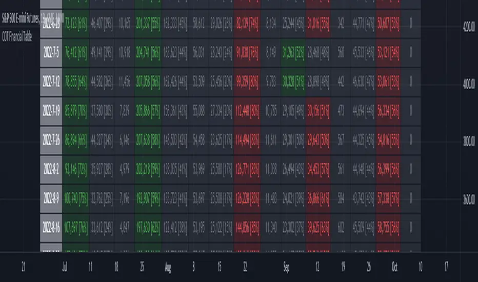
ILM COT Financial Table - CFTCUse this indicator on Daily Timeframe Please refer to the below link for CFTC Financials www.cftc.gov This script shows the Financial COT for the respective instrument by deriving the CFTC code. Option is provided to override the CFTC code User can also configure the historical CFTC data view The script calculates the Long% vs Short% for various categories (Dealers/Asset Managers/Leveraged Funds/Other Reportables) and color codes the column appropriately. The goal of this script is to show all the financial CFTC data on a single page to digest the data better in a tabular form Fixed the default TradingView Library which has some errors with CFTC code mapping. For example, SPX CFTC Code #13874+ which is the most important one where big players take positions is not there in the default Library.Pine Script® göstergesiILuvMarkets tarafındanGüncellendi 44115
VWAP Push StrategyThis strategy is unfortunately not finished yet. A pretty simple strategy. If price broke through VWAP and had three consecutive candles following the breakthroughs trend, the high of the third candle will be drawn. If this happened after a crossover of the vwap and price breaks through the high of the third candle, strategy will go long. Short will be the same after crossing under the vwap. A long or short will be closed after crossing the vwap in the opposite direction, so the vwap is kind of a trailing stop. Unfortunately, I could not manage to stop the script from entering multiple times into one drawn high or low. Of course, if a high was crossed the script should wait for a new formed high before entering a new long. If someone would find a solution to this, it would be great, because I think it is a nice strategy . Should work great scalping 5min charts (when scripting, I used the SPX for reference). Pine Script® stratejisichristopher451 tarafındanGüncellendi 112
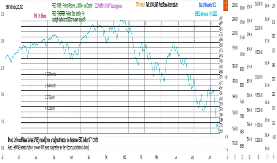
PuetzUWS [time, price] multiFractal mirrors, SPX 1872-2020This script is simply provided because a few rare people may actually be able to use one or two coding ideas. It is not possible to provide useful (description, explanation)s here. Maybe you can find those with a webSearch. If anybody is interested in the basic concept, just copy the code and run with it. As the original was in violation of PineScript rules, I've removed many links, including : - documentation of my code - external sources of code - blog solutions to Pine script programming - math, science references, people Hopefully it will won't be rejected this time, if so, too bad. I only made it through 10% of the conceptual objectives, and I do not believe any of the rest of the concepts are do-able in Pine Script. The current coding is (incomplete, unstable) but does give a faint idea of my "first step" intents. I have stopped all work, as I have to get back to my real projects (nothing to do with markets).Pine Script® göstergesiBill_Howell tarafından43
Volatility Calculator for Daily Top and Bottom RangeWith the usage of ATR, applied on the close of the daily candle, I am calculated the volatility channels for the TOP and BOTTOM Based on this logic, we can estimate, with a huge confidence factor, where the prices are going to be compressed for the trading day. Having said that, lets take a look at the data gathered among the most important financial markets: SPX TOP CROSSES : 2116 BOT CROSSES : 1954 Total Daily Candles : 18908 Occurance ratio = 0.215 NDX TOP CROSSES : 1212 BOT CROSSES : 1183 Total Daily Candles : 9386 Occurance ratio = 0.255 DIA TOP CROSSES : 759 BOT CROSSES : 769 Total Daily Candles : 6109 Occurance ratio = 0.25 DXY TOP CROSSES : 1597 BOT CROSSES : 1598 Total Daily Candles : 13156 Occurance ratio = 0.243 DAX TOP CROSSES : 1878 BOT CROSSES : 1848 Total Daily Candles : 13155 Occurance ratio = 0.283 BTC USD TOP CROSSES : 416 BOT CROSSES : 417 Total Daily Candles : 4290 Occurance ratio = 0.194 ETH USD TOP CROSSES : 247 BOT CROSSES : 268 Total Daily Candles : 2452 Occurance ratio = 0.21 EUR USD TOP CROSSES : 820 BOT CROSSES : 805 Total Daily Candles : 7489 Occurance ratio = 0.217 GOLD TOP CROSSES : 1722 BOT CROSSES : 1569 Total Daily Candles : 13747 Occurance ratio = 0.239 USOIL TOP CROSSES : 1077 BOT CROSSES : 1089 Total Daily Candles : 10231 Occurance ratio = 0.212 US 10Y TOP CROSSES : 1302 BOT CROSSES : 1365 Total Daily Candles : 9075 Occurance ratio = 0.294 Based on this, we can assume with a very high confidence ( 70-80%) that the market is going to stay, within the range created from the BOT and TOP ATR points. Pine Script® göstergesiexlux tarafından4476
PClose Levels 2.0This script plots the levels generated via a combination of SPX 2Y Quartiles for everyday, red days, and green days. It is intended for use solely with SPX. These quartiles are also sorted by VIX averages into bands that expand and contract with VIX. It gives us an idea of what levels to potentially expect resistance/support fairly well, but is designed to be used in conjunction with other indicators and macroeconomic information. Green Dashed is your Expected Max Range (EMR+) based on Green Day averages. Green Dotted is your Expected Range (ER+) based on full dataset averages. Green solid lines are POS2 and POS1, based on Green Day averages. White Dotted is your Expected Move (EM), based on full dataset averages. Red solid lines are NEG1 and NEG2, based on Red Day averages. Red Dotted is your Expected Range (ER-) based on full dataset averages. Red Dashed is your Expected Max Range (EMR-) based on Red Day averages.Pine Script® göstergesiTheWaysian tarafındanGüncellendi 3334
VIX SPX & XJOVix is a volatility indicator that lets traders know when to be cautious. This indicator shows the volatility for the US market as well as the Australian market on seperate lines. Blue lines are Vix for SPX (S&P 500) If blue indicator goes above 30, high volatility is present and caution should be taken. Green lines are Vix for XJO (ASX 200) If green indicator goes above 20, high volatility is present and caution should be taken.Pine Script® göstergesimikey0888 tarafından2217
S&P Sector Advance/Decline Weighted -Tom1traderEnjoy, enhance your trading (I hope), copy or adapt to your needs and keep smiling! Thanks to @MartinShkreli. The sector variables and the "repaint" option (approx lines 20 through 32 of this script) are used directly from your script "Sectors" RECOMMENDATION: Update the sector weightings -inputs are provided. They change as often as monthly and the annual changes are certainly significant. When updating weighting percentages use the decimal value. I.E. 29% is .29 Good on any time frame. Especially SPY, SPX and ES scalpers and 0DTE options traders may like this a lot. This gives good signals on S & P and related (ES, SPY) and indicates / plots differently than the AD line or ratio. Each sector's entire % weight is added or subtracted depending of whether that sector advanced or declined. Example: Information Tech weight at 29% so that % of 500 (145) is added if InfoTech is up a penny and subtracted if it is down a penny. All sectors processed the same way so that for a given bar/candle the value will be between +500 (all sectors up) and -500 (all sectors down). This weighted AD line of sectors is scaled to +/- 350 and plotted as a red/green line along with aqua/fuchsia columns of its 5 period ema. The line is actual sector behavior and the columns seem to make a good signal with column zero crosses standing out. The columns aqua / fuchsia are a 5 period ema of the Sector AD line and give pretty good signals at zero cross for SPX. I colored the AD red green line also to emphasize the times it opposes the ema for example the histo/colums zero cross signal is NOT true when the AD line is showing all or most sectors going the other way. For readability, the AD line itself is scaled to 350. This lets the columns of the ema stand out better. The hlines at 350 and at 175 give an idea for the AD green red line how much of the sector's weight is up or down. 350 is all sectors up (advancing) and -350 is all sectors down (declining). The hlines at +/- 175 seem to outline a more or less "neutral" zone. For example in an uptrend with most of the AD level positive and the columns positive; a negative spike that does not pass the -175 line and returns positive does not seem to impact the price as much as a deeper negative spike.Pine Script® göstergesiTom1trader tarafındanGüncellendi 2929687
S&P Sector CorrelationScript for Macro: This indicator shows the 9 day average of the correlation of the 11 S&P500 sectors with the security. Recommend you use the indicator on SPX or SPY, but you can change the values to be compared. GLHF - DPTPine Script® göstergesiUnknownUnicorn1043646 tarafından1179
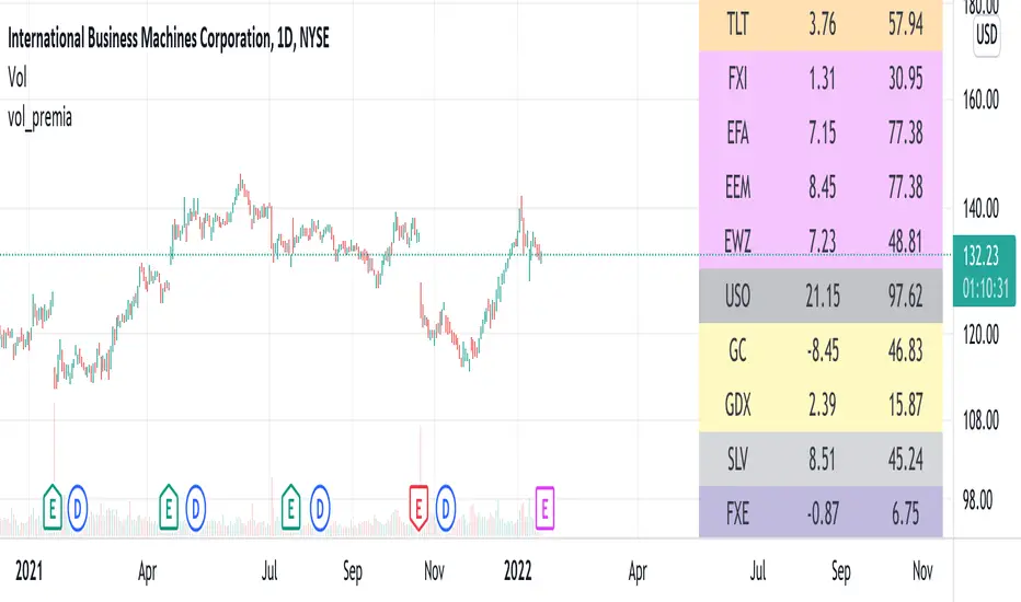
vol_premiaThis script shows the volatility risk premium for several instruments. The premium is simply "IV30 - RV20". Although Tradingview doesn't provide options prices, CBOE publishes 30-day implied volatilities for many instruments (most of which are VIX variations). CBOE calculates these in a standard way, weighting at- and out-of-the-money IVs for options that expire in 30 days, on average. For realized volatility, I used the standard deviation of log returns. Since there are twenty trading periods in 30 calendar days, IV30 can be compared to RV20. The "premium" is the difference, which reflects market participants' expectation for how much upcoming volatility will over- or under-shoot recent volatility. The script loads pretty slow since there are lots of symbols, so feel free to delete the ones you don't care about. Hopefully the code is straightforward enough. I won't list the meaning of every symbols here, since I might change them later, but you can type them into tradingview for data, and read about their volatility index on CBOE's website. Some of the more well-known ones are: ES: S&P futures, which I prefer to the SPX index). Its implied volatility is VIX. USO: the oil ETF representing WTI future prices. Its IV is OVX. GDX: the gold miner's ETF, which is usually more volatile than gold. Its IV is VXGDX. FXI: a china ETF, whose volatility is VXFXI. And so on. In addition to the premium, the "percentile" column shows where this premium ranks among the previous 252 trading days. 100 = the highest premium, 0 = the lowest premium.Pine Script® göstergesitaylor_o tarafındanGüncellendi 91
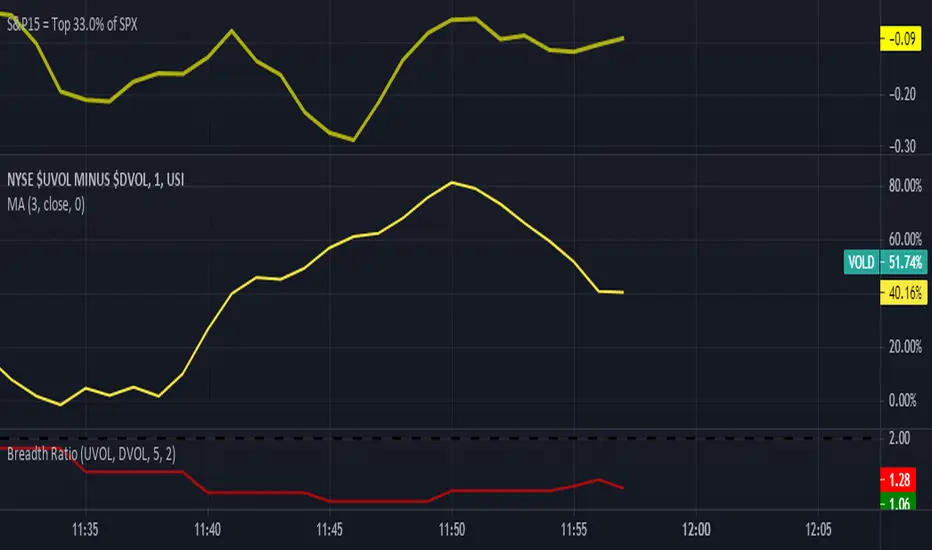
S&P15 = 33.0% of SPXThis indicator shows what the top 15 stocks in the SPX is doing in a chart form.Pine Script® göstergesijrami013 tarafından1112
VIX Implied Move Bands for ES/Emini futuresThis script uses the close of the VIX on a daily resolution to provide the 'implied move' for the E-mini SP500 futures. While it can be applied to any equity index, it's crucial to know that the VIX is calculated using SPX options, and may not reflect the implied volatility of other indices. The user can adjust the length of the moving average used to calculate the bands, the window of days used to calculate the implied move, and the multiplier that effects the width of the bands. Pine Script® göstergesiCSC1 tarafından77607
VIX & SPX COMPARED Compares close of SPX against VIX to find divergencePine Script® göstergesisimtrader19a tarafından36