LuBotINTRODUCTION
This indicator was born from a personal need to have everything needed in one place and to allow any trader to see the market as I see it, so that everyone, even the novice trader, immediately feels at ease as I do me when I look at the graphs.
Over time I have also developed other indicators which I associate with the LuBot, however it is designed to be used as a standalone indicator which can suit any trading style.
Of course, no indicator or strategy can predict the future. Only a good mindset and good money management can lead you to be a consistently profitable trader in the long run. Which is why together with the indicator I will provide further examples of use with personal insights and thoughts about my way of seeing the market.
Below you will find everything you need to understand what you will get with this indicator and how to use it, but there are so many configurations that you can do that could make you find a better setup than mine as each of us has different needs and different timing.
Some of us don't mind keeping positions open overnight and others want to close everything by the end of the day. There are those who look at charts with very low timeframes and those like me who prefer to look at higher timeframes like the Daily for reasons of practicality and more "relaxed" timing.
Because of this I don't want to limit the use of the indicator to what is my way of using it. Each of us has different needs, and this indicator is used to show you the way forward and satisfy your needs.
WHAT IS LuBot?
LuBot is a multi-piece indicator that provides any trader with everything they need to trade in one place.
The idea is to make it easier to see the market and give everyone the opportunity to start trading with a simple method that is within everyone's reach.
The LuBot indicator works on any TradingView chart and timeframe and includes several basic components including:
- Long and Short signals: distinguishable in SwingSignals and MultiSignals.
SwingSignals have an alternating Long-Short sequence. The logic of these signals is to indicate the trend to follow which, if supported by the other components, allows inputs in favor of swings. MultiSignals signals add intermediate signals to favor entry even on a single signal and could be used both to add further confirmation to the trend-following trade and for scalping, thus exiting the trade as soon as possible.
- Reversal Bands : placed at the ends of the chart, they indicate an area of probable price reversal (overbought and oversold areas). They are divided into colored bands each of which increases its repelling force as the intensity of the color increases. If the price crosses an extreme we expect an even stronger reversal.
- Customizable Moving Averages : 3 in total which can be modified in length, source and type of moving average (ema, sma, wma, etc.). By default I have entered the settings that I use personally.
- Trend Cloud : colored band according to the trend. By default the colors are green for bullish trend, red for bearish trend and gray for sideways/neutral phase. Coupled with moving averages they are a perfect tool to better follow the trend.
- Swings : shows swings on the chart so you can better understand their structure and refine trend tracking. Excellent as reference points for new trades.
- Reversal Signals : small signals shown as arrows above and below the chart. Those above appear when the price is overbought, conversely those below appear when the price is oversold. They are not entry inputs but they help for both entry and exit of the trade.
- Trend Candles : the candles are colored according to the trend defined in the code. Additional support to avoid entering against the trend or to exit the market when the trend reverses.
- Supports and Resistances : supply and demand levels will appear automatically and will update over time. They take the pivot points as references and it is possible to modify their period. A higher value will show wider levels, a lower value will show levels based on the latest price movements.
- Trend Channel : Show an automatic trend channel based on the period entered in the settings. A value of 100 will show a channel based on the price average of the last 100 candles.
- Alerts : finally we find the alerts both for Long and Short signals and for the appearance of a new swing. Before activating alerts, make sure you have chosen the signal settings you prefer so that you only receive that type of alert. The alert will adapt to the parameters you have chosen and will notify you whenever a new signal or swing appears. The "Any function alert" will alert you whenever a Long or Short SwingSignals appear.
SIGNAL SETTINGS
These are the signal setting modes.
First we open the indicator settings by clicking on the gear in the upper left next to the indicator name, or by double clicking on one of the indicator components in the chart.
At this point a menu will open in which the various components appear in an orderly manner.
The first group concerns the signal settings.
The first item indicates the Signal Type in which we can choose whether to display the SwingSignals or MultiSignals signals.
The second item indicates the Signal Style in which we can choose a value from 0 to 3.
Value 0 will show all signals not filtered by the trend. The value 1 will add a first trend filter and increase the restriction on the trend by increasing the value.
Next we find 3 selectable boxes called Limit Signals.
Each of these boxes will add further filters to the signals in order to limit the signals in periods of laterality and to avoid an excess of signals shown on the chart.
By acting on these settings we could find the right setup that best suits our needs.
Finally, the last modifiable parameter concerns the display of the last signals which by default is set to 3000. This means that all the signals in the last 3000 candles will be displayed on the chart.
HOW I USE IT
As I wrote above my favorite timeframe is the Daily. This timeframe allows me to study the market very calmly and gives me all the time necessary to decide how to behave on the market. Furthermore, the Daily timeframe fits perfectly with my vision of trading, which is the one that allows you to have time for yourself instead of working all day and not being able to devote yourself to family or other businesses.
In this way I observe the market only in the morning or in the evening and thanks to this indicator I can make decisions very quickly unlike when I had to analyze chart by chart with other manual tools. Moreover, thanks to this configuration I can easily do everything from my smartphone. You don't know what satisfaction it feels like to sit comfortably on your sofa in the evening and observe the markets from your mobile phone and open and close trades thanks to this indicator.
Now let's move on to the practical part and see the main actions I take when I look at a graph from scratch. The examples will cover the Long position but the reverse applies for the Short position.
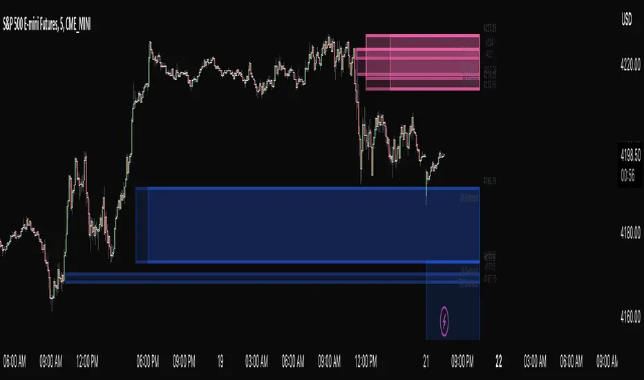
HOW TO ENTER THE MARKET
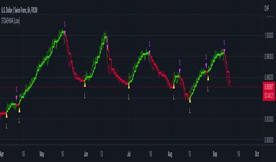
1- First I set the signals with the Limit Signals type 3 option and use the SwingSignals signals. In this way I avoid too much confusion in the graph and consider the last signal
that points me in the main direction to follow.
2- In the image above we see a Long signal as the last. So from then on I will only look for Long entries.
3- I wait for the TrendCloud to turn green and thus favor the direction bullish.
4- I wait for the price to rise above the ema21 (orange moving average set by default) and the TrendCloud.
5- If the TrendCloud is above the ema100 (blue moving average) and the ema200 (yellow moving average) this increases the idea of bullish strength.
6- I expect a retracement and then a return of prices towards the zone ema21 or TrendCloud.
7- At this point, as we can see from the image below, I start looking at the Swing.
Swings determine the structure and trend of the market.
Increasing highs and lows = Uptrend
Lower highs and lower lows = Bearish trend
If in this case the swing low is positive then HL (HigherLow) we are more likely to enter in favor of a positive trend and be able to bring home a profit.
8- The break of the high of the swing candle (the one where we find the label HL) is already an entry trigger in itself, but to improve the probability of success and avoid
entering false movements we add MultiSignals signals to have input patterns specific.
In this case we have a Long entry pattern so the entry on the break of the maximum is confirmed.
9- A further confirmation is given by the TrendCandles that we can activate from the settings. If the last candles are green and the candle of ours probable trade is also
green, we have a further confirmation of possible rise.
TRADE MANAGEMENT AND EXIT
1- The moment we decide to open the position we need to know in advance where you mainly enter the stop loss and then the take profit.
2- To enter the stop loss we can use the last swing low as reference, or the TrendCloud. Based on the risk you want to get on that trade.
If the conditions are particularly positive you can place the stop loss a few pips below the swing low. The take profit instead it depends on how long you want to hold the
trade. Personally I prefer to exit trades as soon as possible to avoid staying too long exposed to reversal risks. This is about a trading approach short term.
So it could be placed on the level of the previous high as in the following example.
In this case the trade lasts only 4 candles and the overnight costs and the risk of closing the trade with a loss are limited.
3- To view the exit levels for TP and SL you can also use the automatic Support and Resistance tool.
In this example we see that the closest support level coincided with the low of the swing so inserting the stop loss below the low of the swing would have had greater validity. The Take Profit, on the other hand, could be placed on the closest Resistance level.
4- A more conservative approach would lead us to place the stop loss below the TrendCloud or below the previous swing low (more recommended approach). In this way we
will avoid the risk of being stopped and subsequently seeing the market continue in our direction as often happens.
In this example we see a Long trade on a subsequent MultiSignals signal which is stopped when the price makes a retracement on the TrendCloud. In this case we see that if we had placed the stop below the previous swing low or below the TrendCloud we would still have remained in the market and would be positive.
5- In the example above, it must also be considered that the market had already made several positive swings without making a more important retracement on the
TrendCloud, so after making 1 or 2 trades I would avoid forcing too much by chasing all the signals because it is the most correct approach.
After 3-4 consecutive swings without retracements, I recommend waiting.
When the market has made a major retracement then the swing count can start over and we could enter on the next swing high mark or break.
CONCLUSIONS
As you will have understood, the main approach is Trend is Your Friend, the trend is our main friend in trading and insisting on counter-trend operations is not profitable and sustainable in the long run. Even with LuBot you can do countertrend trades but they are not the ones I recommend so I won't talk about them here.
Last but not least it must be said that the indicator does not repaint, this means that the signals will not disappear over time and the alerts are reliable.
Each of these components has been inserted on the basis of a personal need and on the basis of studies done directly by me in the field. This is the first official release after 3 years of developments.
This indicator is not a strategy, does not show backtest results and does not show Take Profit or Stop Loss levels. The purpose of this indicator is to give everyone an idea of price behavior and to implement a discretionary strategy. Signals are not always a reason to enter and TP and SL levels vary depending on the type of trade, which is why an automated backtest could show different results than you might have.
This indicator is intended to help the trader (beginner or not) to find the trades to make more easily and to allow anyone to follow a strategy. Since this is an indicator for discretionary trading, I don't invite you to follow all the signals, but to reason with all the tools available within it. When there are more elements that match, the chances of success are higher. You have to be patient and avoid getting caught up in haste and emotions. Considering that the market is unpredictable and there can be no certainties about its future movement, I take no responsibility for your use of this indicator.
Komut dosyalarını "smart" için ara

ASE Supply & Demand█ Introduction
ASE Supply & Demand is a multi-timeframe Supply and Demand zone indicator based on the Order Block concept. Order Blocks are a price action concept defined as a basing candle followed by a breakout candle (as seen in the chart below). A basing candle typically shows a slowing down in price action, foreshadowing a reversal and initial institutional activity. The breakout candle then confirms institutional activity with a displacement candle in the opposite direction of the basing candle. Additionally, there is an advanced feature called “Potentials,” which allows us to see price action forming S&D zones beforehand & trapped positions live through the same Order Block concept.
█ Supply and Demand Zones
The Supply & Demand zones are plotted on 8 timeframes (5m, 15m, 30m, 1hr, 2hr, 3hr, 4hr, D). In addition, there are custom settings that allow the trader to filter for the most significant zones and to cohere to their trading style:
Range Multiplier
Filters the creation of a zone based on the basing candle of Supply/Demand(0-5)
The size of the basing candle must be smaller than 0-5 times the True Range Index to create Supply/Demand.
If the basing candle range is smaller than the True Range Index, this can foreshadow the potential of institutional activity as price slows down, and a potential reversal might occur.
True Range Index
The number of bars to calculate the True Range in Range S+D mode.
Displacement Sensitivity
Filters the creation of a zone based on the displacement from the base (0-20)
Calculated by taking the breakout range (as seen in the chart below) divided by the range of the basing candle
0 = less significant, more zones
20 = more significant, fewer zones
Zone Strength Filter %
Filter out current zones based on how strong they are (0-100)
Calculated by the amount of fill within a zone. By changing the Zone Strength Filter, you can display zones that have not breached the filter % you select. For example, if you choose 80% Zone Strength, that means it will only show zones that are 20% filled or less; in other words, zones that have 80% or more yet to be filled.
0 = All Zones
100 = Completely unused zones
With these advanced filters and plotting on multiple timeframes, we have created the best Supply and Demand Indicator . In addition, these filters help to eliminate insignificant zones and noise in the market, leaving us a clean chart.
█ Potentials
Potentials foreshadow the possibility of a Supply or Demand Zone forming, the possibility of a Trapped concept, and it works great as targets or influence in our trades.
Potentials are calculated by the same Order Block concept, which allows us to see Supply & Demand/Order Blocks forming in real-time.
When a potential is triggered and holds, the line turns solid. If it continues to hold, it has the potential of forming a Supply/Demand zone based on the trader's Zone Filters. If the price pulls back and fails to hold, it will go back to dotted. Inferring it used the potential as liquidity and is potentially trapping market participants at that potential.
█ How To Use:
Supply and Demand Zones are the ‘Where’ to our trade but not the ‘Why.’ This means that the zones are our POI (Point of Interest) and ‘Where’ we want to be looking for a trade. It is not our ‘Why’ because we do not enter just because we are in a zone. This is because we expect pivots or reversals inside our Supply & Demand zones, and this rarely happens quickly.
What we want to look for in our zones is a solid base for our reversals. Simply put, we want to see new demand forming at our Demand Zones and new supply forming at our Supply Zones. This can be achieved by observing the ‘Potentials’ feature which allows us to see new Order Blocks or ‘Base Candles’ forming. With a trained eye, the ‘Potentials’ feature is highly effective in addition to its ‘Trapped’ logic which can offer entries on their own. The "Trapped" label on potentials shows potential trapped buyers or sellers after we reach that level. Observing and understanding how price action facilitates, especially around the zones, is crucial to its usability. In addition, other strategies or indicators can be used in confluence to support bounces out of demand and rejections out of supply.
Ultimately once we find a viable entry, we want to see a complete cycle. For example, if we caught a bounce out of demand with new demand forming, we would want to see the cycle complete and us reach the next supply or manufacture new supply. The ‘Potentials’ feature is the easiest way to gather multiple targets and at the same time offers stop loss management.
█ Settings:
Enable Supply/Demand/ Zones and Potential Liquidity
STF S&D Zones - Enables 5 minute and 15 minute timeframe for zones
LTF S&D Zones - Enables 30 minute and 1 hour timeframe for zones
HTF S&D Zones - Enables 2 hour, 3 hour, and 4 hour timeframe for zones
Daily S&D Zones - Enables Daily timeframe for zones
Enable Potentials
Supply Demand Zone Models
Range - Filters zones based on the range of candles before supply/demand
Displacement - Filters zones based on the displacement of the breakout candle
Range + Displacement - Filters zones based on the displacement of breakout candle and range of the candles before supply/demand
Supply Demand Zone Filters (see “Supply and Demand Zones” section for usage)
Range Multiplier
True Range Index
Displacement Sensitivity
Zone Strength Filter %
Deletion Conditions
Confirmed - Deletes zone upon time-frame close above supply or below demand
On Break - Deletes zone upon break above the top of supply or break below bottom of demand
On Tap - Deletes zone upon the touch of supply or demand
Other Settings
Price Labels - Turns on Zone Price Levels
Supply/Demand Color Input - Customize color of zones to your liking
Supply Demand Border Width - Change the border width of zones (0 would be completely borderless zones)
Supply Demand Transparency - Change transparency of zones (0 is completely solid zones, 100 is completely transparent)
Transparency Input - "Normal" Transparency stays at the level that's set; "Decrease with price" as price moves through, the zones become more transparent
Default Color - Changes color of any text/labels (default is gray)
Text size - Change size of text on labels
Intrabar Efficiency Ratio█ OVERVIEW
This indicator displays a directional variant of Perry Kaufman's Efficiency Ratio, designed to gauge the "efficiency" of intrabar price movement by comparing the sum of movements of the lower timeframe bars composing a chart bar with the respective bar's movement on an average basis.
█ CONCEPTS
Efficiency Ratio (ER)
Efficiency Ratio was first introduced by Perry Kaufman in his 1995 book, titled "Smarter Trading". It is the ratio of absolute price change to the sum of absolute changes on each bar over a period. This tells us how strong the period's trend is relative to the underlying noise. Simply put, it's a measure of price movement efficiency. This ratio is the modulator utilized in Kaufman's Adaptive Moving Average (KAMA), which is essentially an Exponential Moving Average (EMA) that adapts its responsiveness to movement efficiency.
ER's output is bounded between 0 and 1. A value of 0 indicates that the starting price equals the ending price for the period, which suggests that price movement was maximally inefficient. A value of 1 indicates that price had travelled no more than the distance between the starting price and the ending price for the period, which suggests that price movement was maximally efficient. A value between 0 and 1 indicates that price had travelled a distance greater than the distance between the starting price and the ending price for the period. In other words, some degree of noise was present which resulted in reduced efficiency over the period.
As an example, let's say that the price of an asset had moved from $15 to $14 by the end of a period, but the sum of absolute changes for each bar of data was $4. ER would be calculated like so:
ER = abs(14 - 15)/4 = 0.25
This suggests that the trend was only 25% efficient over the period, as the total distanced travelled by price was four times what was required to achieve the change over the period.
Intrabars
Intrabars are chart bars at a lower timeframe than the chart's. Each 1H chart bar of a 24x7 market will, for example, usually contain 60 intrabars at the LTF of 1min, provided there was market activity during each minute of the hour. Mining information from intrabars can be useful in that it offers traders visibility on the activity inside a chart bar.
Lower timeframes (LTFs)
A lower timeframe is a timeframe that is smaller than the chart's timeframe. This script determines which LTF to use by examining the chart's timeframe. The LTF determines how many intrabars are examined for each chart bar; the lower the timeframe, the more intrabars are analyzed, but fewer chart bars can display indicator information because there is a limit to the total number of intrabars that can be analyzed.
Intrabar precision
The precision of calculations increases with the number of intrabars analyzed for each chart bar. As there is a 100K limit to the number of intrabars that can be analyzed by a script, a trade-off occurs between the number of intrabars analyzed per chart bar and the chart bars for which calculations are possible.
Intrabar Efficiency Ratio (IER)
Intrabar Efficiency Ratio applies the concept of ER on an intrabar level. Rather than comparing the overall change to the sum of bar changes for the current chart's timeframe over a period, IER compares single bar changes for the current chart's timeframe to the sum of absolute intrabar changes, then applies smoothing to the result. This gives an indication of how efficient changes are on the current chart's timeframe for each bar of data relative to LTF bar changes on an average basis. Unlike the standard ER calculation, we've opted to preserve directional information by not taking the absolute value of overall change, thus allowing it to be utilized as a momentum oscillator. However, by taking the absolute value of this oscillator, it could potentially serve as a replacement for ER in the design of adaptive moving averages.
Since this indicator preserves directional information, IER can be regarded as similar to the Chande Momentum Oscillator (CMO) , which was presented in 1994 by Tushar Chande in "The New Technical Trader". Both CMO and ER essentially measure the same relationship between trend and noise. CMO simply differs in scale, and considers the direction of overall changes.
█ FEATURES
Display
Three different display types are included within the script:
• Line : Displays the middle length MA of the IER as a line .
Color for this display can be customized via the "Line" portion of the "Visuals" section in the script settings.
• Candles : Displays the non-smooth IER and two moving averages of different lengths as candles .
The `open` and `close` of the candle are the longest and shortest length MAs of the IER respectively.
The `high` and `low` of the candle are the max and min of the IER, longest length MA of the IER, and shortest length MA of the IER respectively.
Colors for this display can be customized via the "Candles" portion of the "Visuals" section in the script settings.
• Circles : Displays three MAs of the IER as circles .
The color of each plot depends on the percent rank of the respective MA over the previous 100 bars.
Different colors are triggered when ranks are below 10%, between 10% and 50%, between 50% and 90%, and above 90%.
Colors for this display can be customized via the "Circles" portion of the "Visuals" section in the script settings.
With either display type, an optional information box can be displayed. This box shows the LTF that the script is using, the average number of lower timeframe bars per chart bar, and the number of chart bars that contain LTF data.
Specifying intrabar precision
Ten options are included in the script to control the number of intrabars used per chart bar for calculations. The greater the number of intrabars per chart bar, the fewer chart bars can be analyzed.
The first five options allow users to specify the approximate amount of chart bars to be covered:
• Least Precise (Most chart bars) : Covers all chart bars by dividing the current timeframe by four.
This ensures the highest level of intrabar precision while achieving complete coverage for the dataset.
• Less Precise (Some chart bars) & More Precise (Less chart bars) : These options calculate a stepped LTF in relation to the current chart's timeframe.
• Very precise (2min intrabars) : Uses the second highest quantity of intrabars possible with the 2min LTF.
• Most precise (1min intrabars) : Uses the maximum quantity of intrabars possible with the 1min LTF.
The stepped lower timeframe for "Less Precise" and "More Precise" options is calculated from the current chart's timeframe as follows:
Chart Timeframe Lower Timeframe
Less Precise More Precise
< 1hr 1min 1min
< 1D 15min 1min
< 1W 2hr 30min
> 1W 1D 60min
The last five options allow users to specify an approximate fixed number of intrabars to analyze per chart bar. The available choices are 12, 24, 50, 100, and 250. The script will calculate the LTF which most closely approximates the specified number of intrabars per chart bar. Keep in mind that due to factors such as the length of a ticker's sessions and rounding of the LTF, it is not always possible to produce the exact number specified. However, the script will do its best to get as close to the value as possible.
Specifying MA type
Seven MA types are included in the script for different averaging effects:
• Simple
• Exponential
• Wilder (RMA)
• Weighted
• Volume-Weighted
• Arnaud Legoux with `offset` and `sigma` set to 0.85 and 6 respectively.
• Hull
Weighting
This script includes the option to weight IER values based on the percent rank of absolute price changes on the current chart's timeframe over a specified period, which can be enabled by checking the "Weigh using relative close changes" option in the script settings. This places reduced emphasis on IER values from smaller changes, which may help to reduce noise in the output.
█ FOR Pine Script™ CODERS
• This script imports the recently published lower_ltf library for calculating intrabar statistics and the optimal lower timeframe in relation to the current chart's timeframe.
• This script uses the recently released request.security_lower_tf() Pine Script™ function discussed in this blog post .
It works differently from the usual request.security() in that it can only be used on LTFs, and it returns an array containing one value per intrabar.
This makes it much easier for programmers to access intrabar information.
• This script implements a new recommended best practice for tables which works faster and reduces memory consumption.
Using this new method, tables are declared only once with var , as usual. Then, on the first bar only, we use table.cell() to populate the table.
Finally, table.set_*() functions are used to update attributes of table cells on the last bar of the dataset.
This greatly reduces the resources required to render tables.
Look first. Then leap.

Liquidity Levels MTF - SonarlabThis indicator uses Pivot Points to identify Liquidity Levels in the market. Liquidity Levels are levels in the market where you would expect price to be pulled towards.
Liquidity Levels by Sonarlab also has an option to show Higher Timeframe Liquidity Levels.
Below are the indicators settings:
Liquidity Mitigation Options
The Indicator has options for you to choose what happens to the Liquidity line/boxes once it has been mitigated. Either Keep them on the chart, or remove them.
Display Styles
Choose how the levels are displayed, either with Lines or Boxes.
Set the your Extension options, by keeping the lines/boxes "short" or extend to current price, or maximum to the right
Colors and Styles
Set colors and styles for all lines and boxes

[PlayBit] FVG/EMAThis Indicator was made for the PlayBit Community by @FFriZz
This indicator includes 2 of the most used indicators within the community
1. FVG indicator -- Very minimalistic version seems to be the most used
2. EMA indicator -- Indicator made by using two 200 EMAs one tracking highs and one tracking closes -- to form a 200 EMA Channel
-- The EMA Can be used as a single one on the current chart or there are 5 other options that will allow you to track up to 5 timeframes
higher or lower
----- Options ------
-- FVGs --
1. Ability to keep FVGs on chart when Filled/Mitigated or have them Deleted
2. Setting to Change the border of the FVG when it has been tested
3. Can have the FVGs resize to the untapped area
4. Setting to adjust the number of FVGs that are displayed on Chart at a time
-- EMA --
1. Up to 5 Different timeframes
2. Color Switch if close is above or below EMAs
3. Color Settings
Shout out to the PlayBit Community
for being a great community for Trading and in general!
If anyone finds any bugs Please let me know on here or on PlayBit
or if I removed something in this version you would like to see put back..
Hope you enjoy!
@FFriZz | @FrizLabz
Automatic Closest FVG with BPRFair Value Gaps are a hugely popular concept and because of that there are numerous indicators available. This one however, was designed to automate the process of actually using them in trading.
Designed with lower time frame entries in mind (though will work on HTF just as well), this indicator automatically draws the closest, non-mitigated FVG, to the current price, cutting out the work of looking for what FVG is relevant.
The indicator also has an option to show when the current nearest pair of FVGs form a BPR or 'balanced price range'.
There are various option for what counts as mitigation, including no mitigation at all, and when mitigated an FVG is no longer considered for proximity searching.

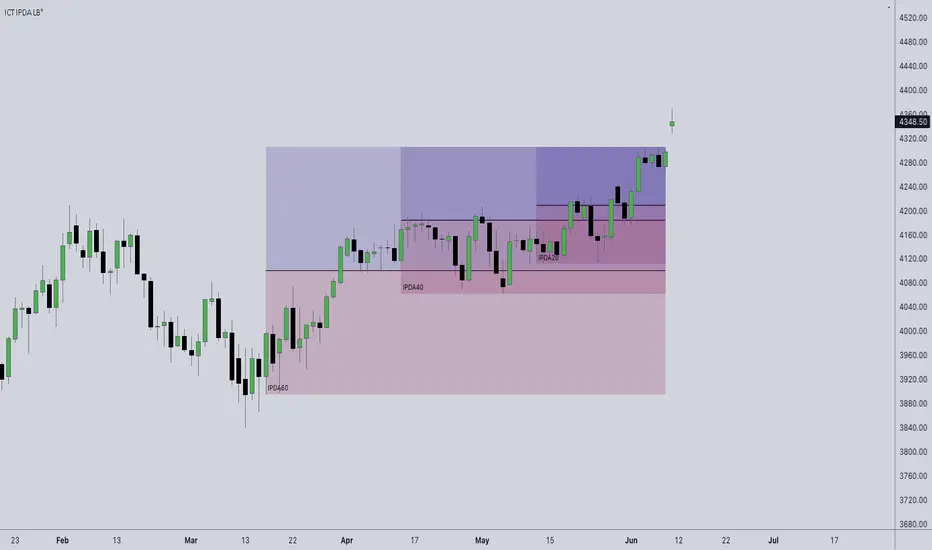
ICT IPDA Look BackThis script automatically calculates and updates ICT's daily IPDA look back time intervals and their respective discount / equilibrium / premium, so you don't have to :)
IPDA stands for Interbank Price Delivery Algorithm. Said algorithm appears to be referencing the past 20, 40, and 60 days intervals as points of reference to define ranges and related PD arrays.
Intraday traders can find most value in the 20 Day Look Back box, by observing imbalances and points of interest.
Longer term traders can reference the 40 and 60 Day Look Back boxes for a clear indication of current market conditions.
SCREENER:INDEX
TradingView enables traders and investors to make smarter and better investment decisions. TradingView offers to scan 20 or 40 stock or index. Scanner can be shown in dash board as shown in
above image. This dashboard has following figure
1.Column No.1 show sectoral and thematic index.
2. The price is slipped due to aggressive order punched by market participants. There is six types of price slippage. Three are bullish and three are bearish . This price slippage indicates market fear and greed. Green slippage indicates that bullish rally can start while Red slippage indicates that Bearish rally can start. Area of slippage will act as a support and resistance for future price moment. Where column No. 2,3 and 4 shows H.G., W.G. and T.V. shows price slippage.
3.Column No.6 show resistance strength
4.Column No.7 show Volume strength with respect to ( SMA1000X2)
5.Column No.8 show volatility while Column No. 9 shows liquidity
with previous 1000 bar.
6.Column No.10 show relative strength comparison with respect to broader index.

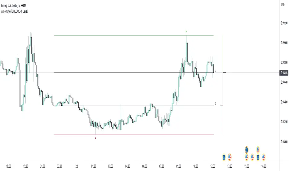
Automated OHLC OLHC LevelsA simple, clean, effective visualization tool, for the OHLC or OLHC of a chosen candle/timeframe.
Apply this indicator using a higher timeframe, in conjunction with other levels and the directional bias, to easily recognize trading opportunities at lower timeframes.
STD-Filtered, Adaptive Exponential Hull Moving Average [Loxx]STD-Filtered, Adaptive Exponential Hull Moving Average is a Kaufman Efficiency Ratio Adaptive Hull Moving Average that uses EMA instead of WMA for its computation. I've also added standard deviation stepping to further smooth the signal. Using EMA instead of WMA turns the Hull into what's called the AEHMA. You can read more about the EHMA here: eceweb1.rutgers.edu
What is the traditional Hull Moving Average?
The Hull Moving Average (HMA) attempts to minimize the lag of a traditional moving average while retaining the smoothness of the moving average line. Developed by Alan Hull in 2005, this indicator makes use of weighted moving averages to prioritize more recent values and greatly reduce lag. The resulting average is more responsive and well-suited for identifying entry points.
What is Kaufman's Efficiency Ratio?
The Efficiency Ratio (ER) was first presented by Perry Kaufman in his 1995 book ‘Smarter Trading‘. It is calculated by dividing the price change over a period by the absolute sum of the price movements that occurred to achieve that change. The resulting ratio ranges between 0 and 1 with higher values representing a more efficient or trending market.
The value of the ER ranges between 0 and 1. It has the value of 1 when prices move in the same direction for the full time over which the indicator is calculated, e.g. n bars period. It has a value of 0 when prices are unchanged over the n periods. When prices move in wide swings within the interval, the sum of the denominator becomes very large compared to the numerator and ER approaches zero.
Some uses for ER:
A qualifier for a trend following trade; a trend is considered “persistent” only when RE is above a certain value, e.g. 0.3 or 0.4 .
A filter to screen out choppy stocks/markets, where breakouts are frequently “fakeouts”.
In an adaptive trading system, helping to determine whether to apply a trend following algorithm or a mean reversion algorithm.
It is used in the calculation of Kaufman’s Adaptive Moving Average (KAMA).
How to calculate the Hull Adaptive Moving Average (HAMA)
Find Signal to Noise ratio (SNR)
Normalize SNR from 0 to 1
Calculate adaptive alphas
Apply EMAs
Included
Bar coloring
Signals
Alerts
Loxx's Expanded Source Types
Multiple Averages Moving - S&P 500This moving average script was created by "bren4013" & is only to be used on the Daily Chart for the S&P 500.
Back tested from when the 21.5% crash started (All Time High) in August 1956, to its end (Bottom Is In) in October 1957, & to the present day.
It's obvious where the signals are if you choose to take the time & look at it in detail.
(Disclaimer) Trade at your own risk. Do not do what i do, or say.
Trade safe. Trade smart. & remember;
"Price moves indicators".
"Indicators DO NOT move price".
"Price will always exist without indicators".
"Indicators CAN NOT exist without price".
ENJOY...

ArtiumPro Main Market StructureThis indicator maps out Market Structure using real time price action rather than simply pulling "pivot" points. Use to see at a glance where a BOS or CHoCH has occurred and where the current and historic highs and lows are.
- M-BOS happens when a main break of structure occurs (trend continuation) the continuation of a bullish or bearish trend.
User setting change line style, color and transparency & turn off text, change text color and transparency
- M-CHoCH happens when a Change of Character occurs (trend change) this is the 1st sign of a possible change of the trend direction from bullish to bearish or bearish to bullish
User setting change line style, color and transparency & turn off text, change text color and transparency
- M-swh & M-swl are the current active unmitigated highs and lows
- User setting for M-swh & M-swl allows you to chose the amount of active highs / lows you want to see on the chart. this can be used at a glace to see where potential liquidity may be laying. If you only want to see the last most current
high an low you can turn on the "just last active" option box.
- User settings to turn on or off the old mitigated highs lows making it easy to see at a glance when old highs and lows have been broken or swept. The label for this is also customizable to user preference.

OPAL - Sense→ Hi everyone, very proud to publish my unique leading oscillator ! ←
Sense is a "leading indicator" : it shows what can happen in the future, meanwhile a lagging indicator like MAs shows past sentiment.
Sense diverging with Price ? Care at the reversal !
It can be a great tool to upgrade your timings, after a divergence for example, to snipe reversals or to find Trend entries.
This tool is used for sniping in our levels trading setup (in our trading community)
Sense is made of everything you know about common indicators :
RSI/STOCH/STOCHRSI/MFI/RVSI/PZO/VZO/MOMENTUM/VOLUMES/UO
>>> Basically shows situations where almost all the known indicators reach interesting points in Overbought and Oversold zones
Signals provided :
*Visible and Hidden Minor OB/OS Crosses (Small Arrows)
*Visible and Hidden Major OB/OS Crosses (Bigger Arrows)
*Visible and Hidden Major and Minor Confluence in OB/OS Zones (Rockets/Blood)
*Background Smart Coloring when price reaches OB/OS Zones :
- blue/purple = entering OB/OS Zones
- green/red = extrem multiple OB/OS situation
*Coloration of Middle Line based on std Price Deviation
*Smart Divergences spotting : applied level filter to get divergences that reached OB/OS Zones at least once.
Divergences are scanned twice for confirmation<
*Full alerting system on :
- Full signals = blood and rockets
- Half signals = bigger arrows
- Minor signals = small arrows
- Dual Divergences = on both oscillators (slow & fast)
1) What is the curve i see on Sense ? => It is my homemade oscillator, described above
2) What are thoses Zones around the curve ? => Overbought/Oversold Zones
3) What are those dots on the curve ? => When the oscillator crosses its Triggerline
4) What are those little arrows ? => Printing minor Overbought/Oversold situations
5) What are those bigger arrows ? => Printing major Overbought/Oversold situations
6) What are those Blood dots/ Rockets ? => Printing Confluence situations in Overbought/Oversold Zones
7) Why is background coloring ? => I applied smart coloration based on oscillators location (see above coloration meaning)
8) What are those lines between curve spikes ? => Situations when Price and oscillator are doing different moves, basically divergences, meaning a correction can happen sooner or later
Should be strong on almost every timeframe !
Always backtest, watch, then use or not in your trading strategy.
If you like my work, leave a like :)
Hoping you success !

Adaptive Moving Average (AMA)Adaptive Moving Average (AMA) Technical Indicator is used for constructing a moving average with low sensitivity to price series noises and is characterized by the minimal lag for trend detection. This indicator was developed and described by Perry Kaufman in his book "Smarter Trading".
One of disadvantages of different smoothing algorithms for price series is that accidental price leaps can result in the appearance of false trend signals. On the other hand, smoothing leads to the unavoidable lag of a signal about trend stop or change. This indicator was developed for eliminating these two disadvantages.

Dash System with RSI/MFI/Stoch MTFHere I am providing you Improved single system to get all components to take better and smarter trading decisions and improve your trading with
a) Dashboard - to gauge market sentiment across all TF.
b) VWAP – to get idea about trend and fair value of market.
c) BB – to get idea about volatility and contraction/expansion in price.
1.Gauge Sentiment across timeframe for various indicators in single dashboard.
RSI - to get the idea about relative price strength across all TFs.
MFI- gives idea whether trend is supported by volume or not across all TFs.
STOCH – IT is a range bound momentum oscillator. It is designed to display the location of the close compared to the high/low range over a user defined number of periods. You can use STOCH for Identifying overbought and oversold levels and also for identifying bull and bear set ups or signals across all TFs.
with this dashboard , you will get complete sentiment of market on your screen whether you use lower to upper TF or upper to lower TF approach. you can see market behavior and sentiment with these all in one dashboard across all TFs.
2.Dashboard better be used with MA or vwap to get trend direction and just for that this system has
a) VWAP- a technical analysis tool used to measure the average price weighted by volume . It's similar to a moving average in that when price is above VWAP , prices are rising and when price is below VWAP , prices are falling. VWAP is primarily used by technical analysts to identify market trend.
b) Bollinger Band - This is an oscillator meaning that it operates between or within a set range of numbers or parameters. the standard parameters for Bollinger Bands are a 20 day period with standard deviations 2 steps away from price above and below the SMA line. Essentially Bollinger Bands are a way to measure and visualize volatility . As volatility increases, the wider the bands become. Likewise, as volatility decreases, the gap between bands narrows.
Volatility can generally be seen as a cycle. Typically periods of time with low volatility and steady or sideways prices (known as contraction) are followed by period of expansion. Expansion is a period of time characterized by high volatility and moving prices. Periods of expansion are then generally followed by periods of contraction. It is a cycle in which traders can be better prepared to navigate by using Bollinger Bands because of the indicators ability to monitor ever changing volatility .
Read more about it on Bollinger Bands (BB).
And as a bonus added ability for BB to use SMA or EMA line as basis as per your comfort.
2. Added feature to change location of dashboard on chart, now you can place it on top left, top right, bottom left, bottom right corner of chart as per your comfort.
3. ability to hide/show for all TFs.
Now you can on/off 5min, 15 min, 30 min, 60 min, 4 hour, daily ,weekly and monthly TF column if you do not use it. you can keep and work with TFs as per your comfort and liking.
4. Added feature to hide/show indicators, MFI , Stoch , VWAP and BB Bands
Now you can on/off indicator s MFI , Stoch , VWAP and BB bands if you don't need them on dashboard as per your need.
Hope IT helps to take better trading decisions and improve your trading experience.

Trend OptimizerWhat is this?
This horizontal trend color and vertical trend bar is a trend identification to optimize your positioning in the market. Colors helps you to understand the trend easily, spontaneously.
The indicators & Strategies?
1. A horizontal trend color which represents the medium term trend. The color change is based on the price position towards moving average. We exclude the moving averaged from chart area so the chart area will be clean and you'll have an easier interpretation. This trend color helps you to understand the major trend as simple as you see navigation maps in your smartphone. When the trend color changed from the long red into white, then green, then blue, it indicates a bottom reversal. This module will work best with out other module: Trend Optimizer Module and Momentum line Module.
2. A vertical trend bar represents long term trend. Bars that above the axis is an uptrend bar. If it occurs, the long term bullish trend is exists. Bars below the axis is a downtrend bar. If it occurs, the long term bearish trend is exists. If there is no bars (empty), means the long term trend is weakened but the trend still as same as the last bars occurrence.
Benefit for you:
You'll have a guidance the existing trend and the trend progress from time to time.
If you combine this script with our other two module: Profit Trader module & Momentum Line Module, You'll have a complete template to analyze both trend and swing strategies.
Fund MasterFund Master, Revision 1, 3Apr2022
A. About Fund Master
1. An Oscillator with values between -100 to 100, with intention to simulate Fund inflow and outflow.
2. Presented itself in the form of solid candles without upper and lower tails.
B. Features and Setting
1. Fund Master(FM) will show up by default.
2. User has the option to turn Fund Master Bull Bear Line(BBL), and the label. Label text size is adjustable.
3. User has the option to turn on FM crossover BBL (alert text is coB) or FM crossunder BBL (alert text is cuB)
4. User has the option to turn on FM crossover 0 (alert text is co0) or FM crossunder 0 (alert text is cu0)
5. Band 0 will be shown(default), user can turn on additional band with user input value
6. Table will be shown(default), provides information on Indicator Name, FM values, FM Turn Green/Turn Red status,
FM crossover/crossunder status.
7. Alertcondition features are included. User can set the alert using the Create Alert (the Clock Icon).
The alerts includes : FM crossover or crossunder BBL, FM crossover or crossunder 0, FM turns Green, FM turns Red.
C. Using the Indicator
1. Band 0, baseline to tell if a stocks is potentially moving into bullish trend(above 0) or into bearish trend(0).
Band 0, approximately exponential 30 day of closing price(EMA30). User may use EMA30 on price chart as reference.
2. BBL, baseline to tell if fund is moving in or moving out. Above BBL means inflow of fund, vice versa.
BBL, approximately exponential 20d ay of closing price. User may use EMA20 on price chart as reference.
3. Below Band 0
After FM crossunder 0 and continues to move down, it means outflow of fund, while fund is reducing,
chips are potentially accumulated during this stage.
After FM hitting the minimum, rebounds and moving up, but still below BBL, chips are potentially being accumulated.
User can use Chips Master to visualise the chips accumulation stage.
When FM crossover BBL and continues to move up, it means inflow of fund in pushing up the stock price.
4. Above Band 0
After FM crossover 0, continues to move up and stays above BBL, stocks potentially moving into bullish trend with inflow of fund.
During retrace, FM may turn from Green to Red and moves sideways, and FM may turn from Red to Green when stocks price rebounds.
User can set the alert to notify on FM turn Red/turn red (as mentioned in Section B, point 7)
5. User can use MCDX Plus to visualise the increase or decrease of Profitable Level as shown by the Red Bar.
User can look and golden cross or death cross of Moving Average of Profitable Chips and Locked Chips.
Death cross, stock trend most likely moving into chips accumulating stage, FM may move down towards 0 or moving down below 0.
Golden cross, stock trend most likely moving into bullish trend, FM may move up towards 0 or moving up above 0.
6. Top Deviation and Bottom Deviation
FM has the potential ability to demonstrate Top Deviation (Stock Price is moving up while FM is moving down) as well as
Bottom Deviation (Stocks price is moving down or sideway while FM is moving up).
This helps to prepare user to buy during Bottom Deviation or sell during Top Deviation.
It is not perfect, user needs to use their technical analysis judgement.
D. Smart Money System
Indicators published includes : Chips Master, BBD Master, MCDX Plus, Trend Master, Ladder Master, Deviation Master, Fund Master
Chips Master for studying chips accumulating by banker/smart money
BBD Master for studying the big buy net deviation by banker/smart money
MCDX Plus for studying the profitable and locked chips
Trend Master for studying the Price Trends
Ladder Master for studying the Trends reversal (mid term) and short term entry/exit
Deviation Master for studying the Top and Bottom Deviation.
Fund Master for studying fund inflow/outflow, chips accumulating, price push up, top deviation and bottom deviation.
E. Disclaimer :
1. Attached chart is for the purpose of illustrating the use of indicator, no recommendation of buy/sell.
2. Based on feedback, there may be unethical individual with no respects of author's effort and originality, either.
a. claiming the published indicators as theirs, for their own business purposes, or
b. claiming paying the author to develop the scripts, for their own business purposes, or
c. Copy and modify the scripts for their own business purposes
This scripts is locked for the time being to prevent those unethical malpractice.
Public users are welcome to use indicator for their technical analysis.

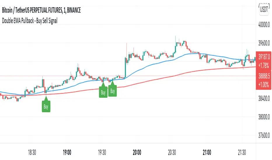
Double EMA WIth Pullback Buy Sell Signal - Smarter AlgoBuilt with love "Double EMA With Pullback Buy Sell Signal "
This indiator will help you to find a Double EMA Pullback Signal
You can combine with your own strategy, or use this purely
DISCLAIMER :
Measure the risk first before use it in real market
Backtest The Strategy was very important, so you know the probability
Fundamentally Logical :
Pullback (Some Previous candle is Red for Bull Pullback vice versa)
the Entry candle must be a Candlestick Pattern
Features :
1. Double EMA
2. Pullback Signal
How to use it :
1. Adjust the Pullback Backstep
2. Adjust the EMA Period
3. Adjust the Style to your preferences
Regards,
Hanabil
Fair Value Gap by AncheIndicator that plots boxes for fair value gaps (also known as imbalances or inefficiencies)
fair value gaps are a very useful concept in price action trading, as they provide a trader with information about where a lot of orders were injected creating this inefficiency in the market. This inefficiency can become a magnet for price in the future to resolve this inefficiency as there are many resting orders. A trader can use this information to target a fair value gap, or to look for a potential entry for a long/short making it a good POI.
you have the possible to extend boxes to the right of the screen or to edit their width
fair value gaps tend to get mitigated, to restore the balance. This indicator gives you the option to define a mitigation using a full fill or a 0.5 fill. You can also define what to use for mitigation: candle bodies or candle wicks.
there are some other indicators for fair value gaps, although I haven't found one that let's me define a 0.5 mitigation, this indicator suits my trading style
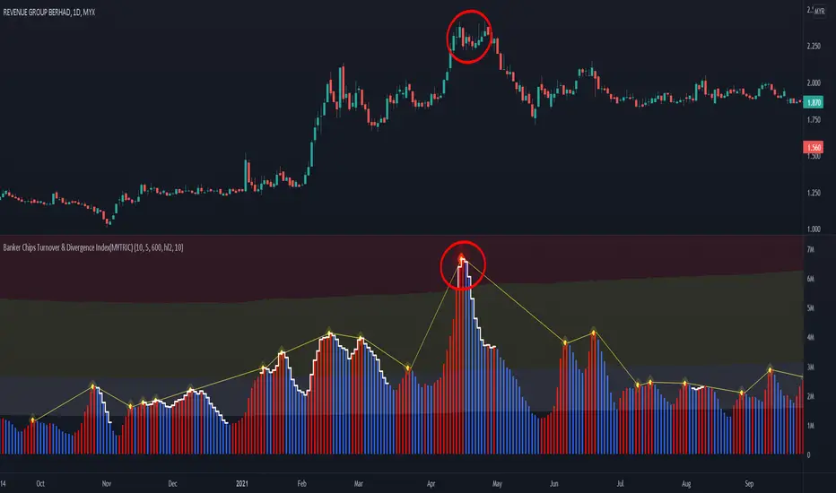
Banker Chips Turnover & Divergence Index(MYTRIC)█ OVERVIEW
Development of this toolkit is to understanding information provided by the market in depth before trading.
The main reason for losing money or not being profitable is that you do not understand the information given by the market.
If you master the information given by the market, the number of losses will be greatly reduce.
We composed a lot of algorithms module and innovative indicators,
to provide endless possibilities and meet all trading styles.
Our toolkit works in global trading market and any indices, through algorithms we extract 9️⃣ major information in the market.
Which 9️⃣ major market information are include :
• Overall Trend
• Trend Phase
• Demand & Supply
• Price Risk
• Game Theory
• Banker Chips
• Chart Pattern Meaning
• Business Model (Stocks)
• Companies Financial Health (Stocks)
This indicator provides 1️⃣ market information among the 9️⃣ major information.
The 1 market information as below :
✅ - Banker Chips (banker collect / banker disposed)
【Banker Chips Turnover & Market Divergence Index(MYTRIC)】
❌ - Game Theory
【Bull Bear Momentum Indicator】
❌ - Demand & Supply
【Dt Smart Trend (MYTRIC)】 & 【Bull Bear Momentum Indicator】
❌ - Price Risk
【Dt Smart Trend (MYTRIC)】 & 【Bull Bear Momentum Indicator】
❌ - Overall Trend
【Dt Smart Trend (MYTRIC)】
❌ - Trend Phase
【Dt Smart Trend (MYTRIC)】
❌ - Chart Pattern Meaning
【coming soon】
❌ - Business Model
【we didn't provide】
❌ - Companies Financial Health
【Financial Intelligent Evaluation】
██████████████████████████████████████████████████████████████████████████████████████████████████████████████████████
——————————————————————————————————————————————————————————————————————————————————————————————————————————————————
█ What market information does this indicator tell you ?
The Banker Chips Turnover & Divergence Index(MYTRIC) indicator is telling you 'Banker chips' or 'Market maker' activities.
• Track abnormal trade in the market.
The Banker Chips Turnover & Divergence Index(MYTRIC) indicator used to measure the divergence index of current trend and prices, a way to measure the potential accumulation or distribution of chips by banker or main force.
This indicator are calculation according to the relationship between volume and price, this is one of the methods to quantify "volume & price analysis". Volume & price analysis can provide insight the behavior of banker.
When the index appears at the high of the price, it mean banker may be distributing/disposing, the price is very soon to retracement(if retailer have a big support) or downtrend.
When the index appears at the low of the price, it mean banker may be accumulating/acquiring, if it break-out, the upward trend will be considerable.
The Banker Chips Turnover & Divergence Index(MYTRIC) indicator is used to track 'Banker' collecting & distribution activity.
Let you know the 'Banker' intention in advance to prevent 'Rug-pull or stock scammer' 'Chinese call '割韭菜 or 杀猪盘''.
We also can use this indicator to spot is the current market is a scam or Chinese call '杀猪盘', to avoid losing your huge capital in a moment.
• Usually the histogram bar excessive to 'Extremely High Turnover Area', we will judge it as a scam and '杀猪盘'
██████████████████████████████████████████████████████████████████████████████████████████████████████████████████████
——————————————————————————————————————————————————————————————————————————————————————————————————————————————————
█ CASE STUDY
before case study must know the every color intention.
• Histogram Bar = Market divergence index or Banker Chips Turnover Index
• White Step Line Above Bar = High probability of Banker Chips activity
• Red line is only mark up the peak of index above high turnover
• Must be attention when the higher histogram bar in higher level price, the price may fall or plunge after breaking support.
• Must be attention when the higher histogram bar in lower level price, the price may rise or skyrocket after breaking resistant.
Color Description :
Case Study 01 :
Scam Stock 1 HKEX:1343
——————————————————————————————————————————————————————————————————————————————————————————————————————————————————
Scam Stock 2 HKEX:3893
——————————————————————————————————————————————————————————————————————————————————————————————————————————————————
Scam Stock 3 MYX:VINVEST
Vinvest 1 , before pump activity
Vinvest 2 , after dump activity
——————————————————————————————————————————————————————————————————————————————————————————————————————————————————
Case Study 4 BINANCE:BTCUSDT
English News.
www.bloomberg.com
Chinese News.
www.chinapress.com.my
——————————————————————————————————————————————————————————————————————————————————————————————————————————————————
Case Study 5 MYX:SCIB
PSv5 Color Magic and Chart Theme SimulatorKEEP YOUR COINS FOLKS! I DON'T NEED THEM, DON'T WANT THEM. Many other talented authors on TV deserve them.
INTRODUCTION:
This is my "PSv5 Color Magic and Chart Theme Simulator" displayed using Pine Script version 5.0. The purpose of this PSv5 colorcator is to show vivid colors that are most suitable in my opinion for modifying or developing Pine scripts. Whether you are new to Pine or an experienced Pine poet, this should aid you in developing indicators with stunning color from the provided color list that is easily copied and pasted into any novel script you should possess. Whichever colors you choose, and how, is up to your imagination's capacity.
COMMENTARY:
I have a thesis. Pine essentially is a gigantor calculator with a lot of programmable bells and whistles to perform intense analytics. Zillions of numbers per day are blended up into another cornucopia of numbers to analyze. The thing is, ALL of those numbers are moot unless we can informatively portray them in various colorized forms with unique methods to point out significant numeric events. By graphically displaying them with specific modes of operation, only then do these numbers truly make any sense to us and become quantitatively beneficial.
I have to admit... I hate numbers. I never really liked them, even before I knew what an ema() was. Some days I almost can't stand them, and on occasion I feel they deserve to be flushed down the toilet at times. However, I'm a stickler for a proper gauge of measurements. Numbers are a mental burden, but they do have "purpose and meaning". That's where COLOR comes in! By applying color in specific ways in varying dynamic forms, we can generate smarter visual aids from these numerics. Numbers can be "transformed" into something colorful it wasn't before, into a tool, like a hammer. But we don't need a hammer, we need an impressive jack hammer for BIG problem solving that we could never achieve in the not to distant past.
As time goes on, we analytically measure more, and more, and more each year. It's necessary to our continual evolution. That's one significant difference between us and cave men, and the pertinent reason why we are quickly evolving as a species, while animals haven't. Humankind is gifted to enumerate very well AND blessed to see in color. We use it for innumerable things in the technological present for purpose and pleasure. Day in and day out, we take color for granted, because it's every where we can look. The fact is, color is the most important apparatus in humankind's existence EVER. We wouldn't have survived this far without it.
By utilizing color to it's grand potential, greater advancements can be attained while simultaneously being enjoyed visually. Once color is transformed from it's numeric origins into applicable tools, we can enjoy the style, elegance, and QUALITATIVE nature of the indication that can be forged. Quantities can't reveal all. Color on the other hand has a handy "quality" factor to it, often revealing things we can't ordinarily recognize. When high quality tools provide us with obtained goals, that's when we will realize how magical color truly is, always has been, and shall always be.
The future emerging economies and future financial vessels of people around the globe are going to be dependent on the secured construction of intelligent applications with a rock solid color foundation, not just math alone. I have no doubt about that. I can envision that with my eyes closed. To make an informed choice, it should be charted or graphed somehow prior to a final executive decision to trade. Going back to abysmal black and white with double decimal points placed next to cartoons within extinction doomed newspapers is not a viable option any more.
OBSERVATIONS AND UTILITY:
One thing you will notice is the code is very dense. Looks almost hideous right? Well, the variable naming is lengthy, but it's purpose is to be self explanatory, even for those who don't know how to program, YET. I'm simply not a notation enthusiast. My main intention was to provide clearly identifiable variables from their origin of assignment to their intended destination of use, clearly visible for anyone visiting. The empowerment of well versed words that are easier to understand, is a close rival to the prominent influence color has.
Secondly, I'm displaying hline() and label.new() as prime candidates to exemplify by demonstration how the "Power of Color" can be embraced with the "Power of Pine". Color in Pine has been extensively upgraded to serve novel purposes to accomplish next generation indicators that do and WILL come to exist. New functions included with PSv5 are color.rgb(), color.from_gradient(), color.r(), color.g(), color.b(), and color.t() to accompany color.new() in our mutual TV adventures. Keep in mind, the extreme agility of color also extends to line.new(), the "entirely new" linefill.new(), table.new(), bgcolor() and every other function that may utilize color.
There's a wide range of adjustability in Settings to make selections to see how they perform on different backgrounds, with their size and form. As you curiously toy with those, you're going to notice how some jump out like laser beams while others don't. Things that aren't visually appealing, still have very viable purposes, even if they don't stand out in the crowd. Often, that's preferable. The important thing is that when pertinent information relative to indication is crucial, you can program it with distinction from an assortment of a potential 1.67 million colors that can be created in Pine. "These" are my chosen favorite few, and I hope you adopt them.
PURPOSES:
For those of you who are new to Pine Script, this also may help you understand color hex/rgb and how it is utilized in Pine in a most effective manner. The most skilled of programmers can garner perks as well. There is countless examples of code diversity present here that are applicable in other scripts with adequate mutation. Any member has the freedom use any of this code in this script any way they see fit. It's specifically intended for all. There is absolutely no need for accreditation for any of this code reuse ever, in the present case. Don't worry about, I'm not.
The color_tostring() will be most valuable in troubleshooting color when using color.rgb() and becoming adept with it. I'm not going to be able to use color.rgb() without it. Chameleon indicators of the polychromatic variety are most likely going to be fine tuned with color_tostring() divulging it's results to label.new() or even table.new() maybe. One the best virtues of this script in chart, is when you hover over the generated labels, there's a hidden gift for those who truly wish to learn the intricate mechanics of diverse color in Pine. Settings has informative tooltips too.
AFTERTHOUGHTS:
Colors are most vibrant on the "Black Chart" which is the default, but it doesn't currently exist as a chart theme. With the extreme luminous intensity of LCDs in millicandela( mcd ), you may notice "Light" charts may saturate the colors making charts challenging to analyze. Because of this, I personally use "Dark Charts" and design my indicators specifically for these. I hope this provides inspiration for the future developers who are contemplating the creation of next generation indicators and how color may enhance their usefulness.
When available time provides itself, I will consider your inquiries, thoughts, and concepts presented below in the comments section, should you have any questions or comments regarding this indicator. When my indicators achieve more prevalent use by TV members , I may implement more ideas when they present themselves as worthy additions. Have a profitable future everyone!

MTF Market Structure Highs and LowsThe indicator marks the last fractal highs and lows (W,D,4H and 1H options) to help determine current market structure. The script was created to help with directional bias but also as a MTF visual aid for stop hunts/liquidity raids.
Liquidity areas are where we assume trader's stop losses would be when buying or selling. Liquidity lies above and below swing points and institutions need liquidity to fill large orders.
Monitor price action as it hits these areas for a potential reversal trade.

Deviation MasterDeviation Master, Revision 1, 18Dec2021
1. Deviation Master, an indicator for Trend Analysis.
2. Deviation Master presents itself in the form of solid candles without upper and lower tails.
3. Deviation Master can be used to detect potential Top Deviation and Bottom Deviation, besides being able to show the up or down trend.
4. Top Deviation : while price is moving up, Deviation Master is moving down, as shown in the attached chart.
5. Bottom Deviation : while price is moving down or moving side way, Deviation Master is moving up, as shown in the attached chart.
6. During an up trend, Deviation Master typically will be above 0 and follows the trend, vice versa.
7. When Deviation Master is moving up from below 0 , towards 0, and crossover 0, it can be a potential bottom catch.
When Deviation crossover 0, typically, price candle may crossovers EMA21 or stands above EMA21.
Default band is 0, user can turn on two additional levels per user input value if there is a need.
User can turn on Deviation Master's EMA of 5,13,21,34 or user-input respectively. Shown on chart is EMA21 for reference.
8. User can turn on the Rainbows to see the changes of Deviation Master.
During an uptrend, green colour rainbows may spread out upwards. During a downtrend, red colour rainbows may spread out downwards.
9. User can turn on to show table to candle status and value.
10. User can turn on the alerts to show Green turns Red or Red turns Green alerts. Do note that only past 50 bars' alerts will be shown.
11. With the publish of Deviation Master, the author has laid the basic sets of Banker/Smart Money related indicators, namely
Chips Master, BBD Master, MCDX Plus, Trend Master, Ladder Master, Deviation Master
Chips Master for studying chips accumulating by banker/smart money
BBD Master for studying the big buy deviation by banker/smart money
MCDX Plus for studying the profitable and locked chips
Trend Master for studying the Trends
Ladder Master for studying the Trends reversal (mid term) and short term entry/exit
Deviation Master for studying the Top and Bottom Deviation.
Disclaimer :
1. Attached chart is for the purpose of illustrating the indicator, no recommendation of buy/sell.
2. Based on feedback received wrt previously published indicators by the author, namely:
open source code : Chips Master, BBD Master, MCDX Plus, and Trend Master
there may be unethical individual with no respects of author's effort and intellectual property, either
a. claiming the published indicators as theirs, for their own business purpose, or
b. claiming paying the author to develop the scripts, for their own business purpose, or
c. modify the scripts for their own business purpose
In view of this, the scripts will be locked for the time being to prevent those unethical malpractice.
Public users can still use the indicator for their technical analysis. Hope this help.
