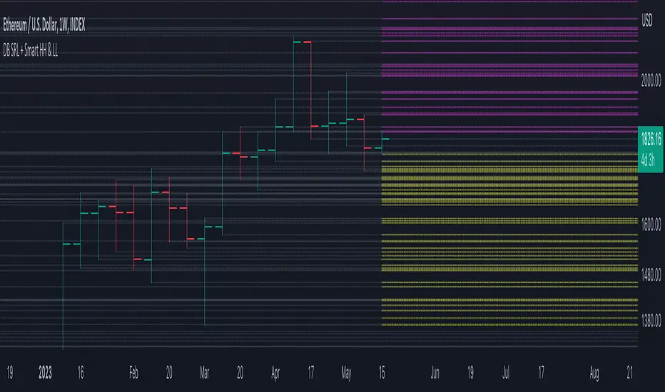
DB Support Resistance Levels + Smart Higher Highs and Lower LowsDB Support Resistance Levels + Smart Higher Highs and Lower Lows
The indicator plots historic lines for high, low and close prices shown in settings as "base levels". Users can control the lookback period that is plotted along with an optional multiplier. Traders will notice that the price bounces off these historic base levels. The base levels are shown as light gray by default (customizable in the settings). Users may choose to display base levels by a combination of historic high, low and close values.
On top of the historic base levels, the indicator display higher high and lower low levels from the current bar high/low. Higher highs are shown by default in pink and lower lows by default in yellow. The user can adjust the lookback period for displaying higher highs and the optional multiplier. Only historic values higher than the current bar high are displayed filtering out (by highlighting) the remaining levels for the current bar. Users may choose to use a combination of historic open, low and close values for displaying higher highs. The user can adjust the lookback period for displaying lower lows and the optional multiplier. Only historic values lower than the current bar low are displayed filtering out (by highlighting) the remaining levels for the current bar. Users may choose to use a combination of historic open, low and close values for displaying lower low.
The indicator includes two optional filters for filtering out higher highs and lower lows to focus (highlight) the most relevant levels. The filters include KC and a simple price multiplier filter. The latter is enabled by default and recommended.
The indicator aims to provide two things; first a simple plot of historic base levels and second as the price moves to highlight the most relevant levels for the current price action. While the indicator works on all timeframes, it was tested with the weekly. Please keep in mind adjusting the timeframe may require the lookback settings to be adjusted to ensure the bars are within range.
How should I use this indicator?
Traders may use this indicator to gain a visual reference of support and resistance levels from higher periods of time with the most likely levels highlighted in pink and yellow. Replaying the indicator gives a visual show of levels in action and just how very often price action bounces from these highlighted levels.
Additional Notes
This indicator does increase the max total lines allowed which may impact performance depending on device specs. No alerts or signals for now. Perhaps coming soon...
"smart" için komut dosyalarını ara
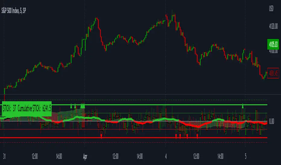
LNL Smart TICKLNL Smart TICK
This study is mostly beneficial for intraday traders. It is basically a user-friendly "colorful" representation of the $TICK chart with highlighted $TICK extremes. This indicator also includes: a simple trend gauge that can visualize the bias for the day, cumulative tick cloud which is showing the cumulative strength of either longs & shorts on the day.
$TICK Trend Gauge
Although it is just a exponential moving average. This average (default set on 20) works quite well as an overall gauge for the day. Whenever the gauge is green (above zero), any negative $TICK values below -500 can offer great pullback opportunities. Same applies for the red gauge. 20 EMA is below zero ? Great time to fade any +500 or +1000 tick readings. Obviously the gauge can be ajdusted to any number based on personal style.
$TICK Extremes (little triangles)
These little triangles are triggered anytime $TICK jumps above or below the pre-set values of +1000 or -1000. By just simply observing the $TICK triangles during the day can tell you how much volaility or pressure there is. Sometimes there will be 20 green triangles and only 2 red ones. That obviously mean there is a strong bearish pressure. But there will be days when you are not going to see any triangles at all which can mean there is either a low volatility or the price is stuck in the indecisive market.
Cumulative $TICK Cloud
Cumulative $TICK by itself is a great study for day traders. It is basically running "counting" $TICK that is adding the previous $TICK values from previous bars. Cumulative $TICK can create a direct picture of the current market sentiment. It is not just a simple green / red line but a cloud that can really show you the depth on the $TICK. Some days, the cloud will be quite wide which is a good sign for the strength to one side, but sometimes the cloud will be so narrow it will practically disappear. This would be telling you the exact opposite - not much conviction to any side. Of course the depth as well as the color of the cloud can change during the day.
$TICK & Cumulative $TICK Tables
By just looking at these tables. You can immidiately tell the state of the current $TICK. They both can be red or green. It all depends whether the values are positive or negative. The tables are just a little visual addition to the whole $TICK study.
Hope it helps.
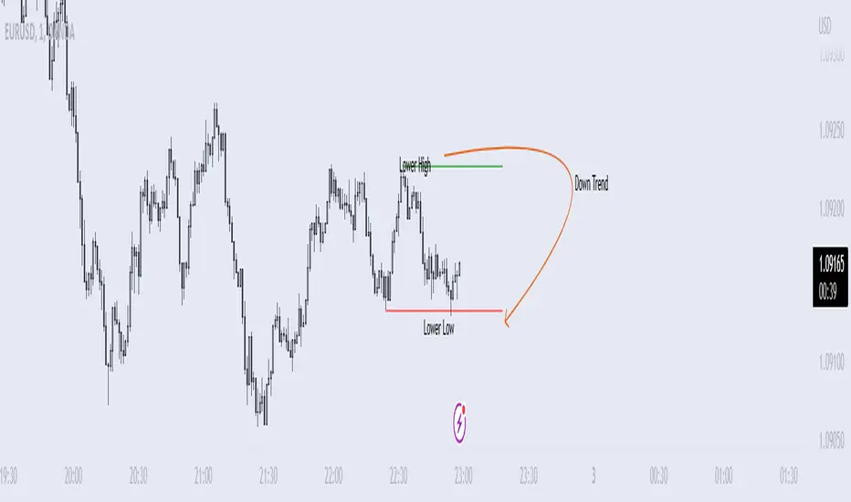
Price Swing Detection - Smart Money ConceptSince my own style is Smart Money Concept and these days I have seen a lot of my friends who are having trouble identifying structures for their indicators and strategies. I wrote this code so they could use it in their strategy . In fact, this type of structure, as one of the strongest technical structures, can increase the success of your strategy according to your personalization.
The script detects swings (i.e. significant highs and lows) in a financial instrument's price action over a specified period. The user can set the lookback period (number of candles to consider) and the colors of the lines representing bullish and bearish trends.
The script has two functions: detectSwing and pivot high. The detectSwing function calculates the swing highs and lows for the specified number of candles. The function uses the ta.highest and ta.lowest functions to find the highest and lowest prices, respectively, over the lookback period. The function also determines the swing state (high or low) of the current candle and returns the calculated swing values.
The pivot high function calculates the pivot high, which is an important step in detecting bullish structures in the market. If a new top (i.e. swing high) is found, the script updates the pivot high values and creates a line from the recent top to the last bar. The script also updates the trailing maximum values, which are used to extend the top extension line.
For Strategy :
The variable "trendDirection" in the code is used to keep track of the trend state, either bullish (up trend) or bearish (down trend), in the market. The variable is initialized to 0 which represents a downtrend. The value of this variable is updated later in the code based on the calculations of swing highs and lows, pivot crosses, and the trailing maximum. If a bullish structure is detected, the value of "trendDirection" is set to 1, indicating an uptrend.
MACD Alert [All MA in one] [Smart Crypto Trade (SCT)]This code is a gift from "Smart Crypto Trade (SCT)" group
MACD indicator contains 3 EMA, I think one of the best usage of MACD is trend detection and divergences.
In our indicator, you can select the type of Moving averages that used in macd.
You can using "MACD" based on several types of moving averages including:
Exponential Moving Average ( EMA )
Volume-Weighted Moving Average ( VWMA )
Simple Moving Average ( SMA )
Weighted Moving Average ( WMA )
Exponentially Weighted Moving Average (RMA) that used in RSI
Smoothed Moving Average ( SMMA )
Arnaud Legoux Moving Average ( ALMA )
Double EMA ( DEMA )
Double SMA (DSMA)
Double WMA (DWMA)
Double RMA (DRMA)
Triple EMA ( TEMA )
Triple SMA (TSMA)
Triple WMA (TWMA)
Triple RMA (TRMA)
Linear regression curve Moving Average ( LSMA )
Variable Index Dynamic Average ( VIDYA )
Fractal Adaptive Moving Average ( FRAMA )
In other words we tried to collect all the most popular MAs in our MACD indicator.
In addition, you can use four types of alert or alarm conditions for detection LONG or SHORT positions and trends. For this, you must set an alert in alert tab and set the condition based on four defaults conditions.
Enjoy

[LunaOwl] 智慧型RSI (Smart RSI - a handy tool with less noise)Relative Strength Index is a common technical analysis tool, it is classified as a momentum oscillator, measuring the velocity and magnitude of directional price movements. it is most typically used on a 14-period timeframe, measured on a scale from 0 to 100, with high and low levels marked at 70 and 30.
相對強弱指標是常見的技術分析工具,它被歸類為動量振盪器,用於測量定向價格運動的速度和幅度,通常會使用14期數,擺盪範圍在0到100間,超買超賣分別標記成70、30。
after simple improvement and addition of logical judgment, it becomes a passive judge from subjective judgments, avoid the shortcomings of peoples in watching passivation, and the trade can be more consistent.
經過簡單的改良與添加邏輯判斷,能夠使RSI指標的使用,從主觀的判斷成為被動的確認指標,有效避免人們判斷指標鈍化的主觀缺失,並能夠使得交易更加一致。
--------------------------*
1) parameter
RSI period 1 - default is 14, same as general RSI.
RSI period 2 - default is 5, due to its own formula, the amplitude of the oscillator will become larger and more agile or fast. When the parameter is small.
exponential moving avg of RSI - using the result of RSI period 1 as the source of Ema's formula, the default length is 14, which can filter the excessive agility of RSI period 2 to reduce noise, and compared to using the baseline as the criterion for long and short judgments, The characteristics of exponential moving avg are more suitable to become flexible filtering standards.
Overbought - default is 70, you can set your overbought level.
Oversold - same as above, the default is 30.
2) Options
Open Candle color(開啟蠟燭線趨勢) - choose whether to start the color of the candle.
Open background color(開啟指標背景色) - the default is false, you can turn on.
--------------------------*
1. 設置參數
RSI期數1:預設值是14,是普通的RSI指標。
RSI期數2:預設值是5,由於RSI公式的算法,造成參數愈小擺盪幅度就會變大,反應比較快。
指數平均化的RSI期數1:將RSI期數1的結果帶入指數移動平均公式,預設值14,它能過濾RSI期數2過度敏捷的缺點,減少雜訊,相較於單純使用基準線作為多空判斷標準,用EMA的判斷標準更加因時制宜。
超買線:預設值是70,可以隨意調。
超賣線:預設值是30,一樣的。
2. 設定選項
開啟蠟燭線趨勢:顧名思義。已經幫您開好了。
開啟指標背景色:顏色太淺的話可以調深一點。
--------------------------*
ver.2- adjust new style design and create two options.
修改2: 調整新的樣式設計與建立兩個選項。
--------------------------*
ver.3- Create alert condition. maybe I should refer to the Alert Creation Framework,
there is also room for improvement.
修改3: 建立快訊選項。我應該參考警報創建框架,還有進步空間。
--------------------------*
Indicator Style - 指標樣式
The design uses casual light color style, light gray between overbought and oversold.
--------------------------*
Market Example - 市場範例
1. Bitcoin/Tether, Binance, 1 day
2. Bitcoin/USD, Coinbase, 4 hour
3. EUR/USD, Forex Market, 4 hour
4. GBP/USD, Forex Market, 30 min
5. TAIEX, Taiwan SE Weighted Index, 1 week
--------------------------*
postscript - 後記感想
The purpose of publishing Chinese Scripts is to make Pine close to more Chinese user.
I hope English skills enhancement...staggered writing makes me feel hard.
發布中文腳本的目的,是希望可以讓 Pine 親近更多中文圈的使用者。希望我的英語進步,中英文交錯撰寫有一些困難。
--------------------------*
If you find my works useful, you can give me encouragement. I can buy more books to sophisticated themselves.
如果您發現我的作品有用,可以給我鼓勵。讓我可以買更多書籍來精進自己。

MSTY-WNTR Rebalancing SignalMSTY-WNTR Rebalancing Signal
## Overview
The **MSTY-WNTR Rebalancing Signal** is a custom TradingView indicator designed to help investors dynamically allocate between two YieldMax ETFs: **MSTY** (YieldMax MSTR Option Income Strategy ETF) and **WNTR** (YieldMax Short MSTR Option Income Strategy ETF). These ETFs are tied to MicroStrategy (MSTR) stock, which is heavily influenced by Bitcoin's price due to MSTR's significant Bitcoin holdings.
MSTY benefits from upward movements in MSTR (and thus Bitcoin) through a covered call strategy that generates income but caps upside potential. WNTR, on the other hand, provides inverse exposure, profiting from MSTR declines but losing in rallies. This indicator uses Bitcoin's momentum and MSTR's relative strength to signal when to hold MSTY (bullish phases), WNTR (bearish phases), or stay neutral, aiming to optimize returns by switching allocations at key turning points.
Inspired by strategies discussed in crypto communities (e.g., X posts analyzing MSTR-linked ETFs), this indicator promotes an active rebalancing approach over a "set and forget" buy-and-hold strategy. In simulated backtests over the past 12 months (as of August 4, 2025), the optimized version has shown potential to outperform holding 100% MSTY or 100% WNTR alone, with an illustrative APY of ~125% vs. ~6% for MSTY and ~-15% for WNTR in one scenario.
**Important Disclaimer**: This is not financial advice. Past performance does not guarantee future results. Always consult a financial advisor. Trading involves risk, and you could lose money. The indicator is for educational and informational purposes only.
## Key Features
- **Momentum-Based Signals**: Uses a Simple Moving Average (SMA) on Bitcoin's price to detect bullish (price > SMA) or bearish (price < SMA) trends.
- **RSI Confirmation**: Incorporates MSTR's Relative Strength Index (RSI) to filter signals, avoiding overbought conditions for MSTY and oversold for WNTR.
- **Visual Cues**:
- Green upward triangle for "Hold MSTY".
- Red downward triangle for "Hold WNTR".
- Yellow cross for "Switch" signals.
- Background color: Green for MSTY, red for WNTR.
- **Information Panel**: A table in the top-right corner displays real-time data: BTC Price, SMA value, MSTR RSI, and current Allocation (MSTY, WNTR, or Neutral).
- **Alerts**: Configurable alerts for holding MSTY, holding WNTR, or switching.
- **Optimized Parameters**: Defaults are tuned (SMA: 10 days, RSI: 15 periods, Overbought: 80, Oversold: 20) based on simulations to reduce whipsaws and capture trends effectively.
## How It Works
The indicator's logic is straightforward yet effective for volatile assets like Bitcoin and MSTR:
1. **Primary Trigger (Bitcoin Momentum)**:
- Calculate the SMA of Bitcoin's closing price (default: 10-day).
- Bullish: Current BTC price > SMA → Potential MSTY hold.
- Bearish: Current BTC price < SMA → Potential WNTR hold.
2. **Secondary Filter (MSTR RSI Confirmation)**:
- Compute RSI on MSTR stock (default: 15-period).
- For bullish signals: If RSI > Overbought (80), signal Neutral (avoid overextended rallies).
- For bearish signals: If RSI < Oversold (20), signal Neutral (avoid capitulation bottoms).
3. **Allocation Rules**:
- Hold 100% MSTY if bullish and not overbought.
- Hold 100% WNTR if bearish and not oversold.
- Neutral otherwise (e.g., during choppy or extreme markets) – consider holding cash or avoiding trades.
4. **Rebalancing**:
- Switch signals trigger when the hold changes (e.g., from MSTY to WNTR).
- Recommended frequency: Weekly reviews or on 5% BTC moves to minimize trading costs (aim for 4-6 trades/year).
This approach leverages Bitcoin's influence on MSTR while mitigating the risks of MSTY's covered call drag during downtrends and WNTR's losses in uptrends.
## Setup and Usage
1. **Chart Requirements**:
- Apply this indicator to a Bitcoin chart (e.g., BTCUSD on Binance or Coinbase, daily timeframe recommended).
- Ensure MSTR stock data is accessible (TradingView supports it natively).
2. **Adding to TradingView**:
- Open the Pine Editor.
- Paste the script code.
- Save and add to your chart.
- Customize inputs if needed (e.g., adjust SMA/RSI lengths for different timeframes).
3. **Interpretation**:
- **Green Background/Triangle**: Allocate 100% to MSTY – Bitcoin is in an uptrend, MSTR not overbought.
- **Red Background/Triangle**: Allocate 100% to WNTR – Bitcoin in downtrend, MSTR not oversold.
- **Yellow Switch Cross**: Rebalance your portfolio immediately.
- **Neutral (No Signal)**: Panel shows "Neutral" – Hold cash or previous position; reassess weekly.
- Monitor the panel for key metrics to validate signals manually.
4. **Backtesting and Strategy Integration**:
- Convert to a strategy script by changing `indicator()` to `strategy()` and adding entry/exit logic for automated testing.
- In simulations (e.g., using Python or TradingView's backtester), it has outperformed buy-and-hold in volatile markets by ~100-200% relative APY, but results vary.
- Factor in fees: ETF expense ratios (~0.99%), trading commissions (~$0.40/trade), and slippage.
5. **Risk Management**:
- Use with a diversified portfolio; never allocate more than you can afford to lose.
- Add stop-losses (e.g., 10% trailing) to protect against extreme moves.
- Rebalance sparingly to avoid over-trading in sideways markets.
- Dividends: Reinvest MSTY/WNTR payouts into the current hold for compounding.
## Performance Insights (Simulated as of August 4, 2025)
Based on synthetic backtests modeling the last 12 months:
- **Optimized Strategy APY**: ~125% (by timing switches effectively).
- **Hold 100% MSTY APY**: ~6% (gains from BTC rallies offset by downtrends).
- **Hold 100% WNTR APY**: ~-15% (losses in bull phases outweigh bear gains).
In one scenario with stronger volatility, the strategy achieved ~4533% APY vs. 10% for MSTY and -34% for WNTR, highlighting its potential in dynamic markets. However, these are illustrative; real results depend on actual BTC/MSTR movements. Test thoroughly on historical data.
## Limitations and Considerations
- **Data Dependency**: Relies on accurate BTC and MSTR data; delays or gaps can affect signals.
- **Market Risks**: Bitcoin's volatility can lead to false signals (whipsaws); the RSI filter helps but isn't perfect.
- **No Guarantees**: This indicator doesn't predict the future. MSTR's correlation to BTC may change (e.g., due to regulatory events).
- **Not for All Users**: Best for intermediate/advanced traders familiar with ETFs and crypto. Beginners should paper trade first.
- **Updates**: As of August 4, 2025, this is version 1.0. Future updates may include volume filters or EMA options.
If you find this indicator useful, consider leaving a like or comment on TradingView. Feedback welcome for improvements!

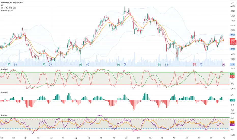
SmartMind2The MACD (Moving Average Convergence Divergence) is a popular technical indicator in trading, primarily used to detect trends and possible reversal points.
How is the MACD structured?
The MACD indicator consists of three components:
MACD Line:
Calculated as the difference between two exponential moving averages (EMAs), commonly 12 and 26 periods.
Formula:
MACD Line
=
𝐸
𝑀
𝐴
12
(
Price
)
−
𝐸
𝑀
𝐴
26
(
Price
)
MACD Line=EMA
12
(Price)−EMA
26
(Price)
Signal Line:
An exponential moving average (usually 9 periods) of the MACD line.
Formula:
Signal Line
=
𝐸
𝑀
𝐴
9
(
MACD Line
)
Signal Line=EMA
9
(MACD Line)
Histogram:
Graphically represents the difference between the MACD line and the Signal line.
Formula:
Histogram
=
MACD Line
−
Signal Line
Histogram=MACD Line−Signal Line
Interpretation of MACD:
Buy Signal: Occurs when the MACD line crosses above the signal line (bullish signal).
Sell Signal: Occurs when the MACD line crosses below the signal line (bearish signal).
Trend Reversal: A divergence between price movements and the MACD indicates a potential reversal (e.g., rising prices with a falling MACD).
Financial Conditions Composite Z-Score1. Inputs and Data Sources
The script pulls data for the following financial metrics using TradingView's request.security function:
CBOE:VIX (Volatility Index): A measure of market volatility.
MOVE Index: A measure of bond market volatility (or Treasury volatility).
BAMLH0A0HYM2 (High-Yield Spread): The spread between high-yield corporate bonds and Treasury yields.
BAMLC0A0CM (Credit Spread): The spread for investment-grade corporate bonds.
Each of these metrics represents a key aspect of financial conditions:
VIX: Equity market risk.
MOVE: Bond market risk.
High-Yield Spread and Credit Spread: Perception of risk in corporate debt.
2. Z-Score Calculation
A z-score standardizes each metric to show how far it deviates from its average over a specified period (lookback = 160, or 160 days):
Positive z-scores indicate the metric is higher than average.
Negative z-scores indicate the metric is lower than average.
The formula for the z-score:
Z-Score = Metric − Mean
Standard Deviation Z-Score = Standard Deviation Metric−Mean
3. Combined Z-Score
The script combines the four individual z-scores into a single Composite Z-Score, equally weighted across the metrics:
Combined Z-Score = (Z VIX + Z MOVE + Z High-Yield Spread + Z Credit Spread) / 4
This Combined Z-Score provides an overall measure of financial conditions:
Positive combined z-scores indicate tighter or riskier financial conditions.
Negative combined z-scores indicate looser or less risky financial conditions.
4. Visual Elements on the Chart
A. Colorful Lines: Individual Z-Scores
Each of the four metrics is plotted as a separate line:
Red: Z-score of the VIX.
Green: Z-score of the MOVE index.
Orange: Z-score of the high-yield spread.
Purple: Z-score of the credit spread.
These lines show how each metric contributes to the overall financial conditions. For example:
A rising red line means increasing equity market volatility (risk).
A rising green line means increasing bond market volatility (risk).
B. Blue Line: Combined Z-Score
The blue line represents the Combined Z-Score. It aggregates the individual z-scores into a single measure:
A rising blue line suggests financial conditions are tightening (greater risk across markets).
A falling blue line suggests financial conditions are loosening (lower risk across markets).
C. Red and Green Background: Z-Score Regions
Red Background: When the Combined Z-Score is positive (>0), it indicates riskier or tighter financial conditions.
Green Background: When the Combined Z-Score is negative (<0), it indicates less risky or looser financial conditions.
This background coloring helps visually distinguish periods of riskier financial conditions from less risky ones.
5. Purpose of the Visualization
This indicator provides a comprehensive view of financial conditions across multiple asset classes:
Traders can use it to gauge the level of systemic market stress.
Investors can use it to assess when risk is elevated (positive z-scores) or subdued (negative z-scores).
It helps in decision-making for strategies that depend on market volatility or risk appetite.
Summary of What You See:
Colorful Lines (Red, Green, Orange, Purple): Individual z-scores for each metric (VIX, MOVE, high-yield spread, credit spread).
Blue Line: The aggregated Combined Z-Score that summarizes financial conditions.
Red and Green Background:
Red: Tight or risky financial conditions (Combined Z-Score > 0).
Green: Loose or low-risk financial conditions (Combined Z-Score < 0).
This visualization provides a multi-dimensional view of financial conditions at a glance, helping to identify periods of high or low risk in the markets.

Long Short Trading System With TableSmart Trading System Pro is an advanced TradingView indicator designed for precision and clarity.
It combines Order Blocks, Liquidity Zones, EMA trend alignment, MACD, RSI, Volume, and ATR-based risk management to generate high-quality LONG / SHORT signals.
🔹 Clear trade direction
🔹 Smart entry, stop-loss & multi-level take-profit
🔹 Automatic risk/reward & leverage calculation
🔹 Clean visual dashboard for fast decision-making
Built for traders who value structure, confirmation, and risk control.
Best suited for crypto, forex, and indices on all timeframes.
Disclaimer:
This indicator is for educational and informational purposes only and does not constitute financial advice.
Trading involves risk, and past performance does not guarantee future results.
You are solely responsible for your trading decisions and outcomes.

AKILLI ANALIZ TERMINALI (V20-REVIZE)SMART ANALYSIS TERMINAL (V20-ULTIMATE)
This indicator is a professional-grade analysis terminal designed for both strategic daily analysis (Swing Trade) and real-time intraday trading (Scalp/Day Trade). It allows you to perform a complete technical X-ray of the market on a single dashboard.
CORE FEATURES:
- Dual-Mode Hybrid Engine: Choose between "NIGHT (ANALYSIS)" or "IN-DAY (AGGRESSIVE)" modes in settings. Mathematical periods and target levels update automatically.
- Smart Scoring System: Blends RSI, MACD, EMA, ADX, and Volume data to produce 5 distinct signals from "VERY POSITIVE" to "VERY NEGATIVE."
- Symmetrical Visual Panel: Left panel displays Live Signal, Pivot Balance, Money Flow, and Target/Support; right panel focuses on RSI, Trend, Momentum, and Volume confirmation.
- Money Flow Algorithm: Detects institutional accumulation (Entry) or distribution (Exit) by analyzing price-volume correlation.
USER GUIDE:
1. NIGHT MODE: Use for evening analysis to plan for the next day. Based on EMA 20/50 and standard MACD values.
2. IN-DAY MODE: Use during live sessions on 5m and 15m charts. Catch instant momentum shifts with EMA 9/21 and aggressive settings.

Correlation Pro
Smart Correlation Pro is an indicator for assessing the correlation between two assets in the market. It analyzes correlation over a selected period and provides traders with flexible tools for making informed decisions.
Key Features:
1. Correlation coefficient (-1 to 1):
• 1: Perfect positive correlation (movement in the same direction).
• 0: No correlation (assets are independent).
• -1: Perfect negative correlation (movement in opposite directions).
2. Dynamic analysis:
• Changes the color of the line depending on the strength of the correlation:
• Green — high positive correlation.
• Red — high negative correlation.
• Gray — weak or no correlation.
3. Trading signals:
• Automatic alerts when important correlation levels are reached (> 0.8 or < -0.8).
• Visual cues for identifying potential entry points or risk diversification.
4. Customizable settings:
• Compare any two assets (e.g., BTC and ETH).
• Ability to choose the correlation calculation period.
Who it’s for:
• Traders analyzing coin movements in the cryptocurrency market.
• Investors looking for the strongest or weakest assets for their portfolio.
• Those working with hedging or diversification strategies.
How to Use:
1. Set the second asset in the indicator settings.
2. Analyze the correlation change on the chart:
• High positive correlation → similar price movement, opportunity for hedging.
• High negative correlation → opposite movement, suitable for diversification.
• Low correlation → independence of assets, opportunity to choose the stronger asset.
Benefits:
• Easy to use.
• Instant analysis of asset correlations.
• Increases decision-making accuracy in the market.
(Опис:
Smart Correlation Pro — це індикатор для оцінки взаємозв’язку між двома активами на ринку. Він аналізує кореляцію за обраним періодом та надає трейдерам гнучкі інструменти для ухвалення обґрунтованих рішень.
Основні можливості:
1. Коефіцієнт кореляції (-1 до 1):
• 1: Ідеальна позитивна кореляція (рух в одному напрямку).
• 0: Відсутність кореляції (активи незалежні).
• -1: Ідеальна негативна кореляція (рух у протилежних напрямках).
2. Динамічний аналіз:
• Змінює колір лінії залежно від сили кореляції:
• Зелений — висока позитивна кореляція.
• Червоний — висока негативна кореляція.
• Сірий — слабка або відсутня кореляція.
3. Сигнали для трейдингу:
• Автоматичні оповіщення при досягненні важливих рівнів кореляції (> 0.8 або < -0.8).
• Візуальні підказки для визначення можливих точок входу або диверсифікації ризиків.
4. Гнучкість налаштувань:
• Порівнюйте будь-які два активи (наприклад, BTC та ETH).
• Можливість обирати період розрахунку кореляції.
Кому підходить:
• Трейдерам, які аналізують рух монет на криптовалютному ринку.
• Інвесторам, що шукають найсильніші або найслабші активи для портфеля.
• Тих, хто працює з хеджуванням або диверсифікацією.
Як використовувати:
1. Встановіть другий актив у параметрах індикатора.
2. Аналізуйте зміну кореляції на графіку:
• Висока позитивна кореляція → схожий рух цін, можливість хеджування.
• Висока негативна кореляція → протилежний рух, підходить для диверсифікації.
• Низька кореляція → незалежність активів, можливість вибору сильнішого активу.
Переваги:
• Простота у використанні.
• Миттєвий аналіз взаємозв’язків між активами.
• Підвищує точність рішень на ринку.)

Smart Take ProfitThis script for EURUSD on the M3 timeframe detects Take Profit zones close to a reversal, automatically displays TP1, TP2, and Stop Loss, and follows the RSI + Bollinger Band + ATR logic.
It triggers an exit signal when the price touches a Bollinger Band, when the RSI is in an extreme zone, or when there is a rejection candle.
It automatically calculates the TP at 0.8 ATR, TP2 at 1.0 ATR, and the Stop Loss at 0.6 ATR.
It operates on the EURUSD M3 timeframe. You decide the entry point. This indicator is not a trading strategy.

Smart Position Calculator: Risk, Margin & TicksAre you tired of manually calculating position sizes or using clumsy external calculators? This minimalist indicator solves the problem directly on your chart.
It tells you exactly how much to buy/sell to risk a specific dollar amount (e.g., $50), considering your leverage and commissions.
Key Benefits:
Protect your deposit: Standardize your risk per trade.
Plan better: See your Risk/Reward ratio and Commission costs instantly.
Trade comfortably: The UI adapts to your screen (Dark/Light modes + Font Size control).
Scalp precisely: See distance in Ticks.
How it works:
Add to Favorites.
Select Entry, Stop, and Take Profit points on the chart.
Read the table.

Smart Multi-Timeframe SeparatorsHere you will get Hourly, daily, weekly and monthly candle separator and also Running candle formation. Enjoy our indiactor. Happy Trading. Drop your feedback also please.

Smart Auto-Step Openndicator Name: 15m Reversal Strategy (Polymarket)
Short Description: A mean-reversion strategy designed for the 15-minute timeframe. It identifies overextended short-term trends and signals entries on the probability of a reversal candle.

Smart Floors & Ceilings [RSI + Volume] - MarcDuckMarks floors and ceilings based off of RSI and Volume

Smart Scalper Pro Template + VWAP
📌 Author
Garry Evans
Independent system developer focused on:
Risk-first automation
Market structure & liquidity behavior
Discipline, consistency, and capital preservation
“The edge isn’t the market — it’s the man who survives it.”
⚙️ Risk Management & Position Sizing
The script is built around capital protection, not signal frequency.
Risk logic includes:
Fixed or dynamic risk per trade
Market-adaptive position sizing
Session-based trade limits
Daily trade caps and auto-lockout protection
Volatility-aware sizing (futures & crypto)
⚠️ Profit is pursued only after risk is controlled.
📊 Track Record
Backtested across multiple market environments
Forward-tested and actively used by the author
Real-account trades are logged where platform rules allow
Results vary by market, timeframe, and user-defined risk settings.
🌍 Supported Markets
Designed to work across all liquid markets, including:
Stocks
Crypto (spot & futures)
Options (signal-based framework)
Futures (indices, metals, crypto futures)
The system adapts to volatility and structure — it is not market-specific.
⚖️ Leverage
Leverage is not required
If used, leverage is fully user-controlled
Risk logic scales exposure conservatively
No martingale.
No revenge sizing.
No over-exposure logic.
🧪 Backtesting
✔ Yes
Strategy logic has been backtested
Filters reduce chop, noise, and forced trades
Focus on drawdown control over curve-fitting
🛠 Support
✔ Yes
Direct author support
Ongoing improvements and updates
Feature refinement based on real usage and feedback
👥 Community
✔ Yes
Private user access
High-quality feedback environment
No public signal spam or hype-driven chat rooms
⏳ Trial Period
✔ Yes
Limited trial access available
Designed for evaluation only
Trial users do not receive full feature access
🚫 Who This Script Is NOT For
This system is not for:
Traders looking for guaranteed profits
Users expecting copy-paste “signal calls”
Over-leveraged gamblers
Those unwilling to follow risk rules
Anyone seeking overnight results
This is a discipline and automation tool, not a shortcut.
🧠 Final Positioning
This is not a signal service.
This is a risk-controlled execution framework designed to:
Enforce discipline
Reduce emotional trading
Protect capital during bad market conditions
Scale responsibly during favorable ones

Elite Elliott Wave - Auto Fibonacci Smart Mode: Automatically selects optimal levels
📊 Adaptive: Adjusts based on wave characteristics
🎯 Intelligent: Shows extensions only when Wave 3 is extended
💪 Accurate: Elliott Wave validation with confidence scores

Smart S&D v1.0 [Breaker Blocks]Automatically marks off supply and demand zones based on previous and consequent candles.
Previous and consequent candles can be changed.
Recommend 5:3 for 15m, or 7:5 for 10m
ATR default 1
Volume confirmation off by default but there as an option
The number on bars is the number of times price has bounced off the zone. After 3 bounces (this can be changed/personalized in settings) the zone is exhausted and removed.
If price breaks through a zone, it becomes a breaker zone, flipping supply to demand, or demand to supply. Ideal for a break and retest setup.

SMART Algo Mode plus Session (Instrument Aware PLUS Warnings)It will color background red, yellow or green for each one of the instruments MGC, MNQ, MYM and MES depending on the hour of the day and the mode (scalp vs swing) See table below
SCALP MODE (ET) MNQ / MES MYM MGC
08:20–09:30 GREEN YELLOW GREEN
09:30–11:00 GREEN GREEN GREEN
11:00–13:30 RED RED RED
13:30–15:00 YELLOW YELLOW YELLOW
15:00–16:00 YELLOW GREEN RED
After 16:00 RED RED RED
SWING MODE (ET) MNQ / MES MYM MGC
08:20–09:30 YELLOW YELLOW YELLOW
09:30–11:00 GREEN GREEN YELLOW
11:00–13:30 YELLOW YELLOW YELLOW
13:30–15:00 GREEN GREEN GREEN
15:00–16:00 GREEN GREEN RED
After 16:00 RED RED

Smart Candlestick Pattern Filter [MarkitTick]💡 This Script is a sophisticated technical analysis tool designed to identify, grade, and display over 40 distinct candlestick formations based on a proprietary strength and context filtering system. Unlike standard pattern finders that often clutter charts with conflicting signals, this script utilizes a hierarchy logic to display only the most significant pattern detected on any given candle, ensuring chart clarity and actionable data.
● Originality and Utility
The primary utility of this script lies in its filtering engine. Standard indicators often flag every minor Doji or Spinning Top, creating noise. This indicator categorizes patterns into five distinct levels of strength, ranging from simple indecision to very strong reversal or continuation signals.
Furthermore, it incorporates a Trend Context filter, which checks the relationship between price and a Simple Moving Average (SMA). This ensures that reversal patterns (like Hammers) are prioritized during downtrends, while continuation patterns are highlighted during established moves, reducing false positives.
● Methodology
The indicator evaluates price action using specific ratios between the Open, High, Low, and Close, alongside the body size relative to the total range. It assigns a strength score to each detected pattern.
• Pattern Strength Grading
Strength 1 (Indecision): Includes patterns like Doji, Spinning Tops, Dragonfly, and Gravestone Dojis. These signal a pause in momentum.
Strength 2 (Weak): Includes patterns like Hanging Man, Inverted Hammer, Belt Holds, and In-Neck lines. These suggest potential movement but often require confirmation.
Strength 3 (Moderate): Includes classic reversals like Hammers, Shooting Stars, Haramis, Dark Cloud Cover, and Piercing Lines.
Strength 4 (Strong): Includes major signals like Engulfing patterns, Morning/Evening Stars, and Marubozu candles.
Strength 5 (Very Strong): Reserved for rare, high-probability multi-candle formations like Three White Soldiers, Three Black Crows, Rising/Falling Three Methods, and Breakaway gaps.
The script calculates all potential patterns for the current bar and then compares their strength scores. Only the pattern with the highest strength is displayed. If the Show Trend Context option is enabled, the script further validates the pattern against the current market direction (determined by the SMA and slope) before plotting.
● How to Use
Traders can use this tool to identify potential entry and exit points based on the strength of the signal.
• Visual Signals
Patterns are labeled directly on the chart:
Green Labels/Text: Indicate Bullish patterns.
Red Labels/Text: Indicate Bearish patterns.
Gray/White Labels: Indicate Indecision or Weak patterns.
Hovering over any label provides the full name of the pattern and its strength rating (e.g., "Bullish Engulfing - Strength: Strong").
• Trading Logic
High Strength Signals (Levels 4-5): These can be used as primary triggers for trend reversals or strong continuations.
Moderate Signals (Level 3): Useful for adding confluence to existing analysis or anticipating a setup.
Indecision (Level 1): Often useful for taking profits or tightening stop-losses, as they indicate the current trend may be stalling.
● Settings
Show Only Strong Patterns: When enabled, filters out Strength 1, 2, and 3, showing only the most significant signals (Strength >= 4).
Max Patterns to Display: Limits the number of historical labels to prevent chart clutter.
Max Candles to Check Engulfing: Adjusts how far back the script looks to validate the size of an engulfing candle.
Trend Detection Period: Sets the length of the SMA used to determine the background trend context.
Show Only Trend-Appropriate Patterns: If checked, bullish reversals are only shown in downtrends, and bearish reversals in uptrends.
● Disclaimer
All provided scripts and indicators are strictly for educational exploration and must not be interpreted as financial advice or a recommendation to execute trades. I expressly disclaim all liability for any financial losses or damages that may result, directly or indirectly, from the reliance on or application of these tools. Market participation carries inherent risk where past performance never guarantees future returns, leaving all investment decisions and due diligence solely at your own discretion.

Smart stock Uptrend Forecaster by Prawindesigned by Prawin for trying to forecast the trend of stocks.

Smart Gap Concepts [MarkitTick]💡 This indicator automates the identification and classification of price gaps, commonly known as Fair Value Gaps (FVG) or Imbalances, by integrating market structure and volume analysis. Unlike standard gap detectors that simply highlight empty space on a chart, this script applies algorithmic filters to categorize gaps into three distinct phases of market movement: Breakaway, Runaway, and Exhaustion. This helps traders understand the potential context of a move rather than just seeing a support or resistance zone.
● Originality and Utility
The primary innovation of this tool is its dynamic classification system. It moves beyond visual detection by checking the "why" behind the gap. By referencing Swing Highs and Swing Lows (Market Structure) alongside Volume efficiency, it determines if a gap represents a breakout, a trend continuation, or a climatic end to a move. Additionally, the script features an automated mitigation tracking system that removes gaps from the chart once price has re-tested the midpoint, ensuring the visual workspace remains clean and relevant to current price action.
● Methodology
The script operates on a multi-stage logic engine:
• Gap Detection
It first identifies the core imbalance where the Low of the current bar does not overlap with the High of the bar two periods prior (for bullish gaps), ensuring the intervening candle represents a strong displacement.
• Structural Analysis (Breakaway Gaps)
The script monitors Pivot Highs and Lows. If a gap occurs simultaneously with a close beyond a key structural Pivot, it is classified as a "Breakaway Gap." This signals the potential start of a new trend.
• Volume and Time Analysis (Exhaustion Gaps)
To identify potential reversals, the script looks for "Trend Maturity." If a gap forms after a long duration since the last pivot and is accompanied by a volume spike (defined by the Volume Spike Multiplier), it is labeled as an "Exhaustion Gap."
• Continuation (Runaway Gaps)
If a gap is valid but meets neither the Breakaway nor Exhaustion criteria, it is considered a "Runaway Gap," typically found in the middle of an established trend.
• Dynamic Cleanup
The script tracks the midpoint of every active gap. If price creates a lower low (for bullish gaps) or higher high (for bearish gaps) beyond this midpoint, the gap is considered mitigated and is removed from the screen.
📖 How to Use
Traders can utilize the color-coded classifications to gauge market intent:
Breakaway (Default Blue): Watch these zones for potential trend initiations. These are often high-probability areas for a retest entry after a structure break.
Runaway (Default Orange): These indicate strong momentum. They can be used to trail stop-losses or add to winning positions, as price should ideally not close below these gaps in a healthy trend.
Exhaustion (Default Red): Be cautious when these appear. They suggest the current move is overextended and a reversal or complex pullback may be imminent.
• Exhaustion Gap : A Practical Case Study
• Breakaway Gap: A Practical Case Study
• Runaway Gap : A Practical Case Study
⚙️ Inputs and Settings
Min Gap Size (Points): Filters out insignificant gaps smaller than this threshold.
Structure Lookback: Defines the sensitivity of the Pivot detection (Swing High/Low).
Volume Avg Length & Multiplier: Determines what qualifies as a "Volume Spike" for exhaustion logic.
Trend Maturity: The minimum number of bars required to consider a trend "old" enough for an exhaustion signal.
Visual Settings: Custom colors for each gap type and box extension length.
● Disclaimer
All provided scripts and indicators are strictly for educational exploration and must not be interpreted as financial advice or a recommendation to execute trades. I expressly disclaim all liability for any financial losses or damages that may result, directly or indirectly, from the reliance on or application of these tools. Market participation carries inherent risk where past performance never guarantees future returns, leaving all investment decisions and due diligence solely at your own discretion.
