ICT Market SessionsThis indicator highlights sessions, kill-zones and significant time elements on the chart based on ITC's method.
"session" için komut dosyalarını ara
London Breakout/Session GBP/USD Forex DaytradeThis is a forex strategy suited for day traders, specialized in the london breakout session
The key elements for this strategy are the specific london time session, together with an exit time(before asian trade/at the end of new york session).
At the same time, as logic elements we only use price action inside like :
For long we have 3 ascending candles, and for short we have 3 descending candles.
For exit we have both TP/SL based on price percentage movement, or we exit if we reach the end of the day.
If you have any questions message me in private !

Trading Sessions by Aflaq for UF TradersThis indicator is meant for traders under the UF Program who needs a quick way to show multiple sessions high and low
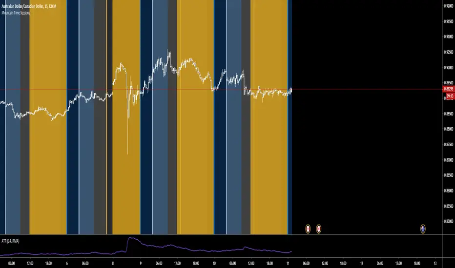
Mountain Time SessionsEdited sessions time zones for people in the Mountain Time Zone. thanks to original creator ChrisMoody.

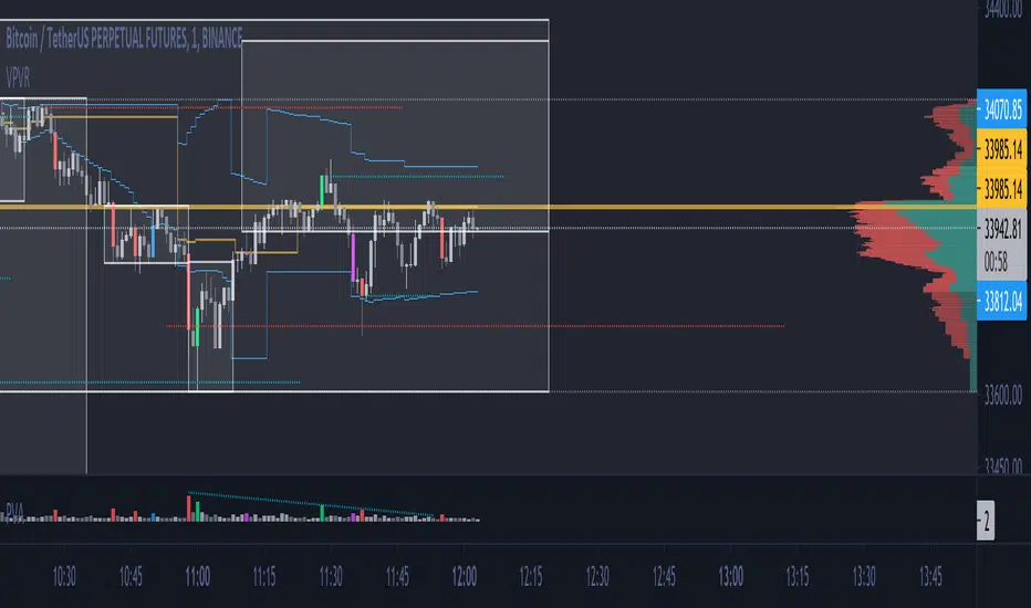
Market Profile for Futures with Session and After Hours SplitAdapted existing Market Profile scripts to be move suitable for Futures Markets with Session and After Hours split
Script Provides split Market Profiles for Session and After Hours
Users can customize the Session and AH hours inputs to suit any ticker and their interpretation of prime and non-prime hours

Fx Sessions For CryptoFx Sessions for crypto traders. High Volatility occurs at weekends, and NY-Assia overlap in week days.


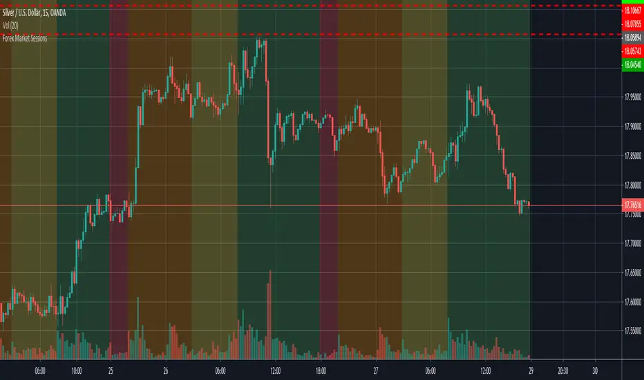
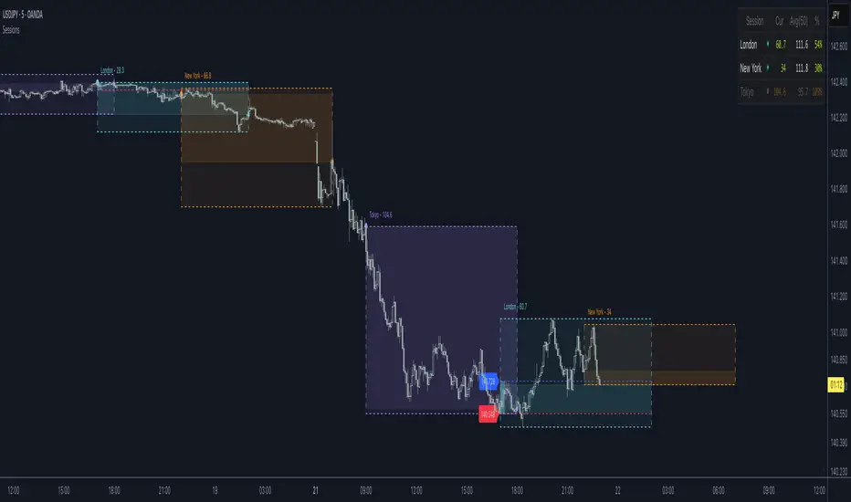
Fx SessionsThis script displays a lower strip to be aware of Fx Sessions (London, NY and Tokyo). Please pay attention to the pre London "Kill Zone" which comprehends the Gap between the Tokyo close (End of Yellow Strip) and the London open (Beginning of Aqua Strip).
Courtesy from Kevin Prudhom from Octopus Fx Academy.

NY PM Session Highlighter (For Hawaiian Traders)Purpose: This script is designed for traders targeting the New York PM Session (1:30 PM – 4:00 PM ET). Based on 5-year historical data for ES and NQ, this window represents a high-probability period for 2:1 Risk-to-Reward setups as institutional traders rebalance and drive price toward the daily close.
Key Features:
DST-Automated Tracking: Uses the America/New_York timezone to ensure the lines stay accurate during Daylight Saving transitions.
Visual Guidance: Draws a dashed vertical line at the 1:30 PM ET start and the 4:00 PM ET close.
Session Boxing: Highlights the background in a soft blue to define the "trading zone," helping you ignore the low-volume "lunch doldrums" that occur immediately before.
Hawaii-Friendly: Automatically adjusts to your local Hawaii Standard Time (HST) so you don't have to calculate the 5 or 6-hour offset manually.
Trade Logic:
Wait for the 1:30 PM ET (8:30 AM HST) line.
Look for a sweep of the 12:00 PM – 1:00 PM (Lunch) range.
Enter on a Market Structure Shift (MSS) or Fair Value Gap (FVG).
Target a 2:1 Reward-to-Risk ratio, aiming to exit by the 4:00 PM ET line.

Tom's Session Lows & HighsJust a simple indicator showing previous day, Asian Session & London Session lows and highs.

NQ ICT NY Session ChecklistNQ ICT NY Session Checklist
A manual, on-chart checklist indicator designed to enforce ICT execution rules during the New York session on Nasdaq (NQ). The script displays a step-by-step confirmation panel for higher-timeframe bias, liquidity identification, liquidity sweep, market structure shift, fair value gap entry, and risk/reward validation. It helps prevent early entries, FOMO, and overtrading by clearly indicating when all conditions are met and the trader is ready to execute.

HTB NY Session VWAP with Prev CloseVisual Distinction: The current VWAP is a bold pink line that moves with price, while the previous VWAP appears as a static, thin gray line, providing a clear "anchor" from yesterday's value.
Many institutional traders look for "Value Area" relationships. If today's price opens above the Previous Session VWAP, the market is considered "internally bullish." If it fails to hold that level and crosses below it, it often signals a "mean reversion" or a trend reversal.
Would you like me to add an alert that triggers specifically when the current price touches the Previous Session VWAP line?

ICT First FVG Per Session - Big Boss TradersICT First FVG Per Session like per session FVG Asia FVG london First P FVG and New york first P FVG

Support Resistance-Session Box Breakout Support Resistance-Session Box Breakout สามารถใช้แนวรับแนวต้านจากSupport Resistance-Session Box หาจุกลับตัวหรือหาจุดเข้าเทรดได้

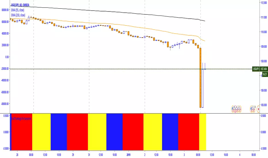
London Session + EMA 200 + UT BotCombined trading indicator featuring three powerful tools:🔵 London Session Box - Highlights the London trading session (0700-1600) with a customizable colored box to identify high-volume trading periods📈 EMA 200 - Exponential Moving Average for trend identification and dynamic support/resistance levels🎯 UT Bot - ATR-based trailing stop indicator with buy/sell signals and bar coloring for trend following

MarketMind LITEM🜁rketMind LITE ────────────────────
Essential Market Awareness, Reduced to Its Core
M🜁rketMind LITE is a lightweight market awareness tool designed to display essential situational context .
It provides basic orientation and movement awareness without interpretation, risk framing, diagnostics, or decision guidance.
This script is designed as a standalone awareness layer. It does not evaluate trade quality, issue signals, or influence decision-making.
WHAT IT DOES ────────────────────
M🜁rketMind LITE presents a minimal, static view of current market conditions focused entirely on awareness rather than analysis.
The system displays only essential context, allowing traders to stay oriented without introducing judgment, noise, or implied direction.
The script provides visibility into:
Time-of-day session context
Basic market regime classification (trending, range-bound, mixed)
Short-term momentum direction only (up, down, neutral)
A clean, static HUD display
M🜁rketMind LITE also includes a minimal visual state indicator that reflects recent price responsiveness, intended to be observed over time alongside the trader’s own experience.
The goal is to support awareness without influence .
HOW TO USE IT ────────────────────
M🜁rketMind LITE is not a signal generator.
It is designed to remain visible in the background of any chart, offering quiet orientation while traders rely entirely on their own process for analysis and execution.
Common use cases include:
Maintaining session awareness
Preserving context during focused trading periods
Reducing cognitive load while monitoring markets
M🜁rketMind LITE does not evaluate risk, alignment, or opportunity.
It simply shows what is happening.
DESIGN PHILOSOPHY ────────────────────
M🜁rketMind LITE is intentionally minimal.
It includes only essential awareness elements and excludes all interpretive or evaluative logic:
Situational context only
Directional momentum (up / down / neutral)
No diagnostics, confidence, or conviction framing
No process, risk, or quality assessment
Presentation controls only (HUD on/off, size, position)
Nothing is inferred.
Nothing is suggested.
This script shows market state without interpretation.
WHO IT IS FOR ────────────────────
M🜁rketMind LITE is suited for traders who:
Want passive situational awareness
Prefer minimal on-chart information
Already operate with a defined decision process
It is not designed for:
Analytical or diagnostic use
Risk evaluation or context synthesis
Traders seeking guidance or confirmation
IMPORTANT NOTES ────────────────────
M🜁rketMind LITE does not provide financial advice
No system can predict future price behavior
This tool is designed for awareness only
Used appropriately, M🜁rketMind LITE helps traders stay oriented without interference.

Auto Box Custom Pre SessionAuto Box Custom WIB Pre Session Asia (09.00 morning), London(14.00 evening), New York(19.00 night) M30 Area, M5 entry (winter session late 1 hour)
