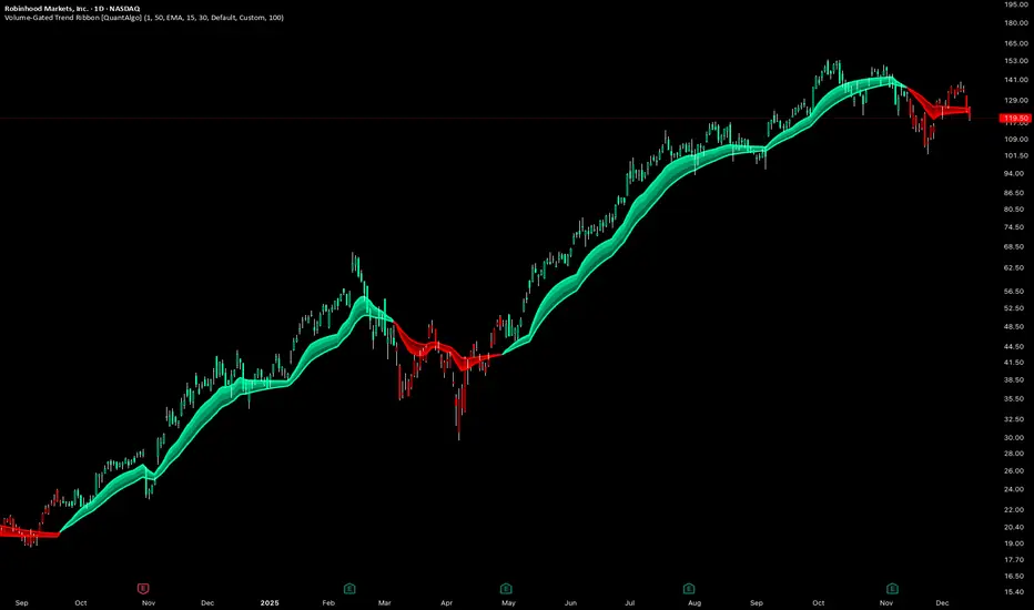
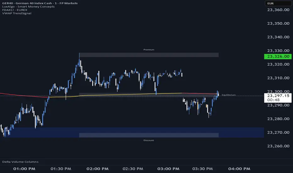
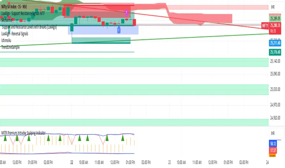
Institutional Zone Detector [Scalping-Algo]█ OVERVIEW
The Institutional Zone Detector identifies key supply and demand zones where large market participants (institutions, banks, hedge funds) have likely placed significant orders. These zones often act as powerful support and resistance levels, making them strategic areas for trade entries and exits.
This indicator is non-repainting, meaning once a signal appears on your chart, it will never disappear or change position. What you see in backtesting is exactly what you would have seen in real-time.
█ CORE CONCEPT
Markets move when large players execute substantial orders. These orders leave footprints in the form of specific candlestick patterns:
Demand Zones (Bullish)
When institutions accumulate positions, we often see a bearish candle followed by a strong bullish sequence. The last bearish candle before this move marks the demand zone - an area where buying pressure overwhelmed sellers.
Supply Zones (Bearish)
When institutions distribute positions, we typically see a bullish candle followed by a strong bearish sequence. The last bullish candle before this move marks the supply zone - an area where selling pressure overwhelmed buyers.
Price has a tendency to revisit these zones, offering potential trade opportunities.
█ HOW IT WORKS
The indicator scans for:
1. A potential zone candle (bearish for demand, bullish for supply)
2. A sequence of consecutive candles in the opposite direction
3. Optional: A minimum percentage move to filter weak signals
When all conditions are met, the zone is marked on your chart with:
• Upper and lower boundaries (solid lines)
• Equilibrium/midpoint level (cross marker)
• Extended channel lines for easy visualization
█ SETTINGS
Consecutive Candles Required (Default: 5)
Number of same-direction candles needed after the zone candle to confirm the pattern. Higher values = fewer but stronger signals.
Minimum Move Threshold % (Default: 0.0)
Minimum percentage price movement required to validate a zone. Increase this to filter out weak moves and focus on significant institutional activity.
Display Full Candle Range (Default: Off)
• Off: Shows Open-to-Low for demand zones, Open-to-High for supply zones
• On: Shows complete High-to-Low range of the zone candle
Show Demand/Supply Zone Channel (Default: On)
Toggle extended horizontal lines that project the zone levels across your chart.
Visual Theme (Default: Dark)
Choose between Dark (white/blue) or Light (green/red) color schemes.
Show Statistics Panel (Default: Off)
Displays a floating panel with exact price levels of the most recent zones.
Display Info Tooltip (Default: Off)
Shows an information label with indicator documentation.
█ HOW TO USE
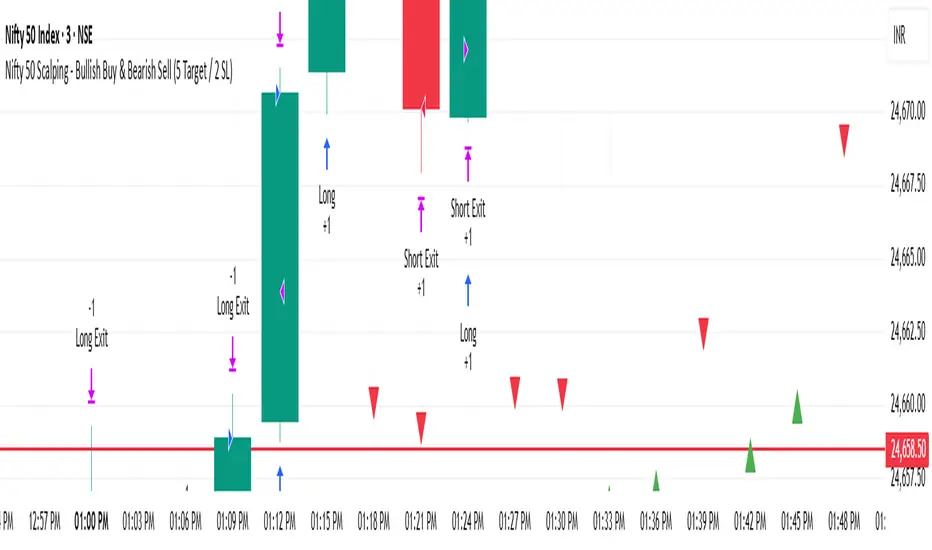
Entry Strategies
1. Zone Bounce (Mean Reversion)
• Wait for price to return to a previously identified zone
• Look for rejection candles (pin bars, engulfing patterns) at zone levels
• Enter in the direction of the original zone (long at demand, short at supply)
• Place stops beyond the zone boundary
2. Zone Break (Momentum)
• When price breaks through a zone with strong momentum
• The broken zone often becomes the opposite type (broken demand becomes supply)
• Use for trend continuation trades
3. Equilibrium Trades
• The midpoint (cross marker) often acts as a magnet for price
• Can be used as a first target or as an entry point for scaled positions
Risk Management
• Always place stop-loss orders beyond zone boundaries
• Consider the zone width when calculating position size
• Wider zones = wider stops = smaller position size
• Use the equilibrium level for partial profit taking
Best Practices
• Higher timeframes produce more reliable zones
• Zones on multiple timeframes (confluence) are stronger
• Fresh/untested zones are more powerful than zones that have been touched multiple times
• Combine with other analysis methods (trend direction, volume, market structure)
█ ALERTS
Two alert conditions are available:
• "Demand Zone Identified" - Triggers when a new demand zone is detected
• "Supply Zone Identified" - Triggers when a new supply zone is detected
To set up alerts: Click on the indicator name → Add Alert → Select condition
█ IMPORTANT NOTES
• This indicator is a tool for analysis, not a complete trading system
• Signals are NOT automatic buy/sell recommendations
• Always use proper risk management
• Past performance does not guarantee future results
• Works on all markets and timeframes
• Non-repainting: Signals appear only after bar close confirmation
█ ACKNOWLEDGMENTS
Inspired by institutional order flow concepts and smart money trading methodologies. Built with a focus on reliability and practical application.
Pine Script® göstergesi