ROCWhat is Rate of Change (ROC)
The rate of change (ROC) is the speed at which a variable changes over a specific period of time. ROC is often used when speaking about momentum, and it can generally be expressed as a ratio between a change in one variable relative to a corresponding change in another; graphically, the rate of change is represented by the slope of a line. The ROC is often illustrated by the Greek letter delta.
"roc" için komut dosyalarını ara

ROC Based Buy/Sell SignalsIndicator Explanation:
The "Consolidation Identifier (ROC) with Buy/Sell Signals" indicator is designed to help traders identify potential consolidation zones in the market using the Rate of Change (ROC) indicator. It plots both the positive and negative ROC values, providing insights into price momentum changes. The indicator also includes buy and sell signals that are generated when the positive ROC crosses above the negative ROC (buy signal) or when the negative ROC crosses above the positive ROC (sell signal).
How It Works:
The indicator calculates the ROC of the closing price over a specified period. ROC measures the percentage change in price over a given period. Positive ROC values indicate price increases, while negative ROC values indicate price decreases.
The positive and negative ROC values are plotted on the chart using different colors. The key feature of this indicator is the buy and sell signals that occur when the positive ROC crosses above the negative ROC (buy signal) or when the negative ROC crosses above the positive ROC (sell signal). These signals can help traders identify potential shifts in momentum and potential consolidation zones.
Why It's Useful:
Consolidation Detection: The indicator helps identify periods of potential consolidation in the market. Consolidation zones often precede significant price movements, making them valuable for traders looking to anticipate trends.
Momentum Shifts: The ROC crossovers provide insights into momentum changes. Buy and sell signals can indicate shifts in the market sentiment, helping traders make more informed decisions.
Pairs Well With:
Volume Analysis: Combining this indicator with volume analysis can provide a more comprehensive view of market activity during consolidation zones.
Trend Confirmation Indicators: Pairing with trend-following indicators can help confirm the direction of potential breakout moves following consolidations.
Warnings:
False Signals: Like any technical indicator, false signals can occur, especially in choppy or low-volume markets. Always use additional indicators or analysis to confirm signals.
Market Conditions: The effectiveness of the indicator can vary based on market conditions. It may work better during ranging or consolidation periods rather than strong trending phases.
Parameter Optimization: Adjusting the indicator's parameters (ROC period, SMA period, ROC threshold) may be necessary to fine-tune its performance for specific assets or timeframes.

ROC+ADX Trend & Momentum System### Code Analysis: ROC+ADX Trend & Momentum System (v5 Pine Script)
#### **Core Function**
This Pine Script indicator integrates **Rate of Change (ROC)** and **Average Directional Index (ADX)** to build a professional trend-momentum trading system, which identifies trend strength, momentum changes, price divergences and generates actionable long/short trading signals for financial markets (stocks, crypto, forex). It features coordinated visual display, adaptive volatility adjustment and a comprehensive scoring mechanism for trend evaluation.
#### **Key Features (Concise)**
1. **Hybrid Indicator Logic**
Combines **ROC (12/6-period, EMA-smoothed)** (measures price momentum) and **ADX (14-period)** (identifies trend strength/direction, with +DI/-DI for trend bias), forming a dual-dimension analysis of trend + momentum.
2. **Adaptive Dynamic Threshold**
Adjusts momentum thresholds in real time based on **14-period ATR volatility**; higher market volatility raises thresholds, lower volatility lowers them, ensuring signal accuracy across different market conditions.
3. **Multi-Category Trading Signals**
Generates 4 core signal types: trend breakout (long/short), momentum boost/drop, trend reversal, and price-ROC bullish/bearish divergence, all filtered by ADX trend validity.
4. **Comprehensive Trend Scoring System**
Calculates a **0-100 trend score** (integrates ADX strength, ROC momentum, direction consistency, momentum persistence) and classifies trend intensity into 5 levels (Extreme/Strong/Medium/Weak/None).
5. **Coordinated Visual Display**
Supports scalable unified display for ROC & ADX values (custom scale factors), with color-coded lines, momentum histograms, heatmap background and reference lines for intuitive trend judgment.
6. **Informative Dashboard & Alerts**
Embeds a top-right info panel showing real values (ROC, ADX, volatility), trend level and active signals; includes multi-tier alert conditions for all key signals (breakout, reversal, divergence).
7. **High Customizability**
Full input configurability for all core parameters (periods, thresholds, scale factors) and visual toggles (show/hide ROC/ADX, signals, heatmap, reference lines).
#### **Technical Highlights**
- Uses EMA smoothing for ROC/ADX to reduce false signals;
- Identifies ROC momentum & acceleration for precise trend phase judgment;
- ADX grading (strong/weak/oscillation) filters invalid signals in sideways markets;
- Color-coded elements (lines, histograms, heatmap) reflect real-time trend/momentum status;
- Non-overlay layout ensures clear separation from price charts, optimized for multi-screen analysis.

ROC-Weighted MA Oscillator [SeerQuant]ROC-Weighted MA Oscillator (ROCWMA)
The ROC-Weighted MA Oscillator (ROCWMA) is a momentum-based indicator which uniquely combines the Rate of Change (ROC) with customizable moving averages, offering a dynamic oscillator for trend analysis. Featuring z-score normalization and weighted MA integration, the ROCWMA delivers actionable trend signals with customizable thresholds.
--------------------------------------------------------------------------------------------------
⚙️ How It Works
1️⃣ Rate of Change (ROC) Normalization
The indicator begins with a normalized ROC calculation over a customizable length, transforming raw momentum data into a dynamic range for enhanced analysis.
2️⃣ Weighted Moving Average (MA)
A custom moving average (MA) is calculated using selectable MA types such as TEMA, SMA, EMA, and more. The normalized ROC is then applied as a weight to derive the ROC-Weighted MA (RWMA), blending trend and momentum data.
3️⃣ Z-Score Oscillator
The RWMA is normalized using z-score calculations, resulting in a smoothed oscillator. This process highlights deviations from the mean, identifying overbought and oversold conditions dynamically.
4️⃣ Threshold Logic
Bullish (Uptrend): Oscillator exceeds the positive threshold.
Bearish (Downtrend): Oscillator drops below the negative threshold.
Neutral: Oscillator remains between thresholds.
5️⃣ Dynamic Visual Representation
A color-coded histogram reflects trend strength and direction.
Optional candle coloring visually emphasizes trends on the chart.
Gradient fills enhance clarity of threshold areas.
--------------------------------------------------------------------------------------------------
✨ Customizable Settings
ROC Settings
Define the ROC length for momentum calculation.
MA Settings
Choose from multiple MA types (TEMA, EMA, SMA, etc.).
Customize the length and data source for MA calculations.
Adjust the signal length for smoothing.
Threshold Settings
Set neutral, bullish, and bearish thresholds to match your strategy.
Style Settings
Toggle candle coloring for visual trend enhancement.
Select from five unique color schemes to suit your chart style.
--------------------------------------------------------------------------------------------------
🚀 Features and Benefits
Momentum-Weighted Analysis: Combines ROC with advanced moving averages for precise trend evaluation.
Dynamic Thresholds: Z-score-based logic adapts to market conditions.
Visual Clarity: Color-coded histograms, candles, and gradient fills make trend detection intuitive.
Highly Customizable: Flexible inputs and multiple MA types ensure adaptability to various trading styles.
--------------------------------------------------------------------------------------------------
📜 Disclaimer
This indicator is for educational purposes only and does not constitute financial advice. Past performance is not indicative of future results. Users should consult a licensed financial advisor before making trading decisions. Use at your own risk.
--------------------------------------------------------------------------------------------------

ROC [CHE] with Kernel SelectionIntroduction:
The script titled "ROC with Kernel Selection" utilizes Rate of Change (ROC) to analyze price momentum in financial markets. It incorporates a kernel selection mechanism to smooth ROC values, enhancing clarity in trend identification.
Middle Part:
The script begins by calculating ROC over a specified period using the formula:
roc = (close - close ) / close * 100
The period length determined by the user. The result is plotted alongside a zero line for reference.
The kernel selection aspect allows users to choose from various smoothing techniques:
Linear
Exponential
Epanechnikov
Triangular
Cosine
Each kernel applies a different weighting function to ROC values, influencing the sensitivity and smoothness of the plotted line. Users can customize parameters such as bandwidth and color preferences for up and down movements, facilitating visual interpretation.
The main logic of the script involves iterating through historical data to compute weighted averages of ROC values based on the selected kernel. It adjusts graphical elements dynamically, highlighting changes in momentum direction with color-coded lines and directional symbols (▲ or ▼).
Conclusion:
In conclusion, "ROC with Kernel Selection" offers a flexible toolset for traders and analysts to assess price momentum robustly. By integrating kernel-based smoothing techniques, it enhances the clarity of ROC signals, aiding in the identification of trends and potential reversals in financial markets.

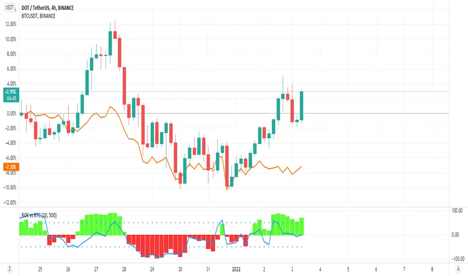
ROC vs BTCThis is a modification of my Rate of Change Percentile script, used to compare the current ticker (e.g. Altcoins) to BTC.
Essentially we are looking at (Current Ticker ROC percentile) vs (Bitcoin ROC percentile).
In other words, we are using the ROC value of both the current ticker and BTC, and ranking each based on their previous ROC.
We compare the rankings to gauge the relative overperformance or underperformance of the current ticker vs BTC.
The blue line is BTC, the columns are the current ticker.
Green columns above the blue line indicate positive ROC and current ticker has higher ROC ranking than BTC.
Red columns below the blue line indicate negative ROC and current ticker has a higher ROC ranking than BTC.
*** PLEASE LEAVE A LIKE AND FOLLOW IF YOU ENJOY THE SCRIPT ***
Any questions, comments or feedback I'd love to hear from you below!
ROC with closed based coloring & info table [DB]Rate of Change (ROC) Basics
The Rate of Change (ROC) is a momentum oscillator measuring the percentage price change between the current close and the close from N periods ago.
Calculated as: ROC = * 100
Traders use ROC to:
Identify overbought/oversold conditions
Spot momentum shifts
Confirm trend strength
My improvements:
Visual Clarity
Color-Coded Direction: ROC line changes color (green/red/yellow) based on intra-candle momentum shifts.
Direction Table: Instant view of the last change in ROC with the candle close (▲ UP / ▼ DOWN / ▶ FLAT).
Cells for current value and previous change between timeframe bar period.
What you can benefit with this over the regular ROC:
Faster Analysis: The visual cues make direction and strength instantly obvious and it allows for faster decision making while preserving more mental capital.

ROC with AveragesMain Idea
This script provides traders with a comprehensive view of market momentum by calculating the Rate of Change (ROC) and categorizing its impact into averages of positive, negative, and total values.
Key Features
Rate of Change (ROC) Calculation: Measures the percentage change in closing prices over a user-defined period.
Categorical Averages:
Positive Average: Average ROC for upward movements.
Negative Average: Average ROC for downward movements.
Total Average: Aggregate average across all movements.
Dynamic Visualization: Plots ROC alongside its categorized averages for better trend analysis.
Benefits
Simplifies the evaluation of market trends by breaking down data into actionable insights.
Helps traders identify the strength of upward or downward movements.
Offers a clear visual representation for quick decision-making.
This structure highlights the purpose and value of the script while aligning with the Minto Pyramid Principle. Let me know if you'd like further refinements!
الفكرة الرئيسية
يوفر هذا السكربت للمتداولين رؤية شاملة لزخم السوق من خلال حساب معدل التغير (ROC) وتصنيفه إلى متوسطات القيم الإيجابية والسلبية والإجمالية.
المميزات الرئيسية
حساب معدل التغير (ROC): يقيس النسبة المئوية للتغير في أسعار الإغلاق خلال فترة محددة يختارها المستخدم.
المتوسطات التصنيفية:
المتوسط الإيجابي: متوسط معدل التغير للحركات الصعودية.
المتوسط السلبي: متوسط معدل التغير للحركات الهبوطية.
المتوسط الإجمالي: متوسط إجمالي يشمل جميع الحركات.
تصور ديناميكي: يعرض معدل التغير إلى جانب المتوسطات المصنفة لتسهيل تحليل الاتجاهات.
الفوائد
يبسط تقييم اتجاهات السوق من خلال تقسيم البيانات إلى رؤى قابلة للتنفيذ.
يساعد المتداولين على تحديد قوة الحركات الصعودية أو الهبوطية.
يقدم تمثيلاً بصرياً واضحاً لاتخاذ قرارات سريعة ودقيقة.

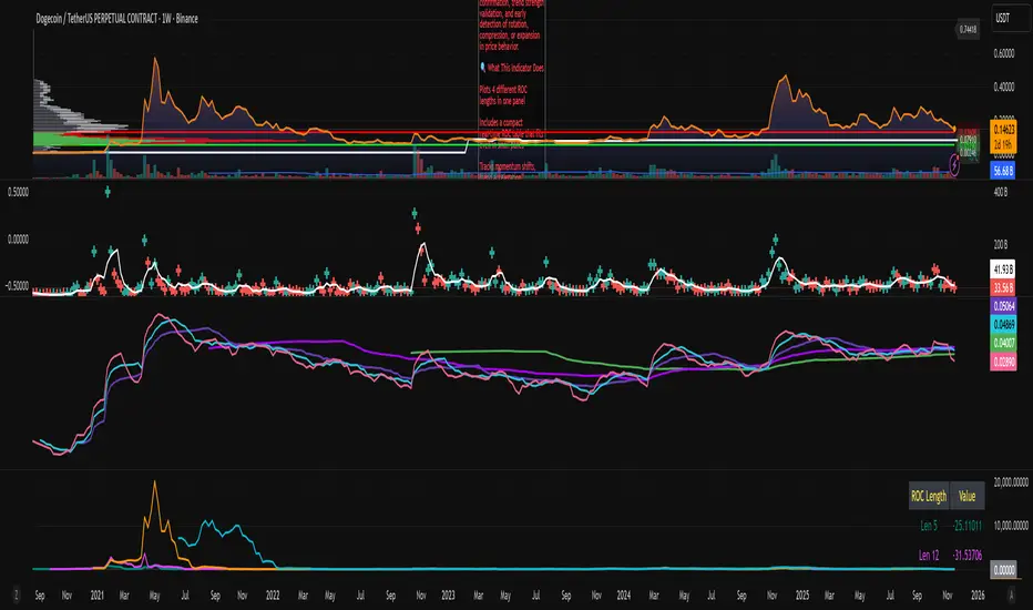
ROC x4 (Multi-Period Overlay) + Table📈 ROC x4 (Multi-Period Momentum Suite) + Compact Table
A clean, powerful momentum indicator that overlays four Rate-of-Change (ROC) periods inside a single pane — without needing to stack multiple separate indicators.
This script is designed for traders who use multi-timeframe momentum confirmation, trend strength validation, and early detection of rotation, compression, or expansion in price behavior.
🔍 What This Indicator Does
Plots 4 different ROC lengths in one panel
Includes a compact real-time ROC table that fits even in small panes
Tracks momentum shifts, trend acceleration, slowdowns, and regime transitions
Allows manual input for all 4 ROC lengths
Optional smoothing to reduce noise
Zero-line toggle for momentum direction clarity
Perfect for traders who want to monitor short-term, mid-term, and long-term ROC simultaneously.
ROC Since MorningThe "ROC Since Morning" indicator is designed for traders who wish to gauge the momentum of an asset from a specific time in the morning, allowing for a customizable analysis of pre-market and intraday movements. This indicator calculates the Rate of Change (ROC) from a user-defined hour, offering insights into how the price has moved since then.
How to Use:
Add the "ROC Since Morning" indicator to your chart.
Adjust the start hour input to your preferred time, considering pre-market hours or the official market opening time.
Analyze the ROC values to understand price movements and momentum since your specified start hour. A positive ROC indicates an upward price movement, while a negative ROC suggests downward movement.
ROC + dROC + d2ROC (with z-scores & percentiles)This indicator measures how price momentum is changing — not just whether it’s rising or falling, but how quickly that change itself is accelerating or slowing. It starts with the Rate of Change (ROC), which shows how much price has moved over a set period. The first derivative (ΔROC) tracks how ROC is changing from bar to bar, and the second derivative (Δ²ROC) shows whether that change is speeding up or fading — essentially the “acceleration” of momentum. Positive Δ²ROC means momentum is strengthening; negative means it’s weakening. The script also quantifies how extreme those shifts are using z-scores and percentiles, helping spot Druckenmiller-style turning points where trends often begin or end.

ROC'n-H is a ROC indicator with dynamic length From Investopedia "The Price Rate of Change (ROC) is a momentum-based technical indicator that measures the percentage change in price between the current price and the price a certain number of periods ago.
The ROC indicator is plotted against zero, with the indicator moving upwards into positive territory if price changes are to the upside, and moving into negative territory if price changes are to the downside."
In this script, ROC length (the moment from when ROC is calculated) is set by detected trend change.
Trend change is marked by indicators background colour.
"Trend Lenght" - Adjust this to fit the security and time frame
"SMA" - Simple Moving Average
"MHA" - Hull Moving Average
Feedback for improvements are welcome.
ROC divergenceThe Rate Of Change Divergence indicator is used to identify a possible Bullish Trend Shift.
The rules are:
1. ROC(10) is rising.
2. ROC(30) is falling.
3. RSI(14) < 50
When all the rules are triggered this is indicated with a blue circle below the candle.
Note that this doesn't give you a Buy signal; you also have to get a confirmation from
the price graph, e.g by crossing a trend line.
This has become a favourite indicator of mine.
I think it gives a very strong indication that a Bullish trend shift is in the making.
I like to use it together with the Pocket Pivot indicator.
Idea curtesy: Tobbe Rosèn.

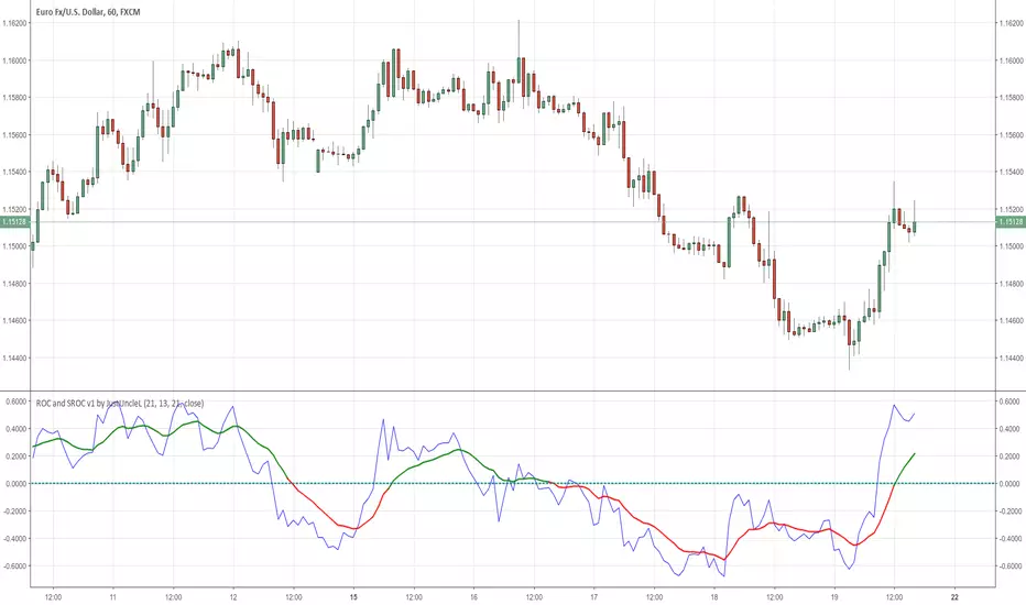
ROC and SROC v1 by JustUncleLDescription:
This study plots a combination Rate of Change Indicator (ROC) and Smoothed Rate of Change (SROC) indicators.
The ROC and SROC are momentum indicators and can be used in ranging or trending markets, please refer to the references for further details of how to use the indicators.
References:
www.incrediblecharts.com
www.incrediblecharts.com
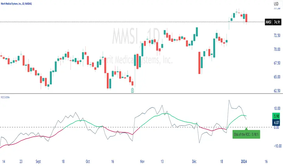
ROC & EMAIn summary, this allows you to plot the ROC, its EMA, and dynamically display the value of this EMA on the chart.
You can configure different lengths and colors.
Unpretentious code, just for the pleasure of sharing.
Thank you for sharing your comments with me, which will be welcome.
ROC 20x Dingue v5This is the updated v5 for PineScript 5.
20x Rate of Change indicators into 1 indicator.
Plus a built-in moving average for the 20xROC can be plotted with its own MA, which simplifies the visual rendering.
Auto settings can be used, which have automatic preset lengths based on the timeframe used.
Middle line 0 is important as it is a positive and negative threshold for the ROC.
Divergences are added but they do not work so well unless bigger time frames are used or longer ROC's length.
---------------------
In closing, no indicator can give perfect signals, you need to use them in conjunction with other information to make better decisions.
I hope you like my indicators and that they help your trading.
If you have any questions please ask.
Thank you.

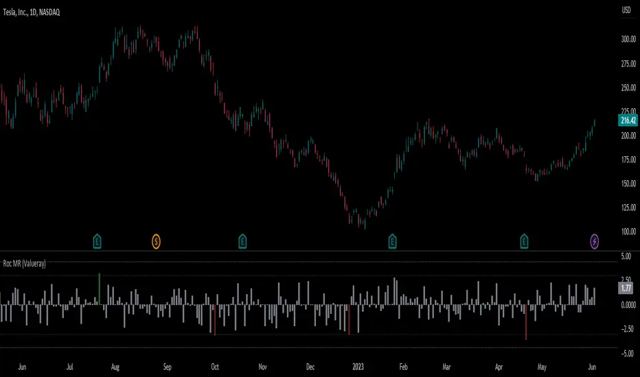
Roc Mean Reversion (ValueRay)This Indicator shows the Absolute Rate of Change in correlation to its Moving Average.
Values over 3 (gray dotted line) can savely be considered as a breakout; values over 4.5 got a high mean-reverting chance (red dotted line).
This Indicator can be used in all timeframes, however, i recommend to use it <30m, when you want search for meaningful Mean-Reverting Signals.
Please like, share and subscribe. With your love, im encouraged to write and publish more Indicators.
ROC of Majors against the USD (Label)Version 2 of the ROC study that now puts them as a label on the same chart.
ROC of Majors against the USDA simple study that shows the majors against the USD Rate of Change.
Allows you to pick opposing strength pairs to trade.
There are different ROC calculations for people to play with as I am not sure which way the ( ) should be so feedback is welcome.

JPY GBP ROCsRate of change of most volatile JPY and GBP pairs. All pairs ending in JPY are red except GBPJPY (colored yellow --currently most volatile 7/2016). GBPNZD is blue, the other GBP pairs are green, lime and teal. GBPJPY and GBPNZD are my favorite day trading / swing trading pairs. This script allows me to see the action of the most volatile and liquid pairs on one screen. JPY pairs (ex-GBPJPY) are all red so that I see the flow of JPY not so much each pair and its name. Global movement of JPY is what I am after. Same for the coloring of GBP pairs as green expect GBPNZD as blue. ***** EURGBP is plotted as an opposite (with a negative in front of its sma. EURGBP is extremely correlated to GBPNZD, I decided to plot it also.

