RANGEThe indicator predicts the lower and upper limits of the next bar. The principle of constructing the indicator: the volatility of candles is analyzed, then it is averaged and reduced to a stationary series to obtain a normal distribution. For a stationary series, the standard deviation for the period is analyzed, and the number of standard periods multiplied by the Student's coefficient is added to the average value of volatility. The next term of the stationary series is predicted as the previous term plus the difference between the previous term of the stationary series and the pre-existing one. After that, the stationary series is transformed to a non-stationary one, and thus the upper and lower limits are obtained.
The upper and lower limits are determined with a confidence probability of 0.95. The places where the lows and highs go beyond their limits are marked with colored circles above and below the candles. In the upper right corner there is a summary table of the indicator metrics, which contains the following metrics: 1. current upper and lower limits 2. How much does the current price differ in % from the upper and lower ranges 3. A metric that considers the standard error between the limits of the indicator and the highs and lows 4. The percentage of accuracy of the indicator 5. The correlation coefficient between the upper and lower limit and, respectively, the maxima and minima
The periods are specified separately for the minimum and maximum. Depending on the tasks, you can iterate through the periods to reduce the error or increase the correlation coefficient
"range" için komut dosyalarını ara


Range Breaker [MOT]Range Breaker - Volatility Compression System
Range Breaker is a technical analysis tool designed to identify periods of market consolidation (volatility compression) and generate signals when the market transitions into an expansion phase (breakout). Unlike static box tools that require manual drawing, this script uses an adaptive, volatility-based algorithm to automatically detect, draw, and monitor trading ranges in real-time. It adapts to changing market conditions by comparing recent price action against the asset's Average True Range (ATR).
METHODOLOGY & CORE CONCEPTS
1. Volatility Compression Detection
The script's primary engine is a "Tightness Filter." It continuously measures the distance between the highest high and lowest low over a lookback period.
The Logic: It compares this raw range size against the ATR multiplied by a specific threshold. If the current range is significantly smaller than the historical average volatility, the script identifies this as a "Consolidation" event and begins constructing a box.
Adaptive Thresholds: This method ensures the indicator works across all assets (Crypto, Forex, Stocks) because the definition of "tight" is relative to the asset's own volatility, not a fixed price distance.
2. Dynamic Range Expansion
Originality lies in how the script manages an active range. A consolidation phase is not static; it breathes.
The Mechanism: If price pushes the boundary of the box but remains within the consolidation logic (does not close outside with momentum), the box dynamically expands to include the new data. This prevents premature signals and accurately captures the full "churn" of the accumulation/distribution phase.
3. Signal Generation Models
The script offers two distinct ways to trade the detected ranges:
Momentum Breakouts: A signal is triggered when a candle closes decisively outside the box boundaries (plus a buffer).
Wick Reversals (Mean Reversion): The script identifies "False Breakouts" where price probes outside the range but fails to close there (leaving a long wick). If confirmed by the subsequent candle, this signals a potential reversal back to the midline.
A chart showing a highlighted consolidation box with a "Vol Break" signal triggering on the breakout.
Visualizing volatility compression followed by a confirmed momentum breakout.
A chart showing a "Wick Reversal" signal where price poked out of the box but failed to close, indicating a trap/reversal back into the range.
False Breakout Detection: The script identifies liquidity traps at the range edges.
FEATURES & SETTINGS
Preset Profiles
To make the tool instantly usable for different styles, we have included tuned preset profiles that adjust the ATR multipliers and lookback periods automatically:
Tight Ranges: For scalping on lower timeframes.
Normal Ranges: Balanced settings suitable for most intraday and short-term swing trading strategies (Default).
Swing Trading: Looser parameters for capturing multi-day consolidations.
Options Selling: Optimized to find long, sideways chop ideal for theta strategies.
The settings menu showing the "Preset" dropdown selected.
Built-in profiles allow for quick adaptation to different market environments.
Volume Confirmation
The Volume Filter: Users can enable a "Volume Spike" requirement. This checks if the breakout candle's volume is significantly higher than the average volume (e.g., > 1.7x), helping to filter out "fakeouts" that lack institutional participation.
Visual Customization
Full control over Box colors, borders, and midlines.
Toggle signals for "Wick Reversals" and standard "Breakouts" independently.
HOW TO USE & BEST PRACTICES
The Squeeze: Use this tool to identify "the calm before the storm." Long periods of consolidation (large boxes) often lead to more explosive moves.
Breakout & Retest Strategy: While the script signals the initial breakout, conservative traders often wait for price to pull back and "retest" the range extreme (Box Top/Bottom) or the Midline as support/resistance. Entering on this confirmation often provides a better risk-to-reward ratio.
Risk Management: Stop losses can be strategically placed based on your style. Aggressive traders might place stops below the entry candle, while conservative traders often place them below the opposite side of the range box to allow for volatility.
Filtering Fakeouts: We highly recommend enabling the "Confirm with Volume Spike" option in the settings. Breakouts accompanied by low volume often fail and return to the range.
Reversals: In choppy sideways markets, use the "Wick Reversal" signals to trade from the edges back toward the midline (Mean Reversion).
ALERTS
The script includes the following alert conditions:
Range Detected: Triggered when a new consolidation phase begins.
Range Breakout: Triggered when price closes outside the box.
Breakout with Volume Confirmation: Triggered only when a breakout is accompanied by a significant volume spike, allowing for filtered automated entries.
Range Reversal: Triggered on confirmed Wick Reversal setups.
⚠️ DISCLAIMER
This script is for educational and analytical purposes only. It does not constitute financial advice. Trading involves significant risk. Past performance of the logic described is not indicative of future results.

Range Opening (ADX)▶ OVERVIEW
Range Opening (ADX) dynamically detects market opening ranges triggered by ADX (Average Directional Index) momentum shifts. Upon a user-defined ADX crossover or crossunder event, it builds a volume-based range box that tracks high and low prices over a fixed bar length and visualizes order flow pressure with delta volume and breakout buffer zones.
▶ RANGE TRIGGER VIA ADX CROSSOVER
The range begins when ADX crosses a custom threshold, indicating a shift in trend strength:
Users choose between ADX crossover or crossunder as the trigger.
Once triggered, the indicator starts collecting price and volume data for the specified “Range Opening Length.”
The ADX plot on the subchart is colored dynamically using a green-to-magenta gradient based on its strength.
A small label marks the ADX crossover/crossunder event visually.
▶ RANGE DEVELOPMENT BOX
While the range is forming:
Price highs and lows over the defined period are collected and stored.
A temporary gray box is drawn between the maximum high and minimum low, showing the developing range.
At each bar, delta volume is updated:
Positive if close > open
Negative if close < open
A total delta volume value is shown inside the developing box for real-time monitoring.
▶ RANGE COMPLETION & BREAKOUT LINES
Once the range completes (after the defined bar count):
The gray box is replaced with a finalized, color-coded range box.
Color Logic:
Green box if delta volume is positive (bullish bias)
Magenta box if delta is negative (bearish bias)
Two solid horizontal lines are drawn:
Top line from the range high
Bottom line from the range low
Two dashed lines are added above and below the range using ATR-based buffers, acting as buffer zones.
These lines extend until a new ADX trigger occurs, helping track future price interaction with the range.
▶ INFO PANEL & STATUS MONITORING
A compact data table appears in the top-right corner, offering quick insight:
ADX: Current value, color-coded to strength.
Threshold: User-defined trigger level.
Range Status:
Shows a green diamond when range is still forming.
Shows a magenta diamond after the range has completed.
Tooltip updates to “Developing” or “Formatted” based on stage.
▶ USAGE
Traders can use Range Opening (ADX) to:
Identify periods of strength expansion and price consolidation using ADX signals.
Track breakout potential and liquidity zones formed during opening-type setups.
Monitor delta volume to gauge buying/selling bias inside short-term ranges.
Use ATR buffer zones for breakout confirmation or fade setups.
Visually mark where the most recent structured range was defined.
▶ CONCLUSION
Range Opening (ADX) offers a systematic method to detect and monitor market ranges triggered by volatility surges. With real-time delta volume insight, persistent breakout levels, and ADX-driven logic, it serves as a versatile tool for both breakout traders and range strategists looking to capitalize on momentum-based setups.

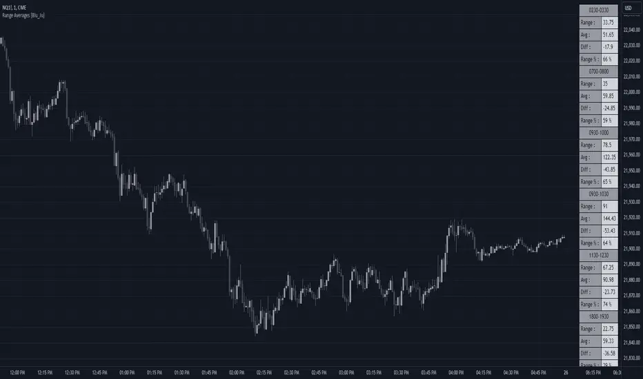
Range Averages [Blu_Ju]Using Ranges
A popular analysis technique among traders is to use statistical price data over a given time range. For example, a trader might want to examine the average price range for the time period of 9:30 am - 10:00 am EST (commonly referred to as the Opening Range), and compare the average range to the current, live range as it forms.
What this Script Does
This script allows a user to monitor the current price range against the average price range of up to six different periods of time (sessions). The data is presented in a table in the chart window, with four stats listed per session:
Range: This is the most recent (or current) price range for the session. This value is updated in real-time as the price range forms.
Avg: This is the average price range for the session. (See below for how this is calculated.)
Diff: This is the price difference between the most recent (or current) price range of the session and the average price range of the session. When the most recent price range is smaller than the average, this will be a negative number. This value is updated in real-time as the price range forms.
Range %: This is the percent value of the most recent (or current) price range of the session compared to the average price range of the session. For example, If the most recent price range was half that of the average price range, the Range % would be 50%. If the most recent price range was twice that of the average price range, the Range % would be 200%. A Range % value of 100% indicates that the most recent price range is equal to the average price range. This value is updated in real-time as the price range forms.
What Makes this Script Unique
While this is not the only publicly available average range script, what makes it unique is the complete user control over up to six sessions (including overlapping sessions) and the display of that data.
Scope of this Script
This script is intended for use on intraday timeframes only. It will not calculate properly on daily or higher timeframes. Additionally, for the calculation to be correct, the input session must be evenly divisible by the chart timeframe. For example, if the user inputs a session that is 30 minutes long (e.g., 9:30 am - 10:00 am), then the calculations would be correct on the 1, 2, 3, 5, 10, 15, and 30-minute timeframes only.
User Inputs
This script was written to provide the user with maximum control over the range data and how that data is displayed. These are the user inputs:
Data - Input the number of days used to calculate the average price range of the sessions. This input is applied to all six sessions. The default value is 10.
Sessions - There are six sessions the user can set. Checking the box next to a session will cause that session data to be calculated and displayed. This allows the user to turn on or off a session at their discretion. The default value are displayed in the chart image above.
Visibility - Checking this box will cause the range data to be displayed only when the range is currently forming (i.e., live price is within the session). This allows the user to display the data from multiple sessions only when needed.
Visual Styles - This section has controls for how the data table is displayed. The user can select the table position, colors and border, and text size.
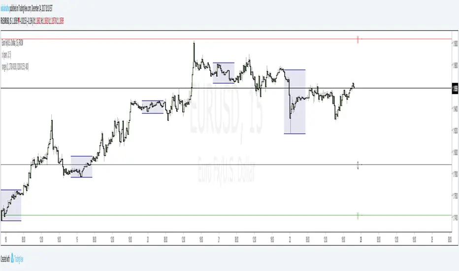
Range Projections [TFO]The purpose of this indicator is to see how often price reached certain standard deviations from a selected time range. The inspiration for this was to study ICT (Inner Circle Trader) concepts regarding the Central Bank Dealer’s Range (CBDR), which is 2:00 pm - 8:00 pm New York local time according to ICT Core Content. However, the idea and data collection could certainly be applied to any range of time.
The main settings of this indicator are session time, range type, and the standard deviation filter. The session time is the window of price that will be utilized for range projections. The range type can be either body or wick (on the current timeframe). The standard deviation filter is used to eliminate sessions whose ranges (from high to low) are greater than the desired/input number of standard deviations from all available session ranges.
In this example, the time range is set to 16:00 - 20:00, or the time between the New York session close and the Asia session open. Our standard deviations are set to 1, 2, 2.5, and 4. Now, by taking this session’s price range and extrapolating these extensions from the initial range, we can use these levels to see if and how price interacts with them before the next 16:00 - 20:00 session.
Furthermore, we can enable the Data Table to analyze how often price trades to these levels for the sessions that are deemed valid (determined by the standard deviation filter). This time our standard deviations are set to 1, 2, 3, and 4.
This concept can theoretically be applied to any window of time. ICT has mentioned that, in instances where the CBDR is too large, the Asia range may be used instead. We can observe that the indicator behaves the same way when we change the session to the Asia range, 20:00 - 00:00.

Range Weighted Moving Average (RWMA)The Range Weighted Moving Average (RWMA) :
The Range Weighted Moving Average (RWMA) is a variation of the traditional moving average that incorporates the price range within each period as a weighting factor.
It assigns higher weights to periods with larger price ranges, aiming to provide a moving average that responds more dynamically to changes in price range and volatility.
Compared to a normal Simple Moving Average (SMA) or Exponential Moving Average (EMA), the RWMA offers several potential advantages:
Why do i think its better than Normal SMA , EMA ?
Increased Sensitivity: The RWMA reacts faster to changes in price compared to traditional moving averages. By incorporating the price range, which represents the volatility of each period, the RWMA gives more importance to periods with larger price ranges. This increased sensitivity can help traders identify price movements and trends more quickly.
Adaptive to Volatility: The RWMA adjusts dynamically to changes in market volatility. During periods of high volatility, the RWMA places more weight on those periods, capturing and reflecting the increased price movements. This adaptability allows the RWMA to be responsive to different market conditions and better capture significant price swings.
Filtering Potential: The RWMA can be utilized as a filtering tool in trading strategies. By using the RWMA as a trend indicator or filter, traders can focus on trades that align with the direction indicated by the RWMA. This filtering mechanism can help eliminate trades that go against the prevailing momentum, potentially improving the overall quality of trade entries.

Range PolarityDescription:
This indicator is a "Rate of Change" style oscillator designed to measure market dynamics through the lens of price ranges. By utilizing the true range in conjunction with high and low separation, this script produces two distinct oscillators: one for positive price shifts and one for negative price shifts.
Key Features:
High/Low Isolation:
The script calculates the relative movement of upwards and downwards price movements over a user-defined period. This separation provides a nuanced view of market behavior, offering two separate signals for comparison.
Dynamic Transform Smoothing:
A smoothing transform is applied to the signals, ensuring better outlier handling while maintaining sensitivity to price extremes. This makes the oscillator especially suited for identifying overbought and oversold conditions.
Zero-Centered:
The zero line acts as a "gravity point," where shifts away or toward zero indicate market momentum. Signal crosses or reversals from extreme zones can signal potential entry or exit points.
Outlier Identification:
Unlike traditional ATR based strategies (e.g., Keltner Channels ), this indicator isolates high and low ranges, creating a more granular view of market extremes. These measurements can help identify shifts from the outlying positions and reversal opportunities.
Visual Enhancements:
Multiple layers enhance the visual distinction of the positive and negative transformations. Horizontal lines at key thresholds provide visual reference for overbought, oversold, and equilibrium zones.
How to Use:
Primary signals are shifts from outlying positions or a positive/negative cross. An extreme reading itself can reveal an incoming reversal when calibrated with other indicators or compared with higher timeframes. Pairing "Range Polarity" with volume and momentum can create a comprehensive strategy.
In conclusion, be aware the base length controls the window for high/low contributions while the transform smoothing enhances the raw data through normalization within a tempered range to filter out insignificant fluctuations.
Merry Christmas to all and have a Happy New Year!

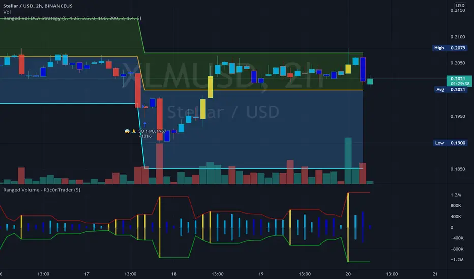
Ranged Volume Study - R3c0nTraderCredits:
Thank you "EvoCrypto" for granting me permission to use "Ranged Volume" to create this version of it.
What is this and What does this do?
This study shows the ranged volume, and it can be used to produce buy signals for a 3Commas bot.
What’s different about this script?
I added code so that negative volume has its own color settings and lower opacity than the positive volume.
I changed the color scheme from Yellow, Red, Green, and Black to Yellow, Red, Light Blue, and Dark Blue.
How to Use
1. On the “Inputs” tab:
a. Set your “Volume Range Length” (number of bars to look back)
b. “Heikin Ashi” – Usually I leave this enabled. Make sure this matches what you have in your strategy!
c. “Show Bar Colors” – Leave disabled. Let the Strategy script color the bars in the price chart.
d. “Show Break-Out” – Leave enabled. Highlights the volume breakout in yellow and breakdowns in red.
e. “Show Range” – Leave enabled
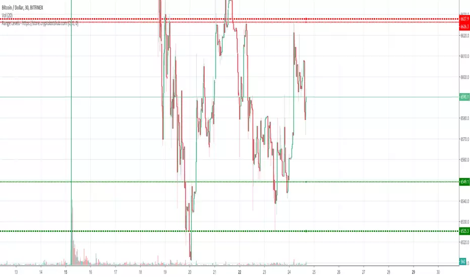
Range Levels - High and Low of Daily, Weekly, and Montly RangesThis is a great free script for the current ranging crypto markets.
You can see the daily, weekly, and monthly high and low of ranges. It also has alerts that you can enable in the settings and then setup in your TradingView alerts for when the price crosses these levels.
Ranges With Targets [ChartPrime]The Ranges With Targets indicator is a tool designed to assist traders in identifying potential trading opportunities on a chart derived from breakout trading. It dynamically outlines ranges with boxes in real-time, providing a visual representation of price movements. When a breakout occurs from a range, the indicator will begin coloring the candles. A green candle signals a long breakout, suggesting a potential upward movement, while a red candle indicates a short breakout, suggesting a potential downward movement. Grey candles indicate periods with no active trade. Ranges are derived from daily changes in price action.
This indicator builds upon the common breakout theory in trading whereby when price breaks out of a range; it may indicate continuation in a trend.
Additionally, users have the ability to customize their risk-reward settings through a multiplier referred to as the Target input. This allows traders to set their Take Profit (TP) and Stop Loss (SL) levels according to their specific risk tolerance and trading strategy.
Furthermore, the indicator offers an optional stop loss setting that can automatically exit losing trades, providing an additional layer of risk management for users who choose to utilize this feature.
A dashboard is provided in the top right showing the statistics and performance of the indicator; winning trades; losing trades, gross profit and loss and PNL. This can be useful when analyzing the success of breakout trading on a particular asset or timeframe.

Range Levels OverlayThis indicator lets you plot up to three sets of horizontal range levels on any chart, with labels that stay readable while you scroll.
It’s designed for traders who want clean, always-visible reference levels like weekly ranges, today’s ranges, and yesterday’s reference levels, without clutter.
What it shows
You can optionally display:
1. Weekly Levels (Manual)
> Two manual prices (Upper / Lower)
> Drawn across the entire chart
2. Current Day Levels (Manual)
> Two manual prices (Upper / Lower)
> Drawn across the entire chart
3. Prior Day Levels
Choose one source:
> Prev Day Range (from Today inputs) (default)
Automatically “rolls” yesterday’s Current Day Upper/Lower into Prior Day once a new day begins.
> Auto High/Low (Daily)
Uses the chart’s previous day high/low via the Daily timeframe.
> Manual Override
Enter your own prior day upper/lower.
Labels that stay visible when you scroll
This script uses two label anchors:
> Primary labels are anchored to the last bar (so they remain visible when you scroll left/right).
> Ghost labels follow the current bar (so you still see levels near current price action).
You can adjust both label sets:
> Location: Left / Middle / Right
> Offset: number of bars from the anchor
> Font size
How to use (quick steps)
1. Add the indicator to your chart.
2. Turn on/off what you want:
> Weekly Levels
> Current Day Levels
> Prior Day Levels
3. Enter your numbers:
> Weekly Upper/Lower
> Current Day Upper/Lower
4. Choose your Prior Day Source:
> Default: Prev Day Range (from Today inputs)
(yesterday’s range is automatically captured when the new day starts)
> Or use Auto High/Low (Daily) if you prefer true daily OHLC.
> Or Manual Override if you want full control.
5. Adjust label placement so it fits your layout:
> If labels feel too far away, reduce offsets.
> If labels overlap candles, switch label location or reduce ghost offset.
Recommended settings (good starting point)
> Show Ghost Copy: ON
> Primary Label Location: Right, Offset ~80
> Ghost Label Location: Right, Offset ~40
> Prior Day Source: “Prev Day Range (from Today inputs)” (default)
Notes
> The “Prev Day Range (from Today inputs)” option depends on you entering your Current Day Upper/Lower each day. Once the day rolls over, those values become the Prior Day levels automatically.
> All lines extend across the full chart, so levels remain visible no matter where you scroll.

HTF Bias & Key LevelsRange EQ Bias & Levels is a clean, non-repainting higher-timeframe overlay tool designed to help traders align lower-timeframe decisions with broader market context.
Key features:
• Displays the midpoint (EQ) of the recent range as a central pivot
• Provides directional bias (Bull / Bear / Range) based on price position relative to EQ
• Plots key levels: range high/low, recent swing high/low
• Optional candle strength filter to reduce noise and false bias flips
• Subtle background tint + right-side level tags for quick visual reference
Perfect for day traders, swing traders, and anyone wanting a simple HTF filter without laggy oscillators or smoothed indicators.
Use on 4H/Daily charts for context, or pair with lower-timeframe setups for confluence.
Completely free – enjoy and happy trading!

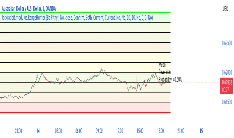
Jackrabbit.modulus.RangeHunterRange Hunter is a unique module that offers a wide range of trading potentials and paradigms for the Jackrabbit suite.
Range Hunter works by finding the highest boundary and the lowest boundary of a time frame. From there, it creates a median by which the market should fluctuate as signs of its health. When the price stays in the upper/lower ranges for too long, the market is considered "unhealthy". Price action should cycle around the median routinele for a healthy market.
From the upper range to the lower range is divided into 10% segments.
There are five segments above the median where price action is considered over valued or oversold.
There are five segments below the median where price action is considered undervalued or oversold.
Buying and selling is divided into 10 boundaries. The 10th boundary for purchasing starts at the lowest range and goes downwards as price climbs. The 10th boundary for selling is where the price is the highest range and goes downwards as price drops.
Buys take place when price action drops bwelow and the climbs above the desire boundary. Sells behave the exact opposite.
The user can configure the boundary that buying and selling takes place independently and supports all elements/settings of the Jackrabbit modulus framework except confirmation bias. If confirmation bias is desired then this module needs to be loaded twice.
The Jackrabbit modulus framework is a plug in play paradigm built to operate through TradingView's indicator on indicatior (IoI) functionality. As such, this script receives a signal line from the previous script in the IoI chain, and evaluates the buy/sell signals appropriate to the current analysis.
Range Weekly HL© ForexPipCheats and iceicebaby_
This indicator is coded to run on Trading View which was originally created by traderathome (TAH), qFish, and all other respective contributors for the mt4 version.
It creates a Range High/Low Lines for the Week by displaying two horizontal lines, one for the computed range high target, and one for the computed range low target. The range is based on the averaging period of 13 days. A swing trader might pay more attention to the RWH/RWL lines, and hold a trade into oncoming days.
A. Two conditions determine where range lines appear
1. Condition #1 - the Week range has not exceeded the computed average range.
* The RWH line is the computed average range distance above the session Low.
* The RWL line is the computed average range distance below the session high.
* The lines will move as new highs/lows are achieved during the session.
* This display shows how far price can move in either direction before exceeding the computed average range.
2. Condition #2 - the Week range has exceeded the computed average range.
* If price swings during the Week TF cause the difference between the high and the low to equal the computed range, the range lines lock into place.
* This display will clearly show any subsequent breakout of the range.
B. The purpose of the range lines is to provide a perspective on how far PA might move during the trading week. This can be of some guidance in selecting where to exit a trade.
Due to pinescript limitations, the Daily HL is separated into another indicator which you may wish to add it into your chart

Range Daily HL© ForexPipCheats and iceicebaby_
This indicator is coded to run on Trading View which was originally created by traderathome (TAH), qFish, and all other respective contributors for the mt4 version.
It creates a Range High/Low Lines for the Day by displaying two horizontal lines, one for the computed range high target, and one for the computed range low target. The range is based on the averaging period of 15 days. A day trader looking for quick profits and limited exposure to market price swings might pay more attention to the RDH/RDL lines.
A. Two conditions determine where range lines appear
1. Condition #1 - the Day range has not exceeded the computed average range.
* The RDH line is the computed average range distance above the session Low.
* The RDL line is the computed average range distance below the session high.
* The lines will move as new highs/lows are achieved during the session.
* This display shows how far price can move in either direction before exceeding the computed average range.
2. Condition #2 - the Day range has exceeded the computed average range.
* If price swings during the day TF cause the difference between the high and the low to equal the computed range, the range lines lock into place.
* This display will clearly show any subsequent breakout of the range.
B. The purpose of the range lines is to provide a perspective on how far PA might move during the trading day. This can be of some guidance in selecting where to exit a trade.
Due to pinescript limitations, the Weekly HL is separated into another indicator which you may wish to add it into your chart

Ranged Volume - evoA simple script that shows mirrored regular volume bars with the purpose to show break-outs and low volume ranges, using highest and lowest of a few bars back.
Use Heikin Ashi function to smooth the colors with the trend.

Range Delta Heiken Ashi Bollinger|Buy/Sell |OB & OS CandlesPurpose: Mathematically represent buying and selling zones for Daily/ Weekly Traders
Indicator: Calculates moving average of the candle's body with respect to the daily trading range
Buy and Sell Signals: Calculates Bollinger Range with Max/Min and Buy/Sell Bollinger signals
Overbought and Oversold Signals: Candlesticks show overbought and oversold conditions
Level of Difficulty: This indicator was written to make life easier. Follow the Rules and anyone can use it.
Rule 1: Buy when candlestick is below "purple" line
Rule 2: Sell when candlestick is above "blue" line
Rule 3: Add bollinger bands to your currency chart
Rule 4: Confirm indicator bollinger bands with currency chart's bollinger bands
Rule 5: Trade in direction of trend
Rule 6: As with all trading; no indicators are fool proof. Please trade responsibly.
****Full Customization for you****
Suggestion 1: Add bollinger bands to currency chart to improve probability
Suggestion 2: Trade the direction of Trend
Suggestion 3: This indicator works very well with Ranged Markets (or use Suggestion 2)
Disclaimer 1: This Indicator words best on Daily and Weekly time frames
Disclaimer 2: Enjoy the Indicator and feel free to ADD COMMENTS; I worked very hard for you and me :)

Range-Weighted Volatility (Comparable)I wrote an indicator to measure volatility inside a range. It’s extremely useful for choosing a trading pair for grid strategies, because it lets you quickly, easily, and fairly identify which asset is the volatility leader. It measures volatility “fairly” relative to the asset’s trading range, not just by absolute price changes.
For example: if an asset trades in a 50–100 range and over a week it moves many, many times between 52 and 98, then it’s highly volatile. But if another asset trades in a 50–1000 range and makes the same 52–98 moves, its volatility is actually low — because the “weight” of that movement relative to the full range is small. The indicator accounts for this “movement weight” relative to the range, then sums these weights into a single number. That number makes it easy to judge whether an asset is suitable for a grid strategy.
That’s exactly what grids need: not just high volatility, but high volatility within a narrow range.
Settings: the Window (bars) field defines how many bars are used to calculate volatility. On a 5-minute chart, one week is 2016 bars (2460/57). By default, the script calculates over 30 days on 5-minute charts. The script also allows you to set a second symbol for comparison, so you can see both results on the same chart.
Написал индикатор для определения волатильности в диапазоне, очень-очень полезно для выбора торговой пары на гриде, позволяет легко и быстро и честно определить лидера по волатильности, при этом определяет ее "честно", относительно торгового диапазона, а не просто изменения цены.
Например если актив торгуется в диапазоне 50-100 и за неделю много-много раз сходил 52-98, то это очень волатильный актив, и в то же время если актив торгуется в диапазоне 50-1000 и сходил так же 52-98, то это будет низко волатильный актив, т.е. учитывается "вес" движения относительно диапазона и данные "веса" суммируются в одну единую цифру по которой и можно оценивать насколько актив подходит под грид стратегию.
А ведь именно это для гридов и нужно, не просто высокая волатильность, а именно высокая волатильность в узком диапазоне.
Касательно настроек , в поле Windows (bars) задается количество баров по которым скрипт будет считать волатильность, на 5-ти минутки неделя это 2016 (24*60/5*7), стандартно скрипт считает за 30 дней на 5-ти минутки. + в самом скрипте можно указать вторую пару для сравнения чтоб на одном графике увидеть результат.

RANGE IDENTIFIER [ASHUTOSH]This script is for intraday purpose and mainly for index traders. It works well on 3/5 min time frame. Script provides VIP( very important pivot) level and one support and resistance. It's ideal for price action traders trading breakouts and mean reversion. It is built on true range. It can be customized as per the traders requirement. True range is on daily time period. Divisor will decide the broadness of the range. Bigger the divisor narrower the range.

((Range||Type||Swing))Consecutive Candle range boxes with gradient and number count. Inside Outside and Engulfing color bars plus plots. Strict swing filter plus bonus filter where the 3rd bar in the swing closes below the swing candles high or low respectfully.
How I Use
I use the candle stick patterns to gauge market conditions, the consecutive candle ranges to follow order flow using a closing break of the range and retest and the filtered swings to assist in identifying stronger. If any one wants to create a strategy around this that would be cool i know nothing of coding and do everything with A.I
turns
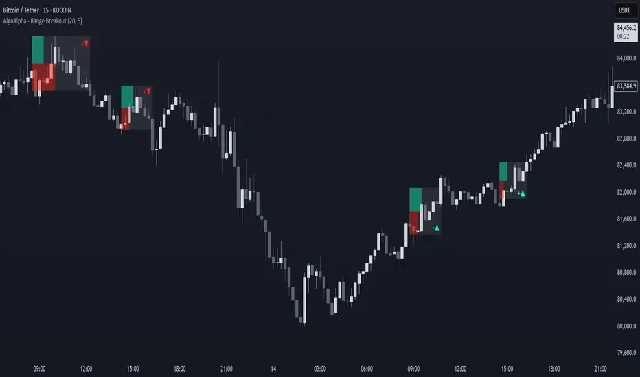
Range Breakout Signals [AlgoAlpha]OVERVIEW
This script detects range-bound market conditions and breakout signals using a combination of volatility compression and volume imbalance analysis. It identifies zones where price consolidates within a defined range and highlights potential breakout points with visual markers. Traders can use this to spot market transitions from ranging to trending phases, aiding in decision-making for breakout strategies.
CONCEPTS
The script measures volatility by comparing the ratio of the simple moving average (SMA) of price movements to their median value. When volatility drops below a threshold, the script assumes a range-bound market. It then tracks the cumulative volume of buying and selling pressure to assess breakout strength. The approach is based on the idea that market consolidation often precedes strong moves, and volume distribution can provide clues on the breakout direction.
FEATURES
Range Detection : Uses a volatility filter to identify low-volatility zones and marks them on the chart with shaded boxes.
Volume Imbalance Analysis : Evaluates cumulative up and down volume over a confirmation period to assess directional bias.
Breakout Signals : When price exits a detected range, the script plots breakout markers. A ▲ symbol indicates a bullish breakout, and a ▼ symbol indicates a bearish breakout. Additional "+" markers indicate strong volume imbalance favoring the breakout direction.
Adaptive Timeframe Volume Analysis : The script dynamically adjusts its volume calculation based on the chart’s timeframe, ensuring reliable signal generation across different trading conditions.
Alerts : Notifies traders when a new range is detected or when a breakout occurs, allowing for automated monitoring.
USAGE
Traders can use this script to identify potential trade setups by entering positions when price breaks out of a detected range. For breakout confirmation, traders can look at volume imbalance cues—bullish breakouts with strong buying volume may indicate sustained moves, while weak volume breakouts may lead to false signals. This script is particularly useful for breakout traders, range traders seeking to fade breakouts, and those looking to automate trade alerts in volatile markets.