QCS - Quantum Confluence OSC
**QCS**
A clean, institutional-grade confluence oscillator designed for scalpers, day traders and swing traders who demand high signal quality with minimal noise.
This indicator fuses three independent, proven market drivers into one smoothed Quantum Score:
- Trend (EMA 8/21 + ATR-normalized strength)
- Momentum (centered and bounded 14-period RSI)
- Order flow (multi-timeframe normalized Cumulative Volume Delta)
Only when these three components align with sufficient strength does the system trigger a signal. No repainting, no future leak, no magic numbers.
### Key Features
- Quantum Score plotted as a single cyan line oscillating around zero (-1 to +1 range)
- Resonance detection: background turns pale gold when ≥2 components are in strong agreement → highest-probability setups
- Two-tier signal system:
- Large gold triangles = STRONG BUY/SELL (high resonance, best risk-reward)
- Standard green/red triangles = regular BUY/SELL
- Real-time information table (top-right) showing Trend direction, exact RSI, CVD bias, current Score, active Signal and Resonance state
- Built-in bearish/bullish hidden divergence protection on CVD (toggleable)
- Multi-timeframe CVD incorporation (1m + 5m + 15m) for superior context without clutter
- Market-regime adaptive weighting (automatically emphasizes trend in high volatility, momentum in low volatility)
### Usability & Practical Application
Designed primarily for 1-minute to 15-minute charts on highly liquid instruments (indices futures, BTC, major forex pairs, large-cap stocks). Works on any symbol and any timeframe, but shines where volume and order flow matter.
Best practical ideas to trade it:
1. Scalping (1m–3m)
Wait for candle close. Take only STRONG (gold) signals in the direction of the 15m trend shown in the table. Typical holding time 3–15 minutes.
2. Intraday swing (5m–15m)
Use regular or STRONG signals. Gold resonance entries routinely catch 3:1 to 8:1 moves on futures and crypto.
3. Confirmation filter
Add to any existing strategy. Only take your usual setups when Quantum table shows matching Signal + HIGH resonance.
### Settings Explained & Recommended Values
Signal Threshold (default 1.0)
- 0.7–0.9 → aggressive scalping (more trades)
- 1.0–1.2 → standard professional setting (excellent win rate)
- 1.3–1.6 → ultra-conservative (very few, very high-probability signals)
Market Regime Filter → leave ON (automatically optimizes weighting)
Divergence Protection → leave ON (prevents most fakeouts at swing highs/lows)
Use MTF CVD → leave ON (adds significant edge, especially in crypto and futures)
Show Component Plots → keep OFF in live trading (turn on only when you want to study internals)
### Performance Profile (author backtests & live forwarding 2024–2025)
- Win rate on STRONG signals: 68–74 % across ES, NQ, BTC, EURUSD on 1m–5m
- Average reward:risk on STRONG signals: 2.8:1 to 4.2:1
- Regular signals still profitable but roughly half the RR of STRONG
### Final Notes
Zero repainting. All calculations use only confirmed data.
Works immediately after adding to chart. No external data feeds required.
Table updates on every tick so you always know the exact market state at a glance.
Trade the gold triangles and you will rarely need another entry indicator.
"profitable" için komut dosyalarını ara

BTST Stats BTST Statistical Edge Analyzer — VCR · Volume · SMA · RSI Filtered
This indicator isn’t a trading signal generator.
It’s a research framework designed to answer a simple but valuable question:
“Does Buy-Today-Sell-Tomorrow (BTST) have statistical edge under specific market conditions?”
Most traders assume BTST works because they feel markets gap.
This script measures whether that belief holds true — and under what filters.
🔍 What the Indicator Does
For each bar, the script simulates a BTST trade:
Entry: previous bar’s close
Exit: current bar’s open
Result: Open(next day) − Close(previous day)
But a BTST trade is only counted if the entry bar satisfies the filter logic.
🎯 Entry Filters You Can Tune
A trade is included only if ALL activated conditions are satisfied:
Filter Rule
VCR Filter Candle volatility ratio must exceed threshold: `(High−Low) /
Volume Filter Volume must be greater than n × AverageVolume
SMA Trend Filter (Optional) Close must be above a user-selected SMA length
RSI Condition (Optional) RSI must be between a user-defined min/max band
This allows testing BTST under different volatility, trend, and momentum conditions.
📊 What the Table Shows
For all qualifying trades inside the chosen lookback window, the indicator displays:
Metric Meaning
Profitable Trades Count of BTST trades with positive overnight return
Losing Trades Count of negative overnight returns
Avg Profit Average upside gain on winner trades
Avg Loss Average downside loss on losing trades
Avg Net per Trade Overall expectancy across all trades
Avg High After Entry Average maximum price movement above entry (potential upside)
Avg Low After Entry Average price movement against the entry (risk exposure)
Winner-Only High/Low Stats How far good trades move and how much heat they take
Loser-Only High/Low Stats How bad trades behave, including early fake-outs
Together, these reveal:
Opportunity potential
Risk exposure
Whether trades behave cleanly or chaotically
Whether exits are leaving money on the table
🧠 Why This Matters
BTST edges change drastically across:
Market regimes
Trend direction
Volatility clusters
Earnings cycles
Volume surges
This tool helps identify when BTST should be traded — and when it should be avoided entirely.
Rather than guessing, traders can:
Validate if their BTST assumptions hold,
Apply filters until the expectancy improves,
Rank symbols and conditions where the system performs best.
🚫 Not a Buy/Sell Indicator
This script does not place arrows, signals, alerts, or entries.
It exists for analysis and system development, not live execution.
Use it to:
Build ideas
Validate hypotheses
Compare symbols
Optimize BTST frameworks
Decide if BTST belongs in your playbook — or in the trash
🔧 Who This Is For
✔ System traders
✔ Quant-minded traders
✔ Options/Index traders who rely on gaps
✔ Swing traders testing overnight holds
✔ Developers building automated BTST logic
Final Thought
BTST isn’t magic — it’s just a behavior pattern.
Some markets reward it.
Some punish it.
Some reward it only under the right volatility and volume conditions.
This tool tells you which is which.

Auto Seasonality Scanner by Luis TrompeterThe Auto Seasonality Scanner automatically detects seasonal patterns by scanning a user-defined number of past years (e.g., the last 10 years).
Based on this historical window, the indicator identifies the strongest seasonal tendency for the currently selected date range.
The scanner evaluates all valid seasonal windows using two filters:
• Hit Rate – the percentage of profitable years
• Average Return – the highest mean performance across the analyzed period
The best-scoring seasonal setup is displayed directly on the chart, including the exact start and end dates of the identified pattern for the chosen time range.
Users can define the period they want to analyze, and the indicator will automatically determine which seasonal window performed best over the selected history.
Recommended Settings (Standard Use)
For optimal and consistent results, the following settings are recommended:
• Search Window: 20–30
• Minimum Length: 5
• Time Period: from 2015 onward
• US Election Cycle: All Years
These settings provide a balanced and reliable baseline to detect meaningful seasonal tendencies across markets.
This indicator helps traders understand when recurring seasonal patterns typically occur and how they may align with ongoing market conditions.
Timeframe Requirement
This indicator is intended to be used exclusively on the daily timeframe, as all calculations are based on daily candles.
Using it on lower timeframes may result in inaccurate or misleading seasonal readings.

BTC Dual Cycle: Stats DashboardOverview
"Price takes the elevator down, but takes the stairs up."
This indicator is a macro-analysis tool designed to visualize the true duration of Bitcoin’s market cycles. Unlike standard oscillators that focus on short-term price action, the Macro Cycle Tracker filters out the noise to answer two fundamental questions:
Are we in a phase of Expansion (Price Discovery)?
Are we in a phase of Recovery (Repairing the damage of a crash)?
It visually separates the market into two distinct regimes based on a configurable drawdown threshold (default: -50%) and provides real-time statistics on how long these phases historically last.
How It Works
The script tracks the All-Time High (ATH) and divides market history into two colored zones:
🟢 The Green Zone (Expansion / Price Discovery)
Trigger: Starts immediately when Bitcoin breaks the previous ATH.
Meaning: The market is healthy, profitable, and exploring new valuation levels.
End: The zone ends when price drops by 50% (configurable) from the cycle top.
🔴 The Red Zone (Recovery / Capitulation)
Trigger: Starts when price drops below the 50% threshold from the peak.
Meaning: The asset is "underwater." This zone remains active persistently—even during relief rallies—until the previous ATH is fully reclaimed.
Philosophy: A cycle is not over until the damage is repaired.
Key Features
Cycle Timer: Displays the exact number of days passed for every historical cycle directly on the chart.
Live Counter: Shows the current duration of the active phase (e.g., "ZONE GREEN: 450 Days...").
Statistical Dashboard: A table in the bottom-right corner automatically calculates the Mean and Median duration (in days) for both Green and Red phases. This allows you to compare the current cycle against historical averages.
How to Use
For Investors (HODLers): Use the Red Zone to understand the "Time Cost" of a bear market. It helps visualize that recovery takes patience and that price action below the old ATH is merely accumulation.
For Analysts: Use the Dashboard statistics to project potential cycle turning points based on historical median durations.
Settings
Drop Percent (%): Default is 50%. This defines the "Crash" threshold. You can adjust this to 20% or 30% for more sensitive cycle detection.
Text Size: Adjust the size of the dashboard text to fit your screen resolution.
Disclaimer: This tool is for educational purposes only and does not constitute financial advice. Past performance is not indicative of future results.

NeuraEdge Block Trades v1.0NEURAEDGE BLOCK TRADES
═══════════════════════════════════════════════════════════════════════
We are excited to release Block Trades!
WHY THIS INDICATOR EXISTS?
Retail traders face a fundamental challenge: institutions move markets, but their activity is hidden. When smart money accumulates at support or distributes at resistance, retail traders often find themselves on the wrong side of the move.
Understanding where institutions are actively buying or selling is crucial for:
• Validating trade setups with volume confirmation
• Identifying supply and demand zones that actually hold
• Avoiding false breakouts driven by retail sentiment
• Spotting accumulation before major moves up
• Detecting distribution before major moves down
Most volume indicators simply show size without context. Block Trades was created to bridge this gap by detecting abnormally large volume bars and determining their directional bias, giving retail traders insight into institutional activity.
═══════════════════════════════════════════════════════════════════════
WHAT IT DOES:
Block Trades identifies volume spikes that likely represent institutional order flow and classifies them as buying pressure, selling pressure, or contested zones. The indicator then validates these prints against directional flow analysis and groups nearby prints into accumulation or distribution clusters.
This helps you answer critical questions:
• Is this support level being defended by institutions?
• Are smart money players distributing into this rally?
• Is heavy volume confirming my trade or warning against it?
• Where are institutional interest zones forming?
KEY FEATURES:
• Multi-tier volume detection (Large: 2x, Huge: 3x, Massive: 5x average)
• Directional classification with flow validation
• Accumulation/distribution zone detection
• Print clustering for institutional interest areas
• Confluence scoring system (0-10 points)
• Real-time statistics dashboard
• Clean, minimal chart labels
═══════════════════════════════════════════════════════════════════════
HOW IT WORKS:
VOLUME SPIKE DETECTION
The indicator monitors volume against a moving average baseline. When current volume significantly exceeds this average (default thresholds: 2x, 3x, 5x), it flags the bar as a potential institutional print.
DIRECTIONAL CLASSIFICATION
Buy Print: Large volume + closes in top 70% of range
Sell Print: Large volume + closes in bottom 70% of range
Neutral Print: Large volume + mid-range close (absorption/contested)
The close position within the bar's range reveals who won the battle. A bar with massive volume that closes near its high indicates aggressive buying. The same volume closing near the low indicates aggressive selling.
FLOW VALIDATION
Each print is validated against underlying institutional flow calculations. This filters out volume spikes that don't align with directional pressure, significantly reducing false signals. Buy prints require bullish flow, sell prints require bearish flow.
ACCUMULATION & DISTRIBUTION ZONES
When multiple prints occur at similar price levels with consistent direction:
• Repeated buy prints + bullish trend = Accumulation (institutions building positions)
• Repeated sell prints + bearish trend = Distribution (institutions unloading positions)
These zones often become powerful support/resistance levels because institutions have established significant positions there.
PRINT CLUSTERING
The indicator groups nearby prints (within configurable ATR distance) into clusters. When 3 or more prints form a cluster, it marks an institutional interest zone. These clusters frequently act as price magnets and reversal points.
PRINT CLUSTERING
The indicator groups nearby prints (within configurable ATR distance) into clusters. When 3 or more prints form a cluster, it marks an institutional interest zone. These clusters frequently act as price magnets and reversal points.
CONFLUENCE SCORING
Each print receives a confluence score (0-10 points) based on:
• Volume size (Massive: +3, Huge: +2, Large: +1)
• Flow alignment (+2 points, configurable)
• Trend alignment (+1)
• New high/low made (+1)
• Extreme close position (+1)
Prints with 5+ points receive a star marker, indicating ultra-high conviction setups.
═══════════════════════════════════════════════════════════════════════
HOW TRADERS USE IT:
USE CASE 1: TRADE VALIDATION
Your system signals a long entry at support. Check Block Trades:
• Buy prints present at this level? Institutions defending = Take the trade
• Sell prints present? Institutions distributing = Skip or wait
• No prints? Proceed with normal risk management
USE CASE 2: IDENTIFYING EXHAUSTION
Price rallies to resistance with heavy volume:
• Sell prints appear = Distribution, institutions unloading into strength
• Likely reversal coming, consider shorts or exit longs
• Confirmed by multiple sell prints = High conviction reversal setup
USE CASE 3: FINDING SUPPORT/RESISTANCE
Accumulation cluster forms at 450 level:
• Multiple buy prints over several sessions
• Institutions building positions at this price
• 450 becomes high-probability support for future pullbacks
• Use for entries or stop placement
USE CASE 4: BREAKOUT CONFIRMATION
Price breaks above key resistance:
• Buy print on breakout bar = Real institutional participation
• High confluence score (5+) = Ultra-high conviction
• Fake breakout would show sell prints or no prints
USE CASE 5: AVOIDING TRAPS
Price spikes up on huge volume:
• Sell print appears (closes low in range) = Trap
• Institutions selling into retail FOMO
• Avoid chasing, prepare for reversal
═══════════════════════════════════════════════════════════════════════
VISUAL ELEMENTS:
ON-CHART LABELS
Buy Print: Green label below bar showing size (LARGE/HUGE/MASSIVE)
Sell Print: Red label above bar showing size
Contested Print: Orange label at bar high (large volume, mid-range close)
Accumulation: Green "ACCUM" label with diamond symbol
Distribution: Red "DISTRIB" label with diamond symbol
WHAT CONTESTED MEANS:
When a bar has massive volume but closes in the middle of its range (neither top nor bottom 70%), it indicates a battle between buyers and sellers with no clear winner. This often occurs at:
• Major support/resistance levels where institutions are absorbing supply/demand
• Transition zones before a directional move
• Areas of genuine price discovery and uncertainty
Contested prints can signal absorption (institutions quietly building positions) or genuine indecision. Watch for follow-through on the next bar to determine which side won.
LABEL MODIFIERS
∆ checkmark = Flow validated (institutional flow aligns with print)
Star symbol = High confluence (5+ points, ultra-high conviction)
CLUSTER ZONES
Semi-transparent boxes marking areas where multiple prints occurred
Extend to the right to show ongoing institutional interest zones
Color-coded: green for bullish clusters, red for bearish clusters
DASHBOARD (TOP RIGHT)
• Current volume state and ratio
• Institutional flow direction
• Cumulative trend direction
• Recent print count (last 20 bars)
• Active cluster count
• Volume thresholds
STATISTICS (BOTTOM LEFT)
• Total session prints
• Buy/sell percentage split
═══════════════════════════════════════════════════════════════════════
SETTINGS:
PRINT DETECTION
• Volume Lookback Period: 20 bars (for average calculation)
• Large Print Threshold: 2.0x average
• Huge Print Threshold: 3.0x average
• Massive Print Threshold: 5.0x average
• Min Candle Size: 0.3x ATR (filters doji bars)
CLASSIFICATION
• Directional Threshold: 70% (how far in range to qualify as buy/sell)
• Show Neutral Prints: Toggle contested zones
• Require New High/Low: Optional stricter filter
INSTITUTIONAL FLOW
• Enable Flow Confluence: On/Off toggle
• Flow Confluence Weight: 2 points (adjustable 1-5)
CLUSTERING
• Enable Clustering: On/Off
• Cluster Distance: 1.0x ATR (how close prints must be)
• Min Prints for Cluster: 3 prints
• Show Cluster Zones: On/Off
DISPLAY
• Show Print Labels: Toggle all labels
• Show Accumulation/Distribution/Contested Labels: Toggle special labels
• Label Size: Tiny/Small/Normal
• Colors: Customizable buy/sell/neutral colors
FILTERS
• Minimum Volume: 0 (set threshold to ignore low volume bars)
• Session Filter: Avoid first/last 15 minutes (low liquidity)
═══════════════════════════════════════════════════════════════════════
BEST PRACTICES:
DO:
✓ Use as confluence with your primary trading system
✓ Pay attention to accumulation/distribution zones
✓ Look for high confluence prints (5+ stars)
✓ Validate breakouts with print direction
✓ Use cluster zones as future support/resistance
✓ Combine with higher timeframe analysis
✓ Works best on liquid instruments (major pairs, indices, large cap stocks)
DON'T:
✗ Trade prints as standalone buy/sell signals
✗ Ignore the directional classification (context matters)
✗ Use on low-volume instruments (prints less reliable)
✗ Chase every print without confluence confirmation
✗ Trade during low liquidity hours (first/last 15 min)
✗ Expect 100% accuracy (it's a confluence tool, not crystal ball)
OPTIMAL TIMEFRAMES:
• 5-minute to 1-hour charts for intraday trading
• 1-hour to 4-hour charts for swing trading
• Daily charts for position trading
BEST INSTRUMENTS:
• Major forex pairs (EUR/USD, GBP/USD, etc.)
• Index futures (ES, NQ, YM)
• High-volume stocks (SPY, QQQ, TSLA, AAPL, etc.)
• Major cryptocurrencies (BTC, ETH)
═══════════════════════════════════════════════════════════════════════
IMPORTANT DISCLAIMERS
METHODOLOGY DISCLAIMER
This indicator identifies abnormally large volume bars and estimates their directional bias based on price action and flow analysis. It does NOT have access to:
• Actual dark pool transaction data
• Off-exchange Alternative Trading System (ATS) prints
• Level 2 order book data
• Individual trade sizes or timestamps
• Institutional order identification
The prints detected are estimates based on publicly available volume and price data from TradingView. They indicate probable institutional activity patterns but are not confirmed block trades or dark pool executions.
USAGE DISCLAIMER
Block Trades is designed as a CONFLUENCE tool to validate trade setups - not as a standalone trading system. The indicator does not:
• Generate specific entry/exit signals
• Provide stop loss or take profit levels
• Constitute a complete trading strategy
• Guarantee profitable trades
Prints should be interpreted within the context of:
• Your overall trading strategy
• Market structure and trend
• Support/resistance levels
• Risk management rules
• Multiple timeframe analysis
RISK DISCLAIMER
Trading involves substantial risk of loss and is not suitable for every investor. Past performance is not indicative of future results. This indicator is a tool for technical analysis only and does NOT constitute financial advice, investment advice, trading advice, or a recommendation to buy or sell any securities or financial instruments.
You should not make any investment decision without conducting your own research and due diligence. The accuracy, completeness, and timeliness of the information provided by this indicator is not guaranteed. No representation is being made that using this indicator will guarantee profits or prevent losses.
By using this indicator, you acknowledge that you understand and accept all risks associated with trading, and you agree that the developer is not liable for any losses you may incur.
═══════════════════════════════════════════════════════════════════════
ALERTS
Available alert conditions:
• Massive Buy Print
• Massive Sell Print
• Huge Buy Print
• Huge Sell Print
• Accumulation Detected
• Distribution Detected
• High Confluence Buy (5+ points)
• High Confluence Sell (5+ points)
Happy Trading!

DPPSI A+ FINDPPSI is a precision-driven ORB-based confirmation indicator built from the DPPS Framework (Databased Probable Profitable System) — a rule-based trading process backed by real data, real backtests, and real forward results.
DPPSI helps traders identify A-grade breakouts using three core pillars:
Opening Range Logic (ORB)
Automatically detects your morning OR window and plots OR High, Low, and EQ.
Volume Confirmation
Filters breakouts using relative volume strength (customizable).
Smart Retest Logic
Signals only when price breaks the OR and pulls back with clean retest structure.
Optional filters include Fair Value Gaps, signal limits per session, and adjustable sensitivity.
Designed for traders who want clean, rule-based setups without clutter or random noise.
DPPSI doesn’t replace your strategy it confirms the highest-probability moments inside it.

NeuraAlgo - Market DynamicsNeuraAlgo – Market Dynamics
Simplyfying the Market Dynamics
Unlock the complexity of financial markets with NeuraAlgo – Market Dynamics. Designed for traders and investors alike, this intelligent tool distills the chaos of price movements, volume fluctuations, and trend directions into clear, actionable insights. With advanced algorithms working behind the scenes, it simplifies market dynamics so you can focus on making informed decisions, spotting opportunities, and managing risk with confidence.
Behind this simple overlay lies a powerful, complex algorithm.
Main Settings -Main Algorithm
Timeframe – Choose the chart timeframe that the indicator will analyze. It adapts the calculations to the selected interval for precise market insights.
Preset – Select the operating mode:
Main Trend: Focuses on the dominant market trend.
Multi Trend: Analyzes multiple trend layers for a broader perspective.
Sensitivity – Adjusts the indicator’s responsiveness to price changes. Higher values make the system more reactive to market fluctuations, while lower values smooth out minor noise.
Smooth Tuner – Controls the smoothing of the underlying calculations, helping to reduce false signals and provide cleaner trend visualization.
Orderflow Statistics – Toggle to display detailed order flow statistics directly on the chart for deeper market analysis.
Performance Statistics – Toggle to enable backtesting tables, showing historical performance metrics of the indicator for strategy evaluation.
2.Art Settings -Change Visuals
Color Scheme – Select a pre-defined visual theme for your charts:
Bright Light – High-contrast, vibrant colors for maximum clarity.
Freezer Mode – Cool-toned palette for calm, visually comfortable analysis.
Standard Mode – Balanced, neutral colors for everyday use.
Delta Mode – Highlights key differences and movements with distinct colors.
Custom – Fully customize the colors of bullish, bearish, and range elements.
Green / Red / Range (Custom Colors) – When “Custom” is selected, these options allow you to define the colors for bullish (Green), bearish (Red), and neutral/range areas (Range) according to your preference.
Candle Coloring Type – Choose how candles are highlighted based on market signals:
Confirmation Simple – Basic signal-based coloring for clear, direct visualization.
Confirmation Gradient – Smooth gradient-based coloring for more dynamic and aesthetic signal representation.
3.Dashboard -Market Statistics
The Dashboard provides a compact, at-a-glance overview of key market conditions and indicator metrics, helping traders make faster and more informed decisions.
Functionality & Layout – The dashboard dynamically displays multiple sections:
Optimal Scale ⚖️ – Shows key market scaling metrics like volatility for better decision-making.
Risk Manager 📊 – Indicates the active risk management strategy (e.g., Risk-Reward, Partial Exits, or Trailing Stop Loss).
Orderflow Statistics 📈 – Displays market sentiment, footprint strength, and delta trends for precise order flow analysis.
Market Status 🌐 – Highlights current trend conditions and trend strength across different timeframes.
Bias Scores 🎯 – Provides trend strength percentages across multiple timeframes (5min, 15min, 30min, 1H, 4H, 1D) to quickly gauge market bias.
Backtest Performance -A summary panel showing the overall performance of the strategy.
Deposit -The starting capital used for backtesting.
Win Trades -Total number of profitable trades.
Winrate -Percentage of winning trades out of all trades.
Max DD -Maximum drawdown — the largest peak-to-trough loss.
PnL -Net profit or loss generated by the strategy.
Return -Percentage growth of the account during the test.
Profit Factor -Ratio of total profits to total losses.
The dashboard uses color-coded indicators (green for bullish, red for bearish, yellow for neutral) and merged cells for a clean and organized display.
It’s designed to simplify complex market dynamics into a visually intuitive interface, giving traders real-time insights without cluttering the chart.
4.Neura Engineering – Enhancements
This section provides advanced filtering options to fine-tune market analysis, reduce noise, and highlight meaningful trends.
Noise Filter – Smoothens minor price fluctuations to reduce false signals.Noise Sensitivity helps Adjust how aggressively the filter suppresses noise.
Gap Filter – Detects and smooths price gaps to improve trend clarity.Gap Sensitivity helps Controls the responsiveness of the gap filter.
Range Filter – Filters out small-range price movements to focus on significant market swings.helps Adjusts how tightly the filter defines meaningful ranges.
Volatility Filter – Highlights periods of high market volatility while filtering less active periods.helps Sets the threshold for what constitutes high volatility.
Trend Filter – Focuses analysis on strong trends by filtering out weaker signals.helps Determines the minimum strength required for a trend to be considered valid.helps Uses Average True Range to dynamically adjust trend filtering based on market movement.
These enhancement tools allow traders to customize signal clarity, reduce noise, and focus on meaningful market dynamics, creating a cleaner and more actionable charting experience.
5.Neura Overlays – Market Visual Enhancements
These overlays add visual intelligence to your chart, helping you instantly understand trend behavior, sentiment shifts, and price structure.
Reversal Cloud - Highlights potential reversal zones where price may change direction.Reversal Sensitivity helps Controls how quickly the cloud reacts to shifts in momentum.
Sentiment Cloud -Maps the underlying market mood—bullish, bearish, or neutral—directly onto the chart.Sentiment Sensitivity helps Adjusts how sensitive the sentiment readings are.
Price Steps -Draws structured “price steps” that reveal hidden market rhythm, impulse strength, and trend flow.Price Step Depth helps Determines the size and spacing of these steps.
Market Bias -Shows directional bias based on deeper trend pressure and underlying orderflow.Bias Sensitivity helps Controls how strict or lenient the bias detection is.
6.Risk Management Settings – Intelligent Trade Control
This module controls how your trades manage themselves after entry. Choose between traditional Risk/Reward exits, partial profit-taking, or an adaptive trailing stop system.
RiskReward
A classic risk-to-reward exit system.You set a risk multiple (e.g., 1:2), and the indicator automatically sets one Stop Loss and one Take Profit based on that ratio.
Partials
Scales out your position at multiple take-profit levels.Instead of closing the entire trade at once, the system secures profits gradually at TP1, TP2, and TP3 while keeping the remainder running.
TrailingStop
Uses a dynamic stop loss that follows price as it moves in your favor.There is no fixed Take Profit; instead, the trailing stop locks in profit and exits the trade automatically when momentum reverses.
7.Automatic Alert System
This is the System that organizes all settings related to the automatic webhook alert creator inside the indicator.
Rule No. 1 is never lose money. Rule No. 2 is never forget Rule No. 1.
Warren Buffet
NeuraAlgo – Market Dynamics transforms complex market behavior into clear, actionable insights for smarter trading decisions.

Plus Screener [ChartPrime]The Plus Screener is designed to provide a broad vision of market conditions across selected asset classes. These models include low-lag filtering, directional bias estimation, pressure gradient calculations, probabilistic states, reversal inflection modelling, candlestick structure classification, and volatility phase metrics.
By combining these metrics the aim is to provide the user with a blanket breakdown at a glance of all key market systems and states.
Underlying Components
This section defines the technical foundations of the screener’s calculations and each column.
Low-Lag Trend Engine
The trend signals / trend-detection module based on recursive low pass filtering and phase compensation techniques to minimize delay typically seen in classical trading signals.
It produces directional states by evaluating:
- filtered slope
- rate-of-change
- smoothing derivative
- trend persistence score
This engine forms the primary input for the Trend Signals column. By combining these evaluations the trend signals offer unique insights.
A plus next to the signal shows that the signal is stronger in nature and a more violent market reaction could be occurring. A tick next to the signal suggests a system take profit (derived from ATR) was reached. This could suggest taking this trade is less likely to be profitable as we already have overextended.
A vital feature of The Prime Screener is its adaptability and customizability.
Users can refine the tuning and responsiveness of signals through the settings and tuning input, offering a tailored experience to individual trading preferences.
For example; a trader that wants to scan for longer term swing moves might want to consider using a higher tuning input. A scalper however might want to use a lower value for higher frequency signals.
Dynamic Reactor Model
The Dynamic Reactor provides a simple band passing through the chart. This can provide assistance in support and resistance locations as well as identifying the trend direction expressed via green and red colors. Taking a moving average and applying unique low lag adaptivity calculations gives this plot a unique and fast behavior. This gives a unique edge to standard high length moving averages.
This model approximates buying/selling force without relying on volume data, instead inferring pressure from displacement behaviour.
Quantum Reactor System
The quantum reactor is a custom weighted moving average analyzing trends in the market. Unlike other moving averages; weighting has been considered to account for ranging markets. The Reactor will turn gray in a ranging market to avoid chop allowing for filtering of trades. This offers a unique insight into price action. Classical moving averages will constantly attempt to re-adapt to a trend whereas the Reactor will avoid adaptation where it sees fit.
The Quantum Reactor column therefore shows the current state of this calculation making for easy volume analysis at a glance.
Candlestick Structure Classifier
Beyond signal identification, the screener incorporates a comprehensive analysis of candle patterns and potential reversals. Employing contrarian logic, the tool highlights key reversal signals on assets. Additionally, the screener accommodates ChartPrime's candlestick pattern identification, contributing a predictive element for anticipating market reversals or continuations.
These candle sticks are detected via traditional candle formations however it is important to note these are filtered. By looking for reversal candles with correct momentum attributes we can create a unique candlestick detection system.
Only patterns with statistically relevant characteristics are displayed.
Volatility Computation
In trading, volatility and finding volatile assets can help traders get in on opportunities and assess market conditions. This column in the table leverages filtered Z-scores to present a percentage rating with anything >70% deemed highly volatile. These are charts of the present possible scalping opportunities depending on the selected timeframe.
The Plus Screener consolidates multiple analytical models each focused on a distinct aspect of market behaviour, into a single, structured output.
By evaluating trend direction, displacement pressure, probabilistic bias, reversal potential, structural candle formation, and volatility phases, the system offers a high-resolution overview of each asset in a watchlist.
The goal is not to issue buy/sell decisions, but to present objective system states so traders can:
- rapidly identify favourable environments
- filter out assets lacking structure
- locate high-energy or low-energy conditions
- observe early signs of trend initiation, trend exhaustion, or reversal formation

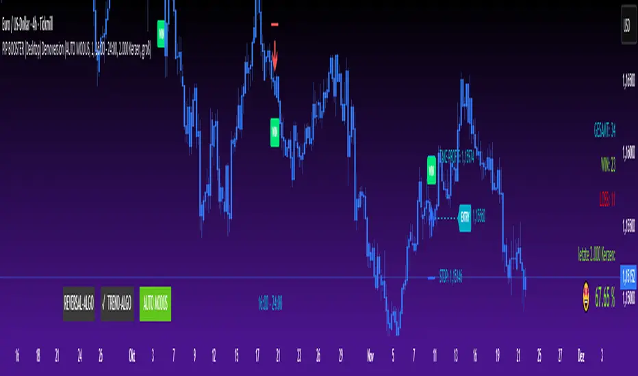
PIP BOOSTER (Desktop) DemoversionThe PIP BOOSTER from underground-traders.com is a very intelligent indicator with integrated win-rate tracking (%), which can be used on all markets and timeframes. Thanks to its two fundamentally different algorithms, the PIP BOOSTER is able to find a profitable setup in over 80% of all charts. The win-rate tracking (%) is highly detailed and can be applied to up to 5,000 candles.
It updates after every single signal, ensuring that performance monitoring is always up to date. Additionally, PIP BOOSTER users can apply different time filters, which can further optimize performance.
There is both a desktop version and a mobile version, which can be used with the TradingView mobile app. All signals are displayed clearly in the mobile app, making it possible to trade directly from your smartphone.
Please note that the demo version does not include any live signals. The demo version is only for you to evaluate the performance (win-rate %) of the two algorithms.
We guarantee that there are no repaint signals, and the signals in the demo version are 100% identical to those in the full version.
For any questions, please visit:
underground-traders.com
Or contact us at:
help@underground-traders.com
PIP BOOSTER (Mobile) DemoversionThe PIP BOOSTER from underground-traders.com is a very intelligent indicator with integrated win-rate tracking (%), which can be used on all markets and timeframes. Thanks to its two fundamentally different algorithms, the PIP BOOSTER is able to find a profitable setup in over 80% of all charts. The win-rate tracking (%) is highly detailed and can be applied to up to 5,000 candles.
It updates after every single signal, ensuring that performance monitoring is always up to date. Additionally, PIP BOOSTER users can apply different time filters, which can further optimize performance.
There is both a desktop version and a mobile version, which can be used with the TradingView mobile app. All signals are displayed clearly in the mobile app, making it possible to trade directly from your smartphone.
Please note that the demo version does not include any live signals. The demo version is only for you to evaluate the performance (win-rate %) of the two algorithms.
We guarantee that there are no repaint signals, and the signals in the demo version are 100% identical to those in the full version.
For any questions, please visit:
underground-traders.com
Or contact us at:
help@underground-traders.com

PIP BOOSTER (Desktop) FullversionThe PIP BOOSTER from underground-traders.com is a very intelligent indicator with integrated win-rate tracking (%), which can be used on all markets and timeframes. Thanks to its two fundamentally different algorithms, the PIP BOOSTER is able to find a profitable setup in over 80% of all charts. The win-rate tracking (%) is highly detailed and can be applied to up to 5,000 candles.
It updates after every single signal, ensuring that performance monitoring is always up to date. Additionally, PIP BOOSTER users can apply different time filters, which can further optimize performance.
There is both a desktop version and a mobile version, which can be used with the TradingView mobile app. All signals are displayed clearly in the mobile app, making it possible to trade directly from your smartphone.
Please note that the demo version does not include any live signals. The demo version is only for you to evaluate the performance (win-rate %) of the two algorithms.
We guarantee that there are no repaint signals, and the signals in the demo version are 100% identical to those in the full version.
For any questions, please visit:
underground-traders.com
Or contact us at:
help@underground-traders.com

PIP BOOSTER (Mobile) FullversionThe PIP BOOSTER from underground-traders.com is a very intelligent indicator with integrated win-rate tracking (%), which can be used on all markets and timeframes. Thanks to its two fundamentally different algorithms, the PIP BOOSTER is able to find a profitable setup in over 80% of all charts. The win-rate tracking (%) is highly detailed and can be applied to up to 5,000 candles.
It updates after every single signal, ensuring that performance monitoring is always up to date. Additionally, PIP BOOSTER users can apply different time filters, which can further optimize performance.
There is both a desktop version and a mobile version, which can be used with the TradingView mobile app. All signals are displayed clearly in the mobile app, making it possible to trade directly from your smartphone.
Please note that the demo version does not include any live signals. The demo version is only for you to evaluate the performance (win-rate %) of the two algorithms.
We guarantee that there are no repaint signals, and the signals in the demo version are 100% identical to those in the full version.
For any questions, please visit:
underground-traders.com
Or contact us at:
help@underground-traders.com

NeuraEdge Pro v1- Auto-OptimizedNeuraEdge Pro is an advanced, self-optimizing trading system that combines Smart Money Concepts (SMC), ICT principles, and adaptive neural networks to identify high-probability trade setups. The indicator automatically learns from its signal history and optimizes parameters in real-time to maintain your target win rate.
Key Features:
✅ Auto-optimization based on historical performance
✅ Neural adaptive system that learns market conditions
✅ ICT session filtering (London, New York, Asian)
✅ Smart Money Concepts integration
✅ Multi-timeframe support (Scalping to Swing trading)
✅ Built-in risk management system
📊 How It Works
NeuraEdge Pro identifies institutional order blocks, fair value gaps, and liquidity zones using advanced price action analysis. The system then filters these setups through multiple confluence factors including:
Market structure alignment
Volume confirmation
Neural network prediction
Session timing (ICT concepts)
Momentum indicators
RSI divergences
The higher you set the confluence number to (max 5) the more accurate but less signal quantity preferred on higher time frame from 1 HR and above.
The unique auto-optimization engine tracks signal performance and automatically adjusts internal parameters to improve accuracy over time.
⚙️ Recommended Settings by Trading Style
🔥 Scalping (1m - 5m charts)
Trading Mode:
✅ Scalp Mode
❌ Intraday Mode
❌ Swing Mode
✅ ICT Concepts
✅ Neural Adaptive
Risk Management:
Risk % per Trade: 0.5-1.0%
Risk:Reward Ratio: 2:1
ATR-Based Stop Loss: ON
ATR Multiplier: 1.3
Min SL Points: 15-20
Advanced Settings:
Analysis Lookback: 40
Order Block Strength: 4-5
Base FVG Size: 0.8-1.0
Base Volume Threshold: 1.8
Base Confluence Score: 4
📈 Intraday (15m - 1h charts)
Trading Mode:
❌ Scalp Mode
✅ Intraday Mode
❌ Swing Mode
✅ ICT Concepts
✅ Neural Adaptive
Risk Management:
Risk % per Trade: 1.0-1.5%
Risk:Reward Ratio: 2.5:1
ATR-Based Stop Loss: ON
ATR Multiplier: 1.5
Min SL Points: 25-30
Advanced Settings:
Analysis Lookback: 50
Order Block Strength: 4
Base FVG Size: 0.9
Base Volume Threshold: 1.6
Base Confluence Score: 4
📊 Swing Trading (4h - Daily charts)
Trading Mode:
❌ Scalp Mode
❌ Intraday Mode
✅ Swing Mode
✅ ICT Concepts
✅ Neural Adaptive
Risk Management:
Risk % per Trade: 1.5-2.0%
Risk:Reward Ratio: 3:1
ATR-Based Stop Loss: ON
ATR Multiplier: 1.8
Min SL Points: 40-50
Advanced Settings:
Analysis Lookback: 75
Order Block Strength: 3-4
Base FVG Size: 1.0-1.2
Base Volume Threshold: 1.5
Base Confluence Score: 3-4
🤖 Auto-Optimization Settings
Recommended for all timeframes:
Enable Auto-Optimization: ON
Optimization Lookback: 100 trades
Target Win Rate: 60%
💡 The system needs at least 10-15 signals to begin optimization. Initial signals use base settings, then the system adapts automatically.
🔮 Predictive Analysis
Keep these balanced for optimal results:
Enable Predictive Mode: ON
Price Action Weight: 0.4
Volume Weight: 0.3
Momentum Weight: 0.3
These weights determine how much each factor influences setup scoring.
📱 Signal Interpretation
BUY Signals (Green Labels)
Price has reached a bullish order block or FVG
Multiple confluence factors aligned
Neural network confirms bullish bias
Entry price shown on label
Green dashed line = Take Profit target
Red dashed line = Stop Loss
SELL Signals (Red Labels)
Price has reached a bearish order block or FVG
Multiple confluence factors aligned
Neural network confirms bearish bias
Entry price shown on label
Green dashed line = Take Profit target
Red dashed line = Stop Loss
📊 Dashboard Explained
Top Section:
Mode - Active trading mode and timeframe
Trend - Current market structure (Bullish/Bearish/Range)
Vol - Volume ratio (higher = stronger moves)
ATR - Current volatility measurement
Auto-Optimize Section:
Win Rate - Historical performance (updates after signals)
FVG/Vol/Conf - Current optimized parameters with arrows:
↑ = System increased selectivity (fewer signals)
↓ = System decreased selectivity (more signals)
= = No change from base settings
Ready OBs - Number of high-probability setups currently available
⚠️ Important Trading Rules
Wait for signal labels - Don't trade order blocks/FVGs without confirmation
Respect the stop loss - Always displayed as red dashed line
Use proper position sizing - Based on your Risk % setting
Trade during recommended sessions - When ICT Concepts enabled
Let auto-optimization work - Give it 15-20 signals before judging
One signal at a time - System prevents new signals for 5 bars after entry
🎯 Best Practices
✅ DO:
Use on liquid, trending markets (Forex majors, indices, crypto majors)
Enable only ONE trading mode matching your timeframe
Keep ICT Concepts enabled for session filtering
Trust the auto-optimization after 15+ signals
Set alerts for BUY/SELL signals
❌ DON'T:
Enable multiple trading modes simultaneously
Override stop losses manually
Trade during low liquidity hours without ICT filtering
Expect perfection - manage risk appropriately
Judge performance before 20+ signals
🔔 Alert Setup
The indicator includes 4 alert types:
Buy Signal - Long entry opportunity
Sell Signal - Short entry opportunity
Sell-Side Sweep - Liquidity grabbed above
Buy-Side Sweep - Liquidity grabbed below
Set up alerts via TradingView's alert menu for real-time notifications.
📈 Performance Tracking
The dashboard shows real-time performance metrics:
Win Rate % - Percentage of profitable signals
Parameter adjustments - How the system is adapting
Neural Score - AI confidence (0-1 scale)
ICT Session Status - Whether optimal trading hours are active
💡 Pro Tips
Start conservative - Use recommended settings for your timeframe
Give it time - Auto-optimization needs 20-30 signals for best results
Higher timeframes = higher quality - Fewer but better signals
Volume matters - Strongest signals occur on volume spikes
Structure alignment - Best trades align with overall trend
⚙️ Technical Requirements
Minimum Timeframe: 1 minute
Maximum Timeframe: Monthly
Best Timeframes: 5m, 15m, 1h, 4h
Asset Classes: Forex, Crypto, Indices, Stocks
Account Type: Any (works with all TradingView plans)
📞 Support & Updates
This indicator is actively maintained and updated based on user feedback. Future updates will include additional features and optimizations.
Disclaimer: Trading involves substantial risk. This indicator is a tool to assist analysis, not a guarantee of profits. Always use proper risk management and never risk more than you can afford to lose. Past performance does not guarantee future results.

BBWW 2.0 Revised EN# Expert Review: BBWW 2.0 (Bollinger Bands Wing Waves)
**Verdict:** This is not just an indicator, but a full-fledged **system for visualizing market regimes**. Unlike standard Bollinger Bands, which only show volatility and deviation, BBWW 2.0 decodes **crowd psychology**, separating price movements into momentum phases (Fear/Greed) and decay phases (Correction).
This is a tool for **trend** and **swing** traders operating on volatility breakouts.
---
## How It Works: Under the Hood
At its core lies the classic mathematics of standard deviation, enhanced by advanced digital filters (Gaussian, Butterworth, SWMA).
The main "feature" of the indicator is the **Wing Waves** algorithm, which analyzes three vectors simultaneously:
1. Direction of the Basis (central line).
2. Dynamics of the Upper Band (expansion/contraction).
3. Dynamics of the Lower Band (expansion/contraction).
The combination of these vectors creates 4 market states:
### 1. Greed Impulse (Color: Olive)
* **Logic:** Basis rising + Channel expanding upwards.
* **Meaning:** Aggressive buying. Volatility is increasing in the direction of the trend. This is the most profitable phase for holding long positions. Shorting here is suicide.
### 2. Greed Correction (Color: Maroon)
* **Logic:** Basis is still rising, but the lower band has started to pull up (volatility contraction).
* **Meaning:** Buyers are exhausting, taking profits. Momentum has faded, the market is drifting or preparing for a reversal.
### 3. Fear Impulse (Color: Fuchsia)
* **Logic:** Basis falling + Channel expanding downwards.
* **Meaning:** Panic selling. Strong downward impulsive movement. The best time to hold shorts or stay out of the market (for spot).
### 4. Fear Correction (Color: Teal)
* **Logic:** Basis falling, but the upper band has started to decline (contraction).
* **Meaning:** "Dead cat bounce" or bottom stabilization. Sellers are closing positions, volatility is dropping. Dangerous to open new shorts.
---
## Trading Strategies and Recommendations
As a professional trader, I recommend using BBWW 2.0 as follows:
### Strategy 1: "Surfing the Waves" (Trend Following)
Works perfectly on 1H, 4H, and 1D timeframes.
* **ENTRY:** Enter a trade when a "Correction" phase changes to an "Impulse" phase.
* *Long:* Change from Maroon (Correction) → to Olive (Greed). This is a signal that consolidation is over and the trend has resumed.
* *Short:* Change from Teal (Correction) → to Fuchsia (Fear).
* **EXIT:** As soon as the color changes to a correction phase, tighten your stop-loss or take partial profits.
### Strategy 2: "The Squeeze"
BBWW excels at showing moments when the spring is coiling.
* If you see a prolonged period of "Correction" (bands narrowing), and price is squeezed between the Basis and one of the bands — get ready for a breakout.
* Use **Basis Line touches** during a trend as an entry point to add to a position. In a strong trend, price often tests the middle (Basis) and bounces off it.
### Strategy 3: Noise Filtering
* Enable **Gaussian** or **Butterworth** filter in settings instead of the standard SMA. This removes market noise and provides a smoother Basis Line, reducing false signals in sideways markets (flat).
---
## Nuances and Risks
1. **Sideways Market (Flat):** Like any trend tool, BBWW will give false signals in a narrow range. Colors will change frequently, and bands will be horizontal.
* *Solution:* Do not trade if the Basis Line is flat (horizontal). Wait for a slope.
2. **Lag:** Any MA (Moving Average) has lag. The signal for a phase change (e.g., start of Fear) comes when the move has already started. Do not try to catch the absolute tops and bottoms. Capture the "body" of the move.
3. **Period Settings:**
* For scalping (5m-15m): Reduce period to 14-16.
* For medium-term (4H-1D): Leave at 20 or increase to 50 to filter for the global trend.
### Summary
BBWW 2.0 is a powerful visual assistant. It removes the emotional component of trading by answering the main questions: *"Is it greed or fear right now?"* and *"Is volatility rising or falling?"*.
**Best Application:** Cryptocurrencies and volatile stocks, where pump and dump phases (volatility expansions) are most pronounced.

ICT/SMC DOL Detector PRO (Final)This indicator is designed to operate only on the 1-hour timeframe.
The ICT/SMC DOL Detector PRO is an educational indicator designed to identify and visualize Draw on Liquidity (DOL) levels across multiple time-frames. It tracks unmitigated daily highs and lows, clusters them into zones, and calculates confidence scores based on multiple factors including time decay, cluster size, and time-frame alignment.
This indicator is based on ICT (Inner Circle Trader) concepts and liquidity theory, which suggests that price tends to seek out areas of concentrated unfilled orders before reversing or continuing its trend.
What is a DOL (Draw on Liquidity)?
A Draw on Liquidity represents a daily high or low that has not been revisited (mitigated) by price. These levels act as "magnets" that draw price toward them because:
1. They represent untapped liquidity pools where unfilled orders exist
2. Market makers and institutions often target these levels to fill large orders
3. Price is drawn to these zones to clear pending orders
4. They can serve as potential reversal or continuation zones once liquidity is taken
Methodology
1. Level Tracking
The indicator monitors daily session highs and lows on the 1-hour time-frame, tracking:
- Session high price and time of formation
- Session low price and time of formation
- Whether each level has been breached (mitigated)
- Time elapsed since level formation
2. Clustering Algorithm
Unmitigated levels within a defined tolerance (default 0.5% of price) are grouped together to identify zones where multiple DOLs cluster. Larger clusters indicate stronger liquidity pools.
3. Confidence Scoring (The "AI" Logic)
Each DOL receives a confidence score (0-100%) based on three weighted factors. This is the core "AI" intelligence of the indicator:
**Factor 1: Cluster Size (50% weight)**
- Counts how many unmitigated levels exist within 0.5% of the price zone
- Formula: (levels_in_cluster / total_unmitigated_levels) × 50
- Logic: More unfilled orders clustered together = stronger liquidity pool = higher confidence
- Example: If 5 out of 10 total unmitigated levels cluster at 27,500, cluster score = (5/10) × 50 = 25%
**Factor 2: Time Decay (25% weight)**
- Calculates age of the level since formation
- Fresh levels (< 1 week old): Full 25% score
- Aging penalty: Loses 5% per week of age
- Maximum penalty: 25% (very old levels = 0% time score)
- Formula: max(0, 25 - (weeks_old × 5))
- Logic: Recent liquidity is more relevant than old liquidity that price has ignored for months
**Factor 3: Timeframe Alignment (25% weight)**
- Checks how many timeframes (1H, 4H, D1, W1) point in the same direction
- If multiple timeframes identify DOLs on the same side (all bullish or all bearish): Higher score
- If mixed signals: Lower score
- Formula: (aligned_timeframes / total_timeframes) × 25
- Logic: When multiple timeframes agree, the liquidity zone is validated across different time perspectives
**Total Confidence Score:**
```
Confidence = Cluster_Score + Time_Score + Alignment_Score
= (0-50%) + (0-25%) + (0-25%)
= 0-100%
```
**Example Calculation:**
```
DOL at 27,500:
- 6 out of 12 unmitigated levels cluster here → (6/12) × 50 = 25%
- Level is 2 weeks old → 25 - (2 × 5) = 15%
- 3 out of 4 timeframes bullish toward this level → (3/4) × 25 = 18.75%
- Total Confidence = 25% + 15% + 18.75% = 58.75% ≈ 59%
```
This mathematical approach removes subjectivity and provides objective, data-driven confidence scoring.
4. Multi-Timeframe Analysis
The indicator analyzes DOLs across four timeframes:
- **1H:** Intraday levels (fastest reaction)
- **4H:** Short-term swing levels
- **Daily:** Intermediate-term levels
- **Weekly:** Long-term structural levels
For each timeframe, it identifies:
- Highest confidence unmitigated high
- Highest confidence unmitigated low
- Directional bias (bullish if high > low confidence, bearish if low > high confidence)
5. Primary DOL Selection (AI Auto-Selection Logic)
When "Show AI DOL" is enabled, the indicator uses an automated selection algorithm to identify the most important targets:
**Step 1: Collect All Candidates**
The algorithm gathers all identified DOLs from all timeframes (1H, 4H, D1, W1) that meet minimum criteria:
- Must be unmitigated (not yet swept)
- Must have confidence score > 0%
- Must have at least 1 level in cluster
**Step 2: Calculate Confidence for Each**
Each candidate DOL receives its confidence score using the three-factor formula described above (Cluster + Time + Alignment).
**Step 3: Sort by Confidence**
All candidates are ranked from highest to lowest confidence score.
**Step 4: Select Primary and Secondary**
- **P1 (Primary DOL):** The DOL with the absolute highest confidence score
- **P2 (Secondary DOL):** The DOL with the second highest confidence score
**Why This Matters:**
Instead of manually scanning multiple timeframes and guessing which level is most important, the AI objectively identifies the two highest-probability liquidity targets based on quantifiable data.
**Example AI Selection:**
```
Available DOLs:
- 1H High: 27,400
- 4H High: 27,500
- D1 High: 27,500 ← P1 (Highest)
- W1 High: 27,650 ← P2 (Second Highest)
- 1H Low: 26,800
- D1 Low: 26,500
AI Selection:
P1 = 27,500 (Daily High with 92% confidence)
P2 = 27,650 (Weekly High with 88% confidence)
```
This provides a data-driven target selection rather than subjective manual interpretation. The AI removes emotion and bias, selecting targets based purely on mathematical probability.
Features
Why "AI" DOL?
The term "AI" in this indicator refers to the automated algorithmic selection process, not machine learning or neural networks. Specifically:
**What the AI Does:**
- Automatically evaluates all available DOLs across all timeframes
- Applies a weighted scoring algorithm (Cluster 50%, Time 25%, Alignment 25%)
- Objectively ranks DOLs by probability
- Selects the top 2 highest-confidence targets (P1 and P2)
- Removes human bias and emotion from target selection
**What the AI Does NOT Do:**
- It does not use machine learning or train on historical data
- It does not predict future price movements
- It does not adapt or "learn" over time
- It does not guarantee accuracy
The "AI" is simply an automated decision-making algorithm that applies consistent mathematical rules to identify the most statistically significant liquidity zones. Think of it as a "smart filter" rather than artificial intelligence in the traditional sense.
Visual Components
**Daily Level Lines:**
- Green lines: Unmitigated (not yet breached) levels
- Red lines: Mitigated (already breached) levels
- Dots at origin point showing where level was formed
- X marker when level gets breached
- Lines extend forward to show projection
**DOL Labels:**
- Display timeframe (1H, 4H, D1, W1) or "DOL" for AI selection
- Show confidence percentage in brackets
- Color-coded by timeframe:
- Lime: AI DOL (Smart selection)
- Aqua: 1-hour timeframe
- Blue: 4-hour timeframe
- Purple: Daily timeframe
- Orange: Weekly timeframe
**Info Box (Top Right):**
Displays comprehensive liquidity metrics:
- Total levels tracked
- Active (unmitigated) levels count
- Cleared (mitigated) levels count
- Flow direction (BID PRESSURE / OFFER PRESSURE)
- Most recent sweep
- Primary and Secondary DOL targets
- Multi-timeframe bias analysis
- Overall directional bias
Settings Explained
**Daily Levels Group:**
- Show Daily Highs/Lows: Toggle visibility of all daily level tracking
- Unbreached Color: Color for levels not yet hit
- Breached Color: Color for levels that have been swept
- Show X on Breach: Display marker when level is breached
- Show Dot at Origin: Display marker at level formation point
- Line Width: Thickness of level lines (1-5)
- Line Extension: How many bars forward to project (1-24)
- Max Days to Track: Historical lookback period (5-200 days)
**DOL Settings Group:**
- Cluster Tolerance %: Price range to group DOLs (0.1-2.0%)
- Show Price on Labels: Display actual price value on labels
- Backtest Mode: Only show recent labels for clean historical analysis
- Labels Lookback: Number of bars to show labels when backtesting (10-500)
**Info Box Group:**
- Show Info Box: Toggle info panel visibility
**DOL Toggles Group:**
- Show AI DOL: Display smart auto-selected primary target
- Show 1HR DOL: Display 1-hour timeframe DOLs
- Show 4HR DOL: Display 4-hour timeframe DOLs
- Show Daily DOL: Display daily timeframe DOLs
- Show Weekly DOL: Display weekly timeframe DOLs
**Advanced Group:**
- Manual Mode: Simplified display showing only daily high/low clusters
How to Use This Indicator
Educational Application
This indicator is intended for educational purposes to help traders:
1. **Understand Liquidity Concepts:** Visualize where unfilled orders may exist
2. **Identify Key Levels:** See where price may be drawn to
3. **Analyze Market Structure:** Understand how price interacts with liquidity
4. **Study Multi-Timeframe Alignment:** Observe when multiple timeframes agree
5. **Learn ICT Concepts:** Apply liquidity theory in practice
Interpretation Guidelines
**BID PRESSURE (Flow):**
When lows are being swept more than highs, it suggests:
- Sell-side liquidity being taken
- Potential for upward move to unfilled buy-side liquidity
- Market may be clearing the way for a bullish move
**OFFER PRESSURE (Flow):**
When highs are being swept more than lows, it suggests:
- Buy-side liquidity being taken
- Potential for downward move to unfilled sell-side liquidity
- Market may be clearing the way for a bearish move
**Confidence Scores:**
- 90-100%: Very high probability zone (strong cluster, recent, aligned)
- 80-89%: High probability zone (good cluster, relatively recent)
- 70-79%: Moderate probability zone (decent cluster or older)
- 60-69%: Lower probability zone (small cluster or very old)
- Below 60%: Weak zone (minimal confluence)
**Timeframe Analysis:**
- All timeframes LONG: Strong bullish alignment
- All timeframes SHORT: Strong bearish alignment
- Mixed: Conflicting signals, exercise caution
- Higher timeframes (D1, W1) carry more weight than lower (1H, 4H)
**DIRECTIONAL Indicator:**
- BULLISH: Overall bias suggests upward movement toward buy-side DOLs
- BEARISH: Overall bias suggests downward movement toward sell-side DOLs
- NEUTRAL: No clear directional bias, conflicting signals
Practical Application Examples
**Example 1: Bullish Setup**
```
Flow: BID PRESSURE (lows being swept)
P1: 27,500 (price above current market)
D1: LONG 27,500
W1: LONG 27,650
DIRECTIONAL: BULLISH
```
Interpretation: Price has cleared sell-side liquidity. High confidence buy-side DOL at 27,500. Daily and Weekly timeframes aligned bullish. Watch for move toward 27,500 target.
**Example 2: Bearish Setup**
```
Flow: OFFER PRESSURE (highs being swept)
P1: 26,200 (price below current market)
D1: SHORT 26,200
W1: SHORT 26,100
DIRECTIONAL: BEARISH
```
Interpretation: Price has cleared buy-side liquidity. High confidence sell-side DOL at 26,200. Daily and Weekly timeframes aligned bearish. Watch for move toward 26,200 target.
**Example 3: Mixed Signals - Wait**
```
Flow: BID PRESSURE
P1: 26,800
D1: LONG 27,000
W1: SHORT 26,200
DIRECTIONAL: NEUTRAL
```
Interpretation: Conflicting signals. Flow suggests up, but Weekly bias is down. Confidence scores moderate. Better to wait for clarity.
Important Considerations
This Indicator Does NOT:
- Predict the future
- Guarantee profitable trades
- Provide buy/sell signals
- Replace proper risk management
- Work in isolation without other analysis
This Indicator DOES:
- Visualize liquidity concepts
- Identify potential target zones
- Show timeframe alignment
- Calculate objective confidence scores
- Help understand market structure
Proper Usage:
1. Use as one component of a complete trading strategy
2. Combine with price action analysis
3. Confirm with other technical indicators
4. Consider fundamental factors
5. Always use proper risk management
6. Backtest any strategy before live trading
Risk Disclaimer
**FOR EDUCATIONAL PURPOSES ONLY**
This indicator is for educational purposes only. Trading financial markets involves substantial risk of loss. Past performance does not guarantee future results. Always conduct your own research and consult with a financial advisor before making trading decisions.
**Important Limitations:**
- No indicator is 100% accurate, including the AI selection
- The "AI" is an automated algorithm, not predictive artificial intelligence
- DOL levels can be swept and price can continue in the same direction
- Confidence scores are mathematical calculations, not predictions or probabilities of success
- High confidence does not mean guaranteed profit
- Markets can remain irrational longer than you can remain solvent
- Always use stop losses and proper position sizing
**Understanding the AI Component:**
The AI auto-selection feature uses a fixed mathematical formula to rank DOLs. It does not:
- Predict where price will go
- Learn from past performance
- Adapt to market conditions
- Guarantee any level of accuracy
The confidence score represents the mathematical strength of a liquidity cluster based on objective factors (cluster size, recency, timeframe alignment), NOT a probability of the trade succeeding.
**Risk Warning:**
Trading is risky. Most traders lose money. This indicator cannot change that fundamental reality. Use it as an educational tool to understand market structure, not as a trading signal or system.
Technical Requirements
- **Timeframe:** Best used on 1-hour charts (required for accurate daily level tracking)
- **Markets:** Works on any market (forex, crypto, stocks, futures, indices)
- **Updates:** Real-time calculation on each bar close
- **Resources:** Uses max 500 lines and 500 labels (TradingView limits)
Backtesting Features
The indicator includes "Backtest Mode" to keep historical charts clean:
- When enabled, only shows labels from recent bars
- Adjustable lookback period (10-500 bars)
- All lines remain visible
- Helps review past setups without clutter
To use:
1. Enable "Backtest Mode" in settings
2. Adjust "Labels Lookback" to desired period
3. Review historical price action
4. Disable for live trading
Credits and Methodology
This indicator implements concepts from:
- ICT (Inner Circle Trader) liquidity theory
- Smart Money Concepts (SMC)
- Order flow analysis
- Multi-timeframe analysis principles
The clustering algorithm, confidence scoring, and timeframe synthesis are original implementations designed to quantify and visualize these concepts.
Version History
**v1.0 - Initial Release**
- Multi-timeframe DOL detection
- Confidence scoring system
- Info box with liquidity metrics
- Backtest mode for clean charts
- Black/white professional theme
Support and Updates
For questions, feedback, or suggestions, please use the TradingView comments section. Updates and improvements will be released as needed based on user feedback and market evolution.
**Remember:** This is an educational tool. Successful trading requires knowledge, discipline, risk management, and continuous learning. Use this indicator to enhance your understanding of market structure and liquidity, not as a standalone trading system.

Quantum Market Analyzer X7Quantum Market Analyzer X7 - Complete Study Guide
Table of Contents
1. Overview
2. Indicator Components
3. Signal Interpretation
4. Live Market Analysis Guide
5. Best Practices
6. Limitations and Considerations
7. Risk Disclaimer
________________________________________
Overview
The Quantum Market Analyzer X7 is a comprehensive multi-timeframe technical analysis indicator that combines traditional and modern analytical methods. It aggregates signals from multiple technical indicators across seven key analysis categories to provide traders with a consolidated view of market sentiment and potential trading opportunities.
Key Features:
• Multi-Indicator Analysis: Combines 20+ technical indicators
• Real-Time Dashboard: Professional interface with customizable display
• Signal Aggregation: Weighted scoring system for overall market sentiment
• Advanced Analytics: Includes Order Block detection, Supertrend, and Volume analysis
• Visual Progress Indicators: Easy-to-read progress bars for signal strength
________________________________________
Indicator Components
1. Oscillators Section
Purpose: Identifies overbought/oversold conditions and momentum changes
Included Indicators:
• RSI (14): Relative Strength Index - momentum oscillator
• Stochastic (14): Compares closing price to price range
• CCI (20): Commodity Channel Index - cycle identification
• Williams %R (14): Momentum indicator similar to Stochastic
• MACD (12,26,9): Moving Average Convergence Divergence
• Momentum (10): Rate of price change
• ROC (9): Rate of Change
• Bollinger Bands (20,2): Volatility-based indicator
Signal Interpretation:
• Strong Buy (6+ points): Multiple oscillators indicate oversold conditions
• Buy (2-5 points): Moderate bullish momentum
• Neutral (-1 to 1 points): Balanced conditions
• Sell (-2 to -5 points): Moderate bearish momentum
• Strong Sell (-6+ points): Multiple oscillators indicate overbought conditions
2. Moving Averages Section
Purpose: Determines trend direction and strength
Included Indicators:
• SMA: 10, 20, 50, 100, 200 periods
• EMA: 10, 20, 50 periods
Signal Logic:
• Price >2% above MA = Strong Buy (+2)
• Price above MA = Buy (+1)
• Price below MA = Sell (-1)
• Price >2% below MA = Strong Sell (-2)
Signal Interpretation:
• Strong Buy (6+ points): Price well above multiple MAs, strong uptrend
• Buy (2-5 points): Price above most MAs, bullish trend
• Neutral (-1 to 1 points): Mixed MA signals, consolidation
• Sell (-2 to -5 points): Price below most MAs, bearish trend
• Strong Sell (-6+ points): Price well below multiple MAs, strong downtrend
3. Order Block Analysis
Purpose: Identifies institutional support/resistance levels and breakouts
How It Works:
• Detects historical levels where large orders were placed
• Monitors price behavior around these levels
• Identifies breakouts from established order blocks
Signal Types:
• BULLISH BRK (+2): Breakout above resistance order block
• BEARISH BRK (-2): Breakdown below support order block
• ABOVE SUP (+1): Price holding above support
• BELOW RES (-1): Price rejected at resistance
• NEUTRAL (0): No significant order block interaction
4. Supertrend Analysis
Purpose: Trend following indicator based on Average True Range
Parameters:
• ATR Period: 10 (default)
• ATR Multiplier: 6.0 (default)
Signal Types:
• BULLISH (+2): Price above Supertrend line
• BEARISH (-2): Price below Supertrend line
• NEUTRAL (0): Transition period
5. Trendline/Channel Analysis
Purpose: Identifies trend channels and breakout patterns
Components:
• Dynamic trendline calculation using pivot points
• Channel width based on historical volatility
• Breakout detection algorithm
Signal Types:
• UPPER BRK (+2): Breakout above upper channel
• LOWER BRK (-2): Breakdown below lower channel
• ABOVE MID (+1): Price above channel midline
• BELOW MID (-1): Price below channel midline
6. Volume Analysis
Purpose: Confirms price movements with volume data
Components:
• Volume spikes detection
• On Balance Volume (OBV)
• Volume Price Trend (VPT)
• Money Flow Index (MFI)
• Accumulation/Distribution Line
Signal Calculation: Multiple volume indicators are combined to determine institutional activity and confirm price movements.
________________________________________
Signal Interpretation
Overall Summary Signals
The indicator aggregates all component signals into an overall market sentiment:
Signal Score Range Interpretation Action
STRONG BUY 10+ Overwhelming bullish consensus Consider long positions
BUY 4-9 Moderate to strong bullish bias Look for long opportunities
NEUTRAL -3 to 3 Mixed signals, consolidation Wait for clearer direction
SELL -4 to -9 Moderate to strong bearish bias Look for short opportunities
STRONG SELL -10+ Overwhelming bearish consensus Consider short positions
Progress Bar Interpretation
• Filled bars indicate signal strength
• Green bars: Bullish signals
• Red bars: Bearish signals
• More filled bars = stronger conviction
________________________________________
Live Market Analysis Guide
Step 1: Initial Assessment
1. Check Overall Summary: Start with the main signal
2. Verify with Component Analysis: Ensure signals align
3. Look for Divergences: Identify conflicting signals
Step 2: Timeframe Analysis
1. Set Appropriate Timeframe: Use 1H for intraday, 4H/1D for swing trading
2. Multi-Timeframe Confirmation: Check higher timeframes for trend context
3. Entry Timing: Use lower timeframes for precise entry points
Step 3: Signal Confirmation Process.
For Buy Signals:
1. Oscillators: Look for oversold conditions (RSI <30, Stoch <20)
2. Moving Averages: Price should be above key MAs
3. Order Blocks: Confirm bounce from support levels
4. Volume: Check for accumulation patterns
5. Supertrend: Ensure bullish trend alignment.
For Sell Signals:
1. Oscillators: Look for overbought conditions (RSI >70, Stoch >80)
2. Moving Averages: Price should be below key MAs
3. Order Blocks: Confirm rejection at resistance levels
4. Volume: Check for distribution patterns
5. Supertrend: Ensure bearish trend alignment.
Step 4: Risk Management Integration
1. Signal Strength Assessment: Stronger signals = larger position size
2. Stop Loss Placement: Use Order Block levels for stops
3. Take Profit Targets: Based on channel analysis and resistance levels
4. Position Sizing: Adjust based on signal confidence
________________________________________
Best Practices
Entry Strategies
1. High Conviction Entries: Wait for STRONG BUY/SELL signals
2. Confluence Trading: Look for multiple components aligning
3. Breakout Trading: Use Order Block and Trendline breakouts
4. Trend Following: Align with Supertrend direction.
Risk Management
1. Never Risk More Than 2% Per Trade: Regardless of signal strength
2. Use Stop Losses: Place at invalidation levels
3. Scale Positions: Stronger signals warrant larger (but still controlled) positions
4. Diversification: Don't rely solely on one indicator.
Market Conditions
1. Trending Markets: Focus on Supertrend and MA signals
2. Range-Bound Markets: Emphasize Oscillator and Order Block signals
3. High Volatility: Reduce position sizes, widen stops
4. Low Volume: Be cautious of breakout signals.
Common Mistakes to Avoid
1. Signal Chasing: Don't enter after signals have already moved significantly
2. Ignoring Context: Consider overall market conditions
3. Overtrading: Wait for high-quality setups
4. Poor Risk Management: Always use appropriate position sizing
________________________________________
Limitations and Considerations
Technical Limitations
1. Lagging Nature: All technical indicators are based on historical data
2. False Signals: No indicator is 100% accurate
3. Market Regime Changes: Indicators may perform differently in various market conditions
4. Whipsaws: Possible in choppy, sideways markets.
Optimal Use Cases
1. Trending Markets: Performs best in clear trending environments
2. Medium to High Volatility: Requires sufficient price movement for signals
3. Liquid Markets: Works best with adequate volume and tight spreads
4. Multiple Timeframe Analysis: Most effective when used across different timeframes.
When to Use Caution
1. Major News Events: Fundamental analysis may override technical signals
2. Market Opens/Closes: Higher volatility can create false signals
3. Low Volume Periods: Signals may be less reliable
4. Holiday Trading: Reduced participation affects signal quality
________________________________________
Risk Disclaimer
IMPORTANT LEGAL DISCLAIMER FROM aiTrendview
WARNING: TRADING INVOLVES SUBSTANTIAL RISK OF LOSS
This Quantum Market Analyzer X7 indicator ("the Indicator") is provided for educational and informational purposes only. By using this indicator, you acknowledge and agree to the following terms:
No Investment Advice
• The Indicator does NOT constitute investment advice, financial advice, or trading recommendations
• All signals generated are based on historical price data and mathematical calculations
• Past performance does not guarantee future results
• No representation is made that any account will achieve profits or losses similar to those shown.
Risk Acknowledgment
• TRADING CARRIES SUBSTANTIAL RISK: You may lose some or all of your invested capital
• LEVERAGE AMPLIFIES RISK: Margin trading can result in losses exceeding your initial investment
• MARKET VOLATILITY: Financial markets are inherently unpredictable and volatile
• TECHNICAL ANALYSIS LIMITATIONS: No technical indicator is infallible or guarantees profitable trades.
User Responsibility
• YOU ARE SOLELY RESPONSIBLE for all trading decisions and their consequences
• CONDUCT YOUR OWN RESEARCH: Always perform independent analysis before making trading decisions
• CONSULT PROFESSIONALS: Seek advice from qualified financial advisors
• RISK MANAGEMENT: Implement appropriate risk management strategies
No Warranties
• The Indicator is provided "AS IS" without warranties of any kind
• aiTrendview makes no representations about the accuracy, reliability, or suitability of the Indicator
• Technical glitches, data feed issues, or calculation errors may occur
• The Indicator may not work as expected in all market conditions.
Limitation of Liability
• aiTrendview SHALL NOT BE LIABLE for any direct, indirect, incidental, or consequential damages
• This includes but is not limited to: trading losses, missed opportunities, data inaccuracies, or system failures
• MAXIMUM LIABILITY is limited to the amount paid for the indicator (if any)
Code Usage and Distribution
• This indicator is published on TradingView in accordance with TradingView's house rules
• UNAUTHORIZED MODIFICATION or redistribution of this code is prohibited
• Users may not claim ownership of this intellectual property
• Commercial use requires explicit written permission from aiTrendview.
Compliance and Regulations
• VERIFY LOCAL REGULATIONS: Ensure compliance with your jurisdiction's trading laws
• Some trading strategies may not be suitable for all investors
• Tax implications of trading are your responsibility
• Report trading activities as required by law
Specific Risk Factors
1. False Signals: The Indicator may generate incorrect buy/sell signals
2. Market Gaps: Overnight gaps can invalidate technical analysis
3. Fundamental Events: News and economic data can override technical signals
4. Liquidity Risk: Some markets may have insufficient liquidity
5. Technology Risk: Platform failures or connectivity issues may prevent order execution.
Professional Trading Warning
• THIS IS NOT PROFESSIONAL TRADING SOFTWARE: Not intended for institutional or professional trading
• NO REGULATORY APPROVAL: This indicator has not been approved by any financial regulatory authority
• EDUCATIONAL PURPOSE: Designed primarily for learning technical analysis concepts
FINAL WARNING
NEVER INVEST MONEY YOU CANNOT AFFORD TO LOSE
Trading financial instruments involves significant risk. The majority of retail traders lose money. Before using this indicator in live trading:
1. Practice on paper/demo accounts extensively
2. Start with small position sizes
3. Develop a comprehensive trading plan
4. Implement strict risk management rules
5. Continuously educate yourself about market dynamics
By using the Quantum Market Analyzer X7, you acknowledge that you have read, understood, and agree to this disclaimer. You assume full responsibility for all trading decisions and their outcomes.
Contact: For questions about this disclaimer or the indicator, contact aiTrendview through official TradingView channels only.
________________________________________
This study guide and indicator are published on TradingView in compliance with TradingView's community guidelines and house rules. All users must adhere to TradingView's terms of service when using this indicator.
Document Version: 1.0
Publisher: aiTrendview
________________________________________
Disclaimer
The content provided in this blog post is for educational and training purposes only. It is not intended to be, and should not be construed as, financial, investment, or trading advice. All charting and technical analysis examples are for illustrative purposes. Trading and investing in financial markets involve substantial risk of loss and are not suitable for every individual. Before making any financial decisions, you should consult with a qualified financial professional to assess your personal financial situation.

One Minute AI scalper keep extended trading hours on# One Minute AI Scalper - Trading Indicator
## Overview
The One Minute AI Scalper is a precision-engineered trading indicator designed specifically for short-term scalping strategies on 1-minute timeframes. This indicator combines multiple technical analysis methods to identify high-probability entry points for both long and short positions, making it ideal for active traders seeking quick, momentum-based opportunities.
## Key Features
### Visual Signals
- **Long Entry Arrows**: Clear green triangle markers appear below price bars when bullish conditions align
- **Short Entry Arrows**: Clear red triangle markers appear above price bars when bearish conditions align
- Clean, uncluttered chart interface focusing on actionable signals
### Advanced Signal Generation
The indicator utilizes a sophisticated multi-factor approach to generate trading signals:
1. **Trend Analysis**: Employs moving average crossover methodology to identify the prevailing market direction
2. **Momentum Confirmation**: Analyzes candlestick patterns and price behavior to confirm momentum strength
3. **Volume Validation**: Incorporates volume analysis to distinguish between high-conviction and standard signals
4. **Reversal Detection**: Identifies potential trend reversals by examining recent price action patterns
5. **Precision Entry Filtering**: Uses specific candlestick characteristics to minimize false signals
### Alert System
Comprehensive alert functionality for all signal types:
- Long Entry alerts
- Short Entry alerts
## How It Works
### Long Position Signals
The indicator generates long entry signals when multiple bullish conditions simultaneously align, including:
- Confirmation of upward momentum through price action
- Specific candlestick structure indicating strong buying pressure
- Price position relative to key moving averages
- Recent price behavior suggesting reversal potential
- Volume characteristics supporting the move
### Short Position Signals
Short entry signals are generated when multiple bearish conditions converge, including:
- Confirmation of downward momentum through price action
- Specific candlestick structure indicating strong selling pressure
- Price position relative to key moving averages
- Recent price behavior suggesting reversal potential
- Volume characteristics supporting the move
### Position Management
The indicator includes intelligent position state tracking to:
- Prevent duplicate signals while in an active position
- Generate exit signals based on opposing price action
- Maintain clear status of whether you're in a long or short position
## Best Practices
### Recommended Usage
- **Timeframe**: Optimized for 1-minute charts
- **Extended Hours**: Keep extended trading hours enabled for full market coverage
- **Markets**: Works on stocks, forex, crypto, and futures
- **Strategy**: Best suited for scalping and day trading strategies
### Risk Management
- Always use proper stop-loss orders
- Consider position sizing based on account risk tolerance
- Pay attention to volume-indicated signals for higher conviction trades
- Avoid trading during low-liquidity periods
- Combine with your own risk management rules
### Trading Tips
- Higher volume signals generally indicate stronger conviction
- Wait for clear arrow signals rather than trying to anticipate them
- Monitor overall market conditions and major support/resistance levels
- Be aware of news events that may cause unusual volatility
- Practice in a paper trading account before using real capital
## Important Notes
### What This Indicator Does
✅ Provides clear visual entry signals for long and short positions
✅ Incorporates multiple technical factors for signal generation
✅ Includes volume analysis for conviction assessment
✅ Offers comprehensive alert options for all signal types
✅ Maintains position state awareness
### What This Indicator Doesn't Do
❌ Does not guarantee profitable trades
❌ Does not provide specific price targets or stop-loss levels
❌ Does not replace the need for proper risk management
❌ Does not account for fundamental analysis or news events
❌ Does not adapt settings automatically to market conditions
## Disclaimer
This indicator is provided for educational and informational purposes only. It is not financial advice, and past performance does not guarantee future results. Trading involves substantial risk of loss, and you should only trade with capital you can afford to lose. Always conduct your own research and consider consulting with a qualified financial advisor before making trading decisions.
## Configuration
This indicator uses fixed, optimized parameters that have been carefully calibrated for 1-minute scalping. No user configuration is required - simply add it to your chart and monitor for signals.
## Support
For questions, suggestions, or feedback about this indicator, please use the comments section or contact the author directly through TradingView.
---
**Version**: 6.0
**Category**: Momentum/Scalping
**Overlay**: Yes
**Timeframe**: 1 minute (optimized)

Net Profit Margin %📌 Net Profit Margin % Indicator — Short Explanation
This indicator calculates and displays a company’s Net Profit Margin (NPM) using its financial statements.
What it does:
Pulls Net Income and Total Revenue from the company’s quarterly (FQ) or yearly (FY) financials.
Calculates:
Net Profit Margin = (Net Income / Revenue) × 100
Plots the NPM% as a line chart.
Background turns green when margin is positive and red when negative.
Shows the latest NPM value in a small info table on the chart.
Purpose:
Helps you quickly see whether a company is profitable and how its profit margin is trending over time.

JuBaKa Sniper Entry Master™JuBaKa Sniper Entry Master™ — Premium High-Precision Scalping System
JuBaKa Sniper Entry Master™ is a professional-grade scalping indicator engineered specifically for XAUUSD, NAS100, US30, GER30, and BTC.
It combines trend structure, momentum pressure, RSI confirmation, and non-repainting crossover logic to produce extremely precise sniper entries.
Designed with fixed internal parameters, this invite-only indicator provides a clean, simplified, black-box experience with no inputs — just powerful entries and dynamic stop guidance.
🔥 KEY FEATURES
✓ Sniper Entry Engine
Signals only appear when all conditions align:
• Trend direction
• Momentum pressure
• RSI confirmation
• Non-repainting cross structure
✓ Ultra-Clean Scalping Signals
Perfect for 1m, 3m, 5m, and 15m timeframes.
✓ Fixed Internal Settings (Locked Version)
No inputs to tweak — removes confusion and keeps behavior consistent.
✓ ATR Adaptive Stoploss Line
Automatically adjusts to volatility; perfect for scalpers.
✓ Trend Ribbon
Green = Bullish
Red = Bearish
✓ Alert Ready
BUY and SELL alerts for automation, webhook bots, and mobile trading.
⭐ BEST FOR
✔ Gold (XAUUSD) Scalping
✔ NAS100 / US30 Fast Indices
✔ High-volatility markets
✔ Traders who want early entries
✔ Traders who prefer simple, execution-ready signals
✔ Anyone needing a non-repainting scalping tool
🚀 ACCESS INSTRUCTIONS
This is a premium invite-only indicator.
To gain access:
Complete payment on the official page
Send your TradingView username via Mail
Access will be granted within minutes
The indicator will appear under:
Indicators → Invite-Only Scripts → JuBaKa Sniper Entry Master™
Support (Payments / Access):
Mail: jubaka.com@gmail.com
🏆 JuBaKa Sniper Entry Master™
Precision. Speed. Profitable Entries.
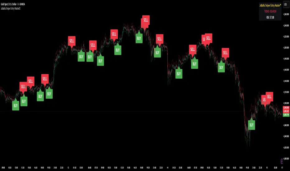
🎓 Smart Beginner Pro - AI Trading Assistant🎓 Smart Beginner Pro - AI Trading Assistant
Short Description:
Your perfect FIRST trading indicator! Clear BUY/SELL signals with automatic risk management. Learn professional trading while getting 5-star rated entries. Built-in education + Stop Loss/Take Profit included. No experience needed!
🎯 FULL DESCRIPTION
Smart Beginner Pro is the ONLY indicator designed specifically to help complete beginners start trading professionally from day one!
Unlike complicated indicators that overwhelm you with information, Smart Beginner Pro makes trading simple while teaching you professional techniques.
🌟 What Makes This Special?
⭐ 5-Star Quality Rating System
Every signal is rated 1-5 stars based on:
✅ Trend alignment
✅ Major trend confirmation
✅ Volume analysis
✅ RSI health check
✅ Trend strength
You always know EXACTLY how good a setup is before entering!
Example:
⭐⭐⭐⭐⭐ = Perfect setup (all factors aligned)
⭐⭐⭐⭐ = Excellent setup (4/5 factors)
⭐⭐⭐ = Good setup (3/5 factors)
Choose your preferred quality level - Conservative traders only take 5-star signals!
🎓 Built-in Education
Learn WHILE You Trade!
This isn't just an indicator - it's your AI trading teacher!
Beginner Mode Features:
✅ Educational tooltips on every signal
✅ Explains WHY each signal appears
✅ Shows what each factor means
✅ Teaches you professional analysis
✅ Risk management guidance included
After a few weeks, you'll understand:
How trends work
Why volume matters
When to enter trades
How to manage risk
Professional trading concepts
Turn OFF Beginner Mode when ready for cleaner charts!
🛡️ Automatic Risk Management
Never Wonder Where to Place Stops Again!
Every signal comes with:
Entry Zone (Green box)
Exact entry price shown
Small buffer zone for entry
Stop Loss (Red box)
Calculated using ATR (volatility)
Placed at safe distance
Protects your capital
Take Profit 1 (Yellow box)
First profit target (50% of full target)
Partial profit recommended
Take Profit 2 (Green box)
Full profit target (1:3 risk/reward default)
Let winners run!
Risk/Reward Ratio: Always displayed!
Default: 1:3 (Risk $10 to make $30)
Customizable: 1.5 to 5.0
Professional money management built-in
🎯 Crystal Clear Signals
No Confusion. No Guessing.
BUY Signals:
🟢 HUGE green arrow below bar
Text says "BUY"
Star rating above
Can't miss it!
SELL Signals:
🔴 HUGE red arrow above bar
Text says "SELL"
Star rating below
Impossible to miss!
WAIT (No Signal):
⚪ Dashboard shows "WAIT"
Don't trade when no signal
Patience is key!
📊 Live Dashboard
All Information at a Glance:
Everything you need to make a decision - RIGHT THERE!
⚙️ Three Sensitivity Modes
Choose your trading style:
🎯 Conservative (Recommended for Beginners)
✅ Only 5-star signals
✅ 2-3 signals per day
✅ Highest win rate
✅ Best for learning
✅ Perfect for part-time traders
⚖️ Balanced (Default)
✅ 4-5 star signals
✅ 5-8 signals per day
✅ Good win rate
✅ More opportunities
✅ Best for most traders
⚡ Aggressive (For Active Traders)
✅ 3-5 star signals
✅ 10-15 signals per day
✅ More trades
✅ Requires experience
✅ For full-time traders
Start Conservative → Move to Balanced → Then Aggressive as you improve!
🌍 Works on EVERYTHING
✅ All Markets:
Forex (EUR/USD, GBP/USD, etc.)
Crypto (Bitcoin, Ethereum, etc.)
Stocks (Apple, Tesla, etc.)
Indices (S&P 500, NASDAQ, etc.)
Commodities (Gold, Silver, Oil, etc.)
✅ All Timeframes:
M5-M15: Scalping (quick trades)
M15-H1: Day trading (same day)
H4-D1: Swing trading (multi-day)
One indicator for your entire trading career!
🕐 Session Highlighting
Trade at the Right Time!
Background colors show best trading sessions:
🟢 Green = London Session (8 AM - 4 PM GMT)
High liquidity
Best for EUR/GBP pairs
🔵 Blue = New York Session (1 PM - 9 PM GMT)
Maximum liquidity
Best for all USD pairs
No color = Asian Session
Lower liquidity
Beginners: Avoid or trade carefully
Toggle ON/OFF in settings if you don't need it.
📚 How to Use (Step by Step)
For Complete Beginners:
Step 1: Add to Chart
1. Open your favorite pair (Start with EUR/USD)
2. Set timeframe to M15
3. Add "Smart Beginner Pro" indicator
4. Done! Default settings work great!
Step 2: Wait for Signal
1. Watch the dashboard
2. When it says "BUY" or "SELL" → A signal appeared!
3. Check the star rating (aim for 4-5 stars)
4. Look at "Safe to Trade" (should be ✅ YES)
Step 3: Enter Trade
1. Enter at current market price
2. Set Stop Loss at RED box level
3. Set Take Profit at GREEN box level (TP2)
4. Optional: Take partial profit at YELLOW box (TP1)
Step 4: Manage Trade
1. Let the trade run to TP or SL
2. Don't move stops (trust the system)
3. When TP1 hit: Close 50%, let rest run
4. When TP2 hit or SL hit: Close completely
Step 5: Learn & Improve
1. Review what happened
2. Was it a 5-star? How did it perform?
3. Read the tooltips (Beginner Mode)
4. Understand WHY signals work
5. Get better with each trade!
💡 Trading Rules for Success
🟢 DO:
✅ Only trade 4-5 star signals at first
✅ Use proper position sizing (1-2% risk)
✅ Always set Stop Loss (use indicator levels)
✅ Be patient (wait for quality setups)
✅ Trade during good sessions (London/NY)
✅ Learn from each trade
✅ Keep a trading journal
🔴 DON'T:
❌ Trade 1-2 star signals (not shown anyway)
❌ Risk more than 2% per trade
❌ Move stop losses (honor them!)
❌ Trade without a signal
❌ Overtrade (quality > quantity)
❌ Trade when "Safe to Trade" says NO
❌ Trade on emotion
⚙️ Settings Explained
📊 Mode Settings
Beginner Mode (Default: ON)
What it does:
- Shows educational tooltips
- Displays "Why?" explanations
- Extra help text
- Star ratings always visible
Turn OFF when:
- You understand the signals
- Want cleaner charts
- Prefer minimal interface
Signal Sensitivity
Conservative: Only perfect setups (5 stars)
Balanced: Good setups (4-5 stars)
Aggressive: Okay setups (3-5 stars)
Tip: Start Conservative, upgrade as you improve!
📈 Trend Settings
Fast EMA (Default: 9)
Shorter period = More responsive
Longer period = Smoother trend
Recommended: Keep at 9
Slow EMA (Default: 21)
Used with Fast EMA for crossovers
Recommended: Keep at 21
Standard setting works best
Major Trend EMA (Default: 200)
The "big picture" trend
Above = Uptrend | Below = Downtrend
Never trade against this!
Recommended: Keep at 200
Show EMAs (Default: ON)
Toggle if you want cleaner chart
EMAs still calculated even if hidden
Dashboard still shows trend direction
🛡️ Risk Management
Risk/Reward Ratio (Default: 3.0)
How much profit vs risk
3.0 = Risk $10 to make $30
Conservative: 2.0
Balanced: 3.0
Aggressive: 4.0-5.0
Higher = Bigger targets (but fewer hits)
Stop Loss ATR Multiplier (Default: 1.5)
How far stop loss is placed
Based on volatility (ATR)
Tight: 1.0 (more stops hit)
Balanced: 1.5
Loose: 2.0-3.0 (fewer stops, bigger risk)
Show Entry/SL/TP Boxes (Default: ON)
Toggle the colored risk boxes
Keep ON for visual guidance
Turn OFF for minimal charts
🎨 Visual Settings
Highlight Trading Sessions (Default: ON)
Shows London/NY sessions with color
Helps you trade at best times
Turn OFF if you trade 24/7
Show Trend Strength Bar (Default: ON)
Shows trend strength percentage
Useful for filtering weak trends
Turn OFF if not needed
🎓 Educational Value
What You'll Learn:
Week 1-2: Basics
✅ How to read trend direction
✅ When to enter trades
✅ Where to place stop losses
✅ What risk/reward means
✅ Why some signals are better than others
Week 3-4: Intermediate
✅ How EMA crossovers work
✅ Why volume matters
✅ What RSI tells you
✅ Session timing importance
✅ Risk management principles
Month 2-3: Advanced
✅ Market structure understanding
✅ Trend vs range recognition
✅ Quality signal identification
✅ Position sizing strategies
✅ Trading psychology basics
After 3 Months:
🎯 You're no longer a beginner!
🎯 You understand price action
🎯 You can analyze markets yourself
🎯 You make informed decisions
🎯 Ready for advanced indicators
💎 Why Choose Smart Beginner Pro?
vs. Other Beginner Indicators:
Most Beginner Indicators:
❌ Just show arrows (no explanation)
❌ No quality rating
❌ No stop loss help
❌ No education
❌ Too many bad signals
❌ Confusing settings
Smart Beginner Pro:
✅ Explains WHY each signal
✅ 5-star quality system
✅ Automatic SL/TP levels
✅ Built-in education
✅ Quality over quantity
✅ Simple, clear settings
✅ Professional results from day 1
vs. Advanced Indicators:
Advanced Indicators:
❌ Too complicated for beginners
❌ Require trading knowledge
❌ No educational features
❌ Overwhelming settings
❌ Steep learning curve
Smart Beginner Pro:
✅ Simple but powerful
✅ No prior knowledge needed
✅ Teaches while you trade
✅ Easy to understand
✅ Grows with you
🚀 Quick Start Guide
First 24 Hours:
Hour 1: Setup
1. Add indicator to EUR/USD M15
2. Enable all alerts (BUY + SELL)
3. Read dashboard labels
4. Wait for first signal
Hour 2-24: Learn
1. Watch how signals appear
2. Check star ratings
3. Observe trend direction
4. Notice session highlights
5. Don't trade yet - just observe!
Day 2-7: Demo Trading
1. Open demo account
2. Trade ONLY 5-star signals
3. Use exact SL/TP from indicator
4. Risk $100 per trade (demo)
5. Keep journal of results
6. Review each trade (win or loss)
Week 2+: Real Trading
1. Start with SMALL real account ($100-500)
2. Risk only 1% per trade ($1-5)
3. Trade Conservative mode only
4. Build confidence slowly
5. Increase size as you improve
🔔 Alert System
Available Alerts:
1. BUY Signal
Triggers: When 4-5 star BUY appears
Message: "SMART BEGINNER PRO - BUY SIGNAL!"
Action: Check chart, enter if conditions met
2. SELL Signal
Triggers: When 4-5 star SELL appears
Message: "SMART BEGINNER PRO - SELL SIGNAL!"
Action: Check chart, enter if conditions met
3. 5-STAR BUY (Premium Quality)
Triggers: Only perfect 5-star BUY setups
Message: "PERFECT 5-STAR BUY SIGNAL!"
Action: Highest probability - don't miss!
4. 5-STAR SELL (Premium Quality)
Triggers: Only perfect 5-star SELL setups
Message: "PERFECT 5-STAR SELL SIGNAL!"
Action: Highest probability - don't miss!
Alert Setup:
1. Click "Create Alert" on indicator
2. Choose "BUY Signal" and "SELL Signal"
3. Set "Once Per Bar Close"
4. Enable notifications to phone/email
5. Never miss a quality setup!
📊 Best Practices
Daily Routine:
Before Market Open:
1. Check economic calendar
2. Identify trending pairs
3. Set up charts with indicator
4. Enable alerts
During Trading:
1. Wait for signal
2. Check star rating (4-5 only)
3. Verify "Safe to Trade" = YES
4. Enter with proper position size
5. Set SL/TP from boxes
6. Walk away (don't watch tick-by-tick)
After Trading:
1. Review trades in journal
2. What worked? What didn't?
3. Were they 4-5 star signals?
4. Did you follow rules?
5. Plan improvements
Position Sizing:
The 1% Rule:
Account: $1000
Risk per trade: 1% = $10
If SL is 20 pips away:
Position size = $10 / 20 pips = $0.50/pip
Simple! Never risk more than you can afford to lose.
🎯 Success Tips
From Professional Traders:
Tip #1: Quality Over Quantity
"Better to take 3 excellent trades per week
than 20 mediocre trades per day."
→ Focus on 5-star signals at first
Tip #2: Respect the Stop Loss
"The indicator calculated it for a reason.
Moving stops = breaking risk management."
→ Set it and honor it, always
Tip #3: Take Partial Profits
"Bank some profit at TP1, let the rest run to TP2.
This keeps you profitable even if TP2 doesn't hit."
→ Close 50% at TP1 (yellow box)
Tip #4: Trade Best Sessions
"London and New York overlap (1-4 PM GMT)
is the most liquid time of day."
→ Watch for green+blue background
Tip #5: Keep Learning
"Every trade is a lesson.
Winners teach confidence, losers teach discipline."
→ Journal everything, review weekly
⚠️ Important Disclaimers
Realistic Expectations:
This is NOT:
❌ A get-rich-quick scheme
❌ A 100% win rate system
❌ A replacement for education
❌ A guarantee of profits
❌ Financial advice
This IS:
✅ A learning tool
✅ A signal system with good probability
✅ A risk management helper
✅ A starting point for beginners
✅ An educational indicator
Trading Risks:
⚠️ All trading involves risk
⚠️ You can lose money
⚠️ Never trade with money you can't afford to lose
⚠️ Start small, grow slowly
⚠️ Past performance ≠ future results
⚠️ Demo trade first!
🎁 Bonus: Beginner's Checklist
Before Every Trade:
□ Signal appeared (BUY or SELL arrow)
□ Star rating is 4 or 5 stars
□ Dashboard shows "Safe to Trade: ✅ YES"
□ Trend and signal agree (both bullish or bearish)
□ Trading during London/NY session
□ Stop Loss level identified (red box)
□ Take Profit level identified (green box)
□ Position size calculated (1% risk max)
□ Emotionally ready (not revenge trading)
□ Have clear mind (not tired/stressed)
If ALL checked → TRADE
If ANY missing → SKIP
🎯 Final Words
Trading doesn't have to be complicated.
Smart Beginner Pro proves that you can:
Get professional results as a beginner
Learn proper trading techniques
Manage risk automatically
Understand WHY trades work
Build confidence step by step
This is your starting point.
Add it to your chart. Watch it work. Learn from it. Grow with it.
Welcome to professional trading! 🚀
📈 Ready to Start?
1. Click "Add to favorites"
2. Apply to your chart
3. Enable alerts
4. Wait for your first 5-star signal
5. Start your trading journey TODAY!
Questions? Comments? Success stories?
Share below! 👇
Happy Trading! 🎓📊✨
Disclaimer: This indicator is for educational purposes. Trading involves risk. Always use proper risk management and never trade with money you cannot afford to lose. Past performance does not guarantee future results.

Buy Sell Entry Filter SYS (SMC IDM LIT)BUY SELL Entry FILTER
An advanced market analysis tool. It provides visual Buy/Sell signals in the form of triangles (▲▼), as well as analytical elements such as Entry/Stop Loss lines, a delta table, overbought and oversold zones, structural market elements with breakouts, displays information from higher time frames, and most importantly, liquidity blocks that trigger reactions. The indicator has a number of built-in filters that help remove unnecessary Buy/Sell signals from the chart. This allows you to create several profitable strategies. You don't need to sit in front of the charts; the alert system (ALERTS) will tell you when to pay attention to the chart and quickly enter a trade.
There are many signals, and the ▲▼ lines themselves are not an entry point. You need to filter them using other tools, such as liquidity blocks (LB and HTF LB), trend, OS/OB, Delta, and Pullback breakout.
If the ▲▼ appears in the right place, for example, in the liquidity block with the correct trend and the correct delta, then you can enter a trade!
Ideally, take short trades of 1/3 – 1/5 RR on a 1-minute timeframe and be sure to set a stop loss.
Remember! You are solely responsible for your deposit!
Buy/Sell, Entry/SL, OS/OB, Filter, EMA, Delta
This main group of settings is responsible for generating buy and sell signals, setting filters, and displaying moving averages.
1. Buy/Sell Main: Enables/disables the display of the main Buy/Sell signal as a ▲▼. This is a specific pattern that identifies potential trend reversals or continuations.
Buy/Sell Simple: Toggles the display of a simplified Buy/Sell signal in the ▲▼ pattern.
This pattern is less powerful than the main one, but works well in certain contexts.
2. Trend Delta Table: Displays a table on the chart showing the cumulative volume delta for the current trend, as well as the percentage. Useful for assessing the strength of a trend.
3. Entry/SL: When enabled, draws horizontal lines on the chart for Entry and Stop Loss.
4. Filters (Delta, Trend, OS/OB, HTF OS/OB):
These filters help filter out false signals. A Buy/Sell signal is displayed only if it passes all enabled filters:
Delta Filter: A signal is generated if the volume percentage delta (set by the user) matches the signal direction (positive for Buy, negative for Sell).
Trend Filter (EMA): A signal is generated if it matches the trend direction.
OS/OB Filter (RSI): A signal is generated if the price where the signal formed is in the desired zone (below Oversold for Buy, above Overbought for Sell).
HTF OS/OB Filter (RSI): Same as OS/OB, but uses the RSI on a higher timeframe (HTF).
EMA 1 & EMA 2: Displays two exponential moving averages on the chart (default 50 and 100). The line color changes (e.g., green if EMA1 is above EMA2).
Overbought/oversold zone
This group configures overbought/oversold levels and zones, both on the current and higher timeframes.
1. OS/OB zone: Enables/disables the display of dynamic overbought (Oversold) and oversold (Overbought) levels. These levels "float," adapting to the current price. 2. Period: Period for calculating zones (default 50)
OS: Level below which the Oversold zone is defined (default 40).
OB: Level above which the Overbought zone is defined (default 60).
Labels: Toggles the display of text labels (--- OB, --- OS) next to the corresponding levels.
Mid: Toggles the display of the center level and its color.
HTF Zones & Labels: Same as for OS/OB, but for levels on a higher timeframe (HTF).
Smooth: Enables smoothing for calculated price levels of zones, making the lines less sharp.
Structure / Breakout line
This setting adds structural analysis elements and breakout lines to the chart. 1. BO Lines (Breakout Lines): Displays horizontal lines on the chart when the price breaks through the external pullback against the trend, thus showing ChoCh.
2. HH/LL: Displays markers (HH - LL - HL - LH) on the chart to indicate key market structural points.________________________________________
Pullbacks EXT/INT
This setting is responsible for the visualization of pullback lines (Pullback) at external (EXT) and internal (INT) levels.
1. Ext (External): Displays lines connecting external extremes (Pullback), showing potential pullback levels.
2. Int (Internal): Displays lines connecting internal extremes (Pullback).
3. Pending Ext/Int: Displays potential pullback lines that may form if the price reaches the next extreme.
Liquidity blocks
Adds visual rectangles (blocks) to the chart, representing potential liquidity zones (where large orders were placed).
1. LB tune: Parameter determining how many candles are used to determine the pattern for a block.
2. High zone: Color of the line inside the block, indicating the strongest part of the block.
3. Show deleted: Shows deleted (broken) blocks in a different color.
4. Volume LB: Enables/disables the display of the volume value in the block.
Quick liquidity blocks
Similar to main blocks, but creates quick blocks. If a quick block is confirmed, it becomes the main LB; if not, it disappears.
1. Quick LB: Enables/disables quick blocks.
2. QLB tune: Pattern length parameter for quick blocks.
HTF liquidity blocks
Displays LB from a higher timeframe (HTF), using the same principles as main blocks. 1. HTF: Enable/disable HTF blocks.
2. Select a timeframe for calculation.
Alerts
A system for alerting you to important indicator actions. Alerts are triggered by certain events.
1. Bull PB Breakout / Bear PB Breakout: Alert when the external pullback is broken and a ChoCh is formed.
2. Trend Change: Alert when a trend changes.
3. New Block: Alert when a new main liquidity block is formed.
4. New HTF Block: Alert when a new HTF liquidity block is formed.
5. Touch Block: Alert when the price of the main liquidity block is touched.
6. Touch HTF Block: Alert when the price of the HTF liquidity block is touched.
7. Touch mode / Touch mode HTF: Select the alert frequency (before or after the bar closes).
This indicator provides a powerful and flexible tool for market analysis, combining several approaches in a single interface.

Presidential ScannerThe Presidential Scanner is an advanced analysis tool that combines state-of-the-art algorithmic calculations with the processing of economic and macroeconomic data in real time.
Thanks to its intelligent technology, it detects high-potential market revenue, offering clear, profitable and highly operationally effective signals.

Tactical Holding [SwissAlgo]Tactical Holding
A visual framework for managing long-term positions across market cycles
--------------------------------------------------------------
Purpose
Instead of holding a fixed position through all market conditions , you can use this framework to adjust your exposure tactically . By reducing positions during distribution phases and accumulating during favorable accumulation zones, you may end up holding more units of the asset over complete market cycles - even if you temporarily exit or reduce exposure during unfavorable periods. This approach aims to help you compound your holdings by taking advantage of market volatility rather than simply enduring it.
--------------------------------------------------------------
Recommended Settings
Timeframe : Weekly (1W) chart
Chart Type : Standard candlesticks (select 'Bar' type Candles)
This indicator is designed for higher timeframe analysis. While it can be applied to other timeframes, the logic and signal generation are optimized for weekly charts to filter out short-term noise and focus on major market cycles.
--------------------------------------------------------------
Key Features
♦ Market State Classification
The indicator aims to categorize potential market conditions into five color-coded states based on technical confluences:
* Bull (bright green): Multiple bullish indicators align
* Bull Retrace (teal): Bullish structure with temporary weakness
* Bull ⇆ Bear Reversal (yellow): Transitional phase between trends
* Bear (bright red): Multiple bearish indicators align
* Bear Retrace (Pale Red/Maroon): Bearish structure with temporary strength
♦ Visual Elements
* Candles change color based on the current market state
* A 50-period EMA tracks with the same color coding, providing visual trend context
* Small arrow markers appear when specific pattern conditions are met (zones for potential distribution or accumulation)
* A legend table (toggle on/off) explains the color system
* A label shows the current state name on the chart
♦ Pattern Recognition
The system monitors for two types of potential entry/exit zones:
1. State transition patterns after periods of market regime consistency
2. RSI divergence patterns (when price and momentum move in opposite directions)
♦ Customization
* Toggle the legend table visibility through settings
* All calculations are transparent and use standard technical analysis methods
--------------------------------------------------------------
How It Works
Think of this indicator as a traffic light system for your portfolio:
♦ Green zones suggest the asset might be in an environment where long-term holders historically have remained invested
Bright green (Bull) : Multiple technical indicators align in a potentially strong bullish phase
Pale green (Bull Retrace) : Bullish structure remains intact, but momentum shows temporary weakness - often a pullback within an uptrend
♦ Red zones suggest conditions where long-term holders might consider reducing exposure or waiting for better entry points
Dark red (Bear) : Multiple technical indicators align in a potentially strong bearish phase
Pale red (Bear Retrace) : Bearish structure remains intact but shows temporary strength - often a bounce within a downtrend
♦ Yellow zones indicate the market is in transition between bull and bear regimes - a time for increased attention as the trend direction becomes uncertain
The system doesn't predict future prices. Instead, it helps you understand the current technical environment by doing the heavy lifting of analyzing multiple indicators at once and presenting them in a simple visual format.
Example: During the 2022 crypto bear market, the indicator would have displayed extended red periods, signaling defensive conditions for holders. When accumulation arrows appeared in late 2022-early 2023, it highlighted potential re-entry zones as the technical regime transitioned back toward green, before the 2024 recovery.
--------------------------------------------------------------
Who This Is For
♦ Long-term investors who want to hold assets through cycles but prefer a systematic approach to position sizing and timing rather than buying and never selling .
♦ Portfolio managers looking for a visual tool to help determine when to increase or decrease exposure to specific assets based on technical regime changes.
♦ Swing traders on higher timeframes who want to align their positions with the broader market structure rather than fighting the trend.
This is not designed for:
* Day traders or scalpers
* Those seeking exact entry/exit prices
* Automated trading systems (this is a visual decision-support tool)
--------------------------------------------------------------
Understanding the Visuals
When you apply Tactical Holding to a chart, you'll see:
1. Colored candles - Instantly see what market regime the asset is in
2. Colored EMA line (thick line) - Provides a dynamic support/resistance reference that changes color with market conditions
3. Small arrows (↑ ↓) - Mark bars where specific technical patterns complete
4. State label - Shows current market classification
5. Legend table (top right) - Quick reference guide for the color system
6. Warning banner (top center) - Reminds you to use weekly charts
The visual design prioritizes clarity over complexity. You should be able to glance at a chart and immediately understand the current technical environment.
--------------------------------------------------------------
Important Limitations
This indicator cannot:
* Predict future price movements
* Guarantee profitable trades
* Work equally well on all assets or timeframes
* Replace your own research and risk management
Technical considerations:
* Divergence detection has a 3-bar confirmation lag (by design, to avoid false signals)
* State transitions require multiple technical confirmations, which may cause delayed reactions to rapid market changes
* The system is reactive, not predictive - it responds to price action after it occurs
* Performance varies significantly between trending assets (like Solana) and stable assets (like Apple)
--------------------------------------------------------------
Practical Application
Consider using this indicator as one component of a broader investment framework:
♦ Understanding Position Context:
The color-coded states can help frame your thinking about current holdings:
Bull: Technical conditions that have historically been associated with sustained uptrends
Bull Retrace: Pullbacks within an overall bullish structure- these periods may offer opportunities to evaluate entry points or reassess existing positions
Reversal (Yellow): Transitional phases where the trend direction is unclear - periods that may warrant closer monitoring
Bear Retrace: Temporary strength within an overall bearish structure - rallies that historically have often faded
Bear: Technical conditions that have historically been associated with sustained downtrends
♦ Interpreting Signal Arrows:
Arrow markers indicate when specific technical pattern conditions have been met. These are observation points, not instructions:
A signal appearing doesn't mean immediate action is required
Treat arrows as prompts for further analysis rather than automatic triggers
Consider the broader context: fundamentals, your investment timeline, risk tolerance, and overall market conditions
Signals show when historical technical patterns have formed - not whether those patterns will lead to the same outcomes as in the past
The framework is designed to organize information visually, not to tell you what to do. Your investment decisions should incorporate this technical perspective alongside other factors relevant to your situation.
--------------------------------------------------------------
Technical Methodology
For transparency, the indicator uses:
* RSI (14) with a 14-period SMA to assess momentum direction
* MACD (12,26,9) to confirm trend strength and histogram momentum
* Stochastic RSI with K and D line crossovers for additional confirmation
* 50-period EMA as the primary trend filter
* Linear regression-based slope analysis to detect flat/transitional periods
* Pivot-based divergence detection following standard technical analysis principles
All calculations use publicly available technical analysis formulas. Nothing is hidden or proprietary beyond the specific combination and weighting of these standard tools.
--------------------------------------------------------------
Disclaimer
This indicator is an educational and analytical tool only. It is not financial advice.
* Trading and investing involve substantial risk of loss
* Past performance of any technical system does not indicate future results
* No indicator can predict market movements with certainty
* Always conduct your own research and consult with qualified financial professionals
* Never invest more than you can afford to lose
* The creators of this indicator are not responsible for any trading losses
* This tool is not affiliated with, endorsed by, or connected to TradingView, 3Commas, or any other trading platform
* Use of this indicator is at your own risk
Risk Management: Regardless of what any indicator shows, always use proper position sizing, stop losses, and risk management appropriate to your personal financial situation.
This indicator provides a framework for analysis. Your decisions, research, and risk management determine your results.
