Linear Regression Channel Pro# Linear Regression Channel Pro - Script Description
## English Description
### What it does
The **Linear Regression Channel Pro** is a technical analysis indicator that creates a statistical channel around price movements using linear regression mathematics. The script calculates the best-fit line through a specified number of price bars and then adds parallel boundaries based on standard deviation calculations.
### Key Features
- **Main Regression Line**: Shows the statistical trend direction of the price over the selected period
- **Channel Boundaries**: Upper and lower bands that contain most price movements (typically 95% when using 2.0 multiplier)
- **Inner Boundaries**: Additional reference lines for more precise analysis
- **Future Projection**: Extends all lines into the future to show potential price paths
- **Customizable Parameters**: Adjustable period length, deviation multipliers, and projection distance
### How it works
1. **Data Collection**: Gathers price data over the specified regression length (default 400 bars)
2. **Linear Regression**: Calculates the mathematical best-fit line through the price data
3. **Standard Deviation**: Measures how much prices deviate from the regression line
4. **Channel Creation**: Creates parallel lines above and below the regression line
5. **Future Projection**: Extends the channel into the future using the same slope
### Statistical Foundation and Band Settings
**The 68-95-99.7 Rule**
The indicator is based on the statistical principle that in a normal distribution:
- **1 Standard Deviation (σ)**: Contains approximately **68%** of price movements
- **2 Standard Deviations (σ)**: Contains approximately **95%** of price movements
- **3 Standard Deviations (σ)**: Contains approximately **99.7%** of price movements
**Outer Bands (Default 2.0 Multiplier)**
- **Coverage**: Approximately **95%** of price movements
- **Meaning**: Only 5% of price action should exceed these bands
- **Usage**: Identification of extreme overbought/oversold conditions
- **Signal**: Touching outer bands often indicates potential reversal points
**Inner Bands (Default 1.0 Multiplier)**
- **Coverage**: Approximately **68%** of price movements
- **Meaning**: 32% of movements can normally exceed these bands
- **Usage**: Identification of significant but not extreme price moves
- **Signal**: Breaking inner bands suggests meaningful directional movement
### Recommended Settings by Market Type
**Standard Configuration**
```
- Outer Bands: 2.0 (95% coverage)
- Inner Bands: 1.0 (68% coverage)
```
**High Volatility Markets (Crypto, Emerging Markets)**
```
- Outer Bands: 2.5-3.0 (99%+ coverage)
- Inner Bands: 1.5 (85% coverage)
```
**Low Volatility Markets (Major Forex, Blue Chip Stocks)**
```
- Outer Bands: 1.5 (86% coverage)
- Inner Bands: 0.5 (38% coverage)
```
### Trading Applications
**Trend Analysis**
- The slope of the regression line indicates the overall trend direction
- Steep slopes suggest strong trends, flat slopes suggest consolidation
- Price above center line = bullish bias, below = bearish bias
**Support and Resistance Levels**
- **Inner bands**: Act as first level support/resistance (68% probability)
- **Outer bands**: Act as strong support/resistance (95% probability)
- **Dynamic levels**: Bands adjust automatically to market conditions
**Entry and Exit Strategies**
*Using Inner Bands (1.0σ):*
- **Breakout signals**: Price breaking through inner bands with volume confirms direction
- **Pullback entries**: Price returning to inner band after breakout offers entry opportunity
- **Range trading**: Price oscillating between inner bands suggests consolidation
*Using Outer Bands (2.0σ):*
- **Reversal signals**: Price touching outer bands often indicates exhaustion
- **Extreme conditions**: Only 5% of movements reach these levels
- **Profit taking**: Consider closing positions when price reaches outer bands
**Risk Management Applications**
- **Stop Loss Placement**: Use opposite band as stop level (high probability of not being hit randomly)
- **Position Sizing**: Wider channels = higher volatility = smaller position sizes
- **Risk/Reward**: Measure potential moves using band distances
**Future Planning with Projections**
- **Target Setting**: Orange projection lines show potential future support/resistance
- **Trade Duration**: Plan holding periods based on projected channel direction
- **Market Timing**: Anticipate when price might reach significant levels
### Practical Trading Examples
**Bullish Trend Scenario**
1. Price consistently above center line (trend confirmed)
2. Bounces from inner lower band = re-entry opportunity
3. Reaching outer upper band = consider profit taking
4. Break above outer upper band = potential trend acceleration
**Range-Bound Market**
1. Price oscillates between inner bands = range trading mode
2. Sell near inner upper band, buy near inner lower band
3. Breakout from outer bands = range breakout signal
**Bearish Trend Scenario**
1. Price consistently below center line (downtrend confirmed)
2. Bounces from inner upper band = short entry opportunity
3. Reaching outer lower band = potential oversold bounce
4. Break below outer lower band = trend continuation likely
### Best Practices and Tips
- **Timeframe Selection**: Use higher timeframes (4H, Daily) for more reliable statistical significance
- **Confirmation**: Combine with volume analysis and other indicators
- **Market Adaptation**: Adjust multipliers based on asset volatility characteristics
- **Regression Length**: Shorter periods (100-200) for reactive signals, longer (400-800) for stable trends
- **False Breakouts**: Wait for close beyond bands rather than just touching
- **Volume Confirmation**: Higher volume on band breakouts increases signal reliability
---
## Descrizione Italiana
### Cosa fa
Il **Linear Regression Channel Pro** è un indicatore di analisi tecnica che crea un canale statistico intorno ai movimenti di prezzo utilizzando la matematica della regressione lineare. Lo script calcola la linea di miglior adattamento attraverso un numero specificato di barre di prezzo e aggiunge quindi confini paralleli basati sui calcoli della deviazione standard.
### Caratteristiche Principali
- **Linea di Regressione Principale**: Mostra la direzione statistica del trend del prezzo nel periodo selezionato
- **Confini del Canale**: Bande superiori e inferiori che contengono la maggior parte dei movimenti di prezzo (tipicamente il 95% usando il moltiplicatore 2.0)
- **Confini Interni**: Linee di riferimento aggiuntive per un'analisi più precisa
- **Proiezione Futura**: Estende tutte le linee nel futuro per mostrare potenziali percorsi di prezzo
- **Parametri Personalizzabili**: Lunghezza del periodo, moltiplicatori di deviazione e distanza di proiezione regolabili
### Come Funziona
1. **Raccolta Dati**: Raccoglie i dati di prezzo per la lunghezza di regressione specificata (default 400 barre)
2. **Regressione Lineare**: Calcola matematicamente la linea di miglior adattamento attraverso i dati di prezzo
3. **Deviazione Standard**: Misura quanto i prezzi si discostano dalla linea di regressione
4. **Creazione del Canale**: Crea linee parallele sopra e sotto la linea di regressione
5. **Proiezione Futura**: Estende il canale nel futuro usando la stessa pendenza
### Fondamenti Statistici e Impostazione delle Bande
**La Regola 68-95-99.7**
L'indicatore si basa sul principio statistico che in una distribuzione normale:
- **1 Deviazione Standard (σ)**: Contiene circa il **68%** dei movimenti di prezzo
- **2 Deviazioni Standard (σ)**: Contiene circa il **95%** dei movimenti di prezzo
- **3 Deviazioni Standard (σ)**: Contiene circa il **99.7%** dei movimenti di prezzo
**Bande Esterne (Moltiplicatore Default 2.0)**
- **Copertura**: Circa il **95%** dei movimenti di prezzo
- **Significato**: Solo il 5% dell'azione di prezzo dovrebbe superare queste bande
- **Utilizzo**: Identificazione di condizioni estreme di ipercomprato/ipervenduto
- **Segnale**: Il tocco delle bande esterne spesso indica potenziali punti di inversione
**Bande Interne (Moltiplicatore Default 1.0)**
- **Copertura**: Circa il **68%** dei movimenti di prezzo
- **Significato**: Il 32% dei movimenti può normalmente superare queste bande
- **Utilizzo**: Identificazione di movimenti di prezzo significativi ma non estremi
- **Segnale**: La rottura delle bande interne suggerisce un movimento direzionale significativo
### Impostazioni Raccomandate per Tipo di Mercato
**Configurazione Standard**
```
- Bande Esterne: 2.0 (copertura 95%)
- Bande Interne: 1.0 (copertura 68%)
```
**Mercati ad Alta Volatilità (Crypto, Mercati Emergenti)**
```
- Bande Esterne: 2.5-3.0 (copertura 99%+)
- Bande Interne: 1.5 (copertura 85%)
```
**Mercati a Bassa Volatilità (Forex Maggiori, Azioni Blue Chip)**
```
- Bande Esterne: 1.5 (copertura 86%)
- Bande Interne: 0.5 (copertura 38%)
```
### Applicazioni nel Trading
**Analisi del Trend**
- La pendenza della linea di regressione indica la direzione generale del trend
- Pendenze ripide suggeriscono trend forti, pendenze piatte suggeriscono consolidamento
- Prezzo sopra la linea centrale = bias rialzista, sotto = bias ribassista
**Livelli di Supporto e Resistenza**
- **Bande interne**: Agiscono come supporto/resistenza di primo livello (probabilità 68%)
- **Bande esterne**: Agiscono come supporto/resistenza forte (probabilità 95%)
- **Livelli dinamici**: Le bande si adattano automaticamente alle condizioni di mercato
**Strategie di Entrata e Uscita**
*Usando le Bande Interne (1.0σ):*
- **Segnali di breakout**: Il prezzo che rompe le bande interne con volume conferma la direzione
- **Entrate su pullback**: Il prezzo che ritorna alla banda interna dopo un breakout offre opportunità di entrata
- **Range trading**: Il prezzo che oscilla tra bande interne suggerisce consolidamento
*Usando le Bande Esterne (2.0σ):*
- **Segnali di inversione**: Il prezzo che tocca le bande esterne spesso indica esaurimento
- **Condizioni estreme**: Solo il 5% dei movimenti raggiunge questi livelli
- **Presa di profitto**: Considera di chiudere posizioni quando il prezzo raggiunge le bande esterne
**Applicazioni di Gestione del Rischio**
- **Posizionamento Stop Loss**: Usa la banda opposta come livello di stop (alta probabilità di non essere colpito casualmente)
- **Dimensionamento Posizioni**: Canali più larghi = volatilità maggiore = posizioni più piccole
- **Rischio/Rendimento**: Misura i movimenti potenziali usando le distanze delle bande
**Pianificazione Futura con Proiezioni**
- **Impostazione Target**: Le linee di proiezione arancioni mostrano potenziali supporti/resistenze futuri
- **Durata del Trade**: Pianifica i periodi di detenzione basandoti sulla direzione del canale proiettato
- **Timing di Mercato**: Anticipa quando il prezzo potrebbe raggiungere livelli significativi
### Esempi Pratici di Trading
**Scenario Trend Rialzista**
1. Prezzo costantemente sopra la linea centrale (trend confermato)
2. Rimbalzi dalla banda interna inferiore = opportunità di re-entrata
3. Raggiungimento banda esterna superiore = considera presa di profitto
4. Rottura sopra banda esterna superiore = potenziale accelerazione del trend
**Mercato in Range**
1. Prezzo oscilla tra bande interne = modalità range trading
2. Vendi vicino alla banda interna superiore, compra vicino a quella inferiore
3. Breakout dalle bande esterne = segnale di rottura del range
**Scenario Trend Ribassista**
1. Prezzo costantemente sotto la linea centrale (downtrend confermato)
2. Rimbalzi dalla banda interna superiore = opportunità di short
3. Raggiungimento banda esterna inferiore = potenziale rimbalzo da ipervenduto
4. Rottura sotto banda esterna inferiore = probabile continuazione del trend
### Migliori Pratiche e Consigli
- **Selezione Timeframe**: Usa timeframe più alti (4H, Giornaliero) per maggiore significatività statistica
- **Conferma**: Combina con analisi del volume e altri indicatori
- **Adattamento al Mercato**: Regola i moltiplicatori in base alle caratteristiche di volatilità dell'asset
- **Lunghezza Regressione**: Periodi più corti (100-200) per segnali reattivi, più lunghi (400-800) per trend stabili
- **Falsi Breakout**: Aspetta la chiusura oltre le bande piuttosto che solo il tocco
- **Conferma del Volume**: Volume più alto sui breakout delle bande aumenta l'affidabilità del segnale
"profit" için komut dosyalarını ara

(Mustang Algo) Stochastic RSI + Triple EMAStochastic RSI + Triple EMA (StochTEMA)
Overview
The Stochastic RSI + Triple EMA indicator combines the Stochastic RSI oscillator with a Triple Exponential Moving Average (TEMA) overlay to generate clear buy and sell signals on the price chart. By measuring RSI overbought/oversold conditions and confirming trend direction with TEMA, this tool helps traders identify high-probability entries and exits while filtering out noise in choppy markets.
Key Features
Stochastic RSI Calculation
Computes a standard RSI over a user-defined period (default 50).
Applies a Stochastic oscillator to the RSI values over a second user-defined period (default 50).
Smooths the %K line by taking an SMA over a third input (default 3), and %D is an SMA of %K over another input (default 3).
Defines oversold when both %K and %D are below 20, and overbought when both are above 80.
Triple EMA (TEMA)
Calculates three successive EMAs on the closing price with the same length (default 9).
Combines them using TEMA = 3×(EMA1 – EMA2) + EMA3, producing a fast-reacting trend line.
Bullish trend is identified when price > TEMA and TEMA is rising; bearish trend when price < TEMA and TEMA is falling; neutral/flat when TEMA change is minimal.
Signal Logic
Strong Buy: Previous bar’s Stoch RSI was oversold (both %K and %D < 20), %K crosses above %D, and TEMA is in a bullish trend.
Medium Buy: %K crosses above %D (without requiring oversold), TEMA is bullish, and previous %K < 50.
Weak Buy: Previous bar’s %K and %D were oversold, %K crosses above %D, TEMA is flat or bullish (not bearish).
Strong Sell: Previous bar’s Stoch RSI was overbought (both %K and %D > 80), %K crosses below %D, and TEMA is bearish.
Medium Sell: %K crosses below %D (without requiring overbought), TEMA is bearish, and previous %K > 50.
Weak Sell: Previous bar’s %K and %D were overbought, %K crosses below %D, TEMA is flat or bearish (not bullish).
Visual Elements on Chart
TEMA Line: Plotted in cyan (#00BCD4) with a medium-thick line for clear trend visualization.
Buy/Sell Markers:
BUY STRONG: Lime label below the candle
BUY MEDIUM: Green triangle below the candle
BUY WEAK: Semi-transparent green circle below the candle
SELL STRONG: Red label above the candle
SELL MEDIUM: Orange triangle above the candle
SELL WEAK: Semi-transparent orange circle above the candle
Candle & Background Coloring: When a strong buy or sell signal occurs, the candle body is tinted (semi-transparent lime/red) and the chart background briefly flashes light green (buy) or light red (sell).
Dynamic Support/Resistance:
On a strong buy signal, a green dot is plotted under that bar’s low as a temporary support marker.
On a strong sell signal, a red dot is plotted above that bar’s high as a temporary resistance marker.
Alerts
Strong Buy Alert: Triggered when Stoch RSI is oversold, %K crosses above %D, and TEMA is bullish.
Strong Sell Alert: Triggered when Stoch RSI is overbought, %K crosses below %D, and TEMA is bearish.
General Buy Alert: Triggered on any bullish crossover (%K > %D) when TEMA is not bearish.
General Sell Alert: Triggered on any bearish crossover (%K < %D) when TEMA is not bullish.
Inputs
Stochastic RSI Settings (group “Stochastic RSI”):
K (smoothK): Period length for smoothing the %K line (default 3, minimum 1)
D (smoothD): Period length for smoothing the %D line (default 3, minimum 1)
RSI Length (lengthRSI): Number of bars used for the RSI calculation (default 50, minimum 1)
Stochastic Length (lengthStoch): Number of bars for the Stochastic oscillator applied to RSI (default 50, minimum 1)
RSI Source (src): Price source for the RSI (default = close)
TEMA Settings (group “Triple EMA”):
TEMA Length (lengthTEMA): Number of bars used for each of the three EMAs (default 9, minimum 1)
How to Use
Add the Script
Copy and paste the indicator code into TradingView’s Pine Editor (version 6).
Save the script and add it to your chart as “Stochastic RSI + Triple EMA (StochTEMA).”
Adjust Inputs
Choose shorter lengths for lower timeframes (e.g., intraday scalping) and longer lengths for higher timeframes (e.g., swing trading).
Fine-tune the Stochastic RSI parameters (K, D, RSI Length, Stochastic Length) to suit the volatility of the instrument.
Modify TEMA Length if you prefer a faster or slower moving average response.
Interpret Signals
Primary Entries/Exits: Focus on “BUY STRONG” and “SELL STRONG” signals, as they require both oversold/overbought conditions and a confirming TEMA trend.
Confirmation Signals: Use “BUY MEDIUM”/“BUY WEAK” to confirm or add to an existing position when the market is trending. Similarly, “SELL MEDIUM”/“SELL WEAK” can be used to scale out or confirm bearish momentum.
Support/Resistance Dots: These help identify recent swing lows (green dots) and swing highs (red dots) that were tagged by strong signals—useful to place stop-loss or profit-target orders.
Set Alerts
Open the Alerts menu (bell icon) in TradingView, choose this script, and select the desired alert condition (e.g., “BUY Signal Strong”).
Configure notifications (popup, email, webhook) according to your trading workflow.
Notes & Best Practices
Filtering False Signals: By combining Stoch RSI crossovers with TEMA trend confirmation, most false breakouts during choppy price action are filtered out.
Timeframe Selection: This indicator works on all timeframes, but shorter timeframes may generate frequent signals—consider higher-timeframe confirmation when trading lower timeframes.
Risk Management: Always use proper position sizing and stop-loss placement. An “oversold” or “overbought” reading can remain extended for some time in strong trends.
Backtesting/Optimization: Before live trading, backtest different parameter combinations on historical data to find the optimal balance between sensitivity and reliability for your chosen instrument.
No Guarantee of Profits: As with any technical indicator, past performance does not guarantee future results. Use in conjunction with other forms of analysis (volume, price patterns, fundamentals).
Author: Your Name or Username
Version: 1.0 (Pine Script v6)
Published: June 2025
Feel free to customize input values and visual preferences. If you find bugs or have suggestions for improvements, open an issue or leave a comment below. Trade responsibly!

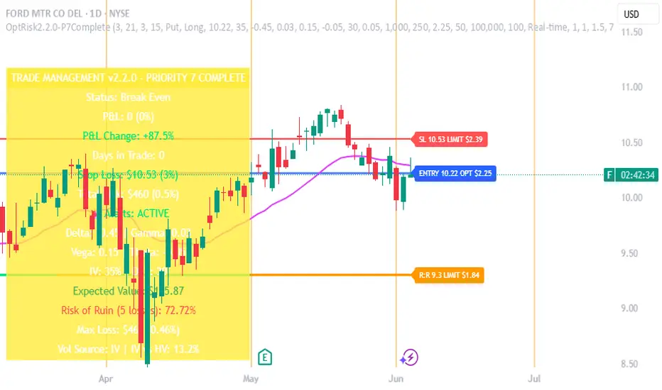
Options Risk Manager v2.2.0 - Priority 7 CompleteScript Description for TradingView Publication
Options Risk Manager v2.2.0 - Priority 7 Complete
What does this script do?
Options Risk Manager v2.2.0 is a comprehensive position management system designed specifically for options traders. The indicator calculates precise stop loss levels, risk/reward targets, and position sizing based on user-defined risk parameters. It provides real-time profit/loss tracking, options Greeks monitoring, and automated alert systems for critical price levels.
The script displays entry points, stop losses, and profit targets directly on the chart while continuously calculating position metrics including dollar risk, account exposure, and probability of success. Version 2.2.0 introduces Priority 7 advanced alerts with dynamic risk warnings and multi-condition notifications.
How does it do it?
The script performs several key calculations:
1. Risk-Based Stop Loss Calculation - Determines stop loss levels based on percentage of entry price, automatically adjusting for calls versus puts. Put positions place stops above entry, while calls place stops below.
2. Position Sizing Algorithm - Calculates optimal contract quantities using account size, risk
percentage, and stop distance to ensure consistent risk per trade regardless of underlying price.
3. Options-Specific P&L Tracking - Incorporates Delta, Gamma, Vega, and Theta to provide accurate profit/loss calculations for options positions, including time decay effects.
4. Three-Phase Trade Management - Implements systematic position management through Entry
Phase (initial risk), Profit Phase (approaching target), and Trailing Phase (EMA-based exit
management).
5. Multi-Level Alert System - Monitors price action, Greeks thresholds, time decay acceleration, and account risk levels to generate context-aware notifications.
How to use it?
Initial Setup:
1. Apply indicator to any optionable security
2. Toggle "In Position" ON when entering a trade
3. Set Direction (Call/Put) and Side (Long/Short)
4. Enter the underlying price at position entry
5. Specify number of contracts and risk percentage
Position Management:
Blue line shows entry price
Red line indicates stop loss level
Orange line displays risk/reward target
Purple EMA line activates after target hit
Monitor real-time P&L in trade panels
Alert Configuration:
Enable Advanced Alerts in settings
Set profit/loss notification thresholds
Configure Greek-based warnings
Activate time decay alerts for expiration
Risk Parameters:
Risk % determines stop distance from entry
Account Value sets position sizing limits
Contract Multiplier (standard = 100)
R:R Ratio defines profit targets
What makes it unique?
Options Risk Manager addresses the specific challenges of options trading that generic indicators miss. The script accounts for the inverse relationship in put options (profiting from price declines), incorporates Greeks for accurate P&L calculations, and provides options-specific limit orders for TradeStation integration.
The three-phase management system removes emotional decision-making by defining clear rules for position management. Phase transitions occur automatically based on price action, shifting from initial risk management to profit protection to trend-following modes.
Version 2.2.0's Priority 7 alert system provides intelligent notifications that include live metrics, risk warnings, and market context rather than simple price crosses.
Key Features Summary
Options-Specific Calculations - Proper handling of calls/puts with inverse relationships
Risk-Based Position Sizing - Consistent risk regardless of underlying price
Greeks Integration - Delta, Gamma, Vega, Theta for accurate tracking
Phase Management System - Systematic three-stage position handling
Advanced Alert System - Context-aware notifications with metrics
TradeStation Integration - Option limit orders for execution
Visual Risk Display - Clear chart overlays for all levels
Probability Calculator - Win/loss probability with expected value
Multi-Account Support - Scales from small to large accounts
Important Notes
This indicator requires manual input of option prices and Greeks (available from your broker's option chain). It functions as a risk management overlay and does not generate entry signals. The calculations assume standard options contracts of 100 shares.
Designed for TradeStation platform with full functionality. Basic features available on other platforms
without options data integration. Always verify calculations with your broker's risk system before placing
trades.
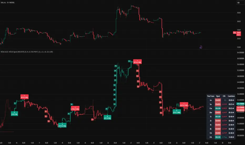
MÈGAS ALGO : MÈGAS Signals [INDICATOR]Overview
The MÈGAS Signals is a cutting-edge, multi-functional trading tool designed for advanced traders seeking to identify high-probability trade setups. This script combines price action analysis, machine learning techniques, and real-time signal generation across multiple timeframes to provide actionable insights. The indicator is optimized for both bullish and bearish market conditions and includes features like backtesting metrics, take-profit tools, and customizable alerts.
Key Features
1. Machine Learning and Statistical Clustering
The script implements the K-Means clustering algorithm , a widely used unsupervised machine learning technique, to segment historical price movements into distinct clusters based on magnitude and distribution characteristics. These clusters represent quantized levels of bullish and bearish momentum, enabling the system to adaptively model market behavior across varying volatility regimes.
By applying this statistical clustering approach to real-time price data, the algorithm dynamically identifies meaningful thresholds for key Smart Money Concepts (SMC) such as Break of Structure (BOS) and Change of Character (CHOCH) . This integration enhances classical SMC logic with a data-driven, self-adjusting mechanism that responds to evolving market conditions, effectively bridging traditional price action analysis with modern machine learning methodologies.
2.Multi-Timeframe Table:
A dynamic, real-time multi-timeframe table displayed on the chart that provides at-a-glance insight into:
-Current trend or signal status per timeframe
-Percentage price change relative to the previous bar
-Countdown to the next bar open , updated every second
This table empowers traders with cross-timeframe context , helping them identify confluence, reversals, or divergences across multiple horizons — from scalping (1m) to long-term trends (1D).
3.Dynamic Trailing Stops with Enhanced Visualization
The dynamic trailing stop mechanism adjusts based on volatility clusters, ensuring tighter risk
management during low-volatility periods and wider stops during high-volatility phases.
The feed speed feature enhances visualization by adjusting the transparency of candle
coloring relative to the trailing stop. This makes it easier to interpret trend strength and
momentum, allowing traders to stay ahead of price action.
4.Customizable Alerts for Seamless Execution
Sublimia Signals offers highly customizable alerts that can be tailored to specific timeframes
and trading preferences.
With the intra-bar calculation feature, alerts can be triggered on every tick rather than just
on bar close, empowering traders to act swiftly in fast-moving markets.
Personalized alert messages allow you to create clear and concise notifications for entry and
exit points, streamlining your trading workflow.
5.Comprehensive Backtesting Metrics
The built-in performance metrics table provides detailed backtesting results, including total
trades, win rates, cumulative profit/loss, profit factor, best profit, and worst loss for both
long and short positions.
These metrics enable traders to evaluate the effectiveness of their strategies and optimize
input parameters for better performance.
6.Non-Standard Candle Integration for Smoother Price Action Analysis
The optional Non-Standard Candle toggle allows users to switch between "Traditional", "Heikin-Ashi", "Volume-Weighted" and "Hybrid" candles.
This feature is particularly useful for identifying trends and filtering out market noise, while
backtesting remains based on normal candles to ensure accuracy.
7.Intra-Bar Calculation for Granular Insights
When enabled, the intra-bar calculation feature provides granular insights into price
movements within each bar, offering traders a deeper understanding of market dynamics.
This feature also modifies the algorithm's logic, triggering alerts on every tick rather than just
on bar close, making it ideal for scalpers and day traders who need ultra-responsive tools.
8.Take-Profit/Trailing-Profit Tools: Precision and Flexibility
This feature allows you to set multiple profit levels with customizable percentage
distances, giving you unparalleled control over your trades.
Selectable Type of exit mode : Take-Profit or Trailing-Profit.
Selectable Number of Profit Levels: Define as many profit targets as you need,
ensuring you can capture profits at different stages of price movement.
Percentage-Based Distance: Set each profit level based on a percentage distance from
your entry point. This ensures precise positioning tailored to your risk-reward preferences.
Integrated Alerts: Never miss an opportunity! The tool includes built-in alerts that notify you
when each take-profit level is reached, keeping you informed in real-time.
9.Optimized Visualization
The script ensures optimized visualization of trend strength through smooth transitions in
candle transparency, making it easier to interpret market momentum.
The feed speed parameter calculates how quickly the candle coloring adjusts relative to the
trailing stop, enhancing clarity and decision-making.
How it work
Identify the Primary Trend Using Multi-Timeframe Analysis :
Focus on Higher Timeframes : Start by analyzing the 4h, 8h, or 24h timeframes to determine the primary trend. These higher timeframes provide a clearer picture of long-term momentum.
The built-in table provides real-time updates across all primarly timeframes. Look for confluence—when multiple timeframes align in the same direction.
Confirm Entry Points Using Lower Timeframes :
Fine-Tune Entries with Shorter Timeframes : Once you’ve identified the primary trend, use lower timeframes (e.g., 1m, 5m, or 15m ) to confirm entry points.
Set Take-Profit Levels Based on Percentage Distances :
Customizable Take-Profit Tools : Use the take-profit feature to set multiple levels based on percentage distances from your entry point.
Use Customizable Alerts for Real-Time Updates :
Enable alerts for specific timeframes (e.g., 4h, 8h, 15m) to stay informed about changes in the primary trend or short-term opportunities.
For fast-moving markets, enable the intra-bar calculation feature to receive alerts on every tick, ensuring you don’t miss critical entries or exits.
Backtesting for Strategy Optimization :
Performance Metrics : Use the backtesting metrics table to evaluate how well your trend-following strategy performs over time. Analyze win rates, profit factor, and best/worst trades to refine your approach.
Adjust Inputs : Fine-tune settings like slippage and commission(%) to optimize the indicator for your prefer pair.
Please Note:
This indicator is provided for informational and educational purposes only. It is not financial advice, and it should not be considered a recommendation to buy, sell, or trade any financial instrument. Trading involves significant risks, including the potential loss of your entire investment. Always conduct your own research and consult with a licensed financial advisor before making any trading decisions.
The results and images provided are based on algorithms and historical/paid real-time market data but do not guarantee future results or accuracy. Use this tool at your own risk, and understand that past performance is not indicative of future outcomes.
RTI Shifting Band Oscillator | QuantMAC📊 RTI Shifting Band Oscillator | QuantMAC - Revolutionary Adaptive Trading Indicator
🎯 Overview
The RTI Shifting Band Oscillator represents a breakthrough in adaptive technical analysis, combining the innovative Range Transition Index (RTI) with dynamic volatility bands to create an oscillator that automatically adjusts to changing market conditions. This cutting-edge indicator goes beyond traditional static approaches by using RTI to dynamically shift band width based on market volatility transitions, providing superior signal accuracy across different market regimes.
🔧 Key Features
Revolutionary RTI Technology : Proprietary Range Transition Index that measures volatility transitions in real-time
Dynamic Adaptive Bands : Self-adjusting volatility bands that expand and contract based on RTI readings
Dual Trading Modes : Flexible Long/Short or Long/Cash strategies for different trading preferences
Advanced Performance Analytics : Comprehensive metrics including Sharpe, Sortino, and Omega ratios
Smart Visual System : Dynamic color coding with 9 professional color schemes
Precision Backtesting : Date range filtering with detailed historical performance analysis
Real-time Signal Generation : Clear entry/exit signals with customizable threshold sensitivity
Position Sizing Intelligence : Half Kelly criterion for optimal risk management
📈 How The RTI Technology Works
The Range Transition Index (RTI) is the heart of this indicator's innovation. Unlike traditional volatility measures, RTI analyzes the transitions between different volatility states, providing early warning signals for market regime changes.
RTI Calculation Process:
Calculate True Range for each period using high, low, and previous close
Compute Average True Range over the RTI Length period
Sum absolute differences between consecutive True Range values
Normalize by dividing by ATR to create the raw RTI
Apply smoothing to reduce noise and create the final RTI value
Use RTI to dynamically adjust standard deviation multipliers
The genius of RTI lies in its ability to detect when markets are transitioning between calm and volatile periods before traditional indicators catch up. This provides traders with a significant edge in timing entries and exits.
⚙️ Comprehensive Parameter Control
RTI Settings:
RTI Length : Controls the lookback period for volatility analysis (default: 25)
RTI Smoothing : Reduces noise in RTI calculations (default: 12)
Base MA Length : Foundation moving average for band calculations (default: 40)
Source : Price input selection (close, open, high, low, etc.)
Oscillator Settings:
Standard Deviation Length : Period for volatility measurement (default: 27)
SD Multiplier : Base band width adjustment (default: 1.5)
Oscillator Multiplier : Scaling factor for oscillator values (default: 100)
Signal Thresholds:
Long Threshold : Bullish signal trigger level (default: 82)
Short Threshold : Bearish signal trigger level (default: 55)
🎨 Advanced Visual System
Main Chart Elements:
Dynamic Shifting Bands : Upper and lower bands that automatically adjust width based on RTI
Adaptive Fill Zone : Color-coded area between bands showing current market state
Basis Line : Moving average foundation displayed as subtle reference points
Smart Bar Coloring : Candles change color based on oscillator state for instant visual feedback
Oscillator Pane:
Normalized RTI Oscillator : Main signal line centered around zero with dynamic coloring
Threshold Lines : Horizontal reference lines for entry/exit levels
Zero Line : Central reference for oscillator neutrality
Color State Indication : Line colors change based on bullish/bearish conditions
📊 Professional Performance Metrics
The built-in analytics suite provides institutional-grade performance measurement:
Net Profit % : Total strategy return percentage
Maximum Drawdown % : Worst peak-to-trough decline
Win Rate % : Percentage of profitable trades
Profit Factor : Ratio of gross profits to gross losses
Sharpe Ratio : Risk-adjusted return measurement
Sortino Ratio : Downside-focused risk adjustment
Omega Ratio : Probability-weighted performance ratio
Half Kelly % : Optimal position sizing recommendation
Total Trades : Complete transaction count
🎯 Strategic Trading Applications
Long/Short Mode: ⚡
Maximizes profit potential by capturing both upward and downward price movements. The RTI technology helps identify when trends are strengthening or weakening, allowing for optimal position switches between long and short.
Long/Cash Mode: 🛡️
Conservative approach ideal for retirement accounts or risk-averse traders. The indicator's adaptive nature helps identify the best times to be invested versus sitting in cash, protecting capital during adverse market conditions.
🚀 Unique Advantages
Traditional Indicators vs RTI Shifting Bands:
Static vs Dynamic : While most indicators use fixed parameters, RTI bands adapt in real-time
Lagging vs Leading : RTI detects volatility transitions before they fully manifest
One-Size vs Adaptive : The same settings work across different market conditions
Simple vs Intelligent : Advanced volatility analysis provides superior market insight
💡 Professional Setup Guide
For Day Trading (Short-term):
RTI Length: 15-20
RTI Smoothing: 8-10
Base MA Length: 20-30
Thresholds: Long 80, Short 60
For Swing Trading (Medium-term):
RTI Length: 25-35 (default range)
RTI Smoothing: 12-15
Base MA Length: 40-50
Thresholds: Long 83, Short 55 (defaults)
For Position Trading (Long-term):
RTI Length: 40-50
RTI Smoothing: 15-20
Base MA Length: 60-80
Thresholds: Long 85, Short 50
🧠 Advanced Trading Techniques
RTI Divergence Analysis:
Watch for divergences between price action and RTI readings. When price makes new highs/lows but RTI doesn't confirm, it often signals upcoming reversals.
Band Width Interpretation:
Expanding Bands : Increasing volatility, expect larger price moves
Contracting Bands : Decreasing volatility, prepare for potential breakouts
Band Touches : Price touching outer bands often signals reversal opportunities
Multi-Timeframe Analysis:
Use RTI on higher timeframes for trend direction and lower timeframes for precise entry timing.
⚠️ Important Risk Disclaimers
Past performance is not indicative of future results. This indicator represents advanced technical analysis but should never be used as the sole basis for trading decisions.
Critical Risk Factors:
Market Conditions : No indicator performs equally well in all market environments
Backtesting Limitations : Historical performance may not reflect future market behavior
Volatility Risk : Adaptive indicators can be sensitive to extreme market conditions
Parameter Sensitivity : Different settings may produce significantly different results
Capital Risk : Always use appropriate position sizing and stop-loss protection
📚 Educational Benefits
This indicator provides exceptional learning opportunities for understanding:
Advanced volatility analysis and measurement techniques
Adaptive indicator design and implementation
The relationship between volatility transitions and price movements
Professional risk management using Kelly Criterion principles
Modern oscillator interpretation and signal generation
🔍 Market Applications
The RTI Shifting Band Oscillator works across various markets:
Forex : Excellent for currency pair volatility analysis
Stocks : Individual equity and index trading
Commodities : Adaptive to commodity market volatility cycles
Cryptocurrencies : Handles extreme volatility variations effectively
Futures : Professional derivatives trading applications
🔧 Technical Innovation
The RTI Shifting Band Oscillator represents years of research into adaptive technical analysis. The proprietary RTI calculation method has been optimized for:
Computational Efficiency : Fast calculation even on high-frequency data
Noise Reduction : Advanced smoothing without excessive lag
Market Adaptability : Automatic adjustment to changing conditions
Signal Clarity : Clear, actionable trading signals
🔔 Updates and Evolution
The RTI Shifting Band Oscillator | QuantMAC continues to evolve with regular updates incorporating the latest research in adaptive technical analysis. The code is thoroughly documented for transparency and educational purposes.
Trading Notice: Financial markets involve substantial risk of loss. The RTI Shifting Band Oscillator is a sophisticated technical analysis tool designed to assist in trading decisions but cannot guarantee profitable outcomes. Always conduct thorough testing, implement proper risk management, and consider seeking advice from qualified financial professionals. Only trade with capital you can afford to lose.
---
Master The Markets With Adaptive Intelligence! 🎯📈

Dr.Avinash Talele quarterly earnings, VCP and multibagger trakerDr. Avinash Talele Quarterly Earnings, VCP and Multibagger Tracker.
📊 Comprehensive Quarterly Analysis Tool for Multibagger Stock Discovery
This advanced Pine Script indicator provides a complete financial snapshot directly on your chart, designed to help traders and investors identify potential multibagger stocks and VCP (Volatility Contraction Pattern) setups with precision.
🎯 Key Features:
📈 8-Quarter Financial Data Display:
EPS (Earnings Per Share) - Track profitability trends
Sales Revenue - Monitor business growth
QoQ% (Quarter-over-Quarter Growth) - Spot acceleration/deceleration
ROE (Return on Equity) - Assess management efficiency
OPM (Operating Profit Margin) - Evaluate operational excellence
💰 Market Metrics:
Market Cap - Current company valuation
P/E Ratio - Valuation assessment
Free Float - Liquidity indicator
📊 Technical Positioning:
% Down from 52-Week High - Identify potential bottoming patterns
% Up from 52-Week Low - Track momentum from lows
Turnover Data (1D & 50D Average) - Volume analysis
ADR% (Average Daily Range) - Volatility measurement
Relative Volume% - Institutional interest indicator
🚀 How It Helps Find Multibaggers:
1. Growth Acceleration Detection:
Consistent EPS Growth: Identifies companies with accelerating earnings
Revenue Momentum: Tracks sales growth patterns quarter-over-quarter
Margin Expansion: Spots improving operational efficiency through OPM trends
2. VCP Pattern Recognition:
Volatility Contraction: ADR% helps identify tightening price ranges
Volume Analysis: Relative volume shows institutional accumulation
Distance from Highs: Tracks healthy pullbacks in uptrends
3. Fundamental Strength Validation:
ROE Trends: Ensures management is efficiently using shareholder capital
Debt-Free Growth: High ROE with growing margins indicates quality growth
Scalability: Revenue growth vs. margin expansion analysis
4. Entry Timing Optimization:
52-Week Positioning: Enter near lows, avoid near highs
Volume Confirmation: High relative volume confirms breakout potential
Valuation Check: P/E ratio helps avoid overvalued entries
💡 Multibagger Characteristics to Look For:
✅ Consistent 15-20%+ EPS growth across multiple quarters
✅ Accelerating revenue growth with QoQ% improvements
✅ ROE above 15% and expanding
✅ Operating margins improving over time
✅ Low debt (indicated by high ROE with growing profits)
✅ Strong cash generation (reflected in consistent growth metrics)
✅ 20-40% down from 52-week highs (ideal entry zones)
✅ Above-average volume during consolidation phases
🎨 Visual Design:
Clean white table with black borders for maximum readability
Color-coded QoQ% changes (Green = Growth, Red = Decline)
Centered positioning for easy chart analysis
8-quarter historical view for trend identification
📋 Perfect For:
Long-term investors seeking multibagger opportunities
Growth stock enthusiasts tracking earnings acceleration
VCP pattern traders looking for breakout candidates
Fundamental analysts requiring quick financial snapshots
Swing traders timing entries in growth stocks
⚡ Quick Setup:
Simply add the indicator to any NSE/BSE stock chart and instantly view comprehensive quarterly data. The table updates automatically with the latest financial information, making it perfect for screening and monitoring your watchlist.
🔍 Start identifying your next multibagger today with this powerful combination of fundamental analysis and technical positioning data!
Disclaimer: This indicator is for educational and analysis purposes. Always conduct thorough research and consider risk management before making investment decisions.

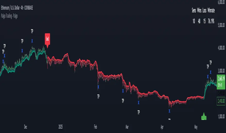
Palgo Trading - Palgo🎯THE PALGO INDICATOR
The "Palgo Trading - Palgo" indicator, developed by PALGOTRADING is a sophisticated technical analysis tool designed to identify potential buy and sell signals by combining trend analysis with momentum and optional AI-driven sentiment assessment. This indicator provides a clear visual representation of potential trading opportunities directly on the price chart.
At its core, the Palgo indicator synthesizes information from well-established technical analysis concepts with statistical functions, and has optional AI Integration for social analysis of the asset using external data :
Supertrend: This indicator identifies the prevailing trend direction. A positive Supertrend value suggests an upward trend, while a negative value indicates a downward trend. The Palgo indicator utilizes a Supertrend with a customizable multiplier and a user-configurable Average True Range (ATR) length (defaulting to 21).
🛜Signal Generation Logic
The indicator generates buy and sell signals based on a calculated "final direction" value. This value is derived by combining the Supertrend direction and a modified RSI. The modification involves scaling the RSI output to a range of -0.5 to 0.5 and then further adjusting it.
The buy and sell conditions are as follows:
Buy Signal: A buy signal is triggered when the "final direction" crosses above a positive activation threshold while the current signal is not already bullish. Upon signal generation, a "Buy" label (colored green) appears below the bar, and initial Take Profit (TP) and Stop Loss (SL) levels are calculated and stored.
Sell Signal: Conversely, a sell signal is triggered when the "final direction" crosses below a negative activation threshold while the current signal is not already bearish. A "Sell" label (colored red) is plotted above the bar, and corresponding TP and SL levels are determined.
✅ Optimized Take-Profit / Stop-Loss
The Take-Profit (TP) & Stop-Loss (SL) signals are optimized with Kernel Density Estimation (KDE), the script uses KDE activated by gaussian function on previous pivot points and trains the model, then tries to estimate new pivot points early, to determine new TP / SL levels for the current signal. Kernel Density Estimation takes values of the previous confirmed pivots' RSI values, body size & more factors to determine their role. This indicator can generate up to 5 TP signals per signal.
📈 Signal Trail
Palgo also includes a "Signal Trail" that visually shows the market's momentum. This trail is like a dynamic line that follows the price.
When the market is in an uptrend and looking strong, you'll see a green trail.
When it's in a downtrend and looking weak, you'll see a red trail.
This trail helps you see if the market is currently aligned with Palgo's bullish (buy) or bearish (sell) signal. It also acts as a visual guide for potential support or resistance levels.
📊Backtesting Dashboard
The Palgo indicator includes an optional Backtesting Dashboard to help you understand its historical performance. This dashboard appears directly on your chart and provides a quick summary of how the indicator's signals have performed in the past.
Here's what you'll see on the dashboard:
Sensitivity: This shows the specific "Sensitivity" setting you've chosen for the indicator. This setting influences how often signals are generated.
Wins: This number tells you how many trades initiated by the Palgo indicator historically ended in profit (reached a Take-Profit target or closed profitably when the signal reversed).
Loss: This number indicates how many trades historically ended in a loss (hit the Stop-Loss).
Winrate: This is a very important metric, displayed as a percentage. It shows you the proportion of winning trades compared to the total number of trades (Wins / (Wins + Loss)). A higher winrate generally suggests a more effective strategy.
This dashboard is a valuable tool for reviewing the indicator's effectiveness with different settings and helping you make informed decisions about its use in your trading.
🤖AI Integration (Optional):
A unique feature of the Palgo indicator is the optional integration of Artificial Intelligence (AI) sentiment analysis. When the "Use AI" input is enabled, the indicator incorporates two additional user-defined inputs:
Impression Change %: This input represents the percentage change in overall market sentiment as assessed by an external AI.
Positivity Change: This input reflects the change in positive sentiment, also provided by an AI.
These AI inputs are combined to create an "AI Score," which then influences the "final direction" calculation. A positive AI Score amplifies the bullish signals and dampens bearish signals, while a negative AI Score has the opposite effect.
❓Why PALGO ?
All-in-One Analysis: Palgo combines trend, momentum, and advanced statistical analysis into one easy-to-use tool, giving you a complete picture without needing multiple indicators.
Dynamic Profit & Loss Management: Unlike many tools with fixed targets, Palgo's smart profit and stop-loss system adapts to the market using KDE. This helps you potentially capture more gains and limit losses effectively.
Optional AI Insights: For an extra edge, Palgo can tap into Artificial Intelligence (AI) to gauge overall market mood. If the AI sees a lot of positive buzz, it can strengthen buy signals; if it's negative, it can reinforce sell signals. This helps you trade with a better understanding of the market's pulse.
Clear and Customizable: Palgo is designed to be very visual. It changes the color of the price bars, adds clear "Buy" or "Sell" labels, and marks your profit and stop-loss points. You can also change the colors to suit your preference.
Palgo aims to be a comprehensive and adaptable trading tool, giving you clearer insights.
⚙️Visualizations and Customization
The Palgo indicator offers several visual cues to aid traders:
Bar Coloring: The price bars are colored green when the indicator identifies a bullish signal and red during a bearish signal.
Signal Labels: Clear "Buy" and "Sell" labels are plotted at the signal generation points.
Take Profit and Stop Loss Markers: Distinct shapes and labels indicate when the price reaches the calculated TP and SL levels.
Style Options: Users can customize the colors for bullish and bearish bars, text, and TP/SL markers within the indicator's settings.
Canuck Trading IndicatorOverview
The Canuck Trading Indicator is a versatile, overlay-based technical analysis tool designed to assist traders in identifying potential trading opportunities across various timeframes and market conditions. By combining multiple technical indicators—such as RSI, Bollinger Bands, EMAs, VWAP, MACD, Stochastic RSI, ADX, HMA, and candlestick patterns—the indicator provides clear visual signals for bullish and bearish entries, breakouts, long-term trends, and options strategies like cash-secured puts, straddles/strangles, iron condors, and short squeezes. It also incorporates 20-day and 200-day SMAs to detect Golden/Death Crosses and price positioning relative to these moving averages. A dynamic table displays key metrics, and customizable alerts help traders stay informed of market conditions.
Key Features
Multi-Timeframe Adaptability: Automatically adjusts parameters (e.g., ATR multiplier, ADX period, HMA length) based on the chart's timeframe (minute, hourly, daily, weekly, monthly) for optimal performance.
Comprehensive Signal Generation: Identifies short-term entries, breakouts, long-term bullish trends, and options strategies using a combination of momentum, trend, volatility, and candlestick patterns.
Candlestick Pattern Detection: Recognizes bullish/bearish engulfing, hammer, shooting star, doji, and strong candles for precise entry/exit signals.
Moving Average Analysis: Plots 20-day and 200-day SMAs, detects Golden/Death Crosses, and evaluates price position relative to these averages.
Dynamic Table: Displays real-time metrics, including zone status (bullish, bearish, neutral), RSI, MACD, Stochastic RSI, short/long-term trends, candlestick patterns, ADX, ROC, VWAP slope, and MA positioning.
Customizable Alerts: Over 20 alert conditions for entries, exits, overbought/oversold warnings, and MA crosses, with actionable messages including ticker, price, and suggested strategies.
Visual Clarity: Uses distinct shapes, colors, and sizes to plot signals (e.g., green triangles for bullish entries, red triangles for bearish entries) and overlays key levels like EMA, VWAP, Bollinger Bands, support/resistance, and HMA.
Options Strategy Signals: Suggests opportunities for selling cash-secured puts, straddles/strangles, iron condors, and capitalizing on short squeezes.
How to Use
Add to Chart: Apply the indicator to any TradingView chart by selecting "Canuck Trading Indicator" from the Pine Script library.
Interpret Signals:
Bullish Signals: Green triangles (short-term entry), lime diamonds (breakout), blue circles (long-term entry).
Bearish Signals: Red triangles (short-term entry), maroon diamonds (breakout).
Options Strategies: Purple squares (cash-secured puts), yellow circles (straddles/strangles), orange crosses (iron condors), white arrows (short squeezes).
Exits: X-cross shapes in corresponding colors indicate exit signals.
Monitor: Gray circles suggest holding cash or monitoring for setups.
Review Table: Check the top-right table for real-time metrics, including zone status, RSI, MACD, trends, and MA positioning.
Set Alerts: Configure alerts for specific signals (e.g., "Short-Term Bullish Entry" or "Golden Cross") to receive notifications via TradingView.
Adjust Inputs: Customize input parameters (e.g., RSI period, EMA length, ATR period) to suit your trading style or market conditions.
Input Parameters
The indicator offers a wide range of customizable inputs to fine-tune its behavior:
RSI Period (default: 14): Length for RSI calculation.
RSI Bullish Low/High (default: 35/70): RSI thresholds for bullish signals.
RSI Bearish High (default: 65): RSI threshold for bearish signals.
EMA Period (default: 15): Main EMA length (15 for day trading, 50 for swing).
Short/Long EMA Length (default: 3/20): For momentum oscillator.
T3 Smoothing Length (default: 5): Smooths momentum signals.
Long-Term EMA/RSI Length (default: 20/15): For long-term trend analysis.
Support/Resistance Lookback (default: 5): Periods for support/resistance levels.
MACD Fast/Slow/Signal (default: 12/26/9): MACD parameters.
Bollinger Bands Period/StdDev (default: 15/2): BB settings.
Stochastic RSI Period/Smoothing (default: 14/3/3): Stochastic RSI settings.
Uptrend/Short-Term/Long-Term Lookback (default: 2/2/5): Candles for trend detection.
ATR Period (default: 14): For volatility and price targets.
VWAP Sensitivity (default: 0.1%): Threshold for VWAP-based signals.
Volume Oscillator Period (default: 14): For volume surge detection.
Pattern Detection Threshold (default: 0.3%): Sensitivity for candlestick patterns.
ROC Period (default: 3): Rate of change for momentum.
VWAP Slope Period (default: 5): For VWAP trend analysis.
TradingView Publishing Compliance
Originality: The Canuck Trading Indicator is an original script, combining multiple technical indicators and custom logic to provide unique trading signals. It does not replicate existing public scripts.
No Guaranteed Profits: This indicator is a tool for technical analysis and does not guarantee profits. Trading involves risks, and users should conduct their own research and risk management.
Clear Instructions: The description and usage guide are detailed and accessible, ensuring users understand how to apply the indicator effectively.
No External Dependencies: The script uses only built-in Pine Script functions (e.g., ta.rsi, ta.ema, ta.vwap) and requires no external libraries or data sources.
Performance: The script is optimized for performance, using efficient calculations and adaptive parameters to minimize lag on various timeframes.
Visual Clarity: Signals are plotted with distinct shapes and colors, and the table provides a concise summary of market conditions, enhancing usability.
Limitations and Risks
Market Conditions: The indicator may generate false signals in choppy or low-liquidity markets. Always confirm signals with additional analysis.
Timeframe Sensitivity: Performance varies by timeframe; test settings on your preferred chart (e.g., 5-minute for day trading, daily for swing trading).
Risk Management: Use stop-losses and position sizing to manage risk, as suggested in alert messages (e.g., "Stop -20%").
Options Trading: Options strategies (e.g., straddles, iron condors) carry unique risks; consult a financial advisor before trading.
Feedback and Support
For questions, suggestions, or bug reports, please leave a comment on the TradingView script page or contact the author via TradingView. Your feedback helps improve the indicator for the community.
Disclaimer
The Canuck Trading Indicator is provided for educational and informational purposes only. It is not financial advice. Trading involves significant risks, and past performance is not indicative of future results. Always perform your own due diligence and consult a qualified financial advisor before making trading decisions.

[blackcat] L2 Multi-Level Price Condition TrackerOVERVIEW
The L2 Multi-Level Price Condition Tracker represents an innovative approach to analyzing financial markets by simultaneously monitoring multiple price levels, thus providing traders with a holistic view of market dynamics. By combining dynamic calculations based on moving averages and price deviations, this tool aims to deliver precise and actionable insights into potential entry and exit points. It leverages sophisticated statistical measures to identify key thresholds that signify shifts in market sentiment, thereby aiding traders in making well-informed decisions. 🎯
Key benefits encompass:
• Comprehensive calculation of midpoints and average prices indicating short-term trend directions.
• Interactive visualization elements enhancing interpretability effortlessly.
• Real-time generation of buy/sell signals driven by precise condition evaluations.
TECHNICAL ANALYSIS COMPONENTS
📉 Midpoint Calculations:
Computes central reference points derived from high-low ranges establishing baseline supports/resistances.
Utilizes Simple Moving Averages (SMAs) along with standardized deviation formulas smoothing out volatility while preserving long-term trends accurately.
Facilitates identification of directional biases reflecting underlying market forces dynamically.
🕵️♂️ Advanced Price Level Detection:
Derives upper/lower bounds adjusting sensitivities adaptively responding to changing conditions flexibly.
Employs proprietary logic distinguishing between bullish/bearish sentiments promptly signaling transitions effectively.
Ensures consistent adherence to predefined statistical protocols maintaining accuracy robustly.
🎥 Dynamic Signal Generation:
Detects crossovers indicating dominance shifts between buyers/sellers promptly triggering timely alerts.
Integrates conditional logic reinforcing signal validity minimizing erroneous activations systematically.
Supports adaptive thresholds tuning sensitivities based on evolving market conditions flexibly accommodating varying scenarios.
INDICATOR FUNCTIONALITY
🔢 Core Algorithms:
Utilizes moving averages alongside standardized deviation formulas generating precise net volume measurements.
Implements Arithmetic Mean Line Algorithm (AMLA) smoothing techniques improving interpretability.
Ensures consistent alignment with established statistical principles preserving fidelity.
🖱️ User Interface Elements:
Dedicated plots displaying real-time midpoint markers facilitating swift decision-making.
Context-sensitive color coding distinguishing positive/negative deviations intuitively highlighting key activations clearly.
Background shading emphasizing proximity to crucial threshold activations enhancing visibility focusing attention on vital signals promptly.
STRATEGY IMPLEMENTATION
✅ Entry Conditions:
Confirm bullish/bearish setups validated through multiple confirmatory signals assessing concurrent market sentiment factors.
Validate entry decisions considering alignment between calculated midpoints and broader trend directions ensuring coherence.
Monitor cumulative breaches signifying potential trend reversals executing partial/total closes contingent upon predetermined loss limits preserving capital efficiently.
🚫 Exit Mechanisms:
Trigger exits upon hitting predefined thresholds derived from historical analyses promptly executing closures.
Execute partial/total closes contingent upon cumulative loss limits preserving capital efficiently managing exposures prudently.
Conduct periodic reviews gauging strategy effectiveness rigorously identifying areas needing refinement implementing corrective actions iteratively enhancing performance metrics steadily.
PARAMETER CONFIGURATIONS
🎯 Optimization Guidelines:
Lookback Period: Governs responsiveness versus stability balancing sensitivity/stability governing moving averages aligning with preferred granularity.
Price Source: Dictates primary data series driving volume calculations selecting relevant inputs accurately tailoring strategies accordingly.
💬 Customization Recommendations:
Commence with baseline defaults; iteratively refine parameters isolating individual impacts evaluating adjustments independently prior to combined modifications minimizing disruptions.
Prioritize minimizing erroneous trigger occurrences first optimizing signal fidelity sustaining balanced risk-reward profiles irrespective of chosen settings upholding disciplined approaches preserving capital efficiently.
ADVANCED RISK MANAGEMENT
🛡️ Proactive Risk Mitigation Techniques:
Enforce strict compliance with pre-defined maximum leverage constraints adhering strictly to guidelines managing exposures prudently.
Mandatorily apply trailing stop-loss orders conforming to script outputs enforcing discipline rigorously preventing adverse consequences.
Allocate positions proportionately relative to available capital reserves conducting periodic reviews gauging effectiveness continuously identifying improvement opportunities steadily.
⚠️ Potential Pitfalls & Solutions:
Address frequent violations arising during heightened volatility phases necessitating manual interventions judiciously preparing contingency plans proactively mitigating risks effectively.
Manage false alerts warranting immediate attention avoiding adverse consequences systematically implementing corrective actions reliably.
Prepare proactive responses amid adverse movements ensuring seamless functionality amidst fluctuating conditions fortifying resilience against anomalies robustly.
PERFORMANCE MONITORING METRICS
🔍 Evaluation Criteria:
Assess win percentages consistently across diverse trading instruments gauging reliability measuring profitability efficiency accurately evaluating downside risks comprehensively uncovering systematic biases potentially skewing outcomes.
Calculate average profit ratios per successful execution benchmarking actual vs expected performances documenting results meticulously tracking progress dynamically addressing identified shortcomings proactively fostering continuous improvements.
📈 Historical Data Analysis Tools:
Maintain detailed logs capturing every triggered event recording realized profits/losses comparing simulated projections accurately identifying discrepancies warranting investigation implementing iterative refinements steadily enhancing performance metrics progressively.
Identify recurrent systematic errors demanding corrective actions implementing iterative refinements steadily addressing identified shortcomings proactively fostering continuous enhancements dynamically improving robustness resiliently.
PROBLEM SOLVING ADVICE
🔧 Frequent Encountered Challenges:
Unpredictable behaviors emerging within thinly traded markets requiring filtration processes enhancing signal integrity excluding low-liquidity assets prone to erratic movements effectively.
Latency issues manifesting during abrupt price fluctuations causing missed opportunities introducing buffer intervals safeguarding major news/event impacts mitigating distortions seamlessly verifying reliable connections ensuring uninterrupted data flows guaranteeing accurate interpretations dependably.
💡 Effective Resolution Pathways:
Limit ongoing optimization attempts preventing model degradation maintaining optimal performance levels consistently recalibrating parameters periodically adapting strategies flexibly responding appropriately amidst varying conditions dynamically improving robustness resiliently.
Verify reliable connections ensuring uninterrupted data flows guaranteeing accurate interpretations dependably bolstering overall efficacy systematically addressing identified shortcomings dynamically fostering continuous advancements.
THANKS
Heartfelt acknowledgment extends to all developers contributing invaluable insights regarding multi-level price condition-based trading methodologies! ✨

[blackcat] L1 Net Volume DifferenceOVERVIEW
The L1 Net Volume Difference indicator serves as an advanced analytical tool designed to provide traders with deep insights into market sentiment by examining the differential between buying and selling volumes over precise timeframes. By leveraging these volume dynamics, it helps identify trends and potential reversal points more accurately, thereby supporting well-informed decision-making processes. The key focus lies in dissecting intraday changes that reflect short-term market behavior, offering critical input for both swing and day traders alike. 📊
Key benefits encompass:
• Precise calculation of net volume differences grounded in real-time data.
• Interactive visualization elements enhancing interpretability effortlessly.
• Real-time generation of buy/sell signals driven by dynamic volume shifts.
TECHNICAL ANALYSIS COMPONENTS
📉 Volume Accumulation Mechanisms:
Monitors cumulative buy/sell volumes derived from comparative closing prices.
Periodically resets accumulation counters aligning with predefined intervals (e.g., 5-minute bars).
Facilitates identification of directional biases reflecting underlying market forces accurately.
🕵️♂️ Sentiment Detection Algorithms:
Employs proprietary logic distinguishing between bullish/bearish sentiments dynamically.
Ensures consistent adherence to predefined statistical protocols maintaining accuracy.
Supports adaptive thresholds adjusting sensitivities based on changing market conditions flexibly.
🎯 Dynamic Signal Generation:
Detects transitions indicating dominance shifts between buyers/sellers promptly.
Triggers timely alerts enabling swift reactions to evolving market dynamics effectively.
Integrates conditional logic reinforcing signal validity minimizing erroneous activations.
INDICATOR FUNCTIONALITY
🔢 Core Algorithms:
Utilizes moving averages along with standardized deviation formulas generating precise net volume measurements.
Implements Arithmetic Mean Line Algorithm (AMLA) smoothing techniques improving interpretability.
Ensures consistent alignment with established statistical principles preserving fidelity.
🖱️ User Interface Elements:
Dedicated plots displaying real-time net volume markers facilitating swift decision-making.
Context-sensitive color coding distinguishing positive/negative deviations intuitively.
Background shading highlighting proximity to key threshold activations enhancing visibility.
STRATEGY IMPLEMENTATION
✅ Entry Conditions:
Confirm bullish/bearish setups validated through multiple confirmatory signals.
Validate entry decisions considering concurrent market sentiment factors.
Assess alignment between net volume readings and broader trend directions ensuring coherence.
🚫 Exit Mechanisms:
Trigger exits upon hitting predetermined thresholds derived from historical analyses.
Monitor continuous breaches signifying potential trend reversals promptly executing closures.
Execute partial/total closes contingent upon cumulative loss limits preserving capital efficiently.
PARAMETER CONFIGURATIONS
🎯 Optimization Guidelines:
Reset Interval: Governs responsiveness versus stability balancing sensitivity/stability.
Price Source: Dictates primary data series driving volume calculations selecting relevant inputs accurately.
💬 Customization Recommendations:
Commence with baseline defaults; iteratively refine parameters isolating individual impacts.
Evaluate adjustments independently prior to combined modifications minimizing disruptions.
Prioritize minimizing erroneous trigger occurrences first optimizing signal fidelity.
Sustain balanced risk-reward profiles irrespective of chosen settings upholding disciplined approaches.
ADVANCED RISK MANAGEMENT
🛡️ Proactive Risk Mitigation Techniques:
Enforce strict compliance with pre-defined maximum leverage constraints adhering strictly to guidelines.
Mandatorily apply trailing stop-loss orders conforming to script outputs reinforcing discipline.
Allocate positions proportionately relative to available capital reserves managing exposures prudently.
Conduct periodic reviews gauging strategy effectiveness rigorously identifying areas needing refinement.
⚠️ Potential Pitfalls & Solutions:
Address frequent violations arising during heightened volatility phases necessitating manual interventions judiciously.
Manage false alerts warranting immediate attention avoiding adverse consequences systematically.
Prepare contingency plans mitigating margin call possibilities preparing proactive responses effectively.
Continuously assess automated system reliability amidst fluctuating conditions ensuring seamless functionality.
PERFORMANCE AUDITS & REFINEMENTS
🔍 Critical Evaluation Metrics:
Assess win percentages consistently across diverse trading instruments gauging reliability.
Calculate average profit ratios per successful execution measuring profitability efficiency accurately.
Measure peak drawdown durations alongside associated magnitudes evaluating downside risks comprehensively.
Analyze signal generation frequencies revealing hidden patterns potentially skewing outcomes uncovering systematic biases.
📈 Historical Data Analysis Tools:
Maintain comprehensive records capturing every triggered event meticulously documenting results.
Compare realized profits/losses against backtested simulations benchmarking actual vs expected performances accurately.
Identify recurrent systematic errors demanding corrective actions implementing iterative refinements steadily.
Document evolving performance metrics tracking progress dynamically addressing identified shortcomings proactively.
PROBLEM SOLVING ADVICE
🔧 Frequent Encountered Challenges:
Unpredictable behaviors emerging within thinly traded markets requiring filtration processes.
Latency issues manifesting during abrupt price fluctuations causing missed opportunities.
Overfitted models yielding suboptimal results post-extensive tuning demanding recalibrations.
Inaccuracies stemming from incomplete/inaccurate data feeds necessitating verification procedures.
💡 Effective Resolution Pathways:
Exclude low-liquidity assets prone to erratic movements enhancing signal integrity.
Introduce buffer intervals safeguarding major news/event impacts mitigating distortions effectively.
Limit ongoing optimization attempts preventing model degradation maintaining optimal performance levels consistently.
Verify reliable connections ensuring uninterrupted data flows guaranteeing accurate interpretations reliably.
USER ENGAGEMENT SEGMENT
🤝 Community Contributions Welcome
Highly encourage active participation sharing experiences & recommendations!
THANKS
Heartfelt acknowledgment extends to all developers contributing invaluable insights about volume-based trading methodologies! ✨

[blackcat] L2 Z-Score of PriceOVERVIEW
The L2 Z-Score of Price indicator offers traders an insightful perspective into how current prices diverge from their historical norms through advanced statistical measures. By leveraging Z-scores, it provides a robust framework for identifying potential reversals in financial markets. The Z-score quantifies the number of standard deviations that a data point lies away from the mean, thus serving as a critical metric for recognizing overbought or oversold conditions. 🎯
Key benefits encompass:
• Precise calculation of Z-scores reflecting true price deviations.
• Interactive plotting features enhancing visual clarity.
• Real-time generation of buy/sell signals based on crossover events.
STATISTICAL ANALYSIS COMPONENTS
📉 Mean Calculation:
Utilizes Simple Moving Averages (SMAs) to establish baseline price references.
Provides smooth representations filtering short-term noise preserving long-term trends.
Fundamental for deriving subsequent deviation metrics accurately.
📈 Standard Deviation Measurement:
Quantifies dispersion around established means revealing underlying variability.
Crucial for assessing potential volatility levels dynamically adapting strategies accordingly.
Facilitates precise Z-score derivations ensuring statistical rigor.
🕵️♂️ Z-SCORE DETECTION:
Measures standardized distances indicating relative positions within distributions.
Helps pinpoint extreme conditions signaling impending reversals proactively.
Enables early identification of trend exhaustion phases prompting timely actions.
INDICATOR FUNCTIONALITY
🔢 Core Algorithms:
Integrates SMAs along with standardized deviation formulas generating precise Z-scores.
Employs Arithmetic Mean Line Algorithm (AMLA) smoothing techniques improving interpretability.
Ensures consistent adherence to predefined statistical protocols maintaining accuracy.
🖱️ User Interface Elements:
Dedicated plots displaying real-time Z-score markers facilitating swift decision-making.
Context-sensitive color coding distinguishing positive/negative deviations intuitively.
Background shading highlighting proximity to key threshold activations enhancing visibility.
STRATEGY IMPLEMENTATION
✅ Entry Conditions:
Confirm bullish/bearish setups validated through multiple confirmatory signals.
Validate entry decisions considering concurrent market sentiment factors.
Assess alignment between Z-score readings and broader trend directions ensuring coherence.
🚫 Exit Mechanisms:
Trigger exits upon hitting predetermined thresholds derived from historical analyses.
Monitor continuous breaches signifying potential trend reversals promptly executing closures.
Execute partial/total closes contingent upon cumulative loss limits preserving capital efficiently.
PARAMETER CONFIGURATIONS
🎯 Optimization Guidelines:
Length: Governs responsiveness versus smoothing trade-offs balancing sensitivity/stability.
Price Source: Dictates primary data series driving Z-score computations selecting relevant inputs accurately.
💬 Customization Recommendations:
Commence with baseline defaults; iteratively refine parameters isolating individual impacts.
Evaluate adjustments independently prior to combined modifications minimizing disruptions.
Prioritize minimizing erroneous trigger occurrences first optimizing signal fidelity.
Sustain balanced risk-reward profiles irrespective of chosen settings upholding disciplined approaches.
ADVANCED RISK MANAGEMENT
🛡️ Proactive Risk Mitigation Techniques:
Enforce strict compliance with pre-defined maximum leverage constraints adhering strictly to guidelines.
Mandatorily apply trailing stop-loss orders conforming to script outputs reinforcing discipline.
Allocate positions proportionately relative to available capital reserves managing exposures prudently.
Conduct periodic reviews gauging strategy effectiveness rigorously identifying areas needing refinement.
⚠️ Potential Pitfalls & Solutions:
Address frequent violations arising during heightened volatility phases necessitating manual interventions judiciously.
Manage false alerts warranting immediate attention avoiding adverse consequences systematically.
Prepare contingency plans mitigating margin call possibilities preparing proactive responses effectively.
Continuously assess automated system reliability amidst fluctuating conditions ensuring seamless functionality.
PERFORMANCE AUDITS & REFINEMENTS
🔍 Critical Evaluation Metrics:
Assess win percentages consistently across diverse trading instruments gauging reliability.
Calculate average profit ratios per successful execution measuring profitability efficiency accurately.
Measure peak drawdown durations alongside associated magnitudes evaluating downside risks comprehensively.
Analyze signal generation frequencies revealing hidden patterns potentially skewing outcomes uncovering systematic biases.
📈 Historical Data Analysis Tools:
Maintain comprehensive records capturing every triggered event meticulously documenting results.
Compare realized profits/losses against backtested simulations benchmarking actual vs expected performances accurately.
Identify recurrent systematic errors demanding corrective actions implementing iterative refinements steadily.
Document evolving performance metrics tracking progress dynamically addressing identified shortcomings proactively.
PROBLEM SOLVING ADVICE
🔧 Frequent Encountered Challenges:
Unpredictable behaviors emerging within thinly traded markets requiring filtration processes.
Latency issues manifesting during abrupt price fluctuations causing missed opportunities.
Overfitted models yielding suboptimal results post-extensive tuning demanding recalibrations.
Inaccuracies stemming from incomplete/inaccurate data feeds necessitating verification procedures.
💡 Effective Resolution Pathways:
Exclude low-liquidity assets prone to erratic movements enhancing signal integrity.
Introduce buffer intervals safeguarding major news/event impacts mitigating distortions effectively.
Limit ongoing optimization attempts preventing model degradation maintaining optimal performance levels consistently.
Verify reliable connections ensuring uninterrupted data flows guaranteeing accurate interpretations reliably.
USER ENGAGEMENT SEGMENT
🤝 Community Contributions Welcome
Highly encourage active participation sharing experiences & recommendations!
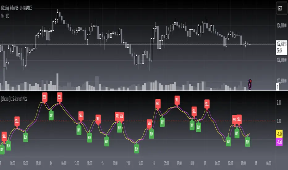
BTC/ETH Lot Size for Dexin - V1.0
█ Overview - This tool is specifically tailored for Delta Exchange India’s users.
I use this interactive tool before taking a position in the BTC’s futures perpetual market . With only 3 mouse clicks, I see all the necessary information, whether a Long or Short position.
A visual of Liquidation Price Level, Stop Loss Price Level, Entry Price Level, Break-even Price Level, and Take Profit Price Level can be immediately seen.
On the top right corner of the chart, which Leverage is to be used, No. of Lots to be taken, expected Profit amount, Loss amount, Brokerage Fees, Risk to Reward Ratios, and Return on Investment are shown, excluding brokerage travel. To get the correct answer in the table that suits your account and risk-taking appetite, the user needs to enter the account balance and Risk per trade.
It also does live tracking of the position, and alerts can be configured too.
█ How to Use
Load the indicator on an active chart.
In the Trading View, ensure that the Magnets is enabled (on the left panel). This will precisely select the price levels you want to choose from OHLC for a candle.
When you first load the tool on the bottom of the chart, you will see a blue box with text in white color guiding you on what you need to do.
Before the first click, the box shall prompt “On the signal candle, set the entry level, where the position would be executed”.
Once the entry price level is selected, the next prompt in the blue box shall be “Set the stop loss level where the position would be exited”. Thus, you need to click the stop loss price level.
Now that the two clicks of Entry and Stop Loss are already done, the last remaining is for the take profit. The last prompt shall be “Set the profit level where the position would be exited”. Therefore, you need to select your take-profit level
Finally, when all three points are selected, the tool shall draw trade zones.
The tool automatically determines whether it is a Long Position or Short Position from the Stop loss and take-profit price levels concerning the entry price level
If the take profit level is above the entry price, the stop must be below, and vice versa; otherwise, an error occurs.
You can change levels by dragging the handles that appear when you select the indicator, or by entering new values in the settings.
Once the position tool is on a chart, it will appear at the same levels on all symbols you use.
If you select the position tool on your chart and delete it, this will also delete the indicator from the chart. You will need to re-add it if you want to draw another position tool. You can add multiple instances of the indicator if you need a position tool on more than one of your charts.
█ Features
Display
The tool displays the following information as graphical visuals
The Liquidation to Stop Loss, Stop Loss to Entry, Entry to Break-even, and Entry to Take Profit zones shall be initiated from the entry candle point.
If you want to be from the candle that crossed the level at a different time from the entry candle, you may go to the settings and adjust the time accordingly. Please note that the time interval is 15 minutes, so at times you may not be able to see the graphical display; however, once the 15-minute time interval is over, you will see the graphical display on the chart.
The tool displays the following information in a tabulated manner
The first row indicates the Leverage that is best suited. The leverage selection by default is greater than or equal to the risk distance.
The second row indicates the number of lots that is computed in relation to the account balance, Risk appetite, Entry price, and Stop Loss price.
The third row indicates estimated profit considering taker's fees and is computed in relation to the number of Lots, Entry price, and Take-Profit price.
The fourth row indicates estimated loss considering taker's fees and is computed in relation to the number of Lots, Entry price, and Stop Loss price.
The fifth row indicates the actual Risk to Reward Ratio, ignoring the travel that pertains to fees.
The sixth row indicates actual Return on Investment, ignoring the travel that pertains to fees.
The intent is to allow the user to make an informed decision prior to taking a position by seeing “$/Rs.” or “% of R O I” or “R : R”.
In case the user wants to know beforehand what the expected charges are that need to be borne before taking a position, that too is made available in the seventh and eighth rows. Both sides' charges are made available for ready reference, irrespective of the outcome of the trade, the user knows the consequences beforehand.
█ Settings
'Trade Sizing'
The tool's input menu is divided into various parts. The first part is 'Trade Sizing'. The user needs to key in the exact number that appears in the Delta Exchange India account against 'Account Balance ($)'. The second thing the user needs to do is key in the 'Risk per Trade'. By default,t it is set to 0.25 and has a default stop change of 0.25. Alternatively, the user can key in any number (Whole number or Rational number) within 100 if that suits their risk management criterion.
'Trade Levels'
Allows users to manually set the Entry, Time, Stop Loss, and Take Profit Price Levels.
'Aggressive Mode Selection'
As the Liquidation zone is shown on the chart, if the user feels that the liquidation price level is too far from the stop loss, this option of 'Use Aggressive Leverage?' allows to increase the leverage, thus reducing the investment amount and in return increasing the Return on Investment %.
The second option in this category is 'Compute Lots based on invested Margin?' itself is self-explanatory, and thus the tabulated data shall be populating the data based on the number entered by the user against 'Margin to be invested ($)'. It is for the user to ensure that the estimated outcomes are within their risk management criterion.
'Conversion & Charges'
If the user wants to see the Profit, Loss, and Fees amount in 'Rs.', all that needs to be done is simply enable the 'Show P&L in Rs.?' The conversion shall take place considering 1 USD = 85 Rs. Same as that carried out by Delta Exchange India.
If the user wants to see the Brokerage Fees, all that needs to be done is simply enable the 'Show Brokerage Fees?'. On enabling this, the table shall show Profitable Trade's (PT) Fees and Lost Trade's (LT) Fees irrespective of the outcome of the trade. The intent is to allow the user to make informed decisions to avoid regrets or surprises at the end of the trade.
'Table'
The division of the input section is related to table position, font size and colors for text and background.
█ Alerts
Alerts can be configured by clicking 'More' (the three dots that appear when you place the cursor on the indicator title that appears on the top left corner of the chart). Alternatively, one can configure alerts by right-clicking on either of the two price levels - Stop Loss price level or Take Profit Price level. Upon right clicking, a window shall appear and the topmost line on that window shall display 'Add alert on ……….' The user can thus put alerts on either of the key levels, such as Stop Loss, Take Profit, and Break Even, or on all of them one by one.

MMM @MaxMaserati 2.0MMM @MaxMaserati 2.0 - TradingView Indicator
The Backbone of the Max Maserati Method
The MMM @MaxMaserati 2.0 indicator is the core of the proprietary Max Maserati Method (MMM), a trading system designed to decode institutional price action. It integrates candle bias analysis, market structure identification, volume-based signals, and precise entry zones to align traders with smart money.
Core Components of the MMM System
1. Six Core Candle Classifications
Master these patterns to reveal institutional behavior:
Bullish Body Close: Closes above previous high, signaling strong buying.
Bearish Body Close: Closes below previous low, indicating intense selling.
Bullish Affinity: High tests previous low, closes within range, showing hidden bullish strength.
Bearish Affinity: Low tests previous high, closes within range, reflecting bearish pressure.
Seek & Destroy: Breaks both previous high/low, closes inside, direction depends on close.
Close Inside: High/low within previous range, bias based on close.
2. Plus/Minus Strength System
Quantifies candle conviction:
Bullish Strength: Low to close distance.
Bearish Strength: High to close distance.
Plus (+): Dominant strength signals strong follow-through.
Minus (-): Balanced strengths suggest caution.
3. PO4 Candles (Power of OHLC (4))
Analyzes OHLC for body-closed candles after swing high/low fractals:
C2: Body close above high/below low post fractal with strength conditions.
C3: Stronger body close with pronounced low/high breakouts.
C4: Body close which show strength and might trigger a BeB/BuB
Visualization: Green (bullish), purple (bearish) bars; triangle markers for fractals.
4. MC2 (High Volume Reversal Candles)
High buy/sell volume candles reversed by opposing volume:
Bullish MC2: Buy volume flipped by sell volume, signaling exhaustion.
Bearish MC2: Sell volume flipped by buy volume, indicating reversal.
Visualization: Dark green (bullish), dark red (bearish) bars.
5. MMM Blocks (eBlocks and iBlocks)
Marks institutional order blocks:
External Blocks (eBlocks): At market structure changes (MSC), labeled BuB/BeB.
Internal Blocks (iBlocks): Within trends, labeled L/S.
Volume: Normalized with indicators (🔥 high, ↑ above average, ↓ low).
Filters: Discount (0-50), premium (50-100), extreme (0-20, 80-100), mid-range (20-50, 50-80).
6. Entry Blocks - Specific Entry Areas
Entry Blocks are precise zones for framing trades based on the MMM system, triggered post-MSC to capitalize on institutional momentum:
Purpose: Pinpoint high-probability entry areas following a Market Structure Change (MSC), aligning with smart money direction.
Formation:
MMM Entry Block Long: Forms after a bullish MSC (BuB), typically at the swing low (e.g., lowerValueMSC) of the fractal pattern, marking a long entry zone.
MMM Entry Block Short: Forms after a bearish MSC (BeB), typically at the swing high (e.g., upperValueMSC), marking a short entry zone.
Styles :
Close-to-Swing High/Low: Box drawn from the candle’s close to the swing high/low level, emphasizing the fractal pivot.
High/Low-to-Close: Box drawn from the candle’s high/low to its close, capturing the full price action range.
Visualization:
Labeled “MMM Entry Block Long” (cyan background/border) or “Short” (pink background/border).
Includes a dashed midline for reference.
Volume displayed if enabled, normalized with markers (🔥 >150%, ⚡ >120%, ❄️ <70%).
Behavior:
Deletes when price touches the level (On Level Touch) or closes beyond it (On Candle Close)
Limited to a configurable number ( default 5) to avoid clutter.
Trade Framing:
Entry: Enter within the eBreak box, ideally on a pullback or confirmation candle aligning with MMM bias (e.g., Bullish Body Close or Affinity).
Stop-Loss: Placed below the eBreak low (bullish) or above the high (bearish), leveraging the swing level as support/resistance.
Take-Profit: Targets higher timeframe high (bullish) or low (bearish), with ratio (default 2.0) for risk-reward.
MMM Integration: Use candle bias (Plus/Minus), PO4 signals, and MMPD consensus to confirm entry direction and strength.
Significance: eBreaks frame trades by isolating institutional entry points post-MSC, reducing noise and enhancing precision.
7. Market Structure Change (MSC)
Tracks structure shifts:
Detection: Fractal highs/lows with adjustable candle count.
Visualization: Green (BuB), red (BeB) lines/labels; numbered breaks (Bub1/Beb1).
Counter: Tracks consecutive MSCs for trend strength.
8. MMPD (Market Momentum Price Delivery)
Analyzes momentum/trend:
Conditions: Red (bearish), Green (bullish), Pink (modifying bearish), Pale Green (modifying bullish).
Traps: Flags bullish/bearish traps when MMPD conflicts with body close.
Metrics: SuperMaxTrend, momentum (K/D), MMPD level.
Consensus: Rated signals (e.g., “Very Strong Buy ★★★★★”).
9. Trade and Risk Management
Disciplined trading:
Entry Visualization: Entry, stop-loss, take-profit lines/labels with customizable risk (riskAmount, default $50) and reward (ratio).
Behavior: Shows last/all entries, removes on MSC shift or breach.
Text Size: Tiny, Small, Normal.
NB: The Trade and risk management is to use with caution, it is not fully implemented yet.
10. Stats Table
Real-time dashboard:
Elements: Timeframe, symbol, candle bias, strength, MMPD, momentum, SuperMaxTrend, MMPD level, volume, consensus, divergence, delta MA, price delivery, note (“Analyze | Wait | Repeat”).
Customization: Position, size, element visibility.
Colors: Green (bullish), red (bearish), orange (warnings), gray (neutral).
11. Delta MA and Divergence
Monitors volume delta:
Delta MA: Smoothed delta with direction arrows (↗↘→).
Divergence: Flags MMPD-momentum divergences (⚠️).
Key Features
Automated Analysis: Detects PO4, MSC, blocks, MC2, Entry Block via OHLC.
Color-Coded Visualization: Bars, lines, table cells reflect bias/strength.
Dynamic Bias Lines: Higher timeframe high/low lines with labels.
Volume Analysis: Normalized volume across blocks, entries, MC2.
Flexible Filters: Tailors block/entry Block display to strategies.
Real-Time Metrics: Tracks strength, delta, trend points.
Trading Advantages
Institutional Insight: Decodes manipulation via OHLC and volume.
Early Reversals: Spots shifts via PO4, MC2, MSC, Entry Blocks.
Precise Entries: entry block frame high-probability trades.
Robust Risk Management: Stop-loss, take-profit, risk-reward.
Simplified Complexity: Actionable signals from complex action.
Profit Target Framework
Bullish: Higher timeframe high.
Bearish: Higher timeframe low.
Plus Strength: Direct move.
Minus Strength: Pullbacks expected.
Entry Blocks/MSC-Driven: Entry anchor entries to MSC targets.
Trader’s Mantra
“Analyze | Wait | Repeat” - Discipline drives profits.
The MMM @MaxMaserati 2.0 indicator, with Entry Blocks as specific trade-framing zones, offers a professional-grade framework for precise, institutional-aligned trading.
Note: Based on the proprietary Max Maserati Method for educational and analytical use.
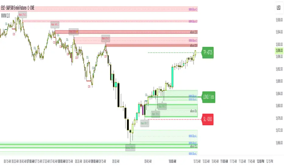
AQPRO Pattern Map
📝 INTRODUCTION
AQPRO Pattern Map is a comprehensive trading tool designed to automate the detection of 27 most popular candlestick patterns across any financial asset, making it a powerful tool for traders who use strategies, which are based on candlestick patterns.
This indicator not only identifies candlestick patterns but also incorporates multi-timeframe (MTF) analysis , risk management tools like Take-Profit (TP) and Stop-Loss (SL) , and labeled visual cues for effortless chart reading. Below is the complete list of patterns it supports:
📜 Patterns scanned by the indicator:
One-candle patterns:
Hammer;
Shooting Star;
Marubozu (Bullish/Bearish);
Doji.
Two-candle patterns:
Belt Hold (Bullish/Bearish);
Engulfing (Bullish/Bearish);
Harami (Bullish/Bearish);
Harami Cross (Bullish/Bearish);
Kicker (Bullish/Bearish);
Window (Rising/Falling Gap);
Piercing Line / Dark Cloud Cover.
Three-candle patterns:
Outside Up / Down Bar;
Inside Up / Down Bar;
Morning Star / Evening Star;
Three White Soldiers / Three Black Crows;
Advance Block / Descent Block;
Tasuki Gap (Upside/Downside);
Side-by-Side White Lines.
Multi-candle patterns:
Rising One / Falling One;
Rising Two / Falling Two;
Rising Three / Falling Three;
Rising Four / Falling Four;
Rising Five / Falling Five;
Breakaway Two / Three / Four / Five (Bullish/Bearish);
Fakey (Bullish/Bearish).
With this tool, traders can visually and systematically track key candlestick setups across multiple timeframes simultaneously, making it an all-in-one solution for identifying actionable patterns.
🎯 PURPOSE OF USAGE
The primary goal of the "AQPRO Pattern Map" is to equip traders with a highly efficient way of identifying significant candlestick patterns across different timeframes, making the decision-making process stronger in a sense of both quality and quantity of presented information.
Specifically, this indicator addresses the following needs:
Automation of pattern detection.
Nobody likes searching for patterns on the chart "by hand", because it takes too much time and mental energy. With this screener you can forget about this problem: automatic scanning for 27 of the most commonly used patterns will save your tens, if not hundreds of hours of time, so you can focus on what really matters;
Multi-timeframe (MTF) analysis.
This one is one of the most unique features of this indicator, because after conducting product research in library of open-source scripts alike this screener, almost none of reviewed indicators had MTF analysis feature embedded in them. This feature is important for the simplest of reasons: you see candlestick data from other timeframes without jumping from one timeframe to another . Needless to say how much time it will save for traders over the years of trading. See description below to learn more on exact functionality of our MTF analysis;
Risk management automation.
Humans tend to overestimate risk, when matters are about earning money from "financially-dangerous" activities and trading is no exception. To help traders better understand what they risk, we implemented a simple, yet effective way of displaying levels of risk for each pattern. For each new pattern on the chart you will be able see automatic creation of Take-Profit (TP) and Stop-Loss (SL) levels. It involves creation and displaying of lines and labels, representing each level at its exact coordinates. This elevates visual perception of risk for fellow traders and avoid excessive risk in many cases;
Simplicity in data visualization.
Charts, which are cluttered with pointless visual noise, presented as 'additional confirmation analysis', don't foster insights and are not worth a dime . We understand this issue very well and we designed our indicator with the solution to this problem in mind. Every bit of information, that you will see on your chart, will make sense both technically and visually — no more wasting time cleaning mess on your charts.
By addressing the needs, described above, this indicator will be a useful tool for any trader, who employs principles of candlestick pattern analysis, because most important pains of this kind of analysis are efficiently handled by our indicator.
⚙️ SETTINGS OVERVIEW
Customization options of our indicator are quite extensive, because flexibility in such indicator is in the top of most important qualities. Let's review each group of settings deeper:
📊 Patterns: One-Candle
This group allows you to enable or disable specific onep -candle candlestick patterns.
Toggle on/off switch for Hammer, Shooting Star, Marubozu, and Doji .
📊 Patterns: Two-Candle
This group allows you to enable or disable specific two -candle candlestick patterns.
Toggle on/off switch for Belt Hold, Engulfing, Harami & Harami Cross, Kicker, Window, Piercing Line & Dark Cloud Cover .
📊 Patterns: Three-Candle
This group allows you to enable or disable specific three -candle candlestick patterns.
Toggle on/off switch for Morning Star & Evening Star, Three White Soldiers, Three Black Crows, Advance Block & Descent Block, Tasuki Gap, Side-by-Side Gap (Bullish), Squeeze .
📊 Patterns: Multi-Candle
This group allows you to enable or disable specific multi -candle (3 or more candle) candlestick patterns.
Toggle on/off switch for Rising/Falling sequences, Breakaway patterns, and Fakey .
📊 MTF Settings
These settings allow you to use the Multi-Timeframe Screener to display patterns from additional timeframes.
"Use MTF Screener" — toggles the addition of MTF Screener to main dashboard ( described in 'Visual Settings' ). If enabled, adds section of MTF Screener below main dashboard
* List of four timeframes — your personal list to choose your timeframe, which will be used to get data about latest patterns. Default list of timeframes includes timeframes like 15min, 30min 1hr, 4hr .
* The detected patterns from these timeframes will be displayed in the MTF Dashboard on the chart.
🛡️ Risk Settings
As was described above, risk settings in our indicator will control appearance of TP and SL labels and lines, which appear for each new trade. Here you can customize the most essential parameters.
"Show TP/SL" — toggles the visibility of Take-Profit (TP) and Stop-Loss (SL) values for the most recent pattern.
"Risk-to-Reward Ratio (R:R)" — defines your desired risk/reward ratio for the TP and SL calculations. The more this parameter is, the further the TP from entry level will be.
🎨 Visual Settings
In this group of settings you can fine-tune the visual appearance of the indicator to fit your preferences.
IMPORTANT: colour parameters from this group of settings affect ONLY colours in the dashboard.
"Use info dashboard" — if enabled, shows dashboard in the top right corner of the chart, which displays latest pattern's TP and SL alongside with this pattern's trade status: '⏳' - TP or SL have not been reached yet, '✋' - TP or SL have already been reached already, refrain from taking the trade.
"Bullish Pattern" — defines the color for bullish patterns.
"Bearish Pattern" — defines the color for bearish patterns.
"Neutral Pattern" — specify the color for neutral patterns like Doji.
"Frame Width" — adjusts the thickness of frames highlighting detected patterns on the chart.
📈 APPLICATION GUIDE
The way of application of this indicator is pretty straightforward, because trading methodologies based on candlestick patterns were developed decades ago and haven't changed much since then. However, we find it necessary to explain the most essential ways of application in this section.
Let's start with the basics — how you will your chart look when you load the indicator for the first time:
By default we have 5 main visual data "blocks":
Bullish patterns;
Bearish patterns;
Risk visualization;
Main Dashboard;
MTF Screener.
Let's review each of these groups one by one.
BULLISH & BEARISH PATTERNS
Patterns are displayed as up/down labels, which are styled in corresponding to trend colours. Each patterns has its own unique emoji to help traders easily navigate between patterns.
Also by default each pattern has its custom frame, inside of which resides candle (or multiple candles) of the pattern iself. These frames are made with purpose to show each pattern in a very clear way on the chart, because huge number of public scripts usually only show simple label of such patterns and don't highlight the pattern itself on the chart. To remove frames you can set "Frame Width" parameter to 0 in 'Visual Settings' group in the settings.
You can see the examples of frame on the screenshot below:
RISK VISUALIZATION (TP & SL)
Displaying Take-Profits and Stop-Losses in our indicator on the chart works quite simple: for each new trade indicator creates new pairs of lines and labels for TP and SL, while lines & labels from previous trade are erased for aesthetics purposes. Each label shows price coordinates, so that each trader would be able to grap the numbers in seconds.
See the visual showcase of TP & SL visualization on the screenshot below:
Also, whenever TP or SL of the current trade is reached, drawing of both TP and SL stops . When the TP is reached, additional '✅' emoji on the TP price is shown as confirmation of Take-Profit.
However, while TP or SL has not been reached, TP&SL labels and lines will be prolonged until one of them will be reached or new signals will come.
See the visual showcase of TP & SL stopping being visualized & TP on the screenshot below:
MAIN DASHBOARD
Main dashboard is displayed in the top right corner of the chart and it shows the data of latest pattern, that occurred on the current asset and current timeframe: pattern's name, TP, SL and trade status. Depending on bullishness or bearishness of the pattern, dashboard is colour in respective colour.
Also on the right of side TP and SL data block there is a so called trade status. It is basically an indication of wether or not latest pattern's trade is still active or not:
If TP or SL of the pattern have not been reached yet, trade is considered active and is marked with '⏳' emoji;
If TP or SL of the pattern have already been reached, trade is considered inactive and is marked with '✋' emoji.
See the visual showcase of dashboard on the screenshot below:
MTF Screener
MTF Screener is displayed right below the main dashboard and its has distinctive 'MTF Patterns' header row on the top, painted in gray colour to make sure that every traders understand he is looking at.
This screener shows the timeframe and name of patterns from four other timeframes, which trader can customize in the settings to his liking. This will help trader get more insights on global sentiment of other timeframes, which improves trading results overall if applied correctly.
In the future MTF Screener will be expanded to have more data in it, like TP and SL, age of pattern and etc.
See the visual showcase of the MTF Screener on the screenshot below:
Features, explained above, make this indicator quite versatile and suitable for incorporation in any trading strategy, which uses candlestick patterns. They are simple, yet insightful, and traders, which use similar strategies everyday, will truly appreciate the benefits of this indicator when they will set up this indicator for the first time on their chart.
🔔 ALERTS
This indicator employs alerts for an event when new pattern occurs. While creating the alert below 'Condition' field choose 'any alert() function call' .
When this alert is triggered, it will generate this kind of message:
string msg_template = "EXCHANGE:ASSET, TIMEFRAME: BULLISH_OR_BEARISH pattern PATTERN_NAME was found."
string msg_example = "BINANCE:BTCUSDT, 15m: bullish pattern 'Hammer' was found."
📌 NOTES
This indicator is most effective when used in combination with other technical analysis tools such as trendlines, moving averages, support/resistance levels or any other indicator-type tool. We strongly recommend using this indicator as confirmation indicator for your main trading strategy, not as primary source of signals;
If you want to trade directly by these patterns, make sure to use proper risk management techniques of your own and use TP&SL visualization on the chart to always have a clue about your current position;
If you lost track of visual components on the chart, look at the main dashboard to see text summary of data from latest pattern. Also don't forget to look at MTF Screener to have more context about MTF sentiment, because it is increases your understandings of MTF price trend and improves your decision-making process.
🏁 AFTERWORD
AQPRO Pattern Map was built to help traders automate candlestick pattern searching routine, improve chart readability and enhance perception of current potential risks, which may come from trading from a specific pattern. Indicator's main dashboard and MTF screener eliminate the need for constantly checking other timeframe for global sentiment, helping traders save even more time and fostering improved decision making.
This indicator will work in great conjunction with any other trading strategy as confirmation tool for entry decision. Using this indicator as primary source of signals is not recommended due to unstable nature of trading patterns.
ℹ️ If you have questions about this or any other our indicator, please leave it in the comments.

Best SMA FinderThis script, Best SMA Finder, is a tool designed to identify the most robust simple moving average (SMA) length for a given chart, based on historical backtest performance. It evaluates hundreds of SMA values (from 10 to 1000) and selects the one that provides the best balance between profitability, consistency, and trade frequency.
What it does:
The script performs individual backtests for each SMA length using either "Long Only" or "Buy & Sell" logic, as selected by the user. For each tested SMA, it computes:
- Total number of trades
- Profit Factor (total profits / total losses)
- Win Rate
- A composite Robustness Score, which integrates Profit Factor, number of trades (log-scaled), and win rate.
Only SMA configurations that meet the user-defined minimum trade count are considered valid. Among all valid candidates, the script selects the SMA length with the highest robustness score and plots it on the chart.
How to use it:
- Choose the strategy type: "Long Only" or "Buy & Sell"
- Set the minimum trade count to filter out statistically irrelevant results
- Enable or disable the summary stats table (default: enabled)
The selected optimal SMA is plotted on the chart in blue. The optional table in the top-right corner shows the corresponding SMA length, trade count, Profit Factor, Win Rate, and Robustness Score for transparency.
Key Features:
- Exhaustive SMA optimization across 991 values
- Customizable trade direction and minimum trade filters
- In-chart visualization of results via table and plotted optimal SMA
- Uses a custom robustness formula to rank SMA lengths
Use cases:
Ideal for traders who want to backtest and auto-select a historically effective SMA without manual trial-and-error. Useful for swing and trend-following strategies across different timeframes.
📌 Limitations:
- Not a full trading strategy with position sizing or stop-loss logic
- Only one entry per direction at a time is allowed
- Designed for exploration and optimization, not as a ready-to-trade system
This script is open-source and built entirely from original code and logic. It does not replicate any closed-source script or reuse significant external open-source components.

Breadth Thrust PRO by Martin E. ZweigThe Breadth Thrust Indicator was developed by Martin E. Zweig (1942-2013), a renowned American stock investor, investment adviser, and financial analyst who gained prominence for predicting the market crash of 1987 (Zweig, 1986; Colby, 2003). Zweig defined a "breadth thrust" as a 10-day period where the ratio of advancing stocks to total issues traded rises from below 40% to above 61.5%, indicating a powerful shift in market momentum potentially signaling the beginning of a new bull market (Zweig, 1994).
Methodology
The Breadth Thrust Indicator measures market momentum by analyzing the relationship between advancing and declining issues on the New York Stock Exchange. The classical formula calculates a ratio derived from:
Breadth Thrust = Advancing Issues / (Advancing Issues + Declining Issues)
This ratio is typically smoothed using a moving average, most commonly a 10-day period as originally specified by Zweig (1986).
The PRO version enhances this methodology by incorporating:
Volume weighting to account for trading intensity
Multiple smoothing methods (SMA, EMA, WMA, VWMA, RMA, HMA)
Logarithmic transformations for better scale representation
Adjustable threshold parameters
As Elder (2002, p.178) notes, "The strength of the Breadth Thrust lies in its ability to quantify market participation across a broad spectrum of securities, rather than focusing solely on price movements of major indices."
Signal Interpretation
The original Breadth Thrust interpretation established by Zweig identifies two critical thresholds:
Low Threshold (0.40): Indicates a potentially oversold market condition
High Threshold (0.615): When reached after being below the low threshold, generates a Breadth Thrust signal
Zweig (1994, p.123) emphasizes: "When the indicator moves from below 0.40 to above 0.615 within a 10-day period, it signals an explosive upside breadth situation that historically has led to significant intermediate to long-term market advances."
Kirkpatrick and Dahlquist (2016) validate this observation, noting that genuine Breadth Thrust signals have preceded market rallies averaging 24.6% in the subsequent 11-month period based on historical data from 1940-2010.
Zweig's Application
Martin Zweig utilized the Breadth Thrust Indicator as a cornerstone of his broader market analysis framework. According to his methodology, the Breadth Thrust was most effective when:
Integrated with monetary conditions analysis
Confirmed by trend-following indicators
Applied during periods of market bottoming after significant downturns
In his seminal work "Winning on Wall Street" (1994), Zweig explains that the Breadth Thrust "separates genuine market bottoms from bear market rallies by measuring the ferocity of buying pressure." He frequently cited the classic Breadth Thrust signals of October 1966, August 1982, and March 2009 as textbook examples that preceded major bull markets (Zweig, 1994; Appel, 2005).
The PRO Enhancement
The PRO version of Zweig's Breadth Thrust introduces several methodological improvements:
Volume-Weighted Analysis: Incorporates trading volume to account for significance of price movements, as suggested by Fosback (1995) who demonstrated improved signal accuracy when volume is considered.
Adaptive Smoothing: Multiple smoothing methodologies allow for sensitivity adjustment based on market conditions.
Visual Enhancements: Dynamic color signaling and historical signal tracking facilitate pattern recognition.
Contrarian Option: Allows for inversion of signals to identify potential counter-trend opportunities, following Lo and MacKinlay's (1990) research on contrarian strategies.
Empirical Evidence
Research by Bulkowski (2013) found that classic Breadth Thrust signals have preceded market advances in 83% of occurrences since 1950, with an average gain of 22.4% in the 12 months following the signal. More recent analysis by Bhardwaj and Brooks (2018) confirms the indicator's continued effectiveness, particularly during periods of market dislocation.
Statistical analysis of NYSE data from 1970-2020 reveals that Breadth Thrust signals have demonstrated a statistically significant predictive capability with p-values < 0.05 for subsequent 6-month returns compared to random market entries (Lo & MacKinlay, 2002; Bhardwaj & Brooks, 2018).
Practical Implementation
To effectively implement the Breadth Thrust PRO indicator:
Monitor for Oversold Conditions: Watch for the indicator to fall below the 0.40 threshold, indicating potential bottoming.
Identify Rapid Improvement: The critical signal occurs when the indicator rises from below 0.40 to above 0.615 within a 10-day period.
Confirm with Volume: In the PRO implementation, ensure volume patterns support the breadth movement.
Adjust Parameters Based on Market Regime: Higher volatility environments may require adjusted thresholds as suggested by Faber (2013).
As Murphy (2004, p.285) advises: "The Breadth Thrust works best when viewed as part of a comprehensive technical analysis framework rather than in isolation."
References
Appel, G. (2005) Technical Analysis: Power Tools for Active Investors. Financial Times Prentice Hall, pp. 187-192.
Bhardwaj, G. and Brooks, R. (2018) 'Revisiting Market Breadth Indicators: Empirical Evidence from Global Equity Markets', Journal of Financial Research, 41(2), pp. 203-219.
Bulkowski, T.N. (2013) Trading Classic Chart Patterns. Wiley Trading, pp. 315-328.
Colby, R.W. (2003) The Encyclopedia of Technical Market Indicators, 2nd Edition. McGraw-Hill, pp. 123-126.
Elder, A. (2002) Come Into My Trading Room: A Complete Guide to Trading. John Wiley & Sons, pp. 175-183.
Faber, M.T. (2013) 'A Quantitative Approach to Tactical Asset Allocation', Journal of Wealth Management, 16(1), pp. 69-79.
Fosback, N. (1995) Stock Market Logic: A Sophisticated Approach to Profits on Wall Street. Dearborn Financial Publishing, pp. 112-118.
Kirkpatrick, C.D. and Dahlquist, J.R. (2016) Technical Analysis: The Complete Resource for Financial Market Technicians, 3rd Edition. FT Press, pp. 432-438.
Lo, A.W. and MacKinlay, A.C. (1990) 'When Are Contrarian Profits Due to Stock Market Overreaction?', The Review of Financial Studies, 3(2), pp. 175-205.
Lo, A.W. and MacKinlay, A.C. (2002) A Non-Random Walk Down Wall Street. Princeton University Press, pp. 207-214.
Murphy, J.J. (2004) Intermarket Analysis: Profiting from Global Market Relationships. Wiley Trading, pp. 283-292.
Zweig, M.E. (1986) Martin Zweig's Winning on Wall Street. Warner Books, pp. 87-96.
Zweig, M.E. (1994) Winning on Wall Street, Revised Edition. Warner Books, pp. 121-129.

Breakout Patterns Detector: Triangle & Wedge [Splirus]This indicator identifies Breakout Patterns such as Ascending Triangles , Descending Triangles , Symmetric Triangles , Ascending Wedges , and Descending Wedges , using candlestick charts and Trendlines. It provides visual cues, stop-loss (SL), and take-profit (TP) levels, alongside a detailed dashboard to evaluate performance. The indicator supports two alert modes: Manual Mode for trader notifications and Bot Mode for automated trading signals.
To achieve optimal results, users are encouraged to experiment with indicator parameters and analyze the dashboard summary to find the perfect configuration for each timeframe, pair, and market condition.
Pattern Identification
The indicator detects the following breakout patterns based on pivot highs and lows:
Ascending Triangle : Flat upper trendline, rising lower trendline.
Descending Triangle : Flat lower trendline, declining upper trendline.
Symmetric Triangle : Converging trendlines with similar slopes (within a user-defined threshold).
Ascending Wedge : Both trendlines slope upward, converging.
Descending Wedge : Both trendlines slope downward, converging.
Patterns are identified using configurable left and right bars for small and big patterns, with slope thresholds normalized by ATR. A trend confirmation filter ensures breakouts align with market direction, and users can adjust breakout confirmation bars to validate signals.
The goal is to fine-tune these settings to suit specific timeframes and pairs, as each combination may require a unique setup for optimal performance.
Stop-Loss Calculation
Stop-loss levels are calculated dynamically based on pattern type and breakout direction:
Symmetric Triangle : SL is set at the first pivot of the opposite trendline, adjusted by a buffer percentage.
Ascending/Descending Triangle : SL is placed at the breakout trendline’s price, plus the buffer.
Ascending/Descending Wedge : SL is set at the second pivot of the opposite trendline, adjusted by the buffer.
The indicator calculates leverage based on a user-defined risk tolerance percentage. Users should adjust the SL buffer and risk tolerance to balance risk and reward, monitoring the dashboard to assess how these settings impact performance across different timeframes and pairs.
Take-Profit Calculation
Three take-profit levels ( TP1 , TP2 , TP3 ) are calculated using pattern height and user-defined multipliers:
For Ascending/Descending Triangles, height is the difference between the max and min prices within the pattern.
For Symmetric Triangles and Wedges, height is the vertical distance between trendlines at the pattern’s start.
TP levels are set as:
TP1 = Breakout price ± (Height × TP1 Multiplier).
TP2 = Breakout price ± (Height × TP2 Multiplier).
TP3 = Breakout price ± (Height × TP3 Multiplier, with a 1.5x adjustment for Wedges).
Experiment with TP multipliers to optimize the risk-reward ratio, using the dashboard to evaluate TP hit rates and overall profitability for each configuration.
Symmetric Triangle:
Ascending/Descending Wedge:
Ascending/Descending Triangles:
Finding the Perfect Configuration
The indicator’s dashboard provides a comprehensive summary of performance metrics, including total trades, TP1/TP2/TP3 hits, SL hits, profit/loss percentages, and win rates for bullish, bearish, and combined trades. These metrics are crucial for identifying the ideal parameter settings:
Timeframe and Pair Variability : Each timeframe (e.g., 15m, 30min, 1H, 4H, Daily) and pair (e.g., BTC/USD, EUR/USD) behaves differently. Adjust parameters like left/right bars, minimum pattern length, and breakout confirmation bars to match the volatility and trend characteristics of the chosen pair and timeframe.
Parameter Tuning : Modify slope thresholds, trend confirmation filters, and bars inside the pattern to filter out false breakouts. For example, a higher breakout confirmation bar setting may reduce signals but increase reliability on longer timeframes.
Dashboard Analysis : Focus on the dashboard’s win rate, profit/loss ratio, and TP/SL hit frequencies. A “Perfect” win rate (>66%) or high TP hit rate indicates a strong configuration. If the SL hit rate is high, consider tightening the trend confirmation filter or increasing the SL buffer.
Iterative Testing : Test different combinations of settings (e.g., small vs. big patterns, aggressive vs. conservative breakout confirmation) and compare dashboard results over time. The goal is to find a balance where the indicator consistently delivers high win rates and profitability for your specific trading setup.
Alert Modes
The indicator supports two alert modes to suit different trading styles:
Manual Mode : Generates alerts for breakouts with entry price, SL, TP1/TP2/TP3, and leverage, tailored for Crypto or Forex markets. Use this mode to manually evaluate signals while refining configurations.
Bot Mode : Sends automated trading signals. To avoid conflicts, Bot Mode ensures no short position alert is triggered while a long position is active, and vice versa. This mode is ideal once you’ve identified an optimal configuration via the dashboard.
Additional Features
Historical Patterns : Displays past trendlines with customizable transparency and extension, helping users analyze how patterns performed under different settings.
Customizable Settings : Adjust pattern size, breakout confirmation, trend filters, and visual preferences (colors, dashboard location) to match your trading style.
Market Compatibility : Supports Crypto and Forex markets across all timeframes, but requires careful tuning for each market type.
Usage Notes
Start with default settings and monitor the dashboard to establish a baseline performance for your chosen timeframe and pair.
Gradually adjust one parameter at a time (e.g., left/right bars, TP multipliers) and compare dashboard results to identify improvements.
Use historical pattern analysis to understand how past breakouts performed under different configurations, guiding your optimization process.
Once a high win rate and profitability are achieved, consider automating trades with Bot Mode for consistent execution.
Disclaimer
This indicator is intended for educational purposes only and should not be considered financial advice. Trading involves significant risk, and past performance is not indicative of future results. Users are strongly advised to thoroughly test and validate the indicator’s signals in a demo environment before using it in live trading. The author is not responsible for any financial losses incurred while using this indicator. Always conduct your own research and consult with a qualified financial advisor before making trading decisions.
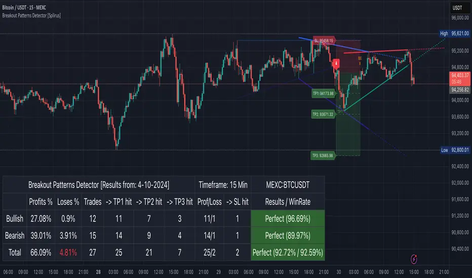
Another EMA trend indicator"Another EMA Trend Indicator" is a dynamic trend-following tool. Blending customizable Moving Averages (EMA or SMA) with an automated, visualized trade management system. It identifies bullish and bearish trend shifts based on short- and long-term MA crossovers, dynamically calculates optimal entry points, stop-losses, and take-profits, and visually manages trades on the chart with optional clouds, lines, and labels.
Main Features:
Moving Average Trend Detection:
Choice between EMA (Exponential Moving Average) or SMA (Simple Moving Average).
Two customizable lengths: a short MA and a long MA.
Detects bullish and bearish switches based on MA crossover events.
Entry, SL, and TP Calculation:
Entries are calculated dynamically after a signal using a combination of historical candle high/low analysis and a risk divider.
Stop-loss and take-profit levels are automatically set based on the trend's recent volatility and user-defined risk parameters.
Supports fixed or dynamic profit targets.
Risk Management Settings:
Define minimum and maximum acceptable profit percentages.
Set maximum stop-loss distance and apply a stop-loss multiplier for added flexibility.
Limit maximum trade duration to avoid endless open trades.
Trade Visualization:
Optional debug mode to display:
Entry, stop-loss, and take-profit lines.
Buy/sell signals via shapes on the chart.
Trend cloud between short and long MAs.
Historical trend levels for better visualization.
Dynamic Statistics Panel:
Real-time display of:
First trade date.
Total number of trades.
Number of profitable and losing trades.
Average and maximum trade duration.
Win rate and average profit/loss percentages.
Inputs:
MA Type: Choose between "EMA" or "SMA."
Short/Long MA Length: Customize lengths to control sensitivity.
Source: Apply to typical price values like hl2.
Risk Settings:
Minimum, maximum, and fixed profit percentages.
Stop-loss settings and risk dividers.
Trade Behavior Settings:
Max trade length.
Visualization Toggles:
Show/hide debug labels, lines, clouds.
Use Case:
This indicator is ideal for trend-following traders who prefer a semi-automated trading framework. It helps maintain consistency in entries and exits while visualizing important trend dynamics and trade health directly on the chart.
Best suited for swing trading crypto coins.

MÈGAS ALGO : CNA (Cognitio Analysis) [INDICATOR]Overview
The CNA (Cognitio Analysis) is a comprehensive financial analysis tool designed to evaluate the overall health and potential of a market or company based on fundamental metrics. It aggregates data across five key metric groups—**Growth**, **Profitability**, **Cash Flow**, **Income**, and **Valuation**—to provide a final interpretation of market conditions. The indicator dynamically adapts to the selected fiscal period (Quarter, Year, or Trailing Twelve Months) and delivers insights into dominant trends and conflicting signals.
Key Features
1. Customizable Fiscal Period:
- Users can select between "Quarter", "Year", or "Trailing Twelve Months" (TTM) to analyze data for their desired timeframe.
2. Dynamic Table Visualization:
- Displays raw metric values, aggregated scores, and the final interpretation in an intuitive
table.
- Highlights the final interpretation with dynamic background colors (`color.teal` for bullish,
`color.red` for bearish, etc.).
3. Comprehensive Data Integration:
- Pulls financial data using TradingView's `request.financial()` function for metrics like
revenue, earnings, margins, and valuation ratios.
4. Normalization and Scoring:
- Normalizes data to create a consistent scoring system, ensuring accurate comparisons across
metrics.
How It Works
1. Metric Group Analysis
- Growth Metrics: Measures revenue growth, earnings per share (EPS) growth, and tax
efficiency.
- Profitability Metrics: Analyzes net profit margin, return on equity (ROE), and EBITDA margin.
- Cash Metrics: Assesses operating cash flow margin, free cash flow to operating cash flow
ratio, and cash flow coverage.
- Income Metrics: Examines gross profit margin, operating profit margin, and EBIT margin.
- Valuation Metrics: Evaluates price-to-earnings (P/E), price-to-sales (P/S), and enterprise
value-to-EBITDA (EV/EBITDA).
2. Dynamic Scoring System
- Metrics are normalized to ensure consistency across different scales.
- A geometric mean is used to calculate scores for each metric group, ensuring that all metrics
within a group contribute equally to the final score.
3. Dominant Trend Identification
- Scores from all five metric groups are aggregated to determine the **dominant trend** of the
market.
- The dominant trend is categorized as:
- Bullish: Strong fundamentals across most metrics.
- Bearish: Weak fundamentals across most metrics.
- Neutral: Balanced conditions with no clear direction.
- Unclear: Mixed signals dominate, requiring further monitoring.
4. Conflicting Signals Interpretation
- The indicator identifies scenarios where metrics conflict (e.g., high growth but low valuation).
- These conflicting signals provide nuanced insights into market conditions, highlighting rare opportunities or potential risks.
How to Use the Indicator
1. Select Fiscal Period:
- Choose between "FQ", "FY", or "TTM" to analyze data for the desired timeframe.
2. Review Metric Scores:
- Examine the scores for each metric group (Growth, Profitability, Cash, Income, Valuation) to
understand the underlying performance.
3. Interpret Final Output:
- The final interpretation provides a summary of the dominant trend and conflicting signals,
helping users make informed decisions.
4. Dynamic Coloring:
- Use the dynamic background colors in the table to quickly identify market sentiment
(bullish, bearish, neutral, or mixed).
Applications
- Identifying Opportunities:
- Look for bullish dominant trends combined with undervalued growth opportunities for
potential long positions.
- Avoiding Risks:
- Watch out for bearish dominant trends with overvaluation alerts to avoid potential losses.
- Monitoring Neutral Markets:
- Use the indicator to identify neutral markets and wait for clearer signals before making
decisions.
Conclusion
The CNA (Cognitio Analysis) is a powerful tool for traders and investors seeking to make informed decisions based on fundamental analysis. By combining detailed metric evaluations, dynamic scoring, and sentiment-based interpretations, this indicator provides a comprehensive view of market conditions. Whether you're identifying undervalued opportunities, avoiding overvalued risks, or monitoring neutral markets, this indicator equips you with the insights needed to navigate complex financial landscapes.
Please Note:
This indicator is provided for informational and educational purposes only. It is not financial advice, and it should not be considered a recommendation to buy, sell, or trade any financial instrument. Trading involves significant risks, including the potential loss of your entire investment. Always conduct your own research and consult with a licensed financial advisor before making any trading decisions.
The results and images provided are based on algorithms and historical/paid real-time market data but do not guarantee future results or accuracy. Use this tool at your own risk, and understand that past performance is not indicative of future outc
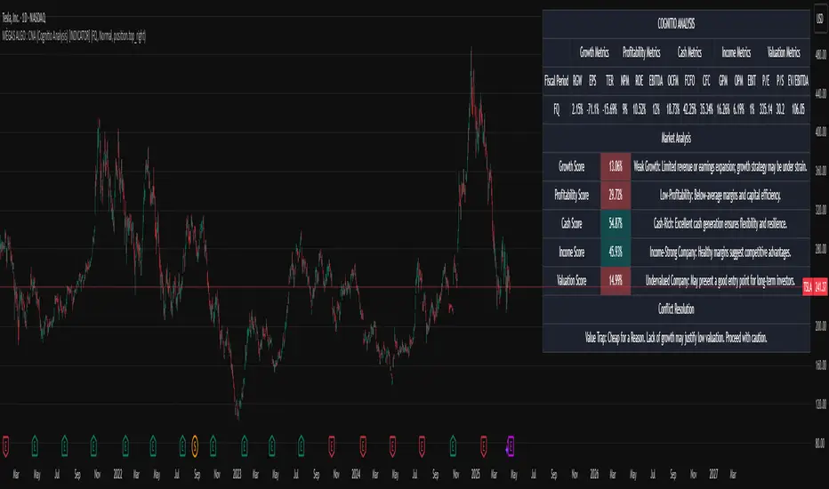
Heiken Ashi Supertrend ADXHeiken Ashi Supertrend ADX Indicator
Overview
This indicator combines the power of Heiken Ashi candles, Supertrend indicator, and ADX filter to identify strong trend movements across multiple timeframes. Designed primarily for the cryptocurrency market but adaptable to any tradable asset, this system focuses on capturing momentum in established trends while employing a sophisticated triple-layer stop loss mechanism to protect capital and secure profits.
Strategy Mechanics
Entry Signals
The strategy uses a unique blend of technical signals to identify high-probability trade entries:
Heiken Ashi Candles: Looks specifically for Heiken Ashi candles with minimal or no wicks, which signal strong momentum and trend continuation. These "full-bodied" candles represent periods where price moved decisively in one direction with minimal retracement. These are overlayed onto normal candes for more accuarte signalling and plotting
Supertrend Filter: Confirms the underlying trend direction using the Supertrend indicator (default factor: 3.0, ATR period: 10). Entries are aligned with the prevailing Supertrend direction.
ADX Filter (Optional) : Can be enabled to focus only on stronger trending conditions, filtering out choppy or ranging markets. When enabled, trades only trigger when ADX is above the specified threshold (default: 25).
Exit Signals
Positions are closed when either:
An opposing signal appears (Heiken Ashi candle with no wick in the opposite direction)
Any of the three stop loss mechanisms are triggered
Triple-Layer Stop Loss System
The strategy employs a sophisticated three-tier stop loss approach:
ATR Trailing Stop: Adapts to market volatility and locks in profits as the trend extends. This stop moves in the direction of the trade, capturing profit without exiting too early during normal price fluctuations.
Swing Point Stop: Uses natural market structure (recent highs/lows over a lookback period) to place stops at logical support/resistance levels, honoring the market's own rhythm.
Insurance Stop: A percentage-based safety net that protects against sudden adverse moves immediately after entry. This is particularly valuable when the swing point stop might be positioned too far from entry, providing immediate capital protection.
Optimization Features
Customizable Filters : All components (Supertrend, ADX) can be enabled/disabled to adapt to different market conditions
Adjustable Parameters : Fine-tune ATR periods, Supertrend factors, and ADX thresholds
Flexible Stop Loss Settings : Each of the three stop loss mechanisms can be individually enabled/disabled with customizable parameters
Best Practices for Implementation
[Recommended Timeframes : Works best on 4-hour charts and above, where trends develop more reliably
Market Conditions: Performs well across various market conditions due to the ADX filter's ability to identify meaningful trends
Performance Characteristics
When properly optimized, this has demonstrated profit factors exceeding 3 in backtesting. The approach typically produces generous winners while limiting losses through its multi-layered stop loss system. The ATR trailing stop is particularly effective at capturing extended trends, while the insurance stop provides immediate protection against adverse moves.
The visual components on the chart make it easy to follow the strategy's logic, with position status, entry prices, and current stop levels clearly displayed.
This indicator represents a complete trading system with clearly defined entry and exit rules, adaptive stop loss mechanisms, and built-in risk management through position sizing.
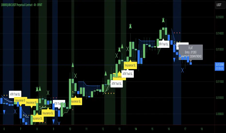
RSI VWAP POC [Uncle Sam Trading]Category: Oscillators, Volume, Market Profile
Timeframe: Suitable for all timeframes
Markets: Crypto, Forex, Stocks, Commodities
Overview
The RSI VWAP POC indicator is a powerful and innovative oscillator that combines the Relative Strength Index (RSI), Volume-Weighted Average Price (VWAP), and Point of Control (POC) from market profile analysis. Designed to provide traders with clear, high-probability trading signals, this indicator helps you identify key market levels, spot overbought/oversold conditions, and time your entries and exits with precision. Whether you’re a day trader, swing trader, or scalper, this free tool adds significant value to your trading strategy by offering a unique blend of momentum, volume, and market profile insights.
How It Works
This indicator integrates three core components to deliver actionable insights:
RSI (Relative Strength Index): Measures momentum to identify overbought (above 70) and oversold (below 30) conditions, helping you anticipate potential reversals.
VWAP (Volume-Weighted Average Price): Calculates a volume-weighted price benchmark, which is used to compute a more accurate, volume-sensitive RSI. This ensures the indicator reflects true market dynamics.
POC (Point of Control): Derived from market profile analysis, the POC represents the price level with the highest traded volume in a session, acting as a critical support or resistance level.
The indicator plots a smoothed RSI based on VWAP, overlaid with market profile data on a user-defined higher timeframe (default: 4H). The POC is displayed as a red line, with aqua bars indicating the value area where the majority of trading volume occurred. When the RSI crosses the POC, the indicator generates clear buy and sell signals:
Strong Buy (SBU): RSI crosses above the POC in an oversold zone.
Strong Sell (SBD): RSI crosses below the POC in an overbought zone.
Additional features include:
Background colors to highlight bullish (green) or bearish (red) trends.
Shaded zones for overbought (70/60) and oversold (30/40) levels.
Customizable settings to fit your trading style and timeframe.
How This Indicator Adds Value
The RSI VWAP POC indicator offers several key benefits that enhance your trading performance:
High-Probability Signals: By combining RSI, VWAP, and POC, this indicator identifies trades at key market levels where price is likely to react, increasing your win rate.
Improved Timing: Clear buy and sell signals, such as ‘SBU’ and ‘SBD’, help you enter and exit trades at optimal points, maximizing profitability.
Risk Management: Overbought/oversold zones and trend confirmation via background colors help you avoid false signals, protecting your capital.
Versatility: Suitable for all markets (crypto, forex, stocks) and timeframes, making it a valuable tool for traders of all experience levels.
Time Efficiency: The indicator does the heavy lifting by analyzing momentum, volume, and market profile data, allowing you to focus on executing trades.
Real-World Performance Example: On a 1-hour Bitcoin chart with a 4-hour higher timeframe, this indicator identified a strong sell signal on April 6th at 12:00 ($82,000), leading to a 9% drop to $74,600. A subsequent strong buy signal on April 7th at 04:00 ($76,200) captured a 6% rise to $81,200 – a potential 25% profit with 5x leverage if exited at 5%.
How to Use
Add the Indicator: Search for “RSI VWAP POC ” in TradingView’s indicator library and add it to your chart.
Set Your Timeframe: The indicator works on any timeframe but is optimized for a 1-hour chart with a 4-hour higher timeframe (set in the settings).
Interpret Signals:
Look for ‘SBU’ (strong buy) labels when the RSI crosses above the POC in an oversold zone, indicating a potential buying opportunity.
Look for ‘SBD’ (strong sell) labels when the RSI crosses below the POC in an overbought zone, signaling a potential selling opportunity.
Use the background colors (green for bullish, red for bearish) to confirm the trend.
Combine with Your Strategy: Use the indicator alongside your existing analysis (e.g., support/resistance, candlestick patterns) for best results.
Settings and Customization
The indicator is highly customizable to suit your trading needs:
RSI Length (Default: 14): Adjust the sensitivity of the RSI. Use a shorter length (e.g., 10) for scalping, or a longer length (e.g., 20) for smoother signals.
EMA Smoothing Length (Default: 3): Smooths the RSI line. Increase to 5 or 7 for less choppy signals in volatile markets.
Higher Timeframe (Default: 240 minutes): Set to 240 (4 hours) for a 1-hour chart. Adjust based on your chart’s timeframe (e.g., 60 minutes for a 15-minute chart).
Value Area Percentage (Default: 100%): Defines the size of the value area around the POC. Lower to 70% for a tighter focus on key levels.
Overbought/Oversold Thresholds (Defaults: 70/30): Adjust these levels to match market conditions (e.g., 80/20 for trending markets).
Show POC Line (Default: True): Toggle the red POC line on or off.
Show Buy/Sell Signals: Enable ‘Show Strong Breakup Signals’ and ‘Show Strong Breakdown Signals’ to focus on high-probability trades.
Why Choose This Indicator?
The RSI VWAP POC indicator stands out by offering a unique combination of momentum, volume, and market profile analysis in a single, easy-to-use tool. It’s designed to help traders of all levels make informed decisions, reduce risk, and increase profitability. Whether you’re trading Bitcoin, forex pairs, or stocks, this indicator provides the clarity and precision you need to succeed.
Breaking Structures (javieresfeliz)This TradingView script is designed to identify market structure changes, using a break of highs and lows approach, as well as technical indicators such as ATR, RSI, and EMAs (Exponential Moving Averages). It is aimed at detecting bullish and bearish trends, signaling possible entry and exit points based on various factors. It also offers additional confirmations to avoid false signals and provides a clear visualization of buy and sell signals.
Main Features:
Indicators Used:
ATR (Average True Range): Used to calculate a volatility range, which helps set stop-loss levels and price targets based on the current market volatility.
EMAs (50 and 200): Exponential Moving Averages (EMAs) are used to determine the short-term and long-term trends. The 50-period EMA is used to identify the short-term trend, while the 200-period EMA is used to identify the long-term trend.
RSI (Relative Strength Index): Used to identify overbought or oversold conditions in the market, providing additional buy or sell signals.
Volume: Used to confirm the validity of a signal. An increase in volume can confirm a structure break and provide more reliability to the signal.
Break of Structure Detection (BOS):
Bullish Break: Generated when the price surpasses previous highs.
Bearish Break: Generated when the price falls below previous lows.
Change of Character (CHOCH):
Bullish Trend: Defined by a close above the open and above the 50 EMA.
Bearish Trend: Defined by a close below the open and below the 50 EMA.
Buy and Sell Conditions:
Buy (Long): Activated when several conditions are met, including a bullish change of character, a bullish structure break, the price closing above the previous value plus a multiple of the ATR, and additional confirmations from RSI and volume.
Sell (Short): Activated when several conditions are met, including a bearish change of character, a bearish structure break, the price closing below the previous value minus a multiple of the ATR, with additional confirmations from RSI and volume.
Entry and Exit Signals:
Long Entry (Buy): Executed when the buy conditions are met.
Short Entry (Sell): Executed when the sell conditions are met.
Position Close: Positions are closed when the price crosses below (for long positions) or above (for short positions) the 50 EMA.
Historical Highs and Lows Lines:
The script draws lines of historical highs and lows from the last 288 and 60 periods to show key support and resistance levels on the chart.
Signal Table Across Multiple Timeframes:
The script displays a table in the top-right corner of the chart with indicators like the EMA trend, RSI value, and MACD histogram for timeframes of 1 minute, 5 minutes, 30 minutes, 1 hour, 4 hours, daily, and weekly.
Precautions:
Does not guarantee profits: Although the script is designed to detect structure breaks and possible trend changes, it does not guarantee 100% profitable signals. The market is always subject to risk and unpredictable volatility.
Requires adjustments for each asset: Parameters such as ATR length and EMA lengths should be adjusted according to the asset being analyzed and market conditions.
Use of additional confirmations: To reduce false signals, the script uses additional confirmations like RSI and volume, but it is always recommended to perform additional analysis before making trading decisions.
Changing trends: The change of character (CHOCH) can be a useful indicator, but it can give false signals in highly volatile markets or during prolonged consolidations.
Relies on historical data: This script relies on historical data to identify highs and lows. It does not consider fundamental events that may significantly impact the market.
Requires constant monitoring: Although the signals are automated, it is important to monitor open positions and make adjustments if market conditions change.
Risk of false signals: In low liquidity markets or consolidations, structure breaks can be false, so it’s recommended to pay attention to any additional confirmation signals or use a proper risk management strategy.

Portfolio Monitor - DolphinTradeBot1️⃣ Overview
▪️This indicator unifies the value of all your investments—whether stocks, currencies, or cryptocurrencies—in your chosen currency. This tool not only provides a clear snapshot of your overall portfolio performance but also highlights the individual growth of each asset with intuitive visualizations and an easy-to-understand performance report.
2️⃣ What sets this indicator apart
▪️is its ability to convert values from various currency pairs into any currency you choose. This means you can monitor your portfolio's performance against any currency pair you prefer, offering a flexible and comprehensive view of your investments.
3️⃣ How Is It Work ?
🔍The indicator can be analyzed under two main categories: visual representations and tables.
1- Visual representations ;
The indicator includes three different types of lines:
1. 1 - Reference Line → This represents the cost of all assets we hold, based on the selected date.
1. 2 - Total Assets Line → Displays the real-time value of all assets in our possession, including cash value, in the selected trading pair.
The area between the reference line is filled with green and red. The section above the reference line is represented in green, while the section below is shown in red.
1. 3 - Performance Lines → These visualize the performance of the assets, starting from the reference line and taking into account their weights in the portfolio. (Note: The lines are scaled for visualization purposes, so their absolute values should not be considered.)
"The names of the lines are shown in the image below."⤵️
2- Tables
The indicator includes three different types of tables:
2. 1 - Analysis Table : It provides a superficial overview of wallet statistics and values.
▪️TOTAL ASSETS → The current equivalent of all assets in the target currency
▪️CASH VALUE → The current value of the amount "Cash Value", in the target currency.
▪️PORTFOLIO VALUE → The total value of assets excluding Cash, in the target currency.
▪️POSTFOLIO COST → The cost of assets excluding Cash, in the target currency.
▪️PORTFOLIO ABSOLUTE RETURN → It shows the profit or loss relative to the cost of assets
▪️PORTFOLIO RETURN % →It shows the profit or loss relative to the cost of assets on a percentage basis
2. 2 - Performance Table : It displays the names of assets excluding Cash and their profit amounts, sorted from highest to lowest profit. If "Show as Percentage" is selected in the settings, it shows the percentage profit or loss relative to the cost. Profits are represented in green, while losses are represented in red.
"You can see the visual showing the tables below"⤵️
4️⃣How to Use ?
1- Choose the date on which the visualization will begin (📌The start date only affects the exchange rate used for calculating the reference line in the target currency.)
2- If you have cash holdings, enter the amount and specify the currency.
3- Select the currency in which your portfolio value will be displayed.(Default value is USD)
4- To set up your portfolio;
SYMBOLS - QUANTITY - PURCHASE PRICE
Enter the symbols of your assets - the number of units you hold - and their cost levels.
5- If you have cash, be sure to include your cash balance. If you also hold other currencies, enter them as separate assets with their corresponding quantities and purchase prices.
6- If you want to see the percentage returns of the assets in the performance table relative to their cost, select the "Show as Percent" option.
7- If you want to see the performance visuals of the assets, click on the "Show Asset Performance" option.
You can find an image of the settings section where the numbers above are used as references below.⤵️
📌 NOTE → By default, a few assets and their values have been pre-added in the initial settings. This is to ensure that you don’t see an empty screen when adding the indicator to the chart. Please remember to enter your own assets and values. The default settings are only provided as an example.