Composite Time ProfileComposite Time Profile Overlay (CTPO) - Market Profile Compositing Tool
Automatically composite multiple time periods to identify key areas of balance and market structure
What is the Composite Time Profile Overlay?
The Composite Time Profile Overlay (CTPO) is a Pine Script indicator that automatically composites multiple time periods to identify key areas of balance and market structure. It's designed for traders who use market profile concepts and need to quickly identify where price is likely to find support or resistance.
The indicator analyzes TPO (Time Price Opportunity) data across different timeframes and merges overlapping profiles to create composite levels that represent the most significant areas of balance. This helps you spot where institutional traders are likely to make decisions based on accumulated price action.
Why Use CTPO for Market Profile Trading?
Eliminate Manual Compositing Work
Instead of manually drawing and compositing profiles across different timeframes, CTPO does this automatically. You get instant access to composite levels without spending time analyzing each individual period.
Spot Areas of Balance Quickly
The indicator highlights the most significant areas of balance by compositing overlapping profiles. These areas often act as support and resistance levels because they represent where the most trading activity occurred across multiple time periods.
Focus on What Matters
Rather than getting lost in individual session profiles, CTPO shows you the composite levels that have been validated across multiple timeframes. This helps you focus on the levels that are most likely to hold.
How CTPO Works for Market Profile Traders
Automatic Profile Compositing
CTPO uses a proprietary algorithm that:
- Identifies period boundaries based on your selected timeframe (sessions, daily, weekly, monthly, or auto-detection)
- Calculates TPO profiles for each period using the C2M (Composite 2 Method) row sizing calculation
- Merges overlapping profiles using configurable overlap thresholds (default 50% overlap required)
- Updates composite levels as new price action develops in real-time
Key Levels for Market Profile Analysis
The indicator displays:
- Value Area High (VAH) and Value Area Low (VAL) levels calculated from composite TPO data
- Point of Control (POC) levels where most trading occurred across all composited periods
- Composite zones representing areas of balance with configurable transparency
- 1.618 Fibonacci extensions for breakout targets based on composite range
Multiple Timeframe Support
- Sessions: For intraday market profile analysis
- Daily: For swing trading with daily profiles
- Weekly: For position trading with weekly structure
- Monthly: For long-term market profile analysis
- Auto: Automatically selects timeframe based on your chart
Trading Applications for Market Profile Users
Support and Resistance Trading
Use composite levels as dynamic support and resistance zones. These levels often hold because they represent areas where significant trading decisions were made across multiple timeframes.
Breakout Trading
When composite levels break, they often lead to significant moves. The indicator calculates 1.618 Fibonacci extensions to give you clear targets for breakout trades.
Mean Reversion Strategies
Value Area levels represent the price range where most trading activity occurred. These levels often act as magnets, drawing price back when it moves too far from the mean.
Institutional Level Analysis
Composite levels represent areas where institutional traders have made significant decisions. These levels often hold more weight than traditional technical analysis levels because they're based on actual trading activity.
Key Features for Market Profile Traders
Smart Compositing Logic
- Automatic overlap detection using price range intersection algorithms
- Configurable overlap thresholds (minimum 50% overlap required for merging)
- Dead composite identification (profiles that become engulfed by newer composites)
- Real-time updates as new price action develops using barstate.islast optimization
Visual Customization
- Customizable colors for active, broken, and dead composites
- Adjustable transparency levels for each composite state
- Premium/Discount zone highlighting based on current price vs composite range
- TPO aggression coloring using TPO distribution analysis to identify buying/selling pressure
- Fibonacci level extensions with 1.618 target calculations based on composite range
Clean Chart Presentation
- Only shows the most relevant composite levels (maximum 10 active composites)
- Eliminates clutter from individual session profiles
- Focuses on areas of balance that matter most to current price action
Real-World Trading Examples
Day Trading with Session Composites
Use session-based composites to identify intraday areas of balance. The VAH and VAL levels often act as natural profit targets and stop-loss levels for scalping strategies.
Swing Trading with Daily Composites
Daily composites provide excellent swing trading levels. Look for price reactions at composite zones and use the 1.618 extensions for profit targets.
Position Trading with Weekly Composites
Weekly composites help identify major trend changes and long-term areas of balance. These levels often hold for months or even years.
Risk Management
Composite levels provide natural stop-loss levels. If a composite level breaks, it often signals a significant shift in market sentiment, making it an ideal place to exit losing positions.
Why Composite Levels Work
Composite levels work because they represent areas where significant trading decisions were made across multiple timeframes. When price returns to these levels, traders often remember the previous price action and make similar decisions, creating self-fulfilling prophecies.
The compositing process uses a proprietary algorithm that ensures only levels validated across multiple time periods are displayed. This means you're looking at levels that have proven their significance through actual market behavior, not just random technical levels.
Technical Foundation
The indicator uses TPO (Time Price Opportunity) data combined with price action analysis to identify areas of balance. The C2M row sizing method ensures accurate profile calculations, while the overlap detection algorithm (minimum 50% price range intersection) ensures only truly significant composites are displayed. The algorithm calculates row size based on ATR (Average True Range) divided by 10, then converts to tick size for precise level calculations.
How the Code Actually Works
1. Period Detection and ATR Calculation
The code first determines the appropriate timeframe based on your chart:
- 1m-5m charts: Session-based profiles
- 15m-2h charts: Daily profiles
- 4h charts: Weekly profiles
- 1D charts: Monthly profiles
For each period type, it calculates the number of bars needed for ATR calculation:
- Sessions: 540 minutes divided by chart timeframe
- Daily: 1440 minutes divided by chart timeframe
- Weekly: 7 days worth of minutes divided by chart timeframe
- Monthly: 30 days worth of minutes divided by chart timeframe
2. C2M Row Size Calculation
The code calculates True Range for each bar in the determined period:
- True Range = max(high-low, |high-prevClose|, |low-prevClose|)
- Averages all True Range values to get ATR
- Row Size = (ATR / 10) converted to tick size
- This ensures each TPO row represents a meaningful price movement
3. TPO Profile Generation
For each period, the code:
- Creates price levels from lowest to highest price in the range
- Each level is separated by the calculated row size
- Counts how many bars touch each price level (TPO count)
- Finds the level with highest count = Point of Control (POC)
- Calculates Value Area by expanding from POC until 68.27% of total TPO blocks are included
4. Overlap Detection Algorithm
When a new profile is created, the code checks if it overlaps with existing composites:
- Calculates overlap range = min(currentVAH, prevVAH) - max(currentVAL, prevVAL)
- Calculates current profile range = currentVAH - currentVAL
- Overlap percentage = (overlap range / current profile range) * 100
- If overlap >= 50%, profiles are merged into a composite
5. Composite Merging Logic
When profiles overlap, the code creates a new composite by:
- Taking the earliest start bar and latest end bar
- Using the wider VAH/VAL range (max of both profiles)
- Keeping the POC from the profile with more TPO blocks
- Marking the composite as "active" until price breaks through
6. Real-Time Updates
The code uses barstate.islast to optimize performance:
- Only recalculates on the last bar of each period
- Updates active composite with live price action if enabled
- Cleans up old composites to prevent memory issues
- Redraws all visual elements from scratch each bar
7. Visual Rendering System
The code uses arrays to manage drawing objects:
- Clears all lines/boxes arrays on every bar
- Iterates through composites array to redraw everything
- Uses different colors for active, broken, and dead composites
- Calculates 1.618 Fibonacci extensions for broken composites
Getting Started with CTPO
Step 1: Choose Your Timeframe
Select the period type that matches your trading style:
- Use "Sessions" for day trading
- Use "Daily" for swing trading
- Use "Weekly" for position trading
- Use "Auto" to let the indicator choose based on your chart timeframe
Step 2: Customize the Display
Adjust colors, transparency, and display options to match your charting preferences. The indicator offers extensive customization options to ensure it fits seamlessly into your existing analysis.
Step 3: Identify Key Levels
Look for:
- Composite zones (blue boxes) - major areas of balance
- VAH/VAL lines - value area boundaries
- POC lines - areas of highest trading activity
- 1.618 extension lines - breakout targets
Step 4: Develop Your Strategy
Use these levels to:
- Set entry points near composite zones
- Place stop losses beyond composite levels
- Take profits at 1.618 extension levels
- Identify trend changes when major composites break
Perfect for Market Profile Traders
If you're already using market profile concepts in your trading, CTPO eliminates the manual work of compositing profiles across different timeframes. Instead of spending time analyzing each individual period, you get instant access to the composite levels that matter most.
The indicator's automated compositing process ensures you're always looking at the most relevant areas of balance, while its real-time updates keep you informed of changes as they happen. Whether you're a day trader looking for intraday levels or a position trader analyzing long-term structure, CTPO provides the market profile intelligence you need to succeed.
Streamline Your Market Profile Analysis
Stop wasting time on manual compositing. Let CTPO do the heavy lifting while you focus on executing profitable trades based on areas of balance that actually matter.
Ready to Streamline Your Market Profile Trading?
Add the Composite Time Profile Overlay to your charts today and experience the difference that automated profile compositing can make in your trading performance.
"profit" için komut dosyalarını ara

Golden Duck Runner With TargetsGolden Duck Runner With Targets
Overview
The Golden Duck Runner is a comprehensive trend-following indicator designed for intraday and swing trading. It combines dual EMA analysis with pullback detection to identify high-probability entry points in trending markets.
Key Features
Core Signal Logic
Dual EMA System: Uses a fast EMA (default 18) and trend filter EMA (default 111)
Pullback Detection: Identifies when price pulls back to the fast EMA while staying above/below the trend filter
Trend Confirmation: Only generates signals in the direction of the overall trend
Visual Elements
Dynamic EMA Colors: Golden fast EMA, with trend filter changing from teal (uptrend) to orange (downtrend)
Entry Signals: Clear golden arrows marking buy/sell opportunities
Target Levels: Displays three take profit levels and stop loss with visual confirmation
Professional Dashboard: Real-time position and trend information
Risk Management
Fixed Tick-Based Targets: Consistent risk/reward ratios across all instruments
Multiple Take Profits: Three progressive profit-taking levels (30, 50, 75 ticks)
Stop Loss Protection: 36-tick stop loss with visual tracking
Position Duration Limit: Automatic closure after 20 bars if targets not reached
Alert System
Comprehensive alert notifications for:
Long and short entry signals
Individual take profit level hits (TP1, TP2, TP3)
Stop loss activation
Combined alerts for any entry or profit-taking event
How It Works
Entry Conditions
Long Signal:
Market in uptrend (Fast EMA > Trend Filter EMA)
Price pulls back below fast EMA but stays above trend filter EMA
Price closes back above fast EMA with momentum
Short Signal:
Market in downtrend (Fast EMA < Trend Filter EMA)
Price pulls back above fast EMA but stays below trend filter EMA
Price closes back below fast EMA with momentum
Exit Strategy
TP1: 30 ticks from entry (partial profit)
TP2: 50 ticks from entry (partial profit)
TP3: 75 ticks from entry (final target)
Stop Loss: 36 ticks against entry
Time Exit: 20 bars maximum hold time
Customization Options
Adjustable EMA periods for different timeframes
Configurable stop loss and take profit levels
Toggle visibility of EMAs, signals, and visual elements
Professional color scheme optimized for all chart backgrounds
Best Use Cases
Futures Trading: ES, NQ, YM, RTY with tick-based precision
Forex Pairs: Major and minor currency pairs
Crypto Markets: Bitcoin, Ethereum, and altcoins
Stock Indices: SPY, QQQ, and sector ETFs
Recommended Timeframes
Scalping: 1m, 3m, 5m charts
Intraday: 15m, 30m, 1H charts
Swing Trading: 4H, 1D charts
Educational Value
This indicator teaches traders:
Trend identification and confirmation
Pullback trading strategies
Proper risk management techniques
Multi-target profit-taking approaches
Important Notes
Not Financial Advice: This indicator is for educational and analysis purposes only
Backtesting Recommended: Test on historical data before live trading
Risk Management: Always use proper position sizing and risk controls
Market Conditions: Performance may vary in different market environments
Technical Specifications
Version: Pine Script v5
Overlay: True (plots on price chart)
Alerts: Full alert integration for automated trading systems
Performance: Optimized for real-time data processing
Compatibility: Works on all TradingView subscription levels
Disclaimer: Trading involves substantial risk of loss and is not suitable for all investors. Past performance does not guarantee future results. Always trade with proper risk management and never risk more than you can afford to lose.

MTF Options Signals (message-free)script made to help with options profitability. made using ai to increase portfolio profitability
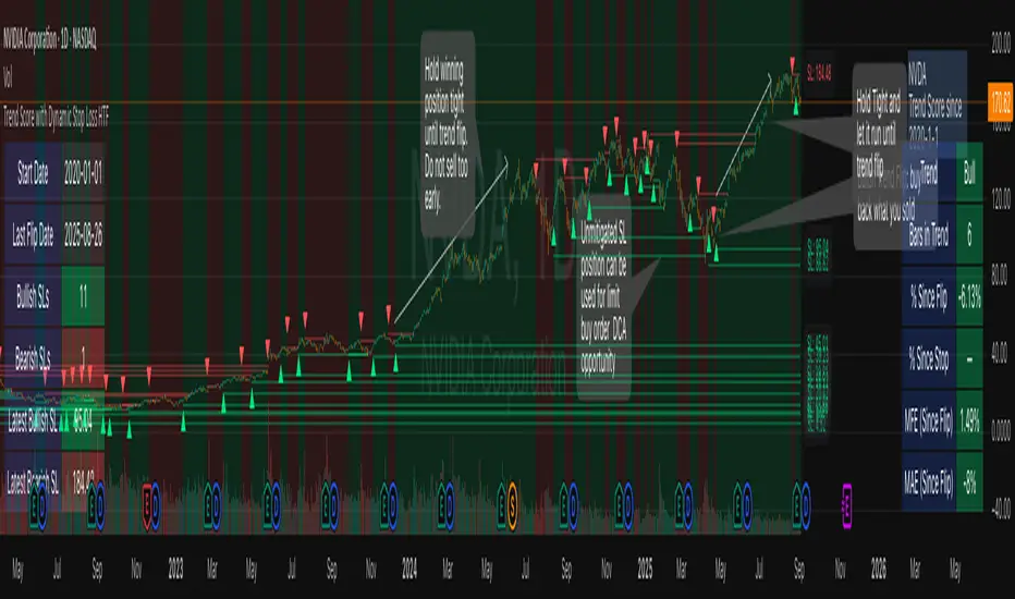
Trend Score with Dynamic Stop Loss HTF
How the Trend Score System Works
This indicator uses a Trend Score (TS) to measure price momentum over time. It tracks whether price is breaking higher or lower, then sums these moves into a cumulative score to define trend direction.
⸻
1. Trend Score (+1 / -1 Mechanism)
On each new bar:
• +1 point: if the current bar breaks the previous bar’s high.
• −1 point: if the current bar breaks the previous bar’s low.
• If both happen in the same bar, they cancel each other out.
• If neither happens, the score does not change.
This creates a simple running measure of bullish vs bearish pressure.
⸻
2. Cumulative Trend Score
The Trend Score is cumulative, meaning each new +1 or -1 is added to the total score, building a continuous count.
• Rising scores = buyers are consistently pushing price to higher highs.
• Falling scores = sellers are consistently pushing price to lower lows.
This smooths out noise and helps identify persistent momentum rather than single-bar spikes.
⸻
3. Trend Flip Trigger (default = 3)
A trend flip occurs when the cumulative Trend Score changes by 3 points (default setting) in the opposite direction of the current trend.
• Bullish Flip:
• Cumulative TS rises 3 points from its most recent low pivot.
• Marks a potential start of a new uptrend.
• A bullish stop-loss (SL) is set at the most recent swing low.
• Bearish Flip:
• Cumulative TS falls 3 points from its most recent high pivot.
• Marks a potential start of a new downtrend.
• A bearish SL is set at the most recent swing high.
Example:
• TS is at -2, then climbs to +1.
• That’s a +3 change, triggering a bullish flip.
⸻
4. Visual Summary
• Green background: Active bullish trend.
• Red background: Active bearish trend.
• ▲ Triangle Up: A bullish flip occurred this bar.
• Stop Loss Line: Shows the structural low used for risk management.
⸻
Why This Matters
The Trend Score measures trend pressure simply and objectively:
• +1 / -1 mechanics track real price behavior (breakouts of highs and lows).
• Cumulative changes of 3 points act like a momentum filter, ignoring small reversals.
• This helps you see true regime shifts on higher timeframes, which is especially useful for swing trades and investing decisions.
⸻
Key Takeaways
• Only flips after meaningful swings: prevents overreacting to single-bar noise.
• SL shows invalidation point: helps you know where a trend thesis fails.
• Works best on Daily or Weekly charts: for smoother, more reliable signals. Using Trend Score for Long-Term Investing
This indicator is designed to support decision-making for higher timeframe investing, such as swing trades, multi-month positions, or even multi-year holds.
It helps you:
• Identify major bullish regimes.
• Decide when to add to winning positions (DCA up).
• Know when to pause buying or consider trimming during weak periods.
• Stay disciplined while holding long-term winners.
Important Note:
These are suggestions for context. Always combine them with your own analysis, portfolio allocation rules, and risk tolerance.
⸻
1. Start With the Higher Timeframe
• Use Weekly charts for a broad investing view.
• Use Daily charts only for fine-tuning entry points or deciding when to add.
• A Bullish Flip on Weekly suggests the market may be entering a major uptrend.
• If Weekly is bullish and Daily also turns bullish, it’s extra confirmation of strength.
⸻
2. Building a Position with DCA
Goal: Grow your position gradually during strong bullish regimes while staying aware of risk.
A. Initial Buy
• Start with a small initial allocation when a Bullish Flip appears on Weekly or Daily.
• This is just a starter position to get exposure while the new trend develops.
B. Adding Through Strength (DCA Up)
• Consider adding during pullbacks, as long as price stays above the active SL line.
• Each add should be smaller or equal to your first buy.
• Spread out adds over time or price levels, instead of going all-in at once.
C. Pause Buying When:
• Price approaches or touches the SL level (trend invalidation).
• A Bearish Flip appears on Weekly or Daily — this signals potential weakness.
• Your total position size reaches your maximum allocation limit for that asset.
⸻
3. Holding Winners
When a position grows in profit:
• Stay in the trend as long as the Weekly regime remains bullish.
• The indicator’s green background acts as a reminder to hold, not panic sell.
• Use the SL bubble to monitor where the trend could potentially break.
• Avoid selling just because of small pullbacks — focus on big-picture trend health.
⸻
4. Taking Partial Profits
While this tool is designed to help hold long-term winners, there may be times to lighten risk:
• After large, rapid moves far above the SL, consider trimming a small portion of your position.
• When MFE (Maximum Favorable Excursion) in the table reaches unusually high levels, it may signal overextension.
• If the Weekly chart turns Neutral or Bearish, you can gradually reduce exposure while waiting for the next Bullish Flip.
⸻
5. Using the Stop Loss Line for Awareness
The Dynamic SL line represents a structural level that, if broken, may suggest the bullish trend is weakening.
How to think about it:
• Above SL: Market remains structurally healthy — continue holding or adding gradually.
• Close to SL: Pause adds. Be cautious and consider tightening your risk.
• Below SL: Treat this as a potential signal to reassess your position, especially if the break is confirmed on Weekly.
The SL is not a hard stop — it’s a visual guide to help you manage expectations.
⸻
6. Example Use Case
Imagine you are investing in a growth stock:
• Weekly Bullish Flip: You open a small starter position.
• Price pulls back slightly but stays above SL: You add a second, smaller tranche.
• Trend continues up for months: You hold and stop adding once your desired allocation is reached.
• Price doubles: You trim 10–20% to lock some profits, but continue holding the majority.
• Price later dips below SL: You slow down, reassess, and decide whether to reduce exposure.
This keeps you:
• Participating in major uptrends.
• Avoiding overcommitment during weak phases.
• Making adjustments gradually, not emotionally.
⸻
7. Suggested Workflow
1. Check Weekly chart → is it Bullish?
2. If yes, review Daily chart to fine-tune entry or adds.
3. Build exposure gradually while Weekly remains bullish.
4. Watch SL bubbles as awareness points for risk management.
5. Use partial trims during big rallies, but avoid exiting entirely too soon.
6. Reassess if Weekly turns Neutral or Bearish.
⸻
Key Takeaways
• Use this as a compass, not a command system.
• Weekly flips = big picture direction.
• Daily flips = timing and precision.
• Add gradually (DCA) while above SL, pause near SL, reassess below SL.
• Hold winners as long as Weekly remains bullish.
RSI Crossover AlertRSI Crossover Alert Indicator - User Guide
The RSI Crossover Alert Indicator is a comprehensive technical analysis tool that detects multiple types of RSI crossovers and generates real-time alerts. It combines traditional RSI analysis with signal lines, divergence detection, and multi-level crossing alerts.
1. Multiple Crossover Detection
- RSI/Signal Line Cross: Signals a primary trend change.
- RSI/Second Signal Cross: Confirmation signals for stronger trends.
- Level Crossings: Crosses of Overbought 70, Oversold 30, and Midline 50.
- Divergence Detection: Hidden and regular divergences for reversal signals.
2. Alert Types
- Alert: RSI > Signal
Description: Bullish momentum is building.
Signal: Consider long positions.
- Alert: RSI < Signal
Description: Bearish momentum is building.
Signal: Consider short positions.
- Alert: RSI > 70
Description: Entering the overbought zone.
Signal: Prepare for a potential reversal.
- Alert: RSI < 30
Description: Entering the oversold zone.
Signal: Watch for a bounce opportunity.
- Alert: RSI crosses 50
Description: A shift in momentum.
Signal: Trend confirmation.
3. Visual Components
- Lines: RSI blue, Signal orange, Second Signal purple
- Histogram: Visualizes momentum by showing the difference between RSI and the Signal line.
- Background Zones: Red overbought, Green oversold
- Markers: Up/down triangles to indicate crossovers.
- Info Table: Real-time RSI values and status.
Strategy 1: Classic Crossover
- Entry Long: RSI crosses above the Signal Line AND RSI is below 50.
- Entry Short: RSI crosses below the Signal Line AND RSI is above 50.
- Take Profit: On the opposite signal.
- Stop Loss: At the recent swing high/low.
Strategy 2: Extreme Zone Reversal
- Entry Long: RSI is below 30 and crosses above the Signal Line.
- Entry Short: RSI is above 70 and crosses below the Signal Line.
- Risk Management: Higher win rate but fewer signals. Use a minimum 2:1 risk-reward ratio.
Strategy 3: Divergence Trading
- Setup: Enable divergence alerts and look for price/RSI divergence. Wait for an RSI crossover for confirmation.
- Entry: Enter on the crossover after the divergence appears. Place the stop loss beyond the starting point of the divergence.
Strategy 4: Multi-Timeframe Confirmation
1. Check the higher timeframe e.g. Daily to identify the main trend.
2. Use the current timeframe e.g. 4H/1H for your entry.
3. Only enter in the direction of the main trend.
4. Use the RSI crossover as the entry trigger.
Optimal Settings by Market
- Forex Major Pairs
RSI Length: 14, Signal Length: 9, Overbought/Oversold: 70/30
- Crypto High Volatility
RSI Length: 10-12, Signal Length: 6-8, Overbought/Oversold: 75/25
- Stocks Trending
RSI Length: 14-21, Signal Length: 9-12, Overbought/Oversold: 70/30
- Commodities
RSI Length: 14, Signal Length: 9, Overbought/Oversold: 80/20
Risk Management Rules
1. Position Sizing: Never risk more than 1-2% on a single trade. Reduce size in ranging markets.
2. Stop Loss Placement: Place stops beyond the recent swing high/low for crossovers. Using an ATR-based stop is also effective.
3. Profit Taking: Take partial profits at a 1:1 risk-reward ratio. Switch to a trailing stop after reaching 2:1.
1. Filtering Signals
- Combine with volume indicators.
- Confirm the trend on a higher timeframe.
- Wait for candlestick pattern confirmation.
2. Avoid Common Mistakes
- Don't trade every single crossover.
- Avoid taking signals against a strong trend.
- Do not ignore risk management.
3. Market Conditions
- Trending Market: Focus on midline 50 crosses.
- Ranging Market: Look for reversals from overbought/oversold levels.
- Volatile Market: Widen the overbought/oversold levels.
- If you get too many false signals:
Increase the signal line period, add other confirmation indicators, or use a higher timeframe.
- If you are missing major moves:
Decrease the RSI length, shorten the signal line period, or check your alert settings.
Recommended Combinations
1. RSI + MACD: For dual momentum confirmation.
2. RSI + Bollinger Bands: For volatility-adjusted signals.
3. RSI + Volume: To confirm the strength of a signal.
4. RSI + Moving Averages: To use as a trend filter.
This indicator provides a comprehensive RSI analysis. Success depends on proper configuration, risk management, and combining signals with the overall market context. Start with the default settings, then optimize based on your trading style and market conditions.
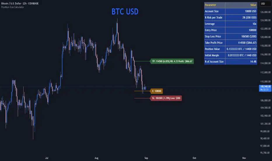
Position Size CalculatorPosition Size Calculator
This open-source Pine Script® indicator helps traders manage risk by calculating position size, margin, and risk/reward based on account size, leverage, entry, stop-loss, and take-profit. It features a customizable table and optional chart lines/labels for clear trade planning across stocks, forex, crypto, and futures.
What It Does
- Position Size: Computes units to trade based on risk percentage and stop-loss distance, capped by leverage.
- Margin: Calculates initial margin in base currency and USD, with account size percentage.
- Risk/Reward: Shows risk-reward ratio, percentage price movements, and USD gains/losses.
- Visualization: Displays results in a table and optional chart lines/labels with customizable styles.
How It Works
- Precision: Adjusts price formatting using syminfo.mintick for accuracy across assets.
- Calculations: Position size = accountSize * (riskPercent / 100) / |entry - stoploss|, capped by accountSize * leverage / entry. Margin = positionSize / leverage. Risk-reward = |takeprofit - entry| / |stoploss - entry|.
- Display: Table shows metrics; optional lines/labels plot entry, stop-loss, and take-profit with percentage and USD details.
How to Use
- Set Inputs:
1- Account Size (USD): Your capital (e.g., 1000).
2- % Risk per Trade: Risk tolerance (e.g., 1%).
3- Leverage: Broker leverage (e.g., 1x, 10x).
4- Entry, Stop Loss, Take Profit: Trade prices.
5- Show Lines and Labels: Enable chart overlays.
- Customize: Adjust table position, colors, and line styles (Solid, Dashed, Dotted).
- View Results: Table shows position size, margin, and risk/reward. Chart lines/labels (if enabled) display prices, percentages, and USD outcomes.
- Apply: Use metrics for trade execution; modify code for custom features.
Notes
- Ensure valid inputs (entry ≠ stop-loss, both positive) to avoid “N/A”.
- Open-source: Inspect or extend the code for your needs.
- Contact the author via TradingView for feedback.
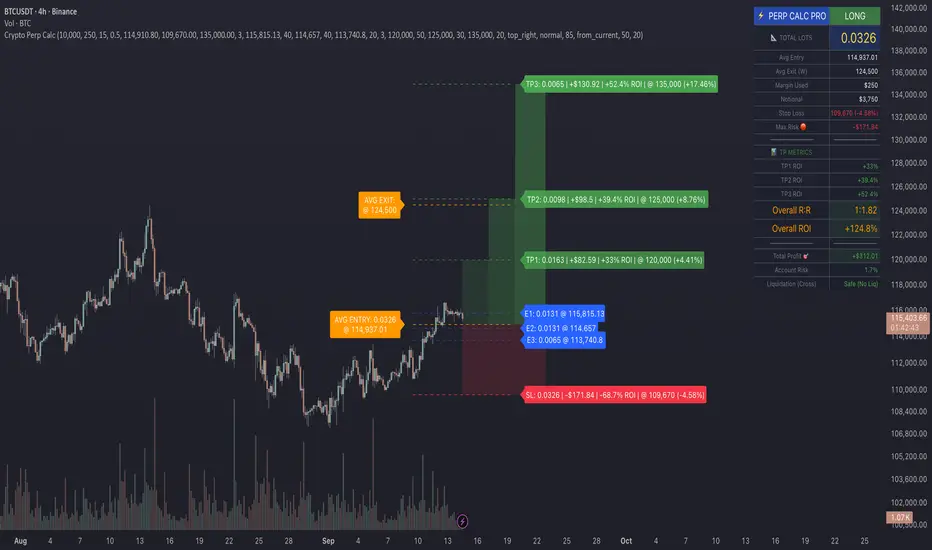
Crypto Perp Calc v1Advanced Perpetual Position Calculator for TradingView
Description
A comprehensive position sizing and risk management tool designed specifically for perpetual futures trading. This indicator eliminates the confusion of calculating leveraged positions by providing real-time position metrics directly on your chart.
Key Features:
Interactive Price Selection: Click directly on chart to set entry, stop loss, and take profit levels
Accurate Lot Size Calculation: Instantly calculates the exact position size needed for your margin and leverage
Multiple Entry Support: DCA into positions with up to 3 entry points with customizable allocation
Multiple Take Profit Levels: Scale out of positions with up to 3 TP targets
Comprehensive Risk Metrics: Shows dollar P&L, account risk percentage, and liquidation price
Visual Risk/Reward: Color-coded boxes and lines display your trade setup clearly
Real-time Info Table: All critical position data in one organized panel
Perfect for traders using perpetual futures who need precise position sizing with leverage.
---------
How to Use
Quick Start (3 Clicks)
1. Add the indicator to your chart
2. Click three times when prompted:
First click: Set your entry price
Second click: Set your stop loss
Third click: Set your take profit
3. Read the TOTAL LOTS value from the info table (highlighted in yellow)
4. Use this lot size in your exchange when placing the trade
Detailed Setup
Step 1: Configure Your Account
Enter your account balance (total USDT in account)
Set your margin amount (how much USDT to risk on this trade)
Choose your leverage (1x to 125x)
Select Long or Short position
Step 2: Set Price Levels
Main levels use interactive clicking (Entry, SL, TP)
For multiple entries or TPs, use the settings panel to manually input prices and percentages
Step 3: Read the Results
The info table shows:
TOTAL LOTS - The position size to enter on your exchange
Margin Used - Your actual capital at risk
Notional - Total position value (margin × leverage)
Max Risk - Dollar amount you'll lose at stop loss
Total Profit - Dollar amount you'll gain at take profit
R:R Ratio - Risk to reward ratio
Account Risk - Percentage of account at risk
Liquidation - Price where position gets liquidated
Step 4: Advanced Features (Optional)
Multiple Entries (DCA):
Enable "Use Multiple Entries"
Set up to 3 entry prices
Allocate percentage for each (must total 100%)
See individual lot sizes for each entry
Multiple Take Profits:
Enable "Use Multiple TPs"
Set up to 3 TP levels
Allocate percentage to close at each level (must total 100%)
View profit at each target
Visual Elements
Blue lines/labels: Entry points
Red lines/labels: Stop loss
Green lines/labels: Take profit targets
Colored boxes: Visual risk (red) and reward (green) zones
Info table: Can be positioned anywhere on screen
Alerts
Set price alerts for:
Entry zones reached
Stop loss approached
Take profit levels hit
Works with TradingView's alert system
Tips for Best Results
Always verify the lot size matches your intended risk
Check the liquidation price stays far from your stop loss
Monitor the account risk percentage (recommended: keep under 2-3%)
Use the warning indicators if risk exceeds margin
For quick trades, use single entry/TP; for complex strategies, use multiple levels
Example Workflow
Find your trade setup using your analysis
Add this indicator and click to set levels
Check risk metrics in the table
Copy the TOTAL LOTS value
Enter this exact position size on your exchange
Set alerts for key levels if desired
This tool bridges the gap between TradingView charting and exchange execution, ensuring your position sizing is always accurate when trading with leverage.
Disclaimer, this was coded with help of AI, double check calculations if they are off.
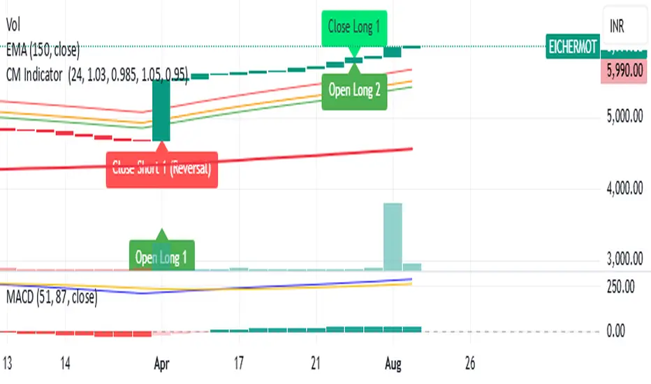
CM Indicator About Indicator:-
1) This is best Indicator for trend identification.
2) This is based on 42 EMA with Upper Band and Lower bands for trend identification.
3) This should be used for Line Bar chart only.
4) Line bar chart should be used at 1 hour for 15 line breaks.
How to Use:-
1) To go with trend is best use of this indicator.
2) This is for stocks and options not for index. Indicator used for Stocks at one hour and options for 10-15 minutes line break.
3) There will be 5% profitability defined for each entry, 3 entries with profit are best posible in same continuous trend 4 and 5th entry is in riskier zone in continuous trend.
4) Loss will only happen if there is trend reversal.
5) Loss could only be one trade of profit out of three profitable trades.
6) Back tested on 200 stocks and 100 options.
Wolfe Wave Auto+ManualWolfe Wave Auto+Manual Indicator
Description
The "Wolfe Wave Auto+Manual" indicator is a powerful tool for identifying and analyzing Wolfe Wave patterns on TradingView charts. It supports both automatic pattern detection based on Gann pivots and manual point configuration for precise pattern construction. This indicator is ideal for traders looking to leverage Wolfe Waves to predict market reversals and set take-profit targets.
The indicator displays the pattern with lines, zones (Sweet Zone), and labels, offering three take-profit calculation methods: ETA (intersection of lines 1-3 and 2-4), Line 1-4 (projection of the 1-4 trendline), and Flat (Point 4 price level). Users can customize visualization and calculations, including support for linear and logarithmic price scales.
Key Features
Auto and Manual Modes: Choose between automatic pattern detection using pivots or manual input of points 1-5.
Flexible Take-Profit Options: Supports three TP methods (ETA, Line 1-4, Flat) with customizable line and label colors.
Logarithmic Scale Support: Accurate calculations for charts with linear or logarithmic price scales.
Customizable Visualization: Enable/disable pattern lines, display the Sweet Zone, and show point labels positioned on the outer edges of the pattern for better readability.
Gann Pivots: Auto mode uses pivot detection for precise identification of key points.
User-Friendly Settings: All parameters include tooltips for easy configuration.
How to Use
Add the Indicator:
Find "Wolfe Wave Auto+Manual" in the TradingView indicator library and add it to your chart.
Select Mode:
Auto: The indicator automatically detects patterns based on pivots. Adjust "Swing Length" and "Pivot Offset" to control sensitivity.
Manual: Specify the time and price for points 1-5 in the settings to build a specific pattern.
Customize Visualization:
Enable/disable pattern lines using "Show Pattern Lines."
Adjust pivot and take-profit colors in their respective setting groups.
Choose Price Scale:
Set "Price Scale" to "Linear" or "Logarithmic" based on your chart type.
Configure Take-Profits:
Enable desired TP methods (ETA, Line 1-4, Flat) and customize their colors.
Use "TP Decimal Precision" to control the precision of displayed prices.
Analyze the Pattern:
Look for entry points near Point 5, using the Sweet Zone as a confirmation area.
Use TP levels to set profit targets.
Recommendations
Timeframes: The indicator works on all timeframes, but Auto mode is recommended for H1 and higher for more reliable pivots.
Instruments: Suitable for stocks, forex, cryptocurrencies, and other assets. Use logarithmic scale for long-term charts with high volatility.
Additional Filters: Combine with RSI, MACD, or support/resistance levels to enhance signal accuracy.
Testing: Experiment with "Swing Length" in Auto mode to optimize pattern detection for your trading style.
Notes
Ensure prices in Manual mode are positive when using logarithmic scale to avoid errors.
Disable "Show Pattern Lines" to focus on labels and TP levels for a cleaner chart.
Verify settings when switching between linear and logarithmic scales.
The "Wolfe Wave Auto+Manual" indicator is a versatile addition to your trading toolkit, helping you identify high-probability reversal patterns and plan trades with clear profit targets. Try it today to elevate your market analysis!
Индикатор "Wolfe Wave Auto+Manual"
Описание
Индикатор "Wolfe Wave Auto+Manual" — мощный инструмент для выявления и анализа паттернов волн Вульфа на графиках TradingView. Этот индикатор поддерживает как автоматическое обнаружение паттернов на основе пивотов Ганна, так и ручную настройку точек для точного построения. Он идеально подходит для трейдеров, которые хотят использовать волны Вульфа для прогнозирования разворотов рынка и определения целей тейк-профита.
Индикатор отображает паттерн с линиями, зонами (Sweet Zone) и метками, а также предлагает три метода расчёта тейк-профита: ETA (пересечение линий 1-3 и 2-4), Line 1-4 (проекция линии 1-4) и Flat (уровень точки 4). Пользователь может гибко настраивать визуализацию и расчёты, включая поддержку линейной и логарифмической шкал цен.
Ключевые особенности
Автоматический и ручной режимы: Выбирайте между автоматическим обнаружением паттернов на основе пивотов или ручным заданием точек 1-5.
Гибкие настройки тейк-профита: Поддержка трёх методов TP (ETA, Line 1-4, Flat) с настраиваемыми цветами линий и меток.
Поддержка логарифмической шкалы: Корректные расчёты для графиков с линейной или логарифмической шкалой цен.
Настраиваемая визуализация: Включайте/отключайте линии паттерна, отображайте Sweet Zone и метки точек, расположенные на внешних углах конструкции для лучшей читаемости.
Пивоты Ганна: В автоматическом режиме используются пивоты для точного определения ключевых точек.
Интуитивные настройки: Все параметры сопровождаются всплывающими подсказками для удобства.
Как использовать
Добавьте индикатор:
Найдите "Wolfe Wave Auto+Manual" в библиотеке индикаторов TradingView и добавьте на график.
Выберите режим:
Auto: Индикатор автоматически определяет паттерны на основе пивотов. Настройте "Swing Length" и "Pivot Offset" для контроля чувствительности.
Manual: Задайте время и цену для точек 1-5 в настройках для построения конкретного паттерна.
Настройте визуализацию:
Включите/отключите линии паттерна через "Show Pattern Lines".
Настройте цвета пивотов и тейк-профитов в соответствующих группах настроек.
Выберите шкалу цен:
Установите "Price Scale" в "Linear" или "Logarithmic" в зависимости от типа графика.
Настройте тейк-профиты:
Включите нужные методы TP (ETA, Line 1-4, Flat) и настройте их цвета.
Используйте "TP Decimal Precision" для контроля точности отображаемых цен.
Анализируйте паттерн:
Ищите точки входа вблизи точки 5, используя Sweet Zone как зону подтверждения.
Ориентируйтесь на уровни TP для фиксации прибыли.
Рекомендации
Таймфреймы: Индикатор работает на любых таймфреймах, но для Auto-режима рекомендуется использовать таймфреймы от H1 и выше для более надёжных пивотов.
Инструменты: Подходит для акций, форекса, криптовалют и других активов. Для долгосрочных графиков с высокой волатильностью используйте логарифмическую шкалу.
Дополнительные фильтры: Комбинируйте с индикаторами RSI, MACD или уровнями поддержки/сопротивления для повышения точности сигналов.
Тестирование: Протестируйте настройки в Auto-режиме с разными значениями "Swing Length" для оптимизации обнаружения паттернов.
Примечания
Убедитесь, что цены в Manual-режиме положительные при использовании логарифмической шкалы, чтобы избежать ошибок.
Для отключения линий паттерна используйте настройку "Show Pattern Lines", чтобы сосредоточиться на метках и уровнях TP.
Регулярно проверяйте настройки при переключении между линейной и логарифмической шкалами.
Этот индикатор станет отличным дополнением к вашей торговой стратегии, помогая выявлять высоковероятные разворотные паттерны и планировать сделки с чёткими целями прибыли. Попробуйте "Wolfe Wave Auto+Manual" и улучшите свой анализ рынка!
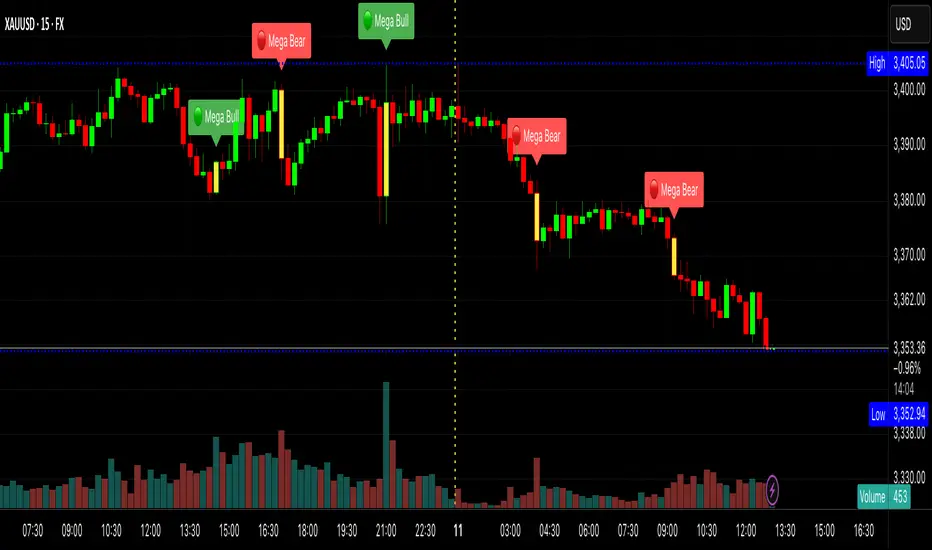
XAUMO MEGABAR Detector]XAUMO MegaBar Detector – Breakout Candle Identification Tool
Purpose:
The XAUMO MegaBar Detector is built to highlight rare, high-impact candles where strong price movement and high trading volume occur together. These moments often reflect aggressive market activity and can be used to confirm potential breakouts or reversals.
How It Works (High-Level Overview)
The tool continuously monitors two primary conditions:
Price Expansion – Identifies large-bodied candles compared to recent averages.
Volume Expansion – Confirms that the move is supported by above-average trading activity.
When both conditions are present, the candle is marked:
🟢 Mega Bull – Strong bullish pressure.
🔴 Mega Bear – Strong bearish pressure.
Key Features
Automatic Timeframe Adjustment – Detection sensitivity changes based on chart timeframe, so results stay relevant from 1-minute scalps to multi-day swing setups.
Clear Visual Output – Significant candles are highlighted directly on the chart for easy recognition.
Optional Labels – Toggle on/off text labels (“Mega Bull” / “Mega Bear”) for a cleaner chart view.
Alert Integration – Set TradingView alerts to be notified immediately when a qualifying candle appears.
Universal Compatibility – Works on Forex, Commodities, Indices, Crypto, Stocks, ETFs, and Futures.
Practical Uses for Traders
As a confirmation tool when price approaches support/resistance or Fibonacci levels.
To filter low-quality setups by focusing only on moments where both price and volume confirm the move.
As part of a trend-following or breakout strategy when combined with other analysis methods.
Using the Indicator
Add the indicator to any chart and select your preferred timeframe.
Watch for highlighted candles – they indicate significant combined momentum and liquidity.
Use as a signal filter or confirmation alongside your existing trading system.
Optional: Set alerts to receive push/email/webhook notifications.
===================================
📌 MEGA BAR TRADING CHEAT SHEET
Spot Big Money. Ride the Move.
===================================
🧠 WHAT’S A MEGA BAR?
A Mega Bar is a candle so big it makes the rest look tiny — and it often means institutions are making a move.
Check the 4 Rules:
✅ Body size ≥ 2x average
✅ High relative volume (vs. last 20 bars)
✅ Closes near high (bull) or low (bear)
✅ Comes after sideways chop or price squeeze
📈 WHY IT MATTERS
Mega Bars = intent, not random spikes.
🟢 Mega Bull near support/Fib pullback → Likely accumulation
🔴 Mega Bear near resistance/Fib extension → Likely distribution or trap
🔧 HOW TO TRADE IT
1. WAIT FOR IT
No Mega Bar → No trade.
Mega Bull (big green) → BUY bias.
Mega Bear (big red) → SELL bias.
2. FIND THE SPOT
Fib levels: 61.8% / 78.6% / 138.2%
Major Support/Resistance
3. CONFIRM ON BIGGER TIMEFRAME
Example: 15M Mega Bar → Check 1H trend direction.
4. SET YOUR LEVELS
Stop-Loss:
Long → Below Mega Bull low (+0.2×ATR)
Short → Above Mega Bear high (+0.2×ATR)
Take-Profit:
Fib extensions: 127.2% / 161.8% / 261.8%
Prior highs/lows
5. RISK SMART
Risk 1–2% max per trade
Aim for 2:1+ R:R
🌍 WORKS ON:
Forex • Commodities • Stocks • Crypto • Indices
THE RETAILER’S FORMULA:
🟢 Big Green → Buy
🔴 Big Red → Sell
🎯 Fibs = Payday
One setup. One signal. Discipline = profit.
ML Compressor Enhanced Trading Indicator# 🤖 ML Enhanced Trading Indicator - Advanced Market Analysis
## 📊 Overview
This is a comprehensive Machine Learning Enhanced Trading Indicator that combines multiple advanced analytical techniques to provide high-probability trading signals. The indicator uses artificial intelligence, pattern recognition, anomaly detection, and traditional technical analysis to identify optimal entry and exit points in the market.
## 🚀 Key Features
### 🧠 **Machine Learning Core**
- **Advanced Pattern Recognition**: Uses cosine similarity, Pearson correlation, and Spearman rank correlation to identify historical patterns
- **AI-Powered Predictions**: Implements multiple correlation methods to forecast price movements
- **Anomaly Detection**: Z-score based detection system for unusual market activities
- **Signal Confidence Scoring**: Reliability assessment for each trading signal
### 📈 **Technical Analysis Integration**
- **Multi-Timeframe RSI Analysis**: 14 and 21-period RSI with oversold/overbought detection
- **MACD Momentum**: Enhanced MACD histogram analysis for trend confirmation
- **Bollinger Bands Position**: Dynamic position tracking within BB channels
- **Volume Analysis**: Spike and dry volume detection with ratio calculations
- **Trend Strength Measurement**: EMA-based trend power analysis
### 🎯 **Perfect Zone Detection**
- **Ideal Buy Zone**: Identifies perfect buying opportunities when 7 conditions align:
- ML Score ≥ 0.60
- Bottom proximity detection
- RSI in 20-35 range
- Volume spike confirmation
- Positive price anomaly
- Bullish pattern match
- Positive MACD momentum
### 📊 **Comprehensive Display Table**
- **Real-time ML Analysis**: Complete breakdown of all indicators
- **Perfect Buy Conditions Tracker**: Visual checklist with completion percentage
- **Performance Metrics**: Win rate tracking and P&L analysis
- **Signal Strength Indicators**: Confidence levels for each signal
## 🔧 **Customizable Parameters**
### **ML Settings**
- **ML Lookback Period**: 20-500 bars (default: 100)
- **Anomaly Threshold**: 1.0-5.0 sensitivity (default: 2.0)
- **Pattern Similarity**: 0.5-0.99 matching threshold (default: 0.80)
- **AI Lookback Period**: 20-200 bars (default: 50)
### **AI Prediction Models**
- **Correlation Methods**: Spearman, Pearson, Cosine Similarity
- **Forecast Length**: 15-250 bars (default: 50)
- **Similarity Type**: Price or %Change analysis
### **Visual Options**
- **Table Position**: Top/Bottom Left/Right positioning
- **Table Size**: Small, Normal, Large options
- **Signal Display**: Toggle buy/sell signals on/off
- **AI Visualization**: Optional prediction paths and ZigZag
## 📋 **How to Use**
### **For Beginners**
1. Add the indicator to your chart
2. Look for "PERFECT BUY" signals in the table
3. Wait for completion percentage ≥ 85% for highest probability trades
4. Use the background color changes as visual confirmation
### **For Advanced Traders**
1. Analyze individual ML components in the detailed table
2. Monitor anomaly detection for unusual market conditions
3. Use pattern confidence levels for trade timing
4. Combine with your existing strategy for confirmation
### **Signal Interpretation**
- **🟢 PERFECT BUY**: All 7 conditions met - highest probability reversal
- **🟡 NEAR BOTTOM**: Close to ideal conditions - monitor closely
- **🔴 NOT READY**: Wait for better setup
- **Strong Buy/Sell Signals**: ML score-based entries with high confidence
## ⚠️ **Important Notes**
### **Risk Management**
- This indicator provides analysis and signals, not guaranteed outcomes
- Always use proper risk management and position sizing
- Consider market conditions and fundamental factors
- Backtest the strategy on your preferred timeframes and assets
### **Best Practices**
- Use multiple timeframe analysis for confirmation
- Combine with support/resistance levels
- Monitor volume confirmation for all signals
- Set appropriate stop-losses and profit targets
### **Performance Tracking**
- The indicator tracks its own performance with win rate calculations
- Monitor the "AI Prediction" accuracy percentage
- Use the P&L tracking to assess signal quality over time
## 🔄 **Updates and Improvements**
This indicator is continuously evolving with:
- Enhanced machine learning algorithms
- Improved pattern recognition capabilities
- Additional correlation methods for better accuracy
- Performance optimization for faster calculations
- New visualization features based on user feedback
## 📚 **Technical Details**
### **Machine Learning Implementation**
- **Pattern Matching**: 20-bar normalized price patterns with historical comparison
- **Correlation Analysis**: Mathematical similarity scoring between current and historical patterns
- **Anomaly Detection**: Statistical Z-score analysis across price, volume, and RSI
- **Signal Weighting**: Multi-factor scoring system with optimized weights
### **Algorithm Components**
1. **Feature Extraction**: Price, volume, momentum, volatility, and trend features
2. **Pattern Recognition**: Historical pattern database with similarity matching
3. **Anomaly Detection**: Multi-dimensional Z-score threshold analysis
4. **Signal Generation**: Weighted scoring system with confidence intervals
5. **Performance Tracking**: Real-time win rate and accuracy monitoring
### **Calculation Methods**
- **Trend Strength**: (EMA8 - EMA21) / EMA21 * 100
- **Volume Ratio**: Current Volume / 20-period SMA Volume
- **BB Position**: (Close - BB_Lower) / (BB_Upper - BB_Lower)
- **Anomaly Score**: Average of normalized Z-scores for price, volume, and RSI
## 🎨 **Visual Elements**
### **Background Colors**
- **Light Green**: Perfect buy zone detected
- **Light Red**: Perfect sell zone detected
- **Light Blue**: Near bottom proximity
- **Green/Red Transparency**: Price anomaly detection
### **Signal Shapes**
- **Green Triangle Up**: Strong buy signal
- **Red Triangle Down**: Strong sell signal
- **Aqua Diamond**: Perfect buy zone entry
- **Purple Diamond**: Perfect sell zone entry
### **Table Information**
- **ML Complete Analysis**: 16 comprehensive metrics
- **Perfect Buy Conditions**: 7-point checklist with status indicators
- **Real-time Values**: Live updating of all calculations
- **Color-coded Status**: Green (good), Yellow (moderate), Red (caution)
## 🔍 **Troubleshooting**
### **Common Issues**
- **Table Not Showing**: Enable "Show ML Table" in settings
- **No Signals Appearing**: Check "Show Buy/Sell Signals" option
- **Performance Issues**: Reduce ML Lookback Period for faster calculation
- **Too Many/Few Signals**: Adjust Anomaly Threshold sensitivity
### **Optimization Tips**
- **For Day Trading**: Use lower timeframes (1m, 5m, 15m) with reduced lookback periods
- **For Swing Trading**: Use higher timeframes (1h, 4h, 1D) with standard settings
- **For Scalping**: Enable only strong signals and reduce pattern similarity threshold
- **For Long-term**: Increase all lookback periods and use daily/weekly timeframes
## 📖 **Disclaimer**
This indicator is for educational and informational purposes only. It should not be considered as financial advice. Trading involves substantial risk of loss and is not suitable for all investors. Past performance does not guarantee future results.
### **Risk Warning**
- All trading involves risk of substantial losses
- Never risk more than you can afford to lose
- This indicator does not guarantee profitable trades
- Always use proper risk management techniques
- Consider consulting with a financial advisor
### **Liability**
The creator of this indicator is not responsible for any losses incurred from its use. Users should thoroughly test and understand the indicator before using it with real money.
### **Feature Requests**
- Suggest improvements through TradingView comments
- Report bugs with detailed descriptions
- Share successful strategies using the indicator
- Contribute to community discussions
## 🏆 **Credits and Acknowledgments**
This indicator builds upon various open-source libraries and mathematical concepts:
- TradingView ZigZag library for visualization
- Statistical correlation methods from academic research
- Machine learning concepts adapted for financial markets
- Community feedback and testing contributions
## 📈 **Performance Metrics**
The indicator includes built-in performance tracking:
- **Win Rate Calculation**: Percentage of profitable signals
- **Signal Accuracy**: ML prediction vs actual price movement
- **Drawdown Tracking**: Current unrealized P&L from last signal
- **Completion Percentage**: How many perfect conditions are met
## 🔬 **Mathematical Foundation**
### **Correlation Calculations**
- **Pearson**: Measures linear correlation between patterns
- **Spearman**: Rank-based correlation for non-linear relationships
- **Cosine Similarity**: Vector-based similarity for pattern matching
### **Statistical Methods**
- **Z-Score**: (Value - Mean) / Standard Deviation
- **Pattern Normalization**: Price / Price
- **Volatility Percentile**: Historical ranking of current volatility
- **Momentum Calculation**: Price change over multiple periods
## 🎯 **Trading Strategies**
### **Conservative Approach**
- Wait for Perfect Buy Zone (85%+ completion)
- Use higher timeframes for confirmation
- Set stop-loss at recent swing low
- Take profits at resistance levels
### **Aggressive Approach**
- Trade on Strong Buy/Sell signals
- Use lower completion thresholds (70%+)
- Tighter stop-losses with faster exits
- Higher position sizes with confirmed trends
### **Hybrid Strategy**
- Combine with other indicators for confirmation
- Use different settings for different market conditions
- Scale in/out based on signal strength
- Adjust parameters based on market volatility

Fundur - Market Sentiment A Fundur - Market Sentiment A: Complete Trading Indicator Guide
Indicator Overview
The Fundur - Market Sentiment A is a revolutionary multi-timeframe sentiment analysis indicator that combines advanced ZigZag pivot detection, wave-based structure analysis, and comprehensive market sentiment evaluation into one powerful trading tool. This indicator is designed to identify high-probability reversal points and trend continuations by analyzing market sentiment across 11 different timeframes simultaneously.
What Makes Market Sentiment A Unique?
Market Sentiment A is a sophisticated ZigZag system that utilizes the Market Sentiment B oscillator to perform advanced on-chart analysis against price action. By introducing Histogram-Correlated ZigZag Analysis - a breakthrough methodology that correlates sentiment histogram waves with actual price pivots to identify validated market extremes. Unlike static pivot indicators, Market Sentiment A provides dynamic analysis that adapts to changing market conditions while maintaining precise accuracy in pivot identification.
Core Methodology
The indicator operates on the principle that market sentiment oscillates in measurable waves that precede price movements. By analyzing sentiment patterns across multiple timeframes and correlating them with histogram wave behavior, traders can identify precise entry and exit points with quantifiable strength ratings and comprehensive wave event analysis.
Key Features
🎯 Revolutionary ZigZag System
Histogram-Correlated Detection : Unique correlation between sentiment waves and price pivots
Dynamic Speed Control : High, Medium, Low sensitivity settings for different market conditions
Validated Extremes : Only confirmed pivots are marked with comprehensive validation system
Real-Time Correlation : Live correlation between histogram turns and price extremes
📊 Multi-Timeframe Sentiment Engine
11 Timeframe Analysis : Simultaneous analysis across periods from 8 to 987 bars
Advanced Sentiment Calculation : Proprietary algorithm combining multiple sentiment factors
Momentum Wave Integration : 34-period momentum waves for trend context
Dynamic Smoothing : Optional smoothing for cleaner signals
🧠 Intelligent Wave Event Tracking
Green Wave Events : Bullish histogram wave analysis with comprehensive event detection
Red Wave Events : Bearish histogram wave analysis with detailed event tracking
Event Deduplication : Advanced system prevents duplicate event detection
10+ Event Types : MPIV, HTURN, TRI, SW, VOL, MDIV, HDIV, PDIV and more
⚖️ Advanced Strength Rating System
0-100 Strength Score : Comprehensive strength calculation for every pivot
Multi-Factor Analysis : Based on wave events, trend context, structure, and sentiment
Real-Time Calculation : Dynamic strength scoring as conditions change
Strength Breakdown : Detailed tooltip showing strength components
🎨 Sophisticated Visual System
Validated Pivot Labels : Clear ✓ markers for confirmed extremes
Structure Analysis : HH/HL/LH/LL structure identification with trend context
Dynamic ZigZag Lines : Connecting validated extremes with trend-based coloring
Bar Coloring Options : Momentum swings and market sentiment bar coloring
Comprehensive Tooltips : Detailed information on hover for every pivot
Setup Guide
Step 1: Adding the Indicator
Open TradingView and navigate to your desired chart
Click the "Indicators" button or press "/" key
Search for "Fundur - Market Sentiment A"
Add the indicator to your chart
Step 2: Core System Configuration
ZigZag System Settings
✅ Enable ZigZag System: ON (Core functionality)
ZigZag Speed : Choose based on your trading style:
High Speed : Most sensitive, fastest detection (2-bar lookback) - Best for scalping
Medium Speed : Balanced approach (3-bar lookback) - Recommended for most traders
Low Speed : Most reliable, slower detection (4-bar lookback) - Best for swing trading
✅ Show ZigZag Lines: ON (Visual connection of validated pivots)
Bar Coloring Settings
⚠️ Momentum Swings: OFF (Avoid visual clutter initially)
✅ Market Sentiment: ON (Primary sentiment-based bar coloring)
Step 3: Label Display Configuration
Essential Labels (Recommended Settings)
✅ Show Validated Pivots (✓): ON (Core validated extremes)
⚠️ Show Potential Turns (●): OFF (Reduces noise - enable once familiar)
⚠️ Show Structure Labels: OFF (Start clean, enable for advanced analysis)
⚠️ Include Trend in Structure Labels: OFF (Advanced feature)
✅ Show Strength Rating (💪): ON (Critical for trade quality assessment)
⚠️ Show Market Sentiment Wave Events: OFF (Advanced feature for later)
Label Visual Customization
Label Coloring : Standard (Highs=Red, Lows=Green)
Label Size : Normal
Label Transparency : 0%
Text Transparency : 0%
Step 4: Alert System Setup
✅ Enable Alerts: ON
⚠️ Alert Potential Bullish Turns: OFF (Disabled by design to prevent noise)
⚠️ Alert Potential Bearish Turns: OFF (Disabled by design to prevent noise)
✅ Alert ONLY on Confirmed Extremes: ON (High-quality signals only)
✅ Include Wave Events in Confirmed Alerts: ON (Comprehensive context)
Basic Trading Guide
Understanding the Dynamic ZigZag System
Market Sentiment A is fundamentally a Dynamic ZigZag System that displays validated highs and lows on your price chart. The indicator uses Market Sentiment B wave calculations internally to determine when sentiment waves finish, but these histograms and oscillators are NOT displayed on your chart .
What You See on Your Chart:
✓ Validated Highs : Red checkmarks marking confirmed resistance levels
✓ Validated Lows : Green checkmarks marking confirmed support levels
ZigZag Lines : Connecting validated extremes to show market structure
💪 Strength Ratings : 0-100 scores indicating signal quality
Structure Labels : HH/HL/LH/LL showing trend context
How Validation Works (Behind the Scenes):
High Validation : Uses Market Sentiment B wave analysis to confirm when a price high represents a true resistance level
Low Validation : Uses Market Sentiment B wave analysis to confirm when a price low represents a true support level
Dynamic Detection : Continuously monitors sentiment waves to validate extremes in real-time
Quality Filtering : Only displays the most significant highs and lows based on wave completion
Key Trading Concept:
Focus entirely on the validated highs and lows displayed on your chart. These represent dynamic support and resistance levels that have been confirmed by underlying sentiment analysis. The histogram and oscillator calculations happen internally - your trading decisions should be based on price action around these validated levels.
Entry Strategies
Primary Strategy: Dynamic Support/Resistance Reversals
Setup : Wait for validated pivot with ✓ marker and strength rating displayed on chart
Entry Timing : Enter on the bar when validation occurs or on pullback to the validated level
Direction : Counter-trend to the validated extreme (buy at validated lows/support, sell at validated highs/resistance)
Confirmation : Look for strength rating above 60 for higher probability setups
Structure Context : Consider overall trend using HH/HL/LH/LL structure labels
Secondary Strategy: ZigZag Trend Continuation
Setup : Identify trend direction using consecutive validated highs and lows
Entry : Enter in trend direction when price pulls back to previous validated level
Confirmation : Look for structure labels confirming trend (HH/HL for uptrend, LH/LL for downtrend)
Strength Filter : Use strength ratings above 70 for trend continuation entries
Stop Loss Methodology
For Long Positions (Validated Lows) : Place stop below the validated low price level
For Short Positions (Validated Highs) : Place stop above the validated high price level
Alternative Method : Use previous validated extreme in opposite direction as stop level
Structure-Based Method : Use significant validated levels that would invalidate the trade setup
Buffer Consideration : Add small buffer beyond validated level to account for wicks and spread
Profit Taking Strategy
For Long Positions (Validated Low Entries):
Target 1 : Previous validated high shown on chart (75% of position)
Target 2 : Next significant validated high or key resistance level (50% of remaining 25% = 12.5% of original position)
Target 3 : Extended targets using ZigZag structure analysis and trend context (remaining 12.5% of original position)
Management : Move stop loss to breakeven once first target (TP1) is executed
For Short Positions (Validated High Entries):
Target 1 : Previous validated low shown on chart (75% of position)
Target 2 : Next significant validated low or key support level (50% of remaining 25% = 12.5% of original position)
Target 3 : Extended targets using ZigZag structure analysis and trend context (remaining 12.5% of original position)
Management : Move stop loss to breakeven once first target (TP1) is executed
ZigZag Structure Trading Approach
Sideways Markets : Trade between validated highs and lows - buy at support, sell at resistance
Trending Markets : Use validated levels as pullback entry points in trend direction
Structure Breaks : Watch for breaks of significant validated levels to signal trend changes
Range Identification : Use consecutive validated highs and lows to identify trading ranges
Breakout Trading : Enter when price breaks beyond validated levels with strong momentum
Strength Rating Interpretation
Understanding the 0-100 Strength Score
The strength rating combines multiple factors:
Base Strength (25 points) : Fundamental pivot validation
Wave Events (12 points each) : Number and quality of wave events detected
Trend Context (5-10 points) : Alignment with overall trend direction
Structure Quality (3-8 points) : HH/HL/LH/LL structure strength
Sentiment Position (5-10 points) : Extreme sentiment readings
Momentum Context (5 points) : Momentum divergence confirmation
Strength Categories
90-100 : Exceptional strength - Highest probability setups
75-89 : Strong signal - High confidence trades
60-74 : Good signal - Solid trading opportunities
45-59 : Moderate signal - Use additional confirmation
30-44 : Weak signal - Proceed with caution
Below 30 : Very weak - Generally avoid
Wave Event Reference (Calculation Background)
Understanding Wave Events in Strength Calculations
Wave events are used internally by Market Sentiment A to calculate strength ratings and validate pivots. While these events may appear in alert messages or tooltips, they are not meant for direct trading decisions - they are calculation components that contribute to the overall strength score.
Key Wave Events (For Reference Only)
MPIV↑/MPIV↓ : Momentum pivot detection used in validation process
HTURN : Histogram turn identification used for wave completion
TRI↑/TRI↓ : Triangle pattern detection contributing to strength calculation
SW : Small wave indication affecting pivot quality assessment
VOL : Volume spike detection adding to strength scoring
MDIV↑/MDIV↓ : Momentum divergence contributing to validation strength
HDIV↑/HDIV↓ : Histogram divergence used in pivot confirmation
PDIV↑/PDIV↓ : Price divergence analysis for strength enhancement
How Wave Events Affect Your Trading
Strength Score Impact : More events generally result in higher strength ratings for validated pivots
Alert Context : Events may be mentioned in alerts to provide background on signal quality
Focus on Results : Instead of analyzing individual events, focus on the final strength rating and validated pivot levels
Trust the System : The indicator processes these events automatically - your job is to trade the validated highs and lows
Analysis Setups
Setup 1: Scalping Configuration (1-5 minute charts)
Core Settings:
ZigZag Speed: High (fastest detection for quick scalps)
Show Validated Pivots: ON
Show Strength Rating: ON
Bar Coloring: Market Sentiment
Visual Settings:
Label Size: Small (reduce visual clutter)
ZigZag Lines: ON
Potential Turns: ON (for immediate signals)
Trading Approach:
Focus on strength ratings above 70 for scalp entries
Quick entries at validated highs/lows with immediate execution
Tight stops just beyond validated levels
Target previous validated pivots shown on chart for quick profits
Use ZigZag structure to identify rapid reversal opportunities
Setup 2: Day Trading Configuration (5-15 minute charts)
Core Settings:
ZigZag Speed: Medium (balanced approach)
Show Validated Pivots: ON
Show Strength Rating: ON
Include Wave Events: ON (for context)
Visual Settings:
Label Size: Normal
Show Structure Labels: ON (for trend context)
ZigZag Lines: ON with trend coloring
Trading Approach:
Wait for strength ratings above 60 for quality setups
Use HH/HL/LH/LL structure labels for trend bias
Combine reversal trades at extremes with trend continuation at pullbacks
Hold positions targeting next validated pivot levels
Use ZigZag structure analysis for entry timing and market context
Setup 3: Swing Trading Configuration (1-4 hour charts)
Core Settings:
ZigZag Speed: Low (most reliable signals)
Show Validated Pivots: ON
Show Structure Labels: ON
Include Trend Analysis: ON
Visual Settings:
Label Size: Normal
Show all wave events for comprehensive analysis
Enable all alert types
Trading Approach:
Focus on strength ratings above 75 for swing positions
Emphasize trend continuation using ZigZag structure
Use validated level breaks for major position adjustments
Hold positions across multiple sessions targeting distant validated levels
Use comprehensive structure analysis (HH/HL/LH/LL) for entries/exits
Setup 4: Position Trading Configuration (4H-Daily charts)
Core Settings:
ZigZag Speed: Low (maximum reliability)
Show Validated Pivots: ON
Show Structure Labels: ON
Show all analysis features
Visual Settings:
Clean, comprehensive labeling
Full wave event display
Trend-based coloring for major bias
Trading Approach:
Only trade strength ratings above 80 for position entries
Focus on major ZigZag structure changes and validated level breaks
Use long-term structure analysis (HH/HL/LH/LL) for bias
Hold positions for weeks to months targeting major validated levels
Align with fundamental analysis and major market structure
Setup 5: Multi-Asset Analysis Configuration
For Forex Pairs:
Use Medium to Low speed settings
Focus on major session changes
Pay attention to news event correlation
Use strength ratings above 70
For Crypto Assets:
Medium speed for 24/7 market adaptation
Higher volatility requires strength above 75
Monitor weekend behavior patterns
Consider market sentiment cycles
For Stock Markets:
Align with market hours
Consider earnings and economic events
Use sector-specific analysis
Respect market close/open dynamics
Visual Components
Core Visual Elements
✓ Validated Pivots : Green checkmarks for confirmed lows, red for confirmed highs
● Potential Turns : Small dots showing histogram turn correlations (optional)
ZigZag Lines : Connecting validated extremes with trend-based coloring
💪 Strength Ratings : Numerical strength scores from 0-100
Structure Labels : HH/HL/LH/LL with trend context (optional)
Bar Coloring System
Market Sentiment Coloring : Based on sentiment oscillator position and momentum
Extreme Conditions : Special coloring for extreme overbought/oversold conditions
Momentum Swing Coloring : Alternative coloring based on momentum analysis
Advanced Visual Features
Wave Event Labels : Comprehensive event display within pivot labels
Trend Context : Dynamic trend identification and display
Strength Breakdown : Detailed tooltips showing strength components
Custom Coloring Modes : Standard vs trend-based coloring options
Alert System
Core Alert Types
Validated High Confirmed : When red wave validates ultimate high with full context
Validated Low Confirmed : When green wave validates ultimate low with full context
Trend Change Detected : When structure analysis detects trend shifts
Alert Message Structure
Each alert includes:
Timeframe identification
Signal type (BULLISH/BEARISH)
Structure context (HH/HL/LH/LL)
Strength score with 💪 rating
Exact price level
Wave events context (if enabled)
Setting Up Alerts
Enable desired alert types in indicator settings
Focus on "Confirmed Extremes" alerts for quality
Enable wave events for comprehensive context
Test alerts on historical data first
Set up multiple notification methods
Risk Management Framework
Strength-Based Position Sizing
Strength 90-100 : Maximum position size (3-5% risk)
Strength 75-89 : Large position size (2-3% risk)
Strength 60-74 : Standard position size (1-2% risk)
Strength 45-59 : Small position size (0.5-1% risk)
Below 45 : Avoid or minimal size (0.25% risk maximum)
Stop Loss Guidelines
Primary Method : Always use validated pivot levels for stops
Buffer Method : Add small buffer beyond validation level
Multiple Timeframe : Consider higher timeframe validated levels
Wave Event Context : Adjust stops based on event confluence
Risk-Reward Optimization
Minimum R:R : 1.5:1 for all trades
Preferred R:R : 2:1 or better for strength above 70
Exceptional Setups : 3:1+ for strength above 85
Position Management : Take 75% at TP1, 50% of remaining at TP2, close remaining at TP3
Stop Management : Move stop to breakeven after TP1 execution
Best Practices
Signal Quality Assessment
Always wait for validated pivots with ✓ checkmarks displayed on chart
Prioritize strength ratings above 60 for trade quality
Focus on the validated high/low levels rather than underlying calculations
Consider HH/HL/LH/LL structure labels for directional bias
Use ZigZag line connections to understand market structure flow
Entry Timing Optimization
Enter on validation bar or immediate pullback to validated level
Use lower timeframes for precise entry refinement around validated levels
Wait for strength score calculation completion before entry
Monitor price action around validated highs and lows
Consider multiple timeframe validated level alignment
Exit Strategy Management
Use opposite validated pivots displayed on chart as primary targets
Execute Fundur 3-stage exit: 75% at TP1, 12.5% at TP2, 12.5% at TP3
Move stop loss to breakeven immediately after TP1 execution
Monitor strength ratings of new validated levels that could reverse remaining position
Watch for structure changes (trend breaks) via HH/HL/LH/LL labels for early exit consideration
Common Mistakes to Avoid
Signal Interpretation Errors
Don't trade potential turns without ✓ validation markers
Never ignore strength ratings below 45 - they indicate weak signals
Don't chase signals after significant movement away from validated levels
Avoid overriding clear ZigZag structure and trend context
Don't ignore the relationship between consecutive validated highs and lows
Risk Management Failures
Never risk more than the strength score suggests for position sizing
Don't move stops against validated levels - they represent key structure
Avoid oversizing on "sure thing" setups - even high-strength signals can fail
Don't ignore multiple timeframe validated level context
Never trade without clear invalidation levels (validated highs/lows for stops)
System Usage Mistakes
Don't enable all features immediately - start simple
Avoid changing speed settings mid-session
Don't ignore alert system capabilities
Never disable core validation features
Don't overlook customization for your chart setup
Advanced Techniques
Multi-Timeframe ZigZag Analysis
Use higher timeframe validated levels for major bias and targets
Align lower timeframe entries with higher timeframe validated structure
Look for validated level confluence across timeframes
Monitor strength rating consistency of validated levels across periods
Advanced Structure Pattern Recognition
Identify recurring validated level patterns and their outcomes
Recognize high-probability ZigZag structure sequences
Use historical validated level patterns for target projection
Combine ZigZag analysis with other Fundur technical analysis tools
Advanced Alert Utilization
Create custom alert combinations based on strength thresholds
Use validated level break alerts for position management
Combine strength rating filters with validated pivot alerts
Develop systematic responses to different validated level types
Conclusion
The Fundur - Market Sentiment A indicator represents a breakthrough in technical analysis, providing a dynamic ZigZag system that displays validated highs and lows with unprecedented accuracy. By following the methodologies outlined in this guide and adapting the settings to your trading style, you can harness the full power of this sophisticated system for more precise and profitable trading decisions.
The key to success with Market Sentiment A lies in understanding that it is fundamentally a dynamic support and resistance system. Focus on the validated highs and lows displayed on your chart, use the strength ratings to assess signal quality, and leverage the structure analysis for trend context. Start with conservative settings, focus on high-strength signals, and gradually incorporate advanced features as you become familiar with the system's behavior across different market conditions.
Remember that this indicator provides the tools for identification and analysis - successful trading still requires proper risk management, psychological discipline, and continuous learning. Use the strength rating system as your primary guide, respect the validated pivot methodology, and always prioritize capital preservation over profit maximization.
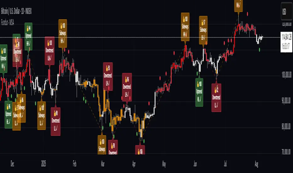
Option CalculatorOption Calculator – Comprehensive Feature Guide
The aiTrendview Option Calculator is a feature-rich options trading dashboard built using Pine Script, designed for real-time market interpretation and strategy selection. It integrates Black-Scholes-based pricing models with dynamic market inputs to help traders evaluate directional bias, volatility, risk, and potential profitability in a structured, intuitive format. The tool supports both beginner and experienced options traders in making data-driven decisions.
Core Inputs and Pricing Foundations
Users can input the strike price, days to expiration, implied volatility (IV), interest rate, and option type (call or put). These values feed directly into calculations for the option's theoretical price, Greeks, and expected move. For example:
• Strike Price helps define moneyness, impacting delta and risk/reward balance.
• Days to Expiry determines the speed of time decay (theta).
• Risk-Free Rate adjusts for time value and interest rate impact (rho).
• Implied Volatility affects premium pricing and vega exposure.
• Option Type sets the directional foundation for strategy analysis.
Live Market Data Integration
The script pulls current underlying price, price change, and volume comparison against a moving average (e.g., current volume vs. 20-day average). This helps identify unusual trading activity or volume spikes. Volatility readings are also incorporated using ATR or external volatility indexes to enhance the realism of IV assessments.
Greek Calculations
The dashboard provides visual and numerical values for all five major Greeks:
• Delta shows directional sensitivity and is plotted with a visual bar.
• Gamma represents the rate of delta change, especially critical near-the-money.
• Theta measures time decay and is most impactful in the final weeks before expiration.
• Vega tracks sensitivity to volatility shifts, crucial for premium-selling strategies.
• Rho reflects sensitivity to interest rates, primarily relevant in long-dated options.
Each Greek is calculated based on real-time inputs, providing a statistical framework for assessing risk and return.
Market Sentiment & Risk Environment
A sentiment scoring system interprets the put-call ratio (PCR), volume trends, and price momentum (e.g., RSI). IV levels are color-coded (e.g., low, medium, high) to identify whether options are relatively cheap or expensive. These values support better timing decisions and help identify whether to be a buyer or seller of premium.
Strategy Recommendation Engine
The script dynamically evaluates six core strategies based on current data:
1. Long Call
2. Short Put
3. Long Put
4. Bull Call Spread
5. Long Straddle
6. Iron Butterfly
Each strategy is assigned a confidence score (0–100%) and updated in real-time. This system is designed to match the appropriate strategy to market conditions such as trend, volatility, and time to expiration.
Risk-Adjusted Trading Insights
The dashboard helps traders evaluate whether to initiate trades, reduce exposure, or wait:
• High Confidence (80%+): Favorable environment; standard sizing recommended.
• Moderate Confidence (60–80%): Trade with caution and reduced risk.
• Low Confidence (<60%): Consider avoiding the trade or waiting for better setup.
It also supports risk mitigation through defined-risk strategies and provides guidance on stop-loss, profit targets, and time-based exits (e.g., managing options with <21 days to expiry).
Real-Time Monitoring
The script continuously tracks:
• Changes in Greeks as price, volatility, or time evolve.
• Profit probability estimates using expected move and breakeven pricing.
• Volume activity and IV rank to spot institutional behavior.
This empowers traders to manage trades proactively, adjust exposure, or lock in profits based on changing market conditions.
Practical Use Case Flow
Step 1: Input Setup
Enter option-specific parameters (strike, expiry days, IV, etc.) and let the dashboard auto-calculate risk metrics.
Step 2: Analyze Market
Use sentiment analysis, IV level, and volume data to understand the environment.
Step 3: Select Strategy
Rely on the confidence score and recommendation engine to choose a suitable options strategy.
Step 4: Manage Risk
Apply size rules based on signal strength, adjust based on exposure, and set alerts if needed.
Step 5: Monitor Outcomes
Track Greeks, probability, and progress metrics to stay informed throughout the trade.
Trading Environment Adaptation
• Low IV: Favor long premium strategies (e.g., long straddles, long calls).
• High IV: Favor premium selling strategies (e.g., iron condors, credit spreads).
• Bullish Markets: Focus on call-based trades or bullish spreads.
• Sideways Markets: Use neutral setups like iron butterflies or calendar spreads.
Position sizing and stop-loss logic are aligned with industry practices (e.g., risk no more than 2% per trade, take profit at 50%, and cut losses at double the premium received).
Dashboard Interpretation Guide
• Green: High confidence strategy, favourable IV, and strong volume confirmation.
• Yellow: Mixed signals or moderate conviction – proceed with caution.
• Red: Low confidence, poor conditions – better to wait for clearer opportunities.
Disclaimer from aiTrendview
This script is intended for educational and informational use only. It does not offer financial advice or trading signals, nor does it guarantee results. aiTrendview and its affiliates are not responsible for any financial loss or decision made using this tool. Options trading involves substantial risk and is not suitable for all investors. Past performance of any strategy or metric does not guarantee future results. Users are encouraged to consult with a certified financial advisor and conduct independent research before making trading decisions.

TZtraderTZtrader
This is a TrendZones version with features to set stoploss and targets in short and long positions meant for use in intraday charts. It aims to provide signals for opening and closing long and short positions. In the comments under the TrendZones publication several people expressed a need for features for a short position similar to those for a long position as implemented in TrendZones, some want to use it for scalping, some asked for alerts. When I proposed to create a version for day trading with target lines based on ATR, several people liked the idea.
Full disclosure: I don’t do day trading, because, after I lost a lot of money, I had to promise my wife to stay away from it. I restrict myself to long term investing in stocks which are in uptrend. However I understand what a day trader needs. I gather from my experience that day trading or scalping is an attempt to earn something by opening a position in the morning and close, reopen and close it again during the day with a profit. It is usually done with leveraged instruments like CFD’s, futures, options, and what have you. Opening and closing positions is done within minutes, so the trader needs a quick and efficient way to set proper stoploss and target. TZtrader supports this by showing only three or four numbers on the price bar: The price of the instrument, The logical stop level (gray or green or maroon dots), and the target level (navy). All other numbers are suppressed to prevent mistakes. Also a clear feedback for current settings at the top-center of the pane and an alert feedback at bottom that flashes alerts during the development of the current bar and gives suppression status.
The script
First I made a bare bones version of TrendZones to which I added code for long and short trading setups and a bare setup for no position. The code for the logical stops in long setup had to be reviewed, after which this became the basis for stops in short setup.
Then I added code for 10 alert messages, which was a hassle, because this is the first time I coded alerts and the first time I used an array as a stack to avoid a complicated if-then construction. During testing the array caused a runtime error which I solved by adding ‘array.clear’ to the code, also I discovered that in TradingView separate alerts have to be created for all three setups - short, long and bare. Flipping setups is done in the inputs with a dropdown menu because Pine Script has no function for a clickable button.
One visual with three setups.
The visual has the TrendZones structure: Three near parallel very smooth curves, which border the moderate uptrend (green) and downtrend (orange) zone over and under the curve in the middle, the COG (Center Of Gravity). Where the price breaks out of these curves, strong trend zones show up over and under the curves, respectively strong uptrend (blue) and strong downtrend (red).
Three setups were made clearly different to avoid confusion and to provide oversight in case of multiple trades going on simultaneously which I imagine are monitored in one screen. You have to see which one is long, which short and which have no position. The long setup should not trigger short signals, nor should the short trigger long signals nor the bare setup exclusive long or short signals.
The Long setup is default, shown on the example chart. In this setup the Stoploss suggestions (green, gray and maroon dots) are under the price bars and the target line (navy) at a set distance above the High Border. A zone with a width of 1 ATR is drawn under the Low Border. In this setup 5 specific alerts are provided
The Short setup has the Stoploss suggestions over the price bars, the target line at a set distance under the Low Border. A zone with a width of 1 ATR is drawn above the High Border. This setup also has 5 specific alerts.
The Bare setup has no Stoploss suggestions, no target line and supports 4 alerts, 2 in common with the Long setup and 2 with Short.
The table below gives a summary of scripted alerts:
Setup = Where = When = Purpose
Long, Bare = Green Zone = Bars come from lower zones = Uptrend starts
Long, Bare = Green Zone = Sideways ends in uptrend = Uptrend resumes
Long = COG = First crossing = Uptrend might end warning
Long = Orange Zone = Bars come from higher zones = Uptrend ended take care
Long = Red Zone = Bars come from higher zones = Strong downtrend->close Long
Short, Bare = Orange Zone = Bars come from higher zones = Downtrend starts
Short, Bare = Orange Zone = Sideways ends in downtrend = Downtrend resumes
Short = COG = First crossing = Downtrend might end warning
Short = Green Zone = Bars come from lower zones = Downtrend ended take care
Short = Blue Zone = Bars come from lower zones = Strong uptrend -> close short
You can use script alerts in TradingView by clicking the clock in the sidebar, then ‘create alert’ or plus, as condition you choose ‘Tztrader’ in the dialog box, then the “Any alert() function call” option (the first item in the list). The script lets the valid alert trigger by TradingView after the bar is completed, this can differ from the flashed messages during its formation.
When you create alerts in Tradingview, I advice to do that for each setup, then to make only the alert active which matches the current setup, pause the other ones.
Suppressing false and annoying signals
The script has two ways to suppress such signals, which have to do with the numbers in the alert feedback. The numbers left and right of the message with a colored background, depict the zones in which the previous (left) and current (right) bar move. 1 is the strong downtrend zone (red), 2 the moderate downtrend zone (orange), 3 the sideways zones (gray), 4 the COG (gray), 5 the moderate uptrend zone (green), 6 the strong uptrend zone (blue), 7 something went wrong with assigning a zone (black). In extensive testing the number 7 never occurs, because I catch that error in the code. The idea is that an alert is only triggered if the previous bar was in a different zone. When the bars are in the same zone, no alert is possible. This way all annoying signals are suppressed and long, short and bare get the appropriate alerts.
The third number is a counter. It counts how often the COG is crossed without touching the outer curves. The counter will reset to zero when the upper or lower curve is touched. When the count is 1 you have zone situation 4 and appropriate alerts are flashed. When the count is 2 or higher, a sideways situation (3) is called and while the recrossings are going on, no alerts can be flashed. This suppresses false signals. The ATR zone and curves are brownish-gray where sideways happens(ed). When the channel is narrowed down to just the three curves, some false signals still might occur.
Inputs
“Setup”, default is long, drop down menu provides long, short and bare.
“Target ATR”, default is 2, sets the amount of ATR for the target line. In 1 minute charts 4 seems an appropriate setting, you have to learn by experience which setting works.
“show feedback …” default is on, This creates two feedback labels, a Setup feedback on top of the pane, which shows charted instrument, Setup type, Trend and timeframe of the chart. Background color of Trend feedback is green when it matches the setup, red when mismatches and gray when no match. The alert feedback at the bottom of the pane shows a number, a message and two numbers. The numbers will be explained in the chapter about false and annoying signals below. During formation of the bar, valid alerts are flashed with a blue background, otherwise the message ‘alerts for current bar suppressed’.
Logical Stops
The curves are the logical place to put stops, because, as these are averages of the high and low border of a Donchian channel, they signify the ‘natural’ current highest, lowest and main level in the lookback period that fit the monitored trend setup. A downtrend turns into an uptrend when a breakout of the upper curve occurs. If you are short, that is where you want to close position, so the logical place for the stoploss is the upper curve. Vice versa, when you are long, the logical stop is on the lower curve. The stops show up as green or gray dots on the curves, the green dots signify a nice entry level, the gray stops are there to suggest levels where unrealized profits might be secured, the maroon dots indicate that the trend mismatches the setup.
COG versus other lines
Any line used to identify a trend, be it some MA or some other line, is interpreted the same way: When the bars move above the line there is an uptrend and when below, a downtrend. COG is not different in that sense. If you put such a line in the same chart as TZtrader, you can see situations in which the other line shows uptrend or downtrend earlier than COG, also some other lines, e.g. Hull MA, are very good at showing tops and bottoms, while COG ignores these. On the other hand the other lines are usually a little nervous and let you shake out of position too soon. Just like the other lines, COG gives false signals when it is near horizontal. The advantage of the placement COG is the tolerance for pull backs. This way TZtrader keeps you longer in the trend. Such pull backs are often ‘flags’ which are interpreted in TA as confirming the trend. Tztrader aims to get you in position reasonably soon when a trend begins and out of position as soon as the trend turns against you. The placement of COG is done with a fundamentally different algorithm than other lines as it is not an average of prices, but the middle of two averages of borders of a Donchian channel. This gives the two zones between the curves the same quality as the two zones above and below the middle line of a standard Donchian Channel.
A multi timeframe application.
In this scenario you put a 5 minutes and 1 minute chart with Tztrader side by side. If the 5 minutes shows uptrend, set the 1 minute on long trading and open positions when the trend matches uptrend en close when it mismatches. Don’t open short positions. Once the 5 minute changes to downtrend, set Tztrader in the 1 minute to short trading and open positions when the trend matches downtrend and close when it mismatches.
The idea is that in a long ‘context’, provided by the 5 minutes, the uptrends in the 1 minute will last longer and go further, vice versa for the short ‘context’. This way you do swing trading in the 5 minute in a smart way, maximizing profits.
You can do this with any timeframe pairs with a proportion of around 5:1, 4:1, 6:1, like e.g. 60 minutes and 15 minutes or weeks and days (5 trading days in a week).
Dear day-traders, may this tool be helpful and may your days be blessed.
Take care

Breakout Range Signal with Quality Analysis [Dova Lazarus]📌 Breakout Range Signal with Quality Analysis
🎓 Training-focused indicator for breakout logic, SL & TP behavior and signal quality assessment
🔷 PURPOSE
This tool identifies breakout candles from a calculated channel range and visually simulates entries, stop losses, and take profits, providing live and historical performance metrics.
⚙️ MAIN SETTINGS
1️⃣ Channel Setup
channel_length = 10 → how many candles are averaged to form channel boundaries
channel_multiplier = 0.0 → adds expansion above/below the base channel
channel_smoothing_type = SMA → smoothing method for high/low averaging
📊 The channel consists of two moving averages: one from highs, the other from lows. When expanded (via multiplier), it creates a buffer range for breakout validation.
2️⃣ Signal Detection
Body > Channel % = 50 → a breakout candle's body must exceed 150% of the channel width
Signal Mode:
• Weak → every valid breakout candle is highlighted
• Strong → only the first signal in a sequence is shown (helps reduce noise)
🟦 Bullish signals (blue):
• Candle opens inside the channel
• Closes above the channel
• Body is large enough
• Optional: confirms with trend (if enabled)
🟨 Bearish signals (yellow):
• Candle opens inside the channel
• Closes below the channel
• Body is large enough
• Optional: confirms with trend
3️⃣ Trend Filter (optional)
Enabled via checkbox
Uses a higher timeframe MA to filter signals
Bullish signals are allowed only if price is below the trend MA
Bearish signals only if price is above it
⏱️ trend_timeframe = 1D (typically set higher than the chart's timeframe)
🟢 Trend line is plotted if enabled
🎯 ENTRY, STOP LOSS & TAKE PROFIT LOGIC
SL and TP are based on channel width, not fixed pip/tick size:
📍 Entry Price = close of the breakout candle
🛑 Stop Loss:
• Bullish → below the lower channel border (minus offset)
• Bearish → above the upper channel border (plus offset)
🎯 Take Profit:
• Bullish → entry + channel width × profit multiplier
• Bearish → entry − channel width × profit multiplier
You can control:
Profit Target Multiplier (e.g., 1.0 → TP = 1×channel width)
Stop Loss Target Multiplier (e.g., 0.5 → SL = 0.5×channel width)
Signals to Show = how many historical SL/TP setups to display
📈 Lines and labels ("TP", "SL") are drawn on the chart for clarity.
🧪 QUALITY ANALYSIS MODULE
If enabled, the indicator will:
Track each new signal (entry, SL, TP)
Analyze outcomes:
• Win = TP hit before SL
• Loss = SL hit before TP
• Expired = signal unresolved after N bars
Display statistics in a table (top-right corner):
📋 Table fields:
✅ Overall win rate
📈 Bullish win rate
📉 Bearish win rate
🔢 Total signals
🕓 Pending (still active trades)
Maximum bars to wait for outcome is customizable (max_bars_to_analyze).
📐 VISUALIZATION TOOLS
TP / SL lines per signal
Labels “TP” and “SL”
Optional channel lines and trendline for better context
Colored bars for valid signals (blue/yellow)
📌 BEST USE CASES
Understand how breakout signals are formed
Learn SL/TP logic based on dynamic range
Test how volatility affects trade outcomes
Use as a visual simulation of trade behavior over time

BookYourTradeHappy trade,
This is a semi-automated tool that allows you to define a trade setup in advance, including multiple exit levels. It incorporates a proven method for managing risk and reward. You specify a fixed entry price, an initial stop loss, two take profit levels, and a trailing stop loss for the remaining position—aiming to maximize gains from the trend. Alerts are included so you can step away from the screen and still be notified when any predefined price level is reached. The tool sends trade orders as market orders to your exchange or broker via webhooks. You provide the general webhook format, and the script automatically fills in the correct values.
How to Use
This tool is intended for manual day traders.
Define Entry Conditions:
Set your planned entry price and, optionally, a start and end time for trade activation. The script will not run unless the price reaches your specified level during this time window.
Set Stop Loss:
Define the stop loss as a fixed number of points from the entry price (above or below). This also determines whether the trade is long or short.
Configure Take Profits:
Specify the risk-reward ratio and position size for Take Profit 1.
Do the same for Take Profit 2.
Trailing Stop Loss:
For the remaining position after Take Profit 2, set a trailing stop loss. This is also defined in points, relative to the previous bar's closing price.
Time and Session Filters:
Set the earliest date to begin trading and the latest date by which all positions should be closed.
Optionally, define specific time windows (daily and or weekly) during which trading should be disabled. These off-times will be visually grayed out.
Define Capital and Fees:
Input the dollar amount you want to invest, along with any applicable percentage-based fees or fixed fees per trade. This is useful since different brokers, exchanges, or webhook service providers may charge in different ways (fixed, percentage, or both).
Configure Webhooks:
Enter your broker- or exchange-specific webhook for each trade event: entry, Take Profit 1, Take Profit 2, Stop Loss, and trailing exit. You’ll need to include placeholder strings in the webhook that the script will replace with actual trade values. The script provides a helper table to display these placeholders directly on the chart.
Some values you can deliver to the webhook service provider as an $ value or a deviation in percentage. For example the quantity of a trade or the take profit price. choose the correct replacement accordingly.
The script sends all orders as market orders.
Multiple Instances:
If you want to run multiple instances of this script, you must assign a unique name to each one. This ensures that the webhook service provider can correctly route trade signals to the appropriate bot.
Here is an evolution of one trade in images:
The trade setting are defined but the trade has not started
The trade has started
The price reached the first take profit level and a part of the investment was liquidated.
The trade reached it's end date and the remaining investment was liquidated.
cheers

BullTrading Easy Tops & BottomsTRADING TOOL OVERVIEW
The Easy Tops & Bottoms indicator identifies potential reversal points on intraday charts by analysing volatility patterns and momentum shifts during major trading sessions. It projects horizontal zones that may act as support or resistance, adapting dynamically to price behavior.
This indicator is designed for use on intraday timeframes from 1-minute to 15-minute charts only.
HOW THE INDICATOR WORKS
The indicator uses an adaptive algorithm to evaluate momentum exhaustion and volatility clusters within intraday sessions (aligned with New York local time). It generates time based zones when conditions indicate potential trend reversals, such as after volatility spikes followed by contraction. These zones extend horizontally until price breaks boundaries or a bar limit is reached.
- Support Zones : Formed during bullish sessions with tail volatility, suggesting potential bottoms.
- Resistance Zones : Formed during bearish sessions with wick volatility, suggesting potential tops.
Zones are filtered for significant sessions to focus on meaningful price action. Signals trigger based on price interaction with the zone, requiring a specific relationship between the candle's low, high, and close relative to the zone level—for example, engulfing the level but closing in the reversal direction.
Note that signals and zone behaviors will differ across timeframes (e.g., 1m, 5m, 15m) due to varying candle sizes affecting how closes relate to zone triggers. Shorter timeframes may show more frequent but noisier interactions, while longer ones capture broader momentum shifts.
USERS GUIDE
What the Indicator Does?
The indicator has two operating modes: Buy/Sell Signal Mode (suitable for beginners and trend-following traders—important note: trend-following traders must filter according to their own trend criteria) and Support/Resistance Mode, which is a full and complete trading system.
- Plots Dynamic Zones: Horizontal boxes appear at qualifying session ends, representing support (bottoms) or resistance (tops).
- Active zones use a semi-transparent colour (customisable) and extend rightward while valid.
- Expired zones (after break or timeout) shift to a historical colour for reference.
- Generates Signals (in Buy/Sell Signal Mode): Labels appear on zone interactions confirming reversal potential:
- "BUY" (green) for support zones.
- "SELL" (red) for resistance zones.
- Time Based Focus: Ties to intraday periods like Asian, London, and New York transitions. Use NY Local Time in your charts.
- Additional Elements: Includes a watermark with symbol, timeframe, and date; an optional NotePad table for notes.
How to Interpret Signals
- Zone Dynamics: Active zones indicate ongoing validity; expiration signals a potential shift (e.g., a support break may turn it into resistance).
- Signal Triggers: Require price to test the zone level with a closing bias toward reversal. These are suitable for beginners learning basic reversals or trend traders adding their own filters (e.g., moving averages for direction).
- Value for Users: Beginners can use zone height to set stop-loss (SL) below/above the box, enabling a 1:2 risk-reward ratio (RR) for take-profit (TP) at twice the zone distance.
- Timeframe Variations: Expect different signals on 1m vs. 15m, as smaller candles on lower frames may trigger more selectively based on close positions relative to zones.
- Note on Entries in Internal Range Zones: For all entries (the Internal Range inside range zones), when a big zone swallows smaller zones ahead, consider using the bigger zone or the SL price level as an entry level.
PRACTICAL TRADING SCENARIOS
Here, we expand on how to apply the indicator in real-world trading, with detailed examples for each mode. These scenarios assume a basic understanding of risk management, such as position sizing at 0.5-1.5% of account capital per trade. Always backtest these ideas on historical data for your specific instrument (e.g., forex pairs like EUR/USD or indices like US30).
Buy/Sell Signal Mode: Reversal and Trend-Following Applications
This mode is ideal for spotting reversal opportunities while allowing flexibility for trend filters. Signals appear as labels when price interacts with zones in a confirmatory way, making it beginner-friendly for learning entry points. Trend-following traders should overlay their preferred trend indicators (e.g., a 50-period EMA) to avoid counter-trend trades.
Important critical note: In this mode, the 1:2 RR is based and measured directly on the zone height (not on the actual distance from entry price to SL). The correct SL placement is at the far edge of the zone (e.g., zone bottom for buys, zone top for sells), and TP is set at twice the zone height from the signal level (the key trigger price where the label appears).
- Basic Reversal Scalping (Beginner-Friendly): On a 5-minute chart during the London session open, after a sharp down-move in EUR/USD, a support zone forms with signal level at 1.0850 (zone top) and height of 10 pips (zone bottom at 1.0840). Wait for a "BUY" signal when price dips to test the zone (low touches 1.0850) but closes above it. Enter long at the current price (e.g., 1.0855). Set SL at the zone bottom (1.0840), and TP at the signal level + 2x zone height (1.0850 + 20 pips = 1.0870). This ensures the 1:2 RR is measured purely on the zone (risk = 10 pips zone height, reward = 20 pips), regardless of exact entry. If volatility is high (filter enabled), this setup prioritizes stronger sessions for better win rates.
- Trend-Following with Filter: On a 15-minute chart of GBP/JPY during New York AM, the overall trend is upward (price above a 200-period SMA). A support zone appears with signal level at 185.20 (zone top) after a pullback, with a height of 20 pips (zone bottom at 185.00). Ignore any "SELL" signals as they counter the trend; instead, wait for a "BUY" when price tests the zone from above and closes bullishly. Enter long at the current price (e.g., 185.25). Set SL at the zone bottom (185.00), and TP at the signal level + 2x zone height (185.20 + 40 pips = 185.60). Add a trend filter like MACD histogram turning positive for confirmation, reducing whipsaws in ranging markets. The RR remains 1:2 based on the zone (risk = 20 pips height, reward = 40 pips).
- Range-Bound Day Trading: In a 1-minute chart of USD/JPY during Asian session consolidation, multiple zones form stacking as support/resistance. Monitor for "SELL" at a resistance zone with signal level at 147.80 (zone bottom) and height of 8 pips (zone top at 147.88) after an uptick. Enter short on the signal at the current price (e.g., 147.78). Set SL at the zone top (147.88), and TP at the signal level - 2x zone height (147.80 - 16 pips = 147.64). Shorter timeframes like 1m may produce more signals due to tighter candle closes, but use the volatility filter to avoid flat periods—test historically to see how 1m noise compares to 15m's smoother triggers. The RR is fixed at 1:2 on the zone (risk = 8 pips height, reward = 16 pips).
Support/Resistance Mode: Standalone Contrarian System for Fading Breaks
This mode hides signals and labels, turning the indicator into a complete contrarian trading system focused on fading zone breaks. It treats broken zones as "flips"—a broken support becomes potential resistance, and vice versa. Entries use limit orders at a distance equal to the zone height, with fixed 1:2 RR based on that height. No additional filters are required, but combining with session timing enhances edge. Alerts fire on new zone creation, allowing proactive setup.
When a setup results in a stop loss in Support/Resistance Mode, the original zone can be used for a "Stop & Reverse" trade with the same trading proportions. This means reversing the position direction upon hitting SL, using the original zone to set the new entry (at the box top/bottom trigger level), SL (at the opposite box edge), and TP (2x the height beyond entry)—effectively capturing momentum in the opposite direction while maintaining the 1:2 RR.
- Fading a Support Break (Short Setup): On a 5-minute chart of AUD/USD during NY PM, a support zone at 0.6650 (height 12 pips) breaks when low pierces below 0.6638. Consider the zone flipped to resistance. Place a sell limit order 12 pips above the broken zone (at 0.6662), SL 12 pips above entry (0.6674), and TP 24 pips below entry (0.6638, achieving 1:2 RR). This anticipates sellers re-entering on pullbacks to the former support. If the volatility filter is on, this only applies to significant breaks; historically, test on pairs with clear pip values to adjust for spreads.
Stop & Reverse Scenario: If the short position hits SL at 0.6674 (price rallies above), reverse to a long position. Use the original 12-pip zone: Place a buy limit order on the original broken support (now acting as flipped resistance, at 0.6650 box top), SL 12 pips below the new entry (0.6638 box bottom), and TP 24 pips above the new entry (0.6674, maintaining 1:2 RR). This captures potential upside momentum after the false break.
- Fading a Resistance Break (Long Setup): In a 15-minute chart of Nasdaq futures (NQ) during London close, a resistance zone at 18500 (height 50 points) breaks upward (high > 18550). Flip it to support. Place a buy limit order 50 points below the broken zone (at 18450), SL 50 points below entry (18400), TP 100 points above entry (18550). This catches pullbacks in uptrends. Longer timeframes like 15m may show fewer but more reliable breaks due to broader candle relationships—compare to 1m, where smaller candles might invalidate zones quicker.
Stop & Reverse Scenario: If the long position hits SL at 18400 (price drops below), reverse to a short position. Use the original 50-point zone: Place a sell limit order on the original broken resistance (now acting as flipped support, at 18500 box bottom), SL 50 points above the new entry (18550 box top), and TP 100 points below the new entry (18400, maintaining 1:2 RR). This captures potential downside momentum after the false break.
- Multi-Zone Contrarian Scalping in High-Volatility Sessions: On a 1-minute chart of Bitcoin (BTC/USD) during NY open, several zones form and break in quick succession. After a resistance at 65000 (height 200 USD) breaks, place buy limit 200 USD below (64800), SL at 64600, TP at 65200. Conversely, for a broken support at 64000 (height 150 USD), sell limit 150 USD above (64150), SL 64300, TP 63850. Use the max bars setting to limit zone lifespan in fast markets; enable volatility filter to focus on explosive sessions like news releases. This mode's standalone nature suits automated mindsets—backtest to quantify edge, noting 1m's frequent triggers vs. 15m's strategic ones.
Stop & Reverse Scenario: For the buy after resistance break, if it hits SL at 64600 (price falls below), reverse to short. Use the original 200 USD zone: Place a sell limit order on the original broken resistance (now acting as flipped support, at 65000 box bottom), SL 200 USD above the new entry (65200 box top), TP 400 USD below the new entry (64600, maintaining 1:2 RR). Similarly, for the sell after support break, if it hits SL at 64300 (price rallies above), reverse to buy: Use the original 150 USD zone: Place a buy limit order on the original broken support (now acting as flipped resistance, at 64000 box top), SL 150 USD below the new entry (63850 box bottom), TP 300 USD above the new entry (64300, maintaining 1:2 RR). This captures potential momentum after the false breaks.
- Risk Considerations for Both Modes: Always test scenarios historically and adjust for instrument specifics like pip/point values and spreads. For example, forex might use 1-2 pip buffers, while crypto needs larger due to volatility. This is not trading advice; users should evaluate independently and consult professionals.
KEY SETTINGS
- Indicator Mode: "Buy/Sell Signal Mode" for signals; "Support/Resistance Mode" for zones only.
- Show S/R Zones: Toggle box visibility.
- Colours: Customise active/historical zones, buy/sell labels.
- Max Bars for Signal: Zone extension limit (default: 288).
- Require Significant Volatility: Filter for notable sessions (default: true).
- Days to Keep Historical Zones: Retention period (default: 7).
- Show NotePad?: Toggle notes table.
ALERTS
- Signal Mode: On BUY/SELL triggers.
- S/R Mode: On new zone creation.
Backtest thoroughly before use.
Why Protected?
This script uses a proprietary zone detection method designed to highlight support/resistance zones in a clear, structured way. To maintain the integrity and unique utility of the algorithm, the code is closed-source.
Important Considerations
This tool does not guarantee profits and is not intended to replace sound trade management or risk discipline. It is designed to aid traders in visualiSing market structure. Use responsibly with appropriate risk measures.
Legal Disclaimer
This indicator is provided for educational and informational purposes only. It is not intended as financial, investment, or trading advice, and does not constitute a recommendation to buy, sell, or hold any financial instrument.
Trading financial markets involves substantial risk. Past performance of any trading strategy or indicator is not indicative of future results. Users of this indicator assume full responsibility for their trading decisions. No guarantees are made regarding the accuracy, reliability, or profitability of the signals generated by this tool.
This indicator is published as-is, without any express or implied warranties. The publishers shall not be held liable for any losses or damages, direct or indirect, arising from the use, misuse, or reliance on this tool.
All trading decisions should be made with consideration of your financial situation and risk tolerance. Consultation with a licensed financial advisor is strongly recommended before making any investment decisions.
By using this indicator, you acknowledge and agree to these terms. Your use constitutes acceptance of full responsibility and the understanding that trading is inherently risky and should be approached with caution and discipline.

Risk Guardian Pro📊 Risk Guardian Pro - Complete Script Summary
🎯 Overview
Risk Guardian Pro is a comprehensive Pine Script indicator for advanced trading risk management. It provides real-time position sizing, risk calculation, fee tracking, and profit/loss analysis with intelligent profit stop detection.
⚙️ Settings Sections
1. Account Settings
2. Risk Management
3. Stop Loss Settings
4. Trading Fees Settings
5. Display Settings
6. Table Row Toggles
7. Position Settings
🧮 Core Calculations
Risk Analysis
Position Risk
Risk Percentage
Risk:Reward Ratio
Fee Calculations
Trading Fee: Position Size × Leverage × Trading Fee %
Funding Rate: Full Margin × Funding Rate % × 8-Hour Periods
Total Fees: Trading Fee + Accumulated Funding Fees
P&L Calculations
Gross P&L: Position Size × Leverage × Price Movement / Entry Price
Net P&L: Gross P&L - Total Fees
Adjusted Risk/Reward: All targets include fee impact
🎨 Visual Display System
Risk Management Table
Header: "RISK GUARDIAN PRO" with version info
Status Bar: Position direction + Risk heat level with color coding
Main Metrics (11 configurable rows):
Account Balance: Total trading capital
Position Size: Trade allocation with size warnings
Risk %: Percentage at risk with progress bars
Risk:Reward: Current ratio with quality indicators
Stop Loss: Exit price with profit stop intelligence
Take Profit: Target price for profits
Trading Fee: One-time entry cost
Funding Rate: 8-hour accumulation with auto-timer
Total Fees: Complete cost breakdown
Potential Loss: Maximum risk including fees
Potential Win: Profit target minus fees
Chart Elements
Entry Line: Blue horizontal line at entry price
Stop Loss Line: Red line (turns green for profit stops)
Take Profit Line: Green horizontal line
Live P&L Plot: Real-time profit/loss line
Price Labels
Entry Label: "ENTRY" - Blue box
Stop Label: "STOP or "PROFIT STOP"
"PROFITSTOP" - Red/Green
Target Label: "TARGET" - Green box
Live P&L Label: "NET P&L" - Dynamic colour
🧠 Intelligent Features
Profit Stop Detection
Automatically detects when stop loss moves into profit territory:
Long Position: Stop above entry price
Short Position: Stop below entry price
Smart Transformations:
Status → "PROFIT SECURED" 🔒
Stop Loss → "Profit Stop" (green)
Risk % → "Secured Profit %"
Risk:Reward → "Secured:Additional"
Chart elements turn green
Risk Heat Levels
LOW: <2% risk (Green indicators)
MODERATE: 2-3% risk (Yellow indicators)
HIGH: >3% risk (Red indicators)
PROFIT SECURED: Stop in profit (Dark green)
Dynamic Color Coding
Table borders change based on risk level
Position size warnings for oversized trades
Progress bars show risk proximity to limits
All elements adapt to profit stop status
⏰ Time & Fee Management
Automatic Fee Accumulation
Set trade entry time using calendar picker
Funding fees automatically increase every 8 hours
Real-time progression as chart time advances
Visual feedback shows elapsed time and periods
Fee Impact Integration
All P&L calculations include fee deductions
Risk calculations add fee costs to potential loss
Take profit targets account for fee impact
Breakeven point automatically adjusts for fees
🚨 Alert System
Risk Alerts
High Risk: When risk exceeds 3% of capital
High Fees: When fees exceed 10% of position risk
Long Hold: Position held over 10 days
Extended Trade: Trade duration review reminder
Profit Alerts
Profit Secured: Stop loss moved to profit territory
🎛️ Customization Options
Visual Customization
2 Currency options with proper symbols
9 Table positions around chart
4 Size options for table and labels
200-bar range for label positioning
Progress bar toggles for risk visualization
Data Display Control
11 Individual row toggles for table content
Percentage displays in chart labels
Emoji options for visual enhancement
Tooltip information on hover
💡 Key Benefits
Professional Risk Management
✅ Comprehensive fee tracking with real-time accumulation
✅ Intelligent profit stop detection with visual adaptation
✅ Multi-method stop loss (ATR, percentage, manual)
✅ Advanced R:R calculations with fee impact
User Experience
✅ Date/time picker for precise entry timing
✅ Real-time updates as market moves
✅ Visual risk indicators with progress bars
✅ Extensive customization for personal preferences
Trading Integration
✅ Works with any timeframe and instrument
✅ Suitable for long-term use on charts
✅ Accurate fee modeling for realistic P&L
✅ Professional alert system for risk management
🎯 Perfect For
Active traders needing precise risk management
Position traders with long-term holds
Leveraged trading with fee-conscious strategies
Professional risk assessment and portfolio management
Risk Guardian Pro V2.5 represents a complete, professional-grade risk management solution that adapts intelligently to your trading style while providing comprehensive oversight of costs, risks, and profit potential.

Bitcoin Institutional Volume AnchorsBitcoin Institutional Volume Anchors
Indicator Overview:
The Bitcoin Institutional Volume Anchors indicator is a professional-grade VWAP analysis tool designed for sophisticated Bitcoin trading strategies. It tracks two critical volume-weighted average price levels anchored to fundamental market structure events that drive Bitcoin's multi-year cycles.
-Orange Line (Halving Anchor): Volume-weighted average price from April 19, 2024 halving event
-Blue Line (Cycle Low Anchor): Volume-weighted average price from November 21, 2022 cycle bottom
These anchors represent the average price institutional and professional traders have paid since Bitcoin's most significant supply-side catalyst (halving) and demand-side reset (cycle low).
Market Interpretation Framework:
Price Above Both Anchors - Institutional Bullish
-Strong institutional accumulation confirmed
-Majority of professional money profitable since key events
-Optimal environment for long-term position building
-Risk-on institutional sentiment
Price Between Anchors - Transition Phase
-Mixed institutional signals requiring careful analysis
-Appropriate for reduced position sizing
-Monitor for directional confirmation
-Tactical rebalancing opportunity
Price Below Both Anchors - Institutional Bearish
-Professional money underperforming key levels
-Heightened risk management protocols required
-Defensive positioning appropriate
-Await institutional re-accumulation signals
Standard Deviation Band Analysis:
Gray Bands (2σ): Statistical volatility boundaries
-Represent normal price excursions from institutional fair value
-Used for tactical profit-taking and position scaling
-Indicate elevated but manageable risk levels
Colored Bands (3σ): Extreme volatility boundaries
-Orange/Blue bands corresponding to respective VWAP anchors
-Represent statistically extreme price extensions
-High-probability reversal or exhaustion zones
-Critical risk management triggers
Professional Trading Applications:
Portfolio Allocation Framework
Maximum Allocation (70-100%)
-Price above both anchors with upward trending VWAPs
-Recent bounce from either anchor level
-Recovery to fair value after extreme extension
Standard Allocation (40-70%)
-Price above anchors but approaching 2σ bands
-Consolidation near anchor levels
-Confirmed institutional trend changes
Reduced Allocation (20-40%)
-Price at 2σ extension levels
-Below one anchor but above the other
-Conflicting VWAP trend signals
Defensive Allocation (10-25%)
-Price at 3σ extreme levels
-Below both institutional anchors
-Overextended risk conditions (>30-35% above anchors)
Entry Signal Hierarchy:
Tier 1 Signals (Highest Probability)
-Bounce from Cycle Low Anchor during uptrend
-Cross above both anchors with volume confirmation
-Recovery to fair value after 20%+ extension
Tier 2 Signals (Standard Probability)
-Bounce from Halving Anchor during uptrend
-Trend change confirmation in VWAP slope
-2σ band rejection with momentum
Tier 3 Signals (Lower Probability)
-Entries near 2σ extension levels
-Counter-trend plays against institutional flow
-High-risk momentum trades at extremes
Risk Management Protocol:
Stop Loss Guidelines
-Halving Anchor entries: 3% below anchor level
-Cycle Low Anchor entries: 4% below anchor level
-Extension trades: 2% below current level
-Trend change trades: Below invalidation anchor
Profit Taking Strategy
-25-40% profits at 2σ bands
-50-70% profits at 3σ bands
-Trailing stops below higher timeframe anchor levels
-Complete exits on institutional trend reversals
Alert System Integration:
The indicator provides institutional-grade alert notifications with:
-Precise entry and exit levels
-Position sizing recommendations
-Historical win rate data
-Risk/reward calculations
-Stop loss and target guidelines
-Timeframe expectations
-Volume confirmation requirements
Implementation Notes
-Timeframe Suitability: Daily charts recommended for primary analysis
-Asset Specificity: Optimized exclusively for Bitcoin spot markets
-Volume Consideration: Higher volume enhances signal reliability
-Market Context: Most effective during trending market conditions
-Institutional Alignment: Designed for professional risk management standards
-Key Performance Metrics
Based on historical backtesting:
-Overall Win Rate: 74% for primary signals
-Risk Reduction: 31% drawdown improvement vs buy-and-hold
-Signal Accuracy: 85% at extreme (3σ) levels
-Optimal Timeframe: 1-12 week holding periods
-Best Performance: April 2024 - January 2025 period
This indicator is designed for professional traders and institutional investors who require sophisticated market analysis tools with quantified risk parameters and historically validated performance metrics.

All SMAs Bullish/Bearish Screener (Enhanced)All SMAs Bullish/Bearish Screener Enhanced: Uncover High-Conviction Trend Alignments with Confidence
Description:
Are you ready to elevate your trading from mere guesswork to precise, data-driven decisions? The "All SMAs Bullish/Bearish Screener Enhanced" is not just another indicator; it's a sophisticated, yet user-friendly, trend-following powerhouse designed to cut through market noise and pinpoint high-probability trading opportunities. Built on the foundational strength of comprehensive Moving Average confluence and fortified with critical confirmation signals from Momentum, Volume, and Relative Strength, this script empowers you to identify truly robust trends and manage your trades with unparalleled clarity.
The Power of Multi-Factor Confluence: Beyond Simple Averages
In the unpredictable world of financial markets, true strength or weakness is rarely an isolated event. It's the harmonious alignment of multiple technical factors that signals a high-conviction move. While our original "All SMAs Bullish/Bearish Screener" intelligently identified stocks where price was consistently above or below a full spectrum of Simple Moving Averages (5, 10, 20, 50, 100, 200), this Enhanced version takes it a crucial step further.
We've integrated a powerful three-pronged confirmation system to filter out weaker signals and highlight only the most compelling setups:
Momentum (Rate of Change - ROC): A strong trend isn't just about price direction; it's about the speed and intensity of that movement. Positive momentum confirms that buyers are still aggressively pushing price higher (for bullish signals), while negative momentum validates selling pressure (for bearish signals).
Volume: No trend is truly trustworthy without the backing of smart money. Above-average volume accompanying an "All SMAs" alignment signifies strong institutional participation and conviction behind the move. It separates genuine trend starts from speculative whims.
Relative Strength Index (RSI): This versatile oscillator ensures the trend isn't just "there," but that it's developing healthily. We use RSI to confirm a bullish bias (above 50) or a bearish bias (below 50), adding another layer of confidence to the direction.
When the price aligns above ALL six critical SMAs, and is simultaneously confirmed by robust positive momentum, healthy volume, and a bullish RSI bias, you have an exceptionally strong "STRONGLY BULLISH" signal. This confluence often precedes sustained upward moves, signaling prime accumulation phases. Conversely, a "STRONGLY BEARISH" signal, where price is below ALL SMAs with negative momentum, confirming volume, and a bearish RSI bias, indicates powerful distribution and potential for significant downside.
How to Use This Enhanced Screener:
Add to Chart: Go to TradingView's Pine Editor, paste the script, and click "Add to Chart."
Customize Parameters: Fine-tune the lengths of your SMAs, RSI, Momentum, and Volume averages via the indicator's settings. Experiment to find what best suits your trading style and the assets you trade.
Choose Your Timeframe Wisely:
Daily (1D) and 4-Hour (240 min) are highly recommended. These timeframes cut through intraday noise and provide more reliable, actionable signals for swing and position trading.
Shorter timeframes (e.g., 15min, 60min) can be used by advanced day traders for very short-term entries, but be aware of increased volatility and noise.
Visual Confirmation:
Green/Red Triangles: Appear on your chart, indicating confirmed bullish or bearish signals.
Background Color: The chart background will subtly turn lime green for "STRONGLY BULLISH" and red for "STRONGLY BEARISH" conditions.
On-Chart Status Table: A clear table displays the current signal status ("STRONGLY BULLISH/BEARISH," or "SMAs Mixed") for immediate feedback.
Set Up Alerts (Your Primary Screener Tool): This is the game-changer! Create custom alerts on TradingView based on the "Confirmed Bullish Trade" and "Confirmed Bearish Trade" conditions. Receive instant notifications (email, pop-up, mobile) for any stock in your watchlist that meets these stringent criteria. This allows you to scan the entire market effortlessly and act decisively.
Strategic Stop-Loss Placement: The Trader's Lifeline
Even the most robust signals can fail. Protecting your capital is paramount. For this trend-following strategy, your stop-loss should be placed where the underlying trend structure is broken.
For a "STRONGLY BULLISH" Trade: Place your stop-loss just below the most recent significant swing low (higher low). This is the last point where buyers stepped in to support the price. If price breaks below this, your bullish thesis is invalidated.
For a "STRONGLY BEARISH" Trade: Place your stop-loss just above the most recent significant swing high (lower high). If price breaks above this, your bearish thesis is invalidated.
Alternatively, consider placing your stop-loss just below the 20-period SMA (for bullish trades) or above the 20-period SMA (for bearish trades). A significant close beyond this intermediate-term average often indicates a critical shift in momentum. Always ensure your chosen stop-loss adheres to your pre-defined risk per trade (e.g., 1-2% of capital).
Disciplined Profit Booking: Maximizing Gains
Just as important as knowing when you're wrong is knowing when to take profits.
Trailing Stop-Loss: As your trade moves into profit, trail your stop-loss upwards (for longs) or downwards (for shorts). You can trail it using:
Previous Swing Lows/Highs: Move your stop to just below each new higher low (for longs) or just above each new lower high (for shorts).
A Moving Average (e.g., 10-period or 20-period SMA): If price closes below your chosen trailing SMA, exit. This allows you to ride the trend while protecting accumulated profits.
Target Levels: Identify potential resistance levels (for longs) or support levels (for shorts) using pivot points, previous highs/lows, or Fibonacci extensions. Consider taking partial profits at these levels and letting the rest run with a trailing stop.
Loss of Confluence: If the "STRONGLY BULLISH/BEARISH" condition ceases to be met (e.g., RSI crosses below 50, or volume drops significantly), this can be a signal to reduce or exit your position, even if your stop-loss hasn't been hit.
The "All SMAs Bullish/Bearish Screener Enhanced" is your comprehensive partner in navigating the markets. By combining robust trend identification with critical confirmation signals and disciplined risk management, you're equipped to make smarter, more confident trading decisions. Add it to your favorites and unlock a new level of precision in your trading journey!
#PineScript #TradingView #SMA #MovingAverage #TrendFollowing #StockScreener #TechnicalAnalysis #Bullish #Bearish #QQQ #Momentum #Volume #RSI #SPY #TradingStrategy #Enhanced #Signals #Analysis #DayTrading #SwingTrading

True Market Structure [Advanced Liquidity Hunter] v1True Market Structure v1
📌 Table of Contents
1. Introduction
2. Core Concepts
3. Indicator Components
4. Configuration
5. Signal Interpretation
6. Trading Strategies
7. Risk Management
8. FAQ
________________________________________
🎯 Introduction
What is True Market Structure?
True Market Structure is an advanced technical analysis indicator that reveals hidden market mechanisms. Based on Smart Money Concepts (SMC) and ICT (Inner Circle Trader) methodology, it identifies where large financial institutions hunt retail traders' stop losses.
Who is this indicator for?
• ✅ Beginners - Intuitive visualizations and clear signals
• ✅ Intermediate - Deeper market structure analysis
• ✅ Advanced - Full parameter control and advanced strategies
Key Benefits
• 🔍 Sees the invisible - Hidden liquidity levels
• 🎯 Precise signals - Based on real data
• ⚡ Real-time - Instant analysis
• 🛡️ Capital protection - Warns against traps
💡 Pro Tip: Start with 15M timeframe! That's where most action happens - stop hunts every few candles, retail traps, liquidity battles. It's the best "microscope" to understand how the market really works.
________________________________________
📚 Core Concepts
Smart Money vs Retail Money
Smart Money:
• Banks, hedge funds, large institutions
• Create market moves, don't follow them
• Exploit retail predictability
Retail Money:
• Individual traders
• Often act emotionally
• Place stop losses at predictable levels
Liquidity
Liquidity refers to areas where many orders are waiting:
• Stop losses above highs (shorts)
• Stop losses below lows (longs)
• Orders at round numbers
Key principle: Smart Money needs liquidity to enter/exit large positions. That's why they "hunt" stop losses first, then make the real move.
________________________________________
🔧 Indicator Components
1. 💧 Liquidity Pools
What is it?
• Price levels tested multiple times
• Stop loss accumulation areas
• Displayed as blue horizontal lines
How to read?
• LIQ HIGH x15 = Level tested 15 times from above
• LIQ LOW x8 = Level tested 8 times from below
• Higher number = stronger zone
Significance:
• Price magnet
• High probability of reaction
• Smart Money target
2. 🎣 Stop Hunts
What is it?
• Candles with long wicks
• Brief penetrations of important levels
• Marked with purple labels
Types:
• STOP HUNT ⬆ - Upward hunt (shorts' stop losses)
• STOP HUNT ⬇ - Downward hunt (longs' stop losses)
Characteristics:
• Long wick (minimum 2x larger than body)
• Wick must also be larger than 0.5 ATR (default)
• Breaks recent high/low from lookback period
• Quick price return
3. 🪤 Trapped Traders
What is it?
• Areas where retail got trapped
• Failed breakouts that didn't hold
• Colored rectangles on chart
Trap types:
• 🔴 TRAPPED LONGS - Buyers caught at top
• 🟢 TRAPPED SHORTS - Sellers caught at bottom
Mechanism:
1. Important level break
2. Retail enters breakout direction
3. Price returns leaving them at loss
4. Stop losses get activated
4. 🎪 Inducement Levels
What is it?
• "Too obvious" support/resistance
• Levels respected minimum 3 times
• Orange dashed lines
Why is it a trap?
• Look like perfect trading spots
• Attract retail traders' attention
• Smart Money uses them to collect liquidity
Example:
• 100,000 level on BTC - round number
• 3 bounces = "strong support"
• Retail buys, Smart Money sells to them
5. ⏰ Kill Zones
What is it?
• Highest Smart Money activity periods
• Red background on chart
• Maximum manipulation time
Default Kill Zones:
• 🌆 London Open (08:00-09:00 UTC)
• 🏙️ NY Open (13:00-14:00 UTC)
• 🌃 Midnight (00:00-01:00 UTC)
Trading Sessions (chart background):
• 🌏 Asian (00:00-08:00 UTC) - Gray background
• 🇬🇧 London (08:00-16:00 UTC) - Blue background
• 🇺🇸 New York (13:00-21:00 UTC) - Orange background
Note: London and New York sessions overlap (13:00-16:00 UTC) - this is the highest liquidity period!
6. 🎯 Smart Money Signals
What is it?
• Potential institutional entry points
• Large labels with 🎯 emoji
• Appear after stop hunts
Conditions:
1. Stop hunt in one direction
2. High volume (2x average)
3. In Kill Zone
4. Direction reversal
7. 📊 Market Analysis Table
The table displays 9 rows with key information:
1. Session - Current trading session (ASIA/LONDON/NEW YORK/CLOSED)
2. Kill Zone - Zone status (🔴 ACTIVE / ✅ SAFE)
3. Liquidity Pools - Number of liquidity zones found
4. Inducement Levels - Number of bait levels
5. Traps (50 bars) - Number of traps in last 50 bars
6. Market Bias - Market direction:
o BULLISH 📈 (close > SMA50 and EMA21)
o BEARISH 📉 (close < SMA50 and EMA21)
o NEUTRAL ➡️ (other cases)
7. Volume - Volume status:
o 🔥 EXTREME (>2x average)
o ⬆️ HIGH (>1.5x average)
o NORMAL (>average)
o ⬇️ LOW (3 traps)
o ⚠️ CHOPPY (>5 traps)
o 👀 WATCH LIQUIDITY (>3 liquidity zones)
o ✓ NORMAL (other)
________________________________________
⚙️ Configuration
Step 1: Basic Configuration
Where to find settings:
• Method 1: Click the ⚙️ (gear) icon next to indicator name on chart
• Method 2: Double-click any indicator line/label
• Method 3: Right-click → "Settings" on indicator name
🌍 Timezone Setting
UTC Offset: Your timezone
Examples:
- London: 0 (winter) or +1 (summer)
- New York: -5 (winter) or -4 (summer)
- Tokyo: +9
🎚️ Sensitivity Adjustment
For beginners - Default settings:
• Lookback Period: 30
• Detection Sensitivity: 0.3
• Min. Touches: 2
For different timeframes:
• 15M: Sensitivity 0.2-0.3, Lookback 20-30
• 1H: Sensitivity 0.3-0.4, Lookback 30-40
• 4H: Sensitivity 0.4-0.5, Lookback 40-50
For different instruments:
• Forex Majors (EUR/USD): Sensitivity 0.1-0.2
• Indices (S&P500;): Sensitivity 0.2-0.4
• Crypto (BTC): Sensitivity 0.4-0.8
• Stocks: Sensitivity 0.3-0.5
Step 2: Advanced Configuration
🔧 Liquidity Zones Parameters
• Min. Touches (1-5): Less = more signals
• Lookback (20-200): More = further levels
• Max Zones (1-10): Display quantity control
🎣 Stop Hunt Parameters
• Wick/Body Ratio (1-5): Lower = more signals
• Min. Wick Size (0.1-2 ATR): Filters small wicks
🎯 Smart Money Analysis
• Require Kill Zone: Enable for fewer signals
• Volume Multiplier: Higher = only big moves
________________________________________
📖 Signal Interpretation
Note: Most examples are shown on 15M timeframe, because that's where you can best see all market manipulations in action!
Signal Importance Hierarchy
1. 🎯 Smart Money Signal - Strongest signal
2. 🪤 Trapped Traders - High reliability
3. 🎣 Stop Hunt - Medium reliability
4. 💧 Liquidity Touch - Needs confirmation
Interpretation Examples
Scenario 1: "Liquidity Grab"
You see: LIQ HIGH x20 at 100,000
+ Stop Hunt ⬆
+ Volume spike
= Likely decline
Scenario 2: "Trap and Reverse"
You see: TRAPPED LONGS
+ Kill Zone Active
+ SM SHORT 🎯
= Strong short signal
Scenario 3: "Inducement Break"
You see: Inducement Level break
+ No volume
+ Status: NORMAL
= Likely trap, wait
Colors and Their Meaning
• 🔵 Blue - Liquidity (neutral)
• 🟠 Orange - Caution, possible trap
• 🔴 Red - Negative signal / long trap
• 🟢 Green - Positive signal / short trap
• 🟣 Purple - Stop hunt (neutral, wait for reaction)
________________________________________
💡 Trading Strategies
Strategy 1: "Liquidity Sweep" (For Beginners)
Assumptions:
• Trade only with trend
• Wait for liquidity collection
• Enter on return
Best timeframe for learning: 15M - you'll see all manipulation stages in real-time!
Steps:
1. Identify trend (Market Bias in table)
2. Find nearest liquidity zone aligned with trend
3. Wait for price to touch and bounce
4. Enter after confirming candle
5. Stop loss beyond liquidity zone
6. Take profit at next zone
Example:
• Trend: BULLISH
• Liquidity at 100,000 (support)
• Price drops to 99,950 (stop hunt)
• Returns above 100,000
• LONG with SL 99,900, TP 101,000
Strategy 2: "Kill Zone Hunter" (Intermediate)
Assumptions:
• Trade only in Kill Zones
• Exploit stop hunts
• Aggressive entries
Ideal timeframe: 15M - in Kill Zones on 15M you'll see exactly every Smart Money move!
Steps:
1. Wait for Kill Zone (red background)
2. Watch first 15-30 minutes
3. Look for stop hunt
4. Enter immediately after stop hunt
5. Tight stop loss (0.5 ATR)
6. Scale position with profit
Tips:
• London Open - often stop hunt down, then rise
• NY Open - often tests Asian High/Low
• Midnight - position resets, false moves
Strategy 3: "Smart Money Follow" (Advanced)
Assumptions:
• Ignore minor signals
• Wait only for SM signals
• Larger positions, fewer trades
Steps:
1. Status must show HIGH RISK or WATCH LIQUIDITY
2. Wait for stop hunt series (minimum 2)
3. Watch Trapped Traders
4. Enter only on SM signal 🎯
5. Stop loss beyond last extreme
6. Hold position until opposite SM signal
Position Management:
• 1/3 position at signal
• 1/3 after direction confirmation
• 1/3 after breaking last high/low
________________________________________
🛡️ Risk Management
Basic Rules
1. Never place stop loss at obvious level
o Add 5-10 pips buffer
o Avoid round numbers
o Check where Liquidity Pools are
2. Reduce position in Kill Zones
o 50% of normal size
o Or wait until they end
3. Avoid trading at HIGH RISK status
o Unless experienced
o Then reverse logic - look for traps
Stop Loss - Where to Place?
❌ Bad places:
• Exactly below/above candle
• At Inducement Levels
• At round numbers
• Where Liquidity Pools visible
✅ Good places:
• Beyond last stop hunt
• Behind Trapped Traders zone
• Minimum 1.5 ATR from entry
• Where SM would lose significantly
Position Sizing
Safe position formula:
Risk per trade = 1-2% of capital
Position size = Risk / (Stop Loss in pips × Pip value)
Modifiers:
• Kill Zone active: × 0.5
• After SM signal: × 1.5
• HIGH RISK status: × 0.3
• With trend: × 1.2
________________________________________
❓ FAQ
General Questions
Q: Indicator shows nothing, what to do? A: Check in settings:
1. Reduce "Min. Touches" to 1
2. Increase "Detection Sensitivity"
3. Enable "Debug Mode" to see statistics
4. Ensure proper timeframe (15M+)
5. On 15M sometimes wait a few candles for first signal
Tip for 15M: If you don't see signals on 15M, enable Debug Mode. If it shows Liq=0, reduce "Min. Touches" to 1 and increase "Liquidity Lookback" to 100.
Q: Too many signals, I'm lost A:
1. Increase requirements (min. touches, respects)
2. Disable some components
3. Trade only strongest signals (SM 🎯)
Q: Which timeframe is best? A:
• 15M - PERFECT FOR LEARNING! Many signals, shows all manipulations, great for beginners
• 30M - Good balance, less noise than 15M
• 1H - Medium-term trading, clear setups
• 4H - Fewer signals but bigger moves, for patient traders
• 1D - Only major levels, position trading
💡 For beginners: Start with 15M! That's where you'll see how the market really works - stop hunts, traps, false breakouts. Only after understanding the mechanics, move to higher timeframes.
Technical Questions
Q: What does "x15" mean at LIQ? A: Number of level touches. Higher = stronger level.
Q: Why are Kill Zones red? A: High risk periods - most manipulation.
Q: What does Debug Mode show? A: When "Show Debug Info" is enabled, a label appears above the last candle with:
• Liq=X - number of Liquidity Pools found
• Ind=X - number of Inducement Levels found
• HighLvl=X - number of highs stored in memory
• LowLvl=X - number of lows stored in memory
This helps understand why sometimes no signals appear (e.g., when Liq=0).
Trading Questions
Q: Can I use only this indicator? A: Yes, but better combined with:
• Trend analysis
• Support/resistance
• Volume
Q: Does it work on all markets? A: Best on liquid ones:
• ✅ Major Forex pairs
• ✅ Main indices
• ✅ BTC, ETH
• ⚠️ Less liquid altcoins
• ❌ Exotic pairs, small caps
Q: How to remove indicator from chart? A:
• Method 1: Click X next to indicator name
• Method 2: Right-click on name → "Remove"
• Method 3: In indicators panel (left side) find and click trash icon
Q: Can I use multiple copies of the indicator? A: Yes! You can add the indicator multiple times with different settings (e.g., one for liquidity, another for stop hunts only).
Q: How much can I earn? A: Indicator doesn't guarantee profit. It's an analysis tool, not a trading system. Your results depend on:
• Discipline
• Risk management
• Experience
• Market conditions
________________________________________
🎯 Quick Start - Checklist
Pro Tip: After adding the indicator, click the star ⭐ to add to favorites - you'll have quick access in the future!
For Beginners:
• After adding indicator, set your UTC offset in settings
• Start on 15M timeframe (where you'll see the most action!)
• Observe for a week without trading
• Learn to recognize each signal type
• Practice on 15M, then try 1H
• Start with "Liquidity Sweep" strategy
• Max 1% risk per trade
• Keep trading journal
First Steps:
1. Days 1-3: Observe and learn signals
2. Days 4-7: Mark potential entries (no trading)
3. Week 2: Demo trading with small positions
4. Week 3+: Real trading with strict risk management
________________________________________
💬 Support
• Questions & Suggestions: Comments section under the indicator
• Bug Reports: Describe issue in comments with timeframe and instrument
• Updates: Click "Follow" to receive notifications
• Examples: Regular trading idea publications with usage examples
💡 Community: Share your setups in comments - let's help each other!
________________________________________
⚖️ Disclaimer
This indicator is an educational and analytical tool. It does not constitute investment advice. Trading involves risk of capital loss. Always conduct your own analysis and apply appropriate risk management. Historical results do not guarantee future profits.

RSI MSB | QuantMAC📊 RSI MSB | QuantMAC
🎯 Overview
The RSI MSB (Momentum Shifting Bands) represents a groundbreaking fusion of traditional RSI analysis with advanced momentum dynamics and adaptive volatility bands. This sophisticated indicator combines RSI smoothing , relative momentum calculations , and dynamic standard deviation bands to create a powerful oscillator that automatically adapts to changing market conditions, providing superior signal accuracy across different trading environments.
🔧 Key Features
Hybrid RSI-Momentum Engine : Proprietary combination of smoothed RSI with relative momentum analysis
Dynamic Adaptive Bands : Self-adjusting volatility bands that respond to indicator strength
Dual Trading Modes : Flexible Long/Short or Long/Cash strategies for different risk preferences
Advanced Performance Analytics : Comprehensive metrics including Sharpe, Sortino, and Omega ratios
Smart Visual System : Dynamic color coding with 9 professional color schemes
Precision Backtesting : Date range filtering with detailed historical performance analysis
Real-time Signal Generation : Clear entry/exit signals with customizable threshold sensitivity
Position Sizing Intelligence : Half Kelly criterion for optimal risk management
📈 How The MSB Technology Work
The Momentum Shifting Bands technology is built on a revolutionary approach that combines multiple signal sources into one cohesive system:
RSI Foundation : 💪
Calculate traditional RSI using customizable length and source
Apply exponential smoothing to reduce noise and false signals
Normalize values for consistent performance across different timeframes
Momentum Analysis Engine : ⚡
Compute fast and slow momentum using rate of change calculations
Calculate relative momentum by comparing fast vs slow momentum
Normalize momentum values to 0-100 scale for consistency
Apply smoothing to create stable momentum readings
Dynamic Combination : 🔄
The genius of MSB lies in its weighted combination of RSI and momentum signals. The momentum weight parameter allows traders to adjust the balance between RSI stability and momentum responsiveness, creating a hybrid indicator that captures both trend continuation and reversal signals.
Adaptive Band System : 🎯
Calculate dynamic standard deviation multiplier based on indicator strength
Generate upper and lower bands that expand during high volatility periods
Create normalized oscillator that scales between band boundaries
Provide visual reference for overbought/oversold conditions
⚙️ Comprehensive Parameter Control
RSI Settings : 📊
RSI Length: Controls the period for RSI calculation (default: 21)
Source: Price input selection (close, open, high, low, etc.)
RSI Smoothing: Reduces noise in RSI calculations (default: 20)
Momentum Settings : 🔥
Fast Momentum Length: Short-term momentum period (default: 19)
Slow Momentum Length: Long-term momentum period (default: 21)
Momentum Weight: Balance between RSI and momentum (default: 0.6)
Oscillator Settings : ⚙️
Base Length: Foundation moving average for band calculations (default: 40)
Standard Deviation Length: Period for volatility measurement (default: 53)
SD Multiplier: Base band width adjustment (default: 0.7)
Oscillator Multiplier: Scaling factor for oscillator values (default: 100)
Signal Thresholds : 🎯
Long Threshold: Bullish signal trigger level (default: 93)
Short Threshold: Bearish signal trigger level (default: 53)
🎨 Advanced Visual System
Main Chart Elements : 📈
Dynamic Shifting Bands: Upper and lower bands with intelligent transparency
Adaptive Fill Zone: Color-coded area between bands showing current market state
Basis Line: Moving average foundation displayed as subtle reference points
Smart Bar Coloring: Candles change color based on oscillator state for instant visual feedback
Oscillator Pane : 📊
Normalized MSB Oscillator: Main signal line with dynamic coloring based on market state
Threshold Lines: Horizontal reference lines for entry/exit levels
Zero Line: Central reference for oscillator neutrality
Color State Indication: Line colors change based on bullish/bearish conditions
📊 Professional Performance Metrics
The built-in analytics suite provides institutional-grade performance measurement:
Net Profit % : Total strategy return percentage
Maximum Drawdown % : Worst peak-to-trough decline
Win Rate % : Percentage of profitable trades
Profit Factor : Ratio of gross profits to gross losses
Sharpe Ratio : Risk-adjusted return measurement
Sortino Ratio : Downside-focused risk adjustment
Omega Ratio : Probability-weighted performance ratio
Half Kelly % : Optimal position sizing recommendation
Total Trades : Complete transaction count
🎯 Strategic Trading Applications
Long/Short Mode : ⚡
Maximizes profit potential by capturing both upward and downward price movements. The MSB technology helps identify when momentum is building in either direction, allowing for optimal position switches between long and short positions.
Long/Cash Mode : 🛡️
Conservative approach ideal for retirement accounts or risk-averse traders. The indicator's adaptive nature helps identify the best times to be invested versus sitting in cash, protecting capital during adverse market conditions.
🚀 Unique Advantages
Traditional Indicators vs RSI MSB :
Static vs Dynamic: While most indicators use fixed parameters, MSB bands adapt based on indicator strength
Single Signal vs Multi-Signal: Combines RSI reliability with momentum responsiveness
Lagging vs Balanced: Optimized balance between signal speed and accuracy
Simple vs Intelligent: Advanced momentum analysis provides superior market insight
💡 Professional Setup Guide
For Day Trading (Short-term) : 📱
RSI Length: 14-18
RSI Smoothing: 12-15
Momentum Weight: 0.7-0.8
Thresholds: Long 90, Short 55
For Swing Trading (Medium-term) : 📊
RSI Length: 21-25 (default range)
RSI Smoothing: 18-22
Momentum Weight: 0.5-0.7
Thresholds: Long 93, Short 53 (defaults)
For Position Trading (Long-term) : 📈
RSI Length: 25-30
RSI Smoothing: 25-30
Momentum Weight: 0.4-0.6
Thresholds: Long 95, Short 50
🧠 Advanced Trading Techniques
MSB Divergence Analysis : 🔍
Watch for divergences between price action and MSB readings. When price makes new highs/lows but the oscillator doesn't confirm, it often signals upcoming reversals or momentum shifts.
Band Width Interpretation : 📏
Expanding Bands: Increasing volatility, expect larger price moves
Contracting Bands: Decreasing volatility, prepare for potential breakouts
Band Touches: Price touching outer bands often signals reversal opportunities
Multi-Timeframe Analysis : ⏰
Use MSB on higher timeframes for trend direction and lower timeframes for precise entry timing. The momentum component makes it particularly effective for timing entries within established trends.
⚠️ Important Risk Disclaimers
Critical Risk Factors :
Market Conditions: No indicator performs equally well in all market environments
Backtesting Limitations: Historical performance may not reflect future market behavior
Parameter Sensitivity: Different settings may produce significantly different results
Volatility Risk: Momentum-based indicators can be sensitive to extreme market conditions
Capital Risk: Always use appropriate position sizing and stop-loss protection
📚 Educational Benefits
This indicator provides exceptional learning opportunities for understanding:
Advanced RSI analysis and momentum integration techniques
Adaptive indicator design and dynamic band calculations
The relationship between momentum shifts and price movements
Professional risk management using Kelly Criterion principles
Modern oscillator interpretation and multi-signal analysis
🔍 Market Applications
The RSI MSB works effectively across various markets:
Forex : Excellent for currency pair momentum analysis
Stocks : Individual equity and index trading with momentum confirmation
Commodities : Adaptive to commodity market momentum cycles
Cryptocurrencies : Handles extreme volatility with momentum filtering
Futures : Professional derivatives trading applications
🔧 Technical Innovation
The RSI MSB represents advanced research into multi-signal technical analysis. The proprietary momentum-RSI combination has been optimized for:
Computational Efficiency : Fast calculation even on high-frequency data
Signal Clarity : Clear, actionable trading signals with reduced noise
Market Adaptability : Automatic adjustment to changing momentum conditions
Parameter Flexibility : Wide range of customization options for different trading styles
🔔 Updates and Evolution
The RSI MSB | QuantMAC continues to evolve with regular updates incorporating the latest research in momentum-based technical analysis. The comprehensive parameter set allows for extensive customization and optimization across different market conditions.
Past Performance Disclaimer : Past performance results shown by this indicator are hypothetical and not indicative of future results. Market conditions change continuously, and no trading system or methodology can guarantee profits or prevent losses. Historical backtesting may not reflect actual trading conditions including market liquidity, slippage, and fees that would affect real trading results.
Master The Markets With Multi-Signal Intelligence! 🎯📈
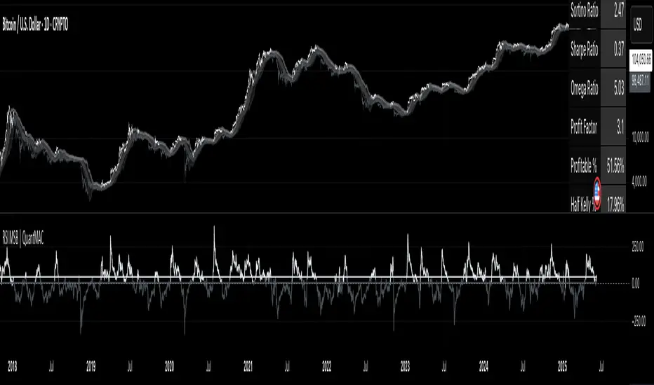
TitanGrid L/S SuperEngineTitanGrid L/S SuperEngine
Experimental Trend-Aligned Grid Signal Engine for Long & Short Execution
🔹 Overview
TitanGrid is an advanced, real-time signal engine built around a tactical grid structure.
It manages Long and Short trades using trend-aligned entries, layered scaling, and partial exits.
Unlike traditional strategy() -based scripts, TitanGrid runs as an indicator() , but includes its own full internal simulation engine.
This allows it to track capital, equity, PnL, risk exposure, and trade performance bar-by-bar — effectively simulating a custom backtest, while remaining compatible with real-time alert-based execution systems.
The concept was born from the fusion of two prior systems:
Assassin’s Grid (grid-based execution and structure) + Super 8 (trend-filtering, smart capital logic), both developed under the AssassinsGrid framework.
🔹 Disclaimer
This is an experimental tool intended for research, testing, and educational use.
It does not provide guaranteed outcomes and should not be interpreted as financial advice.
Use with demo or simulated accounts before considering live deployment.
🔹 Execution Logic
Trend direction is filtered through a custom SuperTrend engine. Once confirmed:
• Long entries trigger on pullbacks, exiting progressively as price moves up
• Short entries trigger on rallies, exiting as price declines
Grid levels are spaced by configurable percentage width, and entries scale dynamically.
🔹 Stop Loss Mechanism
TitanGrid uses a dual-layer stop system:
• A static stop per entry, placed at a fixed percentage distance matching the grid width
• A trend reversal exit that closes the entire position if price crosses the SuperTrend in the opposite direction
Stops are triggered once per cycle, ensuring predictable and capital-aware behavior.
🔹 Key Features
• Dual-side grid logic (Long-only, Short-only, or Both)
• SuperTrend filtering to enforce directional bias
• Adjustable grid spacing, scaling, and sizing
• Static and dynamic stop-loss logic
• Partial exits and reset conditions
• Webhook-ready alerts (browser-based automation compatible)
• Internal simulation of equity, PnL, fees, and liquidation levels
• Real-time dashboard for full transparency
🔹 Best Use Cases
TitanGrid performs best in structured or mean-reverting environments.
It is especially well-suited to assets with the behavioral profile of ETH — reactive, trend-intraday, and prone to clean pullback formations.
While adaptable to multiple timeframes, it shows strongest performance on the 15-minute chart , offering a balance of signal frequency and directional clarity.
🔹 License
Published under the Mozilla Public License 2.0 .
You are free to study, adapt, and extend this script.
🔹 Panel Reference
The real-time dashboard displays performance metrics, capital state, and position behavior:
• Asset Type – Automatically detects the instrument class (e.g., Crypto, Stock, Forex) from symbol metadata
• Equity – Total simulated capital: realized PnL + floating PnL + remaining cash
• Available Cash – Capital not currently allocated to any position
• Used Margin – Capital locked in open trades, based on position size and leverage
• Net Profit – Realized gain/loss after commissions and fees
• Raw Net Profit – Gross result before trading costs
• Floating PnL – Unrealized profit or loss from active positions
• ROI – Return on initial capital, including realized and floating PnL. Leverage directly impacts this metric, amplifying both gains and losses relative to account size.
• Long/Short Size & Avg Price – Open position sizes and volume-weighted average entry prices
• Leverage & Liquidation – Simulated effective leverage and projected liquidation level
• Hold – Best-performing hold side (Long or Short) over the session
• Hold Efficiency – Performance efficiency during holding phases, relative to capital used
• Profit Factor – Ratio of gross profits to gross losses (realized)
• Payoff Ratio – Average profit per win / average loss per loss
• Win Rate – Percent of profitable closes (including partial exits)
• Expectancy – Net average result per closed trade
• Max Drawdown – Largest recorded drop in equity during the session
• Commission Paid – Simulated trading costs: maker, taker, funding
• Long / Short Trades – Count of entry signals per side
• Time Trading – Number of bars spent in active positions
• Volume / Month – Extrapolated 30-day trading volume estimate
• Min Capital – Lowest equity level recorded during the session
🔹 Reference Ranges by Strategy Type
Use the following metrics as reference depending on the trading style:
Grid / Mean Reversion
• Profit Factor: 1.2 – 2.0
• Payoff Ratio: 0.5 – 1.2
• Win Rate: 50% – 70% (based on partial exits)
• Expectancy: 0.05% – 0.25%
• Drawdown: Moderate to high
• Commission Impact: High
Trend-Following
• Profit Factor: 1.5 – 3.0
• Payoff Ratio: 1.5 – 3.5
• Win Rate: 30% – 50%
• Expectancy: 0.3% – 1.0%
• Drawdown: Low to moderate
Scalping / High-Frequency
• Profit Factor: 1.1 – 1.6
• Payoff Ratio: 0.3 – 0.8
• Win Rate: 80% – 95%
• Expectancy: 0.01% – 0.05%
• Volume / Month: Very high
Breakout Strategies
• Profit Factor: 1.4 – 2.2
• Payoff Ratio: 1.2 – 2.0
• Win Rate: 35% – 60%
• Expectancy: 0.2% – 0.6%
• Drawdown: Can be sharp after failed breakouts
🔹 Note on Performance Simulation
TitanGrid includes internal accounting of fees, slippage, and funding costs.
While its logic is designed for precision and capital efficiency, performance is naturally affected by exchange commissions.
In frictionless environments (e.g., zero-fee simulation), its high-frequency logic could — in theory — extract substantial micro-edges from the market.
However, real-world conditions introduce limits, and all results should be interpreted accordingly.
