Adaptive Regression Channel [MissouriTim]The Adaptive Regression Channel (ARC) is a technical indicator designed to empower traders with a clear, adaptable, and precise view of market trends and price boundaries. By blending advanced statistical techniques with real-time market data, ARC delivers a comprehensive tool that dynamically adjusts to price action, volatility, volume, and momentum. Whether you’re navigating the fast-paced world of cryptocurrencies, the steady trends of stocks, or the intricate movements of FOREX pairs, ARC provides a robust framework for identifying opportunities and managing risk.
Core Components
1. Color-Coded Regression Line
ARC’s centerpiece is a linear regression line derived from a Weighted Moving Average (WMA) of closing prices. This line adapts its calculation period based on market volatility (via ATR) and is capped between a minimum of 20 bars and a maximum of 1.5 times the user-defined base length (default 100). Visually, it shifts colors to reflect trend direction: green for an upward slope (bullish) and red for a downward slope (bearish), offering an instant snapshot of market sentiment.
2. Dynamic Residual Channels
Surrounding the regression line are upper (red) and lower (green) channels, calculated using the standard deviation of residuals—the difference between actual closing prices and the regression line. This approach ensures the channels precisely track how closely prices follow the trend, rather than relying solely on overall price volatility. The channel width is dynamically adjusted by a multiplier that factors in:
Volatility: Measured through the Average True Range (ATR), widening channels during turbulent markets.
Trend Strength: Based on the regression slope, expanding channels in strong trends and contracting them in consolidation phases.
3. Volume-Weighted Moving Average (VWMA)
Plotted in orange, the VWMA overlays a volume-weighted price trend, emphasizing movements backed by significant trading activity. This complements the regression line, providing additional confirmation of trend validity and potential breakout strength.
4. Scaled RSI Overlay
ARC features a Relative Strength Index (RSI) overlay, plotted in purple and scaled to hover closely around the regression line. This compact display reflects momentum shifts within the trend’s context, keeping RSI visible on the price chart without excessive swings. User-defined overbought (default 70) and oversold (default 30) levels offer reference points for momentum analysis."
Technical Highlights
ARC leverages a volatility-adjusted lookback period, residual-based channel construction, and multi-indicator integration to achieve high accuracy. Its parameters—such as base length, channel width, ATR period, and RSI length—are fully customizable, allowing traders to tailor it to their specific needs.
Why Choose ARC?
ARC stands out for its adaptability and precision. The residual-based channels offer tighter, more relevant support and resistance levels compared to standard volatility measures, while the dynamic adjustments ensure it performs well in both trending and ranging markets. The inclusion of VWMA and scaled RSI adds depth, merging trend, volume, and momentum into a single, cohesive overlay. For traders seeking a versatile, all-in-one indicator, ARC delivers actionable insights with minimal noise.
Best Ways to Use the Adaptive Regression Channel (ARC)
The Adaptive Regression Channel (ARC) is a flexible tool that supports a variety of trading strategies, from trend-following to breakout detection. Below are the most effective ways to use ARC, along with practical tips for maximizing its potential. Adjustments to its settings may be necessary depending on the timeframe (e.g., intraday vs. daily) and the asset being traded (e.g., stocks, FOREX, cryptocurrencies), as each market exhibits unique volatility and behavior.
1. Trend Following
• How to Use: Rely on the regression line’s color to guide your trades. A green line (upward slope) signals a bullish trend—consider entering or holding long positions. A red line (downward slope) indicates a bearish trend—look to short or exit longs.
• Best Practice: Confirm the trend with the VWMA (orange line). Price above the VWMA in a green uptrend strengthens the bullish case; price below in a red downtrend reinforces bearish momentum.
• Adjustment: For short timeframes like 15-minute crypto charts, lower the Base Regression Length (e.g., to 50) for quicker trend detection. For weekly stock charts, increase it (e.g., to 200) to capture broader movements.
2. Channel-Based Trades
• How to Use: Use the upper channel (red) as resistance and the lower channel (green) as support. Buy when the price bounces off the lower channel in an uptrend, and sell or short when it rejects the upper channel in a downtrend.
• Best Practice: Check the scaled RSI (purple line) for momentum cues. A low RSI (e.g., near 30) at the lower channel suggests a stronger buy signal; a high RSI (e.g., near 70) at the upper channel supports a sell.
• Adjustment: In volatile crypto markets, widen the Base Channel Width Coefficient (e.g., to 2.5) to reduce false signals. For stable FOREX pairs (e.g., EUR/USD), a narrower width (e.g., 1.5) may work better.
3. Breakout Detection
• How to Use: Watch for price breaking above the upper channel (bullish breakout) or below the lower channel (bearish breakout). These moves often signal strong momentum shifts.
• Best Practice: Validate breakouts with VWMA position—price above VWMA for bullish breaks, below for bearish—and ensure the regression line’s slope aligns (green for up, red for down).
• Adjustment: For fast-moving assets like crypto on 1-hour charts, shorten ATR Length (e.g., to 7) to make channels more reactive. For stocks on daily charts, keep it at 14 or higher for reliability.
4. Momentum Analysis
• How to Use: The scaled RSI overlay shows momentum relative to the regression line. Rising RSI in a green uptrend confirms bullish strength; falling RSI in a red downtrend supports bearish pressure.
• Best Practice: Look for RSI divergences—e.g., price hitting new highs at the upper channel while RSI flattens or drops could signal an impending reversal.
• Adjustment: Reduce RSI Length (e.g., to 7) for intraday trading in FOREX or crypto to catch short-term momentum shifts. Increase it (e.g., to 21) for longer-term stock trades.
5. Range Trading
• How to Use: When the regression line’s slope is near zero (flat) and channels are tight, ARC indicates a ranging market. Buy near the lower channel and sell near the upper channel, targeting the regression line as the mean price.
• Best Practice: Ensure VWMA hovers close to the regression line to confirm the range-bound state.
• Adjustment: For low-volatility stocks on daily charts, use a moderate Base Regression Length (e.g., 100) and tight Base Channel Width (e.g., 1.5). For choppy crypto markets, test shorter settings.
Optimization Strategies
• Timeframe Customization: Adjust ARC’s parameters to match your trading horizon. Short timeframes (e.g., 1-minute to 1-hour) benefit from lower Base Regression Length (20–50) and ATR Length (7–10) for agility, while longer timeframes (e.g., daily, weekly) favor higher values (100–200 and 14–21) for stability.
• Asset-Specific Tuning:
○ Stocks: Use longer lengths (e.g., 100–200) and moderate widths (e.g., 1.8) for stable equities; tweak ATR Length based on sector volatility (shorter for tech, longer for utilities).
○ FOREX: Set Base Regression Length to 50–100 and Base Channel Width to 1.5–2.0 for smoother trends; adjust RSI Length (e.g., 10–14) based on pair volatility.
○ Crypto: Opt for shorter lengths (e.g., 20–50) and wider widths (e.g., 2.0–3.0) to handle rapid price swings; use a shorter ATR Length (e.g., 7) for quick adaptation.
• Backtesting: Test ARC on historical data for your asset and timeframe to optimize settings. Evaluate how often price respects channels and whether breakouts yield profitable trades.
• Enhancements: Pair ARC with volume surges, key support/resistance levels, or candlestick patterns (e.g., doji at channel edges) for higher-probability setups.
Practical Considerations
ARC’s adaptability makes it suitable for diverse markets, but its performance hinges on proper calibration. Cryptocurrencies, with their high volatility, may require shorter, wider settings to capture rapid moves, while stocks on longer timeframes benefit from broader, smoother configurations. FOREX pairs often fall in between, depending on their inherent volatility. Experiment with the adjustable parameters to align ARC with your trading style and market conditions, ensuring it delivers the precision and reliability you need.
"price action" için komut dosyalarını ara

DTFX Algo Zones [SamuraiJack Mod]CME_MINI:NQ1!
Credits
This indicator is a modified version of an open-source tool originally developed by Lux Algo. I literally modded their indicator to create the DTFX Algo Zones version, incorporating additional features and refinements. Special thanks to Lux Algo for their original work and for providing the open-source code that made this development possible.
Introduction
DTFX Algo Zones is a technical analysis indicator designed to automatically identify key supply and demand zones on your chart using market structure and Fibonacci retracements. It helps traders spot high-probability reversal areas and important support/resistance levels at a glance. By detecting shifts in market structure (such as Break of Structure and Change of Character) and highlighting bullish or bearish zones dynamically, this tool provides an intuitive framework for planning trades. The goal is to save traders time and improve decision-making by focusing attention on the most critical price zones where market bias may confirm or reverse.
Logic & Features
• Market Structure Shift Detection (BOS & CHoCH): The indicator continuously monitors price swings and marks significant structure shifts. A Break of Structure (BOS) occurs when price breaks above a previous swing high or below a swing low, indicating a continuation of the current trend. A Change of Character (ChoCH) is detected when price breaks in the opposite direction of the prior trend, often signaling an early trend reversal. These moments are visually marked on the chart, serving as anchor points for new zones. By identifying BOS and ChoCH in real-time, the DTFX Algo Zones indicator ensures you’re aware of key trend changes as they happen.
• Auto-Drawn Fibonacci Supply/Demand Zones: Upon a valid structure shift, the indicator plots a Fibonacci-based zone between the breakout point and the preceding swing high/low (the source of the move). This creates a shaded area or band of Fibonacci retracement levels (for example 38.2%, 50%, 61.8%, etc.) representing a potential support zone in an uptrend or resistance zone in a downtrend. These supply/demand zones are derived from the natural retracement of the breakout move, highlighting where price is likely to pull back. Each zone is essentially an auto-generated Fibonacci retracement region tied to a market structure event, which traders can use to anticipate where the next pullback or bounce might occur.
• Dynamic Bullish and Bearish Zones: The DTFX Algo Zones indicator distinguishes bullish vs. bearish zones and updates them dynamically as new price action unfolds. Bullish zones (formed after bullish BOS/ChoCH) are typically highlighted in one color (e.g. green or blue) to indicate areas of demand/support where price may bounce upward. Bearish zones (formed after bearish BOS/ChoCH) are shown in another color (e.g. red/orange) to mark supply/resistance where price may stall or reverse downward. This color-coding and real-time updating allow traders to instantly recognize the market bias: for instance, a series of bullish zones implies an uptrend with multiple support levels on pullbacks, while consecutive bearish zones indicate a downtrend with resistance overhead. As old zones get invalidated or new ones appear, the chart remains current with the latest key levels, eliminating clutter from outdated levels.
• Flexible Customization: The indicator comes with several options to tailor the zones to your trading style. You can filter which zones to display – for example, show only the most recent N zones or limit to only bullish or only bearish zones – helping declutter the chart and focus on recent, relevant levels. There are settings to control zone extension (how far into the future the zones are drawn) and to automatically invalidate zones once they’re no longer relevant (for instance, if price fully breaks through a zone or a new structure shift occurs that supersedes it). Additionally, the Fibonacci retracement levels within each zone are customizable: you can choose which retracement percentages to plot, adjust their colors or line styles, and decide whether to fill the zone area for visibility. This flexibility ensures the DTFX Algo Zones can be tuned for different markets and strategies, whether you want a clean minimalist look or detailed zones with multiple internal levels.
Best Use Cases
DTFX Algo Zones is a versatile indicator that can enhance various trading strategies. Some of its best use cases include:
• Identifying High-Probability Reversal Zones: Each zone marks an area where price has a higher likelihood of stalling or reversing because it reflects a significant prior swing and Fibonacci retracement. Traders can watch these zones for entry opportunities when the market approaches them, as they often coincide with order block or strong supply/demand areas. This is especially useful for catching trend reversals or pullbacks at points where risk is lower and potential reward is higher.
• Spotting Key Support and Resistance: The automatically drawn zones act as dynamic support (below price) and resistance (above price) levels. Instead of manually drawing Fibonacci retracements or support/resistance lines, you get an instant map of the key levels derived from recent price action. This helps in quickly identifying where the next bounce (support) or rejection (resistance) might occur. Swing traders and intraday traders alike can use these zones to set alerts or anticipate reaction areas as the market moves.
• Trend-Following Entries: In a trending market, the indicator’s zones provide ideal areas to join the trend on pullbacks. For example, in an uptrend, when a new bullish zone is drawn after a BOS, it indicates a fresh demand zone – buying near the lower end of that zone on a pullback can offer a low-risk entry to ride the next leg up. Similarly, in a downtrend, selling rallies into the highlighted supply zones can position you in the direction of the prevailing trend. The zones effectively serve as a roadmap of the trend’s structure, allowing trend traders to buy dips and sell rallies with greater confidence.
• Mean-Reversion and Range Trading: Even in choppy or range-bound markets, DTFX Algo Zones can help find mean-reversion trades. If price is oscillating sideways, the zones at extremes of the range might mark where momentum is shifting (ChoCH) and price could swing back toward the mean. A trader might fade an extended move when it reaches a strong zone, anticipating a reversion. Additionally, if multiple zones cluster in an area across time (creating a zone overlap), it often signifies a particularly robust support/resistance level ideal for range trading strategies.
In all these use cases, the indicator’s ability to filter out noise and highlight structurally important levels means traders can focus on higher-probability setups and make more informed trading decisions.
Strategy – Pullback Trading with DTFX Algo Zones
One of the most effective ways to use the DTFX Algo Zones indicator is trading pullbacks in the direction of the trend. Below is a step-by-step strategy to capitalize on pullbacks using the zones, combining the indicator’s signals with sound price action analysis and risk management:
1. Identify a Market Structure Shift and Trend Bias: First, observe the chart for a recent BOS or ChoCH signal from the indicator. This will tell you the current trend bias. For instance, a bullish BOS/ChoCH means the market momentum has shifted upward (bullish bias), and a new demand zone will be drawn. A bearish structure break indicates downward momentum and creates a supply zone. Make sure the broader context supports the bias (e.g., if multiple higher timeframe zones are bullish, focus on long trades).
2. Wait for the Pullback into the Zone: Once a new zone appears, don’t chase the price immediately. Instead, wait for price to retrace back into that highlighted zone. Patience is key – let the market come to you. For a bullish setup, allow price to dip into the Fibonacci retracement zone (demand area); for a bearish setup, watch for a rally into the supply zone. Often, the middle of the zone (around the 50% retracement level) can be an optimal area where price might slow down and pivot, but it’s wise to observe price behavior across the entire zone.
3. Confirm the Entry with Price Action & Confluence: As price tests the zone, look for confirmation signals before entering the trade. This can include bullish reversal candlestick patterns (for longs) or bearish patterns (for shorts) such as engulfing candles, hammers/shooting stars, or doji indicating indecision turning to reversal. Additionally, incorporate confluence factors to strengthen the setup: for example, check if the zone overlaps with a key moving average, a round number price level, or an old support/resistance line from a higher timeframe. You might also use an oscillator (like RSI or Stochastic) to see if the pullback has reached oversold conditions in a bullish zone (or overbought in a bearish zone), suggesting a bounce is likely. The more factors aligning at the zone, the more confidence you can have in the trade. Only proceed with an entry once you see clear evidence of buyers defending a demand zone or sellers defending a supply zone.
4. Enter the Trade and Manage Risk: When you’re satisfied with the confirmation (e.g., price starts to react positively off a demand zone or shows rejection wicks in a supply zone), execute your entry in the direction of the original trend. Immediately set a stop-loss order to control risk: for a long trade, a common placement is just below the demand zone (a few ticks/pips under the swing low that formed the zone); for a short trade, place the stop just above the supply zone’s high. This way, if the zone fails and price continues beyond it, your loss is limited. Position size the trade so that this stop-loss distance corresponds to a risk you are comfortable with (for example, 1-2% of your trading capital).
5. Take Profit Strategically: Plan your take-profit targets in advance. A conservative approach is to target the origin of the move – for instance, in a long trade, you might take profit as price moves back up to the swing high (the 0% Fibonacci level of the zone) or the next significant zone or resistance level above. This often yields at least a 1:1 reward-to-risk ratio if you entered around mid-zone. More aggressive trend-following traders may leave a portion of the position running beyond the initial target, aiming for a larger move in line with the trend (for example, new higher highs in an uptrend). You can also trail your stop-loss upward behind new higher lows (for longs) or lower highs (for shorts) as the trend progresses, locking in profit while allowing for further gains.
6. Monitor Zone Invalidation: Even after entering, keep an eye on the behavior around the zone and any new zones that may form. If price fails to bounce and instead breaks decisively through the entire zone, respect that as an invalidation – the market may be signaling a deeper reversal or that the signal was false. In such a case, it’s better to exit early or stick to your stop-loss than to hold onto a losing position. The indicator will often mark or no longer highlight zones that have been invalidated by price, guiding you to shift focus to the next opportunity.
Risk Management Tips:
• Always use a stop-loss and don’t move it farther out in hope. Placing the stop just beyond the zone’s far end (the swing point) helps protect you if the pullback turns into a larger reversal.
• Aim for a favorable risk-to-reward ratio. With pullback entries near the middle or far end of a zone, you can often achieve a reward that equals or exceeds your risk. For example, risking 20 pips to make 20+ pips (1:1 or better) is a prudent starting point. Adjust targets based on market structure – if the next resistance is 50 pips away, consider that upside against your risk.
• Use confluence and context: Don’t take every zone signal in isolation. The highest probability trades come when the DTFX Algo Zone aligns with other analysis (trend direction, chart patterns, higher timeframe support/resistance, etc.). This filtered approach will reduce trades taken in weak zones or counter-trend traps.
• Embrace patience and selectivity: Not all zones are equal. It can be wise to skip very narrow or insignificant zones and wait for those that form after a strong BOS/ChoCH (indicating a powerful move). Larger zones or zones formed during high-volume times tend to produce more reliable pullback opportunities.
• Review and adapt: After each trade, note how price behaved around the zone. If you notice certain Fib levels (like 50% or 61.8%) within the zone consistently provide the best entries, you can refine your approach to focus on those. Similarly, adjust the indicator’s settings if needed – for example, if too many minor zones are cluttering your screen, limit to the last few or increase the structure length parameter to capture only more significant swings.
⸻
By combining the DTFX Algo Zones indicator with disciplined confirmation and risk management, traders can improve their timing on pullback entries and avoid chasing moves. This indicator shines in helping you trade what you see, not what you feel – the clearly marked zones and structure shifts keep you grounded in price action reality. Whether you’re a trend trader looking to buy the dip/sell the rally, or a reversal trader hunting for exhaustion points, DTFX Algo Zones provides a robust visual aid to elevate your trading decisions. Use it as a complementary tool in your analysis to stay on the right side of the market’s structure and enhance your trading performance.

Orion Daily Bias v1What It Does
The Daily Bias Indicator identifies the daily market bias (bullish or bearish) using principles inspired by institutional trading activity. It analyses daily price action to detect imbalances caused by large market participants, providing a clear directional bias for the upcoming trading day.
Key Features
Daily Bias Signals:
Displays "Daily Bias: Bullish" (green) or "Daily Bias: Bearish" (red) in the top-right corner of your chart.
Colors daily candles to reflect the current bias (toggle on/off).
Non-Repainting:
Signals finalize only at market close and never change retroactively.
Intraday Flexibility:
Use the daily bias to align intraday strategies (e.g., 15-minute entries) with the broader trend.
Custom Alerts:
Receive alerts only when the bias changes (e.g., bullish to bearish). Alerts trigger at market close, preparing you for the next trading day.
How It Works
Market Close Analysis:
At the end of each trading day, the indicator evaluates price action and institutional-level inefficiencies to determine the next day’s bias.
Visual Guidance:
Daily candles are coloured green (bullish) or red (bearish) to reflect the confirmed bias.
A label in the top-right corner updates automatically across all timeframes.
Actionable Alerts:
Set alerts to notify you only when the bias shifts, helping you stay focused on high-probability setups.
Why Traders Use It
Simplify Decision-Making: Start each day with a clear bias, avoiding trades against institutional momentum.
Adaptable to Strategies: Works with scalping, swing trading, or position building.
Rule-Based Signals: Objective criteria finalize at market close.
Settings & Parameters
Candle Colouring: Enable/disable daily candle highlights.
Daily bias label: Turn the daily bias label on and off
Alerts: Setting an alert with this indicator will only alert you if a bias changes from bullish to bearish or vice versa.
How to Use It
Add the indicator to your chart (works on any timeframe).
Check the top-right label for the daily bias.
Set alerts to track bias changes effortlessly.
Combine with your preferred intraday strategy for entries/exits.
Important Notes
No Repainting: Signals lock in at daily close and never change.
Confirmation Tool: Pair with additional analysis (e.g., support/resistance, volume).
Time Agnostic: The daily bias applies to all intraday timeframes (1H, 15M, etc.).
Disclaimer
This tool is for educational purposes only. It is not financial advice, and past performance does not guarantee future results. Always test strategies in a risk-controlled environment.

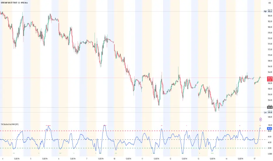
THE Bucknut test PARI (SPY)📌 THE Bucknut Test PARI – Market Momentum & Volatility Gauge
🔹 Description
THE Bucknut Test PARI Indicator is a momentum and volatility-based market gauge designed to provide clear, actionable insights on price movement. This indicator calculates a Price Action Relative Index (PARI) score to help traders evaluate risk and potential market reversals.
It utilizes exponential moving average (EMA)-based momentum, standard deviation volatility, and SPY correlation to generate a PARI score between 1-100. The score is then categorized into risk zones, helping traders identify when conditions are favorable for entries or caution is needed.
Ideal for intraday traders, options traders (including SPX 0DTE), and swing traders looking to gauge volatility-driven market shifts.
🔥 Features & Functionality
✅ Momentum Calculation via EMA Filtering – Ensures smooth, responsive signals.
✅ Volatility-Based Adjustments – Uses standard deviation-based volatility scaling.
✅ SPY Correlation Filtering – Helps align momentum signals with market sentiment.
✅ User-Defined Timeframe Settings – Adjusts dynamically based on selected time intervals.
✅ Customizable Risk Thresholds – Allows traders to define high-risk, neutral, and low-risk zones.
✅ Non-Repainting Algorithm – Ensures reliable, static signals without revision.
⚙️ Settings & Adjustments
Setting Default Value Description
Time Frame Mode "5m-15m" Choose between 1m-3m, 5m-15m, or 1H-Daily. Affects smoothing values.
Scaling Factor 10 Adjusts PARI score sensitivity. Higher values amplify movement.
Background Color Black Custom background for the indicator panel.
Background Transparency 85 Controls indicator panel opacity (0 = solid, 100 = invisible).
High-Risk Threshold 80 Above this level, market is in overbought/high-risk conditions.
Low-Risk Threshold 20 Below this level, market is oversold/low-risk for potential reversals.
Neutral Level 50 Middle ground where price action is balanced.
📈 How to Use THE Bucknut Test PARI
🔴 Above 80 (High-Risk Zone)
Market may be overheated, strong momentum may fade or reverse soon.
Caution with calls; potential put opportunities.
🟢 Below 20 (Low-Risk Zone)
Market is oversold, potential reversal or bounce incoming.
Consider long entries or avoiding shorts.
⚪ Between 20-80 (Neutral Zone)
Market is in equilibrium; follow primary trend direction.
No extreme risk, trend-following strategies preferred.
🔍 Example Use Cases
✔ Intraday Traders → Gauge market strength on short-term charts (1m-15m).
✔ SPX 0DTE Options Traders → Time high-confidence call/put setups.
✔ Swing Traders → Identify periods of excessive momentum or exhaustion.
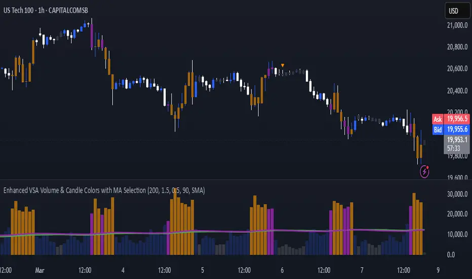
Enhanced VSA Volume & Candle Colors with MA SelectionOverview:
This script aims to enhance the visualization of volume spikes and price action by coloring volume bars and price candles dynamically based on the volume behavior. It allows traders to customize the type of volume moving average (SMA, EMA, or VWMA) used and apply various color schemes to highlight high, low, and extreme volume conditions. Additionally, alerts are generated when extreme or low-volume conditions occur.
---------------------------------------------------------------------------------------------------------------------
Key Features:
Customizable Volume Lookback Period:
The script allows users to define the period for calculating the moving average of volume (default: 200).
Volume Multiplier Settings:
High and low volume thresholds are defined using multipliers. Users can adjust these to customize how volume is categorized (default multipliers: 1.5 for high volume, 0.5 for low volume).
Percentile-Based Extreme Volume Detection:
The script calculates a percentile threshold for extreme volume (default: 90th percentile) based on the volume data, highlighting exceptionally high volume spikes.
Moving Average Selection:
Users can choose between Simple Moving Average (SMA), Exponential Moving Average (EMA), or Volume Weighted Moving Average (VWMA) to track volume trends over the selected lookback period.
Volume-Based Price Bar Coloring:
Price bars can be colored according to the volume conditions (high, low, or extreme). This feature can be toggled on or off.
Dynamic Transparency and Color Customization:
The script allows users to set custom colors for different volume conditions (high, low, neutral, extreme) and adjusts the transparency of volume bars based on the relative size of the volume.
Alerts:
Alerts can be set for when extreme volume spikes or low volume conditions are detected.
---------------------------------------------------------------------------------------------------------------------
Script Components:
Volume Histogram Plot:
Displays the volume bars with dynamic coloring based on the volume condition (high, low, or extreme). The color of the bars adjusts for clarity, with transparency based on volume levels.
Moving Average Plot:
Plots the selected volume moving average (SMA, EMA, or VWMA) to visualize the trend of volume over the chosen lookback period.
Smoothed Average Volume (EMA of Volume):
A smoothed EMA line is plotted to provide a clear representation of volume trends over time.
Price Bar Coloring:
If enabled, price bars are colored according to the current volume condition, providing immediate visual feedback to the trader.
---------------------------------------------------------------------------------------------------------------------
How It Can Be Used:
Volume Analysis for Entry/Exit Points: Traders can use the volume conditions (high, low, and extreme) to identify potential entry or exit points. High-volume bars often signal strong market activity, while low-volume bars may indicate consolidation or indecision.
Volume Confirmation for Trend Reversal: Extreme volume spikes can sometimes precede significant price movements. Traders can monitor these spikes for potential trend reversal signals.
Customizing Alerts: Alerts based on volume conditions help traders stay updated on important volume events without constantly monitoring the chart.
Color-Coded Price Action: The dynamic coloring of price bars makes it easier to identify periods of strong or weak market participation, allowing traders to make informed decisions quickly.
---------------------------------------------------------------------------------------------------------------------
Compliance with TradingView's House Rules:
No Promotion of Financial Products: The script does not promote any specific financial instruments or products, ensuring compliance with TradingView’s content guidelines.
Clear Functionality: The script provides clear, functional analysis tools without making unsupported claims about predicting market movements.
No Automated Trading: The script does not include any automated trading or order execution features, which complies with TradingView’s policy on non-automated scripts.
This breakdown ensures clarity on the script’s purpose, features, and how it might be used by traders. It's written in a way that fits TradingView's content guidelines, keeping the focus on providing valuable analytical tools rather than making promises or promoting any financial product.
Advanced Market Structure & Order Blocks (fadi)Advanced Market Structure & Order Blocks indicator provides a new approach to understanding price action using ICT (Inner Circle Trader) concepts related to candle blocks to analyze the market behavior and eliminate much of the noise created by the price action.
This indicator is not intended to provide trade signals, it is designed to provide the traders with to support their trading strategies and add clarity where possible.
There are currently three main elements to this indicator:
Market Structure
Order Blocks
Liquidity Voids
Market Structure
In trading, market structure is often identified by observing higher highs and higher lows. An uptrend is characterized by a series of higher highs, where each peak surpasses the previous one, and higher lows, where each trough is higher than the preceding one. Conversely, a downtrend is marked by lower highs and lower lows.
Other indicators usually determine these peaks by calculating the highest or lowest levels within a predefined number of candles. For example, identifying the highest price level within the last 15 candles and marking it as a higher high or a lower high. While this approach offers some structure to price action, it can be arbitrary and random due to price fluctuations and the lack of proper structure analysis beyond finding the highest peaks and valleys within candle ranges.
In his 2022 mentorship, episode 12, ICT introduced an alternative approach focusing on three-candle pivots called Short Term High and Low (STH/STL), which are then used to calculate the Intermediate Term High and Low (ITH/ITL), and in turn, the Long Term High and Low (LTH/LTL). ICT’s approach provides better structure than the traditional method mentioned above. However, it can be confusing and difficult to track. There are great indicators that track and label ICT’s levels, but traders still find it challenging to follow and understand.
The Advanced Market Structure indicator takes a unique approach by analyzing candle formations, using ICT concepts, to identify possible turning points that mimic a real trader’s analysis of price action as closely as possible. However, it should be expected that Market Makers may use market manipulation to induce traders to make failed trades, and no tooling can eliminate these situations.
Advanced Market Structure tracks true Peaks and Valleys as they form, confirms them, and marks the chart with corresponding labels using traditional labeling methods (HH/HL/LH/LL), as such labeling makes it easier for traders to follow and understand. The indicator also draws levels to help identify possible liquidity areas and trade targets.
The indicator uses different calculation methods for the different type of market structure length, however all calculations are based on the same ICT candle blocks concepts.
Market Structure Settings
Other than the display settings, there are four (4) settings, mainly under the Level Settings section.
Allow Nested Candles
This option is only available on the Short Market Structure due to the methods used in calculating highs and lows. When used, the indicator will attempt to detect smaller fluctuations in price by tracking smaller candle moves, if any.
Level Settings
Level Settings allows the trader to decide two main calculations:
1. A new pivot point will form when a candle’s is crossed by the following candle’s
2. For a liquidity sweep and marking a level as mitigated, a candle’s must cross that level
Order Blocks
ICT (Inner Circle Trader) defines an Order Block as the last down-closing candle, or series of candles, before a significant upward price move or the last up-closing candle, or series of candles, before a significant downward price move. These key price levels, marked by substantial buy or sell orders from institutional traders or "smart money," create a block or zone on the price chart. When the price revisits these levels, it often leads to a strong market reaction. Order Blocks can consist of one or multiple consecutive candles of the same color, signaling areas of significant buying or selling interest. ICT's approach to Order Blocks provides traders with a structured method to identify potential areas of support or resistance, where price movements are more likely to change direction. Although ICT has shared some criteria for identifying Order Blocks publicly, the full details are reserved for his upcoming books. This indicator leverages the publicly available information to provide traders with valuable insights into these crucial price levels.
The Advanced Market Structure indicator is designed to be highly flexible, allowing traders to define their own combination of rules for identifying Order Blocks, thus customizing it to fit their unique trading strategies.
Order Block Configuration
Can be nested
An Order Block is defined as the last down candle or candles before a strong move higher, and vice versa for bearish Order Blocks. However, larger-than-usual candles resulting from news events or price action may not qualify as Order Blocks and can mute any Order Block within their range.
The "Can be nested" flag ensures that each Order Block is treated as an independent entity, even if it appears within the body of another Order Block.
Forms at swing point
Order Blocks formed at swing points typically have higher probabilities but are less frequent, assuming the same rules are applied. Additionally, Order Blocks at swing points may become Breaker and Mitigation blocks if they fail, providing more trading opportunities.
Forms a simple pivot point
A simple pivot point corresponds to ICT Short Term High and Low (STH/STL). Order Blocks using simple pivot points can occur in the middle of a move, not just at swing points. These are useful for identifying IOFED setups and supporting blocks that can bolster the price move.
Causes Market Structure Shift
Order Blocks that result in a break above or below a short swing point can help narrow down target order blocks, but they are less frequent. An Order Block causing a break above or below a pivot point does not necessarily indicate a strong Order Block. For example, an Order Block formed at a Lower Low is more likely to fail in a downtrend.
A clean close above order block
When the first candle breaks above an Order Block and closes above its high, this indicates a stronger Order Block. On the other hand, if a candle merely wicks through the Order Block without a solid close above it, it suggests a weaker Order Block. This may indicate hesitation or an impending reversal, as the wick represents a temporary and unsustained price movement.
Has displacement more than X the body
While some traders may capitalize on the initial break above an Order Block's CISD level, others prefer to focus on the return to an Order Block after displacement. Displacement is determined by the body size of the Order Block, and an Order Block cannot be tested until this level has been achieved.
Has a Fair Value Gap
When an Order Block is combined with a Fair Value Gap (FVG), it signifies a strong Order Block. The Fair Value Gap indicates a strong price movement away from the Order Block.
Has a liquidity void
A Liquidity Void occurs when two consecutive candles of the same color do not overlap, creating a gap similar to a Fair Value Gap, but involving one or more middle candles. Liquidity Voids can be utilized in combination with, or as an alternative to, the displacement setting.
Maximum number of OBs
The maximum number of Order Blocks to display.
Mitigated at block’s
An Order Block is considered mitigated when price reaches one of the main Order Block levels.
Liquidity Void
Liquidity Void refers to areas on a price chart where there is one-sided trading activity. This phenomenon occurs when the price of an asset moves sharply in one direction, leaving gaps where two consecutive candles of the same color do not overlap. These gaps can comprise one or more middle candles and indicates a pronounced lack of trading within that price range. Liquidity Voids are important because they highlight areas of minimal resistance, where price is more likely to return to fill the void and balance the market.
Liquidity Void vs Fair Value Gap
While both concepts are related to gaps in price action, they are distinct. A Fair Value Gap is a specific three-candle pattern where the middle candle creates a gap between the first and third candles. In contrast, a Liquidity Void represents a broader area on the chart where there is little to no trading activity, often encompassing multiple candles and indicating a more pronounced imbalance between buy and sell orders.
A FVG can be part of a Liquidity Void, a Liquidity Void can exist without necessarily including an FVG. Both concepts highlight areas of minimal resistance and potential price movement, but they differ in their formation and implications.
Advanced Market Structure and Order Blocks indicator focus on liquidity voids since a liquidity void can substitute for a FVG and it is usually less addressed by other indicators.

DXA JOKERThis custom indicator is designed to provide traders with a comprehensive toolkit for identifying potential entry and exit points in the market, while incorporating dynamic risk management features. The script integrates multiple analytical components to generate actionable signals, trend direction insights, and volatility-based adjustments for stop-loss and take-profit levels.
Key Features:
Signal Generation:
The indicator employs a sophisticated algorithm to generate precise trading signals. These signals are derived from a combination of trend-following and momentum-based calculations, ensuring adaptability to various market conditions. The signals are designed to highlight potential entry points for both long and short positions, providing clear visual cues on the chart.
Trend Identification:
A robust trend-detection mechanism is embedded within the indicator to assess the overall market direction. This component evaluates price action and momentum to determine whether the market is in a bullish, bearish, or neutral phase. The trend analysis is visually represented on the chart, allowing traders to align their strategies with the prevailing market conditions.
Volatility-Based Adjustments:
The script incorporates a dynamic volatility assessment tool to adjust stop-loss and take-profit levels according to current market conditions. By measuring market volatility, the indicator ensures that risk parameters are scaled appropriately, reducing the likelihood of premature stop-outs during periods of high volatility and optimizing profit potential during stable market phases.
Fibonacci-Based Levels:
The indicator includes a proprietary method for calculating and plotting Fibonacci-derived levels on the chart. These levels are used to identify potential support and resistance zones, which serve as strategic take-profit and stop-loss targets. The Fibonacci levels are dynamically updated based on recent price action, ensuring relevance to the current market structure.
Risk Management Integration:
The script seamlessly integrates risk management principles by combining volatility-adjusted stop-loss levels with Fibonacci-based take-profit targets. This approach allows traders to maintain a disciplined risk-reward ratio, enhancing the overall consistency of their trading strategy.
Visual Clarity:
The indicator is designed with a user-friendly interface, featuring clear visual markers for signals, trend direction, and key levels. Customizable colors and styles ensure that the indicator can be tailored to individual preferences, making it suitable for traders of all experience levels.
Usage Guidelines:
Entry Signals: Traders can use the generated signals to identify potential entry points in alignment with the prevailing trend.
Trend Confirmation: The trend-detection component provides additional confirmation, helping traders avoid counter-trend positions.
Stop-Loss and Take-Profit Levels: The dynamically calculated levels offer precise risk management guidelines, ensuring trades are executed with predefined risk parameters.
Volatility Awareness: The volatility assessment tool helps traders remain aware of changing market conditions, allowing for adjustments to position sizing and risk tolerance.
Conclusion:
This custom indicator is a versatile and powerful tool for traders seeking to enhance their decision-making process. By combining signal generation, trend analysis, volatility adjustments, and Fibonacci-based levels, the script provides a holistic approach to trading. Its intuitive design and dynamic calculations make it suitable for a wide range of trading styles and timeframes, empowering traders to navigate the markets with confidence and precision.

Cumulative Volume Delta with SignalThis premium-grade technical indicator provides deep insights into market sentiment by tracking the difference between buying and selling pressure through volume analysis. SCVD offers a sophisticated approach to volume profile analysis, helping traders identify potential trend reversals and momentum shifts before price action confirms them.
Key Features:
Real-Time Volume Delta Analysis: Visualizes buying vs. selling pressure through color-coded candles
Smart Signal Line Integration: EMA-based signal line helps identify trend changes and trading opportunities
Multi-Timeframe Capabilities: Automatically selects optimal lower timeframes for precision or can be customized
Daily Reset Option: Anchor period functionality for intraday delta analysis
Professional Visualization: Clean, color-coded display with zero reference line
Trading Applications:
Identify divergences between price action and volume delta for potential reversals
Spot accumulation/distribution patterns through delta behavior
Use signal line crossovers for entry/exit timing
Confirm trend strength by analyzing delta momentum
Detect potential false breakouts through volume confirmation
Perfect for day traders, swing traders, and institutional investors who rely on volume analysis for decision-making. This indicator combines sophisticated volume delta metrics with an intuitive interface to provide actionable trading insights across all markets and timeframes.

RSI & EMA IndicatorMulti-Timeframe EMA & RSI Analysis with Trend Merging Detection
Overview
This script provides traders with a multi-timeframe analysis tool that simplifies trend detection, momentum confirmation, and potential trend shifts. It integrates Exponential Moving Averages (EMAs) and the Relative Strength Index (RSI) across Daily, Weekly, and Monthly timeframes, helping traders assess both long-term and short-term market conditions at a glance.
This script is a simplification and modification of the EMA Cheatsheet by MarketMoves, reducing chart clutter while adding EMA merging detection to highlight potential trend reversals or breakouts.
Originality and Usefulness
Unlike traditional indicators, which focus on a single timeframe, this script combines multiple timeframes in a single view to offer a comprehensive market outlook.
What Makes This Indicator Unique?
This Indicator to Combine RSI and EMA Clouds for Multiple Timeframes
Multi-Timeframe Trend Analysis in One Visual Tool
EMA Merging Detection to Spot Trend Shifts Early
Momentum Validation Using RSI Across Daily, Weekly, and Monthly Timeframes
Reduces Chart Clutter While Providing Actionable Trade Signals
I couldn't find a TradingView indicator that displayed RSI and EMA clouds together across Daily, Weekly, and Monthly timeframes. This tool bridges that gap, allowing traders to see trend strength and momentum shifts across key timeframes without switching charts.
How the Script Works
1. Trend Direction via EMAs
The script tracks Short-term (5 & 12-period), Medium-term (34 & 50-period), and Long-term (72 & 89-period) EMAs across Daily, Weekly, and Monthly timeframes.
Bullish trend: When faster EMAs are above slower EMAs.
Bearish trend: When faster EMAs are below slower EMAs.
A visual table simplifies trend recognition with:
Green cells for bullish alignment.
Red cells for bearish alignment.
This color-coded system allows traders to quickly assess market momentum across different timeframes without excessive manual analysis.
2. Momentum Confirmation with RSI
The RSI(14) values for Daily, Weekly, and Monthly timeframes are displayed alongside the EMAs.
RSI above 70 suggests overbought conditions.
RSI below 30 suggests oversold conditions.
By combining RSI with EMA trends, traders can confirm whether momentum supports the trend direction or if the market is losing strength.
3. Trend Shift Detection (EMA Merging Mechanism)
A unique feature of this script is EMA merging detection, which occurs when:
The short, medium, and long-term EMAs come within 0.5% of the price.
This often signals trend reversals, breakouts, or consolidations.
When this condition is met, a warning signal appears, alerting traders to potential market shifts.
Who This Indicator Is For?
This script is designed for traders who want to track trends across multiple timeframes while keeping a clean and simplified chart.
Swing & Position Traders – Identify strong trends and potential momentum shifts for longer-term trades.
Trend Followers – Stay aligned with major market trends and avoid trading against momentum.
Day Traders – Use the Daily timeframe for entries while referencing higher timeframes for confirmation.
How to Use the Indicator
Add the indicator to any chart.
Check the trend table in the top-right corner:
Green cells indicate a bullish trend.
Red cells indicate a bearish trend.
Look at RSI values to confirm momentum:
RSI above 70 = Overbought.
RSI below 30 = Oversold.
Watch for the "Merge" alert to spot potential reversals or consolidations.
Combine signals from multiple timeframes for stronger trade decisions.
Why This Indicator is Unique on TradingView?
Before this script, no TradingView indicator displayed RSI and EMA clouds together across multiple timeframes (Daily, Weekly, Monthly).
This tool eliminates the need to:
Manually check multiple timeframes for trend alignment.
Add multiple EMA and RSI indicators to the same chart, creating clutter.
Constantly switch between different timeframes to confirm momentum and trend direction.
With this indicator, traders can see trend strength and momentum shifts instantly, improving their decision-making process.
Chart Guidelines
The script is designed for use on a clean chart to maximize clarity.
The trend alignment table is displayed in a non-intrusive manner so traders can focus on price action.
No additional indicators are required, but users may combine this script with volume-based indicators for further confirmation.
The script name and timeframe should always be visible on published charts to help traders understand the analysis.
Final Notes
This script is a simplification and modification of the EMA Cheatsheet by MarketMoves, improving trend detection, momentum confirmation, and EMA merging detection.
It is designed to help traders quickly identify trend direction, confirm momentum, and detect potential trend shifts, reducing the need for excessive manual analysis.
Disclaimer: This indicator is for educational purposes only and does not constitute financial advice. Trading involves risk; always use proper risk management when applying this tool in live markets.

Power Play Signal Indicator [Masky18]Power Play Signal Indicator
The Power Play Signal Indicator is a sophisticated custom trading strategy designed to identify high-probability breakout and breakdown opportunities by combining consolidation detection, trend alignment, volume analysis, and relative strength ranking. Unlike simple mashups of existing indicators, this script integrates multiple technical concepts into a cohesive strategy that helps traders capitalize on market momentum with precision.
What Makes This Indicator Unique?
The PowerPlay Signal Indicator is not just a combination of existing indicators; it is a custom-built strategy that uses original logic to filter out low-probability setups and focus on high-quality trading opportunities. Here’s how it works:
Consolidation Detection:
The script identifies consolidation zones by analyzing price action over a user-defined period (default: 6 bars). It calculates the high, low, and midpoint of the consolidation range and ensures the price stays within a specified percentage range (default: 13%).
Consolidations are classified as Tight, Loose, or Okay, helping traders gauge the strength of the potential breakout or breakdown.
Breakout & Breakdown Logic:
Breakouts and breakdowns are confirmed using a combination of:
Price Action: The script checks if the price closes above the consolidation high (breakout) or below the consolidation low (breakdown).
Volume Analysis: A significant volume spike (default: 20% increase) is required to confirm the move.
MACD & Moving Averages: The script uses MACD and moving averages (50-day and 200-day) to ensure the breakout/breakdown aligns with the prevailing trend.
Trend Alignment:
The script ensures trades are aligned with the long-term trend by using:
50-day SMA and 200-day SMA to confirm uptrends or downtrends.
150-day SMA as an additional filter to ensure the trend is strong.
52-week high/low conditions to ensure the price is in a favorable position relative to its historical range.
Relative Strength Ranking:
The script compares the asset’s performance against a benchmark asset (e.g., SPY) to ensure it is outperforming the market. This is done using a customizable Relative Strength (RS) Threshold (default: 70).
Golden Candle Signals:
For high-probability setups, the script identifies Golden Candles—strong breakout or breakdown candles with:
Large price movement (default: 7.5% to 12.5% candle size).
High volume (default: 2x the average consolidation volume).
Alignment with MACD and moving averages.
Risk Management:
The script provides stop loss, trailing stop, and take profit levels based on:
ATR (Average True Range): Dynamic stop loss levels are calculated using ATR (default: 14-period ATR with a 2x multiplier).
Trailing Stop Percentage: User-defined trailing stop (default: 2%).
Take Profit Percentage: User-defined take profit (default: 5%).
Performance Tracking:
The script includes a Performance Table that tracks:
Total breakouts and breakdowns.
Successful and failed trades.
Win rates for breakouts and breakdowns.
Golden candle signals.
How Does It Work?
The PowerPlay Signal Indicator combines the following key components to generate signals:
Consolidation Detection:
The script calculates the high, low, and midpoint of the consolidation range over a user-defined period.
It ensures the price stays within a specified percentage range (default: 13%) to confirm consolidation.
Breakout/Breakdown Confirmation:
A breakout is confirmed when:
The price closes above the consolidation high.
Volume increases by at least 20%.
MACD is positive and above the signal line.
The price is above the 50-day and 200-day SMAs.
A breakdown is confirmed when:
The price closes below the consolidation low.
Volume increases by at least 20%.
MACD is negative and below the signal line.
The price is below the 50-day and 200-day SMAs.
Golden Candle Signals:
Golden Candles are identified when:
The candle size is between 7.5% and 12.5%.
Volume is at least 2x the average consolidation volume.
The candle aligns with the prevailing trend and MACD.
Risk Management:
Stop loss levels are calculated using ATR (default: 14-period ATR with a 2x multiplier).
Trailing stop and take profit levels are based on user-defined percentages.
How to Use the Indicator
Input Parameters:
Consolidation Periods: Set the number of bars to analyze for consolidation (default: 6).
Maximum Consolidation Range: Define the maximum percentage range for consolidation (default: 13%).
Stop Loss Factor: Adjust the stop loss multiplier based on the midpoint of the consolidation range (default: 0.985).
RS Threshold: Set the relative strength threshold for trend alignment (default: 70).
Comparison Asset: Enable comparison with a benchmark asset (e.g., SPY) to ensure the asset is outperforming the market.
Trailing Stop Percentage: Set the trailing stop percentage (default: 2%).
Take Profit Percentage: Set the take profit percentage (default: 5%).
Time Exit Bars: Define the maximum number of bars to hold a trade (default: 10).
Interpreting Signals:
Breakout Signal: A green label ("BO") appears when a breakout is detected.
Breakdown Signal: A red label ("BD") appears when a breakdown is detected.
Golden Candle Signal: A gold medal icon (🥇) appears for high-probability setups.
Performance Table:
The performance table displays the number of trades, successful trades, failed trades, and win rates for breakouts and breakdowns.
Alerts:
Enable alerts for breakouts, breakdowns, and golden candles to stay informed about potential trading opportunities.
Why Choose the PowerPlay Signal Indicator?
Original Logic: Combines consolidation detection, trend alignment, volume analysis, and relative strength ranking into a unique strategy.
High-Probability Signals: Focuses on high-quality setups with strong volume and trend alignment.
Risk Management: Built-in stop loss, trailing stop, and take profit options help you manage risk effectively.
Performance Tracking: Tracks trade outcomes and win rates to help you refine your strategy.
Customizable: Fully adjustable inputs allow you to adapt the indicator to your trading style and market conditions.

TTC EMA Scalping Machine with RSI Filter and MACDTTC EMA Scalping Machine with RSI Filter and MACD
TTC EMA Scalping Machine with RSI Filter and MACD is a multi-layered technical analysis tool designed for traders looking to scalp the markets with a combination of trend-following and momentum-based indicators. This strategy leverages Exponential Moving Averages (EMAs) , Relative Strength Index (RSI) , MACD , and Volume Analysis to help traders identify high-probability entry points for short and long trades. The indicator can be used in multiple market conditions and is suited for both beginners and experienced traders looking for clear entry signals.
---
Key Features :
1. EMA-Based Trend Filtering :
- The indicator uses four Exponential Moving Averages (EMAs) with different periods:
- EMA 10 (Short-Term) : The fastest-moving average for detecting quick price movements.
- EMA 20 (Medium-Term) : A central trendline for market momentum.
- EMA 30 (Long-Term) : To observe broader market trends.
- EMA 50 (Longest-Term) : To identify the overall market direction.
- These EMAs are plotted on the chart and used to create EMA bands , visually displaying potential support and resistance levels. Price action inside these bands helps identify scalping opportunities.
2. RSI Filter :
- RSI (Relative Strength Index) is used to gauge overbought and oversold conditions in the market:
- Overbought condition (RSI > 70) : The market may be overextended, signaling the possibility of a short.
- Oversold condition (RSI < 30) : The market may be undervalued, signaling the possibility of a long.
- The RSI filter ensures that trades are not taken when the market is overextended, offering a more conservative approach to trade entries.
3. MACD Momentum Analysis :
- The MACD (Moving Average Convergence Divergence) indicator is included to confirm the trend and momentum direction:
- Long Condition : The MACD line crosses above the signal line, confirming a bullish momentum.
- Short Condition : The MACD line crosses below the signal line, confirming a bearish momentum.
- This serves as an additional filter to verify if the market momentum aligns with the long or short entry criteria.
4. Long Entry (Buy Signal) :
- A long entry signal is triggered when the following conditions are met:
- The price is above EMA 20 (indicating an overall bullish market).
- The price is within the green EMA band (EMA 10 and EMA 20), suggesting short-term support.
- The RSI is below 70 (indicating the market is not overbought).
- The MACD line is above the signal line , showing bullish momentum.
- These conditions combined suggest an ideal environment for entering a long position.
5. Short Entry (Sell Signal) :
- A short entry signal is triggered when the following conditions are met:
- The price is below EMA 20 (indicating an overall bearish market).
- The price is within the green EMA band (EMA 20 and EMA 30), suggesting short-term resistance.
- The RSI is above 30 (indicating the market is not oversold).
- The MACD line is below the signal line , showing bearish momentum.
- These conditions combined suggest an ideal environment for entering a short position.
6. Signal Alerts :
- Long Alerts : Users can set alerts to notify them when a long condition is met. These alerts are triggered when all the criteria for a long entry are satisfied.
- Short Alerts : Similarly, users can set alerts for short signals, notifying them when all the conditions for a short entry are satisfied.
7. EMA Bands :
- The EMA bands are visually represented with colored fills between the EMAs, providing a visual aid to recognize potential trading zones. These zones can serve as a reference for traders to make quick decisions regarding entries and exits.
8. Volume Filter :
- The indicator also includes a volume filter , which compares the current volume to its 20-period simple moving average. Higher volumes provide confirmation of price movement, which can indicate stronger potential for the trade.
---
How It Works :
- Long Trades : The indicator suggests a long position when the price is above the EMA 20, within the green EMA band, the RSI is not overbought, and MACD confirms bullish momentum (MACD line above the signal line).
- Short Trades : The indicator suggests a short position when the price is below the EMA 20, within the green EMA band, the RSI is not oversold, and MACD confirms bearish momentum (MACD line below the signal line).
- Volume Confirmation : The indicator uses a volume-based filter to ensure the trade is backed by sufficient market participation.
---
Usage :
- Best for Scalping : This strategy is designed for short-term trades ( scalping ) and can be applied to any time frame, though it works best on intraday charts, such as 5-minute or 15-minute charts.
- Ideal for Trend-Following : With the use of EMAs and MACD, the strategy is best suited for markets that exhibit clear trends. It helps to avoid whipsaw trades and focuses on capturing medium-term trends.
- Risk Management : By using RSI, MACD, and volume analysis together, this strategy reduces the likelihood of entering a trade in an overextended market, which helps with risk management.
---
Alerts and Signals :
- Long Signals : When all conditions are met for a long trade, a green label appears below the price bar, indicating a potential buy opportunity. An alert is also generated, notifying the user.
- Short Signals : When all conditions are met for a short trade, a red label appears above the price bar, indicating a potential sell opportunity. An alert is also generated, notifying the user.
---
This combination of EMA , RSI , MACD , and volume-based filters creates a balanced approach to scalping, ensuring that traders receive clear, actionable entry signals with trend confirmation, while avoiding overbought and oversold conditions that may lead to false signals. The indicator is designed to help traders confidently identify high-probability trades while maintaining simplicity and clarity in its setup.

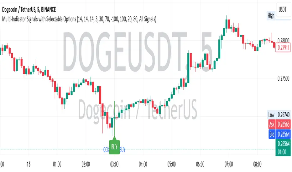
Multi-Indicator Signals with Selectable Options by DiGetMulti-Indicator Signals with Selectable Options
Script Overview
This Pine Script is a multi-indicator trading strategy designed to generate buy/sell signals based on combinations of popular technical indicators: RSI (Relative Strength Index) , CCI (Commodity Channel Index) , and Stochastic Oscillator . The script allows you to select which combination of signals to display, making it highly customizable and adaptable to different trading styles.
The primary goal of this script is to provide clear and actionable entry/exit points by visualizing buy/sell signals with arrows , labels , and vertical lines directly on the chart. It also includes input validation, dynamic signal plotting, and clutter-free line management to ensure a clean and professional user experience.
Key Features
1. Customizable Signal Types
You can choose from five signal types:
RSI & CCI : Combines RSI and CCI signals for confirmation.
RSI & Stochastic : Combines RSI and Stochastic signals.
CCI & Stochastic : Combines CCI and Stochastic signals.
RSI & CCI & Stochastic : Requires all three indicators to align for a signal.
All Signals : Displays individual signals from each indicator separately.
This flexibility allows you to test and use the combination that works best for your trading strategy.
2. Clear Buy/Sell Indicators
Arrows : Buy signals are marked with upward arrows (green/lime/yellow) below the candles, while sell signals are marked with downward arrows (red/fuchsia/gray) above the candles.
Labels : Each signal is accompanied by a label ("BUY" or "SELL") near the arrow for clarity.
Vertical Lines : A vertical line is drawn at the exact bar where the signal occurs, extending from the low to the high of the candle. This ensures you can pinpoint the exact entry point without ambiguity.
3. Dynamic Overbought/Oversold Levels
You can customize the overbought and oversold levels for each indicator:
RSI: Default values are 70 (overbought) and 30 (oversold).
CCI: Default values are +100 (overbought) and -100 (oversold).
Stochastic: Default values are 80 (overbought) and 20 (oversold).
These levels can be adjusted to suit your trading preferences or market conditions.
4. Input Validation
The script includes built-in validation to ensure that oversold levels are always lower than overbought levels for each indicator. If the inputs are invalid, an error message will appear, preventing incorrect configurations.
5. Clean Chart Design
To avoid clutter, the script dynamically manages vertical lines:
Only the most recent 50 buy/sell lines are displayed. Older lines are automatically deleted to keep the chart clean.
Labels and arrows are placed strategically to avoid overlapping with candles.
6. ATR-Based Offset
The vertical lines and labels are offset using the Average True Range (ATR) to ensure they don’t overlap with the price action. This makes the signals easier to see, especially during volatile market conditions.
7. Scalable and Professional
The script uses arrays to manage multiple vertical lines, ensuring scalability and performance even when many signals are generated.
It adheres to Pine Script v6 standards, ensuring compatibility and reliability.
How It Works
Indicator Calculations :
The script calculates the values of RSI, CCI, and Stochastic Oscillator based on user-defined lengths and smoothing parameters.
It then checks for crossover/crossunder conditions relative to the overbought/oversold levels to generate individual signals.
Combined Signals :
Depending on the selected signal type, the script combines the individual signals logically:
For example, a "RSI & CCI" buy signal requires both RSI and CCI to cross into their respective oversold zones simultaneously.
Signal Plotting :
When a signal is generated, the script:
Plots an arrow (upward for buy, downward for sell) at the corresponding bar.
Adds a label ("BUY" or "SELL") near the arrow for clarity.
Draws a vertical line extending from the low to the high of the candle to mark the exact entry point.
Line Management :
To prevent clutter, the script stores up to 50 vertical lines in arrays (buy_lines and sell_lines). Older lines are automatically deleted when the limit is exceeded.
Why Use This Script?
Versatility : Whether you're a scalper, swing trader, or long-term investor, this script can be tailored to your needs by selecting the appropriate signal type and adjusting the indicator parameters.
Clarity : The combination of arrows, labels, and vertical lines ensures that signals are easy to spot and interpret, even in fast-moving markets.
Customization : With adjustable overbought/oversold levels and multiple signal options, you can fine-tune the script to match your trading strategy.
Professional Design : The script avoids clutter by limiting the number of lines displayed and using ATR-based offsets for better visibility.
How to Use This Script
Add the Script to Your Chart :
Copy and paste the script into the Pine Editor in TradingView.
Save and add it to your chart.
Select Signal Type :
Use the "Signal Type" dropdown menu to choose the combination of indicators you want to use.
Adjust Parameters :
Customize the lengths of RSI, CCI, and Stochastic, as well as their overbought/oversold levels, to match your trading preferences.
Interpret Signals :
Look for green arrows and "BUY" labels for buy signals, and red arrows and "SELL" labels for sell signals.
Vertical lines will help you identify the exact bar where the signal occurred.
Tips for Traders
Backtest Thoroughly : Before using this script in live trading, backtest it on historical data to ensure it aligns with your strategy.
Combine with Other Tools : While this script provides reliable signals, consider combining it with other tools like support/resistance levels or volume analysis for additional confirmation.
Avoid Overloading the Chart : If you notice too many signals, try tightening the overbought/oversold levels or switching to a combined signal type (e.g., "RSI & CCI & Stochastic") for fewer but higher-confidence signals.
Exhaustion Analysis - Bullish and Bearish Exhaustion Points Single Timeframe Exhaustion Analysis is an advanced Pine Script trading tool meticulously designed to provide traders with granular insights into market exhaustion and potential reversals by leveraging data from a single lower timeframe.
This script utilizes the request.security_lower_tf() function to pull high, low, close, and volume data from a user-specified lower timeframe, ensuring that the analysis is rooted in detailed, intraday price action rather than broader, less responsive data points.
At the heart of this indicator is a multi-faceted approach to market analysis, employing several key metrics that evaluate market efficiency, directional volume imbalances, and volume-to-price relationships.
The script calculates price efficiency as the relative movement of price compared to traded volume, offering a measure of how efficiently the market is absorbing buy and sell orders.
Directional imbalance is assessed by examining the dominance between buy-side and sell-side volumes, while volume-to-price ratios provide insight into the intensity of trading activity relative to price fluctuations.
Each of these metrics is computed across the entire range of lower timeframe data, generating individual values that are then aggregated and normalized.This normalization process ensures that no single metric dominates the analysis, instead creating a balanced composite view of market conditions.
The script’s normalization method scales these metrics into proportional ratios, allowing for consistent comparison across varying market states and ensuring adaptability in dynamic trading environments.
To enhance its detection capabilities, the indicator incorporates a multi-layered composite scoring system.
Three distinct composite scores are derived, each placing different emphasis on various market metrics, ranging from price efficiency and directional imbalance to volume dynamics and rate-of-change acceleration.These composite scores are then combined into a final composite score, which serves as the foundation for the script’s exhaustion and reversal detection logic.The script identifies exhaustion by comparing the final composite score against a historical percentile-based threshold, dynamically calculated over an extensive lookback period.
When market conditions reflect extreme exhaustion—either due to rapid price movements, volume surges, or directional imbalances—the script flags potential reversal zones.These exhaustion flags are visually represented as histogram plots, providing clear, real-time indicators of emerging market fatigue.
In addition to exhaustion detection, the indicator assesses potential directional reversals by integrating volatility-based range calculations.Utilizing a rolling average of price ranges, the script detects instances where the market breaks beyond typical price boundaries, signaling possible trend reversals.
Buy signals are generated when the price breaks above the previous high plus an adaptive range during periods of exhaustion, while sell signals occur when the price drops below the previous low minus the adaptive range under similar exhausted conditions.
To enhance usability, the script visually presents its analysis through multiple plots, including histogram representations of exhaustion flags, upward and downward reversal indicators, and the continuously updating final composite score.
Labels are dynamically added to the chart, marking buy and sell opportunities, ensuring that traders have clear, actionable insights at their fingertips.This script stands out for its meticulous use of lower timeframe data, comprehensive market metrics, and dynamic exhaustion detection, making it a valuable tool for traders looking to identify high-probability reversal points with precision and confidence.

KEMAD | QuantumResearchQuantumResearch KEMAD Indicator
The QuantumResearch KEMAD Indicator is a sophisticated trend-following and volatility-based tool designed for traders who demand precision in detecting market trends and price reversals. By leveraging advanced techniques implemented in PineScript, this indicator integrates a Kalman filter, an Exponential Moving Average (EMA), and dynamic ATR-based deviation bands to produce clear, actionable trading signals.
1. Overview
The KEMAD Indicator aims to:
Reduce Market Noise: Employ a Kalman filter to smooth price data.
Identify Trends: Use an EMA of the filtered price to define the prevailing market direction.
Set Dynamic Thresholds: Adjust breakout levels with ATR-based deviation bands.
Generate Signals: Provide clear long and short trading signals along with intuitive visual cues.
2. How It Works
A. Kalman Filter Smoothing
Purpose: The Kalman filter refines the selected price source (e.g., close price) by reducing short-term fluctuations, thus offering a clearer view of the underlying price movement.
Customization: Users can adjust key parameters such as:
Process Noise: Controls the filter’s sensitivity to recent changes.
Measurement Noise: Determines how responsive the filter is to incoming price data.
Filter Order: Sets the number of data points considered in the smoothing process.
B. EMA-Based Trend Detection
Primary Trend EMA: A 25-period EMA is applied to the Kalman-filtered price, serving as the core trend indicator.
Signal Mechanism:
Long Signal: Triggered when the price exceeds the EMA plus an ATR-based upper deviation.
Short Signal: Triggered when the price falls below the EMA minus an ATR-based lower deviation.
C. ATR Deviation Bands
ATR Utilization: The Average True Range (ATR) is computed (default length of 21) to assess market volatility.
Dynamic Thresholds:
Upper Deviation: Calculated by adding 1.5× ATR to the EMA (for long signals).
Lower Deviation: Calculated by subtracting 1.1× ATR from the EMA (for short signals).
These bands adapt to current volatility, ensuring that signal thresholds are both dynamic and market-sensitive.
3. Visual Representation
The indicator’s design emphasizes clarity and ease of use:
Color-Coded Bar Signals:
Green Bars: Indicate bullish conditions when a long signal is active.
Red Bars: Indicate bearish conditions when a short signal is active.
Trend Confirmation Line: A 54-period EMA is plotted to further validate trend direction. Its color dynamically changes to reflect the active trend.
Background Fill: The space between a calculated price midpoint (typically the average of high and low) and the EMA is filled, visually emphasizing the prevailing market trend.
4. Customization & Parameters
The KEMAD Indicator is highly configurable, allowing traders to tailor the tool to their specific trading strategies and market conditions:
ATR Settings:
ATR Length: Default is 21; adjusts sensitivity to market volatility.
EMA Settings:
Trend EMA Length: Default is 25; smooths price action for trend detection.
Confirmation EMA Length: Default is 54; aids in confirming the trend.
Kalman Filter Parameters:
Process Noise: Default is 0.01.
Measurement Noise: Default is 3.0.
Filter Order: Default is 5.
Deviation Multipliers:
Long Signal Multiplier: Default is 1.5× ATR.
Short Signal Multiplier: Default is 1.1× ATR.
Appearance: Eight customizable color themes are available to suit individual visual preferences.
5. Trading Applications
The versatility of the KEMAD Indicator makes it suitable for various trading strategies:
Trend Following: It helps identify and ride sustained bullish or bearish trends by filtering out market noise.
Breakout Trading: Detects when prices move beyond the ATR-based deviation bands, signaling potential breakout opportunities.
Reversal Detection: Alerts traders to potential trend reversals when price crosses the dynamically smoothed EMA.
Risk Management: Offers clearly defined entry and exit points, based on volatility-adjusted thresholds, enhancing trade precision and risk control.
6. Final Thoughts
The QuantumResearch KEMAD Indicator represents a unique blend of advanced filtering (via the Kalman filter), robust trend analysis (using EMAs), and dynamic volatility assessment (through ATR deviation bands).
Its PineScript implementation allows for a high degree of customization, making it an invaluable tool for traders looking to reduce noise, accurately detect trends, and manage risk effectively.
Whether used for trend following, breakout strategies, or reversal detection, the KEMAD Indicator is designed to adapt to varying market conditions and trading styles.
Important Disclaimer: Past data does not predict future behavior. This indicator is provided for informational purposes only; no indicator or strategy can guarantee future results. Always perform thorough analysis and use proper risk management before trading.
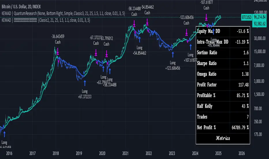
[Excalibur] Advanced Polynomial Regression Trend ChannelIt's been a long time coming... Regression channel enthusiasts, it's 'ultimately' here! Welcome to my Apophis page. But first, let me explain the origins of its attributed name blending both descriptive & engaging content with concise & technical topics...
EGYPTIAN ROOTED TALES:
Apophis (Greek) or Apep (Egyptian) was known by many cultures to be a mighty Egyptian archetype of chaos, darkness, and destruction. In ancient Egyptian mythology, Apophis was often depicted in the form of a fearsome menacing serpent, in those days, with an insatiable appetite for relentless malevolence. This dreaded entity was considered a formidable enemy and was also believed to appear as a giant serpent arising from the underworld.
Forever engaging in eternal battle, according to lore, Apophis' adversarial attributes represented the forces of disorder and anarchy clashing with the forces of order and harmony. This serpent's wickedly described figure was significantly symbolic of the disruptive, treacherous powers that Apophis embodied, those which threatened to plunge the perceivable archaic world into darkness. To the ancients, the legendary cyclical struggles against Apophis served as allegory reflecting on the macrocosm of the larger conflict between good and evil disparities that shaped early ancient civilization, much like the tree serpent.
One of Apophis’ mythological roots was immortally depicted on tomb stone. On one particular hieroglyphic wall tableau, in the second chamber of Inherkau’s tomb at Deir el-Medina, within the Theban Necropolis, portrays a mural of a serpent (Apep) under an edible fruit tree being slain in defeat. The species of snake depicted on various locations of tomb walls appears to me to bear a striking resemblance to the big eyed Echis pyramidum (Egyptian saw-scaled viper) native to regions of North Africa and the Middle East. It's a species of viper notoriously contributing to the most snake bite fatalities in the world still to this day; talk about a true harbinger of chaos incarnate. You do NOT want to cross paths with this asp in the dark of night, ever! Nor the other species of Echis found around Echid trees in the garden.
As we all know, fabled archaic storytelling can be misconstruing. Yet, these archaic serpent narratives still have echoes of significant notions and wisdom to learn from, especially in a modern technological society still rife with miscalculating deep snakes slithering about with intent to specifically plot disorder on national scales, and then profitably capitalize on it. Many deep black snakes are hiding in plain sight and under rocks. They do indeed speak and spell with forked tongues and malfeasance to the masses. I have great news. Tools now exist in the realms of AI combined with fractal programming circles to uncover these venomous viper mesh networks and investigatively monitor their subversive activities, so their days are surely numbered for... GAME OVER. Prepare to meet the doom you vain vipers have sought!
The arrival of the great and powerful international storm of the century has come, clothed in vindication. It's the only just way for the globe to clean house and move forward economically into the evolving herafter unobstructed by rampant evils and corruption. The foundations of future architectures are being established, and these nefarious obstacles MUST NOT hinder that path ahead.
With my former days of serpent wrangling being behind me, I now explore avenues of history, philosophy, programming, and mathematics, weaving them all into my daily routine. Now is the time to make some mathematical history unfold and get to the good and spicy stuff that you as the reader seek...
CALCULATING ON CHAOS:
Perhaps frightful characteristics of serpents (their maneuverability to adapt to any swervy situation) could be harnessed and channeled into a powerful tool for navigating the treacherous waters of data chaos. What if taming a monstrous beast of mayhem was not only possible, but fully achievable? Well, I think I have improved upon an approach to better tackle fractal chaos handling and observation within a modest PSv6 float environment without doubles. Finally, I've successfully turned my pet anaconda, Apophis, into a docile form of mathematical charting resilience beyond anything I have ever visually witnessed before. This novel work clearly deprecates ALL of my prior regression works by performing everything those delivered AND more, but it doesn't necessarily eliminate them into extinction.
INTRODUCTION:
Allow me to introduce Apophis! What you see showcased above is also referred to as 'Advanced Polynomial Regression Trend Channel' (APRTC) for technical minds. I would describe it as an avant-garde trend channel obtaining accurate polynomial approximations on market data with Pine v6.0. APRTC is a fractal following demystifier that I can only describe as being a signal trajectory tracking stalker manifesting as a data devouring demon. My full-fledged 'Excalibur' version of poly-regression swiftly captures undulating patterns present in market data with ease and at warp speed faster than you can blink. Now unchained, this is my rendering of polynomial wrath employing the "Immense Power of Pine".
By pushing techniques of regression to extremes, I am able to trace the serpentine trajectory of chaos up to a 50th order with 100s or 1000s of samples via "advanced polynomial regression" (APR), aka Apophis. This uniquely reactive trend channel method is designed to enhance the way we engage with the complex challenge of observably interpreting chaotic price behavior. While this is the end of the road for my revolutionary trend channel technology, that doesn't imply that future polynomial regression upgrades won't/might occur... There are a number of other supplementary concepts I have in my mind that could potentially prove useful eventually, who knows. However, for the moment, I feel it's wisest to monitor how accommodating APRTC is towards servers for the present time.
HISTORICAL ENDEAVORS:
Having wrangled countless wild serpents in my youth by the handfuls, tackling this was one multi-headed regression challenge temptation I couldn't resist. Besides, serpents in reality are more than often scared of us in the wild, so I assumed this shouldn't be too terribly hard. Wrong! It's been a complex struggle indeed. APRTC gave me many stinging bites for a LONG time. I had unknowingly opened Pandora's box of polynomials unprepared for what was to follow.
Long have I wrestled with Apophis throughout many nights for years with adversity, at last having arrived at a current grand solution and ultimately emerging victorious. Now, does the significance of the entitled name Apophis become more apparent at this point of reading? What you can now witness above is a very powerful blend of precision combined with maneuverability, concluding my dreamy expectations of a maximal experience with polynomial regression in TV charts. With all of my wizardry components finally assembled, Apophis genuinely is the most phenomenal indicator I ever devised in my life... as of yet.
How was this accomplished? By unlocking a deep understanding of the mathematical principles that govern regression, combined with an arsenal of mathemagical trickeries through sheer determination. I also spent an incredible amount of time flexing the unbendable 64bit float numerics to obtain a feasible order/degree of up to 50 polynomials or up to 4000 bars of regression (never simultaneously) on a labyrinth of samples. Lastly, what was needed was a pinch of mathematical pixie dust with a pleasant dose of Pine upgrades (lots of line re-drawings) that millions of other members can also utilize. Thank you so much, Pine developers, for once again turning meager proposed visions into materialized reality by leveraging the "Power of Pine" for the many!
DESCRIBING POLYNOMIAL REGRESSION:
APRTC is a visual guide for navigating noisy markets, providing both trajectory and structure through the power of mathematical modeling. Polynomial regression, especially at higher orders, exhibits obvious sidewinder/serpentine like characteristics. Even the channel extremities, on swift one second charts, resemble scales in motion with a pair of dashed exterior lines. This poly version presently yields the best quality of fit, providing an extreme "visual analysis" of your price action in high noise environments. The greater the order of the polynomial, the more pronounced the meandering regression characteristics become, as the algorithm strives to visually capture the fundamental fractal patterns most effectively.
Polynomial Regression in Action:
The medial line displays the core polynomial regression approximation in similarity to spinal backbones of serpents when following the movements of market data. Encasing the central structure, the channel's skin consists of enveloping lines having upper and lower extremes. To further enhance visualization, background fill colors distinguish the breadth between positive and negative territories of potential movement.
Additional internal dotted variability lines are available with multiple customizable settings to adjust dynamic dispersion, color, etc. One other exciting feature I added is the the ability to see the polynomial values with up to 50 (adjustable) decimal places if available. Witnessing Xⁿ values tapering near to 0.0 may indicate overfitting. Linear regression is available at order=1 and quadratic regression is invoked using order=2.
Information Criterion:
A toggleable label provides a multitude of information such as Bayesian Information Criterion (BIC), order, period, etc. BIC serves as an polynomial regression fit metric, with lesser values indicating a better balance between polynomial order adjustments, reflecting a more accurate fit in relation to the channel's girth. One downside of BIC values is their often large numerical values, making visual comparisons challenging, and then also their rare occurrence as negative values.
Furthermore, I formulated my own "EXPERIMENTAL" Simpler Information Criterion (SIC) fit metric, which seems to offer better visual interpretability when adjusting order settings on a selected regression period, especially on minuscule price numerics. Positive valued SIC numerics with lesser digits also reflect a preferred better fit during order adjustment, same as applying BIC principles of the minimum having a superior calulation tendency. I'll let members be the judge of deciding whether my SIC is actually a superior information criterion compared to BIC.
TECHNICAL INTERPRETATION and APPLICATION:
The Apophis indicator utilizes high-order polynomial regression, up to a maximum 50th order ability to deliver a nuanced, visual representation of complex market dynamics. I would caution against using upwards toward a 50th order, because opting for a 50th order polynomial is categorically speaking "wildly unsane" in real-world practice. As the polynomial degree increases from lesser orders, the regression line exhibits more pronounced curvature and undulations.
Visually analyzing the regression curve can provide insights into prevailing trends, as well as volatility regimes. For example, a gently sloping line may signal a steady directional trend, while a tightly curled oscillating curve may indicate heightened volatility and range-bound trading. Settings are rather straight forward, and comparable to my former "Quadratic Regression Trend Channel" efforts, although one torturous feature from QRTC is omitted due too computational complexity concerns.
Notice: Trial invite only access will not be granted for this indicator. Those who are familiar with recognizing what APRTC is, you will either want it or not, to add to your arsenal of trading approaches.
When available time provides itself, I will consider your inquiries, thoughts, and concepts presented below in the comments section, should you have any questions or comments regarding this indicator. When my indicators achieve more prevalent use by TV members , I may implement more ideas when they present themselves as worthy additions. Have a profitable future everyone!
RISK DISCLAIMER:
My scripts and indicators are specifically intended for informational and educational use only. This script uses historical data points to perform calculations to derive real-time calculations. They do not infer, indicate, or guarantee future results or performance.
By utilizing this script/indicator or any portion of it, you agree to accept 100% responsibly and liability for your investment or financial decisions, and I will not be held liable for your subjective analytic interpretations incurring sustained monetary losses. The opinions and information visual or otherwise provided by this script/indicator is not investment advice, nor does it constitute recommendation.
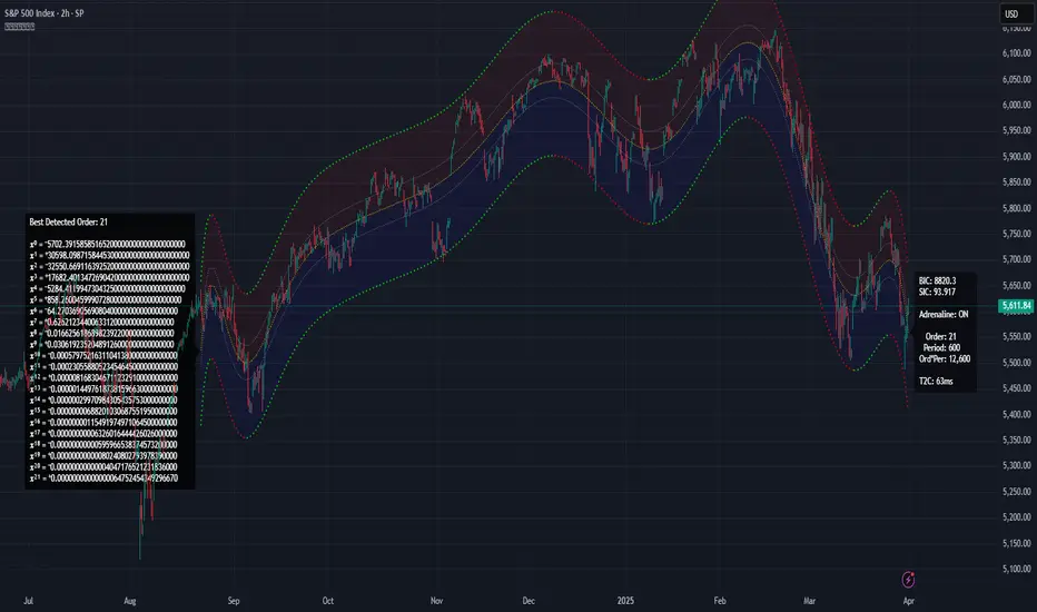
Breakout Detection using EMAs and Mansfield Relative StrengthThis script identifies breakout opportunities based on a combination of price action, volume, and relative strength. It is designed for daily timeframe charts and helps traders pinpoint strong bullish setups with the following criteria:
Price Action: Stock price is above both the 10-day EMA and 5-week EMA.
EMA Trends: The 10-day EMA is above the 20-day EMA, and the 5-week EMA is above the 10-week EMA, confirming bullish momentum.
Customizable Parameters: Customize the index for the Mansfield Relative Strength, the volume multiplier, and the price breakout look-back period.
Price Breakout: The price is at a 3-month high, indicating strength.
Volume Breakout: A volume spike occurs, surpassing the 20-day average volume by a user-defined multiplier.
Features:
Generates clear breakout signals with a green triangle below the bar.
Integrated Mansfield Relative Strength for relative performance analysis.
Alerts for when all conditions are met, ensuring you never miss an opportunity.
How to Use:
Add this script to a daily chart of your chosen stock.
Look for green triangle signals indicating a potential breakout.
Adjust the parameters to suit your trading strategy and preferred index for the Mansfield Relative Strength.
This tool is ideal for swing traders looking to combine technical analysis with relative strength metrics for high-conviction bullish setups.

Relative Volume Index [PhenLabs]Relative Volume Index (RVI)
Version: PineScript™ v6
Description
The Relative Volume Index (RVI) is a sophisticated volume analysis indicator that compares real-time trading volume against historical averages for specific time periods. By analyzing volume patterns and statistical deviations, it helps traders identify unusual market activity and potential trading opportunities. The indicator uses dynamic color visualization and statistical overlays to provide clear, actionable volume analysis.
Components
• Volume Comparison: Real-time volume relative to historical averages
• Statistical Bands: Upper and lower deviation bands showing volume volatility
• Moving Average Line: Smoothed trend of relative volume
• Color Gradient Display: Visual representation of volume strength
• Statistics Dashboard: Real-time metrics and calculations
Usage Guidelines
Volume Strength Analysis:
• Values > 1.0 indicate above-average volume
• Values < 1.0 indicate below-average volume
• Watch for readings above the threshold (default 6.5x) for exceptional volume
Trading Signals:
• Strong volume confirms price moves
• Divergences between price and volume suggest potential reversals
• Use extreme readings as potential reversal signals
Optimal Settings:
• Start with default 15-bar lookback for general analysis
• Adjust threshold (6.5x) based on market volatility
• Use with multiple timeframes for confirmation
Best Practices:
• Combine with price action and other indicators
• Monitor deviation bands for volatility expansion
• Use the statistics panel for precise readings
• Pay attention to color gradients for quick assessment
Limitations
• Requires quality volume data for accurate calculations
• May produce false signals during pre/post market hours
• Historical comparisons may be skewed during unusual market conditions
• Best suited for liquid markets with consistent volume patterns
Note: For optimal results, use in conjunction with price action analysis and other technical indicators. The indicator performs best during regular market hours on liquid instruments.
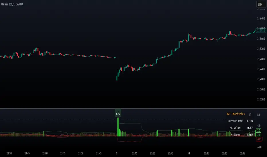
XAUMOvisionXAUMOvision: T he XAU/USD Composite Correlation Indicator with Weighted Spillover & Dynamic Lines
XAUMOvision is a custom-built trading indicator designed to track the intricate relationship between XAU/USD (Gold) and key economic factors: DXY (US Dollar Index), US Treasury Yields, S&P 500, and Crude Oil. By blending correlation metrics with weighted spillover effects, XAUMOvision offers actionable insights to refine your Gold trading strategy.
Core Features of XAUMOvision
1. Correlation (CC)
Definition: Measures how closely two assets move together over a given period.
Calculation: Pearson Correlation is used to assess Gold's relationship with:
DXY: Negative correlation—when DXY rises, Gold typically falls.
US Treasury Yields: Negative correlation—higher yields reduce Gold’s appeal.
S&P 500: Opposite movement, as Gold acts as a safe-haven.
Crude Oil: Positive correlation—both often rise during inflationary pressures.
2. Weighted Spillover
What It Does: Quantifies how movements in each asset (DXY, Yields, etc.) influence Gold.
Weighting: User-defined values (e.g., DXY weight = 0.4) scale each factor’s impact.
Result: A total spillover score reveals bullish or bearish sentiment for XAU/USD.
3. Composite Bias Line
Purpose: Consolidates spillover impacts into a single sentiment indicator.
Readings:
Strong Bullish: Composite Bias > 0.5.
Neutral: Close to 0.
Strong Bearish: Composite Bias < -0.5.
Output: A directional bias to guide your trading decisions.
4. Traffic Signal Line
Visual Cues:
Green: Strong Bullish Signal.
Red: Strong Bearish Signal.
Gray: Neutral—avoid trading.
Utility: A quick, color-coded overview of market conditions.
Using XAUMOvision Effectively
When to Use
During high volatility or major news events (e.g., CPI, interest rate decisions).
To understand macroeconomic forces driving Gold’s price action.
Recommended Timeframes
4-Hour: Ideal for swing traders seeking medium-term setups.
Daily: Perfect for macro trend analysis.
Weekly: Suitable for long-term investors aligning with broader trends.
---------------------------------------------------------------------------------
Practical Example
Monday, January 13, 2025 (Neutral Market)
Market Behavior: Gold stagnated (-0.96%), with low volume (681.13K).
Indicator Insights:
Composite Spillover: -0.92 (mild bearish pressure).
Traffic Signal Line: Gray—stay out of the market.
Bias Line: Weak Bearish (-1), signaling no strong trend.
Result: XAUMOvision kept traders from entering a choppy, low-volume market.
Wednesday, January 15, 2025 (CPI-Driven Rally)
CPI Release: Core CPI softer than expected (0.2% vs. 0.3%), weakening the DXY and Yields. Gold surged.
Indicator Insights:
Composite Spillover: +0.57 (strong bullish sentiment).
Traffic Signal Line: Green—clear buy signal.
Bias Line: Strong Bullish (+2), confirming the trend.
Result: Traders aligned with institutional flows and profited from the CPI-driven rally.
--------------------------------------------------------------------------------
Why XAUMOvision Stands Out
Avoids Bad Trades: Neutral signals and low-volume days keep you sidelined during indecisive markets.
Pinpoints Big Moves: Green signals during high-impact events help you capitalize on major trends.
Volume Validation: Confirms institutional activity to distinguish real trends from fakeouts.
Conclusion: Trade Like a Pro
XAUMOvision blends macroeconomic analysis with real-time technical indicators, ensuring you stay ahead of market moves. Whether navigating neutral markets or CPI-driven surges, this tool provides clarity and confidence in your trading decisions. For swing traders and macro enthusiasts, XAUMOvision is the ultimate weapon in Gold trading.

[GrandAlgo] Candle Trap ZonesThe Candle Trap Zones indicator identifies areas where price becomes "trapped" within a defined range and refines these zones using a proprietary algorithm. This unique approach ensures that only the most relevant zones, based on both proximity and price behavior, are highlighted for traders. By integrating advanced features like Fibonacci Cloud visualization and customizable detection parameters, the indicator offers tools to support detailed and adaptable price action analysis.
How It Works:
The Candle Trap Zones indicator evaluates historical price data to identify ranges where price has been trapped. Zones are filtered using proximity detection to prevent overlaps and maintain clarity. Additionally:
The strength parameter adjusts the sensitivity of zone identification, while the trap detection range determines how far back the algorithm evaluates price data.
The Fibonacci Cloud acts as an extension of the identified zones, providing additional precision by highlighting key levels just outside the zones
The auto-adjustment feature dynamically modifies zones if new zones are formed in close proximity, ensuring the chart reflects the most relevant areas.
The zone extension feature expands zones when price re-enters, allowing traders to track extended interactions with critical levels.
Key Features:
Proximity-Based Trap Zone Detection
Dynamically identifies and refines trap zones while avoiding overlaps to keep charts clean.
Fibonacci Cloud Integration:
Extends trap zones with Fibonacci-based levels, providing actionable reference points for potential reactions.
Customizable Detection Parameters:
Fine-tune zone detection with adjustable strength and range settings to suit various trading styles.
Real-Time Alerts:
Sends notifications when price enters, exits, or re-tests a trap zone, enabling timely trading decisions.
Dynamic Zone Updates:
Continuously recalculates zones as new data becomes available, reflecting current market conditions.
Clear and Intuitive Visuals:
Trap zones and Fibonacci clouds are highlighted in distinct colors for seamless chart analysis.
Use Cases:
Identify areas where price consolidates or liquidity builds up.
Monitor zones for potential breakouts or reversals.
Fibonacci Clouds serve as additional reference points for anticipating market reactions and refining trade setups
Trap zones may highlight areas of accumulation or distribution where traders can anticipate price reversals or breakouts.
Useful for identifying liquidity zones in range-bound markets or pinpointing key levels for breakout trades in trending markets.
Adaptable for use in Forex, crypto, stocks, and other trading markets.
Disclaimer:
This indicator is a technical analysis tool designed to assist traders by providing insights into market conditions. It does not guarantee future price movements or trading outcomes and should not be relied upon as a sole decision-making tool. The effectiveness of this indicator depends on its application, which requires your trading knowledge, experience, and judgment.
Trading involves significant financial risk, including the potential loss of capital. Past performance of any tool or indicator does not guarantee future results. This script is intended for educational and informational purposes only and does not constitute financial or investment advice. Users are strongly encouraged to perform their own analysis and consult with a qualified financial professional before making trading decisions.

[GrandAlgo] Liquidity HeatmapThe Liquidity Heatmap is a unique indicator designed to identify and highlight zones where price is likely to react based on liquidity dynamics. Unlike tools that analyze volume across all price levels, this indicator focuses specifically on liquidity concentrated around potential reversal zones. By evaluating price action and volume at these critical levels, it identifies areas of heightened interest for traders.
Key Features:
Dynamic Liquidity Zones:
Automatically calculates liquidity zones based on historical price activity, ensuring real-time relevance.
Volume-Based or Candle Interaction Analysis:
Choose between volume-based evaluation to focus on order flow or candle-based interaction for a broader perspective.
Customizable Percentile Threshold:
Filter zones based on their significance by setting a threshold to display only the top liquidity areas.
Lookback Period Control:
Define how many candles the indicator should analyze, allowing you to focus on short-term or long-term liquidity levels.
Color-Coded Visuals:
Liquidity zones are displayed using gradients, with green representing potential bullish zones (below price) and red representing potential bearish zones (above price). Stronger zones are indicated with darker colors.
How It Works:
The Liquidity Heatmap divides the price range into multiple levels, evaluating each level for interaction with historical price data. Liquidity zones are calculated based on:
Volume Concentration: When enabled, the indicator evaluates zones using historical volume, highlighting areas with significant order flow.
Candle Interactions: When volume-based analysis is disabled, the indicator calculates the number of candles interacting with each zone to determine its importance.
Zones that meet the user-defined percentile threshold are highlighted on the chart. Color gradients indicate the strength of each zone, allowing traders to prioritize the most significant areas. Real-time alerts notify users when the price touches these zones, providing actionable insights.
The image illustrates the volume-based analysis feature of the Liquidity Heatmap indicator. Liquidity zones are dynamically highlighted with intuitive color gradients—green for bullish volume and red for bearish volume—providing a clear visual representation of areas with concentrated liquidity at potential reversal points. This feature helps traders focus on zones with significant market activity, enhancing their decision-making process.
Disclaimer
This indicator is a technical analysis tool designed to assist traders by providing insights into market conditions. It does not guarantee future price movements or trading outcomes and should not be relied upon as a sole decision-making tool. The effectiveness of this indicator depends on its application, which requires your trading knowledge, experience, and judgment.
Trading involves significant financial risk, including the potential loss of capital. Past performance of any tool or indicator does not guarantee future results. This script is intended for educational and informational purposes only and does not constitute financial or investment advice. Users are strongly encouraged to perform their own analysis and consult with a qualified financial professional before making trading decisions.

L.I.F.T. - Legaci Index Flow TrackerL.I.F.T. - Legaci Index Flow Tracker
The 'Legaci Index Flow Tracker' is a cutting-edge tool designed for traders and analysts who want to gain unparalleled insight into the strength and momentum of key market indices. This innovative indicator evaluates the relationship between 13 customisable indices and their respective Simple Moving Averages (SMAs), along with the slopes of those SMAs, to deliver a comprehensive market sentiment analysis.
Key Features:
Dynamic Scoring System :
Each index is evaluated across four categories, assigning a score of +1 (bullish) or -1 (bearish) based on price action and momentum.
Intuitive Table Display :
Scores for each index are presented in an easy-to-read table, highlighting:
The index ticker.
Individual scores for the 4 categories (price vs. SMA and slope).
A Final Score summarising the overall strength or weakness of each index.
Customisable Parameters :
Timeframe : Adapt to short-term, mid-term, or long-term trading strategies.
Lookback Period : Fine-tune slope calculations to capture precise market trends.
SMA Lengths : Adjust the moving average lengths to align with your trading methodology.
Index Selection : Choose from the 13 default indices or customise them to track your preferred market segments.
Why use the "L.I.F.T."?
This indicator is perfect for traders seeking a big-picture overview of market flow across multiple indices while maintaining the flexibility to drill down into specific trends. By tracking price action, SMA relationships, and momentum slopes in a unified framework, the Legaci Index Flow Tracker helps you:
Identify market trends at a glance.
Pinpoint the strongest and weakest indices in any timeframe.
Stay ahead of market shifts with actionable insights.
Whether you’re a day trader or a long-term strategist, the indicator is an essential addition to your toolkit, providing you with the clarity and precision needed to navigate today’s complex markets.
[blackcat] L2 BullBear OscillatorOVERVIEW
The " L2 BullBear Oscillator" is a custom trading indicator for TradingView that helps traders identify market trends, potential tops and bottoms, and the strength of trends using various moving averages and price relationships.
FEATURES
Calculates a base oscillator based on the close price relative to the highest and lowest prices over the past 60 periods.
Smoothes the oscillator using exponential moving averages (EMAs).
Determines market strength through relative strength indicators and moving averages.
Identifies potential tops and strong support levels based on specific conditions involving oscillators and price actions.
Plots several signals to help traders make informed decisions.
HOW TO USE
Install the script on your TradingView chart.
Customize the settings in the "Inputs" section:
Set the periods for the short-term and long-term EMAs.
Set the periods for the three SMAs used in calculations.
Interpret the plots:
BullBear Signal (Fuchsia Line): Indicates the overall market trend. Uptrends suggest buying opportunities, while downtrends suggest selling.
Decreasing BullBear Signal (Aqua Line): Highlights periods when the trend is weakening or turning bearish, signaling possible selling opportunities.
Potential Top Condition (Yellow Plot): Signals possible trend reversals from bullish to bearish, indicating times to consider taking profits or preparing for a downtrend.
High Price Condition (Yellow Plot): Indicates strong bullish momentum but also potentially overbought conditions, which might precede a correction.
Earning Condition (Red Line): Possibly signifies strong bullish signals, indicating good times to enter long positions.
Strong Support Condition (White Arrows): Signals potential bottoms or support levels, indicating buying opportunities.
Start Hiding Condition (Fuchsia Plot): Might indicate times to exit positions or reduce exposure due to unfavorable market conditions.
ALGORITHMS
Moving Averages:
Simple Moving Averages (SMAs): Used to calculate averages of price data over specified periods.
Exponential Moving Averages (EMAs): Used to give more weight to recent prices, making the moving averages more responsive to new data.
Oscillator Calculation:
The base oscillator is calculated based on the close price's position within the highest and lowest prices over 60 periods, normalized to a 0-100 scale.
This oscillator is then smoothed using EMAs to reduce noise and make trends more visible.
Relative Strength Indicator:
Calculated based on the close price's position within the highest and lowest prices over 20 periods, also normalized to a 0-100 scale.
This is smoothed using SMAs to get a more stable signal.
Condition Checks:
Various conditions are checked to identify potential tops, strong support, and other market states based on the relationships between these indicators and price actions.
LIMITATIONS
The script is based on historical data and does not guarantee future performance.
It is recommended to use the script in conjunction with other analysis tools.
The effectiveness of the strategy may vary depending on the market conditions and asset being traded.
NOTES
The script is designed for educational purposes and should not be considered financial advice.
Users are encouraged to backtest the strategy on a demo account before applying it to live trades.
THANKS
Special thanks to the TradingView community for their support and feedback.
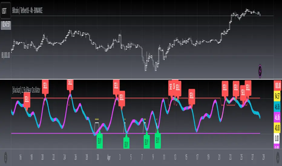
BTC Trendline Patterns with Signals BTC Trendline Patterns with Signals
This custom Pine Script indicator automatically detects key pivot points in Bitcoin price action and draws support and resistance trendlines. The indicator provides buy (long) and sell (short) signals when these trendlines are broken. This can help traders identify potential breakout opportunities and trend reversals based on established price levels.
Features:
Pivot Point Detection: Automatically identifies pivot highs and lows in the price chart, based on customizable parameters (Pivot Left and Pivot Right).
Support and Resistance Trendlines: Draws trendlines based on the identified pivot points. These lines represent significant price levels where price may experience support or resistance.
Breakout Signals: Provides buy (long) and sell (short) signals when the price breaks above the resistance trendline (for buy signals) or below the support trendline (for sell signals).
Customizable Pivot Lengths: Adjust the number of bars considered for determining pivot points using the Pivot Left and Pivot Right input parameters.
How it Works:
Pivot Detection: The script identifies the highest high (pivotHigh) and the lowest low (pivotLow) within a specific range of bars (defined by Pivot Left and Pivot Right).
Trendline Plotting: Once pivots are detected, the script draws resistance (red) and support (green) trendlines connecting the most recent pivots. These trendlines act as dynamic support and resistance levels.
Breakout Signals: The script generates signals:
BUY (Long): Triggered when the price breaks above the most recent resistance trendline.
SELL (Short): Triggered when the price breaks below the most recent support trendline.
Parameters:
Pivot Left: Number of bars to the left of the pivot point to consider.
Pivot Right: Number of bars to the right of the pivot point to consider.
Line Width: Customizable line width for drawing trendlines.
Ideal Use:
Timeframes: This indicator works well on timeframes ranging from 1-minute to daily charts. For best results, use it on 1-hour, 4-hour, or daily charts.
Strategy: Ideal for breakout traders or trend-following strategies. Use it to identify potential entry points when price breaks key levels of support or resistance.
Example Use Case:
Swing Traders: Traders looking for potential breakouts can use this script to identify key levels in the market and wait for the price to break through resistance for a long trade or support for a short trade.
Day Traders: For those looking to enter and exit trades in a single day, this indicator can help pinpoint areas of support and resistance, and provide actionable signals when price breaks those levels.
Disclaimer:
This script is not a guarantee of success and should be used in conjunction with other technical analysis tools. Always perform additional research and backtesting before live trading.
Important Notes:
The pivot points and trendlines may adjust dynamically as the price evolves. Adjust the pivot settings to suit the volatility and timeframe of the market you're trading.
This indicator works best when combined with other indicators such as volume, RSI, or MACD for confirmation.
How to Use:
Add the indicator to your chart.
Adjust the Pivot Left and Pivot Right parameters to fine-tune the pivot point detection.
Monitor for trendline breakouts. When the price breaks above the resistance line, a BUY signal will appear. When the price breaks below the support line, a SELL signal will appear.
Use the signals to enter trades at the right moment.
Final Notes:
If you're submitting to TradingView for publishing, keep your description clear and informative, but also concise. Traders need to quickly understand how your indicator works, what parameters they can adjust, and how it might fit into their trading strategy.
