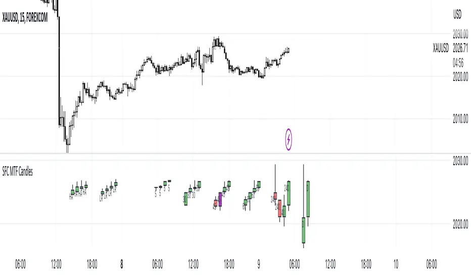
SFC MTF CandlesMost technical traders in the foreign exchange market, whether they are novices or seasoned pros, have come across the concept of multiple time frame analysis in their market educations.
Multiple time-frame analysis involves monitoring the same currency pair across different frequencies (or time compressions). While there is no real limit as to how many frequencies can be monitored or which specific ones to choose, there are general guidelines that most practitioners will follow.
Typically, using three different periods gives a broad enough reading on the market, while using fewer than this can result in a considerable loss of data, and using more typically provides redundant analysis.
This indicator helps traders to visualise the last few candles on many time frames.
For manipulation traders I have added the ability to see the current manipulation on different time frames. When such a candle is created, its colour changes to purple.
The Heikin-Ashi technique averages price data to create a Japanese candlestick chart that filters out market noise.
Heikin-Ashi charts, developed by Munehisa Homma in the 1700s, share some characteristics with standard candlestick charts but differ based on the values used to create each candle. Instead of using the open, high, low, and close like standard candlestick charts, the Heikin-Ashi technique uses a modified formula based on two-period averages. This gives the chart a smoother appearance, making it easier to spots trends and reversals, but also obscures gaps and some price data.
Linear regression attempts to model the relationship between two variables, with a given collection of data values.
Linear regression is a very common and useful technique for following the trend. This technique is applied to candles in order to filter out false movements.
Heikin Ashi and Linear Regression candles are helpful for more conservative traders. If they are not sure about the direction, they can wait for these candles to change colour (direction) as an extra confirmation.
Features:
- Up to 6 time frames
- Up to 4 MTF bars
- Heikin Ashi candles (current time frame) - x4
- Linear Regression candles (current time frame) - x4
Settings
- Time frames on/off
- Selection how many bars to display from each time frame (max 4)
- Adjustment of distance between candles
- Adjusting the position of the candles
- Heikin Ashi candles on/off
- TLinear regression candles on/off
- Linear regression candle length adjustment
How to use the indicator:
Traders can visualise different candles in order to observe the chart better and faster.
All they have to do is activate the group of candles they want and set it up according to their preferences.
Due to the complexity of the code, there is a 1s delay when all features are enabled. To eliminate the lag, deactivate some of the features
It is recommended to have a maximum of 3 time frames activated during the high impact news, as the price changes very quickly.
"mtf" için komut dosyalarını ara
DSS Bressert Stochastic MTFDouble Smoothed Stochastics – DSS Bressert is an oscillator introduced by William Blau and Walter Bressert shortly after each other in two slightly different versions. The calculation of DSS Bressert values is similar to the stochastic indicator. The difference is the use of double exponential smoothing. The advantages over the classic stochastic oscillators are the fast response to price changes in a still very smooth pattern. In addition, the extreme zones at the other end of the scale are reached quite frequently, even in strong trends, resulting in many trend conforming signals. Double Smoothed Stochastics – DSS The Bressert values are the same as the stochastics – values above 80 indicate an overbought condition of the market, values below 20 indicate an oversold condition of the market.
This is a full implementation of the original Stochastic Calulation with Multi-Time-Frame options. Other available scrips are lagging here and messing MTF up...
This Scrip will plot 2 lines for the double smoothed Stochastic based on the original exponential calculation from Blau/Bressert. Whilst the original stochastic is only simple moving average.
If you are a daytrader or scalper, the script is able to show a slow line and a fast line pair. Preferred Settings are embedded as screenshot.

DojiCandle body size RSI-SMMA filter MTF
DojiCandle body size RSI-SMMA filter MTF
Hi. I was inspired by a public script written by @ahmedirshad419, .
I thank him for his idea and hard work.
His script is the combination of RSI and Engulfing Pattern.
//------------------------------------------------------------
I decided to tweak it a bit with Open IA.
I have changed:
1) candle pattern to DojiCandle Pattern;
2) I added the ability for the user to change the size of the candlestick body;
3) Added SMMA 200;
4) Changed the colour of SMMA 200 depending on price direction;
5) Added a change in the colour of candlesticks, depending on the colour of the SMMA 200;
6) Added buy and sell signals with indicator name, ticker and close price;
7) Added ability to use indicator on multi time frame.
How it works
1. when RSI > 70 > SMMA 200 and form the bullish DojiCandle Pattern. It gives sell signal
2. when RSI < 30 < SMMA 200 and form the bearish DojiCandle Pattern. It gives buy signal
settings:
basic setting for RSI, SMMA 200 has been enabled in the script to set the levels accordingly to your trades
Enjoy

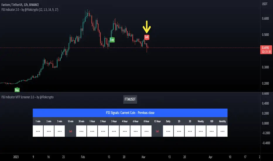
FSS Indicator MTF Screener 2.0 -- by @FlokicryptoFSS Indicator MTF Screener is built so that the user can scan the target coin quickly to see on which timeframes FSS Buy or Sell signals have shown up in the last closed candle on a range of timeframes. This saves both the time and effort of having to browse through multiple timeframes. By using this script the user will be able to quickly screen through a list of coins and read what the FSS indicator is telling, without touching the timeframe. Its uniqueness and originality is tightly related to its tandem work with the FSS Indicator (You can find the description of this indicator below).
The screener is true Multi Time Frame, in that the information is fetched via security requests on other timeframes, and not calculated within the script. This script only makes use of the last close candle, but later versions could include the current candle.
Above you can see a Sell signal on FTMUSDT on the 12H Timeframe on the chart and its corresponding signal on the Screener just under the chart.
Below is another example of the S&P/TSX Composite Index printing a 12H Buy signal on that same 12H Timeframe and its corresponding signal within the screener window.
** The format of the table, cells and text can be changed without notice, but it is my plan to make as many things as possible with regards to the table, editable by the user in the long term.
About the FSS Indicator:
This FSS Indicator script (which is included within this screener) is unique not only in that it removes the need for the user to run each of these indicators individually; it provides an ‘at-a-glance’ summary of the aggregate indicator data, while also providing the user a simultaneous recommended stop loss value based on past market behavior for the given asset and the user's tolerance to risk by editing the ATR Multiplier in the inputs.
The basic concept of the script is to apply past data to present market conditions, and through the use of that data, provide an additional confluence/confirmation signal which simultaneously provides a recommended stop loss value based on average true range (ATR).
The FSS Indicator uses a blend of :
RSI: If within a defined RSI range, increments print score.
MACD: trend and crossovers increment print score.
Histogram: increments print score if a trend of X candles is up or down.
21 EMA: Increments print score if price is above/below 21EMA.
Parabolic SAR: Increments print score if price is above/below Parabolic SAR .
These parameters generate a print score, which is then determined to be sufficient or not to print a LONG or a SHORT signal on the candle.
The indicator isn't built to find bottoms or tops, won't trigger 100% of the time, but should see a high success rate when triggered on higher timeframes. After testing on several pairs/tickers ( Bitcoin , Ethereum , XRP, DJI, SPX and others) on multiple timeframes I have seen the best results on 12-hour, Daily, 2-day, 3-day & weekly timeframes. The success criteria are as follows: Stop Loss not hitting before a rise of at least 10% in value for a long, or a loss of at least 10% in value for a short; waiting until the signal-candle closes for confirmation and back testing.
**Disclaimer: The recommendations of the Indicator/Screener are the result of back-tests and past results will never guarantee future performance of this script on any chart.**
ICT MTF FVG [MK]FVGs (Fair Value Gaps) are significant levels that may act as support or resistance to price. The script finds FVGs as per ICT trading system, then plots the full FVG to the right side of the chart. FVG boxes do not change size when they are semi-mitigated as its important to know where the original FVG midpoint lies. Plotting to the right side of price allows for a cleaner chart. The script is MTF and can display FVG boxes for the following timeframes. Chart, 5,10,15,30,1hr,4hr,8hr,12hr,D,W,M.
Below shows 1hr FVGs marked out. NOTE: this is not what the script does, this is for explanation only.
Below shows what the script will do. 1hr FVGs shown on 15min chart

ICT MTF Order Block Wicks [MK]Order Blocks are significant levels that may act as support or resistance to price. Often the wick area is where price may react. The script finds order blocks as per ICT trading system, then plots either the top or bottom wick area to the right side of price. Plotting to the right side of price allows for a cleaner chart. The script is MTF and can display order block boxes for the following timeframes. 5,10,15,30,1hr,4hr,8hr,12hr,D,W,M. Only order blocks of a higher timeframe than the current chart can be shown.
Below shows how order block wicks should be drawn on a 1hr chart NOTE: this is not what the indicator does, its only for explanation.
Below shows the same 1hr order blocks, but shown on a 15min chart NOTE: this is the function of this indicator.
ORB PSAR MTFThis is an adaptation of the inbuilt PSAR function in a Multi Time Frame .
When MTF enabled It will plot two timeframe simultaneously as follows:-
1 Min with 5 Min (HTF)
5 Min with 15 Min(HTF)
15 Min with 1H(HTF)
1H with 4H(HTF)
4H with Daily(HTF)
Daily with Weekly(HTF)
Weekly with Monthly(HTF)
The higher timeframe(HTF) will get plotted in bigger circled lines.
By enabling plotting of all levels, you can see all current levels of all TF( M1 ,M5,M15,H,4H,D,W,M) on the same screen as "X" on the right side.
Alerts allow you to get alerts when these crossover happens.
Concept Credits: Deishma (Nimblr)

Bender Money Flow Index MTF with Buy & Sell SignalsMFI = Money Flow Index
MTF = Multi Timeframe
The Money Flow Index (MFI) is a technical indicator that can generate sentiment insight or pressure using both price and volume data.
Configurable Indicator Signals
Signal on MFI line directional changes
Invalidate Signal if not in a overbought or oversold pressure zone
Invalidate signal if MFI line is not in confluence with the moving average
Invalidate signal after a defined number of bars in the opposing direction
Please Note:
This indicator is also embedded in the Bender Bot strategy script. Signals and confluence identified by this indicator can be used to autonomously mange strategies. The below features will not have any effect on this indicator's functionality when used as a stand alone indicator.
Bender Bot Strategy Confluence
Require any signal and MFI directional confluence before opening any trade
Require any signal and MFI and Moving average to be in confluence before opening any trade
Require any signal to be in directional confluence with the full MFI signal
Please feel free to contact me with any questions or concerns.

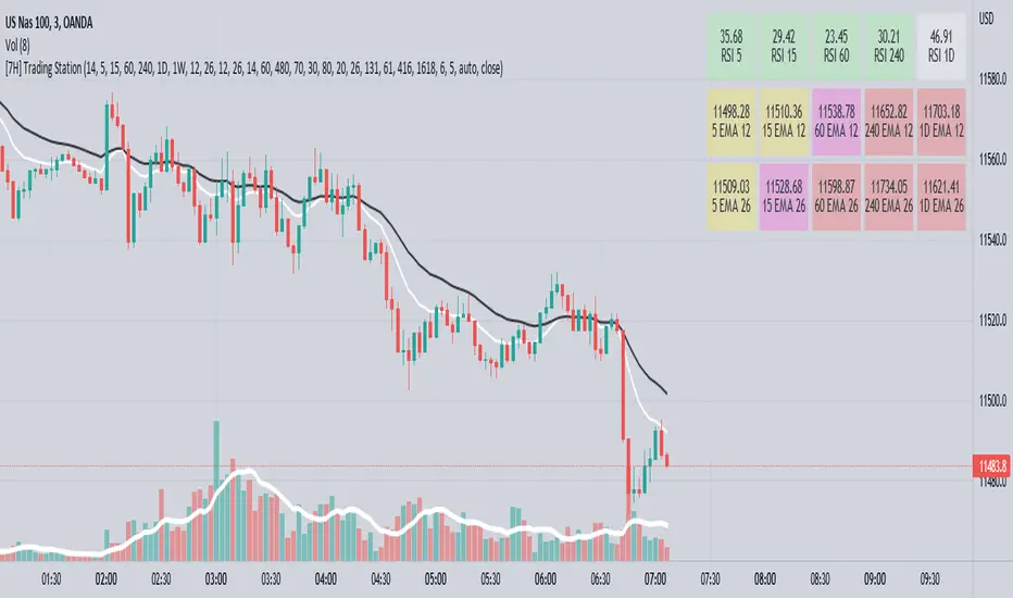
[7H] Trading HUD - MTF EMAs and RSIThis is a MTF HUD built around Chartguy Dan's trading style of 12/26 EMAs and RSI levels from multiple time frames. The HUD is configurable, allowing you to change the time frame of RSI levels and EMAs. The EMAs can be displayed at their current price or a percentage distance away. The HUD values will change color.
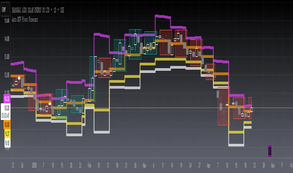
[blackcat] L2 Auto MTF Pivot Forecast Level 2
Background
A algo for pivot points forecast for each bar of automatic multiple timeframe (MTF) data.
Function
In financial markets, a pivot point is a price level that is used by traders as an indicator of market movement. Pivot points are averaged from important prices (highest, lowest, closing) based on the market performance of the previous time period. There are many ways to calculate the pivot point. The pivot point is calculated using the highest price (H), the lowest price (L) and the closing price (C) of the previous time period, and sometimes the opening price of the current time period Valence (O) was added to it.
S1 yellow
S2 white
R1 Orange
R2 fuchsia
The smoothing parameter default to 55
The pivot point indicator can be used in two ways. First, the pivot point can be used as a price trend confirmation. It is generally believed that if the price is above the pivot point in the latter period of time, the market is considered to be in a bull market sentiment, otherwise it is considered to be in a bear market sentiment. Second, support and resistance levels are mainly used as exit positions. For example, R1 and R2 can be used as trade targets if the market price breaks above a pivot point. If the market effectively breaks R1 and R2, traders may consider adding to their long positions.
Remarks
Feedbacks are appreciated.
DB CCI Breakout MTFDB CCI Breakout MTF
What does the indicator do?
The indicator will display crypto breakout and fallouts based on 4 timeframe CCI values. By default the current chart timeframe is used and the user may chose 3 other timeframes in the settings. Additionally, the symbol may be configured in the indicator settings. Default is Coinbase:ETHUSD.
The indicator will monitor the CCI levels on 4 timeframes and will alert to any CCI activity over 100 or under -100 which would indicate a breakout or fallout is present.
A green diamond is displayed when a breakout is detected on one or more of the timeframes for the selected symbol.
How should this indicator be used?
The indicator is a secondary alert system for the presence of breakouts or fallout conditions as under those scenarios position exit or entry strategies may be different.
Does the indicator include any alerts?
Not in this version. But I could add some if desired.
Use at your own risk and do your own diligence.
Enjoy!

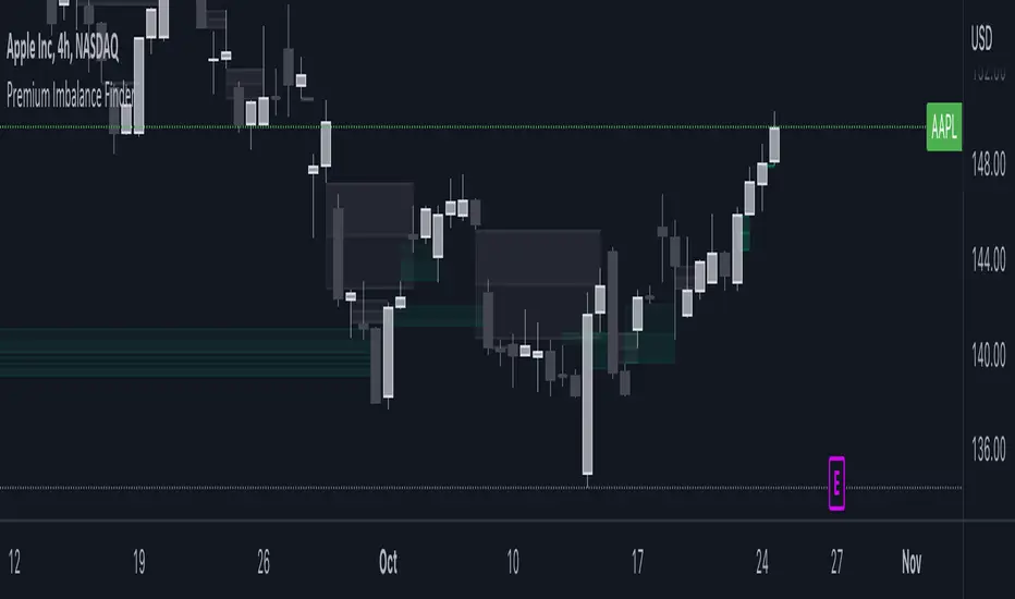
Sonarlab - MTF Imbalance/ FVGAn imbalance is created when the order block creates such impulsive volume in the market that it throws off the equilibrium between buyers and sellers, forming a gap. This is referred to as imbalance or FVG. These gaps act as a magnet for price to retrace to, in order to correct the disturbance in market equilibrium.
Imbalances = FVG
This image above shows you how an imbalance is created in the market using 3 candles. As we all know, candle sticks represent a specific time-range - for example: 1H. This means that inside 1 candle stick, there are 60 1 minute candle sticks resting. What I'm trying to say with this is that you get a totally different picture when you are on the lower timeframes. An imbalance can be overlooked, so it can be very helpful to have the multiple timeframe Imbalances on your screen, so you understand what is actually going on in the bigger picture.
Usage
Focused on combining with SMC:
When trading SMC, Imbalances can be great for POI's (point of interests) or using as targets in the market. Imbalances work like magnets in the market. When the market is imbalanced, it mostly wants to balance those gaps and can sometimes react perfectly from the area's. Besides that, it can really give you an idea who is in control at that moment.
Here you can see an example of an Imbalance when on the 1H timeframe - in the next picture below you can see the exact same imbalance, but then on the 3M. Now you understand why it can be overlooked?
So, imbalances/ FVG's:
- Increase probability of certain Point of Interests
- Can be a sign of strong interest in price areas
- Can be used as targets
- Can be used as POI's
What makes this Imbalance indicator different?
The Sonarlab MTF Imbalance indicator makes it possible to show up to 3 higher timeframes, which makes it easier to do your analysis and spot these areas when trading.
TT Multibands MTFThis Multi Moving Average Indicator is for a long list of Moving Averages:
- Simple Moving Average (SMA)
- Exponential Moving Average (EMA)
- Weighted Moving Average (WMA)
- Hull Moving Average (HMA)
- Double Exponential Moving Average (DEMA)
- Triple Exponential Moving Average (TEMA)
- Volume Weighted Moving Average (VWMA)
- Kaufman's Adaptive Moving Average (KAMA)
- Relative Moving Average (RMA)
- Arnaud Legoux’s Moving Average (ALMA)
Advantages:
- Auto Plotting the Lable: < TIMEFRAME + BAND TYPE + LENGTH >
- Multi TimeFrame (MTF)
- Usable with Custom Time Frames: You can choose any Time Frame out of your Custom Time Frame List
- "No Repainting"
- "No Gaps" on lower Chart Time Frames (HD, no "Stairs")
"No Repainting" and "No Gaps" TRUE
"No Gaps" FALSE
STD Stepped Ehlers Optimal Tracking Filter MTF w/ Alerts [Loxx]STD Stepped Ehlers Optimal Tracking Filter MTF w/ Alerts is the traditional Ehlers Optimal Tracking Filter but with stepped price levels, access to multiple time frames, and alerts.
What is Ehlers Optimal Tracking Filter?
From "OPTIMAL TRACKING FILTERS" by John Ehlers:
"Dr. R.E. Kalman introduced his concept of optimum estimation in 1960. Since that time, his technique has proven to be a powerful and practical tool. The approach is particularly well suited for optimizing the performance of modern terrestrial and space navigation systems. Many traders not directly involved in system analysis have heard about Kalman filtering and have expressed an interest in learning more about it for market applications. Although attempts have been made to provide simple, intuitive explanations, none has been completely successful. Almost without exception, descriptions have become mired in the jargon and state-space notation of the “cult”.
Surprisingly, in spite of the obscure-looking mathematics (the most impenetrable of which can be found in Dr. Kalman’s original paper), Kalman filtering is a fairly direct and simple concept. In the spirit of being pragmatic, we will not deal with the full-blown matrix equations in this description and we will be less than rigorous in the application to trading. Rigorous application requires knowledge of the probability distributions of the statistics. Nonetheless we end with practically useful results. We will depart from the classical approach by working backwards from Exponential Moving Averages. In this process, we introduce a way to create a nearly zero lag moving average. From there, we will use the concept of a Tracking Index that optimizes the filter tracking for the given uncertainty in price movement and the uncertainty in our ability to measure it."
Included:
-Standard deviation stepping filter, price is required to exceed XX deviations before the moving average line shifts direction
-Selection of filtering based on source price, the moving average, or both; you can also set the Filter deviations to 0 for no filtering at all
-Toggle on/off bar coloring
-Toggle on/off signals
-Long/Short alerts

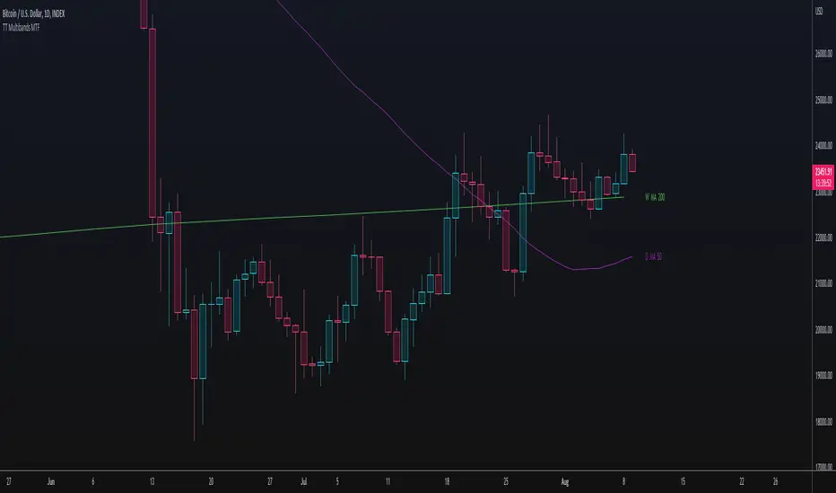
Moving Average Multipliers MTF (Mescu)Includes 4 customizable Moving Average with multipliers and multi-timeframe (MTF).
Tweaks the parameters to your liking, it should be pretty simple to understand
Used here with BTC/USD (1W) to identify good sell and buy zone for Bitcoin.
Got the idea from the 2-year MA Multiplier indicator, but didn't find something of my liking on TradingView, so I made my own.
Drop me a comment if you have any questions, suggestions, improvements.
Mescu
www.tradingview.com

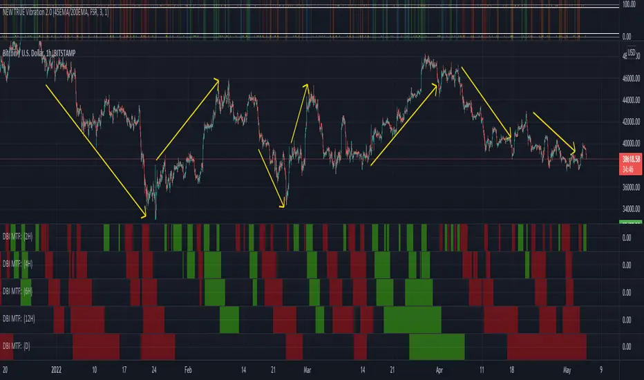
DBI MTFDBI is the Directional Bias Indicator
This is a Daily timeframe concept that we can take to MTF's. What DBI does it takes an advanced look at Trend to produce four results... Active Green (which simply gives EDGE to buying exhausted or weak pullbacks that hold Bull Market Structure), Last Green (which means the indicator turned active Green and lost some of the characteristics that allowed it to go Active Green (this is a natural part of any pullback process and during these times there is still EDGE to finding confluent reasons too look for Longs until the indicator again turns to Active Red)), Active Red (which simply gives EDGE to shorting exhausted or weak bounces that hold Bear Market Structure), and Last RED (which means the indicator turned active Red and lost some of the characteristics that allowed it to go Active Green (this is a natural part of any pullback process and during these times there is still EDGE to finding confluent reasons too short until the indicator again turns to Active Green)).
As mentioned, this is a Daily TF concept, but, this indicator allows you to look at the same formula from the 5-minute chart to the Weekly chart. The benefit here is that it can allow the trained eye to get a better view at times where Longs have the path of least resistance and time when shorts have the path of least resistance. If we can give ourselves some extra EDGE toward knowing the path of least resistance on time frames that are above our trigger TF (The TF we plan to take a trade on) then we can be better prepared to either keep a tighter stop or perhaps give a Long or a Short more room to run due to what seems to be a friendly environment.
This indicator takes some time to understand, but, it has also been a massive favorite for many True Vibration 2.0 users for quite some time as this was previously built into that indicator. Utilizing True Vibration 2.0 along with DBI will heighten your experience dramatically.
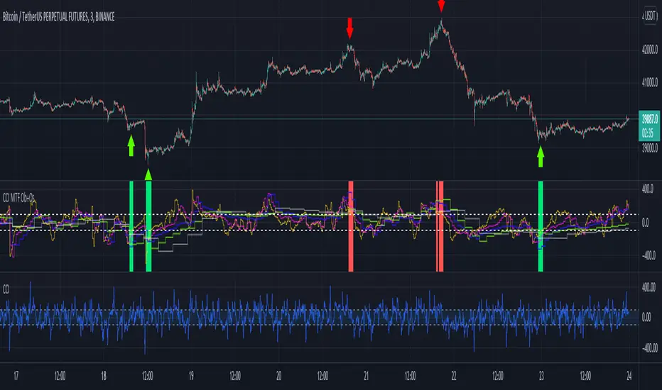
CCI MTF Ob+OsHello Traders,
This is a simple Commodity Channel Index (CCI) indicator with multi-timeframe (MTF) overbought and oversold level.
It can detect overbought and oversold level up to 5 timeframes, which help traders spot potential reversal point more easily.
There are options to select 1-5 timeframes to detect overbought and oversold.
Green Background is "Oversold" , looking for "Long".
Red Background is "Overbought" , looking for "Short".
Have fun :)
Ichimoku Buy/Sell Signals of manual MTF Tenkan crossing KijunIchimoku Buy/Sell Signals based on fast, small time frame Tenkans crossing longer timeframes Kijuns - Manual MTF Analysis
This code marks the potential change of direction based on the input of one timeframe's Ichimoku Tenkan (conversion) line crossing over a higher, longer timeframe's Ichimoku Kijun (base) line.
Feel free to change the inputs if need be and to hide the yellow box. Use Ichimoku rules of Tenkan, Kijun, Lagging Span, and Cloud for Take profit/Stop Losses. It is best to wait 3-5 minutes after the signal to enter to confirm the trend and to confirm if the Lagging Span has broken key levels. I refer to the book Trading with Ichimoku - A Practical Guide to Low-Risk Ichimoku Strategies by Karen Peloille as the Ichimoku rulebook. Good luck.
For day trading/scalping/intraday - 1min/3min/5min
Tenkan Line Timeframe = 1min
Kijun Line Timeframe = 5min
For swing trading - multiple days/weeks - 4HR/Daily/Weekly Charts
Tenkan Line Timeframe = day
Kijun Line Timeframe = week
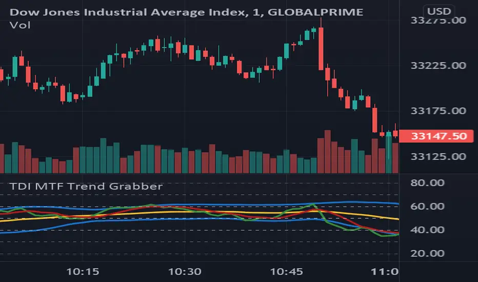
TDI MTF Trend GrabberWork in progress!
I like using the TDI, but getting more interested in the confluence of when several timeframes all turn bullish or bearish , etc.
However I actually could use some help getting the MTF / request.security working properly.
Currently the idea is to be able to switch between the current timeframe, and at this point 2 other timeframes.
Change the timeframe using the "Plot_tf" input.
Thanks community.
[Sextan] Dark Cloud Density MTFNOTE: Sextan Bactest version which support MTF
Level:1
Background
Go long through the buy and sell tags, and determine the size of the buy position by observing the density of the dark cloud or the thickness of the dark cloud.
Function
This is a buying and selling system that strives for simplicity and clarity, and position control is determined by the trend. The dark cloud here is the standard of this measurement. If there are many dark clouds, it means that the short-selling power is relatively strong, and the long-buying signal can be given up or bought with a small position. If the density of the dark clouds is sparse, it means that the long and short positions are weak, and the long positions can be appropriately increased.
The specific function is to follow the label prompts to buy and sell, and to decide how much to buy according to the density of the dark clouds.
Remarks
Free and Open Source
Alerts are added.

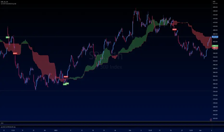
[Dipiers] Phoenix MTF v2.1This indicator is a modified (Multi Timeframe) version of the Phoenix Ascending that you can find between the @WyckoffMode scripts and it follows the same rules at the moment of the pubblication.
A special thanks to @Neuromantic that did a great part of the MTF coding and to @HedgeMode for the "real-time" idea to make the ongoing candle visibly different to always remember that it hasn't closed yet.
The chart TF must be the lowest between all the ones analysed.
The value of the higher TFs candles are the ones at the last close so to avoid repainting.
It is best used applying no more than a couple of TFs each chart so to have a better view of the races, you can apply the indicator multiple times to have a good view of the different TFs.
If you are using the code remember to give credit to the persons have worked on it.
[blackcat] L3 Supply and Demand Zones MTFLevel: 3
Background
Supply and Demand represent the two most powerful forces of the market. Demand means the number of buyers buying a security in the market. Supply means the number of sellers selling a security in the market. Large supply takes the price to move down and large demand takes the price to move up. Balance in both forces will keep the price in sideways movement. There are two types of states of the price of a security in technical analysis. 1. Balanced state; 2. Unbalanced state. In a balanced state, the price is moving in a range like moving sideways. Simply means forces of buyers and sellers are balanced. Both of them don’t have the ability to create a trend either bearish or bullish trend. After breakout of this sideways (range) movement of price, imbalance in price occur. And after the breakout, the recent range will be called a base zone and the price will again come to this base zone to pick unfilled orders.
Function
This is a composite supply and demand zone indicator, which inlcude:
1. demand and supply zones: yellow color box for demand zone while fuchsia color box for supply zone
2. half-semi log based fibo levels
3. multiple time frame (MTF) manual or automatic setting to see clear trend
4. tendline drawing. Default 610 bars back to draw, you can change it to your preferred value. However, you need to guarantee the existing chart already have equal or more than the number of bars you set or 610 bars.
5. blackcat reveral labels
6. box color to indicate volume information as:
box border color is green --> bullish
box boarder color is red --> bearish
box body color meanings:
a. turquoise or aqua or cyan box body color --> no volume indicaor signal or NA --> no supply and demand signal
b. red box body color --> volume climax up - strong bullish high volume --> demand >> supply
c. white box body color --> volume climax down - strong bearish high volume --> supply >> demand
d. green box body color --> high volume churn - bars with high volume and low range --> suppy and demand is balancing
e. yellow box body color --> low Volume - bar for low volume --> bullish/bearish trend is exhausted, reversal may happen soon --> supply or demand dominance will be changed soon.
f. fuchsia box body color --> volume climax plus high volume churn --> two possibilities: red+green=fuchsia or white+green=fuchsia, so fuchsia is a mixed state --> srong demand with supply attack or strong supply with demand attack.
Remarks
Free but closed sourced.
If the trendline is not drawn but you can see the red resistance and green support dashed lines, please drag the the chart to the left unitl you see the yellow solid trend line appears.
This is the initial version. This will be contineously improved along time.

Zero-Lag MTF PSAR MACD with Bollinger Bands v1.0 [loxx]Zero-Lag MTF PSAR MACD with Bollinger Bands v1.0
This is an experimental indicator that captures PSAR movements on seven different timeframes in order to improve trend detection on the daily timeframe. The seven PSARs are averaged and then fed into a zero-lag MACD function where the average of the PSARs is the source for the slow moving average and the daily timeframe close is the sourse of the fast moving average.
Things to know:
- Dark Green Background: All seven PSAR waves are above the closes of the PSARs respective timeframes; i.e., macro trend up
- Dark Red Background: All seven PSAR waves are below the closes of the PSARs respective timeframes; i.e., macro trend down
- Histogram and bar coloration is based on the difference between close and the average of all seven PSARs
- Various color schemes included
- Indicator has neither been backtested nor tuned with a strategy backtest
How to use:
Reversal Longs and Shorts
- Bollinger Bands show movement outside of normal deviation around the zero line. Wait for MACD to reach the either side top or bottom of Bollinger Bands for reversal long and reversal short respectively
- Check that MACD has crossed over or under the Signal line; i.e., denoted with a green dot for cross up and red dot for cross down
- Check dark background colors to see where the PSAR waves are currently situated and whether PSAR wave direction has aligned on all time frames
Longs and Shorts
- Longs: Check when MACD is above the zero line and the Signal line crosses over the zero line
- Shorts: Check when MACD is below the zero line and the Signal line crosses below the zero line
Strong Confluence:
- Longs/Shorts: Whenever the MACD crosses up or crosses down over/under the Signal/Zero line while inside a candle with background highlighting
- Reversals: Whenever the MACD crosses up or crosses down over/under the Signal/Zero line while inside a candle with background highlighting and at the very top/bottom or outside the top/bottom of the Bollinger Bands
Comment below or send a PM with questions, comments, observations, or concerns.
