Optimal Daily MA Suite [MTF]Title: Optimal Daily MA Suite
Description: This is a comprehensive Multi-Timeframe (MTF) analysis suite designed to streamline chart layouts. Instead of loading multiple separate indicators to track various trend lines, this single tool allows traders to overlay higher-timeframe Moving Averages and key support/resistance levels directly onto their intraday charts.
Utility & Workflow: Swing traders and day traders often need to monitor "Big Picture" Daily Moving Averages (like the Daily 200 SMA or Daily 50 EMA) while executing trades on lower timeframes like the 15m or 1H. This tool automates that process, ensuring the major trend context is always visible without cluttering the indicator list.
Key Features:
Multi-Timeframe Engine: By default, all MAs are calculated on the Daily ("D") timeframe, regardless of the chart's current timeframe. This creates a stable "anchor" for trend analysis. The timeframe is fully customizable in the settings (e.g., set to "W" for Weekly analysis).
10 Customizable Slots: Toggle up to 10 different Moving Averages on/off individually.
Flexible Calculation Types: Supports SMA, EMA, WMA, VWMA, RMA (SMMA), and SWMA for every single line.
Trend Cloud Crossovers: Includes two dedicated "Cloud" setups to visualize crossovers (e.g., Golden Cross or Death Cross) with fill shading between the fast and slow lines.
Price Action Crossovers: Optional markers to highlight when the closing price crosses specific MAs.
Contextual Levels: Includes Previous Day High (PDH) and Previous Day Low (PDL) markers for immediate intraday support/resistance context.
How to Use:
Settings: Open the settings menu to select your "Indicator Timeframe" (Default: Daily).
Customization: Enable only the MAs relevant to your strategy (e.g., Enable MA 8 for the 50 SMA and MA 10 for the 200 SMA).
Clouds: Use the "Crossover Set" inputs to define a Bullish/Bearish trend cloud between two moving averages of your choice.
Technical Note: This script uses request.security with lookahead=barmerge.lookahead_off to ensure no repainting of historical data while providing accurate higher-timeframe values on closed bars.
Credits: Standard Moving Average calculations based on TradingView built-in functions.
"mtf" için komut dosyalarını ara

Hybrid Trend | Auto-Adaptive | MTF | + Signal🔥 Hybrid Trend — Auto-Adaptive MTF Trend System + Smart Signals
Hybrid Trend is a fast, lightweight, and adaptive trend-tracking system that combines MTF SuperTrend structure with MA-based shift signals to deliver clean, reliable entries for both scalpers and trend traders.
🚀 Key Features
Multi-Timeframe SuperTrend Engine for stable directional bias
Hybrid MA Slope Signals filtered by higher-timeframe trend
Precise Bull/Bear reversal markers
Ideal for scalping, intraday, and trend continuation setups
Clean visuals, minimal lag, high adaptability in volatile markets
🎯 Best For
Scalpers • Day Traders • Algorithmic Traders • Trend Followers
© Copyright & Author
Author: Nariman Pourtalaei
Powered by: Real Company Bio Information Helpline Directory
Brand: RCO TradingHelpline
Website: trading.rco.ae

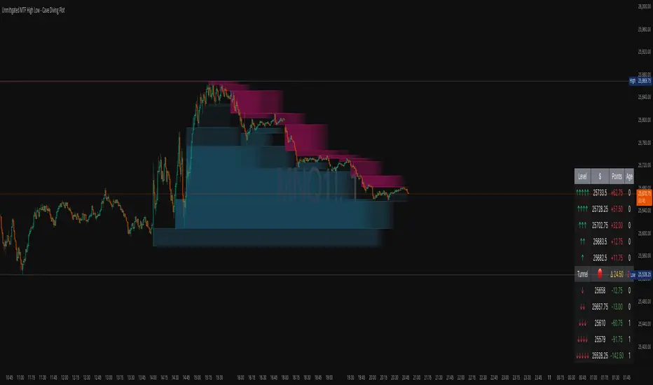
Unmitigated MTF High Low - Cave Diving Plot
IntroductionThe Unmitigated MTF High Low -
Cave Diving Plot is a multi-timeframe (MTF) indicator designed for NQ and ES futures traders who want to identify high-probability entry and exit zones based on unmitigated price levels. The "Cave Diving" visualization helps you navigate between support (floor) and resistance (ceiling) zones, while the integrated Strat analysis provides directional context.
Who Is This For?
Futures traders (NQ, ES) trading during ETH and RTH sessions
Scalpers and day traders looking for precise entry/exit levels
Traders using The Strat methodology for directional analysis
Anyone seeking confluence between price action and key levels
Core Concepts
1. Unmitigated Level:
An unmitigated level is a price high or low that has been created but not yet tested (touched) by price. These levels act as magnets - price often returns to test them.Key Properties:
Resistance (Highs): Price has created a high but hasn't revisited it
Support (Lows): Price has created a low but hasn't revisited it
Mitigation: When price touches a level, it becomes "mitigated" and loses strength
2. The Cave Diving MetaphorThink of trading as cave diving between two zones:
┌─────────────────────────────────┐
│ CEILING (Upper Band) │ ← 1st & 2nd Unmitigated Highs
│ 🟥 Resistance Zone │
├─────────────────────────────────┤
│ │
│ THE TUNNEL │ ← Price navigates here
│ (Trading Channel) │
│ │
├─────────────────────────────────┤
│ 🟢 Support Zone │
│ FLOOR (Lower Band) │ ← 1st & 2nd Unmitigated Lows
└─────────────────────────────────┘
Trading Concept:
Ceiling: Formed by the 1st and 2nd most recent unmitigated highs
Floor: Formed by the 1st and 2nd most recent unmitigated lows
Tunnel: The space between ceiling and floor where price operates
Cave Diving: Navigating between these zones for entries and exits
3. Session-Based Age TrackingLevels are tracked by session age:
Session: 6:00 PM to 5:00 PM NY time (23-hour window)
Age 0: Created in the current session (today)
Age 1: Created 1 session ago (yesterday)
Age 2+: Older levels (more significant)
Why Age Matters:
Older unmitigated levels are typically stronger magnets
Fresh levels (Age 0) may be weaker and easier to break
Age 2+ levels often provide high-probability reversal zones
Indicator Components
Visual Elements
1. Colored Bands (Cave Zones)Upper Band (Pink/Maroon - 95% transparency)
Space between 1st and 2nd unmitigated highs
Acts as resistance zone
Price often hesitates or reverses here
Lower Band (Teal - 95% transparency)
Space between 1st and 2nd unmitigated lows
Acts as support zone
Price often finds buyers here
2. Information Table Located in your chosen corner (default: Bottom Right), the table displays:
5 most recent unmitigated highs (top section)
Tunnel row (middle separator)
5 most recent unmitigated lows (bottom section)
Reading the TableTable Structure
┌────────┬──────────┬────────┬───────┐
│ Level │ $ │ Points │ Age │
├────────┼──────────┼────────┼───────┤
│ ↑↑↑↑↑ │ 21,450.25│ +45.30 │ 3 │ ← 5th High (oldest)
│ ↑↑↑↑ │ 21,425.50│ +32.75 │ 2 │ ← 4th High
│ ↑↑↑ │ 21,410.00│ +25.00 │ 1 │ ← 3rd High
│ ↑↑ │ 21,400.75│ +18.50 │ 1 │ ← 2nd High
│ ↑ │ 21,395.25│ +12.00 │ 0 │ ← 1st High (newest)
├────────┼──────────┼────────┼───────┤
│ Tunnel │ 🟢 │ Δ 85.50│ 2U │ ← Current State
├────────┼──────────┼────────┼───────┤
│ ↓ │ 21,310.00│ -15.25 │ 0 │ ← 1st Low (newest)
│ ↓↓ │ 21,295.50│ -22.75 │ 1 │ ← 2nd Low
│ ↓↓↓ │ 21,280.25│ -30.00 │ 1 │ ← 3rd Low
│ ↓↓↓↓ │ 21,265.75│ -38.50 │ 2 │ ← 4th Low
│ ↓↓↓↓↓ │ 21,250.00│ -45.00 │ 3 │ ← 5th Low (oldest)
└────────┴──────────┴────────┴───────┘Column
Breakdown
Column 1: Level (Arrows)
Green arrows (↑): Resistance levels above current price
Red arrows (↓): Support levels below current price
Arrow count: Indicates recency (1 arrow = newest, 5 arrows = oldest)
Why This Matters:
More arrows = older level = stronger magnet for price
Column 2: $ (Price)
Exact price of the unmitigated level
Use this for limit orders and stop placement
Column 3: Points (Distance)
Positive (+) for highs: Points above current price
Negative (-) for lows: Points below current price
Helps gauge proximity to key levels
Trading Application:
If you're +2.50 points from resistance, a reversal may be imminent
If you're -45.00 points from support, you're far from the floor
Column 4: Age (Sessions)
Number of full 6pm-5pm sessions the level has survived
Age 0: Created today (current session)
Age 1+: Created in previous sessions
Significance Ladder:
Age 0: Weak, may break easily
Age 1-2: Medium strength
Age 3+: Strong, high-probability reaction zone
Tunnel Row (Critical Information)│ Tunnel │ 🟢 │ Δ 85.50│ 2U │
└─┬─┘ └─┬─┘ └──┬──┘ └─┬─┘
│ │ │ │
Label Direction Range Strat
1. Tunnel Label: Identifies the separator row
2. Direction Indicator (🟢/🔴)
🟢 Green Circle: Current 15m bar closed bullish (above previous close)
🔴 Red Circle: Current 15m bar closed bearish (below previous close)
3. Δ (Delta/Range)
Distance in points between 1st High and 1st Low
Shows the tunnel width (trading range)
Example: Δ 85.50 = 85.50 points between ceiling and floor
Trading Use:
Wide tunnel (>100 points): More room to trade, consider range strategies
Narrow tunnel (<50 points): Tight range, expect breakout
4. Strat Pattern
1: Inside bar (consolidation)
2U: 2 Up (bullish directional bar)
2D: 2 Down (bearish directional bar)
3: Outside bar (expansion/volatility)
Color Coding:
Green: 2U (bullish)
Red: 2D (bearish)
Yellow: 3 (expansion)
Gray: 1 (inside/neutral)
Tamil | MTF DashboardThe Tamil | MTF Dashboard is a powerful multi-timeframe (MTF) market strength and trend-bias analyzer designed to give traders a fast, at-a-glance understanding of market conditions across 7 timeframes.
This dashboard consolidates essential indicators into a clean table plus a dynamic bias label that updates live with the chart timeframe.
⸻
✅ What This Dashboard Shows
1. RSI (Multi-Timeframe)
• Uses custom color logic:
• Green: RSI > 55
• Red: RSI < 45
• Gray: Neutral zone (45–55)
• Quickly identifies momentum shifts across multiple timeframes.
2. Stochastic (Multi-Timeframe)
• Values clamped to 0–100
• Color-coded:
• Oversold (<20): Green
• Overbought (>80): Red
• Neutral: Gray
3. Supertrend Direction
• Returns Buy / Sell / Neutral per timeframe
• Color-coded trend bias for quick directional confirmation.
4. Moving Average Trend (SMA or EMA)
• Choose between SMA or EMA
• Shows whether price is above/below MA
• Above MA → Bullish (Buy)
• Below MA → Bearish (Sell)
5. Combined Score (-4 to +4)
A powerful numeric sentiment summarizing 4 trend components:
• RSI score
• Stochastic score
• Supertrend score
• MA trend score
Each indicator contributes -1, 0, or +1, giving a total score:
• +2 to +4 = Bullish
• -2 to -4 = Bearish
• Between -1 and +1 = Neutral
Includes Trend Strength:
• Very Weak
• Weak
• Moderate
• Strong
All shown inside the Score cell per timeframe.
⸻
📌 Bias Label (Chart Timeframe Only)
Displays real-time information for the active chart timeframe:
• Bias (Bullish / Bearish / Neutral)
• Combined Score
• ATR value
• ADX value (0–100, DI-based calculation)
Perfect for gauging trend strength without cluttering the chart.
⸻
🧩 Supported Timeframes
The dashboard updates the following timeframes simultaneously:
• 1m, 3m, 5m, 15m, 1H, 4H, 1D
⸻
🎯 Designed For
• Intraday traders
• Swing traders
• Scalpers
• Multi-timeframe analysts
• Traders who want instant visual confirmation of market strength
⸻
⭐ Why This Dashboard Is Unique
• True multi-timeframe aggregation
• Custom, realistic scoring engine
• Accurate ADX (0–100) matching textbook DI calculation
• Clean color logic for fast interpretation
• Zero repainting (uses standard indicators + request.security)
• Works on any market: Stocks, Crypto, Forex, Futures

FVG / Imbalance MTF Pro (4 HTFs + Alerts) - (@JP7FX)FVG / Imbalance MTF Pro (@JP7FX)
This indicator finds and plots Fair Value Gaps across up to four higher timeframes on a single chart. It shows them as lines, zones, 50 percent levels and labels, and can fire alerts when new gaps form or when price mitigates them.
Core logic
The script detects bullish and bearish FVGs using the classic three candle logic:
• Bullish FVG when high is below the current low.
• Bearish FVG when low is above the current high.
All logic runs on the selected higher timeframes through request.security, then projects the zones down onto your current chart timeframe. The script also checks that your chart timeframe is equal to or lower than the selected HTFs so the plots stay meaningful.
Multi timeframe control
You can configure up to four separate FVG layers: TF1, TF2, TF3 and TF4.
For each TF you can choose:
• Timeframe (or link it to the chart).
• Display mode, Lines and Zones, Zones Only, Lines Only, or Disable.
• Whether to show the 50 percent line.
• Whether to show a label with the TF name next to each FVG.
Inputs also convert the timeframe into minutes and hours so labels can show clear tags such as “15m”, “1h” and so on.
Visuals per timeframe
For every timeframe you can set:
• Entry and stop FVG line colours.
• 50 percent line colour and line style.
• Bullish and bearish zone fill colours.
• Separate colours for mitigated bullish and mitigated bearish zones.
• Label text colours for demand and supply.
Each FVG can draw:
• Two lines for the “entry” and “stop” edges of the gap.
• An optional 50 percent line through the zone.
• A shaded box that tracks the zone as price trades into it.
• A label that shows the originating timeframe.
Line and zone behaviour
Global settings let you control:
• Maximum number of FVG lines and zones kept on the chart.
• Line style for FVG edges and 50 percent lines.
• Whether lines and zones extend to the right.
• Whether zones update with price movement as price trades deeper.
• Whether the zone colour changes once the FVG has been mitigated.
• Label offset so you can push the TF labels to the right of price.
• An option to avoid overlapping zones per timeframe by checking for box overlap.
The script uses arrays of lines, boxes and labels for each TF and for demand and supply separately. It removes the oldest objects once the max count is hit and deletes or recolours zones when price reaches them.
Bar colouring
You can optionally colour the bar that creates the chart timeframe FVG.
• Bullish FVG origin bar can show as green.
• Bearish FVG origin bar can show as red.
Alerts
The indicator exposes alertcondition signals for both creation and mitigation. For each timeframe it supports:
• FVG zone created, bullish or bearish.
• Bullish FVG mitigated.
• Bearish FVG mitigated.
You choose the alert pack per TF through the inputs, then set the alert from the chart by right clicking the indicator and adding an alert.
Use case
This tool is for traders who map and trade Fair Value Gaps across multiple higher timeframes and want clean, configurable MTF FVG zones with clear labels, mitigation behaviour and alerts all in one script.

Orderblocks MTF Pro (4 HTFs + Alerts) - (@JP7FX)Orderblocks MTF Pro (JP7FX)
Orderblocks MTF Pro identifies higher timeframe orderblocks and displays them on lower timeframe charts. It tracks when new orderblocks form, remain active or become mitigated.
Higher Timeframe Orderblocks
The indicator can display orderblocks from four higher timeframes at the same time.
Users can select which HTFs to show, such as Daily, 4H, 1H and 15m.
Bullish and Bearish Orderblocks
Bullish orderblocks mark areas where buying pressure formed during prior moves.
Bearish orderblocks mark areas where selling pressure formed.
Each block is colour coded and can be customised.
Mitigation Tracking
The tool monitors when price returns to a previously formed orderblock.
If price trades back into the block, the indicator can mark it as mitigated or keep it highlighted as active depending on user settings.
Alerts
Alert conditions are included for:
• New orderblock creation
• Orderblock mitigation
Users can enable or disable alerts for each timeframe.
Customisation
• Choose up to four higher timeframes to display
• Custom colours for bullish and bearish blocks
• Visibility filters for active and mitigated blocks
• Adjustable opacity and block display style
Use Cases
Suitable for traders who reference higher timeframe zones while executing on lower timeframes.
The indicator reduces manual chart work by identifying and updating HTF orderblocks automatically.

SuperTrend Oscillator MTF█ OVERVIEW
SuperTrend Oscillator MTF is a multi-timeframe version of the classic SuperTrend converted into an oscillator. Instead of drawing the SuperTrend line on the price chart, it displays the distance of the close from the SuperTrend line simultaneously for the current timeframe and two additional timeframes. This allows you to instantly see the trend direction and strength across three selected timeframes in a single window.
█ CONCEPT
The classic SuperTrend value is subtracted from price and normalized so that trend direction can be directly compared across different timeframes without switching charts.
- Value above zero = price below SuperTrend line → bearish trend
- Value below zero = price above SuperTrend line → bullish trend
- The further away from zero, the stronger the trend.
█ FEATURES
- Three SuperTrend Oscillator lines: current TF, TF1 and TF2
- Automatic detection of 3-timeframe agreement
- BUY and SELL labels that appear only when all three timeframes turn in the same direction at the same moment
- Circle signals on every zero-line cross of the current timeframe
- Configurable soft gradient fill (can be disabled)
- Zero line changes color (green/red/gray) depending on 3-TF agreement
- Fully customizable colors for each timeframe
- Built-in alerts for all signal types
█ HOW TO USE
Add the indicator to the chart → set two additional timeframes and adjust ATR Period and Factor to suit your trading style.
Main settings:
- ATR Period → default 10
- Factor → default 3.0 (higher = fewer signals)
- TF 1 and TF 2 → any timeframes (e.g. 1H+4H, 4H+D, D+W, etc.)
- Enable gradient → turn fill on/off
- Show BUY/SELL labels (3 TF agreement) → enable/disable the strongest signals
Interpretation:
Two types of signals:
- Green/red circles → current timeframe changes trend direction (faster signal)
- BUY/SELL labels → all three timeframes simultaneously switch to the same direction (strongest confluence)
- Additionally, the zero line turns green or red when all three trends are aligned.
█ APPLICATIONS
Perfect for:
- Trend-following with multi-timeframe confirmation
- Filtering false breakouts on lower timeframes
- Scalping & day trading (use fast circle signals)
- Swing & position trading (wait for full 3-TF agreement)
Best combined with:
- Support/resistance levels and supply/demand zones – enter long after a confirmed breakout and retest of a key level (e.g. Change of Character, Break of Structure, Order Block, 0.618–0.786 Fibonacci) only when the oscillator shows 3-TF agreement or at least a bullish circle. Hold the trade to the next significant resistance/supply zone.
- Volume and Volume Profile – confirm move strength with rising volume and high-volume nodes at the breakout level. Declining volume while moving away from zero may signal trend exhaustion.
- Classic oscillators (RSI, Stochastic, MACD) – use primarily for spotting divergences and overbought/oversold conditions. One of the safest exits is when a regular or hidden divergence appears on RSI/Stochastic in an extreme zone, even if SuperTrend Oscillator MTF still shows alignment.
█ NOTES
- Works on all markets and all timeframes
- BUY/SELL labels (3-TF agreement) are the cleanest and strongest signals
- Circle signals are faster but more prone to noise
- Higher ATR Period = fewer signals, higher quality

ICT Concept MTF Scanner [Elykia]ICT Concept MTF Scanner
Overview
The ICT Concept MTF Scanner is the ultimate productivity dashboard for traders using SMC (Smart Money Concepts) and ICT methodologies.
Stop switching tabs constantly. This indicator allows you to monitor the market structure (Trend, BOS, CHoCH) of 20 different assets simultaneously, each with its own custom timeframe.
It also overlays the structural points and Premium/Discount zones directly on your current chart.
Key Features:
📊 Multi-Asset Dashboard: Monitor up to 20 symbols (Indices, Forex, Crypto, Metals) in a single, fully customizable table.
clock: Individual Timeframes: Unlike standard screeners, you can set a different timeframe for each ticker (e.g., NQ on 15m, ES on 1h, DXY on 4h).
🧠 Auto-Structure Detection:
BOS (Break of Structure): Trend continuation.
CHoCH (Change of Character): Trend reversal signal.
SMS (Shift in Market Structure): Failure swing.
⚖️ Premium & Discount Zones: Automatically calculates buying (Discount) and selling (Premium) zones based on the Active or Previous range.
🔔 Smart Alerts: Get notified on structural changes or when price enters a Premium/Discount zone.
How to use:
1. Ticker Setup: In the settings, select your favorite assets and assign the specific timeframe you want to monitor for each.
2. Sensitivity (Structure): Adjust the "Period" (Pivot Length). A lower value (e.g., 3-5) detects minor structure, while a higher value (e.g., 10-20) reveals the macro trend.
3. Reading the Table:
Teal: Bullish Structure.
Red: Bearish Structure.
Signal: Shows the most recent structural event (BOS or CHoCH).
Disclaimer :
This indicator is for educational and informational purposes only. Past performance does not guarantee future results. Trade at your own risk.

Crypto Intraday Scalper [Patterns + RSI + Volume + MTF + ADX]# Guide to Reading the Indicator (CIS Pro v2)
## 1. Operational Signals (The Labels)
- **GREEN Label "BUY"**:
**Meaning**: Entry for a Long position.
**Conditions**: Bullish candle pattern + Oversold RSI + High Volume + Bullish 1-hour trend + Sufficient Volatility.
- **RED Label "SELL"**:
**Meaning**: Entry for a Short position.
**Conditions**: Bearish candle pattern + Overbought RSI + High Volume + Bearish 1-hour trend + Sufficient Volatility.
- **No Label**: The market is in an uncertain phase, sideways movement, or filters (ADX/MTF) are blocking signals for protection.
## 2. Trend Lines (The Context)
- **Gray Line (EMA 200)**: This serves as the dividing line between bullish and bearish trends.
**Rule**: Seek Long positions only above the gray line; Short positions only below it.
- **Red/Green Step Line (Supertrend / Trailing Stop)**:
**Green (below the price)**: Strong bullish trend. Acts as dynamic support.
**Red (above the price)**: Strong bearish trend. Acts as dynamic resistance.
**Usage**: Use it for trade exits. If in a Long position and the line turns red, close the entire trade.
## 3. Price Levels (Targets and Supports)
- **Blue/Red/Green Dots (Pivot Points)**:
These are levels calculated from the previous day. The price tends to bounce at these points. Use them as final targets for taking profit.
- **Orange Line (VWAP)**:
This represents the "average price" for the day. If the price deviates too far, it often returns (elastic effect).
- **Dashed Lines (Appear after a signal)**:
**Red Dashed**: Suggested Stop Loss (based on ATR volatility).
**Green Dashed**: Suggested Take Profit (quick target).
## 4. The Table (Dashboard in the Top Right)
This provides reasons why you may not be receiving signals:
- **Trend (Current)**: The trend on your current chart.
- **Trend (MTF 60)**: The trend on the 1-hour chart. If these two conflict (e.g., Bullish vs. Bearish), no signals will appear.
- **ADX Volatility**: If RED (below 20), the market is flat—no trades. If GREEN, there is sufficient movement.
- **Volume Status**: Alerts if anomalous high volume is entering (High) or if conditions are calm.
## 🚀 Operational Summary
- Wait for the label.
- Quick Check: Is the price on the correct side of the gray line? Is the step line the right color?
- Enter the trade.
- Exit when the price hits the green dashed line (Quick Take Profit) **OR** when the price breaks the step line (Trailing Stop for longer trends).
What aspect of this indicator should we analyze next—perhaps integrating it with real-time ETH data or testing it via code execution for backtesting?

Ichimoku Horizon MTFIchimoku Horizon MTF — Multi-TimeFrame Ichimoku with auto-map
Overview
Ichimoku Horizon MTF plots classic Ichimoku on your current chart timeframe and projects up to three higher timeframes (TF1 / TF2 / TF3) onto the same chart. The goal is to keep one clean chart while still seeing higher-timeframe Ichimoku context (for example Daily / Weekly / Monthly).
On the screen, you typically see:
– the full Ichimoku set for your chart timeframe (Tenkan, Kijun, Kumo, Chikou),
– the same structure projected from TF1–TF3, each with its own colour family,
– an optional Kumo Midline (extra line, not part of original Ichimoku, used as a visual helper),
– and an optional TF banner showing which higher timeframes are currently mapped.
And optionally: A Kumo Midline (midpoint between SSA and SSB)
Kumo Midline (non-original Ichimoku addition)
The Kumo Midline is a personal addition.
It is not part of the original Ichimoku.
It is provided for informational and visual purposes only, as a helper to read the centre of the cloud.
It is calculated as the simple average of the two cloud boundaries:
Midline= SSA + SSB / 2
You can turn it ON/OFF globally, and also separately for each timeframe (Chart / TF1 / TF2 / TF3). The same logic (including the optional Midline) is applied to TF1 / TF2 / TF3 and projected onto your main chart.
Auto-map & timeframe presets
You control how TF1 / TF2 / TF3 are selected using two mechanisms:
Auto-map TF from chart (ON/OFF)
When ON, the script automatically chooses a profile based on your chart timeframe
(Scalp / Intraday / Swing / Long Term / Investment / Macro).
TF1 / TF2 / TF3 are always higher than the chart timeframe, with a consistent progression.
Preset Time Frame (when Auto-map = OFF)
When OFF, you choose a fixed preset, for example:
Scalp S — 1m / 5m / 15m
Intraday L — 1H / 4H / 1D
Swing — 1D / 1W / 1M
Investment — 1M / 3M / 6M
Macro — 3M / 6M / 12M
If you choose Custom, you manually set TF1 / TF2 / TF3 using the three “Timeframe selection” inputs in the TF1 / TF2 / TF3 sections.
This allows you to switch quickly between scalp / intraday / swing / macro profiles without editing any code.
TF banner (legend) & display options
The indicator includes an optional TF banner (a small panel) that acts as a timeframe legend:
Shows the active profile name (Scalp, Intraday M, Intraday XL, Swing, Long Term, Macro, Custom). Displays the three mapped timeframes (TF1 / TF2 / TF3) in short form (5m, 1H, 4H, 1D, 1W, 1M, etc.). Shows “TK / KJ” with small coloured squares for Tenkan and Kijun for each TF, matching the line colours on the chart.
You can control:
Show / hide the banner.
Position: Top / Bottom, Left / Center / Right.
Text colour, background, text size.
Each block (Chart, TF1, TF2, TF3) also has its own toggles for:
Tenkan
Kijun
Chikō
SSA
SSB
Kumo fill
Kumo Midline
This lets you keep only what you really need (for example: just HTF Kijun + HTF Kumo).
Colour design
Special care has been taken with the colour design:
Each timeframe uses its own colour family
(for example: warm colours for the chart timeframe, green for TF1, blue for TF2, neutral/grey for TF3), so the chart stays readable even when all TFs are displayed at once.Kumo fills are semi-transparent to provide context without hiding price action. Defaults are tuned for light charts, and every colour can be customised if you prefer another palette.
Built-in alerts
The script includes a small set of ready-to-use alerts, controlled by:
A global “Enable alerts” switch
A built-in cooldown to avoid alert spam
Available conditions (on the chart timeframe):
TK > KJ (UP) – Tenkan crosses above Kijun (filtered by a bullish HTF bias).
TK < KJ (DOWN) – Tenkan crosses below Kijun (filtered by a bearish HTF bias).
Kumo Breakout (UP) – Close breaks above the cloud (with bullish HTF filter).
Kumo Breakout (DOWN) – Close breaks below the cloud (with bearish HTF filter).
All TF Bullish – Chart + TF1 + TF2 + TF3 all have Tenkan > Kijun (full bullish alignment).
All TF Bearish – Chart + TF1 + TF2 + TF3 all have Tenkan < Kijun (full bearish alignment).
HTF Confirms (BULL) – Bullish TK cross on the chart timeframe, with HTF support and price above the cloud.
HTF Confirms (BEAR) – Bearish TK cross on the chart timeframe, with HTF confirmation and price below the cloud.
To use them:
Add an alert on the indicator,
Choose one of these conditions,
Use “Once per bar close” for cleaner signals.
No-repaint logic
Higher-timeframe data is fetched using request.security() with:
barmerge.gaps_off
barmerge.lookahead_off
This means:
No artificial lookahead,
No repainting,
Apart from the normal forward shift of the Ichimoku cloud, which is how standard Ichimoku works by design.
If the chart get “stuck on the left”
stuck on the left side, or misaligned. If you see the TF banner or right-side labels not updating correctly: Clear the TradingView app cache (or restart the app / browser)
Reload the chart. This usually forces TradingView to redraw all tables and labels correctly and fixes the display issue.
Disclaimer
This script is provided for educational and informational purposes only.
It does not constitute financial or investment advice and should not be used as a standalone signal provider.
Always do your own analysis and use proper risk management before taking any trade.
Thanks for using Ichimoku Horizon MTF.

KVS-Ultimate FVG & iFVG System [MTF + Distance Filter]Description: This indicator identifies Fair Value Gaps (FVG) and Inversion FVGs (iFVG) across multiple timeframes (MTF) with an advanced visualization system. Unlike standard FVG indicators, this script solves the "chart clutter" problem with a unique Distance Filter and offers a customizable Split Label System.
Key Features:
1. Unique Distance Filter (Clean Screen Mode):
When enabled, the script only shows the closest FVGs to the current price within a user-defined limit.
Keeps your chart clean while focusing on relevant price action levels.
2. Split Label System (Tabular Design):
Completely customizable label positioning, sizing, and coloring.
Separate controls for Normal FVGs and iFVGs.
Smart Label Logic: If you hide the FVG box, its label automatically hides. If an FVG breaks and becomes an iFVG (or fades), the label logic switches automatically to the iFVG settings.
3. Strict Mode Filtering:
Enabled: Checks if the candle closing price effectively breaks the previous structure (High/Low of the 1st candle), ensuring high-quality gaps.
Disabled: Detects all gaps between wicks (Standard calculation).
4. Multi-Timeframe (MTF) Support:
Monitor FVGs from up to 5 different timeframes simultaneously on a single chart.
5. Dynamic Interaction:
Choose how the script reacts when an FVG is broken: Turn it into an iFVG (Inversion) or simply fade the color (Ghost/Fade mode).
How to Use:
Use the "Distance Filter" checkbox in settings to clean up old/far blocks.
Adjust "TF1" to "TF5" to set up your multi-timeframe analysis.
Customize the Label Panel to align text perfectly with your chart style.
Disclaimer: This tool is for educational purposes and support for technical analysis.

BullTrading Axis Ribbon (MTF)BullTrading Axis Ribbon (MTF)
BullTrading Axis Ribbon 是一条「高周期主轴 + 自适应包络带」的趋势彩带,用来刻画价格围绕关键均衡轴的磁吸区、扩散区与趋势方向。
• 主轴(Axis Ribbon):使用更高时间级别的价格数据,在当前周期上映射一条「日内趋势中轴」。默认适合在 3m / 5m 图上调用 15m 主轴。
• 中枢区(Core Zone):主轴上下的窄区间,用彩带填充显示。当价格在中枢区震荡时,代表围绕均衡轴的磁吸与盘整。
• 外圈带(Outer Band):位于中枢之外的扩展区,用于观察顺势扩张与「过热」区域,可选线框或填充显示。
• 颜色逻辑:
• 轴线彩带根据趋势方向与中枢状态变色:上升(绿色)、下降(红色)、中枢磁吸(黄色)、整理(灰色)。
• 左下角状态灯同步给出当前轴向状态(上涨 / 下跌 / 中枢 / 整理)。
使用建议
• 在 3m / 5m 作为短周期信号时,用 Axis Ribbon 作为「大级别方向过滤」与「高概率回踩区域」参考。
• 价格长时间贴着外圈带运行,可视为顺势加速或过热区;频繁回到中枢,则倾向震荡与均值回归。
• 指标本身不直接给出买卖点,更适合与你已有的进场离场系统配合,用于方向过滤和环境判断。
本指标仅用于技术研究与图表分析,不构成任何投资建议或交易信号,请根据自身风险承担能力独立决策。
BullTrading Axis Ribbon (MTF)
BullTrading Axis Ribbon is a trend ribbon built from a higher-timeframe core axis + adaptive envelope bands.
It depicts the magnet zone, expansion zone and trend direction of price around a key equilibrium axis.
• Axis (Axis Ribbon): Uses higher-timeframe price data to project an “intraday trend spine” onto the current chart. By default it works well using a 15m axis on 3m / 5m charts.
• Core Zone: A narrow band above and below the axis, displayed as a filled ribbon. When price oscillates inside the Core Zone, it reflects magnet behavior and consolidation around the equilibrium axis.
• Outer Band: An extended area outside the Core Zone, used to observe trend extension and potential “overheated” zones. It can be shown as simple lines or as a filled band.
• Color Logic:
• The axis ribbon color changes with trend direction and core state: uptrend (green), downtrend (red), core/magnet (yellow), ranging/flat (gray).
• A status lamp in the bottom-left corner simultaneously shows the current axis state (Up / Down / Core / Flat).
Usage Suggestions
• When using 3m / 5m as your signal timeframe, treat Axis Ribbon as a higher-timeframe bias filter and as a reference for high-probability pullback areas.
• If price rides along the Outer Band for an extended period, it can be interpreted as trend acceleration or a potential overheated zone; if price frequently returns to the Core Zone, the market tends to be ranging with mean-reversion behavior.
• The indicator itself does not directly generate entry/exit signals. It is best used together with your existing entry/exit systems, as a tool for directional filtering and market-regime assessment.
This indicator is intended solely for technical research and chart analysis.
It does not constitute investment advice or a trading signal. Please make independent decisions according to your own risk tolerance.

EDGE MTF ATR Bias Matrix EDGE MTF ATR BIAS MATRIX - User Guide & Documentation
═════════════════════════════════════════════════════════════
OVERVIEW
The EDGE MTF ATR Bias Matrix is a multi-timeframe directional bias indicator
that displays dynamic support and resistance levels across six timeframes in a
compact corner panel. It uses ATR-based trailing bands to determine trend
direction and highlights key levels you should be watching for potential
entries, exits, or reversals.
Think of it as your "compass" — at a glance, you can see which direction the
market is pointing on the 5m, 15m, 30m, 1H, 4H, and Daily timeframes, along
with the critical price level to watch on each.
─────────────────────────────────────────────────────────────
HOW IT WORKS
The indicator uses a dual-band trailing stop system on each timeframe:
INNER BAND (Tighter/Faster)
• Calculated as: HL2 ± (Inner Multiplier × ATR)
• Default multiplier: 3.0
• Reacts more quickly to price changes
• Defines the "active" trend direction
OUTER BAND (Wider/Slower)
• Calculated as: HL2 ± (Outer Multiplier × ATR)
• Default multiplier: 6.0
• Provides a buffer zone / "cloud" between signals
• Represents major support/resistance levels
The two bands create a "cloud" structure:
• When Inner > Outer → Bullish Cloud (uptrend structure)
• When Inner < Outer → Bearish Cloud (downtrend structure)
Signal Logic:
▲ BULLISH (Green): Price is ABOVE the inner band in a bullish cloud
▼ BEARISH (Red): Price is BELOW the inner band in a bearish cloud
◆ NEUTRAL (Gray): Price is inside the cloud or at an inflection point
─────────────────────────────────────────────────────────────
READING THE PANEL
The panel displays three columns:
TF │ Level │ Δ
────────┼───────────
Daily │ 4,125.50 │
4H │ 4,118.25 │ 3.25
1H │ 4,115.00 │
30m │ 4,112.75 │ 1.50
15m │ 4,110.50 │
5m │ 4,108.25 │ 0.75
COLUMN 1 - TF (Timeframe)
The timeframe being analyzed
COLUMN 2 - Level
The key support/resistance level to watch
• Color indicates bias: Green = Bullish, Red = Bearish, Gray = Neutral
• This is the trailing band level that price is respecting
COLUMN 3 - Δ (Delta/Proximity)
Distance from current price to the key level
• Only appears when price is within the Proximity Threshold
• Yellow color draws attention to nearby levels
• Helps you spot imminent tests of support/resistance
─────────────────────────────────────────────────────────────
WHAT TO LOOK FOR
1. CONFLUENCE OF BIAS
When multiple timeframes show the same color (all green or all red), the
directional bias is strong. Trade with the trend.
Example: Daily, 4H, 1H, and 30m all GREEN = Strong bullish environment
→ Look for long entries on pullbacks to the displayed levels
2. DIVERGENCE BETWEEN TIMEFRAMES
When higher timeframes disagree with lower timeframes, expect choppy
conditions or potential reversals.
Example: Daily RED but 15m and 5m GREEN = Short-term bounce in downtrend
→ Approach longs with caution; these may be counter-trend trades
3. PROXIMITY ALERTS (Δ Column)
When you see a value in the Δ column, price is close to that timeframe's
key level. This is where you should pay attention for:
• Bounces (level holds = continuation)
• Breaks (level fails = potential reversal or acceleration)
4. LEVEL CLUSTERING
When multiple timeframe levels are near each other, that zone becomes
significant. Price often reacts strongly at these areas.
Example: If 1H shows 4,115 and 30m shows 4,114, that 4,114-4,115 zone
is a high-probability reaction area.
5. TREND ALIGNMENT FOR ENTRIES
For highest-probability trades:
• Ensure at least the 1H and 4H (or Daily) agree on direction
• Use lower timeframe (5m/15m) levels for entry timing
• Place stops beyond the next timeframe's level
─────────────────────────────────────────────────────────────
CONFIGURABLE SETTINGS
═══ Color Theme ═══
Bullish Default: Green (#4CAF50, 30% transparency)
Color used when bias is bullish
Bearish Default: Red (#F44336, 0% transparency)
Color used when bias is bearish
Neutral Default: Gray (#ECEFF1, 30% transparency)
Color used when price is in the cloud/neutral zone
═══ Display Settings ═══
Panel Location Default: Top Right
Choose where the panel appears on your chart
Options: Top Left, Top Center, Top Right,
Bottom Left, Bottom Center, Bottom Right
Sort Highest Default: ON (checked)
TF First When ON: Daily at top, 5m at bottom
When OFF: 5m at top, Daily at bottom
Choose based on your trading style preference
Proximity Default: 10.5
Threshold How close price must be to a level before the Δ column
shows the distance
• For index futures (ES, NQ): 10-15 points works well
• For forex: 0.0010-0.0050 (10-50 pips)
• For stocks: Adjust based on typical ATR
• Set to 0 to disable proximity alerts
Text Size Default: Small
Options: Tiny, Small, Normal, Large
Adjust based on your screen size and preference
═══ Algorithm Parameters ═══
ATR Lookback Default: 10
Number of bars used to calculate ATR
• Lower values (5-8): More reactive to recent volatility
• Higher values (14-20): Smoother, less reactive
Range: 1-50
Inner Band Default: 3.0
Multiplier Controls the tighter/faster trailing band
• Lower values: Tighter stops, more signals, more whipsaws
• Higher values: Wider stops, fewer signals, smoother trends
Range: 0.5-10.0 (step 0.5)
Outer Band Default: 6.0
Multiplier Controls the wider/slower trailing band
• Should always be larger than Inner Multiplier
• Creates the "buffer zone" between trend states
• Larger values = bigger neutral zones
Range: 1.0-20.0 (step 0.5)
─────────────────────────────────────────────────────────────
RECOMMENDED CONFIGURATIONS
FOR SCALPING (Fast/Aggressive):
• ATR Lookback: 7
• Inner Multiplier: 2.0
• Outer Multiplier: 4.0
• Proximity Threshold: 5.0
FOR DAY TRADING (Balanced):
• ATR Lookback: 10 (default)
• Inner Multiplier: 3.0 (default)
• Outer Multiplier: 6.0 (default)
• Proximity Threshold: 10.5 (default)
FOR SWING TRADING (Smooth/Patient):
• ATR Lookback: 14
• Inner Multiplier: 4.0
• Outer Multiplier: 8.0
• Proximity Threshold: 20.0
─────────────────────────────────────────────────────────────
TIPS FOR BEST RESULTS
1. Use this indicator as a BIAS tool, not an entry signal
It tells you which direction to favor — you still need price action,
order flow, or another method to time entries.
2. Respect higher timeframe bias
Even if 5m and 15m turn bullish, if Daily is bearish, those longs are
counter-trend. Size smaller and take profits quicker.
3. Watch for color changes on your trading timeframe
A flip from green to gray (or red) is an early warning that momentum
may be shifting.
4. The displayed levels are dynamic
They trail price during trends but lock in during pullbacks. This is
by design — the levels only move in the direction of the trend.
5. Combine with volume or momentum
This indicator shows structure. Pair it with volume analysis or a
momentum oscillator to confirm strength of moves.
─────────────────────────────────────────────────────────────
TIMEFRAMES ANALYZED
The indicator automatically pulls data from these fixed timeframes regardless
of what chart timeframe you're viewing:
• 5 Minute (5m) — Micro structure, scalp timing
• 15 Minute (15m) — Intraday swings
• 30 Minute (30m) — Intraday trend
• 1 Hour (1H) — Day trading bias
• 4 Hour (4H) — Swing trading bias
• Daily (1D) — Overall trend direction
─────────────────────────────────────────────────────────────
TROUBLESHOOTING
Panel not showing?
→ Make sure you're viewing on a timeframe equal to or lower than 5m
→ Check that the panel location isn't obscured by other indicators
All levels showing gray/neutral?
→ This can happen during ranging/consolidating markets
→ The multipliers may need adjustment for the instrument's volatility
Levels seem too far from price?
→ Reduce the Inner and Outer Multipliers
→ The defaults work well for index futures but may need tuning for
lower-volatility instruments
Proximity column never shows values?
→ Increase the Proximity Threshold setting
→ Current default (10.5) may be too tight for your instrument

Ultimate Market Structure + MTF Dashboard [FIXED]Ultimate Market Structure + MTF Dashboard — Indicator Description
🔶 Overview
Ultimate Market Structure + MTF Dashboard is a fully-automated Smart Money Concepts (SMC) market-structure indicator designed to give traders extremely clean and accurate structural mapping on any timeframe.
It intelligently detects:
External (Swing) Structure
Internal Structure
BOS / CHoCH (Break of Structure / Change of Character)
HH/HL/LH/LL swing labels
Strong/Weak Highs & Lows
Equal Highs (EQH) & Equal Lows (EQL)
Internal BOS/CHoCH (micro-structure)
Multi-Timeframe Structure Dashboard (D, H4, H1, M15, M5)
This indicator eliminates clutter, repaints nothing, and provides crystal-clear visual understanding of market direction.
🎯 What This Indicator Solves
Most structure indicators fail because they:
✔ spam BOS/CHoCH everywhere
✔ repaint pivots
✔ mix internal and external structure
✔ draw messy lines
✔ ignore confluence
✔ don’t show higher timeframe structure
This script solves all of that by using:
Gap-proof pivot detection
Strict internal/external structure separation
Proper BOS/CHoCH logic using previous break
“LastBreak memory” system (no double BOS on same leg)
ATR-filtered internal pivots
Candle-context confluence filter
User-controlled filters for BOS/CHoCH only
Everything is designed for clean, reliable structure.
🧠 How It Works (Logic Explained Clearly)
1️⃣ Swing Structure – External
Based on user-defined swing length (default: 50).
Detects major turning points and evaluates:
HH / HL → Bullish structure
LH / LL → Bearish structure
Once a swing high/low is confirmed, the indicator tracks:
Has price crossed that pivot?
If yes → BOS or CHoCH depending on previous break direction.
2️⃣ Internal Structure – Micro Trend
A second layer using small length pivots (default: 5).
Useful for:
Entries
Scalp-level reversals
Early CHoCH detection
Internal structure uses ATR distance from swing pivots to avoid overlap.
3️⃣ BOS / CHoCH Logic
The script uses a very strict rule:
If previous break direction was opposite → CHoCH
If previous break direction was same → BOS
This eliminates false CHoCH spam and improves trend clarity.
4️⃣ Strong & Weak High/Low Detection
Each time a BOS occurs:
In bearish trend → last swing high = Strong High
In bullish trend → last swing low = Strong Low
Opposite becomes Weak High/Weak Low
These are important Smart Money Concepts levels for:
Premium/discount zones
Liquidity targets
Stop hunts
5️⃣ Equal Highs & Equal Lows (EQH/EQL)
The script automatically identifies EQH/EQL using:
Percentage threshold
Confirmation bar count
Useful for:
Liquidity sweep setups
Inducement
Stop runs
6️⃣ Multi-Timeframe Dashboard
Displays Internal & External structure for:
D (Daily)
H4
H1
M15
M5
Each cell is color-coded:
🟢 Bullish
🔴 Bearish
⚪ Neutral
This gives you instant top-down analysis without switching charts.
📌 What You Can Use This Indicator For
✔ Trend Trading
Keep trades aligned with:
Higher timeframe external trend
Lower timeframe internal entries
For example:
Daily → Bullish
H1 → Bullish
M5 → CHoCH bullish
Entry → Pullback to strong low
✔ Scalping
Internal structure (i-BOS, i-CHoCH) gives:
Fast reversals
Micro CHoCH entries
High-frequency trend shifts
Works extremely well on 1M–5M.
✔ Smart Money Concepts Trading
This indicator gives every SMC component you need:
Liquidity (EQH/EQL)
Swing structure
Internal structure
BOS/CHoCH
Strong/Weak High/Low
Multi-TF context
Perfect for ICT/SMC trading style.
✔ Institutional Order Flow Mapping
Using strong/weak highs/lows and BOS, you can easily determine:
Where smart money targets your stops
Where displacement started
Where structure shifted
Where mitigation may occur
✔ High-Timeframe Confirmation
The dashboard prevents you from trading against:
Daily trend
H4 liquidity levels
H1 structure direction
📈 Who Is This Indicator For?
Beginners
Learn structure visually instead of guessing.
Advanced Traders
Combine structure with:
Liquidity sweeps
FVG
OB
Breaker blocks
Momentum shifts
Scalpers
Use internal BOS/CHoCH for sniper entries.
Swing Traders
Use swing BOS to hold trades for large R:R moves.
ICT / SMC Traders
Perfect for order-block & FVG models.
📌 Recommended Settings
Swing Structure
Length: 50–100
Best for BTC, FX, XAU
Internal Structure
Length: 3–7
Best for scalping
EQ Threshold
FX: 0.10% – 0.25%
Crypto: 0.35% – 0.5%
Confirm Method
Close = safer
Wick = aggressive (scalping)
🧩 Unique Features (Compared to Other Indicators)
✔ Advanced gap-proof pivot engine
✔ Proper historical vs. present structure mode
✔ ATR-filtered internal pivots
✔ Smart confluence filter (detect candle context)
✔ Chart remains clean & minimal
✔ Works on all timeframes including 1-second
✔ No repaint structure
✔ Optimised for high-volatility assets like XAUUSD
🔚 Final Notes
This indicator was engineered to give traders a complete structure toolkit with professional-grade accuracy normally found only in premium paid tools.
With:
Clean BOS/CHoCH
Perfect swing tracking
Full multi-TF dashboard
Smart liquidity detection
Strong/weak level mapping
You can analyse any market with clarity and confidence.

Strat Reversal MTF TableStrat Reversal MTF Table — Your Complete Multi-Timeframe Strat Command Center
Take your Strat trading to the next level with an indicator that shows every reversal, on every timeframe, in one powerful visual dashboard.
Designed for traders who demand speed, clarity, and full Strat alignment, the Strat Reversal MTF Table instantly identifies all major bullish and bearish reversal patterns:
Bullish Patterns
2-1-2
3-1-2
1-3-2
3-2-2
Bearish Patterns
2-1-2
3-1-2
1-3-2
3-2-2
Each signal is displayed with:
Clear pattern name (e.g., “2-1-2 Bull”)
Automatic trigger price
Timeframe label
Color-coded background (Bullish / Bearish / Neutral)
Whether you trade options, equities, futures, or crypto, this indicator makes it effortless to see what’s flipping — and where the strongest setups are emerging.
🔥 Key Features
📊 Multi-Timeframe Scanning (1 min → Daily)
Monitor 7 customizable timeframes at once.
From scalping to swing trading, you always know which timeframe is turning.
⚡ Real-Time OR Close-Confirmed Logic
Choose your style:
Realtime (Wick Mode) → Fast entries
Close-Confirmed → Stronger validation
Ideal for traders who want precision on any timeframe.
🎨 Clean & Customizable Dashboard
Move the table anywhere on the chart
Adjust text size
Choose your own colors
Lightweight and non-intrusive
A perfect blend of simplicity and power.
📩 Instant Alerts, Built In
Get notified instantly when:
Any timeframe reverses
A specific timeframe flips
Multiple reversals fire across the stack
The indicator works great with TradingView’s push notifications, email, and webhooks.
🎯 What This Helps You Do
✔ Catch Strat reversals as they happen
✔ Quickly spot full-timeframe alignment
✔ Improve your entries for options plays
✔ Avoid chop by reading higher-timeframe intent
✔ Trade more confidently with automated trigger levels
This indicator is built for Strat traders who want to trade smarter, faster, and cleaner.
✨ Perfect For
Strat Traders
Options Traders
Futures Scalpers
Intraday & Swing Traders
Quant/Algo-inspired traders
Anyone following Rob Smith’s methodology
(CRT) MTF Candle Range Theory Model# 🚀 **CASH Pro MTF – Candle Range Theory (CRT) Indicator**
**The Smart Money ICT Setup Detector** 🔥
Hey Traders!
Here is the **ultimate Pine Script indicator** that automatically detects one of the most powerful Smart Money / ICT setups: **Candle Range Theory (CRT)**
---
### What is Candle Range Theory – CRT?
**CRT** is a high-probability price action model based on **liquidity grabs** and **range expansion**.
Price loves to:
1️⃣ Raid the low/high of the previous candle (take stop-losses)
2️⃣ Then reverse and run to the opposite side of the range (or beyond)
When this happens near a **key higher-timeframe level**, magic happens!
### Bullish CRT Model
- Price touches a **strong HTF support**
- Previous candle closes near that support
- Next candle **sweeps the low** (grabs liquidity)
- Current candle **closes above the raided low AND breaks the high** of the sweep candle
**Result → Aggressive bullish move expected!**
**Entry:** On close above the high (or on retest + MSS)
**Stop Loss:** Below the swept low
**Take Profit:** CRT High or next liquidity pool
### Bearish CRT Model
- Price touches a **strong HTF resistance**
- Previous candle closes near resistance
- Next candle **sweeps the high** (grabs buy stops)
- Current candle **closes below the raided high AND breaks the low** of the sweep candle
**Result → Strong bearish expansion!**
**Entry:** On close below the low
**Stop Loss:** Above the swept high
**Take Profit:** CRT Low or next downside liquidity
This whole setup can form in **just 3 candles**… or sometimes more if price consolidates after the sweep.
---
### Why This Indicator is Special
This is **NOT** a simple 3-candle pattern scanner!
This is a **true CRT + MTF confluence beast** with:
- **Multi-Timeframe Confirmation** (default 4H – fully customizable)
- **Built-in RSI Filter** (avoid fake moves in overbought/oversold)
- **Day-2 High/Low Levels** automatically drawn (the exact CRT range!)
- **Clean “LONG” / “SHORT” labels** right on the candle (no ugly arrows or offset)
- **Background highlight** on signal
- **Fully grouped inputs** – super clean settings panel
---
### Features at a Glance
| Feature | Included |
|--------------------------------|----------|
| Higher Timeframe Confirmation | Yes |
| RSI Overbought/Oversold Filter | Yes |
| Day-2 High/Low Lines + Labels | Yes |
| Clean Text Signals (no offset) | Yes |
| Background Highlight | Yes |
| Fully Customizable Colors & Text| Yes |
| Works on All Markets & TFs | Yes |
---
### How to Use
1. Add the indicator to your chart
2. Wait for a **LONG** or **SHORT** label to appear
3. Confirm price is near a **key HTF level** (order block, FVG, etc.)
4. Enter on close or retest (your choice)
5. Manage risk with the drawn Day-2 levels
**Pro Tip:** Combine with ICT Market Structure Shift (MSS) or Fair Value Gaps for even higher accuracy!

Turtle System 1 Long & Short (Donchian + N-Stop) + MTF Table V6 Turtle Trading Long & Short (System 1 – 20/10 Donchian + True 2N Trailing Stop) + Multi-Timeframe Dashboard – Pine Script v6This indicator is a 100 % faithful implementation of the famous original Turtle Trading System 1 (Richard Dennis & William Eckhardt) with the following genuine rules:Entry: 20-period Donchian Channel breakout (using the high/low of the previous completed bars only → )
Exit: Classic 10-period Donchian opposite breakout OR hit of the volatility-based stop
Risk Management: True 2N trailing stop (N = 20-period ATR). The stop is pulled tighter on every new favorable extreme (real Turtle trailing – not fixed!)
Fully dynamic position tracking (Long / Short / Flat) on the chart’s timeframe
Visual signals: green/red triangles for entries, diamonds for exits, trailing stop line, entry labels with current N and stop price
Unique Feature – Multi-Timeframe (MTF) Status Table
A clean table in the top-right corner instantly shows the current Turtle position status on five higher timeframes simultaneously:Turtle MTF
1H
4H
8H
1D
1W
Status
LONG / SHORT / FLAT (color-coded)
This allows you to see at a glance whether higher timeframes are already in a Turtle trend – perfect for trend confirmation, filtering, or multi-timeframe trading.Key Visual ElementsLime upper Donchian line (20-period high)
Red lower Donchian line (10-period low)
Gray channel fill
Fuchsia trailing 2N stop line (moves only in favorable direction)
Entry labels showing current N-value and exact stop price
Arrows and diamonds for entries/exits
Alerts
Two ready-to-use alert conditions:“Turtle Long Entry”
“Turtle Short Entry”
Works on any market and any chart timeframe (stocks, forex, futures, crypto).
Completely written and tested in Pine Script version 6.A true, clean, no-nonsense Turtle System 1 with real trailing volatility stops and a powerful higher-timeframe dashboard – exactly how the original Turtles traded (only better visualized)! Enjoy the trends!

Bollinger Bands (MTF) + Bandwidth & %BJBB MTF: Bollinger Bands (MTF) + Bandwidth & %B
This Pine v6 indicator overlays multi‑timeframe Bollinger Bands on the price chart and adds a lower panel with normalized Bandwidth (histogram) and %B (line), plus squeeze/bulge markers and alerts for volatility shifts.
Key idea: See higher‑timeframe BB context on your working chart while tracking volatility regimes and price position within bands.
Features
- Multi‑Timeframe BBs: Up to four TFs (TF1–TF4) via request.security, each with visibility, colors, line widths, and optional background fills.
- Configurable Inputs: Length, MA type (SMA/EMA/SMMA/WMA/VWMA), Source, StdDev multiplier, and Offset.
- Lower Panel Metrics: %B (line) shows price position in the band; Bandwidth (histogram) shows width relative to basis, normalized and color‑coded vs its SMA. Reference lines at 0, 0.5, 1.0; raw highest/lowest bandwidth lines for context.
- Squeeze/Bulge Detection: Alerts when bandwidth equals the rolling lowest (Squeeze) or highest (Bulge).
How It Works
- Per timeframe, BBs use the chosen MA basis and standard deviation × multiplier to form upper/lower bands.
- A selectable TF (TF1–TF4) drives %B/Bandwidth calculations, independent of overlay TFs.
Bandwidth is normalized to the rolling min–max window with safeguards against division by zero.
Use Cases
- Visualize higher‑timeframe context directly on your chart.
- Spot volatility squeezes and expansions with objective markers and alerts.
Combine %B momentum with Bandwidth regime changes to refine entries and exits.

IMS 4H Structural Framework (MA / Pivot / MTF Levels)IMS 4H Structural Framework (MA / Pivot / MTF Levels)
✅ SHORT, COMPLIANT DESCRIPTION (Invite-Only Safe)
Description:
This tool visualizes a 4H Institutional Market Structure (IMS) framework by combining three workflow components into a single structural map—MA-based bias shifts, pivot-derived 4H trendlines, and multi-timeframe (1H/45m) structural levels.
It does not generate signals or performance claims.
The framework is designed purely for visual, discretionary analysis of structural flow, risk context, and higher-timeframe alignment.
Core Components:
• 4H Bias Shift (MA): Highlights directional bias transitions.
• 4H Trendlines (Pivot-Based): Shows structural slopes and reaction zones.
• MTF Levels (1H & 45m): Adds micro-structure inside the 4H box for refinement.
• Caution Zones: Marks potential reaction areas near support/resistance or trendlines.
• Dashboard: Displays bias context and educational guidance only.
Intended Use:
For traders who analyze 4H structural flow and wish to visualize bias, context, and multi-timeframe alignment—not for automation or signals.
________________________________________
✅ SHORT, SAFE DISCLAIMER (Invite-Only Approved)
Disclaimer:
This tool is for educational and informational purposes only.
It does not provide trading signals, financial advice, or performance guarantees.
All decisions remain solely with the user.

CTS Dashmatrix MTF by Tony-TechCTS Dashmatrix MTF by Tony-Tech
The CTS Dashmatrix MTF is a multi-timeframe trend and swing-structure dashboard designed to give traders a fast, accurate view of market conditions across key timeframes. It combines ADX trend direction and pivot-based swing analysis into a compact visual matrix that updates in real time.
This tool helps traders quickly identify:
Overall trend direction (Bullish or Bearish)
Swing structure shifts (Higher Lows, Lower Highs, reversals)
Multi-TF alignment from D1 → H4 → H1 → M15 → M5
Trend strength & directional confluence
The dashboard uses simple color logic:
Green = Bullish bias
Red = Bearish bias
Silver = Neutral swing
Whether you trade intraday or swing, the CTS Dashmatrix gives instant clarity on market bias at a glance. It is best used with price action, smart money concepts, or trend-following strategies.

EMA MTF Trend Dashboard (Cross & Bias Modes)EMA MTF Trend Dashboard (Cross & Bias Modes)
A clean, multi-timeframe trend-alignment tool designed to support disciplined entries and higher-probability trades.
________________________________________
🔍 What This Dashboard Does
The EMA MTF Trend Dashboard provides a clear, structured view of trend direction across seven key timeframes:
1m • 5m • 15m • 30m • 1H • 4H • Daily
It highlights your execution timeframe, displays EMA-based trend direction per timeframe, and produces a plain-English directional bias using either Single EMA mode or Dual EMA Cross mode.
This makes it useful for scalpers, intraday traders, swing traders, and anyone who wants clarity before executing a trade.
________________________________________
🧠 How to Read the Dashboard
1. Execution Timeframe (Blue Row)
The blue row is your execution timeframe — the timeframe used to calculate the final bias.
• In Chart mode, it automatically matches your current chart timeframe.
• In Locked mode, it remains fixed, even if you switch to other chart timeframes.
This ensures consistency and removes any ambiguity before entering a trade.
________________________________________
2. EMA Mode (Use Any Length You Like)
You’re free to choose any EMA lengths — the dashboard adapts to your strategy.
• Smaller EMAs (5–20):
React quickly and highlight short-term momentum changes or early trend shifts.
• Larger EMAs (50–200+):
Move more slowly and provide a smoother read of overall trend structure, filtering out low-timeframe noise.
This flexibility lets you tune the dashboard to your preferred approach — whether you want fast tactical signals or slower, more stable directional structure.
________________________________________
3. Cross & Bias Modes
The dashboard supports two core engines:
✔ Single EMA Mode (Price vs EMA + ATR Neutral Buffer)
A trend-following model that avoids false signals when price is close to the EMA.
✔ Dual EMA Cross Mode (Fast vs Slow EMA)
A crossover-based trend engine ideal for traders who prefer structure shifts based on EMA alignment.
You can switch modes instantly from the settings.
________________________________________
4. Bias (Plain-English Trend Assessment)
The bias row at the bottom shows the overall directional bias for the blue timeframe, calculated using weighted multi-timeframe logic:
• Strong Bull
• Bullish
• Neutral
• Bearish
• Strong Bear
This provides instant clarity on whether market conditions support (or conflict with) your trade idea.
________________________________________
5. Trend Table (Heatmap View)
Each timeframe shows:
• ▲ Bullish
• ▼ Bearish
• – Neutral
Colour coded for clarity:
• Green = bullish
• Red = bearish
• Grey = neutral
• Blue = execution timeframe highlight
This creates a clean, at-a-glance trend heatmap.
________________________________________
⚙️ Customisation Options
• Fully adjustable EMA lengths
• Single EMA mode (with ATR neutral zone)
• Dual EMA Cross mode (fast/slow)
• Selectable text colour (dark/light theme friendly)
• Execution timeframe mode: Chart or Locked
• Compact and visually clear table layout
________________________________________
✔ Why This Tool Helps
This dashboard gives traders a structured, rule-aligned view of trend direction by:
• Keeping you aligned with broader multi-timeframe structure
• Reducing counter-trend mistakes
• Clarifying trend shifts and momentum changes
• Making decision-making faster and more consistent
• Supporting any systematic or rule-based trading plan
It is a decision-support tool, not a buy/sell signal — making it useful for all trading styles.
________________________________________
📌 Notes for Users
• Non-repainting (uses confirmed closes)
• Works universally: Forex, crypto, indices, commodities
• Suitable for scalpers, day-traders, swing traders
________________________________________
💬 Feedback & Future Enhancements
If you’d like to see additional timeframes, alternative trend engines, an ultra-compact mode, or alert integrations, feel free to request upgrades.

VPG – MTF PrevClose Dashboard (Horizontal 6TF, Bottom Right, VPG – MTF PrevClose Dashboard is a lightweight, real-time visual indicator that displays the current price position across six key timeframes — Weekly (W), Daily (D), 4H, 1H, 30m, and 15m.
It compares the current market price to the previous candle close and shows whether the price is:
🟢 RALLY → higher than the previous close
🔵 BASE → roughly equal (sideways / consolidation)
🔴 DROP → lower than the previous close
Designed as a clean, horizontal dashboard fixed at the bottom-right corner of your chart, it provides instant multi-timeframe insight without cluttering your workspace.
⚙️ Key Features
🔹 Real-time monitoring of six key timeframes (W, D, 4H, 1H, 30m, 15m)
🔹 Clear and intuitive color scheme: Green = RALLY, Blue = BASE, Red = DROP
🔹 Fixed bottom-right placement for consistent visibility
🔹 Horizontal layout for compact, at-a-glance analysis
🔹 Adjustable tolerance to define how “equal” prices are classified as BASE
🔹 No alerts or labels — clean, fast, and resource-light
📊 Best For
Multi-timeframe traders who need quick directional context
Scalpers, intraday, and swing traders doing top-down analysis
Dashboard lovers who want a minimalist, data-driven overview
Confirming short-term price moves against higher-timeframe trends
💡 How to Use
Add VPG – MTF PrevClose Dashboard to any chart (Forex, Crypto, Stocks, Gold, Indices, etc.).
Adjust the tolerance parameter if you want a wider or stricter “BASE” range.
Watch the table in the bottom-right corner — it updates live with every price move.
🧠 About the Author
Nizar M — Developer of VPG indicators focused on clarity, momentum visualization, and fast market interpretation for real-time decision-making.

QuantumFlow MTF System Extended
QuantumFlow MTF System Extended
Multi-Timeframe Directional Flow & Volatility Alignment Engine — Higher-Timeframe Edition
The QuantumFlow MTF System Extended is a higher-timeframe analytical framework that expands upon the original QuantumFlow concept.
While the base version focuses on short-term structures (1M – 15M), this edition is designed for traders who need to observe medium- to long-term directional harmony across the 30M, 45M, 1H, 2H, 3H and 4H timeframes.
Its purpose is to provide a structured, non-repainting overview of how momentum and volatility align over broader market horizons — helping traders understand the prevailing directional flow rather than predicting future prices.
Concept
The system aggregates confirmed Supertrend directions from each higher timeframe, converting them into normalized bullish or bearish values.
These values are then processed through dual-layer EMA momentum filters that validate the directional strength of each component.
The resulting matrix displays a precise snapshot of how higher-timeframe market structures are synchronized — serving as a compass of directional alignment rather than a buy/sell signal generator.
A multi-ATR framework defines adaptive volatility zones, allowing each instrument to react proportionally to its intrinsic volatility profile.
This approach smooths sensitivity shifts that often occur between intraday and multi-hour structures, delivering consistent analytical behavior across asset classes.
How It Works
Confirmed Multi-Timeframe Supertrend
Each timeframe produces a close-confirmed Supertrend direction, ensuring signal stability and preventing repainting.
Adaptive Multi-ATR Model
Multiple ATR instances with distinct deviation factors define dynamic volatility thresholds that self-adjust to market conditions.
Dual EMA Momentum Validation
Two independent EMA layers filter and confirm each Supertrend direction, improving directional clarity and reliability.
Flow Totals Engine
The indicator sums all timeframe states into real-time bullish/bearish totals and percentage ratios, clearly visualized within a single panel.
Configurable Alerts (Optional)
Users may set threshold-based alerts when directional alignment reaches specified intensity levels (for example, when all timeframes are synchronized).
Full Customization
All visual elements — colors, text, background, and layout — can be adjusted to match personal preferences or chart themes.
Intended Use and Benefits
Observe how higher-timeframe trends align to reveal medium-term directional bias.
Quantify the balance of bullish vs bearish momentum across multiple timeframes.
Combine with lower-timeframe analysis (e.g. the original QuantumFlow System) to establish multi-layer confirmation between short- and mid-term flows.
Maintain awareness of trend synchronization or divergence without relying on subjective chart interpretation.
This indicator does not provide trading signals, forecasts, or financial advice.
It is an analytical tool intended to assist users in studying market structure and volatility behavior.
Chart Display
QuantumFlow Extended presents a unified dashboard that lists each analyzed timeframe, its active directional state, and the overall flow balance in numeric and percentage form.
It functions seamlessly on all instruments and can be used standalone or alongside the original short-term version.
Access
This is an invite-only indicator.
To request access or additional information, please contact the author privately via the TradingView profile.
