Central Bank Liquidity YOY % ChangeThis shows the percent change from a year ago (YOY%) in Central Bank Liquidity
It's important to the study rate of change data in this liquidity metric and compare it to the nominal chart.
When this chart is accelerating, liquidity is being added, meaning it's a good time to be in assets.
When this chart is declining, liquidity is being removed, meaning it's a good time to be in cash.
Bottoms in markets coincide with the rate of change of liquidity going from negative (below the zero line) to positive (above zero)
Central Bank Liquidity = Total value of the assets of all Federal Reserve Banks - Overnight Reverse Repurchase Agreements (RRP) - The Treasury General Account (TGA)
"liquidity" için komut dosyalarını ara

Seek liquidityGuided by ICT tutoring, I create this versatile "Seek liquidity" indicator.
This indicator shows an easy way to view the Liquidity that has been Created - Eliminated - and what liquidity is left to eliminate.
Liquidity levels appear after the sessions are over, and the lines get stuck on the candle that eliminates them.
Timing session =
//---Asian
- 18:00-00:00
//---London
- 00:00-02:00
- 02:00-05:00
- 00:00-06:00
//---New York
- 06:00-12:00
- 09.30-12.00
//---Lunch
- 12:00-13:30
//---PM
- 1.30pm - 4.00pm
- 12:00-18:00
The user has the possibility to:
- Choose whether or not to view sessions
- Choose to show levels from previous sessions
- Choose to show today's session levels
- Choose whether to view the boxes
- Choose to view the division is open daily
The indicator should be used as ICT shows in its concepts, the indicator takes into consideration both the previous and today's Liquidity, and the session levels can be used for a reversal as in the example below:

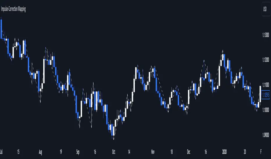
Impulse-Correction MappingAbout
Impulse-Correction Mapper is an indicator of impulses and corrections (valid pullbacks).
Consecutive candlesticks moving in the same direction means an impulse, and a pullback below/above the previous candlestick means a correction.
This way you can identify IDM zones and find significant POIs on the chart.
Below, you can observe valid pullbacks :
And now, the invalid pullbacks :
The impulse and correction shows us the strength of the bulls or bears and also helps us to identify important liquidity areas, including IDMs.
Each high and low of the impulse-correction serves as liquidity for the institutional algorithmic bots.
The indicator can be a self-sufficient tool for market analysis and identification of liquidity swaps. If the price made a liquidity sweep - it can serve as a signal for a reversal to the nearest liquidity area.
When evaluating the daily movement, you can focus on the impulse-correction indicator: if there is a correction - it is very likely that the price will turn around and you can look for a confirmed entry point to the LTF.
The momentum-correction indicator is the basis of the entire Advanced SMC strategy - it is the foundation for determining the market structure.
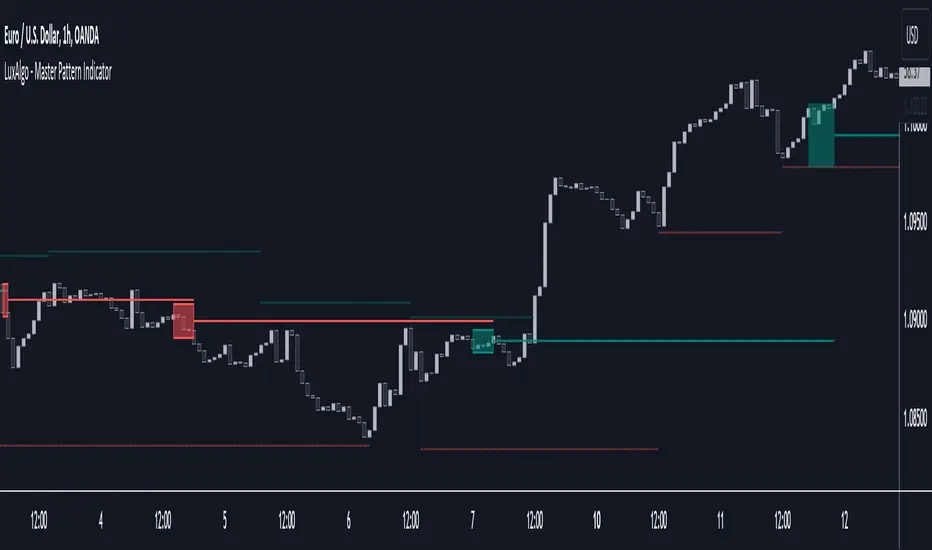
Master Pattern [LuxAlgo]The Master Pattern indicator is derived from the framework proposed by Wyckoff and automatically displays major/minor patterns and their associated expansion lines on the chart.
Liquidity levels are also included and can be used as targets/stops. Note that the Liquidity levels are plotted retrospectively as they are based on pivots.
🔶 USAGE
The Master Pattern indicator detects contraction phases in the markets (characterized by a lower high and higher low). The resulting average from the latest swing high/low is used as expansion line. Price breaking the contraction range upwards highlights a bullish master pattern, while a break downward highlights a bearish master pattern.
During the expansion phase price can tend to be stationary around the expansion level. This phase is then often followed by the price significantly deviating from the expansion line, highlighting a markup phase.
Expansion lines can also be used as support/resistance levels.
🔹 Major/Minor Patterns
The script can classify patterns as major or minor patterns.
Major patterns occur when price breaks both the upper and lower extremity of a contraction range, with their contraction area highlighted with a border, while minor patterns have only a single extremity broken.
🔶 SETTINGS
Contraction Detection Lookback: Lookback used to detect the swing points used to detect the contraction range.
Liquidity Levels: Lookback for the swing points detection used as liquidity levels. Higher values return longer term liquidity levels.
Show Major Pattern: Display major patterns.
Show Minor Pattern: Display minor patterns.
Global LiquidityThe "Global Liquidity" script is an indicator that calculates and displays the global liquidity value using a formula that takes into account the money supply of several major economies. The script utilizes data from various sources, such as the Federal Reserve Economic Data (FRED), Economics, and FX_IDC.
The indicator plots the global liquidity value as a candlestick chart and breaks it down into two categories: the Euro-Atlantic region (West) and the rest of the world (East). The values are denominated both in inflation-adjusted dollars and in trillions of dollars. The script also calculates the spread between the Euro-Atlantic region and the rest of the world.
Traders and investors can use this indicator to gauge the overall liquidity of the global economy and to identify potential investment opportunities or risks. By breaking down the liquidity value into different regions, traders can also gain insights into regional economic trends and dynamics.
Note that this script is subject to the terms of the Mozilla Public License 2.0 and was created by rodopacapital.
USD Liquidity IndexThis USD Liquidity Index composed of 2 parts, total assets and major liabilities of the Federal Reserve .
There is a certain positive correlation between USD liquidity and risk asset price changes in history.
Suggested that USD Liquidity is mostly determined by the Federal Reserve balance (without leveraged), this index deducts three major liabilities from the total assets (in green color line) of the Federal Reserve . They are the currency in circulation (WCURCIR) in gold color, the Treasury General Account (WTREGEN) in blue color, the Reverse Repo (RRPONTSYD) in red color.
The grey line is the calculation result of the USD Liquidity Index. With it goes up, liquidity increases, vice versa.

MarketReader_StrategyMarketReader_Strategy is a very useful and advanced indicator:
- It draws buying (green) and selling (orange) zone .
-Once the buying or selling zone is tapped, the color is automatically changed to grey
-It shows liquidity pool ($$$) engineered by market behaviour
Buying or selling area are determined by an algorithm that combines volume profile, Elliott Wave principles and order flow delivery .
On the above example:
At “1” , you can see that the first buying zone is drawn since January 12
At “2” , the buying zone is tapped on January 18 with a strong bullish reaction.
At “3” and “3’” , you can see that liquidity pool has been created by market maker on both buying and selling side. It is typical of market behavior.
Market maker will take the downside liquidity by targeting the buying zone and then reverse (to the upside) targeting the upside liquidity pool that fuel the pump to the selling zone “4” . This selling zone is reached at “5” with a strong bearish reaction.
“6” represent active buying zone, waiting to be tapped.
To buy or take profit on these areas will depend on market behavior on the way down. Does the market engineer liquidity before? We use 2 complementary indicators helping us to take position on these areas but feel free to experiment with your own.
Usually, I wait price comes to selling or buying zone, then I go on lower timeframe (15 to 30 times lower) searching for divergences and convergences on Momemtum reader (also available on tradingview)
This indicator does not repaint and works on Forex, Crypto, Indices, Commodities and stock.

Smart Money Concepts [MHA Finverse]A comprehensive Smart Money Concepts (SMC) indicator designed to identify institutional trading behavior and market structure shifts. This tool helps traders align with "smart money" by detecting key supply and demand zones, structural breaks, and liquidity patterns.
Core Features
Market Structure Analysis
- Real-time Internal Structure: Detects short-term BOS (Break of Structure) and CHoCH (Change of Character) with customizable filters
- Swing Structure: Identifies major trend shifts and structural breaks on higher timeframes
- Adjustable pivot detection with customizable swing point visualization
- Strong/Weak High/Low identification for bias confirmation
Order Blocks (OB)
- Internal and Swing Order Blocks with independent control
- Volume-based metrics showing OB strength and percentage contribution
- Two filtering methods: ATR-based and Cumulative Mean Range
- Flexible mitigation options (Close or High/Low)
- Display up to 20 order blocks per type with auto-cleanup on mitigation
- Color-coded zones with transparency control
Liquidity Detection
- Equal Highs (EQH) and Equal Lows (EQL) identification
- Threshold-based detection using ATR calculation
- Visual confirmation lines connecting equal levels
- Adjustable sensitivity and bar confirmation settings
Fair Value Gaps (FVG)
- Multi-timeframe FVG detection
- Auto-threshold calculation based on price momentum
- Bullish and Bearish gap visualization
- Extendable gap boxes for tracking unfilled imbalances
Premium & Discount Zones
- Automated premium, equilibrium, and discount zone plotting
- Based on current swing range extremes
- Visual representation of optimal entry zones
- Helps identify potential reversal and continuation areas
Multi-Timeframe Levels
- Previous Daily, Weekly, and Monthly High/Low levels
- Customizable line styles (solid, dashed, dotted)
- Independent color controls for each timeframe
- Auto-adjusted labels (PDH, PDL, PWH, PWL, PMH, PML)
Display Modes
- Historical Mode: Shows all past structures and maintains drawing history
- Present Mode: Displays only current active structures for cleaner charts
Visual Themes
- Colored: Full color customization for all elements
- Monochrome: Clean grey-scale design for minimal distraction
Smart Features
- Confluence filter for internal structure to reduce noise
- Automatic candle coloring based on market bias
- 16 pre-configured alert conditions for all major signals
- Efficient rendering with automatic cleanup of broken structures
- Independent control over each feature for modular usage
Use Cases
- Identify institutional entry and exit points through order blocks
- Spot potential reversals at premium/discount zones
- Confirm trend direction with BOS and CHoCH signals
- Find liquidity grabs at equal highs and lows
- Trade imbalances at fair value gaps
- Align entries with multi-timeframe key levels
Settings Organization
All features are neatly organized into logical groups:
- Smart Money Concepts (general settings)
- Real Time Internal Structure
- Real Time Swing Structure
- Order Blocks
- EQH/EQL
- Fair Value Gaps
- Highs & Lows MTF
- Premium & Discount Zones
Note: This indicator works on all timeframes and instruments. For optimal results, combine multiple SMC concepts together to find high-probability setups with confluence.
Credits
Special thanks to Dau_tu_hieu_goc and BigBeluga for their code examples and inspiration that contributed to the development of this indicator.
Disclaimer
This indicator is for educational purposes only and does not constitute financial advice. Trading involves substantial risk of loss. Past performance does not guarantee future results. Always use proper risk management and conduct your own analysis before making trading decisions. The developer is not responsible for any trading losses incurred.
Happy Trading

JP7FX Signals ProJP7FX Signals Pro
Smart session signals based on structure, liquidity shifts and volatility filters.
Designed for use on the 1 minute timeframe.
What this tool does
This indicator builds signals around three things traders track every day.
• session ranges for Asia, Frankfurt, London and New York
• Fair Value Gap behaviour
• Supertrend shifts with volatility confirmation
The script draws each session range on your chart. It tracks when price breaks a session high or low, then checks if the market is above or below the daily open. These conditions help filter trades by direction during different sessions.
It also detects bullish and bearish Fair Value Gaps. The script tracks when an FVG forms, when price enters the imbalance and when it gets mitigated. These checks create part of the signal logic.
Supertrend is used as an extra filter. A crossover above or below the Supertrend gives a directional bias. When combined with session behaviour and FVG conditions, the script can mark possible long or short signals during London or New York.
How the signals form
A signal only prints when the script has all conditions in place.
This includes:
• a session range break in the correct direction
• a price position relative to the daily open
• confirmation from Supertrend
• FVG creation or mitigation on the right side of price
• liquidity taken in previous sessions
These rules reduce noise and avoid signals that appear in weak conditions.
What the indicator is for
• understanding how sessions behave on the 1 minute chart
• tracking liquidity behaviour
• seeing when a clean break and trend shift takes place
• getting notified when the market forms the conditions you set
This is not a buy or sell system on its own
Signals do not replace analysis. You still need market structure, higher timeframe direction, orderblocks or your own trade model.
A signal is only a prompt to look at the chart, not a confirmation to enter a trade.
Price can shift quickly around sessions, so check the context before acting on any alert.
Important notes
• designed for the 1 minute timeframe
• signals do not guarantee trend continuation
• conditions can form in strong or weak market phases
• use your own risk rules and validation before entering trades
JP7FX Signals Pro helps you track session behaviour and FVG interaction more efficiently, but trading decisions still need your full chart process.

3-bar Swing Liquidity Grab📊 3-BAR SWING LIQUIDITY GRAB
WHAT IT DOES
Automatically detects 3-bar swing highs/lows and alerts you to liquidity grab moments — when price breaks structural levels to trigger stop-losses, then reverses.
SIGNALS AT A GLANCE
Signal What It Means Trade Idea
SH 🟠▼ Swing High (Resistance) Reference level
SL 🔵▲ Swing Low (Support) Reference level
LQH 🔴❌ Fake break ABOVE resistance SHORT ⬇️
LQL 🟢❌ Fake break BELOW support LONG ⬆️
HOW TO TRADE IT
Spot the trend — Is price going up or down?
Wait for signal — LQL (green) in uptrend, LQH (red) in downtrend
Enter on signal — Place order on that bar
Stop Loss — Just outside the swing level
Take Profit — At the next swing level
SETTINGS EXPLAINED
Swing length: 1 = 3-bar swing, 2 = 5-bar swing (use 1 for scalp, 2 for larger TF)
Lookback bars: Time window to find liquidity grabs (10-20 for scalp, 50+ for position)
Toggles: Show/hide swing markers and signals
BEST ON THESE TIMEFRAMES
TF Type Settings
M5-M15 Scalp SL: 1, LB: 10-15
M15-H1 Intraday SL: 1, LB: 15-20
H1-H4 Swing SL: 1-2, LB: 20-50
D+ Position SL: 2, LB: 50+
KEY RULES
✅ DO:
Trade signals aligned with major trend
Always use stop loss
Use 2-5% risk per trade
Confirm with price action
❌ DON'T:
Trade choppy/sideways markets
Ignore the trend
Chase signals
Overtrade
REAL EXAMPLE
LONG Trade (LQL Signal):
text
Uptrend → Swing Low forms at 1.0950
→ Price dips to 1.0930 (below SL)
→ Closes at 1.0955 (above SL) = GREEN ❌ (LQL)
→ BUY at 1.0960
→ Stop Loss: 1.0920
→ Take Profit: 1.1050 (previous Swing High)
WORKS ON
✅ Crypto (Bitcoin, Ethereum, Altcoins)
✅ Forex (EUR/USD, GBP/USD, etc.)
✅ Stocks & Indices
✅ Commodities (Gold, Oil, etc.)
Any asset, any timeframe, any market.
DISCLAIMER
This is a technical analysis tool, not financial advice. Past performance does not guarantee future results. Always use proper risk management and test on a demo account first.

HTCTS - Session & Time LiquidityHTCTS - Session & Time Liquidity
1. ภาพรวมการทำงาน (Overview)
อินดิเคเตอร์ตัวนี้ทำหน้าที่ 4 อย่างหลักพร้อมกัน:
Auto DST (ปรับเวลาตามฤดูอัตโนมัติ): คุณไม่ต้องมานั่งแก้เวลาเมื่อตลาดต่างประเทศเปลี่ยนเวลา (Daylight Saving Time) เพราะโค้ดอ้างอิง Timezone ของตลาดนั้นๆ โดยตรง (เช่น NY ใช้ America/New_York)
Session Bars: แสดงแถบสีเล็กๆ ด้านล่างจอเพื่อบอกว่าตอนนี้อยู่ใน Session ไหน (Asia, London, NY AM, NY PM, Thai) แทนการถมสีพื้นหลังซึ่งอาจจะรกตา
High/Low Levels & Sweeps: เมื่อจบ Session โปรแกรมจะตีเส้น High และ Low ของช่วงเวลานั้นทิ้งไว้ ถ้ากราฟวิ่งไปชนเส้นเหล่านั้น (Breakout/Sweep) เส้นจะเปลี่ยนเป็นเส้นประและขึ้นข้อความว่า "(Swept)"
1. Indicator Overview and Purpose (ICT/SMC Framework)
This custom Pine Script indicator is designed specifically for traders utilizing ICT (Inner Circle Trader) or SMC (Smart Money Concepts) methodologies. Its primary function is to simplify the analysis of Time & Price by automatically defining and tracking key market sessions, their resulting liquidity levels (High/Low), and detecting liquidity sweeps (Stop Hunts).
The indicator is designed to be Zero-Maintenance regarding time zones, as it automatically adjusts for Daylight Saving Time (DST) changes in major financial centers (London, New York).
2. Key Features and Logic
A. Automatic DST Handling (Auto-DST)
The script uses specific, location-based time zones for global markets instead of a fixed GMT/UTC offset.
Asia: Uses Asia/Tokyo.
London: Uses Europe/London (Automatically adjusts for BST).
New York (AM/PM): Uses America/New_York (Automatically adjusts for EST/EDT).
This guarantees that the session times displayed on your chart (regardless of your local time, e.g., Thailand GMT+7) always align with the actual opening and closing moments of the corresponding financial market.

For Vietnamese: 3D Volume Weighted Liquidity LevelIntroduction
The 3D Volume Weighted Liquidity Level indicator visualizes market structure by identifying key support and resistance zones based on Pivot Highs and Lows. Unlike standard support/resistance lines, this tool adds a "3D" dimension by calculating the depth of the zone based on Accumulated Volume and Volatility (ATR). This helps traders visualize the "weighted" or significance of a specific price level.
Key Features
- 3D Visualization: Draws geometric boxes connecting similar Pivot points to create clear structural zones.
- Volume & Volatility Depth: The height (depth) of the box is not random. It is calculated dynamically using the accumulated volume between pivots multiplied by the ATR. Thicker boxes imply higher volume accumulation and volatility at that level.
- Liquidity Grab Detection: The indicator automatically detects and highlights bars that "grab liquidity" (break the top of a resistance box or the bottom of a support box), signaling potential stop hunts or reversals.
- Customizable Sensitivity: Users can adjust pivot lengths, search depth, and the volume scaling factor to fit different timeframes and assets.
How to Use
- Support & Resistance: Use the Blue Boxes as potential Support zones and Red Boxes as potential Resistance zones.
- Trend Reversals: Watch for the Liquidity Grab signals (colored bars). If price pierces a box but fails to close significantly beyond it, it often indicates a trap or a reversal setup.
- Volume Analysis: Pay attention to the thickness of the boxes. A thicker box suggests that a significant amount of volume was traded to form that structure, making it a stronger level of interest.

XAUUSD Liquidity Sweep + Engulfing (4H/2H/15m)Key Features in This Script:
4H Bias (Trend): We use RSI on 4H to determine if the market is in a bullish or bearish trend.
2H Setup: When price sweeps below previous lows or above previous highs (liquidity sweep), we confirm it with RSI and an engulfing candle.
15m Entry: After the liquidity sweep is confirmed on the 15m chart, we check for a bullish engulfing (for buys) or bearish engulfing (for sells) with RSI confirmation.
How to Use It:
Add the Script: Copy-paste the code above into TradingView’s Pine Editor.
Apply it to the 15-minute chart for XAUUSD (Gold).
Alerts: Set up alerts when a Buy or Sell signal appears based on the conditions.
Alerts Example:
When a liquidity sweep and RSI flip happens with an engulfing candle, TradingView will notify you, helping you enter at the right time.
🚀 Next Steps:
Try it out and let me know how the alerts and signals are working for you.
If you'd like to add custom stop-loss or take-profit calculations, or include Fibonacci levels, let me know!

USD Liquidity / FX Swap + Money Market StressThis indicator shows, in a simple way, how tight or loose USD liquidity is. It combines two things: signs of stress in the FX market (Fed swap lines + dollar strength) and signs from the money market (the difference between repo rates like SOFR/TGCR and the Fed’s IORB rate). All of this is merged into a single blue line: when it rises, liquidity tends to be more abundant; when it falls, there is more stress and the dollar becomes “expensive” to obtain.
You read it like a traffic light:
If the background is red, the indicator is below the lower threshold → liquidity stress, an environment that is more prone to sell-offs and violent moves in risk assets (including crypto).
If the background is green, the indicator is above the upper threshold → more relaxed liquidity, a backdrop that is more favorable for risk rallies to be sustained.
No background color → neutral zone, neither very good nor very bad: you trade according to your usual system.
It is designed as a macro context filter, not as a buy/sell signal. In red, it makes sense to be more defensive with risk and leverage; in green, if your technical system gives a long signal, you have a somewhat more favorable tailwind. It should always be used together with other tools and strict risk management.

Key Levels, Liquidity Zones & CC liteSyntropy Liquidity & Key Levels Pro — All-in-One Institutional Toolkit
The ultimate clean confluence tool used by serious ICT/SMC traders worldwide.
This single indicator combines three legendary components into one flawless, non-repainting dashboard:
1. Key Institutional Levels
• Monday Range (High / Low / Mid)
• Current & Previous Weekly Open + Range
• Current & Previous Monthly Open + Range
• Quarterly Open + Range
• Smart level merging (no duplicate lines)
• Right-anchored or standard display
• Fully customizable colors, styles & shorthand labels
2. Advanced Liquidity Zones
• Volume-strength filtered swing highs/lows
• Dynamic or fixed ATR-based liquidity pools
• Real-time "Liquidity Grab" detection with visual markers
• Clean boxes + extension lines
• Small dashboard showing current mode & zone count
3. 9 Logic – Clean Version)
• Classic 6–9 countdowns with modern styling
• Standard & Aggressive 13 signals
• Customizable shapes (labels, arrows, triangles, etc.)
• Buy signals marked with green check, Sell with red cross (clean & intuitive)
Why thousands of traders trust this version:
• Zero repainting – 100% reliable structure
• Institutional-grade clean aesthetics
• Works perfectly on Crypto, Forex, Stocks, Futures
• No lag, no clutter, maximum clarity
• All features fully customizable
This is not just another multi-tool.
This is the final confluence indicator most professional traders keep on their main chart 24/7.
Add to favorites. You won’t trade without it again.
Enjoy the edge,
Syntropy Labs

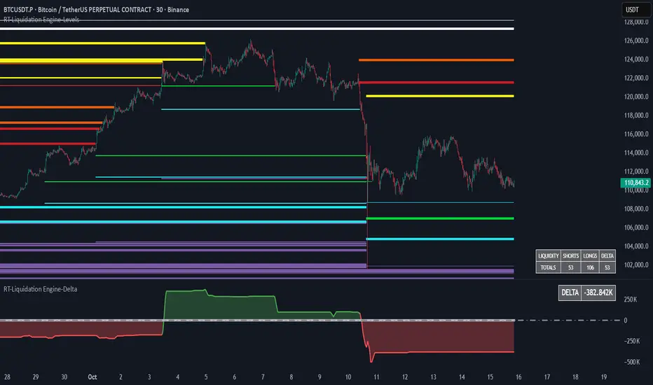
RT-Liquidation Engine-DeltaIntroduction
The RT-Liquidation Engine-Levels is a liquidity mapping tool designed to highlight where leveraged long and short positions may be vulnerable to liquidation. It plots projected Liquidation Levels above and below price, grouped by leverage tiers, so traders can see where the algorithm estimates clustered liquidation zones might sit relative to current price. The RT-Liquidation Engine-Levels indicator is intended to be used in conjunction with the RT-Liquidation Engine-Delta indicator. This writeup will cover both indicators in depth and explain how they work together.
Liquidity Theory – What This Tool Is Looking At
Liquidity levels are a data point that advanced traders study to understand the price levels where positions may be forced out of the market. While exchanges can show open orders in an order book, they do not publish where traders will be liquidated. However, market participants who can estimate those zones often pay close attention to them, because a single wick can be enough to trigger liquidations and force positions to close into the market.
The RT-Liquidation Engine is built around this concept. It uses on-chart information and volume to approximate where these potential liquidation areas may be and displays them directly on the price chart so traders can see the projected levels they may want to monitor.
How It Works
Because real Liquidation Levels are not published by exchanges, the indicator cannot read them directly. Instead, it uses an internal algorithm that studies current prices, direction, and volume to estimate where common leveraged positions might be at risk.
Conceptually, the algorithm: Uses the visible data on the chart to approximate where typical leveraged long and short positions may be clustered.
Projects those estimates as horizontal levels above and below current price.
Keeps those projected levels on the chart until price action trades into them and the level is considered “touched.” The result is a set of dynamic levels that act as an estimated map of where liquidation events might be more likely, based on the chart’s own history and current structure. Trader Math And Leverage Levels
Traders using perpetual futures often use different leverage levels for their positions. The higher the leverage, the more vulnerable those positions are to being liquidated by relatively small moves in price.
While the exact leverage of individual traders is unknown, the Liquidation Engine focuses on four commonly referenced leverage tiers: 5x Leverage
10x Leverage
25x Leverage
50x Leverage Each tier can be displayed as its own set of projected Liquidation Levels on the chart so traders can see a structured view of where different leverage groups may be sensitive.
The Liquidation Levels can be displayed with Multi Color options or in Red/Green depending on the trader's preference.
The above chart shows the Liquidation Levels being displayed with Multi Colors. The above chart shows the Liquidation Levels being displayed in Red/Green.
Reading The Levels
Above and below the candles you will see projected Liquidation Levels. These levels appear at the prices where the algorithm estimates that leveraged positions for each tier could be vulnerable, and they remain drawn until price has traded through them.
In the default view: Thickness of the level – Indicates the estimated size of the position. Thicker lines represent larger projected positions.
Color of the level – Indicates which leverage group the level belongs to (5x, 10x, 25x, or 50x).
Length of the level – Indicates how long the estimated leveraged position has been open according to the algorithm.
This combination provides a visual profile of which zones have more concentrated projected liquidation interest and which have been standing in the market for longer.
Tuning Options
The Liquidation Engine includes a focused set of tuning options so traders can adjust how much information is plotted and how it appears on their charts. Custom Tuning Options Include: Sensitivity Filter – Adjusts the overall threshold the algorithm uses when estimating positions. Increasing this value reduces the number of plotted levels and focuses on larger estimated positions. Decreasing it allows smaller estimated positions to be considered, increasing the number of displayed levels.
Leverage Level Toggles – Individual toggles for each leverage group (5x, 10x, 25x, 50x).
These allow traders to show or hide specific tiers depending on which groups they want to monitor.
Color Settings – Controls the colors and transparency of the levels.
Traders can adjust these settings to match their chart theme and highlight or soften specific leverage groups.
Summary Table Options – Controls the on-chart table that tracks the estimated number of Long versus Short positions. Table On/Off – Toggles the table on or off.
Table Position – Moves the table to different corners of the chart.
Table Background Color / Table Text Color – Customizes the table’s appearance.
Liquidation Engine – Delta
In addition to plotting projected Liquidation Levels, the RT-Liquidation Engine-Levels Indicator is to be used in conjunction with the RT-Liquidation Engine-Delta Indicator. This tool displays the Liquidation Delta data that the algorithm estimates on the imbalance between long and short exposure. Conceptually, the RT-Liquidation Engine-Delta Indicator computes the following items:
Aggregates the estimated long and short positions from the projected Liquidation Levels.
Calculates a net difference (delta) between those two estimates.
Displays that difference so traders can see when the projected open interest appears skewed to one side. When the estimated order book is heavily skewed in one direction, the market may sometimes move in the opposite direction as conditions rebalance. The delta view is designed to provide context for those potential rebalancing moves, not to predict exact turning points.
Tuning options for the RT-Liquidation Engine-Delta Indicator are aligned with the RT-Liquidation Engine-Levels Indicator settings. If you change filters, toggles, or colors in the Levels tool, it is recommended to mirror those settings in the Delta tool so both views remain synchronized.
Best Practices
Some common usage patterns include:
Timeframes – Many traders prefer to use Liquidation Engine on intraday timeframes under 60 minutes. Timeframes such as 30-minute candles or smaller are often used when monitoring leveraged flows.
Load Times – The algorithm performs a significant amount of calculations to project these Liquidation Levels and Deltas. On some symbols and timeframes, this can take noticeable time to load the chart. When changing settings, keep an eye on the loading indicator in the chart header to confirm calculations are still running. In normal conditions, these calculations are completed in less than 30 seconds.
Market Sessions And Levels Out Of Range – If projected levels appear far from current price or do not align with visible action, check the chart’s session settings in the bottom-left of the chart (for example, ETH vs RTH sessions). Ensuring the correct session is active can help keep the displayed levels in a more relevant range.
These guidelines are intended to make the tool easier to work with and to keep expectations realistic when interpreting the projections.
What Makes This Tool Different
While many indicators focus on price alone, the Liquidation Engine Levels and Delta tools are designed specifically around estimated liquidation behavior: It concentrates on where leveraged positions may be at risk, rather than only where price has been in the past.
It segments projected levels by leverage tier so traders can distinguish between different risk profiles on the chart.
It includes both a level-mapping view and a delta view, providing context for both where levels sit and how imbalanced the estimated positioning might be.
Important Note
The RT-Liquidation Engine-Levels and RT-Liquidation Engine-Delta tools provide an approximation of where leveraged positions might be vulnerable based solely on chart data. They do not access actual exchange liquidation feeds, does not reveal real trader positions, and cannot guarantee that a projected level will cause price to react.
This indicator is intended to provide additional context around potential liquidation zones and positioning imbalances. It is not a standalone signal generator and should always be used together with your own analysis, testing, and risk management. Historical interactions with projected Liquidation Levels, including any illustrative examples, do not guarantee future results.
🐋 Tight lines and happy trading!

RT-Liquidation Engine-LevelsIntroduction
The RT-Liquidation Engine-Levels is a liquidity mapping tool designed to highlight where leveraged long and short positions may be vulnerable to liquidation. It plots projected Liquidation Levels above and below price, grouped by leverage tiers, so traders can see where the algorithm estimates clustered liquidation zones might sit relative to current price. The RT-Liquidation Engine-Levels indicator is intended to be used in conjunction with the RT-Liquidation Engine-Delta indicator. This writeup will cover both indicators in depth and explain how they work together.
Liquidity Theory – What This Tool Is Looking At
Liquidity levels are a data point that advanced traders study to understand the price levels where positions may be forced out of the market. While exchanges can show open orders in an order book, they do not publish where traders will be liquidated. However, market participants who can estimate those zones often pay close attention to them, because a single wick can be enough to trigger liquidations and force positions to close into the market.
The RT-Liquidation Engine is built around this concept. It uses on-chart information and volume to approximate where these potential liquidation areas may be and displays them directly on the price chart so traders can see the projected levels they may want to monitor.
How It Works
Because real Liquidation Levels are not published by exchanges, the indicator cannot read them directly. Instead, it uses an internal algorithm that studies current prices, direction, and volume to estimate where common leveraged positions might be at risk.
Conceptually, the algorithm: Uses the visible data on the chart to approximate where typical leveraged long and short positions may be clustered.
Projects those estimates as horizontal levels above and below current price.
Keeps those projected levels on the chart until price action trades into them and the level is considered “touched.” The result is a set of dynamic levels that act as an estimated map of where liquidation events might be more likely, based on the chart’s own history and current structure. Trader Math And Leverage Levels
Traders using perpetual futures often use different leverage levels for their positions. The higher the leverage, the more vulnerable those positions are to being liquidated by relatively small moves in price.
While the exact leverage of individual traders is unknown, the Liquidation Engine focuses on four commonly referenced leverage tiers: 5x Leverage
10x Leverage
25x Leverage
50x Leverage Each tier can be displayed as its own set of projected Liquidation Levels on the chart so traders can see a structured view of where different leverage groups may be sensitive.
The Liquidation Levels can be displayed with Multi Color options or in Red/Green depending on the trader's preference.
The above chart shows the Liquidation Levels being displayed with Multi Colors. The above chart shows the Liquidation Levels being displayed in Red/Green.
Reading The Levels
Above and below the candles you will see projected Liquidation Levels. These levels appear at the prices where the algorithm estimates that leveraged positions for each tier could be vulnerable, and they remain drawn until price has traded through them.
In the default view: Thickness of the level – Indicates the estimated size of the position. Thicker lines represent larger projected positions.
Color of the level – Indicates which leverage group the level belongs to (5x, 10x, 25x, or 50x).
Length of the level – Indicates how long the estimated leveraged position has been open according to the algorithm.
This combination provides a visual profile of which zones have more concentrated projected liquidation interest and which have been standing in the market for longer.
Tuning Options
The Liquidation Engine includes a focused set of tuning options so traders can adjust how much information is plotted and how it appears on their charts. Custom Tuning Options Include: Sensitivity Filter – Adjusts the overall threshold the algorithm uses when estimating positions. Increasing this value reduces the number of plotted levels and focuses on larger estimated positions. Decreasing it allows smaller estimated positions to be considered, increasing the number of displayed levels.
Leverage Level Toggles – Individual toggles for each leverage group (5x, 10x, 25x, 50x).
These allow traders to show or hide specific tiers depending on which groups they want to monitor.
Color Settings – Controls the colors and transparency of the levels.
Traders can adjust these settings to match their chart theme and highlight or soften specific leverage groups.
Summary Table Options – Controls the on-chart table that tracks the estimated number of Long versus Short positions. Table On/Off – Toggles the table on or off.
Table Position – Moves the table to different corners of the chart.
Table Background Color / Table Text Color – Customizes the table’s appearance.
Liquidation Engine – Delta
In addition to plotting projected Liquidation Levels, the RT-Liquidation Engine-Levels Indicator is to be used in conjunction with the RT-Liquidation Engine-Delta Indicator. This tool displays the Liquidation Delta data that the algorithm estimates on the imbalance between long and short exposure. Conceptually, the RT-Liquidation Engine-Delta Indicator computes the following items:
Aggregates the estimated long and short positions from the projected Liquidation Levels.
Calculates a net difference (delta) between those two estimates.
Displays that difference so traders can see when the projected open interest appears skewed to one side. When the estimated order book is heavily skewed in one direction, the market may sometimes move in the opposite direction as conditions rebalance. The delta view is designed to provide context for those potential rebalancing moves, not to predict exact turning points.
Tuning options for the RT-Liquidation Engine-Delta Indicator are aligned with the RT-Liquidation Engine-Levels Indicator settings. If you change filters, toggles, or colors in the Levels tool, it is recommended to mirror those settings in the Delta tool so both views remain synchronized.
Best Practices
Some common usage patterns include:
Timeframes – Many traders prefer to use Liquidation Engine on intraday timeframes under 60 minutes. Timeframes such as 30-minute candles or smaller are often used when monitoring leveraged flows.
Load Times – The algorithm performs a significant amount of calculations to project these Liquidation Levels and Deltas. On some symbols and timeframes, this can take noticeable time to load the chart. When changing settings, keep an eye on the loading indicator in the chart header to confirm calculations are still running. In normal conditions, these calculations are completed in less than 30 seconds.
Market Sessions And Levels Out Of Range – If projected levels appear far from current price or do not align with visible action, check the chart’s session settings in the bottom-left of the chart (for example, ETH vs RTH sessions). Ensuring the correct session is active can help keep the displayed levels in a more relevant range.
These guidelines are intended to make the tool easier to work with and to keep expectations realistic when interpreting the projections.
What Makes This Tool Different
While many indicators focus on price alone, the Liquidation Engine Levels and Delta tools are designed specifically around estimated liquidation behavior: It concentrates on where leveraged positions may be at risk, rather than only where price has been in the past.
It segments projected levels by leverage tier so traders can distinguish between different risk profiles on the chart.
It includes both a level-mapping view and a delta view, providing context for both where levels sit and how imbalanced the estimated positioning might be.
Important Note
The RT-Liquidation Engine-Levels and RT-Liquidation Engine-Delta tools provide an approximation of where leveraged positions might be vulnerable based solely on chart data. They do not access actual exchange liquidation feeds, does not reveal real trader positions, and cannot guarantee that a projected level will cause price to react.
This indicator is intended to provide additional context around potential liquidation zones and positioning imbalances. It is not a standalone signal generator and should always be used together with your own analysis, testing, and risk management. Historical interactions with projected Liquidation Levels, including any illustrative examples, do not guarantee future results.
🐋 Tight lines and happy trading!
Ryan Liquidity Hunt Algo Premium Liquidity Hunt Algo — detects institutional swing liquidity, order blocks, and premium/discount zones.
Shows auto-drawn swing boxes, liquidity lines (daily/weekly/monthly), FVG gaps, and optional OI/volume filters to highlight high-probability areas — designed for clear structure-based trade decisions and visual clarity.

Session Open Range, Breakout & Trap Framework - TrendPredator OBSession Open Range, Breakout & Trap Framework — TrendPredator Open Box
Stacey Burke’s trading approach combines concepts from George Douglas Taylor, Tony Crabel, Steve Mauro, and Robert Schabacker. His framework focuses on reading price behaviour across daily templates and identifying how markets move through recurring cycles of expansion, contraction, and reversal. While effective, much of this analysis requires real-time interpretation of session-based behaviour, which can be demanding for traders working on lower intraday timeframes.
The TrendPredator indicators formalize parts of this methodology by introducing mechanical rules for multi-timeframe bias tracking and session structure analysis. They aim to present the key elements of the system—bias, breakouts, fakeouts, and range behaviour—in a consistent and objective way that reduces discretionary interpretation.
The Open Box indicator focuses specifically on the opening behaviour of major trading sessions. It builds on principles found in classical Open Range Breakout (ORB) techniques described by Tony Crabel, where a defined time window around the session open forms a structural reference range. Price behaviour relative to this range—breaking out, failing back inside, or expanding—can highlight developing session bias, potential trap formation, and directional conviction.
This indicator applies these concepts throughout the major equity sessions. It automatically maps the session’s initial range (“Open Box”) and tracks how price interacts with it as liquidity and volatility increase. It also incorporates related structural references such as:
* the first-hour high and low of the futures session
* the exact session open level
* an anchored VWAP starting at the session open
* automated expansion levels projected from the Open Box
In combination, these components provide a unified view of early session activity, including breakout attempts, fakeouts, VWAP reactions, and liquidity targeting. The Open Box offers a structured lens for observing how price transitions through the major sessions (Asia → London → New York) and how these behaviours relate to higher-timeframe bias defined in the broader TrendPredator framework.
Core Features
Open Box (Session Structure)
The indicator defines an initial session range beginning at the selected session open. This “Open Box” represents a fixed time window—commonly the first 30 minutes, or any user-defined duration—that serves as a structural reference for analysing early session behaviour.
The range highlights whether price remains inside the box, breaks out, or rejects the boundaries, providing a consistent foundation for interpreting early directional tendencies and recognising breakout, continuation, or fakeout characteristics.
How it works:
* At the session open, the indicator calculates the high and low over the specified time window.
* This range is plotted as the initial structure of the session.
* Price behaviour at the boundaries can illustrate emerging bias or potential trap formation.
* An optional secondary range (e.g., 15-minute high/low) can be enabled to capture early volatility with additional precision.
Inputs / Options:
* Session specifications (Tokyo, London, New York)
* Open Box start and end times (e.g., equity open + first 30 minutes, or any custom length)
* Open Box colour and label settings
* Formatting options for Open Box high and low lines
* Optional secondary range per session (e.g., 15-minute high/low)
* Forward extension of Open Box high/low lines
* Number of historic Open Boxes to display
Session VWAPs
The indicator plots VWAPs for each major trading session—Asia, London, and New York—anchored to their respective session opens. These session-specific VWAPs assist in tracking how value develops through the day and how price interacts with session-based volume distributions.
How it works:
* At each session open, a VWAP is anchored to the open price.
* The VWAP updates throughout the session as new volume and price data arrive.
* Deviations above or below the VWAP may indicate balance, imbalance, or directional control.
* Viewed together, session VWAPs help identify transitions in value across sessions.
Inputs / Options:
* Enable or disable VWAP per session
* Adjustable anchor and end times (optionally to end of day)
* Line styling and label settings
* Number of historic VWAPs to draw
First Hour High/Low Extensions
The indicator marks the high and low formed during the first hour of each session. These reference points often function as early control levels and provide context for assessing whether the session is establishing bias, consolidating, or exhibiting reversal behaviour.
How it works:
* After the session starts, the indicator records the highest and lowest prices during the first hour.
* These levels are plotted and extended across the session.
* They provide a visual reference for observing reactions, targets, or rejection zones.
Inputs / Options:
* Enable or disable for each session
* Line style, colour, and label visibility
* Number of historic sessions displayed
EQO Levels (Equity Open)
The indicator plots the opening price of each configured session. These “Equity Open” levels represent short-term reference points that can attract price early in the session.
Once the level is revisited after the Open Box has formed, it is automatically cut to avoid clutter. If not revisited, the line remains as an untested reference, similar to a naked point of control.
How it works:
* At session open, the open price is recorded.
* The level is plotted as a local reference.
* If price interacts with the level after the Open Box completes, the line is cut.
* Untested EQOs extend forward until interacted with.
Inputs / Options:
* Enable/disable per session
* Line style and label settings
* Optional extension into the next day
* Option for cutting vs. hiding on revisit
* Number of historic sessions displayed
OB Range Expansions (Automatic)
Range expansions are calculated from the height of the Open Box. These levels provide structured reference zones for identifying potential continuation or exhaustion areas within a session.
How it works:
* After the Open Box is formed, multiples of the range (e.g., 1×, 2×, 3×) are projected.
* These expansion levels are plotted above and below the range.
* Price reactions near these areas can illustrate continuation, hesitation, or potential reversal.
Inputs / Options:
* Enable or disable per session
* Select number of multiples
* Line style, colour, and label settings
* Extension length into the session
Stacey Burke 12-Candle Window Marker
The indicator can highlight the 12-candle window often referenced in Stacey Burke’s session methodology. This window represents the key active period of each session where breakout attempts, volatility shifts, and reversal signatures often occur.
How it works:
* A configurable window (default 12 candles) is highlighted from each session open.
* This window acts as a guide for observing active session behaviour.
* It remains visible throughout the session for structural context.
Inputs / Options:
* Enable/disable per session
* Configurable window duration (default: 3 hours)
* Colour and transparency controls
Concept and Integration
The Open Box is built around the same multi-timeframe logic that underpins the broader TrendPredator framework.
While higher-timeframe tools track bias and setups across the H8–D–W–M levels, the Open Box focuses on the H1–M30 domain to define session structure and observe how early intraday behaviour aligns with higher-timeframe conditions.
The indicator integrates with the TrendPredator FO (Breakout, Fakeout & Trend Switch Detector), which highlights microstructure signals on lower timeframes (M15/M5). Together they form a layered workflow:
* Higher timeframes: context, bias, and developing setups
* TrendPredator OB: intraday and intra-session structure
* TrendPredator FO: microstructure confirmation (e.g., FOL/FOH, switches)
This alignment provides a structured way to observe how daily directional context interacts with intraday behaviour.
See the public open source indicator TP FO here (click on it for access):
Practical Application
Before Session Open
* Review previous session Open Box, Open level, and VWAPs
* Assess how higher-timeframe bias aligns with potential intraday continuation or reversal
* Note untested EQO levels or VWAPs that may function as liquidity attractors
During Session Open
* Observe behaviour around the first-hour high/low and higher-timeframe reference levels
* Monitor how the M15 and 30-minute ranges close
* Track reactions relative to the session open level and the session VWAP
After the Open Box completes
* Assess price interaction with Open Box boundaries and first-hour levels
* Use microstructure signals (e.g., FOH/FOL, switches) for potential confirmation
* Refer to expansion levels as reference zones for management or target setting
After Session
* Review how price behaved relative to the Open Box, EQO levels, VWAPs, and expansion zones
* Analyse breakout attempts, fakeouts, and whether intraday structure aligned with the broader daily move
Example Workflow and Trade
1. Higher-timeframe analysis signals a Daily Fakeout Low Continuation (bullish context).
2. The New York session forms an Open Box; price breaks above and holds above the first-hour high.
3. A Fakeout Low + Switch Bar appears on M5 (via FO), after retesting the session VWAP triggering the entry.
4. 1x expansion level serves as reference targets for take profit.
Relation to the TrendPredator Ecosystem
The Open Box is part of the TrendPredator Indicator Family, designed to apply multi-timeframe logic consistently across:
* higher-timeframe context and setups
* intraday and session structure (OB)
* microstructure confirmation (FO)
Together, these modules offer a unified structure for analysing how daily and intraday cycles interact.
Disclaimer
This indicator is for educational purposes only and does not guarantee profits.
It does not provide buy or sell signals but highlights structural and behavioural areas for analysis.
Users are solely responsible for their trading decisions and outcomes.

BOS + Liquidity (AOL Detection)This script detects Break of Structure (BOS), swing highs and lows, and liquidity areas (AOL). It marks bullish and bearish BOS when price breaks previous structure points and automatically maps liquidity zones above old highs and below old lows. With adjustable sensitivity, it identifies even small structure breaks. Ideal for traders who rely on SMC, liquidity, and market structure for directional bias and refined entries.

External Range Liquidity by fx4_livingExternal Range Liquidity Indicator
This indicator visualizes the evolving price range boundaries and subdivisions for a user-defined intraday session period on the chart.
It computes and displays the highest and lowest prices observed within the specified session (used as external range liquidity), updating dynamically with each bar, and includes optional midpoint and quartile levels represented by horizontal lines that adjust as the range develops.
Key Features:
Session Range Calculation: Tracks the maximum high and minimum low prices during the active session, refreshing in real-time.
Midpoint Display: Optionally plots a median level between the session high and low, with selectable styles (solid, dotted, or dashed).
Quadrant Display: Optionally segments the range into quarters by displaying levels at 25% and 75% from the low, with customizable line styles.
Color Customization: Allows selection of colors for the high boundary (default blue), low boundary (default red), midpoint (default gray), and quadrants (default gray).
Session Input: User-configurable session timeframe, defaulting to 18:00-16:14 across all weekdays and weekends, using America/New York time zone.
Timeframe Compatibility: Optimized for intraday use on charts of 30 minutes or lower; attempts to apply on higher timeframes will display an error.
Visualization Style: High and low ranges appear as stepped lines with diamond markers indicating external liquidity purges. Midpoint and quadrant lines are horizontal segments without extension for precise session representation.
Settings:
Range: Specifies the session window (e.g., "1800-1614").
High Color: Color for the upper range line.
Low Color: Color for the lower range line.
Show range mid point: Enable/disable the midpoint line.
(Midpoint color and style): Inline choices for color and line type (Solid, Dotted, Dashed).
Show range quadrants: Enable/disable both the 25% and 75% lines.
(Quadrants color and style): choices for color and line type (Solid, Dotted, Dashed).
This tool serves purely for visual analysis of session price dynamics on charts.
It offers no signals, predictions, or guidance for any market actions.
Users are encouraged to perform independent evaluations and align with their own strategies when incorporating charting elements.

Global Liquidity - Impulse (ROC & Z-score) [GMI-style]What it is:
Liquidity is a faucet. When central banks add money, the faucet opens (risk-on). When they pull money out, it closes (risk-off). This indicator builds a global net-liquidity proxy and shows its impulse :
- ROC (green/red histogram): % change vs N weeks ago.
- Z-score (cyan line): how unusually strong the latest weekly move is.
Why it matters:
Liquidity impulse often leads risk assets (equities/crypto) by weeks to a few months.
- Green bars > 0 + positive Z → friendlier risk-on backdrop.
- Red bars < 0 + negative Z → tightening conditions; caution.
Data used (TV Economics / FRED):
USA (FRED, millions USD):
- FRED:WALCL (Fed assets)
- FRED:RRPONTSYD (Reverse Repo – subtract)
- FRED:WTREGEN (Treasury General Account – subtract)
Other CBs (Economics, units vary):
- ECONOMICS:EUCBBS (ECB)
- ECONOMICS:JPCBBS (BoJ)
- ECONOMICS:CNCBBS (PBoC)
Optional:
- ECONOMICS:GBCBBS (BoE, UK)
- ECONOMICS:CACBBS (BoC, Canada)
- ECONOMICS:CHCBBS (SNB, Switzerland)
- ECONOMICS:AUCBBS (RBA, Australia)
Proxy (scaled to billions):
(Fed − RRP − TGA) + ECB + BoJ + PBoC +
How to read:
- Green bars above 0 = faucet opening → money in → risk-on.
- Red bars below 0 = faucet closing → money out → risk-off.
- Taller bar = stronger push.
- Cyan Z > +1 = unusually strong positive impulse; Z < −1 = unusually strong negative impulse.
- Background : green when ROC>0 & Z>0 , red when ROC<0 & Z<0 .
Quick reading guide (TL;DR):
- Early risk-on: ROC crosses > 0 and Z > 0 (ideally Z ≥ +1 ).
- Early risk-off: ROC crosses < 0 and Z < 0 (ideally Z ≤ −1 ).
- Use weekly timeframe; price often reacts with a 0–12 week lag.
- Combine with PMIs/New Orders, real yields (down), and credit spreads (narrowing).
Notes:
Symbols may differ by provider; leave optional banks OFF if missing. Currencies/units differ across CBs; this is a pragmatic proxy, not a perfect macro model. Educational use only; not financial advice.

GT3_Trades Sessions Highs & LowsThis indicator automatically identifies and displays the session highs and lows for the three major global market sessions: Asia, London, and New York. It is designed for intraday traders who rely on session-based structure, liquidity levels, and volatility windows. The script dynamically tracks and plots the highest and lowest price reached during each session and extends these levels forward on the chart for strong visual clarity.
Key Features
Session-Based Highs & Lows
Calculates and updates the high and low for each session (Asia, London, New York) in real time as price develops within the session window.
Fully Customizable Display Options
Traders can individually toggle the visibility of each session’s high and low levels.
Line colors, styles (Solid, Dashed, Dotted), and thickness are also user-configurable.
Accurate Timezone Handling
Session times are defined using user-selected timezone settings (default UTC+3), ensuring session boundaries match the trader’s desired market timing.
Automatic Daily Reset
At the start of each new trading day, the indicator clears the previous levels and begins tracking fresh highs and lows for the new day.
Dynamic Line Drawing
Each level is plotted using real Pine Script line objects, which update automatically as new highs or lows form. Once created, each line extends forward to the right—providing clear, persistent references for potential liquidity zones, breakouts, and reversions.
Efficient Tracking Logic
The script keeps track of the bar index where each high/low occurs and updates the line endpoints in real time. Historical levels are not reused, ensuring clean, uncluttered visuals.
How It Helps Traders
Identifies liquidity pools and sweep areas based on session extremes.
Highlights intraday structure shifts when price breaks or respects session highs/lows.
Provides a clear overview of volatility cycles across the global trading day.
Helps detect potential reversal or continuation setups when interacting with session boundaries.
Ideal For
Intraday and scalping strategies
ICT-based session analysis
Liquidity, sweep, and FVG traders
Forex, indices, crypto, and commodities
