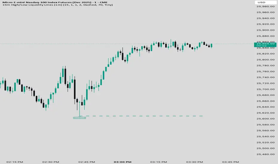
15 min Trailstop15m High/Low Liquidity Lines (1m) — Indicator Description
15m High/Low Liquidity Lines (1m) is a precision liquidity-mapping tool designed for intraday traders who understand the importance of higher-timeframe liquidity levels while executing on the 1-minute chart.
This indicator automatically detects confirmed 15-minute swing highs and swing lows using pivot logic. When a new 15m high or low forms:
✔ Liquidity Line Generation
A horizontal line is drawn exactly at the price level of the pivot.
The line is anchored to the exact 1-minute candle that produced the 15m high/low, ensuring perfect visual alignment.
The line extends only up to the current bar — not across the whole chart.
Optional text labels (“15m High”, “15m Low”) can be shown at the start of each line.
✔ Auto-Cleanup (Smart Liquidity Sweep Detection)
If price trades through the level, the corresponding line and label are:
Instantly deleted
Marking the level as taken/swept
Allowing the chart to stay clean and focused on active liquidity only
This mimics institutional liquidity logic: once the high or low is violated, the target is considered filled and removed.
✔ Alerts
The indicator includes built-in alerts that fire when:
A new 15m high is confirmed
A new 15m low is confirmed
This allows the trader to react immediately when fresh liquidity levels appear.
✔ Customization Options
You can fully tailor the visual representation:
Turn highs and/or lows on or off
Choose line style (solid, dashed, dotted)
Customize line color and thickness
Customize the label style, size, and transparency
Who Is This For?
This indicator is ideal for:
ICT-style traders
Liquidity-based scalpers
1-minute ES/NQ traders
Anyone who uses HTF liquidity levels to frame trades on the LTF
It provides a clean, automated method to track active 15-minute liquidity levels directly on the 1-minute chart with zero clutter and perfect alignment.
"ict" için komut dosyalarını ara
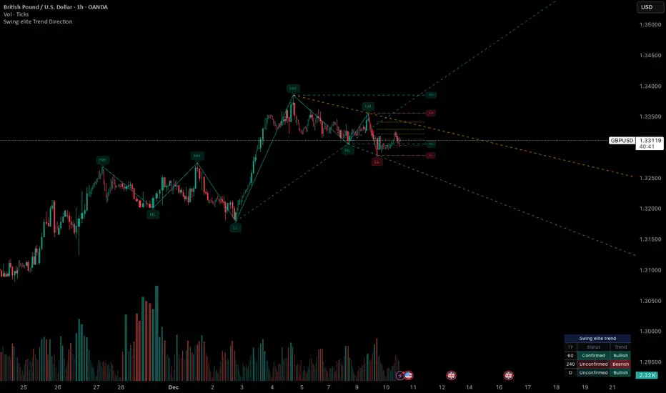
Swing elite Trend directionSwing elite Trend direction
A comprehensive market structure indicator that identifies swing highs/lows, labels them with HH/HL/LH/LL structure, draws dynamic trendlines, and provides multi-timeframe trend analysis.
🔹 FEATURES
Market Structure Analysis
Automatically detects swing highs and swing lows
Labels each pivot with its structure type: HH (Higher High), HL (Higher Low), LH (Lower High), LL (Lower Low)
Color-coded zigzag lines based on confirmed trend direction
Structure Trendlines
Downtrend Line: Connects HH to LH (resistance in bearish structure)
Uptrend Line: Connects LL to HL (support in bullish structure)
Extended projection for potential future price interaction
Swing Trendlines
Connects the last 2 swing highs (resistance trendline)
Connects the last 2 swing lows (support trendline)
Optional extension to project future levels
Break Levels
Horizontal lines at key structure points (HH, HL, LL, LH)
Visual reference for potential breakout/breakdown levels
Customizable colors for bullish and bearish breaks
Fibonacci Retracement
Auto-drawn between the last two pivots
Customizable levels: 0, 0.236, 0.382, 0.5, 0.618, 0.786, 1.0
Individual toggle and color settings for each level
Multi-Timeframe Dashboard
Displays trend status across 3 customizable timeframes
Shows trend direction: Bullish / Bearish / Neutral
Shows confirmation status: Confirmed / Unconfirmed
Color-coded for quick visual analysis
Trend Confirmation Logic (ICT/SMC Concepts)
Bullish Confirmed: HL followed by HH (Higher Low → Higher High pattern)
Bearish Confirmed: LH followed by LL (Lower High → Lower Low pattern)
Unconfirmed: Counter-structure appears (potential reversal signal)
🔹 SETTINGS
Swing Settings
Depth: Lookback period for pivot detection
Display
Toggle zigzag lines, labels, price on labels
Adjust label size and number of visible swings
Zigzag Settings
Line style: Solid, Dashed, Dotted
Thickness and colors for bullish/bearish trends
Swing Trendlines
Toggle high/low trendlines independently
Customizable colors, style, thickness
Option to extend trendlines
Structure Trendlines
Toggle HH→LH and LL→HL lines independently
Customizable colors, style, thickness
Option to extend trendlines
Break Levels
Toggle HH, HL, LL, LH break levels independently
Customizable colors for each level
Fibonacci
Toggle individual fib levels
Customizable colors and line style
Dashboard
Position: Top Left, Top Right, Bottom Left, Bottom Right
Size: Tiny, Small, Normal, Large
3 customizable timeframes
🔹 ALERTS
HH Broken: Price breaks above recent Higher High
HL Broken: Price breaks below recent Higher Low
LL Broken: Price breaks below recent Lower Low
LH Broken: Price breaks above recent Lower High
🔹 USE CASES
✅ Identify market structure and trend direction
✅ Spot potential trend reversals (unconfirmed status)
✅ Find key support/resistance levels
✅ Multi-timeframe trend alignment for trade confirmation
✅ Breakout/breakdown trading with break levels
✅ Fibonacci retracement entries
HTF Candle Overlay – Multi-Timeframe Visualization ToolThis indicator overlays true Higher Timeframe (HTF) candlesticks directly onto any lower timeframe chart, allowing you to see the larger market structure while trading on precise execution timeframes such as 1-minute, 3-minute, or 5-minute.
Instead of constantly switching chart timeframes, you can now see both higher and lower timeframe price action at the same time. Each HTF candle is drawn as a large transparent candlestick with full upper and lower wicks, perfectly aligned in both time and price.
This makes it easy to identify:
- Trend direction from the higher timeframe
- Key support and resistance zones inside each HTF candle
- Liquidity sweeps and rejections across timeframes
- Optimal entries on lower timeframes with higher-timeframe confirmation
Key Features
- Displays true Higher Timeframe candles on any lower timeframe
- Clear transparent candle bodies for unobstructed price visibility
- Full upper and lower wicks
- Non-repainting confirmed candles
- Optional live display of the currently forming HTF candle
- Accurate time-based alignment
- Lightweight and optimized for performance
Who This Indicator Is For
- Scalpers who want higher-timeframe bias
- Day traders using multi-timeframe confirmation
- Smart Money / ICT traders monitoring HTF structure
- Anyone who wants clean multi-timeframe clarity without chart switching
How To Use
- Apply the indicator to any chart.
- Select your preferred Higher Timeframe (HTF) in the settings.
- Use your lower timeframe for entries while respecting HTF structure and direction.
- This tool helps you trade with the bigger picture in view while executing with precision on lower timeframes.

Dark Pool Pulse – LiteDark Pool Pulse Lite
This indicator provides an observational proxy for dealer gamma exposure using only price and volume data. It helps users visualize whether market makers may be leaning long gamma (potential stabilizing flows) or short gamma (potential destabilizing flows). For educational and informational purposes only.
Key Features
0–100 oscillator representing an estimated dealer-gamma proxy.
Bullish zone (above 60): dealers may be long gamma → potentially absorbing volatility.
Bearish zone (below 40): dealers may be short gamma → potentially amplifying volatility.
Background tint for quick visual context.
Optional summary table showing current value and interpretation.
Alert conditions for crosses of the 60 and 40 thresholds.
How It Works
The indicator measures volume-weighted directional pressure and normalizes it over a rolling lookback window. The value is smoothed and mapped into a 0–100 oscillator:
Above 60 → potential positive gamma conditions.
Below 40 → potential negative gamma conditions.
40–60 → neutral or balanced zone.
All calculations are performed internally using only price and volume.
Settings
Lookback Length (default 20): Number of bars used for normalization.
Smoothing Length (default 10): EMA smoothing applied to the proxy.
Show Summary Table: Toggles the optional value/interpretation panel.
How to Use
Add the indicator to any chart or timeframe.
Observe the oscillator levels:
A move above 60 may reflect a more stabilizing dealer environment.
A move below 40 may reflect a more destabilizing environment.
Use the background tint for quick contextual bias.
Enable alerts for threshold crossings if desired.
Adjust settings to match your preferred responsiveness.
Notes
For educational and informational purposes only.
Not financial, trading, or investment advice.
No signals or recommendations are provided.
Source code protected to maintain proprietary calculation methods.

Sen Channel LiteSen Channel Lite
Sen Channel Lite calculates a robust, median-based regression channel using the Theil–Sen slope method. This visual tool helps traders identify trend direction and potential breakout zones in real time.
Key Features
Dynamic Trend Line: The median-based regression line adapts to price movement, providing a central reference for trend direction.
Upper and Lower Bands: Automatically updated bands highlight potential breakout or reversal areas.
Breakout Markers: Optional triangles indicate when price crosses above the upper band or below the lower band.
Midline (EMA/SMA): Toggleable trend line for additional context on price direction.
VWAP Anchor: Optional VWAP plot to visualize volume-weighted average price levels.
Customizable Inputs:
Lookback Period for slope calculation
Band Multiplier to adjust sensitivity
Option to use Standard Deviation or ATR for band width
Midline type, length, and color
VWAP visibility and color
Channel cloud transparency
How to Read Signals (Educational Use Only):
Trend Context: The midline provides a reference for general trend direction. Price above the midline suggests bullish bias; below indicates bearish bias.
Breakouts:
Triangle up → price crossed above the upper band; potential strong move upward.
Triangle down → price crossed below the lower band; potential strong move downward.
Channel Interpretation:
Price near the upper band → market may be overextended.
Price near the lower band → market may be oversold.
Price moving within the channel → trend is balanced; use additional analysis for direction.
VWAP Context: Compare price to VWAP for intraday support/resistance insights.
Usage Notes:
Fully visual tool; no trading or financial advice.
All calculations are protected to preserve intellectual property.
Results reflect real-time calculations; no repainting.
Suitable for intraday to daily timeframes.
Important: This script is published as protected/closed-source to safeguard GammaBulldog intellectual property.

Displacement + FVG + Structure Break (ICT-style)Identifies the displacement candle. Can be used in conjunction with 1 min chart to identify true displacement

CK FVGThis indicator automatically finds bullish and bearish Fair Value Gaps and shows you which ones still matter — without you drawing anything.
What it does:
Marks every new FVG on the chart
Shows bullish (green) and bearish (red) gaps
Removes gaps once they’re mitigated (filled)
Highlights rejections when price taps the FVG and shoots away
Option to only show the last few unmitigated FVGs
Works on any timeframe
Extra features:
Dashboard showing total FVGs + mitigation %
Alert system for new FVGs and mitigations
Static or dynamic gap mode depending on your preference
Why traders like it:
No more drawing FVG boxes manually
Helps spot clean reaction zones
Perfect for ICT-style setups, liquidity plays, and reversals
Simple, clean, and does all the FVG work for you.

Opening Range ICT 3-Bar FVG + Engulfing Signals (Overlay)Beta testing
open range break out and retest of FVG.
Still working on making it accurate so bear with me

SMC Pro: Real-Time (English)Title: SMC Pro: Real-Time Sessions & Daily Cycle
Description:
SMC Pro: Real-Time Sessions & Daily Cycle is a comprehensive tool designed for Smart Money Concepts (SMC) and ICT traders. This indicator automatically plots key trading sessions and identifies market structure manipulations in real-time.
Unlike standard session indicators that wait for the session to close, this tool draws boxes and lines dynamically from the very first candle, allowing you to see the range developing live.
🚀 Key Features
1. Real-Time Session Drawing
Asia, London, and New York sessions are drawn candle-by-candle.
Boxes expand automatically as price creates new highs or lows during the session.
50% Midline for the Asian range to help identify premium/discount pricing.
2. The Daily Cycle & "Type 3" Detection
Based on the "Daily Cycle" logic, the indicator monitors the Asian Range after it closes.
Type 3 Whipsaw Alert: Automatically detects and labels a "Type 3" scenario where price sweeps BOTH the Asian High and Asian Low (manipulation).
Lines extend automatically to help you trade the breakout or reversal (Sweep).
3. PDH / PDL (Previous Day High/Low)
Displays the Previous Day High and Low levels.
Logic is strictly locked to the last completed day to keep your chart clean (no clutter from historical days).
4. Entry Helper (SCOB)
Color-coded candles: Highlights potential entry candles based on engulfing patterns after a liquidity sweep.
Fully customizable colors for Buy and Sell setups.
⚙️ Settings
Customizable Times: Adjust session hours to fit your broker's time zone or your specific strategy.
Visual Styles: Choose between Solid, Dashed, or Dotted lines for the Asian range.
Clean Chart: Toggle any feature (text, fills, lines) on or off to suit your visual preference.
💡 How to Use
Wait for the Asian Range to complete.
Watch for a "Sweep" of the Asian High or Low during the London/NY session.
If price sweeps BOTH sides, the indicator will tag it as "Type 3: Whipsaw", signaling a potential reversal or high-volatility expansion.
Use the PDH/PDL levels as major liquidity targets.

OXE MTF Support/Resistance+Demand/Supply Zone ArsenalOXE MTF Support/Resistance + Demand/Supply Zones Indicator
Your Complete Multi-Timeframe Zone Arsenal
This professional-grade indicator transforms your chart into a zone confluence powerhouse, simultaneously tracking high-probability price reaction areas across 5 timeframes (Daily, H4, H1, M15, M5) – giving you the institutional edge you need to dominate the markets.
🎯 What It Is
A sophisticated dual-system zone detector that identifies both:
Classic Support/Resistance levels using pivot point detection
Smart Money Demand/Supply zones triggered by Break-of-Structure (BOS) confirmations
Unlike basic S/R indicators, this tool employs institutional methodology – capturing order blocks and imbalance zones where smart money is positioned, not just where price bounced.
⚡ Core Capabilities
Multi-Timeframe Mastery
Track up to 5 timeframes simultaneously without switching charts
Identify confluence zones where multiple timeframe levels align
Customize which timeframes to display for clean, focused analysis
Intelligent Zone Management
Automatic zone validation – tracks when zones flip from resistance→support or supply→demand
Invalid zone filtering – hide broken/invalidated zones to focus only on active opportunities
Configurable zone limits – control the number of zones per timeframe (up to 8 each)
Smart Money Detection
BOS-confirmed zones – only marks demand/supply after break-of-structure confirmation
Precise zone timing – captures the exact candle that created the imbalance
Visual differentiation – dashed borders distinguish demand/supply from traditional S/R
Professional Dashboard
Real-time zone counter – shows active zones per timeframe at a glance
Filter status indicators – tracks which validation filters are enabled
Color-coded timeframe labels – instant visual organization
💰 How This Transforms Your Trading
1. Find High-Probability Entries
Enter trades at zones where multiple timeframes converge – when H4 demand aligns with Daily support, you've found institutional backing.
2. Stay on the Right Side of the Market
The zone flipping system shows you when market structure changes – a supply zone that flips to demand tells you the narrative has shifted bullish.
3. Eliminate Guesswork
No more wondering "is this level still valid?" The automatic invalidation tracking removes subjectivity – zones are either active (tradeable) or broken (ignored).
4. Scale Your Timeframe Analysis
Whether you're scalping M5 or swing trading Daily, access all relevant zones without the mental overhead of switching between charts and manually tracking levels.
5. Trade Like Institutions
By combining pivot-based S/R with BOS-confirmed order blocks, you're seeing where retail AND institutional money is positioned – giving you the complete picture.
🔥 Perfect For
Day traders seeking M15/H1 confluence for precise entries
Scalpers needing M5 zones with higher-timeframe confirmation
Swing traders looking for Daily/H4 zone alignment for position trades
ICT/SMC practitioners combining order blocks with traditional analysis
Any trader who values clean, validated, multi-timeframe zones over cluttered charts

Imbalance Heatmap (Free) – pc75A clean, efficient visualisation of liquidity voids, 3-bar imbalances, and price inefficiency zones.
This indicator highlights where the market left gaps in the order flow — areas price often revisits to rebalance.
Imbalances are displayed as stacked horizontal “heatmap strips,” making it easy to see:
Where aggressive buying/selling left a void
Whether multiple voids overlap (stronger zones)
Whether price is likely to return to fill the imbalance
How old a void is (older zones are marked differently)
This is a refined v6 rewrite based on a script I liked, completely modernised with cleaner logic, better performance, and optional labels.
🔍 Features
3-bar liquidity void detection (ICT-style logic)
Bullish imbalance when price displaces upward with no wick overlap
Bearish imbalance for downward displacement
✔ Heatmap-style visualisation
Each imbalance is sliced into multiple thin horizontal bands to create a visual density effect.
✔ Stacking intelligence
If a new void overlaps previous ones, the heatmap is drawn brighter, showing areas where the market left multiple inefficiencies.
✔ “Void xN” labels
Optional labels show how many overlapping voids existed at the moment the imbalance formed.
✔ Automatic deletion when filled
As soon as price trades back through a slice, that slice is removed.
This keeps the chart clean and focuses only on active inefficiencies.
✔ Smart ageing
Older voids are marked with a subtle border so you can distinguish freshly formed inefficiencies from historical ones.
✔ Alerts
Set alerts for when price taps a stacked imbalance zone (“Void x2” and above).
⚙ Inputs & Customisation
ATR threshold (optional)
Minimum tick size gap
Number of heatmap slices
Bullish / bearish toggles
Label toggles
Colour and transparency configuration
Max slice memory for performance
💡 How to Use
Imbalance zones often behave as:
Magnets → price gravitates toward them
Support/resistance → structure respects inefficiencies
Continuity points → used with market structure shifts
Targets → for both scalpers and swing traders
Strong (stacked) voids typically represent areas of institutional displacement, where the market is more likely to return for rebalancing.
📢 Notes
This is the free version.
Educational only — not financial advice.

FVG Maxing - Fair Value Gaps, Equilibrium, and Candle Patterns
What this script does
This open-source indicator highlights 3-candle fair value gaps (FVGs) on the active chart timeframe, draws their midpoint ("equilibrium") line, tracks when each gap is mitigated, and optionally marks simple candle patterns (engulfing and doji) for confluence. It is intended as an educational tool to study how price interacts with imbalances.
3-candle bullish and bearish FVG zones drawn as forward-extending boxes.
Equilibrium line at 50% of each gap.
Different styling for mitigated vs unmitigated gaps.
Compact statistics panel showing how many gaps are currently active and filled.
Optional overlays for bullish/bearish engulfing patterns and doji candles.
1. FVG logic (3-candle gaps)
The script focuses on a strict 3-candle definition of a fair value gap:
Three consecutive candles with the same body direction.
The wick of candle 3 is separated from the wick of candle 1 (no overlap).
A bullish gap is created when price moves up fast enough to leave a gap between candle 1 and 3. A bearish gap is the mirror case to the downside.
In Pine, the core detection looks like this:
// Three candles with the same body direction
bull_seq = close > open and close > open and close > open
bear_seq = close < open and close < open and close < open
// Wick gap between candle 1 and candle 3
bull_gap = bull_seq and low > high
bear_gap = bear_seq and high < low
// Final FVG flags
is_bull_fvg = bull_gap
is_bear_fvg = bear_gap
For each detected FVG:
Bullish FVG range: from high up to low (gap below current price).
Bearish FVG range: from low down to high (gap above current price).
Each zone is stored in a custom FVGData structure so it can be updated when price later trades back inside it.
2. Equilibrium line (0.5 of the gap)
Every FVG box gets an optional equilibrium line plotted at the midpoint between its top and bottom:
eq_level = (top + bottom) / 2.0
right_index = extend_boxes ? bar_index + extend_length_bars : bar_index
bx = box.new(bar_index - 2, top, right_index, bottom)
eq_ln = line.new(bar_index - 2, eq_level, right_index, eq_level)
line.set_style(eq_ln, line.style_dashed)
line.set_color(eq_ln, eq_color)
You can use this line as a neutral “fair value” reference inside the zone, or as a simple way to think in terms of premium/discount within each gap.
3. Mitigation rules and styling
Each FVG stays active until price trades back into the gap:
Bullish FVG is considered mitigated when the low touches or moves below the top of the gap.
Bearish FVG is considered mitigated when the high touches or moves above the bottom of the gap.
When that happens, the script:
Marks the internal FVGData entry as mitigated.
Softens the box fill and border colors.
Optionally updates the label text from "BULL EQ / BEAR EQ" to "BULL FILLED / BEAR FILLED".
Can hide mitigated zones almost completely if you only want to see unfilled imbalances.
This allows you to distinguish between current areas of interest and zones that have already been traded through.
4. Candle pattern overlays (engulfing and doji)
For additional confluence, the script can mark simple candle patterns on top of the FVG view:
Bullish engulfing — current candle body fully wraps the previous bearish body and is larger in size.
Bearish engulfing — current candle body fully wraps the previous bullish body and is larger in size.
Doji — candles where the real body is small relative to the full range (high–low).
The detection is based on basic body and range geometry:
curr_body = math.abs(close - open)
prev_body = math.abs(close - open )
curr_range = high - low
body_ratio = curr_range > 0 ? curr_body / curr_range : 1.0
bull_engulfing = close > open and close < open and open <= close and close >= open and curr_body > prev_body
bear_engulfing = close < open and close > open and open >= close and close <= open and curr_body > prev_body
is_doji = curr_range > 0 and body_ratio <= doji_body_ratio
On the chart, they appear as:
Small triangle markers below bullish engulfing candles.
Small triangle markers above bearish engulfing candles.
Small circles above doji candles.
All three overlays are optional and can be turned on or off and recolored in the CANDLE PATTERNS group of inputs.
5. Inputs overview
The script organizes settings into clear groups:
DISPLAY SETTINGS : Show bullish/bearish FVGs, show/hide mitigated zones, box extension length, box border width, and maximum number of boxes.
EQUILIBRIUM : Toggle equilibrium lines, color, and line width.
LABELS : Enable labels, choose whether to label unmitigated and/or mitigated zones, and select label size.
BULLISH COLORS / BEARISH COLORS : Separate fill and border colors for bullish and bearish gaps.
MITIGATED STYLE : Opacity used when a gap is marked as mitigated.
STATISTICS : Toggle the on-chart FVG statistics panel.
CANDLE PATTERNS : Show engulfing patterns, show dojis, colors, and the body-to-range threshold that defines a doji.
6. Statistics panel
An optional table in the corner of the chart summarizes the current state of all tracked gaps:
Total number of FVGs still being tracked.
Number of bullish vs bearish FVGs.
Number of unfilled vs mitigated FVGs.
Simple fill rate: percentage of tracked FVGs that have been marked as mitigated.
This can help you study how a particular market tends to treat gaps over time.
7. How you might use it (examples)
These are usage ideas only, not recommendations:
Study how often your symbol mitigates gaps and where inside the zone price tends to react.
Use higher-timeframe context and then refine entries near the equilibrium line on your trading timeframe.
Combine FVG zones with basic candle patterns (engulfing/doji) as an extra visual anchor, if that fits your process.
Hope you enjoy, give your feedback in the comments!
- officialjackofalltrades

Breaker Blocks [TakingProphets]Breaker Blocks
Smart Money “breaker” zones automatically mapped on your chart.
This tool is designed for traders who use ICT / Smart Money concepts and want a clean, automated way to see breaker blocks form and evolve in real time.
-----------------------------------------------------------------------------------------------
🔍 What this indicator does
The script automatically detects potential bullish and bearish breaker blocks after a market structure shift, then draws and maintains those zones on your chart:
-Plots bullish breaker blocks as green shaded zones.
-Plots bearish breaker blocks as red shaded zones.
-Optionally shows the 50% (midline) of each breaker for refinement.
-Keeps a rolling list of the most recent breakers and removes older ones to keep your chart clean.
-Optionally hides breakers once price closes through them (invalidation), so only active zones remain.
It’s built to work on any symbol and any timeframe. Lower timeframes will naturally generate more breakers; higher timeframes will show fewer, more significant zones.
Important: This script does not open, manage, or close trades for you. It only visualizes price zones that may be relevant to your own strategy and analysis.
-----------------------------------------------------------------------------------------------
🧠 Core logic (high level)
Under the hood, the indicator:
Uses an internal zigzag swing structure to track major pivot highs and lows.
Watches for a market structure shift (MSS):
Bullish MSS: price closes above a prior swing high.
Bearish MSS: price closes below a prior swing low.
Once an MSS is confirmed, it:
Locates the relevant impulse candle(s) that price traded through.
Defines the breaker block using the high/low (or body vs. wick, based on internal settings).
Draws a breaker box from that origin forward in time.
Each breaker is stored as an internal object with:
Direction (bullish or bearish)
Top and bottom prices
Visual boxes and an optional midline
On every new candle, all active breakers are updated:
Extended forward as new bars print.
Optionally invalidated and deleted if price closes back through the breaker in the opposite direction.
This gives you a dynamic map of which breaker blocks are still “respected” by price and which have failed.
-----------------------------------------------------------------------------------------------
⚙️ Key Inputs & Settings
All user-facing options are grouped under “Breaker Blocks” for a clean UI.
-Display Breaker Block
Toggle the visualization on/off without removing detection logic.
-Bullish Color / Bearish Color
Choose the fill color for bullish and bearish breaker zones.
-Show 50% Line
Plots a dashed line at the mid-point of each breaker block.
Helpful if you use the 50% level as a refinement or entry anchor.
-Max Visible
Limits how many of the most recent breaker blocks stay on the chart.
Older breakers are deleted once this limit is exceeded (keeps things clean and lightweight).
-Hide When Invalidated
If enabled:
Bullish breaker is hidden once price closes below its low.
Bearish breaker is hidden once price closes above its high.
If disabled, breakers remain visible even after those closes (for study / backtesting purposes).
These options allow you to run the tool in either a minimal, current-context only mode, or a more historical, educational mode.
-----------------------------------------------------------------------------------------------
🧭 How traders might use it
Some common ways traders may incorporate breaker blocks into their own plans:
As context zones around which to look for entries using their personal triggers.
As potential support/resistance areas after a shift in structure.
To visually separate active vs. invalidated zones instead of manually redrawing them.
In confluence with other SMC tools (FVGs, liquidity pools, PD arrays, etc.) and higher-timeframe bias.
This indicator is intended as a visual aid and works best when combined with a complete trading plan, risk management rules, and your own discretion.
-----------------------------------------------------------------------------------------------
⚠️ Disclaimer
This indicator does not guarantee profits or specific outcomes.
It is provided for educational and informational purposes only.
Past price behavior around breaker blocks does not imply future results.
Always test any tool on a demo account or in a simulated environment before using it with real capital.
Trading involves risk, and you are solely responsible for your own decisions.

Session Volume Profile – Asia, London, NYSession Volume Profile – Asia, London, New York
Product Description
This tool displays intraday volume distribution for the Asian, London, and New York trading sessions.
It provides a visual breakdown of where trading activity concentrated during each session, helping users study volume structure across global market phases.
What the Tool Shows
1. Session Levels
Each session plots three main reference levels:
Point of Control (POC) — the price level with the highest volume traded during that session
Value Area High (VAH) — upper boundary of the primary volume region
Value Area Low (VAL) — lower boundary of the primary volume region
Each session is assigned its own color for easier differentiation.
2. Session Volume Histogram
A horizontal volume histogram displays how activity is distributed within each session.
Longer bars indicate higher relative volume at that price.
3. Session Highlighting (Optional)
Background shading can be enabled to visually identify the current active session.
4. Session Countdown (Optional)
A small text label shows how much time is left in the current session. This is for chart awareness only.
How to Read the Display (Educational Use Only)
POC is often viewed by many traders as a key reference point when studying intraday balance or activity clusters.
VAH / VAL can help users observe where the majority of volume occurred within a session.
Comparing session profiles may help identify how participation shifts from Asia → London → New York.
Observing how price interacts with these historical volume areas can provide context when studying intraday structure.
This panel does not generate trading signals. It is intended for chart analysis, market study, and understanding how volume distributes across global sessions.
Customization Options
Accessible via Settings → Inputs:
Enable/disable any session
Adjust value area percentage
Modify histogram density
Adjust visual opacity
Toggle countdown timer or session shading
These options allow users to tailor the display to different chart styles and timeframes.
Notes
This tool is for educational and informational purposes only.
It does not provide trading or financial advice.
No signals are produced; all outputs are historical/analytical.
Code is published as protected/closed-source to preserve the structure of the underlying calculations.

Options Fusion Core - Lite v6Options Fusion Core – Lite v6
A dual-engine oscillator designed to provide clear, confidence-driven market reads. OFC – Lite v6 combines two high-signal components into a single 0–100 panel to help traders interpret momentum strength and liquidity flow at a glance.
Core Components
Momentum Engine (Solid Line)
Above 50: Bullish bias (green shades)
Below 50: Bearish bias (red shades)
Near 20 or 80: Potential exhaustion zones where trends may pause or reverse
Liquidity Gauge (Dotted Line)
Above 55: Strong buying pressure
Below 45: Selling pressure
Around 50: Neutral flow
How to Use (Educational Purpose Only)
Alignment Signals: Watch for Momentum Engine and Liquidity Gauge moving in the same direction.
Example: Momentum >50 and Liquidity >55 → constructive environment
Example: Momentum <50 and Liquidity <45 → weakening conditions
Extremes: Momentum near 20 or 80 indicates potential trend exhaustion. Paired with strong Liquidity changes, these zones may highlight possible reversals or pauses.
Neutral Line (50): Many false moves occur around 50. Wait for a clear break above or below before interpreting as a signal.
Use in Context: Combine with price action, volume, or other indicators for confirmation.
User Inputs
Fast Momentum Length — controls how quickly Momentum reacts
VFI Length — smooths the Liquidity Gauge
VFI Cutoff — adjusts sensitivity to flow spikes
Lite Version:
Oscillator panel only
No automated signals or multi-ticker table
Educational and visualization purposes only
Important Notice
This script is educational and informational only. Not trading, financial, or investment advice.
Calculations are proprietary and protected to safeguard intellectual property.
No repainting; all results reflect real-time calculation.

Gamma Conviction Oscillator LiteGamma Conviction Oscillator Lite
A volume-weighted momentum oscillator designed to help traders visualize conviction in gamma-heavy instruments (SPY, TSLA, NVDA, MSTR, COIN, HOOD, etc.). This LITE edition is fully functional and educational, focusing on reading market momentum without offering trading signals.
Core Features (LITE Version):
Dynamic oscillator panel with volatility-adjusted overbought/oversold levels
Long-term trend filter: 200-period moving average selectable as SMA, EMA, or HMA
Conviction-based coloring system:
Bright Lime → high-conviction oversold (price above long-term MA)
Bright Red → high-conviction overbought (price below long-term MA)
Teal / Maroon → low-conviction extremes (counter-trend)
User Inputs:
Base Oscillator Length, Volatility Smoothing Length, and Sensitivity Factor are adjustable in Settings → Inputs
Long-Term Trend Length and MA Type are selectable for trend confirmation
How to Read Signals (Educational Use Only):
Oscillator Level: Observe the main VWPS line relative to overbought/oversold levels:
Above the red overbought line → price may be stretched
Below the green oversold line → price may be compressed
Trend Context: Compare the oscillator reading to the long-term MA:
Oscillator above oversold + price above MA → potential bullish conviction
Oscillator below overbought + price below MA → potential bearish conviction
Color Coding: The line color communicates conviction strength and trend alignment:
Bright Lime / Bright Red indicate strong alignment with trend extremes
Teal / Maroon indicate weaker, counter-trend extremes
Use the oscillator in conjunction with your own analysis; consider confirming with price action, volume, or other indicators.
LITE Version:
Oscillator panel only
No divergence detection
No multi-ticker gamma table
Important Notice:
This script is educational and informational only. Not trading, financial, or investment advice.
All calculations are proprietary and protected to preserve intellectual property.
No repainting: results reflect real-time calculations.
Source Code:
This script is published as protected/closed-source to safeguard GammaBulldog intellectual property.

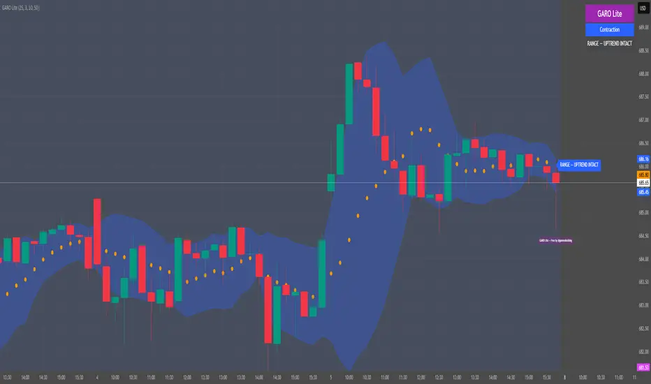
GARO Lite - Free Regime EngineGARO — Gamma Regime Engine
Overview
GARO (Gamma Regime Oscillator) is a visual regime engine that shows market conditions in real-time. This free edition is for educational and charting purposes only.
Key Features
Regime Detection: Highlights Expansion, Contraction, and Spike conditions using trend, volatility, and volume-based calculations.
Core and Bands: Central reference line with upper and lower bands.
Visual Alerts: Orange dots appear under candles during compressions; background colors indicate current regime.
Signal Labels: Labels provide visual guidance based on regime and trend slope.
Gamma Exposure (GEX) Proxy & Zero Gamma Flip: Optional visual overlays for contextual awareness.
User Inputs: Some settings are visible in the input panel but are disabled in this free edition.
How to Use
Regime Colors:
Expansion (green background): Market trending/expanding; core line indicates direction.
Contraction (blue background): Market range-bound; orange dots indicate compression.
Spike (red background): High volatility; visual alert only.
Labels & Signals:
Labels highlight potential regime moves; not trade advice.
Combine colors, core/band positions, and label cues with your own analysis.
Core Line & Bands:
Core line shows central reference per regime.
Upper/lower bands provide context for potential support/resistance zones.
Orange Dots:
Indicate compressions or regime-specific signals; visual only.
Gamma Exposure & Zero Gamma Flip (Optional):
Illustrates potential price sensitivity; charting/educational use only.
Important:
Protected code; underlying calculations are not visible.
For educational and visual guidance only; not financial or trading advice.
Works on any timeframe; free edition gives visual regime insights.
Liquidity Hunter Pro A1 EngineLiquidity Hunter Pro A1 Engine is an advanced trading indicator designed for precision entries during the NY session by tracking institutional liquidity raids across major forex sessions.
Key Features:
Session-Based Liquidity Detection - Automatically identifies when price raids Previous Day High/Low, Asian Session, and London Session liquidity levels
Smart Entry Signals - Color-coded triangles (GREEN/YELLOW/RED) based on confluence strength with FVG and market structure confirmation
A1 Rating System - Proprietary 6-point scoring algorithm that evaluates trend alignment, session timing, R:R ratio, and market structure for premium setups
Fair Value Gaps (FVG) - Visualizes institutional imbalances with auto-managed boxes
Real-Time HUD Dashboard - Shows current session, trading window status, last raid details, active signals with entry/SL/TP levels, and A1 rating
Risk Management - Built-in TP/SL calculator with customizable risk:reward ratios and stop loss buffers
Customizable Display - Toggle session levels, FVG boxes, signal quality filters, and labels to match your trading style
Best Used For:
NY session traders (9:30-11:30 EST default window)
Liquidity sweep strategies
ICT/Smart Money concepts
Forex pairs (works on all timeframes, 5M-15M recommended)
Alerts included for all raid types and A1-rated setups.

Liquidity Pulse Oscillator LITETitle:
Liquidity Pulse Oscillator LITE
Description:
This indicator provides an observational view of market activity by measuring intra-bar price and volume dynamics. It is fully informational and educational, and does not constitute financial, trading, or investment advice.
Key Features:
Fast and Slow Pulse lines: Dual EMAs of volume-weighted pressure to highlight crossover points.
Histogram: Displays the difference between fast and slow pulses with color-coded bars (green for positive, red for negative).
Scaled 0–100 line: Provides a normalized perspective for easier interpretation of relative activity levels.
EXP/CON markers: Indicate expansions and contractions in observed market activity.
How It Works:
Pressure is calculated as the absolute open-to-close movement divided by the candle range, multiplied by volume. Safeguards handle zero-range bars. The resulting values are smoothed using fast and slow EMAs. Crossovers generate EXP and CON markers, helping users visualize changes in market activity.
Why This Approach:
Traditional volume indicators often overlook intra-bar dynamics and range normalization. This oscillator emphasizes price movement relative to bar range combined with volume, offering an additional perspective on shifts in market activity.
How to Use:
EXP marker + positive histogram: Indicates potential expansion in observed market activity.
CON marker + negative histogram: Indicates potential contraction in observed market activity.
Can be applied on any timeframe to help confirm breakouts, reversals, or shifts in market behavior.
Notes:
For informational and educational purposes only. Not financial advice.

CISD by tncylyvCISD (Change in State of Delivery) by tncylyv
The CISD (Change in State of Delivery) indicator is a precision price action tool designed to help traders identify key reversal points based on ICT concepts. Unlike standard support and resistance indicators, this script tracks the specific algorithmic opening prices responsible for the current delivery state and highlights when that state has been invalidated.
🧠 What is CISD?
Change in State of Delivery refers to the moment price shifts from a Buy Program to a Sell Program (or vice versa).
• Bearish CISD (-CISD): Occurs when price closes below the opening price of the up-candle sequence that created the most recent High.
• Bullish CISD (+CISD): Occurs when price closes above the opening price of the down-candle sequence that created the most recent Low.
This indicator automates the identification of these levels, tracking the "Active" reference price in real-time and marking historical reversals.
🚀 Key Features
1. Continuous Active Level Tracking:
o The indicator plots a continuous, stepped line (The "Active CISD") that follows the market structure. As the market expands (makes new highs or lows), the line updates to the new valid reference point.
o This allows you to see the current invalidation level at a glance without cluttering the chart with old lines.
2. Triggered Reversal Lines:
o When a candle closes beyond the Active CISD level, a "Triggered" line is drawn to mark the exact price and location of the reversal.
o These lines serve as excellent historical references for potential Order Blocks or Breakers later in time.
3. Smart Filtering:
o You can choose to display Both Bullish and Bearish setups, or filter to see Bullish Only or Bearish Only. This is ideal for traders who have a specific daily bias and want to remove noise from the chart.
4. Clean & Customizable:
o Fully customizable colors for Bullish and Bearish events.
o Options to toggle Labels, adjust Line Width, and change Line Styles (Solid, Dashed, Dotted).
o "No Continuation" Logic: This version focuses purely on major reversals (Change in State) rather than minor pullbacks, keeping your chart clean.
⚙️ Settings Guide
• Show Active CISD Level: Toggles the continuous stepped line representing the current threshold for a reversal.
• Triggered CISD Display: Choose between Both, Bullish Only, Bearish Only, or None. This controls the historical lines left behind after a reversal occurs.
• Visual Settings: Adjust line width, label sizes, and font styles to match your chart aesthetic.
• Colors: Customize the Shrek Mode (Bullish) and Blood Bath (Bearish) colors.
⚠️ A Note for Developers
This indicator is open source! If you are a Pine Script developer, feel free to check the source code. I’ve utilized some... creative variable naming conventions to make the coding experience more entertaining. Enjoy the read!
________________________________________
Risk Disclaimer: This tool is for educational purposes and market analysis. It does not guarantee future performance. Always manage your risk.

MTF S/R Array - Full CustomA clean, institutional-style multi-timeframe support and resistance indicator designed for precision trading decisions. Plots previous and current period levels with full customization for backtesting and live trading.
━━━━━━━━━━━━━━━━━━━━━━
WHAT IT PLOTS
━━━━━━━━━━━━━━━━━━━━━━
MONTHLY
- Previous Month High / Low / Close
- Previous Month Highest Closing Price
- Current Month High / Low / Highest Close
WEEKLY
- Previous Week High / Low / Close
- Current Week High / Low
DAILY
- Previous Day High / Low / Close
- Current Day High / Low
SESSIONS (Full Session - EST)
- Asian: 7pm - 4am
- London: 3am - 12pm
- New York: 8am - 5pm
OPENING RANGE
- Monday/Tuesday combined high and low
- Clean box visualization for weekly initial balance
━━━━━━━━━━━━━━━━━━━━━━
WHY THESE LEVELS MATTER
━━━━━━━━━━━━━━━━━━━━━━
Institutions and smart money reference these key levels for:
- Liquidity targets
- Stop hunts
- Reversal zones
- Trend continuation entries
Previous period levels act as magnets for price. Current levels show where the battle is happening now.
━━━━━━━━━━━━━━━━━━━━━━
FULL CUSTOMIZATION
━━━━━━━━━━━━━━━━━━━━━━
Every level type has independent controls:
- Show/Hide Previous and Current separately
- Extend Bars - control how far each level stretches
- Line Width - adjust thickness per level
- Transparency - fade previous levels for clarity
- Colors - separate colors for High/Low vs Close
Additional settings:
- Labels on/off with size and style options
- Info table with position and size controls
- Opening range box transparency and border width
━━━━━━━━━━━━━━━━━━━━━━
HOW TO USE
━━━━━━━━━━━━━━━━━━━━━━
1. Use on lower timeframes (1m, 5m, 15m) to see HTF levels
2. Watch for price reactions at previous period highs/lows
3. Look for session high/low sweeps followed by reversals
4. Use Monday/Tuesday opening range for weekly bias and targets
5. Previous levels extend further back for backtesting context
━━━━━━━━━━━━━━━━━━━━━━
TIPS
━━━━━━━━━━━━━━━━━━━━━━
- Increase "Prev Extend Bars" on monthly/weekly to see levels across more history
- Use higher transparency on previous levels to keep chart clean
- Turn off sessions you don't trade to reduce clutter
- The info table shows all values at a glance - position it where it doesn't block price action
━━━━━━━━━━━━━━━━━━━━━━
BEST FOR
━━━━━━━━━━━━━━━━━━━━━━
- ICT / Smart Money Concepts traders
- Session-based strategies
- Swing traders using HTF levels on LTF entries
- Anyone who wants clean, customizable S/R levels
Works on Forex, Crypto, Stocks, Futures, and Indices.

EMA/SMA Crossover Signals📊 EMA/SMA Crossover Signals
A professional trading indicator that identifies golden and death crosses between a customizable EMA and SMA with clear BUY/SELL labels displayed directly on your chart.
🎯 Key Features:
✅ Customizable Moving Averages - Adjust both EMA and SMA periods to match your trading strategy
✅ Clear Signal Labels - Large, color-coded "BUY" and "SELL" labels that are impossible to miss
✅ Adjustable Label Positioning - Control the vertical distance of signal labels from price action
✅ Professional Color Customization - Change colors for both moving averages and signals to match your theme
✅ Label Size Options - Choose from 4 different sizes (Tiny, Small, Normal, Large)
✅ Audio Alerts - Get notified instantly when crossovers occur
✅ Overlay Display - Signals appear directly on your price chart for better context
📈 How It Works:
🟢 BUY Signal: Triggered when the EMA crosses above the SMA (bullish crossover)
🔴 SELL Signal: Triggered when the EMA crosses below the SMA (bearish crossover)
⚙️ Customizable Settings:
Moving Averages:
- EMA Period (Default: 8)
- SMA Period (Default: 200)
Colors:
- EMA Color
- SMA Color
- Buy Signal Color
- Sell Signal Color
Signal Settings:
- Signal Vertical Offset
- Label Vertical Offset
- Label Size
💡 Best For:
- Day Trading (1-5 min timeframes)
- Swing Trading (4H-Daily)
- Trend Following Strategies
- Identifying momentum shifts
- Confirming market structure changes
🔔 Perfect for traders using ICT, Wyckoff, and institutional trading methodologies
Use this indicator as part of your complete trading system. Always combine with proper risk management and additional confluence factors.
