Ultimate SMC Dashboard — Pro v2.1 (ICT/SMC)
🔍 1. General Objective of the Script
This script is a complete visual and algorithmic SMC (Smart Money Concepts) analysis system that:
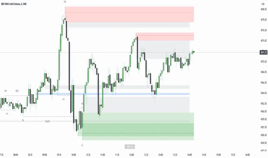
* Automatically identifies market structures (BOS / CHoCH / Liquidity Grab).
* Detects and dynamically maintains Fair Value Gaps (FVG) according to ICT methodology .
* Draws and tracks the evolution of Order Blocks (OB) and Breaker Blocks (BRK) .
* Calculates MACD / Volume divergences .
* Analyzes trend, volume, and buyer/seller dominance .
* Displays a clear and dynamic dashboard directly on the chart.
* Builds the foundation for reversal / continuation probability models .
---
⚙️ 2. Input Parameters
The script is highly configurable. Inputs are organized by sections:
Structure (ICT)
* Pivot left/right (swing length) → determines the swing size for HH/LL detection.
* OB lookback → number of candles to look back for an Order Block after a BOS.
* Show BOS / CHoCH / Liquidity Grab → enables or disables structural elements.
Imbalances (FVG)
* Enables the display of Fair Value Gaps .
* Manages minimum size, transparency, and **dynamic reduction** when partially filled.
* Limits the maximum number of FVGs displayed simultaneously.
Order Blocks / Breakers
* Enables Order Blocks and Breaker Blocks .
* Defines their colors, opacity , and dynamic behavior .
* Automatically removes outdated OBs exceeding the maximum limit.
Signal & Probabilities
* Sets the lookback period for structure calculation.
* Calculates average volume (MA) to detect dominance and momentum.
* Defines the probability threshold for signals (not yet visible in this snippet).
RSI / EMA / Divergences / Sentiment
* Prepares additional indicator modules, such as:
* MACD divergence detection
* RSI / EMA visualization
* Market sentiment and funding metrics
---
🧠 3. Market Structure Logic (ICT Core)
a. Pivot Detection
Uses ta.pivothigh and ta.pivotlow to detect Higher Highs (HH) and Lower Lows (LL) .
b. Break of Structure (BOS)
A BOS occurs when price breaks a validated swing high or low:
* bullBOS → bullish break.
* bearBOS → bearish break.
c. Change of Character (CHoCH)
A CHoCH is detected when BOS direction changes (e.g., a bullish BOS followed by a bearish BOS).
d. Liquidity Grab
Detection of liquidity sweeps :
* grabUp : wick above the last high, closing below.
* grabDown : wick below the last low, closing above.
All these signals feed into the main trend bias (Bull / Bear / Flat).
---
🧱 4. Fair Value Gaps (FVG)
The FVG logic strictly follows ICT principles :
* Bullish FVG: if `low > high `
* Bearish FVG: if `high < low `
Each FVG becomes a dynamic box :
* Shrinks in real time as price partially fills it.
* Automatically deletes itself once fully closed.
* Color and opacity depend on direction (green = bullish, red = bearish).
This is one of the most complex parts of the code, managing:
* Arrays of box objects (`array`)
* Real-time updates for every candle
* Automatic cleanup to prevent chart overload
---
🧱 5. Order Blocks (OB) and Breaker Blocks
An Order Block is generated:
* After a BOS,
* By identifying the last candle opposite to the trend before the break.
Examples:
* Bullish BOS → Bullish OB = last red candle before the breakout.
* Bearish BOS → Bearish OB = last green candle before the breakdown.
Each OB:
* Is visualized as a colored rectangle (cyan or orange).
* Becomes inactive once mitigated (touched).
* Is removed and converted into a Breaker Block if invalidated (opposite side broken).
The system uses arrays similar to FVGs to maintain visual cleanliness and chart efficiency .
---
📊 6. Volume and Dominance
The script computes:
* A moving average (SMA) of volume.
* Whether the current volume is abnormally high or low .
* Whether candles are buyer- or seller-dominant .
Simplified display:
* 🔥 High Volume
* 📉 Low Volume
* 🟩 Buyers Dominant
* 🟥 Sellers Dominant
* ⚪️ Neutral
---
🧩 7. Textual Dashboard
Text variables such as:
* `struct_txt` → displays BOS, CHoCH, Grab info
* `fvg_txt` → “🟢 Open” or “🔴 Close”
* `ob_txt` → “🟩 Open” or “🟥 Close”
These feed a visual dashboard (not yet displayed in this excerpt), summarizing the entire market state in real time.
---
💡 8. Summary
The script:
* Observes market structure (ICT) .
* Automatically draws institutional imbalance and interest zones (OB, FVG).
* Dynamically manages their evolution.
* Provides visual structural, volume, and sentiment signals .
* Builds a complete foundation for a professional ICT/SMC dashboard .
"ict" için komut dosyalarını ara

First Presented Fair Value Gap [TakingProphets]🧠 Indicator Purpose:
The "First Presented Fair Value Gap" (FPFVG) by Taking Prophets is a precision tool designed for traders utilizing Inner Circle Trader (ICT) concepts. It automatically detects and highlights the first valid Fair Value Gap (FVG) that forms between 9:30 AM and 10:00 AM New York time — one of the most critical windows in ICT-based trading frameworks.
It also plots the Opening Range Equilibrium (the average of the previous day's 4:14 PM close and today's 9:30 AM open) — a key ICT reference point for premium/discount analysis.
🌟 What Makes This Indicator Unique:
This script is highly specialized for early session trading and offers:
Automatic Detection: Finds the first Fair Value Gap after the 9:30 AM NYSE open.
Clear Visualization: Highlights the FVG zone and labels it with optional time stamps.
Equilibrium Line: Plots the Opening Range Equilibrium for instant premium/discount context.
Time-Sensitive Logic: Limits detection to the most volatile early session (9:30 AM - 10:00 AM).
Extension Options: You can extend both the FVG box and Equilibrium line out to 3:45 PM (end of major session liquidity).
⚙️ How the Indicator Works (Detailed):
Pre-Market Setup:
Captures the previous day's 4:14 PM close.
Captures today's 9:30 AM open.
Calculates the Equilibrium (midpoint between the two).
After 9:30 AM (New York Time):
Monitors each 1-minute candle for the creation of a Fair Value Gap:
Bullish FVG: Low of the current candle is above the high two candles ago.
Bearish FVG: High of the current candle is below the low two candles ago.
The first valid gap is boxed and optionally labeled.
Post-Detection Management:
The FVG box and label extend forward in time until 3:45 PM (or the current time, based on settings).
If enabled, the Equilibrium line and label also extend to help with premium/discount analysis.
🎯 How to Use It:
Step 1: Wait for market open (9:30 AM New York time).
Step 2: Watch for the first presented FVG on the 1-minute chart.
Step 3: Use the FPFVG zone to guide entries (retracements, rejections, or breaks).
Step 4: Use the Opening Range Equilibrium to determine premium vs. discount conditions:
Price above Equilibrium = Premium market.
Price below Equilibrium = Discount market.
Best Application:
In combination with ICT Killzones, especially during the London or New York Open.
When framing intraday bias and identifying optimal trade locations based on liquidity theory.
🔎 Underlying Concepts:
Fair Value Gaps: Price imbalances where liquidity is likely inefficient and future rebalancing can occur.
Opening Range Equilibrium: Key ICT price anchor used to separate premium and discount conditions post-open.
Time-Gated Setup: Limits focus to early session price action, aligning with inner circle trader timing models.
🎨 Customization Options:
FVG color, label visibility, and label size.
Opening Range Equilibrium line visibility and label styling.
Extend lines and boxes to 3:45 PM automatically for full session tracking.
✅ Recommended for:
Traders applying Inner Circle Trader (ICT) models.
Intraday scalpers or day traders trading the New York session open.
Traders who want to frame early session bias and liquidity traps effectively.
Twitter Model ICT [TradingFinder] MMXM ERL D + FVG + M15 MSS/SMT🔵 Introduction
The Twitter Model ICT is a trading approach based on ICT (Inner Circle Trader) models, focusing on price movement between external and internal liquidity in lower timeframes. This model integrates key concepts such as Market Structure Shift (MSS), Smart Money Technique (SMT) divergence, and CISD level break to identify precise entry points in the market.
The primary goal of this model is to determine key liquidity levels, such as the previous day’s high and low (PDH/PDL) and align them with the Fair Value Gap (FVG) in the 1-hour timeframe. The overall strategy involves framing trades around the 1H FVG and using the M15 Market Structure Shift (MSS) for entry confirmation.
The Twitter Model ICT is designed to utilize external liquidity levels, such as PDH/PDL, as key entry zones. The model identifies FVG in the 1-hour timeframe, which acts as a magnet for price movement. Additionally, traders confirm entries using M15 Market Structure Shift (MSS) and SMT divergence.
Bullish Twitter Model :
In a bullish setup, the price sweeps the previous day’s low (PDL), and after confirming reversal signals, buys are executed in internal liquidity zones. Conversely, in a bearish setup, the price sweeps the previous day’s high (PDH), and after confirming weakness signals, sells are executed.
Bearish Twitter Model :
In short setups, entries are only executed above the Midnight Open, while in long setups, entries are taken below the Midnight Open. Adhering to these principles allows traders to define precise entry and exit points and analyze price movement with greater accuracy based on liquidity and market structure.
🔵 How to Use
The Twitter Model ICT is a liquidity-based trading strategy that analyzes price movements relative to the previous day’s high and low (PDH/PDL) and Fair Value Gap (FVG). This model is applicable in both bullish and bearish directions and utilizes the 1-hour (1H) and 15-minute (M15) timeframes for entry confirmation.
The price first sweeps an external liquidity level (PDH or PDL) and then provides an entry opportunity based on Market Structure Shift (MSS) and SMT divergence. Additionally, the entry should be positioned relative to the Midnight Open, meaning long entries should occur below the Midnight Open and short entries above it.
🟣 Bullish Twitter Model
In a bullish setup, the price first sweeps the previous day’s low (PDL) and reaches an external liquidity level. Then, in the 1-hour timeframe (1H), a bullish Fair Value Gap (FVG) forms, which serves as the price target.
To confirm the entry, a Market Structure Shift (MSS) in the 15-minute timeframe (M15) should be observed, signaling a trend reversal to the upside. Additionally, SMT divergence with correlated assets can indicate weakness in selling pressure.
Under these conditions, a long position is taken below the Midnight Open, with a stop-loss placed at the lowest point of the recent bearish move. The price target for this trade is the FVG in the 1-hour timeframe.
🟣 Bearish Twitter Model
In a bearish setup, the price first sweeps the previous day’s high (PDH) and reaches an external liquidity level. Then, in the 1-hour timeframe (1H), a bearish Fair Value Gap (FVG) is identified, serving as the trade target.
To confirm entry, a Market Structure Shift (MSS) in the 15-minute timeframe (M15) should form, signaling a trend shift to the downside. If an SMT divergence is present, it can provide additional confirmation for the trade.
Once these conditions are met, a short position is taken above the Midnight Open, with a stop-loss placed at the highest level of the recent bullish move. The trade's price target is the FVG in the 1-hour timeframe.
🔵 Settings
Bar Back Check : Determining the return of candles to identify the CISD level.
CISD Level Validity : CISD level validity period based on the number of candles.
Daily Position : Determines whether only the first signal of the day is considered or if signals are evaluated throughout the entire day.
Session : Specifies in which trading sessions the indicator will be active.
Second Symbol : This setting allows you to select another asset for comparison with the primary asset. By default, "XAUUSD" (Gold) is set as the second symbol, but you can change it to any currency pair, stock, or cryptocurrency. For example, you can choose currency pairs like EUR/USD or GBP/USD to identify divergences between these two assets.
Divergence Fractal Periods : This parameter defines the number of past candles to consider when identifying divergences. The default value is 2, but you can change it to suit your preferences. This setting allows you to detect divergences more accurately by selecting a greater number of candles.
The indicator allows displaying sessions based on various time zones. The user can select one of the following options :
UTC (Coordinated Universal Time)
Local Time of the Session
User’s Local Time
Show Open Price : Displays the New York market opening price.
Show PDH / PDL : Displays the previous day’s high and low to identify potential entry points.
Show SMT Divergence : Displays lines and labels for bullish ("+SMT") and bearish ("-SMT") divergences.
🔵 Conclusion
The Twitter Model ICT is an effective approach for analyzing and executing trades in financial markets, utilizing a combination of liquidity principles, market structure, and SMT confirmations to identify optimal entry and exit points.
By analyzing the previous day’s high and low (PDH/PDL), Fair Value Gaps (FVG), and Market Structure Shift (MSS) in the 1H and M15 timeframes, traders can pinpoint liquidity-driven trade opportunities. Additionally, considering the Midnight Open level helps traders avoid random entries and ensures better trade placement.
By applying this model, traders can interpret market movements based on liquidity flow and structural changes, allowing them to fine-tune their trading decisions with higher precision. Ultimately, the Twitter Model ICT provides a structured and logical approach for traders who seek to trade based on liquidity behavior and trend shifts in the market.
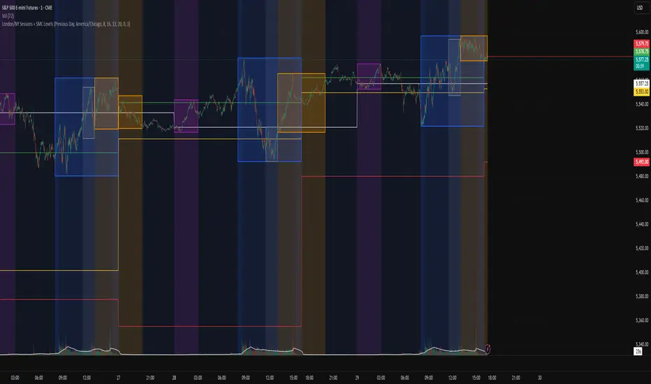
HTF Multi-Asset Sync Display ProHTF Multi-Asset Sync Display Pro
A professional-grade indicator designed for advanced multi-timeframe and multi-symbol analysis. This powerful tool enables synchronized visualization of up to three different assets across various timeframes, making it perfect for correlation analysis, market structure comparison, and smart money tracking.
Overview
HTF Multi-Asset Sync Display Pro is an advanced visualization tool that allows traders to monitor up to three different symbols simultaneously on a single chart. Whether you're analyzing correlations, divergences, or inter-market relationships, this indicator provides a comprehensive solution for complex market analysis.
Usage Examples
1. Multi-Timeframe Analysis of Single Symbol
Perfect for traders focusing on market structure and order flow:
- Configure all three sets to display different higher timeframes of the chart's main symbol
- Example: On 5M chart, display 15M, 1H, and 4H timeframes
Benefits:
- Clear visualization of higher timeframe market structure
- Real-time order flow analysis across multiple timeframes
- Better context for ICT PD Arrays on higher timeframes
- Enhanced understanding of support/resistance levels
- Improved timing for entries and exits
2. Correlated Assets Analysis
Ideal for traders working with related instruments:
- Display higher timeframes of correlated assets (e.g., ES, NQ, and YM)
Benefits:
- Easy identification of divergences between correlated symbols
- Enhanced probability assessment for CRT setups
- Improved Turtle Soup trading opportunities
- Clear visualization of relative strength/weakness
- Better timing for market reversals
3. Extended Analysis with Multiple Indicators
Advanced setup for comprehensive market analysis:
- Use two instances of the indicator to display up to 6 different HTF sets
- Synchronization capabilities ensure precise alignment between indicators
Benefits:
- Extended market coverage with up to 6 HTF sets
- Perfect synchronization between indicator instances
- Comprehensive view of market structure
- Enhanced correlation analysis capabilities
- Maximum flexibility in timeframe selection
Note: The ability to combine multiple instances of the indicator, each showing three HTF sets, provides traders with unprecedented analytical capabilities while maintaining perfect synchronization across all displayed timeframes.
Key Features
Multi-Symbol Display
- Display up to three different symbols simultaneously
- Up to 12 candles for each symbol
- Customizable colors and styles for each symbol
- Adjustable vertical offsets for optimal visual arrangement
- Flexible scale factor for precise price movement comparison
Comprehensive Timeframe Support
- Intraday: 1, 2, 3, 4, 5, 6, 10, 15, 30, 45, 60, 90, 120, 180, 240 minutes
- Daily: D, 2D
- Weekly: W, 2W
- Monthly: M
- Compatibility between all minutes timeframes for synchronization
Dual Synchronization Modes
Auto Mode
- Automatic alignment based on relative price levels
- Perfect for quick visual comparison
Manual Mode
- Precise synchronization based on candle closing times
- Ideal for detailed technical analysis
Session Markers
- Two configurable session lines (e.g., Regular Open and True Day Open)
- Adjustable line length, style, and color
- Flexible timezone support for global markets
Visual Customization
- Fully customizable candle appearance including wicks
- Optional vertical lines for better time orientation
- Scalability for optimal price movement comparison
- Professional labeling system
Trading Applications
Correlation Analysis
- Monitor relationships between currency pairs
- Analyze crypto/stock correlations
- Identify divergences between related instruments
- Track inter-market relationships
Smart Money Analysis
- Identify accumulation zones
- Detect manipulation phases
- Track distribution phases
- Analyze institutional levels
- Monitor smart money footprints
ICT Price Delivery (PD) Arrays Analysis
- Enhanced visualization for manual PD Arrays identification
- Clear display of higher timeframe price action
- Improved visibility of potential PD Array structures
- Better context for manual analysis
Visual aid for ICT concepts identification
- Helps traders manually spot potential Breaker Blocks and Order Blocks
- Clearer view for identifying Inefficient Price Points
- Better context for Fair Value Gaps analysis
- Enhanced visibility for Mitigation Points and Liquidity Voids detection
Note: This indicator provides enhanced visualization tools to support manual ICT analysis. It does not automatically detect or mark PD Arrays or other ICT concepts - it serves as a visual aid for traders who understand and manually apply ICT concepts in their analysis.
Market Structure Analysis
- Compare price structure across timeframes
- Identify key levels on multiple timeframes
- Analyze session breakouts and swings
- Track market structure shifts
Candle Range Theory (CRT)
- Compare candle ranges across timeframes
- Identify potential breakout/breakdown levels
- Analyze relationships between HTF and LTF candle ranges
- Recognize reversal points at HTF range extremes
Turtle Soup Strategy Enhancement
- Identify false breakouts
- Validate breakouts by comparing LTF momentum with HTF structure
- Precise entry and exit level determination
Trading Efficiency
Time Management
- All necessary information on one chart
- Eliminate timeframe switching
- Quick market condition analysis
- Enhanced trading efficiency
Decision Making
- Instant market structure overview
- Quick key level identification
- Efficient trade setup confirmation
- Better entry and exit timing
Note
For optimal results, we recommend starting by setting the Base Price Level to the approximate price level of the main symbol, then adjusting the vertical offsets of other symbols according to your preferences.
HTF Multi Candles DisplayHTF Multi Candles Display
Description
The HTF Multi Candles Display is a powerful and versatile indicator that overlays higher timeframe (HTF) candles on your current chart, providing traders with a comprehensive multi-timeframe analysis tool in a single view. This indicator is particularly valuable for traders who employ strategies that rely on higher timeframe context, such as the Power of Three strategy, Turtle Soup, Candle Range Theory (CRT), and Inner Circle Trader (ICT) concepts like Price Delivery (PD) arrays.
> **Notice**: If you find this indicator beneficial for your trading, I would greatly appreciate any contribution in the form of TradingView Coins. Thank you for your support!
Key Features
1. Displays up to 5 higher timeframe candles
2. Customizable higher timeframe selection (5m to Monthly)
3. Adjustable candle appearance (colors, wicks, width)
4. Time labels for easy reference
5. Optional vertical lines to separate HTF candles
6. Offset adjustment to position candles away from the chart edge
7. Customizable wick and border colors
8. Flexible vertical line styles (solid, dashed, dotted)
9. Adjustable time label font sizes
How it Helps Traders
### 1. Multi-timeframe Analysis
By overlaying higher timeframe candles on your current chart, this indicator allows you to easily identify key levels, trends, and potential reversal points across different timeframes without switching between multiple charts.
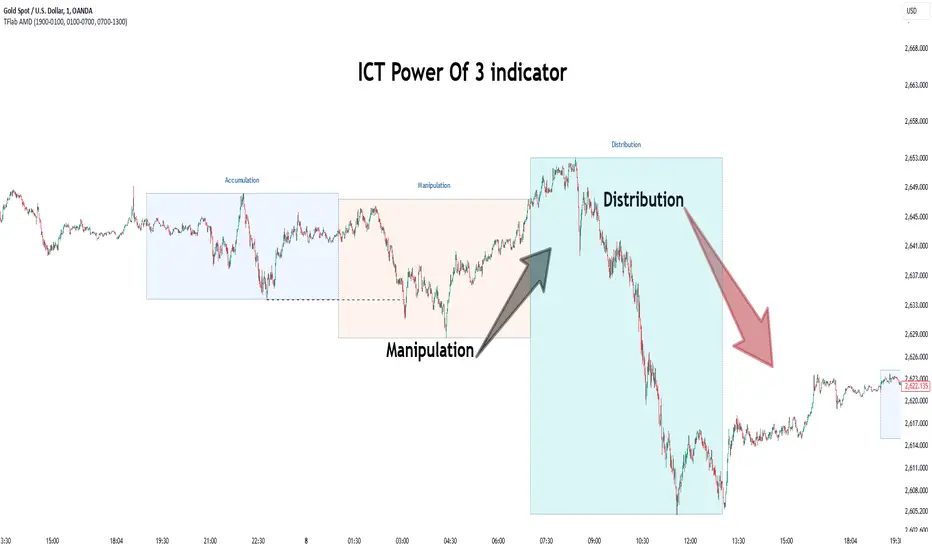
### 2. Power of Three Strategy
This indicator is invaluable for traders using the Inner Circle Trader (ICT) Power of Three strategy, which focuses on accumulation, manipulation, and distribution phases. The higher timeframe candles help identify these phases more accurately, allowing for better trade entries and exits:
- Accumulation: Identify periods of sideways price action on higher timeframes.
- Manipulation: Spot false breakouts or breakdowns on lower timeframes that are contained within higher timeframe ranges.
- Distribution: Recognize when price is approaching significant higher timeframe levels where smart money may begin to distribute.
### 3. Turtle Soup
Traders can use this indicator to spot potential Turtle Soup setups by identifying key breakout levels on higher timeframes and comparing them to current price action. This helps in:
- Identifying false breakouts that may lead to Turtle Soup trade opportunities.
- Confirming the validity of breakouts by comparing lower timeframe momentum to higher timeframe structure.
### 4. Candle Range Theory (CRT)
This indicator is extremely useful for traders applying Candle Range Theory. CRT focuses on the relationship between the current candle's range and the previous candle's range. By displaying higher timeframe candles, traders can:
- Easily compare candle ranges across multiple timeframes.
- Identify potential breakout or breakdown levels based on the previous HTF candle's range.
- Spot instances where the current lower timeframe price action is testing or breaking significant HTF candle ranges.
- Recognize potential reversal points where price reaches the extremes of higher timeframe candle ranges.
### 5. Support and Resistance
Higher timeframe candles often represent significant support and resistance levels. This indicator makes it easy to spot these levels and incorporate them into your trading decisions, allowing you to:
- Identify key support and resistance levels from higher timeframes.
- Anticipate potential price reactions at these levels on your current timeframe.
- Plan entries, exits, and stop-loss placement with greater precision.
### 6. Trend Identification
By displaying multiple HTF candles, traders can quickly assess the overall trend direction on higher timeframes, helping to align trades with the broader market direction:
- Easily visualize the trend on higher timeframes without changing your chart.
- Identify potential trend changes or continuations based on HTF candle patterns.
- Align your trades with the higher timeframe trend for potentially higher probability setups.
### 7. Enhanced Decision Making
The combination of current timeframe price action and higher timeframe context allows for more informed decision-making, potentially improving trade quality and risk management:
- Validate trade setups by ensuring they align with higher timeframe structure.
- Avoid low-probability trades that conflict with higher timeframe trends or key levels.
- Adjust position sizing based on the proximity to significant HTF levels.
### 8. Time Efficiency
Instead of constantly switching between timeframes, traders can view all necessary information on a single chart, streamlining their analysis process:
- Reduce the time spent switching between multiple charts.
- Quickly assess market conditions across various timeframes.
- Improve focus by having all relevant information in one view.
### 9. ICT Price Delivery (PD) Arrays
The HTF Multi Candles Display is particularly useful for traders familiar with Inner Circle Trader (ICT) concepts, especially in identifying Price Delivery (PD) arrays:
- Visualize potential PD arrays across multiple timeframes without switching charts.
- Identify key swing highs and lows that form PD array structures.
- Recognize patterns such as Breaker Blocks, Inefficient Price Points, and Fair Value Gaps more easily on higher timeframes.
- Spot potential areas where smart money might be accumulating or distributing by analyzing the relationship between HTF candles.
- Use the series of HTF candles to identify potential Order Blocks, which are often key components of PD arrays.
- Recognize Mitigation Points and Liquidity Voids more effectively by analyzing the structure of multiple HTF candles.
By displaying a series of HTF candles, this indicator allows traders to more easily identify and validate ICT concepts like PD arrays, enhancing their ability to spot high-probability trading opportunities and potential market turning points.
Conclusion
The HTF Multi Candles Display indicator is suitable for traders of all levels, from beginners looking to understand market structure across timeframes to experienced traders refining their multi-timeframe analysis techniques. Whether you're day trading, swing trading, or looking for longer-term positions, this indicator provides valuable insights to enhance your trading strategy.
By incorporating higher timeframe context into your analysis, you can make more informed trading decisions, identify high-probability setups, and potentially improve your overall trading performance. The HTF Multi Candles Display is a versatile tool that adapts to various trading strategies and helps traders gain a deeper understanding of market dynamics across multiple timeframes, including advanced concepts like ICT Price Delivery arrays.

Displacement Order Blocks ~ DOB [Liquidity_Pro]Displacement Order Blocks (DOB)
This indicator shows order blocks with displacement (FVG required) and leans heavily on ICT’s generous and insightful teachings to define midlines for FVG, IFVG, and order blocks. The market structure definitions follow TradingHub’s (TH) rules filtering out inside bars.
It offers alerts for price in order block, liquidity sweep, break of structure (BOS), change of character (CHoCH), and inducement (IDM).
The TH model was chosen because it's programmatic allowing clear structure definitions that allow us to mark inducements (S/O to @albatherium for publishing the first TH market structure indicator).
TH’s Single Candle Order Block (SCOB) rules have also been helpful in refining order block definition, for example in the Transfer case. ICT fans will see when back testing this, that it moves the focus closer to the FVG.
In developing this indicator, we've tried to offer great aesthetic flexibility, to keep the chart uncluttered and to avoid exceeding Trading View’s limitations on boxes and lines. It's also configured to work reasonably well on both light and dark background charts:
We hope this indicator can serve as a teaching tool for ICT’s price action insights and SMC market structure concepts. For this, we've included optional labels for various order block types:
I = inside bar. The bars that follow the order block have been ignored – you will see the number of ignored bars shown after a hyphen. The idea is that inside bars fall in the shadow of a more important candle and can’t be relied on for defining a trade.
S = standard case. The order block candle takes liquidity from the previous candle and is followed immediately after by an FVG on the next candle. This differs technically from the ICT “last down-close/last up-close” order block concept. In practice, this choice has very little impact on ICT trading, because the ICT trader is entering on the FVG anyway.
T = transfer case. This is an order block that has been transferred from the candle that takes liquidity to the candle just prior to the FVG. When you back test this, you will see it is a high probability choice.
TZ = tweezer. This is an option you can turn off that fills a hole in TH teachings. It bypasses the requirement for an order block to take liquidity from the previous candle in the case of equal h/ls. The result is that you will find 2 candle order blocks with equal highs and lows (also known as tweezer tops/bottoms) show on your chart. You will note that every tweezer is a wick on a higher timeframe.
W = wick. this is a big wick candle that we call an order block without requiring an FVG. The presumption is that the displacement is contained within the wick itself on a lower timeframe.
* Asterisk denotes an extreme order block.
Finally, we trade with this indicator (using it together with our Daye Quarterly Theory ~ DQT free indicator, taking trades when price reaches an extreme FVG or order block during a Q2 manipulation).
We will continue developing it along with other indicators we have not yet published. So please boost if you like this and follow us for updates. Also please let us know what new features you would like to see.
Opening Range Gap + Std Dev [starclique]The ICT Opening Range Gap is a concept taught by Inner Circle Trader and is discussed in the videos: 'One Trading Setup For Life' and 2023 ICT Mentorship - Opening Range Gap Repricing Macro
ORGs, or Opening Range Gaps, are gaps that form only on the Regular Trading Hours chart.
The Regular Trading Hours gap occurs between 16:15 PM - 9:29 AM EST (UTC-4)
These times are considered overnight trading, so it is useful to filter the PA (price action) formed there.
The RTH option is only available for futures contracts and continuous futures from CME Group.
To change your chart to RTH, first things first, make sure you’re looking at a futures contract for an asset class, then on the bottom right of your chart, you’ll see ETH (by default) - Click on that, and change it to RTH.
Now your charts are filtering the price action that happened overnight.
To draw out your gap, use the Close of the 4:14 PM candle and the open of the 9:30 AM candle.
How is this concept useful?
Well, It can be used in many ways.
---
How To Use The ORG
One of the ways you can use the opening range gap is simply as support and resistance
If we extend out the ORG from the example above, we can see that there is a clean retest of the opening range gap high after breaking structure to the upside and showing acceptance outside of the gap after consolidating within it.
The ORG High (4:14 Candle Close in this case) was used as support.
We then see an expansion to the upside.
Another way to implement the ORG is by using it as a draw on liquidity (magnet for price)
In this example, if we looked to the left, there was a huge ORG to the downside, leaving a massive gap.
The market will want to rebalance that gap during the regular trading hours.
The market rallies higher, rejects, comes down to clear the current days ORG low, then closes.
That is one example of how you can combine liquidity & ICT market structure concepts with Opening Range Gaps to create a story in the charts.
Now let’s discuss standard deviations.
---
Standard Deviations
Standard Deviations are essentially projection levels for ranges / POIs (Point of Interests)
By this I mean, if you have a range, and you would like to see where it could potentially expand to, you’d place your fibonacci retracement tool on and high and low of the range, then use extension levels to find specific price points where price might reject from.
Since 0 and 1 are your Range High and Low respectively, your projection levels would be something like 1.5, 2, 2.5, and 3, for the extension from your 1 Fib Level, and -0.5, -1, -1.5, and -2 for your 0 Fib level.
The -1 and 2 level produce a 1:1 projection of your range low and high, meaning, if you expect price to expand as much as it did from the range low to range high, then you can project a -1 and 2 on your Fib, and it would show you what ICT calls “symmetrical price”
Now, how are standard deviations relevant here?
Well, if you’ve been paying attention to ICT’s recent videos, you would’ve caught that he’s recently started using Standard Deviation levels on breakers.
So my brain got going while watching his video on ORGs, and I decided to place the fib on the ORG high and low and see what it’d produce.
The results were very interesting.
Using this same example, if we place our fib on the ORG High and Low, and add some projection levels, we can see that we rejected right at the -2 Standard Deviation Level.
---
You can see that I also marked out the EQ (Equilibrium, 50%, 0.5 of Fib) of the ORG. This is because we can use this level as a take profit level if we’re using an old ORG as our draw.
In days like these, where the gap formed was within a consolidation, and it continued to consolidate within the ORG zone that we extended, we can use the EQ in the same way we’d use an EQ for a range.
If it’s showing acceptance above the EQ, we are bullish, and expect the high of the ORG to be tapped, and vice versa.
---
Using The Indicator
Here’s where our indicator comes in play.
To avoid having to do all this work of zooming in and marking out the close and open of the respective ORG candles, we created the Opening Range Gap + Standard Deviations Indicator, with the help of our dedicated Star Clique coder, a1tmaniac.
With the ORG + STD DEV indicator, you will be able to view ORG’s and their projections on the ETH (Electronic Trading Hours) chart.
---
Features
Range Box
- Change the color of your Opening Range Gap to your liking
- Enable or disable the box from appearing using the checkbox
Range Midline
- Change the color of your Opening Range Gap Equilibrium
- Enable or disable the midline from appearing using the checkbox
Std. Dev
- Add whichever standard deviation levels you’d like.
- By default, the indicator comes with 0.5, 1, 1.5, and 2 standard deviation levels.
- Ensure that you add a comma ( , ) in between each standard deviation level
- Enable or disable the standard deviations from appearing using the opacity of the color (change to 0%)
Labels / Offset
- Adjust the offset of the label for the Standard Deviations
- Enable or disable the Labels from appearing using the checkbox
Time
- Adjust the time used for the indicators range
- If you’d like to use this for a Session or ICT Killzone instead, adjust the time
- Adjust the timezone used for the time referenced
- Options are UTC, US (UTC-4, New York Local Time) or UK (UTC+1, London Time)
- By default, the indicator is set to US

Buyside & Sellside Liquidity [LuxAlgo]The Buyside & Sellside Liquidity indicator aims to detect & highlight the first and arguably most important concept within the ICT trading methodology, Liquidity levels.
🔶 SETTINGS
🔹 Liquidity Levels
Detection Length: Lookback period
Margin: Sets margin/sensitivity for a liquidity level detection
🔹 Liquidity Zones
Buyside Liquidity Zones: Enables display of the buyside liquidity zones.
Margin: Sets margin/sensitivity for the liquidity zone boundaries.
Color: Color option for buyside liquidity levels & zones.
Sellside Liquidity Zones: Enables display of the sellside liquidity zones.
Margin: Sets margin/sensitivity for the liquidity zone boundaries.
Color: Color option for sellside liquidity levels & zones.
🔹 Liquidity Voids
Liquidity Voids: Enables display of both bullish and bearish liquidity voids.
Label: Enables display of a label indicating liquidity voids.
🔹 Display Options
Mode: Controls the lookback length of detection and visualization, where Present assumes last 500 bars and Historical assumes all data available to the user
# Visible Levels: Controls the amount of the liquidity levels/zones to be visualized.
🔶 USAGE
Definitions of Liquidity refer to the availability of orders at specific price levels in the market, allowing transactions to occur smoothly.
In the context of Inner Circle Trader's teachings, liquidity mainly relates to stop losses or pending orders and liquidity level/pool, highlighting a concentration of buy or sell orders at specific price levels. Smart money traders, such as banks and other large institutions, often target these liquidity levels/pools to accumulate or distribute their positions.
There are two types of liquidity; Buyside liquidity and Sellside liquidity .
Buyside liquidity represents a level on the chart where short sellers will have their stops positioned, and Sellside liquidity represents a level on the chart where long-biased traders will place their stops.
These areas often act as support or resistance levels and can provide trading opportunities.
When the liquidity levels are breached at which many stop/limit orders are placed have been traded through, the script will create a zone aiming to provide additional insight to figure out the odds of the next price action.
Reversal: It’s common that the price may reverse course and head in the opposite direction, seeking liquidity at the opposite extreme.
Continuation: When the zone is also broken it is a sign for continuation price action.
It's worth noting that ICT concepts are specific to the methodology developed by Michael J. Huddleston and may not align with other trading approaches or strategies.
🔶 DETAILS
Liquidity voids are sudden changes in price when the price jumps from one level to another. Liquidity voids will appear as a single or a group of candles that are all positioned in the same direction. These candles typically have large real bodies and very short wicks, suggesting very little disagreement between buyers and sellers. The peculiar thing about liquidity voids is that they almost always fill up.
🔶 ALERTS
When an alert is configured, the user will have the ability to be notified in case;
Liquidity level is detected/updated.
Liquidity level is breached.
🔶 RELATED SCRIPTS
ICT-Concepts
ICT-Macros
Imbalance-Detector

Hopiplaka Goldbach System with SignalsThis tool builds a dynamic price framework around the current market using a PO3 range and a set of mathematically derived Goldbach levels. It then scores nearby levels for quality (reliability) and produces Buy/Sell signals only when multiple, independent factors line up (price level quality, trend/“Tesla Vortex” state, ICT AMD phase, time confluence, volume bias, and momentum). The goal is to identify high-confluence inflection points rather than constant signals.
Core Concepts & Why They’re Combined
1. PO3 Range Framework
Price is segmented into a primary range (lower → upper) determined by a configurable size (3× ladder: 3, 9, 27, …, 2187).
⦁ If price sits near a boundary (configurable sensitivity), the range can auto-expand to the next 3× size to better fit current volatility.
⦁ This gives a stable “map” of the active trading area and its boundaries.
2. Goldbach Levels (Pure Hopiplaka implementation)
For each even number ≤ your precision limit, the script evaluates all prime-sum partitions (Goldbach partitions) and converts their prime ratios into price levels inside the PO3 range.
⦁ Levels are classified as Premium / Standard / Discount based on properties of the prime pair and a mathematical weighting.
⦁ Strict minimum spacing rules (exact %, OB %, liquidity-void %) prevent clutter and keep only the most meaningful levels.
3. Tesla Vortex (trend/phase strength)
A volatility/trend-aware state machine estimates whether market is in MMxM (accumulation/mean-revert like) or TREND conditions and maps price interaction with high-quality levels to phases (e.g., Order Block Formation, Distribution).
⦁ This helps filter signals: buys favored in MMxM near supportive levels; sells favored in TREND near premium/liquidity levels, etc.
4. ICT Integration (AMD, IPDA bias hooks)
A lightweight AMD phase detector classifies the recent window into Accumulation / Manipulation / Distribution and marks market structure bias. This is used as confluence with level quality and trend state.
5. Time Confluence (Goldbach time)
Swing highs/lows are checked against Goldbach-valid timestamps (based on hour+minute sums decomposable into prime pairs). Repeated alignment adds time-bias confidence. When price and time align, level reliability is boosted.
6. Volume & Liquidity Context
A rolling volume baseline marks High/Low Volume Bias; levels can be volume-weighted (raising or lowering their reliability). Proximity to PO3 extremes flags pending liquidity sweeps.
Why this mashup?
The system blends price geometry (PO3 + Goldbach), state/trend (Tesla Vortex), market-microstructure (ICT AMD), time confluence, and volume/liquidity into one numerically scored signal. Each component answers a different question; together they reduce false positives and favor high-quality trades near meaningful levels.
What You’ll See on the Chart
⦁ PO3 Range Boundaries: two dashed lines (“lower” and “upper”). Auto-expand darkens the boundary style slightly.
⦁ Goldbach Levels: horizontal lines colored by classification and context:
⦁ Premium (strong premium band), Standard, Discount
⦁ OB (Order-Block candidate), LV (Liquidity Void)
⦁ TESLA node (trend/phase aligned)
⦁ Heavier width = higher reliability; dashed/dotted styles encode class differences.
⦁ PO3 Liquidity Boxes: narrow yellow shaded bands above/below each level (configurable pip distance).
⦁ Markers
⦁ ▲ Buy arrow below bar when a Buy signal triggers
⦁ ▼ Sell arrow above bar when a Sell signal triggers
⦁ ● Small dot when price touches a Goldbach level
⦁ Data-window plots:
⦁ Tesla Vortex Strength (numeric)
⦁ Time Bias (positive = bullish, negative = bearish)
⦁ Volume Bias (+1 high / −1 low)
⦁ Signal Strength (+ for buy / − for sell, zero when no signal)
⦁ Label Legend (on level tags)
⦁ TESLA – Tesla-aligned level node
⦁ OB – Order-block-quality zone
⦁ LV – Liquidity-void zone
⦁ Premium / Standard / Discount – Level class
⦁ Gxx – Even number used to build the level (Goldbach reference)
⦁ Reliability – Final score after time/volume/tesla weighting
⦁ Optional extras: Vol (relative volume weight), Time (time-confluence strength)
How Signals Are Generated
A signal is proposed when price comes within a minimum distance of a high-reliability level. It is then accepted only if enough of these independent checks pass (you control the required count):
1. Tesla Vortex state matches direction (e.g., MMxM with buy; TREND with sell).
2. ICT AMD phase aligns (Accumulation → buy bias; Distribution → sell bias).
3. Goldbach time bias supports the direction.
4. Volume bias supportive (high-volume context boosts conviction).
5. Level quality (TESLA node or Premium class) is high.
6. Momentum alignment (recent 2–3 bars in the same direction).
Only when confluence ≥ your threshold and confidence ≥ 0.5 (scaled by sensitivity) will a Buy/Sell arrow print. Cooldown prevents rapid repeats.
Inputs (key ones)
⦁ PO3 Settings: range size, auto-expansion toggle, expansion sensitivity, liquidity band distance.
⦁ Goldbach Mathematics: precision limit, exact spacing rules, spacing for OB/LV classes.
⦁ Trading Signals: master toggle, sensitivity, min reliability, confluence required, cooldown, min distance to level, markers on/off.
⦁ Tesla Vortex / ICT: enable Vortex, sensitivity; enable AMD/IPDA analysis and lookback.
⦁ Time & Volume: enable Goldbach time and weighting; volume lookback; liquidity-pool detection.
⦁ Display: show historical/future projections, number of future bars, labels, path/phase overlays.
⦁ Colors: full palette per class/context (premium/discount/OB/LV/Tesla/time/volume, buy/sell/goldbach hit).
Alerts Included
⦁ Signals: “BUY Signal Generated”, “SELL Signal Generated”
⦁ Level Interactions: “Goldbach Level Hit”; “Near Goldbach Level”; “Tesla Vortex Node”; “Premium Level Alert”
⦁ PO3: “PO3 Upper Break”, “PO3 Lower Break”, “PO3 Range Expansion”
⦁ State Changes: “Tesla Vortex Phase Change”
⦁ Context: “Liquidity Sweep Imminent”, “Strong Time Confluence”
You can wire these to webhooks or notifications.
Suggested Workflow
1. Choose PO3 size that matches your instrument’s volatility; keep Auto-Expansion ON initially.
2. Set confluence threshold (start at 3–4) and cooldown (e.g., 10 bars).
3. Keep Time and Volume modules ON for additional reliability weighting.
4. Use arrows as filters, not blind entries—confirm with your execution plan and risk rules.
5. Prefer signals near Premium/Discount TESLA nodes that also show time confluence and supportive volume.
Practical Notes & Limitations
⦁ The mathematical framework is deterministic, but market execution is not—always manage risk.
⦁ Future projections and heavy labeling can be resource-intensive; tune visibility if performance drops.
⦁ If a market is extremely illiquid or gap-prone, spacing/filters may hide many levels (by design).
Disclaimer
This script is for educational and research purposes only and is not financial advice. Trading involves risk. You are responsible for your own decisions.

Rapid ICT Suite - MTF Concepts & iFVGTitle: Rapid ICT Suite - MTF Concepts & iFVG
Overview
Unlock a new level of market analysis with the Rapid ICT Suite, a comprehensive, all-in-one indicator designed for the discerning price action trader. This powerful tool merges two distinct analytical engines into one seamless experience, allowing you to overlay critical Higher Timeframe (HTF) market structure onto your current chart while simultaneously tracking real-time Fair Value Gaps (FVGs) and their inversions (iFVGs).
Whether you are a scalper needing to respect 1H structure, a day trader aligning with the 4H bias, or a swing trader mapping the daily trend, this indicator provides the clarity and context you need to make higher-probability trading decisions. It was built from the ground up to solve common issues traders face, delivering stable, precise, and flexible analysis.
The Strategy: Targeting IRL with iFVG Entries
The Destination (The "Why"): Internal Range Liquidity (IRL)
On a Higher Timeframe (HTF), we will identify major Internal Range Liquidity (IRL) zones. In the context of ICT, IRL simply refers to unmitigated Fair Value Gaps (FVGs) that exist within a broader trading range.
These HTF FVGs act as powerful magnets for price. The market will often seek out these zones to rebalance before continuing its next major move. By plotting these on our chart, we establish a clear directional bias and a high-probability target. Our indicator will now label these HTF FVG boxes as "IRL".
The Entry Signal (The "How"): Inverted Fair Value Gaps (iFVG)
Once we have our HTF IRL target, we drop down to our Lower Timeframe (LTF) for execution.
We wait for price to create an Inverted Fair Value Gap (iFVG). An iFVG is a regular FVG that has failed and been traded through, signifying a shift in momentum.
An iFVG appearing on the LTF provides a high-precision entry signal to take a trade in the direction of the HTF IRL zone. It's our confirmation that the market is likely now making its move towards that destination.
Key Features
Multi-Timeframe Order Blocks (Boxes): Automatically identify and plot key HTF demand and supply zones (Order Blocks) onto your chart.
Multi-Timeframe Fair Value Gaps (Boxes): See where HTF imbalances exist, giving you a clear map of institutional reference points and potential targets.
Multi-Timeframe Liquidity Pools (Boxes): Pinpoint where buy-side and sell-side liquidity is likely resting, based on clusters of old highs and lows.
Current Timeframe FVG & iFVG (Lines/Labels): A second, independent engine tracks FVGs on your chosen timeframe, monitors them for mitigation, and automatically identifies when an FVG has been inverted (iFVG), a crucial shift in market dynamics.
The "Rapid" Advantage: Solving Trader Frustrations
This indicator was engineered to overcome three of the most common problems with technical indicators:
1. ✅ No More Flickering or "Ghost" Signals
The Problem: Many indicators show signals on the live, forming candle. This causes zones or signals to appear and disappear ("flicker"), leading to confusion and false entries.
The Solution: The Rapid ICT Suite uses 100% confirmed, closed-candle data for all its calculations (OB, FVG, and Liquidity). A zone will only appear on your chart after the price action that confirms it is complete. This means every signal is stable, reliable, and non-repainting.
2. ✅ Frame-Perfect, Precise Placement
The Problem: Indicators that use lookback logic often draw their signals one candle too late, causing a visual disconnect between the price pattern and the signal itself.
The Solution: We have corrected this common flaw. Every box and line is drawn starting from the exact confirmation candle of the pattern. This frame-perfect precision is critical for accurate analysis and planning your entries.
3. ✅ The Dual Analysis Engine: Uncluttered & Flexible
The Problem: Trying to analyze multiple timeframes at once can lead to cluttered charts and mental overload .
The Solution: This suite contains two independent parts that you can control separately.
Part 1 gives you the macro context—the HTF structure where big moves originate.
Part 2 gives you the micro details—the real-time FVG and iFVG story on your trading timeframe.
Use them together for a complete picture, or toggle one off to focus on a specific aspect of your strategy. This flexibility keeps your workspace clean and your analysis sharp.
How to Use & Settings Explained
The indicator settings are neatly organized into two main parts.
Part 1: MTF Concepts (OB, FVG, Liq)
This section controls the Higher Timeframe boxes that are overlaid onto your current chart.
Higher-TF for OB/FVG/Liq: This is the most important setting. Select the higher timeframe you want to analyze. For example, if you are trading on the 15-minute chart, you might set this to 240 (4-Hour) to see the key 4H zones.
Show Order-Blocks / FVGs / Liquidity: Simple toggles to turn each type of HTF zone on or off.
Max... Count: Controls how many of the most recent zones are displayed on the chart, preventing clutter from old, irrelevant zones.
Part 2: FVG & iFVG (Lines/Labels)
This section controls the second engine, which analyzes FVGs and iFVGs on its own selected timeframe.
Timeframe for FVG/iFVG: Choose the timeframe for this analysis. You can leave it blank to use your current chart's timeframe, or set it to a specific one.
Mitigation Type & Mitigation %: A powerful feature to define when an FVG is considered "used up."
Type: Choose if mitigation is counted from the candle's Wick or Close.
Percent: Set how far price must retrace into an FVG (e.g., 50%) before it is considered mitigated and the lines are removed from your chart.
FVG/iFVG Count: Controls how many of the most recent FVG/iFVG zones are displayed.
Style & Color Settings: Fully customize the appearance of the lines and labels to match your chart theme.
Final Words
This indicator was built to provide actionable clarity. By understanding the interplay between higher-timeframe structure and current price action, you can significantly enhance your trading edge. Thank you for choosing the Rapid ICT Suite.
Happy trading!

CandelaCharts - Unicorn Model📝 Overview
The Unicorn Model is an advanced indicator that pinpoints high-probability reversal setups based on the ICT Unicorn formation. It uses a zigzag-based structure to detect engineered liquidity grabs followed by sharp displacements in the opposite direction—ideal for fade entries or the start of new trends.
The indicator is enhanced with macro time filters, allowing it to align model detections with key trading sessions and institutional flow windows.
The ICT Unicorn Model is a precision-driven intraday strategy rooted in smart money concepts. It combines time-of-day sensitivity, engineered liquidity runs, and institutional order flow to uncover high-quality trading opportunities.
📦 Features
Liquidity Levels: Projects forward-looking liquidity zones after a Unicorn model is confirmed, highlighting potential price targets. These zones act as magnet areas where price is likely to be drawn, helping traders manage exits, partials, and re-entries with greater precision.
Unicorn: The Unicorn formation utilizes a smart money framework and a dynamic zigzag detection method to identify engineered liquidity grabs—sharp sweeps of previous highs or lows—followed by impulsive reversals.
Macros: These time-based intervals represent key moments when institutional algorithms are most active, seeking liquidity, rebalancing, or delivering price to key levels like fair value gaps and liquidity pools.
Custom TF Pairing: Choose your preferred combination of entry timeframe and context timeframe. For example, trade 5m setups within a 1h HTF bias, allowing precise alignment of microstructure with broader directional intent.
HTF & LTF PD Arrays: Displays high- and low-timeframe PD Arrays (e.g., Fair Value Gaps, Inversion Fair Value Gaps) that act as zones of interest or rejection, enhancing confluence and risk control.
History: Backtest previous Unicorn setups directly on the chart. Toggle historical models to analyze past behavior, improve your confidence, and fine-tune your trade execution across varying market regimes.
Killzone Filter: Restrict signal generation to specific trading sessions or killzones (e.g., London Open, New York AM). This minimizes false positives in low-volume or overlapping ranges.
Standard Deviation: Dynamically calculates and plots four deviation bands from the model confirmation point. These levels offer insight into stretch targets, volatility bands, and potential mean-reversion zones.
Dashboard: A real-time control panel showing the active model, HTF candle timer, current directional bias, asset name, and session date—offering clarity and fast decision-making at a glance.
⚙️ Settings
Core
Status: Filter models based on status
Bias: Controls what model type will be displayed, bullish or bearish
Fractal: Controls the timeframe pairing that will be used
Length: Sets the maximum number of candles allowed for a model to develop
Labels: Display the model label (e.g., C1, C2, Cn)
Unicorn
Zigzag: Adjusts the length of the Zigzag formation
Breaker: Defines the style of Breaker Blocks
Sweeps
Sweep: Shows the sweep that forms a model
I-sweep: Controls the visibility of invalidated sweeps
D-purge: Plots the double purge sweeps
S-area: Highlights the sweep area
Liquidity
Liquidity: Displays the liquidity levels that belong to the model
History
History: Controls the number of past models displayed on the chart
Filters
Asia: Filter models based on Asia Killzone hours
London: Filter models based on London Killzone hours
NY AM: Filter models based on NY AM Killzone hours
NY Launch: Filter models based on NY Launch Killzone hours
NY PM: Filter models based on NY PM Killzone hours
Custom: Filter models based on user Custom hours
HTF
Candles: Controls the number of HTF candles that will be visible on the chart
NY Open: Display True Day Open line
Offset: Controls the distance of HTF from the current chart
Space: Controls the space between HTF candles
Size: Controls the size of HTF candles
PD Array: Displays ICT PD Arrays
CE Line: Style the equilibrium line of PD Array
Border: Style the border of the PD Array
LTF
H/L Line: Displays on the LTF chart the High and Low of each HTF candle
O/C Line: Displays on the LTF chart the Open and Close of each HTF candle
PD Array: Displays ICT PD Arrays
CE Line: Style the equilibrium line of PD Array
Border: Style the border of the PD Array
Standard Deviation
StDev: Controls standard deviation of available levels
Labels: Controls the size of standard deviation levels
Anchor: Controls the anchor point of standard deviation levels (wick, body)
Lines: Controls the line widths and color of standard deviation levels
Dashboard
Panel: Display information about the current model
💡 Framework
The Unicorn Model analyzes price action by combining key elements to identify high-probability trade setups. It detects liquidity sweeps and uses a zigzag method to spot Breaker Blocks. The model maps PD Arrays like Fair Value Gaps and Inversion FVGs for precision zones, integrates macro time filters for context, and projects forward price targets based on liquidity clusters. Together, these components provide a clear framework to anticipate market trends and optimize entries and exits.
The model incorporates the following timeframe pairing:
15s - 5m
1m - 15m
1m - 30m
2m - 20m
3m - 30m
3m - 60m
5m - 1H
15m - 4H
15m - 8H
30m - 9H
30m - 12H
1H - 1D
2H - 2D
3H - 3D
4H - 1W
8H - 2W
12H - 3W
1D - 1M
2D - 2M
1W - 3M
2W - 6M
3W - 9M
1M - 12M
Below are the key components that make up the model:
Sweep
D-purge
Zigzag (Breaker)
PD Arrays (FVG, IFVG)
Macros
Standard Deviation
Liquidity
The Unicorn Model operates through a defined lifecycle that tracks its current stage, helping to assess the validity of potential trade opportunities.
The model's lifecycle includes the following statuses:
Formation (grey)
Invalidation (red)
Success (green)
Through the phases of Formation, Invalidation, and Success, traders can effectively manage positions, minimize risk, and capitalize on the high-probability setups presented by the Unicorn Model.
⚡️ Showcase
The Unicorn Model is an advanced trading framework designed to elevate your market analysis and increase your trading edge. By leveraging smart money concepts and sophisticated pattern detection, it helps you spot key liquidity sweeps, reversal zones, and high-probability setups, enabling more precise entries, exits, and risk management tailored to market structure.
LTF PD Array
LTF PD Arrays are crucial to the Unicorn Model and must align with the Zigzag Breaker for the setup to be considered valid.
HTF PD Array
Higher-Timeframe PD Arrays deliver essential macro context, serving to validate both the direction and momentum of potential reversals.
Timeframe Alignment
Timeframe alignment is a fundamental element of the Unicorn trading model. By integrating multi-timeframe context, the model effectively identifies high-probability models.
Killzone Filters
Filter Unicorn Models according to key market sessions—Asia, London, New York AM, New York Launch, and New York PM—to target periods of high liquidity. This approach improves the accuracy and timing of trade setups by capturing moments when smart money is most active.
Macros
The Unicorn Model uses ICT Macro Times to identify key trading periods when institutional activity is most intense. By syncing setups with these critical windows, the model improves accuracy and provides better context for entries, risk management, and potential reversals.
Gain a trading advantage with the Unicorn Model — your essential tool for clearer insights, smarter decision-making, and more confident trade execution.
🚨 Alerts
This script provides alert options for all model types, which must be configured within TradingView.
Bearish Model
A bearish model alert is triggered when a model forms, signaling a 4 Zigzag points formation and a bearish Breaker.
Bullish Model
A bullish model alert is triggered when a model forms, signaling a 4 Zigzag points formation and a bullish Breaker.
⚠️ Disclaimer
These tools are exclusively available on the TradingView platform.
Our charting tools are intended solely for informational and educational purposes and should not be regarded as financial, investment, or trading advice. They are not designed to predict market movements or offer specific recommendations. Users should be aware that past performance is not indicative of future results and should not rely on these tools for financial decisions. By using these charting tools, the purchaser agrees that the seller and creator hold no responsibility for any decisions made based on information provided by the tools. The purchaser assumes full responsibility and liability for any actions taken and their consequences, including potential financial losses or investment outcomes that may result from the use of these products.
By purchasing, the customer acknowledges and accepts that neither the seller nor the creator is liable for any undesired outcomes stemming from the development, sale, or use of these products. Additionally, the purchaser agrees to indemnify the seller from any liability. If invited through the Friends and Family Program, the purchaser understands that any provided discount code applies only to the initial purchase of Candela's subscription. The purchaser is responsible for canceling or requesting cancellation of their subscription if they choose not to continue at the full retail price. In the event the purchaser no longer wishes to use the products, they must unsubscribe from the membership service, if applicable.
We do not offer reimbursements, refunds, or chargebacks. Once these Terms are accepted at the time of purchase, no reimbursements, refunds, or chargebacks will be issued under any circumstances.
By continuing to use these charting tools, the user confirms their understanding and acceptance of these Terms as outlined in this disclaimer.

London/NY Sessions + SMC Levels📜 Indicator Description: London/NY Sessions + SMC Levels
Overview: This indicator highlights the key trading sessions — London, New York, NY Lunch, and Asian Range — providing structured visual guides based on Smart Money Concepts (SMC) and ICT principles.
It dynamically plots:
Session Backgrounds and Boxes for London, NY, Lunch, and Asian sessions
Reference Levels for the High, Low, and Close from today, previous day, or weekly data
Midnight Open line for ICT-style power of three setups
Real-time alerts for session starts, session closes, and important price level crossings
Features:
🕰️ Session Visualization:
Toggle London, NY, Lunch, and Asian session ranges individually, with customizable colors and transparent backgrounds.
🔔 Built-in Alerts:
Alerts for:
Price crossing the previous day's high/low
Price crossing the Midnight Open
Start and end of major sessions (London, NY, Lunch, Asian)
🟩 Reference Levels:
Plot selectable session reference levels:
Today’s intraday High/Low/Close
Previous Day’s High/Low/Close
This Week’s or Previous Week’s levels for broader context.
🌙 Midnight Open:
Track the Midnight New York Open as a reference point for daily bias shifts.
🎯 Customizable Settings:
Choose your session time zones (UTC, New York, London, etc.)
Customize all border colors, background colors, and session hours.
Use Cases:
Identify killzones and optimal trade entry windows for Smart Money Concepts (SMC) and ICT strategies.
Monitor liquidity pool sweeps and session transitions.
Confirm or refine your intraday or swing trading setups by referencing session highs/lows.
Recommended For:
ICT traders
Smart Money Concepts (SMC) practitioners
Forex, indices, crypto, and futures traders focusing on session-based volatility patterns
Anyone wanting a clean, professional session mapping tool
📈
Designed to help you trade with session precision and Smart Money accuracy.
Integrates seamlessly into any ICT, Wyckoff, or Liquidity-based trading approach.
Power Of 3 ICT 01 [TradingFinder] AMD ICT & SMC Accumulations🔵 Introduction
The ICT Power of 3 (PO3) strategy, developed by Michael J. Huddleston, known as the Inner Circle Trader, is a structured approach to analyzing daily market activity. This strategy divides the trading day into three distinct phases: Accumulation, Manipulation, and Distribution.
Each phase represents a unique market behavior influenced by institutional traders, offering a clear framework for retail traders to align their strategies with market movements.
Accumulation (19:00 - 01:00 EST) takes place during low-volatility hours, as institutional traders accumulate orders. Manipulation (01:00 - 07:00 EST) involves false breakouts and liquidity traps designed to mislead retail traders. Finally, Distribution (07:00 - 13:00 EST) represents the active phase where significant market movements occur as institutions distribute their positions in line with the broader trend.
This indicator is built upon the Power of 3 principles to provide traders with a practical and visual tool for identifying these key phases. By using clear color coding and precise time zones, the indicator highlights critical price levels, such as highs and lows, helping traders to better understand market dynamics and make more informed trading decisions.
Incorporating the ICT AMD setup into daily analysis enables traders to anticipate market behavior, spot high-probability trade setups, and gain deeper insights into institutional trading strategies. With its focus on time-based price action, this indicator simplifies complex market structures, offering an effective tool for traders of all levels.
🔵 How to Use
The ICT Power of 3 (PO3) indicator is designed to help traders analyze daily market movements by visually identifying the three key phases: Accumulation, Manipulation, and Distribution.
Here's how traders can effectively use the indicator :
🟣 Accumulation Phase (19:00 - 01:00 EST)
Purpose : Identify the range-bound activity where institutional players accumulate orders.
Trading Insight : Avoid placing trades during this phase, as price movements are typically limited. Instead, use this time to prepare for the potential direction of the market in the next phases.
🟣 Manipulation Phase (01:00 - 07:00 EST)
Purpose : Spot false breakouts and liquidity traps that mislead retail traders.
Trading Insight : Observe the market for price spikes beyond key support or resistance levels. These moves often reverse quickly, offering high-probability entry points in the opposite direction of the initial breakout.
🟣 Distribution Phase (07:00 - 13:00 EST)
Purpose : Detect the main price movement of the day, driven by institutional distribution.
Trading Insight : Enter trades in the direction of the trend established during this phase. Look for confirmations such as breakouts or strong directional moves that align with broader market sentiment
🔵 Settings
Show or Hide Phases :mDecide whether to display Accumulation, Manipulation, or Distribution.
Adjust the session times for each phase :
Accumulation: 1900-0100 EST
Manipulation: 0100-0700 EST
Distribution: 0700-1300 EST
Modify Visualization : Customize how the indicator looks by changing settings like colors and transparency.
🔵 Conclusion
The ICT Power of 3 (PO3) indicator is a powerful tool for traders seeking to understand and leverage market structure based on time and price dynamics. By visually highlighting the three key phases—Accumulation, Manipulation, and Distribution—this indicator simplifies the complex movements of institutional trading strategies.
With its customizable settings and clear representation of market behavior, the indicator is suitable for traders at all levels, helping them anticipate market trends and make more informed decisions.
Whether you're identifying entry points in the Accumulation phase, navigating false moves during Manipulation, or capitalizing on trends in the Distribution phase, this tool provides valuable insights to enhance your trading performance.
By integrating this indicator into your analysis, you can better align your strategies with institutional movements and improve your overall trading outcomes.
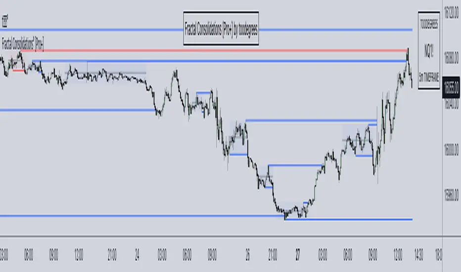
Fractal Consolidations [Pro+]Introduction:
Fractal Consolidations Pro+ pushes the boundaries of Algorithmic Price Delivery Analysis. Tailored for traders seeking precision and efficiency to unlock hidden insights, this tool empowers you to dissect market Consolidations on your terms, live, in all asset classes.
What is a Fractal Consolidation?
Consolidations occur when price is trading in a range. Normally, Consolidation scripts use a static number of "lookback candles", checking whether price is continuously trading inside the highest and lowest price points of said Time window.
After years spent studying price action and numerous programming attempts, this tool succeeds in veering away from the lookback candle approach. This Consolidation script harnesses the delivery mechanisms and Time principles of the Interbank Price Delivery Algorithm (IPDA) to define Fractal Consolidations – solely based on a Timeframe Input used for context.
Description:
This concept was engineered around price delivery principles taught by the Inner Circle Trader (ICT). As per ICT, it's integral for an Analyst to understand the four phases of price delivery: Consolidation , Expansion , Retracement , and Reversal .
According to ICT, any market movement originates from a Consolidation, followed by an Expansion .
When Consolidation ranges begin to break and resting liquidity is available, cleaner Expansions will take place. This tool's value is to visually aid Analysts and save Time in finding Consolidations in live market conditions, to take advantage of Expansion moves.
CME_MINI:ES1! 15-Minute Consolidation setting up an Expansion move, on the 10 Minute Chart:
Fractal Consolidations Pro+ doesn't only assist in confirming Higher Timeframe trend continuations and exposing opportunities on Lower Timeframes. It's also designed for both advanced traders and new traders to save Time and energy in navigating choppy or rangebound environments.
CME_MINI:ES1! 30 Minute Consolidation forming Live, on the 5 Minute Chart:
By analyzing past price action, traders will find algorithmic signatures when Consolidations are taking place, therefore providing a clearer view of where and when price is likely to contract, continue consolidating, breakout, retrace, or reverse. A prominent signature to consider when using this script is ICT's Market Maker Buy/Sell Models. These signatures revolve around the engineering of Consolidations to manipulate price in a specific direction, to then reverse at the appropriate Time. Each stage of the Market Maker Model can be identified and taken advantage of using Fractal Consolidations.
CME_MINI:NQ1! shift of the Delivery Curve from a Sell Program to a Buy Program, Market Maker Buy Model
Key Features:
Tailored Timeframes: choose the Timeframe that suits your model. Whether you're a short-term enthusiast eyeing 1 Hour Consolidations or a long-term trend follower analyzing 4 Hour Consolidations, this tool gives you the freedom to choose.
FOREXCOM:EURUSD Fractal Consolidations on a 15 Minute Chart:
Auto-Timeframe Convenience: for those who prefer a more dynamic and adaptive approach, our Auto Timeframe feature effortlessly adjusts to the most relevant Timeframe, ensuring you stay on top of market consolidations without manually adjusting settings.
Consolidation Types: define consolidations as contractions of price based on either its wick range or its body range.
COMEX:GC1! 4 Hour Consolidation differences between Wick-based and Body-based on a 1 Hour Chart:
Filtering Methods: combine previous overlapping Consolidations, merging them into one uniform Consolidation. This feature is subject to repainting only while a larger Consolidation is forming , as smaller Consolidations are confirmed. However once established, the larger Consolidation will not repaint .
FOREXCOM:GBPUSD 15 Minute Consolidation Differences between Filter Consolidations ON and OFF:
IPDA Data Range Filtering: this feature gives the Analyst control for selective visibility of Consolidations in the IPDA Data Range Lookback . The Analyst can choose between 20, 40, and 60 days as per ICT teachings, or manually adjust through Override.
INDEX:BTCUSD IPDA40 Data Range vs. IPDA20 Data Range:
Extreme Float: this feature provides reference points when the price is outside the highest or lowest liquidity levels in the chosen IPDA Data Range Lookback. These Open Float Extremes offer critical insights when the market extends beyond the Lookback Consolidation Liquidity Levels . This feature helps identify liquidity extremes of interest that IPDA will consider, which is crucial for traders in understanding market movements beyond the IPDA Data Ranges.
INDEX:ETHUSD Extreme Float vs. Non-Extreme Float Liquidity:
IPDA Override: the Analyst can manually override the default settings of the IPDA Data Range Lookback, enabling more flexible and customized analysis of market data. This is particularly useful for focusing on recent price actions in Lower Timeframes (like viewing the last 3 days on a 1-minute timeframe) or for incorporating a broader data range in Higher Timeframes (like using 365 days to analyze Weekly Consolidations on a daily timeframe).
Liquidity Insight: gain a deeper understanding of market liquidity through customizable High Resistance Liquidity Run (HRLR) and Low Resistance Liquidity Run (LRLR) Consolidation colors. This feature helps distinguishing between HRLR (high resistance, delayed price movement) and LRLR (low resistance, smooth price movement) Consolidations, aiding in quick assessment of market liquidity types.
TVC:DXY Low Resistance vs. High Resistance Consolidation Liquidity Behaviour and Narrative:
Liquidity Raid Type: decide whether to categorize a Consolidation liquidity raid by a wick or body trading through a level.
CBOT:ZB1! Wick vs. Body Liquidity Raid Type:
Customizable User Interface: tailor the visual representation to align with your preferences. Personalize your trading experience by adjusting the colors of consolidation liquidity (highs and lows) and equilibrium, as well as line styles.
Ücretli komut dosyası
Daye Quarterly Theory ~ DQT [Liquidity_Pro]Thanks
This indicator puts the time-based research of trader Daye on your chart. Daye studied the ICT killzones and macro times and presented his findings, as “Quarterly Theory” on YouTube. Thank you Daye for sharing!
This indicator is not the first, so S/O to @toodegrees, @a1tmaniac and @joshuuu for their own excellent Quarterly Theory indicators. Last but not least, huge thanks go to ICT for his trading innovation and generous free price action education and to @twingall for his insight, attention to detail and great teamwork coding this indicator.
Daye’s Quarterly Theory
First, the fundamental concept is that all units of time can be divided by four into quarters -- just as we look at the year’s corporate reporting cycle of Q1, Q2, Q3, and Q4.
Dividing the day by four, into six hour quarters and again into 90 minute quarters and again into 22.5 minute ‘Micro’ quarters we reach the smallest unit shown by this indicator. Apply it to your NQ1! or ES1! charts and you may see remarkable confluence with the ICT macro times!
Why would we want to do this? It helps us understand, visualize and predict ICT’s PO3 concept:
• A - Accumulation (required for a cycle to occur)
• M - Manipulation
• D - Distribution
• X - Reversal/Continuation
The bottom line - we want to sell after a manipulation (M) up, or buy after a manipulation down and Quarterly Theory plots times on your chart where this may occur. Every asset is different, so back-test and research it.
Note, this indicator always shows Q1 as the accumulation quarter (by color), but the order is not fixed and instead of AMDX may appear as XAMD, where Q1 is the Reversal/Continuation quarter. We may eventually offer an update to this indicator which would automatically transpose the quarter colors for you.
The Quarters
Yearly:
• Q1 - Jan, Feb, Mar
• Q2 - Apr, May, Jun
• Q3 - Jul, Aug, Sep
• Q4 - Oct, Nov, Dec
Monthly (starts with the first month’s Monday regardless of the date):
• Q1 - Week 1, first Monday of the month
• Q2 - Week 2, second Monday of the month
• Q3 - Week 3, third Monday of the month
• Q4 - Week 4, fourth Monday of the month
Weekly (Daye ignores Friday and Sunday’s price action):
• Q1 - Mon
• Q2 - Tue
• Q3 - Wed
• Q4 - Thu
Daily (times are all EST / New York):
• Q1 - 18:00 - 00:00 Asia
• Q2 - 00:00 - 06:00 London
• Q3 - 06:00 - 12:00 NY AM
• Q4 - 12:00 - 18:00 NY PM
90 Minute:
• Q1 - 18:00 - 19:30
• Q2 - 19:30 - 21:00
• Q3 - 21:00 - 22:30
• Q4 - 22:30 - 00:00
Micro (22.5 minute quarters, DQT only displays Micros on 7 minute TF or lower)
• Q1 - 18:00 - 18:22:30
• Q2 - 18:22:30 - 18:45
• Q3 - 18:45 - 19:07:30
• Q4 - 19:07:30 - 19:30
About the DQT Indicator
This indicator plots the quarterly time boxes in a panel which can be placed above or below your chart. It allows you to add labels with the opening time and dates and also place time of day markers which can be useful for anyone who wants to mark lunch, and of the trading day or perhaps a favorite ICT macro time. It also works on GOLD (CAPITALCOM), DXY (TVC), currencies and stocks in Regular Trading Hour (RTH) mode.
Note the way that the indicator displays quarters is affected by the time frame you are viewing and as a result you may notice imperfections. Also, the indicator is not tuned to work with every broker, so for example with DXY, you will see the TVC feed is displayed nicely but other feeds are not.
Settings
The DQT indicator offers a great deal of flexibility to customize the display of quarters aesthetically. But it’s designed to work out-of-the-box on both light and dark background charts. It's set up to only show 90 minute and micro quarters initially, but in the settings, you can turn on the daily, weekly, monthly, and yearly quarters. Remember you will only see the Micros on the 7 minute TF or lower.
Lastly, the DQT indicator works well with our DOB indicator allowing you to visualize the confluence of high timeframe PDAs or POIs with manipulation quarters.
If you find our indicators useful, please boost, comment and share -- it's very motivational for us to develop them further and publish new ones!

SMC Pro+ ICT v4 Enhanced - FINAL🎯 SMC Pro+ ICT v4 Enhanced - Complete Smart Money Trading System📊 Professional All-in-One Indicator for Smart Money Concepts & ICT MethodologyThe SMC Pro+ ICT v4 Enhanced is a comprehensive trading system that combines Smart Money Concepts (SMC) with Inner Circle Trader (ICT) methodology. This indicator provides institutional-grade market structure analysis, liquidity mapping, and volume profiling in one powerful package.✨ CORE FEATURES🏗️ Advanced Market Structure Detection
MSS (Market Structure Shift) - Identifies major trend reversals with precision
BOS (Break of Structure) - Confirms trend continuation moves
CHoCH (Change of Character) - Detects internal structure shifts
Modern LuxAlgo-Style Lines - Clean, professional visualization
Dual Sensitivity System - External structure (major swings) + Internal structure (minor swings)
Customizable Labels - Tiny, Small, or Normal sizes
Structure Break Visualization - Clear break point markers
💎 Supply & Demand Zones (POI - Point of Interest)
Institutional Order Blocks - Where smart money enters/exits
ATR-Based Zone Sizing - Dynamically adjusted to market volatility
Smart Overlap Detection - Prevents cluttered charts
Historical Zone Tracking - Maintains up to 50 zones
POI Central Lines - Pinpoint entry/exit levels
Auto-Extension - Zones extend to current price
Auto-Cleanup - Removes broken zones automatically
📦 Fair Value Gap (FVG) Detection
Bullish & Bearish FVGs - Institutional inefficiencies
Consequent Encroachment (CE) - 50% fill levels
Auto-Delete Filled Gaps - Keeps charts clean
Customizable Lookback - 1-30 days of history
Color-Coded Zones - Easy visual identification
CE Line Styles - Dotted, Dashed, or Solid
🚀 Enhanced PVSRA Volume Analysis
This is one of the most powerful features:
200% Volume Candles - Extreme institutional activity (Lime/Red)
150% Volume Candles - High institutional interest (Blue/Fuchsia)
Volume Climax Detection - Major reversal signals with 2.5x+ volume
Exhaustion Signals - Identifies buying/selling exhaustion with high accuracy
Enhanced Volume Divergence - NEW! High-quality reversal detection
Price makes lower low, Volume makes higher low = Bullish Divergence
Price makes higher high, Volume makes lower high = Bearish Divergence
Strict trend context filtering for accuracy
Rising/Falling Volume Patterns - Momentum confirmation (allows 1 exception in 3 bars)
Volume Spread Analysis - Price range × Volume for true strength
Body/Wick Ratio Analysis - Candle structure quality
ATR Normalization - Adjusts for different market volatility
Volume Profile Indicators - 🔥 EXTREME, ⚡ VERY HIGH, 📈 HIGH, ✅ ABOVE AVG
💧 Advanced Liquidity System
Smart money targets these levels:
Weekly High/Low Liquidity - Major institutional targets
Daily High/Low Liquidity - Intraday key levels
4H Session Liquidity - Short-term targets
Distance Indicators - Shows % distance from current price
Strength Indicators - Identifies high-probability sweeps
Swept Level Detection - Tracks executed liquidity grabs
Customizable Line Styles - Width, length, offset controls
Color-Coded Levels - Easy visual hierarchy
🎯 Master Bias System
Data-driven directional bias with 9-factor scoring:
Bull/Bear Bias Calculation - 0-100% scoring system
Multi-Timeframe Analysis - Daily, 4H, 1H trend alignment
Kill Zone Integration - London (2-5 AM) & NY (8-11 AM) sessions
EMA Alignment Factor - Trend confirmation
Volume Confirmation - Adds 5% when volume supports direction
Range Filter Integration - Adds 10% for trending markets
Session Context - Above/below session midpoint scoring
Bias Strength Rating - STRONG (>75%), MODERATE (60-75%), WEAK (<60%)
Real-Time Updates - Dynamic recalculation
📈 Premium & Discount Zones
Fibonacci-based institutional pricing:
Extreme Premium - Above 78.6% (Overvalued)
Premium Zone - 61.8% - 78.6% (Expensive)
Equilibrium - 38.2% - 61.8% (Fair Value)
Discount Zone - 21.4% - 38.2% (Cheap)
Extreme Discount - Below 21.4% (Undervalued)
Visual Zone Boxes - Color-coded for instant recognition
200-500 Bar Lookback - Customizable range calculation
🔄 Range Filter
Advanced trend detection:
Smoothed Range Calculation - Eliminates noise
Dynamic Support/Resistance - Auto-adjusting levels
Upward/Downward Counters - Measures trend strength
Color-Coded Line - Green (uptrend), Red (downtrend), Orange (ranging)
Adjustable Period - 1-200 bars
Multiplier Control - Fine-tune sensitivity (0.1-10.0)
🌊 Liquidity Zones (Vector Zones)
PVSRA-based horizontal liquidity:
Above Price Zones - Resistance clusters
Below Price Zones - Support clusters
Maximum 500 Zones - Professional-grade capacity
Body/Wick Definition - Choose zone boundaries
Auto-Cleanup - Removes cleared zones
Color Override - Custom styling options
Transparency Control - 0-100% opacity
📊 EMA System
Triple EMA trend confirmation:
Fast EMA (9) - Green line - Immediate trend
Medium EMA (21) - Blue line - Short-term trend
Slow EMA (50) - Red line - Major trend
EMA Alignment Detection - Bull/Bear stack confirmation
Dashboard Integration - Status: 📈 BULL ALIGN, 📉 BEAR ALIGN, 🔀 MIXED
Adjustable Lengths - Customize all three EMAs (5-200)
🎯 IDM (Institutional Decision Maker) Levels
Key institutional price levels:
Latest IDM Detection - 20-bar pivot lookback
Extended Lines - Projects 50 bars into future
Customizable Styles - Solid, Dashed, or Dotted
Line Width Control - 1-5 pixels
Color Selection - Match your chart theme
Price Label - Shows exact level with tick precision
📱 Professional Dashboard
Real-time market intelligence panel:
🎯 SIGNAL - 🟢 LONG, 🔴 SHORT, ⏳ WAIT, 🛑 NO TRADE
🎲 BIAS - Bull/Bear with STRONG/MODERATE/WEAK rating
📊 BULL/BEAR Scores - 0-100% percentage display
💎 ZONE - Current premium/discount location
🕐 KZ - Kill Zone status (🇬🇧 LONDON/🇺🇸 NY/⏸️ OFF)
🏗️ STRUCT - Market structure status (BULLISH/BEARISH/NEUTRAL)
⚡ EVENT - Last structure event (MSS/BOS)
⚡ INT - Internal structure trend
🎯 IDM - Latest institutional level
📊 EMA - EMA alignment status
🔄 RF - Range Filter direction
📊 PVSRA - Volume status (🚀 CLIMAX/📈 RISING/📉 FALLING)
📅 MTF - Multi-timeframe alignment (✅ FULL/⚠️ PARTIAL/❌ CONFLICT)
💪 CONF - Confidence score (0-100%)
📊 VOL - Volume ratio (e.g., 1.8x average)
Advanced Metrics (Toggle On/Off):
📏 RSI - Value + Status (OVERBOUGHT/STRONG/NEUTRAL/WEAK/OVERSOLD)
📈 MACD - Value + Direction (BULL/BEAR)
🌪️ VOL - Volatility state (⚠️ EXTREME/🔥 HIGH/📊 NORMAL/😴 LOW)
🔊 VOL PROF - Volume profile ratio
⏱️ TF - Current timeframe
Dashboard Customization:
4 Positions - Top Left, Top Right, Bottom Left, Bottom Right
3 Sizes - Small, Normal, Large
2 Modes - Compact (MTF combined) or Full (separate rows)
Professional Design - Dark theme with color-coded cells
🎮 TRADING SIGNALS & SETUP SCORING🟢 LONG Setup Requirements (9-Factor Confidence Score)
MTF Alignment - Daily/4H/1H/Structure all bullish (+2 points for full, +1 for partial)
Volume Confirmation - Above 1.2x average (+1 point)
Structure Event - MSS or BOS bullish (+2 points)
EMA Alignment - 9 > 21 > 50 (+1 point)
Kill Zone Active - London/NY + Bull bias >75% (+2 points)
Bias Match - Master bias matches structure trend (+1 point)
Confidence Threshold - >60% minimum for signal
🔴 SHORT Setup Requirements
Same 9-factor system but inverted for bearish conditions.💪 Confidence Levels
75-100% - ⭐ HIGH CONFIDENCE (Strong setup, all factors aligned)
50-74% - ⚠️ MODERATE (Good setup, partial alignment)
0-49% - ❌ LOW CONFIDENCE (Wait for better setup)
🎯 Signal Output
🟢 LONG - Bull bias + Bullish structure + >60% confidence
🔴 SHORT - Bear bias + Bearish structure + >60% confidence
⏳ WAIT LONG - Bull bias but low confidence
⏳ WAIT SHORT - Bear bias but low confidence
🛑 NO TRADE - Neutral bias or conflicting signals
🔔 COMPREHENSIVE ALERT SYSTEM (12 Alerts)Structure Alerts
⚡ MSS Bullish - Major bullish reversal
⚡ MSS Bearish - Major bearish reversal
📈 BOS Bullish - Bullish continuation
📉 BOS Bearish - Bearish continuation
⚠️ CHoCH Bullish - Internal bullish shift
⚠️ CHoCH Bearish - Internal bearish shift
Bias & Confidence Alerts
🟢 Bias Shift Bull - Master bias turns bullish
🔴 Bias Shift Bear - Master bias turns bearish
⭐ High Confidence - Setup reaches 75%+ confidence
Volume Alerts (High Probability)
🚀 Volume Climax Buy - Extreme bullish volume spike
💥 Volume Climax Sell - Extreme bearish volume spike
⚠️ Selling Exhaustion - Potential bullish reversal
⚠️ Buying Exhaustion - Potential bearish reversal
📊 Bullish Volume Divergence - High-quality bullish reversal signal
📊 Bearish Volume Divergence - High-quality bearish reversal signal
🎨 EXTENSIVE CUSTOMIZATIONColors & Styling
✅ All colors customizable for every component
✅ Supply/Demand zone colors + outlines
✅ FVG colors (bullish/bearish)
✅ PVSRA candle colors (6 types)
✅ Liquidity level colors (Weekly/Daily/4H/Swept)
✅ Structure line colors
✅ Premium/Equilibrium/Discount zone colorsDisplay Controls
✅ Toggle each feature on/off independently
✅ Adjustable sensitivities (Structure: 5-30, Internal: 3-15)
✅ Label size controls (Tiny/Small/Normal)
✅ Line width adjustments (1-5 pixels)
✅ Transparency controls (0-100%)
✅ Extension lengths (20-100 bars)
✅ Lookback periods (50-500 bars)Volume Settings
✅ PVSRA symbol override (trade one asset, analyze another)
✅ Climax threshold (2.0-5.0x)
✅ Rising volume bar count (2-5 bars)
✅ Divergence filters (Strict/Lenient)
✅ Divergence minimum bars (10-30)
✅ Volume threshold multiplier (1.0-2.0x)Dashboard Settings
✅ Position (4 corners)
✅ Size (Small/Normal/Large)
✅ Compact/Full mode
✅ Show/Hide advanced metrics
✅ Show/Hide EMA status💡 BEST PRACTICES & USAGE TIPS⏰ Optimal Timeframes
Scalping - 1m, 5m (Use Kill Zones, Volume Climax, FVG)
Day Trading - 5m, 15m, 1H (Use Structure, Liquidity, Bias)
Swing Trading - 4H, Daily (Use MTF, Premium/Discount, Structure)
Position Trading - Daily, Weekly (Use major structure, liquidity)
🎯 Asset Classes
✅ Forex - All pairs (especially majors during Kill Zones)
✅ Crypto - BTC, ETH, altcoins (24/7 liquidity)
✅ Stocks - All stocks and indices (use session times)
✅ Commodities - Gold, Silver, Oil (high volume periods)
✅ Indices - S&P 500, NASDAQ, DAX, etc.🔥 High-Probability Setups
The Perfect Storm
MSS in direction of daily trend
Kill Zone active
Volume climax
Confidence >75%
Price in discount (long) or premium (short)
Volume Divergence Play
Enhanced volume divergence signal
CHoCH confirms direction change
Price near liquidity level
FVG forms for entry
Liquidity Sweep
Price sweeps weekly/daily high/low
Immediate rejection (selling/buying exhaustion)
Structure shift (MSS)
Volume confirmation
Structure Retest
BOS breaks structure
Price returns to POI/FVG
Volume confirms (>1.2x)
Kill Zone active
📊 Multi-Timeframe Analysis
Higher Timeframe - Identify trend & structure (Daily/4H)
Trading Timeframe - Find entries (15m/1H)
Lower Timeframe - Precise entries (1m/5m)
Look for MTF alignment - Dashboard shows ✅ FULL or ⚠️ PARTIAL
⚠️ Risk Management
Always use stop-loss (below/above recent structure)
Position size: 1-2% risk per trade
Target liquidity levels for take profit
Use supply/demand zones for SL placement
Watch for exhaustion signals near targets

Thiru Macro Time Cycles🕐 Thiru Macro Time Cycles - Advanced Multi-Session Trading Indicator
═══════════════════════════════════════════
📋 WHAT IT DOES:
Thiru Macro Time Cycles is a professional-grade trading indicator that automatically identifies and visualizes 10 critical macro trading sessions throughout the trading day. This indicator helps traders identify optimal entry windows during high-probability market periods across London and New York sessions.
The indicator displays horizontal lines and labels marking specific 30-minute time windows that are known for significant price movements and institutional trading activity. Perfect for traders who follow ICT (Inner Circle Trader) methodologies, session trading strategies, and time-based market analysis.
═══════════════════════════════════════════
✨ KEY FEATURES:
🕐 MULTI-SESSION COVERAGE
10 Distinct Macro Sessions:
- London Sessions: 2 sessions (2:45-3:15 AM & 3:45-4:15 AM EST)
- NY AM Sessions: 4 sessions (7:45-8:15 AM, 8:45-9:15 AM, 9:45-10:15 AM, 10:45-11:15 AM EST)
- NY PM Sessions: 4 sessions (11:45-12:15 PM, 12:45-1:15 PM, 1:45-2:15 PM, 2:45-3:15 PM EST)
• Each session is a precise 30-minute window optimized for institutional activity
🎨 FULLY CUSTOMIZABLE VISUALS
• Individual Color Control: Set unique colors for each of the 10 sessions
• Plain Text Labels: Clean labels without background boxes for better visibility
• Label Customization: Show/hide labels, adjust text alignment (Left/Center/Right), size (Tiny to Huge)
• Line Customization: Adjustable width (1-10px), style (Solid/Dotted/Dashed), transparency
• Professional Color Coding: Different colors for London vs NY sessions
• Clean Visual Design: Horizontal lines with optional plain text labels
⏰ INTELLIGENT TIME MANAGEMENT
• Days to Show: Control how many days of sessions to display (1-30 days, default: 5)
• Weekend Filtering: Option to skip Saturday and Sunday for cleaner weekly view
• Automatic Cleanup: Smart memory management prevents chart clutter
• Timezone Aware: Uses Eastern Time (EST/EDT) with automatic DST handling
• Historical Tracking: View past sessions for pattern analysis
📊 SESSION CONTROL SYSTEM
• Individual Session Control: Enable/disable each of the 10 sessions independently
• Session Group Toggles: Show/hide all London, NY AM, or NY PM sessions at once
• London Sessions: Marked as "LO 1" and "LO 2"
• NY AM Sessions: Marked as "AM 1", "AM 2", "AM 3", "AM 4"
• NY PM Sessions: Marked as "PM 1", "PM 2", "PM 3", "PM 4"
• Clear Label System: Easy to identify which session you're viewing
═══════════════════════════════════════════
🚀 HOW TO USE:
BASIC SETUP:
1️⃣ Add the indicator to your chart
2️⃣ The indicator will automatically display sessions for the current and past days
3️⃣ Sessions appear as horizontal lines at the bottom of the indicator pane
4️⃣ Labels show session names (LO 1, LO 2, AM 1-4, PM 1-4)
CUSTOMIZATION:
1️⃣ Open Settings (gear icon)
2️⃣ Adjust "Days to Show" to control historical display (1-30 days recommended)
3️⃣ Enable/disable individual sessions or entire session groups
4️⃣ Toggle "Show Labels" on/off based on your preference
5️⃣ Choose "Text Alignment" (Left/Center/Right) and label size
6️⃣ Customize line width, style, and transparency
7️⃣ Customize colors for each session in the "Colors" section
8️⃣ Enable "Skip Weekends" for cleaner weekly view
FOR SESSION TRADING:
• Monitor the horizontal lines to identify active macro sessions
• Watch for price reactions during these specific 30-minute windows
• Use session labels to quickly identify which macro period is active
• Track multiple days to see session patterns and consistency
FOR ICT/SMC TRADERS:
• London sessions (LO 1, LO 2) align with London Killzone periods
• NY AM sessions (AM 1-4) cover the New York morning session
• NY PM sessions (PM 1-4) cover the New York afternoon session
• Use these windows for optimal entry timing in your trading setups
FOR MULTI-TIMEFRAME ANALYSIS:
• Works on all timeframes (optimized for 15m, 30m, 1h, 4h)
• Adjust "Days to Show" based on your timeframe:
- Lower timeframes (15m, 30m): 3-5 days
- Higher timeframes (4h, Daily): 5-10 days
═══════════════════════════════════════════
⚙️ SETTINGS OVERVIEW:
📌 DISPLAY SETTINGS:
• Days to Show: Number of days to display (default: 5, range: 1-30)
• Skip Weekends: Toggle to skip Saturday and Sunday (default: ON)
• Line Y Position: Adjust vertical position of lines (-1.0 to 1.0)
📌 SESSION GROUPS:
• Show London Sessions: Toggle all London sessions on/off
• Show NY AM Sessions: Toggle all NY AM sessions on/off
• Show NY PM Sessions: Toggle all NY PM sessions on/off
📌 INDIVIDUAL SESSIONS:
• Enable/disable each of the 10 sessions independently
📌 LABEL SETTINGS:
• Show Labels: Toggle labels on/off (default: ON)
• Text Alignment: Left, Center, or Right positioning
• Label Size: Tiny, Small, Normal, Large, or Huge (default: Small)
• Label Y Position: Adjust vertical position (-1.0 to 1.0)
• Label Text Color: Customize text color
📌 LINE APPEARANCE:
• Line Width: 1-10 pixels (default: 7)
• Line Style: Solid, Dotted, or Dashed
• Line Transparency: 0-100% (default: 0 = fully opaque)
🎨 COLORS:
• London Macro 1 Line Color (2:45-3:15 AM): Default Blue
• London Macro 2 Line Color (3:45-4:15 AM): Default Blue
• NYAM Macro 1 Line Color (7:45-8:15 AM): Default Orange
• NYAM Macro 2 Line Color (8:45-9:15 AM): Default Orange
• NYAM Macro 3 Line Color (9:45-10:15 AM): Default Blue
• NYAM Macro 4 Line Color (10:45-11:15 AM): Default Blue
• NYPM Macro 1 Line Color (11:45-12:15 PM): Default Orange
• NYPM Macro 2 Line Color (12:45-1:15 PM): Default Orange
• NYPM Macro 3 Line Color (1:45-2:15 PM): Default Blue
• NYPM Macro 4 Line Color (2:45-3:15 PM): Default Blue
═══════════════════════════════════════════
💡 TIPS & BEST PRACTICES:
✅ RECOMMENDED SETTINGS:
• Days to Show: 5 days (good balance of history and clarity)
• Show Labels: ON (helps identify sessions quickly)
• Text Alignment: Center (best visibility)
✅ TRADING STRATEGIES:
• Combine with price action analysis during macro sessions
• Watch for breakouts or reversals at session boundaries
• Use in conjunction with other ICT/SMC indicators
• Track which sessions show highest volatility for your instrument
✅ CHART SETUP:
• Works best on clean charts (minimal other indicators)
• Recommended instruments: Forex pairs, indices, futures
• Optimal timeframes: 15m, 30m, 1h for intraday trading
• Can be used on 4h/Daily for swing trading context
✅ PERFORMANCE OPTIMIZATION:
• Reduce "Days to Show" if chart becomes cluttered
• Turn off labels if you prefer cleaner visual
• Use consistent colors to build visual memory
• Adjust based on your trading style and preferences
═══════════════════════════════════════════
📈 SESSION TIMES (Eastern Time):
🌍 LONDON SESSIONS:
• LO 1: 2:45 AM - 3:15 AM EST
• LO 2: 3:45 AM - 4:15 AM EST
🇺🇸 NEW YORK AM SESSIONS:
• AM 1: 7:45 AM - 8:15 AM EST
• AM 2: 8:45 AM - 9:15 AM EST
• AM 3: 9:45 AM - 10:15 AM EST
• AM 4: 10:45 AM - 11:15 AM EST
🇺🇸 NEW YORK PM SESSIONS:
• PM 1: 11:45 AM - 12:15 PM EST
• PM 2: 12:45 PM - 1:15 PM EST
• PM 3: 1:45 PM - 2:15 PM EST
• PM 4: 2:45 PM - 3:15 PM EST
═══════════════════════════════════════════
🔧 TECHNICAL DETAILS:
• Pine Script Version: v6
• Indicator Type: Non-overlay (separate pane)
• Timezone: America/New_York (Eastern Time)
• Automatic DST Handling: Yes
• Memory Management: Optimized with automatic cleanup
• Performance: Lightweight and efficient
═══════════════════════════════════════════
🎯 USE CASES:
1️⃣ SESSION TRADING
Identify optimal entry windows during high-probability trading sessions
2️⃣ ICT/SMC METHODOLOGY
Align with Inner Circle Trader and Smart Money Concepts time-based strategies
3️⃣ INSTITUTIONAL TIMING
Track when institutional traders are most active in the market
4️⃣ MULTI-SESSION ANALYSIS
Compare price action across different macro sessions to find patterns
5️⃣ TIME-BASED ENTRIES
Use macro sessions as timing filters for your trading setups
═══════════════════════════════════════════
📝 NOTES:
• All times are in Eastern Time (EST/EDT)
• The indicator automatically handles daylight saving time changes
• Sessions are displayed as horizontal lines in a separate indicator pane
• Works with all instruments: Forex, Stocks, Futures, Crypto
• Compatible with all timeframes, optimized for intraday trading
═══════════════════════════════════════════
👤 AUTHOR & SUPPORT:
Created by: ThiruDinesh
TradingView Profile: @ThiruDinesh
For questions, feedback, or support, please contact through TradingView.
═══════════════════════════════════════════
© 2025 ThiruDinesh - All Rights Reserved
Proprietary Algorithm - Do Not Redistribute
This indicator contains proprietary trading logic and methodology
developed exclusively by ThiruDinesh. Unauthorized copying,
distribution, or reverse engineering is strictly prohibited.
═══════════════════════════════════════════

MCM By Inner Racers# MCM By Inner Racers - Multi-Timeframe Key Levels & Session Indicator
## 📊 Overview
**MCM (Multi-Timeframe Chart Mapping)** is a comprehensive trading indicator designed for professional traders who need clear visual representation of critical price levels, session ranges, and time-based market structure. This all-in-one tool eliminates chart clutter while providing essential information for ICT, SMC, and institutional trading methodologies.
---
## ✨ Key Features
### 📅 **Previous Daily Levels**
- **Previous Day High (PDH)** - Acts as key resistance/liquidity zone
- **Previous Day Low (PDL)** - Acts as key support/liquidity zone
- **Previous Day Mid (PDM)** - 50% equilibrium level for mean reversion trades
- **Daily Separators** - Vertical lines marking new trading days
### 📆 **Previous Weekly Levels**
- **Previous Week High (PWH)** - Major weekly resistance for swing trading
- **Previous Week Low (PWL)** - Major weekly support for swing trading
- **Previous Week Mid (PWM)** - Weekly equilibrium for higher timeframe bias
- **Weekly Separators** - Vertical lines marking new trading weeks
### 🌅 **True Day Opens (TDO)**
- Displays opening prices at **midnight NY time** for the past 1-10 days
- Each level labeled as "TDO D-0", "TDO D-1", "TDO D-2", etc.
- Critical for tracking institutional reference points and gap trading
- Respects true midnight opens (not session opens)
### 📍 **Weekly Opens**
- **Monday 00:00 Open** - True weekly open at Monday midnight NY time
- **Sunday 17:00 Open** - Forex market open (Sunday 5 PM NY time)
- Essential for understanding weekly bias and manipulation zones
### 🌏 **Trading Session Ranges**
Dynamic session boxes that track real-time high/low ranges:
- **Asian Session** (Default: 20:00-00:00 NY) -
- **London Session** (Default: 02:00-05:00 NY) -
- **New York Session** (Default: 07:00-16:00 NY) -
All session times are **fully customizable** in 15-minute increments.
---
## 🎯 Who Is This For?
✅ **ICT/SMC Traders** - Key levels for market structure, liquidity, and order flow
✅ **Session Traders** - Identifying killzones and optimal entry zones
✅ **Swing Traders** - Previous day/week levels as support/resistance
✅ **Multi-Timeframe Analysts** - Understanding price relationships across timeframes
✅ **Forex & Indices Traders** - NY time-based analysis for institutional moves
---
## 🎨 Full Customization
Every element is fully customizable:
- ✏️ **Colors** - Match your chart theme perfectly
- 📏 **Line Widths** - 1-5 pixels for visibility
- 🎭 **Line Styles** - Solid, Dashed, or Dotted
- 🏷️ **Labels** - Custom text and 5 size options (Tiny to Huge)
- ⏱️ **Session Times** - Adjust to your timezone or broker
- 📐 **Line Extension** - 20-500 bars forward projection
- 👁️ **Toggle Visibility** - Show/hide any feature independently
---
## 🔧 Technical Highlights
- Uses **request.security()** for accurate higher timeframe data
- Implements **lookahead=barmerge.lookahead_on** for non-repainting levels
- All times calculated in **America/New_York timezone** for consistency
- Efficient line management with proper deletion/recreation
- Maximum 500 lines supported for clean chart performance
- Session detection respects broker time differences
---
## 📖 How To Use
### **For Day Traders:**
1. Enable Daily Levels + True Day Opens for intraday structure
2. Use Session Ranges to identify high-probability trading windows
3. Watch for price reactions at PDH/PDL and TDO levels
### **For Swing Traders:**
1. Enable Weekly Levels for higher timeframe bias
2. Use PWH/PWL as major support/resistance zones
3. Monitor Weekly Opens for institutional reference points
### **For Multi-Timeframe Analysis:**
1. Combine Daily + Weekly levels for confluence zones
2. Use Mid levels (50%) for mean reversion opportunities
3. Align session ranges with higher timeframe structure
---
## ⚙️ Setup Tips
- **Timeframe:** Works on all timeframes (recommended: 1m to 1H for intraday)
- **Chart Type:** Overlay indicator - displays directly on price chart
- **Clean Charts:** Toggle off features you don't need for specific strategies
- **Labels:** Turn off labels for cleaner charts, turn on for reference
- **Line Extension:** Adjust based on your screen size and bar count
---
## 🚀 What Makes This Different?
Unlike basic support/resistance indicators, MCM provides:
- ✅ **True NY midnight opens** (not session opens)
- ✅ **Multiple day opens** tracking (not just previous day)
- ✅ **Dynamic session ranges** (not static boxes)
- ✅ **Both true weekly opens** (Monday 00:00 AND Sunday 17:00)
- ✅ **Fully customizable everything** (colors, styles, labels, times)
- ✅ **Non-repainting levels** using proper lookahead settings
- ✅ **All-in-one solution** (no need for multiple indicators)
---
## 📝 Notes
- All times are in **America/New_York timezone** for consistency with institutional trading
- Previous levels update at the start of each new day/week
- Session ranges are calculated dynamically during active sessions
- Lines extend forward for clear visual reference
- Works with any symbol: Forex, Indices, Crypto, Stocks
---
## 🏷️ Tags
`Multi-Timeframe` `Key Levels` `ICT` `Smart Money Concepts` `Sessions` `Previous Day High/Low` `Previous Week High/Low` `Support Resistance` `Institutional Trading` `Order Flow` `Liquidity` `Market Structure`
---
© Inner_Racers
For questions, suggestions, or feedback, please leave a comment below!
**⭐ If you find this indicator helpful, please give it a boost and share with fellow traders!**

Muzyorae - ICT Quarterly Theory (Intraday)ICT Quarterly Theory — Intraday
What it is
ICT’s Quarterly Theory models the intraday session as repeating cycles of four “quarters.” On NY time, a trading day is split into four macro quarters of 6 hours each:
Q1: 00:00–06:00 NY (Asia / pre-London)
Q2: 06:00–12:00 NY (London–NY overlap, AM session)
Q3: 12:00–18:00 NY (Midday / PM session)
Q4: 18:00–24:00 NY (Asia re-open / late session)
Each macro quarter can be further subdivided into micro quarters of 90 minutes (q1–q4). This fractal view helps traders frame accumulation → expansion → distribution → liquidation phases and align executions with time-of-day liquidity.
Why it matters
Orderflow, liquidity raids, and displacement are highly time-dependent. Marking the quarters makes it easier to:
Anticipate when the market is likely to deliver the day’s expansion (often Q2) versus retracement/distribution (often Q3) or late liquidity runs (often Q4).
Compare today’s behavior to prior days within the same quarter windows.
Anchor bias, entries, and risk management to session-specific highs/lows rather than arbitrary clock times.
What this indicator shows
Macro quarters (6h): Vertical lines and optional labels (Q1–Q4) on NY time.
Micro quarters (90m): Optional finer verticals inside each macro quarter (q1–q4) for precise timing.
True Open (Q2 AM): Optional line at the AM session’s true open (default 06:00 NY) to study premium/discount development from the intraday benchmark.
Futures Sunday handling: Optional treatment of Sunday 18:00 NY as Q4 (useful for FX/futures).
Label controls: Choose above/below placement, offset, size, and colors; micro labels can be toggled independently.
Performance-friendly: De-duplicated labels and a look-back “days to show” setting keep charts clean.
How to use
Timeframe: Works on intraday charts (1–60m). 5–15m is a common balance of signal vs. noise.
Bias framing:
Map Asia (Q1), AM expansion (Q2), midday distribution (Q3), late session runs (Q4).
Compare where the daily range forms versus the True Open to gauge premium/discount and likely continuations.
Execution: Look for standard ICT tools (liquidity sweeps, FVGs, displacement, PD arrays) inside the active quarter to avoid fighting time-of-day flow.
Review: Scroll back multiple days and evaluate where the day’s high/low typically forms relative to Q2–Q3; adapt expectations.
Settings (high level)
Show Macro Labels / Micro Lines / Micro Labels
Label position (above/below), X-shift, colors, sizes
Days to show, de-dup window (prevents label overlaps)
Q2 True Open toggle and extension (doesn't work)
Include Sunday as Q4 (18:00 NY)
Notes
Quarter boundaries are fixed to America/New York session logic to match ICT timing.
This is a context tool; it does not generate buy/sell signals. Combine with your existing execution model.
Past behavior does not guarantee future results. Use proper risk management.
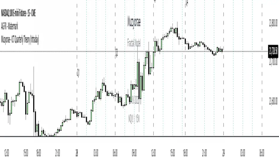
Pure Price Action ICT Tools [Tudou]1.整合了LuxAlgo开发的SMC和ICT的两个指标,将SMC中部分功能加入到了ICT指标中
2.新增了MSS和BOS的警报功能
3.新增了日、周、月的高低点绘制,以及警报功能
=========================================
1. Integrate the two indicators of SMC and ICT developed by LuxAlgo, and add some functions in SMC to the ICT indicators
2. Added alarm functions for MSS and BOS
3. Added day, week, and month high and low point drawing, as well as alarm functions

FVG 9:31–10:00 AM ETFVG 9:31–10:00 AM ET - Script Description
What This Script Does
This indicator finds **Fair Value Gaps (FVGs)** that form during the first 29 minutes of the U.S. stock market (9:31 AM to 10:00 AM Eastern Time). A Fair Value Gap is a price imbalance where there's a gap between candles that often becomes an important support or resistance level.
Key Features:
- **Time Window**: Only looks for FVGs between 9:31-10:00 AM ET (most important opening period)
- **One Per Day**: Finds only the first FVG that forms in this time window each day
- **Visual Display**: Draws a purple box around the gap with a clear "FVG" label
- **Price Tracking**: Monitors when price comes back to test the gap level
- **Alert System**: Sends notifications when price returns to the FVG zone
How FVGs Are Detected:
- **Bullish FVG**: When there's a gap up (low of middle candle is above high of 3rd candle back)
- **Bearish FVG**: When there's a gap down (high of middle candle is below low of 3rd candle back)
The 9:31-10:00 AM window is chosen because this is when institutions and algorithms create their biggest price moves right after market open, making these gaps very reliable.
Customization Options
User Settings
Extend FVG Box (Bars)
- **What it does**: Makes the purple box longer to the right
- **Default**: 0 (box ends right after the gap forms)
- **Options**: Any number from 0 to 100+
- **When to use**:
- Keep at 0 for clean historical view
- Set to 10-20 to track the gap during the current session
- Set higher for longer reference
Code Settings (Can Be Changed)
Time Window
- **Start**: 9:31 AM Eastern Time
- **End**: 10:00 AM Eastern Time
- **Can modify**: Change the hour/minute numbers in the code
Visual Style
- **Color**: Purple with see-through background
- **Label**: Shows "FVG" text in white
- **Can modify**: Change colors and transparency in the code
How to Use:
Setup
Chart Settings
1. Use 1-minute, 5-minute, or 15-minute charts (works best on these timeframes)
2. Apply to liquid markets like ES, NQ, major stocks, or forex pairs
3. Set the "Extend FVG Box" to your preference (start with 0 or 10)
What You'll See
- A purple box appears when an FVG forms during 9:31-10:00 AM
- Box shows the exact price levels of the gap
- "FVG" label appears on the box
- Only one FVG per day will be marked
Trading Strategies
Basic FVG Trading
1. **Wait for Formation**: Let the purple box appear during 9:31-10:00 AM
2. **Watch Price Movement**: See if price moves away from the gap
3. **Enter on Retest**: When price comes back to the purple box area, consider entering
4. **Trade Direction**:
- Bullish FVG = look for long opportunities when price retests
- Bearish FVG = look for short opportunities when price retests
Entry Methods
- **Bounce Play**: Enter when price touches the FVG box and bounces away
- **Break Play**: Enter if price strongly breaks through the FVG box
- **Rejection Play**: Enter opposite direction if price gets rejected at the FVG
Risk Management
Stop Losses
- Place stops just outside the FVG box (a few ticks beyond the gap)
- If trading a bounce, stop goes on opposite side of the gap
- If trading a break, stop goes back inside the gap
Position Sizing
- Start small until you understand how FVGs work in your market
- Bigger gaps = smaller position size (more risk)
- Smaller gaps = can use larger position size
Profit Targets
- Take profits at obvious levels like round numbers, previous highs/lows
- Consider taking half profits at 1:1 risk/reward ratio
- Let some position run if the move is strong
Best Practices
When It Works Best
- High-volume stocks and futures (ES, NQ work great)
- Normal market days without major news during the 9:31-10:00 window
- When there's clear institutional activity in the opening period
When to Be Careful
- Low-volume stocks or markets
- Major economic news releases during the time window
- Market holidays when volume is low
- Very choppy or sideways days
Alert Usage
- The script will alert you when price comes back to test the FVG
- Don't trade the alert blindly - always check the current market situation
- Use the alert as a heads-up to start watching the setup more closely
Tips for Success
- The earlier the FVG forms in the 9:31-10:00 window, often the more significant it is
- FVGs that form with high volume are usually more reliable
- Always consider the overall market direction - don't fight the main trend
- Practice on paper first to understand how FVGs behave in your chosen market
🔗 Works Best With:
✅ Liquidity Levels — Smart Swing Lows: Spot key structural lows that can fuel stop hunts and reversals.
✅ ICT Turtle Soup — Liquidity Reversal: Add a classic reversal pattern to your toolkit to catch fakeouts cleanly.
✅ ICT SMC Liquidity Grabs and OBs- Liquidity Grabs, Order Block Zones, and Fibonacci OTE Levels, allowing traders to identify institutional entry models with clean, rule-based visual signals.
This script is most valuable for day traders who want to catch institutional moves right after market open, but it can also help swing traders identify important intraday levels.
✅ ICT Macro Zones (Grey Box Version)- It tracks real-time highs and lows for each Silver Bullet session.
✅ Weekly Opening Gap (cryptonnnite)
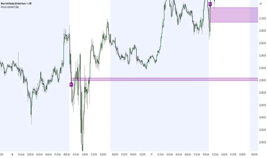
Midnight 30min High/LowMidnight 30min High/Low — Overnight Liquidity Range Tracker
Capture the Overnight Session: A Strategic Level Identification Tool from Professional Trading Methodology
This indicator captures the high and low prices during the critical 30-minute midnight session (12:00-12:30 AM EST) and projects these levels forward as key support and resistance zones. These overnight ranges often contain significant liquidity and serve as crucial reference points for intraday price action, representing areas where institutional activity may have established important levels.
🔍 What This Script Does:
Identifies Critical Overnight Session Levels
- Automatically detects the 12:00-12:30 AM EST session window
- Captures the highest and lowest prices during this 30-minute period
- Projects these levels forward for multiple trading days
Creates Dynamic Support/Resistance Zones
- Extends midnight high/low levels as horizontal lines with customizable projection periods
- Fills the area between high and low to create a visual trading range
- Updates automatically each trading day with new overnight levels
Provides Clear Visual Reference Points
- Optional session start markers (●) highlight when the midnight session begins
- Color-coded lines distinguish between high and low levels
- Transparent fill area creates an easy-to-identify trading zone
Real-Time Level Tracking
- Updates levels in real-time during the active midnight session
- Maintains historical levels for reference and backtesting
- Compatible with data window for precise level values
⚙️ Customization Options:
Extend Days (1-30):** Control how many days forward the levels are projected (default: 5 days)
High Line Color:** Customize the midnight high line color (default: blue)
Low Line Color:** Customize the midnight low line color (default: orange)
Fill Color:** Adjust the transparency and color of the range area (default: light aqua, 80% transparency)
Show Session Markers:** Toggle yellow session start indicators on/off (default: enabled)
💡 How to Use:
Deploy on lower timeframes (1m-15m) for precise level identification and reaction monitoring**
Watch for key price interactions:
- Rejection at midnight high levels (potential resistance)
- Bounce from midnight low levels (potential support)
- Range-bound trading between the high and low levels
Combine with liquidity concepts:
- Monitor for stop hunts above/below these levels
- Look for false breakouts that snap back into the range
- Use as confluence with other ICT concepts like FVGs and Order Blocks
Strategic Applications:
- Range trading between midnight levels
- Breakout confirmation when price closes decisively outside the range
- Support/resistance validation for entry and exit planning
🔗 Combine With These Tools for Complete Market Structure Analysis:
✅ First FVG — Opening Range Fair Value Gap Detector.
✅ ICT Turtle Soup (Liquidity Reversal)— Spot stop hunts and false breakout scenarios
✅ ICT Macro Zones (Grey Box Version)- It tracks real-time highs and lows for each Silver Bullet session
✅ ICT SMC Liquidity Grabs and OBs- Liquidity Grabs, Order Block Zones, and Fibonacci OTE Levels, allowing traders to identify institutional entry models with clean, rule-based visual signals.
Together, these tools create a comprehensive Smart Money Concepts (SMC) framework — helping traders identify, anticipate, and capitalize on institutional-level price movements with precision and confidence during critical overnight sessions.

Contrarian 100 MAPairs nicely with Enhanced-Stock-Ticker-with-50MA-vs-200MA located here:
Description
The Contrarian 100 MA is a sophisticated Pine Script v6 indicator designed for traders seeking to identify key market structure shifts and trend reversals using a combination of a 100-period Simple Moving Average (SMA) envelope and Inner Circle Trader (ICT) Break of Structure (BoS) and Market Structure Shift (MSS) logic. By overlaying a semi-transparent SMA-based shadow on the price chart and plotting bullish and bearish structure signals, this indicator helps traders visualize critical price levels and potential trend changes. It leverages higher timeframe (HTF) pivot points and dynamic logic to adapt to various chart timeframes, making it ideal for swing and contrarian trading strategies. Customizable colors, timeframes, and alert conditions enhance its versatility for manual and automated trading setups.
Key Features
SMA Envelope: Plots a 100-period SMA for high and low prices, creating a semi-transparent (50% opacity) purple shadow to highlight the price range and provide context for price movements.
ICT BoS/MSS Logic: Identifies Break of Structure (BoS) and Market Structure Shift (MSS) signals for both bullish and bearish conditions, based on HTF pivot points.
Dynamic Timeframe Support: Adjusts pivot detection based on user-selected HTF (default: 1D) and chart timeframe (1M, 5M, 15M, 30M, 1H, 4H, 1D), ensuring adaptability across markets.
Visual Signals: Draws dotted lines for BoS (bullish/bearish) and MSS (bullish/bearish) signals at pivot levels, with customizable colors for easy identification.
Contrarian Approach: Signals potential reversals by combining SMA context with ICT structure breaks, ideal for traders looking to capitalize on trend shifts.
Alert Conditions: Supports alerts for bullish/bearish BoS and MSS signals, enabling integration with TradingView’s alert system for automated trading.
Performance Optimization: Uses efficient pivot detection and line management to minimize resource usage while maintaining accuracy.
Technical Details
SMA Calculation:
Computes 100-period SMAs for high (smaHigh) and low (smaLow) prices.
Plots invisible SMAs (fully transparent) and fills the area between them with 50% transparent purple for visual context.
Pivot Detection:
Uses ta.pivothigh and ta.pivotlow to identify HTF swing points, with dynamic lookback periods (rlBars: 5 for daily, 2 for intraday).
Tracks pivot highs (pH, nPh) and lows (pL, nPl) using a custom piv type for price and time.
BoS/MSS Logic:
Bullish BoS: Triggered when price breaks above a pivot high in a bullish trend, drawing a line at the pivot level.
Bearish BoS: Triggered when price breaks below a pivot low in a bearish trend.
Bullish MSS: Occurs when price breaks a pivot high in a bearish trend, signaling a potential trend reversal.
Bearish MSS: Occurs when price breaks a pivot low in a bullish trend.
Lines are drawn using line.new with xloc.bar_time for precise alignment, styled as dotted with customizable colors.
HTF Integration: Fetches HTF close prices and pivot data using request.security with lookahead_on for accurate signal timing.
Line Management: Maintains an array of lines (lin), removing outdated lines when new MSS signals occur to keep the chart clean.
Pivot Reset: Clears broken pivots (e.g., when price exceeds a pivot high or falls below a pivot low) to ensure fresh signal generation.
How to Use
Add to Chart:
Copy the script into TradingView’s Pine Editor and apply it to your chart.
Configure Settings:
SMA Length: Adjust the SMA period (default: 100 bars) to suit your trading style.
Structure Timeframe: Set the HTF for pivot detection (default: 1D).
Chart Timeframe: Select the chart timeframe (1M, 5M, 15M, 30M, 1H, 4H, 1D) to adjust pivot sensitivity.
Colors: Customize bullish/bearish BoS and MSS line colors via input settings.
Interpret Signals:
Bullish BoS: White dotted line (default) at a broken pivot high in a bullish trend, indicating trend continuation.
Bearish BoS: White dotted line at a broken pivot low in a bearish trend.
Bullish MSS: White dotted line at a broken pivot high in a bearish trend, suggesting a reversal to bullish.
Bearish MSS: White dotted line at a broken pivot low in a bullish trend, suggesting a reversal to bearish.
Use the SMA shadow to gauge price position within the recent range.
Set Alerts:
Create alerts for bullish/bearish BoS and MSS signals using TradingView’s alert system.
Customize Visuals:
Adjust line colors or SMA fill transparency via TradingView’s settings for better visibility.
Example Use Cases
Swing Trading: Use MSS signals to enter trades at potential trend reversals, with the SMA envelope confirming price extremes.
Contrarian Trading: Capitalize on BoS and MSS signals to trade against prevailing trends, using the SMA shadow for context.
Automated Trading: Integrate BoS/MSS alerts with trading bots for systematic entries and exits.
Multi-Timeframe Analysis: Combine HTF signals (e.g., 1D) with lower timeframe charts (e.g., 1H) for precise entries.
Notes
Testing: Backtest the indicator on your chosen market and timeframe to validate performance.
Compatibility: Built for Pine Script v6 and tested on TradingView as of June 19, 2025.
Limitations: Signals rely on HTF pivot accuracy, which may lag in fast-moving markets. Adjust rlBars or timeframe for sensitivity.
Optional Enhancements: Consider uncommenting or adding a histogram for SMA divergence (e.g., smaHigh - smaLow) for additional insights.
Acknowledgments
This indicator combines ICT’s market structure concepts with a dynamic SMA envelope to provide a unique contrarian trading tool. Share your feedback or suggestions in the TradingView comments, and happy trading!