ICT Silver bullet sessions, version 1.0Draws the ICT silver bullet session times on the chart. It includes:
London silver bullet session
New York pre-market session
New York AM session
New York lunch session
New York PM session
"ict" için komut dosyalarını ara


ICT Kill Zone & SNR Tool## Features
- **Auto-Draws Key Price Lines:**\
Plots the close price line for both the current timeframe and a higher timeframe (HTF) of your choice. The HTF close line helps you identify major support/resistance (SNR) areas from higher timeframe structure. All lines are managed automatically to keep the chart clear.
- **Kill Zone Session Markers:**\
Automatically highlights four key Kill Zone trading sessions (London, New York, London Close, Asia) according to ICT concepts. Kill Zone time windows are adjusted for your chart's timezone, with colored horizontal lines and center labels. If any major economic event overlaps with a Kill Zone, a 🔥 icon will be added to its label.
- **Real-Time Economic Calendar Integration:**\
Integrates TradingView's EconomicCalendar library to display major macroeconomic events (FOMC, CPI, PPI, NFP, etc.) directly on your chart. Events are matched to each bar in real time and checked for overlap with Kill Zone periods.
## How to Use
1. **Enable/Disable Elements:**\
Use the settings panel to turn on/off the close price lines for the current and higher timeframe, and adjust color/width as needed.
2. **Select HTF (Higher Timeframe):**\
Choose the desired higher timeframe (such as 1H, 4H, D). The HTF close line updates only when its value changes.
3. **Configure Kill Zones:**
- Toggle Kill Zone markers and select line style (solid, dashed, dotted).
- Set custom names for each session if needed.
- All time calculations are auto-adjusted for your chart's timezone.
4. **Economic Events:**
- Select which event types (FOMC, CPI, NFP, etc.) you want to show.
- When a Kill Zone period contains an economic event, a 🔥 icon is shown in the label for extra caution.
- Hidden event icons are also plotted on bars for backtesting reference.
5. **Chart Clarity:**\
The script automatically limits the number of lines/labels plotted to keep the chart clear and readable.
## How it Works
- **Close Line Drawing:**\
Draws a line from the previous close to the current close for each bar; HTF line only updates when the HTF close changes.
- **Kill Zone Detection:**\
Converts NY Kill Zone session times to your local timezone. For each session, detects entry/exit, draws a colored horizontal line and a centered label.
- **Economic Event Overlay:**\
Checks all selected economic events and overlays a 🔥 to session labels if they overlap; optionally plots an icon on the event bar.
## Disclaimer
This script is provided **for educational and research purposes only** and does **not constitute financial advice**. Trading involves substantial risk; the author accepts no liability for any financial loss.

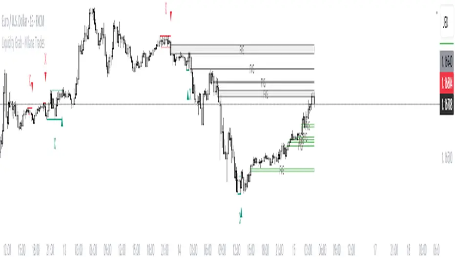
(ICT)Liquidity Grab + FVG + MSS/BOSThis script is a comprehensive educational indicator that combines and enhances several well-known trading concepts:
Liquidity Grabs (Swing Failure Patterns)
Fair Value Gaps (FVG)
Market Structure Shifts / Break of Structure (MSS/BOS)
Alerts
It identifies potential bullish and bearish liquidity grabs, confirms them optionally using volume validation on a lower timeframe, and tracks subsequent price structure changes. The indicator visually marks key swing highs/lows, FVG zones, and BOS/MSS levels—allowing traders to observe how price reacts to liquidity and imbalance zones.
🔍 Features:
Swing Failure Patterns (SFP):
Highlights possible liquidity grabs based on recent highs/lows and candle structure.
Volume Validation (Optional):
Filter signals using relative volume outside the swing on a lower timeframe. Adjustable threshold.
Fair Value Gaps (FVG):
Detects imbalance gaps and extends them for easy visualization.
Market Structure (MSS/BOS):
Displays Break of Structure (BOS) and Market Structure Shift (MSS) based on pivot highs/lows and closing conditions.
Dashboard:
A compact info panel displaying lower timeframe settings and validation status.
Custom Styling:
Adjustable colors, line styles, and label visibility for clean charting.
🧠 Ideal For:
Traders studying ICT concepts, smart money theories, and price-action-based strategies who want a visual tool for analysis and backtesting.
How to Use:
Wait for a Liquidity Grab (SFP) to form
The first condition for a potential entry is the formation of a Stop Hunt / Swing Failure Pattern (SFP).
This indicates that liquidity has been taken above or below a key level (e.g., previous high/low), and the market may be ready to reverse.
Confirmation with Fair Value Gap (FVG) and Market Structure Shift (MSS)
After the SFP, do not enter immediately. Wait for confirmation:
FVG : A Fair Value Gap (an imbalance in price action) must appear, signaling potential institutional activity.
MSS : A Market Structure Shift (break in the current trend) confirms a possible trend reversal or strong corrective move.
Enter the trade
Once both the FVG and MSS are confirmed after the SFP, you can safely enter a trade in the direction of the shift.
Alert Feature
The indicator includes an alert system to notify you when all conditions are met (SFP + FVG + MSS), so you can react quickly without constantly watching the chart.
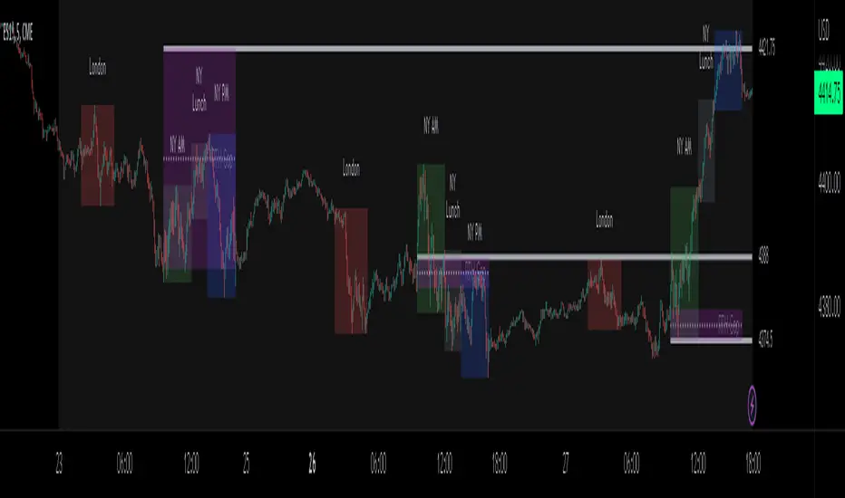
ICT - Trading ToolsThis indicator is designed for traders who follow the ICT (Inner Circle Trader) concepts. It brings together several essential tools for contextual and time-based market analysis, helping to identify key moments throughout the trading day and highlighting important areas of interest.
🕒 Market Sessions
The indicator allows you to configure up to four distinct sessions: Asia, London, New York AM, and New York PM.
Each session is fully customizable:
Start and end times
Background or line colors
Displayed title on the chart
This makes it easy to quickly identify the different phases of the trading day and spot potential accumulation or distribution zones specific to each session.
⏰ Key Times
You can enable the display of major time-based reference points, such as:
New York Open
New York Midnight
International Midnight (UTC)
These time markers are individually toggleable and fully customizable to suit various timing strategies.
📊 Macro
The indicator also displays the timing of macro - Only displayed on TF < M5
Each macro can be:
Enabled or disabled
Visually customized (text, color, display duration)
This feature helps you anticipate volatility spikes related to economic news and manage your risk accordingly.
🧭 Contextual Display
The indicator also includes several useful visual elements:
Previous Day High/Low (PDH/PDL)
Previous Week High/Low (PWH/PWL)
A customizable title and subtitle at the top of the chart (e.g., strategy or setup name)
Optional display at the bottom of the chart showing: Currency pair, Date, Current timeframe (The position of this info box is configurable)

ICT Intraday FrameworkAutomating The Basics Of ICT Intraday Concepts:
NWOG/NDOG
-from 4:14pm to 9:29am a line will be drawn from 4:14pm close to anticipate ndog/nwog
-once 9:30am or later NDOG/NWOG is drawn with High, Mid, and Low prices
-has option to extend High, Mid, and Low price lines until start of new day at 2/3pm
First Presented Imbalance
-draws fp imb from 9:30-10am
-has option to extend High, Mid, and Low price lines until start of new day at 2/3pm
Custom Macro Window
-draw box around high and low of macro
-first presented imbalance of macro window
Future concepts im planning to add:
Asia BSL/SSL Highlight

ICT Balanced Price Range - Double FVG with VolumeThis is an FVG indicator combined with volume to identify moments when a sudden volume spike creates a price gap.
Additionally, I've added the ICT Balanced Price Range, which occurs when two opposing FVGs form a connected gap. This gap has a high probability of reversal and is one of the key signs of liquidity sweeps.
Unlike other FVG indicators that filter FVGs based on ATR, average price, or range, I believe such methods lead to overfitting and may not work across multiple pairs with a single setting. Instead, I only filter FVGs when there are consecutive overlapping FVGs.
The indicator includes full functionality:
Candle color customization
FVG line color customization
FVG fill color customization
BPR color customization
Adjustable average volume and volume threshold
Highlighting candles with abnormal volume
Enjoy and make sure to backtest thoroughly before using!

ICT Concepts: MML, Order Blocks, FVG, OTECore ICT Trading Concepts
These strategies are designed to identify high-probability trading opportunities by analyzing institutional order flow and market psychology.
1. Market Maker Liquidity (MML) / Liquidity Pools
Idea: Institutional traders ("market makers") place orders around key price levels where retail traders’ stop losses cluster (e.g., above swing highs or below swing lows).
Application: Look for "liquidity grabs" where price briefly spikes to these levels before reversing.
Example: If price breaks a recent high but reverses sharply, it may indicate a liquidity grab to trigger retail stops before a trend reversal.
2. Order Blocks (OB)
Idea: Institutional orders are often concentrated in specific price zones ("order blocks") where large buy/sell decisions occurred.
Application: Identify bullish order blocks (strong buying zones) or bearish order blocks (strong selling zones) on higher timeframes (e.g., 1H/4H charts).
Example: A bullish order block forms after a strong rally; price often retests this zone later as support.
3. Fair Value Gap (FVG)
Idea: A price imbalance occurs when candles gap without overlapping, creating an area of "unfair" price that the market often revisits.
Application: Trade the retracement to fill the FVG. A bullish FVG acts as support, and a bearish FVG acts as resistance.
Example: Three consecutive candles create a gap; price later returns to fill this gap, offering a entry point.
4. Time-Based Analysis (NY Session, London Kill Zones)
Idea: Institutional activity peaks during specific times (e.g., 7 AM – 11 AM New York time).
Application: Focus on trades during high-liquidity periods when banks and hedge funds are active.
Example: The "London Kill Zone" (2 AM – 5 AM EST) often sees volatility due to European market openings.
5. Optimal Trade Entry (OTE)
Idea: A retracement level (similar to Fibonacci retracement) where institutions re-enter trends after a pullback.
Application: Look for 62–79% retracements in a trend to align with institutional accumulation/distribution zones.
Example: In an uptrend, price retraces 70% before resuming upward—enter long here.
6. Stop Hunts
Idea: Institutions manipulate price to trigger retail stop losses before reversing direction.
Application: Avoid placing stops at obvious levels (e.g., above/below recent swings). Instead, use wider stops or wait for confirmation.

ICT CheckListCredit to the owner of this script "TalesOfTrader"
The Awakening Checklist indicator is a tool designed to help traders evaluate certain key market conditions and elements before making trading decisions. It consists of a series of questions that the trader must answer using the options "Yes", "No" or "N/A" (not applicable).
“Has Asia Session ended?” : This question aims to determine if the Asian trading session has ended. The answer to this question can influence trading strategies depending on market conditions.
“Have you identified potential medium induction?” : This question concerns the identification of potential average inductions on the market. Recognizing these inductions can help traders anticipate future price movements.
"Have you identified potential PoI's": This question asks about the identification of potential points of interest on the market. These points of interest can indicate areas of significant support or resistance.
"Have you identified in which direction they are creating lQ?" : This question aims to determine in which direction market participants create liquidity (lQ). Understanding this dynamic can help make informed trade decisions.
“Have they induced Asia Range”: This question concerns the induction of the Asian range by market participants. Recognizing this induction can be important in assessing future price movements.
“Have you had a medium induction”: This question asks about the presence of a medium induction on the market. The answer to this question can influence trading prospects.
“Do you have a BoS away from the induction”: This question aims to find out if the trader has an offer (BoS) far from the identified induction. This can be a risk management strategy.
"Doas your induction PoI have imbalance": This question concerns the imbalance of points of interest (PoI) linked to induction. Recognizing this imbalance can help anticipate price movements.
“Do you have a valid target in mind”: This question aims to find out if the trader has a clear trading objective in mind. Having a goal can help guide trading decisions and manage risk.

ICT Vacuum BlocksThe indicator draws a box between the closing price of one candle and the opening price of the next whenever a gap occurs, helping traders easily spot potential areas of interest where the market has skipped over price levels. The boxes do not extend beyond the gap itself, keeping the chart clean and focused on the price action.
Features:
Detects both upward and downward gaps.
Non-extending boxes that accurately represent the size of each gap.
Customizable colors for up and down gaps to match your chart style.
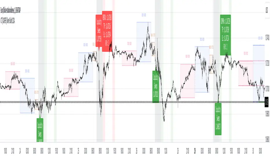
ICT Asian Range and KillzonesThis TradingView indicator highlights key trading sessions and their price ranges on a chart. It identifies the Asian Range and the Killzones for both the London Open and New York Open sessions. Here’s a brief breakdown:
Asian Range:
Defines the high and low price levels during the Asian trading session (between the specified start and end hours, default 00:00 to 04:00 UTC).
Plots horizontal lines to mark the highest and lowest prices reached during the Asian session.
Adds labels showing the values of these high and low points after the session ends.
London and New York Killzones:
Identifies the “Killzones” or key trading windows for the London Open (default 06:00 to 09:00 UTC) and the New York Open (default 11:00 to 14:00 UTC).
Tracks the high and low price levels within these windows and plots rectangles ("boxes") on the chart to visualize these ranges.
The boxes are color-coded and customizable, indicating potential areas of high market activity or volatility.
Customizable Visuals:
Users can adjust the colors, border widths, and other visual properties for better clarity and chart integration.

ICT Time Levels Description:
The Time Levels Indicator is designed to enhance trading decisions by marking significant price levels at key times throughout the trading day. This indicator specifically focuses on three crucial times: 8:30 AM, 9:30 AM, and 10:00 AM (UTC-4), which are often associated with significant market movements.
Key Features:
Customizable Time Levels: Users can toggle the display of price levels at 8:30 AM, 9:30 AM, and 10:00 AM. Each level is marked with a line on the chart, which helps traders visually identify these critical points.
Style and Color Options: Customize the appearance of each time level with different line styles (solid, dotted, dashed) and colors to match your chart preferences.
Dynamic Labeling: The indicator automatically places a label at the current price level for each time, making it easier to identify and track these levels as the day progresses.
Real-Time Updates: As the trading session unfolds, the indicator adjusts the lines and labels to reflect the latest price data at the specified times.
How It Works:
At the specified times (8:30 AM, 9:30 AM, and 10:00 AM), the indicator captures the opening price and plots a horizontal line at that level.
These lines serve as reference points, helping traders to observe how the price interacts with these key levels throughout the day.
The lines and labels are fully customizable, allowing users to adapt the indicator to their trading style and visual preferences.
Use Cases:
Market Open Strategies: Traders can use the 9:30 AM level to monitor the opening price of the New York Stock Exchange (NYSE), which often sets the tone for the trading session.
Morning Volatility: The 8:30 AM and 10:00 AM levels can be useful for identifying potential support and resistance levels during periods of increased volatility, such as economic data releases or after the market opens.
This indicator is particularly useful for intraday traders who focus on morning trading sessions and want to have a clear visual reference to guide their decisions.
Note: This script is designed to be simple yet effective, providing traders with essential information without cluttering the chart.

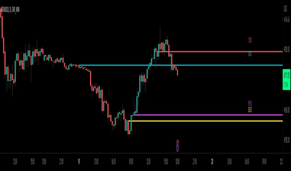
ICT New Week Opening GapDisplay the Current New Week Opening Gap (NWOG) on your Futures Market charts.
Disclaimer: this indicator is completely built from scratch, which is why not many features are added yet.
This indicator is 100% UNIQUE in the way that the NWOG remains accurately drawn on the chart, regardless of which chart settings are modified (for example, Settlement-as-Close, RTH/ETH, Back-Adjustment, etc.), unlike other NWOG plotting indicators.
Additionally, the NWOG can be plotted on a large variety of timeframes, from the Weekly chart, all the way down to the 1-second chart.
The NWOG is defined as Friday's closing price (e.g., at 4:59pm New York Time for ES1!) and Sunday's opening price (e.g., at 6:00pm New York Time for ES1!) on a new week.
This indicator draws a Box at these levels and extends it out in time to the most recent bar so that it can be visualized how price reacts to and gyrates around these levels.
Basically, the Box that is drawn on the chart by this indicator can be used as dynamic support & resistance levels. The actual price levels are shown at the top-right of the chart in a small table, for anyone wanting to remove the indicator and draw the levels themselves.
Only the current week's opening price and the previous week's closing price will be drawn on the chart.
The indicator settings are only used to change the visuals such as box colors and text colors/size. The actual calculations are performed as mentioned above and cannot be changed by the Style/Settings Input.
Note: it is recommended to toggle ON the " Scale Price Chart Only " chart option if using auto-scaling on charts because TradingView by default will force indicator drawings to display on the chart area even if an NWOG is far away from the current price action.
This is a bare bones indicator (1st version) that will only draw the current NWOG. Future updates will add support for displaying historical NWOGs.
For support of additional markets or indicator settings/features, please leave a comment on this script.

ICT [CASPER] Silver Bullet 2024.ENGLISH DESCRIPTION:
The "BOT SILVER BULLET 2024" indicator is a technical analysis tool tailored for active traders on the TradingView platform, combining market pattern study with quantitative trading intelligence. This sophisticated indicator overlays directly on the price chart and is designed to pinpoint and visualize critical liquidity zones, providing traders with a strategic edge in their decision-making process.
Its utility lies in identifying "Liquidity Zones," which are key areas where significant price movements are anticipated due to the accumulation or release of market orders. These zones are often levels where large market participants have placed unexecuted orders, which can lead to sharp and swift movements once those levels are reached. Foreseeing these points can be crucial for strategies aiming to capture volatility or find optimal entry and exit points.
The "BOT SILVER BULLET 2024" does not just focus on the present but also delivers historical analysis by identifying "Session Highs/Lows" and "Global Highs/Lows." These are the extreme points that have been reached during specific and broad timeframes, respectively. Knowing these levels can offer a deeper understanding of how the price has reacted in the past under certain market conditions, hinting at possible areas of support and resistance.
Furthermore, the indicator provides an in-depth analysis that delves beneath the surface. The "Analysis" function of this indicator scrutinizes price and volume patterns and correlates them with known market events, providing traders with a more informed perspective on the market's potential direction. This feature is invaluable for those looking to understand the underlying forces moving prices and how they might impact trading strategies.
To enhance usability and visual user experience, the "BOT SILVER BULLET 2024" allows users to "View Range Labels." This feature adds clear labels to price zones of particular interest, such as the aforementioned liquidity zones and historical highs and lows. These labels act as annotations that help traders keep track of significant developments without the need for constant manual analysis.
The indicator also highlights "Liquidity Grabs," moments when the price is anticipated to react significantly upon reaching levels previously identified with a high volume of pending orders. This information is pivotal for traders employing breakout or reversal strategies, as such price movements can provide profitable opportunities.
In summary, the "BOT SILVER BULLET 2024" indicator is a highly advanced tool and posits itself as one of the "most comprehensive market indicators." Its ability to provide an integrated view of the financial markets makes it indispensable for traders seeking to understand and anticipate price movements. Its amalgamation of historical data, alongside real-time visualization of market conditions, makes this tool not just comprehensive but also pertinent in today's dynamic trading environment. With its focus on liquidity and superior technical analysis, this indicator stands out as a true differentiator for serious traders looking to maximize their effectiveness in the financial markets.
DESCRIPCION EN ESPAÑOL:
El indicador "BOT SILVER BULLET 2024" es una herramienta de análisis técnico proyectada para operadores activos en la plataforma TradingView, con un diseño que fusiona el estudio de patrones de mercado y la inteligencia de trading cuantitativo. Este sofisticado indicador se integra directamente sobre el gráfico de precios y está diseñado para detectar y visualizar zonas críticas de liquidez, proporcionando a los operadores una ventaja estratégica en su toma de decisiones.
Su utilidad radica en la identificación de "Zonas de Liquidez", que son áreas clave donde se espera que ocurran movimientos significativos de precios debido a la acumulación o liberación de órdenes de mercado. Estas zonas son a menudo niveles donde los grandes participantes del mercado han colocado órdenes no ejecutadas, lo que puede dar lugar a movimientos rápidos y agudos una vez que se alcanzan esos niveles. La capacidad de prever estos puntos puede ser crucial para estrategias que buscan capturar volatilidad o encontrar puntos de entrada y salida óptimos.
El "BOT SILVER BULLET 2024" no sólo se enfoca en el presente, sino que también proporciona un análisis histórico mediante la identificación de "Altos/Bajos de Sesiones" y "Altos/Bajos Globales". Estos son los puntos extremos que han sido alcanzados durante períodos de tiempo específicos y generalizados, respectivamente. Conocer estos niveles puede ofrecer una comprensión más profunda de cómo el precio ha reaccionado en el pasado bajo ciertas condiciones de mercado, dando pistas sobre posibles áreas de soporte y resistencia.
Además, el indicador ofrece un análisis en profundidad que va más allá de la superficie. La función "Análisis" de este indicador examina patrones de precios y volúmenes, y los correlaciona con eventos de mercado conocidos, lo que proporciona a los traders una perspectiva más informada sobre la dirección potencial del mercado. Esta característica es invaluable para aquellos que buscan entender las fuerzas subyacentes que mueven los precios y cómo podrían afectar sus estrategias de trading.
Para mejorar la usabilidad y la experiencia visual del usuario, "BOT SILVER BULLET 2024" permite "Ver Etiquetas de Rangos". Esta función agrega etiquetas claras a las zonas de precio que son de particular interés, como las mencionadas zonas de liquidez, y los altos y bajos históricos. Estas etiquetas son una forma de anotación que ayuda a los operadores a mantenerse al tanto de los desarrollos significativos sin la necesidad de realizar un análisis manual constante.
El indicador también resalta las "Tomas de Liquidez", que son momentos en los que se espera que el precio reaccione de manera significativa al alcanzar niveles previamente identificados con un alto volumen de órdenes pendientes. Esta información es crucial para los traders que aplican estrategias de breakout o de reversión, ya que tales movimientos de precios pueden proporcionar oportunidades rentables.
Para resumir, el "BOT SILVER BULLET 2024" es un indicador altamente avanzado y se postula como uno de los "indicadores más completos del mercado". Su capacidad para proporcionar una vista integral de los mercados financieros lo hace indispensable para los traders que buscan comprender y anticipar movimientos de precios. Su integración de datos históricos, junto con la visualización en tiempo real de condiciones de mercado, hace que esta herramienta no solo sea completa sino también relevante en el dinámico entorno de trading actual. Con su enfoque en la liquidez y su análisis técnico superior, este indicador es un verdadero diferenciador para los traders serios que buscan maximizar su eficacia en los mercados financieros.
Time Matrix TableICT stresses time and liquidity levels in his teachings. This table helps to easily locate these key Time-based price levels. You can use these levels to determine your directional bias and to help generate your narrative for where the market is going.
This indicator creates a table that gives you the price for the following liquidity levels:
PDO - Previous Day Open
PDH - Previous Day High
PDL - Previous Day Low
PDC - Previous Day Close
PDEQ - Equilibrium of the previous day's range. (Calculated by math.abs(((pdh-pdl)/2)+pdl))
PWH - Previous Week High
PWL - Previous Week Low
PDH2 - Two Days Back High
PDL2 - Two Days Back Low
PDH3 - Three Days Back High
PDL3 - Three Days Back Low
And gives you the opening price for the following times:
Daily Open - 6:00pm open for current session
1:30 AM
3:00 AM
4:00 AM
Midnight Open
6:00 AM
7:30 AM
8:30 AM
NY Open
10:00 AM
12:00 PM
NY PM - 1:30pm
2:00 PM
The levels are sorted descending in price in the table, with the background colored based on their relation to price. The prices are also plotted on the chart based on the range you specify in relation to the current price. These lines are also colored based on their relation to price.
This indicator does not give you anything but the price at a specific time, you must determine your own bias and narrative based on the levels that are given.

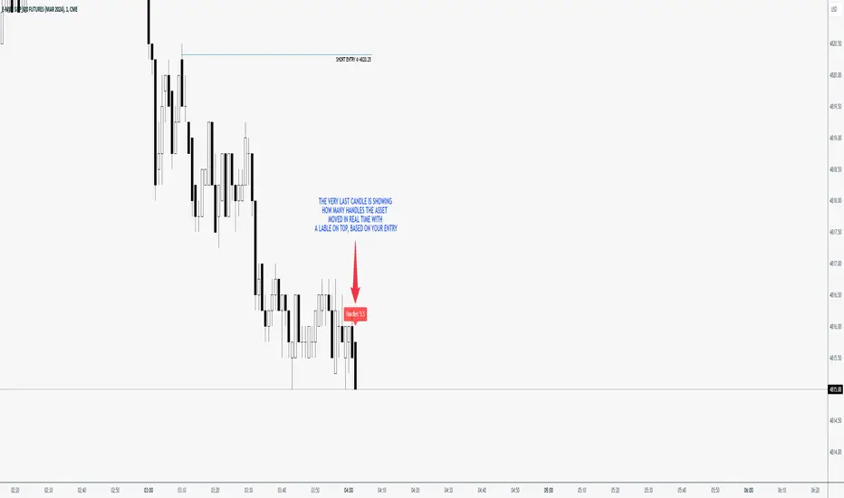
ICT Handle CounterThe "Handle Counter" is a unique TradingView script designed for ease and effectiveness in tracking price movements. It's particularly useful for traders who follow ICT methodologies. Users manually input their trade entry price, and the script then dynamically calculates and displays the number of Handles, or price changes, in a clear box above the latest candle on the chart. This real-time updating feature provides traders with crucial, current data on price movement, aiding in informed decision-making and a better understanding of market dynamics.
The "Handle Counter" script operates in the following way:
User Input: It starts by allowing you to input your trade's entry price. This is the price level from which the script will measure price movement.
Handles Calculation: The script calculates "Handles," which represent the price difference from your entry point to the current market price. This is done using a mathematical formula that finds the absolute value of this difference.
Display Mechanism: The calculated Handles are then displayed in a box, which is positioned above the latest candle on your trading chart. This box updates in real-time, giving you an ongoing view of how many Handles (price changes) have occurred since your entry point.
This script is designed to be straightforward and easy to use, providing clear, real-time information.
How to use:
Add the Indicator.
Open the Menu by clicking on the 'Settings' icon.
Navigate to the 'Inputs' tab and enter your entry price.
Click 'OK.' The indicator should immediately place a box above the latest candle, showing the current handles.
Additional Settings
Change Color of the Box
Change Color of the Font
ICT Time Indicator - MinimalisticThis indicator is intended to make backtesting and journaling a lot easier.
This script will automatically plot the sessions you selec.t
You don't have to worry about your timezone because this indicator will automatically handle that.
For best results please don't go any higher than the Hourly.
I aimed to keep this indicator very minimalistic to reduce the 'lipstick' on your chart.
Enabling any of the follow settings will quickly show you on your chart the times you want to be looking at:
Morning Session
Lunch
Afternoon Session
Marco 0950-1010
Marco 1050-1110
Marco 1450-1510
Silver Bullet London Open
Silver Bullet AM
Silver Bullet PM
You can also customize the color of any time session to suite your color scheme.
If you have any requests please leave a comment (I'm sure there are more marcos) :)

ICT Sessions_One Setup for Life [MK]The script plots the High/Low of the following trading sessions:
London - 02:00-05:00
NY AM - 09:30-12:00
New York Lunch - 12:00-13:30
New York PM - 13:30-16:00
Due to the high level of liquidity (resting orders), highs and lows of these sessions may be used as buy/sell areas and also as profit target areas. Typically, buy orders would be initiated below a session low and sell orders would be initiated above a
session high.
The script also plots 'RTH (Regular Trading Hours) Opening Gaps'. The RTH gaps are drawn from the closing price of regular trading at 16:15 (EST) to the open price of regular trading at 09:30 (EST). Gaps can be areas that traders might anticipate to be filled at some time in the future. A gap 'midline' is available if needed and yesterday RTH close line can be shown and extended to the current bar.
This script is simply a means to draw boxes around certain areas/periods on the charts. It is in no way a trading strategy and users should spend much time to study the concept and should also perform extensive back-testing before taking any trades.
By setting the lookback value to a much higher value then the default of 6, users can utilise the script to perform their own backtesting studies.
The above chart shows the default setup of the indicator. Note that the user has to choose how far (in days) to lookback and draw the sessions/gaps.
It is also possible to show the session high//low lines and extend them to the current bar time. If this is used it is advised to keep the lookback period as low as possible to ensure charts stay clean/uncluttered.
All boxes/lines styles/colors are fully customisable.
ICT Opening Lines [MK]Plots horizontal lines for the following opening times:
00:00 open
08:30 open
09:30 open
13:30 open
Opening lines can be used to monitor for power of 3/judas swings as per ICT teachings. The script allows the user to set a maximum timeframe for displaying the lines to keep HTF charts clean. Also an option is available to hide the lines after the market closes. If the hide option is used, the lines will be removed at 23:00.
Removing the lines after market closes ensures that the charts are clean when the market opens.
Labels can be displayed, colors and line styles can be customised.
ICT NWOG/NDOG GapsThis indicator reveals the new week opening gaps (NWOG) and new day opening gaps (NDOG) as well as the most recent Regular Trading Hour (RTH) Gap. The NWOG is the gap between Friday's closing price and Sunday's opening price. The NDOG is the gap between the opening price and closing price of the previous day. These gaps can be draws on liquidity as well as general reference points of where the market is and has been.
The RTH gap is the difference between the NY Open price at 9:30AM EST and the previous day's closing price during Regular Trading Hours. This gap can also give you an idea of where the market is headed.
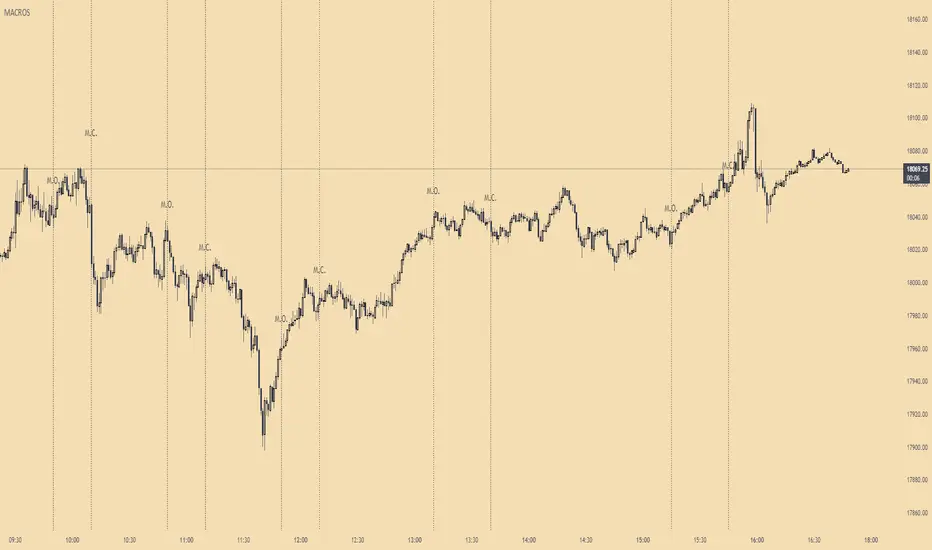
ICT MacrosThis script allows traders to visualize the range of time when a macro (an automated series of instructions/trades from large fund traders, executed by an algorithm) will likely occur in the market. It does this by drawing vertical lines and labels on the chart at these specific times:
(Macro Open) - 9:50 AM EST
(Macro Close) - 10:10 AM EST
(Macro Open) - 10:50 AM EST
(Macro Close) - 11:10 AM EST
(Macro Open) - 1:10 PM EST
(Macro Close) - 1:40 PM EST
(Macro Open) - 3:15 PM EST
(Macro Close) - 3:45 PM EST
The theory behind the use of these macros - is that the market will either seek buy side or sell side liquidity, or seek to rebalance price at a point of interest in between the open and close of the macro. Traders who follow this theory can use that information to anticipate how price might behave.
When a macro occurs, the script draws a vertical line on the chart using a dotted line style with a user-defined color. Additionally, a label is placed above the line to indicate whether it is a Macro Open or Macro Close event.
To preserve space, the labels are abbreviated on chart - "Macro Open" (M.O.) and "Macro Close" (M.C.) for both the morning and afternoon trading sessions. The labels may be turned on/off by the user.
The script also includes alerts that can notify traders when a macro occurs. These alerts can be set to go off once per bar close, and the alert message indicates the specific macro type and time.
This script is entirely open-source, meaning that traders can read the code and modify it as needed. Credit to the foundation of this script goes to TradingView user @rickyzcarroll for his open source Strat Assistant Hour Flip script. Important changes include the specific time changes and alert function.
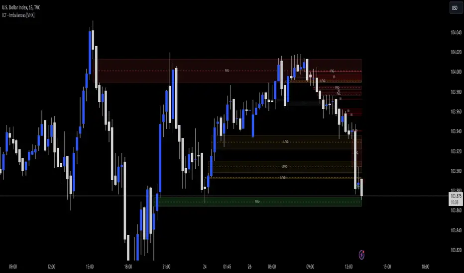
ICT - GAPs and Volume Imbalance
GAPs
Gaps are areas on chart where the price have moved sharply up or down, with no trading in between. Gaps often fill, but they don't have to.
Volume Imbalance
Volume imbalance - determined using 2 candles
Bullish Volume Imbalance - area between the close of 1st candle and the open of 2nd candle
Bearish Volume Imbalance - area between the close of 1st candle and the open of 2nd candle
How to use the indicator:-
When you find imbalance in volume or a GAP in the chart, you may expect price to rebalance it before continuation.
Importantly, GAPs/Imbalances do not always fill. Traders should never assume that a gap/imbalance will fill without understanding the reasons for the gap and monitoring trading activity around the gap.
Pair it with your current bias for better results.
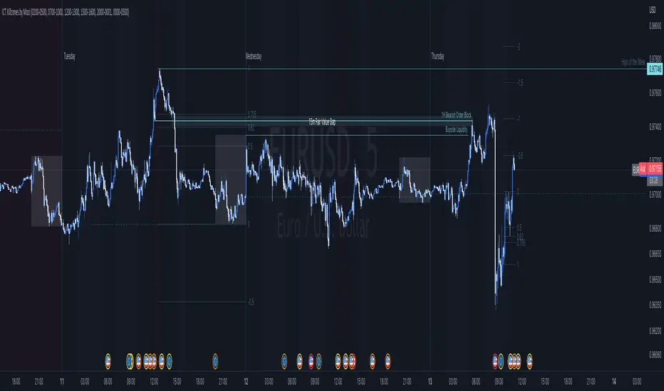
ICT Killzones by MoziThe ICT Killzone and important times indicator.
It highlights:
London Killzone
New York Killzone
New York Lunch Hour
New York Day End Hour
Asian Range
Judas Swing Time
In addition to this, it highlights the US and UK holidays with a background color and a label, so that you don't miss any bank holiday and you are sitting in front of your charts and are wondering, why the chart is not moving ;-)
I manually draw vertical lines at specific times like 08:30 London, 09:30 London, 08:30 New York, 09:30 New York, 11:00 New York (Take Profit Time)