yutas_BOindicator2Ver .1.0
High-low sign indicator for binary option only.
バイナリーオプション専用ハイローサインインジケーター。
"ichimoku" için komut dosyalarını ara

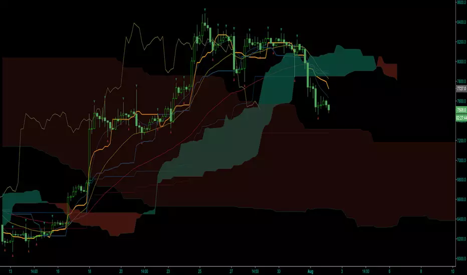
[astropark] Power Tools Overlay//******************************************************************************
// Power Tools Overlay
// Inner Version 1.2.1 13/12/2018
// Developer: iDelphi
// Developer: astropark (Ichimoku Cloud), SMA EMA & Cross tools
//------------------------------------------------------------------------------
// 21/11/2018 Added EMA SMA WMA
// 21/11/2018 Added SMA-EMA EMA-WMA WMA-SMA (Thanks to mariobros1 for the idea of the Simultaneous MA)
// 21/11/2018 Added Bollinger Bands
// 21/11/2018 Added Ichimoku Cloud (Thanks to astropark for all the code of the Ichimoku Cloud)
// 23/11/2018 Show all the indicator as default
// 23/11/2018 Added a cross when single Moving Averages crossing (Thanks to astropark for the idea)
// 24/11/2018 Descriptions Fix
// 24/11/2018 Added Option to enable/disable all Moving Averages
// 10/12/2018 Added EMAs and Crosses
// 13/12/2018 indicator number fixes
//******************************************************************************

Tradingview Widget GaugeThis indicator includes 26 indicators, which are used in Tradingview widget. The widget is to check the strenght of the markets based on the technical analysis and is presented in the main page of each symbol. All those 26 technical indicators have been carefully set up in this indicator.
Please make sure to not use this solely for a trade. Whenever you have a trade in your mind, you can check the trend of this indicator in multi time frames of that specific ticker, and get confirmation for your initial trade.
My suggestion is to use this multi-entity indicator to get confirmation of the strength or changing in trends. Better to use this with elliott waves, harmonic patterns, classic support and resistance, consolidations and fibonacci retracements.
www.tradingview.com
The followings are the 26 indicators have been used in the Tradingview Widget Gauge.
Relative Strength Index (14)
Stochastic %K (14, 3, 3)
Commodity Channel Index (20)
Awesome Oscillator
Momentum (10)
MACD Level (12, 27)
Stochastic RSI Fast (3, 3, 14, 14)
Williams Percent Range (14)
Bull Bear Power
Ultimate Oscillator (7, 14, 28)
Exponential Moving Average (10)
Simple Moving Average (10)
Exponential Moving Average (20)
Simple Moving Average (20)
Exponential Moving Average (30)
Simple Moving Average (30)
Exponential Moving Average (50)
Simple Moving Average (50)
Exponential Moving Average (100)
Simple Moving Average (100)
Exponential Moving Average (200)
Simple Moving Average (200)
Ichimoku Cloud Base Line (9, 26, 52, 26)
Ichimoku Cloud Leadline soft (9, 26, 52, 26)
Ichimoku Cloud Leadline hard (9, 26, 52, 26)
Volume Weighted Moving Average (20)
Hope you enjoy trading

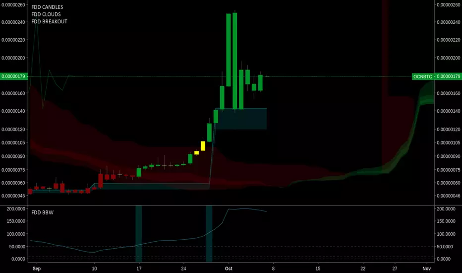
FOMO DRIVEN BREAKOUT INDICATORFomo Driven Developments Breakout Indicator
Works well with FDD Super Candles Indicator and Super Clouds.
This is the breakout indicator that F-DAS uses.
For access please go to www.fomodd.io.
Twitter = Telegram = @dgnsrekt
FOMO DRIVEN DEVELOPMENT
www.youtube.com
This video shows the F-DAS system watching TDI. F-DAS is a modular trading alert system that can easily be programmed to watch any exchange, market, or trading strategy. The video shows F-DAS watching TDI and FDD breakouts.
FOMO DRIVEN SUPERCLOUDSFomo Driven Developments Super Clouds
Works well with FDD Super Candles Indicator.
For access please go to www.fomodd.io.
Twitter = Telegram = @dgnsrekt
FOMO DRIVEN DEVELOPMENT


Gunbot Deluxe Tuners BE [Alerts]Revision 18
Gunbot Deluxe Tuners BE Alerts is part of the official Gunthy version of Gunbot Deluxe Tuners.
It is the companion Alerts script for the Gunbot Deluxe Tuners BE (Black Edition) backtesting and optimizing script.
This Alerts script allows user to automatically send alerts directly to Gunbot through the Gunbot TradingView addon.
Available only to verified Gunbot owners. No exceptions. Anyone interested in obtaining this script must contact either their official Gunbot reseller or me privately.
No public requests or donations for access to this script will be granted. No exceptions.
NOTICE: By requesting access to this script you acknowledge that you have read and understood that this is for research purposes only and neither I or Gunthy are responsible for any financial losses you may incur by using this script!

Ichi Trend Follow System v2This is an improvement upon a very popular trend following system that is currently selling for about $1k per year. I pull data from longer time frames to confirm trend, as well as use the ADX to minimize trading in sideways chop. I’ve backtested both the older $1k system and this newer one and can confirm improvements in every market and timeframe that I’ve tested.
Here’s the gist of how to use it. Wait for a set up bar. The set up bar will be aqua to go long and yellow to go short. Open your trade on the open of the following bar. Close your trade when the trending bar color (lime for long/fuchsia for short) changes back to standard colors on completion of the bar (green or red).
Please ask, and I’ll let you try it for free.
8EMALines,8SMALines,8HorizonLinesThis script plots max 8 EMA(Exponential Moving Average),8 SMA(Simple Moving Average), and 8 Price_Horizon Lines.
You can use there lines as much as necessary.

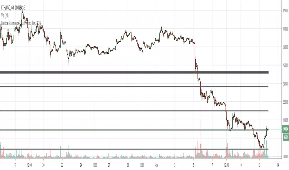
Musical Harmonics - Start with a low.Octaves double from one octave to another, so start with octaves beginning with the number one, for example:
1 doubled is 2, 2 doubled is 4, 4 double is 8 and then we go on to this sequence:
1,2,4,8,16,32,64,126,256,512,1024,2048,etc,etc
Find one of the numbers near a range, so for example on this chart Ethereum was trading at 190.31. That price is in between the octaves of 126 and 256. The number I use as the low for the indicator is 126.
Working on updating with labels and such
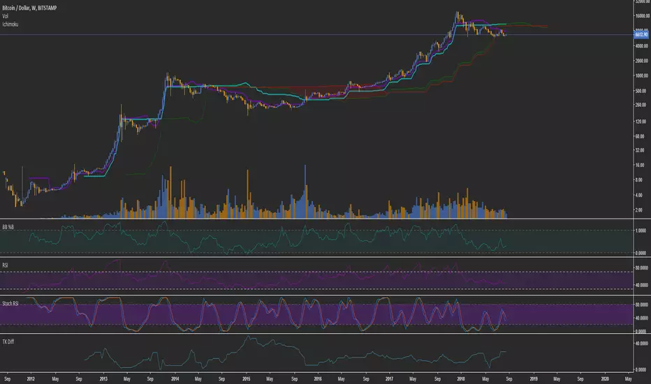
TK DiffThe absolute difference between the (doubled) inchimoku tenkan and kijun, normalized to percentage.

Athena Junction [Crypto World News]This is a is a very basic script that combines 3 EMA and ichimoku strategies. These can be used in conjunction, or for those who use this strategy and have a free account, this reduces your indicator account, freeing you up for other indicators. The ichimoku code has been adapted from Peercoin Developer's @jwilcharts 's script which can be found here ().
This is a modified version of the first script I ever made as well. If you have a request for an indicator to be added, I can make it happen as long as the code is available.
You can find Crypto World News on twitch, providing 24/7 coverage of the market, as well as various other beneficial sources of education.

2xIchimoku Cloud + 4xEMA + Williams FractalCopy+Pasted/edited the code from :
Moku
www.tradingview.com
EMA
www.tradingview.com
Fractal
www.tradingview.com
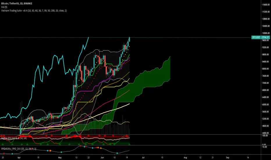
Vietnam Trading SuiteThis indicator helps the newcomers easily to approach trending analysis.
The following indicators added as default:
- Ichimouku (10/30/60/30)
- 5 EMA (9/20/30/50/200)
- Bollinger Bands