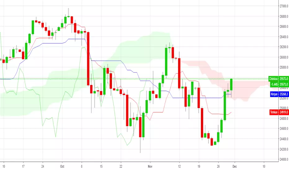
PIVOT AND ICHIMOKU BACKGROUND BY PRANOJIT DEYIt shows pivot bias in relation to day open line and it also shows ichimoku bullish trend background. good for option buyers to understand market bias.
"ichimoku" için komut dosyalarını ara

HTS-Ichimoku CloudAdd more a Longline into the basic ichimoku in order to see the support or assistant especially when the price is outside of cloud.
Vertical lines period 9,26,51 Ichimokuallows you to view the old prices on periods 9, 26 and 51 on the Ichimoku indicator. Periods and color can be changed. Can be used on all products. it saves you from having to count the old candles
이동평균선7개(SMA,EMA,SMMA) + 볼린저밴드 + 일목균형표 Multi-MA & BB & Ichimoku보조 지표 추가하는 법
본문 하단에 있는 즐겨찾기 스크립트에 넣기 버튼을 누르시면
여러분들이 차트 보시는 부분에 자동으로 들어가며
지표 - 즐겨찾기에도 추가되어 있으실겁니다
-----------------------------------------------------------------------------------------------------------------------------------
방송에서 바로 도와주신다고 말씀해주시고 뚝딱 만들어주신 HeroA님 감사합니다.
이 지표는 HeroA님이 직접 만들어주셨으며 시청자 분들에게 공유해도 된다는 허락하에 공유해드리고 있습니다.
본 지표는 제가 사용하시는분들의 편의를 위하여 수정한 부분이있습니다.
수정내용
- 이동평균선 5개 -> 7개로 추가, 볼린저밴드 함수명 변경 및 디폴트값 수정, 각 지표의 대부분의 선 색 수정 및 지표 이름을 영어에서 한국어로 변경 이상 입니다.
이 보조지표는 트레이딩뷰 지표를 여러개 넣기 힘든 투자자분들을 위하여 만들어 졌으며
이동평균선 7개, 볼린저밴드 그리고 일목균형표를 동시에 켤 수 있는 멀티보조지표입니다.
이동평균선 종류
SMA = 단순이동평균선
EMA = 지수이동평균선
SMMA = 스무디드 무빙 애버리지
지표 기본값 설명
-이동평균선
1~5번 20일 50일 120일 240일 365일 기본 설정
6~7번 (여분선) 각 1일 기본 설정
-볼린저밴드
1번 볼린저밴드
표준편차 1
2번 볼린저밴드(기본 볼린저밴드 설정)
표준편차 2
-일목균형표
기본 일목균형표의 설정과 동일
설정 수정 방법
인풋 부분
인풋에서는 이동평균선, 볼린저밴드와 일목균형표를 끄고 키실수있습니다.
더불어서
이동평균선의 종류와 일자를 바꾸실 수 있습니다.
볼린저밴드와 일목균형표는 기본 설정이 들어가 있기에 그대로 사용하셔도 문제없으십니다.
모습 부분
모습에서는 각 보조지표의 선의 굵기 및 색을 정하실 수 있습니다.
편하신 색으로 보시면 됩니다.
기본적으로 이동평균선은 무지개 색으로 하였으며 볼린저밴드와 일목균형표는 기본 세팅값과 동일하게 만들었습니다.
-----------------------------------------------------------------------------------------------------------------------------------
여기서부터는 트레이딩뷰 하우스룰에 따라 번역기를 통한 영어로 번역된 동일한 내용입니다. (영어는 번역기를 사용하였기에 오역이 많을 수 있습니다)
From here, it is the same content translated into English through a translator according to the Trading View House Rules. (English may use a translator, so there may be many mistakes)
-----------------------------------------------------------------------------------------------------------------------------------
How to add auxiliary indicators
If you click the Add to Favorites script button at the bottom of the text,
It automatically goes into the part you see in the chart
Indicators-you may have added them to your favorites
-------------------------------------------------- -------------------------------------------------- -------------------------------
Thank you HeroA for telling me that you are helping me right away on the air.
This indicator was created by HeroA and is shared with permission from viewers.
This indicator has been modified for the convenience of those I use.
Modification
-More than 5 moving average lines -> 7, Bollinger band function name change and default value change, most line color of each index and index name change from English to Korean or more.
This sub-indicator was created for investors who have difficulty entering multiple trading view indicators.
It is a multi-auxiliary indicator that can turn on seven moving average lines, a Bollinger band , and a daily balance table at the same time.
Moving average line type
SMA = simple moving average line
EMA = exponential moving average
SMMA = Smoothed Moving Average
Metric Default Description
-Moving average line
1-5 times 20 days 50 days 120 days 240 days 365 days Default setting
6~7 (extra line) Basic setting for each day
-Bollinger Band
Bollinger Band No. 1
Standard deviation 1
Bollinger Band No. 2 (default bollinger band setting)
Standard deviation 2
-Ilmok Balance Table
Same as the setting of the basic daily balance table
How to modify settings
Input part
In the input, you can turn off the moving average line, Bollinger band and the tree balance table.
Together
You can change the type and date of the moving average line.
The Bollinger Band and the Ichimoku Balance Table have default settings, so you can use them as they are.
Appearance part
In the figure, the thickness and color of the lines of each indicator can be determined.
You can see it in a comfortable color.
Basically, the moving average line was made in rainbow color, and the Bollinger band and the tree balance table were made to be the same as the default settings.

MultiScripts: EMAs + ST + S & R + IchimokuMulti scripts:
Multi EMAs
Super-Trend
Support and Resistence
Ichimoku Cloud

Akash-Ichimoku Cloud + Moving avg of 20-50-200Its a convenient combo indicator of ichimoku cloud and moving averages of 20-50-200
This can help save on limit of indicators in free version.
Most of the positional trading calls can be done with this combo indicator.
Akash Rajpal
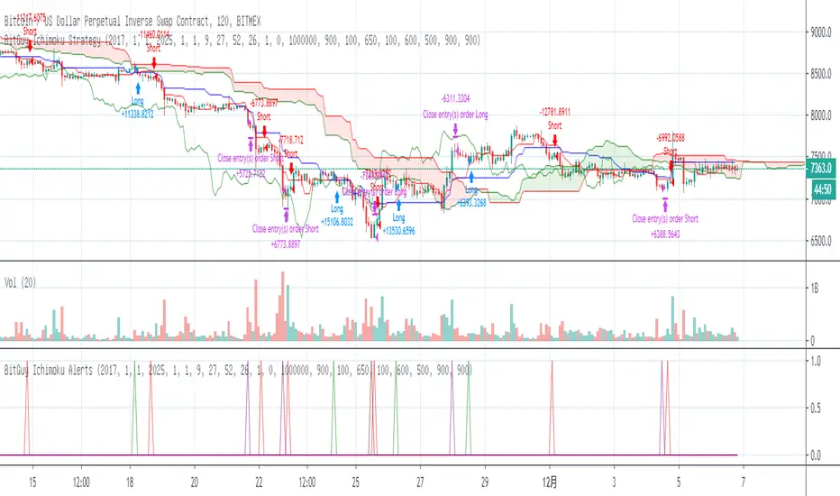
BITMEX Bybit binance HUOBI OKCOIN BTC Ichimoku TREND AlertsBITMEX Bybit binance HUOBI OKCOIN BTC Ichimoku TREND Alerts
This is a very effective trend strategy.
Strategy principle
HOW TO USE
set long position when a green arrow appears in the chart.
set short position when a red arrow appears in the chart.
For the long position and the short direction, you can set the stop profit & stop loss or trailing profit stop & trailing stop loss respectively.
When a purple arrow appears to close a position, an aggressive trader can go in the opposite direction when it is purple.
Strategy applicability
The default setting is for bitmex perpetual swap contract XBTUSD , bybit BTCUSD perpetual futures contract ,binance btcusdt Spot,Bitfinex BTCUSD Spot,bitflyer BTCJPY Spot,bithumb BTCKRW Spot,bitso BTCMXN Spot, bitstamp BTCUSD Spot,bittrex BTCUSDT Spot,Coinbase BTCUSD spot, deribit BTCPERP perpetual futures contract,gemini BTCUSD Spot,Hitbit BTCUSDT Spot,huobi BTCUSDT Spot KRAKEN XBTUSD spot,OKCOIN OKEX BTCUSD3M BTCUSD BTCUSD2W,Poloniex BTCUSDT Spot etc btc symbol with 30 minutes timeframe.
This indicator has broad applicability and can be applied to multiple different symbols.
This indicator also applies to the ETHUSD symbol etc, just adjust the default configuration.
Using the alert of the indicator, it can work well on the trading robot like Gunbot,autoview, without repaint false signals.
这是非常有效的趋势策略。
如何使用
在图表中出现绿色箭头就做多。
在图表中出现红色箭头就做空。
对于多头头寸和空头方向,您可以分别设置止损和止损或尾随利润止损和尾随止损;当出现紫色箭头时平仓,激进的交易者,可以在紫色时就做反方向。
策略适用性
默认设置是针对bitmex交易所 XBTUSD永久掉期合约,BYBIT交易所 BTCUSD永续期货合约,binance币安交易所 btcusdt现货,Bitfinex交易所 BTCUSD现货,bitflyer交易所 BTCJPY现货,bithumb交易所 BTCKRW现货,bitso交易所 BTCMXN现货,bitstamp交易所 BTCUSD现货,bittrex交易所 BTCUSDT现货,Coinbase交易所 BTCUSD现货,deribit交易所 BTCPERP永续期货合约,gemini双子星交易所 BTCUSD现货,Hitbit交易所 BTCUSDT现货,huobi火币交易所 BTCUSDT现货,KRAKEN交易所 XBTUSD现货,OKCOIN OKEX交易所 BTCUSD3M OK BTC季度合约 BTCUSD BTCUSD2W OK BTC次周合约,Poloniex BTCUSDT现货等2小时区间的btc交易。
Bitmex XBTUSD 2H 比特币期货 2 hours Bitcoin Futures
这个指标具有广泛的适用性,可以适用多个不同交易品种。
该指标还适用于ETHUSD,ETHBTC,ADABTC,TRXBTC,XRPBTC交易品种等,只需调整默认配置即可。
Bitmex ETHUSD 2H 以太币合约
binance ADABTC 2H
Binance ETHBTC 90 minutes 分钟
Binance TRXBTC89 minutes 分钟
Binance XRPBTC 90 minutes 分钟
使用该指标的警报设置,它可以在自动交易机器人上很好地工作,而无重绘错误的信号。

4 EMA With Colors(100,300,600,1000)-Ichimoku-Cloring graph tenda4 EMA With Colors(100,300,600,1000)-avec ichimoku en coloriant les zones de forte tendance
4 EMAs With Colors(100,300,600,1000)+ichimoku Cloud4 EMAs With Colors(100,300,600,1000) To detect trend
+ichimoku Cloud to have successful trading
Most Important Moving Averages for Me with Ichimoku+ Pivot StratMost Important Moving Averages for Me with Ichimoku+ Pivot Strat
All in One Chart
It's easy for me


My Bollinger Band - ichimokuMy Bollinger Band - ichimoku
with some signals for buying and selling with below method
3 bolinger band (len 50, div 2,3,4)
EMA 8,15,100
SMA 5,20 with rsi


Geometric Ichimoku CloudThis version of the Ichimoku Cloud indicator uses the geometric mean rather than the arithmetic mean.

Kojirokousi Ichimoku-Kinko-HyoKojirokousi Ichimoku-Kinko-Hyo
Correct one day gap
9 levels of rating in relation to each line
Show rating (4, 3, -3, -4)
Color coding of rating (4, 3, -3, -4)
小次郎講師 一目均衡表
1日のずれを修正
「三役好転」「三役逆転」の表示
各線の関係で9段階の評価
評価:4,3,ー3,ー4を表示
評価:4,3,ー3,ー4の色分け


two Ichimoku ITNG
you can have 2 ichimoku cloud with this indicator
with 2 diffrent time frames
first one with chart default time frame
and second one with your choosen time frame

C10 My Enhanced IchimokuThis script shows Crosses up/down Tenkan-Sen (9 Period) and Kinjun-Sen (26 Period)
There is the ability to Color the Cloud based on Trend
I called it the Enhanced Ichimoku