Trend Fusion: ADX&EMA+Ichimoku (Custom)SAME AS THE ORIGINAL (WITHOUT BOTTOM PART)
Trend Fusion: ADX & EMA+Ichimoku is an innovative indicator designed to provide traders with comprehensive insights into market trends. Combining the power of the Average Directional Index (ADX) with Exponential Moving Averages (EMA) and the Ichimoku Cloud, this indicator offers a sophisticated approach to trend analysis.
This indicator stands out for its unique integration of multiple trend-following indicators, offering traders a holistic view of market dynamics. Unlike traditional trend indicators that focus solely on price movements, Trend Fusion incorporates the ADX, EMA, and Ichimoku Cloud to provide a more nuanced understanding of trend strength and direction. By combining these indicators, traders can make more informed decisions and enhance their trading strategies.
How it works:
Trend Fusion generates buy and sell signals based on the convergence of these indicators. A combination of strong ADX readings, EMA crossovers, and alignment with the Ichimoku Cloud confirms trend direction and provides entry and exit points for traders.
Average Directional Index (ADX): Measures the strength of the prevailing trend by analyzing price movements. A rising ADX indicates a strengthening trend, while a falling ADX suggests weakening momentum.
Exponential Moving Averages (EMA): Detects potential trend reversals through crossover signals. A bullish crossover (fast EMA crossing above slow EMA) suggests an uptrend, while a bearish crossover indicates a downtrend.
Ichimoku Cloud: Provides support and resistance levels along with trend direction. Price movements above the cloud indicate bullish sentiment, while movements below the cloud suggest bearish sentiment.
How to useColour codes:
Green Candles: Represent a strong uptrend, indicating robust buying momentum. The intensity of green color deepens with increasing trend strength.
Red Candles: Indicate a strong downtrend, signaling significant selling pressure in the market. The intensity of red color deepens with increasing trend strength.
Yellow Candles: Suggest a weak trend, characterized by indecision and lack of clear direction. The intensity of yellow color varies based on the strength of the trend, with lighter shades indicating weaker trends and darker shades suggesting slightly stronger trends.
Trend Strength: Monitor the ADX to gauge the strength of the prevailing trend. Higher ADX values indicate stronger trends, while lower values suggest weaker trends.
Trend Direction: Confirm trend direction using EMA crossovers and Ichimoku Cloud signals. Look for bullish crossovers and price movements above the cloud for uptrends, and bearish crossovers and movements below the cloud for downtrends.
Entry and Exit Signals: Enter trades when all components align, signaling a strong trend. Use EMA crossovers and cloud confirmations to identify potential entry points, and consider exiting trades when these signals reverse.
The ADX calculation and signal logic are based on the ADX script by PineCoders, with modifications to integrate it into this indicator.
The EMA crossover logic is adapted from the GDAX EMA Cross script by stefano98.
The Ichimoku Cloud calculation and plotting are adapted from the Ichimoku Cloud script by lonesometheblue.
Trading involves risk, and past performance is not indicative of future results. It is recommended to use this indicator alongside other technical analysis tools and risk management strategies.
"ichimoku" için komut dosyalarını ara

Trend Fusion: ADX&EMA+IchimokuTrend Fusion: ADX & EMA+Ichimoku is an innovative indicator designed to provide traders with comprehensive insights into market trends. Combining the power of the Average Directional Index (ADX) with Exponential Moving Averages (EMA) and the Ichimoku Cloud, this indicator offers a sophisticated approach to trend analysis.
This indicator stands out for its unique integration of multiple trend-following indicators, offering traders a holistic view of market dynamics. Unlike traditional trend indicators that focus solely on price movements, Trend Fusion incorporates the ADX, EMA, and Ichimoku Cloud to provide a more nuanced understanding of trend strength and direction. By combining these indicators, traders can make more informed decisions and enhance their trading strategies.
How it works:
Trend Fusion generates buy and sell signals based on the convergence of these indicators. A combination of strong ADX readings, EMA crossovers, and alignment with the Ichimoku Cloud confirms trend direction and provides entry and exit points for traders.
Average Directional Index (ADX): Measures the strength of the prevailing trend by analyzing price movements. A rising ADX indicates a strengthening trend, while a falling ADX suggests weakening momentum.
Exponential Moving Averages (EMA): Detects potential trend reversals through crossover signals. A bullish crossover (fast EMA crossing above slow EMA) suggests an uptrend, while a bearish crossover indicates a downtrend.
Ichimoku Cloud: Provides support and resistance levels along with trend direction. Price movements above the cloud indicate bullish sentiment, while movements below the cloud suggest bearish sentiment.
How to use
Colour codes:
Green Candles: Represent a strong uptrend, indicating robust buying momentum. The intensity of green color deepens with increasing trend strength.
Red Candles: Indicate a strong downtrend, signaling significant selling pressure in the market. The intensity of red color deepens with increasing trend strength.
Yellow Candles: Suggest a weak trend, characterized by indecision and lack of clear direction. The intensity of yellow color varies based on the strength of the trend, with lighter shades indicating weaker trends and darker shades suggesting slightly stronger trends.
Trend Strength: Monitor the ADX to gauge the strength of the prevailing trend. Higher ADX values indicate stronger trends, while lower values suggest weaker trends.
Trend Direction: Confirm trend direction using EMA crossovers and Ichimoku Cloud signals. Look for bullish crossovers and price movements above the cloud for uptrends, and bearish crossovers and movements below the cloud for downtrends.
Entry and Exit Signals: Enter trades when all components align, signaling a strong trend. Use EMA crossovers and cloud confirmations to identify potential entry points, and consider exiting trades when these signals reverse.
The ADX calculation and signal logic are based on the ADX script by PineCoders, with modifications to integrate it into this indicator.
The EMA crossover logic is adapted from the GDAX EMA Cross script by stefano98.
The Ichimoku Cloud calculation and plotting are adapted from the Ichimoku Cloud script by lonesometheblue.
Trading involves risk, and past performance is not indicative of future results. It is recommended to use this indicator alongside other technical analysis tools and risk management strategies.

[blackcat] L1 Ichimoku Cloud with Entry SignalsThe Ichimoku Cloud is a technical analysis indicator used to identify potential trend reversals, support and resistance levels, and generate entry and exit signals in financial markets. It was developed by a Japanese journalist named Goichi Hosoda, who went by the pen name Ichimoku Sanjin.
The Ichimoku Cloud consists of several components, including the Tenkan-sen (Conversion Line), Kijun-sen (Base Line), Senkou Span A (Leading Span A), Senkou Span B (Leading Span B), and the Cloud. The Tenkan-sen and Kijun-sen lines are calculated based on the average of the highest high and lowest low over a specific period of time. The Senkou Span A is the average of the Tenkan-sen and Kijun-sen, plotted ahead of the current price. The Senkou Span B is calculated based on the average of the highest high and lowest low over a longer period of time, also plotted ahead of the current price. The Cloud is the area between Senkou Span A and Senkou Span B and is often used to identify potential support and resistance levels.
The Ichimoku Cloud with Entry Signals script provided above is a TradingView Pine script that plots the Ichimoku Cloud on a chart, along with entry signals. The entry signals are generated based on the crossover and crossunder of the Tenkan-sen and Kijun-sen lines, as well as the relationship of the closing price with Senkou Span A and Senkou Span B. When the conditions for a long entry signal are met, a green triangle-up shape is plotted below the price bars. Conversely, when the conditions for a short entry signal are met, a red triangle-down shape is plotted above the price bars.
It's important to note that the Ichimoku Cloud is a versatile indicator that can be used in various ways, including identifying trends, determining support and resistance levels, and generating entry and exit signals. Traders and investors often use it in conjunction with other technical analysis tools and indicators to make informed trading decisions.
This piece of code is a TradingView indicator script used to plot Ichimoku Cloud and display entry signals. It is written in Pine Script language.
First, the `indicator` function is used to set the title and short title of the indicator and overlay it on the main chart.
Next, two parameters `tenkanPeriod` and `kijunPeriod` are defined to represent the calculation period of Tenkan-sen (Conversion Line) and Kijun-sen (Base Line) respectively. Then, the `ta.sma` function is used to calculate the values of Tenkan-sen and Kijun-sen, and they are plotted on the chart using the `plot` function.
After that, the value of Senkou Span A (Leading Span A) is calculated using the `math.avg` function, and it is plotted on the chart using the `plot` function. Similarly, the value of Senkou Span B (Leading Span B) is calculated and plotted.
Then, the `fill` function is used to fill the area between Senkou Span A and Senkou Span B with color, forming the cloud.
Finally, entry signals are determined based on certain conditions. If the conditions are met, the `plotshape` function is called to plot arrow shapes at the corresponding positions to represent entry points.

B4Signals Ichimoku PremiumB4Signals Ichimoku is an advanced version of the standard ichimoku indicator. It removed the complexity of understanding all parts of the ichimoku indicator and provides a consensus based status of the overall ichimoku system.
B4Signals Ichimoku indicator is a very powerful price forecasting tool. Trade entry points identified with B4Signals Ichimoku are highly accurate on their own but they become very powerful when integrated into the rest of the B4 suite of indicators. Each entry is confirmed and validated with the the B4Signals Trading System before opening a position.
B4Signals Brackets features:
Automatic interpretation of the current price trend
Automatic interpretation of the lagging line
Automatic interpretation of the crosses
Automatic interpretation of the cloud forecast
Resulting trend direction
Trade entry and exit points
Automatic calculation of risk for entries
Setup alerts and get notified:
Trade entries and exits are triggered
Disclaimer
Copyright by B4Signals.
The information contained in our scripts/indicators/ideas does not constitute financial advice or a solicitation to buy or sell any securities of any type. We will not accept liability for any loss or damage, including without limitation any loss of profit, which may arise directly or indirectly from the use of or reliance on such information.
All investments involve risk, and the past performance of a security, industry, sector, market, financial product, trading strategy, or individual’s trading does not guarantee future results or returns. Investors are fully responsible for any investment decisions they make. Such decisions should be based solely on an evaluation of their financial circumstances, investment objectives, risk tolerance, and liquidity needs.

MM SENSEI ICHIMOKUIt was developed in the late 1930s by Goichi Hosoda (細田悟一, Hosoda Goichi), a Japanese journalist who used to be known as Ichimoku Sanjin (一目山人, Ichimoku Sanjin), which can be translated as "what a man in the mountain sees". He spent 30 years perfecting the technique before releasing his findings to the general public in the late 1960s.
Ichimoku Kinko Hyo translates to one glance equilibrium chart or instant look at the balance chart and is sometimes referred to as "one glance cloud chart" based on the unique "clouds" that feature in Ichimoku charting.
Ichimoku is a moving average-based trend identification system and because it contains more data points than standard candlestick charts, it provides a clearer picture of potential price action. The main difference between how moving averages are plotted in Ichimoku as opposed to other methods is that Ichimoku's lines are constructed using the 50% point of the highs and lows as opposed to the candle's closing price. Ichimoku takes into consideration the factor of time as an additional element along with the price action, similar to William Delbert Gann's trading ideas.
Here is What I Added
'Select between 5 different buy conditions
.auto Atr risk management
.auto pivot levels based on timeframe
.alerts send full signals to your phone
.added trading sessions
.Mtf cloud filter at bottom of the screen
"strict" feature that only shows trades with the trend
How to use
There are many ways to use this Algo based on the different signals it provides
you use the auto pivots for swing trading
or use the cross over signals to scalp or intraday trade
the main purpose of this algo was to make sense of the Ichi Cloud and show its genius
Link below or PM us for access to this indicator Happy Trading
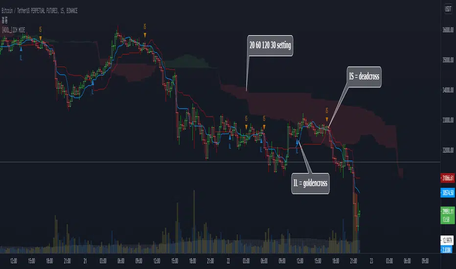
[ADOL_]DOUBLE ICHIMOKU MODEENG) Simple Cross Signal Indicator of Ichimoku Equilibrium
1. Concept
The basic concept of Ichimoku can be learned from the idea.
2. Principle
It is a double Ichimoku equilibrium in which the lengths of the indicators of the basic Ichimoku are different and integrated into a single indicator.
This provides some convenience for users with a limited number of metrics.
IL stands for Ichimoku long, which means the golden cross between the baseline and the transition line.
IS stands for Ichimoku short, which means the dead cross between the baseline and the transition line.
Since IL and IS are marked on a simple cross signal, it is recommended to overlap with other signals.
3. Optional
You can set the range you want to plot on the indicator.
4. Timeframe
Applicable to all timeframes. The time frame is related to the frequency of occurrence of the signal.
Recommended time frame: 15 minutes, 3-5 minutes
5. Alert
You can set alarms for the golden and dead crosses of the baseline and transition lines.
6. Trading method
By combining the trend break with the cross signal of the baseline and the transition line, it is a pre-ingress signal
You can use IL and IS.
7. Limits
Since filtering is not applied to simple cross signals on the indicator, trading that follows only cross signals has limitations.
8. Note
The indicator was created as open source.
Please be aware of the limitations of simple signal generation as above. You are solely responsible for any trading decisions you make.
All enhanced signals result in ARVIS.
KOR) 일목균형의 단순 크로스 신호 지표
1. 개념
일목균형에 대한 기본 개념은 해당 아이디어를 통해 학습할 수 있습니다.
2. 원리
기본 일목균형의 지표의 길이를 달리해서 하나의 지표로 통합한 더블 일목균형 입니다.
따라서 지표의 개수가 제한된 사용자에게 약간의 편의성을 제공합니다.
IL은 Ichimoku long의 약자로 기준선과 전환선의 골든크로스를 의미하며
IS는 Ichimoku short의 약자로 기준선과 전환선의 데드크로스를 의미합니다.
단순 교차 신호에 IL, IS를 표기한 것이므로 다른 신호와 중첩해서 사용할 것을 권장합니다.
3. 옵션
지표에 플로팅 하고자 하는 범위를 설정할 수 있습니다.
4. 타임프레임
모든 시간프레임에 적용가능합니다. 시간프레임은 신호의 발생빈도와 연관이 있습니다.
추천타임프레임 : 15분봉, 3-5분봉
5. 얼러트
기준선과 전환선의 골든크로스와 데드크로스에 알람을 설정할 수 있습니다.
6. 매매방법
기준선과 전환선의 크로스 신호에 Trend Break를 결합하여 추세선을 깨기 전의 선진입 신호로
IL과 IS를 활용 할 수 있습니다.
7. 한계
지표상 단순 크로스 신호는 필터링이 적용되지 않으므로 크로스 신호만을 따르는 매매는 한계가 발생합니다.
8. 참고
해당 지표는 오픈 소스로 제작되었습니다.
위와 같은 단순 신호발생의 한계를 인지하시기 바랍니다. 귀하가 내리는 모든 거래 결정은 전적으로 귀하의 책임입니다.
모든 향상된 신호는 ARVIS로 귀결됩니다.
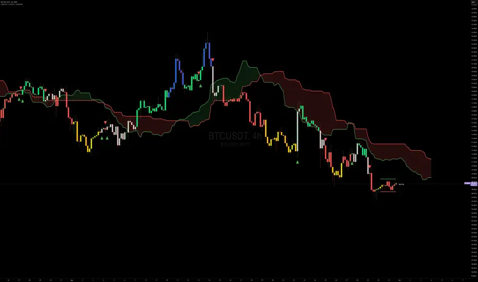
Capiba RSI + Ichimoku + VolatilidadeThe "Capiba RSI + Ichimoku + Volatility" indicator is a powerful, all-in-one technical analysis tool designed to provide traders with a comprehensive view of market dynamics directly on their price chart. This multi-layered indicator combines a custom Relative Strength Index (RSI), the trend-following Custom Ichimoku Cloud, and dynamic volatility lines to help identify high-probability trading setups.
How It Works
This indicator functions by overlaying three distinct, yet complementary, analysis systems onto a single chart, offering a clear and actionable perspective on a wide range of market conditions, from strong trends to periods of consolidation.
1. Custom RSI & Momentum Signals
The core of this indicator is a refined version of the Relative Strength Index (RSI). It calculates a custom Ultimate RSI that is more sensitive to price movements, offering a quicker response to potential shifts in momentum. The indicator also plots a moving average of this RSI, allowing for the generation of clear trading signals. Use RMAs.
Bar Coloring: The color of the price bars on your chart dynamically changes to reflect the underlying RSI momentum.
Blue bars indicate overbought conditions, suggesting trend and a potential short-term reversal.
Yellow bars indicate oversold conditions, hinting at a potential bounce.
Green bars signal bullish momentum, where the Custom RSI is above both 50 and its own moving average.
Red bars indicate bearish momentum, as the Custom RSI is below both 50 and its moving average.
Trading Signals: The indicator plots visual signals directly on the chart in the form of triangles to highlight key entry and exit points. A green triangle appears when the Custom RSI crosses above its moving average (a buy signal), while a red triangle marks a bearish crossunder (a sell signal).
2. Custom Ichimoku Cloud for Trend Confirmation
This component plots a standard Ichimoku Cloud directly on the chart, providing a forward-looking view of trend direction, momentum, and dynamic support and resistance levels.
The cloud’s color serves as a strong visual cue for the prevailing trend: a green cloud indicates a bullish trend, while a red cloud signals a bearish trend.
The cloud itself acts as a dynamic support or resistance zone. For example, in an uptrend, prices are expected to hold above the cloud, which provides a strong support level for the market.
3. Dynamic Volatility Lines
This final layer is a dynamic volatility channel that automatically plots the highest high and lowest low from a user-defined period. These lines create a visual representation of the recent price range, helping traders understand the current market volatility.
Volatility Ratio: A label is displayed on the chart showing a volatility ratio, which compares the current price range to a historical average. A high ratio indicates increasing volatility, while a low ratio suggests a period of price consolidation or lateral movement, a valuable insight for day traders.
The indicator is highly customizable, allowing you to adjust parameters like RSI length, overbought/oversold levels, Ichimoku periods, and volatility lookback periods to suit your personal trading strategy. It is an ideal tool for traders who rely on a combination of momentum, trend, and volatility to make well-informed decisions.
BG Ichimoku Tenkan & RSI MTF (Optimized)BG Ichimoku Tenkan & RSI MTF (Optimized)
The "BG Ichimoku Tenkan & RSI MTF (Optimized)" is a powerful and versatile TradingView indicator designed to provide multi-timeframe insights into market momentum using both the Tenkan-sen component of the Ichimoku Kinko Hyo and the Relative Strength Index (RSI). Developed by BAB & GINO, this tool helps traders quickly gauge trends and potential reversals across various timeframes directly on their chart.
Key Features and Functionality
This indicator combines visual clarity with comprehensive data presentation in a customizable table, making it easier to monitor multiple market dynamics at a glance.
Tenkan-sen Analysis
The Tenkan-sen (turning line) is a crucial part of the Ichimoku Kinko Hyo, calculated as the average of the highest high and lowest low over the past 9 periods. It serves as a short-term trend indicator.
Main Tenkan-sen Plot: The indicator displays the main Tenkan-sen line on your chart, colored dynamically to match the active chart's timeframe color for easy identification.
Multi-Timeframe (MTF) Tenkan Lines: You can enable additional Tenkan-sen lines for up to seven user-defined timeframes (e.g., 1m, 3m, 5m, 15m, 30m, 60m, 240m). These lines extend from the current bar with an adjustable offset, helping you visualize higher or lower timeframe Tenkan-sen levels relative to the current price.
MTF Line Labels: Each MTF Tenkan line can have a corresponding label indicating its timeframe (e.g., "1m", "3m"), with customizable size and offset for optimal visibility.
Tenkan Trend in Table: The indicator's integrated table clearly shows the current relationship between the Tenkan-sen and the price for each selected timeframe. An "🔼" symbol indicates the Tenkan-sen is above the price (bullish signal), while a "🔽" symbol indicates it's below (bearish signal), along with the Tenkan-sen's rounded value.
RSI Analysis
The Relative Strength Index (RSI) is a momentum oscillator that measures the speed and change of price movements. It typically ranges from 0 to 100 and is used to identify overbought or oversold conditions.
Customizable RSI Levels: You can set standard high (e.g., 60) and low (e.g., 40) RSI levels, as well as extreme high (e.g., 80) and extreme low (e.g., 20) levels to define zones of interest.
RSI Status in Table: The table provides a quick overview of the RSI value for each chosen timeframe, accompanied by intuitive emojis and symbols:
"🥵": Extremely overbought (above extreme high level)
"↑": Overbought (above high level)
"🥶": Extremely oversold (below extreme low level)
"↓": Oversold (below low level)
"-": Neutral (between high and low levels) The RSI value is also displayed, rounded to two decimal places.
Customizable Settings
The indicator offers extensive customization options through its input panel:
Table Position: Choose where the information table appears on your chart (Top Left, Top Right, Bottom Left, Bottom Right, Bottom Center).
Tenkan-sen Display: Toggle the visibility of the main Tenkan-sen line and the MTF Tenkan lines.
Line Offset: Adjust how far the MTF Tenkan lines extend from the current price bar.
MTF Label Settings: Control the visibility, size, and pixel offset of the MTF Tenkan line labels.
RSI Configuration: Define the RSI length and the thresholds for high, low, extreme high, and extreme low levels.
Table Text Size: Customize the font size within the indicator's table (Tiny, Small, Normal, Large).
Timeframe Selection: Independently set up to seven specific timeframes (in minutes) for both Tenkan and RSI analysis.
Timeframe Colors: Assign unique colors to each of the seven selected timeframes. These colors are used for the MTF Tenkan lines on the chart, the main Tenkan-sen line when its timeframe matches the chart, and the header cells in the information table, providing a consistent visual theme.
This "BG Ichimoku Tenkan & RSI MTF (Optimized)" indicator is a valuable tool for traders looking to enhance their market analysis with multi-timeframe confirmation, aiding in better-informed trading decisions.

BG Ichimoku Tenkan MTFBG Ichimoku Tenkan MTF: Your Multi-Timeframe Trend Compass
Elevate your Ichimoku analysis with the BG Ichimoku Tenkan MTF indicator. This powerful tool provides a comprehensive view of the Tenkan-sen (Conversion Line) across multiple timeframes, helping you identify trends and potential shifts with greater clarity. It's ideal for all markets, including stocks, cryptocurrencies, Forex, and futures.
Key Features:
Main Tenkan-sen Plot: Visualize the Tenkan-sen for your active chart timeframe with adjustable color.
Multi-Timeframe Table: A dynamic table displays the Tenkan-sen's relationship to price (🔼 for above, 🔽 for below) and its current value for up to 7 timeframes.
Continuous MTF Lines: Plot the Tenkan-sen from higher timeframes directly on your current chart, providing clear support/resistance levels and trend confluence.
Fully Customizable Colors: Personalize the color for each individual timeframe in the table and for its corresponding MTF line, ensuring a clean and intuitive visual experience. You can also adjust the main Tenkan-sen color and the MTF line offset.
Gain a deeper understanding of market dynamics by analyzing the Tenkan-sen across different time scales, all in one intuitive indicator.
We created this indicator to help you better navigate the markets. Thank you for using it, and we hope it brings you value. Enjoy it in your daily analysis!
Bab

[blackcat] L3 Ichimoku FusionCOMPREHENSIVE ANALYSIS OF THE L3 ICHIMOKU FUSION INDICATOR
🌐 Overview:
The L3 Ichimoku Fusion is a sophisticated multi-layered technical analysis tool integrating classic Japanese market forecasting techniques with enhanced dynamic elements designed specifically for identifying potential turning points in financial instruments' pricing action.
Key Purpose:
To provide traders with an intuitive yet powerful framework combining established ichimoku principles while incorporating additional validation checkpoints derived from cross-timeframe convergence studies.
THEORETICAL FOUNDATION EXPLAINED
🎓 Conceptual Background:
:
• Conversion & Base Lines tracking intermediate term averages
• Lagging Span providing delayed feedback mechanism
• Lead Spans projecting future equilibrium states
:
• Adaptive parameter scaling options
• Automated labeling system for critical junctures
• Real-time alert infrastructure enabling immediate response capability
PARAMETER CONFIGURATION GUIDE
⚙️ Input Parameters Explained In Detail:
Regional Setting Selection:**
→ Oriental Configuration: Standardized approach emphasizing slower oscillation cycles
→ Occidental Variation: Optimized settings reducing lag characteristics typical of original methodology
Multiplier Adjustment Functionality:**
↔ Allows fine-graining oscillator responsiveness without altering core relationship dynamics
↕ Enables adaptation to various instrument volatility profiles efficiently
Displacement Value Control:**
↓ Controls lead/lag offset positioning relative to current prices
↑ Provides flexibility in adjusting visual representation alignment preferences
DYNAMIC CALCULATION PROCESSES
💻 Algorithmic Foundation:
:
Utilizes highest/lowest extremes over specified lookback windows
Produces more responsive conversions compared to simple MAs
:
→ Confirms directional bias across multiple independent criteria
← Ensures higher probability outcomes reduce random noise influence
:
♾ Creates persistent annotations documenting significant events
🔄 Handles complex state transitions maintaining historical record integrity
VISUALIZATION COMPONENTS OVERVIEW
🎨 Display Architecture Details:
:
→ Solid colored trendlines representing conversion/base relationships
↑ Fill effect overlay differentiating expansion/compression phases
↔ Offset spans positioned according to calculated displacement values
:
→ Green shading indicates positive configuration scenarios
↘ Red filling highlights negative arrangement situations
⟳ Orange transition areas mark transitional periods requiring caution
:
✔️ LE: Long Entry opportunity confirmed
❌ SE: Short Setup validated
☑ XL/XS: Position closure triggers active
✓ RL/RS: Potential re-entry chances emerging
STRATEGIC APPLICATION FRAMEWORK
📋 Practical Deployment Guidelines:
Initial Integration Phase:
Select appropriate timeframe matching trading horizon preference
Configure input parameters aligning with target asset behavior traits
Test thoroughly under simulated conditions prior to live usage
Active Monitoring Procedures:
• Regular observation of cloud formation evolution
• Tracking label placements against actual price movements
• Noting pattern development leading up to signaled entry/exit moments
Decision Making Process Flowchart:
→ Identify clear breakout/crossover events exceeding confirmation thresholds
← Evaluate contextual factors supporting/rejecting indicated direction
↑ Execute trades only after achieving required number of confirming inputs
PERFORMANCE OPTIMIZATION TECHNIQUES
🚀 Refinement Strategies:
Calibration Optimization Approach:
→ Start testing with default suggested configurations
↓ Gradually adjust individual components observing outcome changes
↑ Document findings systematically building personalized version profile
Context Adaptability Methods:
➕ Add supplementary indicators enhancing overall reliability
➖ Remove unnecessary complexity layers if causing confusion
✨ Incorporate custom rules adapting to specific security behaviors
Efficiency Improvement Tactics:
🔧 Streamline redundant processing routines where possible
♻️ Leverage shared data streams whenever feasible
⚡ Optimize refresh frequencies balancing update speed vs computational load
RISK MITIGATION PROTOCOLS
🛡️ Safety Measures Implementation Guide:
Position Sizing Principles:
∅ Never exceed preset maximum exposure limits defined by risk tolerance
± Scale positions proportionally per account size/market capitalization
× Include slippage allowances within planning stages accounting for liquidity variations
Validation Requirements Hierarchy:
☐ Verify signals meet minimum number of concurrent validations
⛔ Ignore isolated occurrences lacking adequate evidence backing
▶ Look for convergent evidence strengthening conviction level
Emergency Response Planning:
↩ Establish predefined exit strategies including trailing stops mechanisms
🌀 Plan worst-case scenario responses ahead avoiding panic reactions
⇄ Maintain contingency plans addressing unexpected adverse developments
USER EXPERIENCE ENHANCEMENT FEATURES
🌟 Additional Utility Functions:
Alert System Infrastructure:
→ Automatic notifications delivered directly to user devices
↑ Message content customized explaining triggered condition specifics
↔ Timing optimization ensuring minimal missed opportunities due to latency issues
Historical Review Capability:
→ Ability to analyze past performance retrospectively
↓ Assess effectiveness across varying market regimes objectively
↗ Generate statistics measuring success/failure rates quantitatively
Community Collaboration Support:
↪ Share personal optimizations benefiting wider trader community
↔ Exchange experiences improving collective understanding base
✍️ Provide constructive feedback aiding ongoing refinement process
CONCLUSION AND NEXT STEPS
This comprehensive guide serves as your roadmap toward mastering the capabilities offered by the L3 Ichimoku Fusion indicator effectively. Success relies heavily on disciplined application combined with continuous learning and adjustment processes throughout implementation journey.
Wishing you prosperous trading endeavors! 👋💰

DenP Ichimoku Interpreter (DII)A simple indicator using Ishimoku as a basis, giving entry and exit signals.
Components of the Ichimoku Cloud
The Ichimoku system consists of multiple lines that help traders understand market trends, momentum, and potential reversals.
1. Tenkan-Sen (Conversion Line) - Blue
Formula: (Highest High + Lowest Low) / 2 over the last 9 periods (default).
Purpose: Measures short-term trend direction.
Interpretation:
Upward movement: Indicates bullish momentum.
Downward movement: Indicates bearish momentum.
Flat line: Indicates consolidation.
2. Kijun-Sen (Base Line) - Red
Formula: (Highest High + Lowest Low) / 2 over the last 26 periods (default).
Purpose: Represents medium-term trend.
Interpretation:
Price above Kijun-Sen: Bullish signal.
Price below Kijun-Sen: Bearish signal.
Flat Kijun-Sen: Market in consolidation.
3. Senkou Span A (Leading Span A) - Light Green
Formula: (Tenkan-Sen + Kijun-Sen) / 2, plotted 26 periods ahead.
Purpose: Forms one of the Ichimoku Cloud boundaries.
Interpretation:
If Senkou Span A is rising, the market is bullish.
If Senkou Span A is falling, the market is bearish.
4. Senkou Span B (Leading Span B) - Light Red
Formula: (Highest High + Lowest Low) / 2 over the last 52 periods, plotted 26 periods ahead.
Purpose: Forms the second boundary of the Ichimoku Cloud.
Interpretation:
If price is above the cloud, the market is in a strong uptrend.
If price is below the cloud, the market is in a strong downtrend.
If price is inside the cloud, the market is consolidating.
5. Kumo (Cloud)
The area between Senkou Span A and Senkou Span B is shaded.
Green Cloud (Span A above Span B): Bullish trend.
Red Cloud (Span B above Span A): Bearish trend.
The thickness of the cloud represents market volatility.
6. Chikou Span (Lagging Line) - Green
Formula: Current closing price plotted 26 periods back.
Purpose: Confirms trend direction.
Interpretation:
Chikou Span above price 26 periods ago: Bullish.
Chikou Span below price 26 periods ago: Bearish.
Buy and Sell Conditions
The indicator generates buy and sell signals based on Ichimoku components.
1. Kijun Cross (Medium-Term Trend)
Buy Signal: When the closing price crosses above the Kijun-Sen (red line).
Sell Signal: When the closing price crosses below the Kijun-Sen.
2. Cloud Breakout (Senkou Span Cross)
Buy Signal:
When Senkou Span A is above Senkou Span B, and the price crosses above the cloud.
Indicates a strong uptrend.
Sell Signal:
When Senkou Span B is above Senkou Span A, and the price crosses below the cloud.
Indicates a strong downtrend.
3. Chikou Span Confirmation (Momentum Confirmation)
Buy Signal:
If Chikou Span (green) crosses above past price action, it confirms a bullish trend.
Used to validate Kijun and Cloud Buy signals.
Sell Signal:
If Chikou Span crosses below past price action, it confirms a bearish trend.
Visual Signals
The indicator plots triangles on the chart to indicate buy and sell signals:
Kijun Buy Signal: Upward triangle (green).
Kijun Sell Signal: Downward triangle (red).
Cloud Buy Signal: Upward triangle (green) near the cloud.
Cloud Sell Signal: Downward triangle (red) near the cloud.
Chikou Confirmation Buy: Upward triangle (green, confirming previous signals).
Chikou Confirmation Sell: Downward triangle (red, confirming previous signals).
Additional Features
Customizable Colors & Settings: Users can adjust colors, time periods, and display settings.
On-Chart Table: Displays current trend interpretations for easy reference.
How to Use the Indicator?
Check the Cloud Position:
Price above the cloud = bullish.
Price below the cloud = bearish.
Price inside the cloud = consolidation.
Look for Kijun Crosses:
Buy when price crosses above Kijun-Sen.
Sell when price crosses below Kijun-Sen.
Confirm with Chikou Span:
If Chikou Span supports the buy/sell signal, it's more reliable.
Use Cloud Breakouts for Trend Reversals:
If price moves from below to above the cloud = strong buy.
If price moves from above to below the cloud = strong sell.

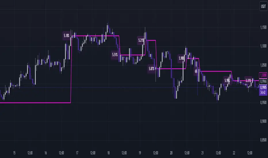
SMA Ichimoku CrossesSMA Ichimoku Crosses displays the moving average between the last two crossings of the Tenkan-Sen and Kijun-Sen lines from Ichimoku Kinko Hyo. The line is calculated based on the closing prices at the time of the crossings and is added directly to the price chart, making it a convenient tool for trend analysis and identifying entry and exit points.
Features:
- Automatic calculation of Tenkan-Sen and Kijun-Sen lines.
- Fixation of closing prices at the point of line crossings.
- Calculation of the average price between the last two crossings.
- Display of a pink line on the price chart for convenient analysis.
How to use:
- Identify potential trend reversal zones by observing the line’s position relative to the price.
- Use the line as a dynamic level of support or resistance.
- Include the indicator in your Ichimoku strategies to enhance the accuracy of signals.
Suitable for:
- Traders using Ichimoku in their trading.
- Trend analysis enthusiasts.
- Those looking for additional filters for entry and exit points.
B4Signals Ichimoku Premium Addon Kyushu Sushi RollKyushu Ashi, one of the Ichimoku strategies, was initially presented in the Ichimoku Kinko Hyo Weekly book by Goichi Hosoda.
<< Historical Context >>
During his time contributing market analysis to the Miyako Newspaper, traders faced the laborious task of manually recording daily open, close, high, and low price levels, alongside the five price values of Ichimoku (Tenkan sen, Kijun sen, Chiko span, Senko span A, Senko span B). With the absence of personal computers, this process was notably cumbersome. In response to traders' requests for a simplified analysis method, Goichi Hosoda introduced the Kyushu Ashi technique.
<< About Kyushu Ashi >>
Derived from Japanese, where "Kyu" denotes nine, "Shu" refers to week, and "Ashi" translates to candles, Kyushu Ashi aims to identify market reversals and trend continuations by leveraging Kihon Suchi time cycles. However, as stated in the original book, trading solely with Kyushu Ashi is not advisable; it is recommended to combine it with the Ichimoku's five lines for a comprehensive trading approach.
Our indicator enhances the Kyushu Ashi strategy by incorporating the original signals in a simplified manner showing up or down carrets in the legs. Additionally, it colors candles with no signals, enabling traders to spot areas of consolidation, continuation, and trend reversal effectively. Drawing inspiration from Fisher's Sushi Roll indicator, our tool identifies these trend changes and adds a trend cloud for the prevailing trend. This comprehensive approach maximizes the effectiveness of the Kyushu Ashi strategy and assists traders in making informed trading decisions.
This is an advanced version with the following features:
- Shows Kyushu Legs
- Shows Kyushu Leg signals
- Draws trend cloud based on Kyushu Legs
- Sends alerts when no Kyushu signal is present, alerting trader of consolidation
- Colors No Kyushu signal candles
- Draws dynamic consolidation zones for breakout identification
Combo Ichimoku + CDC Action Zone by fukuizThis indicator combines the famous indicators Ichimoku and CDC ActionZone.
#A brief introduction to Ichimoku #
The Ichimoku Cloud is a collection of technical indicators that show support and resistance levels, as well as momentum and trend direction. It does this by taking multiple averages and plotting them on a chart. It also uses these figures to compute a “cloud” that attempts to forecast where the price may find support or resistance in the future.
#A brief introduction to CDC ActionZone #
CDC ActionZone is a very simple system, utilizing just two exponential moving averages. The 'zones' in which different 'actions' should be taken are highlighted in different colors. Calculations for the zones
They are based on the relative position of price to the two EMA lines and the relationship between the two EMAs.
The CDC ActionZone was developed by Piriya333, a Thai technical analyst.
#How to use #
The basic method for using Ichimoku+CDC ActionZone is to follow the green/red color and the cloud.
Buy condition
-Buy when the bar closes in green and closes above the cloud
Sell condition
-sell when the bar closes in red.

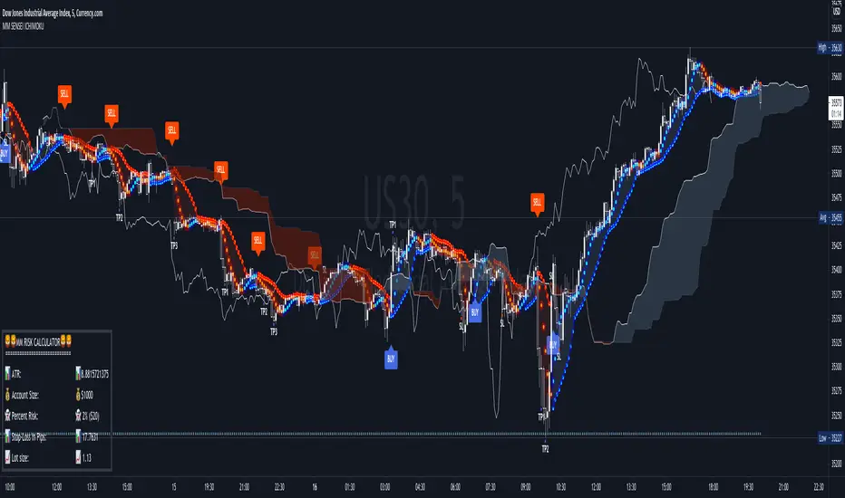
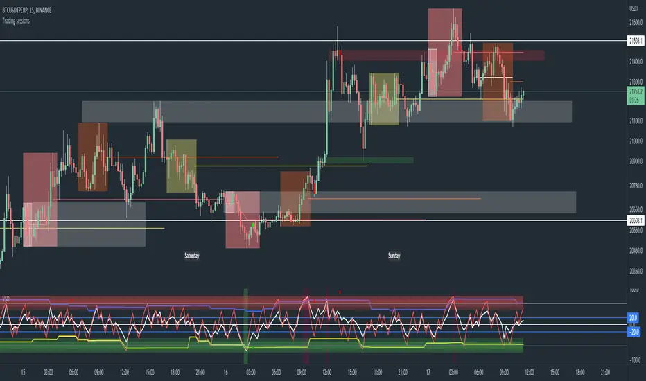
Trading sessions, Ichimoku and Classic Pivots█ OVERVIEW
This a self contained intraday trading style for crypto/forex made to be on and traded on 15-min.
This Script Creates a box around each major session to a trading range, include highlights for the first 12 15-min candles, classic Pivot points and ichimoku cloud.
█ CONCEPTS
1 — Session boxes and ranges are based of the times from Steve from Beat the market maker, and you have the option in setting to have an extension for the high/low until the start of the next box calculation.
2 — 12 candle window, this marks the first 3 hours after a open;
The first hour - stop hunt
The second hour - big moves
The third hour - tend continuation or reversal
3 — The Days of the weeks are labelled and coloured;
Weekends are in grey, ideally no trade days.
Monday, Tuesday, Thursday are green, to mark the week days
Wednesday is red to be mindful of mid week reversal
Friday is red to mark the end of week
4 — Ichimoku cloud, by default the only thing visible is the kumo cloud, but in setting you can turn the line back on. Ichimoku proves a great mark for areas to look for support and resistances.
5 — Lastly, you have classic pivots, by default they are extend to the right and on weekly, Each level act as support and resistance. Look for Bullish momentum at R3 for a larger moves to the upside.
Ichimoku and the pivot are here mainly for when you want to do higher time frame analysis.
█ OTHER SECTIONS
• HOW TO USE
Example of a trade
**Key thing to remember is London will set the high in a down trend and the low in an up trend
you can see the first hour look for stops and stopped at 50% of the range set coming into the session, the second hour a big move to the down side hitting 200% expansion then the third hour reversal stopping wick up then
back down from from London low. before continuing down.
• LIMITATIONS: I have not test this on Stock, as I have a different strategies for those market
• NOTES : I know a lot of people have moving averages on their chart, I have another separate one with all MA types, and it something that will not fit into one script, Other things you can add with this Bollinger bands, and
fib tool with 50%, 100%, 150% and 200%
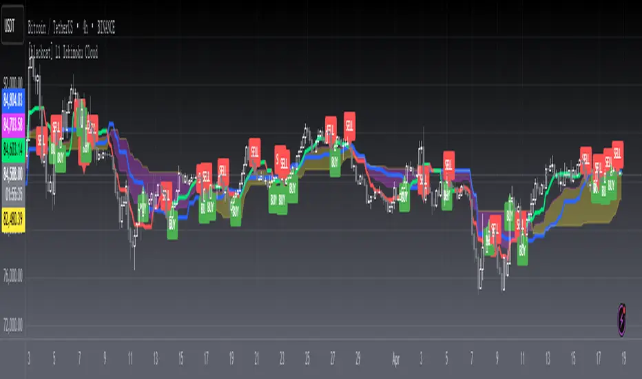
[blackcat] L1 Ichimoku CloudLevel: 1
Background
In Muranaka's article, "Ichimoku Cloud" was described. It contains Ichimoku - Lines and Ichimoku - Cloud.
Function
In the article, Muranaka states that the "market has improved when the delayed line is above the closing prices at that past date." Thus, for this indicator, when the delayed line is above the closing prices at the past date, the turning line will be Green. When the delayed line is below the closing prices at the past date, the turning line will be Red. I eliminate the need to display the delayed line (Silver color). Of course, you can choose to display the delayed line by setting the ShowDelayLine input to true.
Key Signal
Standard Line --> Blue line;
Turning Line --> Green and Red;
Delayed --> Not shown, Silver.
Span1 and Span 2 --> Ichimoku Cloud, Yellow for up trend and Fuchsia for down trend.
Remarks
This is a Level 1 free and open source indicator.
Feedbacks are appreciated.
[Zekis]Squeeze Momentum + IchimokuHi,
This is a strategy developed by @zsone, a strategy suitable mostly for altcoins (but not necessary).
The strategy is using the following indicators: Squeeze Momentum (LazyBear), two Ichimoku Clouds (one is MTF), daily EMA21 and EMA golden cross (optionally).
Setting should be used as default.
Rules for entries (scalping):
Go Long (green line on the histogram):
- use low time frames (3m, 5m, 15m)
- candle closes above the ichimoku cloud
- squeeze momentum, first grey cross on green histogram (2 ways):
1. histogram is green and have a black cross and later it turns to grey cross
2. the histogram is red with grey cross and it goes to green with grey cross without having a black cross, just directly goes green histogram with grey cross
- price is above the daily EMA21
- price is above or inside de ichimoku cloud MTF (1h TF)
- optionally! EMA golden/death cross
Go Short (red line on the histogram):
- vice versa
Rules for exits:
- DI+ crosses down on DI- on longs
- DI- crosses up on DI+ on shorts
- or any fixed, dynamic, trailing... TP/SL (according to the market conditions)
This strategy can be used also for high time frames (12h, 1D) with a golden/death cross confirmation.
Soon I will publish a screener that scan multiple altcoins at once to find setups easier.
P.S.1 The strategy should be used with it's default settings/values (you can change them if you want), but there are 2 versions of Squeeze Momentum from Lazy Bear that you can choose from.
P.S.2 This is not a magic strategy, please do your research before using real money!
P.S.3 The strategy is free to use, just add it to the favorites and then to the chart.
Enjoy!

VOLUME CANDLE ICHIMOKU v1.0 @aliakbariHello guys,
"Volume Candle Ichimoku v1.0" as an auxiliary indicator can be used to get confirmation with your trading strategy.
For example, when your strategy gives a BUY signal and the price is moving up but "Volume Candle Ichimoku" gives low volume signal, we can conclude that something is wrong and probably price movement is not strong enough or vice versa to make sure the price movement is strong enough.
You can get signal from (1) exiting volume candles from Ichimoku clouds, (2) crossing of conversion and base line or (3) lagging span line.
* For each chart, check on which timeframe you will receive better signals.
This is an early version and more efficient versions will be released in the future.
Your comments and suggestions will be greatly appreciated.
Good Luck,
Ali Akbari

NewMexCapital Trading Pack 1 - BB, MA, TD, ICHIMOKUWe have compiled in one indicator some of the most reliable tools (BB, MAs, ICHIMOKU, TD, W/D high-low) that can be added on the chart (overlay = true).
This is very useful when for example you want to add multiple MA's (HMA, EMA, Zerolag MA, RMA, SineWMA etc) and you want to quickly switch between them. Available types of moving averages: Double EMA, EMA, Triple EMA, HullMA, RSI MA, Simple MA, Smoothed MA, Sine WMA, WMA, ZeroLag EMA, Volume WMA. You can also add offset and choose the source for each MA.
Bollinger Bands are now very customisable. You can choose the type of MA used for creating the bands, you can choose the source for that MA and you can choose different options for each band for example you can set the upper band to be calculated based on SMA 20 with HIGH as a source and the lower band to be calculated based on EMA 25 with LOW as a source. You can also define a buy or sell line above or below the line with "Buy Value" and "Sell Value" inputs. This upgrade is based on modhelius's advanced Bollinger Bands script.
Ichimoku, T.D., weekly/daily high low have the original code without any modifications. Ichimoku uses by default the settings for crypto.
This indicator is free to use.

CryptoVN - Ichimoku Cloud Triple ConfirmationThe Ichimoku Cloud Triple Confirmation Indicator.
I created this at the request of the professional trader to use for analyzing and confirming the signal from the market.
We'll used to 03 Ichimoku Cloud with the settings like this:
Ichimoku Cloud 1: 9, 26, 52, 26 (default)
Ichimoku Cloud 2: 20 60 120 30
Ichimoku Cloud 3: Used only Base line = 65
(*) The Trend Is Your Friend. TRADE WHAT YOU SEE, NOT WHAT YOU THINK.
Price Forecast - Future price Ichimoku ATR RSI Kumo It predicts
Future price (projected close)
future high-low (ATR projection)
Ichimoku Future Span overlay
alerts "future price above/below threshold".
Ichimoku Kumo Projection (Leading Span A & B). Senkou Span A (Future A) Senkou Span B (Future B).
ATR Projection Channel (ATR Bands/Volatility Forecast).
Linear regression forecast for +1 bar.
Multi timeframe
RSI+Kumo filter for clearer signals.

P-Ichimoku MTF++English:
Ichimoku indicator on the 4-hour and weekly timeframes is a powerful tool for analyzing market trends and potential reversals. The weekly chart highlights the long-term trend and major support-resistance levels, while the 4-hour chart is ideal for spotting short-term trading opportunities. Crosses of the Tenkan-sen and Kijun-sen lines, as well as the price position relative to the cloud, provide specific signals. Using Ichimoku on multiple timeframes helps traders see both the big picture and short-term opportunities.

Moving Average With Ichimoku and Rsi hey guys
i post this indicator for who like Ma-Wma-Ichi-Rsi
i used most important Ma on it .
you can see overbuy or oversold on Rsi with a Ob-Os alarm on candel
ichimoku cloud is based on crypto setup
Enjoy
Dont forget to leave a like
~~~~~~~~~~~~~~~~~~~~~~~~~~~~~~~~~~~~~~~~~~~~~~~~~~~~~~~~~~~~~~~~~~~~~
RSi :
Rsi Signals its based on Rsi oscillator that mean you can see when market is overbuy or oversell
note : its not Buy or Sell Signal indicator (please dont use it for finding entry or exit )
~~~~~~~~~~~~~~~~~~~~~~~~~~~~~~~~~~~~~~~~~~~~~~~~~~~~~~~~~~~~~~~~~~~~
Ema-Sma-Wma :
An exponential moving average (EMA) is a type of moving average (MA) that places a greater weight and significance on the most recent data points. The exponential moving average is also referred to as the exponentially weighted moving average. An exponentially weighted moving average reacts more significantly to recent price changes than a simple moving average (SMA), which applies an equal weight to all observations in the period.
~~~~~~~~~~~~~~~~~~~~~~~~~~~~~~~~~~~~~~~~~~~~~~~~~~~~~~~~~~~~~~~~~~~~~~
ichimoku cloud :
My setup on this is different with default setup . which mean i used best setup for crypto to allow you take best result from it .
note : default setup is 9-26-52-26 and my setup is 20-60-120-30
dont forget to follow me and like this post !