NQ Session High-Low + Buy Sell Signalsbuy sell signals with session high low .. it will give you more confirmation when to enter or exit with keeping your loss at minimum and making more profitsPine Script® göstergesibalwindermavi tarafından4
Previous Daily/Weekly High-Low levelsSimply charts Previous Daily/Weekly High-Low levelsPine Script® göstergesinjb77trading tarafından3
Previous Daily/Weekly High-Low levelsSimply charts Previous Daily/Weekly High-Low levelsPine Script® göstergesinjb77trading tarafından7
Previous Day LevelsPlot previous day High, Low and Close as horizontal lines. Pine Script® göstergesipradeep4130 tarafından27
25 EMA High-Low Band with 200 EMA by Basanta25 EMA High-Low Band with 200 EMA by Basanta. This indicator is purely for Trend Trading by observing the Exponential moving average 200. When the price is above EMA 200 it is considered Bullish and When the price is below EMA 200 it is considered Bearish. Entry will be made in pullback of 25 EMA.Pine Script® göstergesiSpringwind123 tarafından9
Weekly Levels: High/Low/Mid/POCThis is a simple indicator that plots each week (up to 4 weeks) with the high,low, mid point and a customizable POC. Weeks can be toggled on and off and it has a developing level for the current week. I find these levels valuable in day trading and thought automating them would be ideal.Pine Script® göstergesiJNChristie tarafındanGüncellendi 26
Pivot Points High Low (With confirm bar)This script simply adds a visual circle confirmation to visualise the bar when the pivot has been confirmed. It's based on Pivot Points High Low scripts Pine Script® göstergesiWised123 tarafından607
Swing High Low ZigZag v3.0 BajaSwing High/Low Pivot - Designed to help easily spot peaks and bottoms for quicker drawing of trendlines and other drawings as well as alerts without needing to zoom in a whole lot. Pine Script® göstergesiBajaRookie tarafından30
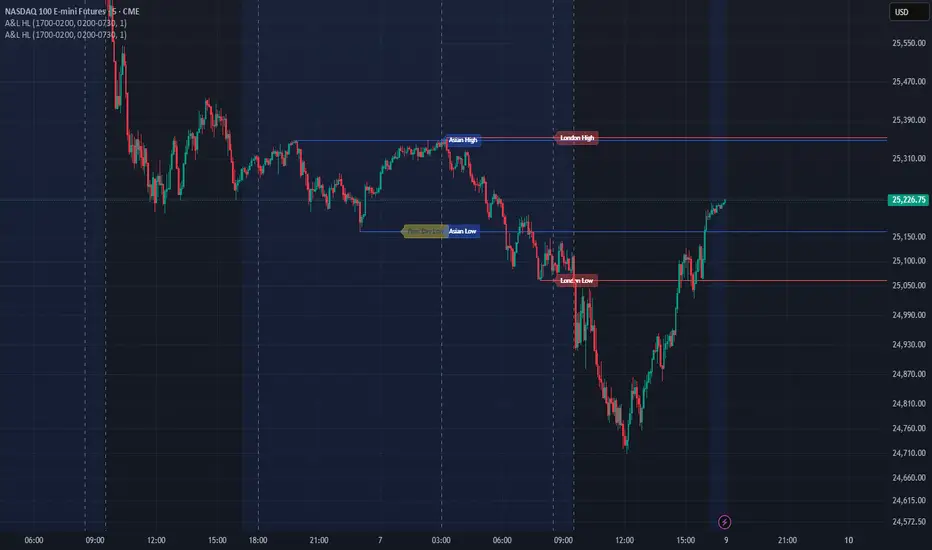
Asian & London Session Highs/LowsThis will help you spot session highs/lows to help you get draws on liq Pine Script® göstergesiairblake01 tarafından1129
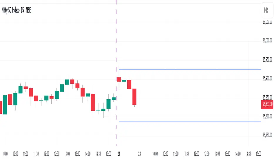
Previous day high lowThis script Identifies and draw Previous day High low on 15 min Intra day chartPine Script® göstergesiturare tarafından11
Vortag High/LowThe script displays the previous day's high/low during trading hours from 9:30 to 16:00 EST. This gives us a clean chart.Pine Script® göstergesiybsjy2tbpg tarafındanGüncellendi 11
Customisable Asia & London Session High/Low (UTC+1)london + asia high / low can customise however you like. its not perfect but saves time Pine Script® göstergesiJkg54321 tarafından11
Multiple Session Pre-market High/LowThis indicator marks each day’s pre-market range and projects it into the opening move so you can see how price reacts after the bell. It tracks the **pre-market high/low** within a user-defined window (default **04:00–09:29 ET**) and, at **09:30 ET**, draws two solid horizontal lines from **09:30 to 11:00 ET** at those levels. For additional context, you can optionally show matching **dotted lines** across the pre-market window itself. Everything is anchored to **America/New\_York** time (DST-safe), and colors/widths for both the RTH and pre-market lines are fully customizable. It’s built for **back testing and review**: levels are finalized at 09:30 and **do not repaint**, so what you see historically is what you would have had live. Use it to study opening drive behavior, VWAP/OR confluence, gap fills, and rejection/acceptance around the pre-market extremes. Works on any intraday timeframe; for stocks, enable **Extended Hours** so the 04:00–09:29 bars are available (futures usually include them by default). Adjust the pre-market start/end inputs to match your playbook (e.g., 07:00–09:29) and evaluate your strategies consistently across months of data. Pine Script® göstergesibigislandconstruction tarafından8
xmtr's session highs/lowsMarks Asia & London session highs/lows with precision + PDH/PDL for daily context. Fully customizable & perfect for all traders.Pine Script® göstergesitrobecmiha2 tarafındanGüncellendi 1152
Premarket High/Low Label ImprovedPremarket High/Low Label Improved. hope it helps :)Pine Script® göstergesihermanmak tarafından10
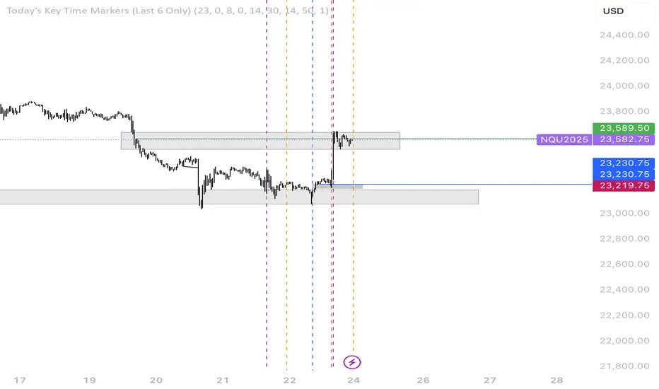
6E update Premarket High/Low Label (CME 6E style)6E update Premarket High/Low Label (CME 6E style). hope it helps :)Pine Script® göstergesihermanmak tarafından2
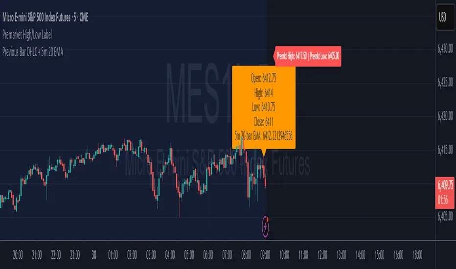
Premarket High/Low LabelThis is the premarket high low label that will persist through current trading session. hope it helps :)Pine Script® göstergesihermanmak tarafından5
Premarket High/Low LabelThis is an indicator which shows premarket high/low label. so that you dont have to do it yourself. hope it helps :)Pine Script® göstergesihermanmak tarafından1118
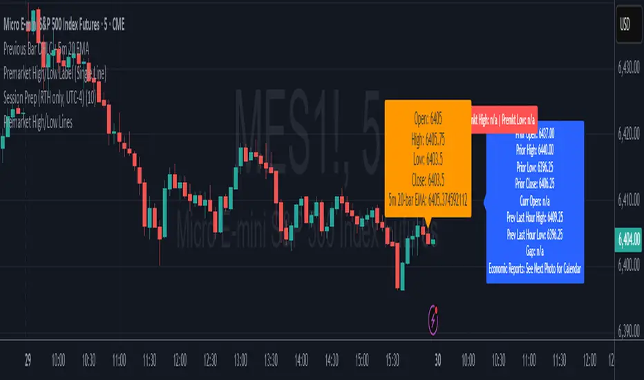
Premarket High/Low Label (Single Line)it shows you what the premarket high low label is on a single line, saving you the hassale of fidning it yourself. :) hope it helps.Pine Script® göstergesihermanmak tarafından4
5m Gold Strategy - Session Break + Previous Day High/LowHere is your complete Pine Script v5 code for TradingView that: Implements your 5-minute Gold breakout strategy. Uses previous day high/low levels. Confirms entry based on 15-minute SMA trend (SMA 9 > SMA 21). Marks session time. Filters news time (pause trading 15 minutes before/after major red news from ForexFactory).Pine Script® göstergesiMasterMind_Forex_Futures tarafından35
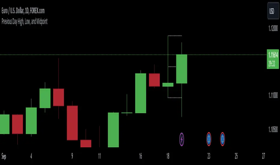
Previous Day High, Low, and Midpointshows yesterdays high low and midpoint elimainating the need to use the fib tool every dayPine Script® göstergesiunusualsuspects tarafından1174
Day Open,High,Low Fib LevelsDay Open,High,Low Fibonacci Levels indicator depicts Fibonacci levels from Highest to lowest price levels vis-à-vis Day Open Price. The indicator is structured based on default Intraday number of bars. Hence the indicator and Gray Zone concept is effective in lower time frames .The indicator has also “Regular” Check in Box option under “Input” with default 14 bars under “Regular Length” to switch over from default Intraday Length. Green Zone represent area above Day Open Price when close is above Day Open Price. Red Zone represent area below Day Open Price when close is below Day Open Price. Gray Zone represent band within the Maximum and Minimum of Moving Averages of MA24,MA38,MA50,MA62,MA79 drawn with relevance to Fibonacci levels. The movement within this band is expected to be resistant prone on either direction. Fibonacci levels between Highest and Lowest points during Green Zone and Red Zone are derived and reflected at 78.6,61.8,50.0,38.2 and 23.6 levels for users guidance. Trades above Gray Zone are favored for Buy trades and below Gray Zone are favored for Sell trades. Trades within Gray Zone are resistant prone from either direction. If number of bars in Gray Zone during Intraday are more than the combined number of bars above Green Zone and number of bras below Gray Zone then market may be assumed to be in Range bound state. MA20 and MA200 are in default in display state. Position of MA 20 above and below Gray Zone and vis-à-vis MA Mid (Mid point in Gray Zone ) reflects the prevailing trend .MA 200 reflects the general Up trend or Down trend . The Indicator reflects the Green Zone, Gray Zone ,Red Zone in the Table below the Chart depending on the position of Day Open Price below or above the Last Price .If the number of bars in the Gray Zone are more than the combined number of bars above and below Gray Zone the table reflect Range Bound Market. Supplementing with other monitoring tools and Price Action dynamics the indicator assist the user to plan his entry and exit of trade based on the position of the market whether it is in Green Zone or Red Zone by taking into account the Fibonacci Levels. DISCLAIMER : For educational and entertainment purpose only .Nothing in this content should be interpreted as financial advice or a recommendation to buy or sell any sort of security/ies or investment/s. Pine Script® göstergesiavsr90 tarafındanGüncellendi 1199
HLM Trend Line (High-Low-Midpoint / Ichimoku Line)Ichimoku style trend line . Some strategies call for a custom Ichimoku style line (midpoint of range's high/low). This allows you to use or replace a single line without having to customize a full Ichimoku setup. Pine Script® göstergesiJollyWizard tarafındanGüncellendi 40