"gann" için komut dosyalarını ara
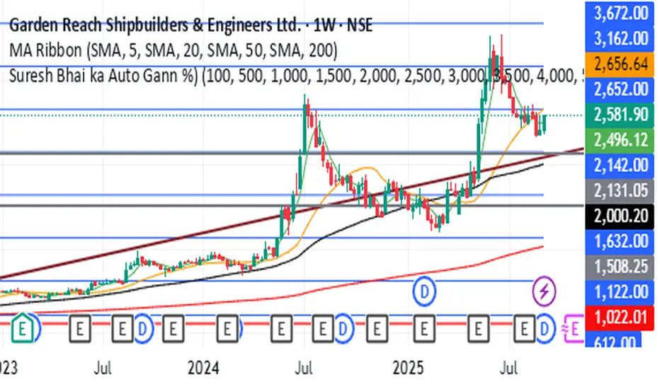
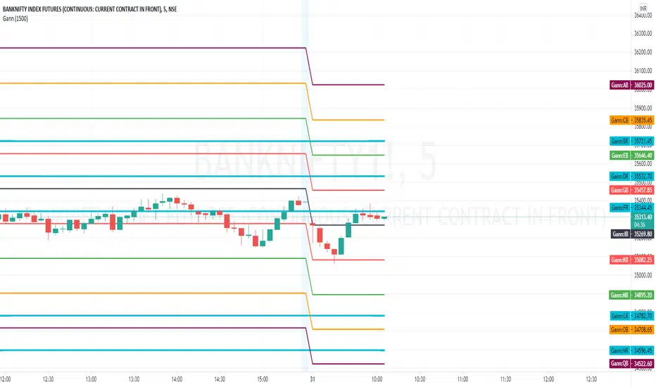
Gann Square NumberFor Backteting Purpose Only,
Its Important date is High and low is very imporatnt and if breck any side most problebly movenebt will get so this type of trade will getting from this indicator,
just for education purpose only its not any trade recommadatio

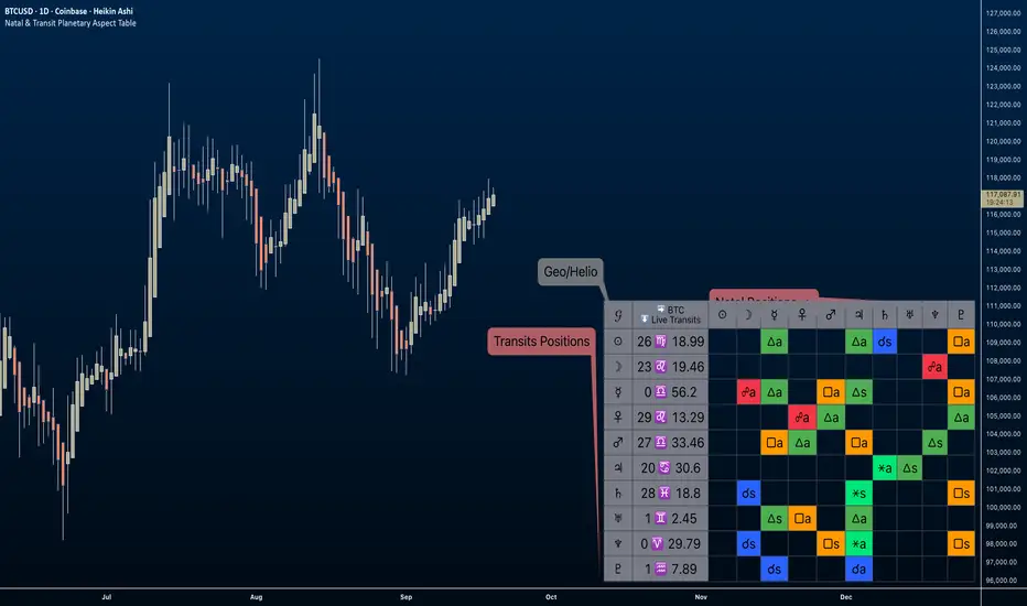
Natal & Transit Planetary Aspect Table📐 Natal & Transit Planetary Aspect Table
This open-source TradingView indicator displays a customizable table of astrological aspects between natal (first trade or custom date) planetary positions and current/live transits. Built in Pine Script v6, it leverages the AstroLib library for accurate geocentric or heliocentric longitude calculations, supporting a range of financial assets and historical events. Ideal for astro-finance enthusiasts, it highlights major and minor aspects with orbs, applying/separating status, and color-coded visuals. Supports 10 planetary bodies in geocentric mode (Sun, Moon, Mercury, Venus, Mars, Jupiter, Saturn, Uranus, Neptune, Pluto) or 11 in heliocentric mode (adds Earth).
Why Use This Indicator?
Astrology offers a unique lens for market analysis by examining planetary alignments relative to an asset's "birth" date (e.g., first trade), potentially revealing cycles, trends, and timing insights that complement technical and fundamental strategies. This tool empowers traders to integrate astro-finance principles, visualizing cosmic influences that may correlate with price movements, reversals, or volatility—backed by historical presets and customizable options for personalized research.
Key Features:
- 23 preset natal dates for assets like BTC, ETH, NYSE, and more (e.g., BTC genesis block on 2009-01-03), with credits to Susan Abbott Gidel for most of the first trade dates from her book " Trading In Sync With Commodities: Introducing Astrology To Your Technical Toolbox ."
- Manual natal and transit timestamp inputs for flexibility.
- Supports geocentric (default) or heliocentric views (displayed as 𝒢 or ℋ in the table), with adjustable observer location (latitude, longitude, timezone).
- Configurable aspects: Conjunction (☌), Opposition (☍), Trine (△), Square (□), Sextile (⚹), and minors like Semi-Sextile (⚺), Quincunx (⚻), etc., with user-defined orbs and colors.
- Applying (a) or separating (s) status is determined by comparing the orb on the current bar to the previous one—if decreasing, applying; if increasing, separating. This simplified approach may differ from traditional astrological methods that consider planetary speeds, directions (direct/retrograde), and which body is faster/slower.
- Table displays planet symbols or names, degrees/signs with tooltips showing exact longitude (e.g., hovering over a planet symbol reveals its precise degree), and aspect symbols/tags (e.g., ⚹a for applying sextile).
- Tooltip on the dates cell to view the exact transit and natal dates for easy tracking.
- Live mode updates with chart timeframe; test mode allows the user to move the transit date historically or to the future via a custom timestamp.
- Customizable table position, text size, colors, and visibility.
How to Use:
1. Add the indicator to your TradingView chart.
2. Select a preset or manual natal date in settings.
3. Choose live transits or test mode with a custom timestamp.
4. Enable/disable aspects and adjust orbs/colors as needed.
5. Hover over cells for detailed tooltips (e.g., exact orb and applying/separating status).
Powered by @BarefootJoey AstroLib for ephemeris data. For best accuracy, verify positions against external sources.
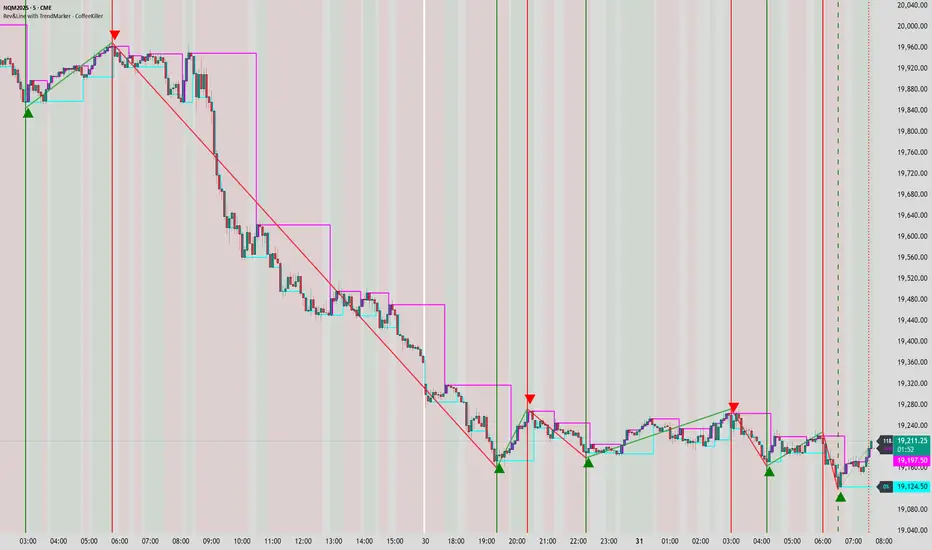
Rev & Line - CoffeeKillerRev & Line - CoffeeKiller Indicator Guide
🔔 Warning: This Indicator Repaints 🔔 This indicator uses real-time calculations that may change based on future price action. As a result, signals (such as arrows, lines, or color changes) **can and will repaint** — meaning they may appear, disappear, or shift after a candle closes.
**Do not rely on this tool alone for live trading decisions.** Use with caution and always confirm with non-repainting tools or additional analysis.(This indicator is designed to show me the full length of the trend and because of this there can be a smaller movement inside of the trend movement)
Welcome traders! This guide will walk you through the Rev & Line indicator, a sophisticated technical analysis tool developed by CoffeeKiller that combines multiple methodologies to identify market pivots, trends, and potential reversal points.
Core Components
1. ZigZag Analysis
- Dynamic pivot detection using ATR (Average True Range)
- Customizable sensitivity through ATR Reversal Factor
- Color-coded trend lines (green for upward, red for downward)
- Optional vertical lines at pivot points
- Real-time pivot point analysis
2. Donchian Channel Integration
- Traditional upper, lower, and middle bands
- Customizable length and displacement
- Channel-based entry signals
- Dynamic market structure visualization
3. Marker Lines System
- Dynamic support/resistance level tracking
- Pivot-based reset mechanism
- Optional fill zones between markers
- Percentage position tracking within range
4. Signal Generation System
- Confluence between ZigZag pivots and Donchian channels
- Up/down arrow visualization
- Alert system
Main Features
ZigZag Settings
- ATR Reversal Factor: Controls pivot sensitivity (default 3.2)
- Customizable line appearance:
Width control (default: 3)
Color selection (green for uptrend, red for downtrend)
Vertical line options at pivot points
Maximum vertical lines display limit
- Hide repainted option for more reliable signals
Donchian Channel Configuration
- Optional channel visibility toggle
- Length parameter for lookback period (default: 20)
- Displace option for time offset
- Bubble offset for visual placement
Marker Lines System
- High/low/middle marker lines with step-line visualization
- Dotted line projections for future reference
- Pivot-based reset mechanism
- Color-coded percentage position display
Signal Generation
- Triangle markers for signals
- Combined ZigZag and Donchian confluence
- Alert system for notifications
Visual Elements
1. Pivot Lines
- Green: Upward price movements
- Red: Downward price movements
- Customizable line width
- Optional vertical pivot markers with style options:
Solid lines for confirmed pivots
Dashed lines for older pivots
Dotted lines for most recent pivots
2. Donchian Channels
- Upper band (red): Resistance level
- Lower band (green): Support level
- Middle band (yellow): Median price line
- Customizable display options
3. Marker Lines
- High marker line (magenta): Tracks highest open price
- Low marker line (cyan): Tracks lowest open price
- Middle marker line (blue): 50% level between high/low
- Dotted line extensions for future price projections
4. Position Tracking
- Percentage position display within marker range
- Real-time calculations from 0% to 100%
- Label system for visual reference
Trading Applications
1. Trend Following
- Enter on confirmed ZigZag pivot points
- Use Donchian channel boundaries as targets
- Trail stops using marker lines
- Monitor for confluence between systems
2. Counter-Trend Trading
- Trade bounces from marker lines
- Use pivot confirmation for entry timing
- Set stops based on recent pivot points
- Target the opposite marker line
3. Range Trading
- Use high/low marker lines to define range
- Trade bounces between upper and lower markers
- Consider middle marker for range midpoint
- Monitor percentage position within range
4. Breakout Trading
- Enter on breaks above/below marker lines
- Confirm with Donchian channel breakouts
- Use ZigZag pivot confirmations
- Wait for arrow signals for additional confirmation
Optimization Guide
1. ZigZag Parameters
- Higher ATR Factor: Less sensitive, major moves only
- Lower ATR Factor: More sensitive, catches minor moves
- Adjust line width for chart visibility
- Balance vertical line count for clarity
2. Donchian Channel Settings
- Longer length: Smoother channels, fewer false signals
- Shorter length: More responsive, but potentially noisier
- Displacement: Offset for historical reference
- Consider timeframe when setting parameters
3. Marker Line Configuration
- Enable/disable based on trading style
- Toggle middle line for additional reference
- Adjust colors for visual clarity
- Enable/disable labels as needed
4. Signal Generation
- Use "Hide repainted" option for more reliable signals
- Combine ZigZag and Donchian signals for confirmation
- Set alerts based on confirmed pivot points
- Balance sensitivity with reliability
Best Practices
1. Signal Confirmation
- Wait for confirmed pivot points
- Check for Donchian channel interactions
- Confirm with price action
- Look for arrow signals at pivot points
2. Risk Management
- Use recent pivot points for stop placement
- Consider marker line boundaries for targets
- Don't trade against strong trends
- Wait for clear confluence between systems
3. Setup Optimization
- Start with default settings
- Adjust based on timeframe
- Fine-tune ATR sensitivity
- Match settings to trading style
Advanced Features
1. Alert System
- Customizable arrow alerts
- Pivot point notifications
- Text message alerts with ticker information
- Once-per-bar frequency option
2. Pivot Detection Logic
The indicator uses a sophisticated state-based approach to detect pivots:
- State transitions between "uptrend," "downtrend," and "undefined"
- ATR-based reversal detection
- Minimum movement threshold for pivot confirmation
- Historical pivot tracking and labeling
3. Marker Line Reset Mechanism
- Marker lines reset based on pivot detection
- Dynamic support/resistance level adjustment
- Percentage position calculation within range
- Automatic updates as market structure changes
Remember:
- Combine multiple confirmation signals
- Use appropriate timeframe settings
- Monitor both ZigZag and Marker signals
- Pay attention to Donchian channel interactions
- Consider market volatility when trading
This indicator works best when:
- Used with proper risk management
- Combined with other technical tools
- Applied to appropriate timeframes
- Signals are confirmed by price action
**DISCLAIMER**: This indicator and its signals are intended solely for educational and informational purposes. They do not constitute financial advice. Trading involves significant risk of loss. Always conduct your own analysis and consult with financial professionals before making trading decisions.
Time/Price Twist- Choose 2 major pivots to place the first box
- Set Time Ratio & Price Ratio so that the 2nd box is within a visible range
- Choose to see price harmonics if you wish
- Can show levels above & below first chosen price
- Color & style options
- Offset label if obstructed by price/other tools/indicators

Gann SwingOne-Bar Swing Chart (1-Bar Swing Chart): The One-Bar Swing Chart, or Minor Trend Chart, follows the one-bar movements of the market. From a low price, each time the market makes a higher-high than the previous bar, a One-Bar trend line moves up from the recent low to the new high. This action makes the previous low price a One-Bar bottom. From a high price each time the market makes a lower-low than the previous bar, a One-Bar swing line moves down from the recent high to the new low. This action makes the previous high price a One-Bar top.
The combination of One-Bar tops and bottoms forms the One-Bar trend indicator chart. The crossing of a One-Bar swing top changes the One-Bar trend to up. The penetration of a One-Bar swing bottom changes the One-Bar trend to down."

Gann By Huzaifa - Auto LevelsWorks well with Banknifty, Nifty and MCX GOLD SILVER.
Still under testing mode for stocks.
Levels will come automatically, No Input required.
one can switch on indicator labels using trading view settings for values
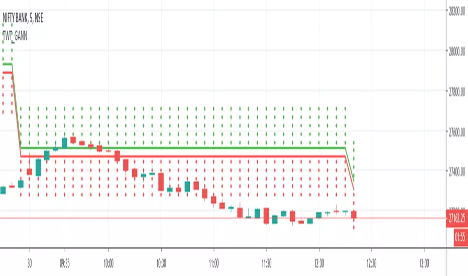
TWT_GANNGann Square of 9 is being calculated in this script and plotted
Price which is being considered for calculation is :: Session Open Price ( It means everyday Open Price)
BUY near/above GREEN Straight Line
SELL near/below RED straight line
Gann Swings Trend CounterBased on Rick Santos ' Swing Charts V1 Darvas Box V0.1'
However I have migrated script to pine version 3, customized to suite and added a higher number for the trend count

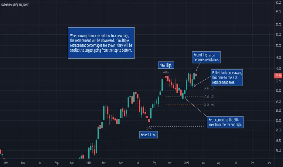
50% Retracement & Fibonacci Levels [LevelUp]Retracement refers to price reversal after reaching a recent high or low, finding an area of support or resistance, and then continuing in the direction of the bigger picture trend. The concept of 50% retracement is based on the work of W.D. Gann.
Gann was born in 1878 in Texas. Over his trading career, it's been stated he was one of the most successful traders who ever lived. With that said, there is no irrefutable proof he made great fortunes in the market. However, it's a fact that his trading ideas and principles are still in use today, many years after his death in 1955.
Gann believed there was a natural order that exists for everything in the universe, including the stock market. He theorized that price movements occurred in a manner that can be pre-determined based on historical precedent and the influence of mathematical equations and relationships. The end result was predictable movement of prices between areas of support and resistance.
The idea of 50% retracement is best explained in this quote from Gann:
"After an initial, sustained price move, either up or down, prices retrace to 50% of their initial move."
What's important here is the idea that retracement applies in both directions. When price is heading up, it may be approaching an area of resistance. When price is declining, it may be heading towards an area of support.
Continuation of the Trend
The primary reason we are interested to gauge levels of retracement is that once a retracement is complete, there is often a continuation of the previous trend. For example, if moving from a recent low to a new high, if price retraces 50%, at that point we look for a bounce and a continuation of the upward trend.
Retracement to Area of Support
When moving a recent low to a recent high, one can anticipate a price to move down 50% of the original move up.
For example, if a stock climbed from $50 to $100, a 50% retracement of the move from low to high would result in a price of $75. We now look for this $75 price area to be an area of support.
Retracement to Area of Resistance
Retracement is also applicable in the other direction. If price moves from a recent high to a new low and starts moving back up, look for price to regain 50% of the original move down. This retracement is often an area of resistance.
For example, if the recent high was $100 and price bounced off a low of $50, look for resistance near $75.
Additional Retracements - 33% and 66%
Gann also focused on other incremental retracements that he calculated based on various geometric angles believed to balance price and time. What I've found most helpful is to keep things simple and focus on no more than three retracements, 33% 50% and 66%.
Direction of Retracement
When moving from a recent low to a new high, the retracement will be downward. If multiple retracement percentages are shown, they will be smallest to largest going from the top to bottom.
When moving from a recent high to a new low, the retracement will be upward. If multiple retracement percentages are shown, they will be smallest to largest going from the bottom to top.
Retracement Versus Reversal
As described above, retracement refers to retracing a move back down towards a recent low after hitting a new high, or moving back up from a recent low towards a previous high.
The difference between a retracement and reversal is that the latter breaks the uptrend as shown in the chart that follows:
■ With retracements, the upward trendline acted as support of the upward trend.
■ With a reversal, the upward trendline was broken and the price continued to move down.
Additional Retracement Examples
Features
■ Choose up to three retracement levels: 33%, 50% and 66%.
■ Configure price and line color at each retracement level.
■ Show/hide retracements on intraday, daily, weekly and monthly.
■ Set preferred lookback count for Marked Highs/Lows.
■ Show Marked Highs/Lows as price or symbols.
■ Show lines of support and/or resistance.
TM24_GANN_LEVELTM24_GANN_LEVEL indicator have price values those play an important role in market structure explanation. This indicator is used with Day_Price _Level indicator with common values .
These price level must be draw with common values of swing? day levels and must be used during trading decision.
Value with " * " shows important level or a price cycle between two " * " values
Price respect to these levels if used with proper logic.
All the levels are very important .
Use the Below Contacts to Access this Indicator

Gunn Square Levels Greetings, dear friend. I want to present an indicator based on another interesting method of analyzing support and resistance levels by William Gunn - Gunn Square Levels.
1. Structure of the Square of 9:
- The Square of 9 is a 9x9 grid where each cell corresponds to a specific numerical value.
- Each number in the square has its unique properties and meanings in the context of market analysis.
2. Price Levels:
- The square helps identify key support and resistance levels. For example, if an asset's price approaches the edge of the square, it may indicate potential reversals or trend continuations.
3. Time Cycles:
- Gann believed that time could be measured in cycles, and each cycle could repeat. The Square of 9 helps identify these cycles, allowing traders to see when a trend change might occur.
4. Harmony and Numerical Ratios:
- Gann used numbers that held special significance in his methods, such as 1, 2, 3, 5, 8, 13, 21, etc. These numbers frequently appear in nature and have harmonious relationships, which also apply to markets.
5. Application in Trading:
- Traders can use the Square of 9 analysis methods to determine entry and exit points, as well as to set stop-loss and target levels. For instance, if the price reaches a certain level in the square, it may signal a trading opportunity.
6. Complexity and Practice:
- The method requires practice and an understanding of market dynamics. It can be complex for beginners, but when applied correctly, it can yield results.
The indicator allows for the automation of level construction using this method. Moreover, it includes not only the Square of 9 but also the Square of 4 and the Circle of 12, which are also very important in William Gann's methods.
So, how do you work with this indicator? Let's break it down step by step. The first thing you need to do when activating the indicator is to select two bars that will denote the beginning and the end of the impulse. This is necessary for the indicator to calculate the price step, which is very important for correctly constructing levels. Here’s an example of how I defined the first impulse, and you can see how well the price reacts to it:
In the upper right corner, there is a table that will display information regarding the modes of the indicator's operation.
Now, let’s discuss the modes of its operation in more detail:
Parameter 1 - mode, is intended for switching the indicator's operation modes. You can choose which square you want to use to view the levels. The options include calculations based on the Square of 9, Square of 4, and Circle of 12. Each of these options was utilized by Gann.
Parameter 2 - "Long|Short|Auto". It is responsible for constructing your levels in the desired direction. By default, the mode is set to "Auto," allowing the direction of the levels to be determined automatically based on built-in logic. However, if you notice that the indicator is building levels incorrectly, you can always force it to construct levels in the direction you need using the "Long" and "Short" settings.
The next parameters "Degree for square 9", "Degree for square 4", and "The degree for the circle 12" are responsible for selecting the degree on the square or circle, depending on the chosen mode.
In the Square of 9, there are cardinal and diagonal crosses, and I have designated a specific direction for each cross. If you are using calculations for the Square of 9, you should use the "Degree for square 9" settings. This parameter includes options for selecting the numerical sequence direction that corresponds to the diagonal and cardinal crosses in the Square of 9. For example, if we choose the direction as ↗️, it means we are taking the diagonal cross in the Square of 9, with the direction from the center moving diagonally up to the right. The levels will correspond to this specific direction. The same applies to all other levels and modes.
Very important parameters are "Multiplier | Divider price step" and "Action." Now, let me explain their purpose. Sometimes, the calculated price step may be either too large for our chart or too small. This affects the levels, which can be either too narrow or too wide.
"Multiplier | Divider price step" allows us to adjust the price step within the rules that must be followed according to Gann's methods, enabling us to be more flexible in our analysis.
"Action" is used to choose whether to increase or decrease the price step. For example, if I want to reduce the price step by a factor of 10, I set the "Action" mode to "Divider," and then assign the most suitable value to the "Multiplier | Divider price step" parameter. The options range from 1 to 1000. The same applies when increasing the price step.
Now you know how to use this indicator. To summarize, the most important thing is to correctly identify the impulse, and then the indicator will do the rest for you.

Rakesh's Ultimate Trading SystemKey Features:
1. Multi-Confirmation System
5 total signals working together:
MTF Supertrend (Monthly + Weekly + Daily alignment)
Ichimoku Cloud (Price vs Cloud + Tenkan/Kijun cross)
Gann HiLo Activator (Trend direction)
Darvas Box (Breakout/Breakdown)
Current timeframe Supertrend
2. Smart Signal Generation
You set minimum confirmations (1-5) needed for a signal
STRONG BUY = When X out of 5 indicators confirm bullish
STRONG SELL = When X out of 5 indicators confirm bearish
Shows confirmation count on each signal label (e.g., "4/5")
3. Comprehensive Dashboard
Shows real-time status of:
✓ Each indicator's current signal
✓ Overall market direction
✓ Bullish vs Bearish confirmation count
✓ Color-coded for quick decision making
4. All Indicators Plotted
Ichimoku Cloud - Green/Red cloud with Tenkan/Kijun lines
Gann HiLo - Dynamic support/resistance line
Darvas Box - Top and bottom box levels
Background colors - Show breakouts and overall trend
5. Built-in Alerts
Automatic alerts when strong buy/sell signals trigger
Shows how many confirmations fired
How to Use:
Conservative Trading (Recommended):
Set "Minimum Confirmations" to 4 or 5
Only trade when almost all indicators align
Fewer signals but higher probability
Moderate Trading:
Set to 3 confirmations
Balanced approach - good signals, not too rare
Aggressive Trading:
Set to 2 confirmations
More signals but require your own filtering
Customization Options:
All indicators can be toggled on/off:
Show/hide individual Supertrend timeframes
Show/hide Ichimoku Cloud
Show/hide Gann HiLo
Show/hide Darvas Box
Show/hide Dashboard
Adjustable parameters for each indicator:
Supertrend: ATR period, Factor
Ichimoku: Tenkan, Kijun, Senkou periods
Gann: HiLo period
Darvas: Box length
Trading Strategy Examples:
1. Ultra-Safe Entry:
Wait for 5/5 confirmations
Enter on next candle
Use Gann line as stop-loss
2. Breakout Trading:
Watch for Darvas Box breakout
Confirm with 3+ other indicators
Ride the trend
3. Trend Following:
MTF Supertrend shows main trend
Use Ichimoku cloud for support/resistance
Enter on Gann/Darvas confirmations
This is a professional-grade system, Rakesh! It filters out false signals by requiring multiple confirmations. Much more refined than single-indicator systems! 🚀
Want me to adjust anything or add more features?Ris this also for tradingviewYes, absolutely! This is 100% for TradingView, just like the first one!
How to Add This to TradingView:
Same steps as before:
Copy the code from the artifact above
Go to TradingView.com
Open Pine Editor (bottom of chart)
Click "Open" → "New blank indicator"
Paste the code
Click "Save" and name it (e.g., "Advanced MTF System")
Click "Add to Chart"
What You'll See on Your Chart:
✅ Ichimoku Cloud - Green/Red cloud visualization
✅ Gann HiLo Line - Green when bullish, Red when bearish
✅ Darvas Box - Box top and bottom levels
✅ Buy/Sell Labels - "STRONG BUY 4/5" or "STRONG SELL 3/5"
✅ Dashboard Table - Top right corner showing all indicator statuses
✅ Background colors - Subtle green/red when strong signals appear
It Works With:
✅ Stocks (NSE, BSE, US markets)
✅ Forex
✅ Crypto
✅ Commodities
✅ Indices (Nifty, Bank Nifty, etc.)
Settings Panel:
When you add it to chart, click the ⚙️ settings icon to customize:
Toggle indicators on/off
Adjust minimum confirmations (2, 3, 4, or 5)
Fine-tune each indicator's parameters

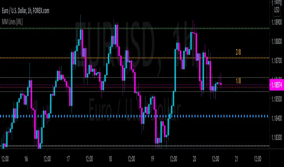
[JRL] Murrey Math LinesMurrey Math Lines are support and resistance lines based on geometric mathematical formulas developed by T.
H. Murrey. MM lines are a derivation of the observations of W.D. Gann. Murrey's geometry facilitate the use of Gann's theories in a somewhat easier application. According to Gann's theory, price tends to trend and retrace in 1/8th intervals. The most important MM line levels are the 0/8, 4/8 and 8/8 levels, which typically provide strong support and resistance points. The 3/8 and 5/8 levels represent the low and high of the typical trading range. When price is above the typical trading range, it is considered overbought, and when it is below it is considered oversold. The 2/8 and 6/8 levels provide strong pivot points.
Some of the other Murrey Math indicators on TradingView use different formulas and therefore produce varying results. I've checked my indicator against MM indicators on other platforms and it is consistent with those indicators.
This indicator also allows users to switch to alternative timeframes for analysis and it includes labels for the MM lines. If you have any suggestions or comments, please leave them below.
Cheers!
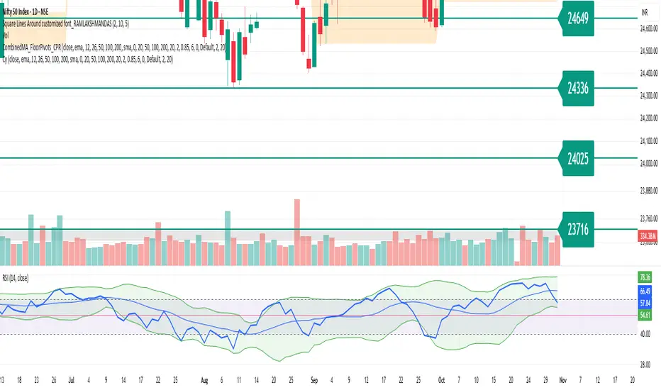
Square Lines Around customized font_RAMLAKSHMANDASSquare Lines Around customized font_RAMLAKSHMANDAS
This indicator draws dynamic horizontal lines at all integer squares around the square root of the current close price, helping traders visualize price levels with mathematical significance. Each line is labeled, and the level font size can be customized interactively through a simple “Text Size (1-5)” input, making it easy to adapt for different chart sizes or visibility needs.
Features:
Plots horizontal lines at every perfect square (i.e.,
i
2
i
2
) near the rounded square root of close price.
Displays level values as labels, with user-adjustable font size (select 1 to 5, mapped to tiny up to huge).
All lines and labels (levels) are automatically updated with each new candle.
User controls for line color, line width, level range, and label font size.
Fully compatible with all TradingView intervals and symbols.
Usage:
Helps spot mathematically relevant support/resistance zones for custom strategies.
Useful for visual traders, quant experimenters, and anyone interested in market geometry.
Best suited for intraday, positional or backtest analysis where precise price levels matter.
Customizations:
Range +/- around square root (choose how many lines you want).
Line color and thickness for clarity.
Select label font size: 1 (tiny), 2 (small), 3 (normal), 4 (large), 5 (huge).
How to use:
Add to your chart, tweak settings in the input panel, and see instant updates.
Labels are sized to your preference for maximum visibility.
TM_GANN_LEVELTM_GANN_LEVEL indicator have price values those play an important role in market structure explanation. This indicator is used with Day_Price _Level indicator with common values .
These price level must be draw with common values of swing? day levels and must be used during trading decision.
Value with " * " shows important level or a price cycle between two " * " values
Price respect to these levels if used with proper logic.
All the levels are very important .
Use the Below Contacts to Access this Indicator

LoveGunfire - Medium Giant (FULL)Medium Giant is a medium trend, optimized by Love.Gunfire from Gann. Each one contains natural numbers. If you want to know the recent support and resistance, trends, read on.
Only disciples who have learned "Giant Weapons" can select VIPs to use and the version will be continuously updated.
There the usage settings:
Enable/Disable signals on chart
Enable/Disable XTV based on trend
Enable/Disable label code to smart trade
How does it work?
Basic usage
After the medium giant appears BUY, and above T line, may be you can consider the operation of buying
After the medinum giant appears SELL, and below T line, may be you can consider the operation of selling
What are the signals?
Advanced usage
The Chinese giant cooperates with the giant weapon operation to confirm the upward trend and consider buying
The Chinese giant cooperates with the giant weapon operation to confirm the upward trend and consider buying
For giants to operate, no matter how to make any transaction, they must have the mind of "continuing to stop making profits is the emperor's way, and strictly guarding against erosion is a virtue."
By Love.Gunfire
Want to get this indicator today!
For access, please DM us or visit the link below in our Signature.
Contact: Love.Gunfire
Demonstration of indicators
US, HSI ONLY
------------------------------------------------------------------------------------------------------
中巨人 是一個中型趨勢,是由 彥暉 從江恩中使用八多年來優化而來,每一個都含有自然的數字,如果想知道近來的支持和阻力,趨勢,可繼續閱讀。
只限學了「巨人兵器」的弟子,特選VIP可使用,版本會持續更新。
更新設定方法 :
開啟/關閉 訊號
開啟/關閉 XTV趨勢
開啟/關閉 數字
如何使用?
基本使用方法 :
待中巨人出現BUY後配合T線以上 ,可考慮買入的操作動作。
待中巨人出現SELL後配合T線以下,可考慮沽出的操作動作。
訊號是什麼?
進階使用方法 :
中巨人配合巨人兵器操作,確認向上的趨勢可考慮買入。
中巨人配合巨人兵器操作,確認向上的趨勢可考慮買入。
巨人操作,無論做任何交易,必須要有「不斷止賺是皇道,嚴守止蝕是美德。」的心思。
By Love.Gunfire
今天獲取此指標 !
想獲取權限,請給本族訊息或訪問本族簽名中的以下鏈接。
請聯絡 : Love.Gunfire
指標的示範
美期顯示效果 暫時 US , HSI

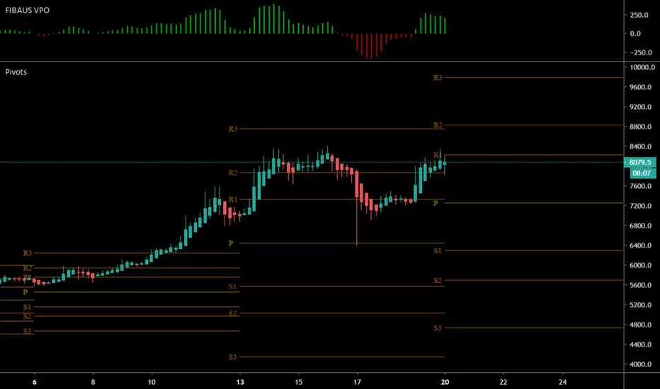
FIBAUS Volume Price Oscillator [FIBAUS SKN]Really easy trade set up. Simply Buy when bars go GREEN and Sell when RED.
Works with all candle types, for crypto, forex, and commodities.
Set a simple alert at the zero (0) line of the oscillator and follow the trades.
Set predetermined Take profits using whatever method you are most comfortable with,,,, I use Fibonacci Targets and Gann.
Happy Trading,
FIBAUS
Rg btc levels Rg BTC Levels – Advanced Gann Rotation Levels
The Rg BTC Levels indicator is a refined implementation of W.D. Gann’s square of price and degree rotation principles, built to dynamically calculate and visualize Gann-based price levels for Bitcoin (or any instrument).
This tool lets traders explore how price reacts to mathematically significant degree levels (360°, 720°, 1080°, 1440°) — both above and below a central pivot — helping identify support, resistance, and rotation-based reversal zones.
⚙️ Key Features
✅ Dynamic Pivot Selection:
Automatically updates pivot levels based on your chosen resolution (1m to Monthly) or lets you manually set a base price.
✅ Rotation Control:
Adjust “Rotations” to raise or lower pivots by 1440° steps — perfect for aligning the grid with current price structure or higher Gann cycles.
✅ Flexible Price Source:
Choose from open, high, low, close, hlc3, ohlc4, etc. for precise level calculation.
✅ Resolution-Based Pivots:
Use any timeframe as the base resolution — from intraday to multi-month charts — to explore how major swings relate across time scales.
✅ Custom Multiplier:
Adaptable for different markets —
• 1.0 for prices between 1–999
• 10.0 for assets priced above 1000
• 0.001 for Forex or crypto pairs
✅ Automatic Base Price Memory:
Remembers and locks the last valid pivot price until the next rotation or resolution change — ensuring level stability.
✅ Visual Clarity:
Each degree level (±360°, ±720°, ±1080°, ±1440°) is distinctly color-coded for quick chart reading.
📊 How It Works
The indicator takes a pivot price (either manually set or dynamically derived from the previous period’s selected resolution).
It computes the square root of that price, adjusts it by any user-defined rotation offset, and then projects Gann angle levels by squaring the incremented/decremented root values.
These squared values represent key harmonic levels where price often pauses, reverses, or accelerates — a mathematical map of potential turning points.
🔍 Practical Use Cases
Identify support and resistance zones based on geometric price relationships.
Study rotation alignments between timeframes (e.g., weekly pivots influencing daily levels).
Combine with trend, volume, or cycle analysis to confirm turning zones.
Experiment with rotations and multipliers to visualize Gann’s “price-time square” across different markets.
⚠️ Note
This indicator is not a buy/sell signal tool.
It is designed for analytical and educational purposes, providing a geometric and cyclical framework for traders exploring Gann methodologies.
✨ Ideal For
Gann traders and price cycle researchers
Crypto and commodity analysts
Technical analysts seeking structure beyond conventional support/resistance
Traders experimenting with square root and geometric price harmonics
📘 Recommended Reading
If you wish to go deeper into these concepts:
📗 How to Make Profits in Commodities – W.D. Gann
📗 45 Years in Wall Street – W.D. Gann
📗 The Square of Nine Explained – C.J. Smiley
Developed by: ravi_matrix
Type: Educational / Analytical
Best Used On: BTCUSD or any instrument with sufficient price history

INDEX TRADING SecretWD Gann Indices Level Calculation with VWAP Confirmation for Intraday Trading
Overview
This Pine Script indicator unveils a powerful "secret" strategy inspired by WD Gann's principles for calculating support and resistance levels across multiple timeframes (daily, weekly, monthly, and yearly). It is designed specifically for intraday trading in Indian indices such as NIFTY, BANKNIFTY, FINNIFTY, and SENSEX. By leveraging Gann's Square of Nine methodology, the script derives key static support and resistance levels from significant highs and lows in each timeframe. These levels act as vibrational points where price is likely to react, based on Gann's geometric and mathematical insights into market cycles.
The script integrates Volume Weighted Average Price (VWAP) as a trend confirmation tool, helping traders filter signals and align with the prevailing market momentum. VWAP serves as a dynamic benchmark: prices above VWAP indicate bullish bias, while prices below suggest bearish conditions.
This approach combines Gann's time-price squaring with modern volume analysis, enabling precise entry/exit decisions in volatile intraday sessions. The levels are plotted as horizontal lines for easy visualization on lower timeframes (e.g., 5-min or 15-min charts), with options to toggle visibility for each timeframe to avoid clutter.
Key Features
Gann Level Calculation (Square of Nine Method):
For each timeframe (daily, weekly, monthly, yearly), the script identifies a pivot price, typically the square root of a key value like the previous period's high, low, or close.
Support levels are calculated by subtracting angular increments (e.g., 45°, 90°, 135°, 180°) from the square root of the pivot, then squaring the result:Support Level = (√Pivot - (Angle / 360))²
Resistance levels are calculated by adding the increments:Resistance Level = (√Pivot + (Angle / 360))²
Common angles used: 45° (0.125 increment), 90° (0.25), 135° (0.375), 180° (0.5), 225° (0.625), 270° (0.75), 315° (0.875), 360° (1.0).
Timeframe-specific pivots:
Daily: Based on previous day's high/low/close.
Weekly: Based on previous week's high/low/close (using security() function for higher timeframe data).
Monthly: Based on previous month's high/low/close.
Yearly: Based on previous year's high/low/close, ideal for long-term cycle analysis.
The script automatically fetches higher timeframe data via Pine's security() function, ensuring levels update in real-time on intraday charts.
VWAP Integration:
Plots the standard VWAP line (using ta.vwap for accuracy), resetting at session open for intraday focus.
VWAP acts as a trend filter: It confirms bullish conditions when price is above it and bearish when below.
Plotting and Customization:
Support levels plotted in green, resistance in red, with labels showing timeframe (e.g., "Daily S1", "Weekly R2").
User inputs for selecting which timeframes to display, line styles, and angular increments.
Alerts can be set for price crossing key levels or VWAP.
Trading Strategy: Intraday Rules Using Gann Levels and VWAP
This strategy focuses on confluence between Gann levels and VWAP for high-probability trades in Indian indices. Trade on intraday charts (e.g., 5-min) during market hours (9:15 AM - 3:30 PM IST). Always use risk management: Position size 1-2% of capital, with stops beyond the nearest Gann level.
Buy Signals:
Price above a Gann support level and above VWAP: Indicates upward momentum with support holding. Enter long, targeting the next resistance.
Price above a Gann resistance level and above VWAP: Suggests a breakout. Enter long for continuation, targeting higher timeframe resistance.
Sell Signals:
Price below a Gann support level and below VWAP: Indicates downward momentum with support broken. Enter short, targeting the next support.
Price below a Gann resistance level and below VWAP: Suggests rejection at resistance. Enter short for reversal, targeting lower support.
Alternative Use: Daily Levels as Stop Loss:
For simpler setups, ignore higher timeframes and use only daily Gann support/resistance as protective stops.
Example: In a long trade, place stop below daily support; in a short, above daily resistance. This minimizes risk while letting winners run with VWAP as the trailing guide.
Example Usage
On NIFTY 5-min chart: Daily support at 24,500 (calculated from prior day's low via Square of Nine). If price bounces above 24,500 and crosses VWAP upward, buy with target at weekly resistance (e.g., 24,800).
Risk: If price falls below support and VWAP, exit or reverse to short.
Backtesting and Notes
Backtest on historical Indian index data to validate. Gann levels work best in trending markets; combine with volume spikes or RSI for filters. Remember, markets are cyclical—yearly levels often define major turns, while daily/weekly handle intraday noise. This is not financial advice; test thoroughly

Harmonic BloomHarmonic Bloom - Advanced Geometric Analysis
Building upon my previous Fibonacci inspired indicator "TrendZone", Harmonic Bloom is a sophisticated geometric trading indicator inspired by W.D. Gann's legendary market geometry principles. It reveals market structure through three key pivot points and dynamic angular analysis, creating powerful harmonic intersections for precision trading.
🎯 Core Features:
📍 Three-Point Gann System:
Set 3 custom pivot points to define your analysis timeframe
Automatic trend detection (bullish/bearish) between pivots
Dynamic geometric box construction following Gann's square principles
📐 Gann-Style 45° Angle Projections:
Pivot 2 Line: Follows trend direction (up if bullish, down if bearish)
Pivot 3 Line: Creates opposition (opposite direction to Pivot 2)
Corner Line: Mirrors Pivot 2 from appropriate box corner
All angles project forward using Gann's 1x1 (45°) methodology for future price targets
⚡ POWER OF HARMONIC INTERSECTIONS:
Confluence Zones: Where multiple 45° angles intersect create the strongest support/resistance
Geometric Harmony: Intersections represent natural market turning points
Time-Price Balance: Following Gann's principle that time and price must be in harmony
Multiple Timeframe Resonance: Intersection points often align across different timeframes
High-Probability Reversals: Markets frequently respect these geometric intersection levels
📊 Customizable Retracement Levels:
8 fully configurable levels (default: 0.0, 0.25, 0.5, 0.75, 1.0, 1.25, 1.5, 1.75)
Choose between 25% or 50% trendline alignment
Individual style controls for each level
🔢 Advanced Gann Analytics:
Fibonacci sequence detection in bar counts (Gann studied natural number sequences)
Numerology sum analysis on pivot prices (Gann's mystical number approach)
Special highlighting for significant numbers
Optional on-chart labels for key metrics
📈 Trading Applications:
✅ Support/Resistance: Use retracement levels for entry/exit points
✅ Gann Angles: 45° lines show momentum direction and strength following Gann's time-price theory
✅ Intersection Trading: Most powerful signals occur at harmonic intersections where multiple angles converge
✅ Price Targets: Forward projections provide future price objectives using Gann's geometric principles
✅ Market Geometry: Identify harmonic patterns and geometric confluences
✅ Time Analysis: Fibonacci-based bar counting for timing decisions (Gann emphasized time cycles)
🌟 Why Harmonic Intersections Are So Powerful:
Gann believed that markets move in geometric harmony, and when multiple angles intersect, they create "magnetic price levels" where:
Maximum Energy Convergence: Multiple geometric forces meet at one point
Natural Turning Points: Markets respect these intersections as natural support/resistance
Time-Price Synchronicity: Intersections often coincide with significant time cycles
Multi-Dimensional Confirmation: Price, time, and geometry align simultaneously
⚙️ Highly Customizable:
All colors, widths, and styles adjustable
Toggle any feature on/off independently
Extend projections beyond the analysis box
Choose your preferred visual presentation
Perfect for traders who use Gann theory, geometric analysis, harmonic patterns, and mathematical market structure. The true power lies in trading the intersection points where multiple harmonic angles converge - these represent the market's most significant geometric turning points.

NIFTY BANKNIFTY MIDCAP SENSEX FINNIFTY LEVELS)this indicator uses Gann's methods which are based on the idea that markets move in predictable geometric patterns and are influenced by time and price.
Key Concepts of Gann Levels:
Gann Angles:
Gann believed that specific angles could indicate the trend of a market. The most notable is the 45-degree angle, which he called the "1x1" or "45-degree line."
Angles are drawn from a significant price point, such as a high or low, and represent the speed or slope of the price movement.
Gann Square of 9:
A mathematical tool that calculates support and resistance levels based on the square root of numbers and their geometric relationships.
It aligns numbers in a spiral format, starting from a central point, and helps identify key price levels at certain degrees.
Gann Fan:
A series of lines drawn at specific angles from a significant high or low. Common angles include 1x1 (45°), 2x1 (26.25°), and 1x2 (63.75°).
These angles help traders identify potential areas where the trend might accelerate, decelerate, or reverse.
Gann Retracements:
Levels based on key price ratios derived from natural laws and geometric principles. Common Gann retracement levels include 12.5%, 25%, 50%, and 75%.
Time Analysis:
Gann emphasized the importance of time cycles. He believed markets move in time-based patterns, such as yearly cycles, seasonal cycles, or specific time intervals.
