Binary Option Turbo M1 by MercalonaAuto risk
You are diving into a high-risk investment. We are not responsible for losses, the only certainty is that they will come, the most important thing is to manage them. Test this script on a demo account, and use the backtest. Make sure you are familiar with it before using real money. Use all your experience and other assistance for better accuracy. Do not risk more than 5% per day. Try to use a maximum of 1-2%.
Recommendations
It is highly recommended whenever trying to make entries in stronger areas
Try to make entries when the graph is in trend and with good movements. It is better to lose an entry than to lose money.
Check if the chart is already with good accuracy before making your entry. At least 65%.
Try to make entries when the payout is above 75%. This will help you with risk / return.
About the Script
This script was developed to identify good entry areas quickly and safely. We recommend using in binary option, where the next candle is successful. Although it can also be used in other markets, using a larger timeframe, such as 1h or 4h.
How it works?
This script is based on trends, up and down, where up trend, we look for "CAL" entries in retractions, and down trends, the entries will be "PUT". Always operate in favor of the trend for better accuracy. A session filter is also displayed. The Filter is based on the New York and London session. In these periods there is a greater market volatility, where it is recommended to operate and avoid losses. In addition, there is also a (no trend) filter. Where it shows whether the chart is volatile or not, even during open market sessions.
What is the final result?
This script will show good entries areas. These areas are represented with lines. The lines closest to the current price are thinner lines. And the lines far from price are thicker. The thick lines represent stronger areas and are resistant to price. This means that there is a greater possibility of reversal when prices touch these lines.
Settings (mode)
There are 2 configuration modes:
1. MODERATELY
2. AGGRESSIVE
Using the "MODERATELY" mode, the signals are rarer, here we expect the price to hit the best areas indicated. To place the entry. Here we expect greater accuracy.
In "AGGRESSIVE" mode, we don't expect good entries. Whenever the price hits entry areas it will be considered an entry. In this case, the accuracy is less, since the areas do not have a great potential for reversion.
Settings (Length)
Here the number of bars can be configured for the calculation of support and resistance areas. A low amount may not be enough to check for good areas. And a very large area can be confused with areas that really matter. Try to check the best quantity for the chart you want to trade.
Settings (Win Rate Limit)
Place the limit of analyzed signals in this field. It is restricted to the “Win Rate Max Bars” field, which will be explained below. If the configured limit is not reached, the cause is that there were not enough signals within the configured bar limit. ATTENTION: Understand that a high value will cause a slow calculation of the script.
Settings (Win Rate Max Bars)
This is information is used to limit the number of bars in the “Win Rate” calculation. ATTENTION: Understand that a high value will cause a slow calculation of the script.
Settings (Sessions)
There are 2 other configurations. New York session and London session. You can see how it works reading below.
Indicator “Stars of Recommendation”
The indicator has 3 stars of recommendation.
NO TRADE (There is no positive point to take chances)
In Session (At least 1 open market, this is a positive point to take chances)
In Trend (There is a good probability of assertiveness when it is on trend)
More than one identified area. (Generally, when there is more than one area, the more distant areas become stronger and stronger. This is a positive point when the price reaches them.)
Good luck ❤️
Please feedback us.
We hope this helps you!
"entry" için komut dosyalarını ara

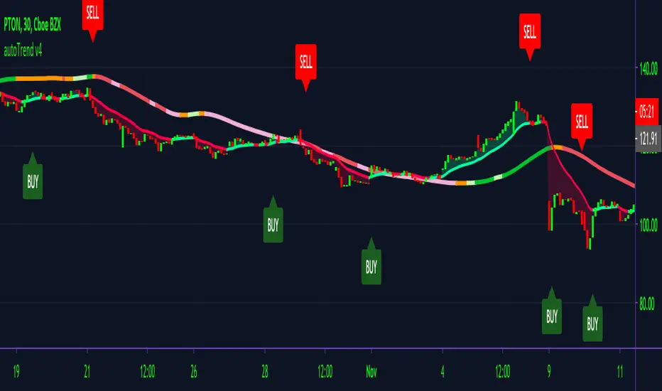
autoTrend V4AutoTrend v4
Made for private access only.
One of the hardest things to do as a new trader is reading charts/ identifying trends. With AutoTrend, we make it easy to do just that & so much more!
The main features of AutoTrend are built-in clean buy/sell signals, trend identifier, volume spike detector & S/R lines. All of these features combined to give out clean entry/ exit points that you can be confident with taking.
AutoTrend offers extensive trend identifiers with adaptive volatility lines changing with the direction of the market enabling users to cherrypick entry points in any market condition.
How AutoTrend gives out signals is by detecting volume spikes and using our volatility cloud to give out signals. If the alert is in the green cloud, then the alert is a good entry; if it's in the red cloud, then it is not suggested that you take the signal.
We also developed a MA line to determine whether an entry is a solid entry. If the line is showing green, it means that the ticker is bullish thus making confirming the entry is a good entry. AutoTrend will only alert when these conditions are met, in which that a ticker is moving above a MA and is in the green cloud. The MA will change color accoridngly.
AutoTrend works best in time frames starting at 15min and above; anything below should be taken with caution.
Users can utilize TradingView built-in Heikin Ashi for better and easier identification of trends for any entry.
Disclaimer: AutoTrend is not a professional trading service. Anything that is stated above in or on any of our sites is to be taken for educational purposes only. AutoTrend team & staff are not liable for any losses or losses in any form. Any content that we provide on any of our sites should not be taken as financial advice. Past results are not indicative of future performances.
You can access AutoTrend on our Discord link below or DM me. :)
Alpha Trader v3.0Alpha Trader is a trend following strategy which identifies good time to take profit and allow trader to ride the trend with multiple re-entry points.
Features
Entry and Exit signals
Multiple Re-Entry points
Built in Risk Management
Position sizing for every entry
Alerts with Stop Loss and Position size
Strategy has built-in risk management with dynamic trailing Stop Loss and Position sizing. You just need to specify what percentage of your capital you are willing to risk on new position and re-entries.
Strategy will evaluate the maximum position you should take for specific signal.
Position and stop Loss levels are visible on alerts and when you hover over the markers on your chart.
You can set alerts for below scenarios. Alerts contain stop loss and Max position advised on a specific trade entry.
1.New Long Entry
2.New Short Entry
3.Long Re-Entry
4.Short Re-Entry
5.Long Take Profit
6.Short Take Profit
Usage
You can enter into a new position with New Long Entry/New Short Entry. Position size and Stop loss are visible on alert and signal marker on the chart. Please set your alerts on bar close.
You can take profit on Long take profit/ Short take profit signal.You can chose to close any % of your position.
You can re-enter into a position and increase your existing position on Long Re-Entry/Short Re-Entry signal. Position size and New stop loss levels are indicated on alerts or when you hover over the signal marker.
Position size can be greater than 100% with leverage. For e.g. if strategy suggest 200% as position size, you can take this position with 5x leverage and 40% of your capital. But, downside risk for every entry would be limited to your preferences.
This strategy works best on 4 hour and Daily time frames.
For Access : Contact me on TradingView.

Cyatophilum Levels [ALERTSETUP]Cyatophilum Levels - Version 1.0 - Alert setup
This indicator allows you to build your own strategy based on Fibonacci levels, and create automated alerts for long & short entries and exits.
This study also has a backtest version. See my previous script.
The Fibonacci levels are printed automatically in real time and without repainting on the chart.
You configure your own strategy in the indicator parameters. You can choose to go long or to go short, or both, on which Fib levels to enter Long/Short, and on which Fib levels to exit (up to 2 entry levels and exit levels).
Detailed Guide:
This is a guide that can be useful if you do not understand the strategy or an indicator parameter. Instructions on how to get access are at the bottom.
To configure your strategy, you need to open the indicator settings. You can either right-click on the indicator and click "settings", or click the settings button near the indicator's name.
You should know that the Fibonnaci levels are calculated from the support and resistance levels, which are calculated using the last swing high and swing low. This behavior can be tweaked in the settings with the first 2 parameters:
· Noise reduction
Dropdown menu. Options are "NONE", "SMALL", "MEDIUM", "HUGE". Used to get a smoother level behavior. The higher it is, the less often the support and resistance levels will move. Can be useful to cut off fakeouts.
· Swings lookback
This is the number of historical bars used to calculate the last swing high and swing low.
In TradingView, we usually wait bar close to validate a signal (trade entry or exit), in order to avoid repainting. But since this indicator is purely based on price action, there is an option called Alert Type if you want to receive intra-bar alerts or not.
· Entry Alert Type
2 options : "Once Per Bar Close", "Once Per Bar". These correspond to the alerts options. You must use the same alert type in the indicator settings and in the alert options. When using "Once Per Bar", the candle high and low are used for the cross conditions, otherwise, candle close is used.
· Exit Alert Type
Same but for exit alerts.
The long trades setup can be configured independantly from the short trade setup, but the parameters are the same.
■ Go Long/Short
Check this box to enable/disable long/short trades.
· Long/Short Entry Condition
Dropdown menu from which you can pick the condition for your entry. Options available are "Cross Over","Cross Under" and "Just Cross".
· Long/Short Entry 1
Dropdown menu from which you can pick the level for your entry n°1. Options available are "Support","FIB 23", "FIB 38", "FIB 50","FIB 61","FIB 78" and "Resistance".
· Long/Short Entry 2
Additional FIB level entry.
· Long/Short Exit 1
Dropdown menu from which you can pick the level for your exit. Options available are "Support","FIB 23", "FIB 38", "FIB 50","FIB 61","FIB 78" and "Resistance".
· Long/Short Exit 2
Additional FIB level exit.
■ Trend Filter
Optionnal Tilson T3 TrendLine to make the strategy go long only when price is above T3 (green) and short only when price is below (red). The length in bars is configurable.
· Configuration Panel
It should appear on the left of the chart. This panel displays the whole indicator settings in a compact and easy-to-read way. You can replicate a strategy from just this info panel. Can be turned off if needed.
· Graphic options
A red/green background corresponding to the strategy position (short/long) can be turned off.
The Fib levels labels can be turned off all at once.
Risk management:
Place your secondary exit one or two levels above/below your entry to act as a stop loss.
Availabe alerts:
To create an alert, right-click on the indicator and click "Add alert".
The LONG alerts corresponds to the green labels on chart, while the SHORT are in red.
Select one of the following signals in order to create your strategy:
· LONG/SHORT ENTRY : Alert to enter a long/short. Make sure to select "Once Per Bar" or "Once Per Bar Close" according to the "Entry Alert Type" parameter.
· LONG/SHORT EXIT : Alert to exit a long/short. Make sure to select "Once Per Bar" or "Once Per Bar Close" according to the "Exit Alert Type" parameter.
Default settings are set for 15m.
Use the link below to obtain access to this indicator

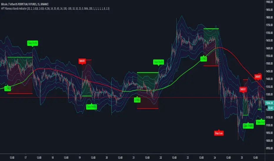
HFT Fibonacci Bands Indicator
Default Settings are meant to be used in XBT/USD chart on 15 min time frame. If you want to use for another asset on another time frame YOU MUST CHANGE THE SETTINGS
This is a Fibonacci bands based trading indicator developed by HFT Research. It is a highly customizable indicator and provided endless opportunities to find profitable trades in the market.
Use Fib BB
This is the main decision maker of the strategy. Tuning the settings of this portion of the strategy will change the outcome the most. We have provided default settings. However, they are only good for 15min chart on Bitcoin. Please adjust accordingly.
Fib BB Length: This setting adjusts the middle line of your Fibonacci Bands. It is the moving average that you take it as base for your Fibonacci bands. Default value is currently 20.
Fib Level to Use for Entry: Here, you adjust which one of the Fibonacci Ratio levels you would like to use for your entry. You can only choose one of the following options.
Fibonacci Ratio 1
This is your Fib ratio level 1 and you can put any number here you would like
Fibonacci Ratio 2
This is your Fib ratio level 2 and you can put any number here you would like
Fibonacci Ratio 3
This is your Fib ratio level 3 and you can put any number here you would like
Please keep in mind that Ratio 1 should be higher than Ratio 2 and Ratio 2 should be higher than Ratio 3.
Use RSI
You can also turn on and off the RSI as well. Alternatively, there is an option to use RSI on a different time frame than you are currently on. For example, if you are looking at the 5min chart to use Bollinger bands but you would like to look at the RSI value on the 15min chart. You can do so by selecting the custom RSI timeframe as well as adjusting the Oversold and Overbought value.
Use CCI
Commodity Channel Index is an indicator developed by Donald Lambert. It is a momentum-based oscillator used to help determine when an investment vehicle is reaching conditions of being overbought or oversold. It also used to asses price trend direction and strength. Default settings are usually the safest and the best fit.
Use VWAP
VWAP stands for volume weighted average price. It is an extremely useful indicator when trading intra-day. It does reset every trading session which is at 00:00 UTC. Instead of looking at x number of candles and providing an average price, it will take into consideration volume that’s traded at a certain price and weigh it accordingly.
Use ADX
ADX stands for average directional index. It is an indicator that measures volatility in the market. Unfortunately, the worst market condition for this strategy is sideways market. ADX becomes a useful tool since it can detect trend. If the volatility is low and there is no real price movement, ADX will pick that up and will not let you get in trades during a sideways market. It will allow you to enter trades only when the market is trending.
Use MA Filters
Lookback: It is an option to look back x number of candles to validate the price crossing. If the market is choppy and the price keeps crossing up and down the moving average you have chosen, it will generate a lot of “noisy” signals. This option allows you to confirm the cross by selecting how many candles the price needs to stay above or below the moving average. Setting it 0 will turn it off.
MA Filter Type: There is a selection of moving averages that is available on TradingView currently. You can choose from 14 different moving average types to detect the trend as accurate as possible.
Filter Length: You can select the length of your moving average. Most commonly used length being 50,100 and 200.
Filter Type: This is our propriety smoothing method in order to make the moving averages lag less and influence the way they are calculated slightly. Type 1 being the normal calculation and type 2 being the secret sauce.
Reverse MA Filter: This option allows you to use the moving average in reverse. For example, the strategy will go long when the price is above the moving average. However, if you use the reserve MA Filter, you will go short when the price is above the moving average. This method works best in sideways market where price usually retraces back to the moving average. So, in an anticipation of price reverting back to the moving average, it is a useful piece of option to use during sideway markets.
If you want to get access to this indicator please DM me or visit our website.
NCTA Trend ConsensusTrend Consensus Indicator
The Trend Consensus Indicator is one of two technical pattern indicators that are part of the Profit Flow Analytics.
New Cycle Trading and Analytics is a group of traders creating market analytics for traders. The objective is to take complex combinations of multiple technical pattern indicators and present to the trader a simple, single signal entry.
The Trend Consensus Indicator is excellent in short 1, 3, and 5 minute timeframes for futures traders and short term options traders. Longer timeframes such as the 5, 10, and 30 minute timeframes work well for options traders.
The Trend Consensus Indicator consists of a simple, single entry indicator designed to provide an entry very close to the shift on the intra-day cycle. It is designed to filter out false signals and provide the trader with an optimum timing of an entry. The signal consists of an early indication of a possible entry followed by a confirming/entry signal. It is very simple to monitor and recognize the entry.
HOW TO USE: Go long when a dark blue bar appears as long as there is at least one light or dark blue bar immediately preceding it. Go short when a dark red bar appears as long as there is at least one light or dark red bar immediately preceding it.
The Trend Consensus Indicator, which is part of the Profit Flow Analytics set of indicators, is traded in a live trading room every market day, hosted by our friends at Options Money Maker.
To learn more and to get a free trial of the Trend Consensus Indicator, as part of the Profit Flow Analytics use the following link:
www.newcycletrading.com
NQU2019
SP:SPX

able FRVP Reversal# able FRVP Reversal - Complete User Guide
## 📌 Overview
**able FRVP Reversal** is a professional-grade Volume Profile indicator with an integrated reversal detection system. It combines Fixed Range Volume Profile (FRVP) analysis with a confluence-based reversal scoring system to identify high-probability turning points at key volume levels.
---
## ✨ Key Features
| Feature | Description |
|---------|-------------|
| **Session-Based Volume Profile** | Automatically resets at the beginning of each regular trading session |
| **POC (Point of Control)** | Highest volume price level - strongest support/resistance |
| **VAH (Value Area High)** | Upper boundary of the 70% value area - resistance zone |
| **VAL (Value Area Low)** | Lower boundary of the 70% value area - support zone |
| **Confluence Scoring System** | 5-point scoring system for reversal detection |
| **Smart Cooldown** | Prevents signal spam with customizable cooldown period |
| **Real-time Info Table** | Displays all key metrics in a retro-style dashboard |
---
## 🔧 Installation
1. Open TradingView and go to **Pine Editor**
2. Delete any existing code and paste the indicator code
3. Click **"Add to Chart"**
4. Configure settings as needed
---
## ⚙️ Settings Explained
### 📊 Volume Profile Settings
| Setting | Default | Description |
|---------|---------|-------------|
| **Number of Rows** | 50 | Resolution of the volume profile (more rows = finer detail) |
| **Value Area %** | 70 | Percentage of volume to include in Value Area (industry standard: 70%) |
| **Profile Width** | 40 | Visual width of the histogram on chart |
| **Show Histogram** | ✓ | Display volume histogram bars |
| **Show POC/VAH/VAL** | ✓ | Display the three key levels |
| **Show Labels** | ✓ | Display price labels for each level |
| **Extend Lines** | ✓ | Extend levels to the right of current price |
| **Extend Length** | 100 | How far to extend the lines (in bars) |
### 🔄 Reversal Detection Settings
| Setting | Default | Description |
|---------|---------|-------------|
| **Enable Reversal Detection** | ✓ | Turn reversal signals on/off |
| **Min Confluence Score** | 3 | Minimum score required to trigger signal (1-5) |
| **Cooldown Bars** | 10 | Minimum bars between signals to prevent spam |
#### Understanding Min Confluence Score:
- **Score 1-2**: Very sensitive, many signals (not recommended)
- **Score 3**: Balanced - good for most traders ⭐ Recommended
- **Score 4**: Conservative - fewer but higher quality signals
- **Score 5**: Very strict - only strongest reversals
### 🎨 Color Settings
All colors are fully customizable:
- **POC Line**: Default Gold (#FFD700)
- **VAH Line**: Default Coral Red (#FF6B6B)
- **VAL Line**: Default Teal (#4ECDC4)
- **Bullish Reversal**: Default Green (#00E676)
- **Bearish Reversal**: Default Red (#FF5252)
---
## 📖 How to Read the Indicator
### Volume Profile Histogram
```
█████████████ ← High volume = Strong S/R
████████ ← Medium volume
████ ← Low volume = Weak S/R
██
```
- **Darker/Longer bars** = More trading activity at that price
- **Inside Value Area** = Colored based on session direction (Bull/Bear)
- **Outside Value Area** = Muted gray color
### Key Levels
| Level | Color | Meaning |
|-------|-------|---------|
| **POC** | Yellow | Price with highest volume - Strongest magnet |
| **VAH** | Red | Upper resistance - Look for bearish reversals |
| **VAL** | Teal | Lower support - Look for bullish reversals |
---
## 🔄 Reversal Detection System
### How the Scoring System Works
The indicator uses a **5-point confluence scoring system**. Each condition adds 1 point:
#### 🟢 Bullish Reversal Score (at VAL)
| Condition | Points | Description |
|-----------|--------|-------------|
| Price at VAL Zone | +1 | Price is within VAL ± 0.2 ATR |
| Bullish Candle | +1 | Close > Open (green candle) |
| RSI Oversold | +1 | RSI < 35 |
| Rejection Wick | +1 | Lower wick > 1.5× body size |
| Failed Breakdown | +1 | Touched below VAL but closed above |
#### 🔴 Bearish Reversal Score (at VAH)
| Condition | Points | Description |
|-----------|--------|-------------|
| Price at VAH Zone | +1 | Price is within VAH ± 0.2 ATR |
| Bearish Candle | +1 | Close < Open (red candle) |
| RSI Overbought | +1 | RSI > 65 |
| Rejection Wick | +1 | Upper wick > 1.5× body size |
| Failed Breakout | +1 | Touched above VAH but closed below |
### Signal Quality Ratings
| Score | Rating | Meaning |
|-------|--------|---------|
| 5/5 | ★★★ | Excellent - Highest probability |
| 4/5 | ★★ | Good - High probability |
| 3/5 | ★ | Acceptable - Moderate probability |
| <3 | - | No signal triggered |
---
## 📋 Info Table Explained
```
╔═ able-REV ═╗ 15 ████████ SCR
─────────────────────────────────────
ZONE UPPER VA ▒▒▓▓████ ▲
POC 4272.680 ██████·· ▲
VAH 4322.745 ████···· ·
VAL 4264.977 ██████·· ·
═ SCORE ═════════════════════════════
BULL 0/5 ········ ·
BEAR 1/5 ░······· ·
RSI 49 ▒▒▓▓···· ·
◄SIGNAL► WAIT ········ ·
```
| Row | Description |
|-----|-------------|
| **ZONE** | Current price position relative to Value Area |
| **POC/VAH/VAL** | Price levels with distance indicators |
| **BULL Score** | Current bullish confluence score |
| **BEAR Score** | Current bearish confluence score |
| **RSI** | RSI value with OB/OS status |
| **SIGNAL** | Current signal status (BUY/SELL/WAIT) |
### Zone Types
| Zone | Meaning | Bias |
|------|---------|------|
| ABOVE VAH | Price broke above resistance | Bullish (but watch for rejection) |
| ⚠ AT VAH | Price testing resistance | Watch for bearish reversal |
| UPPER VA | Price in upper value area | Slight bullish bias |
| LOWER VA | Price in lower value area | Slight bearish bias |
| ⚠ AT VAL | Price testing support | Watch for bullish reversal |
| BELOW VAL | Price broke below support | Bearish (but watch for rejection) |
---
## 📈 Trading Strategies
### Strategy 1: VAH Rejection (Bearish Reversal)
**Setup:**
1. Price approaches or touches VAH (red dashed line)
2. BEAR score reaches 3+ (or your minimum setting)
3. REV signal appears above the candle
**Entry:**
- Enter SHORT on signal candle close
- Or wait for confirmation candle
**Stop Loss:**
- Above the signal candle high
- Or above VAH + 0.5 ATR
**Take Profit:**
- First target: POC (yellow line)
- Second target: VAL (teal line)
---
### Strategy 2: VAL Bounce (Bullish Reversal)
**Setup:**
1. Price approaches or touches VAL (teal dashed line)
2. BULL score reaches 3+ (or your minimum setting)
3. REV signal appears below the candle
**Entry:**
- Enter LONG on signal candle close
- Or wait for confirmation candle
**Stop Loss:**
- Below the signal candle low
- Or below VAL - 0.5 ATR
**Take Profit:**
- First target: POC (yellow line)
- Second target: VAH (red line)
---
### Strategy 3: POC Bounce
**Setup:**
1. Price pulls back to POC after trending
2. POC acts as support/resistance
3. Watch for reversal candle patterns
**Entry:**
- Long if bullish candle at POC from below
- Short if bearish candle at POC from above
**Stop Loss:**
- Other side of POC ± buffer
---
## ⚠️ Important Notes
### When Signals Work Best
✅ **High Probability Setups:**
- Score 4-5 with clear rejection wick
- RSI confirms (oversold for long, overbought for short)
- First test of VAH/VAL in the session
- Clear trend before reversal
❌ **Low Probability Setups:**
- Score barely meeting minimum (3/5)
- Multiple tests of same level (level weakening)
- Low volume/choppy market
- News events pending
### Risk Management Rules
1. **Never risk more than 1-2% per trade**
2. **Always use stop loss** - place beyond the level
3. **Wait for candle close** - don't enter on wick touches
4. **Respect the cooldown** - avoid overtrading
5. **Consider the trend** - counter-trend reversals are riskier
---
## 🔔 Alerts
The indicator includes built-in alerts:
| Alert | Trigger |
|-------|---------|
| VAL Bullish Reversal | BULL score meets minimum at VAL |
| VAH Bearish Reversal | BEAR score meets minimum at VAH |
### Setting Up Alerts:
1. Right-click on the chart
2. Select "Add Alert"
3. Choose "able FRVP Reversal" as condition
4. Select desired alert type
5. Configure notification method
---
## 💡 Pro Tips
1. **Combine with trend analysis** - Reversals in trend direction are more reliable
2. **Watch for confluence with other S/R** - If VAH/VAL aligns with round numbers, previous highs/lows, or fib levels, the level is stronger
3. **Volume confirmation** - Higher volume on reversal candle = stronger signal
4. **Time of day matters** - Reversals during active trading hours are more reliable
5. **Adjust sensitivity by market** - Volatile assets may need higher Min Confluence Score
6. **Use multiple timeframes** - Check if reversal level aligns with higher timeframe levels
---
## 🔧 Recommended Settings by Trading Style
| Style | Min Confluence | Cooldown | Best For |
|-------|----------------|----------|----------|
| Scalping | 3 | 5-7 | Quick trades, more signals |
| Day Trading | 3-4 | 10-15 | Balanced approach |
| Swing Trading | 4-5 | 20+ | Fewer, higher quality signals |
---
## ❓ Troubleshooting
| Issue | Solution |
|-------|----------|
| No signals appearing | Lower Min Confluence Score or check if market is ranging |
| Too many signals | Increase Min Confluence Score or Cooldown Bars |
| Levels not showing | Enable Show POC/VAH/VAL in settings |
| Histogram too wide/narrow | Adjust Profile Width setting |
---
## 📞 Support
For questions, suggestions, or bug reports, please contact the developer.
---
**Version:** 1.0
**Last Updated:** 2024
**Platform:** TradingView (Pine Script v6)

Brahmastra Basic1. Core Purpose and Strategy
This is a multi-timeframe (MTF) indicator designed to identify high-probability entry points for a specific trend-following options selling strategy. It works by confirming a trend on higher timeframes (Daily and Hourly) before waiting for a precise entry trigger on a lower timeframe (15-Minute).
The core principle is confluence: ensuring that the Daily trend bias and the Hourly trend momentum are aligned before looking for a trade. This filters out many false signals that can occur when trading on a single timeframe.
IMPORTANT: This indicator MUST be applied to a 15-minute chart to function correctly.
2. How to Read the Visual Signals on Your Chart
The indicator provides several visual cues to guide you through the trading setup from start to finish.
A. Candle Colors: The "Setup is Ready" Signal
The primary signal to start paying attention is the change in candle color.
Aqua Candles: The market is in a Bullish Alignment. This means both the Daily and Hourly trends are bullish. You should now be preparing for a Put Sell entry. The very first aqua candle in a sequence is your "alert candle."
Yellow Candles: The market is in a Bearish Alignment. This means both the Daily and Hourly trends are bearish. You should now be preparing for a Call Sell entry. The very first yellow candle in a sequence is your "alert candle."
B. Entry Signals: The "Execute Trade" Signal
These signals appear only after the alert candle's level has been breached.
Green "PUT SELL" Label (below candle): This is your signal to enter a Put Sell (or a long position). It appears on the close of the 15-minute candle that breaks above the high of the first aqua alert candle.
Red "CALL SELL" Label (above candle): This is your signal to enter a Call Sell (or a short position). It appears on the close of the 15-minute candle that breaks below the low of the first yellow alert candle.
C. Exit Signals: The "Close Position" Signal
Red 'X' (above candle): This is the signal to close your Put Sell position. It appears when the primary daily trend has reversed to bearish.
Green 'X' (below candle): This is the signal to close your Call Sell position. It appears when the primary daily trend has reversed to bullish.
D. Background & EMA Lines: The "Context"
EMA Lines: The indicator plots two key EMAs from the higher timeframes onto your 15-minute chart so you can see the context.
Orange Line: Daily 5 EMA
Blue Line: Hourly 51 EMA
Faint Background Color: After an entry signal appears, the background will remain faintly colored (green for a bullish trade, red for a bearish trade) to remind you that you are in a hypothetical position.
3. The Step-by-Step Strategy Logic
Here is the precise set of rules the indicator follows to generate its signals:
For a PUT Sell (Bullish Trade):
Alignment Check: The indicator first confirms that:
The Daily Close is above the Daily 5 EMA.
AND the Hourly Close is above the Hourly 51 EMA.
Alert Phase: As soon as this alignment is true, the 15-minute candles turn aqua. The indicator internally notes the high of the very first aqua candle.
Entry Trigger: The indicator waits for a 15-minute candle to close above the high of that first alert candle. When this happens, the green "PUT SELL" label is plotted.
Exit Condition: The position is held until the Daily Close crosses back below the Daily 5 EMA. When this happens, the red 'X' exit signal is plotted.
For a CALL Sell (Bearish Trade):
Alignment Check: The indicator first confirms that:
The Daily Close is below the Daily 5 EMA.
AND the Hourly Close is below the Hourly 51 EMA.
Alert Phase: As soon as this alignment is true, the 15-minute candles turn yellow. The indicator internally notes the low of the very first yellow candle.
Entry Trigger: The indicator waits for a 15-minute candle to close below the low of that first alert candle. When this happens, the red "CALL SELL" label is plotted.
Exit Condition: The position is held until the Daily Close crosses back above the Daily 5 EMA. When this happens, the green 'X' exit signal is plotted.

200 EMA Rebound Signals | Partnior Programista🚀 200 EMA Rebound Signals | TradingView Indicator Description
1. 💡 Overview
The 200 EMA Rebound Signals is a trend-following indicator designed to identify high-probability reversal signals (rebound) from the 200-period Exponential Moving Average (EMA), which is widely recognized as a major dynamic support and resistance level defining the long-term market trend.
This tool provides a clear, actionable signal when price temporarily pulls back to the 200 EMA and then continues in the direction of the prevailing trend (the context).
2. 🎯 Core Logic (Context & Trend)
The indicator first establishes the market context (long-term trend) using the 200 EMA:
* Bullish Context (LONG): The current closing price is above the 200 EMA.
* Bearish Context (SHORT): The current closing price is below the 200 EMA.
A trade signal is only generated when a rebound pattern occurs in the direction of the established context.
3. 🧩 Three Entry Logic Options
The indicator offers three distinct methods for confirming the rebound, selectable via the Entry Signal Logic input:
Option 1: Confirmation (A/D) - (Default)
This logic requires a two-candle sequence for confirmation:
* LONG Signal: The previous candle's close was above the EMA, and its low touched the EMA. The current candle then closes above the high of the previous candle, confirming the upward bounce.
* SHORT Signal: The previous candle's close was below the EMA, and its high touched the EMA. The current candle then closes below the low of the previous candle, confirming the downward bounce.
Option 2: Pin Bar / Rejection (B/E)
This logic uses the powerful Pin Bar candlestick pattern to signal a strong rejection of the 200 EMA level.
* LONG Signal: A Pin Bar forms (long lower shadow) in a Bullish Context, and the candle's low touches the EMA. The lower shadow must be greater than the candle body by the specified Min. Shadow Ratio.
* SHORT Signal: A Pin Bar forms (long upper shadow) in a Bearish Context, and the candle's high touches the EMA. The upper shadow must be greater than the candle body by the specified Min. Shadow Ratio.
Option 3: Simple Touch & Close (C/F)
This is the simplest logic, requiring only a single candle to signal the rebound:
* LONG Signal: In a Bullish Context, the candle's low touches or penetrates the EMA, but the candle closes above the EMA.
* SHORT Signal: In a Bearish Context, the candle's high touches or penetrates the EMA, but the candle closes below the EMA.
4. ⚙️ Key Inputs (Inputs)
| Parameter (Russian) | Parameter (English) | Default Value | Description |
|---|---|---|---|
| Период EMA (N) | EMA Period (N) | 200 | Sets the lookback period for the Exponential Moving Average. (Default: 200) |
| Источник Цены | Price Source | close | The price data used for the EMA calculation (e.g., Close, Open, High, Low). |
| Логика Сигнала Отскока | Entry Signal Logic | 1. Confirmation (A/D) | Selects one of the three rebound confirmation methods explained above. |
| Мин. Коэф. Тени (Пин-Бар) | Min. Shadow Ratio (Pin Bar) | 2.0 | Used only for Option 2. Specifies how many times the pin bar's shadow must be larger than its body to qualify as a signal. (e.g., 2.0 means shadow >= 2 * body size). |
5. 🛠️ How to Use
* Define Your Trend: The indicator automatically shows the long-term trend (Bullish/Bearish Context).
* Select Logic: Choose the entry logic that best suits your trading style (Confirmation, Pin Bar, or Simple Touch).
* Wait for the Rebound: Wait for the price to pull back to the 200 EMA.
* Enter Trade: A Green Triangle below the bar signals a potential LONG entry. A Red Triangle above the bar signals a potential SHORT entry.
Would you like me to translate any other sections of your code's comments or description?

DarkPool FlowDarkPool Flow is a professional-grade technical analysis tool designed to align retail traders with the dominant "smart money" flow. Unlike standard moving average crossovers that often generate false signals during consolidation, this script employs a multi-layered filtering engine to isolate high-probability trends.
The core philosophy of this indicator is that Trends are fractal. A sustainable move on a lower timeframe must be supported by momentum on a higher timeframe. By comparing a "Fast Signal Trend" against a "Slow Anchor Trend" (e.g., Daily vs. Weekly), the script identifies the market bias used by institutional algorithms.
This edition features a Smart Recovery Engine, ensuring that valid trends are not missed simply because momentum started slowly, and a Dynamic Cloud that visually represents the strength of the trend spread.
Key Features
1. Auto-Adaptive Timeframe Logic
The script eliminates the guesswork of Multi-Timeframe (MTF) selection. By enabling "Auto-Adapt," the indicator detects your current chart timeframe and automatically maps it to the mathematically correct institutional pairings:
Scalping (<15m): Uses 15-Minute Trend vs. 1-Hour Anchor.
Day Trading (15m - 1H): Uses 4-Hour Trend vs. Daily Anchor.
Swing Trading (4H - Daily): Uses Daily Trend vs. Weekly Anchor (The classic "Golden" setup).
Investing (Weekly): Uses 21-Week EMA vs. 50-Week SMA (Bull Market Support Band logic).
2. Smart Recovery Signal Engine
Standard crossover scripts often miss major moves if the specific breakout candle has low volume or weak ADX. This script utilizes a state-machine logic that "remembers" the trend direction. If a trend begins during low volatility (gray candles), the script waits. The moment volatility and momentum confirm the move, a Smart Recovery Signal is triggered, allowing you to enter an existing trend safely.
3. Chop Protection (Gray Candles)
Preservation of capital is the priority. The script analyzes the Average Directional Index (ADX) and Volatility (ATR).
Colored Candles (Green/Red): The market is trending with sufficient strength. Trading is permitted.
Gray Candles: The market is in a low-energy chop or consolidation (ADX < 20). Trading is discouraged.
4. Dynamic Trend Cloud
The space between the Fast and Slow trends is filled with a dynamic cloud.
Darker/Opaque Cloud: Indicates a widening spread, suggesting accelerating momentum.
Lighter/Transparent Cloud: Indicates a narrowing spread, suggesting the trend may be weakening or consolidating.
5. Pullback & Retest Signals (+)
While triangles mark the start of a trend, the Plus (+) signs mark low-risk opportunities to add to a position. These appear when price dips into the cloud, finds support at the "Fair Value" zone, and closes back in the direction of the trend with confirmed momentum.
User Guide & Strategy
Setup
Add the indicator to your chart.
For Beginners: Enable "Auto-Adaptive Timeframes" in the settings.
For Advanced Users: Disable Auto-Adapt and manually configure your Fast/Slow pairings (Default is Daily 50 EMA / Weekly 50 EMA).
Signal Mode: Choose "First Breakout Only" for a cleaner chart, or "All Signals" if you wish to see re-entry points during choppy starts.
Long Entry Criteria (Buy)
Trend: The Cloud must be Green (Fast Trend > Slow Trend).
Signal: A Green Triangle appears below the bar.
Confirmation: The signal candle must not be Gray.
Re-Entry: A small Green (+) sign appears, indicating a successful test of the cloud support.
Short Entry Criteria (Sell)
Trend: The Cloud must be Red (Fast Trend < Slow Trend).
Signal: A Red Triangle appears above the bar.
Confirmation: The signal candle must not be Gray.
Re-Entry: A small Red (+) sign appears, indicating a successful test of the cloud resistance.
Stop Loss & Risk Management
Stop Loss: A standard institutional stop loss is placed just beyond the Slow Trend Line (the outer edge of the cloud). If price closes beyond the Slow Trend, the macro thesis is invalid.
Take Profit: Target liquidity pools or use a trailing stop based on the Fast Trend line.
Settings Overview
Mode Selection: Toggle between Auto-Adaptive logic or Manual control.
Manual Configuration: Define the specific Timeframe, Length, and Type (EMA, SMA, WMA) for both Fast and Slow trends.
Signal Logic: Toggle "Show Pullback Signals" on/off. Switch between "First Breakout" or "All Signals."
Quality Filters: Toggle individual filters (ATR, RSI, ADX) to adjust sensitivity. Turning these off makes the script more responsive but increases false signals.
Visual Style: Customize colors for Bullish, Bearish, and Neutral (Gray) states. Adjust cloud transparency.
Disclaimer
Risk Warning: Trading financial markets involves a high degree of risk and is not suitable for all investors. You could lose some or all of your initial investment.
Educational Use Only: This script and the information provided herein are for educational and informational purposes only. They do not constitute financial advice, investment advice, trading advice, or any other recommendation.
No Guarantee: Past performance of any trading system or methodology is not necessarily indicative of future results. The "Institutional Trend" indicator is a tool to assist in technical analysis, not a crystal ball. The creators of this script assume no responsibility or liability for any trading losses or damages incurred as a result of using this tool. Always perform your own due diligence and consult with a qualified financial advisor before making investment decisions.

Brian Shannon Market Structure + Reversal Engine Shannon Market Structure & Reversal Engine
This indicator is based on the concepts from Brian Shannon's book, *Technical Analysis Using Multiple Timeframes*. It focuses on **Market Structure**, **Trend Alignment**, and **Volume Weighted Average Price (VWAP)** to identify low-risk, high-probability trade setups. It automates the identification of the 4 Market Stages and provides actionable entry/exit signals based on momentum shifts and institutional value levels.
**Key Visuals:**
1. **Trend Ribbon:**
* **Green:** Stage 2 Markup (Bullish). The 10, 20, and 50 SMAs are aligned upward. Look for LONGS.
* **Red:** Stage 4 Decline (Bearish). The 10, 20, and 50 SMAs are aligned downward. Look for SHORTS.
* **Gray:** Stage 1 or 3 (Neutral). Moving averages are tangled. Avoid trading or reduce size.
2. **VWAP (Orange Line):** The "Institutional Truth." Used as a dynamic support/resistance level.
3. **Signals:**
* **"L" (Green):** Long Entry. Triggered when price reclaims the VWAP while the intermediate trend is bullish.
* **"S" (Red):** Short Entry. Triggered when price loses the VWAP while the intermediate trend is bearish.
* **"Rev" (X):** Reversal Warning. Triggered when the Short-Term trend (10 SMA) crosses the Intermediate-Term trend (20 SMA), signaling a loss of momentum.
-----
### **Instructions: How to Trade This**
**1. The Setup (Context)**
* **Check the Dashboard:** Look at the "Daily Trend" box in the top right. If it says "Stage 2 (Bull)," you are primarily looking for **Long** trades. Do not fight the Daily trend.
* **Check the Ribbon:** On your trading timeframe (e.g., 5m, 15m, 30m), wait for the ribbon to turn **Green**.
**2. The Entry (Timing)**
* **Wait for the "L":** Do not buy just because the ribbon is green. Wait for price to pull back towards the Orange VWAP line and then cross back above it.
* **The Signal:** When the **"L"** label appears, it means price has reclaimed value and momentum is aligned. This is your trigger.
**3. The Exit / Defense (Risk Management)**
* **Stop Loss:** Place your stop below the most recent swing low or below the VWAP.
* **Reversal Warning:** If you see an **Orange "Rev" X** appear at the top of a candle, the fast momentum is breaking down. This is not a signal to short, but a signal to **take profits** or tighten your stop loss immediately.
**4. The Rules (Brian Shannon's Philosophy)**
* **Innocent Until Proven Guilty:** If the ribbon is Green and rising, stay with the trend.
* **Guilty Until Proven Innocent:** If the ribbon is Red and falling, stay short or in cash.
* **Don't Predict:** Do not buy at the absolute bottom. Wait for the ribbon to turn and the VWAP to be reclaimed. Better to buy higher with confirmation than lower with hope.
Timeframe, Rating, Adjustments Needed
Intraday (1m - 4h), Perfect, "Use exactly as is. This is the ""sweet spot"" for this script."
Daily (1D),Good, "Turn OFF ""Show Session VWAP"" in settings. Use the Ribbon for Stage Identification."
Weekly/Monthly, Okay, "Turn OFF VWAP. Ignore the ""L/S"" entry signals (as they rely on VWAP). Use strictly for the Ribbon color (Green = Long Term Bull Market)."

元宝均线趋势指标Yuanbao Moving Average Trend Indicator (元宝均线趋势指标)
A powerful, trend-following indicator designed to simplify market dynamics while capturing reliable trend signals—named for its "gold ingot" (Yuanbao) inspiration, symbolizing stability, precision, and wealth accumulation in trading. Built on optimized moving average (MA) logic, this tool filters noise, identifies trend direction, and highlights potential entry/exit zones, making it suitable for forex, stocks, cryptocurrencies, and commodities across all timeframes (from 1-minute scalping to daily swing trading).
Core Logic & Features
1. Multi-Layered MA Architecture
Combines short-term, medium-term, and long-term moving averages (customizable lengths) to balance responsiveness and reliability:
Short MA (e.g., 20-period): Tracks recent price momentum for timely signals.
Medium MA (e.g., 50-period): Confirms trend strength and filters false breakouts.
Long MA (e.g., 200-period): Acts as a dynamic support/resistance level and identifies major trend direction.
All MA types (SMA, EMA, WMA) are selectable—tailor to your trading style (EMA for faster reactions, SMA for smoother trends).
2. Trend Direction Visualization
Intuitive color-coding and line styling eliminate guesswork:
Bullish Trend: Short MA above Medium MA, and Medium MA above Long MA—lines turn green (customizable) to signal upward momentum.
Bearish Trend: Short MA below Medium MA, and Medium MA below Long MA—lines turn red (customizable) to indicate downward pressure.
Sideways/Consolidation: MAs cluster closely (with a built-in "range filter" to reduce noise)—lines turn blue (customizable) to alert neutral market conditions.
3. Dynamic Support/Resistance Zones
The indicator automatically highlights key levels based on MA crossovers and price interactions:
When price pulls back to the Medium/Long MA in a bullish trend: The MA line thickens to mark a potential "support zone" for long entries.
When price rallies to the Medium/Long MA in a bearish trend: The MA line thickens to mark a potential "resistance zone" for short entries.
Breaks above/below clustered MAs trigger "trend reversal alerts" (optional pop-up/alert conditions).
4. Customization for All Traders
Flexible parameters to adapt to any asset or strategy:
Adjust MA periods (short/medium/long) for different volatility levels (e.g., shorter periods for crypto, longer for blue-chip stocks).
Toggle MA type (SMA/EMA/WMA) to match your analysis style.
Customize color schemes, line thickness, and alert conditions (crossovers, trend shifts, price touches).
Enable/disable "noise reduction mode" (smoothes price data to filter choppy markets).
How to Use
Entry Signals
Long Entry:
Bullish trend confirmed (green MA stack: Short > Medium > Long).
Price pulls back to Medium MA (or Long MA for stronger trends) and bounces.
Optional: Confirm with volume or a candlestick pattern (e.g., hammer, bullish engulfing).
Short Entry:
Bearish trend confirmed (red MA stack: Short < Medium < Long).
Price rallies to Medium MA (or Long MA for stronger trends) and rejects.
Optional: Confirm with volume or a candlestick pattern (e.g., shooting star, bearish engulfing).
Exit Signals
Take Profit: Target next resistance/support level, or trail stop using the Short MA (exit if price crosses below Short MA in a bullish trend).
Stop Loss: Place below the Long MA (bullish trades) or above the Long MA (bearish trades) to limit downside.
Trend Reversal: Exit if the MA stack flips color (e.g., green → red for long trades).
Why Choose Yuanbao MA Trend Indicator?
Simplicity: No complex calculations—clear visual cues for trend direction and key levels.
Versatility: Works on all assets (forex, BTC, stocks, oil) and timeframes (1min, 15min, 4h, daily).
Reliability: Multi-MA confirmation reduces false signals, ideal for both beginners and experienced traders.
Customization: Adapt to your trading style, whether you’re a scalper, day trader, or swing trader.
Tips for Optimal Performance
For high-volatility assets (e.g., crypto), use shorter MA periods (e.g., 15/30/100) to stay responsive.
For low-volatility assets (e.g., bonds, blue-chip stocks), use longer MA periods (e.g., 50/100/200) for smoother trends.
Combine with oscillators (e.g., RSI, MACD) to avoid trading against overbought/oversold conditions.
Always test parameters on historical data before live trading—adjust based on asset-specific volatility.

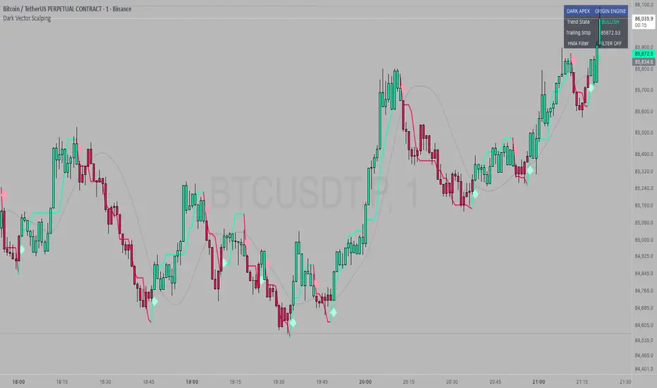
Dark Vector ScalpingThe Dark Vector Scalping indicator is a high-frequency trend-following system designed specifically to capture rapid momentum shifts in the market. It combines a staircase-style breakout logic with volatility-adjusted trailing stops to define market direction.
While the underlying math is robust enough for various asset classes, this specific configuration is optimized for scalping operations on 1-minute and 5-minute timeframes. It aims to filter out the "noise" common in lower timeframes while reacting quickly to genuine breakouts.
Core Components
1. The Apex Engine (Staircase Logic) Unlike traditional moving averages that curve with price, this engine uses a "hard" breakout logic. It looks back at a specific number of bars (Sensitivity) to find the highest highs and lowest lows.
Bullish Flip: Occurs when the price closes below the calculated low of the previous trend.
Bearish Flip: Occurs when the price closes above the calculated high of the previous trend.
Trailing Stop: Once a trend is established, a trailing stop line is drawn. This line only moves in the direction of the trend (up for bullish, down for bearish) and never retraces, acting as a ratchet to lock in paper profits.
2. Volatility Normalization To prevent getting stopped out by random market noise (scam wicks), the indicator calculates the Average True Range (ATR). It multiplies this volatility metric by a user-defined deviation factor to determine exactly how far the stop line should be from the current price action.
3. The Hull Moving Average (HMA) Filter The script includes an optional 50-period Hull Moving Average. The HMA is known for being extremely fast and smooth, reducing lag compared to standard moving averages.
Visual Reference: You can plot the line to see the overall macro trend.
Hard Filter: You can enable a "Safety Filter" in the settings. If enabled, the system will only generate Buy signals if the price is above the HMA, and Sell signals if the price is below the HMA.
4. The Dashboard A data panel is located on the chart (customizable position) to provide instant numerical data without needing to calculate levels manually. It displays the current trend state, the exact price of the trailing stop, and the status of the HMA filter.
Settings & Configuration
Sensitivity (Lookback)
Default: 5
This is the primary setting for the Apex Engine. A setting of 5 is the "sweet spot" for 1-minute and 5-minute charts. It allows the system to react very quickly to sudden volume spikes. Increasing this number (e.g., to 10) will make the signals slower and more conservative.
Stop Deviation
Default: 3.0
This controls the "breathing room" for the trade. A value of 3.0 allows for standard volatility on minute charts without triggering a premature exit. Lowering this to 2.0 will result in tighter stops but more false signals.
HMA Filter
Use HMA as Filter? (Default: OFF):
When OFF, the system signals purely on price action breakouts (fastest).
When ON, the system waits for the price to align with the 50-period HMA before signaling (safest, but may delay entry).
How to Interpret Visuals
Candle Colors
Teal/Green: The market is in a Bullish regime.
Red/Pink: The market is in a Bearish regime.
The Line
The solid stepped line represents the hard invalidation point. If price closes beyond this line, the trend is considered over.
Diamond Signals
Light Green Diamond (Below Bar): Confirmed Buy Signal. A new bullish trend has started.
Light Red/Pink Diamond (Above Bar): Confirmed Sell Signal. A new bearish trend has started.
Trading Strategy Guide
The Scalp Entry
Ensure you are on a 1-minute or 5-minute timeframe.
Wait for a signal Diamond to close. Do not enter while the bar is still forming, as the signal may repaint (disappear) if the price retraces before the close.
Long Entry: Enter when a Green Diamond appears and the candle turns Teal.
Short Entry: Enter when a Red Diamond appears and the candle turns Red.
Risk Management
Stop Loss: Your invalidation level is the "Apex Stop" line. You can place your hard stop loss slightly beyond this line.
Take Profit: Because this is a trend-following system, it is often best to hold until the candle color changes, or to take profit at fixed Risk:Reward ratios (e.g., 1:1.5 or 1:2).
The HMA Nuance If you find the market is "choppy" (moving sideways), enable the "Use HMA as Filter" option in the settings. This will force the system to ignore signals that are counter-trend to the longer-term momentum.
Disclaimer
The information provided by the "Dark Vector Scalping" indicator and this accompanying guide is for educational and informational purposes only. It does not constitute financial, investment, or trading advice. Trading cryptocurrencies, stocks, and forex involves a high level of risk and may not be suitable for all investors. You could lose some or all of your initial investment.
JFX Smart ORBJFX Smart ORB is a complete visual trading framework built around the classic
Opening Range Breakout (ORB) concept, enhanced with:
Fixed position sizing (lots)
Automatic Martingale-style size increase after full SL only
A full, event-based alert system for entries, targets, stops, and break-even exits
All of that, plus a clean dual-language HUD (AR/EN) directly on your chart.
What JFX Smart ORB Does
🔹 Smart Opening Range (ORB)
Automatically defines the opening range via:
Fixed timeframe (e.g., 30 minutes), or
Custom session window (e.g., 09:30–09:45) with configurable time zone (UTC-5, etc.).
Plots ORH / ORL and the midline, and shades the OR building zone for visual clarity.
🔹 Regime Detection (Context)
Background shading tells you where price is trading:
📈 Green: Above ORH (bullish regime)
📉 Red: Below ORL (bearish regime)
🔵 Neutral: Inside the OR range
This gives you an instant read on context before you even think about entries.
🔹 Trade Logic & Multi-Target Management
Automatic entry when:
Price breaks ORH for long trades
Price breaks ORL for short trades
Stop loss on the opposite side of the range.
Targets calculated in R-multiples:
TP1 = 0.5R
TP2 = 1R
TP3 = 2R
Position is split across TP1 / TP2 / TP3 according to user-defined percentages, normalized automatically.
💰 Fixed Size + Martingale After Loss Only
Inputs:
Capital ($) – for display/analysis
Base Position Size (lots) – your standard trade size
Contract per 1.00 lot – to convert price movement to P/L in dollars
If a trade hits a full stop loss before TP1, the indicator:
Doubles the position size for the next trade (Martingale factor).
If the trade hits any profit (TP1, TP2, TP3) or closes at Break-Even, the:
Martingale factor resets back to 1× (base size).
Everything is tracked and shown on the chart: current trade size, P/L per trade, and net P/L.
🧠 Session Protection & Inner-Range Logic
Optional session block:
After a strong winning trade (e.g., TP2 or TP3), you can block any further trades for the rest of the ORB session to avoid overtrading.
Inner-range logic after TP1:
Prevents immediate re-entry in the same direction after a BE exit from TP1.
Waits for price to return into a defined inner range around the OR midline, filtering out random noise.
📊 On-Chart HUD / Stats (AR & EN)
The built-in info panel shows in real time:
Session status:
✅ Trading enabled
🚫 Trading disabled until a new ORB
⏳ Waiting for two bars back inside the range
Current price regime (Above ORH / Below ORL / Inside OR).
Entry price, stop loss, TP1, TP2.
Total trades, losing trades, and win rate.
Counts of TP1 / TP2 / TP3 hits.
Reported capital, current position size (lots).
Current trade P/L and total net P/L in dollars.
🔔 Full Alert System (Ready for Webhooks/Bots)
The indicator generates per-bar event flags that feed into alertcondition() so you can build any alert setup you want (pop-up, email, SMS, webhook, bot, EA, etc.).
Available alerts:
Buy Entry: JFX_ORB_BUY_ENTRY
Sell Entry: JFX_ORB_SELL_ENTRY
Stop Loss Hit: JFX_ORB_SL_HIT
TP1 Hit: JFX_ORB_TP1
TP2 Hit: JFX_ORB_TP2
TP3 Hit: JFX_ORB_TP3
Break-Even Exit: JFX_ORB_BE_EXIT
Simply create alerts in TradingView based on these conditions and messages, or plug them into your automation via webhooks.
Who Is JFX Smart ORB For?
Day traders and scalpers who like structured ORB strategies instead of random entries.
Traders who want clear, rule-based entries, well-defined stops and multi-target exits.
Anyone looking to combine ORB + position management + Martingale logic + Alerts in a single, professional tool.
Disclaimer:
This indicator is a professional analysis and trade-management tool, not a guarantee of profit.
Always test on demo first and adapt the position sizing and Martingale behavior to your own risk management and trading plan.

SFP + Binance Hedge Direct (Full)RSI SFP + Binance Direct Auto-Trading (Hedge Mode)
RSI SFP + 币安直连自动交易脚本 (双向持仓模式)
🇨🇳 中文说明 (Chinese)
简介 / Introduction 这是一个专为 Binance Futures Signal Bot(币安合约信号机器人) 深度定制的 RSI SFP(假突破)策略脚本。它移除了对第三方中间商(如 WunderTrading)的依赖,实现了 TradingView 到币安的毫秒级直连下单,极大降低了滑点。
核心功能 / Key Features
SFP 针尖策略: 基于 RSI 背离 + 前高/前低假突破(Swing Failure Pattern)捕捉反转机会。支持 "触碰即入场" 或 "收线确认" 模式。
币安直连 (Binance Direct): 内置符合币安 Hedge Mode (双向持仓) 标准的 JSON 生成器。支持自动挂入 TP/SL (止盈止损) 单。
智能资金管理: 无需手动计算总金额。只需输入 本金 (Margin) 和 杠杆 (Leverage),脚本自动计算总名义价值 (Notional Value) 并发送给交易所。
多重过滤系统: 集成 布林带 (Bollinger Bands) 和 成交量 (Volume) 过滤器,有效过滤震荡中的假信号。
双重报警支持:
机器人端: 发送标准 JSON 指令,包含开单、金额、止盈止损价。
手机端: 通过隐藏绘图输出,支持发送清晰易读的文本消息(如 "BTC Long, Entry: 95000, TP: 96000")。
设置指南 / Setup Guide
参数设置:
在 🤖 Bot Connection 中填入币安提供的 signalId 和 uid。
在 Position & Money 中设置您的单笔本金和杠杆(如 1000 U, 100x)。
币安设置:
在币安创建信号机器人时,务必选择 Order Size 单位为 USDT。
报警设置 (双报警模式):
自动交易: 创建报警 -> 选择 Any alert() function call -> 填入 Webhook URL -> 消息框留空。
手机提醒: 创建报警 -> 选择 Bullish/Bearish Reversal -> 填入 {{plot("Alert_Entry")}} 等占位符 -> 发送到 App。
🇺🇸 English Description
Introduction This is a specialized RSI SFP (Swing Failure Pattern) strategy script tailored for the Binance Futures Signal Bot. It eliminates the need for third-party middleware (like WunderTrading), enabling direct, low-latency execution from TradingView to Binance with minimal slippage.
Key Features
SFP Strategy: Captures reversals based on RSI Divergence + Structure False Breakouts (Wick-based). Supports "Touch Only" or "Close Return" entry modes.
Binance Direct Integration: Built-in JSON generator strictly compliant with Binance Hedge Mode. Automatically attaches TP/SL (Take Profit & Stop Loss) orders directly to the entry signal.
Smart Money Management: No need to calculate position sizes manually. Simply input your Margin (USDT) and Leverage. The script auto-calculates the Total Notional Value to send to the exchange.
Advanced Filtering: Integrated Bollinger Bands and Volume filters to reduce false signals during choppy markets.
Dual Alert System:
For Bot: Sends raw JSON commands with execution details.
For Phone: Uses hidden plots to allow clean, human-readable text alerts (e.g., "BTC Long, Entry: $...", "TP: $...").
Setup Guide
Script Settings:
Paste your Binance signalId and uid in the 🤖 Bot Connection section.
Set your Margin and Leverage in Position & Money (e.g., 1000 USDT, 100x).
Binance Settings:
When creating the Signal Bot on Binance, ensure Order Size unit is set to USDT.
Alert Setup (Double-Alert Method):
For Auto-Trading: Create Alert -> Select Any alert() function call -> Check Webhook -> Leave Message empty.
For Phone Notification: Create Alert -> Select Bullish/Bearish Reversal -> Use placeholders like {{plot("Alert_Entry")}} -> Notify on App.
⚠️ Risk Warning
This script automates high-leverage trading. Ensure your Binance Futures account is set to Hedge Mode before running. Use at your own risk.

Dr. Barbara Star: Dual Strategies Combined [Merged] - geminiDr. Barbara Star: Dual Strategy Suite (Merged)
Overview
This script integrates two distinct but complementary trading methodologies developed by Dr. Barbara Star: "Capture Direction & Momentum" and "Profit with Dual Oscillators & Bands." While both strategies utilize price channels to filter noise, they approach entry and exit timing from different angles—one focusing on momentum shifts (Stochastic/EMA) and the other on cyclical price deviations (DPO/Bollinger Bands).
This tool allows the user to run either strategy independently or combine them to find high-confluence setups where momentum and cyclical structure align.
Strategy A: Capture Direction & Momentum
Source: Capture Direction And Momentum
1. Purpose & Theory
The goal of this method is to filter out the "noise" of choppy markets and identify the specific point where price direction aligns with momentum strength. It moves away from trying to catch exact tops or bottoms and instead focuses on catching the "meat" of the trend (continuation).
2. Implementation
Structure (The Channel): A 13-period SMA of the Highs and Lows creates a "No Trade Zone". When price is inside this channel, the market is considered directionless.
Direction (5 EMA): A fast 5-period EMA acts as a directional trigger. When it breaks outside the SMA channel, it signals acceleration.
Momentum (Modified Stochastic): A Slow Stochastic (14,2) is used, but with a crucial modification: the overbought/oversold levels are shifted to 40 and 60 (instead of 20/80).
3. How to Use It
The "Trend Zones" (Background Colors):
Green Background (Bullish): The 5 EMA is above the channel AND the Stochastic is > 60. This is the "Go" zone.
Red Background (Bearish): The 5 EMA is below the channel AND the Stochastic is < 40.
Yellow Background: The "No Trade Zone." The price is consolidating, or the indicators disagree.
The Continuation Signal (Marked by "U" or "D"):
Why it matters: This is the most powerful setup in the system. It detects when price pulls back (retracement) but momentum remains strong.
The Signal: If the 5 EMA dips back into the SMA channel (weakness) but the Stochastic stays above 60 (strength), a blue "U" (Up) marker appears. This indicates the pullback is likely a buying opportunity, not a reversal. Conversely, a yellow "D" appears in downtrends if Stoch stays below 40.
Exits (Marked by "X"):
Signals to take profit when the 5 EMA closes back inside the channel and the Stochastic crosses back into the neutral 40–60 zone.
Strategy B: Dual Oscillators & Bands
Source: Profit With Dual Oscillators & Bands
1. Purpose & Theory
This strategy uses "Dual Bollinger Bands" to define the volatility structure of the trend and "Dual Detrended Price Oscillators" (DPO) to time the entries based on cycle shifts.
2. Implementation
Structure (Dual Bands):
Inner Bands (1 SD): These define the "Trend Channel." Strong trends tend to ride between the 1 SD and 3 SD bands.
Outer Bands (3 SD): These represent extremes (containing 99.5% of price action). Hits here often signal exhaustion.
Timing (Dual DPOs):
Long Oscillator (DPO 20): Identifies the broader trend direction (Positive = Bullish).
Short Oscillator (DPO 9): Identifies shorter-term timing and potential divergences.
3. How to Use It
Identifying the Trend State:
Strong Uptrend: Price holds above the Upper Inner Band (1 SD).
Strong Downtrend: Price holds below the Lower Inner Band (1 SD).
Transition/Neutral: Price is stuck between the Upper and Lower Inner bands.
Entry Signals (Triangles on Chart & Circles in Pane):
Aggressive Entry: When the fast DPO 9 crosses zero. This signals early momentum shifts.
Conservative Entry: Wait for the slow DPO 20 to cross zero, confirming the broader trend has shifted.
Visuals: The script plots triangles on the main chart when these cross. In the lower pane, a Blue Circle indicates a bullish cross and a Yellow Circle indicates a bearish cross.
Continuation Setup:
Similar to Strategy A, look for moments where the DPO 9 dips below zero (pullback) while the DPO 20 remains above zero (trend intact). This is often a reload opportunity.
Combined Mode: The "Power Couple"
When selecting "Both" in the settings, the indicator merges these tools for maximum confirmation:
Visual filtering: The lower pane automatically scales the DPO lines to fit inside the 0–100 Stochastic range (centering the DPO zero line at 50). This allows you to read both momentum and cycles in a single glance.
Confluence Trading:
Look for the Background to turn Green (Strategy A Trend) coincident with a Blue Triangle/Circle (Strategy B Momentum Cross).
Use the Inner Bollinger Bands (Strategy B) as your trailing stop-loss while riding the SMA Channel (Strategy A) trend.
Reference Settings
Strategy A: SMA Channel (13), EMA (5), Stochastic (14, 2, 40/60 levels).
Strategy B: Bollinger Bands (20 SMA, 1.0 & 3.0 deviations), DPO (9 & 20).
Sources: of the methodologies
1-Stocks & Commodities V. 32:7 (10-16): Profit With Dual Oscillators & Bands by Barbara Star, PhD
2-Stocks & Commodities V. 43:12 (8–12): Capture Direction And Momentum by Barbara Star, PhD

Mark Minervini SEPA - Balanced
📊 MARK MINERVINI SEPA BALANCED - COMPLETE USER GUIDE
🚀 WHAT IS THIS INDICATOR?
This is a professional swing trading indicator based on Mark Minervini's famous
Trend Template strategy. It automatically identifies high-probability setups where:
✅ Long-term trend is BULLISH (confirmed by moving averages)
✅ Stock is OUTPERFORMING the market (relative strength improving)
✅ Price is CONSOLIDATING (forming a base for breakout)
✅ Volume is CONFIRMING (volume spike on breakout)
Result: CLEAR BUY SIGNALS when everything aligns! 🎯
🎨 WHAT YOU SEE ON YOUR CHART
1️⃣ FOUR MOVING AVERAGE LINES:
🟠 Orange Line (MA 20) = Short-term trend
🔵 Blue Line (MA 50) = Intermediate trend
🟢 Green Line (MA 150) = Long-term trend
🔴 Red Line (MA 200) = Very long-term trend
IDEAL: All lines stacked in order (Orange > Blue > Green > Red)
2️⃣ BACKGROUND COLOR:
🟢 GREEN background = Trend template is VALID (bullish setup ready)
🔴 RED background = Trend template is BROKEN (avoid trading)
3️⃣ DASHBOARD PANEL (Top-Right):
Real-time checklist showing:
✓ 6 core trend template rules
✓ Relative strength status
✓ VCP base quality
✓ Stage classification (S1/S2/S3/S4)
✓ Volume breakout status
4️⃣ VCP BASE BOXES (Blue Rectangles):
Shows where consolidation is happening
This is your potential entry zone
5️⃣ BUY SIGNAL LABEL (Green Text Below Candle):
Green "BUY" label appears when ALL criteria are met
This is your strongest entry signal
6️⃣ STOP LOSS LINE (Red Dashed Line):
Shows your stop loss level (base low)
📖 HOW TO USE - STEP BY STEP
STEP 1: ADD INDICATOR TO CHART
────────────────────────────────
1. Open TradingView chart
2. Click "Indicators" (top toolbar)
3. Search "Minervini SEPA Balanced"
4. Click to add to your chart
5. Use DAILY (1D) timeframe for swing trading
STEP 2: CHECK THE DASHBOARD (Top-Right Panel)
1. Look at all the checkmarks
2. Count how many are GREEN (✓)
3. Check Stage column - is it showing S2 or S1?
STEP 3: LOOK FOR SETUP PATTERNS
─────────────────────────────────
Ideal setup shows:
✓ Dashboard: 10+ criteria are GREEN
✓ Stage: S2 (green) or S1 (orange)
✓ Blue VCP box visible on chart (base forming)
✓ Moving averages aligned (50 > 150 > 200)
✓ Price above all moving averages
✓ Background is GREEN
STEP 4: WAIT FOR ENTRY SIGNAL
──────────────────────────────
Option A: BUY SIGNAL label appears
→ Green "BUY" label = ALL criteria met
→ ENTER at market price immediately
Option B: Setup looks good but no BUY label yet
→ Wait for price to break above blue VCP box
→ Volume should spike (1.3x or higher)
→ Then enter at breakout
STEP 5: PLACE YOUR TRADE
────────────────────────
📍 ENTRY: At breakout from VCP base
📍 STOP LOSS: Base low (red dashed line)
📍 TARGET: 20-30% move (typical Minervini target)
📍 HOLDING TIME: 2-4 weeks
🎯 BALANCED VERSION - WHY IT'S BETTER FOR INDIAN STOCKS
Volume Multiplier: 1.3x (NOT 1.5x)
→ Original was too strict for Indian market
→ 1.3x is realistic and catches good breakouts
→ Results: 5-10 signals per stock per year (tradeable!)
Trend Template: Core 6 rules (NOT all 8)
→ Focuses on the most important rules
→ Still maintains quality, but more flexible
→ Works better with Indian stock behavior
Stage Allowed: S1 OR S2 (NOT just S2)
→ Catches earlier moves
→ Allows you to enter sooner
→ But maintains quality with other criteria
📊 DASHBOARD INDICATORS - WHAT EACH MEANS
TREND SECTION (Core 6 Rules):
─────────────────────────────
P>200 ✓ = Price above 200-day MA (long-term uptrend)
150>200 ✓ = MA150 above MA200 (MA alignment)
200↑ ✓ = MA200 trending up (uptrend accelerating)
50>150 ✓ = MA50 above MA150 (intermediate uptrend)
50>200 ✓ = MA50 above MA200 (overall alignment)
P>50 ✓ = Price above MA50 (pullback level intact)
RS STRENGTH SECTION:
───────────────────
RS↑ ✓ = Stock outperforming NIFTY index
✗ = Stock underperforming NIFTY (avoid)
VCP BASE SECTION:
────────────────
In Base ✓ = Consolidation zone detected
✗ = No consolidation yet
Vol Dry ✓ = Volume drying up (base tightening)
✗ = Normal volume (consolidation weak)
ENTRY SECTION:
──────────────
Stage S2 = GREEN (best for swing trading)
S1 = ORANGE (acceptable, early entry)
S3 = RED (avoid - distribution phase)
S4 = RED (avoid - downtrend)
Vol Brk ✓ = Volume confirmed breakout (1.3x+ average)
✗ = Weak volume (breakout likely to fail)
❌ WHEN NOT TO TRADE
SKIP if ANY of these are true:
❌ Background is RED (trend template broken)
❌ Stage is S3 or S4 (distribution or downtrend)
❌ Vol Brk is RED (volume not confirming)
❌ RS↑ is ORANGE/RED (stock underperforming market)
❌ Blue box is NOT visible (no base forming)
❌ Base is very loose/messy (not tight enough)
❌ Moving averages are not aligned
❌ Less than 8 GREEN criteria on dashboard
⚙️ CUSTOMIZATION GUIDE
Click ⚙️ gear icon next to indicator name to adjust settings:
VOLUME MULTIPLIER (Default: 1.3)
────────────────────────────────
Current: 1.3x = BALANCED for Indian stocks ✅
Change to 1.2x = MORE signals (more false breakouts)
Change to 1.4x = FEWER signals (very selective)
Change to 1.5x = ORIGINAL (too strict, rarely triggers)
RS BENCHMARK (Default: NSE:NIFTY)
─────────────────────────────────
Current: NSE:NIFTY = Large-cap stocks
Change to NSE:NIFTY500 = Mid-cap stocks
Change to NSE:NIFTYNXT50 = Small-cap stocks
MINIMUM BASE DAYS (Default: 20)
───────────────────────────────
Current: 20 days = 4 weeks consolidation ✅
Change to 15 = Shorter bases (more frequent signals)
Change to 25 = Longer bases (higher quality)
ATR% FOR TIGHTNESS (Default: 1.5)
──────────────────────────────────
Current: 1.5% = BALANCED ✅
Change to 1.0% = ONLY very tight bases
Change to 2.0% = Loose bases accepted
📈 REAL TRADING EXAMPLE
SCENARIO: Trading RELIANCE over 4 weeks
WEEK 1: Base Starts Forming
────────────────────────────
- Price consolidating around ₹1,500
- Dashboard: 5/14 criteria green
- Action: MONITOR (not ready yet)
WEEK 2: Base Tightens
─────────────────────
- Price still ₹1,500 (no movement)
- VCP box appearing on chart
- Dashboard: 8/14 criteria green
- Vol Dry: ✓ (volume shrinking - good!)
- Action: MONITOR (almost ready)
WEEK 3: Perfect Setup Formed
──────────────────────────────
- Base still ₹1,500
- Dashboard: 12/14 criteria GREEN ✓✓✓
- Stage: S2 ✓
- Blue box tight and clean
- Action: WAIT FOR BREAKOUT
WEEK 4: Breakout Happens!
──────────────────────────
- Price closes at ₹1,550 (breakout!)
- Volume: 1.6x average (exceeds 1.3x requirement)
- Dashboard: BUY SIGNAL ✓ (all criteria met)
- Action: ENTER TRADE
Entry: ₹1,550
Stop: ₹1,480 (base low)
Target: ₹1,850 (20% move)
RESULT: +19.4% profit in 2 weeks! ✅
💡 PRO TIPS FOR BEST RESULTS
1. USE DAILY (1D) CHARTS ONLY
Weekly charts = Fewer signals, slower moves
Daily charts = Best for swing trading ✅
Intraday charts = Too many false signals
2. SCAN MULTIPLE STOCKS
Don't just watch 1 stock
Scan 50-100 stocks daily
More stocks = More opportunities
3. WAIT FOR PERFECT ALIGNMENT
Don't enter on 8/14 criteria
Wait for 12+/14 criteria
This increases win rate significantly
4. VOLUME IS CRITICAL
Always check Vol Brk column
No volume = Likely to fail
1.3x+ volume = Good breakout
5. COMBINE WITH YOUR OWN ANALYSIS
Indicator gives technical signals
You add your own fundamental view
Strong fundamental + technical = Best trade
6. BACKTEST ON HISTORICAL DATA
Use TradingView Replay feature
Go back 6-12 months
See how many signals appeared
Verify which were profitable
7. KEEP A TRADING JOURNAL
Track entry, exit, profit/loss
Note what worked and what didn't
Continuous improvement!
⚠️ IMPORTANT DISCLAIMERS
✓ This indicator is for educational purposes only
✓ Past performance does not guarantee future results
✓ Always use proper risk management (position sizing, stop loss)
✓ Never risk more than 2% of your account on one trade
✓ Backtest thoroughly before using with real money
✓ The indicator provides technical signals, not investment advice
✓ Losses can occur - trade at your own risk
🎯 QUICK START CHECKLIST
Before entering ANY trade, verify:
□ Dashboard shows mostly GREEN (10+ criteria)
□ Stage = S2 (green) or S1 (orange)
□ Blue VCP box visible on chart
□ Price just broke above the box
□ Volume is high (1.3x+ average, Vol Brk = ✓)
□ Moving averages aligned (50 > 150 > 200)
□ RS is uptrending (RS↑ = ✓)
□ BUY SIGNAL label appeared (optional but strong confirmation)
ALL CHECKED? → READY TO BUY! 🚀
📞 FOR HELP & SUPPORT
Questions about the indicator?
→ Check the dashboard - each criterion has a specific meaning
→ Review this guide - answers most common questions
→ Backtest on historical data using TradingView Replay
→ Start with paper trading (no real money) first
🎓 LEARNING RESOURCES
To understand Mark Minervini's method better:
→ Read: "Trade Like a Stock Market Wizard" by Mark Minervini
→ Watch: TradingView educational videos on trend templates
→ Practice: Backtest this indicator on 6-12 months of historical data
→ Learn: Study successful traders who use similar strategies
GOOD LUCK WITH YOUR TRADING! 🚀📈
May your trends be bullish and your breakouts be explosive! 🎯

Momentum Market Structure ProThis first indicator in the Beyond Market Structure Suite gives you clear market structure at a glance, with adaptive support & resistance zones. It's the only SMC-style indicator built from momentum highs & lows, as far as I know. It creates dynamic support & resistance zones that change strength and resize intelligently, and gives you timely alerts when price bounces from support/rejects from resistance.
You’re free to use the provided entry and exit signals as a ready-to-use, self-contained strategy, or plug its structure into your existing system to sharpen your edge :
• Market structure bias may help improve a compatible system's win rate by taking longs only in bullish bias and shorts in bearish structure.
• Support/resistance can help trend traders identify inflection points, and help range traders define ranges.
🟩 HIGHLIGHTS
⭐ Unique market structure with different characteristics than purely price-based models.
⭐ Support and resistance created from only the extreme levels.
⭐ Support & resistance zones adapt to remain relevant. Zones are deactivated when they become too weak.
⭐ Long and short signals for a bounce from support/rejection from resistance.
🟩 WHY "MARKET STRUCTURE FIRST, ALWAYS"?
"There is only one side to the stock market; and it is not the bull side or the bear side, but the right side." — Jesse Livermore, Reminiscences of a Stock Operator (1923)
If the market is structurally against your trade, you're gonna have a bad time. So you must know what the market structure is before you plan your trade. The more precise and relevant your definition of market structure, the better.
🟩 HOW TO TRADE USING THIS INDICATOR (SIMPLE)
• Directional filter : The prevailing bias background can be used for any kind of trades you want to take. For example, you can long a bounce from support in a bullish market structure bias, or short a rejection from resistance in bearish bias.
• Entries : For more conservative entries, you could wait for a Candle Trend flip after a reaction from your chosen zone (see below for more about Candle Trend).
• Stops : The included running stop-loss level based on Average True Range (ATR) can be used for a stop-loss — set the desired multiplier, and use the level from the bar where you enter your trade.
• Take-profit : Similarly, you can set a Risk:Return-based take-profit target. Support and resistance zones can also be used as full or partial take-profit targets.
See the Advanced section below for more ideas.
🟩 SIGNALS
⭐ ENTRIES
You can enable signals and alerts for bounces from support and rejections from resistance (you'll get more signals using Adaptive mode). You can filter these by requiring corresponding market structure bias (it uses the bias you've already set for the background), and by requiring that Candle Trend confirm the move.
I've slipped in my all-time favourite creation to this indicator: Candle Trend. When price makes a Simple Low pivot, the trend flips bullish. When price then makes a Simple High pivot, the trend flips bearish (see my Market Structure library for a full explanation). This tool is so simple, yet I haven't noticed it anywhere else. It shows short-term trends beautifully. I use it mainly as confirmation of a move. You can use it to confirm ANY kind of move, but here we use it for bounces from support/rejections from resistance.
Note that the pivots and Zigzags are structure, not signals.
⭐ STOPS
You can use the supplied running ATR-based stop level to find a stop-loss level that suits your trading style. Set the desired multiplier, and use the level from the bar where you enter your trade.
⭐ TAKE-PROFIT
Similarly, you can set a take-profit target based on Risk:Return (R:R). If this setting is enabled, the indicator calculates the distance between the closing price and your configured stop, then multiplies that by the configured R:R factor to calculate an appropriate take-profit level. Note that while the stop line is reasonably smooth, the take-profit line varies much more, reflecting the fact that if price has moved away from your stop, the trade requires a greater move in order to hit a given R:R ratio.
Since the indicator doesn't know where you were actually able to enter a position, add a ray using the drawing tool and set an alert if you want to be notified when price reaches your stop or target.
🟩 WHAT'S UNIQUE ABOUT THIS INDICATOR
⭐ MOMENTUM PIVOTS
Almost all market structure indicators use simple Williams fractals. A very small number incorporate momentum, either as a filter or to actually derive the highs and lows. However, of those that derive pivots from momentum, I'm not aware of any that then create full market structure from it.
⭐ SUPPORT & RESISTANCE
Some other indicators also adjust S/R zones after creation, some use volume in zone creation, some increase strength for overlap, a few merge zones together, and many use price interactions to classify zones. But my implementation differs from others, as far as I can tell after looking at many many indicators, in seven specific ways:
+ Zones are *created* from purely high-momentum pivots, not derived or filtered from simple Williams pivots (e.g. `ta.pivothigh()`).
+ Zones are *weakened* dynamically as well as strengthened. Many people know that S/R gets stronger if price rejects from it, but this is only half the story. Different price patterns strengthen *or weaken* zones.
+ We use *conviction-weighted candle patterns* to adjust strength. Not simply +1 for price touching the zone, but a set of single-bar and multi-bar patterns which all have different effects.
+ The rolling strength adjustments are all *moderated by volume*. The *relative volume* forms a part of each adjustment pattern. Some of our patterns reward strong volume, some punish it.
+ We do our own candle modelling, and the adjustment patterns take this into account.
+ We *resize* zones as a result of certain candle patterns ("indecision erodes, conviction defends").
+ We shrink overlapping zones to their sum *and* add their strengths.
🟩 HOW TO TRADE USING THIS INDICATOR (ADVANCED)
In addition to the ideas in the How to Trade Using This indicator (Simple) section above, here are some more ideas.
You can use the market structure:
• As a bias for entries given by more reactive momentum resets, or indeed other indicators and systems.
• You could use a change in market structure to close a long-running trend-following position.
You can use the distance from a potential entry to the CHoCH line as a filter to choose higher-potential trades in ranging assets.
Confluence between market structure and your favourite trend indicator can be powerful.
Multi timeframe analysis
This is a bit of a rabbit hole, but you could use a split screen with this indicator on a higher timeframe (HTF) view of the same asset:
• If the 1D structure turns bullish, the next time that the 1H structure also flips bullish might be a good entry.
• Rejection from a HTF zone, confirmed by lower timeframe (LTF) structure, could be a good entry.
None of this is advice. You need to master your own system, and especially know your own strengths and weaknesses, in order to be a successful trader. An indicator, no matter how cool, is not going to one-shot that process for you.
In Adaptive mode, a skillful trader will be able to spot more opportunities to classify and use support and resistance than any algorithm, including mine, now that they've been automatically drawn for you.
If you are doing historical analysis, note that the "Calculated bars" setting is set to a reasonably small number by default, which helps performance. Either increase this number (setting to zero means "use all the bars"), or use Bar Replay to examine further back in the chart's history. If you encounter errors or slow loading, reduce this number.
🟩 SUPPORT & RESISTANCE
A support zone is an area where price is more likely to bounce, and a resistance zone is an area where price is more likely to reject. Marking these zones up on the chart is extremely helpful, but time-consuming. We create them automatically from only high-momentum areas, to cut noise and highlight the zones we consider most important.
In Simple mode, we simply mark S/R zones from momentum and Implied pivots. We don't update them, just deactivate them if price closes beyond them. Use this mode if you're interested in only recent levels.
In Adaptive mode, zones persist after they're traversed. Once the zones are created, we adjust them based on how price and volume interact with them. We display stronger zones with more opaque fills, and weaker zones with more transparent fills. To calculate strength, we first preprocess candles to take into account gaps between candles, because price movement after market is just as important in its own way. The preprocessing also redefines what constitutes upper and lower wicks, so as to better account for order flow and commitment. We use these modelled candle values, as well as their relative amplitude historically, rather than the raw OHLC for all calculations for interactions of price and zones. It's important to understand, when trying to figure out why the indicator strengthened or weakened a zone, that it sees fundamental price action in a different way to what is shown on standard chart candles (and in a way that can't easily be represented accurately on chart candles).
Then, we strengthen or weaken , and resize support and resistance zones dynamically using different formulas for different events, based on principles including these:
• The close is the market's "vote", the momentum shift anchor.
• Defended penetrations reveal validated liquidity clusters.
• Markets contract to defended levels.
• "The wick is the fakeout, but the close tells you if institutions held the level." — ICT (Inner Circle Trader)
Adaptive mode is more powerful, but you might need to tweak some of the Advanced Support & Resistance settings to get a comfortable number of zones on the chart.
🟩 MOMENTUM PIVOTS
The building blocks of market structure are Highs and Lows — places where price hits a temporary extreme and reverses. All the indicators I could find that create full market structure do so from basic price pivots — Williams fractals, being the highest/lowest candle wick for N candles backwards and forwards (there are some notable first attempts on TradingView to use momentum to define pivots, but no full structure). "Highest/lowest out of N bars" is the almost universal method, but it also picks up somewhat arbitrary price movements. Recognising this, programmers and traders often use longer lookbacks to focus on the more significant Highs and Lows. This removes some noise, but can also remove detail.
My indicator uses a completely different way of thinking about High and Low pivots. A High is where *momentum* peaks and falls back, and a low is where it dips and then recovers. While this is happening, we record the extremes in price, and use those prices as the High or Low pivot zones.
This deliberately picks out different, more meaningful pivots than any purely price-based approach, helping you focus on the swings that matter. By design, it also ignores some stray wicks and other price action that doesn't reflect significant momentum. Price action "purists" might not like this at first, but remember, ultimately we want to trade this. Check and see which levels the market later respects. It's very often not simply the numerically higher/lower local maxima and minima, but the levels that held meaning, interpreted here through momentum.
The first-release version uses the humble Stochastic as the structural momentum metric. Yes, I know — it's overlooked by most people, but that's because they're using it wrong. Stochastic is a full-range oscillator with medium excursions, unlike RSI, say, which is a creeping oscillator with reluctant resets. This makes Stoch (at the default period of 14) not quite reactive enough for on-the-ball momentum reset entry signals, but close to perfect (no metric is 100%) for structural pivots.
Stochastic is also a solid choice for structure because divergences are rare and not usually very far away in terms of price. More reactive momentum metrics such as Stochastic RSI produce very noisy structure that would take a whole extra layer of interpreting (see Further Research, below).
For these reasons, I may or may not add other options for momentum. In the initial release, I've added smoothed RSI as an alternative just to show it's possible, which takes even longer than Stochastic to migrate from one extreme to another, creating an interesting, longer-term structure.
🟩 IMPLIED PIVOTS
We want pivots to mark important price levels so that we can compute market direction and support & resistance zones from them.
In this context, we see that some momentum metrics, and Stochastic in particular, tend to give multiple consecutive resets in the same direction. In other words, we get High followed by High, or Low followed by Low, which does not give us the chance to create properly detailed structure. To remedy this, we simply take the most extreme price action between two same-direction pivots, and create an Implied pivot out of it, after the second same-direction pivot is created.
Obviously these pivots are created very late. Recalling why we wanted them, we realise that this is fine. By definition , price has not exceeded the Implied Pivot level when they're created. So they show us an interesting level that is yet untested.
Implied Pivots are thus created indirectly by momentum but defined directly by price. They are for structure only. We choose not to give them a Dow type (HH, HL, LH, LL) and not to include them in the Main Zigzag to emphasise their secondary nature. However, Implied Pivots are not "internal" or "minor" pivots. There is no such concept in the current Momentum Market Structure model.
If you want less responsive, more long-term structure, you can turn Implied Pivots off.
🟩 DOW STRUCTURE
Dow structure is the simplest form of market structure — Higher Highs (HHs) and Higher Lows (HLs) is an uptrend (showing buyer dominance), and vice-versa for a downtrend.
We label all Momentum (not Implied) Pivots with their Dow qualifier. You can also choose to display the background bias according to the Dow trend.
There is an input option to enable a "Ranging" Dow state, which happens when you get Lower Highs in an uptrend or Higher Lows in a downtrend.
🟩 SMC-STYLE STRUCTURE (BOS, CHOCH)
The ideas of trend continuation after taking out prior highs/lows and looking for early signs of possible reversal go back to Dow and Wyckoff, but have been popularised by SMC as Break Of Structure (BOS) and Change of Character (CHoCH).
BOS can be used as a trigger: for example:
• Wait for a bullish break of structure
• Then attempt to buy the pullback
• Cancel if structure breaks bearish (meaning, we get a bearish CHoCH break)
How to buy the pullback? This is the trillion-dollar question. First, you need solid structure. Without structure, you got nothin'. Then, you want some identified levels where price might bounce from.
If only we incorporated intelligent support and resistance into this very indicator 😍
Creating and maintaining correct BOS and CHoCH continuously , without resetting arbitrarily when conditions get difficult, is technically challenging. I believe I've created an implementation of this structure that is at least as solid as any other available.
In general, BOS is fully momentum‑pivot‑driven; CHoCH is anchored to momentum pivots but maintained mainly by raw price extremes relative to those anchors (breaks are obviously pure price). This means that the exact levels will sometimes differ from your previous favourite market structure indicator.
We have made some assumptions here which may or may not match any one person's understanding of the "correct" way to do things, including: BOS is not reset on wicks because, for us, if price cannot close beyond the BOS there is no BOS break, therefore the previous wick level is still important. The candidate for CHoCH on opposing CHoCH break *is* reset on a wick, because we want to be sure to overcome the leftover liquidity at that new extreme before calling a Change of Character. The CHoCH is moved on a BOS break. For a bullish BOS break, the new CHoCH is the lowest price *since the last momentum pivot was confirmed, creating the BOS that just broke*, and vice-versa for bearish. If there's a stray wick before that, which doesn't shift momentum, we don't care about it.
🟩 ZIGZAG
The Major Swing Zigzag dynamically connects momentum highs and lows (e.g., from a Higher Low to the latest Higher High), adjusting as new extremes form to reveal the overall trend leg.
The Implied Structure Zigzag joins momentum pivots and Implied pivots, if enabled.
🟩 REPAINTING
It's really important to understand two things before asking "Does it repaint?":
1. ALL structure indicators repaint, in the sense of drawing things into the past or notifying you of things that happened in past bars, because by definition, structure needs some kind of confirmation, which takes at least one bar, usually several. This is normal.
2. Almost all indicators of ANY kind repaint in that they display unconfirmed values until the current bar closes. This is also normal.
Most features of this indicator repaint in the ordinary, intended ways described above: the pivots (Implied doubly so), BOS and CHoCH lines, and formation of S/R zones.
The Zigzags, by design, adjust themselves to new pivots. The active lines often change and attach themselves to new anchors. This is a form of repainting. It's important to note that the Zigzags are not signals. They're there to help visualise market structure, and structure does change. Therefore, I prioritised clearly explaining what price did rather than preserving its history.
One of the "bad" kinds of repainting is if a signal is printed when the bar closes, but then on a later bar that "confirmed" signal changes. This is a fundamental issue with some high timeframe implementations. It's bad because you might already have entered a trade and now the indicator is pretending that it never signalled it for you. My indicators do not do this (in fact I wrote an entire library to help other authors avoid this).
If you are ever in any doubt, play with an indicator in Bar Replay mode to see exactly what it does.
To understand repainting, see the official docs: www.tradingview.com
🟩 FURTHER RESEARCH
I've attempted to answer two of the tricky problems in technical analysis in Pine: how to do robust and responsive market structure, and how to maintain support and resistance zones once created. However, this just opens up more possibilities. Which momentum metrics are suitable for structure? Can more reactive metrics be used, and how do we account for divergences in a structural model based on key horizontal levels? Which sets of rules give the best results for maintaining support and resistance? Does the market have a long or a short memory? Is bar decay a natural law or a coping mechanism?
🟩 CREDITS
❤️ I'd like to thank my humble trading mentor, whose brilliant ideas inspire me to garble out code. Thanks are also due to @Timeframe_Titans for guidance on the finer points of market structure (all mistakes and distortions are my own), and to @NJPorthos for feedback and encouragement during the months in the wilderness.
Ücretli komut dosyası

Hammer Model [#]Hammer Model - HTF Candle Entry Model
Overview
The Hammer Model is a sophisticated technical indicator that identifies high-probability reversal setups based on Higher Timeframe (HTF) candlestick wick rejection patterns. Unlike traditional hammer pattern indicators that simply flag candle formations, this system provides a complete trading framework with precise entry zones, stop loss placement, and multiple take profit targets calculated using statistical projections.
What Makes This Different
Proprietary Signal Filtering: This indicator uses a proprietary algorithm that analyzes multiple market structure conditions to filter out low-quality hammer patterns. Only the highest-probability setups are displayed, significantly reducing false signals compared to standard pattern recognition tools.
Dynamic Quadrant Mapping: Rather than basic support/resistance levels, the system divides each qualified hammer candle into three distinct zones (Upper Wick, Body, and Lower Wick), with precise .25, .5, and .75 subdivision levels for granular entry and exit planning.
Multi-Standard Deviation Projections: The indicator automatically calculates TP1 and TP2 targets based on the wick's range, along with optional 1-4 standard deviation extension levels for position scaling and profit maximization.
How It Works
Signal Generation @ Candle Close/New Candle Open
The indicator monitors your chart for HTF candles that meet specific criteria:
Bullish Hammer: Lower wick must be significantly larger than the body
Bearish Hammer: Upper wick must be significantly larger than the body
When both wicks qualify, the indicator selects the larger wick as the primary signal, depending on conditions set.
Visual Components
Bullish Setups:
SL: Stop loss level (below lower wick)
ENTRY: Entry zone (candle body range)
.25/.5/.25: Wick quadrant levels for scaling entries
TP1/TP2: First and second take profit targets
1-4STDV: Advanced/Long Range Targets
Bearish Setups:
SL: Stop loss level (above upper wick)
ENTRY: Entry zone (candle body range)
.25/.5/.25: Wick quadrant levels for scaling entries
TP1/TP2: First and second take profit targets
1-4STDV: Advanced/Long Range Targets
HTF Candle Overlay (Optional):
Displays the actual HTF candle that generated the signal
Shows Open, High, Low, and Close lines for context
Trading the Signals
For Bullish Hammers (Long):
Entry is @ HTF Candle Close / New HTF Candle Open (or wait for a .25-.5 wick retrace)
Place stop loss at or 1 tick below the SL level (lower wick low)
Target TP1 (1x wick range above) and TP2 (2x wick range above) and STDV
Use .25/.5/.25 levels to scale into positions or manage partial exits
For Bearish Hammers (Short):
Entry is @ HTF Candle Close / New HTF Candle Open (or wait for a .25-.5 wick retrace)
Place stop loss at or above the SL level (upper wick high)
Target TP1 (1x wick range below) and TP2 (2x wick range below) and STDV
Use .25/.5/.25 levels to scale into positions or manage partial exits
Key Settings
Hammer Model Conditions
Bullish/Bearish: Toggle which direction setups to display
1-2STDV / 3-4STDV: Show extended projection levels
HTF Liquidity Sweep: Filter for setups that swept previous HTF highs/lows (proprietary)
Wick Size: Require larger wick-to-body ratio (1.75x vs 1x)
Time Filters: Isolate setups during specific trading sessions (NY AM/PM, Asia, London)
Hourly Filters: Target setups that form during specific hour segments (useful for lower timeframes)
Display Options
Show Recent Hammer Models: Limit how many setups display on chart (default: 4)
Unlimited: Show all historical setups
Candle Quadrants: Toggle .25, .5, .25 subdivision lines
HTF Candle Overlay: Display the actual HTF candle that generated the signal
Timeframes
1min chart → 15min HTF (scalping)
5min chart → 1H HTF (day trading)
15min chart → 4H HTF (swing trading)
1H chart → Daily HTF (position trading)
The indicator automatically selects appropriate HTF pairs
Why Closed Source
This indicator is closed source to protect proprietary filtering algorithms that determine which hammer patterns qualify as valid signals. These filters analyze specific market structure conditions, liquidity dynamics, and statistical thresholds that have been developed through extensive backtesting, data logging over 1 years time, and represent the core intellectual property of this system. The filtering methodology is what separates this from basic pattern recognition tools and delivers higher-probability setups. To learn how to learn more about this system see Author Notes.
Best Practices
Confluence: Use this indicator alongside trend analysis, key support/resistance levels, or volume profiles
Risk Management: The SL levels provide clear invalidation points - always honor them
Scaling: Use the quadrant levels (.25/.5/.25) to scale into positions rather than entering full size at once
Session Filters: Enable time filters to focus on setups during high-liquidity sessions
Backtesting: Review historical signals on your preferred instruments to understand typical behavior and win rates
Notes
The indicator displays a table in the top-right showing the current chart timeframe and HTF being analyzed
Only charts with sufficient historical data will display all past signals
The "Unlimited" option may cause performance issues on very low timeframes with extensive history
Disclaimer: This indicator is a tool for technical analysis and risk management education and does not guarantee profitable trades. Always practice proper risk management and position sizing. Past performance does not indicate future results

Delta Zones Smart Money Concept (SMC) UT Trend Reversal Mul.Sig.🚀 What's New in This Version (V5 Update)
This version is a major overhaul focused on improving trade entry timing and risk management through enhanced UT Bot functionality:
Integrated UT Trailing Stop (ATR-based): The primary trend filter and moving stop-loss mechanism is now fully integrated.
Pre-Warning Line: A revolutionary feature that alerts traders when the price penetrates a specific percentage distance (customizable) from the UT Trailing Stop before the main reversal signal fires.
"Ready" Signal: Plots a "Ready" warning label on the chart and triggers an alert condition (UT Ready Long/Short) for pre-emptive trade preparation.
V5 Compatibility: All code has been optimized for Pine Script version 5, utilizing the modern array and type structures for efficient Order Block and Breaker Block detection.
💡 How to Use This Indicator
This indicator works best when confirming signals across different components:
1. Identify the Trend Bias (UT Trailing Stop)
Uptrend: UT Trailing Stop line is Green (Focus only on Buy/Long opportunities).
Downtrend: UT Trailing Stop line is Red (Focus only on Sell/Short opportunities).
2. Prepare for Entry (Warning Line)
Action: When you see the "Ready" label or the price hits the Pre-Warning Line (Dotted Orange Line), this is your alert to prepare for a trend flip, or to tighten the stop on your current trade.
3. Confirm the Entry (Multi-Signals)
Look for a primary entry signal that aligns with the desired trend:
High-Conviction Entry: Wait for the UT Buy/Sell label (confirmed trend flip) AND a Combined Buy/Sell arrow (confirmed by your selected Oscillator settings).
High-Liquidity Entry: Look for a Delta Zone Box forming near an active Order Block or Breaker Block (SMC zones), and then confirm with a UT or Combined Signal.
4. Manage Risk (Trailing Stop)
Always set your initial Stop Loss (SL) either just outside the opposite Order Block or at the UT Trailing Stop level itself.
If the price closes back across the UT Trailing Stop, exit your position immediately, as the trend bias has officially shifted.
Features & Components
1. Delta Zones (Liquidity/Wick Pressure)
Identifies periods of extreme buying or selling pressure based on wick-to-body ratios and standard deviation analysis.
Plots colored pressure boxes (Buy/Sell) to highlight potential exhaustion points or institutional activity.
2. Smart Money Concepts (SMC)
Automatically detects and plots Order Blocks (OBs) and Breaker Blocks (BBs) based on confirmed Market Structure Breaks (MSBs).
Includes Chop Control logic to remove less reliable Breaker Blocks.
3. UT Bot Trailing Stop & Warning Line
UT Trailing Stop (ATR-based): Plots a dynamic trend line (Green/Red) that acts as a moving stop-loss and primary trend filter.
Ready/Warning Signals: Alerts traders (via the "Ready" label and orange lines) when the price enters a "Pre-Reversal Zone" near the Trailing Stop.
4. Multi-Indicator Confirmation (Filters)
Includes customizable signals based on the crossover/crossunder of RSI, CCI, and Stochastic indicators against configurable Overbought/Oversold levels.
Allows selection of combination signals (e.g., RSI & CCI, All Combined, etc.) for high-conviction entries.

Lorentzian Harmonic Flow - Adaptive ML⚡ LORENTZIAN HARMONIC FLOW — ADAPTIVE ML COMPLETE SYSTEM
THEORETICAL FOUNDATION: TEMPORAL RELATIVITY MEETS MACHINE LEARNING
The Lorentzian Harmonic Flow Adaptive ML system represents a paradigm shift in technical analysis by addressing a fundamental limitation that plagues traditional indicators: they assume time flows uniformly across all market conditions. In reality, markets experience time compression during volatile breakouts and time dilation during consolidation. A 50-period moving average calculated during a quiet overnight session captures vastly different market information than the same calculation during a high-volume news event.
This indicator solves this problem through Lorentzian spacetime modeling , borrowed directly from Einstein's special relativity. By calculating a dynamic gamma factor (γ) that measures market velocity relative to a volatility-based "speed of light," every calculation adapts its effective lookback period to the market's intrinsic clock. Combined with a dual-memory architecture, multi-regime detection, and Bayesian strategy selection, this creates a system that genuinely learns which approaches work in which market conditions.
CRITICAL DISTINCTION: TRUE ADAPTIVE LEARNING VS STATIC CLASSIFICATION
Before diving into the system architecture, it's essential to understand how this indicator fundamentally differs from traditional "Lorentzian" implementations, particularly the well-known Lorentzian Classification indicator.
THE ORIGINAL LORENTZIAN CLASSIFICATION APPROACH:
The pioneering Lorentzian Classification indicator (Jdehorty, 2022) introduced the financial community to Lorentzian distance metrics for pattern matching. However, it used offline training methodology :
• External Training: Required Python scripts or external ML tools to train the model on historical data
• Static Model: Once trained, the model parameters remained fixed
• No Real-Time Learning: The indicator classified patterns but didn't learn from outcomes
• Look-Ahead Bias Risk: Offline training could inadvertently use future data
• Manual Retraining: To adapt to new market conditions, users had to retrain externally and reload parameters
This was groundbreaking for bringing ML concepts to Pine Script, but it wasn't truly adaptive. The model was a snapshot—trained once, deployed, static.
THIS SYSTEM: TRUE ONLINE LEARNING
The Lorentzian Harmonic Flow Adaptive ML system represents a complete architectural departure :
✅ FULLY SELF-CONTAINED:
• Zero External Dependencies: No Python scripts, no external training tools, no data exports
• 100% Pine Script: Entire learning pipeline executes within TradingView
• One-Click Deployment: Load indicator, it begins learning immediately
• No Manual Configuration: System builds its own training data in real-time
✅ GENUINE FORWARD-WALK LEARNING:
• Real-Time Adaptation: Every trade outcome updates the model
• Forward-Only Logic: System uses only past confirmed data—zero look-ahead bias
• Continuous Evolution: Parameters adapt bar-by-bar based on rolling performance
• Regime-Specific Memory: Learns which patterns work in which conditions independently
✅ GETS BETTER WITH TIME:
• Week 1: Bootstrap mode—gathering initial data across regimes
• Month 2-3: Statistical significance emerges, parameter adaptation begins
• Month 4+: Mature learning, regime-specific optimization, confident selection
• Year 2+: Deep pattern library, proven parameter sets, robust to regime shifts
✅ NO RETRAINING REQUIRED:
• Automatic Adaptation: When market structure changes, system detects via performance degradation
• Memory Refresh: Old patterns naturally decay, new patterns replace them
• Parameter Evolution: Thresholds and multipliers adjust to current conditions
• Regime Awareness: If new regime emerges, enters bootstrap mode automatically
THE FUNDAMENTAL DIFFERENCE:
Traditional Lorentzian Classification:
"Here are patterns from the past. Current state matches pattern X, which historically preceded move Y. Signal fired."
→ Static knowledge, fixed rules, periodic retraining required
LHF Adaptive ML:
"In Trending Bull regime, Strategy B has 58% win rate and 1.4 Sharpe over last 30 trades. In High Vol Range, Strategy C performs better with 61% win rate and 1.8 Sharpe. Current state is Trending Bull, so I select Strategy B. If Strategy B starts failing, I'll adapt parameters or switch strategies. I'm learning which patterns matter in which contexts, and I improve every trade."
→ Dynamic learning, contextual adaptation, self-improving system
WHY THIS MATTERS:
Markets are non-stationary. A model trained on 2023 data may fail in 2024 when Fed policy shifts, volatility regime changes, or market structure evolves. Static models require constant human intervention—retraining, re-optimization, parameter updates.
This system learns continuously . It doesn't need you to tell it when markets changed. It discovers regime shifts through performance feedback, adapts parameters accordingly, and rebuilds its pattern library organically. The system running in Month 12 is fundamentally smarter than the system in Month 1—not because you retrained it, but because it learned from 1,000+ real outcomes.
This is the difference between pattern recognition (static ML) and reinforcement learning (adaptive ML). One classifies, the other learns and improves.
PART 1: LORENTZIAN TEMPORAL DYNAMICS
Markets don't experience time uniformly. During explosive volatility, price can compress weeks of movement into minutes. During consolidation, time dilates. Traditional indicators ignore this, using fixed periods regardless of market state.
The Lorentzian approach models market time using the Lorentz factor from special relativity:
γ = 1 / √(1 - v²/c²)
Where:
• v (velocity): Trend momentum normalized by ATR, calculated as (close - close ) / (N × ATR)
• c (speed limit): Realized volatility + volatility bursts, multiplied by c_multiplier parameter
• γ (gamma): Time dilation factor that compresses or expands effective lookback periods
When trend velocity approaches the volatility "speed limit," gamma spikes above 1.0, compressing time. Every calculation length becomes: base_period / γ. This creates shorter, more responsive periods during explosive moves and longer, more stable periods during quiet consolidation.
The system raises gamma to an optional power (gamma_power parameter) for fine control over compression strength, then applies this temporal scaling to every calculation in the indicator. This isn't metaphor—it's quantitative adaptation to the market's intrinsic clock.
PART 2: LORENTZIAN KERNEL SMOOTHING
Traditional moving averages use uniform weights (SMA) or exponential decay (EMA). The Lorentzian kernel uses heavy-tailed weighting:
K(distance, γ) = 1 / (1 + (distance/γ)²)
This Cauchy-like distribution gives more influence to recent extremes than Gaussian assumptions suggest, capturing the fat-tailed nature of financial returns. For any calculation requiring smoothing, the system loops through historical bars, computes Lorentzian kernel weights based on temporal distance and current gamma, then produces weighted averages.
This creates adaptive smoothing that responds to local volatility structure rather than imposing rigid assumptions about price distribution.
PART 3: HARMONIC FLOW (Multi-Timeframe Momentum)
The core directional signal comes from Harmonic Flow (HFL) , which blends three gamma-compressed Lorentzian smooths:
• Short Horizon: base_period × short_ratio / γ (default: 34 × 0.5 / γ ≈ 17 bars, faster with high γ)
• Mid Horizon: base_period × mid_ratio / γ (default: 34 × 1.0 / γ ≈ 34 bars, anchor timeframe)
• Long Horizon: base_period × long_ratio / γ (default: 34 × 2.5 / γ ≈ 85 bars, structural trend)
Each produces a Lorentzian-weighted smooth, converted to a z-score (distance from smooth normalized by ATR). These z-scores are then weighted-averaged:
HFL = (w_short × z_short + w_mid × z_mid + w_long × z_long) / (w_short + w_mid + w_long)
Default weights (0.45, 0.35, 0.20) favor recent momentum while respecting longer structure. Scalpers can increase short weight; swing traders can emphasize long weight. The result is a directional momentum indicator that captures multi-timeframe flow in compressed time.
From HFL, the system derives:
• Flow Velocity: HFL - HFL (momentum acceleration)
• Flow Acceleration: Second derivative (turning points)
• Temporal Compression Index (TCI): base_period / compressed_length (shows how much time is compressed)
PART 4: DUAL MEMORY ARCHITECTURE
Markets have memory—current conditions resonate with past regimes. But memory operates on two timescales, inspiring this indicator's dual-memory design:
SHORT-TERM MEMORY (STM):
• Capacity: 100 patterns (configurable 50-200)
• Decay Rate: 0.980 (50% weight after ~35 bars)
• Update Frequency: Every 10 bars
• Purpose: Capture current regime's tactical patterns
• Storage: Recent market states with 10-bar forward outcomes
• Analogy: Hippocampus (rapid encoding, fast fade)
LONG-TERM MEMORY (LTM):
• Capacity: 512 patterns (configurable 256-1024)
• Decay Rate: 0.997 (50% weight after ~230 bars)
• Quality Gate: Only high-quality patterns admitted (adaptive threshold per regime)
• Purpose: Strategic pattern library validated across regimes
• Storage: Validated patterns from weeks/months of history
• Analogy: Neocortex (slow consolidation, persistent storage)
Each memory stores 6-dimensional feature vectors:
1. HFL (harmonic flow strength)
2. Flow Velocity (momentum)
3. Flow Acceleration (turning points)
4. Volatility (realized vol EMA)
5. Entropy (market uncertainty)
6. Gamma (time compression state)
Plus the actual outcome (10-bar forward return).
K-NEAREST NEIGHBORS (KNN) PATTERN MATCHING:
When evaluating current market state, the system queries both memories using Lorentzian distance :
distance = Σ (1 - K(|feature_current - feature_memory|, γ))
This calculates similarity across all 6 dimensions using the same Lorentzian kernel, weighted by current gamma. The system finds K nearest neighbors (default: 8), weights each by:
• Similarity: Lorentzian kernel distance
• Age: Exponential decay based on bars since pattern
• Regime: Only patterns from similar regimes count
The weighted average of these neighbors' outcomes becomes the prediction. High-confidence predictions require both high similarity and agreement between multiple neighbors.
REGIME-AWARE BLENDING:
STM and LTM predictions are blended adaptively:
• High Vol Range regime: Trust STM 70% (recent matters in chaos)
• Trending regimes: Trust LTM 70% (structure matters in trends)
• Normal regimes: 50/50 blend
Agreement metric: When STM and LTM strongly disagree, the system flags low confidence—often indicating regime transition or novel market conditions requiring caution.
PART 5: FIVE-REGIME MARKET CLASSIFICATION
Traditional regime detection stops at "trending vs ranging." This system detects five distinct market states using linear regression slope and volatility analysis:
REGIME 0: TRENDING BULL ↗
• Detection: LR slope > trend_threshold (default: 0.3)
• Characteristics: Sustained positive HFL, elevated gamma, low entropy
• Best Strategy: B (Flow Momentum)
• Trading Behavior: Follow momentum, trail stops, pyramid winners
REGIME 1: TRENDING BEAR ↘
• Detection: LR slope < -trend_threshold
• Characteristics: Sustained negative HFL, elevated gamma, low entropy
• Best Strategy: B (Flow Momentum)
• Trading Behavior: Follow momentum short, aggressive exits on reversal
REGIME 2: HIGH VOL RANGE ↔
• Detection: |slope| < threshold AND vol_ratio > vol_expansion_threshold (default: 1.5)
• Characteristics: Oscillating HFL, high gamma spikes, high entropy
• Best Strategies: A (Squeeze Breakout) or C (Memory Pattern)
• Trading Behavior: Fade extremes, tight stops, quick profits
REGIME 3: LOW VOL RANGE —
• Detection: |slope| < threshold AND vol_ratio < vol_expansion_threshold
• Characteristics: Low HFL magnitude, gamma ≈ 1, squeeze conditions
• Best Strategy: A (Squeeze Breakout)
• Trading Behavior: Wait for breakout, wide stops on breakout entry
REGIME 4: TRANSITION ⚡
• Detection: Trend reversal OR volatility spike > 1.5× threshold
• Characteristics: Erratic gamma, high entropy, conflicting signals
• Best Strategy: None (often unfavorable)
• Trading Behavior: Stand aside, wait for clarity
Each regime gets a confidence score (0-1) measuring how clearly defined it is. Low confidence indicates messy, ambiguous conditions.
PART 6: THREE INDEPENDENT TRADING STRATEGIES
Rather than one signal logic, the system implements three distinct approaches:
STRATEGY A: SQUEEZE BREAKOUT
• Logic: Bollinger Bands squeeze release + HFL direction + flow velocity confirmation
• Calculation: Compares BB width to Keltner Channel width; fires when BB expands beyond KC
• Strength Score: 70 + compression_strength × 0.3 (tighter squeeze = higher score)
• Best Regimes: Low Vol Range (3), Transition exit (4→0 or 4→1)
• Pattern: Volatility contraction → directional expansion
• Philosophy: Calm before the storm; compression precedes explosion
STRATEGY B: LORENTZIAN FLOW MOMENTUM
• Logic: Strong HFL (×flow_mult) + positive velocity + gamma > 1.1 + NOT squeezing
• Calculation: |HFL × flow_mult| > 0.12, velocity confirms direction, gamma shows acceleration
• Strength Score: |HFL × flow_mult| × 80 + gamma × 10
• Best Regimes: Trending Bull (0), Trending Bear (1)
• Pattern: Established momentum → acceleration in compressed time
• Philosophy: Trend is friend when spacetime curves
STRATEGY C: MEMORY PATTERN MATCHING
• Logic: Dual KNN prediction > threshold + high confidence + agreement + HFL confirms
• Calculation: |memory_pred| > 0.005, memory_conf > 1.0, agreement > 0.5, HFL direction matches
• Strength Score: |prediction| × 800 × agreement
• Best Regimes: High Vol Range (2), sometimes others with sufficient pattern library
• Pattern: Historical similarity → outcome resonance
• Philosophy: Markets rhyme; learn from validated patterns
Each strategy generates independent strength scores. In multi-strategy mode (enabled by default), the system selects one strategy per regime based on risk-adjusted performance. In weighted mode (multi-strategy disabled), all three fire simultaneously with configurable weights.
PART 7: ADAPTIVE LEARNING & BAYESIAN SELECTION
This is where machine learning meets trading. The system maintains 15 independent performance matrices :
3 strategies × 5 regimes = 15 tracking systems
For each combination, it tracks:
• Trade Count: Number of completed trades
• Win Count: Profitable outcomes
• Total Return: Sum of percentage returns
• Squared Returns: For variance/Sharpe calculation
• Equity Curve: Virtual P&L assuming 10% risk per trade
• Peak Equity: All-time high for drawdown calculation
• Max Drawdown: Peak-to-trough decline
RISK-ADJUSTED SCORING:
For current regime, the system scores each strategy:
Sharpe Ratio: (mean_return / std_dev) × √252
Calmar Ratio: total_return / max_drawdown
Win Rate: wins / trades
Combined Score = 0.6 × Sharpe + 0.3 × Calmar + 0.1 × Win_Rate
The strategy with highest score is selected. This is similar to Thompson Sampling (multi-armed bandits) but uses deterministic selection rather than probabilistic sampling due to Pine Script limitations.
BOOTSTRAP MODE (Critical for Understanding):
For the first min_regime_samples trades (default: 10) in each regime:
• Status: "🔥 BOOTSTRAP (X/10)" displayed in dashboard
• Behavior: All signals allowed (gathering data)
• Regime Filter: Disabled (can't judge with insufficient data)
• Purpose: Avoid cold-start problem, build statistical foundation
After reaching threshold:
• Status: "✅ FAVORABLE" (score > 0.5) or "⚠️ UNFAVORABLE" (score ≤ 0.5)
• Behavior: Only trade favorable regimes (if enable_regime_filter = true)
• Learning: Parameters adapt based on outcomes
This solves a critical problem: you can't know which strategy works in a regime without data, but you can't get data without trading. Bootstrap mode gathers initial data safely, then switches to selective mode once statistical confidence emerges.
PARAMETER ADAPTATION (Per Regime):
Three parameters adapt independently for each regime based on outcomes:
1. SIGNAL QUALITY THRESHOLD (30-90):
• Starts: base_quality_threshold (default: 60)
• Adaptation:
Win Rate < 45% → RAISE threshold by learning_rate × 10 (be pickier)
Win Rate > 55% → LOWER threshold by learning_rate × 5 (take more)
• Effect: System becomes more selective in losing regimes, more aggressive in winning regimes
2. LTM QUALITY GATE (0.2-0.8):
• Starts: 0.4 (if adaptive gate enabled)
• Adaptation:
Sharpe < 0.5 → RAISE gate by learning_rate (demand better patterns)
Sharpe > 1.5 → LOWER gate by learning_rate × 0.5 (accept more patterns)
• Effect: LTM fills with high-quality patterns from winning regimes
3. FLOW MULTIPLIER (0.5-2.0):
• Starts: 1.0
• Adaptation:
Strong win (+2%+) → MULTIPLY by (1 + learning_rate × 0.1)
Strong loss (-2%+) → MULTIPLY by (1 - learning_rate × 0.1)
• Effect: Amplifies signal strength in profitable regimes, dampens in unprofitable
Each regime evolves independently. Trending Bull might develop threshold=55, gate=0.35, mult=1.3 while High Vol Range develops threshold=70, gate=0.50, mult=0.9.
PART 8: SHADOW PORTFOLIO VALIDATION
To validate learning objectively, the system runs three virtual portfolios :
Shadow Portfolio A: Trades only Strategy A signals
Shadow Portfolio B: Trades only Strategy B signals
Shadow Portfolio C: Trades only Strategy C signals
When any signal fires:
1. Open virtual position for corresponding strategy
2. On exit, calculate P&L (10% risk per trade)
3. Update equity, win count, profit factor
Dashboard displays:
• Equity: Current virtual balance (starts $10,000)
• Win%: Overall win rate across all regimes
• PF: Profit Factor (gross_profit / gross_loss)
This transparency shows which strategies actually perform, validates the selection logic, and prevents overfitting. If Shadow C shows $12,500 equity while A and B show $9,800, it confirms Strategy C's edge.
PART 9: HISTORICAL PRE-TRAINING
The system includes historical pre-training to avoid cold-start:
On Chart Load (if enabled):
1. Scan past pretrain_bars (default: 200)
2. Calculate historical HFL, gamma, velocity, acceleration, volatility, entropy
3. Compute 10-bar forward returns as outcomes
4. Populate STM with recent patterns
5. Populate LTM with high-quality patterns (quality > 0.4)
Effect:
• Without pre-training: Memories empty, no predictions for weeks, pure bootstrap
• With pre-training: System starts with pattern library, predictions from day one
Pre-training uses only past data (no future peeking) and fills memories with validated outcomes. This dramatically accelerates learning without compromising integrity.
PART 10: COMPREHENSIVE INPUT SYSTEM
The indicator provides 50+ inputs organized into logical groups. Here are the key parameters and their market-specific guidance:
🧠 ADAPTIVE LEARNING SYSTEM:
Enable Adaptive Learning (true/false):
• Function: Master switch for regime-specific strategy selection and parameter adaptation
• Enabled: System learns which strategies work in which regimes (recommended)
• Disabled: All strategies fire simultaneously with fixed weights (simpler, less adaptive)
• Recommendation: Keep enabled for all markets; system needs 2-3 months to mature
Learning Rate (0.01-0.20):
• Function: Speed of parameter adaptation based on outcomes
• Stocks/ETFs: 0.03-0.05 (slower, more stable)
• Crypto: 0.05-0.08 (faster, adapts to volatility)
• Forex: 0.04-0.06 (moderate)
• Timeframes:
1-5min scalping: 0.08-0.10 (rapid adaptation)
15min-1H day trading: 0.05-0.07 (balanced)
4H-Daily swing: 0.03-0.05 (conservative)
• Tradeoff: Higher = responsive but may overfit; Lower = stable but slower to adapt
Min Samples Per Regime (5-30):
• Function: Trades required before exiting bootstrap mode
• Active trading (>5 signals/day): 8-10 trades
• Moderate (1-5 signals/day): 10-15 trades
• Swing (few signals/week): 5-8 trades
• Logic: Bootstrap mode until this threshold; then uses Sharpe/Calmar for regime filtering
• Tradeoff: Lower = faster exit (risky, less data); Higher = more validation (safer, slower)
🌍 REGIME DETECTION:
Regime Lookback Period (20-200):
• Function: Bars used for linear regression to classify regime
• By Timeframe:
1-5min: 30-50 bars (~2-4 hour context)
15min: 40-60 bars (daily context)
1H: 50-100 bars (weekly context)
4H: 100-150 bars (monthly context)
Daily: 50-75 bars (quarterly context)
• By Market:
Crypto: 40-60 (faster regime changes)
Forex: 50-75 (moderate stability)
Stocks: 60-100 (slower structural trends)
• Tradeoff: Shorter = more regime switches (reactive); Longer = fewer switches (stable)
Trend Strength Threshold (0.1-0.8):
• Function: Minimum normalized LR slope to classify as trending vs ranging
• Lower (0.1-0.2): More markets classified as trending
• Higher (0.4-0.6): Only strong trends qualify
• Recommendations:
Choppy markets (BTC, small caps): 0.25-0.35
Smooth trends (major FX pairs): 0.30-0.40
Strong trends (indices during bull): 0.20-0.30
• Effect: Controls sensitivity of trending vs ranging classification
Vol Expansion Factor (1.2-3.0):
• Function: Volatility ratio to classify high-vol regimes (current_vol / avg_vol)
• By Asset:
Bitcoin: 1.4-1.6 (frequent vol spikes)
Altcoins: 1.3-1.5 (very volatile)
Major FX (EUR/USD): 1.6-2.0 (stable baseline)
Stocks (SPY): 1.5-1.8 (moderate)
Penny stocks: 1.3-1.4 (always volatile)
• Impact: Higher = fewer "High Vol Range" classifications; Lower = more sensitive to volatility spikes
🎯 SIGNAL GENERATION:
Base Quality Threshold (30-90):
• Function: Starting signal strength requirement (adapts per regime)
• THIS IS YOUR MAIN SIGNAL FREQUENCY CONTROL
• Conservative (70-80): Fewer, higher-quality signals
• Balanced (55-65): Moderate signal flow
• Aggressive (40-50): More signals, more noise
• By Trading Style:
Scalping (1-5min): 50-60
Day trading (15min-1H): 60-70
Swing (4H-Daily): 65-75
• Adaptive Behavior: System raises this in losing regimes (pickier), lowers in winning regimes (take more)
Min Confidence (0.1-0.9):
• Function: Minimum confidence score to fire signal
• Calculation: (Signal_Strength / 100) × Regime_Confidence
• Recommendations:
High-frequency (scalping): 0.2-0.3 (permissive)
Day trading: 0.3-0.4 (balanced)
Swing/position: 0.4-0.6 (selective)
• Interaction: During Transition regime (low regime confidence), even strong signals may fail confidence check; creates natural regime filtering
Only Trade Favorable Regimes (true/false):
• Function: Block signals in unfavorable regimes (where all strategies have negative risk-adjusted scores)
• Enabled (Recommended): Only trades when best strategy has positive Sharpe in current regime; auto-disables during bootstrap; protects capital
• Disabled: Always allows signals regardless of historical performance; use for manual regime assessment
• Bootstrap: Auto-allows trading until min_regime_samples reached, then switches to performance-based filtering
Min Bars Between Signals (1-20):
• Function: Prevents signal spam by enforcing minimum spacing
• By Timeframe:
1min: 3-5 bars (3-5 minutes)
5min: 3-6 bars (15-30 minutes)
15min: 4-8 bars (1-2 hours)
1H: 5-10 bars (5-10 hours)
4H: 3-6 bars (12-24 hours)
Daily: 2-5 bars (2-5 days)
• Logic: After signal fires, no new signals for X bars
• Tradeoff: Lower = more reactive (may overtrade); Higher = more patient (may miss reversals)
🌀 LORENTZIAN CORE:
Base Period (10-100):
• Function: Core time period for flow calculation (gets compressed by gamma)
• THIS IS YOUR PRIMARY TIMEFRAME KNOB
• By Timeframe:
1-5min scalping: 20-30 (fast response)
15min-1H day: 30-40 (balanced)
4H swing: 40-55 (smooth)
Daily position: 50-75 (very smooth)
• By Market Character:
Choppy (crypto, small caps): 25-35 (faster)
Smooth (major FX, indices): 35-50 (moderate)
Slow (bonds, utilities): 45-65 (slower)
• Gamma Effect: Actual length = base_period / gamma; High gamma compresses to ~20 bars, low gamma expands to ~50 bars
• Default 34 (Fibonacci) works well across most assets
Velocity Period (5-50):
• Function: Window for trend velocity calculation: (price_now - price ) / (N × ATR)
• By Timeframe:
1-5min scalping: 8-12 (fast momentum)
15min-1H day: 12-18 (balanced)
4H swing: 14-21 (smooth trend)
Daily: 18-30 (structural trend)
• By Market:
Crypto (fast moves): 10-14
Stocks (moderate): 14-20
Forex (smooth): 18-25
• Impact: Feeds into gamma calculation (v/c ratio); shorter = more sensitive to velocity spikes → higher gamma
• Relationship: Typically vel_period ≈ base_period / 2 to 2/3
Speed-of-Market (c) (0.5-3.0):
• Function: "Speed limit" for gamma calculation: c = realized_vol + vol_burst × c_multiplier
• By Asset Volatility:
High vol (BTC, TSLA): 1.0-1.3 (lower c = more compression)
Medium vol (SPY, EUR/USD): 1.3-1.6 (balanced)
Low vol (bonds, utilities): 1.6-2.5 (higher c = less compression)
• What It Does:
Lower c → velocity hits "speed limit" sooner → higher gamma → more compression
Higher c → velocity rarely hits limit → gamma stays near 1 → less adaptation
• Effect on Signals: More compression (low c) = faster regime detection, more responsive; Less compression (high c) = smoother, less adaptive
• Tuning: Start at 1.4; if gamma always ~1.0, lower to 1.0-1.2; if gamma spikes >5 often, raise to 1.6-2.0
Gamma Power (0.5-2.0):
• Function: Exponent applied to gamma: final_gamma = gamma^power
• Compression Strength:
0.5-0.8: Softens compression (gamma 4 → 2)
1.0: Linear (gamma 4 → 4)
1.2-2.0: Amplifies compression (gamma 4 → 16)
• Use Cases:
Reduce power (<1.0) if adaptive lengths swing too wildly or getting whipsawed
Increase power (>1.0) for more aggressive regime adaptation in fast markets
• Most users should leave at 1.0; only adjust if gamma behavior needs tuning
Max Kernel Lookback (20-200):
• Function: Computational limit for Lorentzian smoothing (performance control)
• Recommendations:
Fast PC / simple chart: 80-100
Slow PC / complex chart: 40-60
Mobile / lots of indicators: 30-50
• Impact: Each kernel smoothing loops through this many bars; higher = more accurate but slower
• Default 60 balances accuracy and speed; lower to 40-50 if indicator is slow
🎼 HARMONIC FLOW:
Short Horizon (0.2-1.0):
• Function: Fast timeframe multiplier: short_length = base_period × short_ratio / gamma
• Default: 0.5 (captures 2× faster flow than base)
• By Style:
Scalping: 0.3-0.4 (very fast)
Day trading: 0.4-0.6 (moderate)
Swing: 0.5-0.7 (balanced)
• Effect: Lower = more weight on micro-moves; Higher = smooths out fast fluctuations
Mid Horizon (0.5-2.0):
• Function: Medium timeframe multiplier: mid_length = base_period × mid_ratio / gamma
• Default: 1.0 (equals base_period, anchor timeframe)
• Usually keep at 1.0 unless specific strategy needs fine-tuning
Long Horizon (1.0-5.0):
• Function: Slow timeframe multiplier: long_length = base_period × long_ratio / gamma
• Default: 2.5 (captures trend/structure)
• By Style:
Scalping: 1.5-2.0 (less long-term influence)
Day trading: 2.0-3.0 (balanced)
Swing: 2.5-4.0 (strong trend component)
• Effect: Higher = more emphasis on larger structure; Lower = more reactive to recent price action
Short Weight (0-1):
Mid Weight (0-1):
Long Weight (0-1):
• Function: Relative importance in HFL calculation (should sum to 1.0)
• Defaults: Short: 0.45, Mid: 0.35, Long: 0.20 (day trading balanced)
• Preset Configurations:
SCALPING (fast response):
Short: 0.60, Mid: 0.30, Long: 0.10
DAY TRADING (balanced):
Short: 0.45, Mid: 0.35, Long: 0.20
SWING (trend-following):
Short: 0.25, Mid: 0.35, Long: 0.40
• Effect: More short weight = responsive but noisier; More long weight = smoother but laggier
🧠 DUAL MEMORY SYSTEM:
Enable Pattern Memory (true/false):
• Function: Master switch for KNN pattern matching via dual memory
• Enabled (Recommended): Strategy C (Memory Pattern) can fire; memory predictions influence all strategies; prediction arcs shown; heatmaps available
• Disabled: Only Strategy A and B available; faster performance (less computation); pure technical analysis (no pattern matching)
• Keep enabled for full system capabilities; disable only if CPU-constrained or testing pure flow signals
STM Size (50-200):
• Function: Short-Term Memory capacity (recent pattern storage)
• Characteristics: Fast decay (0.980), captures current regime, updates every 10 bars, tactical pattern matching
• Sizing:
Active markets (crypto): 80-120
Moderate (stocks): 100-150
Slow (bonds): 50-100
• By Timeframe:
1-15min: 60-100 (captures few hours of patterns)
1H: 80-120 (captures days)
4H-Daily: 100-150 (captures weeks/months)
• Tradeoff: More = better recent pattern coverage; Less = faster computation
• Default 100 is solid for most use cases
LTM Size (256-1024):
• Function: Long-Term Memory capacity (validated pattern storage)
• Characteristics: Slow decay (0.997), only high-quality patterns (gated), regime-specific recall, strategic pattern library
• Sizing:
Fast PC: 512-768
Medium PC: 384-512
Slow PC/Mobile: 256-384
• By Data Needs:
High-frequency (lots of patterns): 512-1024
Moderate activity: 384-512
Low-frequency (swing): 256-384
• Performance Impact: Each KNN search loops through entire LTM; 512 = good balance of coverage and speed; if slow, drop to 256-384
• Fills over weeks/months with validated patterns
STM Decay (0.95-0.995):
• Function: Short-Term Memory age decay rate: age_weight = decay^bars_since_pattern
• Decay Rates:
0.950: Aggressive fade (50% weight after 14 bars)
0.970: Moderate fade (50% after 23 bars)
0.980: Balanced (50% after 35 bars)
0.990: Slow fade (50% after 69 bars)
• By Timeframe:
1-5min: 0.95-0.97 (fast markets, old patterns irrelevant)
15min-1H: 0.97-0.98 (balanced)
4H-Daily: 0.98-0.99 (slower decay)
• Philosophy: STM should emphasize RECENT patterns; lower decay = only very recent matters; 0.980 works well for most cases
LTM Decay (0.99-0.999):
• Function: Long-Term Memory age decay rate
• Decay Rates:
0.990: 50% weight after 69 bars
0.995: 50% weight after 138 bars
0.997: 50% weight after 231 bars
0.999: 50% weight after 693 bars
• Philosophy: LTM should retain value for LONG periods; pattern from 6 months ago might still matter
• Usage:
Fast-changing markets: 0.990-0.995
Stable markets: 0.995-0.998
Structural patterns: 0.998-0.999
• Warning: Be careful with very high decay (>0.998); market structure changes, old patterns may mislead
• 0.997 balances long-term memory with regime evolution
K Neighbors (3-21):
• Function: Number of similar patterns to query in KNN search
• By Sample Size:
Small dataset (<100 patterns): 3-5
Medium dataset (100-300): 5-8
Large dataset (300-1000): 8-13
Very large (>1000): 13-21
• Tradeoff:
Fewer K (3-5): More reactive to closest matches; noisier; outlier-sensitive; better when patterns very distinct
More K (13-21): Smoother, more stable predictions; may dilute strong signals; better when patterns overlap
• Rule of Thumb: K ≈ √(memory_size) / 3; For STM=100, LTM=512: K ≈ 8-10 ideal
Adaptive Quality Gate (true/false):
• Function: Adapts LTM entry threshold per regime based on Sharpe ratio
• Enabled: Quality gate adapts: Low Sharpe → RAISE gate (demand better patterns); High Sharpe → LOWER gate (accept more patterns); each regime has independent gate
• Disabled: Fixed quality gate (0.4 default) for all regimes
• Recommended: Keep ENABLED; helps LTM focus on proven pattern types per regime; prevents weak patterns from polluting memory
🎯 MULTI-STRATEGY SYSTEM:
Enable Strategy Learning (true/false):
• Function: Core learning feature for regime-specific strategy selection
• Enabled: Tracks 3 strategies × 5 regimes = 15 performance matrices; selects best strategy per regime via Sharpe/Calmar/WinRate; adaptive strategy switching
• Disabled: All strategies fire simultaneously (weighted combination); no regime-specific selection; simpler but less adaptive
• Recommended: ENABLED (this is the core of the adaptive system); disable only for testing or simplification
Strategy A Weight (0-1):
• Function: Weight for Strategy A (Squeeze Breakout) when multi-strategy disabled
• Characteristics: Fires on Bollinger squeeze release; best in Low Vol Range, Transition; compression → expansion pattern
• When Multi-Strategy OFF: Default 0.33 (equal weight); increase to 0.4-0.5 for choppy ranges with breakouts; decrease to 0.2-0.3 for trending markets
• When Multi-Strategy ON: This is ignored (system auto-selects based on performance)
Strategy B Weight (0-1):
• Function: Weight for Strategy B (Lorentzian Flow) when multi-strategy disabled
• Characteristics: Fires on strong HFL + velocity + gamma; best in Trending Bull/Bear; momentum → acceleration pattern
• When Multi-Strategy OFF: Default 0.33; increase to 0.4-0.5 for trending markets; decrease to 0.2-0.3 for choppy/ranging markets
• When Multi-Strategy ON: Ignored (auto-selected)
Strategy C Weight (0-1):
• Function: Weight for Strategy C (Memory Pattern) when multi-strategy disabled
• Characteristics: Fires when dual KNN predicts strong move; best in High Vol Range; requires memory system enabled + sufficient data
• When Multi-Strategy OFF: Default 0.34; increase to 0.4-0.6 if strong pattern repetition and LTM has >200 patterns; decrease to 0.2-0.3 if new to system; set to 0.0 if memory disabled
• When Multi-Strategy ON: Ignored (auto-selected)
📚 PRE-TRAINING:
Historical Pre-Training (true/false):
• Function: Bootstrap feature that fills memory on chart load
• Enabled: Scans past bars to populate STM/LTM before live trading; calculates historical outcomes (10-bar forward returns); builds initial pattern library; system starts with context, not blank slate
• Disabled: Memories only populate in real-time; takes weeks to build pattern library
• Recommended: ENABLED (critical for avoiding "cold start" problem); disable only for testing clean learning
Training Bars (50-500):
• Function: How many historical bars to scan on load (limited by available history)
• Recommendations:
1-5min charts: 200-300 (few hours of history)
15min-1H: 200-400 (days/weeks)
4H: 300-500 (months)
Daily: 200-400 (years)
• Performance:
100 bars: ~1 second
300 bars: ~2-3 seconds
500 bars: ~4-5 seconds
• Sweet Spot: 200-300 (enough patterns without slow load)
• If chart loads slowly: Reduce to 100-150
🎨 VISUALIZATION:
Show Regime Background (true/false):
• Function: Color-code background by current regime
• Colors: Trending Bull (green tint), Trending Bear (red tint), High Vol Range (orange tint), Low Vol Range (blue tint), Transition (purple tint)
• Helps visually track regime changes
Show Flow Bands (true/false):
• Function: Plot upper/lower bands based on HFL strength
• Shows dynamic support/resistance zones; green fill = bullish flow; red fill = bearish flow
• Useful for visual trend confirmation
Show Confidence Meter (true/false):
• Function: Plot signal confidence (0-100) in separate pane
• Calculation: (Signal_Strength / 100) × Regime_Confidence
• Gold line = current confidence; dashed line = minimum threshold
• Signals fire when confidence exceeds threshold
Show Prediction Arc (true/false):
• Function: Dashed line projecting expected price move based on memory prediction
• NOT a price target - a probability vector; steep arc = strong expected move; flat arc = weak/uncertain prediction
• Green = bullish prediction; red = bearish prediction
Show Signals (true/false):
• Function: Triangle markers at entry points
• ▲ Green = Long signal; ▼ Red = Short signal
• Markers show on bar close (non-repainting)
🏆 DASHBOARD:
Show Dashboard (true/false):
• Function: Main info panel showing all system metrics
• Sections: Lorentzian Core, Regime, Dual Memory, Adaptive Parameters, Regime Performance, Shadow Portfolios, Current Signal Status
• Essential for understanding system state
Dashboard Position: Top Left, Top Right, Bottom Left, Bottom Right
Individual Section Toggles:
• System Stats: Lorentzian Core section (Gamma, v/c, HFL, TCI)
• Memory Stats: Dual Memory section (STM/LTM predictions, agreement)
• Shadow Portfolios: Shadow Portfolio table (equity, win%, PF)
• Adaptive Params: Adaptive Parameters section (threshold, quality gate, flow mult)
🔥 HEATMAPS:
Show Dual Heatmaps (true/false):
• Function: Visual pattern density maps for STM and LTM
• Layout: X-axis = pattern age (left=recent, right=old); Y-axis = outcome direction (top=bearish, bottom=bullish); Color intensity = pattern count; Color hue = bullish (green) vs bearish (red)
• Warning: Can clutter chart; disable if not using
Heatmap Position: Screen position for heatmaps (STM at selected position, LTM offset)
Resolution (5-15):
• Function: Grid resolution (bins)
• Higher = more detailed but smaller cells; Lower = clearer but less granular
• 10 is good balance; reduce to 6-8 if hard to read
PART 11: DASHBOARD METRICS EXPLAINED
The comprehensive dashboard provides real-time transparency into every aspect of the adaptive system:
⚡ LORENTZIAN CORE SECTION:
Gamma (γ):
• Range: 1.0 to ~10.0 (capped)
• Interpretation:
γ ≈ 1.0-1.2: Normal market time, low velocity
γ = 1.5-2.5: Moderate compression, trending
γ = 3.0-5.0: High compression, explosive moves
γ > 5.0: Extreme compression, parabolic volatility
• Usage: High gamma = system operating in compressed time; expect shorter effective periods and faster adaptation
v/c (Velocity / Speed Limit):
• Range: 0.0 to 0.999 (approaches but never reaches 1.0)
• Interpretation:
v/c < 0.3: Slow market, low momentum
v/c = 0.4-0.7: Moderate trending
v/c > 0.7: Approaching "speed limit," high velocity
v/c > 0.9: Parabolic move, system at limit
• Color Coding: Red (>0.7), Gold (0.4-0.7), Green (<0.4)
• Usage: High v/c warns of extreme conditions where trend may exhaust
HFL (Harmonic Flow):
• Range: Typically -3.0 to +3.0 (can exceed in extremes)
• Interpretation:
HFL > 0: Bullish flow
HFL < 0: Bearish flow
|HFL| > 0.5: Strong directional bias
|HFL| < 0.2: Weak, indecisive
• Color: Green (positive), Red (negative)
• Usage: Primary directional indicator; strategies often require HFL confirmation
TCI (Temporal Compression Index):
• Calculation: base_period / compressed_length
• Interpretation:
TCI ≈ 1.0: No compression, normal time
TCI = 1.5-2.5: Moderate compression
TCI > 3.0: Significant compression
• Usage: Shows how much time is being compressed; mirrors gamma but more intuitive
╔═══ REGIME SECTION ═══╗
Current:
• Display: Regime name with icon (Trending Bull ↗, Trending Bear ↘, High Vol Range ↔, Low Vol Range —, Transition ⚡)
• Color: Gold for visibility
• Usage: Know which regime you're in; check regime performance to see expected strategy behavior
Confidence:
• Range: 0-100%
• Interpretation:
>70%: Very clear regime definition
40-70%: Moderate clarity
<40%: Ambiguous, mixed conditions
• Color: Green (>70%), Gold (40-70%), Red (<40%)
• Usage: High confidence = trust regime classification; low confidence = regime may be transitioning
Mode:
• States:
🔥 BOOTSTRAP (X/10): Still gathering data for this regime
✅ FAVORABLE: Best strategy has positive risk-adjusted score (>0.5)
⚠️ UNFAVORABLE: All strategies have negative scores (≤0.5)
• Color: Orange (bootstrap), Green (favorable), Red (unfavorable)
• Critical Importance: This tells you whether the system will trade or stand aside (if regime filter enabled)
╔═══ DUAL MEMORY KNN SECTION ═══╗
STM (Size):
• Display: Number of patterns currently in STM (0 to stm_size)
• Interpretation: Should fill to capacity within hours/days; if not filling, check that memory is enabled
STM Pred:
• Range: Typically -0.05 to +0.05 (representing -5% to +5% expected 10-bar move)
• Color: Green (positive), Red (negative)
• Usage: STM's prediction based on recent patterns; emphasis on current regime
LTM (Size):
• Display: Number of patterns in LTM (0 to ltm_size)
• Interpretation: Fills slowly (weeks/months); only validated high-quality patterns; check quality gate if not filling
LTM Pred:
• Range: Similar to STM pred
• Color: Green (positive), Red (negative)
• Usage: LTM's prediction based on long-term validated patterns; more strategic than tactical
Agreement:
• Display:
✅ XX%: Strong agreement (>70%) - both memories aligned
⚠️ XX%: Moderate agreement (40-70%) - some disagreement
❌ XX%: Conflict (<40%) - memories strongly disagree
• Color: Green (>70%), Gold (40-70%), Red (<40%)
• Critical Usage: Low agreement often precedes regime change or signals novel conditions; Strategy C won't fire with low agreement
╔═══ ADAPTIVE PARAMS SECTION ═══╗
Threshold:
• Display: Current regime's signal quality threshold (30-90)
• Interpretation: Higher = pickier; lower = more permissive
• Watch For: If steadily rising in a regime, system is struggling (low win rate); if falling, system is confident
• Default: Starts at base_quality_threshold (usually 60)
Quality:
• Display: Current regime's LTM quality gate (0.2-0.8)
• Interpretation: Minimum quality score for pattern to enter LTM
• Watch For: If rising, system demanding higher-quality patterns; if falling, accepting more diverse patterns
• Default: Starts at 0.4
Flow Mult:
• Display: Current regime's flow multiplier (0.5-2.0)
• Interpretation: Amplifies or dampens HFL for Strategy B
• Watch For: If >1.2, system found strong edge in flow signals; if <0.8, flow signals underperforming
• Default: Starts at 1.0
Learning:
• Display: ✅ ON or ❌ OFF
• Shows whether adaptive learning is enabled
• Color: Green (on), Red (off)
╔═══ REGIME PERFORMANCE SECTION ═══╗
This table shows ONLY the current regime's statistics:
S (Strategy):
• Display: A, B, or C
• Color: Gold if selected strategy; gray if not
• Shows which strategies have data in this regime
Trades:
• Display: Number of completed trades for this pair
• Interpretation: Blank or low numbers mean bootstrap mode; >10 means statistical significance building
Win%:
• Display: Win rate percentage
• Color: Green (>55%), White (45-55%), Red (<45%)
• Interpretation: 52%+ is good; 58%+ is excellent; <45% means struggling
• Note: Short-term variance is normal; judge after 20+ trades
Sharpe:
• Display: Annualized Sharpe ratio
• Color: Green (>1.0), White (0-1.0), Red (<0)
• Interpretation:
>2.0: Exceptional (rare)
1.0-2.0: Good
0.5-1.0: Acceptable
0-0.5: Marginal
<0: Losing
• Usage: Primary metric for strategy selection (60% weight in score)
╔═══ SHADOW PORTFOLIOS SECTION ═══╗
Shows virtual equity tracking across ALL regimes (not just current):
S (Strategy):
• Display: A, B, or C
• Color: Gold if currently selected strategy; gray otherwise
Equity:
• Display: Current virtual balance (starts $10,000)
• Color: Green (>$10,000), White ($9,500-$10,000), Red (<$9,500)
• Interpretation: Which strategy is actually making virtual money across all conditions
• Note: 10% risk per trade assumed
Win%:
• Display: Overall win rate across all regimes
• Color: Green (>55%), White (45-55%), Red (<45%)
• Interpretation: Aggregate performance; strategy may do well in some regimes and poorly in others
PF (Profit Factor):
• Display: Gross profit / gross loss
• Color: Green (>1.5), White (1.0-1.5), Red (<1.0)
• Interpretation:
>2.0: Excellent
1.5-2.0: Good
1.2-1.5: Acceptable
1.0-1.2: Marginal
<1.0: Losing
• Usage: Confirms win rate; high PF with moderate win rate means winners >> losers
╔═══ STATUS BAR ═══╗
Display States:
• 🟢 LONG: Currently in long position (green background)
• 🔴 SHORT: Currently in short position (red background)
• ⬆️ LONG SIGNAL: Long signal present but not yet confirmed (waiting for bar close)
• ⬇️ SHORT SIGNAL: Short signal present but not yet confirmed
• ⚪ NEUTRAL: No position, no signal (white background)
Usage: Immediate visual confirmation of system state; check before manually entering/exiting
PART 12: VISUAL ELEMENT INTERPRETATION
REGIME BACKGROUND COLORS:
Green Tint: Trending Bull regime - expect Strategy B (Flow) to dominate; focus on long momentum
Red Tint: Trending Bear regime - expect Strategy B (Flow) shorts; focus on short momentum
Orange Tint: High Vol Range - expect Strategy A (Squeeze) or C (Memory); trade breakouts or patterns
Blue Tint: Low Vol Range - expect Strategy A (Squeeze); wait for compression release
Purple Tint: Transition regime - often unfavorable; system may stand aside; high uncertainty
Usage: Quick visual regime identification without reading dashboard
FLOW BANDS:
Upper Band: close + HFL × ATR × 1.5
Lower Band: close - HFL × ATR × 1.5
Green Fill: HFL positive (bullish flow); bands act as dynamic support/resistance in uptrend
Red Fill: HFL negative (bearish flow); bands act as dynamic resistance/support in downtrend
Usage:
• Bullish flow: Price bouncing off lower band = trend continuation; breaking below = possible reversal
• Bearish flow: Price rejecting upper band = trend continuation; breaking above = possible reversal
CONFIDENCE METER (Separate Pane):
Gold Line: Current signal confidence (0-100)
Dashed Line: Minimum confidence threshold
Interpretation:
• Line above threshold: Signal likely to fire if strength sufficient
• Line below threshold: Even if signal logic met, won't fire (insufficient confidence)
• Gradual rise: Signal building strength
• Sharp spike: Sudden conviction (check if sustainable)
Usage: Real-time signal probability; helps anticipate upcoming entries
PREDICTION ARC:
Dashed Line: Projects from current close to expected price 8 bars forward
Green Arc: Bullish memory prediction
Red Arc: Bearish memory prediction
Steep Arc: High conviction (strong expected move)
Flat Arc: Low conviction (weak/uncertain move)
Important: NOT a price target; this is a probability vector based on KNN outcomes; actual price may differ
Usage: Directional bias from pattern matching; confirms or contradicts flow signals
SIGNAL MARKERS:
▲ Green Triangle (below bar):
• Long signal confirmed on bar close
• Entry on next bar open
• Non-repainting (appears after bar closes)
▼ Red Triangle (above bar):
• Short signal confirmed on bar close
• Entry on next bar open
• Non-repainting
Size: Tiny (unobtrusive)
Text: "L" or "S" in marker
Usage: Historical signal record; alerts should fire on these; verify against dashboard status
DUAL HEATMAPS (If Enabled):
STM HEATMAP:
• X-axis: Pattern age (left = recent, right = older, typically 0-50 bars)
• Y-axis: Outcome direction (top = bearish outcomes, bottom = bullish outcomes)
• Color Intensity: Brightness = pattern count in that cell
• Color Hue: Green tint (bullish), Red tint (bearish), Gray (neutral)
Interpretation:
• Dense bottom-left: Many recent bullish patterns (bullish regime)
• Dense top-left: Many recent bearish patterns (bearish regime)
• Scattered: Mixed outcomes, ranging regime
• Empty areas: Few patterns (low data)
LTM HEATMAP:
• Similar layout but X-axis spans wider age range (0-500+ bars)
• Shows long-term pattern distribution
• Denser = more validated patterns
Comparison Usage:
• If STM and LTM heatmaps look similar: Current regime matches historical patterns (high agreement)
• If STM bottom-heavy but LTM top-heavy: Recent bullish activity contradicts historical bearish patterns (low agreement, transition signal)
PART 13: DEVELOPMENT STORY
The creation of the Lorentzian Harmonic Flow Adaptive ML system represents over six months of intensive research, mathematical exploration, and iterative refinement. What began as a theoretical investigation into applying special relativity to market time evolved into a complete adaptive learning framework.
THE CHALLENGE:
The fundamental problem was this: markets don't experience time uniformly, yet every indicator treats a 50-period calculation the same whether markets are exploding or sleeping. Traditional adaptive indicators adjust parameters based on volatility, but this is reactive—by the time you measure high volatility, the explosive move is over. What was needed was a framework that measured the market's intrinsic velocity relative to its own structural limits, then compressed time itself proportionally.
THE LORENTZIAN INSIGHT:
Einstein's special relativity provides exactly this framework through the Lorentz factor. When an object approaches the speed of light, time dilates—but from the object's reference frame, it experiences time compression. By treating price velocity as analogous to relativistic velocity and volatility structure as the "speed limit," we could calculate a gamma factor that compressed lookback periods during explosive moves.
The mathematics were straightforward in theory but devilishly complex in implementation. Pine Script has no native support for dynamically-sized arrays or recursive functions, forcing creative workarounds. The Lorentzian kernel smoothing required nested loops through historical bars, calculating kernel weights on the fly—a computational nightmare. Early versions crashed or produced bizarre artifacts (negative gamma values, infinite loops during volatility spikes).
Optimization took weeks. Limiting kernel lookback to 60 bars while still maintaining smoothing quality. Pre-calculating gamma once per bar and reusing it across all calculations. Caching intermediate results. The final implementation balances mathematical purity with computational reality.
THE MEMORY ARCHITECTURE:
With temporal compression working, the next challenge was pattern memory. Simple moving average systems have no memory—they forget yesterday's patterns immediately. But markets are non-stationary; what worked last month may not work today. The solution: dual-memory architecture inspired by cognitive neuroscience.
Short-Term Memory (STM) would capture tactical patterns—the hippocampus of the system. Fast encoding, fast decay, always current. Long-Term Memory (LTM) would store validated strategic patterns—the neocortex. Slow consolidation, persistent storage, regime-spanning wisdom.
The KNN implementation nearly broke me. Calculating Lorentzian distance across 6 dimensions for 500+ patterns per query, applying age decay, filtering by regime, finding K nearest neighbors without native sorting functions—all while maintaining sub-second execution. The breakthrough came from realizing we could use destructive sorting (marking found neighbors as "infinite distance") rather than maintaining separate data structures.
Pre-training was another beast. To populate memory with historical patterns, the system needed to scan hundreds of past bars, calculate forward outcomes, and insert patterns—all on chart load without timing out. The solution: cap at 200 bars, optimize loops, pre-calculate features. Now it works seamlessly.
THE REGIME DETECTION:
Five-regime classification emerged from empirical observation. Traditional trending/ranging dichotomy missed too much nuance. Markets have at least four distinct states: trending up, trending down, volatile range, quiet range—plus a chaotic transition state. Linear regression slope quantifies trend; volatility ratio quantifies expansion; combining them creates five natural clusters.
But classification is useless without regime-specific learning. That meant tracking 15 separate performance matrices (3 strategies × 5 regimes), computing Sharpe ratios and Calmar ratios for sparse data, implementing Bayesian-like strategy selection. The bootstrap mode logic alone took dozens of iterations—too strict and you never get data, too permissive and you blow up accounts during learning.
THE ADAPTIVE LAYER:
Parameter adaptation was conceptually elegant but practically treacherous. Each regime needed independent thresholds, quality gates, and multipliers that adapted based on outcomes. But naive gradient descent caused oscillations—win a few trades, lower threshold, take worse signals, lose trades, raise threshold, miss good signals. The solution: exponential smoothing via learning rate (α) and separate scoring for selection vs adaptation.
Shadow portfolios provided objective validation. By running virtual accounts for all strategies simultaneously, we could see which would have won even when not selected. This caught numerous bugs where selection logic was sound but execution was flawed, or vice versa.
THE DASHBOARD & VISUALIZATION:
A learning system is useless if users can't understand what it's doing. The dashboard went through five complete redesigns. Early versions were information dumps—too much data, no hierarchy, impossible to scan. The final version uses visual hierarchy (section headers, color coding, strategic whitespace) and progressive disclosure (show current regime first, then performance, then parameters).
The dual heatmaps were a late addition but proved invaluable for pattern visualization. Seeing STM cluster in one corner while LTM distributed broadly immediately signals regime novelty. Traders grasp this visually faster than reading disagreement percentages.
THE TESTING GAUNTLET:
Testing adaptive systems is uniquely challenging. Static backtest results mean nothing—the system should improve over time. Early "tests" showed abysmal performance because bootstrap periods were included. The breakthrough: measure pre-learning baseline vs post-learning performance. A system going from 48% win rate (first 50 trades) to 56% win rate (trades 100-200) is succeeding even if absolute performance seems modest.
Edge cases broke everything repeatedly. What happens when a regime never appears in historical data? When all strategies fail simultaneously? When memory fills with only bearish patterns during a bull run? Each required careful handling—bootstrap modes, forced diversification, quality gates.
THE DOCUMENTATION:
This isn't an indicator you throw on a chart with default settings and trade immediately. It's a learning system that requires understanding. The input tooltips alone contain over 10,000 words of guidance—market-specific recommendations, timeframe-specific settings, tradeoff explanations. Every parameter needed not just a description but a philosophical justification and practical tuning guide.
The code comments span 500+ lines explaining theory, implementation decisions, edge cases. Future maintainers (including myself in six months) need to understand not just what the code does but why certain approaches were chosen over alternatives.
WHAT ALMOST DIDN'T WORK:
The entire project nearly collapsed twice. First, when initial Lorentzian smoothing produced complete noise—hours of debugging revealed a simple indexing error where I was accessing instead of in the kernel loop. One character, entire system broken.
Second, when memory predictions showed zero correlation with outcomes. Turned out the KNN distance metric was dominated by the gamma dimension (values 1-10) drowning out normalized features (values -1 to 1). Solution: apply kernel transformation to all dimensions, not just final distance. Obvious in retrospect, maddening at the time.
THE PHILOSOPHY:
This system embodies a specific philosophy: markets are learnable but non-stationary. No single strategy works forever, but regime-specific patterns persist. Time isn't uniform, memory isn't perfect, prediction isn't possible—but probabilistic edges exist for those willing to track them rigorously.
It rejects the premise that indicators should give universal advice. Instead, it says: "In this regime, based on similar past states, Strategy B has a 58% win rate and 1.4 Sharpe. Strategy A has 45% and 0.2 Sharpe. I recommend B. But we're still in bootstrap for Strategy C, so I'm gathering data. Check back in 5 trades."
That humility—knowing what it knows and what it doesn't—is what makes it robust.
PART 14: PROFESSIONAL USAGE PROTOCOL
PHASE 1: DEPLOYMENT (Week 1-4)
Initial Setup:
1. Load indicator on primary trading chart with default settings
2. Verify historical pre-training enabled (should see ~200 patterns in STM/LTM on first load)
3. Enable all dashboard sections for maximum transparency
4. Set alerts but DO NOT trade real money
Observation Checklist:
• Dashboard Validation:
✓ Lorentzian Core shows reasonable gamma (1-5 range, not stuck at 1.0 or spiking to 10)
✓ HFL oscillates with price action (not flat or random)
✓ Regime classifications make intuitive sense
✓ Confidence scores vary appropriately
• Memory System:
✓ STM fills within first few hours/days of real-time bars
✓ LTM grows gradually (few patterns per day, quality-gated)
✓ Predictions show directional bias (not always 0.0)
✓ Agreement metric fluctuates with regime changes
• Bootstrap Tracking:
✓ Dashboard shows "🔥 BOOTSTRAP (X/10)" for each regime
✓ Trade counts increment on regime-specific signals
✓ Different regimes reach threshold at different rates
Paper Trading:
• Take EVERY signal (ignore unfavorable warnings during bootstrap)
• Log each trade: entry price, regime, selected strategy, outcome
• Calculate your actual P&L assuming proper risk management (1-2% risk per trade)
• Do NOT judge system performance yet—focus on understanding behavior
Troubleshooting:
• No signals for days:
- Check base_quality_threshold (try lowering to 50-55)
- Verify enable_regime_filter not blocking all regimes
- Confirm signal confidence threshold not too high (try 0.25)
• Signals every bar:
- Raise base_quality_threshold to 65-70
- Increase min_bars_between to 8-10
- Check if gamma spiking excessively (raise c_multiplier)
• Memory not filling:
- Confirm enable_memory = true
- Verify historical pre-training completed (check STM size after load)
- May need to wait 10 bars for first real-time update
PHASE 2: VALIDATION (Week 5-12)
Statistical Emergence:
By week 5-8, most regimes should exit bootstrap. Look for:
✓ Regime Performance Clarity:
- At least 2-3 strategies showing positive Sharpe in their favored regimes
- Clear separation (Strategy B strong in Trending, Strategy A strong in Low Vol Range, etc.)
- Win rates stabilizing around 50-60% for winning strategies
✓ Shadow Portfolio Divergence:
- Virtual portfolios showing clear winners ($10K → $11K+) and losers ($10K → $9K-)
- Profit factors >1.3 for top strategy
- System selection aligning with best shadow portfolio
✓ Parameter Adaptation:
- Thresholds varying per regime (not stuck at initial values)
- Quality gates adapting (some regimes higher, some lower)
- Flow multipliers showing regime-specific optimization
Validation Questions:
1. Do patterns make intuitive sense?
- Strategy B (Flow) dominating Trending Bull/Bear? ✓ Expected
- Strategy A (Squeeze) succeeding in Low Vol Range? ✓ Expected
- Strategy C (Memory) working in High Vol Range? ✓ Expected
- Random strategy winning everywhere? ✗ Problem
2. Is unfavorable filtering working?
- Regimes with negative Sharpe showing "⚠️ UNFAVORABLE"? ✓ System protecting capital
- Transition regime often unfavorable? ✓ Expected
- All regimes perpetually unfavorable? ✗ Settings too strict or asset unsuitable
3. Are memories agreeing appropriately?
- High agreement during stable regimes? ✓ Expected
- Low agreement during transitions? ✓ Expected (novel conditions)
- Perpetual conflict? ✗ Check memory sizes or decay rates
Fine-Tuning (If Needed):
Too Many Signals in Losing Regimes:
→ Increase learning_rate to 0.07-0.08 (faster adaptation)
→ Raise base_quality_threshold by 5-10 points
→ Enable regime filter if disabled
Missing Profitable Setups:
→ Lower base_quality_threshold by 5-10 points
→ Reduce min_confidence to 0.25-0.30
→ Check if bootstrap mode blocking trades (let it complete)
Excessive Parameter Swings:
→ Reduce learning_rate to 0.03-0.04
→ Increase min_regime_samples to 15-20 (more data before adaptation)
Memory Disagreement Too Frequent:
→ Increase LTM size to 768-1024 (broader pattern library)
→ Lower adaptive_quality_gate requirement (allow more patterns)
→ Increase K neighbors to 10-12 (smoother predictions)
PHASE 3: LIVE TRADING (Month 4+)
Pre-Launch Checklist:
1. ✓ At least 3 regimes show positive Sharpe (>0.8)
2. ✓ Top shadow portfolio shows >53% win rate and >1.3 profit factor
3. ✓ Parameters have stabilized (not changing more than 10% per month)
4. ✓ You understand every dashboard metric and can explain regime/strategy behavior
5. ✓ You have proper risk management plan independent of this system
Position Sizing:
Conservative (Recommended for Month 4-6):
• Risk per trade: 0.5-1.0% of account
• Max concurrent positions: 1-2
• Total exposure: 10-25% of intended full size
Moderate (Month 7-12):
• Risk per trade: 1.0-1.5% of account
• Max concurrent positions: 2-3
• Total exposure: 25-50% of intended size
Full Scale (Year 2+):
• Risk per trade: 1.5-2.0% of account
• Max concurrent positions: 3-5
• Total exposure: 100% (still following risk limits)
Entry Execution:
On Signal Confirmation:
1. Verify dashboard shows signal type (▲ LONG or ▼ SHORT)
2. Check regime mode (avoid if "⚠️ UNFAVORABLE" unless testing)
3. Note selected strategy (A/B/C) and its regime Sharpe
4. Verify memory agreement if Strategy C selected (want >60%)
Entry Method:
• Market entry: Next bar open after signal (for exact backtest replication)
• Limit entry: Slight improvement (2-3 ticks) if confident in direction
Stop Loss Placement:
• Strategy A (Squeeze): Beyond opposite band or recent swing point
• Strategy B (Flow): 1.5-2.0 ATR from entry against direction
• Strategy C (Memory): Based on predicted move magnitude (tighter if pred > 2%)
Exit Management:
System Exit Signals:
• Opposite signal fires: Immediate exit, potential reversal entry
• 20 bars no exit signal: System implies position stale, consider exiting
• Regime changes to unfavorable: Tighten stop, consider partial exit
Manual Exit Conditions:
• Stop loss hit: Take loss, log for validation (system expects some losses)
• Profit target hit: If using fixed targets (2-3R typical)
• Major news event: Flatten during high-impact news (system can't predict these)
Warning Signs (Exit Criteria):
🚨 Stop Trading If:
1. All regimes show negative Sharpe for 4+ weeks (market structure changed)
2. Your results >20% worse than shadow portfolios (execution problem)
3. Parameters hitting extremes (thresholds >85 or <35 across all regimes)
4. Memory agreement <30% for extended periods (unprecedented conditions)
5. Account drawdown >20% (risk management failure, system or otherwise)
⚠️ Reduce Size If:
1. Win rate drops 10%+ from peak (temporary regime shift)
2. Selected strategy underperforming another by >30% (selection lag)
3. Consecutive losses >5 (variance or problem, reduce until clarity)
4. Major market regime change (Fed policy shift, war, etc. - let system re-adapt)
PART 15: THEORETICAL IMPLICATIONS & LIMITATIONS
WHAT THIS SYSTEM REPRESENTS:
Contextual Bandits:
The regime-specific strategy selection implements a contextual multi-armed bandit problem. Each strategy is an "arm," each regime is a "context," and we select arms to maximize expected reward given context. This is reinforcement learning applied to trading.
Experience Replay:
The dual-memory architecture mirrors DeepMind's DQN breakthrough. STM = recent experience buffer; LTM = validated experience replay. This prevents catastrophic forgetting while enabling rapid adaptation—a key challenge in neural network training.
Meta-Learning:
The system learns how to learn. Parameter adaptation adjusts the system's own sensitivity and selectivity based on outcomes. This is "learning to learn"—optimizing the optimization process itself.
Non-Stationary Optimization:
Traditional backtesting assumes stationarity (past patterns persist). This system assumes non-stationarity and continuously adapts. The goal isn't finding "the best parameters" but tracking the moving optimum.
Regime-Conditional Policies:
Rather than a single strategy for all conditions, this implements regime-specific policies. This is contextual decision-making—environment state determines action selection.
FINAL WISDOM:
"The market is a complex adaptive system. To trade it successfully, one must also adapt. This indicator provides the framework—memory, learning, regime awareness—but wisdom comes from understanding when to trade, when to stand aside, and when to defer to conditions the system hasn't yet learned. The edge isn't in the algorithm alone; it's in the partnership between mathematical rigor and human judgment."
— Inspired by the intersection of Einstein's relativity, Kahneman's behavioral economics, and decades of quantitative trading research
Taking you to school. — Dskyz, Trade with insight. Trade with anticipation.

Mars Signals - Ultimate Institutional Suite v3.0(Joker)Comprehensive Trading Manual
Mars Signals – Ultimate Institutional Suite v3.0 (Joker)
## Chapter 1 – Philosophy & System Architecture
This script is not a simple “buy/sell” indicator.
Mars Signals – UIS v3.0 (Joker) is designed as an institutional-style analytical assistant that layers several methodologies into a single, coherent framework.
The system is built on four core pillars:
1. Smart Money Concepts (SMC)
- Detection of Order Blocks (professional demand/supply zones).
- Detection of Fair Value Gaps (FVGs) (price imbalances).
2. Smart DCA Strategy
- Combination of RSI and Bollinger Bands
- Identifies statistically discounted zones for scaling into spot positions or exiting shorts.
3. Volume Profile (Visible Range Simulation)
- Distribution of volume by price, not by time.
- Identification of POC (Point of Control) and high-/low-volume areas.
4. Wyckoff Helper – Spring
- Detection of bear traps, liquidity grabs, and sharp bullish reversals.
All four pillars feed into a Confluence Engine (Scoring System).
The final output is presented in the Dashboard, with a clear, human-readable signal:
- STRONG LONG 🚀
- WEAK LONG ↗
- NEUTRAL / WAIT
- WEAK SHORT ↘
- STRONG SHORT 🩸
This allows the trader to see *how many* and *which* layers of the system support a bullish or bearish bias at any given time.
## Chapter 2 – Settings Overview
### 2.1 General & Dashboard Group
- Show Dashboard Panel (`show_dash`)
Turns the dashboard table in the corner of the chart ON/OFF.
- Show Signal Recommendation (`show_rec`)
- If enabled, the textual signal (STRONG LONG, WEAK SHORT, etc.) is displayed.
- If disabled, you only see feature status (ON/OFF) and the current price.
- Dashboard Position (`dash_pos`)
Determines where the dashboard appears on the chart:
- `Top Right`
- `Bottom Right`
- `Top Left`
### 2.2 Smart Money (SMC) Group
- Enable SMC Strategy (`show_smc`)
Globally enables or disables the Order Block and FVG logic.
- Order Block Pivot Lookback (`ob_period`)
Main parameter for detecting key pivot highs/lows (swing points).
- Default value: 5
- Concept:
A bar is considered a pivot low if its low is lower than the lows of the previous 5 and the next 5 bars.
Similarly, a pivot high has a high higher than the previous 5 and the next 5 bars.
These pivots are used as anchors for Order Blocks.
- Increasing `ob_period`:
- Fewer levels.
- But levels tend to be more significant and reliable.
- In highly volatile markets (major news, war events, FOMC, etc.),
using values 7–10 is recommended to filter out weak levels.
- Show Fair Value Gaps (`show_fvg`)
Enables/disables the drawing of FVG zones (imbalances).
- Bullish OB Color (`c_ob_bull`)
- Color of Bullish Order Blocks (Demand Zones).
- Default: semi-transparent green (transparency ≈ 80).
- Bearish OB Color (`c_ob_bear`)
- Color of Bearish Order Blocks (Supply Zones).
- Default: semi-transparent red.
- Bullish FVG Color (`c_fvg_bull`)
- Color of Bullish FVG (upward imbalance), typically yellow.
- Bearish FVG Color (`c_fvg_bear`)
- Color of Bearish FVG (downward imbalance), typically purple.
### 2.3 Smart DCA Strategy Group
- Enable DCA Zones (`show_dca`)
Enables the Smart DCA logic and visual labels.
- RSI Length (`rsi_len`)
Lookback period for RSI (default: 14).
- Shorter → more sensitive, more noise.
- Longer → fewer signals, higher reliability.
- Bollinger Bands Length (`bb_len`)
Moving average period for Bollinger Bands (default: 20).
- BB Multiplier (`bb_mult`)
Standard deviation multiplier for Bollinger Bands (default: 2.0).
- For extremely volatile markets, values like 2.5–3.0 can be used so that only extreme deviations trigger a DCA signal.
### 2.4 Volume Profile (Visible Range Sim) Group
- Show Volume Profile (`show_vp`)
Enables the simulated Volume Profile bars on the right side of the chart.
- Volume Lookback Bars (`vp_lookback`)
Number of bars used to compute the Volume Profile (default: 150).
- Higher values → broader historical context, heavier computation.
- Row Count (`vp_rows`)
Number of vertical price segments (rows) to divide the total price range into (default: 30).
- Width (%) (`vp_width`)
Relative width of each volume bar as a percentage.
In the code, bar widths are scaled relative to the row with the maximum volume.
> Technical note: Volume Profile calculations are executed only on the last bar (`barstate.islast`) to keep the script performant even on higher timeframes.
### 2.5 Wyckoff Helper Group
- Show Wyckoff Events (`show_wyc`)
Enables detection and plotting of Wyckoff Spring events.
- Volume MA Length (`vol_ma_len`)
Length of the moving average on volume.
A bar is considered to have Ultra Volume if its volume is more than 2× the volume MA.
## Chapter 3 – Smart Money Strategy (Order Blocks & FVG)
### 3.1 What Is an Order Block?
An Order Block (OB) represents the footprint of large institutional orders:
- Bullish Order Block (Demand Zone)
The last selling region (bearish candle/cluster) before a strong upward move.
- Bearish Order Block (Supply Zone)
The last buying region (bullish candle/cluster) before a strong downward move.
Institutions and large players place heavy orders in these regions. Typical price behavior:
- Price moves away from the zone.
- Later returns to the same zone to fill unfilled orders.
- Then continues the larger trend.
In the script:
- If `pl` (pivot low) forms → a Bullish OB is created.
- If `ph` (pivot high) forms → a Bearish OB is created.
The box is drawn:
- From `bar_index ` to `bar_index`.
- Between `low ` and `high `.
- `extend=extend.right` extends the OB into the future, so it acts as a dynamic support/resistance zone.
- Only the last 4 OB boxes are kept to avoid clutter.
### 3.2 Order Block Color Guide
- Semi-transparent Green (`c_ob_bull`)
- Represents a Bullish Order Block (Demand Zone).
- Interpretation: a price region with a high probability of bullish reaction.
- Semi-transparent Red (`c_ob_bear`)
- Represents a Bearish Order Block (Supply Zone).
- Interpretation: a price region with a high probability of bearish reaction.
Overlap (Multiple OBs in the Same Area)
When two or more Order Blocks overlap:
- The shared area appears visually denser/stronger.
- This suggests higher order density.
- Such zones can be treated as high-priority levels for entries, exits, and stop-loss placement.
### 3.3 Demand/Supply Logic in the Scoring Engine
is_in_demand = low <= ta.lowest(low, 20)
is_in_supply = high >= ta.highest(high, 20)
- If current price is near the lowest lows of the last 20 bars, it is considered in a Demand Zone → positive impact on score.
- If current price is near the highest highs of the last 20 bars, it is considered in a Supply Zone → negative impact on score.
This logic complements Order Blocks and helps the Dashboard distinguish whether:
- Market is currently in a statistically cheap (long-friendly) area, or
- In a statistically expensive (short-friendly) area.
### 3.4 Fair Value Gaps (FVG)
#### Concept
When the market moves aggressively:
- Some price levels are skipped and never traded.
- A gap between wicks/shadows of consecutive candles appears.
- These regions are called Fair Value Gaps (FVGs) or Imbalances.
The market generally “dislikes” imbalance and often:
- Returns to these zones in the future.
- Fills the gap (rebalance).
- Then resumes its dominant direction.
#### Implementation in the Code
Bullish FVG (Yellow)
fvg_bull_cond = show_smc and show_fvg and low > high and close > high
if fvg_bull_cond
box.new(bar_index , high , bar_index, low, ...)
Core condition:
`low > high ` → the current low is above the high of two bars ago; the space between them is an untraded gap.
Bearish FVG (Purple)
fvg_bear_cond = show_smc and show_fvg and high < low and close < low
if fvg_bear_cond
box.new(bar_index , low , bar_index, high, ...)
Core condition:
`high < low ` → the current high is below the low of two bars ago; again a price gap exists.
#### FVG Color Guide
- Transparent Yellow (`c_fvg_bull`) – Bullish FVG
Often acts like a magnet for price:
- Price tends to retrace into this zone,
- Fill the imbalance,
- And then continue higher.
- Transparent Purple (`c_fvg_bear`) – Bearish FVG
Price tends to:
- Retrace upward into the purple area,
- Fill the imbalance,
- And then resume downward movement.
#### Trading with FVGs
- FVGs are *not* standalone entry signals.
They are best used as:
- Targets (take-profit zones), or
- Reaction areas where you expect a pause or reversal.
Examples:
- If you are long, a bearish FVG above is often an excellent take-profit zone.
- If you are short, a bullish FVG below is often a good cover/exit zone.
### 3.5 Core SMC Trading Templates
#### Reversal Long
1. Price trades down into a green Order Block (Demand Zone).
2. A bullish confirmation candle (Close > Open) forms inside or just above the OB.
3. If this zone is close to or aligned with a bullish FVG (yellow), the signal is reinforced.
4. Entry:
- At the close of the confirmation candle, or
- Using a limit order near the upper boundary of the OB.
5. Stop-loss:
- Slightly below the OB.
- If the OB is broken decisively and price consolidates below it, the zone loses validity.
6. Targets:
- The next FVG,
- Or the next red Order Block (Supply Zone) above.
#### Reversal Short
The mirror scenario:
- Price rallies into a red Order Block (Supply).
- A bearish confirmation candle forms (Close < Open).
- FVG/premium structure above can act as a confluence.
- Stop-loss goes above the OB.
- Targets: lower FVGs or subsequent green OBs below.
## Chapter 4 – Smart DCA Strategy (RSI + Bollinger Bands)
### 4.1 Smart DCA Concept
- Classic DCA = buying at fixed time intervals regardless of price.
- Smart DCA = scaling in only when:
- Price is statistically cheaper than usual, and
- The market is in a clear oversold condition.
Code logic:
rsi_val = ta.rsi(close, rsi_len)
= ta.bb(close, bb_len, bb_mult)
dca_buy = show_dca and rsi_val < 30 and close < bb_lower
dca_sell = show_dca and rsi_val > 70 and close > bb_upper
Conditions:
- DCA Buy – Smart Scale-In Zone
- RSI < 30 → oversold.
- Close < lower Bollinger Band → price has broken below its typical volatility envelope.
- DCA Sell – Overbought/Distribution Zone
- RSI > 70 → overbought.
- Close > upper Bollinger Band → price is extended far above the mean.
### 4.2 Visual Representation on the Chart
- Green “DCA” Label Below Candle
- Shape: `labelup`.
- Color: lime background, white text.
- Meaning: statistically attractive level for laddered spot entries or short exits.
- Red “SELL” Label Above Candle
- Warning that the market is in an extended, overbought condition.
- Suitable for profit-taking on longs or considering short entries (with proper confluence and risk management).
- Light Green Background (`bgcolor`)
- When `dca_buy` is true, the candle background turns very light green (high transparency).
- This helps visually identify DCA Zones across the chart at a glance.
### 4.3 Practical Use in Trading
#### Spot Trading
Used to build a better average entry price:
- Every time a DCA label appears, allocate a fixed portion of capital (e.g., 2–5%).
- Combining DCA signals with:
- Green OBs (Demand Zones), and/or
- The Volume Profile POC
makes the zone structurally more important.
#### Futures Trading
- Longs
- Use DCA Buy signals as low-risk zones for opening or adding to longs when:
- Price is inside a green OB, or
- The Dashboard already leans LONG.
- Shorts
- Use DCA Sell signals as:
- Exit zones for longs, or
- Areas to initiate shorts with stops above structural highs.
## Chapter 5 – Volume Profile (Visible Range Simulation)
### 5.1 Concept
Traditional volume (histogram under the chart) shows volume over time.
Volume Profile shows volume by price level:
- At which prices has the highest trading activity occurred?
- Where did buyers and sellers agree the most (High Volume Nodes – HVNs)?
- Where did price move quickly due to low participation (Low Volume Nodes – LVNs)?
### 5.2 Implementation in the Script
Executed only when `show_vp` is enabled and on the last bar:
1. The last `vp_lookback` bars (default 150) are processed.
2. The minimum low and maximum high over this window define the price range.
3. This price range is divided into `vp_rows` segments (e.g., 30 rows).
4. For each row:
- All bars are scanned.
- If the mid-price `(high + low ) / 2` falls inside a row, that bar’s volume is added to the row total.
5. The row with the greatest volume is stored as `max_vol_idx` (the POC row).
6. For each row, a volume box is drawn on the right side of the chart.
### 5.3 Color Scheme
- Semi-transparent Orange
- The row with the maximum volume – the Point of Control (POC).
- Represents the strongest support/resistance level from a volume perspective.
- Semi-transparent Blue
- Other volume rows.
- The taller the bar → the higher the volume → the stronger the interest at that price band.
### 5.4 Trading Applications
- If price is above POC and retraces back into it:
→ POC often acts as support, suitable for long setups.
- If price is below POC and rallies into it:
→ POC often acts as resistance, suitable for short setups or profit-taking.
HVNs (Tall Blue Bars)
- Represent areas of equilibrium where the market has spent time and traded heavily.
- Price tends to consolidate here before choosing a direction.
LVNs (Short or Nearly Empty Bars)
- Represent low participation zones.
- Price often moves quickly through these areas – useful for targeting fast moves.
## Chapter 6 – Wyckoff Helper – Spring
### 6.1 Spring Concept
In the Wyckoff framework:
- A Spring is a false break of support.
- The market briefly trades below a well-defined support level, triggers stop losses,
then sharply reverses upward as institutional buyers absorb liquidity.
This movement:
- Clears out weak hands (retail sellers).
- Provides large players with liquidity to enter long positions.
- Often initiates a new uptrend.
### 6.2 Code Logic
Conditions for a Spring:
1. The current low is lower than the lowest low of the previous 50 bars
→ apparent break of a long-standing support.
2. The bar closes bullish (Close > Open)
→ the breakdown was rejected.
3. Volume is significantly elevated:
→ `volume > 2 × volume_MA` (Ultra Volume).
When all conditions are met and `show_wyc` is enabled:
- A pink diamond is plotted below the bar,
- With the label “Spring” – one of the strongest long signals in this system.
### 6.3 Trading Use
- After a valid Spring, markets frequently enter a meaningful bullish phase.
- The highest quality setups occur when:
- The Spring forms inside a green Order Block, and
- Near or on the Volume Profile POC.
Entries:
- At the close of the Spring bar, or
- On the first pullback into the mid-range of the Spring candle.
Stop-loss:
- Slightly below the Spring’s lowest point (wick low plus a small buffer).
## Chapter 7 – Confluence Engine & Dashboard
### 7.1 Scoring Logic
For each bar, the script:
1. Resets `score` to 0.
2. Adjusts the score based on different signals.
SMC Contribution
if show_smc
if is_in_demand
score += 1
if is_in_supply
score -= 1
- Being in Demand → `+1`
- Being in Supply → `-1`
DCA Contribution
if show_dca
if dca_buy
score += 2
if dca_sell
score -= 2
- DCA Buy → `+2` (strong, statistically driven long signal)
- DCA Sell → `-2`
Wyckoff Spring Contribution
if show_wyc
if wyc_spring
score += 2
- Spring → `+2` (entry of strong money)
### 7.2 Mapping Score to Dashboard Signal
- score ≥ 2 → STRONG LONG 🚀
Multiple bullish conditions aligned.
- score = 1 → WEAK LONG ↗
Some bullish bias, but only one layer clearly positive.
- score = 0 → NEUTRAL / WAIT
Rough balance between buying and selling forces; staying flat is usually preferable.
- score = -1 → WEAK SHORT ↘
Mild bearish bias, suited for cautious or short-term plays.
- score ≤ -2 → STRONG SHORT 🩸
Convergence of several bearish signals.
### 7.3 Dashboard Structure
The dashboard is a two-column table:
- Row 0
- Column 0: `"Mars Signals"` – black background, white text.
- Column 1: `"UIS v3.0"` – black background, yellow text.
- Row 1
- Column 0: `"Price:"` (light grey background).
- Column 1: current closing price (`close`) with a semi-transparent blue background.
- Row 2
- Column 0: `"SMC:"`
- Column 1:
- `"ON"` (green) if `show_smc = true`
- `"OFF"` (grey) otherwise.
- Row 3
- Column 0: `"DCA:"`
- Column 1:
- `"ON"` (green) if `show_dca = true`
- `"OFF"` (grey) otherwise.
- Row 4
- Column 0: `"Signal:"`
- Column 1: signal text (`status_txt`) with background color `status_col`
(green, red, teal, maroon, etc.)
- If `show_rec = false`, these cells are cleared.
## Chapter 8 – Visual Legend (Colors, Shapes & Actions)
For quick reading inside TradingView, the visual elements are described line by line instead of a table.
Chart Element: Green Box
Color / Shape: Transparent green rectangle
Core Meaning: Bullish Order Block (Demand Zone)
Suggested Trader Response: Look for longs, Smart DCA adds, closing or reducing shorts.
Chart Element: Red Box
Color / Shape: Transparent red rectangle
Core Meaning: Bearish Order Block (Supply Zone)
Suggested Trader Response: Look for shorts, or take profit on existing longs.
Chart Element: Yellow Area
Color / Shape: Transparent yellow zone
Core Meaning: Bullish FVG / upside imbalance
Suggested Trader Response: Short take-profit zone or expected rebalance area.
Chart Element: Purple Area
Color / Shape: Transparent purple zone
Core Meaning: Bearish FVG / downside imbalance
Suggested Trader Response: Long take-profit zone or temporary supply region.
Chart Element: Green "DCA" Label
Color / Shape: Green label with white text, plotted below the candle
Core Meaning: Smart ladder-in buy zone, DCA buy opportunity
Suggested Trader Response: Spot DCA entry, partial short exit.
Chart Element: Red "SELL" Label
Color / Shape: Red label with white text, plotted above the candle
Core Meaning: Overbought / distribution zone
Suggested Trader Response: Take profit on longs, consider initiating shorts.
Chart Element: Light Green Background (bgcolor)
Color / Shape: Very transparent light-green background behind bars
Core Meaning: Active DCA Buy zone
Suggested Trader Response: Treat as a discount zone on the chart.
Chart Element: Orange Bar on Right
Color / Shape: Transparent orange horizontal bar in the volume profile
Core Meaning: POC – price with highest traded volume
Suggested Trader Response: Strong support or resistance; key reference level.
Chart Element: Blue Bars on Right
Color / Shape: Transparent blue horizontal bars in the volume profile
Core Meaning: Other volume levels, showing high-volume and low-volume nodes
Suggested Trader Response: Use to identify balance zones (HVN) and fast-move corridors (LVN).
Chart Element: Pink "Spring" Diamond
Color / Shape: Pink diamond with white text below the candle
Core Meaning: Wyckoff Spring – liquidity grab and potential major bullish reversal
Suggested Trader Response: One of the strongest long signals in the suite; look for high-quality long setups with tight risk.
Chart Element: STRONG LONG in Dashboard
Color / Shape: Green background, white text in the Signal row
Core Meaning: Multiple bullish layers in confluence
Suggested Trader Response: Consider initiating or increasing longs with strict risk management.
Chart Element: STRONG SHORT in Dashboard
Color / Shape: Red background, white text in the Signal row
Core Meaning: Multiple bearish layers in confluence
Suggested Trader Response: Consider initiating or increasing shorts with a logical, well-placed stop.
## Chapter 9 – Timeframe-Based Trading Playbook
### 9.1 Timeframe Selection
- Scalping
- Timeframes: 1M, 5M, 15M
- Objective: fast intraday moves (minutes to a few hours).
- Recommendation: focus on SMC + Wyckoff.
Smart DCA on very low timeframes may introduce excessive noise.
- Day Trading
- Timeframes: 15M, 1H, 4H
- Provides a good balance between signal quality and frequency.
- Recommendation: use the full stack – SMC + DCA + Volume Profile + Wyckoff + Dashboard.
- Swing Trading & Position Investing
- Timeframes: Daily, Weekly
- Emphasis on Smart DCA + Volume Profile.
- SMC and Wyckoff are used mainly to fine-tune swing entries within larger trends.
### 9.2 Scenario A – Scalping Long
Example: 5-Minute Chart
1. Price is declining into a green OB (Bullish Demand).
2. A candle with a long lower wick and bullish close (Pin Bar / Rejection) forms inside the OB.
3. A Spring diamond appears below the same candle → very strong confluence.
4. The Dashboard shows at least WEAK LONG ↗, ideally STRONG LONG 🚀.
5. Entry:
- On the close of the confirmation candle, or
- On the first pullback into the mid-range of that candle.
6. Stop-loss:
- Slightly below the OB.
7. Targets:
- Nearby bearish FVG above, and/or
- The next red OB.
### 9.3 Scenario B – Day-Trading Short
Recommended Timeframes: 1H or 4H
1. The market completes a strong impulsive move upward.
2. Price enters a red Order Block (Supply).
3. In the same zone, a purple FVG appears or remains unfilled.
4. On a lower timeframe (e.g., 15M), RSI enters overbought territory and a DCA Sell signal appears.
5. The main timeframe Dashboard (1H) shows WEAK SHORT ↘ or STRONG SHORT 🩸.
Trade Plan
- Open a short near the upper boundary of the red OB.
- Place the stop above the OB or above the last swing high.
- Targets:
- A yellow FVG lower on the chart, and/or
- The next green OB (Demand) below.
### 9.4 Scenario C – Swing / Investment with Smart DCA
Timeframes: Daily / Weekly
1. On the daily or weekly chart, each time a green “DCA” label appears:
- Allocate a fixed fraction of your capital (e.g., 3–5%) to that asset.
2. Check whether this DCA zone aligns with the orange POC of the Volume Profile:
- If yes → the quality of the entry zone is significantly higher.
3. If the DCA signal sits inside a daily green OB, the probability of a medium-term bottom increases.
4. Always build the position laddered, never all-in at a single price.
Exits for investors:
- Near weekly red OBs or large purple FVG zones.
- Ideally via partial profit-taking rather than closing 100% at once.
### 9.5 Case Study 1 – BTCUSDT (15-Minute)
- Context: Price has sold off down towards 65,000 USD.
- A green OB had previously formed at that level.
- Near the lower boundary of this OB, a partially filled yellow FVG is present.
- As price returns to this region, a Spring appears.
- The Dashboard shifts from NEUTRAL / WAIT to WEAK LONG ↗.
Plan
- Enter a long near the OB low.
- Place stop below the Spring low.
- First target: a purple FVG around 66,200.
- Second (optional) target: the first red OB above that level.
### 9.6 Case Study 2 – Meme Coin (PEPE – 4H)
- After a strong pump, price enters a corrective phase.
- On the 4H chart, RSI drops below 30; price breaks below the lower Bollinger Band → a DCA label prints.
- The Volume Profile shows the POC at approximately the same level.
- The Dashboard displays STRONG LONG 🚀.
Plan
- Execute laddered buys in the combined DCA + POC zone.
- Place a protective stop below the last significant swing low.
- Target: an expected 20–30% upside move towards the next red OB or purple FVG.
## Chapter 10 – Risk Management, Psychology & Advanced Tuning
### 10.1 Risk Management
No signal, regardless of its strength, replaces risk control.
Recommendations:
- In futures, do not expose more than 1–3% of account equity to risk per trade.
- Adjust leverage to the volatility of the instrument (lower leverage for highly volatile altcoins).
- Place stop-losses in zones where the idea is clearly invalidated:
- Below/above the relevant Order Block or Spring, not randomly in the middle of the structure.
### 10.2 Market-Specific Parameter Tuning
- Calmer Markets (e.g., major FX pairs)
- `ob_period`: 3–5.
- `bb_mult`: 2.0 is usually sufficient.
- Highly Volatile Markets (Crypto, news-driven assets)
- `ob_period`: 7–10 to highlight only the most robust OBs.
- `bb_mult`: 2.5–3.0 so that only extreme deviations trigger DCA.
- `vol_ma_len`: increase (e.g., to ~30) so that Spring triggers only on truly exceptional
volume spikes.
### 10.3 Trading Psychology
- STRONG LONG 🚀 does not mean “risk-free”.
It means the probability of a successful long, given the model’s logic, is higher than average.
- Treat Mars Signals as a confirmation and context system, not a full replacement for your own decision-making.
- Example of disciplined thinking:
- The Dashboard prints STRONG LONG,
- But price is simultaneously testing a multi-month macro resistance or a major negative news event is imminent,
- In such cases, trade smaller, widen stops appropriately, or skip the trade.
## Chapter 11 – Technical Notes & FAQ
### 11.1 Does the Script Repaint?
- Order Blocks and Springs are based on completed pivot structures and confirmed candles.
- Until a pivot is confirmed, an OB does not exist; after confirmation, behavior is stable under classic SMC assumptions.
- The script is designed to be structurally consistent rather than repainting signals arbitrarily.
### 11.2 Computational Load of Volume Profile
- On the last bar, the script processes up to `vp_lookback` bars × `vp_rows` rows.
- On very low timeframes with heavy zooming, this can become demanding.
- If you experience performance issues:
- Reduce `vp_lookback` or `vp_rows`, or
- Temporarily disable Volume Profile (`show_vp = false`).
### 11.3 Multi-Timeframe Behavior
- This version of the script is not internally multi-timeframe.
All logic (OB, DCA, Spring, Volume Profile) is computed on the active timeframe only.
- Practical workflow:
- Analyze overall structure and key zones on higher timeframes (4H / Daily).
- Use lower timeframes (15M / 1H) with the same tool for timing entries and exits.
## Conclusion
Mars Signals – Ultimate Institutional Suite v3.0 (Joker) is a multi-layer trading framework that unifies:
- Price structure (Order Blocks & FVG),
- Statistical behavior (Smart DCA via RSI + Bollinger),
- Volume distribution by price (Volume Profile with POC, HVN, LVN),
- Liquidity events (Wyckoff Spring),
into a single, coherent system driven by a transparent Confluence Scoring Engine.
The final output is presented in clear, actionable language:
> STRONG LONG / WEAK LONG / NEUTRAL / WEAK SHORT / STRONG SHORT
The system is designed to support professional decision-making, not to replace it.
Used together with strict risk management and disciplined execution,
Mars Signals – UIS v3.0 (Joker) can serve as a central reference manual and operational guide
for your trading workflow, from scalping to swing and investment positioning.

Scalper Pro Pattern Recognition & Price Action📘 Scalper Pro Pattern Recognition & Price Action
Overview
Scalper Pro is a dynamic multi-layer trend recognition and price action strategy that integrates Supertrend, Smart Money Concepts (SMC), and volatility-based risk control.
It adapts to market volatility in real time to enhance entry precision and optimize risk.
⚠️ This script is for educational and research purposes only.
Past performance does not guarantee future results.
🎯 Strategy Objectives
Detect structural market shifts (BOS / CHoCH) automatically.
Identify Order Blocks (OB), Fair Value Gaps (FVG), and key liquidity zones.
Plot dynamic Take-Profit (TP) and Stop-Loss (SL) levels based on ATR.
Avoid low-volatility (sideways) conditions using ADX filtering.
Combine trend-following signals with structural confirmation.
✨ Key Features
Supertrend Entry Signals — Generates precise buy/sell markers based on price crossovers with the Supertrend line.
Order Block Detection — Automatically plots both Internal and Swing Order Blocks for smart money insights.
Fair Value Gap Visualization — Highlights inefficiency zones in bullish or bearish structures.
Market Structure Labels — Marks Break of Structure (BOS) and Change of Character (CHoCH) points for clear trend shifts.
Dynamic Risk Levels — Automatically generates TP/SL lines and price labels using ATR-based distance.
📊 Trading Rules
Long Entry:
• Price crosses above the Supertrend (ta.crossover(close, supertrend))
• ADX above sideways threshold (trend condition confirmed)
• Optional confirmation from a bullish BOS or CHoCH
Short Entry:
• Price crosses below the Supertrend (ta.crossunder(close, supertrend))
• ADX above threshold
• Optional confirmation from a bearish BOS or CHoCH
Exit (or Reverse):
• Opposite Supertrend crossover
• Price hits TP/SL lines
• Trend shift confirmed by internal BOS/CHoCH
💰 Risk Management Parameters
Stop Loss & Take Profit based on ATR × risk multiplier
ATR Length: 14 (default)
Risk %: 3% per trade
Sideways Filter: ADX < 15 → no trade zone
TP1–TP3 = Entry ± (ATR × 1~3)
⚙️ Indicator Settings
Supertrend Module:
ATR Length: 10
Factor: nsensitivity × 7
ADX Module:
ADX Length: 15
Sideways Threshold: 15
EMA Set:
EMA (5, 9, 13, 34, 50) × Volatility Factor (3)
SMA Filter:
SMA(8) & SMA(9) for short-term trend confirmation
Smart Money Concepts Module:
Displays BOS/CHoCH, Order Blocks, FVGs, Equal Highs/Lows, and Premium/Discount zones
🔧 Improvements & Uniqueness
Integrates Supertrend momentum with Smart Money Concepts (SMC) structural analysis.
Dual detection layers: Internal (micro) and Swing (macro) structures.
ATR-driven auto labeling for entry, stop, and profit targets.
Premium/Discount and Equilibrium zones visualized on the chart.
Built-in ADX filter to skip low-trend market conditions.
✅ Summary
Scalper Pro Pattern Recognition & Price Action merges classical trend-following with modern market structure analytics.
It combines momentum detection, volatility control, and smart money mapping into one cohesive framework.
Unified trend, structure, and risk visualization.
Auto-marked BOS/CHoCH, OB, FVG, and liquidity zones.
Usable for scalping, intraday, or swing trading setups.
⚠️ This strategy is based on historical data and designed for educational use only.
Always apply sound risk management and forward testing before live trading.
