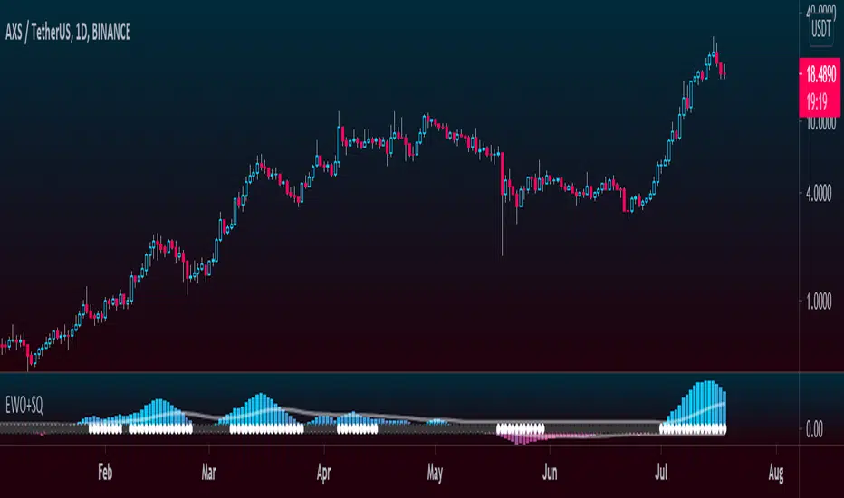
Elliott Wave Oscillator + TTM SqueezeThe Elliott Wave Oscillator enables traders to track Elliott Wave counts and divergences. It allows traders to observe when an existing wave ends and when a new one begins. It works on the basis of a simple calculation: The difference between a 5-period simple moving average and a 34-period simple moving average.
Included with the EWO are the breakout bands that help identify strong impulses.
To further aid in the detection of explosive movements I've included the TTM Squeeze indicator which shows the relationship between Keltner Channels & Bollinger Bands, wich highlight situations of compression/low volatility, and expansion/high volatility. The dark dots indicate a squeeze, and white dots indicates the end of such squeeze and therefore the start of an expansion.
Enjoy!
"elliott" için komut dosyalarını ara
Elliott Wave PivotsThis script is designed to catch high timeframe Elliott Wave Pivots. It will label in hindsight and is therefore NOT intended for any entries of any kind. Both labels and lines are drawn once confirmation comes that a wave has completed. You can set alerts to be informed of the completion of that wave.
There are are four degrees of waves recognized. The wave degrees are named minute, minor, major and primary. These do not necessarily reflect an exact timeframe based on the name, rather it reflects the degree of the waves compared to the next. Minute being the lowest degree shown and primary being the highest.
In essence, a minute wave on the indicator will reflect a daily pivot. Each degree higher reflects a higher timeframe pivot that can be used to form an Elliott Wave count. The minute waves can be a bit noisy. View the higher timeframe waves to see structures before narrowing down to the lower timeframes.
To my knowledge, this indicator is unique in it's mission and execution. With that in mind, there can definitely be bugs. Feel free to reach out to me with feedback.

Elliott Wave Oscillator (EWO)Simple Elliott Wave Oscillator: the fast moving average is a 5-period SMA, the slow moving average is a 35-period SMA, the EWO is the difference between the two.
It lines up almost perfectly with Elliott Waves.

Tom Joseph MACD 5-35 for Elliot WavesThis oscillator for the Elliott Theory has been invented by Tom Joseph and it's useful to correctly count the impulsive and corrective waves.
Its difference compared to a simple MACD is the peculiarity to use the ratio between the Fast SMA (default period set to 5) and the Slow SMA (default period se to 35).
The used formula is as below:
( (fast_SMA / slow_SMA) -1 ) * 100
Hope you could find it useful! 😉

Elliot Wave - ImpulseLets dabble a bit into Elliot Waves.
This is a simple script which tries to identify Wave 1 and 2 of Elliot Impulese Wave and then projects for Wave 3.
Ratios are taken from below link: elliottwave-forecast.com - Section 3.1 Impulse
Wave 2 is 50%, 61.8%, 76.4%, or 85.4% of wave 1 - used for identifying the pattern.
Wave 3 is 161.8%, 200%, 261.8%, or 323.6% of wave 1-2 - used for setting the targets
Important input parameters
Length : Zigzag Length. Keep the numbers low if you are looking for smaller and shorter trades. Keep the numbers high if you are looking for longer and bigger trades.
Error Percent : Adjustments for ratios as it is not always possible to find exactly equal retracement ratio.
Entry Percent : Once Wave 2 is formed, entry is set after reversing 30% of wave 2. This number can be increased or decreased. Caution: Keeping the number too low may result in false signals.
Ignore Trend Direction : If unchecked, it will only look for pattern if Wave 1 has made a higher high. If not, it will ignore Wave 1 condition and only look at wave 1 to 2 ratio.
Handle Duplicates : Since, the labels are generated upon crossover of entry price, this crossover may happen multiple times. Or sometimes wave 2 can further extend and generate new signal with same wave 1. This parameter says how to handle such cases. Keep Last is set to default and is most preferred option.
ShowRatios and ShowWaves lets you display wave line and retracement ratios for each pivots
NEoWave ChartAn automated wave chart for NEoWave wave analysis. This is an automated wave chart plotter that help you to find the current psychological trend and forecast the next one. This Indicator uses the concept of plotting wave charts as per the NeoWave method invented by Glenn Neely in 1990 in the “Mastering Elliott Wave” book. NEoWave is a advanced version of elliott wave theory, which solve the lots of drawback's and issues' of elliott wave theory.
The Logic and Concept used in Indicator
This indictor uses the logic of plotting wave chart as discussed in “Mastering Elliott Wave” book, According to “Mastering Elliott Wave” book to draw a wave chart draw a line from high to low or low to high in order that they occurred, and this indicator plot the line accurately from high to low or low to high in order they occurred.
Some Important Features
1. This indicator can draw wave chart from 5 Seconds to 5 Year or use any custom timeframe of your choice.
2. Use any timeframe wave chart on any timeframe cash data, like use monthly cash data to draw 2.5 years or 5 years wave chart.
3. Do the easy back testing with easy drag tool.
4. Customize wave chart settings based on your requirement.
5. Wave chart will be plotted on any type of charts like candlestick or bar chart.
6. Custom settings to hide other charts, like you can hide bar or candlestick chart, while using wave analysis.
7. Realtime plotting of wave chart from 5 seconds to 5 year.
Features to be added in future update
1. Show Monowave Counts.
2. Show Complexity levels.
3. Show Price and Time.
4. Show Starting point of patterns.
How to use this wave chart?
1. Use the log scale on wave chart. Use Alt + L to use logarithmic scale on chart.
2. Use log Fibonacci on wave chart, just open the settings of Fibonacci channel and check on "Fib channel based on log scale"
3. Find the correct starting point to mark the neowave patterns.
4. Apply the neowave rules as discussed in “Mastering Elliott Wave” book and forecast the market.
Note
If you want to check Daily or any higher timeframe wave chart use cash chart and if you want to check any other timeframe from 5 seconds to any intraday timeframe then use future's data as suggested by Mr. Glen Neely.

Multi ZigZag EW - ImpulseSimilar to the previous script on Elliot Wave Impulse:
But, here we are trying to use multiple zigzags instead of just one.
You can select upto 4 different Zigzags and set different length, line color, line width and style for each. Parameters ShowZigZag , ZigZag Length, ZigZag Color, ZigZag Width, ZigZag Style can be used for adjusting these.
ErrorPercent lets you set error threshold calculation of ratios for pattern identification
EntryPercent is used for marking Entry and T.Stop (Tight Stoploss) based on the length of Wave 2.
Target of the script is same as before. We are trying to identify Wave 1 and 2 of Elliot Impulese Wave and then project Wave 3. Chances of price following the pattern are there. Hence, we set Stoploss based on levels which fails the pattern.
Ratios are taken from below link: elliottwave-forecast.com - Section 3.1 Impulse
Wave 2 is 50%, 61.8%, 76.4%, or 85.4% of wave 1 - used for identifying the pattern.
Wave 3 is 161.8%, 200%, 261.8%, or 323.6% of wave 1-2 - used for setting the targets
Since we use multiple zigzags, labels can be quite messy at times. In such scenarios, just disable one of the zigzag length causing label overlaps.
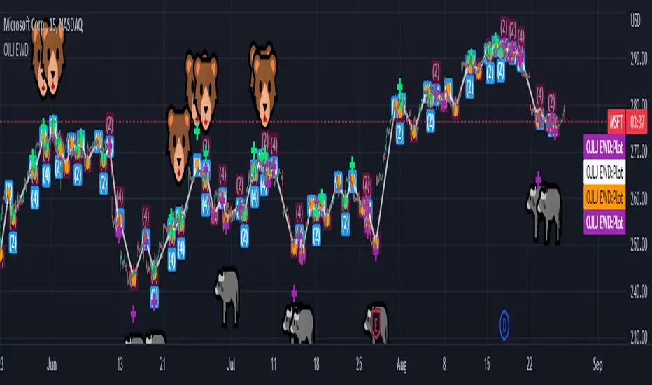
OJLJ Elliott Waves DetectorThis script is made to identify Elliot Waves by setting a zigzag line as principal source, it identifies patterns with the most common rules, in the chart you will see a number in each wave detected, a wave could have the characteristics to be two different waves so it will be plotted the options that could be, To identify which one is most trustable I suggest to use the Fibonacci levels options.
Features:
+ All waves ? (Option to show just the 5 Wave patterns recognition)
+ Draw zigzag line (Option to show the zigzag line)
+ Supports Multiple instruments, from FOREX to Stocks
+ It works on all the timeframes
+ Show Fib levels (Option to show the Fibonacci levels)
+ Fibonacci levels fit test (Green crosses mark were should a Bull wave be to fit with a Fibonacci Level While the purple crosses show were should the wave fit to be a bear trend, the more closer with the point of the wave the most trustable Example, a 5 Wave Bull could also be a 2 Bear Wave, if the green cross is closer to the orange point of the wave then is a 5 Wave Bull, if the purple cross is closer to the orange point)
+ A background color also show when a 5 pattern is identified
+ The way to plot the zigzag can be changed with 3 Input options
Characteristics to add in future updates:
+ Detect more than 1 cycle at the same time
+ Use a volume indicator to identify how many volume was traded in each wave
+ Implement the use of the EWO (Elliot Wave Oscillator)
+ Improve the display
+ Identify ABC patterns
+ Add triangles and Zigzag formations
To have access to this script please send me a message ;D

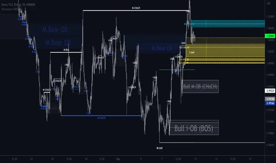
ArtiumPro Smart Money ConceptsSmart money concepts refer to the use of institutional trading strategies which align with the perspectives of Smart Money in the market. i.e. the composite man. Market Structure is the foundation of price action trading, understanding price action is fundamental to SMC.
ArtiumPro SMC 2.1 is an SMC (Smart Money Concepts) indicator full of features to aid SMC traders. Our aim is to save you time with automatic chart mark-up and help you spot areas of interest you may miss with the naked eye.
Fvg (Fair Value Gap) - is also known as an imbalance. An FVG is an imbalance of orders, for instance, for sellers to complete their trades, there must be buyers and vice versa so when a market receives too many of one kind of order buys or sells, and not enough of the order's counterpart. When the amount is not balanced and too many orders are put in for one direction, it creates an imbalance.
Multi timeframe FVG - this will show the same as above but on the higher timeframe you choose. It’ll show as 2 lines that show the higher timeframe fvg with a filled box that mitigates on entry.
Order Blocks - These are supply and demand zones, displayed typically as the last down/up candle before a move in the opposite direction. Great POI’s for entry and take profits.
Outside candle - this is a candle that sweeps the highs and lows of the previous candle, best used for the 1 hour or above these can indicate a change of price direction.
Previous day high & low
Not only does it show your previous day's low and high but it also shows your opening and close of the day. You have settings where you can turn off the open and close and just have daily highs and lows. It’s your choice within your settings.
Market Structure - We have packed this feature with options that are customizable for you,
Break of Structure (BOS) indicates a trend continuation.
Change of Character (CHoCH) indicates the first sign of a possible trend change.
Equal Highs/lows - this will mark your double/triple tops and bottoms.
Retracement - set this to your preferred retracement amount to customize your market structure to what you qualify as a valid pullback.
Elliott Wave ZigZag
Many people ask for the Elliott Waves. Well, here it is, inside this SMC. Just like your pivot highs and lows, the Elliott Wave is showing in real-time so you can see where your previous highs and lows are with the Elliott Wave break of structures that you can use in conjunction with the Smart Money Concepts Indicator of ArtiumPro.
Fib levels - for Premium & Discount areas - in this Instance the fib is used to determine if the price has pulled back into a premium or discount zone for optimal trade entry.
Trading Sessions
One of the most advanced trading session indicators out there and it’s included inside the most advanced SMC indicator on the market today. It has open breakout and settings to filter the opening range along with your pip daily range. You can select what timezone you are in and it automatically adjusts on the chart. Cool right? Hope you enjoy it, happy trading!
EWO[Giskard]Elliott Wave Oscillator with breakout bands
The Elliott Wave Oscillator (EWO) is defined as
EWO = SMA(fast-period, source) – SMA(slow-period, source)
where source is hl2, fast-period is 5 and slow-period is 35.
if price is in an uptrend, and this uptrend has been stronger over the previous five candles relative to the previous 35, then the EWO will be positive. If price is in an uptrend, but price has been in a stronger overall uptrend over the past 35 candles relative to the previous five, the EWO will be negative. Likewise, we can apply this to downtrends.
The Oscillator Break Out Bands provide an Up Band and a Low Band. In a Wave Three, the EWO needs to be above the Break Out
Band. The default strength of the band is 100%, but 80% could be also a good configuration.
Hint: Use together with the XTL indicator

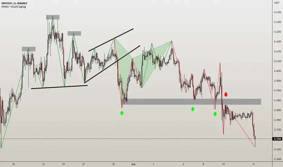
DEMO - FxCanli ZigZagEN - You can spot current trend and lots of patterns with FxCanli ZigZag indicator EASLY
DEMO VERSION of FXCANLI ZIGZAG Indicator works on only GBPNZD and XRPUSDT charts
TR - FxCanli ZigZag indikatörü mevcut trendi ve birçok formasyonu KOLAYCA bulmanızda size yardımcı olacaktır.
FXCANLI ZIGZAG indikatörünün DEMO VERSİYONU sadece GBPNZD ve XRPUSDT grafiklerinde çalışır
EN - Market Structure (At the Current time frame you can choose different colors for UpTrend and DownTrend)
TR - Market Yapısı (Mevcut zaman diliminde, Yukarı Trend ve Aşağı trendin rengini seçebilirsiniz.)
Harmonic Patterns / Harmonik Formasyonları
Elliott Wave / Elliott Dalgaları
AB=CD Pattern / AB=CD Formasyonu
EN - By activating the lower timeframe from the settings, you can see the lower timeframe waves.
TR - Ayarlardan alt zaman dilimini aktif ederek, alt zaman dilimi dalgalarını görebilirsiniz.
EN - By activating the higher timeframe from the settings, you can see the higher timeframe waves.
TR - Ayarlardan üst zaman dilimini aktif ederek, üst zaman dilimi dalgalarını görebilirsiniz.
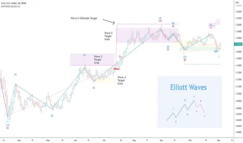
MATHR3E WAVES█ OVERVIEW
MATHR3E WAVES automatically draws Elliott Waves on your charts with their potential associated targets.
█ CONCEPTS
Disclaimer
MATHR3E RETRACEMENTS indicator is intended for advanced traders and may fit your profile, whether you are a day trader or a long-term investor.
It was originally developed by a renowned market analyst and documented in numerous books. Among them is the author Jason Perl.
It is recommended to have read the trading techniques mentioned in the books covering this indicator beforehand.
How to use:
MATHR3E WAVES indicator can provide a roadmap of market direction that you can use to determine price targets and isolate exhaustion points from potential trends in conjunction with other indicators by the same author.
Be aware the indicator's approach is derived from the Elliott wave theory and may slightly diverge from the cardinal rules of Elliott waves.
Principle of the Elliott Wave Theory
Movement in the direction of the trend is unfolding in 5 waves (called motive wave) while any correction against the trend is in three waves (called corrective wave). The movement in the direction of the trend is labeled as 1, 2, 3, 4, and 5. The three-wave correction is labeled as a, b, and c. These patterns can be seen in the long term as well as short term charts.
Wave 1:
Wave one is rarely obvious at its inception. When the first wave of a new bull market begins, the fundamental news is almost universally negative. The previous trend is considered still strongly in force. Fundamental analysts continue to revise their earnings estimates lower; the economy probably does not look strong. Sentiment surveys are decidedly bearish, put options are in vogue, and implied volatility in the options market is high. Volume might increase a bit as prices rise, but not by enough to alert many technical analysts.
Wave 2:
Wave two corrects wave one, but can never extend beyond the starting point of wave one. Typically, the news is still bad. As prices retest the prior low, bearish sentiment quickly builds, and "the crowd" haughtily reminds all that the bear market is still deeply ensconced. Still, some positive signs appear for those who are looking: volume should be lower during wave two than during wave one, prices usually do not retrace more than 61.8% of the wave one gains, and prices should fall in a three-wave pattern.
Wave 3:
Wave three is usually the largest and most powerful wave in a trend. The news is now positive and fundamental analysts start to raise earnings estimates. Prices rise quickly, corrections are short-lived and shallow. Anyone looking to "get in on a pullback" will likely miss the boat. As wave three starts, the news is probably still bearish, and most market players remain negative; but by wave three's midpoint, "the crowd" will often join the new bullish trend. Wave three often extends wave one by a ratio of 1.618:1.
Wave 4:
Wave four is typically clearly corrective. Prices may meander sideways for an extended period, and wave four typically retraces less than 38.2% of wave three. Volume is well below that of wave three. This is a good place to buy a pullback if you understand the potential ahead for wave 5. Still, fourth waves are often frustrating because of their lack of progress in the larger trend.
Wave 5:
Wave five is the final leg in the direction of the dominant trend. The news is almost universally positive and everyone is bullish. Unfortunately, this is when many average investors finally buy-in, right before the top. Volume is often lower in wave five than in wave three, and many momentum indicators start to show divergences (prices reach a new high but the indicators do not reach a new peak).
Wave A:
Corrections are typically harder to identify than impulse moves. In wave A of a bear market, the fundamental news is usually still positive. Most analysts see the drop as a correction in a still-active bull market. Some technical indicators that accompany wave A include increased volume, rising implied volatility in the options markets, and possibly a turn higher in open interest in related futures markets.
Wave B:
Prices reverse higher, which many see as a resumption of the now long-gone bull market. Those familiar with classical technical analysis may see the peak as the right shoulder of a head and shoulders reversal pattern. The volume during wave B should be lower than in wave A. By this point, fundamentals are probably no longer improving, but they most likely have not yet turned negative.
Wave C:
Prices move impulsively lower in five waves. Volume picks up, and by the third leg of wave C, almost everyone realizes that a bear market is firmly entrenched. Wave C is typically at least as large as wave A and often extends to 1.618 times wave A or beyond.
█ FEATURES & BENEFITS
Versatile
The indicator works on relative price action, so you can apply it without having to change any of the default settings.
Targets:
Customize the high and low wave targets to identify possible price target areas.
Adjustable Rules:
• Shift Wave 2: if Wave 4 closes below the low close of Wave 2.
• Shift Wave 4: if Wave A closes below the low close of Wave 4.
• Allow Wave 4 to overlap Wave 1
• Allow truncated Wave 5
• Allow truncated Wave C
Price ratio:
Force waves 2/4 to retrace to a specific Fibonacci level.
Force Waves 3/5 size to a specific Fibonacci level.
Time Ratio:
Force selected waves to last a required number of bars.
Alerts:
Set up your alerts and receive notifications on wave completion.
Alerts format can be adapted to be received on Discord servers.
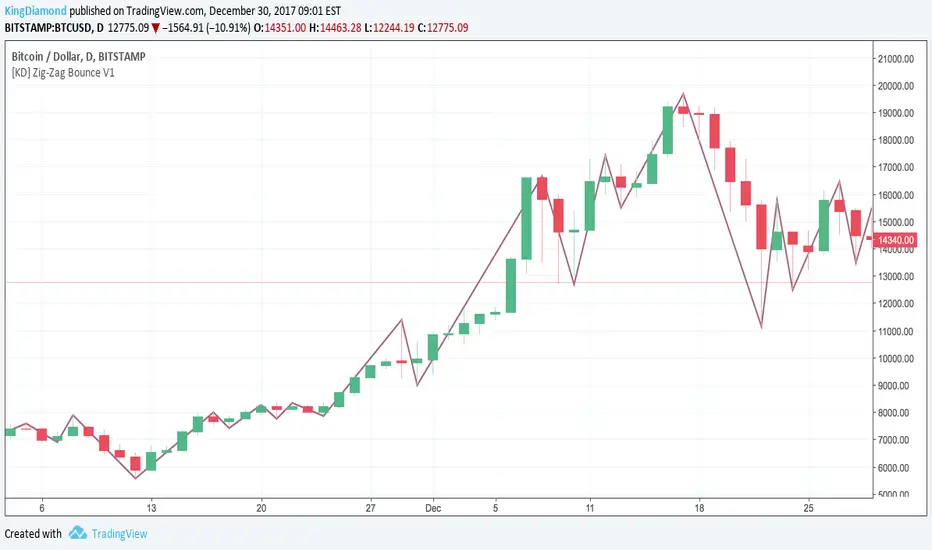
[KD] Zig-Zag Bounce V1Cut through chart noise with Zig-Zag Bounce!
Every time the trend bounces, we show you the highs and lows giving you an incredibly clear overview. Makes it much easier to spot where your Elliott Waves should fit :)
LT Elliott Wave 2.0LT Elliott Waves 2.0 Indicator:
According to Elliott Wave Theory, price moves in 5 waves in the direction of the major trend and moves in 3 waves (ABC) when it moves against the major trend. The key purpose and value of elliott wave theory (EWT) is to provide context for chart analysis. According to the book The Elliott Wave Principle by Frost & Prechter: “This context provides both a basis for disciplined thinking and a perspective on the market's general position and outlook.” The benefit of having context is that one can identify and anticipate changes in direction.
In Elliott Wave theory, waves 1, 3, 5 and C are impulse waves (a five wave pattern that makes progress) whereas waves 2, 4, A and B are corrective waves (a three wave pattern – or combination of three waves - that moves against the direction of the larger trend). Although wave A can also be formed of 5 waves, it is commonly formed of 3 waves. Here is a brief summary of the waves:
Wave 3 tends to be the strongest and most dynamic wave – it is usually (but not always) the longest wave but it is never the shortest. Wave 4 is a corrective wave that is typically composed of 3 smaller waves (ABC) and is notorious for being messy and unpredictable in nature. Wave 5 is the final wave before a significant correction or reversal in trend and is often accompanied by divergences (e.g. negative divergences in an uptrend) and exhaustions in momentum. It is also possible for a wave 5 to form after a “blow-off top” pattern. Wave 2 is composed of 3 smaller waves (ABC) and is a retracement of wave 1 – the retracement can be shallow to moderate (23.6% to 38.2%) or deep (50%, 61.8% to 78.6%). Wave 1 is the first wave of a trend and is composed of 5 smaller waves – it usually occurs after divergences (in the prior move) and extremes in both sentiment and momentum. For example, the wave 1 of an uptrend can often begin after capitulation in the price (after a major decline), extremely pessimistic sentiment, extremely oversold momentum readings, positive divergences and sometimes accompanied by a volume breadth thrust. Waves A and C are often equal in measure. Wave A can be formed of either 5 waves or 3 waves - but more commonly it is composed of 3 waves. Wave B is always corrective and composed of 3 smaller waves. Wave C is a five wave impulse pattern.
The Elliott Wave 2.0 (or EW2) chart indicator seeks to simplify elliott wave theory (EWT) in that its main purpose is to identify the potential major trends and corrections. The indicator takes a more simple and direct approach to EWT in that it focuses more on trying to identify whether price is trending or not, and if there is a trend, then the probable wave pattern. It does this by mainly using the structure of the price chart as well as other factors such as momentum, fibonacci retracements & extensions and the relationship of price to its key averages. The indicator then takes its best guess at whether price is in a trending environment, and if so, which wave it is probably forming. This means that the wave count can often depend on the chart timeframe chosen. For example, what may appear as a major downtrend on a lower timeframe chart may potentially be a corrective drop on a much higher timeframe, due to the different price structure of the charts. To keep things simple and to avoid complexity, the indicator does not display the minor sub-waves within the major waves.
The main feature and benefit of the Elliott Wave 2.0 (EW2) indicator is that it can remove most of the subjectivity in chart and wave analysis. It also allows for flexibility in that it allows the chartist to alter the wave count and the position of the wave counts if they choose to do so (within the parameters and rules set by the indicator). As with all of technical analysis, the wave counts shown by the elliott wave indicator are NOT certain or absolute – they are only a possibility or a probability. So the risk always exists of an alternative wave count. It is for the chartist to determine the probable wave counts and limit or control the risks based on their knowledge of technical analysis and risk management.
The settings of the Elliott Wave 2.0 indicator (EW2) are fairly self-explanatory but here is a brief summary:
In the Trend Analysis Switch, the indicator is set by default to a “moderate” trend setting in that it waits for moderately significant changes in momentum before a probable wave 5 is shown (i.e. the fifth wave within the elliott five wave pattern). So for example, in an uptrend, the indicator may show a probable “wave 3” (a blue-coloured wave 3) if the path of least resistance and the likely trend is still to the upside. Once a change in momentum and trend direction occurs, then the indicator may change the wave count to a “wave 5” (a green-coloured wave 5) provided the parameters for this wave count have been met. This default “moderate” setting can be changed by the user or chartist. So if the user wants to change the wave count from a probable “wave 5” to a potential “wave 3”, then it may be possible to do so by changing the trend analysis switch from “moderate” to “strict”. The indicator will likely then display a “wave 3” count until the price reverses some more and breaks below a key support level (assuming the prior trend was up), thus changing the wave count from a “wave 3” (in blue) to a probable “wave 5” (in green). (The opposite of this example applies in downtrends.)
If the chartist decides to delay the changing of the wave count, such as delaying the change of wave 3 to a wave 5, then the “strict” option can be enabled in the trend analysis switch. If the user prefers a slightly more aggressive (or quicker) change in the trend and wave count, then the “aggressive” option can be applied. This is provided the chartist decides it is reasonable or “logical” to make the change. The EW2 indicator will only make the change IF doing so is allowed within its set parameters and rules. The trend analysis switch settings (moderate, aggressive and strict) are largely based on the relative position of price to certain key averages and crossovers, such as both short-term & long-term moving averages which can act as support and resistance.
It is important to mention here is that if any changes are made to the settings of the EW2 indicator (such as moving or modifying the wave counts), it is essential to click on “Reset settings” when changing the chart to a different symbol or timeframe. So whenever a new chart symbol or timeframe is chosen, it is recommended to apply the “reset settings” function in the indicator defaults at the bottom left of the settings section. This will refresh the settings of the indicator back to defaults.
The Elliott Wave 2.0 indicator has greater flexibility options within the settings to change the positions of certain wave counts based on the structure of the chart. This can be achieved by manually moving the wave counts in the first top-section of the EW2 settings, where it says “Move Wave Forward/Back”. By clicking the up or down arrows (on the box provided) the position of the wave count can be moved, based on the zigzag patterns of the chart. So for example, if we wanted to move the position of the historical wave 5 (shown in green on the chart), then we would hover over the box next to “Move hist wave 5 forward/back” and click up or down on the arrows. Clicking the UP arrow would move the wave count position forward on the chart while clicking the DOWN arrow would move it backward. The same can be done with other waves such as the positions of waves 1, 2, 3 and 4 – provided this is permitted by the structure on the chart and the rules set by the indicator.
In the elliott wave indicator, the potential major wave counts are shown in blue and sometimes yellow. The blue wave counts have a slightly higher probability than the yellow as the yellow will need further confirmation by the price structure and momentum.
The starting point for the wave counts is shown as a green “wave 5” – this is referred to as the “historical wave 5” as it is the likely fifth wave of the prior wave (e.g. a prior impulse or corrective wave). The historical wave 5 is the starting point where the indicator starts “counting” the waves. The indicator makes its best guess as to where to start counting from the historical wave 5, but the user has the option to change its position, if required as per the parameters set by the indicator. As a general rule, in an uptrend, the green historical wave 5 should ideally be positioned at the lowest point on the chart (such as the lowest point in the past 300 bars). The opposite applies in downtrends where the historical wave 5 should ideally be at the highest point on the chart (e.g. in the past 300 bars). It should be noted that when the position of the green historical wave 5 is changed, this usually affects the entire wave count. The position of the historical wave 5 (green) can be changed in the settings of the elliott wave indicator (as discussed above). Additionally, if needed, we can also change the label of the green historical wave 5 within the settings to a pink “C-wave” (i.e. the “C-wave” of the prior corrective wave).
As mentioned, the EW2 indicator does its best to make the optimal “guess” as to the probable position of the wave counts, using the structure and momentum on the chart. However, just like any other chart indicator, it is not perfect and it can get the position wrong at times. This is to be expected as we are dealing with an uncertain, chaotic and probabilistic environment when doing chart analysis. Therefore, where it is deemed suitable, the position of the waves - such as waves 1, 2, 3, 4 and the historical wave 5 (or “C-wave”) – can be changed in the settings. The “wider jumps” option can be enabled in the settings for bigger skips in the position of the waves when toggling the positions using the up and down arrows.
The position of most waves can also be altered by modifying the major structure (in the zigzag) using the option in the settings called “Modify major structure”. Please note that using this can sometimes change the wave count as well. This specific setting provides a drop-down menu (labelled A to F) that allows several structures to be chosen in the zigzag (within certain limits). However, in the majority of cases, only the first four options (A, B, C and D) will be required to change the structure of the zigzag. Options C and D provide the greatest variability in the zigzag structure.
One useful method to remember is that often the most effective way to modify the wave count is to adjust the positions of waves 1 and 3 (assuming the starting position of the historical green wave 5 has been decided). As long as we can place wave 1 (and by default wave 2) to a reasonable or “logical” level, the remaining wave counts and projections can usually take care of themselves. Adjusting the position of wave 3 to a logical position can also be useful in this respect. A good way to correctly determine the “wave 1” and “wave 3” of an impulse is to look at its internal structure. If both are composed of five sub-waves (i.e. if each have an internal structure of five smaller waves) then the probability is higher that we have identified the waves 1 and 3 correctly, as both waves are impulsive. The same rule can apply for wave 5. Another rule to remember is that wave 3 can never be the shortest impulse wave but it is often the longest.
One of the new and major features of the Elliott Wave 2.0 indicator are the wave 3, wave 4 and wave 5 projections. The indicator uses a number of fibonacci extensions and ratios of certain waves (e.g. waves 1 and 2) to calculate the probable wave 3 projections as well as the potential wave 5 projections. The wave 3 projections are labelled as “3” and are shown as blue horizontal lines. Wave 5 projections are labelled as “5” and are shown as cyan, green, brown or purple lines. EW2 also makes use of mainly fibonacci retracements (such as the golden ratio) for calculating the probable wave 4 projections. Wave 4 projections are shown as “4” in orange, dark blue and red. Wave 4 has a number of alternate settings which make use of RSI momentum and fibonacci levels. The alternate settings for wave 4 can be used if the user believes that wave 3 has completed and that a wave 4 correction is likely in progress or coming to an end. The setting “Wave 5 in progress” can also be used for this purpose, if the chartist believes that the wave 4 has likely completed (or coming to an end) and that a potential “wave 5” is taking shape.
The “Logarithmic fibs” setting is an option for certain charts and timeframes that require a logarithmic chart to be used. For example, higher timeframe charts (such as weekly or monthly) and very volatile price charts may benefit from a logarithmic setting and therefore logarithmic fibonacci levels. Generally, if the chartist is using a log chart for a specific symbol (or timeframe), it would be preferable to apply logarithmic fibonacci levels as well. So this function can be selected in the EW2 settings accordingly.
While most wave projections (such as waves 3, 4 and 5) will show automatically on the chart, the user can decide to remove certain projections (e.g. waves 4 and 5) to reduce the amount of text or lines on a chart. This can be done by selecting the specific “Hide wave projections” function in the settings for the waves 4 and 5. Extra projections for waves 3, 4 or 5 can be shown by selecting the option for “More projections” for each specific wave.
Another useful feature is the “Wave 3 probability decrease level” function. This draws a horizontal magenta line at a specific fibonacci extension which can act as a key level of support (or resistance) for a probable wave 3. This could be helpful when a new trend is starting and we have the beginning of what appears to be a wave 3. For example, in a new uptrend, the probable wave 3 would have to stay above this key level (shown as a magenta line) if the probability of a wave 3 is going to remain high or intact. In other words, if price were to drop below this key level (in an uptrend) then the odds of a wave 3 would be lowered significantly and downside risk could increase. The opposite applies in downtrends.
The lookback period can be decreased to make the EW2 indicator focus on the much more recent data, such as the previous 100 bars. This can be done by selecting “Use short term” in the settings. This function can be used in situations where the trend may have changed very suddenly and the user wants to focus on the more immediate chart structure.
The setting also provides an “Aggressive wave 3” option for situations that may require the wave 3 to be shown sooner, such as at the start of a new trend. This option as well as others are included for further flexibility in the wave count. When this “aggressive wave 3” option enabled, the EW2 will display a yellow “wave 3” provided the conditions have been met based on fibonacci extensions.
As mentioned, the elliott wave indicator is programmed to look for and identify potential trending or impulsive patterns, and when appropriate, corrective ABC patterns. In this sense, we are looking to simplify elliott wave theory by taking a more flexible and common-sense approach to the wave patterns. So if the price action has broken key levels of support or resistance, momentum is increasing and price is moving deliberately in a specific direction, it becomes more likely that price is in a trending environment (rather than just a correction). Therefore, the EW2 indicator will likely start by showing the initial impulsive waves 1, 2 and 3 (in blue or blue/yellow) instead of the corrective waves ABC (in pink). However, the user has the choice to change the waves from 123 to ABC by selecting “ABC corrective waves” in the settings.
The EW2 indicator also allows the option to “reverse” the probable trend (and wave count) if required. For example, if the EW2 indicator is showing a probable wave 3 or wave 5 (in blue) and price begins to pullback or move in the opposite direction to the main trend of the wave 3 or 5 – e.g. if price starts to break key support levels (e.g. after an uptrend) and then reverse lower in the opposite direction to the primary trend - then the user has the option to change the wave count in the opposite direction (e.g. downward) a bit quicker. This can be achieved by selecting the option in the settings called “Reverse probable trend”. Applying this setting will reverse the original wave count of the primary trend as set by the indicator (e.g. from up to down or vice versa) provided it is permitted by the rules of the indicator. The colours of the wave counts will change to grey instead of blue. The user can also choose where to manually place the historical wave 5 (if required). However, although this “reverse” option is provided for extra flexibility, it should NOT be used very often. It should only be applied for certain special circumstances where it is deemed appropriate to change the wave count from an uptrend to a downtrend (or vice versa). The EW2 indicator does a reasonably good job on its own of identifying most trend changes without the need for this special “reverse trend” setting.
The chartist can apply other methods of chart analysis – such as trendline breaks, oscillators, regression channels, breaks of support/resistance – to determine when a probable wave (or wave count) has likely completed. For example, technical analysis methods such as trendline breaks and support/resistance breaks can be used by the chartist to determine the probability of whether wave 4 has potentially completed or not. In an uptrend, confirmation that a probable wave such as wave 4 has completed will not come until price has taken out the highs prior to the decline (i.e. the highs before the pullback in the probable “wave 4” correction). The same applies in reverse for a downtrend: confirmation that the probable wave 4 has completed will not come until price has taken out the lows prior to the rally (in a probable wave 4 correction).
It should be remembered that the appearance of the most recent wave counts (or wave labels) shown by the indicator, by themselves do NOT mean that the specific waves in question have definitely completed or finished. The same applies with wave projections as they do NOT imply that price has to necessarily move to those specific projection levels. They are merely to provide helpful guidance and education in chart analysis. Nothing in chart analysis is certain or definite as we are dealing with a system that is chaotic, unpredictable and probabilistic. The wave label itself is simply an indication that the most recent wave is probably still in progress, not necessarily that it has completed. Chartists can apply other technical analysis tools and methods (e.g. trend lines, support/resistance breaks, moving averages and regression channels etc.) to increase the probability of when a specific wave has probably completed. The same also applies to past or “completed” wave counts (or past wave labels): they do NOT mean that the specific waves have definitely completed or finished – it is merely a possibility or probability. So the risk always exists that the wave counts may potentially be wrong, and that an alternative wave count interpretation may exist.
In certain circumstances where there are volatile conditions and charts, it is possible that the elliott wave indicator may show an “unusual” wave count. For example, it is possible that the positions of certain wave counts (such as waves 1, 2, 3 and 5) may be in the “wrong” order. This happens rarely so it is not an issue that happens very often. However, if this issue occurs, the chartist can rectify the matter by applying one of the following options: (a) moving and adjusting the position of the historical wave 5 (in green) to a more logical position, (b) applying the “use short term” setting or (c) wait a bit longer until the volatility resolves itself in time. These options can usually resolve the issue and show the wave counts in a “proper” manner. Changing to a slightly lower (or higher) timeframe can also usually resolve this issue. If any changes are made to the settings of the indicator, please reset the indicator settings back to “default” when changing to a different symbol or timeframe.
The user can also choose to enable the zigzags of the waves to be shown on the chart. This can display the wave structures and zigzags, if enabled. By default it is set to off. As mentioned previously, it may also be a good idea to reset the settings of the indicators whenever a new chart or timeframe is chosen. This then refreshes the settings back to its default.
It is important to appreciate that the elliott wave indicator generally requires between 1,500 to 2000 bars of data on the chart in order to display the wave counts adequately and appropriately. So if a chart or timeframe has less than the minimum number of historical data or bars on the chart, the wave counts may not display properly or not appear at all. Certain chart symbols and timeframes (such as the monthly timeframe) may have very limited amount of data on them. Therefore, the elliott wave indicator will likely not appear on these charts or may not display properly. In these situations, a different chart symbol or a lower timeframe with more data on it can be chosen. For example, instead of a monthly timeframe, a weekly or daily timeframe can be chosen. Similarly, if a “study error” message appears on the EW2 indicator, this can be remedied by switching to a slightly lower (or higher) timeframe. However, usually such study errors are temporary and often get resolved after a brief time.
We have allowed for further flexibility in the EW2 indicator so that the user can move the wave counts manually, if required. The chartist can manually move the position of a wave count to a specific bar (or candle) on the chart if they choose to do so. For example, if we want to move the position of wave 1 to a specific bar in the past, we would first tick the box in the indicator settings called “Manually Place Wave 1”. Then we would use the “date range” tool to find out the distance of that past bar from the current bar (e.g. 50 bars) and then input that number (50) into the box next to “Manually Place Wave 1”.
Price action, markets and their charts are non-linear and chaotic, which means that they are subject to uncertainty, variable change and being unpredictable in nature. So we must maintain a probabilistic mindset and attitude to technical analysis. Nothing is certain. Therefore, no wave count is certain or “set in stone”. Wave counts, just like the actions and emotions of human beings, are subject to change. Elliott Wave theory, just like all of technical analysis is about what is possible, what is probable and what the risks are of a particular outcome. The advantage of elliott wave theory, as explained previously, is about gaining an understanding of context and the likely big picture. The indicator is provided in good faith but we do not vouch for its accuracy.
As mentioned previously, chartists should be aware of the probabilistic and uncertain nature of price action and the markets, and therefore prepare to limit and control any potential risks.
The chart indicator can be used on the charts of the majority of markets (e.g. stocks, indices, ETFs, currencies, cryptocurrencies, precious metals, commodities etc.) and any timeframe. Nothing in this indicator, its signals or labels should be construed as a recommendation to buy or sell any market (e.g. stocks, securities, indices, ETFs, currencies, cryptocurrencies, metals, commodities etc.). The indicator is provided solely for educational purposes, to gain a better understanding of technical analysis and elliott wave theory. It should be noted that the degree of noise and randomness increases significantly on lower timeframes. So the lower the timeframe that is chosen (e.g. 15-min or lower) the greater the degree of noise and randomness and therefore the higher the frequency of false signals or whipsaws. The indicator can be applied to candlestick charts and bar charts.
If you would like access, please send me a PM on Tradingview.

OJLJ Elliott Waves detector (Free)This script is made to identify Elliot Waves by setting a zigzag line as principal source, it identifies patterns with the most common rules, in the chart you will see a number in each wave detected, a wave could have the characteristics to be two different waves so it will be plotted the options that could be, To identify which one is most trustable I suggest to use the Fibonacci levels options as an additional note this is a free update to my existing script.
Features:
+ All waves ? (Option to show just the 5 Wave patterns recognition)
+ Draw zigzag line (Option to show the zigzag line)
+ Supports Multiple instruments, from FOREX to Stocks
+ It works on all the timeframes
+ Show Fib levels (Option to show the Fibonacci levels)
+ Fibonacci levels fit test (Green crosses mark were should a Bull wave be to fit with a Fibonacci Level While the purple crosses show were should the wave fit to be a bear trend, the more closer with the point of the wave the most trustable Example, a 5 Wave Bull could also be a 2 Bear Wave, if the green cross is closer to the orange point of the wave then is a 5 Wave Bull, if the purple cross is closer to the orange point)
+ A background color also show when a 5 pattern is identified
+ The way to plot the zigzag can be changed with 3 Input options
Characteristics to add in future updates (Please if you like it you can support me with coins):
+ Detect more than 1 cycle at the same time
+ Use a volume indicator to identify how many volume was traded in each wave
+ Implement the use of the EWO ( Elliot Wave Oscillator)
+ Improve the display
+ Identify ABC patterns
+ Add triangles and Zigzag formations
LT Elliott Wave AddendumLT Elliott Wave Addendum Indicator:
According to Elliott Wave Theory, price moves in 5 waves in the direction of the major trend and moves in 3 waves (ABC) when it moves against the major trend. The key purpose and value of elliott wave theory (EWT) is to provide context for chart analysis. According to the book The Elliott Wave Principle by Frost & Prechter: “This context provides both a basis for disciplined thinking and a perspective on the market's general position and outlook.” The benefit of having context is that one can identify and anticipate changes in direction.
In Elliott Wave theory, waves 1, 3, 5 and C are impulse waves (a five wave pattern that makes progress) whereas waves 2, 4, A and B are corrective waves (a three wave pattern – or combination of three waves - that moves against the direction of the larger trend). Although wave A can also be formed of 5 waves, it is commonly formed of 3 waves. Here is a brief summary of the waves:
Wave 3 tends to be the strongest and most dynamic wave – it is usually (but not always) the longest wave but it is never the shortest. Wave 4 is a corrective wave that is typically composed of 3 smaller waves (ABC) and is notorious for being messy and unpredictable in nature. Wave 5 is the final wave before a significant correction or reversal in trend and is often accompanied by divergences (e.g. negative divergences in an uptrend) and exhaustions in momentum. It is also possible for a wave 5 to form after a “blow-off top” pattern. Wave 2 is composed of 3 smaller waves (ABC) and is a retracement of wave 1 – the retracement can be shallow to moderate (23.6% to 38.2%) or deep (50%, 61.8% to 78.6%). Wave 1 is the first wave of a trend and is composed of 5 smaller waves – it usually occurs after divergences (in the prior move) and extremes in both sentiment and momentum. For example, the wave 1 of an uptrend can often begin after capitulation in the price (after a major decline), extremely pessimistic sentiment, extremely oversold momentum readings, positive divergences and sometimes accompanied by a volume breadth thrust. Waves A and C are often equal in measure. Wave A can be formed of either 5 waves or 3 waves - but more commonly it is composed of 3 waves. Wave B is always corrective and composed of 3 smaller waves. Wave C is a five wave impulse pattern.
The Elliott Wave indicator (and elliott wave addendum) seeks to simplify elliott wave theory (EWT) in that its main purpose is to identify the potential major trends and corrections. The indicator takes a more simple and direct approach to EWT in that it focuses more on trying to identify whether price is trending or not and if so, the probable wave pattern. It does this by mainly using the structure of the price chart and sometimes other factors such as divergences, momentum and the relationship of price to its key averages. The indicator then takes its best guess at whether price is in a trending environment, and if so, which wave it is probably forming. The wave count can therefore depend on the chart timeframe chosen. For example, what may appear as a major downtrend on a lower timeframe chart may potentially be a corrective drop on a much higher timeframe, due to the different price structure of the charts. To keep things simple and to avoid complexity, the indicator does not display the minor sub-waves within the major waves (probably with the exception of wave 4).
The main feature and benefit of the Elliott Wave indicator is that it can remove subjectivity in chart and wave analysis. It also for flexibility in that it allows the chartist to alter the wave count and the position of the wave counts if they choose to do so (within the parameters and rules set by the indicator). As with all of technical analysis, the wave counts shown by the elliott wave indicator are NOT certain – they are only a possibility or a probability. So the risk always exists of an alternative wave count. It is for the chartist to determine the probable wave counts and limit or control the risks based on their knowledge of technical analysis and risk management.
The LT Elliott Wave addendum indicator is meant to be used in combination with the main LT Elliott Waves indicator, so in this sense they supplement each other.
The settings of the LT Elliott Wave Addendum indicator (“EW addendum”) are fairly self-explanatory but here is a brief summary:
The Elliott Wave indicator has options in the settings to change the positions of certain wave counts based on the structure of the chart. This is achieved by choosing the different major and minor structures based on the zigzag patterns of the chart. So the user can alter the positions of certain wave counts (if needed) by modifying the zigzag structure on the chart.
The lookback period in the settings can be increased (or decreased) to include more data on the chart, when needed. In the majority of situations the lookback period can remain at the default setting of 200 bars – but the user can decide to take into account more (or less) data by changing the lookback period to 300 (or 100 if less data is required).
In the elliott wave addendum indicator, the most recent probable ABC waves are shown in pink and the probable 123 wave counts are shown in dark blue. The position of the wave counts can be changed and modified to a reasonable degree in the settings.
In certain circumstances where there are volatile conditions and charts, it is possible that the elliott wave addendum indicator may show an “unusual” wave count. For example, it is possible that the positions of certain wave counts (such as waves 1, 2, 3 and 5) may be in the “wrong” order. This happens rarely so it is not an issue that happens very often. However, if this issue occurs, the chartist can rectify the matter by first increasing the lookback period (e.g. to 300) to see if this resolves the issue. If it does not, then Alt9 “temporary wave shift” in the elliott wave addendum (EW addendum) can be enabled as this can usually resolve the issue and show the wave counts in a “proper” manner. Changing to a slightly lower timeframe can also usually resolve this issue. If Alt9 is enabled, care should be taken to unselect this option at a later date (as it is only a temporary solution).
The aggressive wave count setting (called “Aggressive 123”) is mainly for the addendum of the elliott wave indicator (i.e. EW addendum). Enabling this option can often change the wave count from an ABC to a 123 provided this is permitted by the parameters of the indicator. For example, if the elliott wave addendum indicator is showing an ABC wave count, it may be possible to change this wave count to a 123 wave count by enabling the “Aggressive 123” setting in the indicator. The other option is to change the wave count at the very top of the settings (where it says “Change recent ABC to 123”). This option as well as others are included for further flexibility in the wave count.
The user can also choose to enable the zigzags of the waves to be shown on the chart. This can display the minor and major wave structures and zigzags, if enabled. By default, it is set to off.
It may also be a good idea to reset the settings of the indicators whenever a new chart or timeframe is chosen. This then refreshes the settings back to its default.
It is important to appreciate that the elliott wave indicator generally requires between 1,500 to 2000 bars of data on the chart in order to display the wave counts adequately and appropriately. So if a chart or timeframe has less than the minimum number of historical data or bars on the chart, the wave counts may not display properly or not appear at all. Certain chart symbols and timeframes (such as the monthly timeframe) may have very limited amount of data on them. Therefore, the elliott wave indicator will likely not appear on these charts or may not display properly. In these situations, a different chart symbol or a lower timeframe with more data on it can be chosen. For example, instead of a monthly timeframe, a weekly or daily timeframe can be chosen.
The Elliott Wave Addendum indicator (“EW Addendum”) displays the most recent and “immediate” probable wave counts – usually after a potential wave 3 or a wave 5 of the main elliott wave indicator (i.e. LT Elliott Waves). So in this sense the EW addendum is more short term in that it focuses on the most recent price action (e.g. after a wave 5) in what may be either a possible corrective pattern (ABC) or the development of a potential new trend (123).
For example, let’s say the price has been trending up and we are seeing a probable wave 5 in the main elliott wave indicator (LT Elliott Waves), and then the price starts to reverse lower. The decline in price could either be an ABC correction or it may possibly be the beginning of a reversal or downtrend. The elliott wave addendum indicator (EW addendum) starts by showing the probable waves A, B and C of a correction (shown in pink). The EW addendum waits for the structure of the chart to develop before making its best guess at what may be an ABC pattern. However, if the price action begins to break support levels and the probability of a downward trend increases, then the wave count may change from ABC to 123 (shown in dark blue). The same principle can apply in the opposite direction: if the price has been trending down in a likely wave 5 and then suddenly price begins to reverse and move higher, at first we may see a potential ABC corrective pattern on the EW addendum indicator. However, if price continues to move up by a certain degree and break resistance levels the wave count may change on the EW addendum to a probable 123 uptrend.
The reason for why the possible ABC wave count may change to a possible 123 trending wave count is because the elliott wave indicator is programmed to look for and identify potential trending patterns (as well as corrective patterns). In this sense, we are looking to simplify elliott wave theory by taking a more flexible and common-sense approach to the wave patterns. So if the price action has broken key levels of support or resistance, momentum is increasing and price is moving deliberately in a specific direction, it becomes more likely that price is in a trending environment (rather than just a correction).
If the main elliott wave indicator (i.e. LT Elliott Waves) is showing a probable wave 3, and price begins to pullback or move in the opposite direction to the main trend of the wave 3, the EW addendum may be used to display the probable ABC wave counts. These ABC wave counts could be for the likely wave 4 correction. However, if price starts to break key support levels (e.g. after an uptrend) and then reverse lower in the opposite direction (to the mentioned wave 3), then it is likely that the main indicator will change the wave count from a wave 3 to a wave 5. This can indicate that the main uptrend may have probably ended and that we are in either a large correction or a trend reversal, as shown by the EW addendum. This example can also apply in reverse for downtrends (e.g. if price starts to break resistance levels and move higher after a downtrend).
We have allowed for further flexibility in the main elliott wave indicator (LT Elliott Waves) – including the EW addendum – so that the user can change the wave counts from a 123 to ABC (or vice versa) if they choose to do so. For example, if the EW addendum is showing a probable 123 wave count (in dark blue), the chartist can choose to change the wave counts to an ABC wave count from within the settings. Please allow up to minute or more for the change to take place as it can sometimes take some time for the modification to take effect.
The position of the wave counts (ABC or 123) can be changed as well to a reasonable degree. In the settings of the EW addendum the positions of the wave counts can be changed by applying Alt3 or by modifying the minor or major structure of the waves (or zigzags). There is also the option to modify or move the position of wave 2 (or Wave B) in Alt2 of the indicator. Please allow up to a minute or more for the change to take place as it can sometimes take some time for the modification to take effect.
The EW addendum indicator also has the option to show a probable projection for wave 4 by enabling this in the settings. This does not mean that the price has to move in the direction of that “wave 4” projection, but it is merely a guide on the basis of probabilities. The chartist can apply other methods of chart analysis – such as trendline breaks, oscillators, regression channels, breaks of support/resistance – to determine when a probable wave 4 has likely completed. However, confirmation that the probable wave 4 has completed will not come until price has taken out the highs prior to the decline (i.e. the highs before the pullback in the probable “wave 4” correction). The same applies in reverse for a downtrend: confirmation that the probable wave 4 has completed will not come until price has taken out the lows prior to the rally (in a probable wave 4 correction).
Here is a brief summary of the “aggressive 123” option in the EW addendum settings: the aggressive wave count setting is mainly for the EW addendum. Enabling this option can often change the wave count from an ABC to a 123 provided this is permitted by the parameters of the indicator. For example, if the elliott wave addendum indicator is showing an ABC wave count, it may be possible to change this wave count to a 123 wave count by enabling the “Aggressive 123” setting in the indicator. The other option is to change the wave count at the very top of the settings (where it says “Change recent ABC to 123”). This option as well as others are included for further flexibility in the wave count.
It should be remembered that the appearance of the most recent wave counts (or wave labels) shown by the indicator, by themselves do NOT mean that the specific waves in question have definitely completed or finished. Nothing in chart analysis is certain or definite. The wave label itself is simply an indication that the most recent wave is probably still in progress, not necessarily that it has completed. Chartists can apply other technical analysis tools and methods (e.g. trend lines, support/resistance breaks, moving averages and regression channels etc.) to increase the probability of when a specific wave has probably completed. The same also applies to past or “completed” wave counts (or past wave labels): they do NOT mean that the specific waves have definitely completed or finished – it is merely a possibility or probability. So the risk always exists that the wave counts may potentially be wrong, and that an alternative wave count interpretation may exist.
Price action, markets and their charts are non-linear and chaotic, which means that they are subject to uncertainty, variable change and being unpredictable in nature. So we must maintain a probabilistic mindset and attitude to technical analysis. Nothing is certain. Therefore, no wave count is certain or “set in stone”. Wave counts, just like the actions and emotions of human beings, are subject to change. Elliott Wave theory, just like all of technical analysis is about what is possible, what is probable and what the risks are of a particular outcome. The advantage of elliott wave theory, as explained previously, is about gaining an understanding of context and the likely big picture. The indicator is provided in good faith but we do not vouch for its accuracy.
As mentioned previously, chartists should be aware of the probabilistic and uncertain nature of price action and the markets, and therefore prepare to limit and control any potential risks.
The indicator can be used on the charts of the majority of markets (e.g. stocks, indices, ETFs, currencies, cryptocurrencies, precious metals, commodities etc.) and any timeframe. Nothing in this indicator, its signals or labels should be construed as a recommendation to buy or sell any market (e.g. stocks, securities, indices, ETFs, currencies, cryptocurrencies, metals, commodities etc.). The indicator is provided solely for educational purposes, to gain a better understanding of technical analysis and elliott wave theory. It should be noted that the degree of noise and randomness increases significantly on lower timeframes. So the lower the timeframe that is chosen (e.g. 15-min or lower) the greater the degree of noise and randomness and therefore the higher the frequency of false signals or whipsaws. The indicator can be applied to candlestick charts and bar charts.
If you would like access, please send me a PM on Tradingview.

LT Elliott WavesLT Elliott Waves Indicator:
According to Elliott Wave Theory, price moves in 5 waves in the direction of the major trend and moves in 3 waves (ABC) when it moves against the major trend. The key purpose and value of elliott wave theory (EWT) is to provide context for chart analysis. According to the book The Elliott Wave Principle by Frost & Prechter: “This context provides both a basis for disciplined thinking and a perspective on the market's general position and outlook.” The benefit of having context is that one can identify and anticipate changes in direction.
In Elliott Wave theory, waves 1, 3, 5 and C are impulse waves (a five wave pattern that makes progress) whereas waves 2, 4, A and B are corrective waves (a three wave pattern – or combination of three waves - that moves against the direction of the larger trend). Although wave A can also be formed of 5 waves, it is commonly formed of 3 waves. Here is a brief summary of the waves:
Wave 3 tends to be the strongest and most dynamic wave – it is usually (but not always) the longest wave but it is never the shortest. Wave 4 is a corrective wave that is typically composed of 3 smaller waves (ABC) and is notorious for being messy and unpredictable in nature. Wave 5 is the final wave before a significant correction or reversal in trend and is often accompanied by divergences (e.g. negative divergences in an uptrend) and exhaustions in momentum. It is also possible for a wave 5 to form after a “blow-off top” pattern. Wave 2 is composed of 3 smaller waves (ABC) and is a retracement of wave 1 – the retracement can be shallow to moderate (23.6% to 38.2%) or deep (50%, 61.8% to 78.6%). Wave 1 is the first wave of a trend and is composed of 5 smaller waves – it usually occurs after divergences (in the prior move) and extremes in both sentiment and momentum. For example, the wave 1 of an uptrend can often begin after capitulation in the price (after a major decline), extremely pessimistic sentiment, extremely oversold momentum readings, positive divergences and sometimes accompanied by a volume breadth thrust. Waves A and C are often equal in measure. Wave A can be formed of either 5 waves or 3 waves - but more commonly it is composed of 3 waves. Wave B is always corrective and composed of 3 smaller waves. Wave C is a five wave impulse pattern.
The Elliott Wave indicator (and addendum) seeks to simplify elliott wave theory (EWT) in that its main purpose is to identify the potential major trends and corrections. The indicator takes a more simple and direct approach to EWT in that it focuses more on trying to identify whether price is trending or not and if so, the probable wave pattern. It does this by mainly using the structure of the price chart and sometimes other factors such as divergences, momentum and the relationship of price to its key averages. The indicator then takes its best guess at whether price is in a trending environment, and if so, which wave it is probably forming. The wave count can therefore depend on the chart timeframe chosen. For example, what may appear as a major downtrend on a lower timeframe chart may potentially be a corrective drop on a much higher timeframe, due to the different price structure of the charts. To keep things simple and to avoid complexity, the indicator does not display the minor sub-waves within the major waves (probably with the exception of wave 4).
The main feature and benefit of the Elliott Wave indicator is that it can remove subjectivity in chart and wave analysis. It also for flexibility in that it allows the chartist to alter the wave count and the position of the wave counts if they choose to do so (within the parameters and rules set by the indicator). As with all of technical analysis, the wave counts shown by the elliott wave indicator are NOT certain – they are only a possibility or a probability. So the risk always exists of an alternative wave count. It is for the chartist to determine the probable wave counts and limit or control the risks based on their knowledge of technical analysis and risk management.
The settings of the Elliott Wave indicator are fairly self-explanatory but here is a brief summary:
By default the indicator is set to a strict setting (“Alt 8”) in that it waits for divergences or exhaustions in momentum before a probable wave 5 is shown (i.e. the fifth wave within the elliott five wave pattern). So for example, in an uptrend, the indicator may show a probable “wave 3” if there are no negative divergences. Once a divergence appears then the indicator may change the wave count to a “wave 5” provided the parameters for this wave count have been met. This default setting can be changed and removed if the chartist wishes to do so. So if the user wants to change the wave count from a probable “wave 5” to a potential “wave 3”, then the Alt 8 setting can be unselected (i.e. unticked) in the settings and then the Alt 1 can be selected. The indicator will then display a “wave 3” count until the price reverses and breaks below a key support level, thus changing the wave count from a “3” to a probable “5”. (The opposite of this example applies in downtrends.) A strict criteria setting is provided for charts of crypto.
The Elliott Wave indicator has options in the settings to change the positions of certain wave counts based on the structure of the chart. This is achieved by choosing the different major and minor structures based on the zigzag patterns of the chart. So the user can alter the positions of certain wave counts (if needed) by modifying the zigzag structure on the chart.
The lookback period in the settings can be increased (or decreased) to include more data on the chart, when needed. In the majority of situations the lookback period can remain at the default setting of 200 bars – but the user can decide to take into account more (or less) data by changing the lookback period to 300 (or 100 if less data is required).
In the elliott wave indicator, the potential major wave counts are shown in blue and the likely ABC counts (for wave 4) are shown in yellow. The starting point for the wave counts is shown as a green “wave 5” – this is referred to as the “historical wave 5” as it is the likely fifth wave of the prior wave. (For the most recent probable wave counts, such as ABC or 123, this is covered in the elliott wave addendum indicator).
The position of the wave counts, such as waves 1 & 2, 3, 4 and the historical wave 5 (in green) can be changed and modified to a reasonable degree. The historical wave 5 is the starting point where the indicator starts “counting” the waves. The indicator makes its best guess as to where to start counting from the historical wave 5, but the user has the option to change its position, if required as per the parameters set by the indicator. When the position of the green historical wave 5 is changed, this usually affects the entire wave count. The position of the historical wave 5 (green) can be changed by Alt6 in the settings of the elliott wave indicator. Alt4 can change the positions of waves 1 and 2 in the indicator. Alt5 can modify the position of the ABC waves within wave 4 (although by default they are set to major points on the chart). The position of wave 3 can be changed by Alt7. For wider “jumps” in the position of wave 3 and wave 5, the wider jump option can be enabled in the settings. For example, “Alt7Jump” has three ways of moving (or “jumping”) the wave 3 called J1, J2 and J3. The position of most wave counts can also be altered by modifying the major and minor structures or zigzag (which can sometimes change the wave count as well).
If the chartist decides to delay the changing of the wave count, such as delaying the change of wave 3 to a wave 5, then the option Alt10 “Delayed wave count” can be enabled. For example, if the indicator displays a probable “wave 5” on the chart, Alt10 can be enabled to change the wave count to a probable “wave 3” if the chartist decides it is reasonable or “logical” to do so. The Alt10 is similar to Alt1 in that both affect waves 3 and 5. However, Alt10 is less strict than Alt1 so it can often change the wave 5 to a wave 3 in the majority of situations. If Alt10 is enabled, it may be a good idea to ensure that the elliott wave addendum indicator is set to display an ABC wave count (instead of the 123) within the settings.
In certain circumstances where there are volatile conditions and charts, it is possible that the elliott wave indicator may show an “unusual” wave count. For example, it is possible that the positions of certain wave counts (such as waves 1, 2, 3 and 5) may be in the “wrong” order. This happens rarely so it is not an issue that happens very often. However, if this issue occurs, the chartist can rectify the matter by first increasing the lookback period (e.g. to 300) to see if this resolves the issue. If it does not, then Alt9 “temporary wave shift” in the elliott wave addendum can be enabled as this can usually resolve the issue and show the wave counts in a “proper” manner. Changing to a slightly lower timeframe can also usually resolve this issue. If Alt9 is enabled, care should be taken to unselect this option at a later date (as it is only a temporary solution).
The aggressive wave count setting (called “Aggressive 123”) is mainly for the addendum of the elliott wave indicator (i.e. EW addendum). Enabling this option can often change the wave count from an ABC to a 123 provided this is permitted by the parameters of the indicator. This option as well as others are included for further flexibility in the wave count.
The user can also choose to enable the zigzags of the waves to be shown on the chart. This can display the minor and major wave structures and zigzags, if enabled. By default it is set to off. It may also be a good idea to reset the settings of the indicators whenever a new chart or timeframe is chosen. This then refreshes the settings back to its default.
It is important to appreciate that the elliott wave indicator generally requires between 1,500 to 2000 bars of data on the chart in order to display the wave counts adequately and appropriately. So if a chart or timeframe has less than the minimum number of historical data or bars on the chart, the wave counts may not display properly or not appear at all. Certain chart symbols and timeframes (such as the monthly timeframe) may have very limited amount of data on them. Therefore, the elliott wave indicator will likely not appear on these charts or may not display properly. In these situations, a different chart symbol or a lower timeframe with more data on it can be chosen. For example, instead of a monthly timeframe, a weekly or daily timeframe can be chosen.
As mentioned, the elliott wave indicator is programmed to look for and identify potential trending patterns (as well as corrective patterns). In this sense, we are looking to simplify elliott wave theory by taking a more flexible and common-sense approach to the wave patterns. So if the price action has broken key levels of support or resistance, momentum is increasing and price is moving deliberately in a specific direction, it becomes more likely that price is in a trending environment (rather than just a correction).
If the main elliott wave indicator (i.e. LT Elliott Waves) is showing a probable wave 3, and price begins to pullback or move in the opposite direction to the main trend of the wave 3, the EW addendum may be used to display the probable ABC wave counts. These ABC wave counts could be for the likely wave 4 correction. However, if price starts to break key support levels (e.g. after an uptrend) and then reverse lower in the opposite direction (to the mentioned wave 3), then it is likely that the main indicator will change the wave count from a wave 3 to a wave 5. This can indicate that the main uptrend may have probably ended and that we are in either a large correction or a trend reversal, as shown by the EW addendum. This example can also apply in reverse for downtrends e.g. if price starts to break resistance levels and move higher after a downtrend.
We have allowed for further flexibility in the main elliott wave indicator i.e. LT Elliott Waves (and the EW addendum) so that the user can change the wave counts, if required. For example, the chartist can change the wave count from a probable wave 5 to a potential wave 3 – or a probable 123 to ABC (or vice versa) if they choose to do so. Further explanation and information is provided in the description for EW addendum. The position of the wave counts can be changed as well to a reasonable degree.
The chartist can apply other methods of chart analysis – such as trendline breaks, oscillators, regression channels, breaks of support/resistance – to determine when a probable wave (or wave count) has likely completed. For example, technical analysis methods such as trendline breaks and support/resistance breaks can be used by the chartist to determine the probability of whether wave 4 has potentially completed or not. In an uptrend, confirmation that a probable wave such as wave 4 has completed will not come until price has taken out the highs prior to the decline (i.e. the highs before the pullback in the probable “wave 4” correction). The same applies in reverse for a downtrend: confirmation that the probable wave 4 has completed will not come until price has taken out the lows prior to the rally (in a probable wave 4 correction).
It should be remembered that the appearance of the most recent wave counts (or wave labels) shown by the indicator, by themselves do NOT mean that the specific waves in question have definitely completed or finished. Nothing in chart analysis is certain or definite. The wave label itself is simply an indication that the most recent wave is probably still in progress, not necessarily that it has completed. Chartists can apply other technical analysis tools and methods (e.g. trend lines, support/resistance breaks, moving averages and regression channels etc.) to increase the probability of when a specific wave has probably completed. The same also applies to past or “completed” wave counts (or past wave labels): they do NOT mean that the specific waves have definitely completed or finished – it is merely a possibility or probability. So the risk always exists that the wave counts may potentially be wrong, and that an alternative wave count interpretation may exist.
Price action, markets and their charts are non-linear and chaotic, which means that they are subject to uncertainty, variable change and being unpredictable in nature. So we must maintain a probabilistic mindset and attitude to technical analysis. Nothing is certain. Therefore, no wave count is certain or “set in stone”. Wave counts, just like the actions and emotions of human beings, are subject to change. Elliott Wave theory, just like all of technical analysis is about what is possible, what is probable and what the risks are of a particular outcome. The advantage of elliott wave theory, as explained previously, is about gaining an understanding of context and the likely big picture. The indicator is provided in good faith but we do not vouch for its accuracy.
As mentioned previously, chartists should be aware of the probabilistic and uncertain nature of price action and the markets, and therefore prepare to limit and control any potential risks.
The indicator can be used on the charts of the majority of markets (e.g. stocks, indices, ETFs, currencies, cryptocurrencies, precious metals, commodities etc.) and any timeframe. Nothing in this indicator, its signals or labels should be construed as a recommendation to buy or sell any market (e.g. stocks, securities, indices, ETFs, currencies, cryptocurrencies, metals, commodities etc.). The indicator is provided solely for educational purposes, to gain a better understanding of technical analysis and elliott wave theory. It should be noted that the degree of noise and randomness increases significantly on lower timeframes. So the lower the timeframe that is chosen (e.g. 15-min or lower) the greater the degree of noise and randomness and therefore the higher the frequency of false signals or whipsaws. The indicator can be applied to candlestick charts and bar charts.
If you would like access, please send me a PM on Tradingview.

Filtered Waves [NXT2017] #Linda Raschke #basics on Arthur MerrilHI BIG PLAYERS,
this script I wrote for an enquiry of a tradingview-user. It should represent the Filtered Waves idea from Arthur Merril and used by Linda Raschke.
It's similar like a visualization of Elliott Waves.
On YouTube title "MTA UK Chapter Presentation with Linda Raschke" between 34-36 minutes Linda Raschke shows the rules for her Filterd Waves.
Any questions? Ask me!
King regards
NXT2017
========
TO MY PERSON
I'm the second winner of the official German Forex Trading Competition in 2018.
Look here to the ranks:
deutsche-trading-meisterschaften.de
I speak german, english and russian.
My strength in trading are Wolfe Wave pattern.
Fib Green zone / Red zone + Elliott Wave 3═══════════════════════════════════════════
🎯 FIB GREEN ZONE / RED ZONE + ELLIOTT WAVE 3
═══════════════════════════════════════════
OVERVIEW
--------
A comprehensive technical analysis tool combining Fibonacci retracement levels
with Elliott Wave theory to identify high-probability trading opportunities.
KEY FEATURES
------------
✅ Dynamic Fibonacci Levels (0%, 23.6%, 38.2%, 50%, 61.8%, 78.6%, 100%)
✅ Color-Coded Trading Zones:
• Green Zone (0-23.6%): Strong support area
• Golden Zone (50-61.8%): High-probability reversal zone
• Red Zone (78.6-100%): Potential resistance area
✅ Elliott Wave 3 Detection:
• Automatic Wave 1 & 2 identification
• Wave 3 entry signals
• Golden Pocket setups (highest probability)
• Customizable retracement parameters
✅ Fully Customizable:
• Toggle individual levels on/off
• Customize all colors and line styles
• Adjust Elliott Wave sensitivity
• Show/hide labels and zones
IDEAL FOR
---------
- Day traders and swing traders
- Fibonacci-based trading strategies
- Elliott Wave practitioners
- Support/resistance trading
ALERT SYSTEM
------------
Built-in alerts for:
- Price crossing key Fibonacci levels
- Wave 3 entry signals
- Golden Pocket setups
HOW TO USE
----------
1. Apply to any timeframe (works best on 1min-1hr for intraday)
2. Watch for price action in zones
3. Wave 3 signals appear when setup criteria are met
4. Use with other confirmations (volume, price action, etc.)
IMPORTANT DISCLAIMER
-------------------
This indicator is for educational purposes only. It does not guarantee
profitable trades. Past performance does not indicate future results.
Always use proper risk management and conduct your own analysis.
═══════════════════════════════════════════
📧 For access requests or questions, please message me directly.

Dynamic Elliott Wave By Lucky-CBTIndicator overview
Dynamic Elliott Wave v5 detects and visually labels single-degree Elliott impulse (1–5) and corrective (A–B–C) structures using robust pivot detection and optional Fibonacci validation. It’s designed as a mechanical, configurable helper to identify clear wave structures across timeframes and instruments — useful as a structural guide for analysis and strategy development.
Key features
Mechanical pivot detection (zigzag-style) evaluated on confirmed bars for stability
Automatic detection and persistent drawing of 1–5 impulse and A–B–C corrective structures
Optional Fibonacci-based validation for Wave 2 / Wave 4 retracements with tolerance control
Configurable pivot lookback and minimum move threshold to reduce noise on different timeframes
Visuals: colored lines and labels for impulses (1–5) and corrections (A–B–C)
Lightweight memory use with bounded pivot storage and safe redraw logic
How it works (short)
Detects pivot highs/lows using ta.highestbars / ta.lowestbars over a user-set lookback
Builds candidate 5-pivot sequences and validates alternation, magnitude, and optional Fibonacci relationships
When a valid impulse is found the script stores and draws the 1–5 chain; if a following 3-pivot corrective is found it stores and draws A–B–C
Visuals persist until a new validated structure replaces them so charts remain readable
Inputs and recommended settings
Pivot lookback (bars): controls sensitivity. Lower for faster markets / lower TF (e.g., 3–7), higher for slow markets / higher TF (e.g., 10–30).
Min move size (%): filters tiny swings. Start ~0.5% for volatile symbols, 0.1–0.3% for large-cap equities on daily.
Use Fibonacci checks: on/off. Turn on to enforce common retrace rules; turn off if you prefer looser mechanical counts.
Fibonacci tolerance: widen for noisy markets, tighten for strict validation.
Show lines / Show labels: toggle visuals to reduce clutter.
Practical notes and limitations
Elliott Wave counting remains partly subjective; this script provides a consistent mechanical count, but it will not match every manual analysis. Use as a guide, not a final trading signal.
The script detects single-degree structures only. For nested multi-degree analysis, consider adding recursive detection layers or complementing with manual degree assignment.
Requires sufficient chart history (max_bars_back) to retain older pivots when reviewing long-term structures. Increase max_bars_back if needed.
Test and tune pivot_len and min_move_pct for your instrument and timeframe before relying on counts in live trading.
Change log (high level)
v1.0 — Initial release: mechanical pivot detection, impulse 1–5 and corrective A–B–C detection, persistent visuals, Fibonacci validation.
Future: planned options for ATR-based pivots, multi-degree nesting, manual clear/aging controls, and degree coloring.
Disclaimer
This indicator is provided for educational and analytical purposes only. It does not provide financial, investment, or trading advice. Always combine structural analysis with risk management and validate any strategy on historical data before trading live.
If you want, I can produce: (1) a shorter “one-sentence” blurb for the publish header, (2) example default settings for specific markets (BTC, Nifty, Forex), or (3) release notes formatted for TradingView — tell me which.

Aibuyzone Elliott Wave SuiteOverview
This study approximates Elliott-style wave structure using swing pivots. It labels primary waves (1–5), tracks subwaves (1–5) inside them, and plots future projection bands derived from the size of a recent primary leg. A small floating dashboard summarizes the current wave number, bias (bullish/bearish) based on the last leg, and a projection price range.
Note: This tool is educational. Wave detection is algorithmic and approximate; it does not identify textbook Elliott patterns or validate rule sets. Manage risk independently.
What it draws
Primary wave labels (1–5): Based on higher swing length pivots (major turns).
Subwave labels (1–5): Based on shorter swing length pivots (minor turns).
Zigzag connectors: Simple lines between the latest primary pivots for structure visualization.
Projection bands: Three dotted horizontal levels forward from the last primary pivot, using user-defined extension multipliers.
Floating dashboard:
Current Wave: Latest primary wave count (1–5).
Bias: “Bullish Leg” (last pivot was a low) or “Bearish Leg” (last pivot was a high), or “Unknown” if insufficient data.
Proj Range: Min–max of the three projection levels.
Key Inputs
Swing Structure
Primary Swing Length: Pivot left/right bars for major swings. Larger values = fewer, cleaner waves.
Subwave Swing Length: Pivot left/right bars for minor swings. Smaller values = more frequent subwave labels.
Max Saved Swing Points: Memory limit to prevent clutter.
Future Projections
Show Projection Levels: Toggle projection lines on/off.
Use Last Nth Leg For Size: Which recent primary leg to use for measuring projection distance (1 = most recent).
Extension 1 / 2 / 3: Multipliers applied to the measured leg (e.g., 1.0, 1.618, 2.0).
Style
Colors and text sizes for primary and subwave labels, and projection lines.
Dashboard
Show Dashboard: Toggle table on/off.
Dashboard Position: Top-Left / Top-Right / Bottom-Left / Bottom-Right.
How projections are computed
The script measures the price distance of a recent primary leg (from pivot A to pivot B).
If the last pivot is a low, projections extend upward; if the last pivot is a high, projections extend downward.
The three extension inputs (e.g., 1.0 / 1.618 / 2.0) are applied to that leg distance to create dotted forward levels.
The dashboard’s Proj Range displays the min–max of those three levels.
Using the study (suggested workflow)
Choose timeframe appropriate for your style (e.g., higher timeframes for cleaner structure; lower timeframes for detail).
Tune swing lengths:
Increase Primary Swing Length on noisy charts to stabilize wave counts.
Adjust Subwave Swing Length to reveal or simplify internal moves.
Read the dashboard:
Current Wave shows where the latest primary count sits (1–5).
Bias summarizes the direction of the last measured leg only; it is not a trend system.
Proj Range offers a coarse price band derived from your extensions.
Context check: Combine wave labeling with your own market context (trend, structure, volatility) before making decisions.
Risk management: Use your own stop/target methods. The projection lines are not signals.
Practical tips
Clutter control: If labels overlap on volatile symbols, try larger swing lengths or reduce label text sizes in Style.
Scaling: On very small tick sizes, increasing the internal label price offset can improve label readability.
Projection sensitivity: Changing Use Last Nth Leg can materially alter levels; confirm they match your intent.
Non-determinism across timeframes: Different timeframes and symbols will produce different pivot sequences and counts.
Limitations & important notes
Approximation: This does not enforce all Elliott rules (e.g., alternation, wave 4 overlap constraints, channeling). It only labels swings numerically.
Repainting of labels: Pivot-based waves confirm after enough bars have printed to the right of a high/low. Labels are placed when pivots confirm; they don’t predict pivots.
Not a signal generator: No entries/exits/alerts are included; add your own trade plan and risk controls.
Data sufficiency: Early bars or sparse data may show “Unknown” bias or “N/A” projections until adequate pivots exist.
Clean-chart publishing guidance (to stay compliant)
Use a chart that clearly shows this script’s outputs without unrelated indicators.
Keep the description educational. Avoid performance claims, guarantees, or language implying certainty.
Do not include links, promotions, prices, giveaways, contact details, or solicitations.
Disclose that labels and projections are algorithmic approximations and for educational use.
Risk disclosure
This script is for educational purposes only. It does not provide financial, investment, or trading advice and does not guarantee outcomes. Markets involve risk, including the potential loss of capital. Always do your own research and use independent judgment.

Smart Elliott Wave [The_lurker]🔷 Smart Elliott Wave – موجات إليوت الذكية
A professional indicator for automatically detecting and analyzing Elliott Wave patterns on the chart. Built on classical Elliott Wave theory, it enhances accuracy with dynamic Fibonacci validation and geometric logic—solving the most common issues traders face when applying Elliott Wave manually: complexity, subjectivity, and misinterpretation of corrections.
🎯 Key Features
Smart Elliott Wave offers a layered intelligent system that:
- Automatically detects impulsive and corrective wave structures
- Validates wave formations using Fibonacci rules
- Highlights potential reversal zones (PRZ)
- Sends instant alerts for newly detected patterns
- Supports both bullish and bearish trends
- Includes fully customizable user settings
🧠 Core Concept
The indicator analyzes price movement over time using pivot points (discovered via `ta.pivothigh` and `ta.pivotlow`) to detect wave structures that conform to Elliott Wave sequencing:
- Impulse Wave: 0-1-2-3-4-5
- Simple Correction: ABC
- Complex Correction: WXY
Each structure is validated through a strict set of logical rules combined with Fibonacci ratio checks to ensure pattern integrity and reduce false signals.
🧩 Wave Structure Components
1️⃣ Impulse Waves
- Wave 3 is not the shortest
- Wave 4 does not overlap Wave 1
- Waves 1, 3, and 5 are impulsive; Waves 2 and 4 are corrective
- Fibonacci validation can be applied to Waves 2 and 4 if enabled
2️⃣ Simple Corrections (ABC)
- Wave B partially retraces Wave A
- Wave C completes the structure without invalid overlap
- Fibonacci ratios validate the symmetry of A, B, and C (if enabled)
3️⃣ Complex Corrections (WXY)
- Only used if ABC structure is insufficient
- Requires 6 sequential pivot points: W, X, Y
- W and Y are corrective; X is a linking wave
- Follows both structural and ratio-based validations
📏 Dynamic Fibonacci Validation
When Enable Fibonacci Rules is active:
- Validates against common ratios:
`38.2%`, `50%`, `61.8%`, `78.6%`, `127.2%`, `161.8%`
- Adjustable **Fibonacci Tolerance** allows for controlled deviation
- Patterns are ignored if ratios fall outside the accepted range
🔮 Potential Reversal Zones (PRZ)
- Calculated from the most recent completed impulse wave
- Uses Fibonacci extensions to project PRZ ahead of price
- Customizable visibility and color for each ratio
- Used as dynamic take-profit or stop-loss zones
🖍️ Dual Trend Detection & Wave Coloring
- Supports both bullish and bearish patterns
- Automatic wave coloring for quick visual recognition:
- 🟦 Blue: Bullish waves
- 🟥 Red: Bearish waves
- Optional fill color for correction zones
🔔 Smart Alert System
Instant alerts are triggered when a valid wave pattern is confirmed:
- New impulse wave detected
- ABC correction appears
- Complex WXY correction formed
> Alerts are triggered only after the bar closes to prevent repainting.
⚙️ Indicator Settings
📌 Wave Detection Settings
- Pivot Left Strength: Bars to the left used for pivot detection
- Pivot Right Strength: Bars to the right for confirmation (0 = real-time)
- Enable Fibonacci Rules: Toggle Fibonacci ratio validation
- Fibonacci Tolerance: Allowed deviation in percentage
🎨 Display Settings
- Show Previous Patterns: Toggle between all patterns or only the latest
- Fill correction zones with color
- Customize wave and PRZ color schemes
📉 PRZ Settings
- Show/hide specific Fibonacci ratios
- Customize each PRZ color
- Set maximum bar extension for PRZ display
🔕 Alert Settings
- Enable or disable alerts for each type of pattern
📚 Practical Use Cases
- Daily or intraday price structure analysis
- Combine with RSI, MACD, or momentum indicators
- Filter weak signals using Fibonacci-based pattern validation
- Use PRZ zones as dynamic entry/exit targets
- Learn and reinforce Elliott Wave theory through real-time examples
📝 Important Notes
- Setting `Pivot Right = 0` allows for real-time pattern previews (may repaint)
- Disabling Fibonacci validation increases pattern count but reduces accuracy
- TradingView limits to 500 visual objects (labels, boxes, lines); older patterns may be removed
- PRZ extends up to 100 bars or 0.618 of the previous impulse duration by default
⚠️ Disclaimer:
This indicator is for educational and analytical purposes only. It does not constitute financial, investment, or trading advice. Use it in conjunction with your own strategy and risk management. Neither TradingView nor the developer is liable for any financial decisions or losses.
🔷 Smart Elliott Wave – موجات إليوت الذكية
مؤشر احترافي لرصد وتحليل أنماط موجات إليوت تلقائيًا على الرسم البياني، يعتمد على المبادئ الكلاسيكية للنظرية مع تعزيزها بالتحقق الرياضي والهندسي، ويهدف إلى تجاوز العقبات التي يواجهها معظم المتداولين عند تطبيق موجات إليوت يدويًا، مثل صعوبة التحديد، التقديرات الذاتية، وتشويش التصحيحات.
🎯 ما الذي يميز هذا المؤشر؟
يُقدّم Smart Elliott Wave نظامًا تراكبيًا ذكيًا يقوم بـ:
رصد تلقائي للموجات (الدافعة والتصحيحية)
التحقق من صحة النموذج باستخدام قواعد فيبوناتشي
عرض مناطق الانعكاس المحتملة (PRZ)
توليد تنبيهات لحظية عند تشكّل أنماط جديدة
دعم الاتجاهين (الصاعد والهابط)
واجهة إعدادات مرنة قابلة للتخصيص الكامل
🧠 الفكرة الأساسية
يعتمد المؤشر على تحليل حركة السعر عبر تسلسل زمني من النقاط المحورية (Pivots)، والتي تُكتشف باستخدام دوال مدمجة مثل ta.pivothigh وta.pivotlow. ثم يُبني فوق هذه النقاط نماذج هندسية متوافقة مع تسلسل موجات إليوت:
الموجة الدافعة (Impulse): تسلسل 0-1-2-3-4-5
التصحيح البسيط (ABC)
التصحيح المعقد (WXY)
ويتم التحقق من كل نموذج اعتمادًا على قواعد إليوت + نسب فيبوناتشي، ما يضمن موضوعية التصنيف، ودقة التحديد.
🧩 مكوّنات التحليل:
1️⃣ الموجات الدافعة (Impulse Waves):
يُشترط أن تكون الموجة الثالثة غير الأقصر.
لا تتداخل الموجة الرابعة مع نطاق الموجة الأولى.
تأكيد أن الموجات 1 و3 و5 دافعة، و2 و4 تصحيحية.
يتم التحقق من نسب تصحيح الموجتين 2 و4 حسب قواعد فيبوناتشي عند تفعيلها.
2️⃣ التصحيح البسيط (ABC):
B تصحيح جزئي للموجة A.
C تُكمل الهيكل بدون تداخل مع A.
يتم التحقق من أطوال الموجات وفق نسب فيبوناتشي لضمان التناسق.
3️⃣ التصحيح المعقد (WXY):
لا يتم تفعيله إلا عند فشل ABC في تفسير النمط.
يتطلب 6 نقاط محورية متسلسلة: W, X, Y.
W وY تصحيحيتان، وX رابط مركزي.
يخضع أيضًا لقواعد النسب والتماثل البنائي.
📏 التحقق باستخدام نسب فيبوناتشي:
عند تفعيل خاصية Enable Fibonacci Rules، يتم التحقق الصارم من نسب تصحيح الموجات:
النسب المعتمدة:
38.2%, 50%, 61.8%, 78.6%, 127.2%, 161.8%
إذا لم تكن الموجة ضمن نطاق النسبة + نسبة التسامح (Tolerance)، يتم تجاهل النموذج.
يُستخدم هذا التحقق أيضًا لرسم مناطق الانعكاس المحتملة (PRZ).
🔮 مناطق الانعكاس المحتملة (PRZ)
تُحسب PRZ باستخدام نسب فيبوناتشي انطلاقًا من نهاية آخر موجة دافعة.
تُعرض بشكل مستطيلات شفافة أو ملونة.
يمكن تخصيص كل نسبة لونًا وشكلًا خاصًا.
تُستخدم PRZ كأداة توقع للموجة التالية أو لتحديد أهداف وقف الخسارة وجني الأرباح ديناميكيًا.
🖍️ دعم الاتجاهين وتلوين الموجات:
يدعم المؤشر النماذج الصاعدة والهابطة بشكل تلقائي.
يتم استخدام تلوين بصري لتسهيل التمييز:
الأزرق: للموجات الصاعدة
الأحمر: للموجات الهابطة
لون تعبئة مخصص لمناطق التصحيح
🔔 نظام التنبيهات الذكية
يحتوي المؤشر على تنبيهات تلقائية يتم تفعيلها عند اكتمال أي نمط جديد.
يدعم التنبيهات التالية:
موجة دافعة جديدة
تصحيح بسيط ABC
تصحيح معقد WXY
التنبيهات تُطلق بعد إغلاق الشمعة التي تحقق فيها النموذج (غير فوري Repainting-safe)
⚙️ إعدادات المؤشر
📌 إعدادات تحليل الموجة:
Pivot Left Strength: عدد الأعمدة (bars) إلى اليسار لتحديد الانعكاس
Pivot Right Strength: الأعمدة إلى اليمين لتأكيد الانعكاس (0 يعني تنبؤ لحظي)
Enable Fibonacci Rules: تفعيل/تعطيل التحقق من فيبوناتشي
Fibonacci Tolerance: نسبة التفاوت المقبولة بالنسب المئوية
🎨 إعدادات العرض:
Show Previous Patterns: إظهار كل الأنماط المكتشفة أو آخر نمط فقط
PRZ Settings:
إظهار أو إخفاء نسب معينة
تخصيص الألوان
تحديد امتداد مربع PRZ زمنيًا (Max Bars)
🔕 إعدادات التنبيهات:
تفعيل/تعطيل تنبيه عند كل نمط جديد
📚 حالات الاستخدام العملية:
تحليل الحركة السعرية في بداية كل جلسة
دمج المؤشر مع أدوات مثل RSI أو MACD للحصول على إشارات مركّبة
مراقبة الموجات التوسعية والتصحيحية على فواصل 4H / Daily
استخدام PRZ كأداة لتحديد الأهداف أو وقف الخسارة
التعلم العملي لنظرية إليوت من خلال أمثلة حية
📝 ملاحظات مهمة:
تعيين Pivot Right = 0 يعني نقاط فورية (قد يعاد رسمها لاحقًا)
تعطيل فيبوناتشي يزيد عدد النماذج، لكن قد يُضعف دقتها
TradingView يحد عدد الكائنات المرسومة (Labels, Boxes, Lines) إلى 500، مما قد يؤدي إلى حذف الأنماط الأقدم تلقائيًا
PRZ يمتد افتراضيًا حتى 100 شمعة، أو 0.618 من مدة الموجة الدافعة السابقة
⚠️ إخلاء مسؤولية:
هذا المؤشر لأغراض تعليمية وتحليلية فقط. لا يُمثل نصيحة مالية أو استثمارية أو تداولية. استخدمه بالتزامن مع استراتيجيتك الخاصة وإدارة المخاطر. لا يتحمل TradingView ولا المطور مسؤولية أي قرارات مالية أو خسائر.
