Curved Radius Supertrend [BOSWaves]Curved Radius Supertrend — Adaptive Parabolic Trend Framework with Dynamic Acceleration Geometry
Overview
The Curved Radius Supertrend introduces an evolution of the classic Supertrend indicator - engineered with a dynamic curvature engine that replaces rigid ATR bands with parabolic, radius-based motion. Traditional Supertrend systems rely on static band displacement, reacting linearly to volatility and often lagging behind emerging price acceleration. The Curved Radius Supertend model redefines this by integrating controlled acceleration and curvature geometry, allowing the trend bands to adapt fluidly to both velocity and duration of price movement.
The result is a smoother, more organic trend flow that visually captures the momentum curve of price action - not just its direction. Instead of sharp pivots or whipsaws, traders experience a structurally curved trajectory that mirrors real market inertia. This makes it particularly effective for identifying sustained directional phases, detecting early trend rotations, and filtering out noise that plagues standard Supertrend methodologies.
Unlike conventional band-following systems, the Curved Radius framework is time-reactive and velocity-aware, providing a nuanced signal structure that blends geometric precision with volatility sensitivity.
Theoretical Foundation
The Curved Radius Supertrend draws from the intersection of mathematical curvature dynamics and adaptive volatility processing. Standard Supertrend algorithms extend from Average True Range (ATR) envelopes - a linear measure of volatility that moves proportionally with price deviation. However, markets do not expand or contract linearly. Trend velocity typically accelerates and decelerates in nonlinear arcs, forming natural parabolas across price phases.
By embedding a radius-based acceleration function, the indicator models this natural behavior. The core variable, radiusStrength, controls how aggressively curvature accelerates over time. Instead of simply following price distance, the band now evolves according to temporal acceleration - each bar contributes incremental velocity, bending the trend line into a radius-like curve.
This structural design allows the indicator to anticipate rather than just respond to price action, capturing momentum transitions as curved accelerations rather than binary flips. In practice, this eliminates the stutter effect typical of standard Supertrends and replaces it with fluid directional motion that better reflects actual trend geometry.
How It Works
The Curved Radius Supertrend is constructed through a multi-stage process designed to balance price responsiveness with geometric stability:
1. Baseline Supertrend Core
The framework begins with a standard ATR-derived upper and lower band calculation. These define the volatility envelope that constrains potential price zones. Directional bias is determined through crossover logic - prices above the lower band confirm an uptrend, while prices below the upper band confirm a downtrend.
2. Curvature Acceleration Engine
Once a trend direction is established, a curvature engine is activated. This system uses radiusStrength as a coefficient to simulate acceleration per bar, incrementally increasing velocity over time. The result is a parabolic displacement from the anchor price (the price level at trend change), creating a curved motion path that dynamically widens or tightens as the trend matures.
Mathematically, this acceleration behaves quadratically - each new bar compounds the previous velocity, forming an exponential rate of displacement that resembles curved inertia.
3. Adaptive Smoothing Layer
After the radius curve is applied, a smoothing stage (defined by the smoothness parameter) uses a simple moving average to regulate curve noise. This ensures visual coherence without sacrificing responsiveness, producing flowing arcs rather than jagged band steps.
4. Directional Visualization and Outer Envelope
Directional state (bullish or bearish) dictates both the color gradient and band displacement. An outer envelope is plotted one ATR beyond the curved band, creating a layered trend visualization that shows the extent of volatility expansion.
5. Signal Events and Alerts
Each directional transition triggers a 'BUY' or 'SELL' signal, clearly labeling phase shifts in market structure. Alerts are built in for automation and backtesting.
Interpretation
The Curved Radius Supertrend reframes how traders visualize and confirm trends. Instead of simply plotting a trailing stop, it maps the dynamic curvature of trend development.
Uptrend Phases : The band curves upward with increasing acceleration, reflecting the market’s growing directional velocity. As curvature steepens, conviction strengthens.
Downtrend Phases : The band bends downward in a mirrored acceleration pattern, indicating sustained bearish momentum.
Trend Change Points : When the direction flips and a new anchor point forms, the curve resets - providing a clean, early visual confirmation of structural reversal.
Smoothing and Radius Interplay : A lower radius strength produces a tighter, more reactive curve ideal for scalping or short timeframes. Higher values generate broad, sweeping arcs optimized for swing or positional analysis.
Visually, this curvature system translates market inertia into shape - revealing how trends bend, accelerate, and ultimately exhaust.
Strategy Integration
The Curved Radius Supertrend is versatile enough to integrate seamlessly into multiple trading frameworks:
Trend Following : Use BUY/SELL flips to identify emerging directional bias. Strong curvature continuation confirms sustained momentum.
Momentum Entry Filtering : Combine with oscillators or volume tools to filter entries only when the curve slope accelerates (high momentum conditions).
Pullback and Re-entry Timing : The smooth curvature of the radius band allows traders to identify shallow retracements without premature exits. The band acts as a dynamic, self-adjusting support/resistance arc.
Volatility Compression and Expansion : Flattening curvature indicates volatility compression - a potential pre-breakout zone. Rapid re-steepening signals expansion and directional conviction.
Stop Placement Framework : The curved band can serve as a volatility-adjusted trailing stop. Because the curve reflects acceleration, it adapts naturally to market rhythm - widening during momentum surges and tightening during stagnation.
Technical Implementation Details
Curved Radius Engine : Parabolic acceleration algorithm that applies quadratic velocity based on bar count and radiusStrength.
Anchor Logic : Resets curvature at each trend change, establishing a new reference base for directional acceleration.
Smoothing Layer : SMA-based curve smoothing for noise reduction.
Outer Envelope : ATR-derived band offset visualizing volatility extension.
Directional Coloring : Candle and band coloration tied to current trend state.
Signal Engine : Built-in BUY/SELL markers and alert conditions for automation or script integration.
Optimal Application Parameters
Timeframe Guidance :
1-5 min (Scalping) : 0.08–0.12 radius strength, minimal smoothing for rapid responsiveness.
15 min : 0.12–0.15 radius strength for intraday trends.
1H : 0.15–0.18 radius strength for structured short-term swing setups.
4H : 0.18–0.22 radius strength for macro-trend shaping.
Daily : 0.20–0.25 radius strength for broad directional curves.
Weekly : 0.25–0.30 radius strength for smooth macro-level cycles.
The suggested radius strength ranges provide general structural guidance. Optimal values may vary across assets and volatility regimes, and should be refined through empirical testing to account for instrument-specific behavior and prevailing market conditions.
Asset Guidance :
Cryptocurrency : Higher radius and multiplier values to stabilize high-volatility environments.
Forex : Midrange settings (0.12-0.18) for clean curvature transitions.
Equities : Balanced curvature for trending sectors or momentum rotation setups.
Indices/Futures : Moderate radius values (0.15-0.22) to capture cyclical macro swings.
Performance Characteristics
High Effectiveness :
Trending environments with directional expansion.
Markets exhibiting clean momentum arcs and low structural noise.
Reduced Effectiveness :
Range-bound or low-volatility conditions with repeated false flips.
Ultra-short-term timeframes (<1m) where curvature acceleration overshoots.
Integration Guidelines
Confluence Framework : Combine with structure tools (order blocks, BOS, liquidity zones) for entry validation.
Risk Management : Trail stops along the curved band rather than fixed points to align with adaptive market geometry.
Multi-Timeframe Confirmation : Use higher timeframe curvature as a trend filter and lower timeframe curvature for execution timing.
Curve Compression Awareness : Treat flattening arcs as potential exhaustion zones - ideal for scaling out or reducing exposure.
Disclaimer
The Curved Radius Supertrend is a geometric trend model designed for professional traders and analysts. It is not a predictive system or a guaranteed profit method. Its performance depends on correct parameter calibration and sound risk management. BOSWaves recommends using it as part of a comprehensive analytical framework, incorporating volume, liquidity, and structural context to validate directional signals.
"curve" için komut dosyalarını ara

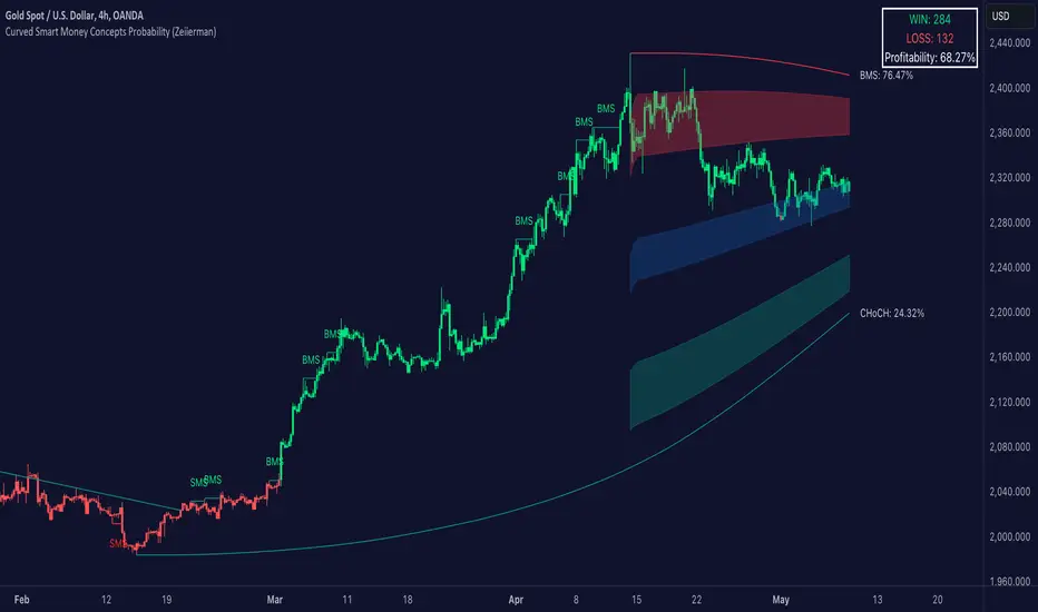
Curved Smart Money Concepts Probability (Zeiierman)█ Overview
The Curved Smart Money Concepts Probability indicator, developed by Zeiierman, is a sophisticated trading tool designed to leverage the principles of Smart Money trading. This indicator identifies key market structure points and adapts to changing market conditions, providing traders with actionable insights into market trends and potential reversals. The trading tool stands out due to its unique curved structure and advanced probability features, which enhance its effectiveness and usability for traders.
█ How It Works
The indicator operates by analyzing market data to identify pivotal moments where institutional investors might be influencing price movements. It employs a combination of adaptive trend lengths, multipliers for sensitivity adjustments, and pivot periods to accurately capture market structure shifts. The indicator calculates upper and lower bands based on adaptive sizes and identifies zones of overbought (premium) and oversold (discount) conditions.
Key Features of Probability Calculations
The Curved Smart Money Concepts Probability indicator integrates sophisticated probability calculations to enhance trading decision-making:
Win/Loss Tracking: The indicator tracks the number of successful (win) and unsuccessful (loss) trades based on the identified market structure points (ChoCH, SMS, BMS). This provides a historical context of the indicator's performance.
Probability Percentages: For each market structure point (ChoCH, SMS, BMS), the indicator calculates the probability of the next move being successful or not. This is presented as a percentage, giving traders a quantifiable measure of confidence in the signals.
Dynamic Adaptation: The probability calculations adapt to market conditions by considering the frequency and success rate of the signals, allowing traders to adjust their strategies based on the indicator’s historical accuracy.
Visual Representation: Probabilities are displayed on the chart, helping traders quickly assess the likelihood of future price movements based on past performance.
Key benefits of the Curved Structure
The Curved Smart Money Concepts Probability indicator features a unique curved structure that offers several advantages over traditional linear structures:
Noise Reduction: The curved structure smooths out short-term market fluctuations, reducing the noise often seen in linear structures. This helps traders focus on the true trend direction rather than getting distracted by minor price movements.
Adaptive Sensitivity: The curved structure adjusts its sensitivity based on market conditions. This means it can effectively capture both short-term and long-term trends by dynamically adapting to changes in market volatility, something linear structures struggle with.
Enhanced Trend Detection: By providing a more gradual transition between market phases, the curved structure helps in identifying trends more accurately. This is particularly useful in volatile markets where linear structures might give false signals due to their rigid nature.
Improved Market Structure Analysis: The curved structure's ability to adapt and smooth out irregularities provides a clearer picture of the overall market structure. This clarity is essential for identifying premium and discount zones, as well as mid-range support and resistance levels, which are crucial for effective ICT Smart Money Trading.
█ Terminology
ChoCH (Change of Character): Indicates a potential reversal in market direction. It is identified when the price breaks a significant high or low, suggesting a shift from a bullish to bearish trend or vice versa.
SMS (Smart Money Shift): Represents the transition phase in market structure where smart money begins accumulating or distributing assets. It typically follows a BMS and indicates the start of a new trend.
BMS (Bullish/Bearish Market Structure): Confirms the trend direction. Bullish Market Structure (BMS) confirms an uptrend, while Bearish Market Structure (BMS) confirms a downtrend. It is characterized by a series of higher highs and higher lows (bullish) or lower highs and lower lows (bearish).
Premium: A zone where the price is considered overbought. It is calculated as the upper range of the current market structure and indicates a potential area for selling or shorting.
Mid Range: The midpoint between the high and low of the market structure. It often acts as a support or resistance level, helping traders identify potential reversal or continuation points.
Discount: A zone where the price is considered oversold. It is calculated as the lower range of the current market structure and indicates a potential area for buying or going long.
█ How to Use
Identifying Trends and Reversals: Traders can use the indicator to identify the overall market trend and potential reversal points. By observing the ChoCH, SMS, and BMS signals, traders can gauge whether the market is transitioning into a new trend or continuing the current trend.
Example Strategies
⚪ Trend Following Strategy:
Identify the current market trend using BMS signals.
Enter a trade in the direction of the trend when the price retraces to the mid-range zone.
Set a stop-loss just below the mid-range (for long trades) or above the mid-range (for short trades).
Take profit in the premium/discount zone or when a ChoCH signal indicates a potential reversal.
⚪ Reversal Strategy:
Wait for a ChoCH signal to identify a potential market reversal.
Enter a trade in the direction of the new trend as indicated by the SMS signal.
Set a stop-loss just beyond the recent high (for short trades) or low (for long trades).
Take profit when the price reaches the premium or discount zone opposite to the entry.
█ Settings
Curved Trend Length: Determines the length of the trend used to calculate the adaptive size of the structure. Adjusting this length allows traders to capture either longer-term trends (for smoother curves) or short-term trends (for more reactive curves).
Curved Multiplier: Scales the adjustment factors for the upper and lower bands. Increasing the multiplier widens the bands, reducing sensitivity to price changes. Decreasing it narrows the bands, making the structure more responsive.
Pivot Period: Sets the period for capturing trends. A higher period captures broader trends, while a lower period focuses on short-term trends.
Response Period: Adjusts the structure’s responsiveness. A low value focuses on short-term changes, while a high value smoothens the structure.
Premium/Discount Range: Allows toggling between displaying the active range or previous range to analyze real-time or historical levels.
Structure Candles: Enables the display of curved structure candles on the chart, providing a modified view of price action.
-----------------
Disclaimer
The information contained in my Scripts/Indicators/Ideas/Algos/Systems does not constitute financial advice or a solicitation to buy or sell any securities of any type. I will not accept liability for any loss or damage, including without limitation any loss of profit, which may arise directly or indirectly from the use of or reliance on such information.
All investments involve risk, and the past performance of a security, industry, sector, market, financial product, trading strategy, backtest, or individual's trading does not guarantee future results or returns. Investors are fully responsible for any investment decisions they make. Such decisions should be based solely on an evaluation of their financial circumstances, investment objectives, risk tolerance, and liquidity needs.
My Scripts/Indicators/Ideas/Algos/Systems are only for educational purposes!
Curved Price Channels (Zeiierman)█ Overview
The Curved Price Channels (Zeiierman) is designed to plot dynamic channels around price movements, much like the traditional Donchian Channels, but with a key difference: the channels are curved instead of straight. This curvature allows the channels to adapt more fluidly to price action, providing a smoother representation of the highest high and lowest low levels.
Just like Donchian Channels, the Curved Price Channels help identify potential breakout points and areas of trend reversal. However, the curvature offers a more refined approach to visualizing price boundaries, making it potentially more effective in capturing price trends and reversals in markets that exhibit significant volatility or price swings.
The included trend strength calculation further enhances the indicator by offering insight into the strength of the current trend.
█ How It Works
The Curved Price Channels are calculated based on the asset's average true range (ATR), scaled by the chosen length and multiplier settings. This adaptive size allows the channels to expand and contract based on recent market volatility. The central trendline is calculated as the average of the upper and lower curved bands, providing a smoothed representation of the overall price trend.
Key Calculations:
Adaptive Size: The ATR is used to dynamically adjust the width of the channels, making them responsive to changes in market volatility.
Upper and Lower Bands: The upper band is calculated by taking the maximum close value and adjusting it downward by a factor proportional to the ATR and the multiplier. Similarly, the lower band is calculated by adjusting the minimum close value upward.
Trendline: The trendline is the average of the upper and lower bands, representing the central tendency of the price action.
Trend Strength
The Trend Strength feature in the Curved Price Channels is a powerful feature designed to help traders gauge the strength of the current trend. It calculates the strength of a trend by analyzing the relationship between the price's position within the curved channels and the overall range of the channels themselves.
Range Calculation:
The indicator first determines the distance between the upper and lower curved channels, known as the range. This range represents the overall volatility of the price within the given period.
Range = Upper Band - Lower Band
Relative Position:
The next step involves calculating the relative position of the closing price within this range. This value indicates where the current price sits in relation to the overall range.
RelativePosition = (Close - Trendline) / Range
Normalization:
To assess the trend strength over time, the current range is normalized against the maximum and minimum ranges observed over a specified look-back period.
NormalizedRange = (Range - Min Range) / (Max Range - Min Range)
Trend Strength Calculation:
The final Trend Strength is calculated by multiplying the relative position by the normalized range and then scaling it to a percentage.
TrendStrength = Relative Position * Normalized Range * 100
This approach ensures that the Trend Strength not only reflects the direction of the trend but also its intensity, providing a more comprehensive view of market conditions.
█ Comparison with Donchian Channels
Curved Price Channels offer several advantages over Donchian Channels, particularly in their ability to adapt to changing market conditions.
⚪ Adaptability vs. Fixed Structure
Donchian Channels: Use a fixed period to plot straight lines based on the highest high and lowest low. This can be limiting because the channels do not adjust to volatility; they remain the same width regardless of how much or how little the price is moving.
Curved Price Channels: Adapt dynamically to market conditions using the Average True Range (ATR) as a measure of volatility. The channels expand and contract based on recent price movements, providing a more accurate reflection of the market's current state. This adaptability allows traders to capture both large trends and smaller fluctuations more effectively.
⚪ Sensitivity to Market Movements
Donchian Channels: Are less sensitive to recent price action because they rely on a fixed look-back period. This can result in late signals during fast-moving markets, as the channels may not adjust quickly enough to capture new trends.
Curved Price Channels: Respond more quickly to changes in market volatility, making them more sensitive to recent price action. The multiplier setting further allows traders to adjust the channel's sensitivity, making it possible to capture smaller price movements during periods of low volatility or filter out noise during high volatility.
⚪ Enhanced Trend Strength Analysis
Donchian Channels: Do not provide direct insight into the strength of a trend. Traders must rely on additional indicators or their judgment to gauge whether a trend is strong or weak.
Curved Price Channels: Includes a built-in trend strength calculation that takes into account the distance between the upper and lower channels relative to the trendline. A broader range between the channels typically indicates a stronger trend, while a narrower range suggests a weaker trend. This feature helps traders not only identify the direction of the trend but also assess its potential longevity and strength.
⚪ Dynamic Support and Resistance
Donchian Channels: Offer static support and resistance levels that may not accurately reflect changing market dynamics. These levels can quickly become outdated in volatile markets.
Curved Price Channels: Offer dynamic support and resistance levels that adjust in real-time, providing more relevant and actionable trading signals. As the channels curve to reflect price movements, they can help identify areas where the price is likely to encounter support or resistance, making them more useful in volatile or trending markets.
█ How to Use
Traders can use the Curved Price Channels in similar ways to Donchian Channels but with the added benefits of the adaptive, curved structure:
Breakout Identification:
Just like Donchian Channels, when the price breaks above the upper curved band, it may signal the start of a bullish trend, while a break below the lower curved band could indicate a bearish trend. The curved nature of the channels helps in capturing these breakouts more precisely by adjusting to recent volatility.
Volatility:
The width of the price channels in the Curved Price Channels indicator serves as a clear indicator of current market volatility. A wider channel indicates that the market is experiencing higher volatility, as prices are fluctuating more dramatically within the period. Conversely, a narrower channel suggests that the market is in a lower volatility state, with price movements being more subdued.
Typically, higher volatility is observed during negative trends, where market uncertainty or fear drives larger price swings. In contrast, lower volatility is often associated with positive trends, where prices tend to move more steadily and predictably. The adaptive nature of the Curved Price Channels reflects these volatility conditions in real time, allowing traders to assess the market environment quickly and adjust their strategies accordingly.
Support and Resistance:
The trend line act as dynamic support and resistance levels. Due to it's adaptive nature, this level is more reflective of the current market environment than the fixed level of Donchian Channels.
Trend Direction and Strength:
The trend direction and strength are highlighted by the trendline and the directional candle within the Curved Price Channels indicator. If the price is above the trendline, it indicates a positive trend, while a price below the trendline signals a negative trend. This directional bias is visually represented by the color of the directional candle, making it easy for traders to quickly identify the current market trend.
In addition to the trendline, the indicator also displays Max and Min values. These represent the highest and lowest trend strength values within the lookback period, providing a reference point for understanding the current trend strength relative to historical levels.
Max Value: Indicates the highest recorded trend strength during the lookback period. If the Max value is greater than the Min value, it suggests that the market has generally experienced more positive (bullish) conditions during this time frame.
Min Value: Represents the lowest recorded trend strength within the same period. If the Min value is greater than the Max value, it indicates that the market has been predominantly negative (bearish) over the lookback period.
By assessing these Max and Min values, traders gain an immediate understanding of the underlying trend. If the current trend strength is close to the Max value, it indicates a strong bullish trend. Conversely, if the trend strength is near the Min value, it suggests a strong bearish trend.
█ Settings
Trend Length: Defines the number of bars used to calculate the core trendline and adaptive size. A length of 200 will create a smooth, long-term trendline that reacts slowly to price changes, while a length of 20 will create a more responsive trendline that tracks short-term movements.
Multiplier: Adjusts the width of the curved price channels. A higher value tightens the channels, making them more sensitive to price movements, while a lower value widens the channels. A multiplier of 10 will create tighter channels that are more sensitive to minor price fluctuations, which is useful in low-volatility markets. A multiplier of 2 will create wider channels that capture larger trends and are better suited for high-volatility markets.
Trend Strength Length: Defines the period over which the maximum and minimum ranges are calculated to normalize the trend strength. A length of 200 will smooth out the trend strength readings, providing a stable indication of trend health, whereas a length of 50 will make the readings more reactive to recent price changes.
-----------------
Disclaimer
The information contained in my Scripts/Indicators/Ideas/Algos/Systems does not constitute financial advice or a solicitation to buy or sell any securities of any type. I will not accept liability for any loss or damage, including without limitation any loss of profit, which may arise directly or indirectly from the use of or reliance on such information.
All investments involve risk, and the past performance of a security, industry, sector, market, financial product, trading strategy, backtest, or individual's trading does not guarantee future results or returns. Investors are fully responsible for any investment decisions they make. Such decisions should be based solely on an evaluation of their financial circumstances, investment objectives, risk tolerance, and liquidity needs.
My Scripts/Indicators/Ideas/Algos/Systems are only for educational purposes!

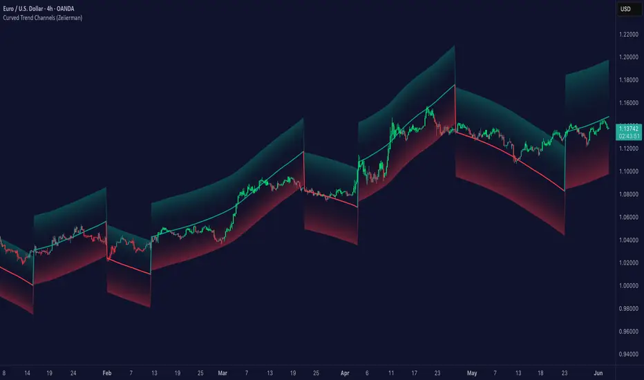
Curved Trend Channels (Zeiierman)█ Overview
Curved Trend Channels (Zeiierman) is a next-generation trend visualization tool engineered to adapt dynamically to both linear and non-linear market behavior. It introduces a novel curvature-based channeling system that grows over time during trending conditions, mirroring the natural acceleration of price trends, while simultaneously leveraging adaptive range filtering and dual-layer candle trend logic.
This tool is ideal for traders seeking smooth yet reactive dynamic channels that evolve with market structure. Whether used in curved mode or traditional slope mode, it provides exceptional clarity on trend transitions, volatility compression, and breakout development.
█ How It Works
⚪ Adaptive Range Filter Foundation
The core of the system is a volatility-based range filter that determines the underlying structure of the bands:
Pre-Smoothing of High/Low Data – Highs and lows are smoothed using a selectable moving average (SMA, EMA, HMA, KAMA, etc.) before calculating the volatility range.
Volatility Envelope – The range is scaled using a fixed factor (2.618) and further adjusted by a Band Multiplier to form the primary envelope around price.
Smoothed Volatility Curve – Final bands are stabilized using a long lookback, ensuring clean visual structure and trend clarity.
⚪ Curved Channel Logic
In Curved Mode, the trend channel grows over time when the trend direction remains unchanged:
Base Step Size (× ATR) – Sets the minimum unit of slope change.
Growth per Bar (× ATR) – Defines the acceleration rate of the channel slope with time.
Trend Persistence Recognition – The longer a trend persists, the more pronounced the slope becomes, mimicking real market accelerations.
This dynamic, time-dependent logic enables the channel to "curve" upward or downward, tracking long-standing trends with increasing confidence.
⚪ Trend Slope
As an alternative to curved logic, traders can activate a regular Trend slope using:
Slope Length – Determines how quickly the trend line adapts to price shifts.
Multiplicative Factor – Amplifies the sensitivity of the slope, useful in fast-moving markets or lower timeframes.
⚪ Candle Trend Confirmation
A robust second-layer trend detection method, the Candle Trend System evaluates directional pressure by analyzing smoothed price action:
Multi-tier Smoothing – Trend lines are derived from short-, medium-, and long-term candle movement.
█ How to Use
⚪ Trend Identification
When the Trend Line direction and Candle Colors are in agreement, this indicates strong, persistent directional conviction. Use these moments to enter with trend confirmation and manage risk more confidently.
⚪ Retest
During ongoing trends, the price will often pull back into the dynamic channel. Look for:
Support/resistance interactions at the upper or lower bands.
█ Settings
Scaled Volatility Length – Controls the historical depth used to stabilize the volatility bands.
Smoothing Type – Choose from HMA, KAMA, VIDYA, FRAMA, Super Smoother, etc. to match your asset and trading style.
Volatility MA Length – Smoothing length for the calculated range; shorter = more reactive.
High/Low Smoother Length – Additional smoothing to reduce noise from spikes or false pivots.
Band Multiplier – Widens or tightens the band range based on personal preference.
Enable Curved Channel – Toggle between curved or regular trend slope behavior.
Base Step (× ATR) – The starting point for curved slope progression.
Growth per Bar (× ATR) – How much the slope accelerates per bar during a sustained trend.
Slope – Reactivity of the standard trend line to price movements.
Multiplicative Factor – Sensitivity adjustment for HyperTrend slope.
Candle Trend Length – Lookback period for trend determination from candle structure.
-----------------
Disclaimer
The content provided in my scripts, indicators, ideas, algorithms, and systems is for educational and informational purposes only. It does not constitute financial advice, investment recommendations, or a solicitation to buy or sell any financial instruments. I will not accept liability for any loss or damage, including without limitation any loss of profit, which may arise directly or indirectly from the use of or reliance on such information.
All investments involve risk, and the past performance of a security, industry, sector, market, financial product, trading strategy, backtest, or individual's trading does not guarantee future results or returns. Investors are fully responsible for any investment decisions they make. Such decisions should be based solely on an evaluation of their financial circumstances, investment objectives, risk tolerance, and liquidity needs.
Price-Curve ChannelIntroduction
Although many will use lines in order to make support and resistances, others might use curves, this is logical since trends are not always linear. Therefore it was also important to take this into consideration, and when i published the price-line channel indicator, i already started a curved version of it. Therefore i propose this new indicator based on the recursive bands framework that allow to return curved support and resistances. The benefits of this indicator are : a totally stable approach, user friendly, and extremities able to converge faster toward the price.
The Indicator
The indicator is way faster than the price-line channel one, this is due to the fast convergence toward the price of the extremities. Length control the reactivity of the indicator, while mult is more related to the rate of convergence, values of mult lower than 1 will make the curve converge slower,
mult = .5
Higher values of mult will make the extremities converge faster toward the price.
mult = 2
Unlike the price-line channel indicator this one is directly "readjusted", this is due to the fact that the extremities are no longer linear, of course a "perfectly" curved version could come in an update, but for the moment it wasn't really a necessity.
Comparison With Price-Line
The fact that the extremities converge faster toward the price allow to possibly capture more tops/bottoms/retracements. However the extremities of both indicator have the same behavior regarding their accuracy, for example the upper extremity have a higher chance to detect a retracement when on a downtrend, while the lower extremity have higher chance to detect a retracement while on a up-trend.
On The Indicator Construction
The recursive bands framework is the core of the indicator, it is important to use it. The curved effect is given by multiplying the correction factor by the barssince function, therefore the correction factor is no longer constant which in return allow for a non linear output.
The size is divided by the square of length in order to keep a certain logic between the output and the length period.
Conclusion
The recursive bands framework prove again to be quite interesting, lot of indicators can be made using it, i only posted a fraction of what can be done with it, which make the recursive bands indicator one of the best indicators i ever made in my opinion.
The proposed indicator is stable, and don't require nightmarish manipulations (unlike the linear channels indicator), its ability to detect possible support and resistances points, although subjective, remain a feature of the indicator. The use of recursion make the indicator efficient. I hope the indicator find some use in the community.
Thanks for reading !
Linear version.
Note
Respect the house rules, always request permission before publishing open source code. This is an original work, requesting permission is the least you can do.
I apologize for any grammatical/orthographic error in this post.

Curved Management (Zeiierman)█ Overview
The Curved Management (Zeiierman) is a trade management indicator tailored for traders looking to visualize their entry, stop loss, and take profit levels. Unique in its design, this indicator doesn't just display lines; it offers rounded or curved visualizations, setting it apart from conventional tools.
█ How It Works
At its core, this indicator leverages the power of the Average True Range (ATR), a metric for volatility, to establish logical stop-loss levels based on recent price action. By incorporating the ATR, the tool dynamically adapts to the market's changing volatility. What sets it apart is the unique curved visualization. Instead of the usual straight lines representing entry/sl levels, users can choose between rounded and straight edges for their take profit and stop loss levels. This aesthetic tweak gives the chart a cleaner look and offers a more intuitive understanding of risk management.
█ How to Apply the Indicator
Upon initially loading the indicator, a label appears that reads, "Set the 'xy' time and price for 'Curved Management (Zeiierman).'" This prompts you to click on the chart at your entry point. After selecting your entry point on the chart, the indicator will load. Ensure you adjust the trend direction in the settings panel based on whether you took a long or short position.
█ How to Use
Use the tool to manage your active position.
Long Entry
Short Entry
█ Settings
The indicator comes packed with various settings allowing customization:
Trade Direction
Decide the direction of the trade (long/short).
Reward multiplier
Sets the ratio for take profit relative to stop loss. Increasing this value will set your take profit further from the entry, and decreasing it will bring it closer.
Risk multiplier
Multiplier for calculating stop loss based on the ATR value. Increasing this makes your stop loss further from the entry, while decreasing brings it closer.
█ Related Free Scripts
Trade & Risk Management Tool
-----------------
Disclaimer
The information contained in my Scripts/Indicators/Ideas/Algos/Systems does not constitute financial advice or a solicitation to buy or sell any securities of any type. I will not accept liability for any loss or damage, including without limitation any loss of profit, which may arise directly or indirectly from the use of or reliance on such information.
All investments involve risk, and the past performance of a security, industry, sector, market, financial product, trading strategy, backtest, or individual's trading does not guarantee future results or returns. Investors are fully responsible for any investment decisions they make. Such decisions should be based solely on an evaluation of their financial circumstances, investment objectives, risk tolerance, and liquidity needs.
My Scripts/Indicators/Ideas/Algos/Systems are only for educational purposes!

UCSgears_Linear Regression CurveThe Linear Regression Slope is based on the Curve.
List of All my Indicators - www.tradingview.com

Multi Yield CurveAn inversion between the 2 year and 10 year US treasury yield generally means a recession within 2 years. But the yield curve has more to it than that. This script helps analysis of the current and past yield curve (not limited to US treasury) and is very configurable.
"A yield curve is a line that plots yields (interest rates) of bonds having equal credit quality but differing maturity dates. The slope of the yield curve gives an idea of future interest rate changes and economic activity." (Investopedia)
When the slope is upward (longer maturity bonds have a higher interest rate than shorter maturity bonds), it generally means the economy is doing well and is expanding. When the slope is downward it generally means that there is more downside risk in the future.
The more inverted the curve is, and the more the inversion moves to the front, the more market participants are hedging against downside risk in the future.
The script draws up to 4 moments of a yield curve, which makes it easy to compare the current yield curve with past yield curves. It also draws lines in red when that part of the curve is inverted.
The script draws the lines with proper length between maturity (which most scripts do not) in order to make it more representative of the real maturity duration. The width cannot be scaled because TradingView does not allow drawing based on pixels.
This script is the only free script at time of writing with proper lengths, showing multiple yield curves, and being able to show yield curves other than the US treasury.
█ CONFIGURATION
(The following can be configured by clicking "Settings" when the script is added to a chart)
By default the script is configured to show the US treasury (government bond) yields of all maturities, but it can be configured for any yield curve.
A ticker represents yield data for a specific maturity of a bond.
To configure different tickers, go to the "TICKERS" section. Tickers in this section must be ordered from low maturity to high maturity.
• Enable: draw the ticker on the chart.
• Ticker: ticker symbol on TradingView to fetch data for.
• Months: amount of months of bond maturity the ticker represents.
To configure general settings, go to the "GENERAL" section.
• Period: used for calculating how far back to look for data for past yield curve lines. See "Times back" further in this description for more info.
• Min spacing: minimum amount of spacing between labels. Depending on the size of the screen, value labels can overlap. This setting sets how much empty space there must be between labels.
• Value format: how the value at that part of the line should be written on the label. For example, 0.000 means the value will have 3 digits precision.
To configure line settings per yield curve, each has its own "LINE" section with the line number after it.
• Enable: whether to enable drawing of this line.
• Times back: how many times period to go back in time. When period is D, and times value is 2, the line will be of data from 2 days ago.
• Color: color of the line when not inverted.
• Style: style of the line. Possible values: sol, dsh, dot
• Inversion color: color of the line when the curve inverses between the two maturities at that part of the curve.
• Thickness: thickness of the line in pixels.
• Labels: whether to draw value labels above the line. By default, this is only enabled for the first line.
• Label text color: text color of value label.
• Label background color: background color of value label.
To configure the durations axis at the bottom of the chart, go to the "DURATIONS" section.
• Durations: whether to show maturity term duration labels below the chart.
• Offset: amount to offset durations label to be below chart.
█ MISC
Script originally inspired by the US Treasury Yield Curve script by @longfiat but has been completely rewritten and changed.

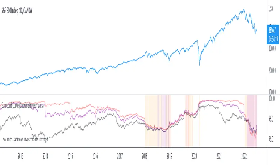
Eurobond CurveABOUT
Dynamically plots 3 no. forward EUROBOND curves. When the curves converge (or worse crossover) there is higher risk of financial uncertainty and potential market correction.
The Eurobond Curves work in a similar way to treasury "yield curve inversion"; except the EUROBOND curves can signal much earlier than Treasuries therefore providing a leading indicator.
The indicator looks the the "near" (next year EUROBOND), "mid" (EUROBOND 2 years out) and "far" (EUROBOND 5 years out) to assess for crossovers.
When the "near" and "mid" curves crossover the "far" curve, concerning economic conditions are developing and it may be a good idea to reduce risk exposure to markets.
LIMITATIONS
The EUROBOND curve crossover events are rare, and this indicator uses data back to 2005 (using approximately 25 TradingView security functions). Given there are relatively few crossover events, the reliability of this indicator should be considered low. Nonetheless, there is decent alignment with treasury yield curve inversions in the 20 year period assessed. Given treasury yield curve inversions have predicted every recession for the last 70 years, we still think the EUROBOND Curves are a useful datapoint to monitor into the future and provide confluence to other risk management strategies.
Cubic Bézier Curve Extrapolation [LuxAlgo]The following script allows for the extrapolation of a Cubic Bézier Curve fit using custom set control points and can be used as a drawing tool allowing users to estimate underlying price trends or to forecast future price trends.
Settings
Extrapolation Length: Number of extrapolated observations.
Source: Source input of the script.
Style
Width: Bézier curve line width.
Colors: The curve is colored based on the direction it's taking, the first color is used when the curve is rising, and the second when it is declining.
The other settings determine the locations of the control points. The user does not need to change them from the settings, instead only requiring adjusting their location on the chart like with a regular drawing tool. Setting these control points is required when adding the indicator to your chart.
Usage
Bézier curves are widely used in a lot of scientific and artistic fields. Using them for technical analysis can be interesting due to their extrapolation capabilities as well as their ease of calculation.
A cubic Bézier curve is based on four control points. Maxima/Minimas can be used as control points or the user can set them such that part of the extrapolated observation better fits the most recent price observations.
A possible disadvantage of Bézier curves is that obtaining a good fit with the data is not their primary goal. Rational Bézier curves can be used if obtaining a good fit is the primary user goal.
Details
At their core, Bézier curves are obtained from nested linear interpolation between each control point and the resulting linearly interpolated results. The Bézier curve point located at the first control point P0 and the last curve point located at the last control point Pn are equal to their respective control points. However, this script does not make use of this approach, instead using a more explicit form.
As mentioned previously, the complexity of a Bézier curve can be determined by its number of control points which is related to the Bézier curve degree (number of control points - 1). Instead of using nested linear interpolations to describe Bézier curves, one can describe them as a polynomial of a degree equal to the degree of the wanted Bézier curve.

Bitcoin Logarithmic Growth CurvesThis plots logarithmic curves fitted to major Bitcoin bear market tops & bottoms. Top line is fitted to bull tops, bottom line is fitted to lower areas of the logarithmic price trend (which is not always the same as bear market bottoms). Middle line is the median of the top & bottom, and the faded solid lines are fibonacci levels in between.
Inspired by & based on a Medium post by Harold Christopher Burger, which shows how linear Bitcoin's long-term price growth is when plotted on a double-log chart (log scaling on the price AND time axis).
These curves will only make sense for tickers representing Bitcoin vs. USD (such as BITSTAMP:BTCUSD, BITMEX:XBTUSD, BLX index). Plotting on other assets will probably end up with lines that shoot off into space without any relationship to the underlying price action.
The upper, middle & lower curves can be projected into the future, which can be turned on or off in the indicator settings. The fibonacci levels can also be switched on/off. And the upper & lower curve intercepts & slopes can be tweaked.
I'm releasing this open-source, if you end up making something cool based off of this code, I don't need attribution but please hit me up on here or on twitter (same username) so I can check out what ya made. Thanks, hope y'all enjoy it.

Inverted Yield Curve with VIX Fear IndexUS 2 year and US 10 year comparison, inverted yield curve with VIX. I use this on a weekly chart with 2 moving averages, the 40 week (ma200 daily) and the 520 week (10 year median).
The bottom histogram is the VIX and the plot is the yield curve. When the VIX is above a certain level (you can set it in settings) and the ýield curve is close to or at inversion the background goes red.
The last seven recessions were preceded by an inverted yield curve. Here I combined the two main fear indexes, the VIX and the run for safe US treasuries (Inverted Yield Curve).
This is preset to the 2 year and 10 year US bond, weekly, and the normal VIX ticker but you can set it to whatever you like.
Published with source code for anyone to modify. Please comment below if you do so! This is the second in a series of indicators I intend to publish as a package of economic recoverty/recession symptom indicators.
Follow me for updates, next one up is commodities with dr Copper and oil!

Coppock Curve StrategyThis strategy makes use of a not widely known technical indicator called "Coppock Curve".
The indicator is derived by taking a weighted moving average of the rate-of-change (ROC) of a market index such as the S&P 500 or a trading equivalent such as the S&P 500 SPDR ETF. For more info: (www.investopedia.com)
This strategy uses $SPY Coppock curve as a proxy to generate buy signals on other ETF's and stocks.
Buy signals are generated when the Coppock Curve crosses above zero, and sell signals are generated when it crosses below.
An optional, trailing stop loss is available, with default settings to 100% so that it does not currently affect the buy and sell signals solely generated by the Coppock Curve. But you may find adding a Trailing stop loss may improve results on certain ETF's/Stocks.
You may also change the symbol for which signals are generated for, default is $SPY.
The published example shows using this strategy on a leverage ETF $TQQQ w/ starting capital of 10k, w/ 10k per trade. Try it on other stocks such as $AAPL, $AMZN $NFLX ect... I have found it to be an effective strategy that has a favorable risk to reward profile.
Any questions, please let me know!

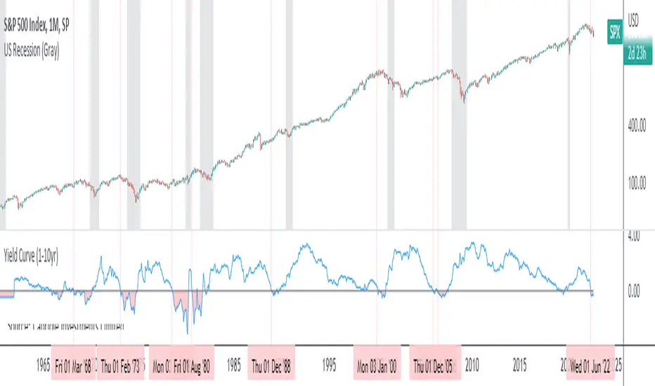
Yield Curve (1-10yr)Yield curve of the 1-10 year US Treasury Bonds, with over 60 years of history.
The Yield Curve is the interest rate on the 10 year bond minus the 1 year bond.
When it inverts (crosses under 0) a recession usually follows 6-12 months later.
It's a great leading indicator to identify risk in the macroeconomic environment.
Yield curves can be constructed on varying durations. Using a 1-year as the short-term bond provides a slightly faster response than the 2-year bond; and the 1-year has more historical data on TradingView.
Function Bezier CurveEXPERIMENTAL:
Function for drawing Bezier Curves.
the 4 points should act as a deformable rectangle:
B------C
|...........|
A.........D
percent of time is a value 0->1 representing the percentage of time traveled.

Historical Federal Fund Futures CurveUse this indicator to plot the federal funds futures implied rates term structure against historical curves
Based upon the work of @BarefootJoey, @longfiat, @OpptionsOnly

Normal Distribution CurveThis Normal Distribution Curve is designed to overlay a simple normal distribution curve on top of any TradingView indicator. This curve represents a probability distribution for a given dataset and can be used to gain insights into the likelihood of various data levels occurring within a specified range, providing traders and investors with a clear visualization of the distribution of values within a specific dataset. With the only inputs being the variable source and plot colour, I think this is by far the simplest and most intuitive iteration of any statistical analysis based indicator I've seen here!
Traders can quickly assess how data clusters around the mean in a bell curve and easily see the percentile frequency of the data; or perhaps with both and upper and lower peaks identify likely periods of upcoming volatility or mean reversion. Facilitating the identification of outliers was my main purpose when creating this tool, I believed fixed values for upper/lower bounds within most indicators are too static and do not dynamically fit the vastly different movements of all assets and timeframes - and being able to easily understand the spread of information simplifies the process of identifying key regions to take action.
The curve's tails, representing the extreme percentiles, can help identify outliers and potential areas of price reversal or trend acceleration. For example using the RSI which typically has static levels of 70 and 30, which will be breached considerably more on a less liquid or more volatile asset and therefore reduce the actionable effectiveness of the indicator, likewise for an asset with little to no directional volatility failing to ever reach this overbought/oversold areas. It makes considerably more sense to look for the top/bottom 5% or 10% levels of outlying data which are automatically calculated with this indicator, and may be a noticeable distance from the 70 and 30 values, as regions to be observing for your investing.
This normal distribution curve employs percentile linear interpolation to calculate the distribution. This interpolation technique considers the nearest data points and calculates the price values between them. This process ensures a smooth curve that accurately represents the probability distribution, even for percentiles not directly present in the original dataset; and applicable to any asset regardless of timeframe. The lookback period is set to a value of 5000 which should ensure ample data is taken into calculation and consideration without surpassing any TradingView constraints and limitations, for datasets smaller than this the indicator will adjust the length to just include all data. The labels providing the percentile and average levels can also be removed in the style tab if preferred.
Additionally, as an unplanned benefit is its applicability to the underlying price data as well as any derived indicators. Turning it into something comparable to a volume profile indicator but based on the time an assets price was within a specific range as opposed to the volume. This can therefore be used as a tool for identifying potential support and resistance zones, as well as areas that mark market inefficiencies as price rapidly accelerated through. This may then give a cleaner outlook as it eliminates the potential drawbacks of volume based profiles that maybe don't collate all exchange data or are misrepresented due to large unforeseen increases/decreases underlying capital inflows/outflows.
Thanks to @ALifeToMake, @Bjorgum, vgladkov on stackoverflow (and possibly some chatGPT!) for all the assistance in bringing this indicator to life. I really hope every user can find some use from this and help bring a unique and data driven perspective to their decision making. And make sure to please share any original implementaions of this tool too! If you've managed to apply this to the average price change once you've entered your position to better manage your trade management, or maybe overlaying on an implied volatility indicator to identify potential options arbitrage opportunities; let me know! And of course if anyone has any issues, questions, queries or requests please feel free to reach out! Thanks and enjoy.

Yield Curve (2-10yr)Yield curve of the 2-10 year US Treasury Bonds, with over 50 years of history.
The Yield Curve is the interest rate on the 10 year bond minus the 2 year bond.
When it inverts (crosses under 0) a recession usually follows 6-12 months later.
It's a great leading indicator to identify risk in the macroeconomic environment.

SBER Coppock Curve with 14EMA (Prefer with 1 HR)Modified coppock curve along with 14EMA can be used by non-aggressive traders as per detailed rules explained in video on "Trading made easy with secret coppock curve"

curveLibrary "curve"
Regression array Creator. Handy for weights, Auto Normalizes array while holding curves.
curve(_size, _power)
Curve Regression Values Tool
Parameters:
_size : (float) Number of Steps required (float works, future consideration)
_power : (float) Strength of value decrease
Returns: (float ) Array of multipliers from 1 downwards to 0.

Parabolic (Brachistochrone) Curve IndicatorOverview of the Script
The script is designed to plot an approximation of the Brachistochrone curve between two points on a TradingView chart. The Brachistochrone curve represents the path of fastest descent under gravity between two points not aligned vertically. In physics, this curve is a segment of a cycloid.
Understanding the Brachistochrone Curve
Definition: The Brachistochrone curve is the curve along which a particle will descend from one point to another in the least time under gravity, without friction.
Mathematical Representation: The solution to the Brachistochrone problem is a cycloid, which is the curve traced by a point on the rim of a circular wheel as it rolls along a straight line.
Relevance to Trading: While the Brachistochrone curve originates from physics, plotting it on a price-time chart can offer a unique visual representation of the fastest possible movement between two price levels.
How the Script Works
Inputs
Start and End Bars:
startBar: The number of bars back from the current bar to define the starting point.
endBar: The number of bars back from the current bar to define the ending point.
Curve Customization:
numPoints: The number of points used to plot the curve (affects smoothness).
curveColor: The color of the curve.
curveWidth: The width of the curve lines.
Labels:
showTimeLabels: A toggle to display labels along the curve for reference.
Calculations
Determine Start and End Points:
The script calculates the coordinates (x_start, y_start, x_end, y_end) of the start and end points based on the specified bar offsets.
x_start and x_end correspond to bar indices (time).
y_start and y_end correspond to price levels.
Calculate Differences and Parameters:
Horizontal and Vertical Differences:
delta_x = x_end - x_start
delta_y = y_end - y_start
Ensure Descending Motion:
If the end point is higher than the start point (i.e., delta_y is positive), the script swaps the start and end points to ensure the curve represents a descent.
Cycloid Parameters:
Angle (theta): Calculated using theta = atan(delta_y / delta_x), representing the inclination of the curve.
Radius (R): The radius of the generating circle for the cycloid, calculated with R = delta_x / (π * cos(theta)).
Generate Points Along the Cycloid:
Parameter t: Varies from 0 to t_end, where t_end is set to π to represent half a cycloid (a common segment for the Brachistochrone).
Cycloid Equations:
Horizontal Component (x_t): x_t = R * (t - sin(t))
Vertical Component (y_t): y_t = R * (1 - cos(t))
Adjust Coordinates:
The script adjusts the cycloid coordinates to align with the chart's axes:
x_plot = x_start + x_t * cos(theta)
y_plot = y_start + y_t * sin(theta)
The x_plot values are converted to integer bar indices to match the chart's x-axis.
Plotting the Curve
Drawing Lines:
The script connects consecutive points using lines to form the curve.
It uses the line.new function, specifying the start and end coordinates of each line segment.
Adding Labels (Optional):
If showTimeLabels is enabled, the script places labels at intervals along the curve to indicate progress or parameter values.
Adjustments for Accurate Visualization
Handling Ascending Paths:
To adhere to the physical definition of the Brachistochrone curve, the script ensures that the ending point is below the starting point in terms of price.
If not, it swaps the points to represent a descending path.
Parameter Constraints:
The script ensures that calculations involving trigonometric functions remain within valid ranges to prevent mathematical errors (e.g., division by zero or invalid arguments for acos).
Scaling Considerations:
Adjustments are made to account for the differences in scaling between time (x-axis) and price (y-axis) on the chart.
The script maps spatial coordinates to the chart's axes appropriately.
Limitations and Considerations
Theoretical Nature:
The Brachistochrone curve is a theoretical concept from physics and doesn't necessarily predict actual price movements in financial markets.
Chart Scaling:
The visual appearance of the curve may be affected by the chart's scaling settings. Users may need to adjust the chart's zoom or scale to view the curve properly.
Data Range:
The start and end bars must be within the range of available data on the chart. If the specified bars are out of range, the script may not plot the curve.
Computational Limits:
TradingView imposes limits on the number of drawing objects (lines, labels) that can be displayed. The script accounts for this, but extremely high numPoints values may lead to performance issues.
Usage Instructions
Adding the Indicator:
The script is added to the chart as a custom indicator in TradingView's Pine Script Editor.
Configuring Inputs:
Start and End Bars: Users specify the bar offsets for the start and end points. It's important that the end point is below the start point in price to represent a descent.
Curve Customization: Users can adjust the number of points for smoothness and customize the curve's color and width.
Labels: Users can choose to display or hide labels along the curve.
Observing the Curve:
After configuring the inputs, the curve will be plotted between the two specified points.
Users can observe the curve to understand the theoretical fastest descent between the two price levels.
Potential Applications
Educational Tool:
The script serves as a visual aid to understand the properties of the Brachistochrone curve and cycloid.
Analytical Insights:
While not predictive, the curve might inspire new ways of thinking about price movements, momentum, or acceleration in markets.
Visualization:
It provides a unique way to visualize the relationship between time and price over a specific interval.
Conclusion
The script effectively adapts the mathematical concept of the Brachistochrone curve to a financial chart by carefully mapping spatial coordinates to time and price axes. By accounting for the unique characteristics of TradingView charts and implementing necessary mathematical adjustments, the script plots the curve between two user-defined points, offering a novel and educational visualization.
4H Candle Curves4H Candle Curves - Detailed User Guide
OVERVIEW
This indicator reveals curve vs continuation behavior in NQ Futures by analyzing how price responds after breaking the first-hour range. Based on 10+ years of statistical analysis (2013-2025, 3,136+ trading days), it identifies which 4-hour sessions exhibit mean reversion (curve) behavior versus trend continuation when Q2 (second hour) breaks Q1 (first hour) extremes.
⚠️ IMPORTANT: This indicator is specifically designed for NQ FUTURES ONLY. All curve probabilities and statistics were derived from a decade-long dataset of NQ 1-minute bars. Using this on other instruments will produce inaccurate results.
CORE CONCEPT: THE CURVE
What is a "Curve"?
A curve occurs when price breaks out of the first hour's range in Q2 (hour 2), but then reverses direction in the second half (Q3+Q4) to make a new extreme on the opposite side.
Curve Example (Upside Break → Downside Reversal):
Q1 (Hour 1): Price establishes range 25,000 - 25,050
Q2 (Hour 2): Price breaks ABOVE Q1 high, reaches 25,100
Q3+Q4 (Hours 3-4): Price curves back down, makes new LOW below 25,000
Result: Q2 broke high, but second half curved back to make new low below Q1 = CURVE
What is "Continuation"?
Continuation occurs when Q2 breaks Q1 range and the second half extends further in the same direction.
Continuation Example (Upside Break → Further Upside):
Q1 (Hour 1): Price establishes range 25,000 - 25,050
Q2 (Hour 2): Price breaks ABOVE Q1 high, reaches 25,100
Q3+Q4 (Hours 3-4): Price continues higher, makes new HIGH above 25,100
Result: Q2 broke high, second half made new high above Q2 = CONTINUATION
THE CRITICAL DISCOVERY: 6AM IS THE CURVE SESSION
Curve Probabilities by Session:
When Q2 Breaks Q1 HIGH:
6AM: 60.6% curve (new low below Q1) | 38.5% continuation
2AM: 38.4% curve | 46.7% continuation (balanced)
10AM: 17.2% curve | 60.4% continuation ← STRONG continuation bias
6PM: 29.6% curve | 59.0% continuation
10PM: 27.5% curve | 55.1% continuation
When Q2 Breaks Q1 LOW:
6AM: 64.4% curve (new high above Q1) | 35.0% continuation ← HIGHEST curve
2AM: 42.8% curve | 43.3% continuation (balanced)
10AM: 16.7% curve | 51.6% continuation ← STRONG continuation bias
6PM: 33.7% curve | 51.1% continuation
10PM: 33.1% curve | 48.6% continuation
Key Insight:
6AM is THE ONLY SESSION with >60% curve probability in both directions. This makes it a uniquely exploitable mean reversion session. When Q2 breaks Q1 range during 6AM, expect the second half to curve back 60-64% of the time.
10AM shows the opposite: Strong continuation bias (60% when Q2 breaks high, 52% when Q2 breaks low). 10AM breakouts tend to follow through.
HOW IT WORKS: THE QUARTER SYSTEM
The Six 4-Hour Candles (EST):
Each trading day (6pm-5pm) is divided into six 4-hour periods:
6PM (18:00-22:00) - Evening/Globex open | Blue box
10PM (22:00-02:00) - Asia session | Purple box
2AM (02:00-06:00) - Early London | Orange box
6AM (06:00-10:00) - Late London + NY Open | Green box ← THE CURVE SESSION
10AM (10:00-14:00) - NY Morning | Red box ← THE CONTINUATION SESSION
2PM (14:00-17:00) - NY Afternoon | Yellow box (3 hours only)
The Four Quarters:
Each 4-hour candle (except 2PM) is divided into four 1-hour quarters:
Q1 (Hour 1, minutes 0-60): Establishes initial range
Q2 (Hour 2, minutes 60-120): Tests Q1 range - breaks or holds?
Q3 (Hour 3, minutes 120-180): Second half begins
Q4 (Hour 4, minutes 180-240): Second half completes
2PM candle only has 3 hours (14:00-17:00), so quarters are adjusted accordingly.
The Three-Step Analysis:
STEP 1: Q1 Establishes Range
The first hour sets the high and low for the session. This becomes the reference range.
STEP 2: Q2 Break Detection
The indicator monitors whether Q2 (hour 2) breaks above Q1 high or below Q1 low.
STEP 3: Second Half Response
Once Q2 breaks Q1 range, the indicator tracks what happens in Q3+Q4:
Does price CURVE back to make new extreme on opposite side?
Does price CONTINUE to make new extreme in same direction?
Or does price stay within the established range?
VISUAL ELEMENTS EXPLAINED
1. 4-Hour Candle Boxes
Colored boxes display the high-to-low range of each 4H candle:
Blue = 6PM (evening session start)
Purple = 10PM (Asia session)
Orange = 2AM (early London)
Green = 6AM ← THE CURVE SESSION (watch for mean reversion)
Red = 10AM ← THE CONTINUATION SESSION (trend follow-through)
Yellow = 2PM (afternoon close, 3 hours only)
2. Quarter Separator Lines
Vertical dotted lines mark the boundaries between quarters (1H, 2H, 3H marks). This helps you see:
When Q1 ends (after 1 hour)
When Q2 ends / second half begins (after 2 hours)
When Q3 ends (after 3 hours)
3. Candle Name Labels
At the 2-hour mark (Q2/Q3 boundary), a label shows:
Candle name (e.g., "6am")
Directional indicator:
🔼 = Q2 broke Q1 HIGH
🔽 = Q2 broke Q1 LOW
⚠️ = Q2 broke BOTH Q1 high and low (extended range)
No symbol = Q2 stayed within Q1 range
THE LIVE STATUS TABLE
Located in your chosen corner (default: bottom-right), this table shows real-time analysis of the current 4H candle.
Header Row:
"LIVE: CANDLE" - Shows which 4H session you're currently in
Quarter Row:
"Quarter: Q1/Q2/Q3/Q4 (Hour X)" - Shows which quarter you're currently forming
STATUS Section:
The status updates dynamically based on what has happened:
During Q1-Q2 (First Half):
"⏳ Q1 Building..." - First hour forming, range being established
"⏳ Q2 Building..." - Second hour in progress, Q2 within Q1 range so far
"🔼 Q2 Broke Q1 HIGH" - Q2 has broken above Q1 high
"🔽 Q2 Broke Q1 LOW" - Q2 has broken below Q1 low
"⚠️ Q2 Broke BOTH Q1 Extremes" - Q2 extended range in both directions
During Q3-Q4 (Second Half):
"✓ CURVE CONFIRMED" - Q2 broke one direction, second half reversed to opposite side
"✓ CONTINUATION CONFIRMED" - Q2 broke one direction, second half extended further same direction
"⏳ 2nd Half In Progress" - Q2 broke Q1, waiting to see if curve or continuation
"📊 No Q2 Break Occurred" - Q2 stayed within Q1 range (no curve/continuation setup)
EXPECTATION Section:
Shows the probabilities based on the current state:
When Q2 breaks Q1 high in 6AM:
EXPECT 2nd half:
CURVE (low < Q1): 60.6%
CONT (high > Q2): 38.5%
This tells you there's a 60.6% chance the second half will curve back to make a new low below Q1, versus 38.5% chance it continues higher above Q2.
When curve/continuation is confirmed:
Q2 broke high → 2nd half made new LOW below Q1
Curve: 60.6%
Shows what actually happened and the historical probability.
Color Coding:
Purple background = Curve confirmed (mean reversion occurred)
Green background = Continuation confirmed (upside extension)
Red background = Continuation confirmed (downside extension)
Blue background = Second half in progress, watching
Yellow background = No Q2 break (no setup)
Gray background = Still in first half, building
THE CURVE REFERENCE TABLE
Located in your chosen corner (default: bottom-left), this table provides a quick reference for all sessions.
Table Structure:
TOP SECTION: "When Q2 BREAKS Q1 HIGH"
BOTTOM SECTION: "When Q2 BREAKS Q1 LOW"
How to Read:
"Curve" column = % of time second half makes new extreme on OPPOSITE side
"Cont" column = % of time second half makes new extreme in SAME direction
"Winner" column = Which behavior is more likely
Purple highlight = Curve is the winner (higher %)
Blue highlight = Continuation is the winner
🔥 symbol = Strong edge (>60%)
Quick Reference Usage:
You're in 10AM session, Q2 just broke Q1 high. Look at top section, 10AM row:
Curve: 17.2%
Cont: 60.4%
Winner: CONT
Interpretation: 10AM breakouts tend to follow through. Only 17% chance of curving back. Trade with the break, not against it.
PRACTICAL TRADING EXAMPLES
Example 1: Perfect 6AM Curve Setup
Scenario:
6AM candle in progress
7:00 AM: Q1 ends, range is 18,000 - 18,050
7:30 AM: Price breaks above 18,050, reaches 18,075 (Q2 broke Q1 high)
Live table shows: "🔼 Q2 Broke Q1 HIGH"
Expectation: "CURVE (low < Q1): 60.6%"
Trading Decision:
Even though price broke to new highs, the 60.6% curve probability suggests looking for short opportunities expecting price to curve back below 18,000 in Q3-Q4.
Typical Outcome:
8:15 AM (Q3): Price starts declining
9:15 AM (Q4): Price makes new low at 17,990
Result: ✓ CURVE CONFIRMED
Example 2: 10AM Continuation Signal
Scenario:
10AM candle in progress
11:00 AM: Q1 ends, range is 18,100 - 18,150
11:45 AM: Price breaks above 18,150, reaches 18,180 (Q2 broke Q1 high)
Live table shows: "🔼 Q2 Broke Q1 HIGH"
Expectation: "CONT (high > Q2): 60.4%"
Trading Decision:
With 60.4% continuation probability, breakout likely to follow through. Look for long opportunities expecting extension above 18,180 in Q3-Q4.
Typical Outcome:
12:30 PM (Q3): Price continues higher to 18,200
1:15 PM (Q4): Price makes new high at 18,225
Result: ✓ CONTINUATION CONFIRMED
Example 3: Using Reference Table During Live Trading
You see Q2 breaking Q1 low during 2AM session:
Quick reference check:
2AM row, "When Q2 BREAKS Q1 LOW" section
Curve: 42.8% | Cont: 43.3% | Winner: Balanced
Interpretation: This is a coin flip - 2AM session is balanced when Q2 breaks low. Don't force a directional bias. Wait for second half price action confirmation or skip the setup.
Example 4: No Setup Scenario
Scenario:
6AM candle, Q2 ends at 8:00 AM
Q2 stayed within Q1 range (no break above or below)
Live table shows: "📊 No Q2 Break Occurred"
Trading Decision:
No curve/continuation setup exists. This analysis only applies when Q2 breaks Q1 range. Monitor for different strategies or wait for next 4H candle.
UNDERSTANDING THE UNDERLYING METHODOLOGY
Data Foundation:
Instrument: NQ Futures (E-mini NASDAQ-100)
Timeframe: 1-minute bars for precise quarter tracking
Period: January 2013 - December 2025
Sample: 3,136+ complete trading days
Total 4H Candles Analyzed: ~18,800+ individual sessions
Analysis Process:
For each 4H candle in the dataset:
Calculate Q1 high and low (first hour range)
Track whether Q2 breaks Q1 high, Q1 low, both, or neither
When Q2 breaks Q1 range, measure second half response:
Did Q3+Q4 make new low below Q1? (curve when Q2 broke high)
Did Q3+Q4 make new high above Q1? (curve when Q2 broke low)
Did Q3+Q4 make new high above Q2? (continuation when Q2 broke high)
Did Q3+Q4 make new low below Q2? (continuation when Q2 broke low)
Calculate percentages for each session
Why NQ-Specific?
Different futures contracts exhibit different intraday personality:
NQ (NASDAQ):
Tech-heavy, volatility-prone
6AM shows extreme curve behavior (60-64%) due to NY Open reversal tendency
10AM shows strong continuation (60%) as trends establish
ES (S&P 500) would show different probabilities because:
Lower volatility than NQ
Different institutional participation patterns
Different response to macro events
The indicator's probabilities are calibrated specifically to NQ behavior patterns. Using it on ES, RTY, or other instruments will produce misleading signals.
ORIGINALITY & INNOVATION
What Makes This Indicator Unique:
Quarter-Based Curve Analysis: Unlike traditional indicators that only identify breakouts, this tracks what happens after the breakout. The curve vs continuation framework is novel and provides directional edge.
Session-Specific Behavior: Recognizes that 6AM behaves fundamentally differently than 10AM. Most indicators apply the same logic across all sessions. This indicator provides session-specific probabilities.
Statistical Validation: Every probability shown is backed by 10+ years of data (2,900+ candles per session). Not based on theory or discretionary observation.
Real-Time Quarter Tracking: Precisely identifies which quarter you're in and what stage of the pattern is forming. Provides forward-looking probabilities based on current state.
The 6AM Discovery: The 60-64% curve probability in 6AM is a quantified, repeatable edge that contradicts traditional "breakout = continuation" assumptions. This session exhibits mean reversion characteristics that most traders miss.
Dual-Direction Analysis: Tracks both upside breaks (Q2 > Q1 high) and downside breaks (Q2 < Q1 low) separately, as they can have different probabilities.
Visual Quarter System: The combination of colored boxes, quarter separators, and real-time labels provides instant visual understanding of pattern stage and expected behavior.
HOW TO USE THIS INDICATOR
Step 1: Identify Current 4H Candle
Check which colored box you're in and what session it represents.
Step 2: Wait for Q2 to Complete
The setup doesn't exist until Q2 (hour 2) breaks Q1 range. Monitor the live table.
Step 3: Check Q2 Break Status
Did Q2 break Q1 high? Q1 low? Both? Or neither?
Step 4: Consult Reference Table
Look up current session in curve reference table. What's the probability?
Step 5: Apply Session-Specific Strategy
For 6AM (60-64% curve):
Q2 breaks high → Expect curve back for new low
Q2 breaks low → Expect curve back for new high
Strategy: FADE the Q2 break, look for reversal entries in Q3-Q4
For 10AM (52-60% continuation):
Q2 breaks high → Expect continuation higher
Q2 breaks low → Expect continuation lower
Strategy: TRADE WITH the Q2 break, look for continuation entries in Q3-Q4
For 2AM (38-43% curve, 43-47% continuation):
Balanced probabilities
Strategy: Wait for Q3 price action to confirm direction, or skip
For 6PM/10PM (50-59% continuation):
Moderate continuation bias
Strategy: Lean with the break but use tight stops
Step 6: Monitor Live Status
Watch the live table for confirmation:
"✓ CURVE CONFIRMED" = Mean reversion occurred
"✓ CONTINUATION CONFIRMED" = Follow-through occurred
"⏳ 2nd Half In Progress" = Still developing
BEST PRACTICES
Focus on 6AM for curve trades - This is THE high-probability mean reversion session
Focus on 10AM for continuation trades - This is THE high-probability breakout session
Be cautious with 2AM - Balanced probabilities mean lower edge
Use quarter separators - Enter trades early in Q3 after Q2 break, don't wait for Q4
Combine with price action - Don't blindly fade 6AM or follow 10AM; wait for confirming price structure
Respect the 60% rule - 6AM curve happens 60% of time, which means 40% it doesn't. Manage risk accordingly
Watch for "No Q2 Break" - If Q2 doesn't break Q1, this analysis doesn't apply
Consider overnight context - If 6AM opens with huge gap, curve probability may be affected
SETTINGS & CUSTOMIZATION
Display Settings:
Show 4H Candle Boxes - Toggle colored range boxes
Box Colors - Customize color for each session
Show Quarter Separators - Show/hide 1H, 2H, 3H lines
Show Candle Name Labels - Show/hide session labels at 2H mark
Separator Line Style - Solid/Dashed/Dotted
Max Historical Candles - How many past 4H candles to display (1-50)
Table Settings:
Show Live Status Table - Toggle real-time analysis table
Show Curve Reference Table - Toggle probability reference table
Table Positions - Place tables in any corner
Table Text Size - Tiny/Small/Normal
LIMITATIONS & DISCLAIMERS
NQ FUTURES ONLY - All probabilities are NQ-specific, do not use on other instruments
Requires Q2 break - No curve/continuation setup exists if Q2 stays within Q1 range
Probabilities, not certainties - 60% means it happens 6 out of 10 times, not every time
Lower timeframe noise - 1-minute tracking can be choppy, consider using 5min+ for entries
Gap days - Large overnight gaps may affect curve/continuation probabilities
Not standalone - Use as confluence with your strategy, not as sole decision factor
Historical performance - Past statistics don't guarantee future results
WHY THE CURVE CONCEPT MATTERS
Traditional trading wisdom says: "Breakout = Continuation"
This indicator proves that's not always true. Specifically, during the 6AM session (late London + NY Open), when Q2 breaks the Q1 range, price curves back to the opposite extreme 60-64% of the time.
This creates a unique exploitable edge:
Most breakout traders go LONG when Q2 breaks Q1 high
But in 6AM, 60.6% of the time, price curves back down for new low
Shorting the breakout (counter-intuitive) is the higher-probability trade
The 10AM session shows the opposite:
Breakouts in 10AM tend to follow through (52-60%)
Traditional "trade the breakout" strategy works better here
By knowing which session you're in, you can adapt your strategy to match the session's personality.
FINAL NOTES
This indicator distills 10+ years of NQ intraday behavior into actionable, session-specific probabilities. The discovery that 6AM exhibits 60-64% curve behavior while 10AM exhibits 52-60% continuation behavior provides a statistical edge for mean reversion and trend-following traders respectively.
The highest-probability setups:
6AM Q2 break → FADE (60-64% edge for curve)
10AM Q2 break → FOLLOW (52-60% edge for continuation)
2AM = SKIP (balanced probabilities, no clear edge)
Master the 6AM curve and 10AM continuation first. These two sessions provide the clearest statistical edges.
Remember: Trade with proper risk management. This tool provides probabilities based on historical behavior, not predictions of future performance.

Optimized Logarithmic Curve for Bitcoin (BTC/USD) by FICASHello everyone!
I'd like to share with you a handy tool that is incredibly useful for analyzing Bitcoin's price movements. This optimized logarithmic curve indicator is a refined version of the popular "My BTC log curve" indicator, originally created by @quantadelic.
We have made several improvements to enhance its predictive capabilities when it comes to identifying potential price bottoms for Bitcoin BTC/USD.
Description:
In this detailed analysis, we are excited to introduce you to an optimized version of the popular "My BTC log curve" indicator, originally created by @quantadelic. We have refined the indicator for enhanced predictive capabilities when it comes to identifying potential price bottoms for Bitcoin BTC/USD. By putting ourselves in the reader's shoes, we aim to provide a comprehensive and meaningful explanation of our analysis and predictions using this improved tool.
The logarithmic curve is a powerful tool for analyzing price movements in a non-linear fashion, allowing traders and investors to identify critical turning points and trends. With the optimized logarithmic curve, we can more accurately predict potential price bottoms, ultimately guiding better-informed trading and investment decisions.
Key Features of the Optimized Logarithmic Curve:
Improved predictive capabilities: The refined logarithmic curve has been optimized to provide more accurate predictions of potential price bottoms, enabling traders to make better-informed decisions.
Enhanced visualization: The optimized curve offers a clearer visual representation of Bitcoin's price movements, making it easier for traders to identify patterns and trends.
Adaptability: This indicator can be applied to various timeframes, providing insights for both short-term and long-term traders.
The optimized logarithmic curve indicator is based on a logarithmic regression of the USD price of Bitcoin, calculated according to the equation:
y = A * exp(beta * x^lambda + c) + m * x + b
where x is the number of days since the genesis block. All parameters are editable in the script options, allowing traders to customize the curve to their preferences.
Here are some of the key changes made to the original indicator to create the optimized logarithmic curve:
Midline Calculation: The optimized logarithmic curve utilizes an updated method for calculating the midline, which better represents the average price movement of Bitcoin over time. This improved midline calculation provides a more accurate representation of Bitcoin's historical price trajectory, making it easier to identify potential price bottoms.
Cross Line Calculation: We have modified the way cross lines are calculated in the optimized logarithmic curve. These new cross lines are derived from a combination of the updated midline calculation and historical support and resistance levels. This change allows traders to more accurately identify critical points in the market where price action is likely to reverse or continue its trend.
Table Display: a powerful visualization tool designed to provide a comprehensive overview of the relationships between various exponential curves and the Bitcoin price. This table display, integrated into the "FiCAS BTC log curve" indicator, enables traders and analysts to quickly compare and assess the impact of these curves on the market.
Our analysis using the optimized logarithmic curve suggests that Bitcoin might be at a critical price bottom, indicating that selling at this point may not be the most prudent course of action. Instead, traders and investors could consider taking advantage of the potential upswing as the market moves away from the identified price bottom.
Key highlights of this Optimized Logarithmic Curve for Bitcoin (BTC/USD) by FICAS:
Custom Pine Script: Pinescript code serves as the backbone of this strategy, providing a strong foundation for identifying potential opportunities based on the relationships between exponential curves and Bitcoin price.
MACD Indicator: The Moving Average Convergence Divergence (MACD) is integrated to help traders recognize trend reversals, bullish or bearish market conditions, and potential entry or exit points.
Momentum Indicator: By incorporating the Momentum (10, close) indicator, traders can identify the strength of price movements and potential trend continuations or reversals.
RSI and SMA: The Relative Strength Index (RSI) is used to assess overbought or oversold conditions, while the Simple Moving Average (SMA) with a period of 14 and an applied factor of 2 smoothens the data for better trend identification.
IMPORTANT:
While this indicator can be applied to traditional BTC/USD charts, we highly recommend using it on the following chart for optimal results in identifying price bottoms:
BITSTAMP:BTCUSD / CRYPTOCAP:BTC.D * 100
By employing the optimized logarithmic curve indicator on the recommended chart, traders can gain a more accurate perspective on potential price bottoms, leading to improved decision-making.
In conclusion, the optimized logarithmic curve indicator provides valuable insights into Bitcoin's price movements, allowing traders and investors to make more informed decisions. We encourage you to test this refined tool and share your thoughts in the comments section. Special thanks to @quantadelic, the first creator of this indicator, for inspiring us to develop this optimized version. If you have any questions or require further clarification, please feel free to ask. Wishing you success in your trading and investment endeavors!
Please ensure you understand and abide by the TradingView House Rules when using this indicator: www.tradingview.com