"crypto" için komut dosyalarını ara

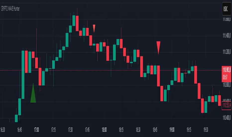
CRYPTO WAVE HUNTERWAVE HUNTER This indicator is designed to identify price movements across different time frames. Its purpose is to identify hourly, 2-hour, and 4-hour price movements on 3-minute candlestick charts. It is suitable for use on a 3-minute chart.
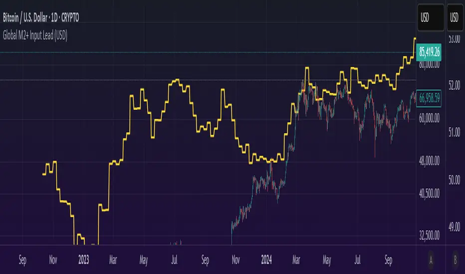
Global M2 Money+ Supply Input Lead (USD)Global M2 Money Supply + INR+CAD Input Lead (USD)
This indicator calculates the global M2 money supply in USD by aggregating M2 data from multiple economies, converted to USD using their respective exchange rates. It overlays the scaled M2 data on the chart with a user-defined time shift to analyze potential correlations with asset prices, such as Bitcoin. The indicator is designed to help traders assess global liquidity trends with a customizable lead or lag.
Countries Included:
Eurozone (EUM2)
North America: United States (USM2), Canada (CAM2)
Non-EU Europe: Switzerland (CHM2), United Kingdom (GBM2), Finland (FIM2), Russia (RUM2)
Pacific: New Zealand (NZM2)
Asia: China (CNM2), Taiwan (TWM2), Hong Kong (HKM2), India (INM2), Japan (JPM2), Philippines (PHM2), Singapore (SGM2)
Latin America: Brazil (BRM2), Colombia (COM2), Mexico (MXM2)
Middle East: United Arab Emirates (AEM2), Turkey (TRM2)
Africa: South Africa (ZAM2)
Input for Lead/Lag:
Time Shift (days): Adjust this input to shift the M2 data forward (positive values) or backward (negative values) on the chart. For example, setting a lead of 85 days shifts the M2 data 85 days into the future, helping traders analyze potential leading indicators for price movements.
Crypto Money Flow TrackerAlerts now trigger automatically – no manual setup needed!
✔ Alerts will notify you when:
OI change (15m) is greater than or below the threshold
Price change (15m) is greater than or below the threshold
✔ Messages will display exact percentage changes in OI and price.

Crypto USDT VolumeScript Title: USDT Volume
This TradingView indicator calculates a volume metric weighted by price, referred to as "Money." It works by first computing the typical price for each bar as the average of the open, high, low, and close prices. Multiplying this typical price by the bar's volume yields the Money value, which serves as a proxy for the dollar (or USDT) flow during that period.
To improve readability, the script dynamically adjusts the units based on recent data. It examines the highest Money value over the past 100 bars and applies a scaling factor:
Values above 1e9 are scaled to billions (B),
Above 1e6 to millions (M),
Above 1e3 to thousands (K),
Otherwise, no scaling is applied.
The indicator plots these scaled Money values as a column chart. It uses TradingView's default colors—green for bullish bars (where the open is less than the close) and red for bearish bars. Additionally, a label is updated on the last bar to display the current unit used for scaling.
Overall, this script provides a visually intuitive way to track and compare the volume-weighted money flow, making it easier to analyze market activity.
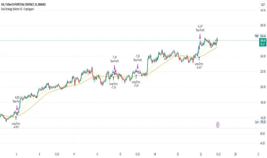
Dual Strategy Selector V2 - CryptogyaniOverview:
This script provides traders with a dual-strategy system that they can toggle between using a simple dropdown menu in the input settings. It is designed to cater to different trading styles and needs, offering both simplicity and advanced filtering techniques. The strategies are built around moving average crossovers, enhanced by configurable risk management tools like take profit levels, trailing stops, and ATR-based stop-loss.
Key Features:
Two Strategies in One Script:
Strategy 1: A classic moving average crossover strategy for identifying entry signals based on trend reversals. Includes user-defined take profit and trailing stop-loss options for profit locking.
Strategy 2: An advanced trend-following system that incorporates:
A higher timeframe trend filter to confirm entry signals.
ATR-based stop-loss for dynamic risk management.
Configurable partial take profit to secure gains while letting the trade run.
Highly Customizable:
All key parameters such as SMA lengths, take profit levels, ATR multiplier, and timeframe for the trend filter are adjustable via the input settings.
Dynamic Toggle:
Traders can switch between Strategy 1 and Strategy 2 with a single dropdown, allowing them to adapt the strategy to market conditions.
How It Works:
Strategy 1:
Entry Logic: A long trade is triggered when the fast SMA crosses above the slow SMA.
Exit Logic: The trade exits at either a user-defined take profit level (percentage or pips) or via an optional trailing stop that dynamically adjusts based on price movement.
Strategy 2:
Entry Logic: Builds on the SMA crossover logic but adds a higher timeframe trend filter to align trades with the broader market direction.
Risk Management:
ATR-Based Stop-Loss: Protects against adverse moves with a volatility-adjusted stop-loss.
Partial Take Profit: Allows traders to secure a percentage of gains while keeping some exposure for extended trends.
How to Use:
Select Your Strategy:
Use the dropdown in the input settings to choose Strategy 1 or Strategy 2.
Configure Parameters:
Adjust SMA lengths, take profit, and risk management settings to align with your trading style.
For Strategy 2, specify the higher timeframe for trend filtering.
Deploy and Monitor:
Apply the script to your preferred asset and timeframe.
Use the backtest results to fine-tune settings for optimal performance.
Why Choose This Script?:
This script stands out due to its dual-strategy flexibility and enhanced features:
For beginners: Strategy 1 provides a simple yet effective trend-following system with minimal setup.
For advanced traders: Strategy 2 includes powerful tools like trend filters and ATR-based stop-loss, making it ideal for challenging market conditions.
By combining simplicity with advanced features, this script offers something for everyone while maintaining full transparency and user customization.
Default Settings:
Strategy 1:
Fast SMA: 21, Slow SMA: 49
Take Profit: 7% or 50 pips
Trailing Stop: Optional (disabled by default)
Strategy 2:
Fast SMA: 20, Slow SMA: 50
ATR Multiplier: 1.5
Partial Take Profit: 50%
Higher Timeframe: 1 Day (1D)
Crypto USD Liquidity Delta [tedtalksmacro]Calculates and plots the week-on-week (WoW), month-on-month (MoM), quarter-on-quarter (QoQ), and year-on-year (YoY) percentage changes in the aggregate stablecoin liquidity. By comparing the current liquidity with its historical values at different intervals, the script provides insights into the short-term and long-term liquidity fluctuations. Each of these percentage changes is plotted with distinct colors, enabling traders to analyze and comprehend the rate of liquidity change over various time frames.

Crypto High Potential StrategyBTCUSD -- 5 min
BUY POSITION
1 : The price is above the EMA
2 : The Parabolic SAR is green
3 : The RSI is above the 50 line
SELL POSITION
1 : The price is bellow the EMA
2 : The Parabolic SAR is red
3 : The rsi is below the 50 line

Price deltaThe indicator shows a price change with respect to a preceded price and the moving average on a given period.
It could be used for the volatility evaluation as well as the normalization of the price evolution.

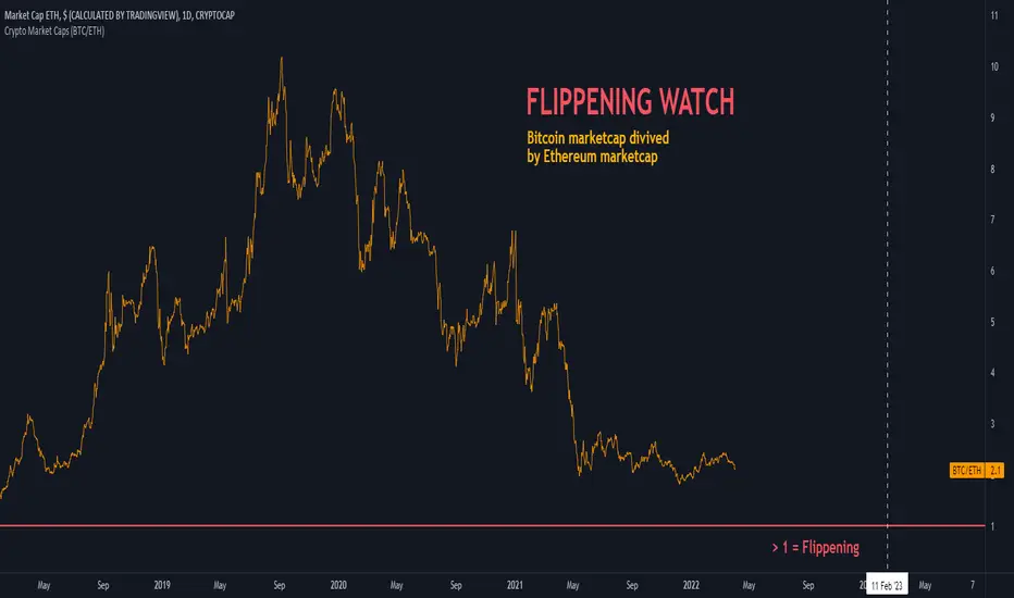
Crypto Market Caps (BTC/ETH)The indicator shows Bitcoin marketcap divived by Ethereum marketcap. On September 2019, Bitcoin's MarketCap hits ATH against ETH, by being 10 times bigger. Today, the ratio is about 2x only. When this ratio drops below 1, the FLIPPENING will happen.
Kviateq - Session Pivots for CryptoPretty much the exact same indicator as my other Session Pivots, however this one also shows the weekends and the session times are set to Bitmex exchange (note: I'm in a GMT+7 timezone myself).
ETF / Stocks / Crypto - DCA Strategy v1Simple "benchmark" strategy for ETFs, Stocks and Crypto! Super-easy to implement for beginners, a DCA (dollar-cost-averaging) strategy means that you buy a fixed amount of an ETF / Stock / Crypto every several months. For instance, to DCA the S&P 500 (SPY), you could purchase $10,000 USD every 12 months, irrespective of the market price. Assuming the macro-economic conditions of the underlying country remain favourable, DCA strategies will result in capital gains over a period of many years, e.g. 10 years. DCA is the safest strategy that beginners can employ to make money in the markets, and all other types of strategies should be "benchmarked" against DCA; if your strategy cannot outperform DCA, then your strategy is useless.
Recommended Chart Settings:
Asset Class: ETF / Stocks / Crypto
Time Frame: H1 (Hourly) / D1 (Daily) / W1 (Weekly) / M1 (Monthly)
Necessary ETF Macro Conditions:
1. Country must have healthy demographics, good ratio of young > old
2. Country population must be increasing
3. Country must be experiencing price-inflation
Necessary Stock Conditions:
1. Growing revenue
2. Growing net income
3. Consistent net margins
4. Higher gross/net profit margin compared to its peers in the industry
5. Growing share holders equity
6. Current ratios > 1
7. Debt to equity ratio (compare to peers)
8. Debt servicing ratio < 30%
9. Wide economic moat
10. Products and services used daily, and will stay relevant for at least 1 decade
Necessary Crypto Conditions:
1. Honest founders
2. Competent technical co-founders
3. Fair or non-existent pre-mine
4. Solid marketing and PR
5. Legitimate use-cases / adoption
Default Robot Settings:
Contribution (USD): $10,000
Frequency (Months): 12
*Robot buys $10,000 worth of ETF, Stock, Crypto, regardless of the market price, every 12 months since its founding time.*
*Equity curve can be seen from the bottom panel*
Risk Warning:
This strategy is low-risk, however it assumes you have a long time horizon of at least 5 to 10 years. The longer your holding-period, the better your returns. The only thing the user has to keep-in-mind are the macro-economic conditions as stated above. If unsure, please stick to ETFs rather than buying individual stocks or cryptocurrencies.

Risk Metrics: Crypto VersionRisk Metrics for Crypto.
Market can be set to BTCUSD, BTCEUR, BTCCHF, BTCGBP, BTC1!, BTC2!, SPX, and DTB3
Beta
Correlation
Standard Deviation
Variance
R-squared

USDT SupplyThis script shows the USDT (Tether) supply, total USDT market capitalization and USDT supply on various Cryptocurrency exchanges.
It is based on this script:
Changes:
- added HiTBTC and Huobi exchange
- updated to Pine Script v4
- improved default style and line width to highlight global USDT plots against exchange-specific plot lines


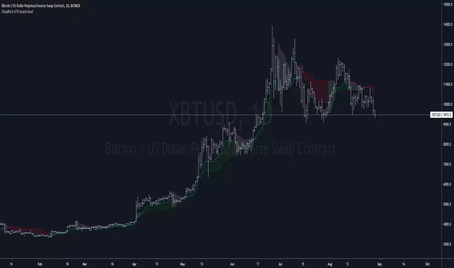
CloudRest ATR based cloudThis is an indicator I have been working on for the past 2 years, developed specifically for cryptocurrency.
It is primarily a trend following indicator with great success and it performs the best in 4hrs to the weekly chart.
There are two components of this indicator.
The baseline from Ichimoku cloud and volatility stop .
baseline period = 26
volatility stop = 1.5ATR, 3
You can view this as the main component of a trend following system but you will need other confirmation indicators to confirm your entry.
Feel free to modify the script for your own system.
Feel free to follow me on twitter @Lancelot_Auger
I will be posting more content in the future, stay tuned.
And lastly,
Free hong kong, the revolution of our time!
ck - Crypto Correlation IndicatorA simple Correlation Indicator initially configured for Crypto Trader use (but other markets can use this too).
It plots the correlation between the current chart (say BTCUSD ) versus 4 user-definable indices, currency pairs, stocks etc.
By default, the indicator is preconfigured for:
GOLD (Oz/$),
Dow Jones Index (DJI),
Standard & Poor 500 Index (SPX) ,
Dollar Index ( DXY )
You can set the period (currently 1D resolution) in the "Period" box in the settings, valid inputs are:
minutes (number), days (1D, 2D, 3D etc), weeks (1W, 2W etc), months (1M, 2M etc)
Length is the lagging period/smoothing applied - default is 14
When changing comparison instruments/tickers, you may find it useful to prefix the exchange with the instrument's ticker, for example:
Binance:BTCUSDT, NYSE:GOOG etc
*** Idea originally from the brilliant Backtest Rookies - backtest-rookies.com ***
Noro's Crypto PatternsFor
- symbols: crypto/usd or crypto/usdt (or any stablecoins)
- timeframe: 1 hour
Signals - quantity of signals (arrows)
Accuracy - as many such transactions were profitable

Noro's Crypto Pattern for H1This indicator shows to the user a pattern. This pattern is drawn on graphics.
For:
- Any crypto
- H1

Swing Surfing on Slow Heiken AshiGood for Crypto related markets. Guaranteed to catch every big swing, just have to make sure you keep your positions updated. 3m chart.

Fx Sessions For CryptoFx Sessions for crypto traders. High Volatility occurs at weekends, and NY-Assia overlap in week days.

Buy The Dip - Does It Work?Buying the dip has become a meme in crypto, but does it actually work?
Using this script you can find out.
The dip is defined here as the average true range multiplied by a number of your choosing (dipness input) and subtracted from the low.
When price crosses under the dip level, a long is initiated. The long is then closed using a timestop (default value 20 bars), no fancy exits here.
A general rule for buying the dip should be to be more passive in a bull market and aggressive in a bear market.
Same goes for all counter trend trading.
Heres a few other examples of dip buying statistics using the H4 timeframe:
50% profitable, 1.692 Profit Factor
BINANCE:PIVXBTC
56.52% profitable, 1.254 Profit Factor
BINANCE:KMDBTC
27.27% Profitable, 0.257 Profit Factor... yikes!
BINANCE:BTSBTC
73.33% Profitable, 13.627 Profit Factor... o.O
BINANCE:MANABTC
Alpha Capital Wealth Pivot Buy and Sell Any Crypto AnytimeAlpha Capital Wealth Pivot Buy and Sell Any Crypto Anytime
