SMART4TRADER-INDEX PATTERN BREAKOUT MULTIThis indicator is designed to analyze the breakdown of previous values of the candles, not only on the selected tool, but also on others. The indicator is well used on the indices of the stock market. In the default indicator, recommended indexes are configured.
The indicator summarizes the results of the analysis of all tools and shows in the form of columns that are above and \ or below the zero line. Additionally, the indicator has two horizontal lines above zero (green) and two horizontal lines below zero (red). The breakdown of these nearest to zero lines signals the possible beginning of the move towards which the column is directed. If the column reached the left line, this means that a very strong trend is noticeable on all the tools selected in the settings.
Additionally, the indicator has a blue line that shows the average value of the columns both above and below the zero line. And also added Hull Moving Average Period (9).
BUY signal:
HIGH > HIGH(1) и LOW > LOW(1)
SELL signal:
HIGH < HIGH(1) и LOW < LOW(1) и LOW < LOW(2)
--------------------------------------------------------
Этот индикатор предназначен для анализа пробития предыдущих значений свечей, не только на выбранном инструменте, но и на других. Индикатор хорошо использовать на индексах фондового рынка. В индикаторе по умолчанию настроены рекомендуемые индексы для анализа.
Индикатор суммирует результаты анализа всех инструментов и показывает в виде столбиков, которые находиться выше и\или ниже нулевой линии. Дополнительно на индикаторе есть две горизонтальные линии выше нуля (зеленый) и две горизонтальные линии ниже нуля (красный). Пробитие этих ближайших к нулю линий сигнализирует о возможном начале движения в сторону, в которую направлен столбик. Если столбик достиг крайней линии, то это значит, что очень сильный тренд заметен на всех инструментах выбранных в настройках.
Дополнительно в индикаторе есть синяя линия, которая показывает среднее значение столбиков как выше, так и ниже нулевой линии. А также добавлена HULL MOVING AVERAGE период (9).
Сигнал на покупку:
HIGH > HIGH(1) и LOW > LOW(1)
Сигнал на продажу:
HIGH < HIGH(1) и LOW < LOW(1) и LOW < LOW(2)
"breakout" için komut dosyalarını ara

Volume Level with AlertThis script is made by Bollinger Bands and Volume , BB is using customize setting to filter the surge volume.
Good to use in Cryptocurrency
When Volume Breakout and price is drop, chance to collect at lower price
Try to find out Price * Volume Divergence , a best entry point with low risk

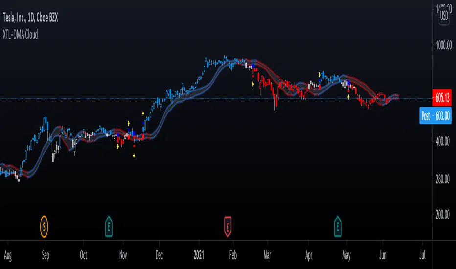
Advanced GET: Tom Joseph's XTL, DMA Cloud & Breakout SignalsThe Expert Trend Locator ( XTL ) was developed by Tom Joseph to identify major trends, similar to elliott wave 3 type swings.
Blue bars are bullish and indicate a potential upwards impulse.
Red bars are bearish and indicate a potential downwards impulse.
White bars indicate no trend is detected at the moment.
Added to the indicator is the recommended use to enter a position, as explained by Tom Joseph in his book Applying Technical Analysis:
Once a blue or red bar appears, the indicator signals an entry level, a stop loss level and two target levels (2nd is optional).
The levels can be shown until a new signal emerges or just above/below the breakout bar.
Finally, a cloud formed by two displaced moving averages (DMA) is included, which allow the trend to continue its momentum. During an uptrend the lower moving average could serve as a trailing stop, and during a downtrend the upper moving average could serve as the trailing stop.
Enjoy!
Bar colour BreakoutIndicator that changes the colour of the bars depending on the breakout of the high or the low of the previous bar. A lime bar indicates a bar that has a higher high than the previous one. A fuchsia bar indicates a bar that has a lower low than the previous bar. A yellow bar indicates an outside bar (higher high and lower low than the previous one). A blue bar indicates an inside bar (lower high and higher low).

ORB Current Timeframe + ATRThis is Indicator
1. Opening Range Breakout for Selected Time frame
2. You can fix your Risk Reward and also Risk Amount
3. It will calculate the Position size based on Open Range ATR and your Risk Amount
4. Display's the Daily ATR for Given Input
5. It Gives Opening ATR Percentage to take a trade or not
6. It Calculates the Target on Either Side Based on the Risk Reward
A Better Fractal (Williams)DESCRIPTION:
This is a more advanced version of the classic Williams Fractal algo, using a looped barindex iterator to examine highs/lows.
You may choose ideal or regular fractals, along with the amount of bars (periods) used to calculate; the minimum being 3. Oddnums only.
Ideal fractals = fractals with each bar needing to be lower/higher than the preceding bar, with the midbar at the apex.
Regular fractals = the typical Williams fractal, wherein each bar only has to be lower/higher than the midbar (apex) only.
How to trade? Combine with other indicators and use breakout or reversal strategies, typically. Set buy/sell stops at the high/low of a fractal, for instance
... to trade the breakout when it occurs. Or, track momentum when a fractal prints and trade accordingly. Or perhaps trade with the alligator or 3 EMA.
Experiment with different types of fractals to achieve the desired result, with higher period fractals obviously offering more solid indication though with higher lag.
Note: A fractal does not print until n/2 (rounded down) bars after, where n = the period you chose.

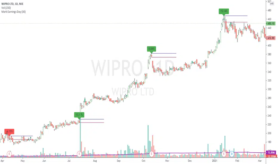
Mark Earnings DayThe idea for today is to plot high / low prices on the Earnings day. (use only on Daily timeframe)
And as we all know, most of the times, price is unidirectional after the earnings are declared.
A target of 1:2 or even 1:5 can be easily achieved in these cases, within few days.
Green label indicates, reported earnings are higher than estimated. Red indicates the other way.
But 1, this does not necessarily indicate the trend direction.
But 2, a breakout / breakdown of this day's candle mostly does. The other serving as a Stop Loss.
Optionally, the scripts can also plot splits and dividends on the charts.
The difference between this indicator and readily available default markings on the chart is,
these figures are directly available on the chart itself, that saves multiple clicks.
Trend ResumptionWe again keep it really simple.
This indicator just plots the combination of RGRR and GRGG candlesticks. (R = Red / Bearish, G = Green / Bullish)
When either pattern occurs, trade the combined high and combined low of recent 2 RR or recent 2 GG candles. I.e.,
Buy above GG's high with SL at GG's low.
Sell below RR's low with SL at RR's high.
Refer the shared chart for example. The signals were plotted on both the sides, and wherever triggered - gave rewards.
Only 1 at 05-Apr, 10:50 a.m. did not trigger, but that must then be ignored. Do not hurry to enter the trade, wait for breakout / breakdown above combined high / low.

MM Session Open AlgoThe MM Session Open Algo is a strategy to catch the opening breakout of a security
displays the current session with background color
Entry, Stop Loss Based on Atr, and two Take Profit levels
Kill zone entries for New york and London session
provides valid signal for entry once price crosses entry line
and set "opening session price" to determine what signal you are looking for. based on time frame
shows the Daily,Weekly,Monthly high and low
average daily range
and comes with trend filter.
Directions are Simple
when price crosses and closes above entry line. you get in with the set inputs of Tp and Sl
or you can set buy/sell stops with the price provided for you and ride the wave of the direction it goes with he Tp and Sl provided
Link below or PM us for access to this indicator Happy Trading

Box Range AlertSimple Script for getting alerts on the crossing of Upper & Lower levels either way.
Good for Free users as they can only use 1 alert at a time. So this indicator will be useful to get alerts on both Breakout Or Breakdowns.
Just add input Price manually and set alerts.

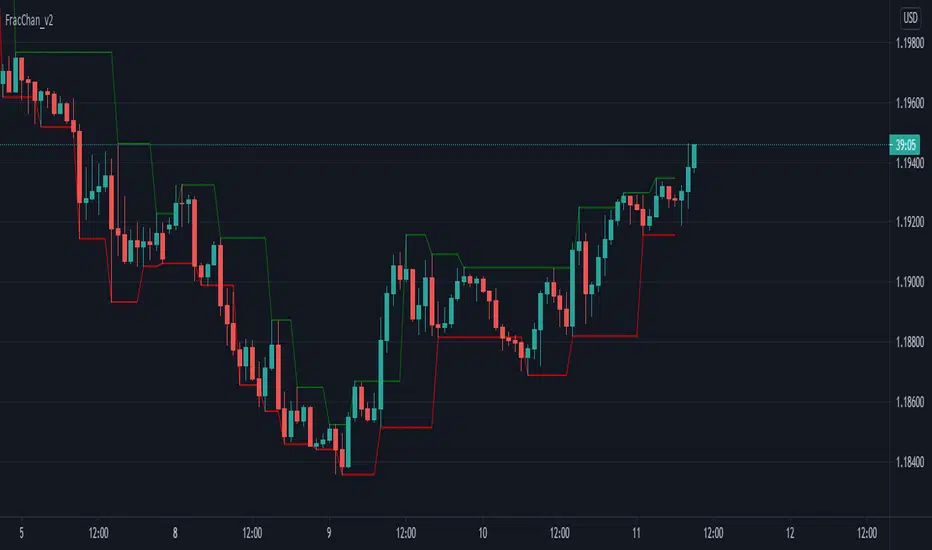
Fractal Channel v2Just another way of visualizing Williams' Fractals: they are now joined in a channel.
You can also create a channel of Fractals from another time frame than the current.
Great for identifying breakout entries, trend direction analysis (i.e. easily visualize Higher Lows, Higher Highs, Lower Lows, Lower Highs) or to trail your Stop Losses.
Version 2 of the Fractal Channel now correctly identifies William's Fractals when the High/Low of the 'Fractal Candle' is equal to the High/Low of the neighbouring 2 candles on both sides.
[astropark] Progressive VWAPDearDear Followers,
today another awesome Analysis Tool, that you can use in your trading journey: Progressive VWAP !
If you love vwap, you will love this indicator, as it calculates some special "progressive" / "evolving" vwap levels:
daily vwap named dvwap
2D vwap named 2dvwap
3D vwap named 3dvwap
weekly vwap named wvwap
2W vwap named 2wvwap
Monthly vwap named mvwap
Quarterly vwap named qvwap
Yearly vwap named yvwap
You can:
choose which progressive vwap to show and which to hide
change each line color / thickness / display style (solid or dashed)
choose to show or hide labels and change their size
Why such indicator should be helpful? How can I use it to do profit?
In multiple ways:
when a lower timeframe crosses an higher timeframe progressive vwap, you know sentiment is getting bullish and viceversa if the cross is downwards
price tends to bounce on such progressive vwaps: the higher the timeframe, the more probably the bounce is as well as the magnitude of the breakout of the level
This indicator works on every timeframe, market and pair.
As I always say, all tools are great if you use them correctly: this is not the "Holy Grail", so always use proper money and risk management strategies.
This is a premium indicator , so send me a private message in order to get access to this script.

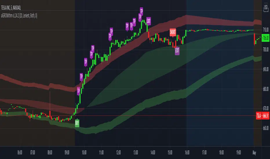
alGROWithm PremiumIntroducing the alGROWithm indicator!
Years of trading experience and endless hours of screen time has undeniably proven to me that the most fundamental rule of any market is: price moves from supply to supply and demand to demand. Specifically, this means that a breakout of a supply zone , the probability of it reaching the next supply zone before starting consolidate is very high. Similarly, a breakdown from previous demand zone will likely continue to the next demand zone . The identification method of these supply and demand channels is one of the features that sets this indicator apart from other available tools.
What separates alGROWithm from other available tools?
- Proprietary method for identifying supply & demand channels combined with a directional bias computation based on recent historical prices
- Only signaling precise entries based on supply & demand that maximize R/R
- Tracking open positions and displaying a trading plan directly on the chart immediately after signaling entry points
- Indicating precise exit levels to help you avoid exiting too early or trading by emotion
What are the features included in alGROWithm?
Trading Plan Lines : These are the Buy/Short/Take Profit/Exit lines plotted directly on the chart
Show Long Signals : These are the green "BUY" labels that appear on the chart when alGROWithm identifies a critical breakout to the next supply level
Show Short Signals : These are the red "SHORT" labels that appear on the chart when alGROWithm identifies a critical breakdown to the next demand level
Show Take Profit Signals : These are the purple "TP" labels that appear on the chart when alGROWithm identifies that the subsequent supply/ demand level has been hit
Show Exit/Stop Loss Signals : These are the purple "EXIT" labels that appear on the chart when alGROWithm identifies that the trade has run its course and it's time to exit
Show Dashboard : This is a dashboard that is displayed to the right of the latest candle, and contains the following information:
- Current Position : "Long", "Short", or "None"
- Next Profit Target : Only displays if there is an active Position
- Current Bias : alGROWithm computes a directional bias based on recent historical prices. Text will say "Long" or "Short"
- Long/Short Bias Until : alGROWithm's bias will change if this price is hit. Note that these are not BUY or SELL levels - this simply indicates whether things are looking up or down
- Enter Short/Long At : Only displays if Current Position = "None"
Note that you can enable/disable any of these chart overlays at anytime through the indicator settings.
The alGROWithm indicator works on any timeframe, any market, and standard OR Heikin Ashi candlesticks .
I have been working very hard on this indicator and I personally use it on a daily basis with options trading. I am so excited to share the wealth with you!
You can use the link below to visit our website and gain access to the script.
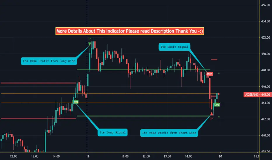
SMART4TRADER-INDEX PATTERN BREAKOUTThe indicator for the TREND market (indices, stocks) works on DAY charts and older
Shows signals to enter a position:
If HIGH is greater than HIGH of the previous candle and LOW is greater than LOW of the previous candle = BUY
If LOW is less than LOW of the previous candle and LOW is less than LOW of the before last candle and HIGH is less than HIGH of the previous candle = SELL
-----------------------
Индикатор для ТРЕНДОВЫХ рынок (индексы, акции) работает на ДНЕВНЫХ графиках и старше
Показывает сигналы на вход в позицию:
Если HIGH больше HIGH прошлой свечи и LOW больше LOW прошлой свечи = BUY
Если LOW меньше LOW прошлой свечи и LOW меньше LOW позапрошлой свечи и HIGH меньше HIGH прошлой свечи = SELL

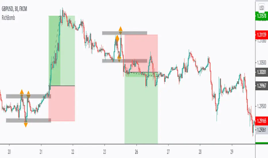
RichBomb Tool/IndicatorThis is a customized strategy by RichTL indicator.
RichBomb helps traders catch explosive movements in the market.
RichBomb color the dots/diamonds by orange when at least three RichTL dots/diamonds come very close to each other forming a small range.
We usually on the break of the RichBomb range upward or downward. Stop Loss goes on the last major swing from the other side, and we target a 2/1 Reward/Risk Ratio.
RichBomb is not a stand-alone strategy, but acts as one confluence in your trading plan.
For example, if the price is sitting around resistance, we would be only interested in selling on the RichBomb range breakout downward, not upward.
RichBomb works on all instruments (Forex, Crypto, Index, Stock, Commodity...) and all Timeframes.
Good Luck!
London Open Range Breakout by KviateqThis script is what I currently use to day trade forex on a 5-minute timeframe.
The script features Multi-timeframe EMA20 that uses timeframe multipliers and is smoother by the factor by which you're multiplying your current timeframe.
Default settings are set to display EMA20 on the current (M5) timeframe, as well as M15, H1, H4 and D1 timeframes.
The background color changes intensity based on how many conditions are met - are all EMAs in the right order, is the current close above/below all the EMAs.
Featured is also a range set to 1 hour since the London breakout (can be changed to M15, or however long you'd like - my current setting is 30 minute).
Also featured are levels that I find to be of most importance - such as Daily and Weekly Open, Previous Day's and Week's Highs.
The idea is to only take trades when all stars align - EMAs, break above/below the Opening Range and not to long/short into an important level.

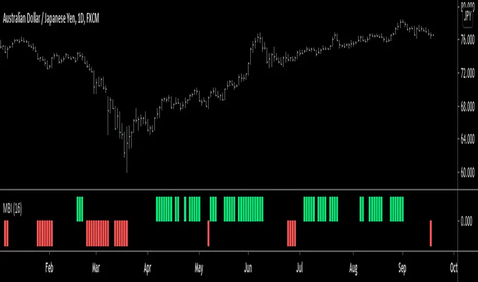
Monster Breakout Index V2Brief Description:
Monster Breakout Index V2 is a the successor to Monster Breakout Index, an indicator I published on May 13, 2020.
Like it's predecessor, MBI V2 gives high quality signals and is incredibly robust at preventing you from trading sideways/consolidating markets.
------------------------------------------------------------------------------------------------------------------------------------------------------------------
Interpreting Signals:
Green = Buy
Red = Sell
------------------------------------------------------------------------------------------------------------------------------------------------------------------
Calculation:
1) Calculate the median price of each bar over n periods. Determine the highest & lowest medians.
2) Current bar's high > highest median? -----Yes = Buy signal
3) Current bar's low < lowest median? -------Yes = Sell signal
Note: Occasionally, the indicator will simultaneously produce both a buy & sell signal. Because of this, it is recommended you use at least one other indicator in conjunction with this one...OR alternatively, ignore this double signal.
------------------------------------------------------------------------------------------------------------------------------------------------------------------
Enjoy ;)
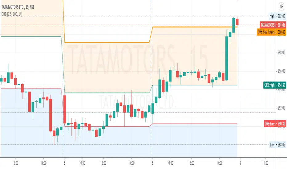
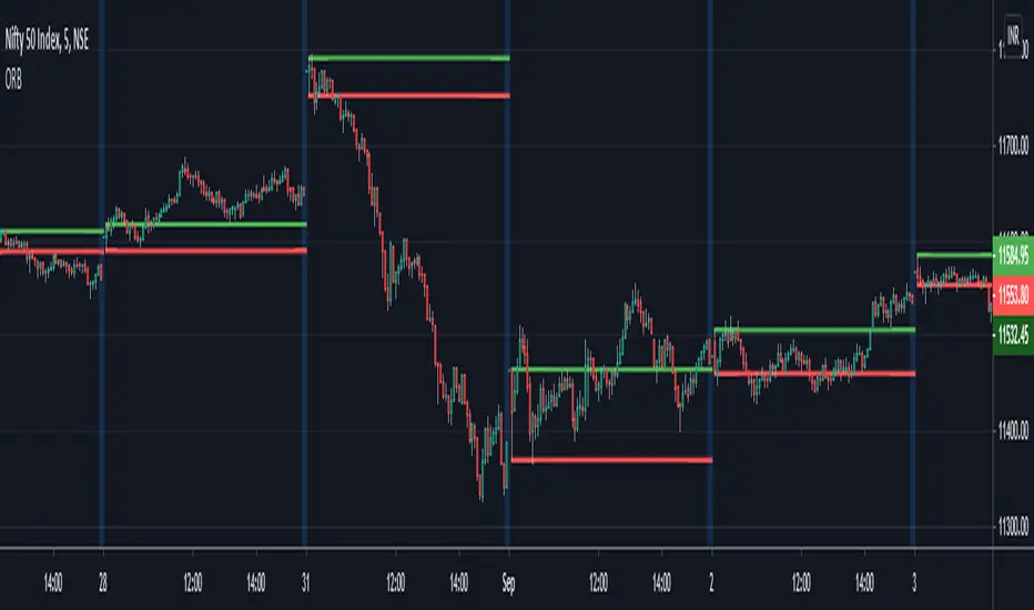
ORB - Opening Range BreakoutThis script plots the high/low of any custom session and extends it until the daily close. It does not show on the timeframe higher than the length of custom opening session by default.
The time period of opening range & the max timeframe to display it on can be adjusted from the settings.
So for eg. if want to use 5m ORB to trade, then set "ORB total time" as 5min & "Session Time" as whatever is the opening 5mins time period of ticker that are trading.
CryptoJur Cat Trade BreakoutSimple range breakout indicator, to catch price action above recent averages. When a candle closes outside the band it will start a long or a short with a simple TP (Take Profit) and SL (Stop Loss).
The use of leverage is just an indication of possible performance. As always use leverage with care ans wisely!

Candle Condition BreakoutHello Everyone
Its indicator Basically base on Candle (Bar)
How to working its indicator?
Condition: if Close equal Low and next bar Open equal Low when plot Bar High and Low line if bar high line Breakout when Long Signal and if Bar Low line Breakout When Short Signal
Indicator Feature
➤ Long Side Signal With Alerts
➤ Short Side Signal With Alerts
➤ Long side Take profit Calculated By Bar High You Can Also Change Calculating Bar Source
➤ Short side Take profit Calculated By Bar High You Can Also Change Calculating Bar Source
➤ Long side Stop Loss Calculated By Bar Open You Can Also Change Calculating Bar Source
➤ Short side Stop Loss Calculated By Bar Open You Can Also Change Calculating Bar Source
➤ You Can Also Target Long TP and SL with One Alert
➤ You Can Also Target Short TP and SL with One Alert
Important: This Indicator we are using for Automation Trading if You Want This Indicator Access Please Contact me PM on Tradingview
[Alerts] Custom ORB with Target/StoplossThis Open Range Breakout (ORB) Indicator displays High, Low for the selected time frame.
Indicator Feature :-
Shows Long & Short signals based on the crossover.
You can use different alerts like Long, Short, Long-TP, Short-TP, Long-SL, Short-SL, Close
You can change Take profit points
Stop Loss will be low of breaking candle when Long signal is generated and high of breaking candle when Short signal is generated
Select Session time to get alerts only on that period
Select Square off and End Session to generate Close alert based on a specific time at the end of the day
In the future, I will Enhance and update this Indicator if needed
If you have any suggestion mention here
Thank you :-)

Box FR-SHLBox SH-SL and breakout :
Box SH-SL and Fixed range :
Box sigH-sigL and breakout :
Used better when combining ichimoku candles :
+ Candles.white = bull
+ Candles.yellow = bear
+ The numbers shows how many candles breakout
+ The " Kumo cloud " represents 2 factions
FIB WEDGE BreakOut-ProNSE:BANKNIFTY
This is Fibonacci retracement Breakout Strategy based on First 5Min of the Day. Retracement line will be auto populated after the confirmation of first 5min candle of the day.
We tested this only on Indian Market, you can try in other Market based on your need but we never tested this in other market.
The levels are defined based fib levels of first 5Min candle. you can use this in any time frame plotting will change accordingly but suggested to use in 5Min.
Compared to my basic version script, pro version has different level plotting and this will give you early entry, Since these are using two different level we cannot club.
