Recent Range DetectorOverview
The Recent Range Detector is a specialized indicator designed to identify when an asset is currently range-bound, providing traders with clear support and resistance levels for range trading strategies. Unlike traditional indicators that focus on trend detection, this tool specifically answers the question: "Is the price range-bound right now, and what are the exact trading levels?"
Key Features
✅ Smart Range Detection - Uses a multi-factor scoring system to identify legitimate ranges
✅ Dynamic Support/Resistance Levels - Automatically calculates and displays key trading levels
✅ Range Quality Scoring - Provides confidence levels (Strong/Moderate/Weak Range)
✅ Touch Validation - Counts actual price touches to confirm range reliability
✅ Breakout Detection - Alerts when price exits the established range
✅ Visual Clarity - Clean boxes, lines, and labels for easy interpretation
How It Works
The indicator analyses recent price action using three core metrics:
Touch Quality (40%) - How many times price has respected support/resistance levels
Containment Quality (40%) - What percentage of recent bars stayed within the range
Recent Respect (20%) - Whether the latest price action confirms the range
These combine into a Range Score (0-1) that determines range strength and reliability.
Settings & Parameters
Range Lookback Period (Default: 15)
Number of bars to analyse for range detection
Shorter periods = more responsive to recent ranges
Longer periods = more stable, fewer false signals
Range Tolerance (Default: 2.0%)
Tolerance for price touches around exact highs/lows
Lower values = stricter range requirements
Higher values = more flexible range detection
Minimum Touches (Default: 3)
Required number of support/resistance touches for valid range
Higher values = more confirmed ranges, fewer signals
Lower values = more sensitive, earlier detection
Visual Options
Show Range Box: Displays the range boundaries
Show Support/Resistance Lines: Extends levels into the future
Understanding the Output
Range Score (0.000 - 1.000)
0.7+ = Strong Range (Green) - High confidence range trading setup
0.5-0.7 = Moderate Range (Yellow) - Decent range with some caution
0.3-0.5 = Weak Range (Orange) - Low confidence, be careful
<0.3 = Not Ranging - Avoid range trading strategies
Range Status Classifications
Strong Range - Perfect for range trading strategies
Moderate Range - Good range with normal risk
Weak Range - Marginal range, use smaller positions
Not Ranging - Price is trending or too choppy for range trading
Key Metrics in Info Table
Range Size (%) - Size of the range relative to price level
5-15% = Ideal range size for most strategies
<5% = Tight range, lower profit potential
>15% = Wide range, higher profit potential but more risk
Support/Resistance Levels - Exact price levels for entries/exits
Use these as your key trading levels
Support = potential buy zone
Resistance = potential sell zone
Total Touches - Number of times price respected the levels
3-5 touches = Newly formed range
6-10 touches = Well-established range
10+ touches = Very strong, reliable range
Price Position (%) - Current location within the range
0-20% = Near support (potential long opportunity)
80-100% = Near resistance (potential short opportunity)
40-60% = Middle of range (wait for better entry)
Visual Elements
Range Box
Green Box = Strong Range (Score ≥ 0.7)
Yellow Box = Moderate Range (Score 0.5-0.7)
Orange Box = Weak Range (Score 0.3-0.5)
Support/Resistance Lines
- Horizontal lines showing exact trading levels
- Extend into the future for forward guidance
- Colour matches the range strength
Background Colouring
- Subtle background tint during range periods
- Helps quickly identify ranging vs trending markets
Breakout Signals
- 📈 RANGE BREAK UP - Price breaks above resistance
- 📉 RANGE BREAK DOWN - Price breaks below support
- Only appears for confirmed ranges (Score ≥ 0.5)
Trading Applications
Range Trading Strategy
1. Look for Range Score ≥ 0.5
2. Buy near support (Price Position 0-20%)
3. Sell near resistance (Price Position 80-100%)
4. Set stops just outside the range
5. Exit on breakout signals
Breakout Strategy
1. Identify strong ranges (Score ≥ 0.7)
2. Wait for volume-confirmed breakout
3. Enter in breakout direction
4. Use previous resistance as support (or vice versa)
Market Context
- Strong ranges often occur after trending moves
- Use higher timeframes to confirm overall market structure
- Combine with volume analysis for better entries/exits
Best Practices
What to Look For
✅ Range Score ≥ 0.5 for trading consideration
✅ Multiple touches (5+) for confirmation
✅ Clear price rejection at levels
✅ Reasonable range size (5-15% for most assets)
✅ Recent price respect of boundaries
What to Avoid
❌ Trading ranges with Score < 0.3
❌ Very tight ranges (<3% size) - low profit potential
❌ Ranges with only 1-2 touches - not confirmed
❌ Ignoring breakout signals
❌ Trading against the higher timeframe trend
Alerts Available
- Range Detected - New range formation
- Range Break Up - Upward breakout
- Range Break Down - Downward breakout
- Range Ended - Range condition ended
Timeframe Recommendations
- Daily Charts - Best for swing trading ranges
- 4H Charts - Good for intermediate-term ranges
- 1H Charts - Suitable for day trading ranges
- Lower Timeframes - May produce more noise
Conclusion
The Recent Range Detector eliminates guesswork in range identification by providing objective, quantified range analysis. It's particularly valuable for traders who prefer range-bound strategies or need to identify when trending strategies should be avoided.
Remember: No indicator is perfect. Always combine with proper risk management, volume analysis, and broader market context for best results.
Disclaimer
This indicator is for educational purposes only and should not be considered as financial advice. Trading involves risk, and past performance does not guarantee future results. Always conduct your own research and consider your risk tolerance before making any trading decisions.
"breakout" için komut dosyalarını ara

SR-PrecisionZoneSR-PrecisionZone — Dynamic Support & Resistance Mapping
SR-PrecisionZone is a precision-engineered support and resistance zone indicator designed for traders who value structure, accuracy, and real-time adaptability. It intelligently detects clusters of pivot points to highlight price levels that have historically acted as strong support or resistance — and projects these zones into the current market with customizable sensitivity.
- Key Features
Dynamic Zone Construction
Automatically detects key support and resistance zones based on pivot clustering logic, with customizable width and minimum strength thresholds.
Strength-Weighted Transparency
Zone opacity reflects the number of pivot hits — the more respected the level, the more visible the zone becomes. This allows traders to instantly gauge the strength of each zone at a glance.
Real-Time Zone Development
Zones appear live as pivot criteria are met; no lag or historical-only rendering.
Breakout & Breakdown Detection
Automatic breakout/breakdown tags highlight when price leaves a zone, helping spot continuation or reversal setups.
Multi-Timeframe Adaptive
Works effectively on intraday, swing, and macro timeframes with a tunable lookback window.
Clean Visual Hierarchy
Support and resistance zones extend 10 bars beyond the current candle, with MA overlays plotted above zones for clear visibility.
- Inputs & Settings
Source: Choose between High/Low or Close/Open pivots
Maximum Channel Width (%): Controls how far apart pivots can be to qualify as a zone
Minimum Strength: Sets how many pivot hits are required for a zone to appear
Lookback Period: Adjusts how far back the script evaluates pivot clusters
Customizable Colors: Separate colors for support, resistance, and mid-zone overlap
Breakout Tags: Optional visual markers for when price breaks out of a zone
MA Overlays: Two optional moving averages (SMA/EMA) to provide additional context
- Ideal Use Cases
Identifying high-probability support/resistance levels
Spotting breakout or fakeout setups
Enhancing confluence in technical strategies
Filtering entries/exits based on structural zones

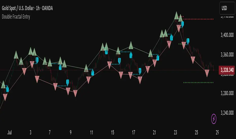
Double Fractal Entry📘 Double Fractal Entry – Original Structure-Based Entry System
Double Fractal Entry is a proprietary indicator that uses dynamic fractal structure to generate actionable buy/sell signals, with automatic Stop-Loss and Take-Profit placement. Unlike classic fractal tools or ZigZag-based visuals, this script constructs real-time structural channels from price extremes and offers precise entry points based on breakout or rejection behavior.
It is designed for traders who want a clear, structured approach to trading price action — without repainting, lagging indicators, or built-in oscillators.
🧠 Core Logic
This script combines three custom-built modules:
1. Fractal Detection and Channel Construction
- Fractals are detected using a configurable number of left/right bars (sensitivity).
- Confirmed upper/lower fractals are connected into two continuous channels.
- These channels represent real-time structure zones that evolve with price.
2. Entry Signal Logic
You can choose between two signal types:
- Breakout Mode – Triggers when price breaks above the upper fractal structure (for buys) or below the lower one (for sells).
- Rebound Mode – Triggers when price approaches a fractal channel and then rejects it (forms a reversal setup).
Each signal includes:
- Entry arrow on the chart
- Horizontal entry line
- Stop-Loss and Take-Profit lines
3. SL/TP Calculation
Unlike tools that use ATR or fixed values, SL and TP are dynamically set using the fractal range — the distance between the most recent upper and lower fractals. This makes the risk model adaptive to market volatility and structure.
📊 Visuals on the Chart
- 🔺 Green/Red triangle markers = confirmed fractals
- 📈 Lime/Red channel lines = evolving upper/lower structure
- 🔵 Blue arrow = signal direction (buy/sell)
- 📉 SL/TP lines = dynamically drawn based on fractal spacing
- 🔁 Signal history = optional, toggleable for backtesting
⚙️ Settings and Customization
- Fractal sensitivity (bars left/right)
- Entry mode: Breakout or Rebound
- SL and TP multiplier (based on fractal range)
- Visibility settings (signal history, lines, colors, etc.)
💡 What Makes It Unique
This is not just a variation of standard fractals or a ZigZag wrapper.
Double Fractal Entry was built entirely from scratch and includes:
- ✅ A dual-channel system that shows the live market structure
- ✅ Entry signals based on price behavior around key zones
- ✅ Volatility-adaptive SL/TP levels for realistic trade management
- ✅ Clean, non-repainting logic for both manual and automated use
The goal is to simplify structure trading and provide precise, repeatable entries in any market condition.
🧪 Use Cases
- Breakout mode – Ideal for trend continuation and momentum entries
- Rebound mode – Great for reversals, pullbacks, and range-bound markets
- Can be used standalone or combined with volume/trend filters
⚠️ Disclaimer
This tool is intended for technical analysis and educational use. It does not predict future market direction and should be used with proper risk management and strategy confirmation.

Quantum Breakout System**Quantum Breakout System (QBS) by @profitgang**
**Description:**
The Quantum Breakout System combines multi-dimensional fractal analysis with a novel “quantum energy” momentum indicator to identify high-probability support and resistance breakout zones. It plots colored boxes around the latest primary fractals—red/orange/yellow for resistance and lime/green/blue for support—each labeled “Strong”, “Medium” or “Weak” to convey relative breakout strength. Optional background fills highlight pre-breakout staging areas.
**Key Features:**
* **Multi-Timeframe Fractals:** Detects primary fractals on the current chart, with adjustable lookback lengths.
* **Quantum Energy Momentum:** Computes an energy score by blending short, medium, and long RSI-based momentum; scaled by ATR-normalized volatility.
* **Dynamic Breakout Zones:** Plots color-coded boxes around fractals, with embedded labels indicating “Resistance — Strong/Medium/Weak” and “Support — Strong/Medium/Weak.”
* **Pre-Breakout Staging:** Semi-transparent background fills show upcoming breakout windows to help you prepare.
* **Fully Customizable:** User inputs for fractal lengths, energy smoothing, prediction bars, confidence thresholds, and label sizing.
* **Non-Repainting Logic:** All signals are evaluated on bar close to ensure historical consistency.
**Inputs & Controls:**
• Primary/secondary/tertiary fractal lengths
• Quantum energy smoothing and time-weight ratios
• Prediction bars ahead & confidence threshold
• Toggle fractal boxes, staging zones, and labels
• Label text size and color transparency
Resistance boxes (res_col):
Red = Strong breakdown potential (quantum_energy > 0.7)
Orange = Medium potential (0.5 < quantum_energy ≤ 0.7)
Yellow = Weak potential (quantum_energy ≤ 0.5)
Support boxes (sup_col):
Lime = Strong breakout potential (quantum_energy > 0.7)
Green = Medium potential (0.5 < quantum_energy ≤ 0.7)
Blue = Weak potential (quantum_energy ≤ 0.5)
**Usage & Disclaimer:**
This indicator is designed to help spot potential breakout areas—it does **not** guarantee future performance. Always backtest and use proper risk management. By using QBS, you acknowledge that @profitgang and TradingView are not responsible for any trading outcomes.
Happy trading!

Double Fractal Entry📘 Double Fractal Entry – Original Structure-Based Entry System
Double Fractal Entry is a proprietary indicator that uses dynamic fractal structure to generate actionable buy/sell signals, with automatic Stop-Loss and Take-Profit placement. Unlike classic fractal tools or ZigZag-based visuals, this script constructs real-time structural channels from price extremes and offers precise entry points based on breakout or rejection behavior.
It is designed for traders who want a clear, structured approach to trading price action — without repainting, lagging indicators, or built-in oscillators.
🧠 Core Logic
This script combines three custom-built modules:
1. Fractal Detection and Channel Construction
- Fractals are detected using a configurable number of left/right bars (sensitivity).
- Confirmed upper/lower fractals are connected into two continuous channels.
- These channels represent real-time structure zones that evolve with price.
2. Entry Signal Logic
You can choose between two signal types:
- Breakout Mode – Triggers when price breaks above the upper fractal structure (for buys) or below the lower one (for sells).
- Rebound Mode – Triggers when price approaches a fractal channel and then rejects it (forms a reversal setup).
Each signal includes:
- Entry arrow on the chart
- Horizontal entry line
- Stop-Loss and Take-Profit lines
3. SL/TP Calculation
Unlike tools that use ATR or fixed values, SL and TP are dynamically set using the fractal range — the distance between the most recent upper and lower fractals. This makes the risk model adaptive to market volatility and structure.
📊 Visuals on the Chart
- 🔺 Green/Red triangle markers = confirmed fractals
- 📈 Lime/Red channel lines = evolving upper/lower structure
- 🔵 Blue arrow = signal direction (buy/sell)
- 📉 SL/TP lines = dynamically drawn based on fractal spacing
- 🔁 Signal history = optional, toggleable for backtesting
⚙️ Settings and Customization
- Fractal sensitivity (bars left/right)
- Entry mode: Breakout or Rebound
- SL and TP multiplier (based on fractal range)
- Visibility settings (signal history, lines, colors, etc.)
💡 What Makes It Unique
This is not just a variation of standard fractals or a ZigZag wrapper.
Double Fractal Entry was built entirely from scratch and includes:
- ✅ A dual-channel system that shows the live market structure
- ✅ Entry signals based on price behavior around key zones
- ✅ Volatility-adaptive SL/TP levels for realistic trade management
- ✅ Clean, non-repainting logic for both manual and automated use
The goal is to simplify structure trading and provide precise, repeatable entries in any market condition.
🧪 Use Cases
- Breakout mode – Ideal for trend continuation and momentum entries
- Rebound mode – Great for reversals, pullbacks, and range-bound markets
- Can be used standalone or combined with volume/trend filters
🔒 Invite-Only Notice
This is an invite-only script with a fully closed source.
All logic is original and developed by the author. It does not use or copy public open-source scripts, built-in indicators (RSI, MA, etc.), or repainting tricks. The entire entry and risk system is based on custom structural logic built from real-time price action.
⚠️ Disclaimer
This tool is intended for technical analysis and educational use. It does not predict future market direction and should be used with proper risk management and strategy confirmation.
Clarix 5m Scalping Breakout StrategyPurpose
A 5-minute scalping breakout strategy designed to capture fast 3-5 pip moves, using premium/discount zone filters and market bias conditions.
How It Works
The script monitors price action in 5-minute intervals, forming a 15-minute high and low range by tracking the highs and lows of the first 3 consecutive 5-minute candles starting from a custom time. In the next 3 candles, it waits for a breakout above the 15m high or below the 15m low while confirming market bias using custom equilibrium zones.
Buy signals trigger when price breaks the 15m high while in a discount zone
Sell signals trigger when price breaks the 15m low while in a premium zone
The strategy simulates trades with fixed 3-5 pip take profit and stop loss values (configurable). All trades are recorded in a backtest table with live trade results and an automatically updated win rate.
Features
Designed exclusively for the 5-minute timeframe
Custom 15-minute high/low breakout logic
Premium, Discount, and Equilibrium zone display
Built-in backtest tracker with live trade results, statistics, and win rate
Customizable start time, take profit, and stop loss settings
Real-time alerts on breakout signals
Visual markers for trade entries and failed trades
Consistent win rate exceeding 90–95% on average when following market conditions
Usage Tips
Use strictly on 5-minute charts for accurate signal performance. Avoid during high-impact news releases.
Important: Once a trade is opened, manually set your take profit at +3 to +5 pips immediately to secure the move, as these quick scalps often hit the target within a single candle. This prevents missed exits during rapid price action.
Opening Range Breakout🧭 Overview
The Open Range Breakout (ORB) indicator is designed to capture and display the initial price range of the trading day (typically the first 15 minutes), and help traders identify breakout opportunities beyond this range. This is a popular strategy among intraday and momentum traders.
🔧 Features
📊 ORB High/Low Lines
Plots horizontal lines for the session’s high and low
🟩 Breakout Zones
Background highlights when price breaks above or below the range
🏷️ Breakout Labels
Text labels marking breakout events
🧭 Session Control
Customizable session input (default: 09:15–09:30 IST)
📍 ORB Line Labels
Text labels anchored to the ORB high and low lines (aligned right)
🔔 Alerts
Configurable alerts for breakout events
⚙️ Adjustable Settings
Show/hide background, labels, session window, etc.
⏱️ Session Logic
• The ORB range is calculated during a defined session window (default: 09:15–09:30).
• During this window, the highest high and lowest low are recorded as ORB High and ORB Low.
📈 Breakout Detection
• Breakout Above: Triggered when price crosses above the ORB High.
• Breakout Below: Triggered when price crosses below the ORB Low.
• Each breakout can trigger:
• A background highlight (green/red)
• A text label (“Breakout ↑” / “Breakout ↓”)
• An optional alert
🔔 Alerts
Two built-in alert conditions:
1. Breakout Above ORB High
• Message: "🔼 Price broke above ORB High: {{close}}"
2. Breakout Below ORB Low
• Message: "🔽 Price broke below ORB Low: {{close}}"
You can create alerts in TradingView by selecting these from the Add Alert window.
📌 Best Use Cases
• Intraday momentum trading
• Breakout and scalping strategies
• First 15-minute range traders (NSE, BSE markets)

Bollinger Bands Entry/Exit ThresholdsBollinger Bands Entry/Exit Thresholds
Author of enhancements: chuckaschultz
Inspired and adapted from the original 'Bollinger Bands Breakout Oscillator' by LuxAlgo
Overview
Pairs nicely with Contrarian 100 MA
The Bollinger Bands Entry/Exit Thresholds is a powerful momentum-based indicator designed to help traders identify potential entry and exit points in trending or breakout markets. By leveraging Bollinger Bands, this indicator quantifies price deviations from the bands to generate bullish and bearish momentum signals, displayed as an oscillator. It includes customizable entry and exit signals based on user-defined thresholds, with visual cues plotted either on the oscillator panel or directly on the price chart.
This indicator is ideal for traders looking to capture breakout opportunities or confirm trend strength, with flexible settings to adapt to various markets and trading styles.
How It Works
The Bollinger Bands Entry/Exit Thresholds calculates two key metrics:
Bullish Momentum (Bull): Measures the extent to which the price exceeds the upper Bollinger Band, expressed as a percentage (0–100).
Bearish Momentum (Bear): Measures the extent to which the price falls below the lower Bollinger Band, also expressed as a percentage (0–100).
The indicator generates:
Long Entry Signals: Triggered when the bearish momentum (bear) crosses below a user-defined Long Threshold (default: 40). This suggests weakening bearish pressure, potentially indicating a reversal or breakout to the upside.
Exit Signals: Triggered when the bullish momentum (bull) crosses below a user-defined Sell Threshold (default: 80), indicating a potential reduction in bullish momentum and a signal to exit long positions.
Signals are visualized as tiny colored dots:
Long Entry: Blue dots, plotted either at the bottom of the oscillator or below the price bar (depending on user settings).
Exit Signal: White dots, plotted either at the top of the oscillator or above the price bar.
Calculation Methodology
Bollinger Bands:
A user-defined Length (default: 14) is used to calculate an Exponential Moving Average (EMA) of the source price (default: close).
Standard deviation is computed over the same length, multiplied by a user-defined Multiplier (default: 1.0).
Upper Band = EMA + (Standard Deviation × Multiplier)
Lower Band = EMA - (Standard Deviation × Multiplier)
Bull and Bear Momentum:
For each bar in the lookback period (length), the indicator calculates:
Bullish Momentum: The sum of positive deviations of the price above the upper band, normalized by the total absolute deviation from the upper band, scaled to a 0–100 range.
Bearish Momentum: The sum of positive deviations of the price below the lower band, normalized by the total absolute deviation from the lower band, scaled to a 0–100 range.
Formula:
bull = (sum of max(price - upper, 0) / sum of abs(price - upper)) * 100
bear = (sum of max(lower - price, 0) / sum of abs(lower - price)) * 100
Signal Generation:
Long Entry: Triggered when bear crosses below the Long Threshold.
Exit: Triggered when bull crosses below the Sell Threshold.
Settings
Length: Lookback period for EMA and standard deviation (default: 14).
Multiplier: Multiplier for standard deviation to adjust Bollinger Band width (default: 1.0).
Source: Input price data (default: close).
Long Threshold: Bearish momentum level below which a long entry signal is generated (default: 40).
Sell Threshold: Bullish momentum level below which an exit signal is generated (default: 80).
Plot Signals on Main Chart: Option to display entry/exit signals on the price chart instead of the oscillator panel (default: false).
Style:
Bullish Color: Color for bullish momentum plot (default: #f23645).
Bearish Color: Color for bearish momentum plot (default: #089981).
Visual Features
Bull and Bear Plots: Displayed as colored lines with gradient fills for visual clarity.
Midline: Horizontal line at 50 for reference.
Threshold Lines: Dashed green line for Long Threshold and dashed red line for Sell Threshold.
Signal Dots:
Long Entry: Tiny blue dots (below price bar or at oscillator bottom).
Exit: Tiny white dots (above price bar or at oscillator top).
How to Use
Add to Chart: Apply the indicator to your TradingView chart.
Adjust Settings: Customize the Length, Multiplier, Long Threshold, and Sell Threshold to suit your trading strategy.
Interpret Signals:
Enter a long position when a blue dot appears, indicating bearish momentum dropping below the Long Threshold.
Exit the long position when a white dot appears, indicating bullish momentum dropping below the Sell Threshold.
Toggle Plot Location: Enable Plot Signals on Main Chart to display signals on the price chart for easier integration with price action analysis.
Combine with Other Tools: Use alongside other indicators (e.g., trendlines, support/resistance) to confirm signals.
Notes
This indicator is inspired by LuxAlgo’s Bollinger Bands Breakout Oscillator but has been enhanced with customizable entry/exit thresholds and signal plotting options.
Best used in conjunction with other technical analysis tools to filter false signals, especially in choppy or range-bound markets.
Adjust the Multiplier to make the Bollinger Bands wider or narrower, affecting the sensitivity of the momentum calculations.
Disclaimer
This indicator is provided for educational and informational purposes only.

ATR Pulse Breakout ATR Pulse Breakout is a versatile volatility-based indicator that identifies buy and sell signals using an adaptive ATR trailing stop strategy. By dynamically tracking market volatility, this indicator highlights potential trend reversals and breakout opportunities with precision.
Features:
• Signals generated when price crosses the ATR-based trailing stop, indicating actionable buy and sell points
• Two extended horizontal lines marking the high and low of the breakout candle for clear visualization
• Semi-transparent candle highlights to emphasize signal bars
• Buy and Sell arrows with customizable colors and labels for easy identification
• User inputs for ATR length, multiplier, and smoothing method to adjust sensitivity
Trading Approaches:
• Aggressive Traders: May enter immediately after the signal candle closes on the 15-minute timeframe to capitalize on early momentum
• Conservative Traders: Should wait for a confirmed breakout above or below the highlighted lines before entering, reducing false signals and enhancing trade reliability
Usage:
Ideal for traders looking to capture volatility-driven moves, ATR Pulse Breakout works well for day trading, swing trading, and longer-term strategies. Use the signals alongside your preferred risk management and confirmation tools to improve trading accuracy.
Developed with care by Ats9, combining robust volatility measures with clean visual cues for improved trade decision-making.

EMA Cross Strategy + Breakout Entry (Trend Filtered)A High-Probability Trading Strategy Using EMAs and Long-Term Trend Filters in Pine Script
In financial markets, successful trading often depends on identifying high-probability setups with consistent rules and clear confirmations. The Pine Script developed here combines the simplicity of exponential moving average (EMA) crossovers with the robustness of long-term trend filtering, enhancing entry timing and reducing exposure to false signals. This essay explains the strategy’s logic, technical components, strengths, and its potential effectiveness for active traders.
Introduction to the Strategy
This Pine Script trading strategy is built upon two foundational components:
1. EMA Crossovers: A well-established technique where a fast EMA (8-period) and a slower EMA (21-period) are used to detect short-term momentum shifts.
2. Trend Filtering Using SMA: A 100-period simple moving average (SMA) acts as a long-term trend indicator. Only trades in the direction of the dominant trend are considered valid.
These two elements are combined to create a high-probability, trend-following system that aims to capture meaningful price movements while avoiding low-quality entries that typically occur during sideways or choppy markets.
⸻
Core Entry Logic
The script defines two distinct entry conditions designed to complement each other:
1. Standard EMA Crossover Entry (Type A)
This is a classic momentum entry condition. When the 8 EMA crosses above the 21 EMA, it indicates a shift in short-term momentum. However, this signal alone is insufficient in many market conditions, especially when the broader trend is unclear or reversing. To mitigate this risk, the crossover is only accepted when the 100 SMA is in an uptrend, defined as the SMA currently being higher than its value on the previous bar. This ensures the strategy only takes long entries in bullish environments, aligning with the principle of trading with the trend.
2. Breakout Entry After Trend Reversal (Type B)
The second entry condition captures powerful “breakout” opportunities that often follow a fresh trend reversal. Specifically, when the 100 SMA transitions from a downtrend to an uptrend, the script starts a 15-bar lookback window. If, during that window, the price, 8 EMA, and 21 EMA all rise above the long-term SMA, it is considered a confirmation of trend strength and momentum alignment. A long entry is then signaled.
This condition is designed to capitalize on early participation in new uptrends, catching strong price expansions that typically follow a change in market direction.
⸻
Exit Logic
The exit logic is intentionally simple and tied to the same framework as entries. A position is exited when the 8 EMA crosses below the 21 EMA, and the 100 SMA remains in an uptrend. This ensures that exits are aligned with weakening momentum while the larger trend remains bullish. This avoids premature exits during minor pullbacks and focuses on retaining trades during sustained uptrends.
Notably, exits do not occur when the long-term trend has flipped bearish. This design choice prevents “reverse trend” noise from triggering exits too early and instead focuses purely on short-term weakness within a bullish macro backdrop.
⸻
Technical Components of the Script
The Pine Script is structured with clear and logical components:
1. Inputs: The user can customize the periods for the fast EMA, slow EMA, long-term SMA, and the trend-reversal lookback window (defaulted to 15 bars).
2. Trend Detection: The long-term trend is calculated using the slope of the 100 SMA. If the SMA is rising, the trend is marked as bullish and is visually plotted in green; otherwise, it is plotted in red.
3. State Management: The script tracks how many bars have passed since the long-term trend turned bullish. This is managed using a var integer variable that resets upon trend reversal and increments while the trend remains up.
4. Entry and Exit Signals: These are plotted as shape markers on the chart — green triangles for entry and red triangles for exit — providing visual clarity.
Each of these components works in harmony to ensure that trade signals are issued only in favorable environments with multiple confirmations.
⸻
Benefits of the Strategy
There are several key advantages to using this hybrid strategy:
1. Filters Out Choppy Markets
By requiring the long-term SMA to be in an uptrend for any entry or exit signal to be valid, the strategy avoids noisy, sideways price action where EMA crossovers are more likely to produce false signals.
2. Dual Entry Approach
The inclusion of two different entry types allows the strategy to both:
• Capture new trends as they emerge (Breakout Entry).
• Ride existing trends using EMA crossover logic (Standard Entry).
This dual approach balances early participation with trend confirmation, offering flexibility for different market conditions.
3. Clear Exit Criteria
By tying exits to a momentum weakening signal (EMA crossover down), traders are not left guessing when to exit. This supports consistent execution and reduces emotional decision-making.
4. Trend Alignment
Aligning both entry and exit decisions with the broader trend increases the probability that trades will move in the desired direction. This is a cornerstone of successful trend-following strategies.
5. Modular Design
The script’s modularity allows traders to easily expand it with backtesting functions, alerts, or additional filters like RSI, ATR, or volume-based conditions, depending on their individual trading needs.
⸻
Use Cases and Applications
This strategy is particularly well-suited for swing traders and position traders operating on the 4-hour or daily timeframes. It is also effective on trending assets like equity indices, major stocks, or cryptocurrencies with defined directional movement.
Additionally, this script can be used as a signal engine in a larger portfolio of strategies, where only trades with trend confirmation are allowed to proceed. It can also function as a discretionary trading aid, helping traders visually identify when technical conditions align favorably.
⸻
Conclusion
This enhanced EMA crossover strategy, powered by a long-term trend filter and a secondary breakout entry condition, offers a robust and disciplined approach to navigating financial markets. By focusing on trading in the direction of a confirmed uptrend and using both momentum and structural price behavior for entry confirmation, the strategy aims to minimize whipsaw trades and maximize participation in sustained bullish moves.
Its simple logic, visual clarity, and strong filtering mechanisms make it both practical for new traders and a valuable foundation for more advanced systems. Whether used as-is or further expanded with custom features, this Pine Script serves as an excellent tool for executing a structured, high-probability trading plan.

VWAP & Breakout Volume ConfirmHow the TradingView Indicator Works (Explained Simply)
VWAP Line (Orange)
It plots the Volume Weighted Average Price for the day.
Price above VWAP = bullish zone
Price below VWAP = bearish zone
Volume Spike Detection (Red Triangle)
It calculates the average volume over the last 20 candles.
If the current volume is 1.5× that average, it plots a red triangle under the candle.
Helps confirm if a move has real momentum or not.
Breakout Confirmation (Green Label ‘BO’)
Checks if price breaks above the last 10-bar high (for upside breakout) or below the last 10-bar low (for downside breakout).
If a breakout happens and the volume spike is present, it plots a green “BO” label above the candle.
This tells you the breakout is strong and likely to follow through.
VoluTility🌊 VoluTility forecasts trend exhaustion, breakout pressure, and structural inflection by measuring volatility within the effort stream. Built on the concept of ATR applied to volume, it doesn’t read raw volume — it reveals whether that volume is stable, chaotic, or compressing ahead of a move. The goal is to detect structural setups before they resolve. The lower the timeframe, the greater the alpha.
🧠 Core Logic
A zero-centered histogram shows the deviation of smoothed volume from its own volatility baseline. Positive bars indicate expansion; negative bars signal compression. Color reflects rate-of-change in volume volatility. Opacity tracks effort/result strength — showing when moves are real or hollow.
The overlaid ribbon (EMA vs HMA) highlights rhythm shifts. Orange fill signals real expansion; yellow shows decay or absorption. Together, they expose pre-breakout compression and exhaustion tails before price reacts.
🏗️ Structural Read
On the 1H BTC chart shown, price coils into a shallow pullback, compressing within a narrow range marked by shrinking candle bodies and muted wick aggression. A sudden expansion candle breaks the coil cleanly, with no immediate rejection or wick reversion. Price holds above the breakout pivot, establishing a baseline for structural acceptance and shifting bias toward continuation.
🔰 Zone Descriptions
🔴 Volatile blowout
🟠 Clean expansion
🟡 Passive or absorbed effort
🟢 Steady-state rhythm
🔵 Compression coil
🧐 Suggested Use
VoluTility is expressly designed as an overlay for sub-pane indicators, where it acts as a second-order rhythm map — exposing hidden structural pressure within volume or volatility streams. When paired with volume (like ZVOL or OBVX), it highlights when flow is expanding with intent versus fading into noise. When layered over volatility signals (like ATR Turbulence or WIRE), it reveals whether expansion has real effort behind it — or is just structural slack.
It pairs especially well with the Relative Directional Index (RDI), where its histogram and ribbon offer early exhaustion signals before traditional trend or momentum fades appear. On raw momentum tools, it acts as a filter: softening false breaks and confirming pressure-backed continuation.
Run on 15m or lower charts for early entry cues or breakout anticipation. On 1H charts, use it to validate compression resolution or detect fatigue before structure turns. It doesn’t react to price — it forecasts readiness.

Dual Trendline Breakout [Splirus]This advanced trading tool leverages the power of dual pivot-based trendlines to provide traders with a superior edge in identifying potential breakout and retest opportunities. By combining two separate pivot lengths, the indicator creates both primary and secondary trendlines, enabling more robust confluence and decision-making in your trading strategy.
Key Features:
1. Dual Pivot Analysis:
Primary Trendline: Uses a shorter pivot length to capture immediate price movements and breakout scenarios.
Secondary Trendline: Employs a longer pivot length for broader trend identification and confirmation.
2. Enhanced Confluence:
The combination of short-term and long-term trendlines provides stronger signals, reducing false positives and enhancing accuracy.
3. Dynamic Visualization:
Automatically plots trendlines and extends them until they are crossed.
Distinct colors for uptrend and downtrend lines for easy interpretation.
Highlights where price breaks above or below the trendlines with bar coloring.
4. Alerts for Key Events:
Alerts are triggered for breakout and retest scenarios, ensuring you never miss critical market movements.
5. Customizable Settings:
Adjust pivot lengths, trendline colors, and visualization preferences to suit your trading style.
Optional settings for showing only the most recent trendlines, hiding crossed lines, and extending lines dynamically.
How It Works:
The indicator identifies pivot highs and lows based on the specified lengths for both primary and secondary trendlines.
When price interacts with these trendlines (breakout, retest, or cross), it highlights the event with customizable bar colors and optional alerts.
By monitoring these interactions, traders can better time their entries and exits, leveraging the dual-period analysis for stronger market confluence.
Ideal Use Cases:
Scalping: Use primary trendlines for quick trade opportunities.
Swing Trading: Combine primary and secondary trendlines for more significant market moves.
Trend Continuation or Reversal: Identify breakout confirmations or retests for confident trade setups.
This indicator is a powerful addition to any trader's toolkit, offering precision, adaptability, and actionable insights for navigating the markets with confidence.
Its closed-source design ensures that the unique advantages of the Dual Trendline identification algorithm remain exclusive to its users, providing an edge that cannot be duplicated elsewhere.

ORB opening range breakoutThis indicator plots the opening range high and low for a selected period of time in minutes after the market opens on an intraday chart to allow the user to visualize the high and low of the opening range for use in the Opening Range Breakout (ORB) strategy.
The Opening Range Breakout (ORB) strategy is a trading approach that involves identifying the price range within the first few minutes of a market session and then waiting for the price to break out of that range. This indicator facilitates this strategy through the use of shaded regions and/or price levels.
Features
Able to plot the high and low for any opening range above 1 min on any intraday timeframe
Fully customizable ORB region, price level, price axis, label
The inclusion of the Bollinger band along with it's Moving Average serves multiple purposes to assist the user in the opening range breakout strategy
Highlights to the user the deviation from the Moving Average due to an opening range breakout so that the user is better informed on whether to avoid entering a position, exit a position, or monitor the situation more closely
Highlights area of support or resistance formed by the Moving Average of Bollinger Band
Inform the user of the current trend direction to serve as confluence during an opening range breakout
What sets this indicator apart from others
In other ORB indicators, the opening range must be a multiple of the current chart's timeframe, restricting users on the intraday timeframes that can be used. E.g. if the user is using the 15 minutes opening range, they are restricted to use the 1, 3, 5, 15 minute(s) chart.
This indicator gives the user the flexibility to set any opening range above 1 min on any intraday timeframe. E.g. if the user is using the 15 minutes opening range, they are free to use any intraday timeframe on their chart, such as 1 hour or 2 hours chart.
How to use
Input the opening time range of interest in minutes
Check the "ORB region" checkbox to shade the ORB region
Check the "PRICE LEVEL" checkbox to draw a horizontal line of the high and low
Check the "PRICE AXIS" checkbox to plot the values on the price axis
Check the "LABEL" checkbox to draw a label of the high and low

rsi wf breakoutRSI Breakout Asif
RSI Breakout Asif Indicator
Overview:
The RSI Breakout Asif indicator is a custom script designed to analyze and highlight potential
breakout points using the Relative Strength Index (RSI) combined with Williams Fractals. This
indicator is specifically developed for traders who want to identify key momentum shifts in the
market.
Features:
1. RSI Analysis:
- The RSI is calculated using a user-defined length and price source.
- Horizontal lines are plotted at levels 70 (overbought), 50 (neutral), and 30 (oversold) to visually
aid decision-making.
2. Williams Fractals on RSI:
- Detects fractal highs and lows based on RSI values.
- Highlights these fractal points with dynamic, symmetrical lines for better visibility.
3. Customization:
- Users can adjust the RSI length and price source for personalized analysis.
- Fractal settings (left and right bar length) are also adjustable, making the indicator versatile for
different trading styles.
4. Visual Enhancements:
- Fractal highs are marked in red, while fractal lows are marked in green.
Asif - Page 1
RSI Breakout Asif
- Precise line placement ensures clarity and reduces chart clutter.
5. Practical Utility:
- Use the fractal breakout signals in conjunction with other technical indicators for enhanced
decision-making.
Usage:
- Add the RSI Breakout Asif indicator to your TradingView chart.
- Adjust the settings according to your trading strategy.
- Observe the RSI values and fractal points to identify potential breakout zones.
Disclaimer:
This indicator is a technical analysis tool and should be used in combination with other analysis
methods. It does not guarantee profitable trades.
Watermarked by Asif.
Asif - Page 2

Ultra Volume High Breakoutser Inputs:
length: Defines the period to calculate the moving average of volume.
multiplier: Sets the threshold above the moving average to consider as "Ultra Volume."
breakoutMultiplier: Allows for customization of breakout sensitivity.
Volume Calculation:
The script calculates a simple moving average (SMA) of the volume for a defined period (length).
It then detects if the current volume is higher than the moving average multiplied by the user-defined multiplier.
Breakout Condition:
The script checks if the price has moved above the highest close of the previous length periods while the volume condition for "Ultra Volume" is true.
Visuals:
The script marks the breakout with an upward label below the bar (plotshape), colored green for easy identification.
Ultra volume is highlighted with a red histogram plot.
Alert Condition:
An alert condition is included to trigger whenever an ultra volume high breakout occurs.
Customization:
You can adjust the length, multiplier, and breakoutMultiplier to fit your strategy and asset volatility.
Alerts can be set in TradingView to notify you when this condition is met.
Let me know if you'd like further customization or explanation!

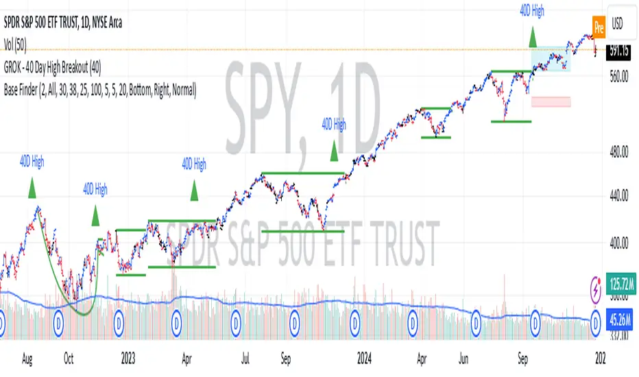
GROK - 40 Day High BreakoutTitle: GROK - Customizable High Breakout Detector
To scan base breakout with Pine Screener
Description:
This Pine Script indicator identifies high breakout patterns based on a user-defined lookback period. By default, it checks for a breakout of the 40-day high, but the period can be adjusted to suit your trading strategy. Key features include:
Custom Lookback Period: Easily modify the number of days for high breakout detection. Lookback period is length of base you want to scan using pine screener.
Visual Alerts: Displays a green triangle above the price bar when a breakout is detected.
Alert Conditions: Built-in alert notifications for automated breakout detection.
Screener Compatibility: Plots breakout signals as a histogram for screener use.
This script is ideal for traders looking to identify strong breakout patterns and incorporate them into their strategies.
How to Use:
Adjust the lookback period in the settings to match your desired breakout criteria.
Add alerts for automated notifications when a breakout is detected.
Use the visual markers and histogram to analyze breakout patterns on your chart.
Volatility Trend Bands [UAlgo]The Volatility Trend Bands is a trend-following indicator that combines the concepts of volatility and trend detection. Built using the Average True Range (ATR) to measure volatility, this indicator dynamically adjusts upper and lower bands around price movements. The bands act as dynamic support and resistance levels, making it easier to identify trend shifts and potential entry and exit points.
With the ATR multiplier, this indicator effectively captures volatility-based shifts in the market. The use of midline values allows for accurate trend detection, which is displayed through color-coded signals on the chart. Additionally, this tool provides clear buy and sell signals, accompanied by intuitive graphical markers for ease of use.
The Volatility Trend Bands is ideal for traders seeking an adaptive trend-following method that responds to changing market conditions while maintaining robust volatility control.
🔶 Key Features
Dynamic Support and Resistance: The indicator utilizes volatility to create dynamic bands. The upper band acts as resistance, and the lower band acts as support for the price. Wider bands indicate higher volatility, while narrower bands indicate lower volatility.
Customizable Inputs
You can tailor the indicator to your strategy by adjusting the:
Price Source: Select the price data (e.g., closing price) used for calculations.
ATR Length: Define the lookback period for the Average True Range (ATR) volatility measure.
ATR Multiplier: This factor controls the width of the volatility bands relative to the ATR value.
Color Options: Choose colors for the bands and signal arrows for better visualization.
Visual Signals: Arrows ("▲" for buy, "▼" for sell) appear on the chart when the trend changes, providing clear entry point indications.
Alerts: Integrated alerts for both buy and sell conditions, allowing you to receive notifications for potential trade opportunities.
🔶 Interpreting Indicator
Upper and Lower Bands: The upper and lower bands are dynamic, adjusting based on market volatility using the ATR. These bands serve as adaptive support and resistance levels. When price breaks above the upper band, it indicates a potential bullish breakout, signaling a strong uptrend. Conversely, a break below the lower band signals a bearish breakout, indicating a downtrend.
Buy/Sell Signals: The indicator provides clear buy and sell signals at breakout points. A buy signal ("▲") is generated when the price breaks above the upper band, suggesting the start of a bullish trend. A sell signal ("▼") is triggered when the price breaks below the lower band, indicating the beginning of a bearish trend. These signals help traders identify potential entry and exit points at key breakout levels.
Color-Coded Bars: The bars on the chart change color based on the trend direction. Teal bars represent bullish momentum, while purple bars signify bearish momentum. This color coding provides a quick visual cue about the market's current direction.
🔶 Disclaimer
Use with Caution: This indicator is provided for educational and informational purposes only and should not be considered as financial advice. Users should exercise caution and perform their own analysis before making trading decisions based on the indicator's signals.
Not Financial Advice: The information provided by this indicator does not constitute financial advice, and the creator (UAlgo) shall not be held responsible for any trading losses incurred as a result of using this indicator.
Backtesting Recommended: Traders are encouraged to backtest the indicator thoroughly on historical data before using it in live trading to assess its performance and suitability for their trading strategies.
Risk Management: Trading involves inherent risks, and users should implement proper risk management strategies, including but not limited to stop-loss orders and position sizing, to mitigate potential losses.
No Guarantees: The accuracy and reliability of the indicator's signals cannot be guaranteed, as they are based on historical price data and past performance may not be indicative of future results.

120 GOAT - Simple Moving Average Breakout IndicatorThe 120 GOAT indicator is a powerful tool designed to help traders identify key breakout points relative to the 120-day Simple Moving Average (SMA). This indicator tracks when the price crosses above or below the 120-day SMA, marking these transition points on the chart with dynamic labels that indicate the percentage change in price since the last crossover.
With the 120 GOAT indicator, traders can:
Identify trend reversals when the price crosses the 120-day SMA.
Monitor price momentum and potential support or resistance levels relative to the 120-day SMA.
Receive alerts when a breakout occurs above or below the 120-day SMA, ensuring they never miss an important market move.
Key Features:
120-day SMA: A customizable 120-day Simple Moving Average that serves as a benchmark for price movements.
Dynamic Labels: The indicator provides labels showing the number of days since the last crossover and the percentage change in price from the previous crossover.
Color-coded Breakout Signals: Labels change color based on the nature of the breakout and price movement:
Above SMA: Green for positive price change, blue for negative.
Below SMA: Orange for positive price change, red for negative.
Price Line Tracking: Displays the current price level relative to the SMA.
Custom Alerts: Set alerts for when the price crosses above or below the 120-day SMA to stay updated on significant market events.
How to Use the 120 GOAT Indicator:
Add the Indicator to Your Chart:
Open TradingView and go to the chart where you want to use the 120 GOAT indicator.
Click on the "Indicators" button at the top of the chart.
Search for "120 GOAT" and select it from the list to apply it to your chart.
Customize the Settings:
Show 120 MA: Toggle this option on if you want the 120-day SMA to be displayed on your chart.
MA Color: Choose your preferred color for the 120-day SMA line.
SMA Length: You can adjust the length of the moving average if you prefer a different period. The default is set to 120 days.
Interpret the Signals:
When the price crosses above the 120-day SMA, the indicator will display a label below the price bar showing the number of days since the last crossover and the percentage change in price. If the price change is positive, the label is green; if negative, it is blue.
When the price crosses below the 120-day SMA, a similar label will appear above the price bar. If the price change is positive, the label is orange; if negative, it is red.
Set Alerts for Key Market Movements:
Go to the Alerts panel and create a new alert.
Select 120 GOAT as the condition.
Choose either "Price Crossed Above SMA 120" or "Price Crossed Below SMA 120" as the alert criteria.
Configure the alert frequency and other settings as needed, then click "Create."
Monitor the Indicator for Trading Opportunities:
Use the breakout signals and percentage change information to identify potential trading opportunities.
Combine this indicator with other technical analysis tools to validate trade setups and enhance decision-making.
Disclaimer: The 120 GOAT indicator is designed for educational purposes and should not be considered as financial advice. Always conduct your own research and consult with a professional financial advisor before making trading decisions.

CG Inside Candle Breakout/BreakdownThe Inside Candle Breakout/Breakdown Indicator can be used to identify the breakout or breakdown cross of the mother candle and inside candle. This helps in deciding whether to go long on a breakout or short on a breakdown.
This indicator first identifies the mother candle and inside candle (baby candle). If the next candle, which is formed after the inside candle, breaks the high of the mother candle in the case of an uptrend or breaks the low of the mother candle in the case of a downtrend, it will indicate a breakout or breakdown.
Manual Trend Line Breakout Labels and Alerts (TA:MTL)Manual Trend Line Breakout Labels and Alerts (TA:MTL)
TA:MTL is an indicator designed for manually plotting trend lines with advanced features including future extension, automatic breakout labels, and alerts. Developed for traders and analysts seeking precise trend determination and timely response to trend changes.
Key Features
Manual Trend Point Selection: Set two time points to define the start and end of the main trend line.
Adaptive Extension: The trend line automatically extends into the future, aiding in the anticipation of potential trend direction.
Strict Breakout Conditions: The indicator monitors strict breakout conditions where the price must cross the trend line post-bar closure, providing more reliable signals.
Visual Labels and Alerts: Visual labels appear upon detecting a breakout, accompanied by alerts for immediate user notification.
Customizable Appearance: Choose colors for primary and extended lines, as well as for breakout labels.
Usage Instructions
Set two time points (Trend time point 1 and Trend time point 2) to determine the initial and final points of the trend line.
Select the position type (Position Type) - "Long" for an upward trend or "Short" for a downward trend.
Customize the appearance of lines and labels using the available color parameters.
Activate the display of the future line extension (Show Future Line) if needed.
Monitor automatic labels and alerts to identify breakout moments of trend lines.

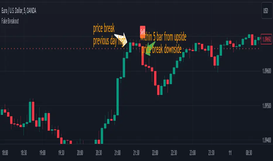
Fake BreakoutThis indicator detect fake breakout on previous day high/low and option previous swing high and low
Rule Detect Fake Breakout On Previous Day High/Low Or Swing high low Fake Breakout -
1) Detect previous day high/low or swing high/low
2)
A) If price revisit on previous day high/swing high look for upside breakout after input
number of candle (1-5) price came back to previous high and breakout happen downside
it show sell because its fake breakout of previous day high or swing high
B) If price revisit on previous day low/swing low look for downside breakout after input
number of candle (1-5) price came back to previous low and breakout upside of previous
day low it show Buy because its fake breakout of previous day low or swing low
Disclaimer -Traders can use this script as a starting point for further customization or as a reference for developing their own trading strategies. It's important to note that past performance is not indicative of future results, and thorough testing and validation are recommended before deploying any trading strategy.
Ranges With Targets [ChartPrime]The Ranges With Targets indicator is a tool designed to assist traders in identifying potential trading opportunities on a chart derived from breakout trading. It dynamically outlines ranges with boxes in real-time, providing a visual representation of price movements. When a breakout occurs from a range, the indicator will begin coloring the candles. A green candle signals a long breakout, suggesting a potential upward movement, while a red candle indicates a short breakout, suggesting a potential downward movement. Grey candles indicate periods with no active trade. Ranges are derived from daily changes in price action.
This indicator builds upon the common breakout theory in trading whereby when price breaks out of a range; it may indicate continuation in a trend.
Additionally, users have the ability to customize their risk-reward settings through a multiplier referred to as the Target input. This allows traders to set their Take Profit (TP) and Stop Loss (SL) levels according to their specific risk tolerance and trading strategy.
Furthermore, the indicator offers an optional stop loss setting that can automatically exit losing trades, providing an additional layer of risk management for users who choose to utilize this feature.
A dashboard is provided in the top right showing the statistics and performance of the indicator; winning trades; losing trades, gross profit and loss and PNL. This can be useful when analyzing the success of breakout trading on a particular asset or timeframe.
