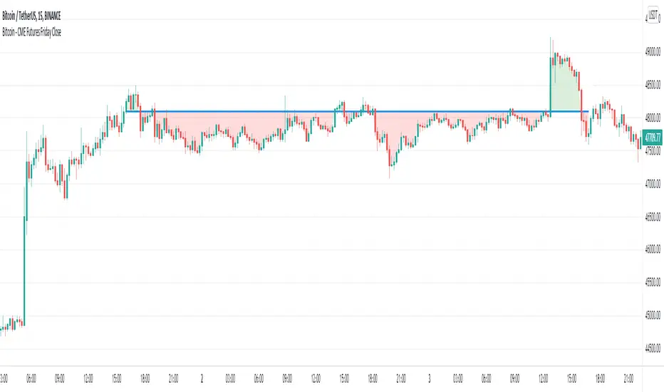
Bitcoin - CME Futures Friday Close
This indicator displays the weekly Friday closing price according to the CME trading hours (Friday 4pm CT).
A horizontal line is displayed until the CME opens again on Sunday 5pm CT.
This indicator is based on the thesis, that during the weekend the Bitcoin price tends to mean reverse to the CME closing price of the prior Friday. The level can also act as support/resistance. This indicator gives a visualization of this key level for the relevant time window.
Furthermore the indicator helps to easily identify, if there is an up or down gap in the CME Bitcoin contract.
"bitcoin" için komut dosyalarını ara
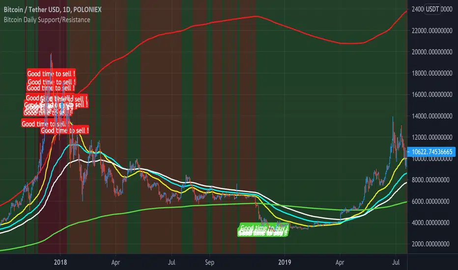
Bitcoin Daily Support/ResistanceA new indicator for tradingview.
Indicator Overview
The 2-Year MA Multiplier is intended to be used as a long term investment tool.
It highlights periods where buying or selling Bitcoin during those times would have produced outsized returns.
To do this, it uses a moving average (MA) line, the 2yr MA, and also a multiplication of that moving average line, 2yr MA x5.
Note: the x5 multiplication is of the price values of the 2yr moving average, not of its time period.
Buying Bitcoin when price drops below the 2yr MA (green line) has historically generated outsized returns. Selling Bitcoin when price goes above the 2yr MA x 5 (red line) has been historically effective for taking profit.
Why This Happens
As Bitcoin is adopted, it moves through market cycles. These are created by periods where market participants are over-excited causing the price to over-extend, and periods where they are overly pessimistic where the price over-contracts. Identifying and understanding these periods can be beneficial to the long term investor.
This tool is a simple and effective way to highlight those periods
MA 50/100/150 was historically good support and resistance. When we cross them we have a new trend that is established.
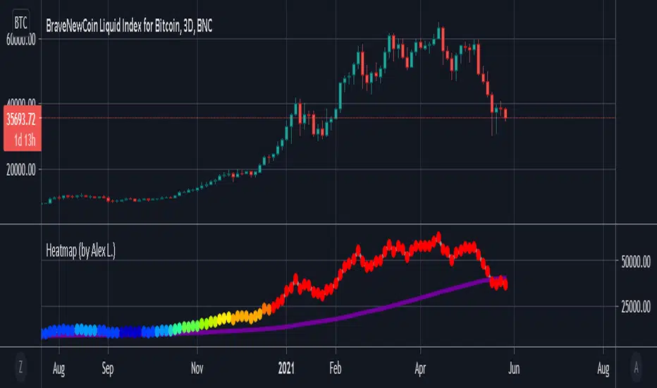
Bitcoin Heatmap (by Alex L.)This indicator is a based on "200 Week Moving Average Heatmap" by Plan B. It shows "heatmap" of a security based on % increase of its 200 week (or other) moving average. It can be used for Bitcoin, as well identifying overheated Stocks (like TSLA). Plan B designed this indicator for Bitcoin using MA = 1400 (which is 200 trading days in Crypto), I personally found it useful to indicate overheated Stock Market stocks using MA = 250 (which is ~1 year of net trading days, excluding weekends and holidays).
Enjoy!
Bitcoin Bullrun ATHFind Bitcoin's next ATH before bearmarket.
This indicator, which successfully indicated the 3 previous tops, has been modified and improved.
Its precision is the most accurate on the 2h timeframe.
3 features:
- A visual percentage gauge will show the next potential high of the current bull run when it reaches 100%
- Possibility to add an alert when the gauge reaches 100%. To do this, go to the tradingview alert menu and instead of the ticker, choose "Bitcoin Bullrun ATH" (Don't forget to set the timeframe on 2h or less.)
- Possibility to choose if you want to see or not the tips/gauge/percentage only.
Welcome and have a good bull run.

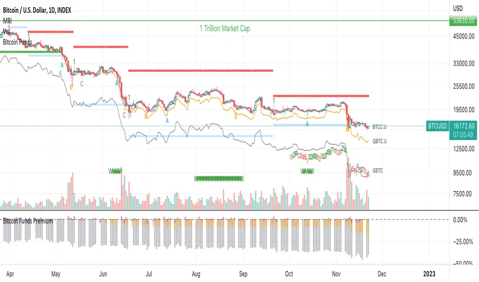
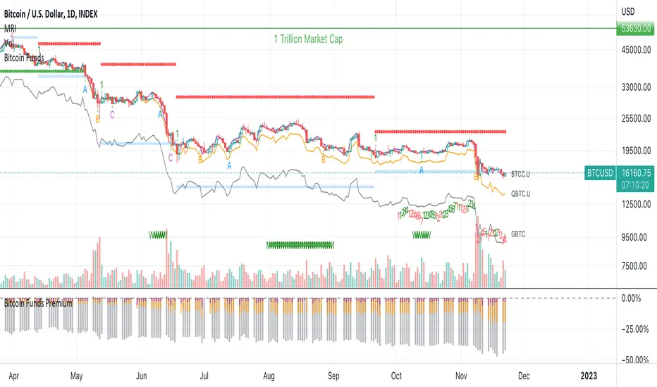
Bitcoin Funds PremiumDisplay the % premium of 4 different Bitcoin Funds relative to the price of Bitcoin in your current chart.
BTCC ETF
QBTC Fund
GBTC Trust
VBTC ETN
This indicator uses the metrics from the fund management websites to calculate the "Net Asset Value per Unit (NAVPU)" to calculate the true underlying value of the fund.
The difference is then compared to the price of Bitcoin in the chart you have open.
Note that the metrics change and therefore the graph is not accurate for long past timeframes.
If TradingView would expand their script language in a way to ingest CSV data from the funds website then this could be improved.
You can update the metrics for each fund in the settings dialogue.
The script will autodetect the currency pairs of your current graph and only display compatible funds:
BTC / USD will show BTCC.U, QBTC.U and GBTC
BTC / CAD will show BTCC and QBTC
BTC / EUR will show VBTC
The script should not show in other currency pairs so it will not mess up other charts you might switch to.
If you find bugs with this logic, please comment below so I can fix them.
Due to TradingViews "no-links in description" policy, you need to google each funds website yourself to find the current metrics. These search terms should help:
BTCC search "Purpose Bitcoin ETF"
QBTC search "3iq The Bitcoin Fund (QBTC)"
GBTC search "Grayscale® Bitcoin Trust"
VBTC search "VanEck Vectors Bitcoin ETN"
Bitcoin Funds OverlayOverlay the Net Asset Value per Unit (NAVPU) of 4 different Bitcoin Funds on your Bitcoin chart.
BTCC ETF
QBTC Fund
GBTC Trust
VBTC ETN
This indicator uses the metrics from the fund management websites to calculate the "Net Asset Value per Unit (NAVPU)" to display the true underlying value of the fund.
Note that the metrics can change and therefore the graph is not accurate for long past timeframes.
You can update the metrics for each fund in the settings dialogue.
The script will autodetect the currency pairs of your current graph and only display compatible funds:
BTC / USD will show BTCC.U, QBTC.U and GBTC
BTC / CAD will show BTCC and QBTC
BTC / EUR will show VBTC
The script should not show in other currency pairs so it will not mess up other charts you might switch to.
If you find bugs with this logic, please comment below so I can fix them.
Due to TradingViews "no-links in description" policy, you need to google each funds website yourself to find the current metrics. These search terms should help:
BTCC search "Purpose Bitcoin ETF"
QBTC search "3iq The Bitcoin Fund (QBTC)"
GBTC search "Grayscale® Bitcoin Trust"
VBTC search "VanEck Vectors Bitcoin ETN"
Bitcoin Bulls and Bears by @dbtrBitcoin 🔥 Bulls & Bears 🔥
v1.0
This free-of-charge BTC market analysis indicator helps you better understand what's going with Bitcoin from a high-level perspective. At a glance, it will give you an immediate understanding of Bitcoin’s historic price channel dating back to 2011, past and current market cycles, as well as current key support levels.
Usage
Use this indicator with any BTCUSD pairs , ideally with a long price history (such as BNC:BLX )
We recommend to use this indicator in log mode, combined with Weekly or Monthly timeframe.
Features
🕵🏻♂️ Historic price channel curve since 2011
🚨 Bull & bear market cycles (dynamic)
🔥 All-time highs (dynamic)
🌟 Weekly support (dynamic, based on 20 SMA )
💪 Long-term support (channel bottom)
🔝 Potential future price targets (dynamic)
❎ Overbought RSI coloring
📏 Log/non-log support
🌚 Dark mode support
Remarks
With exception of the price channel curve, anything in this indicator is calculated dynamically , including bull/bear market cycles (based on a tweaked 20SMA), ATHs, and so on. As a result, historic market cycles may not be 100% accurately reflected and may also differ slightly in between various time-frames (closest result: Monthly). The indicator may even consider periods of heavy ups/downs as their own market cycles, even though they weren’t. Due to its dynamic nature, this indicator can however adapt to the future and helps you quickly identify potential changes in market structure, even if the indicator is no longer updated.
On top of that bullmarket cycles (colored in green) feature an ingrained RSI: the darker the green color, the more the RSI is overbought and close to a correction (darkest color in the chart = 90 Weekly RSI). In comparison with past bull cycles, it helps you easily spot potential reversal zones.
Thanks
Thanks to @quantadelic and @mabonyi which both have worked on the BTC "growth zones" indicator including the price channel, of which I have used parts of the code as well as the actual price channel data.
Follow me
Follow me here on TradingView to be notified as soon as new free and premium indicators and trading strategies are published. Inquire me for any other requests.
Enjoy & happy trading!

Bitcoin Bulls & Bears @dbtr
Bitcoin Bulls & Bears
The "Bitcoin Bulls & Bears" indicator helps you better understand Bitcoin with a high-level view on Bitcoin’s historic price channel, past and current market cycles, as well as current key support levels.
Usage
Use this indicator with any BTCUSD pairs , ideally with a long price history (such as BNC:BLX )
We recommend to use this indicator in log mode, combined with Weekly or Monthly timeframe.
Features
🕵🏻♂️ Historic price channel curve since 2011
🚨 Bull & bear market cycles (dynamic)
🔥 All-time highs (dynamic)
🌟 Weekly support (dynamic, based on 20 SMA)
💪 Long-term support (channel bottom)
🔝 Potential future price targets (dynamic)
📏 Log/non-log support
🌚 Dark mode support
Remarks
Except for the historic price channel curve, all of this indicator is calculated dynamically , including bull/bear market cycles (based on a tweaked 20SMA). Due to this, the historic market cycles may not be 100% accurate and may also differ slightly between time-frames. It may also consider short times of ups/downs to be their own market cycles, even though they weren’t. This dynamic nature allows this indicator to adapt to the future and quickly help you identify changes in market structure.
On top of the that, the bullmarket cycles (green background) feature an ingrained RSI information: the darker the green, the more the RSI is overbought and close to a correction. In combination with past bull cycles, it is easier to spot potential reversal zones.
Thanks
Thanks to @quantadelic and @mabonyi for their pre-work on the price channel information, which I have taken over here

Bitcoin Estimated Transaction FeeThis is the estimated fee you can expect to pay to have your bitcoin transaction confirm in 1 block. The estimation is derived from the daily total revenue miners received divided by the daily total number of transactions.
An option to change to a different currency is provided.
Notes on transaction fees:
Most exchanges do not provide an option to change the fee amount, and charge a static fee. A notable exception is Deribit.
The newer Bech32 wallet format, also known as native or SegWit, use a lower fee for the same transaction as legacy addresses. The addresses start with "bc1".
Mania was $60 USD to move bitcoin to an exchange you've only just heard of to buy a different coin with funny name :)

Bitcoin DAA OscillatorAn oscillator of Bitcoin's Daily Active Addresses (DAA) and fundamental metric of the utilization of the Bitcoin network.
Helps to identify:
Potential buy zones (green) - when the network utilization is low & increasing
Potential sell zones (red) - when the network utilization is high & decreasing

Bitcoin Logarithmic Curves OscillatorThis a companion indicator for the Bitcoin Logarithmic Growth Curves indicator.
This is an oscillator version of the above. When the indicator is at / near 1 then Bitcoin price is at / near the upper range of its long-term logarithmic growth trend. When at / near 0 then price is at / near the lower range of that trend.
This indicator only works with the BLX Brave New Coin Index (ticker:BLX) and only on 1 day, 3 day, or 1 week timeframes.

Bitcoin Fibonacci Log RegressionThe "Zero Line" is the calculated logarithmic regression of Bitcoin over the last decade.
The rainbow above the Zero Line are the Fibonacci multiples from 0 --> 1 of the log regression (0.236, 0.382, etc.)
The rainbow below the Zero Line is identical, except that the multiples are negative (-0.236, -0.382, etc.)
For the first time ever, Bitcoin broke through the Zero Line (the natural regression) when it dumped on March 12-13. It looked at though the regression was invalidated when, in fact, it simply made an unprecedented move to a lower Fibonacci multiple.
Enjoy.
Bitcoin Difficulty Ribbon - Best IndicatorHello everyone,
Today I programed the Bitcoin Difficulty Ribbon Indicator.
First of all, special thanks to:
Vinny Lingham
Willy woo
I just added a green background to clarify the buy signal.
Introducing the Difficulty Ribbon, signaling the best times to buy Bitcoin
Introducing the Bitcoin Difficulty Ribbon.
When the ribbon compresses, or flips negative, these are the best times to buy Bitcoin .
The ribbon consists of simple moving averages on mining difficulty so we can easily see the rate of change in difficulty.
How it the Difficulty Ribbon works
This visualisation of network mining difficulty speaks to the impact of mining on Bitcoin's price. As new coins are mined into existence, miners sell some of their mined coins to pay for production costs. This produces bearish price pressure.
The weakest miners sell more of their coins to remain operational. When it becomes unsustainable, they capitulate, hashing power and network difficulty reduces (ribbon compression), leaving only the strong, who sell less leaving more room for more bullish price action.
Typically we see this at the end of bear cycles, after miners capitulate, the lack of miner selling pressure allows the price to stabilise and then climb; the classic accumulation bottom.

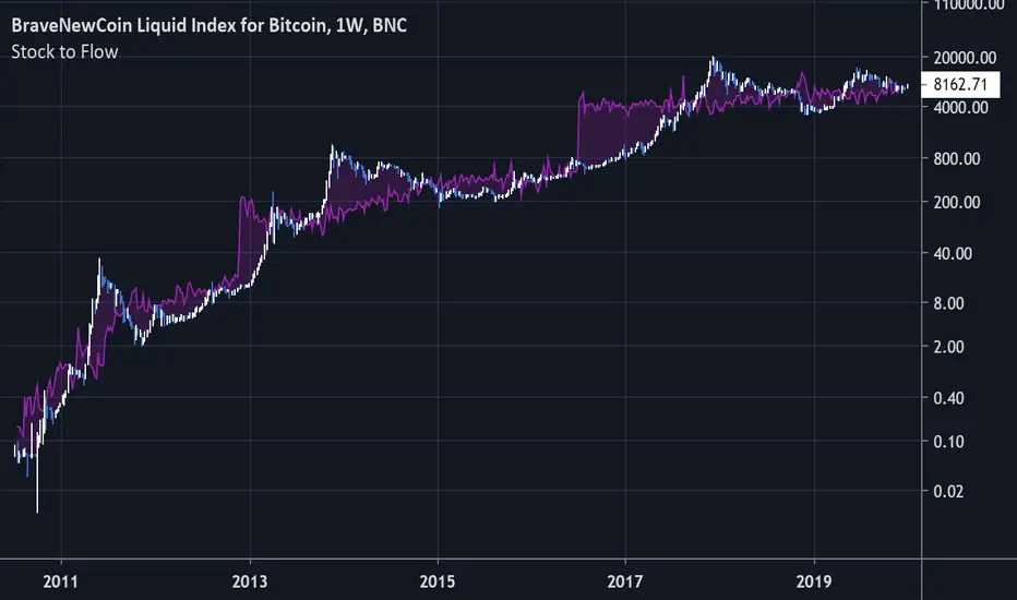
Bitcoin Stock to FlowModeling Bitcoin's Value With Scarcity
The Stock to Flow model for Bitcoin suggests that Bitcoin price is driven by scarcity over time.
Bitcoin is the first scarce digital object the world has ever seen. It is scarce like silver & gold, and can be sent over the internet, radio, satellite etc. Bitcoin includes a mathematical mechanism to restrict its supply over time making it more rare as time goes on. Digital Scarcity.
In 2017 BTC exceeded the market capitalization of Silver. After the next halving in 2024, Bitcoin will become the hardest asset the world has ever seen, rarer than Gold.
There is only enough Bitcoin in the world for each person to own .0023 BTC. Because of this, Bitcoin's value should continue to rise over time.
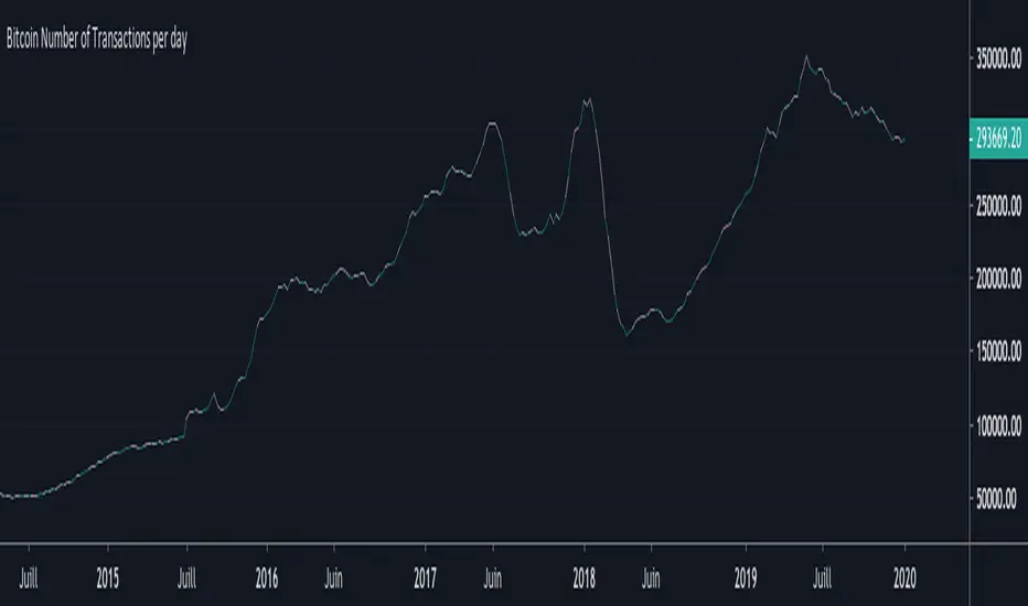
Bitcoin Number of Transactions per dayHello everyone,
Again an indicator for Bitcoin : the Number of Transactions / day.
Total number of unique bitcoin transactions per day
Precision : 10 DAYS AVERAGE
Bitcoin DifficultyHello everyone,
An other indicator for bitcoin : the difficulty
What is difficulty?
Difficulty is a measure of how difficult it is to find a hash below a given target.
The Bitcoin network has a global block difficulty. Valid blocks must have a hash below this target.
Mining pools also have a pool-specific share difficulty setting a lower limit for shares.

Bitcoin Hash RateHello everyone,
An interesting indicator for Bitcoin : the hash rate.
What is the Hash Rate ?
The estimated number of tera hashes per second (trillions of hashes per second) the Bitcoin network is performing.

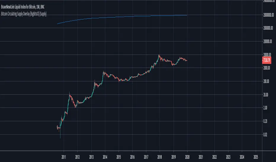
Bitcoin Circulating Supply Overlay [BigBitsIO]This script shows the estimated circulating supply of Bitcoin on any given day.
Features:
- Estimated Bitcoin circulating supply calculated daily
- Uses the Bitcoin reward schedule, past halving dates, and the next upcoming halving estimated date to calculate the current estimated supply.
- Optionally includes an option to use "Log Reduction" on the chart
*** DISCLAIMER: For educational and entertainment purposes only. Nothing in this content should be interpreted as financial advice or a recommendation to buy or sell any sort of security or investment including all types of crypto. DYOR, TYOB. ***
Bitcoin Difficulty RibbonThe Diffiulty Ribbon speaks to the impact of miner selling pressure on Bitcoin`s price action. When network difficulty reduces its rate of climb, miners are going out of business, leaving only the strong miners who proportionally need to sell less of their coins to remain operational, this leads to less sell pressure and more room for bullish price action. The best times to buy Bitcoin are zones where the ribbon compresses. The ribbon consists of simple moving averages of Bitcoin network difficulty so the rate of change of difficulty can be easily seen.
The author of this indicator is Willy Woo (@woonomic).

LinReg-Bitcoin's Power Oscillator.2019.01[wozdux]Bitcoin power oscillator from Harold Christopher Burger.
Since the first day of history is the most important, it is not correct to use this indicator on young exchanges with a short history.
The oscillator is calculated based on regression lines from the first day of history to the current day. The way of calculation of the oscillator. First, the regression line from the first day of history to the current bar is calculated for each bar.
Thus, for each bar, the formula of a straight regression line of the form Y=b*x + a is calculated. Where x is the number of days elapsed from the beginning of the history to the current drill. Y is the bitcoin price of the current day (bar) on the regression line. Thus, Y Is the predicted bitcoin price that would have to be. The second stage of calculation. Now we have the real price of bitcoin for the current day and the predicted price by the regression line. We calculate the ratio of the real price to the predicted one and take the logarithm of the obtained value. G=log10(Close/Y). This value is drawn in the form of a graph of the bitcoin power oscillator. The resulting oscillator oscillates in a constant range of values from -1 to +1.
This oscillator clearly captures the moments of price reversal. At the tops, the reversal occurs when the oscillator reaches the value range from 0.6 to 0.8. In the lowlands, the reversal occurs in the range of values from -0.8 to -0.4.
Indicator setting-description of buttons from top to bottom.
1) Raise the chart by X units. This is a corrective point in order to raise the chart above/below the zero line
2) Offset the start day of the story. The first day of history is the point relative to which all regression lines, all bars are calculated. This point can be slightly corrected by shifting the initial day to the left for a certain number of days.
3) button to switch between different ways to calculate the offset (A) in the formula Y=b*x + A.
4) the Orange level is the trend line of the historical power oscillator troughs. The orange level is an inclined level of price reversal from the bottom up.
5) the Green level is an important area of likely bitcoin price reversal at the tops.
6) the Red level is the horizontal level of the price reversal from the bottom up.
....
Осциллятор мощности биткоина от Harold Christopher Burger. "Это моя попытка воспроизвести вычисления данного генератора методами Pine Script .
Поскольку первый день истории имеет самое важное значение, то использовать данный индикатор на молодых биржах с короткой историей будет не корректно.
Осциллятор вычисляется на основе линий регрессии от первого дня истории до текущего дня. Путь вычисления осциллятора. Сначала для каждого бара вычисляется линия регрессии от первого дня истории до текущего бара.
Таким образом, для каждого бара вычисляется формула прямой линии регрессии вида Y=b*x + a. Где х -это количество дней, прошедших от начала истории до текущего бура. Y- это цена биткоина текущего дня (бара) на линии регрессии. Таким образом, Y- Это предсказанная цена биткоина, которая должна была бы быть. Второй этап вычисления. Теперь у нас есть реальная цена биткоина на текущий день и предсказанная цена линией регрессии. Вычисляем отношение реальной цены к предсказанной и берем логарифм , полученнного значения. G=log10(Close/Y). Это значение рисуем в виде графика осциллятора мощности биткоина. Полученный осциллятор колеблется в постоянном диапазоне значений от -1 до +1.
Данный осциллятор четко отлавливает моменты разворота цены. На вершинах разворот происходит тогда, когда осциллятор достигает области значения от 0.6 до 0.8. В низинах разворот происходит в области значений от -0.8 до -0.4.
Настройка индикатора - описание кнопок сверху вниз.
1 ) Поднять график на Х единиц. Это корректирующий пункт для того, чтобы приподнять график выше/ниже относительно нулевой линии
2) Смещение начального дня истории. Первый день истории -это та точка оносительно которой вычисялются все линиии регрессии, всех баров. Эту точку можно немного подкорректировать, сместив начальный день влево на какое-то количество дней.
3) Кнопка переключения между разными способами вычисления смещения (A) в формуле Y=b*x + A.
4) Оранжевый уровень - это линия тренда исторических впадин осциллятора мощности. Оранжевый уровень это наклонный уровень разворота цены снизу вверх.
5) Зеленый уровень - это важная область вероятного разворота цены биткоина на вершинах.
6) Красный уровень -это горизонтальный уровень областей разворота цены снизу вверх.

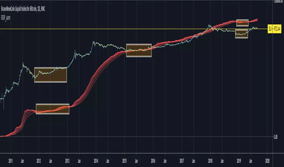
Bitcoin Difficulty Ribbon [aamonkey]This is another tool to find big cycle bottoms that is very unknown yet effective.
The Difficulty Ribbon speaks to the impact of miner selling pressure on Bitcoin`s price action.
When network difficulty reduces its rate of climb, miners are going out of business, leaving only the strong miners who proportionally need to sell less of their coins to remain operational, this leads to less sell pressure and more room for bullish price action.
The best times to buy Bitcoin are zones where the ribbon compresses.
The ribbon consists of simple moving averages of Bitcoin network difficulty so the rate of change of difficulty can be easily seen.
Bitcoin Difficulty RibbonThe Bitcoin Difficulty Ribbon is based on Willy Woo's implementation and it gauges the selling pressure experienced by Bitcoin miners.
The Bitcoin Network Difficulty is a measure of how complicated it is to find the next block, compared to the ease of finding the easiest possible one.
When the difficulty decreases it's a hint that the mining sector is experiencing difficulties and the longer it contracts, the more miners might get out of business.
During these contracting times, the Difficulty Ribbon narrows and becomes a significant proxy to recognize cycle bottoms.
Default settings: Daily Time Frame and SMA mode.
Credit: Willy Woo

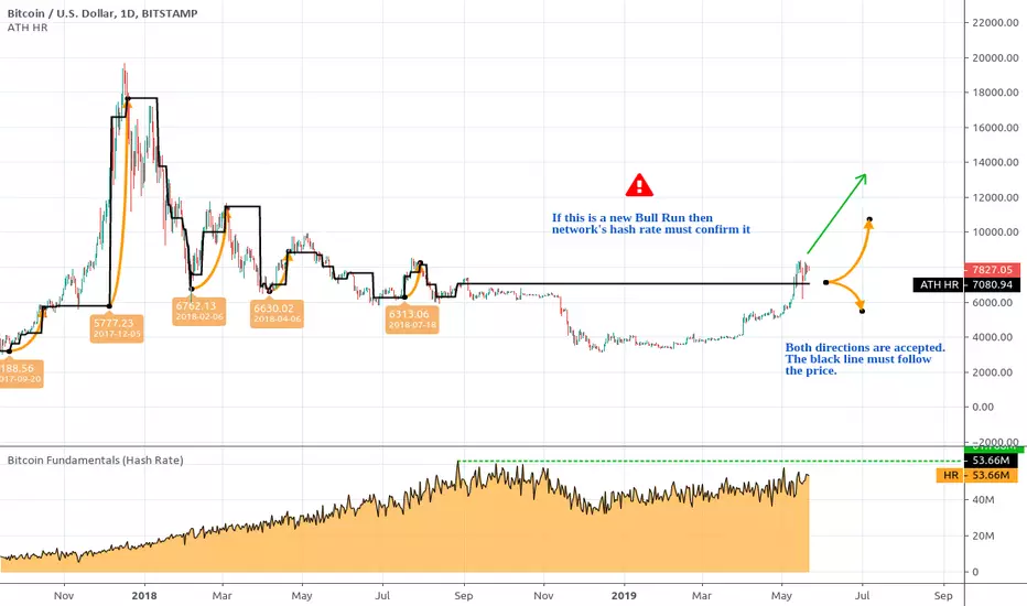
Bitcoin All-Time High (ATH) Hash Rate Level An experimental Bitcoin TotheMoon confirmation tool. Represents a mapping of Bitcoin's All-Time Hash Rate to the corresponding Bitcoin's price on the chart.
As always, you can support the author with donations via PayPal or crypto.