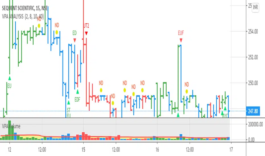
VPA ANALYSIS VPA Analysis provide the indications for various conditions as per the Volume Spread Analysis concept. The various legends are provided below
LEGEND DETAILS
UT1 - Upthrust Bar: This will be widespread Bar on high Volume closing on the low. This normally happens after an up move. Here the smart money move the price to the High and then quickly brings to the Low trapping many retail trader who rushed into in order not to miss the bullish move. This is a bearish Signal
UT2 -Upthrust Bar Confirmation: A widespread Down Bar following a Upthrust Bar. This confirms the weakness of the Upthrust Bar. Expect the stock to move down
Confirms . This is a Bearish Signal
PUT - Pseudo Upthrust: An Upthrust Bar in bar action but the volume remains average. This still indicates weakness. Indicate Possible Bearishness
PUC -Pseudo Upthrust Confirmation: widespread Bar after a pseudo–Upthrust Bar confirms the weakness of the Pseudo Upthrust Bar
Confirms Bearishness
BC - Buying Climax: A very wide Spread bar on ultra-High Volume closing at the top. Such a Bar indicates the climatic move in an uptrend. This Bar traps many retailers as the uptrend ends and reverses quickly. Confirms Bearishness
TC - Trend Change: This Indicates a possible Trend Change in an uptrend. Indicates Weakness
SEC- Sell Condition: This bar indicates confluence of some bearish signals. Possible end of Uptrend and start of Downtrend soon. Bearish Signal
UT - Upthrust Condition: When multiple bearish signals occur, the legend is printed in two lines. The Legend “UT” indicates that an upthrust condition is present. Bearish Signal
ND - No demand in uptrend: This bar indicates that there is no demand. In an uptrend this indicates weakness. Bearish Signal
ND - No Demand: This bar indicates that there is no demand. This can occur in any part of the Trend. In all place other than in an uptrend this just indicates just weakness
ED - Effort to Move Down: Widespread Bar closing down on High volume or above average volume . The smart money is pushing the prices down. Bearish Signal
EDF - Effort to Move Down Failed: Widespread / above average spread Bar closing up on High volume or above average volume appearing after ‘Effort to move down” bar.
This indicates that the Effort to move the pries down has failed. Bullish signal
SV - Stopping Volume: A high volume medium to widespread Bar closing in the upper middle part in a down trend indicates that smart money is buying. This is an indication that the down trend is likely to end soon. Indicates strength
ST1 - Strength Returning 1: Strength seen returning after a down trend. High volume adds to strength. Indicates Strength
ST2 - Strength Returning 2: Strength seen returning after a down trend. High volume adds to strength.
BYC - Buy Condition: This bar indicates confluence of some bullish signals Possible end of downtrend and start of uptrend soon. Indicates Strength
EU - Effort to Move Up: Widespread Bar closing up on High volume or above average volume . The smart money is pushing the prices up. Bullish Signal
EUF - Effort to Move Up Failed: Widespread / above average spread Bar closing down on High volume or above average volume appearing after ‘Effort to move up” bar.
This indicates that the Effort to move the pries up has failed. Bearish Signal
LVT- Low Volume Test: A low volume bar dipping into previous supply area and closing in the upper part of the Bar. A successful test is a positive sign. Indicates Strength
ST(after a LVT ) - Strength after Successful Low Volume Test: An up Bar closing near High after a Test confirms strength. Bullish Signal
RUT - Reverse Upthrust Bar: This will be a widespread Bar on high Volume closing on the high is a Down Trend. Here the buyers have become active and move the prices from the low to High. The down Move is likely to end and up trend likely to start soon. indicates Strength
NS - No supply Bar: This bar indicates that there is no supply. This is a sign of strength especially in a down trend. Indicates strength
ST - Strength Returns: When multiple bullish signals occur, the legend is printed in two lines. The Legend “ST” indicates that an condition of strength other than the condition mentioned in the second line is present. Bullish Signals
BAR COLORS
Green- Bullish / Strength
Red - Bearish / weakness
Blue / White - Sentiment Changing from bullish to Bearish and Vice Versa
"bear" için komut dosyalarını ara
[blackcat] L1 Composite RSI Trend OscillatorLevel: 1
Background
The Relative Strength Index (RSI) is a technical indicator for analyzing financial markets. It is intended to represent the current and historical strength or weakness of a trading pair or a market based on the closing prices of a last trading period.
Function
L1 Composite RSI Trend Oscillator utilizes candles to indicate trend. E.g. yellow candles for bull and fuchsia candles for bear. NOTE: it is inverted to RSI from bull bear perspective. Colorful RSI with yellow indicating bull and fuchsia indicating bear.
Key Signal
lwr1 --> trend oscillator fast line (lwr1 >= lwr2 for bear)
lwr2 --> trend oscillator slow line (lwr1 < lwr2 for bull)
botzone --> bottom zone indicates oversold with green
topzone --> top zone indicates overbought with red
longentry --> long entry signal
shortentry --> short entry signal
Pros and Cons
Pros:
1. combines both the benefit of RSI response and trend oscillator candles
2. divergence can be observed easily
Cons:
1. It may satruate for extreme conditions of long and short.
2. Not accurate for long and short entries and need filtering out noise and fake signal.
Remarks
NA
Readme
In real life, I am a prolific inventor. I have successfully applied for more than 60 international and regional patents in the past 12 years. But in the past two years or so, I have tried to transfer my creativity to the development of trading strategies. Tradingview is the ideal platform for me. I am selecting and contributing some of the hundreds of scripts to publish in Tradingview community. Welcome everyone to interact with me to discuss these interesting pine scripts.
The scripts posted are categorized into 5 levels according to my efforts or manhours put into these works.
Level 1 : interesting script snippets or distinctive improvement from classic indicators or strategy. Level 1 scripts can usually appear in more complex indicators as a function module or element.
Level 2 : composite indicator/strategy. By selecting or combining several independent or dependent functions or sub indicators in proper way, the composite script exhibits a resonance phenomenon which can filter out noise or fake trading signal to enhance trading confidence level.
Level 3 : comprehensive indicator/strategy. They are simple trading systems based on my strategies. They are commonly containing several or all of entry signal, close signal, stop loss, take profit, re-entry, risk management, and position sizing techniques. Even some interesting fundamental and mass psychological aspects are incorporated.
Level 4 : script snippets or functions that do not disclose source code. Interesting element that can reveal market laws and work as raw material for indicators and strategies. If you find Level 1~2 scripts are helpful, Level 4 is a private version that took me far more efforts to develop.
Level 5 : indicator/strategy that do not disclose source code. private version of Level 3 script with my accumulated script processing skills or a large number of custom functions. I had a private function library built in past two years. Level 5 scripts use many of them to achieve private trading strategy.

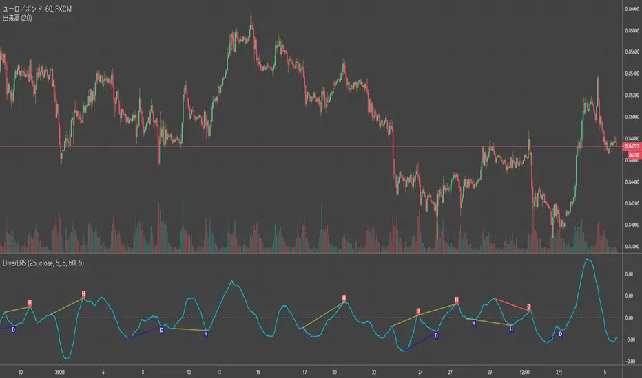
Divergence RSI [mado]Divergence screener for OBV RSI
Regular Bullish: "D" navy label
Hidden Bullish: "H" navy label
Regular Bearish: "D" red label
Hidden Bearish: "H" red label

Divergence Stoch RSI[mado]Divergence screener for Stoch RSI
Regular Bullish: "D" navy label
Hidden Bullish: "H" navy label
Regular Bearish: "D" red label
Hidden Bearish: "H" red label

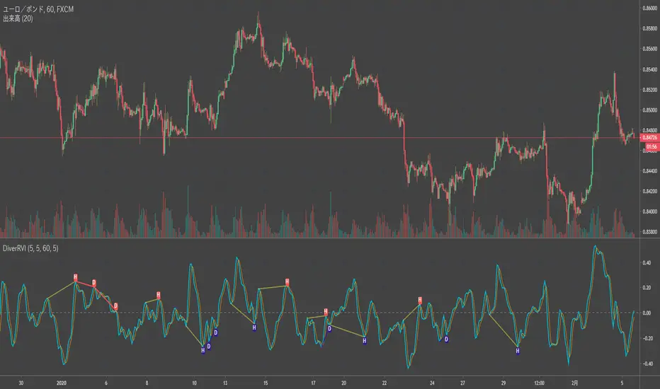
Divergence RVI[mado]Divergence screener for RVI
Regular Bullish: "D" navy label
Hidden Bullish: "H" navy label
Regular Bearish: "D" red label
Hidden Bearish: "H" red label
Divergence OBV RSI[mado]Divergence screener for OBV RSI
Regular Bullish: "D" navy label
Hidden Bullish: "H" navy label
Regular Bearish: "D" red label
Hidden Bearish: "H" red label

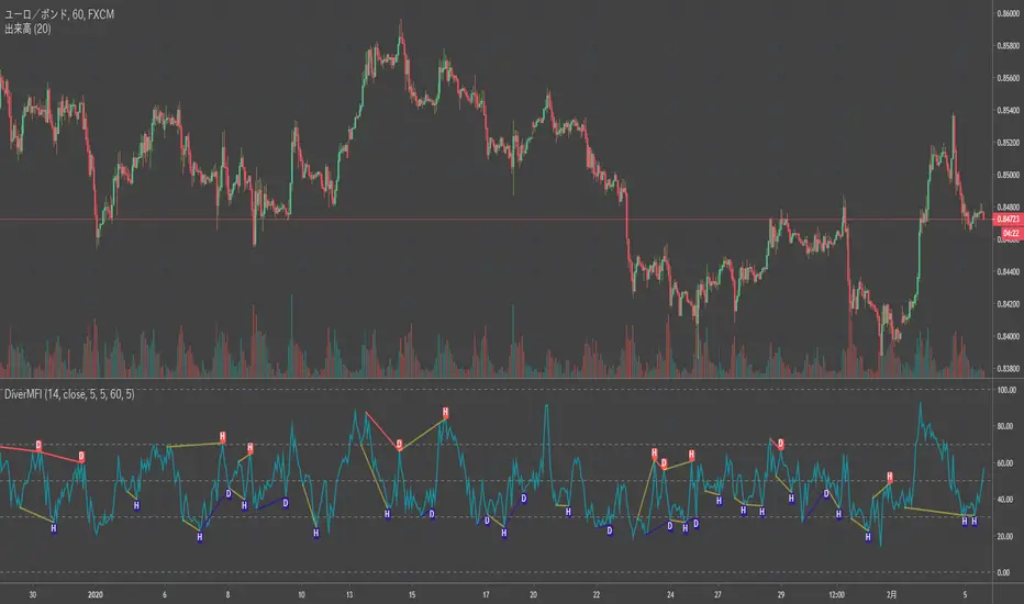
Divergence MFI[mado]Divergence screener for MFI
Regular Bullish: "D" navy label
Hidden Bullish: "H" navy label
Regular Bearish: "D" red label
Hidden Bearish: "H" red label
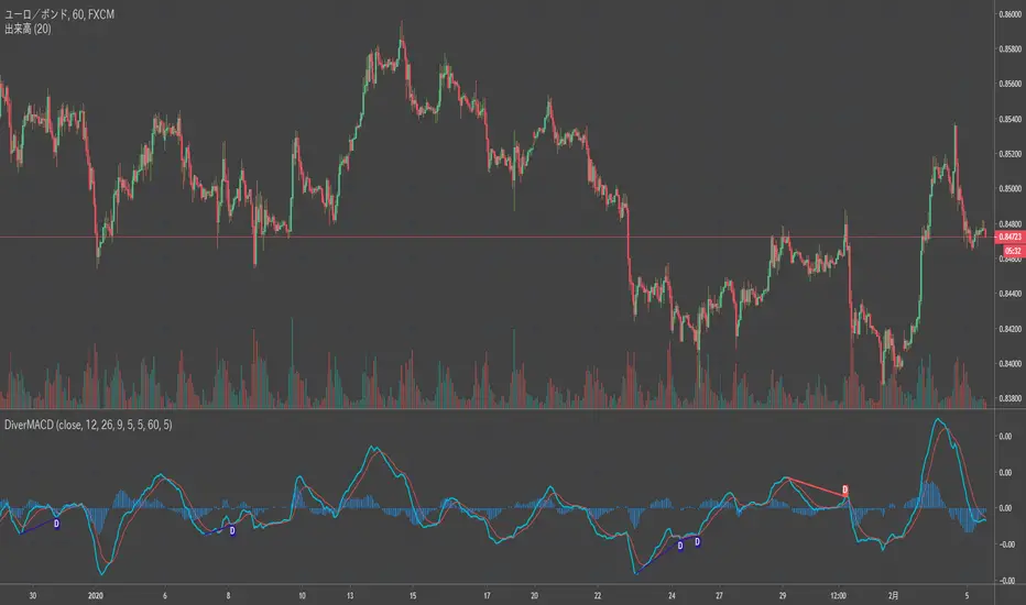
Divergence MACD [mado]Divergence screener for MACD
Regular Bullish: "D" navy label
Hidden Bullish: "H" navy label
Regular Bearish: "D" red label
Hidden Bearish: "H" red label
Divergence LinerRegressionSlope[mado]Divergence screener for LinerRegressionSlope
Regular Bullish: "D" navy label
Hidden Bullish: "H" navy label
Regular Bearish: "D" red label
Hidden Bearish: "H" red label
Divergence KlingerVolumeOscillator [mado]Divergence screener for KVO
Regular Bullish: "D" navy label
Hidden Bullish: "H" navy label
Regular Bearish: "D" red label
Hidden Bearish: "H" red label

Divergence CCI [mado]Divergence screener for CCI
Regular Bullish: "D" navy label
Hidden Bullish: "H" navy label
Regular Bearish: "D" red label
Hidden Bearish: "H" red label

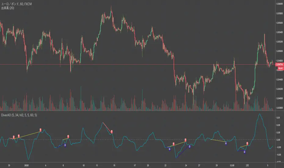
Divergence Awesome Oscillator [mado]Divergence screener for Awesome Oscillator
Regular Bullish: "D" navy label
Hidden Bullish: "H" navy label
Regular Bearish: "D" red label
Hidden Bearish: "H" red label
Elder impulse system with double exponential moving average dema
This version of impulse uses the double exponential moving average instead of the typical ema both to calculate macd and the moving slow and fast moving average that are plotted.
The impulse system :
The Impulse System combines two simple but powerful indicators.
One measures market inertia, the other its momentum. When both
point in the same direction, they identify an impulse worth following.
We get an entry signal when both indicators get in gear.
The Impulse System uses an exponential moving average to find
uptrends and downtrends. When the EMA rises, it shows that inertia
favors the bulls. When EMA falls, inertia works for the bears. The sec-
ond component is MACD-Histogram, an oscillator whose slope reflects
changes of power among bulls or bears. When MACD-Histogram rises,
it shows that bulls are becoming stronger. When it falls, it shows that
bears are growing stronger.
The Impulse System flags those bars where both the inertia and the
momentum point in the same direction. When both the EMA and
MACD-Histogram rise, they show that bulls are roaring and the uptrend
is accelerating.
MACD Zero lag impulse systemThis version of impulse uses the double exponential moving average instead of the typical ema.
The impulse system :
The Impulse System combines two simple but powerful indicators.
One measures market inertia, the other its momentum. When both
point in the same direction, they identify an impulse worth following.
We get an entry signal when both indicators get in gear.
The Impulse System uses an exponential moving average to find
uptrends and downtrends. When the EMA rises, it shows that inertia
favors the bulls. When EMA falls, inertia works for the bears. The sec-
ond component is MACD-Histogram, an oscillator whose slope reflects
changes of power among bulls or bears. When MACD-Histogram rises,
it shows that bulls are becoming stronger. When it falls, it shows that
bears are growing stronger.
The Impulse System flags those bars where both the inertia and the
momentum point in the same direction. When both the EMA and
MACD-Histogram rise, they show that bulls are roaring and the uptrend
is accelerating.

Elder impulse system with barcolor + Safezone stops + emasThe impulse system :
The Impulse System combines two simple but powerful indicators.
One measures market inertia, the other its momentum. When both
point in the same direction, they identify an impulse worth following.
We get an entry signal when both indicators get in gear.
The Impulse System uses an exponential moving average to find
uptrends and downtrends. When the EMA rises, it shows that inertia
favors the bulls. When EMA falls, inertia works for the bears. The sec-
ond component is MACD-Histogram, an oscillator whose slope reflects
changes of power among bulls or bears. When MACD-Histogram rises,
it shows that bulls are becoming stronger. When it falls, it shows that
bears are growing stronger.
The Impulse System flags those bars where both the inertia and the
momentum point in the same direction. When both the EMA and
MACD-Histogram rise, they show that bulls are roaring and the uptrend
is accelerating.
The SafeZone Stop :
Once in a trade, where should you put your stop? This is one of the
hardest questions in technical analysis. After answering it, you’ll face
an even harder one—when and where to move that stop with the pas-
sage of time. Put a stop too close and it’ll get whacked by some mean-
ingless intraday swing. Put it too far, and you’ll have very skimpy
protection.
The Parabolic System, described in Trading for a Living, tried to
tackle this problem by moving stops closer to the market each day,
accelerating whenever a stock or a commodity reached a new extreme.
The trouble with Parabolic was that it kept moving even if the market
stayed flat and often got hit by meaningless noise.
SafeZone trails prices with stops tight enough to protect
capital but remote enough to keep clear of most random fluctuations.
Engineers design filters to suppress noise and allow the signal to come
through. If the trend is the signal, then the countertrend motion is the
noise. When the trend is up, we can define noise as that part of each
day’s range that protrudes below the previous day’s low. When the trend
is down, we can define noise as that part of each day’s range that pro-
trudes above the previous day’s high. SafeZone measures market noise
and places stops at a multiple of noise level away from the market.
We can make our lookback period 100 days or so if we want to aver-
age long-term market behavior.
SafeZone offers an original approach to placing stops. It monitors
changes in prices and adapts stops to the current levels of activity. It
places stops at individually tailored distances rather than at obvious
support and resistance levels.

Absolute Strength MTF IndicatorIntroduction
The non-signal version of the absolute strength indicator from fxcodebase.com requested by ernie76 . This indicator originally from mt4 aim to estimate the bullish/bearish force of the market by using various methods.
The Indicator
Two lines are plotted, a bull line (blue) representing the bullish/buying force and a bear one (red) representing the bearish/selling force, when the bull line is greater than the bear line the market is considered to be strongly bullish, else strongly bearish.
The indicator use various method, Rsi, stochastic, adx. The Rsi method is the one by default.
The stochastic method is less reactive but smoother
The Adx method is way different, while the other two methods make the bull and bear lines somewhat uncorrelated, the adx method focus more on the overall market strength than individual buyer/seller strength.
The smoothing method use 3 different filters, SMA, EMA and LSMA, LSMA is more reactive than the two previous one while EMA is just more computer efficient.
It is possible to use price data of different time frames for the calculation of the indicator.
Stochastic method with 4 hour price close as source.
Conclusion
A classic indicator who can be derived into a lot of ways using a more adaptive architecture or recursion. Hope you find it a use :)
A big thanks to ernie76 for the request and the support/testing of the indicator
Feel free to pm me for any request.

Ichimoku Kinko Hyo: Basic StrategyIchimoku Kinko Hyo: Basic Strategy
Entry/Exit orders are placed when three basic signals are triggered.
Ichimoku Signals:
1) Tenkan-Sen/Kijun-Sen Cross
Bullish: Tenkan-Sen is above the Kijun-Sen.
Bearish: Tenkan-Sen is below the Kijun-Sen.
2) Chikou-Span Cross
Bullish: Chikou-Span is above the close of 26 bars ago.
Bearish: Chikou-Span is below the close of 26 bars ago.
3) Price versus Kumo Cloud
Bullish: Close is above the Kumo Cloud.
Bearish: Close is below the Kumo Cloud.
Notes:
1) Long-only or short-only direction is feasible by checkbox. Stop and reverse strategy is taken by default.
2) Built-in Ichimoku indicator is strictly wrong because of counting one extra bar for all Ichimoku components.
Including the current bar like moving average is correct way in Japan. This problem is fixed in my script.

QuantumPips Session Trend StructureQuantumPips Session Trend Structure is an indicator built to help you read session structure and spot higher-quality breakout → retest opportunities when trend and momentum conditions agree.
It does three main things:
Maps sessions (Asia / London / New York) with live High/Low boxes
Adds trend direction using EMA bias (50/200 + optional slope)
Prints BUY/SELL labels only after a clean breakout + retest sequence, optionally filtered by volume, range expansion (ATR), and candle body strength
Educational tool only — not financial advice. Always manage risk.
What you’ll see on the chart
Session boxes (structure)
The indicator draws a box for each session and updates the session High/Low while the session is active.
Default settings (Timezone Europe/London):
Asia: 00:00–09:00
London: 08:00–17:00
New York: 13:00–22:00
Optional: vertical dotted lines at session starts.
EMA bias (direction)
Two EMAs are plotted:
EMA Fast (50)
EMA Slow (200)
Bias is:
Bullish: EMA50 above EMA200 (and optionally EMA50 rising)
Bearish: EMA50 below EMA200 (and optionally EMA50 falling)
This is designed to reduce counter-trend signals.
The core idea (simple)
Each major session often reacts to the previous session’s range.
This script uses that concept by selecting a reference range:
During London, reference = Asia High/Low
During New York, reference = London High/Low
During Asia (optional), reference = New York High/Low
The panel shows Ref Range, which is just:
Ref Range = Reference High − Reference Low
Signal logic: Breakout → Retest (with confluence)
A signal is only considered when you are inside a session you enabled (Asia/London/NY toggles).
BUY (Long)
Trend bias is Bullish
Price closes above the reference High (breakout)
Price returns to retest near the broken High (ATR tolerance)
Optional: retest candle must close back up (confirm-close)
Optional confirmations pass (volume / expansion / body)
SELL (Short)
Trend bias is Bearish
Price closes below the reference Low (breakout)
Price returns to retest near the broken Low (ATR tolerance)
Optional: retest candle must close back down (confirm-close)
Optional confirmations pass (volume / expansion / body)
This approach is meant to avoid “first-touch” entries and focus on structured moves.
Filters (optional, but useful)
Volume Spike Filter
Requires elevated participation:
volume ≥ SMA(volume) × multiplier
(Volume varies by market/data feed; use discretion on symbols where volume is not meaningful.)
Range Expansion Filter (ATR)
Requires a candle with enough “energy” to avoid weak breakouts:
(high − low) ≥ ATR × range multiplier
Strong Body Filter (optional)
Filters wick-heavy candles around key levels:
body % of candle range ≥ threshold
Side Panel (Top Right) — how to read it
Session
Shows the active session: Asia / London / New York / Off
EMA Bias
Shows: Bullish / Bearish / Neutral
Ref Range
Shows the size of the reference session range being used for the current session:
London uses Asia range
NY uses London range
Asia (optional) uses NY range
Volume
Shows status of the volume filter:
High = passes
Normal = fails
Off = filter disabled
Expansion
Shows status of the ATR expansion filter:
Yes = passes
No = fails
Off = filter disabled
Body
Shows status of the strong-body filter:
Yes = passes
No = fails
Off = filter disabled
Confluence Example
Recommended starting settings
If you want fewer, higher-quality setups:
Enable London + New York
Keep EMA bias ON
Volume filter ON (1.2–1.5×)
Expansion ON (0.8–1.0× ATR)
Body filter optional (0.55–0.70)
Confirm-close ON
If you want more signals:
Lower volume multiplier (1.1–1.2×)
Lower expansion (0.6–0.8× ATR)
Body filter OFF
Best timeframes (TF) to use
Best overall: 5m, 15m, 30m
Best Pairs for Sessions: EURUSD, GBPUSD, GBPJPY, USDJPY, XAUUSD

Money Flow Index - MFI🎯 Overview
This is an advanced Money Flow Index - MFI indicator that combines volume-weighted momentum analysis with dynamic moving average filtering. Unlike basic MFI implementations, this version features gradient overbought/oversold zones, multiple color themes, and a clear signal dashboard for precise money flow identification.
🧩 Core Components
1. ⚙️ Technical Foundation
📊 Primary Calculation: Uses TradingView's built-in ta.mfi() function which incorporates both price and volume data
📈 Dual Analysis Components:
MFI Line: Volume-weighted momentum oscillator
MA Filter: Customizable moving average acting as dynamic signal line
Threshold Zones: Gradient fills for overbought and oversold conditions
⚡ Volume Integration: Unique ability to combine price action with trading volume for more reliable signals
2. 🎛️ Configuration Parameters
📏 MFI Length: Default 14 periods (standard setting)
🔄 MA Filter Settings:
Length: Customizable (default 365 periods)
Type: 6 options available (EMA, SMA, RMA, WMA, VWMA, HMA)
🎨 Color Themes: 5 visual schemes consistent with your indicator suite:
Classic, Modern, Robust, Accented, Monochrome
📊 Signal Interpretation:
🟢 BULLISH: MFI > MA Filter (money flow above trend)
🔴 BEARISH: MFI < MA Filter (money flow below trend)
⚠️ OVERBOUGHT: MFI > 80 (potential reversal zone)
⚠️ OVERSOLD: MFI < 20 (potential reversal zone)
3. 🎨 Visual Elements
🚨 Gradient Zones:
Overbought zone : Red gradient intensifying toward 100
Oversold zone : Green gradient intensifying toward 0
📋 Dashboard Display: Top-right status indicator showing "⬆️ Bullish" or "⬇️ Bearish"
📊 Dynamic Coloring: MFI line changes color based on position relative to MA
⚡ Trading Applications
📈 Primary Uses:
🎯 Money Flow Direction:
MFI > MA = Bullish money flow regime
MFI < MA = Bearish money flow regime
💪 Trend Strength with Volume Confirmation:
MFI considers both price movement AND volume
Higher volume moves have more significance
Validates price trends with volume support
🚨 Extreme Zone Signals:
Overbought: MFI > 80 (potential sell opportunity)
Oversold: MFI < 20 (potential buy opportunity)
📊 Zone Analysis:
🔴 Overbought Zone :
Red gradient fills
Indicates excessive buying pressure
Watch for bearish reversals
🟢 Oversold Zone :
Green gradient fills
Indicates excessive selling pressure
Watch for bullish reversals
🟡 Equilibrium: Yellow MA line acts as volume-weighted trend filter
🎨 Customization Options
👁️ Display Features:
📊 Dual Components: Always shows both MFI line and MA filter
🎨 Gradient Visualization: Automatic fill for overbought/oversold conditions
📋 Status Dashboard: Clear bullish/bearish money flow indication
📈 Customizable MA: Choose from 6 different moving average types
🎨 Visual Themes: (Consistent suite)
🎨 Classic: Green/Red (traditional volume-weighted colors)
🚀 Modern: Cyan/Purple (contemporary)
💪 Robust: Amber/Deep Purple (high contrast)
🌈 Accented: Purple/Magenta (vibrant)
⚫⚪ Monochrome: Light Gray/Dark Gray (minimalist)
🔔 Alert System
🟢 LONG Alert: Triggers when MFI crosses above MA
🔴 SHORT Alert: Triggers when MFI crosses below MA
📧 Format: Includes ticker symbol for tracking
⚡ Key Advantages
✅ Strengths:
🎯 Volume-Weighted Accuracy: Combines price and volume for more reliable signals
💪 Overbought/Oversold Filter: Built-in 80/20 thresholds with gradient visualization
👁️ Clear Trend Identification: MA filter separates noise from meaningful money flow
🔄 Flexible Configuration: Multiple MA types for different trading styles
📊 Professional Dashboard: Immediate money flow status recognition
📊 Optimal Settings:
⚡ Short-term Trading: MFI Length 10-14, MA Length 20-50
📊 Medium-term Trading: MFI Length 14-20, MA Length 50-100
📈 Long-term Trading: MFI Length 20-30, MA Length 100-365
🏆 Unique Features:
🎯 Volume Integration: The only oscillator in your suite that includes volume data
📊 Gradient Thresholds: Visual intensity shows proximity to extremes
🎨 Consistent Design: Matches your indicator family aesthetics
📋 Money Flow Dashboard: Quick visual confirmation of volume trends
🔧 Dual Analysis: Combines oscillator with dynamic trend filter
🔄 Trading Strategies
1. Basic Money Flow Strategy:
Go LONG when MFI crosses above MA from oversold
Go SHORT when MFI crosses below MA from overbought
Exit when opposite extreme is reached
2. Divergence Detection:
Price makes higher high, MFI makes lower high → Bearish divergence (selling pressure weakening)
Price makes lower low, MFI makes higher low → Bullish divergence (buying pressure increasing)
3. Volume Confirmation:
Strong trend + rising MFI = High conviction move
Weak trend + declining MFI = Potential reversal
📈 Performance Tips
Volume Matters: MFI is most effective in markets with consistent volume
Extreme Zones: levels often act as support/resistance for the indicator
Divergence Signals: More reliable than simple overbought/oversold readings
Trend Alignment: MFI above MA in uptrend, below MA in downtrend
Confirmation: Combine with price action at key support/resistance levels
This enhanced MFI indicator provides professional-grade volume-weighted analysis with intuitive visualization, allowing traders to identify money flow trends, spot potential reversals at extremes, and filter signals through the customizable moving average for higher accuracy trading decisions! 📊💰

Stochastic Momentum Index - SMI🎯 Overview
This is a Stochastic Momentum Index (SMI) indicator that combines stochastic momentum with moving average smoothing to identify trend direction and momentum strength in financial markets. The SMI measures where the current price closes relative to the midpoint of its recent trading range, providing enhanced sensitivity to price momentum.
🧩 Core Components
1. ⚙️ Technical Foundation
📊 Primary Calculation: Uses TradingView's built-in ta.stoch() function
📈 Range-Based: Compares closing price to high-low range over specified period
🎯 Scale: Oscillates between 0-100 with 50 as neutral midpoint
2. 🎛️ Configuration Parameters
📏 SMI Length: Default 101 periods (long-term smoothing)
📊 Source Price: Customizable (default = Close)
📈 MA Length: 30-period moving average applied to SMI
🔄 MA Type: 6 options (EMA, SMA, RMA, WMA, VWMA, HMA)
🎨 Color Themes: 5 visual schemes (Classic, Modern, Robust, Accented, Monochrome)
📈 Signal Interpretation:
🟢 BULLISH: SMI > 50 (price closing in upper half of range)
🔴 BEARISH: SMI < 50 (price closing in lower half of range)
🎯 Neutral Zone: Around 50 indicates balanced momentum
👁️ Visual Features
📈 Signal Line (MA):
Yellow moving average of SMI
Smooths momentum for clearer trend identification
🎯 Reference Lines:
50-level midpoint (white dashed line)
0-100 scale boundaries
🎨 Fill Zones:
🟢 Upper Zone : Bullish momentum area
🔴 Lower Zone : Bearish momentum area
Gradient fills enhance visual clarity
📋 Dashboard Display:
Content: "⬆️ Bullish" or "⬇️ Bearish" indicator
Purpose: Quick market bias assessment
⚡ Trading Applications
📈 Primary Uses:
🎯 Trend Identification
SMI > 50 = Uptrend momentum
SMI < 50 = Downtrend momentum
📊 Momentum Strength
Values near 100 = Strong bullish momentum
Values near 0 = Strong bearish momentum
Values around 50 = Neutral/consolidation
🔄 Mean Reversion
Extreme readings (near 0 or 100) may indicate overbought/oversold conditions
⏰ Timeframe Compatibility:
📅 Long-term: 101-period default suits swing/position trading
📊 Medium-term: Adjust lengths for daily/weekly analysis
⚡ Short-term: Reduce periods for intraday trading
🎨 Customization Options
🔄 Moving Average Types:
📉 EMA: Exponential - responsive to recent changes
📊 SMA: Simple - equal weight to all periods
📈 RMA: Relative - TradingView's special moving average
⚖️ WMA: Weighted - emphasizes recent data
💎 VWMA: Volume-weighted - incorporates volume
🚀 HMA: Hull - reduces lag significantly
🎨 Visual Themes:
🎨 Classic: Green/Red (traditional trading colors)
🚀 Modern: Cyan/Purple (modern aesthetic)
💪 Robust: Amber/Deep Purple (high contrast)
🌈 Accented: Purple/Magenta (vibrant)
⚫⚪ Monochrome: Light Gray/Dark Gray (minimalist)
🔔 Alert System
🟢 LONG Alert: Triggers when SMI crosses above 50
🔴 SHORT Alert: Triggers when SMI crosses below 50
📧 Format: Includes ticker symbol for easy identification
⚡ Key Advantages
✅ Strengths:
🎯 Clear Signals: Simple >50/<50 threshold for easy interpretation
📊 Range-Bound: Always oscillates 0-100 (no divergence issues)
👁️ Visual Clarity: Color-coded zones make analysis intuitive
🔄 Customizable: Multiple MA types and visual themes
📱 Professional: Clean, organized display suitable for all traders

Liquidity Grab Engulfing.This indicator highlights Liquidity Sweep Engulfing candles:
• Bullish: previous candle bearish, current candle sweeps the previous low and closes above the previous high.
• Bearish: previous candle bullish, current candle sweeps the previous high and closes below the previous low.
Use it as a price-action confirmation tool alongside your support/resistance, structure, and risk management. This script is for educational purposes only and does not constitute financial advice.

Predator UAV🛩️ Predator UAV — Indicator Overview
Predator UAV is a multi-module market structure & execution assistant.
Think of it as 4 sensors on a drone, each scanning a different layer of price:
Module What it Sees Why it Matters
Module 1 Swing Structure (ZigZag) Trend direction & key levels
Module 2 FVGs, Imbalances, Targets, D/W/M levels Liquidity & objectives
Module 3 Swing Labels + Candle Patterns Entry timing & confirmation
Module 4 VWAP + Slope Dashboard Intraday bias & strength
You can turn any module ON/OFF independently.
🧩 MODULE 1 — ZigZag Swing High / Low (Market Structure)
What it does
Detects Swing Highs (HH / LH) and Swing Lows (HL / LL)
Draws:
Horizontal structure levels
ZigZag connections
Broken vs respected levels
Shows current swing direction in a mini table
How to use it
Bullish structure → higher lows forming
Bearish structure → lower highs forming
Best used for:
Bias filtering
Stop placement
Avoiding counter-trend trades
💡 Pro tip:
If price breaks a swing level and holds → structure shift confirmed.
🧱 MODULE 2 — FVGs, Imbalances, Targets & HTF Levels (Liquidity Engine)
This is the core execution intelligence.
A️⃣ Fair Value Gaps (FVGs)
Bullish FVG → price inefficiency below price
Bearish FVG → inefficiency above price
Options:
Extend none / limited / default
Limit number on chart
Show midpoint equilibrium
Usage
Price returning into FVG = high-probability reaction zone
Best entries = FVG + structure + VWAP bias
B️⃣ Imbalances
Based on strong displacement candles
Shows where price moved too fast
Usage
Often aligns with:
Breakouts
Stop runs
Momentum continuation
C️⃣ Swing Targets
Automatically marks next logical target
Swing Highs for longs
Swing Lows for shorts
Usage
Use as:
Take-profit zones
Partial exits
Trail stop reference
D️⃣ Previous Day / Week / Month Highs & Lows
Institutional liquidity magnets
Extremely effective on indices & forex
Usage
Expect:
Rejections
Stop hunts
Reversals near these levels
🔍 MODULE 3 — Swing Labels + Candle Patterns (Entry Timing)
This module answers: WHEN to enter?
Swing Labels
HH / HL / LH / LL printed directly on chart
Candle Patterns Detected
Hammer
Inverted Hammer
Bullish Engulfing
Bearish Engulfing
Hanging Man
Shooting Star
Each label includes:
Pattern name
Tooltip explanation (educational)
Usage
Never trade patterns alone
Best when combined with:
FVG
VWAP
Structure level
📐 MODULE 4 — VWAP with Slope Dashboard (Bias & Strength)
This is your intraday compass.
What it shows
Session VWAP
VWAP slope (numeric + angle)
Direction:
↗ Bullish
↘ Bearish
→ Neutral
Strength:
Weak
Moderate
Strong
How to read it
Above VWAP + positive slope → long bias
Below VWAP + negative slope → short bias
Flat slope → scalp only or wait
💡 Pro tip:
Strong VWAP slope + FVG pullback = A-grade setup.
🎯 COMPLETE TRADING TUTORIAL (Step-by-Step)
Step 1 — Determine Bias
Use Module 1 + Module 4
Structure bullish?
VWAP slope bullish?
✅ If aligned → look for longs
❌ If mixed → reduce size or wait
Step 2 — Identify POI (Point of Interest)
Use Module 2
Bullish:
Bullish FVG
Prior swing low
VWAP pullback
Bearish:
Bearish FVG
Prior swing high
VWAP rejection
Step 3 — Wait for Entry Confirmation
Use Module 3
Look for:
Engulfing
Hammer / Shooting star
Swing HL / LH confirmation
Step 4 — Define Targets
Use Next Target
Or Previous Day / Week Highs
Partial TP near first liquidity pool
Step 5 — Risk Management
SL beyond:
FVG boundary
Swing high/low
Trail using:
VWAP
Structure breaks
🧠 Best Timeframes
Purpose TF
Bias 15m / 30m
Setup 5m
Entry 1m–3m
Scalping VWAP + FVG only
⚠️ Common Mistakes to Avoid
❌ Trading every FVG
❌ Ignoring VWAP slope
❌ Counter-trend without confirmation
❌ Overloading chart (turn unused modules off)
🚀 Final Thought
Predator UAV is not a signal generator.
It’s a decision-support system — when multiple modules align, probability shifts in your favor.

Alg0 Hal0 CCI SnapAlg0 ۞ Hal0 CCI Snap
1. The Core PhilosophyThe A۞H CCI Snap is a dual-confirmation momentum oscillator. Unlike standard oscillators that only look at one data stream, this tool separates Market Structure (Background Trend) from Momentum Velocity (CCI Snap). It is designed to identify "Mean Reversion" opportunities and "Trend Continuation" snaps.
2. The Interface (Visual Components)The CCI Line (Blue): Tracks the "typical price" relative to its average. It tells you how fast the market is moving.The Signal Line (Yellow): A customizable moving average (HMA, TEMA, etc.) of the CCI. It filters out the "jitters" of the blue line.Background Trend (Green/Red): This is independent of the CCI. It tracks whether the actual Price is above or below a long-term Moving Average (default is 50 SMA).The 5-Color Heatmap Dashboard: A real-time data table that calculates the "Heat" of the current momentum compared to the last 3 bars.
3. How to Trade with A۞H CCI Snap
۞ The "Snap" Entry (Trend Continuation)This is the highest probability trade. You are looking for a momentary dip in a strong trend.Check Background: Background must be solid Green.Observe CCI: The Blue CCI line dips below the Yellow Signal line (a "cooling off").The Trigger: Enter when the Blue line snaps back above the Yellow line.Confirmation: The Dashboard should show Dark Green (Accelerating Bullish Heat).
۞ The Zero-Line Rejection (Trend Strength)
The 0 line is the "Fair Value" of momentum.Bullish: In a Green background, if CCI drops toward 0 but bounces off it without crossing, it confirms the trend is extremely strong.
Bearish: In a Red background, if CCI rises toward 0 but "rejects" and heads back down, it confirms heavy selling pressure.
۞ Exhaustion Warning (Mean Reversion)If the CCI is above +200 or below -200, the market is overextended. Look at the Dashboard Heatmap: If the CCI is at +210 but the cell color turns from Dark Green to Light Green, the "Heat" is leaving the move. This is your signal to tighten stop-losses or take profits.
4. Input Customization Guide and Recommendations
* Setting GroupFunctionPro-TipCCI CoreSets the sensitivity of the blue line.
* Use 14 for scalping, 20 for day trading.
* CCI SignalSets the smoothing of the yellow line.
* HMA (Hull) is best for crypto due to low lag.Background
* TrendDrives the Green/Red chart color.
* Set to 50 SMA for a "Trend Filter" or 200 SMA for "Macro" view.
* Alert SettingsToggles specific notifications.
* Turn off "Zero Cross" if you only want major Trend Flips.
5. Interpreting the Heatmap Dashboard:
۞ Dark Green (+): Bullish Acceleration (Buy/Hold).
۞ Light Green (+): Bullish Deceleration (Caution/Take Profit).
۞ Gray (0): No Momentum (Range-bound/Sideways).
۞ Orange/Light Red (-): Bearish Deceleration (Short Cover/Bottom Fish).
۞ Dark Red (-): Bearish Acceleration (Sell/Short).
!! Important Technical Note!!
VWAP Option: If you select VWAP as your Trend MA Type, the background will only color on charts that provide Volume Data (Stocks, Crypto, most Futures). It will appear gray on most Forex pairs.
