On Balance Volume wi Normalization (OSC)Hello everyone, I'm sorry that the previous open-source version was hidden due to the house rules, I've re-edited the description and re-posted it
(1) Indicator introduction
This indicator is a normalized OBV that never dulls and has a better divergence accuracy than RSI
This indicator is plotted on the Normalized OBV and can display the divergence locations and corresponding divergence intensity
The tolerance of N Klines at the top or bottom positions for price and indicator is supported, which is set by the "Tolerant Kline Number"
Support the display of divergence intensity, that is, the REG/HID value displayed on the label, which is less than 0. The smaller the intensity value, the more obvious divergence
Support the filtering of divergence intensity, which is set by "Cov Threshold". The divergence that REG/HID divergence intensity greater than this value will be ignored
In the label, REG indicates regular top/bottom divergence while HID indicates hidden top/bottom divergence
In the label, SRC(x-y) indicates a divergence occurred from the x-th kline to the y-th kline
In the label, OSC(x-y) indicates a divergence occurred from the indicator corresponding to the x-th kline to the y-th kline
(2) Parameter introduction
- Normalized On Balance Volume
MA Type: Type of moving average for calculating the normalized OBV, default is SMA
MA Period: Period of moving average of normalized OBV, which is SMA14 by default
NOBV Sigma: Upper and lower range of normalized OBV
- Normalized On Balance Volume Divergence
Pivot Lookback Right: Number of K-line bars recalling the pivot top/bottom point to the right
Pivot Lookback Left: Number of K-line bars recalling the pivot top/bottom point to the left
Max of Lookback Range: Maximum number of retracing K-line bars to find the pivot top/bottom point
Min of Lookback Range: Minimum number of retracing K-line bars to find the pivot top/bottom point
Tolerant Kline Number: Maximum tolerance in indexing top/bottom points of Klines and indicators
Cov Threshold: Divergence intensity, which is less than 0. The smaller the intensity value, the more obvious divergence
Plot Bullish: Whether to draw regular bullish divergence label
Plot Hidden Bullish: Whether to draw hidden bullish divergence label
Plot Bearish: Whether to draw regular bearish divergence label
Plot Hidden Bearish: Whether to draw hidden bearish divergence label
Happy trading and enjoy your life!
————————————————————————————————————————
各位朋友大家好,很抱歉之前的开源版本因为规则原因被隐藏,我已经重新编辑了说明并重新发布
(1) 指标说明
该指标是 OBV 的归一化版本,永不钝化,背离准确率高于 RSI
该指标绘制于 归一化OBV 上,并在对应位置显示背离点以及背离程度
支持顶底位置 N 根K线的容差,由 Tolerant Kline Number 参数设置
支持背离强度的显示,即标签上显示的 REG/HID 值,该值小于 0,且越小说明背离程度越大
支持背离强度的过滤,由 Cov Threshold 参数设置, REG/HID 值大于这个值的背离会被忽略
标签中,REG 表示常规顶/低背离,而 HID 表示隐藏顶/底背离
标签中,SRC(x-y) 表示从当前第 x 根 bar 开始到第 y 跟 bar 出现背离
标签中,OSC(x-y) 表示从当前第 x 根 bar 所对应的指标开始到第 y 跟 bar 所对应的指标出现背离
(2) 参数说明
- Normalized On Balance Volume
MA Type: 计算归一化 OBV 的移动平均的类型,默认为 SMA
MA Period: 计算归一化 OBV 的移动平均的周期,默认为 SMA14
NOBV Sigma: 归一化 OBV 的过滤区间
- Normalized On Balance Volume Divergence
Pivot Lookback Right: 枢纽顶/底点往右回顾的 K线 bar 数量
Pivot Lookback Left: 枢纽顶/底点往左回顾的 K线 bar 数量
Max of Lookback Range: 回寻找枢纽顶/底点的最大回溯 K线 bar 数量
Min of Lookback Range: 回寻找枢纽顶/底点的最小回溯 K线 bar 数量
Tolerant Kline Number: K线和指标的顶/底点索引的最大误差
Cov Threshold: 背离程度,该值小于 0,且越小说明背离程度越大
Plot Bullish: 是否绘制常规底背离提示
Plot Hidden Bullish: 是否绘制隐藏底背离提示
Plot Bearish: 是否绘制常规顶背离提示
Plot Hidden Bearish: 是否绘制隐藏顶背离提示
祝大家交易愉快
"bear" için komut dosyalarını ara

On Balance Volume wi Normalization (SRC)Hello everyone, I'm sorry that the previous open-source version was hidden due to the house rules, I've re-edited the description and re-posted it
(1) Indicator introduction
This indicator is a normalized OBV that never dulls and has a better divergence accuracy than RSI
This indicator is plotted on the klines and can display the divergence locations and corresponding divergence intensity
The tolerance of N Klines at the top or bottom positions for price and indicator is supported, which is set by the "Tolerant Kline Number"
Support the display of divergence intensity, that is, the REG/HID value displayed on the label, which is less than 0. The smaller the intensity value, the more obvious divergence
Support the filtering of divergence intensity, which is set by "Cov Threshold". The divergence that REG/HID divergence intensity greater than this value will be ignored
In the label, REG indicates regular top/bottom divergence while HID indicates hidden top/bottom divergence
In the label, SRC(x-y) indicates a divergence occurred from the x-th kline to the y-th kline
In the label, OSC(x-y) indicates a divergence occurred from the indicator corresponding to the x-th kline to the y-th kline
(2) Parameter introduction
- Normalized On Balance Volume
MA Type: Type of moving average for calculating the normalized OBV, default is SMA
MA Period: Period of moving average of normalized OBV, which is SMA14 by default
NOBV Sigma: Upper and lower range of normalized OBV, but the function is reserved
- Normalized On Balance Volume Divergence
Pivot Lookback Right: Number of K-line bars recalling the pivot top/bottom point to the right
Pivot Lookback Left: Number of K-line bars recalling the pivot top/bottom point to the left
Max of Lookback Range: Maximum number of retracing K-line bars to find the pivot top/bottom point
Min of Lookback Range: Minimum number of retracing K-line bars to find the pivot top/bottom point
Tolerant Kline Number: Maximum tolerance in indexing top/bottom points of Klines and indicators
Cov Threshold: Divergence intensity, which is less than 0. The smaller the intensity value, the more obvious divergence
Plot Bullish: Whether to draw regular bullish divergence label
Plot Hidden Bullish: Whether to draw hidden bullish divergence label
Plot Bearish: Whether to draw regular bearish divergence label
Plot Hidden Bearish: Whether to draw hidden bearish divergence label
Happy trading and enjoy your life!
————————————————————————————————————————
各位朋友大家好,很抱歉之前的开源版本因为规则原因被隐藏,我已经重新编辑了说明并重新发布
(1) 指标说明
该指标是 OBV 的归一化版本,永不钝化,背离准确率高于 RSI
该指标绘制于 K线 上,并在对应位置显示背离点以及背离程度
支持顶底位置 N 根K线的容差,由 Tolerant Kline Number 参数设置
支持背离强度的显示,即标签上显示的 REG/HID 值,该值小于 0,且越小说明背离程度越大
支持背离强度的过滤,由 Cov Threshold 参数设置, REG/HID 值大于这个值的背离会被忽略
标签中,REG 表示常规顶/低背离,而 HID 表示隐藏顶/底背离
标签中,SRC(x-y) 表示从当前第 x 根 bar 开始到第 y 跟 bar 出现背离
标签中,OSC(x-y) 表示从当前第 x 根 bar 所对应的指标开始到第 y 跟 bar 所对应的指标出现背离
(2) 参数说明
- Normalized On Balance Volume
MA Type: 计算归一化 OBV 的移动平均的类型,默认为 SMA
MA Period: 计算归一化 OBV 的移动平均的周期,默认为 SMA14
NOBV Sigma: 归一化 OBV 的过滤区间,其功能暂时保留
- Normalized On Balance Volume Divergence
Pivot Lookback Right: 枢纽顶/底点往右回顾的 K线 bar 数量
Pivot Lookback Left: 枢纽顶/底点往左回顾的 K线 bar 数量
Max of Lookback Range: 回寻找枢纽顶/底点的最大回溯 K线 bar 数量
Min of Lookback Range: 回寻找枢纽顶/底点的最小回溯 K线 bar 数量
Tolerant Kline Number: K线和指标的顶/底点索引的最大误差
Cov Threshold: 背离程度,该值小于 0,且越小说明背离程度越大
Plot Bullish: 是否绘制常规底背离提示
Plot Hidden Bullish: 是否绘制隐藏底背离提示
Plot Bearish: 是否绘制常规顶背离提示
Plot Hidden Bearish: 是否绘制隐藏顶背离提示
祝大家交易愉快

EMA Confirmations & RejectionsWant to know how the bulls and bears are doing? Use this to see the attempts made for making big moves and their outcomes to feel more confident in your entry or exit and know when the tides are turning. Do not read a single arrow or cross on the chart and think it means one thing. Take in the big picture and detect patterns and frequency of good or bad signals to determine the likelihood of the future being bullish or bearish. For example, more green arrows than orange arrows in a consolidation period would suggest a break to the upside is more likely.
There are 4 different signals this indicator can print:
1. A green arrow indicates a move of strength to the upside has begun. Could be a bull trap or the start of a long lasting bullish move.
2. An orange arrow indicates a move of strength to the downside has begun. Could be a bear trap or the start of a long lasting bearish move.
3. A blue cross is printed above if the break was to the upside, or below if it was to the downside. Indicates a failed attempt to change the trend and bullish price action is more likely in the next few candles.
4. A red cross is printed above if the break was to the upside, or below if it was to the downside. Indicates a failed attempt to change the trend and bearish price action is more likely in the next few candles.
The location of the cross is more important than the colour. Above means pressure downwards, and below means pressure upwards.
Pro Tip: Green arrows below 50 on the RSI are more meaningful than when above. This also works for orange arrows when above 50.

Ichimoku [xdecow]The Ichimoku Kinko Hyo (Ichimoku Cloud) is a popular indicator / system.
In this version you will have a panel that shows the main signs of this system.
Each signal can have its status as bullish (weak, neutral or strong), consolidation and bearish (weak, neutral or strong).
Signals
Kijun-Sen Cross
Occurs when the price closes above/below the Kijun-sen.
Weak Bullish: Occurs below the Kumo.
Weak Bearish: Occurs above the Kumo.
Bullish/Bearish Neutral: Occurs inside the Kumo.
Strong Bullish: Occurs above the Kumo.
Strong Bearish: Occurs below the Kumo.
TK Cross
Occurs when the Tenkan-sen crosses the Kijun-sen.
Weak Bullish: Occurs when the crossing is below the Kumo.
Weak Bearish: Occurs when the crossing is above the Kumo.
Bullish/Bearish Neutral: Occurs when the crossing is inside the Kumo.
Strong Bullish: Occurs when the crossing is above the Kumo.
Strong Bearish: Occurs when the crossing is below the Kumo.
Chikou Span Cross
Occurs when the Chikou Span crosses the price.
Weak Bullish: Occurs when current price is below the Kumo.
Weak Bearish: Occurs when current price is above the Kumo.
Bullish/Bearish Neutral: Occurs when current price is inside the Kumo.
Strong Bullish: Occurs when current price is above the Kumo.
Strong Bearish: Occurs when current price is below the Kumo.
Kumo Breakout
Occurs when the price closes above/below the Kumo.
Kumo Twist
Occurs when the Senkou Span A crosses the Senkou Span B ahead.
Weak Bullish: Occurs when current price is below the Kumo.
Weak Bearish: Occurs when current price is above the Kumo.
Bullish/Bearish Neutral: Occurs when current price is inside the Kumo.
Strong Bullish: Occurs when current price is above the Kumo.
Strong Bearish: Occurs when current price is below the Kumo.
In addition, Senkou Span B turns golden when it is flat and the cloud is lighter when it is thin (default is half the average of the last 610).

Combo VIX and DXYHello traders
It's been a while :)
I wanted to share a cool script that you can use for any asset class.
The script isn't really special - though what it displays is super helpful
Volatility Index $VIX
(Source: Wikipedia)
VIX is the ticker symbol and the popular name for the Chicago Board Options Exchange's CBOE Volatility Index, a popular measure of the stock market's expectation of volatility based on S&P 500 index options.
It is calculated and disseminated on a real-time basis by the CBOE, and is often referred to as the fear index or fear gauge.
I consider that a $VIX above 30% is a very bearish signal.
Above 30% translating investors selling in masse their assets. #blood #on #the #street
Dollar Index $DXY
(Source: Wikipedia)
The U.S. Dollar Index (USDX, DXY, DX, or, informally, the "Dixie") is an index (or measure) of the value of the United States dollar relative to a basket of foreign currencies, often referred to as a basket of U.S. trade partners' currencies.
The Index goes up when the U.S. dollar gains "strength" (value) when compared to other currencies.
The index is designed, maintained, and published by ICE (Intercontinental Exchange, Inc.), with the name "U.S. Dollar Index" a registered trademark.
It is a weighted geometric mean of the dollar's value relative to following select currencies:
Euro (EUR), 57.6% weight
Japanese yen (JPY) 13.6% weight
Pound sterling (GBP), 11.9% weight
Canadian dollar (CAD), 9.1% weight
Swedish krona (SEK), 4.2% weight
Swiss franc (CHF) 3.6% weight
In "bear markets", the $DXY usually goes up.
People are selling their hard assets to get some $USD in return - pumping the $DXY higher
Corollary
I'm not sure which one happens first between a bearish $DXY or bearish $DXY... though both are usually correlated
If:
- $VIX goes above 30%, usually $DXY increases and assets versus the good old' $USD drop
- $VIX goes below 30%, usually $DXY decreases and assets versus the good old' $USD increases
This is a nice lever effect between both the $VIX, $DXY and the assets versus the $USD
That's being said, I don't only use those 2 information to enter in a trade.
It gives me though a strong confirmation whenever I'm long or short
Imagine I get a LONG signal but the combo $VIX + $DXY is bearish... this tells me to be cautious and to:
- enter at a pullback
- protect my position quickly at breakeven
- take my profit quick
For a mega bull market (some called it hyperinflation), you want your fiat to drop in value for the counter-asset to increase in value.
And before you ask.... yes I look at what $DXY is doing before taking a trade on $BTCUSD :)
In other words, $DXY going down is quite bullish for Bitcoin.
Settings and Alerts
The settings by default are the ones I use for my trading.
The background colors will be colored whenever the COMBO is bullish (green) or bearish (red)
Alerts are enabled using the brand new alert function published last week by @TradingView
That's it for today, I hope you'll like it :)
PS: In this chart above, I'm using the Supertrend indicator from @KivancOzbilgic
Dave

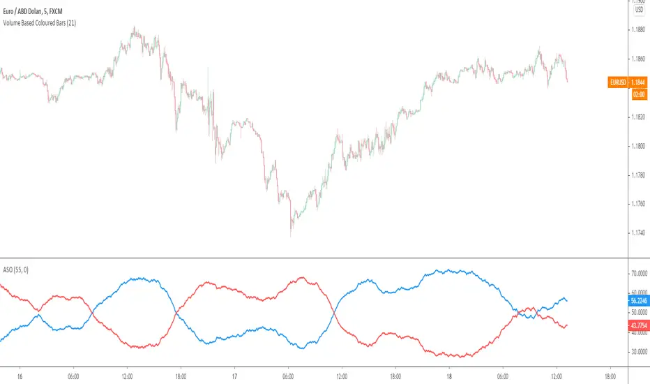
Average Sentiment OscillatorDescription of this indicator from its author:
Average Sentiment Oscillator
Momentum oscillator of averaged bull/bear percentages.
We suggest using it as a relatively accurate way to gauge the sentiment of a given period of candles, as a trend filter or for entry/exit signals.
It’s a combination of two algorithms, both essentially the same but applied in a different way. The first one analyzes the bullish/bearishness of each bar using OHLC prices then averages all percentages in the period group of bars (eg. 10) to give the final % value. The second one treats the period group of bars as one bar and then determines the sentiment percentage with the OHLC points of the group. The first one is noisy but more accurate in respect to intra-bar sentiment, whereas the second gives a smoother result and adds more weight to the range of price movement. They can be used separately as Mode 1 and Mode 2 in the indicator settings, or combined as Mode 0.
Original indicator idea from Benjamin Joshua Nash, converted from MT4 version
Usage:
The blue line is Bulls %, red line is Bears %. As they are both percentages of 100, they mirror each other. The higher line is the dominating sentiment. The lines crossing the 50% centreline mark the shift of power between bulls and bears, and this often provides a good entry or exit signal, i.e. if the blue line closes above 50% on the last bar, Buy or exit Sell, if the red line closes above 50% on the last bar, Sell or exit Buy. These entries are better when average volume is high.
It's also possible to see the relative strength of the swings/trend, i.e. a blue peak is higher than the preceding red one. A clear divergence can be seen in the picture as the second bullish peak registers as a lower strength on the oscillator but moved higher on the price chart. By setting up levels at the 70% and 30% mark the oscillator can also be used for trading overbought/oversold levels similar to a Stochastic or RSI. As is the rule with most indicators, a smaller period gives more leading signals and a larger period gives less false signals.
Bar Balance [LucF]Bar Balance extracts the number of up, down and neutral intrabars contained in each chart bar, revealing information on the strength of price movement. It can display stacked columns representing raw up/down/neutral intrabar counts, or an up/down balance line which can be calculated and visualized in many different ways.
WARNING: This is an analysis tool that works on historical bars only. It does not show any realtime information, and thus cannot be used to issue alerts or for automated trading. When realtime bars elapse, the indicator will require a browser refresh, a change to its Inputs or to the chart's timeframe/symbol to recalculate and display information on those elapsed bars. Once a trader understands this, the indicator can be used advantageously to make discretionary trading decisions.
Traders used to work with my Delta Volume Columns Pro will feel right at home in this indicator's Inputs . It has lots of options, allowing it to be used in many different ways. If you value the bar balance information this indicator mines, I hope you will find the time required to master the use of Bar Balance well worth the investment.
█ OVERVIEW
The indicator has two modes: Columns and Line .
Columns
• In Columns mode you can display stacked Up/Down/Neutral columns.
• The "Up" section represents the count of intrabars where `close > open`, "Down" where `close < open` and "Neutral" where `close = open`.
• The Up section always appears above the centerline, the Down section below. The Neutral section overlaps the centerline, split halfway above and below it.
The Up and Down sections start where the Neutral section ends, when there is one.
• The Up and Down sections can be colored independently using 7 different methods.
• The signal line plotted in Line mode can also be displayed in Columns mode.
Line
• Displays a single balance line using a zero centerline.
• A variable number of independent methods can be used to calculate the line (6), determine its color (5), and color the fill (5).
You can thus evaluate the state of 3 different components with this single line.
• A "Divergence Levels" feature will use the line to automatically draw expanding levels on divergence events.
Features available in both modes
• The color of all components can be selected from 15 base colors, with 16 gradient levels used for each base color in the indicator's gradients.
• A zero line can show a 6-state aggregate value of the three main volume balance modes.
• The background can be colored using any of 5 different methods.
• Chart bars can be colored using 5 different methods.
• Divergence and large neutral count ratio events can be shown in either Columns or Line mode, calculated in one of 4 different methods.
• Markers on 6 different conditions can be displayed.
█ CONCEPTS
Intrabar inspection
Intrabar inspection means the indicator looks at lower timeframe bars ( intrabars ) making up a given chart bar to gather its information. If your chart is on a 1-hour timeframe and the intrabar resolution determined by the indicator is 5 minutes, then 12 intrabars will be analyzed for each chart bar and the count of up/down/neutral intrabars among those will be tallied.
Bar Balances and calculation methods
The indicator uses a variety of methods to evaluate bar balance and to derive other calculations from them:
1. Balance on Bar : Uses the relative importance of instant Up and Down counts on the bar.
2. Balance Averages : Uses the difference between the EMAs of Up and Down counts.
3. Balance Momentum : Starts by calculating, separately for both Up and Down counts, the difference between the same EMAs used in Balance Averages and an SMA of double the period used for the EMAs. These differences are then aggregated and finally, a bounded momentum of that aggregate is calculated using RSI.
4. Markers Bias : It sums the bull/bear occurrences of the four previous markers over a user-defined period (the default is 14).
5. Combined Balances : This is the aggregate of the instant bull/bear bias of the three main bar balances.
6. Dual Up/Down Averages : This is a display mode showing the EMA calculated for each of the Up and Down counts.
Interpretation of neutral intrabars
What do neutral intrabars mean? When price does not change during a bar, it can be because there is simply no interest in the market, or because of a perfect balance between buyers and sellers. The latter being more improbable, Bar Balance assumes that neutral bars reveal a lack of interest, which entails uncertainty. That is the reason why the option is provided to interpret ratios of neutral intrabars greater than 50% as divergences. It is also the rationale behind the option to dampen signal lines on the inverse ratio of neutral intrabars, so that zero intrabars do not affect the signal, and progressively larger proportions of neutral intrabars will reduce the signal's amplitude, as the balance calcs using the up/down counts lose significance. The impact of the dampening will vary with markets. Weaker markets such as cryptos will often contain greater numbers of neutral intrabars, so dampening the Line in that sector will have a greater impact than in more liquid markets.
█ FEATURES
1 — Columns
• While the size of the Up/Down columns always represents their respective importance on the bar, their coloring mode is independent. The default setup uses a standard coloring mode where the Up/Down columns over/under the zero line are always in the bull/bear color with a higher intensity for the winning side. Six other coloring modes allow you to pack more information in the columns. When choosing to color the top columns using a bull/bear gradient on Balance Averages, for example, you will end up with bull/bear colored tops. In order for the color of the bottom columns to continue to show the instant bar balance, you can then choose the "Up/Down Ratio on Bar — Dual Solid Colors" coloring mode to make those bars the color of the winning side for that bar.
• Line mode shows only the line, but Columns mode allows displaying the line along with it. If the scale of the line is different than that of the scale of the columns, the line will often appear flat. Traders may find even a flat line useful as its bull/bear colors will be easily distinguishable.
2 — Line
• The default setup for Line mode uses a calculation on "Balance Momentum", with a fill on the longer-term "Balance Averages" and a line color based on the "Markers Bias". With the background set on "Line vs Divergence Levels" and the zero line on the hard-coded "Combined Bar Balances", you have access to five distinct sources of information at a glance, to which you can add divergences, divergences levels and chart bar coloring. This provides powerful potential in displaying bar balance information.
• When no columns are displayed, Line mode can show the full scale of whichever line you choose to calculate because the columns' scale no longer interferes with the line's scale.
• Note that when "Balance on Bar" is selected, the Neutral count is also displayed as a ratio of the balance line. This is the only instance where the Neutral count is displayed in Line mode.
• The "Dual Up/Down Averages" is an exception as it displays two lines: one average for the Up counts and another for the Down counts. This mode will be most useful when Columns are also displayed, as it provides a reference for the top and bottom columns.
3 — Zero Line
The zero line can be colored using two methods, both based on the Combined Balances, i.e., the aggregate of the instant bull/bear bias of the three main bar balances.
• In "Six-state Dual Color Gradient" mode, a dot appears on every bar. Its color reflects the bull/bear state of the Combined Balances, and the dot's brightness reflects the tally of balance biases.
• In "Dual Solid Colors (All Bull/All Bear Only)" a dot only appears when all three balances are either bullish or bearish. The resulting pattern is identical to that of Marker 1.
4 — Divergences
• Divergences are displayed as a small circle at the top of the scale. Four different types of divergence events can be detected. Divergences occur whenever the bull/bear bias of the method used diverges with the bar's price direction.
• An option allows you to include in divergence events instances where the count of neutral intrabars exceeds 50% of the total intrabar count.
• The divergence levels are dynamic levels that automatically build from the line's values on divergence events. On consecutive divergences, the levels will expand, creating a channel. This implementation of the divergence levels corresponds to my view that divergences indicate anomalies, hesitations, points of uncertainty if you will. It excludes any association of a pre-determined bullish/bearish bias to divergences. Accordingly, the levels merely take note of divergence events and mark those points in time with levels. Traders then have a reference point from which they can evaluate further movement. The bull/bear/neutral colors used to plot the levels are also congruent with this view in that they are determined by price's position relative to the levels, which is how I think divergences can be put to the most effective use.
5 — Background
• The background can show a bull/bear gradient on four different calculations. You can adjust its brightness to make its visual importance proportional to how you use it in your analysis.
6 — Chart bars
• Chart bars can be colored using five different methods.
• You have the option of emptying the body of bars where volume does not increase, as does my TLD indicator, the idea behind this being that movement on bars where volume does not increase is less relevant.
7 — Intrabar Resolution
You can choose between three modes. Two of them are automatic and one is manual:
a) Fast, Longer history, Auto-Steps (~12 intrabars) : Optimized for speed and deeper history. Uses an average minimum of 12 intrabars.
b) More Precise, Shorter History Auto-Steps (~24 intrabars) : Uses finer intrabar resolution. It is slower and provides less history. Uses an average minimum of 24 intrabars.
c) Fixed : Uses the fixed resolution of your choice.
Auto-Steps calculations vary for 24/7 and conventional markets in order to achieve the proper target of minimum intrabars.
You can choose to view the intrabar resolution currently used to calculate delta volume. It is the default.
The proper selection of the intrabar resolution is important. It must achieve maximal granularity to produce precise results while not unduly slowing down calculations, or worse, causing runtime errors.
8 — Markers
Six markers are available:
1. Combined Balances Agreement : All three Bar Balances are either bullish or bearish.
2. Up or Down % Agrees With Bar : An up marker will appear when the percentage of up intrabars in an up chart bar is greater than the specified percentage. Conditions mirror to down bars.
3. Divergence confirmations By Price : One of the four types of balance calculations can be used to detect divergences with price. Confirmations occur when the bar following the divergence confirms the balance bias. Note that the divergence events used here do not include neutral intrabar events.
4. Balance Transitions : Bull/bear transitions of the selected balance.
5. Markers Bias Transitions : Bull/bear transitions of the Markers Bias.
6. Divergence Confirmations By Line : Marks points where the line first breaches a divergence level.
Markers appear when the condition is detected, without delay. Since nothing is plotted in realtime, markers do not appear on the realtime bar.
9 — Settings
• Two modes can be selected to dampen the line on the ratio of neutral intrabars.
• A distinct weight can be attributed to the count of the latter half of intrabars, on the assumption that later intrabars may be more important in determining the outcome of chart bars.
• Allows control over the periods of the different moving averages used in calculations.
• The default periods used for the various calculations define the following hierarchy from slow to fast:
Balance Averages: 50,
Balance Momentum: 20,
Dual Up/Down Averages: 20,
Marker Bias: 10.
█ LIMITATIONS
• This script uses a special characteristic of the `security()` function allowing the inspection of intrabars—which is not officially supported by TradingView.
• The method used does not work on the realtime bar—only on historical bars.
• The indicator only works on some chart resolutions: 3, 5, 10, 15 and 30 minutes, 1, 2, 4, 6, and 12 hours, 1 day, 1 week and 1 month. The script’s code can be modified to run on other resolutions, but chart resolutions must be divisible by the lower resolution used for intrabars and the stepping mechanism could require adaptation.
• When using the "Line vs Divergence Levels — Dual Color Gradient" color mode to fill the line, background or chart bars, keep in mind that a line calculation mode must be defined for it to work, as it determines gradients on the movement of the line relative to divergence levels. If the line is hidden, it will not work.
• When the difference between the chart’s resolution and the intrabar resolution is too great, runtime errors will occur. The Auto-Steps selection mechanisms should avoid this.
• Alerts do not work reliably when `security()` is used at intrabar resolutions. Accordingly, no alerts are configured in the indicator.
• The color model used in the indicator provides for fancy visuals that come at a price; when you change values in Inputs , it can take 20 seconds for the changes to materialize. Luckily, once your color setup is complete, the color model does not have a large performance impact, as in normal operation the `security()` calls will become the most important factor in determining response time. Also, once in a while a runtime error will occur when you change inputs. Just making another change will usually bring the indicator back up.
█ RAMBLINGS
Is this thing useful?
I'll let you decide. Bar Balance acts somewhat like an X-Ray on bars. The intrabars it analyzes are no secret; one can simply change the chart's resolution to see the same intrabars the indicator uses. What the indicator brings to traders is the precise count of up/down/neutral intrabars and, more importantly, the calculations it derives from them to present the information in a way that can make it easier to use in trading decisions.
How reliable is Bar Balance information?
By the same token that an up bar does not guarantee that more up bars will follow, future price movements cannot be inferred from the mere count of up/down/neutral intrabars. Price movement during any chart bar for which, let's say, 12 intrabars are analyzed, could be due to only one of those intrabars. One can thus easily see how only relying on bar balance information could be very misleading. The rationale behind Bar Balance is that when the information mined for multiple chart bars is aggregated, it can provide insight into the history behind chart bars, and thus some bias as to the strength of movements. An up chart bar where 11/12 intrabars are also up is assumed to be stronger than the same up bar where only 2/12 intrabars are up. This logic is not bulletproof, and sometimes Bar Balance will stray. Also, keep in mind that balance lines do not represent price momentum as RSI would. Bar Balance calculations have no idea where price is. Their perspective, like that of any historian, is very limited, constrained that it is to the narrow universe of up/down/neutral intrabar counts. You will thus see instances where price is moving up while Balance Momentum, for example, is moving down. When Bar Balance performs as intended, this indicates that the rally is weakening, which does necessarily imply that price will reverse. Occasionally, price will merrily continue to advance on weakening strength.
Divergences
Most of the divergence detection methods used here rely on a difference between the bias of a calculation involving a multi-bar average and a given bar's price direction. When using "Bar Balance on Bar" however, only the bar's balance and price movement are used. This is the default mode.
As usual, divergences are points of interest because they reveal imbalances, which may or may not become turning points. I do not share the overwhelming enthusiasm traders have for the purported ability of bullish/bearish divergences to indicate imminent reversals.
Superfluity
In "The Bed of Procrustes", Nassim Nicholas Taleb writes: To bankrupt a fool, give him information . Bar Balance can display lots of information. While learning to use a new indicator inevitably requires an adaptation period where we put it through its paces and try out all its options, once you have become used to Bar Balance and decide to adopt it, rigorously eliminate the components you don't use and configure the remaining ones so their visual prominence reflects their relative importance in your analysis. I tried to provide flexible options for traders to control this indicator's visuals for that exact reason—not for window dressing.
█ NOTES
For traders
• To avoid misleading traders who don't read script descriptions, the indicator shows nothing in the realtime bar.
• The Data Window shows key values for the indicator.
• All gradients used in this indicator determine their brightness intensities using advances/declines in the signal—not their relative position in a fixed scale.
• Note that because of the way gradients are optimized internally, changing their brightness will sometimes require bringing down the value a few steps before you see an impact.
• Because this indicator does not use volume, it will work on all markets.
For coders
• For those interested in gradients, this script uses an advanced version of the Advance/Decline gradient function from the PineCoders Color Gradient (16 colors) Framework . It allows more precise control over the range, steps and min/max values of the gradients.
• I use the PineCoders Coding Conventions for Pine to write my scripts.
• I used functions modified from the PineCoders MTF Selection Framework for the selection of timeframes.
█ THANKS TO:
— alexgrover who helped me think through the dampening method used to attenuate signal lines on high ratios of neutral intrabars.
— A guy called Kuan who commented on a Backtest Rookies presentation of their Volume Profile indicator . The technique I use to inspect intrabars is derived from Kuan's code.
— theheirophant , my partner in the exploration of the sometimes weird abysses of `security()`’s behavior at intrabar resolutions.
— midtownsk8rguy , my brilliant companion in mining the depths of Pine graphics. He is also the co-author of the PineCoders Color Gradient Frameworks .

Delta Volume Columns Pro [LucF]█ OVERVIEW
This indicator displays volume delta information calculated with intrabar inspection on historical bars, and feed updates when running in realtime. It is designed to run in a pane and can display either stacked buy/sell volume columns or a signal line which can be calculated and displayed in many different ways.
Five different models are offered to reveal different characteristics of the calculated volume delta information. Many options are offered to visualize the calculations, giving you much leeway in morphing the indicator's visuals to suit your needs. If you value delta volume information, I hope you will find the time required to master Delta Volume Columns Pro well worth the investment. I am confident that if you combine a proper understanding of the indicator's information with an intimate knowledge of the volume idiosyncrasies on the markets you trade, you can extract useful market intelligence using this tool.
█ WARNINGS
1. The indicator only works on markets where volume information is available,
Please validate that your symbol's feed carries volume information before asking me why the indicator doesn't plot values.
2. When you refresh your chart or re-execute the script on the chart, the indicator will repaint because elapsed realtime bars will then recalculate as historical bars.
3. Because the indicator uses different modes of calculation on historical and realtime bars, it's critical that you understand the differences between them. Details are provided further down.
4. Calculations using intrabar inspection on historical bars can only be done from some chart timeframes. See further down for a list of supported timeframes.
If the chart's timeframe is not supported, no historical volume delta will display.
█ CONCEPTS
Chart bars
Three different types of bars are used in charts:
1. Historical bars are bars that have already closed when the script executes on them.
2. The realtime bar is the current, incomplete bar where a script is running on an open market. There is only one active realtime bar on your chart at any given time.
The realtime bar is where alerts trigger.
3. Elapsed realtime bars are bars that were calculated when they were realtime bars but have since closed.
When a script re-executes on a chart because the browser tab is refreshed or some of its inputs are changed, elapsed realtime bars are recalculated as historical bars.
Why does this indicator use two modes of calculation?
Historical bars on TradingView charts contain OHLCV data only, which is insufficient to calculate volume delta on them with any level of precision. To mine more detailed information from those bars we look at intrabars , i.e., bars from a smaller timeframe (we call it the intrabar timeframe ) that are contained in one chart bar. If your chart Is running at 1D on a 24x7 market for example, most 1D chart bars will contain 24 underlying 1H bars in their dilation. On historical bars, this indicator looks at those intrabars to amass volume delta information. If the intrabar is up, its volume goes in the Buy bin, and inversely for the Sell bin. When price does not move on an intrabar, the polarity of the last known movement is used to determine in which bin its volume goes.
In realtime, we have access to price and volume change for each update of the chart. Because a 1D chart bar can be updated tens of thousands of times during the day, volume delta calculations on those updates is much more precise. This precision, however, comes at a price:
— The script must be running on the chart for it to keep calculating in realtime.
— If you refresh your chart you will lose all accumulated realtime calculations on elapsed realtime bars, and the realtime bar.
Elapsed realtime bars will recalculate as historical bars, i.e., using intrabar inspection, and the realtime bar's calculations will reset.
When the script recalculates elapsed realtime bars as historical bars, the values on those bars will change, which means the script repaints in those conditions.
— When the indicator first calculates on a chart containing an incomplete realtime bar, it will count ALL the existing volume on the bar as Buy or Sell volume,
depending on the polarity of the bar at that point. This will skew calculations for that first bar. Scripts have no access to the history of a realtime bar's previous updates,
and intrabar inspection cannot be used on realtime bars, so this is the only to go about this.
— Even if alerts only trigger upon confirmation of their conditions after the realtime bar closes, they are repainting alerts
because they would perhaps not have calculated the same way using intrabar inspection.
— On markets like stocks that often have different EOD and intraday feeds and volume information,
the volume's scale may not be the same for the realtime bar if your chart is at 1D, for example,
and the indicator is using an intraday timeframe to calculate on historical bars.
— Any chart timeframe can be used in realtime mode, but plots that include moving averages in their calculations may require many elapsed realtime bars before they can calculate.
You might prefer drastically reducing the periods of the moving averages, or using the volume columns mode, which displays instant values, instead of the line.
Volume Delta Balances
This indicator uses a variety of methods to evaluate five volume delta balances and derive other values from those balances. The five balances are:
1 — On Bar Balance : This is the only balance using instant values; it is simply the subtraction of the Sell volume from the Buy volume on the bar.
2 — Average Balance : Calculates a distinct EMA for both the Buy and Sell volumes, and subtracts the Sell EMA from the Buy EMA.
3 — Momentum Balance : Starts by calculating, separately for both Buy and Sell volumes, the difference between the same EMAs used in "Average Balance" and
an SMA of double the period used for the "Average Balance" EMAs. The difference for the Sell side is subtracted from the difference for the Buy side,
and an RSI of that value is calculated and brought over the −50/+50 scale.
4 — Relative Balance : The reference values used in the calculation are the Buy and Sell EMAs used in the "Average Balance".
From those, we calculate two intermediate values using how much the instant Buy and Sell volumes on the bar exceed their respective EMA — but with a twist.
If the bar's Buy volume does not exceed the EMA of Buy volume, a zero value is used. The same goes for the Sell volume with the EMA of Sell volume.
Once we have our two intermediate values for the Buy and Sell volumes exceeding their respective MA, we subtract them. The final "Relative Balance" value is an ALMA of that subtraction.
The rationale behind using zero values when the bar's Buy/Sell volume does not exceed its EMA is to only take into account the more significant volume.
If both instant volume values exceed their MA, then the difference between the two is the signal's value.
The signal is called "relative" because the intermediate values are the difference between the instant Buy/Sell volumes and their respective MA.
This balance flatlines when the bar's Buy/Sell volumes do not exceed their EMAs, which makes it useful to spot areas where trader interest dwindles, such as consolidations.
The smaller the period of the final value's ALMA, the more easily you will see the balance flatline. These flat zones should be considered no-trade zones.
5 — Percent Balance : This balance is the ALMA of the ratio of the "On Bar Balance" value, i.e., the volume delta balance on the bar (which can be positive or negative),
over the total volume for that bar.
From the balances and marker conditions, two more values are calculated:
1 — Marker Bias : It sums the up/down (+1/‒1) occurrences of the markers 1 to 4 over a period you define, so it ranges from −4 to +4, times the period.
Its calculation will depend on the modes used to calculate markers 3 and 4.
2 — Combined Balances : This is the sum of the bull/bear (+1/−1) states of each of the five balances, so it ranges from −5 to +5.
█ FEATURES
The indicator has two main modes of operation: Columns and Line .
Columns
• In Columns mode you can display stacked Buy/Sell volume columns.
• The buy section always appears above the centerline, the sell section below.
• The top and bottom sections can be colored independently using eight different methods.
• The EMAs of the Buy/Sell values can be displayed (these are the same EMAs used to calculate the "Average Balance").
Line
• Displays one of seven signals: the five balances or one of two complementary values, i.e., the "Marker Bias" or the "Combined Balances".
• You can color the line and its fill using independent calculation modes to pack more information in the display.
You can thus appraise the state of 3 different values using the line itself, its color and the color of its fill.
• A "Divergence Levels" feature will use the line to automatically draw expanding levels on divergence events.
Default settings
Using the indicator's default settings, this is the information displayed:
• The line is calculated on the "Average Balance".
• The line's color is determined by the bull/bear state of the "Percent Balance".
• The line's fill gradient is determined by the advances/declines of the "Momentum Balance".
• The orange divergence dots are calculated using discrepancies between the polarity of the "On Bar Balance" and the chart's bar.
• The divergence levels are determined using the line's level when a divergence occurs.
• The background's fill gradient is calculated on advances/declines of the "Marker Bias".
• The chart bars are colored using advances/declines of the "Relative Balance". Divergences are shown in orange.
• The intrabar timeframe is automatically determined from the chart's timeframe so that a minimum of 50 intrabars are used to calculate volume delta on historical bars.
Alerts
The configuration of the marker conditions explained further is what determines the conditions that will trigger alerts created from this script. Note that simply selecting the display of markers does not create alerts. To create an alert on this script, you must use ALT-A from the chart. You can create multiple alerts triggering on different conditions from this same script; simply configure the markers so they define the trigger conditions for each alert before creating the alert. The configuration of the script's inputs is saved with the alert, so from then on you can change them without affecting the alert. Alert messages will mention the marker(s) that triggered the specific alert event. Keep in mind, when creating alerts on small chart timeframes, that discrepancies between alert triggers and markers displayed on your chart are to be expected. This is because the alert and your chart are running two distinct instances of the indicator on different servers and different feeds. Also keep in mind that while alerts only trigger on confirmed conditions, they are calculated using realtime calculation mode, which entails that if you refresh your chart and elapsed realtime bars recalculate as historical bars using intrabar inspection, markers will not appear in the same places they appeared in realtime. So it's important to understand that even though the alert conditions are confirmed when they trigger, these alerts will repaint.
Let's go through the sections of the script's inputs.
Columns
The size of the Buy/Sell columns always represents their respective importance on the bar, but the coloring mode for tops and bottoms is independent. The default setup uses a standard coloring mode where the Buy/Sell columns are always in the bull/bear color with a higher intensity for the winning side. Seven other coloring modes allow you to pack more information in the columns. When choosing to color the top columns using a bull/bear gradient on "Average Balance", for example, you will have bull/bear colored tops. In order for the color of the bottom columns to continue to show the instant bar balance, you can then choose the "On Bar Balance — Dual Solid Colors" coloring mode to make those bars the color of the winning side for that bar. You can display the averages of the Buy and Sell columns. If you do, its coloring is controlled through the "Line" and "Line fill" sections below.
Line and Line fill
You can select the calculation mode and the thickness of the line, and independent calculations to determine the line's color and fill.
Zero Line
The zero line can display dots when all five balances are bull/bear.
Divergences
You first select the detection mode. Divergences occur whenever the up/down direction of the signal does not match the up/down polarity of the bar. Divergences are used in three components of the indicator's visuals: the orange dot, colored chart bars, and to calculate the divergence levels on the line. The divergence levels are dynamic levels that automatically build from the line's values on divergence events. On consecutive divergences, the levels will expand, creating a channel. This implementation of the divergence levels corresponds to my view that divergences indicate anomalies, hesitations, points of uncertainty if you will. It precludes any attempt to identify a directional bias to divergences. Accordingly, the levels merely take note of divergence events and mark those points in time with levels. Traders then have a reference point from which they can evaluate further movement. The bull/bear/neutral colors used to plot the levels are also congruent with this view in that they are determined by the line's position relative to the levels, which is how I think divergences can be put to the most effective use. One of the coloring modes for the line's fill uses advances/declines in the line after divergence events.
Background
The background can show a bull/bear gradient on six different calculations. As with other gradients, you can adjust its brightness to make its importance proportional to how you use it in your analysis.
Chart bars
Chart bars can be colored using seven different methods. You have the option of emptying the body of bars where volume does not increase, as does my TLD indicator, and you can choose whether you want to show divergences.
Intrabar Timeframe
This is the intrabar timeframe that will be used to calculate volume delta using intrabar inspection on historical bars. You can choose between four modes. The three "Auto-steps" modes calculate, from the chart's timeframe, the intrabar timeframe where the said number of intrabars will make up the dilation of chart bars. Adjustments are made for non-24x7 markets. "Fixed" mode allows you to select the intrabar timeframe you want. Checking the "Show TF" box will display in the lower-right corner the intrabar timeframe used at any given moment. The proper selection of the intrabar timeframe is important. It must achieve maximal granularity to produce precise results while not unduly slowing down calculations, or worse, causing runtime errors. Note that historical depth will vary with the intrabar timeframe. The smaller the timeframe, the shallower historical plots you will be.
Markers
Markers appear when the required condition has been confirmed on a closed bar. The configuration of the markers when you create an alert is what determines when the alert will trigger. Five markers are available:
• Balances Agreement : All five balances are either bullish or bearish.
• Double Bumps : A double bump is two consecutive up/down bars with +/‒ volume delta, and rising Buy/Sell volume above its average.
• Divergence confirmations : A divergence is confirmed up/down when the chosen balance is up/down on the previous bar when that bar was down/up, and this bar is up/down.
• Balance Shifts : These are bull/bear transitions of the selected signal.
• Marker Bias Shifts : Marker bias shifts occur when it crosses into bull/bear territory.
Periods
Allows control over the periods of the different moving averages used to calculate the balances.
Volume Discrepancies
Stock exchanges do not report the same volume for intraday and daily (or higher) resolutions. Other variations in how volume information is reported can also occur in other markets, namely Forex, where volume irregularities can even occur between different intraday timeframes. This will cause discrepancies between the total volume on the bar at the chart's timeframe, and the total volume calculated by adding the volume of the intrabars in that bar's dilation. This does not necessarily invalidate the volume delta information calculated from intrabars, but it tells us that we are using partial volume data. A mechanism to detect chart vs intrabar timeframe volume discrepancies is provided. It allows you to define a threshold percentage above which the background will indicate a difference has been detected.
Other Settings
You can control here the display of the gray dot reminder on realtime bars, and the display of error messages if you are using a chart timeframe that is not greater than the fixed intrabar timeframe, when you use that mode. Disabling the message can be useful if you only use realtime mode at chart timeframes that do not support intrabar inspection.
█ RAMBLINGS
On Volume Delta
Volume is arguably the best complement to interpret price action, and I consider volume delta to be the most effective way of processing volume information. In periods of low-volatility price consolidations, volume will typically also be lower than normal, but slight imbalances in the trend of the buy/sell volume balance can sometimes help put early odds on the direction of the break from consolidation. Additionally, the progression of the volume imbalance can help determine the proximity of the breakout. I also find volume delta and the number of divergences very useful to evaluate the strength of trends. In trends, I am looking for "slow and steady", i.e., relatively low volatility and pauses where price action doesn't look like world affairs are being reassessed. In my personal mythology, this type of trend is often more resilient than high-volatility breakouts, especially when volume balance confirms the general agreement of traders signaled by the low-volatility usually accompanying this type of trend. The volume action on pauses will often help me decide between aggressively taking profits, tightening a stop or going for a longer-term movement. As for reversals, they generally occur in high-volatility areas where entering trades is more expensive and riskier. While the identification of counter-trend reversals fascinates many traders to no end, they represent poor opportunities in my view. Volume imbalances often precede reversals, but I prefer to use volume delta information to identify the areas following reversals where I can confirm them and make relatively low-cost entries with better odds.
On "Buy/Sell" Volume
Buying or selling volume are misnomers, as every unit of volume transacted is both bought and sold by two different traders. While this does not keep me from using the terms, there is no such thing as “buy only” or “sell only” volume. Trader lingo is riddled with peculiarities.
Divergences
The divergence detection method used here relies on a difference between the direction of a signal and the polarity (up/down) of a chart bar. When using the default "On Bar Balance" to detect divergences, however, only the bar's volume delta is used. You may wonder how there can be divergences between buying/selling volume information and price movement on one bar. This will sometimes be due to the calculation's shortcomings, but divergences may also occur in instances where because of order book structure, it takes less volume to increase the price of an asset than it takes to decrease it. As usual, divergences are points of interest because they reveal imbalances, which may or may not become turning points. To your pattern-hungry brain, the divergences displayed by this indicator will — as they do on other indicators — appear to often indicate turnarounds. My opinion is that reality is generally quite sobering and I have no reliable information that would tend to prove otherwise. Exercise caution when using them. Consequently, I do not share the overwhelming enthusiasm of traders in identifying bullish/bearish divergences. For me, the best course of action when a divergence occurs is to wait and see what happens from there. That is the rationale underlying how my divergence levels work; they take note of a signal's level when a divergence occurs, and it's the signal's behavior from that point on that determines if the post-divergence action is bullish/bearish.
Superfluity
In "The Bed of Procrustes", Nassim Nicholas Taleb writes: To bankrupt a fool, give him information . This indicator can display lots of information. While learning to use a new indicator inevitably requires an adaptation period where we put it through its paces and try out all its options, once you have become used to it and decide to adopt it, rigorously eliminate the components you don't use and configure the remaining ones so their visual prominence reflects their relative importance in your analysis. I tried to provide flexible options for traders to control this indicator's visuals for that exact reason — not for window dressing.
█ LIMITATIONS
• This script uses a special characteristic of the `security()` function allowing the inspection of intrabars — which is not officially supported by TradingView.
It has the advantage of permitting a more robust calculation of volume delta than other methods on historical bars, but also has its limits.
• Intrabar inspection only works on some chart timeframes: 3, 5, 10, 15 and 30 minutes, 1, 2, 3, 4, 6, and 12 hours, 1 day, 1 week and 1 month.
The script’s code can be modified to run on other resolutions.
• When the difference between the chart’s timeframe and the intrabar timeframe is too great, runtime errors will occur. The Auto-Steps selection mechanisms should avoid this.
• All volume is not created equally. Its source, components, quality and reliability will vary considerably with sectors and instruments.
The higher the quality, the more reliably volume delta information can be used to guide your decisions.
You should make it your responsibility to understand the volume information provided in the data feeds you use. It will help you make the most of volume delta.
█ NOTES
For traders
• The Data Window shows key values for the indicator.
• While this indicator displays some of the same information calculated in my Delta Volume Columns ,
I have elected to make it a separate publication so that traders continue to have a simpler alternative available to them. Both code bases will continue to evolve separately.
• All gradients used in this indicator determine their brightness intensities using advances/declines in the signal—not their relative position in a pre-determined scale.
• Volume delta being relative, by nature, it is particularly well-suited to Forex markets, as it filters out quite elegantly the cyclical volume data characterizing the sector.
If you are interested in volume delta, consider having a look at my other "Delta Volume" indicators:
• Delta Volume Realtime Action displays realtime volume delta and tick information on the chart.
• Delta Volume Candles builds volume delta candles on the chart.
• Delta Volume Columns is a simpler version of this indicator.
For coders
• I use the `f_c_gradientRelativePro()` from the PineCoders Color Gradient Framework to build my gradients.
This function has the advantage of allowing begin/end colors for both the bull and bear colors. It also allows us to define the number of steps allowed for each gradient.
I use this to modulate the gradients so they perform optimally on the combination of the signal used to calculate advances/declines,
but also the nature of the visual component the gradient applies to. I use fewer steps for choppy signals and when the gradient is used on discrete visual components
such as volume columns or chart bars.
• I use the PineCoders Coding Conventions for Pine to write my scripts.
• I used functions modified from the PineCoders MTF Selection Framework for the selection of timeframes.
█ THANKS TO:
— The devs from TradingView's Pine and other teams, and the PineCoders who collaborate with them. They are doing amazing work,
and much of what this indicator does could not be done without their recent improvements to Pine.
— A guy called Kuan who commented on a Backtest Rookies presentation of their Volume Profile indicator using a `for` loop.
This indicator started from the intrabar inspection technique illustrated in Kuan's snippet.
— theheirophant , my partner in the exploration of the sometimes weird abysses of `security()`’s behavior at intrabar timeframes.
— midtownsk8rguy , my brilliant companion in mining the depths of Pine graphics.

[BoTo] ATH/2 OverlayThan this indicator is useful?
Can help you to understand this indicator who main in the market now. Bulls or bears.
How it works
All-Time-High ('ATH') - the highest point in price that a cryptocurrency has been in history.
Step 1: The 'ATH' line is drawn
Step 2: 'ATH/2' line is drawn.
Step 3: If the price became more than 'ATH' it means the market bulls have taken, and the price it will be more probable to increase. And vice versa. If the price became less than 'ATH/2' it means that the market was taken by bears, and the price it will be more probable to fall.
Step 4: If it is the bull market, then the green background is drawn. And vice versa. If it is the bear market, then the red background is drawn. If the market has changed, then the background will be gray color. Only one candle.
How to use it
It is possible to use any timeframes, and any symbol.
It is possible to use chart type only the japanese candles, the line or bars. Don't use Kagi, Renko or Haiken Ashi!
The background can be not shown. You can make 1 or 2 lines. If you have chosen only 1 line, then in the bull market you will see only 'ATH/2' line. And vice versa. In the bear market you will see only the 'ATH' line.
You need just to turn on this indicator once to understand what to wait in this market, big falling or big rockets for. And to switch off it that he didn't prevent to analyze.
It is the good help for long-term investments (the position can be longer than 1 year)
For an example
'Ethereum'
'Ripple'
We tried for you. We want to receive your like for good work.

Bill Williams Divergent BarsBill William Bull/Bear divergent bars
See: Book, Trading Chaos by Bill Williams
Coded by polyclick
A bullish (green) divergent bar, signals a trend switch from bear -> bull
-> The current bar has a lower low than the previous bar, but closes in the upper half of the candle.
-> This means the bulls are pushing from below and are trying to take over, potentially resulting in a trend switch to bullish.
-> We also check if this bar is below the three alligator lines to avoid false positives.
A bearish (red) divergent bar, signals a trend switch from bull -> bear
-> The current bar has a higher high than the previous bar, but closes in the lower half of the candle.
-> This means the bears are pushing the price down and are taking over, potentially resulting in a trend switch to bearish.
-> We also check if this bar is above the three alligator lines to avoid false positives.
Best used in combination with the Bill Williams Alligator indicator.

Momentum - MOM🎯 Overview
This is an advanced Momentum - MOM indicator that measures absolute price change over time, combined with dynamic moving average filtering. Unlike basic MOM implementations, this version features gradient momentum zones, multiple color themes, and a clear signal dashboard for precise price momentum identification.
🧩 Core Components
1. ⚙️ Technical Foundation
📊 Primary Calculation: Uses TradingView's built-in ta.mom() function which calculates absolute price difference between current price and price N periods ago
📈 Dual Analysis Components:
MOM Line: Absolute price change oscillator (unbounded range based on price)
MA Filter: Customizable moving average acting as momentum baseline
Momentum Zones: Gradient fills for strong positive and negative momentum extremes
⚡ Absolute Change Measurement: Unique ability to quantify the actual price movement in points/currency units
2. 🎛️ Configuration Parameters
📏 MOM Length: Default 14 periods (standard momentum setting)
🔄 MA Filter Settings:
Length: Customizable (default 365 periods)
Type: 6 options available (EMA, SMA, RMA, WMA, VWMA, HMA)
🎨 Color Themes: 5 visual schemes consistent with your indicator suite:
Classic, Modern, Robust, Accented, Monochrome
📊 Signal Interpretation:
🟢 BULLISH: MOM > MA Filter (price momentum above baseline)
🔴 BEARISH: MOM < MA Filter (price momentum below baseline)
🚀 STRONG BULLISH: (extreme positive momentum)
📉 STRONG BEARISH: (extreme negative momentum)
3. 🎨 Visual Elements
🚨 Gradient Zones:
Strong Bullish zone : Green gradient intensifying toward higher values
Strong Bearish zone : Red gradient intensifying toward lower values
📋 Dashboard Display: Top-right status indicator showing "⬆️ Bullish" or "⬇️ Bearish"
📊 Dynamic Coloring: MOM line changes color based on position relative to MA
⚡ Midline Reference: Subtle 50-level reference line for scale orientation
⚡ Trading Applications
📈 Primary Uses:
🎯 Absolute Momentum Measurement:
MOM > MA = Bullish price momentum
MOM < MA = Bearish price momentum
MOM = 0 = No net price change over period
💪 Momentum Strength in Price Terms:
Shows actual points/currency gained or lost
Useful for position sizing and risk management
More intuitive than percentages for some traders
🚨 Extreme Momentum Signals:
Extreme Bullish: (major price appreciation)
Extreme Bearish: (major price depreciation)
📊 Zone Analysis:
🟢 Strong Bullish Zone :
Green gradient fills
Indicates substantial price gains over the period
Often signals strong trend continuation or potential exhaustion
🔴 Strong Bearish Zone :
Red gradient fills
Indicates substantial price losses over the period
Often signals strong downtrend or potential reversal
🟡 Equilibrium: Yellow MA line acts as momentum baseline filter
🎨 Customization Options
👁️ Display Features:
📊 Dual Components: Always shows both MOM line and MA filter
🎨 Gradient Visualization: Automatic fill for extreme momentum conditions
📋 Status Dashboard: Clear bullish/bearish momentum indication
📈 Customizable MA: Choose from 6 different moving average types
📏 Wide Dynamic Range: ±15,000 levels accommodate various asset price ranges
🎨 Visual Themes: (Consistent suite)
🎨 Classic: Green/Red (traditional momentum colors)
🚀 Modern: Cyan/Purple (contemporary)
💪 Robust: Amber/Deep Purple (high contrast)
🌈 Accented: Purple/Magenta (vibrant)
⚫⚪ Monochrome: Light Gray/Dark Gray (minimalist)
🔔 Alert System
🟢 LONG Alert: Triggers when MOM crosses above MA
🔴 SHORT Alert: Triggers when MOM crosses below MA
📧 Format: Includes ticker symbol for tracking
⚡ Key Advantages
✅ Strengths:
🎯 Price-Based Analysis: Measures actual price movement in understandable units
💪 Absolute Value Interpretation: Shows exact points gained/lost over period
👁️ Clear Trend Momentum: MA filter separates noise from meaningful momentum
🔄 Flexible Across Assets: Works equally well with stocks, crypto, forex, etc.
📊 Professional Dashboard: Immediate momentum status recognition
📊 Optimal Settings:
⚡ Short-term Trading: MOM Length 10-14, MA Length 20-50
📊 Medium-term Trading: MOM Length 14-20, MA Length 50-100
📈 Long-term Trading: MOM Length 20-30, MA Length 100-365
🏆 Unique Features:
🎯 Absolute Price Measurement: Shows exact price change, not percentages
📊 Extreme Thresholds: ±15,000 levels for major momentum identification
🎨 Consistent Design: Matches your indicator family aesthetics
📋 Momentum Dashboard: Quick visual confirmation of price momentum
🔧 Direct Price Analysis: No conversion needed - shows actual market movement
🔄 Trading Strategies
1. Price Momentum Strategy:
Go LONG when MOM crosses above MA with positive values
Go SHORT when MOM crosses below MA with negative values
Strong signals when MA crossover aligns with extreme zones
2. Momentum Divergence:
Price makes higher high, MOM makes lower high → Bearish divergence (momentum weakening)
Price makes lower low, MOM makes higher low → Bullish divergence (selling pressure decreasing)
3. Trend Strength Assessment:
Large positive MOM values = Strong uptrend momentum
Large negative MOM values = Strong downtrend momentum
MOM near zero = Consolidation or trend change
📈 Performance Tips
Asset-Specific Thresholds: Adjust ±15,000 levels based on typical price ranges
Zero Line Significance: MOM crossing zero often precedes trend changes
Extreme Readings: Very high/low MOM values may indicate exhaustion moves
Multiple Timeframes: Compare MOM values across timeframes for confirmation
Combine with Volume: Add volume analysis to confirm momentum moves
This enhanced Momentum indicator provides professional-grade price-based momentum analysis with intuitive visualization, allowing traders to measure exact price movements, identify momentum trends in absolute terms, and filter signals through the customizable moving average for precise momentum-based trading decisions! 📊📈

Rate of Change - ROC🎯 Overview
This is an advanced Rate of Change - ROC indicator that measures percentage price movement over time, combined with dynamic moving average filtering. Unlike basic ROC implementations, this version features gradient momentum zones, multiple color themes, and a clear signal dashboard for precise momentum velocity identification.
🧩 Core Components
1. ⚙️ Technical Foundation
📊 Primary Calculation: Uses TradingView's built-in ta.roc() function which calculates percentage change between current price and price N periods ago
📈 Dual Analysis Components:
ROC Line: Percentage change oscillator
MA Filter: Customizable moving average acting as momentum trend line
Momentum Zones: Gradient fills for strong positive and strong negative momentum
⚡ Velocity Measurement: Unique ability to quantify the speed of price movement as a percentage
2. 🎛️ Configuration Parameters
📏 ROC Length: Default 35 periods (optimized for momentum detection)
🔄 MA Filter Settings:
Length: Customizable (default 365 periods)
Type: 6 options available (EMA, SMA, RMA, WMA, VWMA, HMA)
🎨 Color Themes: 5 visual schemes consistent with your indicator suite:
Classic, Modern, Robust, Accented, Monochrome
📊 Signal Interpretation:
🟢 BULLISH: ROC > MA Filter (momentum accelerating upward)
🔴 BEARISH: ROC < MA Filter (momentum accelerating downward)
🚀 STRONG BULLISH: ROC > 40% (extreme positive momentum)
📉 STRONG BEARISH: ROC < -20% (extreme negative momentum)
3. 🎨 Visual Elements
🚨 Gradient Zones:
Strong Bullish zone : Green gradient intensifying toward higher percentages
Strong Bearish zone : Red gradient intensifying toward lower percentages
📋 Dashboard Display: Top-right status indicator showing "⬆️ Bullish" or "⬇️ Bearish"
📊 Dynamic Coloring: ROC line changes color based on position relative to MA
⚡ Zero Line Reference: Natural equilibrium at 0% change
⚡ Trading Applications
📈 Primary Uses:
🎯 Momentum Velocity Measurement:
ROC > MA = Accelerating bullish momentum
ROC < MA = Accelerating bearish momentum
💪 Momentum Strength Quantification:
Higher positive percentages = Stronger uptrend acceleration
Lower negative percentages = Stronger downtrend acceleration
Measures rate of change rather than just direction
🚨 Extreme Momentum Signals:
Strong Bullish: (rapid price appreciation)
Strong Bearish: (rapid price depreciation)
📊 Zone Analysis:
🟢 Strong Bullish Zone :
Green gradient fills
Indicates rapid price acceleration upward
Often precedes consolidation or pullback
🔴 Strong Bearish Zone :
Red gradient fills
Indicates rapid price acceleration downward
Often precedes bounce or reversal
🟡 Equilibrium: Yellow MA line acts as momentum trend filter
🎨 Customization Options
👁️ Display Features:
📊 Dual Components: Always shows both ROC line and MA filter
🎨 Gradient Visualization: Automatic fill for extreme momentum conditions
📋 Status Dashboard: Clear bullish/bearish momentum acceleration indication
📈 Customizable MA: Choose from 6 different moving average types
📏 Adjustable Thresholds: 40% and -20% levels optimized for ROC analysis
🎨 Visual Themes: (Consistent suite)
🎨 Classic: Green/Red (traditional momentum colors)
🚀 Modern: Cyan/Purple (contemporary)
💪 Robust: Amber/Deep Purple (high contrast)
🌈 Accented: Purple/Magenta (vibrant)
⚫⚪ Monochrome: Light Gray/Dark Gray (minimalist)
🔔 Alert System
🟢 LONG Alert: Triggers when ROC crosses above MA
🔴 SHORT Alert: Triggers when ROC crosses below MA
📧 Format: Includes ticker symbol for tracking
⚡ Key Advantages
✅ Strengths:
🎯 Velocity-Based Analysis: Measures speed of price movement, not just direction
💪 Percentage-Based: Provides intuitive understanding of momentum strength
👁️ Trend Acceleration Identification: MA filter shows when momentum is accelerating/decelerating
🔄 Flexible Timeframes: 35-period default optimized for momentum detection
📊 Professional Dashboard: Immediate momentum acceleration status
📊 Optimal Settings:
⚡ Short-term Momentum: ROC Length 10-20, MA Length 20-50
📊 Medium-term Momentum: ROC Length 20-35, MA Length 50-100
📈 Long-term Momentum: ROC Length 35-50, MA Length 100-365
🏆 Unique Features:
🎯 Percentage-Based Measurement: Shows exact rate of price change
📊 Asymmetric Thresholds: 40% bullish / -20% bearish (reflects typical market asymmetry)
🎨 Consistent Design: Matches your indicator family aesthetics
📋 Momentum Dashboard: Quick visual confirmation of acceleration/deceleration
🔧 Speed Analysis: Focuses on velocity rather than just position
🔄 Trading Strategies
1. Momentum Acceleration Strategy:
Go LONG when ROC crosses above MA with ROC > 0%
Go SHORT when ROC crosses below MA with ROC < 0%
Strong signals when crossing occurs in extreme zones
2. Velocity Divergence:
Price makes higher high, ROC makes lower high → Momentum divergence (trend weakening)
Price makes lower low, ROC makes higher low → Momentum divergence (downtrend losing steam)
3. Trend Acceleration Detection:
Rising ROC above MA = Uptrend accelerating
Falling ROC below MA = Downtrend accelerating
Flat ROC near MA = Trend consolidation
📈 Performance Tips
Context Matters: High ROC during strong trends is normal, during ranges may signal exhaustion
Zero Line Cross: ROC crossing 0% often signals trend change
Extreme Readings: ROC > 40% often precedes consolidation, ROC < -20% often precedes bounce
Timeframe Alignment: Use consistent periods across charts for comparable readings
Confirmation: Combine with price structure and volume for highest probability trades
This enhanced ROC indicator provides professional-grade momentum velocity analysis with intuitive visualization, allowing traders to quantify the speed of price movements, identify acceleration/deceleration phases, and filter signals through the customizable moving average for precise momentum-based trading decisions! 📊⚡

Directional Movement Index - DMI🎯 Overview
This is a versatile Directional Movement Index (DMI) indicator that provides multiple visualization modes for analyzing trend strength and direction. Unlike traditional DMI displays, this version offers three different viewing options and focuses on DI crossover signals for clear trend identification.
🧩 Core Components
1. ⚙️ Technical Foundation
📊 Primary Calculation: Uses TradingView's built-in ta.dmi() function
📈 Three Core Components:
+DI (Positive Directional Indicator): Measures upward movement strength
-DI (Negative Directional Indicator): Measures downward movement strength
ADX (Average Directional Index): Measures overall trend strength
⚡ Dynamic Average: Creates a composite line (+DI minus -DI) for simplified analysis
2. 🎛️ Configuration Parameters
📏 DMI Length: Default 8 periods (standard setting)
🔄 ADX Smoothing: Additional smoothing for ADX line
🎨 Color Themes: 5 visual schemes consistent with your indicator suite
👁️ Display Toggles:
Average DMI: Shows composite line (+DI minus -DI)
DMI: Shows individual +DI and -DI lines
ADX Smoothing: Shows ADX trend strength line
📈 Signal Interpretation:
🟢 BULLISH: +DI > -DI (upward momentum stronger)
🔴 BEARISH: -DI > +DI (downward momentum stronger)
🎨 Visual Elements:
🚨 Signal Highlights: Background coloring on DI crossovers
📋 Line Labels: On-chart labels for each indicator component
📊 Table Display: Top-right bullish/bearish status indicator
📋 Dashboard Display:
Content: "⬆️ Bullish" or "⬇️ Bearish" based on DI relationship
⚡ Trading Applications
📈 Primary Uses:
🎯 Trend Direction Identification
+DI > -DI = Uptrend
-DI > +DI = Downtrend
💪 Trend Strength Assessment
ADX > 25 = Valid trend (tradable)
ADX < 25 = Weak trend (avoid trading)
ADX rising = Strengthening trend
🚨 Crossover Signals
Bull Crossover: +DI crosses above -DI
Bear Crossover: -DI crosses above +DI
🎨 Customization Options
👁️ Display Flexibility:
📊 Mode 1: Simplified (Average DMI only)
📈 Mode 2: Detailed (+DI and -DI lines)
💪 Mode 3: Strength-focused (ADX line)
🔄 Any Combination: Mix and match as needed
🎨 Visual Themes: (Consistent suite)
🎨 Classic: Green/Red (traditional directional colors)
🚀 Modern: Cyan/Purple (contemporary)
💪 Robust: Amber/Deep Purple (high contrast)
🌈 Accented: Purple/Magenta (vibrant)
⚫⚪ Monochrome: Light Gray/Dark Gray (minimalist)
🔔 Alert System
🟢 LONG Alert: Triggers when +DI crosses above -DI
🔴 SHORT Alert: Triggers when -DI crosses above +DI
📧 Format: Includes ticker symbol for tracking
⚡ Key Advantages
✅ Strengths:
🎯 Multiple Perspectives: Three display modes in one indicator
📊 Clear Trend Signals: DI crossovers provide unambiguous entries/exits
💪 Strength Filter: ADX helps avoid trading in weak trends
👁️ Visual Clarity: Color-coded and labeled for easy interpretation
🔄 Flexible Usage: Can be simple or detailed based on trader preference
📊 Optimal Settings:
⚡ Short-term Trading: 8-14 period length
📊 Medium-term Trading: 14-20 period length
📈 Long-term Trading: 20-50 period length
🎯 ADX Smoothing: Higher values for smoother trend strength
🏆 Unique Features:
Mode Selector: Choose your preferred view (simple → detailed)
Composite Average: (+DI - -DI) creates single directional line
Strength Integration: Built-in ADX for trend validation
Visual Harmony: Consistent design with your indicator family
Professional Labels: On-chart annotations for clarity
This DMI indicator provides professional-grade trend analysis with user-friendly flexibility, allowing traders from beginners to experts to customize their view according to their trading style and experience level! 📊🎯

TREND PULL BACK BUY SELL//@version=5
indicator("Clean Signal Bot 24/7 ($250 SL)", overlay=true)
// ===== SETTINGS =====
riskDollars = 250.0
pointValue = syminfo.pointvalue
// ===== INDICATORS =====
fastEMA = ta.ema(close, 9)
slowEMA = ta.ema(close, 21)
rsi = ta.rsi(close, 14)
// ===== TREND =====
bullTrend = fastEMA > slowEMA
bearTrend = fastEMA < slowEMA
// ===== PULLBACK =====
pullbackLong = close < fastEMA and close > slowEMA
pullbackShort = close > fastEMA and close < slowEMA
// ===== CANDLE CONFIRM =====
bullCandle = close > open
bearCandle = close < open
// ===== ENTRY SIGNALS =====
buySignal = bullTrend and pullbackLong and bullCandle and rsi > 50
sellSignal = bearTrend and pullbackShort and bearCandle and rsi < 50
// ===== TRADE STATE =====
var bool inLong = false
var bool inShort = false
var float entry = na
var float stop = na
riskPoints = riskDollars / pointValue
// ===== ENTER =====
if buySignal
inLong := true
inShort := false
entry := close
stop := entry - riskPoints
if sellSignal
inShort := true
inLong := false
entry := close
stop := entry + riskPoints
// ===== EXIT =====
exitLong = inLong and (close <= stop or bearTrend)
exitShort = inShort and (close >= stop or bullTrend)
if exitLong
inLong := false
if exitShort
inShort := false
// ===== CANDLE HIGHLIGHT =====
barcolor(
buySignal ? color.lime :
sellSignal ? color.red :
exitLong or exitShort ? color.yellow :
na)
// ===== LABELS =====
if buySignal
label.new(bar_index, low, "BUY", style=label.style_label_up, color=color.lime, textcolor=color.black)
if sellSignal
label.new(bar_index, high, "SELL", style=label.style_label_down, color=color.red, textcolor=color.white)
if exitLong or exitShort
label.new(bar_index, close, "EXIT", style=label.style_label_left, color=color.yellow, textcolor=color.black)
// ===== ALERTS =====
alertcondition(buySignal, "BUY ENTRY", "BUY SIGNAL")
alertcondition(sellSignal, "SELL ENTRY", "SELL SIGNAL")
alertcondition(exitLong or exitShort, "EXIT TRADE", "EXIT SIGNAL")

[COG] NautilusOverview
This indicator combines multiple technical analysis tools to identify high-probability entry points in trending markets. It uses moving average crossovers for trend direction, Bollinger Bands for mean reversion opportunities, and optional filters to reduce false signals and avoid choppy market conditions.
What Makes This Indicator Unique
Heiken Ashi Toggle:
All calculations can be performed on either regular or Heiken Ashi candles with a single click
Multi-Layer Filtering System: Four independent filters work together to improve signal quality
First Entry Detection: Automatically identifies and labels the first signal after a trend change
Anti-Overtrading Protection: Built-in cooldown mechanism prevents signal spam
Core Components
1. Trend Detection (EMA/SMA Crossover)
The indicator uses a 15-period EMA and 50-period SMA to determine market direction. Buy signals only occur when EMA > SMA, and sell signals only when EMA < SMA.
// Trend Detection
bullishTrend = ema15 > sma50
bearishTrend = ema15 < sma50
2. Bollinger Bands Mean Reversion
Entry signals trigger when price touches or penetrates the Bollinger Bands, indicating potential reversal or pullback opportunities within the established trend.
//Bollinger Band Touch Detection
lowerBandTouch = selectedLow <= bbLower
upperBandTouch = selectedHigh >= bbUpper
// Base Entry Conditions
baseBuySignal = bullishTrend and lowerBandTouch and bullishClose
baseSellSignal = bearishTrend and upperBandTouch and bearishClose
3. Candle Confirmation
Signals require a bullish candle close (close > open) for buy signals and bearish candle close (close < open) for sell signals, ensuring momentum alignment.
// Candle Close Type
bullishClose = selectedClose > selectedOpen
bearishClose = selectedClose < selectedOpen
Optional Filters (All Toggleable)
Filter 1: StochRSI Momentum
Ensures entries occur during oversold/overbought conditions. Buy signals require StochRSI < 20, sell signals require StochRSI > 80.
// StochRSI Calculation
rsi = ta.rsi(stochRSISource, rsiLength)
stochRSI_K = ta.sma(ta.stoch(rsi, rsi, rsi, stochRSILength), stochKSmooth)
// Filter Conditions
stochRSIOversoldCondition = stochRSI_K < stochRSIOversold
stochRSIOverboughtCondition = stochRSI_K > stochRSIOverbought
Filter 2: MA Separation (Anti-Chop)
Blocks signals when moving averages are too close together, indicating sideways/choppy market conditions. Default threshold is 1% separation.
// Calculate percentage separation between EMA and SMA
maSeparationPct = (math.abs(ema15 - sma50) / sma50) * 100
// MA separation filter condition
maSeparationValid = maSeparationPct >= maSeparationThreshold
Why this matters: When the 15 EMA and 50 SMA are very close (< 1% apart), the market is typically consolidating. Signals in these conditions have lower win rates.
Filter 3: Cooldown Period
Prevents over-trading by blocking new signals for a specified number of bars (default: 10) after a signal occurs. Buy and sell cooldowns are tracked separately.
// Variables to track the bar index of the last signal
var int lastBuySignalBar = na
var int lastSellSignalBar = na
// Calculate bars since last signal
barsSinceLastBuy = na(lastBuySignalBar) ? 999999 : bar_index - lastBuySignalBar
// Cooldown filter condition
buyCooldownValid = barsSinceLastBuy >= cooldownBars
// Update tracking when signal fires
if buySignal
lastBuySignalBar := bar_index
Advanced Features
Heiken Ashi Mode
Toggle between regular candles and Heiken Ashi candles for all calculations. Heiken Ashi candles smooth price action and can reduce false signals in volatile markets.
// Fetch Heiken Ashi OHLC values
= request.security(
ticker.heikinashi(syminfo.tickerid),
timeframe.period,
)
// Select which OHLC to use based on toggle
selectedClose = useHeikenAshi ? haClose : close
First Entry Detection
Automatically identifies and labels the first signal after a trend change with "1. Trend Cycle Entry" text. This helps traders distinguish between fresh trend entries and continuation signals.
// Detect trend changes
trendChangedToBullish = bullishTrend and not bullishTrend
// Reset tracking when trend changes
if trendChangedToBullish
hadBuySignalInCurrentBullTrend := false
// Identify first signal in new trend
isFirstBuyInTrendCycle = buySignal and not hadBuySignalInCurrentBullTrend
How Signals Are Generated
The indicator uses a layered approach where each condition must be satisfied:
// Apply all filters
buySignal = enableBuySignals and baseBuySignal and
(not enableStochRSIFilter or stochRSIOversoldCondition) and
(not enableMASeparationFilter or maSeparationValid) and
(not enableCooldownFilter or buyCooldownValid)
Buy Signal Requirements:
✅ 15 EMA above 50 SMA (bullish trend)
✅ Candle low touches or goes below lower Bollinger Band
✅ Candle closes bullish (green)
✅ (Optional) StochRSI < 20
✅ (Optional) MA separation > threshold %
✅ (Optional) Cooldown period expired
Sell Signal Requirements:
✅ 15 EMA below 50 SMA (bearish trend)
✅ Candle high touches or goes above upper Bollinger Band
✅ Candle closes bearish (red)
✅ (Optional) StochRSI > 80
✅ (Optional) MA separation > threshold %
✅ (Optional) Cooldown period expired
Customization Options
Moving Averages:
Adjustable EMA length (default: 15)
Adjustable SMA length (default: 50)
Source selection (Close, Open, High, Low, HL2, HLC3, OHLC4)
Bollinger Bands:
Adjustable length (default: 20)
MA type selection (SMA, EMA, SMMA, WMA, VWMA)
Adjustable standard deviation multiplier (default: 2.0)
StochRSI Filter:
Adjustable RSI length (default: 14)
Adjustable Stochastic length (default: 14)
Customizable oversold/overbought levels (default: 20/80)
MA Separation Filter:
Adjustable minimum separation percentage (default: 1.0%)
Cooldown Filter:
Adjustable cooldown period in bars (default: 10)
Visual Settings:
Customizable colors for all elements
Adjustable line widths
Toggle first entry labels on/off
How to Use
Basic Setup: Apply the indicator to your chart. By default, it shows moving averages, Bollinger Bands, and entry signals.
Choose Your Mode: Enable Heiken Ashi mode if you prefer smoother signals and are willing to accept some lag.
Enable Filters: Start with all filters disabled to see raw signals. Then enable filters one by one:
Start with MA Separation filter to avoid choppy markets
Add StochRSI filter to catch better momentum conditions
Add Cooldown filter to prevent over-trading
Adjust Parameters: Tune the parameters based on your timeframe and trading style:
Lower timeframes: Consider shorter cooldown periods
Higher timeframes: May want tighter MA separation requirements
Watch for First Entry Labels: The "1. Trend Cycle Entry" label highlights the highest-probability signals occurring right after trend changes.
Important Notes
⚠️ This indicator does not repaint. All signals appear on closed candles only.
⚠️ Past performance is not indicative of future results. This indicator should be used as part of a complete trading strategy with proper risk management.
⚠️ Filters reduce signal frequency: Enabling multiple filters will significantly reduce the number of signals. This is intentional to improve quality over quantity.
⚠️ Heiken Ashi mode considerations: While HA mode smooths signals, it can also introduce lag. Test both modes on your preferred timeframe.
Best Practices
Always backtest on your preferred timeframe before live trading
Start conservative with tighter filters, then loosen if needed
Pay special attention to "First Entry" signals for highest probability setups
Use appropriate position sizing and stop losses
Consider market conditions: trending vs ranging
Disclaimer
This indicator is for educational purposes only and should not be considered financial advice. Trading involves substantial risk of loss. Always do your own research and consider your risk tolerance before trading.

DANI _ MTF Pullback StrategyMTF Pullback - RSI Panel Summary
Purpose: Companion indicator for the main strategy that displays RSI with divergence detection in a separate pane below the price chart.
Settings
ParameterDefaultDescriptionRSI Length14Lookback period for RSI calculationRSI Oversold Level30Threshold for oversold conditionRSI Overbought Level70Threshold for overbought conditionDivergence Lookback Bars10How many bars to look back for divergence detection
What It Displays
RSI Line — Changes color based on zone:
Purple = neutral (between 30-70)
Green = oversold (below 30)
Red = overbought (above 70)
Horizontal Levels:
Red dashed line at 70 (overbought)
Green dashed line at 30 (oversold)
Gray dotted line at 50 (midpoint)
Zone Fills:
Light red shading above 70
Light green shading below 30
Divergence Markers:
"DIV" label with lime circle = bullish divergence (price makes lower low, RSI makes higher low while oversold)
"DIV" label with fuchsia circle = bearish divergence (price makes higher high, RSI makes lower high while overbought)
Background Flash:
Green flash when bullish divergence detected
Red flash when bearish divergence detected
Divergence Logic
Bullish: Price makes a lower low AND RSI makes a higher low AND RSI is in oversold territory → potential reversal up
Bearish: Price makes a higher high AND RSI makes a lower high AND RSI is in overbought territory → potential reversal downand for the strategy15:36Outlined strategy script components and display mechanics.The user wants a summary of the main strategy script, similar to what I provided for the RSI panel. I should cover the purpose, settings, entry conditions, exit conditions, and what it displays on the chart.MTF Pullback Strategy Summary
Purpose: Multi-timeframe pullback strategy that trades trend continuations. Uses 4H timeframe for trend direction and entry timeframe (typically 15M) for precise entries based on RSI divergence and engulfing patterns.
Settings
ParameterDefaultDescriptionTimeframesHigher Timeframe240 (4H)Timeframe for trend detectionTrend FilterEMA Length50EMA period for trend directionRSIRSI Length14RSI calculation periodRSI Oversold Level30Long entry RSI thresholdRSI Overbought Level70Short entry RSI thresholdDivergence Lookback10Bars to scan for divergenceSwing DetectionSwing Lookback5Bars left/right to confirm swingRisk ManagementATR Length14ATR calculation periodStop Loss ATR Multiplier2.0SL = 2× ATR from entryTake Profit %2.0TP = entry ± 2%Trade DirectionTrade LongstrueEnable long tradesTrade ShortstrueEnable short trades
Entry Conditions
Long Entry (all must be true):
4H uptrend (price above 50 EMA + EMA rising)
Current price above 4H 50 EMA
Price pulling back from recent 4H swing high
RSI oversold (<30) or below 40
Bullish RSI divergence OR RSI turning up from oversold
Bullish engulfing candle at or within 2 bars after swing low
Short Entry (all must be true):
4H downtrend (price below 50 EMA + EMA falling)
Current price below 4H 50 EMA
Price pulling back from recent 4H swing low
RSI overbought (>70) or above 60
Bearish RSI divergence OR RSI turning down from overbought
Bearish engulfing candle at or within 2 bars after swing high
Exit Conditions
Exit TypeLongShortStop LossEntry - (2 × ATR)Entry + (2 × ATR)Take ProfitEntry × 1.02 (+2%)Entry × 0.98 (-2%)
What It Displays
On Chart:
Blue line = 4H 50 EMA
Green triangle below bar = long entry signal
Red triangle above bar = short entry signal
Green background tint = 4H uptrend active
Red background tint = 4H downtrend active
Info Table (top right):
FieldShows4H TrendUP ↑ / DOWN ↓ / NEUTRALPrice vs EMAABOVE / BELOWPullback LYES/NO (long pullback active)Pullback SYES/NO (short pullback active)Bull DivYES/NO (bullish divergence)Bear DivYES/NO (bearish divergence)
Strategy Logic Flow
4H TREND CHECK
↓
PRICE VS 50 EMA
↓
PULLBACK DETECTED?
↓
RSI CONDITION MET?
↓
RSI DIVERGENCE?
↓
ENGULFING AT SWING?
↓
ENTRY → SL (2×ATR) + TP (2%)
Alerts Available
Long Entry Signal — Triggers when all long conditions align
Short Entry Signal — Triggers when all short conditions align
Recommended Usage
Apply to 15-minute chart (fetches 4H data automatically)
Use alongside the RSI Panel indicator for visual confirmation
Backtest on trending pairs/assets (crypto, forex majors, indices)
Adjust ATR multiplier if stops are too tight/wide for your asset

ORB + Expected Move + Trade Bias RWCORB + Expected Move + Trade Bias v3
Overview
A comprehensive 0DTE SPX options trading indicator designed to identify optimal credit spread and iron condor setups based on Opening Range Breakout (ORB) analysis, Expected Move calculations, VWAP dynamics, and multi-factor confidence scoring. The indicator provides specific strike suggestions, real-time position management signals, and exit warnings.
Who This Is For
This indicator is built for traders who sell 0DTE SPX credit spreads (put spreads, call spreads, or iron condors) and want a systematic, data-driven approach to:
Determine trade direction (bullish, bearish, or neutral)
Select appropriate strikes based on market conditions
Manage positions with clear exit signals
Core Components
1. Opening Range Breakout (ORB)
The ORB establishes the initial trading range after market open, serving as the foundation for trade bias determination.
Settings:
ORB Period: Choose 15, 30, 45, or 60 minutes
Shorter periods (15-30 min) = more signals, more noise
Longer periods (45-60 min) = fewer signals, more reliable ranges
ORB Breakout Buffer %: Percentage buffer beyond ORB high/low before confirming breakout (default 0.1%)
Colors: Customize ORB high (green), low (red), and fill colors
How It Works:
Tracks the high and low during the ORB period
After ORB completes, monitors for breakouts above/below with buffer
Counts consecutive bars above/below ORB for confirmation
2. Expected Move (EM)
Calculates the statistically expected daily range based on Average True Range (ATR).
Settings:
ATR Length: Lookback period for ATR calculation (default 14)
ATR Multiplier: Scale the expected move (default 1.0)
Colors: Customize expected move lines and fill
How It Works:
Pulls daily ATR from the previous session
Projects expected move boundaries from session open
Used for strike distance calculations and range containment analysis
3. VWAP Analysis
Volume Weighted Average Price with standard deviation bands provides trend confirmation and stretch detection.
Settings:
Show VWAP: Toggle VWAP line visibility
Show VWAP StdDev Bands: Toggle ±1 standard deviation bands
VWAP Band Multiplier: Adjust band width (default 1.0)
VWAP Slope Lookback: Bars to measure VWAP slope (default 10)
Key Metrics:
VWAP Slope: Normalized slope indicating trend strength
Strong Up (↑↑): > 0.5
Up (↑): 0.3 to 0.5
Flat (—): -0.3 to 0.3
Down (↓): -0.5 to -0.3
Strong Down (↓↓): < -0.5
Stretched Detection: Warns when price is >1.5 standard deviations from VWAP
4. Prior Day Levels (PDH/PDL)
Yesterday's high and low serve as key support/resistance levels where institutional orders often cluster.
Settings:
Show Prior Day High/Low: Toggle PDH/PDL lines
Show Prior Day Close: Optional PDC line
Colors: Customize PDH (teal), PDL (orange), PDC (gray)
Why It Matters:
Price above PDH = strong bullish continuation signal
Price below PDL = strong bearish continuation signal
Price between PDH/PDL = range-bound, favors iron condors
Strikes are adjusted to respect these levels as potential support/resistance
Trade Signal System
Signal Time
Settings:
Signal Time (ET): Choose when the indicator evaluates and locks in the trade signal
1100 = 8:00 AM PT / 11:00 AM ET
1115 = 8:15 AM PT / 11:15 AM ET (default)
1130 = 8:30 AM PT / 11:30 AM ET
1145 = 8:45 AM PT / 11:45 AM ET
1200 = 9:00 AM PT / 12:00 PM ET
Recommendation: Later signal times (8:30-9:00 AM PT) provide more data and reduce morning fakeout signals, but leave less time for theta decay.
Confidence Scoring (9 Factors)
The indicator calculates three scores: Iron Condor (IC), Bullish, and Bearish. The highest score determines the signal.
Factor 1: Price Position vs ORB (max 40 pts)
Inside ORB → +35-40 IC points
Above ORB (confirmed breakout) → +40 Bull points
Below ORB (confirmed breakout) → +40 Bear points
Factor 2: VWAP Slope (max 30 pts)
Flat slope → +25 IC points
Strong positive slope → +30 Bull points
Strong negative slope → +30 Bear points
Factor 3: Price vs VWAP Position (max 20 pts)
Above upper band → +20 Bull points
Below lower band → +20 Bear points
Near VWAP → +12 IC points
Factor 4: VWAP Consistency (max 15 pts)
70%+ bars above VWAP → +15 Bull points
70%+ bars below VWAP → +15 Bear points
Mixed → +10 IC points
Factor 5: Move from Open (max 20 pts)
30% of EM up → +20 Bull points
30% of EM down → +20 Bear points
<12% move either way → +15 IC points
Factor 6: Trend Structure (max 15 pts)
Higher highs + higher lows → +15 Bull points
Lower lows + lower highs → +15 Bear points
No clear structure → +8 IC points
Factor 7: Day Range Containment (max 15 pts)
Range <35% of EM → +15 IC points
Range <50% of EM → +8 IC points
Range >65% of EM → Points to directional score
Factor 8: Gap Behavior (max 12 pts)
Gap up, unfilled, above ORB → +12 Bull points
Gap down, unfilled, below ORB → +12 Bear points
Gap filled, inside ORB → +8 IC points
Factor 9: Prior Day High/Low (max 20 pts)
Above PDH → +20 Bull points
Below PDL → +20 Bear points
Between PDH/PDL → +15-20 IC points
Alignment Bonuses (max 25 pts)
Additional points when multiple factors align in the same direction.
Signal Types
SignalMeaningTradeIRON CONDORRange-bound conditionsSell both put and call credit spreadsPUT SPREADBullish conditionsSell put credit spread onlyCALL SPREADBearish conditionsSell call credit spread onlyNO TRADEConflicting signals or low confidenceStay out
Confidence Levels
ConfidenceColorStrike Mode75%+Green🍆 AGGRESSIVE (tighter strikes, more premium)60-75%Lime/Yellow🌶️ NORMAL (balanced strikes)45-60%Yellow/Orange🐢 CONSERVATIVE (wider strikes, safer)<45%Orange/RedNO TRADE triggered
Strike Suggestions
Base Calculation
For Iron Condors: Strikes are calculated from current price at signal time as the midpoint, ensuring symmetric risk on both sides.
For Directional Spreads: Strikes are calculated from session open, betting on continuation.
Put Strike = Midpoint - (Expected Move × Distance)
Call Strike = Midpoint + (Expected Move × Distance)
Distance Settings:
High Confidence (75%+): 0.60 EM (default) - Tighter strikes, more premium
Mid Confidence (60-75%): 0.70 EM (default) - Balanced
Low Confidence (<60%): 0.80 EM (default) - Wider strikes, safer
Skew Adjustments
When Auto-Adjust for Skew is enabled, strikes are asymmetrically adjusted based on:
VIX Level:
VIX > 20: Puts pushed wider (-0.05), Calls pulled tighter (+0.05)
VIX < 15: Opposite adjustment
2-Day Momentum:
Strong down move: Puts pushed wider
Strong up move: Calls pushed wider
Prior Day Levels:
Below PDL: Puts pushed wider (more downside protection)
Above PDH: Calls pushed wider (more upside protection)
PDH/PDL Strike Reference
If the calculated strike is too close to PDH or PDL, the indicator adjusts to place strikes 10 points beyond these key levels (maximum 20 point adjustment).
Exit Signal System
Three-Stage Warning System
Stage 1: EARLY ⚠️ (Yellow)
Trigger: Price moves against position with:
Below VWAP AND in lower fib zones (for put spreads/IC downside)
Above VWAP AND in upper fib zones (for call spreads/IC upside)
Action: Heightened awareness. Consider reducing position or tightening mental stops.
Note: Only fires once per direction per day to avoid alert fatigue.
Stage 2: CAUTION (Orange)
Trigger:
2+ consecutive bars beyond ORB
Price has traveled 25%+ of the distance to short strike
Action: Actively manage position. Prepare to exit.
Stage 3: EXIT (Red)
Trigger:
3+ consecutive bars beyond ORB (configurable)
Price has traveled 40%+ of the distance to short strike
VWAP slope confirms the move (if enabled)
Action: Close position immediately.
Exit Settings
Exit Confirmation Bars: Consecutive bars required for EXIT signal (default 3)
CAUTION Distance %: How far toward strike before CAUTION (default 25%)
EXIT Distance %: How far toward strike before EXIT (default 40%)
Require VWAP Confirmation: EXIT only fires if VWAP slope confirms direction
Fibonacci Retracement Levels
After signal fires, fib levels are drawn between key price points:
For Iron Condors:
0% = Put Strike
100% = Call Strike
For Put Spreads:
0% = Put Strike (danger zone)
100% = Day High at signal
For Call Spreads:
0% = Day Low at signal
100% = Call Strike (danger zone)
Fib Levels Shown:
0%, 23.6%, 38.2%, 50%, 61.8%, 78.6%, 100%
Fib Zone Tracking: The left table shows current fib zone, color-coded:
Red: Near strikes (danger)
Orange: Approaching strikes
Green: Safe middle zones
Information Tables
Left Table (Position Management)
RowDescriptionSIGNALCurrent trade signal with confidence colorConfConfidence percentageEXITCurrent exit status (HOLD/EARLY/CAUTION/EXIT)Fib ZoneCurrent price position in fib structurePDHPrior day high valuePDLPrior day low valuevs PDPosition relative to prior day rangeModeStrike mode (🍆/🌶️/🐢)PutSuggested short put strikeCallSuggested short call strikeCall Dist% distance traveled toward call strikePut Dist% distance traveled toward put strike
Right Table (Market Factors)
RowDescriptionStructureOverall market structure (BULLISH/BEARISH/RANGE/MIXED)PricePosition relative to ORBVWAPVWAP slope direction and strengthStretchedWarning if price extended from VWAPMoveCurrent move from open as % of EMEM UsedDay range as % of expected moveGapGap status (up/down, filled/unfilled)ReversalV-top or V-bottom detectionConflictAny conflicting signals detectedVIXCurrent VIX levelSkewMomentum-based skew direction
Alerts
The indicator includes pre-configured alerts:
AlertDescriptionEntry: Iron CondorIC signal firedEntry: Put SpreadBullish signal firedEntry: Call SpreadBearish signal firedHigh Confidence EntryAny signal with 75%+ confidenceNo TradeNO TRADE signal firedEARLY WARNINGEarly warning triggeredCAUTIONPosition under pressureEXIT NOWExit signal triggered
Recommended Settings
Conservative (New Traders)
ORB Period: 60 minutes
Signal Time: 1130 (8:30 AM PT)
Min Confidence: 50%
Strike Distances: 0.65 / 0.75 / 0.85
Balanced (Default)
ORB Period: 30-45 minutes
Signal Time: 1115 (8:15 AM PT)
Min Confidence: 45%
Strike Distances: 0.60 / 0.70 / 0.80
Aggressive (Experienced)
ORB Period: 30 minutes
Signal Time: 1100 (8:00 AM PT)
Min Confidence: 40%
Strike Distances: 0.55 / 0.65 / 0.75
Important Notes
This indicator does not guarantee profits. It provides a systematic framework for trade selection and management.
Paper trade first. Test the indicator on historical data and paper trade before using real capital.
Position sizing matters. Never risk more than you can afford to lose on any single trade.
Exits are suggestions. Use the exit signals as guidance, but always apply your own judgment.
Market conditions vary. The indicator performs best in normal volatility environments. Use extra caution during major news events, FOMC days, and earnings season.
SPX/SPY focused. While the indicator may work on other instruments, it was designed specifically for SPX 0DTE options trading.
Version History
v3.0
Added 45/60 minute ORB options
Added configurable signal time (8:00-9:00 AM PT)
Added stretched detection (VWAP distance warning)
Added Prior Day High/Low as scoring factor
Iron Condor strikes now centered on current price (symmetric risk)
Split table UI (left: position, right: factors)
PDH/PDL reference for strike adjustments
Credits
Developed for the 0DTE SPX options trading community. Inspired by SMB Capital's ORB methodology, VWAP analysis techniques, and real-world credit spread trading experience.
Disclaimer: This indicator is for educational and informational purposes only. It is not financial advice. Trading options involves substantial risk of loss and is not suitable for all investors. Past performance is not indicative of future results.

Scalp Breakout Predictor Pro - by Herman Sangivera (Papua)Scalp Breakout Predictor Pro by Herman Sangivera ( Papuan Trader )
Overview
The Scalp Breakout Predictor Pro is a high-performance technical indicator designed for scalpers and day traders who thrive on market volatility. This tool specializes in identifying "Squeeze" phases—periods where the market is consolidating sideways—and predicts the likely direction of the upcoming breakout using underlying momentum accumulation.
How It Works
The indicator combines three core mathematical concepts to ensure "Safe but Fast" entries:
Squeeze Detection (BB vs. KC): It monitors the relationship between Bollinger Bands and Keltner Channels. When Bollinger Bands contract inside the Keltner Channels, the market is in a "Squeeze" (represented by the gray background). This indicates that energy is being coiled for a massive move.
Momentum Accumulation (Pre-Signal): While the price is still moving sideways, the script analyzes linear regression momentum.
PRE-BULL: Momentum is building upwards despite price being flat.
PRE-BEAR: Momentum is fading downwards despite price being flat.
Breakout Confirmation: An entry signal is only triggered when the Squeeze "fires" (the price breaks out of the bands), ensuring you don't get stuck in a dead market for too long.
Key Features
Real-time Prediction Labels: Get early warnings (PRE-BULL / PRE-BEAR) to prepare for the trade before it happens.
Dynamic TP/SL Lines: Automatically calculates Take Profit and Stop Loss levels based on the Average True Range (ATR), adapting to the current market's "breath."
On-Screen Dashboard: A sleek table in the top-right corner displays the current market phase (Squeeze vs. Volatile), the predicted next move, and the current ATR value.
Pine Script V6 Optimized: Built using the latest version of TradingView’s coding language for maximum speed and compatibility.
Trading Rules
Preparation: When you see a Gray Background, the market is sideways. Watch the Dashboard for the "Potential" direction.
Anticipation: If a PRE-BULL or PRE-BEAR label appears, get ready to enter.
Execution: Enter the trade when the ENTRY BUY (Lime Triangle) or ENTRY SELL (Red Triangle) signal appears.
Exit: Follow the Green Line for Take Profit and the Red Line for Stop Loss.
Technical Settings
HMA Length: Adjusts the sensitivity of the trend filter (Hull Moving Average).
TP/SL Multipliers: Allows you to customize your Risk:Reward ratio based on ATR volatility.
Squeeze Length: Determines the lookback period for consolidation detection.
Disclaimer: Scalping involves high risk. Always test this indicator on a demo account before using it with live capital.

SMC Liquidity Engine Pro SMC Liquidity Engine Pro - Complete Trading Guide & Documentation
📊 Introduction: Understanding Smart Money Concepts
The SMC Liquidity Engine Pro is a comprehensive, institutional-grade trading indicator that brings professional Smart Money Concepts (SMC) methodology directly to your TradingView charts. This isn't just another technical indicator—it's a complete framework for understanding how institutional traders, market makers, banks, and hedge funds manipulate and move the markets.
What Makes This Different?
While most retail traders rely on lagging indicators like moving averages or RSI, this indicator reveals the real-time footprints of institutional activity. It shows you:
Where large players are accumulating or distributing positions
How they engineer liquidity to trigger retail stop losses
When they're shifting from one directional bias to another
Where price inefficiencies exist that institutions will likely revisit
The markets don't move randomly—they move based on liquidity. Understanding this fundamental truth is what separates consistently profitable traders from those who struggle. This indicator decodes that liquidity-driven behavior and presents it in clear, actionable visual signals.
The Philosophy Behind Smart Money Concepts
Smart Money Concepts is built on several core principles:
1. Liquidity is King: Price doesn't move because of patterns or indicators—it moves to collect liquidity (stop losses and pending orders). Institutions need massive liquidity to fill their large positions, so they engineer price movements to create that liquidity before making their real directional move.
2. Market Structure Reveals Intent: The way price forms highs and lows tells a story about who's in control. When structure breaks, it signals a shift in institutional positioning.
3. Inefficiencies Get Filled: When price moves too quickly in one direction, it leaves behind "fair value gaps"—areas of imbalance. Institutions frequently return to these areas to fill orders and restore balance.
4. Manipulation Precedes True Moves: The most explosive directional moves are often preceded by liquidity sweeps in the opposite direction—trapping retail traders before the real move begins.
This indicator automates the identification of all these concepts, allowing you to trade alongside the smart money rather than being their exit liquidity.
🎯 Core Features - Deep Dive
1. Market Structure Detection & Visualization
What It Is: Market structure forms the foundation of all Smart Money analysis. This indicator automatically identifies and tracks swing highs and swing lows using a sophisticated pivot detection algorithm. These aren't just any price points—they represent areas where the market showed a significant shift in supply and demand dynamics.
How It Works: The indicator uses a customizable lookback period to identify valid swing points. A swing high must have lower highs on both sides within the lookback period, and a swing low must have higher lows on both sides. This ensures that only significant structural points are marked, filtering out minor noise and consolidation.
Visual Presentation:
Bullish Structure (Cyan Lines): Horizontal lines extending from each identified swing high, showing resistance levels that price previously respected
Bearish Structure (Red Lines): Horizontal lines extending from each identified swing low, showing support levels where buying pressure emerged
Trading Application: These structure levels serve multiple purposes:
Target Zones: Previous highs become targets in uptrends; previous lows become targets in downtrends
Invalidation Levels: If expecting a bullish move, breaking below the last swing low invalidates the setup
Context for Other Signals: All BOS, CHOCH, and liquidity sweep signals gain meaning from their relationship to structure
Multi-Timeframe Anchors: Higher timeframe structure provides context for lower timeframe entries
Advanced Tip: When multiple timeframe structures align (e.g., a daily swing low coincides with a 4-hour swing low), these levels carry significantly more weight and are more likely to be defended or, when broken, lead to explosive moves.
2. Break of Structure (BOS) - Trend Confirmation
What It Is: A Break of Structure occurs when price definitively closes beyond a previous swing high (bullish BOS) or swing low (bearish BOS). This signals that the current trend maintains its momentum and is likely to continue in the same direction.
The Institutional Perspective: When institutions want to continue pushing price in a direction, they need to break through previous resistance or support. A clean BOS indicates that:
There's sufficient institutional buying/selling to overcome the supply/demand at previous structure
The trend has enough momentum to attract more participants
Stop losses above/below structure have been triggered, providing liquidity for continuation
Signal Characteristics:
Bullish BOS Label: Appears below the bar that closes above the previous swing high
Bearish BOS Label: Appears above the bar that closes below the previous swing low
Confirmation: Requires a full candle close, preventing false signals from wicks
Trading Strategies:
Trend Continuation Entries: After a BOS, wait for a pullback to a Fair Value Gap or minor structure, then enter in the direction of the break
Breakout Trading: Enter immediately on BOS confirmation with a stop below the broken structure
Momentum Confirmation: Use BOS to confirm that your existing position is aligned with institutional flow
Scaling Strategy: Add to positions on each successive BOS in trending markets
What to Watch For:
Volume: Strong BOS movements should be accompanied by above-average volume
Speed: Rapid price movement through structure suggests institutional urgency
Follow-Through: The best BOS signals see price continue strongly without immediately reversing
Higher Timeframe Alignment: BOS on higher timeframes (4H, Daily) carry more weight than lower timeframe breaks
Common Pitfalls:
Not all structure breaks are equal—BOS during ranging markets are less reliable
A BOS immediately followed by a reversal back into the range may indicate a failed breakout
During major news events, structure can be broken temporarily without institutional intent
3. Liquidity Sweep Detection - Spotting Manipulation
What It Is: Liquidity sweeps (also called "stop hunts" or "liquidity grabs") occur when price temporarily breaks beyond a key level to trigger stop losses and pending orders, then immediately reverses back. This is one of the most important concepts in SMC trading because it reveals intentional manipulation.
Why Institutions Do This: Large institutional orders can't be filled at a single price point—they need massive liquidity. The biggest pools of liquidity sit just beyond obvious highs and lows where retail traders place their stops. By briefly pushing price into these zones, institutions:
Trigger retail stop losses (creating market orders)
Activate pending buy/sell orders
Fill their large positions at favorable prices
Trap late breakout traders before reversing
Detection Methodology: The indicator identifies sweeps using multiple criteria:
Price must penetrate beyond the structural high/low (creating the sweep)
The candle must close back on the opposite side of the structure (confirming rejection)
The sweep distance is measured against ATR to distinguish manipulation from normal volatility
The sweep multiplier setting allows you to adjust sensitivity based on market conditions
Visual Indicators:
Orange Down Arrows: Mark liquidity sweeps above structural highs
Lime Up Arrows: Mark liquidity sweeps below structural lows
Liquidity Zone Boxes: Semi-transparent colored boxes highlight the exact range of the swept area
Persistent Display: Zones remain visible for several bars to maintain context
Trading Applications:
Reversal Trading: Liquidity sweeps often mark excellent reversal points. After a sweep:
Wait for the sweep to complete (candle closes back inside structure)
Look for a Change of Character signal for confirmation
Enter in the direction opposite to the sweep
Place stops beyond the sweep high/low
Target the opposite side of the range or next structural level
Continuation Filtering: Not all sweeps lead to reversals. During strong trends:
Sweeps of minor structure in a trending market often precede continuation
Use higher timeframe structure to determine if a sweep is counter-trend (likely reversal) or with-trend (likely continuation)
Entry Refinement: In ranging markets, trade from swept lows to highs and vice versa, as institutions accumulate at the extremes.
Advanced Sweep Analysis:
Double Sweeps: When both sides of a range are swept, expect a strong breakout
Sweep Rejection Quality: Fast, strong rejections of sweeps are more reliable than slow grinding returns
Timeframe Consideration: Daily timeframe sweeps are significantly more important than 15-minute sweeps
Volume Profile: Sweeps with low volume followed by high volume reversals confirm manipulation
What Makes a High-Quality Sweep Signal: ✅ Penetrates structure by at least 0.5-1x ATR
✅ Strong rejection candle (long wick, decisive close)
✅ Occurs at a higher timeframe structural level
✅ Creates a Change of Character on the following move
✅ Sweeps an obvious level where retail stops cluster
4. Change of Character (CHOCH) - Major Reversal Signals
What It Is: A Change of Character represents the most significant shift in market dynamics—when the entire structural bias of the market flips from bullish to bearish or bearish to bullish. CHOCH signals are the crown jewel of SMC trading because they identify the exact moment when institutional positioning fundamentally changes.
The Anatomy of a CHOCH: A valid CHOCH requires a specific sequence:
Established Trend: A clear directional bias with multiple BOS in one direction
Liquidity Engineering: A sweep of structure in the current trend direction (the manipulation phase)
Structural Break: Price then breaks structure in the OPPOSITE direction (the revelation phase)
This combination shows that institutions have:
Completed their accumulation/distribution at favorable prices (via the sweep)
Shifted their positioning from bullish to bearish (or vice versa)
Begun a new directional campaign
Visual Presentation:
Bullish CHOCH (Cyan Triangle Up): Appears when bearish structure is broken after a low sweep, signaling the shift to bullish control
Bearish CHOCH (Red Triangle Down): Appears when bullish structure is broken after a high sweep, signaling the shift to bearish control
Prominent Markers: Larger and more visually distinct than BOS signals, reflecting their importance
Why CHOCH Signals Are So Powerful:
Trend Reversal Identification: They mark the earliest possible confirmation of a trend change
High Win Rate: When combined with proper risk management, CHOCH signals have among the highest success rates in SMC trading
Risk-Reward Ratio: Entering at CHOCH gives you the best possible risk-reward since you're entering at the beginning of a new trend
Institutional Confirmation: The sequence of sweep + structure break proves institutional repositioning, not just retail sentiment
Trading CHOCH Signals:
The Perfect CHOCH Setup:
Identify the Sweep: Watch for a liquidity sweep of structural lows (for bullish) or highs (for bearish)
Wait for the Break: Don't enter on the sweep—wait for structure to break in the opposite direction
CHOCH Confirmation: The indicator fires the CHOCH signal—this is your entry trigger
Entry Execution:
Aggressive: Enter immediately on CHOCH confirmation
Conservative: Wait for a pullback to the first Fair Value Gap or broken structure (now turned support/resistance)
Stop Placement: Beyond the swept liquidity point
Target Selection: Previous swing in the opposite direction, or let it run to the next CHOCH
Multiple Timeframe CHOCH Strategy: The most powerful setups occur when CHOCHs align across timeframes:
Daily CHOCH: Signals major institutional trend change, target 500+ pips (Forex) or significant point moves
4H CHOCH: Confirms daily direction, provides swing trade opportunities
1H CHOCH: Offers precise entry timing within the higher timeframe trend
15M CHOCH: Used for position scaling and intraday management
Example Trade Flow:
Daily Chart: Bullish CHOCH appears after weeks of downtrend
↓
4H Chart: Wait for pullback after the daily CHOCH, then catch the 4H bullish CHOCH
↓
1H Chart: Enter on the 1H bullish CHOCH that aligns with both higher timeframes
↓
Result: You've entered at the beginning of a major trend with multiple confirmations
CHOCH Quality Grading:
A-Grade CHOCH (Highest Probability):
Occurs at major higher timeframe structure
Following a clear liquidity sweep
Volume spike on the structural break
Multiple timeframe alignment
Creates a large Fair Value Gap on the break
B-Grade CHOCH (Good Probability):
Valid sweep and structure break
Single timeframe signal
Moderate volume
Occurs at minor structure
C-Grade CHOCH (Lower Probability):
Choppy, ranging market context
Weak sweep or unclear structure
Counter to higher timeframe trend
Low volume confirmation
Common Mistakes with CHOCH Trading: ❌ Entering on the sweep instead of waiting for the structure break
❌ Ignoring higher timeframe context
❌ Taking every CHOCH regardless of quality
❌ Not waiting for pullbacks on aggressive trends
❌ Placing stops too tight, getting caught in volatility
Advanced CHOCH Concepts:
Failed CHOCH: Occasionally, what appears to be a CHOCH will fail (price reverses back into the previous trend). This often indicates:
Insufficient institutional conviction for the reversal
Fake-out to grab liquidity in the opposite direction
Need to wait for a higher timeframe CHOCH for confirmation
When a CHOCH fails, it often sets up an even stronger continuation of the original trend.
CHOCH vs BOS Decision Matrix:
If in doubt about trend direction → wait for CHOCH
If confident in trend → trade BOS continuations
After a CHOCH → next signals in the new direction are BOS
5. Fair Value Gaps (FVG) - Institutional Retracement Zones
What It Is: Fair Value Gaps represent price imbalances where the market moved so quickly that it left behind inefficient pricing. These gaps form when there's no overlap between the current candle's wick and the candle from two bars ago—a void in the price action that creates a "gap" in the order flow.
The Institutional Logic: When institutions execute large market orders, they can push price rapidly through levels without allowing normal two-way trading. This creates unfilled orders and imbalanced order books. Institutions often return to these gaps to:
Fill additional orders at more favorable prices
Allow the market to "breathe" before the next push
Create support/resistance at the gap for the next move
Restore balance to the order book
FVG Formation Criteria: This indicator uses enhanced FVG detection logic:
Bullish FVG (Upward Gap):
Current candle's low is above the high from 2 candles ago
Creates a visible gap where no trading occurred
Gap size must exceed 30% of ATR (filtering minor gaps)
Typically forms on strong bullish momentum candles
Market moved up so fast it left unfilled sell orders
Bearish FVG (Downward Gap):
Current candle's high is below the low from 2 candles ago
Creates a visible gap where no trading occurred
Gap size must exceed 30% of ATR
Typically forms on strong bearish momentum candles
Market moved down so fast it left unfilled buy orders
Visual Presentation:
Bullish FVG Zones: Semi-transparent cyan boxes extending from gap bottom to top
Bearish FVG Zones: Semi-transparent red boxes extending from gap top to bottom
Dynamic Management: Gaps automatically removed when filled or expired
Clean Display: Only active, unfilled gaps shown to prevent chart clutter
FVG Trading Strategies:
Strategy 1: FVG Retracement Entries After a CHOCH or strong BOS, wait for price to retrace into the FVG for entry:
Identify trend direction via CHOCH or BOS
Locate the nearest FVG in the direction of the trend
Set limit orders within the FVG zone
Stop loss beyond the FVG
Target the next structural level or previous swing
Strategy 2: FVG Breakout Confirmation When price breaks through an FVG without filling it:
Signals extreme institutional urgency
Indicates the move is likely to continue strongly
The unfilled gap becomes a "no-go zone" for counter-trend entries
Strategy 3: Multiple FVG Management When multiple FVGs form in sequence:
The first FVG is most likely to be filled
If price skips the first FVG, it signals exceptional strength
Sequential gaps create a "gap ladder" for scaling into positions
FVG Quality Assessment:
High-Quality FVGs (Best Trading Zones):
Large gap size (1.5x+ ATR)
Formed on high volume impulse moves
Aligned with higher timeframe structure
Created during CHOCH or strong BOS
Positioned between current price and key structure
Low-Quality FVGs (Use Caution):
Small gaps (< 0.5 ATR)
Formed during choppy, ranging conditions
Multiple overlapping gaps in the same area
Counter to higher timeframe trend
Very old gaps (50+ bars ago)
FVG Lifecycle Management:
The indicator intelligently manages FVG zones:
Gap Filling:
Bullish FVG is "filled" when price touches the bottom of the gap
Bearish FVG is "filled" when price touches the top of the gap
Filled gaps are automatically removed from the chart
Partial fills count as complete fills (institutions got their orders)
Gap Expiration:
Gaps older than the extension period (default 10 bars) are removed
This keeps the chart clean and focuses on relevant levels
Adjustable from 5-50 bars based on timeframe and trading style
Gap Priority: When multiple gaps exist, closest gap to current price is most relevant
Advanced FVG Concepts:
Nested FVGs: Sometimes FVGs form within larger FVGs. The smaller, more recent gap typically gets filled first, providing a secondary entry within the larger gap.
FVG Clusters: When 3+ FVGs stack in the same zone, this area becomes a major institutional reaccumulation zone—excellent for swing entries.
Inverted FVGs: Bullish FVGs in downtrends or bearish FVGs in uptrends can act as resistance/support where rallies/dips fail.
FVG + Liquidity Sweep Combination: The ultimate entry setup:
Liquidity sweep occurs
CHOCH confirms reversal
Price retraces into FVG created during the CHOCH move
Enter with exceptional risk-reward ratio
FVG Statistics & Probabilities:
Research on FVG behavior shows:
Approximately 70% of FVGs get filled within 20 bars
FVGs formed during CHOCH have 80%+ fill rate
Larger gaps (2x+ ATR) have lower but higher-quality fill rates
Higher timeframe FVGs are more magnetic than lower timeframe
Timeframe Considerations:
Daily FVGs:
Can remain unfilled for weeks
Major institutional zones
Often mark the absolute best entry prices for swing trades
When filled, usually result in strong reactions
4H FVGs:
Typically fill within 3-7 days
Excellent for swing trading
Balance between frequency and reliability
1H FVGs:
Usually fill within 1-3 days
Good for short-term position trading
More frequent signals
15M FVGs:
Often fill same day
Best used for intraday refinement
Should align with higher timeframe gaps
🔧 Customization & Settings Guide
Structure Detection Settings
Swing Lookback Period (3-50 bars): This is arguably the most important setting as it determines what the indicator considers "structure."
Low Values (3-7):
Identifies minor swings and frequent structure points
More BOS and CHOCH signals
Better for scalping and day trading
Risk: More false signals in choppy markets
Best for: 15M-1H charts, active traders
Medium Values (8-15):
Balanced approach capturing meaningful swings
Default setting works well for most traders
Good signal-to-noise ratio
Best for: 1H-4H charts, swing traders
High Values (16-50):
Only major structural points identified
Fewer but higher-quality signals
Cleaner charts with less noise
Better for trending markets
Best for: 4H-Daily charts, position traders
ATR Period (1-50): Controls how volatility is measured for liquidity sweep detection.
Shorter Periods (7-14):
More responsive to recent volatility changes
Better during high volatility events
May overreact to short-term spikes
Longer Periods (15-30):
Smoother, more stable volatility measurement
Better for swing trading
Reduces sensitivity to short-term noise
Liquidity Sweep Multiplier (0.5-3.0): Determines how far beyond structure price must move to qualify as a sweep.
Low Multiplier (0.5-0.9):
Catches smaller, more frequent sweeps
More signals but lower reliability
Good for scalping or high-frequency trading
Use in ranging markets
Medium Multiplier (1.0-1.5):
Balanced sensitivity
Default 1.2 works for most situations
Good signal quality
High Multiplier (1.6-3.0):
Only major, obvious sweeps detected
Fewer but very high-quality signals
Best for trending markets
Use when you want only the clearest setups
Display Options
Toggle Controls: Each component can be individually enabled/disabled:
Show Market Structure:
Turn off when chart becomes too cluttered
Essential for understanding context, generally keep ON
Disable only when you know structure from higher timeframe
Show Liquidity Zones:
Highlights swept areas with boxes
Can be disabled if you prefer cleaner charts
Keep ON when learning to spot manipulation
Show Break of Structure:
BOS labels can be disabled if trading only reversals
Keep ON for trend following strategies
Show Change of Character:
Core SMC signal, usually keep ON
Only disable if focusing purely on continuation trading
Show Fair Value Gaps:
OFF by default to prevent overwhelming new users
Turn ON once comfortable with basic structure
Can generate many zones on lower timeframes
FVG Extension Period (5-50 bars): Determines how long unfilled gaps remain displayed.
Short Extension (5-10):
Keeps charts very clean
Only shows very recent gaps
Good for day trading
May remove gaps before they fill
Medium Extension (11-25):
Balanced approach
Captures most gap fills
Good for swing trading
Long Extension (26-50):
Shows historical gap context
Better for position trading
Higher timeframe analysis
Can make charts busy on lower timeframes
Color Scheme Customization
Why Colors Matter: Visual clarity is crucial for quick decision-making. The color scheme should:
Clearly distinguish bullish vs bearish elements
Work well with your chart background (dark/light mode)
Be visible but not distracting
Match your personal preference for aesthetics
Default Colors:
Bullish: Cyan (
#00ffff) - visibility and association with "cool" buying
Bearish: Red (
#ff0051) - visibility and universal danger/selling association
FVG Bullish: 85% transparent cyan - visible but not overpowering
FVG Bearish: 85% transparent red - visible but not overpowering
Customization Tips:
Increase transparency if zones overwhelm price action
Use higher contrast colors on light backgrounds
Keep bullish/bearish colors visually distinct
Test colors across different market conditions
Optimization by Market Type
Forex (24-hour markets):
Structure Lookback: 10-15
ATR Period: 14-21
Sweep Multiplier: 1.0-1.5
Best Timeframes: 15M, 1H, 4H
Stocks (Session-based):
Structure Lookback: 8-12
ATR Period: 14
Sweep Multiplier: 1.2-1.8
Best Timeframes: 5M, 15M, 1H, Daily
Note: Gaps at market open/close aren't FVGs
Cryptocurrency (High volatility):
Structure Lookback: 12-20 (filter noise)
ATR Period: 10-14 (responsive to volatility)
Sweep Multiplier: 1.5-2.5 (larger sweeps)
Best Timeframes: 15M, 1H, 4H
Indices (Moderate volatility):
Structure Lookback: 10-15
ATR Period: 14-20
Sweep Multiplier: 1.0-1.5
Best Timeframes: 1H, 4H, Daily
📈 Complete Trading System & Strategies
The Complete SMC Trading Process
Step 1: Higher Timeframe Analysis (Daily/4H) Begin every trading session by analyzing higher timeframes:
Identify the prevailing market structure (bullish or bearish)
Mark key swing highs and lows
Note any recent CHOCHs that signal trend changes
Identify major Fair Value Gaps that could act as targets or entry zones
Determine areas of liquidity (obvious highs/lows where stops cluster)
Step 2: Trading Timeframe Setup (1H/4H) Move to your primary trading timeframe:
Wait for alignment with higher timeframe bias
Look for CHOCH signals if expecting reversal
Look for BOS signals if expecting continuation
Identify liquidity sweeps that create trading opportunities
Note nearby FVGs for entry refinement
Step 3: Entry Timeframe Execution (15M/1H) Use lower timeframe for precise entry:
After higher timeframe signal, wait for lower timeframe confirmation
Enter on FVG fills, structure breaks, or CHOCH signals
Place stop beyond swept liquidity or broken structure
Set targets at next structure level or opposite side of range
Step 4: Management Active trade management increases profitability:
Move stop to breakeven after price moves 1R (risk unit)
Take partial profits at first target (structure level)
Let remainder run to major targets
Trail stop using FVGs or structure breaks in your direction
Exit if a counter-trend CHOCH appears
High-Probability Trading Setups
Setup 1: The Classic CHOCH Reversal
Market Context:
Extended trend in one direction
Price reaching obvious highs/lows where liquidity pools
Setup Requirements:
Liquidity sweep of the high/low
CHOCH signal fires
(Optional) Wait for pullback to FVG
Entry: On CHOCH confirmation or FVG fill
Stop: Beyond swept liquidity
Target: Previous swing in opposite direction
Example (Bullish):
Market in downtrend for 2 weeks
Price sweeps below obvious daily low
Bullish CHOCH fires (breaks previous lower high)
Enter immediately or wait for pullback to bullish FVG
Stop below swept low
Target: Previous lower high, then previous high
Risk-Reward: Typically 1:3 to 1:5+
Setup 2: BOS Continuation with FVG Entry
Market Context:
Established trend with recent CHOCH
Strong momentum in trend direction
Setup Requirements:
Recent CHOCH established trend direction
BOS signal confirms continuation
Wait for pullback into FVG created on the BOS move
Entry: Limit order within FVG zone
Stop: Beyond FVG (invalid if exceeded)
Target: Next structural level
Example (Bearish):
Bearish CHOCH 2 days ago
Price makes BOS breaking new low
Large bearish FVG created during the break
Price retraces into FVG zone
Enter short at FVG fill
Stop above FVG
Target: Next major low or daily FVG below
Risk-Reward: 1:2 to 1:4
Setup 3: Liquidity Sweep Fade
Market Context:
Ranging market between defined highs/lows
Obvious liquidity on both sides of range
Setup Requirements:
Clear range established (minimum 20-30 bars)
Price sweeps one side of range (high or low)
Strong rejection back into range
Entry: After sweep rejection confirmed
Stop: Beyond swept level
Target: Opposite side of range
Example:
Range between 1.0850-1.0920 (EUR/USD)
Price sweeps above 1.0920 to 1.0935
Strong bearish rejection candle back below 1.0920
Enter short at 1.0915
Stop at 1.0940 (above sweep high)
Target: 1.0850 (range low)
Risk-Reward: 1:2.6
Setup 4: Multi-Timeframe CHOCH Alignment
Market Context:
Major trend change occurring
Multiple timeframes showing reversal signals
Setup Requirements:
Daily timeframe shows CHOCH
Wait for 4H CHOCH in same direction
Enter on 1H CHOCH that aligns
Entry: 1H CHOCH confirmation
Stop: Below 4H structure
Target: Daily structural level
Example (Bullish):
Daily bearish trend for months
Daily bullish CHOCH appears
4H shows bullish CHOCH next day
1H bullish CHOCH provides entry
Enter long on 1H signal
Stop: Below 4H swing low
Target: Daily previous high
Risk-Reward: 1:5 to 1:10+
Position: Larger size due to alignment
Setup 5: Failed CHOCH Continuation
Market Context:
Strong trend temporarily looks like reversing
"False" CHOCH creates trap for counter-trend traders
Setup Requirements:
Apparent CHOCH against main trend
Price fails to follow through
Original trend resumes with strong BOS
Entry: On BOS in original trend direction
Stop: Recent swing
Target: Extension of original trend
Example:
Strong daily uptrend
Bearish CHOCH appears (potential reversal)
Price consolidates but doesn't follow through down
Bullish BOS breaks above recent consolidation
Enter long on BOS
Stop: Below failed CHOCH low
Target: New high extension
Risk-Reward: 1:3 to 1:6
Note: Failed reversals often lead to explosive continuations
Risk Management Framework
Position Sizing: Never risk more than 1-2% of account per trade, even on A+ setups.
Risk Calculation:
Position Size = (Account Size × Risk %) / (Entry - Stop Loss in pips/points)
Example:
Account: $10,000
Risk: 1% = $100
Entry: 1.0900
Stop: 1.0870 (30 pips)
Position Size: $100 / 30 pips = $3.33 per pip
Lot Size (Forex): 0.33 lots
Stop Loss Placement:
For CHOCH Reversals:
Place stop 5-10 pips beyond swept liquidity
Gives room for volatility while protecting capital
If swept liquidity is violated, setup is invalidated
For BOS Continuations:
Place stop beyond the FVG or structure that provided entry
Typically tighter stops (closer to entry)
Can trail stop to breakeven quickly
For Range Trading:
Stop beyond the swept level
Generally tight stops work well in ranges
Exit quickly if range boundaries break
Take Profit Strategy:
Scaling Out Method (Recommended):
First Target (50% of position): First structural level (1:1 to 1:2)
Second Target (30% of position): Major structure (1:3 to 1:5)
Trail Stop (20% of position): Let run to full extension
Full Exit Method:
Hold entire position to predetermined target
Requires more discipline
Higher reward but also higher risk of giveback
Trade Management Rules:
Breakeven Rule: Move stop to breakeven after 1R profit
Partial Profit Rule: Take partials at structure levels
Trailing Rule: Trail stop

TQ Gold Trend (Macro Regime)This indicator answers one question only:
Is gold in a monetary uptrend right now?
It does not:
Forecast prices
Time entries
Use momentum or volatility
It simply classifies the macro trend regime of gold.
3️⃣ Logic (Simple, Explicit)
Timeframe: Weekly
Indicator: 30-week Simple Moving Average
Interpretation:
Bullish: Price above a rising 30W SMA
Bearish: Price below a falling 30W SMA
Neutral: Everything else (transition / range)
This is classic macro trend / stage analysis, adapted for gold as a monetary asset.
4️⃣ How to Use It (User Instructions)
How to read the chart
>If Gold is Bull, precious metals matter.
>If Gold is Bear, ignore silver and miners.
>If Gold is Neutral, wait — no edge.
Best use
Check once per week
Use as the first filter before looking at:
Gold/DXY
Gold/SPY
Silver/Gold
Recommended timeframe
Weekly only (designed for macro regimes, not trading)

TQ Silver / Gold (Weekly Macro)This indicator tracks the Silver / Gold ratio on a weekly basis to determine whether silver is leading gold (risk appetite returning inside metals) or gold is leading silver (a more defensive precious-metals posture).
Within the TQ Weekly Macro Framework, this indicator is designed to be used after confirming the broader macro environment using TQ Gold Trend (Weekly Macro), TQ Gold / DXY (Weekly Macro), and TQ Gold / SPY (Weekly Macro).
Why Silver / Gold matters
>When Silver / Gold rises, silver is outperforming gold — often associated with reflation, growth expectations, or broad risk appetite within precious metals.
>When Silver / Gold falls, gold is outperforming silver — often associated with defense, uncertainty, or tighter financial conditions.
>This ratio is not a timing tool — it is a regime and leadership indicator within the metals complex.
How it works (regime rules)
Using weekly data:
Compute Silver ÷ Gold
Apply a 30-week SMA
Regime definitions:
Bull: Ratio above a rising 30-week SMA (silver leading)
Bear: Ratio below a falling 30-week SMA (gold leading)
Neutral: Transition / range
A clear label marks the current regime.
How to use it in your system
Use after confirming:
TQ Gold Trend (Weekly Macro)
TQ Gold / DXY (Weekly Macro)
TQ Gold / SPY (Weekly Macro)
> If Silver / Gold is Bull, metals participation is broadening and silver often has more upside torque.
> If Silver / Gold is Bear, gold leadership is defensive and silver exposure may underperform.
> Neutral often signals rotation or consolidation.
Best timeframe
Designed for weekly macro regime analysis.

TQ Gold / SPY (Weekly Macro)What this indicator does
This indicator tracks the Gold/SPY ratio on a weekly basis to show whether gold is outperforming U.S. equities (risk assets). It helps you determine if the market is favoring hard money / defensive leadership vs risk-on equity leadership.
Within the TQ Weekly Macro Framework, this indicator is intended to be used after confirming gold’s primary trend using TQ Gold Trend (Weekly Macro) and its monetary backdrop using TQ Gold / DXY (Weekly Macro).
Why Gold/SPY matters
Gold can rise during equity booms and during equity stress.
The Gold/SPY ratio tells you which asset class is winning in relative terms.
Rising Gold/SPY often signals defensive leadership, shifting macro preferences, or risk repricing, especially when aligned with TQ Gold Trend (Weekly Macro).
How it works (regime rules)
Using weekly data:
Compute Gold ÷ SPY
Apply a 30-week SMA
Regime definitions:
Bull: Ratio above a rising 30-week SMA (gold leading equities)
Bear: Ratio below a falling 30-week SMA (equities leading gold)
Neutral: Transition / range
A clear label marks the current regime.
How to use it in your system
Use after TQ Gold Trend (Weekly Macro) and TQ Gold / DXY (Weekly Macro).
> If Gold/SPY is Bull, gold is leading risk assets — metals tend to behave stronger and more “macro-relevant.”
> If Gold/SPY is Bear, equities are winning — gold moves may be less dominant.
> Neutral usually means rotation or consolidation.
Best timeframe
Designed for weekly macro regime analysis, not short-term trading.

TQ Gold / DXY (Weekly Macro)What this indicator does
This indicator tracks the relative performance of gold versus the U.S. dollar using the Gold/DXY ratio. It helps determine whether gold’s strength is real (monetary) or merely nominal.
Why Gold/DXY matters
Gold rising with a rising dollar is not a strong signal.
Gold rising against a weakening dollar signals monetary outperformance.
This ratio filters out dollar noise and focuses on true purchasing-power strength.
How it works
The indicator calculates Gold ÷ DXY using weekly data.
A 30-week SMA is applied to the ratio.
Regimes are defined as:
Bull: Ratio above a rising 30-week SMA (gold beating the dollar)
Bear: Ratio below a falling 30-week SMA
Neutral: Transition or range-bound periods
A clear on-chart label shows the current regime.
How to use it
Use after confirming Gold Trend is Bull.
When Gold/DXY is Bull, gold has a true monetary tailwind.
When Gold/DXY is Bear, gold rallies are often fragile or dollar-driven.
Neutral readings signal consolidation or regime change.
Best timeframe
Designed for weekly charts and macro analysis.
Not intended for short-term trading signals.
