Pre-Market ORB Break and Retest - Institutional═══════════════════════════════════
PRE-MARKET ORB BREAK AND RETEST - INSTITUTIONAL
═══════════════════════════════════
Free professional Pre-Market Opening Range Breakout indicator from QuantCrawler - your AI-powered futures trading analysis platform.
Built as a free resource for the trading community. Support us at quantcrawler.com and on YouTube @AutomateWithAaron.
═══════════════════════════════════
📊 HOW IT WORKS
1. Captures the 8:00-8:15 AM ET pre-market range where institutional investors position
2. Draws OR High, OR Low, and Midpoint levels on your chart
3. Waits for market open at 9:30 AM EST before detecting breakouts
4. Fires LONG/SHORT entry signals when price retests the OR midpoint after breakout
═══════════════════════════════════
✓ FEATURES
- Runs on 1m or 5m charts - captures 15m pre-market range automatically
- Zone marked at 8:15 AM, trades trigger after 9:30 AM market open
- Universal - works on futures, forex, stocks, and crypto
- Customizable sessions - NY, London, Asia, or any custom timeframe
- Adjustable breakout distance to match your instrument
- Clean visual signals - only shows actionable entries
- Session end time stops monitoring after market close
═══════════════════════════════════
⚙️ SETTINGS
- Breakout Distance (Points): Distance outside OR zone to confirm breakout
- Timezone: Select your trading session
- Opening Range Time: Pre-market positioning window (default 8:00-8:15)
- Session End Time: When to stop monitoring (default 16:00)
═══════════════════════════════════
🎯 IDEAL FOR
Day traders who defend institutional positioning levels. The 8:00-8:15 AM range captures where smart money positions before retail market open, giving you an edge on key support/resistance zones.
═══════════════════════════════════
🚀 WANT MORE?
This indicator pairs perfectly with QuantCrawler's AI-powered chart analysis:
- Multi-timeframe futures analysis (15m/5m/1m scalping, 4H/1H/30m intraday, 1D/4H/1H swing)
- Precision entry points, stop losses, and profit targets
- Confidence scoring for every setup
- Covers futures, forex, and crypto markets
Visit quantcrawler.com to see how AI can level up your trading.
═══════════════════════════════════
⚠️ DISCLAIMER
This indicator is for educational purposes only. Past performance does not guarantee future results. Always use proper risk management and never risk more than you can afford to lose.
═══════════════════════════════════
Built with ❤️ by Aaron at QuantCrawler
quantcrawler.com | AI-Powered Futures Trading Analysis
"ai" için komut dosyalarını ara

15m ORB BREAK AND RETEST - MIDPOINT═══════════════════════════════════
15m ORB BREAK AND RETEST - MIDPOINT
═══════════════════════════════════
Free professional 15-minute Opening Range Breakout indicator from QuantCrawler - your AI-powered futures trading analysis platform.
Built as a free resource for the trading community. Support us at quantcrawler.com and on YouTube @AutomateWithAaron.
═══════════════════════════════════
📊 HOW IT WORKS
1. Captures the 15-minute Opening Range (default: 9:30-9:45 AM ET)
2. Draws OR High, OR Low, and Midpoint levels on your chart
3. Detects breakouts when price closes beyond the OR zone + your specified distance
4. Fires LONG/SHORT entry signals when price retests the OR midpoint after breakout
═══════════════════════════════════
✓ FEATURES
- Runs on 1m or 5m charts - captures 15m opening range automatically
- Universal - works on futures, forex, stocks, and crypto
- Customizable sessions - NY, London, Asia, or any custom timeframe
- Adjustable breakout distance to match your instrument
- Clean visual signals - only shows actionable entries
- Session end time stops monitoring after market close
═══════════════════════════════════
⚙️ SETTINGS
- Breakout Distance (Points): Distance outside OR zone to confirm breakout
- Timezone: Select your trading session
- Opening Range Time: First 15 minutes to capture (default 9:30-9:45)
- Session End Time: When to stop monitoring (default 16:00)
═══════════════════════════════════
🎯 IDEAL FOR
Day traders and swing traders who prefer wider opening ranges for reduced noise. The 15-minute OR provides more stable support/resistance levels compared to 5m setups.
═══════════════════════════════════
🚀 WANT MORE?
This indicator pairs perfectly with QuantCrawler's AI-powered chart analysis:
- Multi-timeframe futures analysis (15m/5m/1m scalping, 4H/1H/30m intraday, 1D/4H/1H swing)
- Precision entry points, stop losses, and profit targets
- Confidence scoring for every setup
- Covers futures, forex, and crypto markets
Visit quantcrawler.com to see how AI can level up your trading.
═══════════════════════════════════
⚠️ DISCLAIMER
This indicator is for educational purposes only. Past performance does not guarantee future results. Always use proper risk management and never risk more than you can afford to lose.
═══════════════════════════════════
Built with ❤️ by Aaron and QuantCrawler
quantcrawler.com | AI-Powered Futures Trading Analysis

ORB Break & Retest by QuantCrawlerFree professional Opening Range Breakout indicator built by QuantCrawler.
I'm releasing this as a completely free tool - no subscriptions, no hidden costs. Just add it to your chart and trade.
That said, if this helps your trading:
- Hit subscribe on YouTube (@AutomateWithAaron) - it helps more than you know
- Visit QuantCrawler.com to see our AI-powered analysis platform
- Your support lets me keep building free resources like this
Now let's get into how it works...
═══════════════════════════════════
📊 HOW IT WORKS
1. Captures the Opening Range (default: 9:30-9:35 AM ET) from the first 5-minute candle
2. Draws OR High, OR Low, and Midpoint levels on your chart
3. Detects breakouts when price closes beyond the OR zone + your specified distance
4. Fires LONG/SHORT entry signals when price retests the OR midpoint after breakout
═══════════════════════════════════
✓ FEATURES
- Universal - works on futures, forex, stocks, and crypto
- Customizable sessions - NY, London, Asia, or any custom timeframe
- Adjustable breakout distance to match your instrument
- Clean visual signals - only shows actionable entries
- Session end time stops monitoring after market close
- Runs on 1-minute chart for precise timing
═══════════════════════════════════
⚙️ SETTINGS
- Breakout Distance (Points): Distance outside OR zone to confirm breakout
- Timezone: Select your trading session
- Opening Range Time: First 5 minutes to capture (default 9:30-9:35)
- Session End Time: When to stop monitoring (default 16:00)
═══════════════════════════════════
🎯 IDEAL FOR
Day traders and scalpers who trade the opening session using mechanical, rules-based setups. Works best on liquid instruments during active market hours.
═══════════════════════════════════
🚀 WANT MORE?
This indicator pairs perfectly with QuantCrawler's AI-powered chart analysis:
- Multi-timeframe futures analysis (15m/5m/1m scalping, 4H/1H/30m intraday, 1D/4H/1H swing)
- Precision entry points, stop losses, and profit targets
- Confidence scoring for every setup
- Covers futures, forex, and crypto markets
Visit quantcrawler.com to see how AI can level up your trading.
═══════════════════════════════════
⚠️ DISCLAIMER
This indicator is for educational purposes only. Past performance does not guarantee future results. Always use proper risk management and never risk more than you can afford to lose.
═══════════════════════════════════
Built with ❤️ by Aaron @ QuantCrawler
quantcrawler.com | AI-Powered Futures Trading Technical Analysis

KAB 1 BETAKAB 1: The Premier AI-Driven Neural Network Trading Indicator
Unlock the future of trading with KAB 1, an elite, subscription-based indicator meticulously engineered by Koby A. Brown (Lastkingkoby) using state-of-the-art artificial intelligence and advanced neural network algorithms. This isn't your average tool – it's a sophisticated powerhouse that integrates deep learning models to analyze market dynamics, delivering unparalleled insights for professional traders.
Key Highlights:
AI-Powered Precision: Built on proprietary neural networks trained on vast datasets, KAB 1 intelligently identifies dynamic support and resistance zones, forecasting potential breakouts and reversals with high-fidelity accuracy.
Intelligent Signal Generation: Receive crystal-clear buy/sell alerts, complete with predictive warnings for momentum shifts, all derived from AI-optimized range filtering and trend detection mechanisms.
Overlay Mastery: Seamlessly overlays on your charts, visualizing critical levels and signals in real-time, adaptable to any timeframe or asset (with exceptional performance on high-volatility markets like gold and forex).
Beta-Exclusive Features: Early subscribers gain access to evolving AI enhancements, ensuring your edge stays sharp in ever-changing markets.
Priced as a premium subscription service to reflect its exclusive, high-value technology (details via private invite), KAB 1 is reserved for serious traders seeking institutional-grade tools without the hassle. No mimics, no knockoffs – this is the real deal, copyrighted and protected. Elevate your strategy today and experience trading redefined.
© 2025 Koby "Lastkingkoby" Brown. All rights reserved. Subscription required for access.

Luxy Momentum, Trend, Bias and Breakout Indicators V7
TABLE OF CONTENTS
This is Version 7 (V7) - the latest and most optimized release. If you are using any older versions (V6, V5, V4, V3, etc.), it is highly recommended to replace them with V7.
Why This Indicator is Different
Who Should Use This
Core Components Overview
The UT Bot Trading System
Understanding the Market Bias Table
Candlestick Pattern Recognition
Visual Tools and Features
How to Use the Indicator
Performance and Optimization
FAQ
---
### CREDITS & ATTRIBUTION
This indicator implements proven trading concepts using entirely original code developed specifically for this project.
### CONCEPTUAL FOUNDATIONS
• UT Bot ATR Trailing System
- Original concept by @QuantNomad: (search "UT-Bot-Strategy"
- Our version is a complete reimplementation with significant enhancements:
- Volume-weighted momentum adjustment
- Composite stop loss from multiple S/R layers
- Multi-filter confirmation system (swing, %, 2-bar, ZLSMA)
- Full integration with multi-timeframe bias table
- Visual audit trail with freeze-on-touch
- NOTE: No code was copied - this is a complete reimplementation with enhancements.
• Standard Technical Indicators (Public Domain Formulas):
- Supertrend: ATR-based trend calculation with custom gradient fills
- MACD: Gerald Appel's formula with separation filters
- RSI: J. Welles Wilder's formula with pullback zone logic
- ADX/DMI: Custom trend strength formula inspired by Wilder's directional movement concept, reimplemented with volume weighting and efficiency metrics
- ZLSMA: Zero-lag formula enhanced with Hull MA and momentum prediction
### Custom Implementations
- Trend Strength: Inspired by Wilder's ADX concept but using volume-weighted pressure calculation and efficiency metrics (not traditional +DI/-DI smoothing)
- All code implementations are original
### ORIGINAL FEATURES (70%+ of codebase)
- Multi-Timeframe Bias Table with live updates
- Risk Management System (R-multiple TPs, freeze-on-touch)
- Opening Range Breakout tracker with session management
- Composite Stop Loss calculator using 6+ S/R layers
- Performance optimization system (caching, conditional calcs)
- VIX Fear Index integration
- Previous Day High/Low auto-detection
- Candlestick pattern recognition with interactive tooltips
- Smart label and visual management
- All UI/UX design and table architecture
### DEVELOPMENT PROCESS
**AI Assistance:** This indicator was developed over 2+ months with AI assistance (ChatGPT/Claude) used for:
- Writing Pine Script code based on design specifications
- Optimizing performance and fixing bugs
- Ensuring Pine Script v6 compliance
- Generating documentation
**Author's Role:** All trading concepts, system design, feature selection, integration logic, and strategic decisions are original work by the author. The AI was a coding tool, not the system designer.
**Transparency:** We believe in full disclosure - this project demonstrates how AI can be used as a powerful development tool while maintaining creative and strategic ownership.
---
1. WHY THIS INDICATOR IS DIFFERENT
Most traders use multiple separate indicators on their charts, leading to cluttered screens, conflicting signals, and analysis paralysis. The Suite solves this by integrating proven technical tools into a single, cohesive system.
Key Advantages:
All-in-One Design: Instead of loading 5-10 separate indicators, you get everything in one optimized script. This reduces chart clutter and improves TradingView performance.
Multi-Timeframe Bias Table: Unlike standard indicators that only show the current timeframe, the Bias Table aggregates trend signals across multiple timeframes simultaneously. See at a glance whether 1m, 5m, 15m, 1h are aligned bullish or bearish - no more switching between charts.
Smart Confirmations: The indicator doesn't just give signals - it shows you WHY. Every entry has multiple layers of confirmation (MA cross, MACD momentum, ADX strength, RSI pullback, volume, etc.) that you can toggle on/off.
Dynamic Stop Loss System: Instead of static ATR stops, the SL is calculated from multiple support/resistance layers: UT trailing line, Supertrend, VWAP, swing structure, and MA levels. This creates more intelligent, price-action-aware stops.
R-Multiple Take Profits: Built-in TP system calculates targets based on your initial risk (1R, 1.5R, 2R, 3R). Lines freeze when touched with visual checkmarks, giving you a clean audit trail of partial exits.
Educational Tooltips Everywhere: Every single input has detailed tooltips explaining what it does, typical values, and how it impacts trading. You're not guessing - you're learning as you configure.
Performance Optimized: Smart caching, conditional calculations, and modular design mean the indicator runs fast despite having 15+ features. Turn off what you don't use for even better performance.
No Repainting: All signals respect bar close. Alerts fire correctly. What you see in history is what you would have gotten in real-time.
What Makes It Unique:
Integrated UT Bot + Bias Table: No other indicator combines UT Bot's ATR trailing system with a live multi-timeframe dashboard. You get precision entries with macro trend context.
Candlestick Pattern Recognition with Interactive Tooltips: Patterns aren't just marked - hover over any emoji for a full explanation of what the pattern means and how to trade it.
Opening Range Breakout Tracker: Built-in ORB system for intraday traders with customizable session times and real-time status updates in the Bias Table.
Previous Day High/Low Auto-Detection: Automatically plots PDH/PDL on intraday charts with theme-aware colors. Updates daily without manual input.
Dynamic Row Labels in Bias Table: The table shows your actual settings (e.g., "EMA 10 > SMA 20") not generic labels. You know exactly what's being evaluated.
Modular Filter System: Instead of forcing a fixed methodology, the indicator lets you build your own strategy. Start with just UT Bot, add filters one at a time, test what works for your style.
---
2. WHO WHOULD USE THIS
Designed For:
Intermediate to Advanced Traders: You understand basic technical analysis (MAs, RSI, MACD) and want to combine multiple confirmations efficiently. This isn't a "one-click profit" system - it's a professional toolkit.
Multi-Timeframe Traders: If you trade one asset but check multiple timeframes for confirmation (e.g., enter on 5m after checking 15m and 1h alignment), the Bias Table will save you hours every week.
Trend Followers: The indicator excels at identifying and following trends using UT Bot, Supertrend, and MA systems. If you trade breakouts and pullbacks in trending markets, this is built for you.
Intraday and Swing Traders: Works equally well on 5m-1h charts (day trading) and 4h-D charts (swing trading). Scalpers can use it too with appropriate settings adjustments.
Discretionary Traders: This isn't a black-box system. You see all the components, understand the logic, and make final decisions. Perfect for traders who want tools, not automation.
Works Across All Markets:
Stocks (US, international)
Cryptocurrency (24/7 markets supported)
Forex pairs
Indices (SPY, QQQ, etc.)
Commodities
NOT Ideal For :
Complete Beginners: If you don't know what a moving average or RSI is, start with basics first. This indicator assumes foundational knowledge.
Algo Traders Seeking Black Box: This is discretionary. Signals require context and confirmation. Not suitable for blind automated execution.
Mean-Reversion Only Traders: The indicator is trend-following at its core. While VWAP bands support mean-reversion, the primary methodology is trend continuation.
---
3. CORE COMPONENTS OVERVIEW
The indicator combines these proven systems:
Trend Analysis:
Moving Averages: Four customizable MAs (Fast, Medium, Medium-Long, Long) with six types to choose from (EMA, SMA, WMA, VWMA, RMA, HMA). Mix and match for your style.
Supertrend: ATR-based trend indicator with unique gradient fill showing trend strength. One-sided ribbon visualization makes it easier to see momentum building or fading.
ZLSMA : Zero-lag linear-regression smoothed moving average. Reduces lag compared to traditional MAs while maintaining smooth curves.
Momentum & Filters:
MACD: Standard MACD with separation filter to avoid weak crossovers.
RSI: Pullback zone detection - only enter longs when RSI is in your defined "buy zone" and shorts in "sell zone".
ADX/DMI: Trend strength measurement with directional filter. Ensures you only trade when there's actual momentum.
Volume Filter: Relative volume confirmation - require above-average volume for entries.
Donchian Breakout: Optional channel breakout requirement.
Signal Systems:
UT Bot: The primary signal generator. ATR trailing stop that adapts to volatility and gives clear entry/exit points.
Base Signals: MA cross system with all the above filters applied. More conservative than UT Bot alone.
Market Bias Table: Multi-timeframe dashboard showing trend alignment across 7 timeframes plus macro bias (3-day, weekly, monthly, quarterly, VIX).
Candlestick Patterns: Six major reversal patterns auto-detected with interactive tooltips.
ORB Tracker: Opening range high/low with breakout status (intraday only).
PDH/PDL: Previous day levels plotted automatically on intraday charts.
VWAP + Bands : Session-anchored VWAP with up to three standard deviation band pairs.
---
4. THE UT BOT TRADING SYSTEM
The UT Bot is the heart of the indicator's signal generation. It's an advanced ATR trailing stop that adapts to market volatility.
Why UT Bot is Superior to Fixed Stops:
Traditional ATR stops use a fixed multiplier (e.g., "stop = entry - 2×ATR"). UT Bot is smarter:
It TRAILS the stop as price moves in your favor
It WIDENS during high volatility to avoid premature stops
It TIGHTENS during consolidation to lock in profits
It FLIPS when price breaks the trailing line, signaling reversals
Visual Elements You'll See:
Orange Trailing Line: The actual UT stop level that adapts bar-by-bar
Buy/Sell Labels: Aqua triangle (long) or orange triangle (short) when the line flips
ENTRY Line: Horizontal line at your entry price (optional, can be turned off)
Suggested Stop Loss: A composite SL calculated from multiple support/resistance layers:
- UT trailing line
- Supertrend level
- VWAP
- Swing structure (recent lows/highs)
- Long-term MA (200)
- ATR-based floor
Take Profit Lines: TP1, TP1.5, TP2, TP3 based on R-multiples. When price touches a TP, it's marked with a checkmark and the line freezes for audit trail purposes.
Status Messages: "SL Touched ❌" or "SL Frozen" when the trade leg completes.
How UT Bot Differs from Other ATR Systems:
Multiple Filters Available: You can require 2-bar confirmation, minimum % price change, swing structure alignment, or ZLSMA directional filter. Most UT implementations have none of these.
Smart SL Calculation: Instead of just using the UT line as your stop, the indicator suggests a better SL based on actual support/resistance. This prevents getting stopped out by wicks while keeping risk controlled.
Visual Audit Trail: All SL/TP lines freeze when touched with clear markers. You can review your trades weeks later and see exactly where entries, stops, and targets were.
Performance Options: "Draw UT visuals only on bar close" lets you reduce rendering load without affecting logic or alerts - critical for slower machines or 1m charts.
Trading Logic:
UT Bot flips direction (Buy or Sell signal appears)
Check Bias Table for multi-timeframe confirmation
Optional: Wait for Base signal or candlestick pattern
Enter at signal bar close or next bar open
Place stop at "Suggested Stop Loss" line
Scale out at TP levels (TP1, TP2, TP3)
Exit remaining position on opposite UT signal or stop hit
---
5. UNDERSTANDING THE MARKET BIAS TABLE
This is the indicator's unique multi-timeframe intelligence layer. Instead of looking at one chart at a time, the table aggregates signals across seven timeframes plus macro trend bias.
Why Multi-Timeframe Analysis Matters:
Professional traders check higher and lower timeframes for context:
Is the 1h uptrend aligning with my 5m entry?
Are all short-term timeframes bullish or just one?
Is the daily trend supportive or fighting me?
Doing this manually means opening multiple charts, checking each indicator, and making mental notes. The Bias Table does it automatically in one glance.
Table Structure:
Header Row:
On intraday charts: 1m, 5m, 15m, 30m, 1h, 2h, 4h (toggle which ones you want)
On daily+ charts: D, W, M (automatic)
Green dot next to title = live updating
Headline Rows - Macro Bias:
These show broad market direction over longer periods:
3 Day Bias: Trend over last 3 trading sessions (uses 1h data)
Weekly Bias: Trend over last 5 trading sessions (uses 4h data)
Monthly Bias: Trend over last 30 daily bars
Quarterly Bias: Trend over last 13 weekly bars
VIX Fear Index: Market regime based on VIX level - bullish when low, bearish when high
Opening Range Breakout: Status of price vs. session open range (intraday only)
These rows show text: "BULLISH", "BEARISH", or "NEUTRAL"
Indicator Rows - Technical Signals:
These evaluate your configured indicators across all active timeframes:
Fast MA > Medium MA (shows your actual MA settings, e.g., "EMA 10 > SMA 20")
Price > Long MA (e.g., "Price > SMA 200")
Price > VWAP
MACD > Signal
Supertrend (up/down/neutral)
ZLSMA Rising
RSI In Zone
ADX ≥ Minimum
These rows show emojis: GREEB (bullish), RED (bearish), GRAY/YELLOW (neutral/NA)
AVG Column:
Shows percentage of active timeframes that are bullish for that row. This is the KEY metric:
AVG > 70% = strong multi-timeframe bullish alignment
AVG 40-60% = mixed/choppy, no clear trend
AVG < 30% = strong multi-timeframe bearish alignment
How to Use the Table:
For a long trade:
Check AVG column - want to see > 60% ideally
Check headline bias rows - want to see BULLISH, not BEARISH
Check VIX row - bullish market regime preferred
Check ORB row (intraday) - want ABOVE for longs
Scan indicator rows - more green = better confirmation
For a short trade:
Check AVG column - want to see < 40% ideally
Check headline bias rows - want to see BEARISH, not BULLISH
Check VIX row - bearish market regime preferred
Check ORB row (intraday) - want BELOW for shorts
Scan indicator rows - more red = better confirmation
When AVG is 40-60%:
Market is choppy, mixed signals. Either stay out or reduce position size significantly. These are low-probability environments.
Unique Features:
Dynamic Labels: Row names show your actual settings (e.g., "EMA 10 > SMA 20" not generic "Fast > Slow"). You know exactly what's being evaluated.
Customizable Rows: Turn off rows you don't care about. Only show what matters to your strategy.
Customizable Timeframes: On intraday charts, disable 1m or 4h if you don't trade them. Reduces calculation load by 20-40%.
Automatic HTF Handling: On Daily/Weekly/Monthly charts, the table automatically switches to D/W/M columns. No configuration needed.
Performance Smart: "Hide BIAS table on 1D or above" option completely skips all table calculations on higher timeframes if you only trade intraday.
---
6. CANDLESTICK PATTERN RECOGNITION
The indicator automatically detects six major reversal patterns and marks them with emojis at the relevant bars.
Why These Six Patterns:
These are the most statistically significant reversal patterns according to trading literature:
High win rate when appearing at support/resistance
Clear visual structure (not subjective)
Work across all timeframes and assets
Studied extensively by institutions
The Patterns:
Bullish Patterns (appear at bottoms):
Bullish Engulfing: Green candle completely engulfs prior red candle's body. Strong reversal signal.
Hammer: Small body with long lower wick (at least 2× body size). Shows rejection of lower prices by buyers.
Morning Star: Three-candle pattern (large red → small indecision → large green). Very strong bottom reversal.
Bearish Patterns (appear at tops):
Bearish Engulfing: Red candle completely engulfs prior green candle's body. Strong reversal signal.
Shooting Star: Small body with long upper wick (at least 2× body size). Shows rejection of higher prices by sellers.
Evening Star: Three-candle pattern (large green → small indecision → large red). Very strong top reversal.
Interactive Tooltips:
Unlike most pattern indicators that just draw shapes, this one is educational:
Hover your mouse over any pattern emoji
A tooltip appears explaining: what the pattern is, what it means, when it's most reliable, and how to trade it
No need to memorize - learn as you trade
Noise Filter:
"Min candle body % to filter noise" setting prevents false signals:
Patterns require minimum body size relative to price
Filters out tiny candles that don't represent real buying/selling pressure
Adjust based on asset volatility (higher % for crypto, lower for low-volatility stocks)
How to Trade Patterns:
Patterns are NOT standalone entry signals. Use them as:
Confirmation: UT Bot gives signal + pattern appears = stronger entry
Reversal Warning: In a trade, opposite pattern appears = consider tightening stop or taking profit
Support/Resistance Validation: Pattern at key level (PDH, VWAP, MA 200) = level is being respected
Best combined with:
UT Bot or Base signal in same direction
Bias Table alignment (AVG > 60% or < 40%)
Appearance at obvious support/resistance
---
7. VISUAL TOOLS AND FEATURES
VWAP (Volume Weighted Average Price):
Session-anchored VWAP with standard deviation bands. Shows institutional "fair value" for the trading session.
Anchor Options: Session, Day, Week, Month, Quarter, Year. Choose based on your trading timeframe.
Bands: Up to three pairs (X1, X2, X3) showing statistical deviation. Price at outer bands often reverses.
Auto-Hide on HTF: VWAP hides on Daily/Weekly/Monthly charts automatically unless you enable anchored mode.
Use VWAP as:
Directional bias (above = bullish, below = bearish)
Mean reversion levels (outer bands)
Support/resistance (the VWAP line itself)
Previous Day High/Low:
Automatically plots yesterday's high and low on intraday charts:
Updates at start of each new trading day
Theme-aware colors (dark text for light charts, light text for dark charts)
Hidden automatically on Daily/Weekly/Monthly charts
These levels are critical for intraday traders - institutions watch them closely as support/resistance.
Opening Range Breakout (ORB):
Tracks the high/low of the first 5, 15, 30, or 60 minutes of the trading session:
Customizable session times (preset for NYSE, LSE, TSE, or custom)
Shows current breakout status in Bias Table row (ABOVE, BELOW, INSIDE, BUILDING)
Intraday only - auto-disabled on Daily+ charts
ORB is a classic day trading strategy - breakout above opening range often leads to continuation.
Extra Labels:
Change from Open %: Shows how far price has moved from session open (intraday) or daily open (HTF). Green if positive, red if negative.
ADX Badge: Small label at bottom of last bar showing current ADX value. Green when above your minimum threshold, red when below.
RSI Badge: Small label at top of last bar showing current RSI value with zone status (buy zone, sell zone, or neutral).
These labels provide quick at-a-glance confirmation without needing separate indicator windows.
---
8. HOW TO USE THE INDICATOR
Step 1: Add to Chart
Load the indicator on your chosen asset and timeframe
First time: Everything is enabled by default - the chart will look busy
Don't panic - you'll turn off what you don't need
Step 2: Start Simple
Turn OFF everything except:
UT Bot labels (keep these ON)
Bias Table (keep this ON)
Moving Averages (Fast and Medium only)
Suggested Stop Loss and Take Profits
Hide everything else initially. Get comfortable with the basic UT Bot + Bias Table workflow first.
Step 3: Learn the Core Workflow
UT Bot gives a Buy or Sell signal
Check Bias Table AVG column - do you have multi-timeframe alignment?
If yes, enter the trade
Place stop at Suggested Stop Loss line
Scale out at TP levels
Exit on opposite UT signal
Trade this simple system for a week. Get a feel for signal frequency and win rate with your settings.
Step 4: Add Filters Gradually
If you're getting too many losing signals (whipsaws in choppy markets), add filters one at a time:
Try: "Require 2-Bar Trend Confirmation" - wait for 2 bars to confirm direction
Try: ADX filter with minimum threshold - only trade when trend strength is sufficient
Try: RSI pullback filter - only enter on pullbacks, not chasing
Try: Volume filter - require above-average volume
Add one filter, test for a week, evaluate. Repeat.
Step 5: Enable Advanced Features (Optional)
Once you're profitable with the core system, add:
Supertrend for additional trend confirmation
Candlestick patterns for reversal warnings
VWAP for institutional anchor reference
ORB for intraday breakout context
ZLSMA for low-lag trend following
Step 6: Optimize Settings
Every setting has a detailed tooltip explaining what it does and typical values. Hover over any input to read:
What the parameter controls
How it impacts trading
Suggested ranges for scalping, day trading, and swing trading
Start with defaults, then adjust based on your results and style.
Step 7: Set Up Alerts
Right-click chart → Add Alert → Condition: "Luxy Momentum v6" → Choose:
"UT Bot — Buy" for long entries
"UT Bot — Sell" for short entries
"Base Long/Short" for filtered MA cross signals
Optionally enable "Send real-time alert() on UT flip" in settings for immediate notifications.
Common Workflow Variations:
Conservative Trader:
UT signal + Base signal + Candlestick pattern + Bias AVG > 70%
Enter only at major support/resistance
Wider UT sensitivity, multiple filters
Aggressive Trader:
UT signal + Bias AVG > 60%
Enter immediately, no waiting
Tighter UT sensitivity, minimal filters
Swing Trader:
Focus on Daily/Weekly Bias alignment
Ignore intraday noise
Use ORB and PDH/PDL less (or not at all)
Wider stops, patient approach
---
9. PERFORMANCE AND OPTIMIZATION
The indicator is optimized for speed, but with 15+ features running simultaneously, chart load time can add up. Here's how to keep it fast:
Biggest Performance Gains:
Disable Unused Timeframes: In "Time Frames" settings, turn OFF any timeframe you don't actively trade. Each disabled TF saves 10-15% calculation time. If you only day trade 5m, 15m, 1h, disable 1m, 2h, 4h.
Hide Bias Table on Daily+: If you only trade intraday, enable "Hide BIAS table on 1D or above". This skips ALL table calculations on higher timeframes.
Draw UT Visuals Only on Bar Close: Reduces intrabar rendering of SL/TP/Entry lines. Has ZERO impact on logic or alerts - purely visual optimization.
Additional Optimizations:
Turn off VWAP bands if you don't use them
Disable candlestick patterns if you don't trade them
Turn off Supertrend fill if you find it distracting (keep the line)
Reduce "Limit to 10 bars" for SL/TP lines to minimize line objects
Performance Features Built-In:
Smart Caching: Higher timeframe data (3-day bias, weekly bias, etc.) updates once per day, not every bar
Conditional Calculations: Volume filter only calculates when enabled. Swing filter only runs when enabled. Nothing computes if turned off.
Modular Design: Every component is independent. Turn off what you don't need without breaking other features.
Typical Load Times:
5m chart, all features ON, 7 timeframes: ~2-3 seconds
5m chart, core features only, 3 timeframes: ~1 second
1m chart, all features: ~4-5 seconds (many bars to calculate)
If loading takes longer, you likely have too many indicators on the chart total (not just this one).
---
10. FAQ
Q: How is this different from standard UT Bot indicators?
A: Standard UT Bot (originally by @QuantNomad) is just the ATR trailing line and flip signals. This implementation adds:
- Volume weighting and momentum adjustment to the trailing calculation
- Multiple confirmation filters (swing, %, 2-bar, ZLSMA)
- Smart composite stop loss system from multiple S/R layers
- R-multiple take profit system with freeze-on-touch
- Integration with multi-timeframe Bias Table
- Visual audit trail with checkmarks
Q: Can I use this for automated trading?
A: The indicator is designed for discretionary trading. While it has clear signals and alerts, it's not a mechanical system. Context and judgment are required.
Q: Does it repaint?
A: No. All signals respect bar close. UT Bot logic runs intrabar but signals only trigger on confirmed bars. Alerts fire correctly with no lookahead.
Q: Do I need to use all the features?
A: Absolutely not. The indicator is modular. Many profitable traders use just UT Bot + Bias Table + Moving Averages. Start simple, add complexity only if needed.
Q: How do I know which settings to use?
A: Every single input has a detailed tooltip. Hover over any setting to see:
What it does
How it affects trading
Typical values for scalping, day trading, swing trading
Start with defaults, adjust gradually based on results.
Q: Can I use this on crypto 24/7 markets?
A: Yes. ORB will not work (no defined session), but everything else functions normally. Use "Day" anchor for VWAP instead of "Session".
Q: The Bias Table is blank or not showing.
A: Check:
"Show Table" is ON
Table position isn't overlapping another indicator's table (change position)
At least one row is enabled
"Hide BIAS table on 1D or above" is OFF (if on Daily+ chart)
Q: Why are candlestick patterns not appearing?
A: Patterns are relatively rare by design - they only appear at genuine reversal points. Check:
Pattern toggles are ON
"Min candle body %" isn't too high (try 0.05-0.10)
You're looking at a chart with actual reversals (not strong trending market)
Q: UT Bot is too sensitive/not sensitive enough.
A: Adjust "Sensitivity (Key×ATR)". Lower number = tighter stop, more signals. Higher number = wider stop, fewer signals. Read the tooltip for guidance.
Q: Can I get alerts for the Bias Table?
A: The Bias Table is a dashboard for visual analysis, not a signal generator. Set alerts on UT Bot or Base signals, then manually check Bias Table for confirmation.
Q: Does this work on stocks with low volume?
A: Yes, but turn OFF the volume filter. Low volume stocks will never meet relative volume requirements.
Q: How often should I check the Bias Table?
A: Before every entry. It takes 2 seconds to glance at the AVG column and headline rows. This one check can save you from fighting the trend.
Q: What if UT signal and Base signal disagree?
A: UT Bot is more aggressive (ATR trailing). Base signals are more conservative (MA cross + filters). If they disagree, either:
Wait for both to align (safest)
Take the UT signal but with smaller size (aggressive)
Skip the trade (conservative)
There's no "right" answer - depends on your risk tolerance.
---
FINAL NOTES
The indicator gives you an edge. How you use that edge determines results.
For questions, feedback, or support, comment on the indicator page or message the author.
Happy Trading!

Fibonacci Momentum CascadeThe Foundation: FMC Indicator:
The Fibonacci Momentum Cascade (FMC) is an AI-enhanced technical indicator that automates Fibonacci analysis, removing the guesswork and doubt that plagues manual drawing. Instead of relying on subjective human input, the FMC uses a proprietary Momentum Cascade Engine™ that constantly analyzes market strength to detect significant shifts in buying and selling pressure. When confirmed, it automatically identifies the most relevant market trend, cascades fresh Fibonacci levels, and grades potential technical setups. It features 100% automated swings, adaptive real-time analysis, and professional setup grading with Primary Setups (▲P / ▼P) for A+ formations and Secondary Setups (▲S / ▼S) for supplementary patterns.
The Adaptive Edge: AI Co-Pilot:
Our AI analyzes multiple data sources including market sentiment, technical patterns, fundamental factors, and news events to generate comprehensive market insights. It also fine-tunes the FMC indicator inputs for today's market, outputting personalized settings optimized for multiple timeframes (1d, 4h, 1h, 15m, 5m) — removing guesswork and maximizing precision for your asset.
The Force Multiplier: The Hub:
The Hub is our community intelligence platform where users share market analyses and insights. When you or others request AI analyses, they become available in The Hub for everyone to access without using credits. This creates a growing library of market insights across all asset classes. You can browse community analyses, discover trending assets, and benefit from the collective wisdom of experienced traders—essentially getting free analyses beyond your monthly credits.

Neural Network Buy and Sell SignalsTrend Architect Suite Lite - Neural Network Buy and Sell Signals
Advanced AI-Powered Signal Scoring
This indicator provides neural network market analysis on buy and sell signals designed for scalpers and day traders who use 30s to 5m charts. Signals are generated based on an ATR system and then filtered and scored using an advanced AI-driven system.
Features
Neural Network Signal Engine
5-Layer Deep Learning analysis combining market structure, momentum, and market state detection
AI-based Letter Grade Scoring (A+ through F) for instant signal quality assessment
Normalized Input Processing with Z-score standardization and outlier clipping
Real-time Signal Evaluation using 5 market dimensions
Advanced Candle Types
Standard Candlesticks - Raw price action
Heikin Ashi - Trend smoothing and noise reduction
Linear Regression - Mathematical trend visualization
Independent Signal vs Display - Calculate signals on one type, display another
Key Settings
Signal Configuration
- Signal Trigger Sensitivity (Default: 1.7) - Controls signal frequency vs quality
- Stop Loss ATR Multiplier (Default: 1.5) - Risk management sizing
- Signal Candle Type (Default: Candlesticks) - Data source for signal calculations
- Display Candle Type (Default: Linear Regression) - Visual candle display
Display Options
- Signal Distance (Default: 1.35 ATR) - Label positioning from price
- Label Size (Default: Medium) - Optimal readability
Trading Applications
Scalping
- Fast pace signal detection with quality filtering
- ATR-based stop management prevents signal overlap
- Neural network attempts to reduces false signals in choppy markets
Day Trading
- Multi-timeframe compatible with adaptation settings
- Clear trend visualization with Linear Regression candles
- Support/resistance integration for better entries/exits
Signal Filtering
- Use A+/A grades for highest probability setups
- B grades for confirmation in trending markets
- C-F grades help identify market uncertainty
Why Choose Trend Architect Lite?
No Lag - Real-time neural network processing
No Repainting - Signals appear and stay fixed
Clean Charts - Focus on price action, not indicators
Smart Filtering - AI reduces noise and false signals
Flexible and customizable - Works across all timeframes and instruments
Compatibility
- All Timeframes - 1m to Monthly charts
- All Instruments - Forex, Crypto, Stocks, Futures, Indices
Risk Disclaimer
This indicator is a tool for technical analysis and should not be used as the sole basis for trading decisions. Past performance does not guarantee future results. Always use proper risk management and never risk more than you can afford to lose.
Institutional Analyst LLM📊 Institutional Analyst Board LLM – Smart Money Confluence Scanner for XAUUSD, Forex, Crypto 🔍 Overview The Institutional Analyst Board is a complete multi-timeframe smart money toolkit designed for traders who demand clarity, confluence, and precision. It brings together institutional-grade metrics—Order Blocks (OB), Fair Value Gaps (FVG), Liquidity Sweeps, MACD/RSI...
PTS Ultimate Analysis Board (Flexible Position + Ticker)
GoldenTradeClub
GoldenTradeClub
Updated
Jul 15
PTS Ultimate Analysis Board (Flexible Position + Ticker) Version: Pine v5 Description: This indicator builds a fully customizable, multi-timeframe dashboard table that surfaces 19 key metrics for any ticker (current chart TF, 1 h, 4 h). You can position the table at the top-right or bottom-right of your chart and toggle each metric on or off. Key...
Trading Engine AI Light
GoldenTradeClub
GoldenTradeClub
Jul 14
The Trading Engine includes the best and most effective technical analysis tools. It has 27 different Buy Signal parameters and 26 different Sell Signal parameters. Furthermore, it also has 9 Stop Loss triggers for Long Positions and 8 Stop Loss triggers for Short Positions. Many of the Buy or Sell Signal parameters function as Take Profit and Stop Loss signals...
Elliott Wave Complete
GoldenTradeClub
GoldenTradeClub
Jul 4
1. Indicator Presentation Name: Elliott Wave Complete Type: Pine Script v5 overlay dashboard for TradingView Purpose: Automates Elliott Wave motive (1-5) and corrective (A-B-C) pattern detection on any timeframe, enriches it with classic ZigZag pivots, dynamic Fibonacci projection levels, optional wave-count info box, and real-time alerts—all in one...
💀⚡ PTS WIZARD 666™ ULTIMATE SUPREME V5.0 - COMPLETE FIXED ⚡💀
GoldenTradeClub
GoldenTradeClub
Jul 4
1. Indicator Presentation Name: 💀⚡ PTS WIZARD 666™ ULTIMATE SUPREME V5.0 – COMPLETE FIXED Short ID: PTS-666-SUPREME Type: Pine Script v5 overlay dashboard for TradingView Purpose: An all-in-one trading overlay that integrates advanced WaveTrend momentum, RSI/MFI analysis, POC volume profiling, multiple Fibonacci golden/ultimate zones, volume footprint & imbalance...
🔥 PTS TRADE 666™ ULTIMATE BOOKMAP + QUANTUM ENGINE
GoldenTradeClub
GoldenTradeClub
Jul 4
1. Indicator Presentation Name: 🔥 PTS TRADE 666™ ULTIMATE BOOKMAP + QUANTUM ENGINE Short ID: PTS666_QUANTUM_FINAL Type: Pine Script v5 overlay dashboard for TradingView Purpose: A cutting-edge, institutional-grade suite that unifies bookmap-style footprint volume profiling, dynamic heatmap liquidity analysis, AI-driven pattern recognition, smart-money protocols,...
🔥 PTS TRADE 666™ - ULTIMATE INSTITUTIONAL TOOL 🔥
GoldenTradeClub
GoldenTradeClub
Jul 4
1. Indicator Presentation Name: 🔥 PTS TRADE 666™ – ULTIMATE INSTITUTIONAL TOOL V2.0 Short ID: PTS666_UIT_V2 Type: Pine Script v5 overlay dashboard for TradingView Purpose: Combines institutional-grade footprint volume analysis, smart-money structure detection, statistical anomaly checks, multi-timeframe divergence, Ichimoku insights, pattern recognition, and an...
PTS Wizard
GoldenTradeClub
GoldenTradeClub
Jul 4
1. Indicator Presentation Name: PTS Wizard Short Title: PTS Wizard Type: Pine Script v5 overlay dashboard for TradingView Purpose: A unified multi-strategy toolkit that overlays key market insights—liquidity zones, smart-money structure, footprint-style volume profile, consolidation ranges, statistical deviation bands, price forecasts, and session analysis—into a...
🔥 PTS.TRADE 666™ ULTIMATE HYBRID + MTF V3
GoldenTradeClub
GoldenTradeClub
Jul 4
1. Indicator Presentation Name: 🔥 PTS.TRADE 666™ ULTIMATE HYBRID + MTF V3 Short ID: PTS666_ULTIMATE_MTF_V3 Type: Overlay dashboard for TradingView Purpose: A next-level hybrid trading suite that merges institutional-grade order-flow analysis, smart-money concepts, AI-driven insights, classic momentum oscillators (WaveTrend, divergence, “Gold” signals),...
🧙♂ PTS WIZARD V3.0 - FINAL EDITION
GoldenTradeClub
GoldenTradeClub
Jul 4
1. Indicator Presentation Name: 🧙♂ PTS WIZARD V3.0 – FINAL EDITION Short Title: PTS-WIZARD-V3-FINAL Type: Overlay trading dashboard for TradingView Purpose: A comprehensive multi-module indicator that blends classic cipher momentum signals, Elliott Wave pattern detection, advanced statistical analyses (Z-Score, Benford’s Law, Ehlers SNR), footprint-style volume...
🧙♂ PTS WIZARD V3.0 + FOOTPRINT ULTIMATE
GoldenTradeClub
GoldenTradeClub
Jul 4
Name: PTS WIZARD V3.0 + FOOTPRINT ULTIMATE Type: Overlay trading dashboard for TradingView Purpose: Combines classic cipher-style momentum signals with an advanced footprint volume profile, multi-timeframe bias, statistical filters, and a fusion-score system—displayed in a customizable on-chart dashboard. Core Modules Cipher Momentum Signals WaveTrend...
🧙♂ PTS WIZARD V3.0 - BASIC
GoldenTradeClub
GoldenTradeClub
Jul 1
PTS WIZARD V3.0 Basic – Ultimate Multi-Tool Trading Dashboard An all-in-one overlay combining classic cipher signals, Elliott Wave pattern detection, volume analytics, divergence spotting, and smart-entry timing—backed by advanced statistical filters and a live dashboard. Key Features Cipher Signals WaveTrend with overbought/oversold zones & cross signals RSI...
Trading Engine vCD AI
GoldenTradeClub
GoldenTradeClub
Jun 15
The Trading Engine includes the best and most effective technical analysis tools. It has 27 different Buy Signal parameters and 26 different Sell Signal parameters. Furthermore, it also has 9 Stop Loss triggers for Long Positions and 8 Stop Loss triggers for Short Positions. Many of the Buy or Sell Signal parameters function as Take Profit and Stop Loss signals...
Trading Engine vCD
GoldenTradeClub
GoldenTradeClub
Updated
Mar 21
The Trading Engine includes the best and most effective technical analysis tools. It has 27 different Buy Signal parameters and 26 different Sell Signal parameters. Furthermore, it also has 9 Stop Loss triggers for Long Positions and 8 Stop Loss triggers for Short Positions. Many of the Buy or Sell Signal parameters function as Take Profit and Stop Loss signals...
TE CLIENT v13
GoldenTradeClub
GoldenTradeClub
Updated
Mar 15
The Trading Engine includes the best and most effective technical analysis tools. It has 27 different Buy Signal parameters and 26 different Sell Signal parameters. Furthermore, it also has 9 Stop Loss triggers for Long Positions and 8 Stop Loss triggers for Short Positions. Many of the Buy or Sell Signal parameters function as Take Profit and Stop Loss signals...
Trading Engine v13
GoldenTradeClub
GoldenTradeClub
Updated
Mar 15
The Trading Engine includes the best and most effective technical analysis tools. It has 27 different Buy Signal parameters and 26 different Sell Signal parameters. Furthermore, it also has 9 Stop Loss triggers for Long Positions and 8 Stop Loss triggers for Short Positions. Many of the Buy or Sell Signal parameters function as Take Profit and Stop Loss signals...
Trading Engine B2B
GoldenTradeClub
GoldenTradeClub
Updated
Jan 14
The Trading Engine includes the best and most effective technical analysis tools. It has 25 different Buy Signal parameters and 24 different Sell Signal parameters. Furthermore, it also has 9 Stop Loss triggers for Long Positions and 8 Stop Loss triggers for Short Positions. Many of the Buy or Sell Signal parameters function as Take Profit and Stop Loss signals...
Trading Engine B2B FX V9
GoldenTradeClub
GoldenTradeClub
Updated
Jan 14
The VFLOW Trading Engine includes the best and most effective technical analysis tools. It has 20 different Buy Signal parameters and 18 different Sell Signal parameters. Furthermore, it also has 7 Stop Loss triggers for Long Positions and 5 Stop Loss triggers for Short Positions. Many of the Buy or Sell Signal parameters function as Take Profit and Stop Loss...
English
Select market data provided by ICE Data services.
Select reference data provided by FactSet. Copyright © 2025 FactSet Research Systems Inc.
© 2025 TradingView, Inc.
More than a product
Supercharts
Screeners
Stocks
ETFs
Bonds
Crypto coins
CEX pairs
DEX pairs
Pine
Heatmaps
Stocks
ETFs
Crypto
Calendars
Economic
Earnings
Dividends
More products
Yield Curves
Options
News Flow
Pine Script®
Apps
Mobile
Desktop
Tools & subscriptions
Features
Pricing
Market data
Trading
Overview
Brokers
Special offers
CME Group futures
Eurex futures
US stocks bundle
About company
Who we are
Athletes
Blog
Careers
Media kit
Merch
TradingView store
Tarot cards for traders
The C63 TradeTime
Policies & security
Terms of Use
Disclaimer
Privacy Policy
Cookies Policy
Accessibility Statement
Security tips
Bug Bounty program
Status page
Community
Social network
Wall of Love
Refer a friend
House Rules
Moderators
Ideas
Trading
Education
Editors' picks
Pine Script
Indicators & strategies
Wizards
Freelancers
Business solutions
Widgets
Charting libraries
Lightweight Charts™
Advanced Charts
Trading Platform
Growth opportunities
Advertising
Brokerage integration
Partner program
Education program
Look First
Close
Updated 3 hours ago
Institutional Analyst Board
Manage access
Remove from favorites
Use on chart
0
11
Jul 19
📊 Institutional Analyst Board – Smart Money Confluence Scanner for XAUUSD, Forex, Crypto
🔍 Overview
The Institutional Analyst Board is a complete multi-timeframe smart money toolkit designed for traders who demand clarity, confluence, and precision. It brings together institutional-grade metrics—Order Blocks (OB), Fair Value Gaps (FVG), Liquidity Sweeps, MACD/RSI bias, VWAP positioning, and Break of Structure (BoS)—into a single powerful visual dashboard.
This indicator is especially optimized for Gold (XAUUSD) but is also compatible with Crypto and Forex assets.
🧠 Key Features
✅ Multi-Timeframe Dashboard (5M / 15M / 1H)
✅ Order Block Detection with dynamic zones that extend until broken
✅ Fair Value Gap Detection with clear zone shading and border distinction
✅ MACD + RSI Confluence for momentum and bias alignment
✅ VWAP Positioning to identify premium/discount zones
✅ Liquidity Sweeps (internal/external range breaks)
✅ Killzone Highlighting (Asia / London / New York)
✅ Break of Structure (BoS) with advanced confluence filters
✅ Gold Bias Flags across timeframes (BUY / SELL / NEUTRAL)
✅ Dynamic Price Watermark with real-time data
✅ Fully customizable colors, transparencies, and text labels
🧠 How It Works
The Board uses institutional logic to analyze the chart in real time:
Metric Purpose
OB Zones Highlight potential smart money footprints where price is likely to react.
FVG Zones Identify imbalance areas between buyers and sellers—ideal for mean reversion entries.
MACD/RSI Confirm momentum direction and relative strength confluence.
VWAP Determine whether price is trading at a premium or discount.
Liquidity Sweeps Detect manipulative moves before major reversals.
BoS Mark potential trend reversals, filtered by institutional confluence.
Each signal is computed across 3 timeframes and visualized in a clean board that updates live. You’ll also see labels, alerts, and session overlays for maximum clarity.
📌 Ideal Use Case
This tool is perfect for:
Funded Challenge Traders (FTMO, MyForexFunds, etc.)
Gold scalpers and intraday traders
Crypto price action traders using BTC, ETH, SOL, etc.
Smart Money Concept (SMC) and ICT followers
⚙️ Customization Options
Toggle each module (OB, FVG, VWAP, MACD/RSI, etc.)
Set transparency and color for each zone type
Adjust Killzone timing (Asia, London, NY)
Control board position (Top/Bottom) and metric visibility
📈 Compatible Assets
✅ XAUUSD (optimized)
✅ Forex majors/minors
✅ Crypto pairs (BTC, ETH, SOL, etc.)
✅ Indices (GER40, NASDAQ, SPX with minor adaptation)
🛠️ Requirements
Use on TradingView v5
Set chart time to UTC+0 or UTC+3 for optimal Killzone accuracy
For crypto, redefine Killzone hours if needed (24/7 market)
🧠 Pro Tip
Pair this indicator with volume profile tools, CVD/Delta Flow, or Footprint overlays to build high-confidence trade setups with clear institutional confluence.

Linear Regression Channel Screener [Daveatt]Hello traders
First and foremost, I want to extend a huge thank you to @LonesomeTheBlue for his exceptional Linear Regression Channel indicator that served as the foundation for this screener.
Original work can be found here:
Overview
This project demonstrates how to transform any open-source indicator into a powerful multi-asset screener.
The principles shown here can be applied to virtually any indicator you find interesting.
How to Transform an Indicator into a Screener
Step 1: Identify the Core Logic
First, identify the main calculations of the indicator.
In our case, it's the Linear Regression
Channel calculation:
get_channel(src, len) =>
mid = math.sum(src, len) / len
slope = ta.linreg(src, len, 0) - ta.linreg(src, len, 1)
intercept = mid - slope * math.floor(len / 2) + (1 - len % 2) / 2 * slope
endy = intercept + slope * (len - 1)
dev = 0.0
for x = 0 to len - 1 by 1
dev := dev + math.pow(src - (slope * (len - x) + intercept), 2)
dev
dev := math.sqrt(dev / len)
Step 2: Use request.security()
Pass the function to request.security() to analyze multiple assets:
= request.security(sym, timeframe.period, get_channel(src, len))
Step 3: Scale to Multiple Assets
PineScript allows up to 40 request.security() calls, letting you monitor up to 40 assets simultaneously.
Features of This Screener
The screener provides real-time trend detection for each monitored asset, giving you instant insights into market movements.
It displays each asset's position relative to its middle regression line, helping you understand price momentum.
The data is presented in a clean, organized table with color-coded trends for easy interpretation.
At its core, the screener performs trend detection based on regression slope calculations, clearly indicating whether an asset is in a bullish or bearish trend.
Each asset's price is tracked relative to its middle regression line, providing additional context about trend strength.
The color-coded visual feedback makes it easy to spot changes at a glance.
Built-in alerts notify you instantly when any asset experiences a trend change, ensuring you never miss important market moves.
Customization Tips
You can easily expand the screener by adding more symbols to the symbols array, adapting it to your watchlist.
The regression parameters can be adjusted to match your preferred trading timeframes and sensitivity.
The alert system is already configured to notify you of trend changes, but you can customize the alert messages and conditions to your needs.
Limitations
While powerful, the screener is bound by PineScript's limitation of 40 security calls, capping the maximum number of monitored assets.
Using AI to Help With Conversion
An interesting tip:
You can use AI tools to help convert single-asset indicators to screeners.
Simply provide the original code and ask for assistance in transforming it into a screener format. While the AI output might need some syntax adjustments, it can handle much of the heavy lifting in the conversion process.
Prompt (example) : " Please make a pinescript version 5 screener out of this indicator below or in attachment to scan 20 instruments "
I prefer Claude AI (Opus model) over ChatGPT for pinescript.
Conclusion
This screener transformation technique opens up endless possibilities for market analysis.
By following these steps, you can convert any indicator into a powerful multi-asset scanner, enhancing your trading toolkit significantly.
Remember: The power of a screener lies not just in monitoring multiple assets, but in applying consistent analysis across your entire watchlist in real-time.
Feel free to fork and modify this screener for your own needs.
Happy trading! 🚀📈
Daveatt

PCA-Risk IndicatorOBJECTIVE:
The objective of this indicator is to synthesize, via PCA (Principal Component Analysis), several of the most used indicators with in order to simplify the reading of any asset on any timeframe.
It is based on my Bitcoin Risk Long Term indicator, and is the evolution of another indicator that I have not published 'Average Risk Indicator'.
The idea of this indicator is to use statistics, in this case the PCA, to reduce the number of dimensions (indicator) to aggregate them in some synthetic indicators (PCX)
I invite you to dig deeper into the PCA, but that is to try to keep as much information as possible from the raw data. The signal minus the noise.
I realized this indicator a year ago, but I publish it now because I do not see the interest to keep it private.
USAGE:
Unlike the Bitcoin Risk Long Term indicator, it does not make sense to change or disable the input indicators unless you use the 'Average Indicator' function. Because each input is weighted to generate the outputs, the PCX.
I extracted several courses (Bitcoin, Gold, S&P, CAC40) on several timeframes (W, D, 4h, 1h) of Trading view and use the Excel generated for the data on which I played the PCA analysis.
The results:
explained_variance_ratio: 0.55540809 / 0.13021972 / 0.07303142 / 0.03760925
explained_variance: 11.6639671 / 2.73470717 / 1.53371209 / 0.7898212
Interpretation:
Simply put, 55% of the information contained in each indicator can be represented with PC1, +13% with PC2, +7% with PC3, +3% with PC4.
What is important to understand is that PC1, which serves as a thermometer in a way, gives a simple indication of over-buying or over-selling area better than any other indicator.
PC2, difficult to interpret, is more reactive because precedes PC1, but can give false signals.
PC3 and PC4 do not seem relevant to me.
The way I use it is to take PC1 for Risk indicator, and display PC2 with 'Area'. When PC2 turns around and PC1 arrives on extremes, it can be good points to act.
NOTES :
- It is surprising that a simple average of all the indicators gives a fairly relevant result
- With Average indicator as Risk indicator, you can combine the indicators of your choice and see the predictive power with the staining of bars.
- You can add alerts on the levels of your choice on the Risk Indicator
- If you have any idea of adding an indicator, modification, criticism, bug found: share them, it’s appreciated!
---- FR ----
OBJECTIF :
L'objectif de cet indicateur est de synthétiser, via l'ACP (Analyse en Composantes Principales), plusieurs indicateurs parmi les plus utilisés avec afin de simplifier la lecture de n'importe quel actif sur n'importe quel timeframe.
Il est inspiré de mon indicateur 'Bitcoin Risk Long Term indicator', et est l'évolution d'un autre indicateur que je n'ai pas publié 'Average Risk Indicator'.
L'idée de cet indicateur est d'utiliser les statistiques, en l'occurence l'ACP, pour réduire le nombre de dimensions (indicateur) pour les agréger dans quelques indicateurs synthétiques (PCX)
Je vous invite à creuser l'ACP, mais c'est chercher à conserver un maximum d'informations à partir de la donnée brute. Le signal moins le bruit.
J'ai réalisé cet indicateur il y a un an, mais je le publie maintenant car je ne vois pas l'intérêt de le garder privé.
UTILISATION :
Contrairement à 'Bitcoin Risk Long Term indicator', il ne fait pas sens de modifier ou désactiver les indicateurs inputs, sauf si vous utiliser la fonction 'Average Indicator'. Car chaque input est pondéré pour générer les outputs, les PCX.
J'ai extrait plusieurs cours (Bitcoin, Gold, S&P, CAC40) sur plusieurs timeframes (W, D, 4h, 1h) de Trading view et utiliser les Excel généré pour la data sur laquelle j'ai joué l'analyse ACP.
Les résultats :
explained_variance_ratio : 0.55540809 / 0.13021972 / 0.07303142 / 0.03760925
explained_variance : 11.6639671 / 2.73470717 / 1.53371209 / 0.7898212
Interprétation :
Pour faire simple, 55% de l'information contenu dans chaque indicateur peut être représenté avec PC1, +13% avec PC2, +7% avec PC3, +3% avec PC4.
Ce qui faut y comprendre c'est que le PC1, qui sert de thermomètre en quelque sorte, donne une indication simple de zone de sur-achat ou sur-vente mieux que n'importe quel autre indicateur.
PC2, difficile à interpréter, est plus réactif car précède PC1, mais peut donner des faux signaux.
PC3 et PC4 ne me semble pas pertinent.
La manière dont je m'en sert c'est de prendre PC1 pour Risk indicator, et d'afficher PC2 avec 'Region'. Lorsque PC2 se retourne et que PC1 arrive sur des extrêmes, cela peut être des bons points pour agir.
NOTES :
- Il est étonnant de constater qu'une simple moyenne de tous les indicateurs donne un résultat assez pertinent
- Avec Average indicator comme Risk indicator, vous pouvez combiner les indicateurs de vos choix et voir la force prédictive avec la coloration des bars.
- Vous pouvez ajouter des alertes sur les niveaux de votre choix sur le Risk Indicator
- Si vous avez la moindre idée d'ajout d'indicateur, modification, critique, bug trouvé : partagez-les, c'est apprécié !

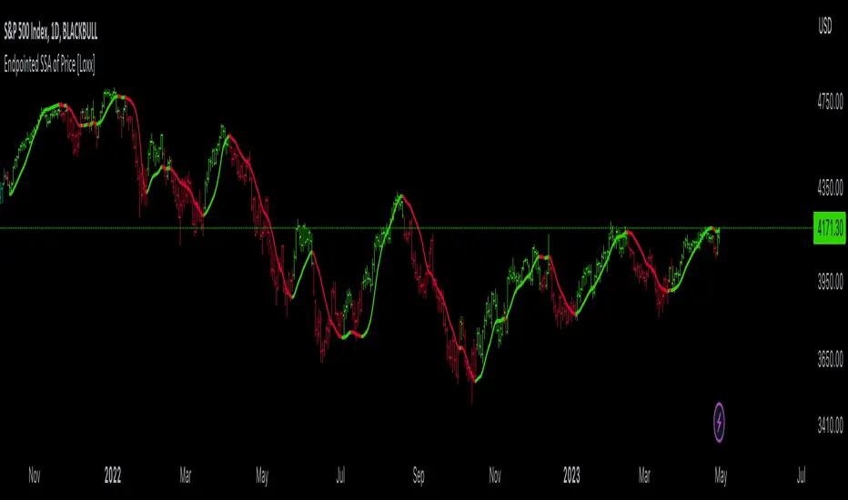
Endpointed SSA of Price [Loxx]The Endpointed SSA of Price: A Comprehensive Tool for Market Analysis and Decision-Making
The financial markets present sophisticated challenges for traders and investors as they navigate the complexities of market behavior. To effectively interpret and capitalize on these complexities, it is crucial to employ powerful analytical tools that can reveal hidden patterns and trends. One such tool is the Endpointed SSA of Price, which combines the strengths of Caterpillar Singular Spectrum Analysis, a sophisticated time series decomposition method, with insights from the fields of economics, artificial intelligence, and machine learning.
The Endpointed SSA of Price has its roots in the interdisciplinary fusion of mathematical techniques, economic understanding, and advancements in artificial intelligence. This unique combination allows for a versatile and reliable tool that can aid traders and investors in making informed decisions based on comprehensive market analysis.
The Endpointed SSA of Price is not only valuable for experienced traders but also serves as a useful resource for those new to the financial markets. By providing a deeper understanding of market forces, this innovative indicator equips users with the knowledge and confidence to better assess risks and opportunities in their financial pursuits.
█ Exploring Caterpillar SSA: Applications in AI, Machine Learning, and Finance
Caterpillar SSA (Singular Spectrum Analysis) is a non-parametric method for time series analysis and signal processing. It is based on a combination of principles from classical time series analysis, multivariate statistics, and the theory of random processes. The method was initially developed in the early 1990s by a group of Russian mathematicians, including Golyandina, Nekrutkin, and Zhigljavsky.
Background Information:
SSA is an advanced technique for decomposing time series data into a sum of interpretable components, such as trend, seasonality, and noise. This decomposition allows for a better understanding of the underlying structure of the data and facilitates forecasting, smoothing, and anomaly detection. Caterpillar SSA is a particular implementation of SSA that has proven to be computationally efficient and effective for handling large datasets.
Uses in AI and Machine Learning:
In recent years, Caterpillar SSA has found applications in various fields of artificial intelligence (AI) and machine learning. Some of these applications include:
1. Feature extraction: Caterpillar SSA can be used to extract meaningful features from time series data, which can then serve as inputs for machine learning models. These features can help improve the performance of various models, such as regression, classification, and clustering algorithms.
2. Dimensionality reduction: Caterpillar SSA can be employed as a dimensionality reduction technique, similar to Principal Component Analysis (PCA). It helps identify the most significant components of a high-dimensional dataset, reducing the computational complexity and mitigating the "curse of dimensionality" in machine learning tasks.
3. Anomaly detection: The decomposition of a time series into interpretable components through Caterpillar SSA can help in identifying unusual patterns or outliers in the data. Machine learning models trained on these decomposed components can detect anomalies more effectively, as the noise component is separated from the signal.
4. Forecasting: Caterpillar SSA has been used in combination with machine learning techniques, such as neural networks, to improve forecasting accuracy. By decomposing a time series into its underlying components, machine learning models can better capture the trends and seasonality in the data, resulting in more accurate predictions.
Application in Financial Markets and Economics:
Caterpillar SSA has been employed in various domains within financial markets and economics. Some notable applications include:
1. Stock price analysis: Caterpillar SSA can be used to analyze and forecast stock prices by decomposing them into trend, seasonal, and noise components. This decomposition can help traders and investors better understand market dynamics, detect potential turning points, and make more informed decisions.
2. Economic indicators: Caterpillar SSA has been used to analyze and forecast economic indicators, such as GDP, inflation, and unemployment rates. By decomposing these time series, researchers can better understand the underlying factors driving economic fluctuations and develop more accurate forecasting models.
3. Portfolio optimization: By applying Caterpillar SSA to financial time series data, portfolio managers can better understand the relationships between different assets and make more informed decisions regarding asset allocation and risk management.
Application in the Indicator:
In the given indicator, Caterpillar SSA is applied to a financial time series (price data) to smooth the series and detect significant trends or turning points. The method is used to decompose the price data into a set number of components, which are then combined to generate a smoothed signal. This signal can help traders and investors identify potential entry and exit points for their trades.
The indicator applies the Caterpillar SSA method by first constructing the trajectory matrix using the price data, then computing the singular value decomposition (SVD) of the matrix, and finally reconstructing the time series using a selected number of components. The reconstructed series serves as a smoothed version of the original price data, highlighting significant trends and turning points. The indicator can be customized by adjusting the lag, number of computations, and number of components used in the reconstruction process. By fine-tuning these parameters, traders and investors can optimize the indicator to better match their specific trading style and risk tolerance.
Caterpillar SSA is versatile and can be applied to various types of financial instruments, such as stocks, bonds, commodities, and currencies. It can also be combined with other technical analysis tools or indicators to create a comprehensive trading system. For example, a trader might use Caterpillar SSA to identify the primary trend in a market and then employ additional indicators, such as moving averages or RSI, to confirm the trend and generate trading signals.
In summary, Caterpillar SSA is a powerful time series analysis technique that has found applications in AI and machine learning, as well as financial markets and economics. By decomposing a time series into interpretable components, Caterpillar SSA enables better understanding of the underlying structure of the data, facilitating forecasting, smoothing, and anomaly detection. In the context of financial trading, the technique is used to analyze price data, detect significant trends or turning points, and inform trading decisions.
█ Input Parameters
This indicator takes several inputs that affect its signal output. These inputs can be classified into three categories: Basic Settings, UI Options, and Computation Parameters.
Source: This input represents the source of price data, which is typically the closing price of an asset. The user can select other price data, such as opening price, high price, or low price. The selected price data is then utilized in the Caterpillar SSA calculation process.
Lag: The lag input determines the window size used for the time series decomposition. A higher lag value implies that the SSA algorithm will consider a longer range of historical data when extracting the underlying trend and components. This parameter is crucial, as it directly impacts the resulting smoothed series and the quality of extracted components.
Number of Computations: This input, denoted as 'ncomp,' specifies the number of eigencomponents to be considered in the reconstruction of the time series. A smaller value results in a smoother output signal, while a higher value retains more details in the series, potentially capturing short-term fluctuations.
SSA Period Normalization: This input is used to normalize the SSA period, which adjusts the significance of each eigencomponent to the overall signal. It helps in making the algorithm adaptive to different timeframes and market conditions.
Number of Bars: This input specifies the number of bars to be processed by the algorithm. It controls the range of data used for calculations and directly affects the computation time and the output signal.
Number of Bars to Render: This input sets the number of bars to be plotted on the chart. A higher value slows down the computation but provides a more comprehensive view of the indicator's performance over a longer period. This value controls how far back the indicator is rendered.
Color bars: This boolean input determines whether the bars should be colored according to the signal's direction. If set to true, the bars are colored using the defined colors, which visually indicate the trend direction.
Show signals: This boolean input controls the display of buy and sell signals on the chart. If set to true, the indicator plots shapes (triangles) to represent long and short trade signals.
Static Computation Parameters:
The indicator also includes several internal parameters that affect the Caterpillar SSA algorithm, such as Maxncomp, MaxLag, and MaxArrayLength. These parameters set the maximum allowed values for the number of computations, the lag, and the array length, ensuring that the calculations remain within reasonable limits and do not consume excessive computational resources.
█ A Note on Endpionted, Non-repainting Indicators
An endpointed indicator is one that does not recalculate or repaint its past values based on new incoming data. In other words, the indicator's previous signals remain the same even as new price data is added. This is an important feature because it ensures that the signals generated by the indicator are reliable and accurate, even after the fact.
When an indicator is non-repainting or endpointed, it means that the trader can have confidence in the signals being generated, knowing that they will not change as new data comes in. This allows traders to make informed decisions based on historical signals, without the fear of the signals being invalidated in the future.
In the case of the Endpointed SSA of Price, this non-repainting property is particularly valuable because it allows traders to identify trend changes and reversals with a high degree of accuracy, which can be used to inform trading decisions. This can be especially important in volatile markets where quick decisions need to be made.
Trend Algo (Zeiierman)█ Overview
Trend Algo (Zeiierman) converts raw price movement into a cohesive, volatility-aware trend map. Rather than static moving averages, it builds an adaptive trend core that responds to market state changes, then layers regime-sensitive clouds (Infinite Sky) and horizon-bounded channels (HorizonX), plus precise trend-change and continuation signals. The result is a clean framework for reading direction, timing pullbacks, and validating momentum.
The indicator visualizes the active trend line, adaptive clouds, and stateful signals to reveal transition zones, trend acceleration, and exhaustion. It suits intraday execution, swing confirmations, and structural regime assessment.
⚪ Why This One Is Unique
Unlike conventional trend tools, this version combines volatility-normalized trend estimation, AI-style regime clustering, and horizon-bounded support/resistance channels. Its framework uses multi-phase smoothing, adaptive width scaling, and state detection that aligns entries and continuations with current market inertia—reducing whipsaw while preserving responsiveness.
█ Main features
⚪ Dynamic Clouds
The Dynamic Trend Line provides a stabilized, noise-aware trajectory of price, color-coded by directional bias. Two cloud systems overlay the core trend:
Infinite Sky (AI) — a regime-aware cloud that distinguishes fast vs. slow trend states.
HorizonX — adaptive channels that operate as dynamic support/resistance and define trend boundaries.
⚪ Candle Coloring
The candle coloring is designed to highlight trend momentum peaks, allowing you to instantly recognize when the trend is accelerating or slowing down. This visual feedback makes it easier to interpret the strength and speed of directional moves directly on the chart, seamlessly complementing the Dynamic Trend Line and Cloud systems.
⚪ Trend Change Signals & Trend Continuation Signals
The main signals are the Trend Change Signals , designed to trigger when the current trend structure begins to shift its state. These signals give you an instant sense of when a potential trend reversal or directional change might occur.
To complement them, we’ve added Trend Continuation Signals , which only activate within an established trend. These signals confirm the current direction and indicate that the trend is gaining strength and preparing for another move in the same direction.
⚪ Trend Line
Two types of trend lines are integrated: Stability and Dynamic.
The Stability Line follows the current price action in a smooth, drift-like manner — staying closer to price to act as a faster support and resistance zone.
The Dynamic Line adapts to volatility, ensuring that continuous movements within the trend are taken into account. This helps traders stay aligned with the trend and capture extended moves during periods of higher market activity.
█ How to Use
⚪ Trend Changes
Trend Change Signals appear when the current trend structure begins to shift, signaling a potential reversal or directional transition. These signals help traders anticipate moments when momentum weakens or changes direction, offering early insight into possible turning points in the market. Combine Trend Change Signals with Candle Coloring or Cloud behavior to confirm entries and strengthen trend reversal validation.
⚪ Trend Continuations
Trend Continuation Signals trigger within an established trend, confirming that the current direction remains strong. They often appear after pullbacks or pauses, suggesting that the market is ready for another move in the same direction. These signals work best when paired with the Dynamic Trend Line, allowing traders to stay confidently aligned with powerful ongoing trends.
⚪ Support and Resistance
The Stability Trend Line acts as a reactive support and resistance guide, staying close to price and highlighting areas where market reactions are most likely to occur. It offers traders a clear view of short-term structure and helps identify potential bounce or rejection zones with precision.
The Dynamic Trend Line adapts to volatility, forming flexible support and resistance zones that expand during strong momentum and contract during quieter phases, keeping the visual structure balanced and responsive to changing market conditions.
HorizonX defines the outer adaptive boundaries of the trend. These dynamic channels operate as broader support and resistance frameworks, helping traders anticipate trend exhaustion or continuation zones beyond the immediate price action.
The Infinite Sky (AI) cloud adds a regime-aware layer that distinguishes fast and slow trend states, visually framing the strength of support or resistance regions as they evolve and allowing traders to read both momentum and structure in a single glance.
█ How It Works
⚪ Dynamic Trend Core
A volatility-normalized estimator generates the primary trajectory and color state, balancing stability vs. agility by adapting to dispersion and displacement.
Calculation: Multi-phase weighted smoothing with volatility-scaled adjustments and adaptive phase control to minimize lag while preserving curvature.
⚪ Infinite Sky (AI Regime Cloud)
Differentiates fast vs. slow trend states and paints a regime-aware cloud that guides timing and risk.
Calculation: Windowed return modeling (with optional consolidation), two-pole response filtering, and distribution-center clustering to classify regimes and modulate the envelope.
⚪ HorizonX Trend Channels
Defines dynamic support/resistance “horizons” that expand/contract with conditions and filter counter-trend noise when strong-trend mode is enabled.
Calculation: A volatility-aware core that evolves with changing price dynamics, maintaining precision across all market conditions.
⚪ Trend Line & Continuations
A fast reaction line confirms pullbacks and validates continuation only when aligned with prevailing bias and structure.
Calculation: Short-horizon smoothing with phase-managed weighting, slope/position gating, and context checks against regime and horizon levels.
⚪ Impulse Detection
Identifies statistically meaningful bursts that precede expansion or warn of exhaustion after extended runs.
Calculation: Nonlinear impulse-response mapping emphasizing second-order changes in directional energy while suppressing micro-noise.
⚪ Trend Bands
Upper/lower bands visualize the active envelope for timing adds, trims, or exits within trend.
Calculation: Percentile-guided banding blended with adaptive anchors to retain structural relevance through regime shifts.
⚪ Bar Color Integration
Bars can inherit trend/gradient context to make state shifts obvious at a glance.
Calculation: Algorithmic gradient model integrating directional momentum intensity to render bar coloration in sync with market flow.
-----------------
Disclaimer
The content provided in my scripts, indicators, ideas, algorithms, and systems is for educational and informational purposes only. It does not constitute financial advice, investment recommendations, or a solicitation to buy or sell any financial instruments. I will not accept liability for any loss or damage, including without limitation any loss of profit, which may arise directly or indirectly from the use of or reliance on such information.
All investments involve risk, and the past performance of a security, industry, sector, market, financial product, trading strategy, backtest, or individual's trading does not guarantee future results or returns. Investors are fully responsible for any investment decisions they make. Such decisions should be based solely on an evaluation of their financial circumstances, investment objectives, risk tolerance, and liquidity needs.
Ücretli komut dosyası

Intelligent Exponential Moving Average Private AccessView the full documentation on this indicator here: www.kenzing.com
Note: This indicator is now intended for those who have been granted private access and may be more frequently updated than the previous versions.
Introduction
This indicator uses machine learning (Artificial Intelligence) to solve a real human problem.
The Exponential Moving Average ( EMA ) is one of the most used indicators on the planet, yet no one really knows what pair of exponential moving average lengths works best in combination with each other.
A reason for this is because no two EMA lengths are always going to be the best on every instrument, time-frame, and at any given point in time.
The " Intelligent Exponential Moving Average " solves the moving average problem by adapting the period length to match the most profitable combination of exponential moving averages in real time.
How does the Intelligent Exponential Moving Average work?
The artificial intelligence that operates these moving average lengths was created by an algorithm that tests every single combination across the entire chart history of an instrument for maximum profitability in real-time.
No matter what happens, the combination of these exponential moving averages will be the most profitable.
Can we learn from the Intelligent Moving Average?
There are many lessons to be learned from the Intelligent EMA . Most will come with time as it is still a new concept. Adopting the usefulness of this AI will change how we perceive moving averages to work.
Limitations
Ultimately, there are no limiting factors within the range of combinations that has been programmed. The exponential moving averages will operate normally, but may change lengths in unexpected ways - maybe it knows something we don't?
Thresholds
The range of exponential moving average lengths is between 5 to 40.
Additional coverage resulted in TradingView server errors.
Future Updates!
Soon, I will be publishing tools to test the AI and visualise what moving average combination the AI is currently using.
Follow and like for more content!

RSI or MACD + Tendance Kijun LTThis script is an update of my previous script "RSI + Tendance Kijun LT", I will not explain it here, if needed have a look at it :
I made a new script (and not update the previous one) because some people may not be interested by MACD and for performance perspective they may be interested to only have RSI (since you can't have both but only switch from RSI and MACD)
So now, you can choose to have MACD instead of RSI with long term trend based on Kijun still dispaying. Why am I adding MACD even if most of the time I never use it ? It's for Elliott Wave purpose and principaly for triangle. With MACD, you can easily identify if you're forming a triangle or not in an Elliott Wave perspective (I'm not speaking about chartist triangle).
As an example, you can see ETHUSD in daily and something looking similar to a triangle. We can trade it with many possibility (breakout, support/resistance) but I'm interested in to identify if it's a triangle with an EW count (not chartist) and if it's the case I will consider different scenario (triangle are most of the time wave 4 so we could have one more push leg down on this ticker)
So, in my daytrading I'm still always using RSI except when I want to verify if we have a triangle :) and I need to switch to MACD for that to check the following things :
- am I able to draw a triangle as the price did
- may I able to join A to C and B to D and still have a triangle on MACD
- If Yes, I will take care of E point because it's the start of the 5th wave (E point may be a truncated wave of the triangle and not join the line of points A to C)
By adding this in my strategy, I can anticipate different scenarios and invalidate them if I didn't get the triangle on MACD (by having a D point on MACD not respecting the triangle form). Don't forget, we can decide to don't trade a triangle as an EW count but still trade it as a chartist form (breakout or anything else).
In summary for the next days/weeks, on ETHUSD in daily time unit I will therefore wait and see if the price goes up to point D by being validated on the MACD. If so, then I will look at the possible formation of point E around prices 141$ and 156$, if at these prices I have short signals then it will be interesting to go back in short position
--------------------------------------------------------
Ce script est une mise à jour de mon script précédent "RSI + Tendance Kijun LT", je ne l'expliquerai pas ici, si besoin jetez-y un oeil :
J'ai fait un nouveau script (sans forcer la mise à jour du précédent) parce que certaines personnes peuvent ne pas être intéressées par MACD et pour des raisons de performance, elles peuvent être intéressées à n'avoir que RSI (puisque vous ne pouvez pas avoir les deux en même temps mais seulement passer de RSI et MACD)
Donc maintenant, vous pouvez choisir d'avoir MACD au lieu de RSI avec une tendance à long terme basée sur Kijun qui s'affiche toujours. Pourquoi est-ce que j'ajoute MACD même si la plupart du temps je ne l'utilise jamais ? C'est pour Elliott Wave et surtout pour le triangle. Avec MACD, vous pouvez facilement identifier si vous formez un triangle ou non dans une perspective Elliott Wave (je ne parle pas de triangle chartiste).
Par exemple, vous pouvez voir que sur ETHUSD en unité de temps journalière nous avons quelque chose qui ressemble à un triangle. Nous pouvons faire des trade de pleins de manières différentes (cassure d'oblique, support/résistance) mais je suis intéressé d'identifier si c'est un triangle avec un compte EW (pas chartiste) et si c'est le cas, je vais envisager un scénario différent (sachant que les triangles sont la plupart du temps la vague 4 et donc envisager à la sortie une dernière poussée baissière type vague 5 sur ETHUSD)
Donc, dans mon daytrading, j'utilise toujours RSI sauf quand je veux vérifier si nous avons un triangle :) et j'ai besoin de passer à MACD afin de vérifier les éléments suivantes :
- Suis-je capable de dessiner un triangle comme le prix le dessine
- puis-je joindre A à C et B à D et toujours avoir un triangle sur MACD ?
- Si oui, je m'occupe du point E car c'est le début de la 5ème vague (le point E peut être une onde tronquée du triangle et ne pas joindre la ligne des points A à C).
En ajoutant cela dans ma stratégie, je peux anticiper différents scénarios et les invalider si je n'ai pas obtenu le triangle sur MACD (en ayant un point D sur MACD ne respectant pas la forme du triangle). N'oubliez pas, nous pouvons décider de ne pas le trade comme un triangle d'un décompte EW mais de le trade simplement comme un triangle chartiste (breakout ou autre chose).
En résumé pour les prochains jours/semaines, sur ETHUSD en unité de temps journalière je vais donc patienter et voir si le prix va jusqu'au point D en étant validé sur le MACD. Si oui, alors je regarderai l'éventuelle formation du point E autour des prix 141$ et 156$, si à ces prix j'ai des signaux vendeurs alors il sera intéressant de rentrer en position short

support@tennaflow.comAI-Powered Market Sentiment & Trend Detector for Bitcoin
Experience next-level trading with an AI-driven indicator optimized for the 5-minute timeframe. Using advanced AI algorithms to detect market fear and predict trend shifts with precision.
Notes: Only subscribers can use this indicator.
Subscription Access: $168/month .
Email: support@tennaflow.com
Trading Pair:
BINANCE:BTCUSDT26Z2025

NeuralFlow Forecast Engine™ | SPY Weekly NeuralFlow Forecast Engine™ | SPY Weekly
AI-adaptive market equilibrium & expansion mapping. NeuralFlow doesn’t forecast by direction — it forecasts by where markets prefer to stabilize.
NeuralFlow Forecast Engine™ is a proprietary Artificial Intelligence framework trained to identify where price is statistically inclined to rebalance and where expansion zones historically exhaust rather than extend.
What the Bands Represent
Band Layer Meaning
AI Equilibrium (white core) Primary weekly balance zone where price is most likely to mean-revert
Predictive Rails (aqua / purple) High-confidence corridor of institutional flow containment
Outer Zones (green / red) Expansion limits where continuation historically decays
Extreme Zones (top/bottom) Rare deviation envelope where auction completion is statistically favored
NeuralFlow operates on proprietary, institution-grade Artificial Intelligence models trained specifically to map statistical rebalancing behavior, not trader predictions or sentiment. No discretionary drawing. No correlations. No lagging overlays.
This engine updates only when underlying structure changes — not when candles fluctuate intraday.
⚠ Risk & Use Notice
NeuralFlow Forecast Engine™ provides AI-derived structural zones, not trade signals or financial advice.
Markets can behave outside modeled distributions, especially during macro catalysts, thin liquidity, or surprise volatility events.
By loading or using this indicator, the user acknowledges full responsibility for any trades or outcomes based on its interpretation.
Educational & analytical use only. Not financial advice.

Meet The Neural Brain: The "Glass Box" AnalystIt observes. It thinks. It speaks.
Most indicators are "Black Boxes"—they give you a signal, but they never tell you why. If you don't know the why, you can't trust the trade.
The Neural Brain is different. It is a "Glass Box" AI Market Analyst that lives on your chart. It breaks down its decision-making process into plain English, so you never have to guess.
How It "Thinks" (The 3-Layer Cortex)
It processes market data through three human-like layers:
1. PERCEPTION (The Eyes)
Forensic Analysis: It scans price action for "clean" vs. "noisy" movement.
Spread History: It tracks momentum expansion in real-time.
2. COGNITION (The Mind)
Mode Selection: It mathematically decides whether to TRACK a trend or REPEL choppy conditions.
Conviction Monitor: It tells you if its confidence in the trade is growing or fading.
3. NARRATIVE (The Voice)
The Killer Feature: It synthesizes all data into a final strategic summary displayed right on your screen:
"STRONG TREND + NOISY ACTION = HOLDING (Ignoring Noise)"
"Is this Real AI?"
Transparency is our priority. This is not "Generative AI" (like ChatGPT) that hallucinates or scours the internet. This is Expert Systems Machine Learning.
The Math: We utilize the Rational Quadratic Kernel, a sophisticated technique used in Gaussian Process Regression. This allows the code to "learn" the structure of volatility without being explicitly hard-coded. It adapts to the market curve.
The Logic: It mimics the thought process of a professional trader running a complex Decision Tree:
Human Thought: "The trend is up, but it's choppy, so I should wait."
Neural Logic: IF (Trend > 0) AND (Efficiency < 0.3) THEN Strategy = "HOLDING"
The Result: A Synthetic Cortex that adapts to the situation just like a pro trader would, giving you the clarity to execute with zero hesitation.

Viprasol Elite Advanced Pattern Scanner# 🚀 Viprasol Elite Advanced Pattern Scanner
## Overview
The **Viprasol Elite Advanced Pattern Scanner** is a sophisticated technical analysis tool designed to identify high-probability double bottom (DISCOUNT) and double top (PREMIUM) patterns with unprecedented accuracy. Unlike basic pattern detectors, this elite scanner employs an AI-powered quality scoring system to filter out false signals and highlight only the most reliable trading opportunities.
## 🎯 Key Features
### Advanced Pattern Detection
- **DISCOUNT Patterns** (Double Bottoms): Identifies bullish reversal zones where price may bounce
- **PREMIUM Patterns** (Double Tops): Detects bearish reversal zones where price may decline
- Multi-point validation system (5-point structure)
- Symmetry analysis with customizable tolerance
### 🤖 AI Quality Scoring System
Each pattern receives a quality score (0-100) based on:
- **Symmetry Analysis** (32% weight): How closely the two bottoms/tops match
- **Trend Context** (22% weight): Strength of the preceding trend using ADX
- **Volume Profile** (22% weight): Volume confirmation at key points
- **Pattern Depth** (16% weight): Significance of the pattern's price range
- **Structure Quality** (16% weight): Overall pattern formation quality
Quality Grades:
- ⭐ **ELITE** (88-100): Highest probability setups
- ✨ **VERY STRONG** (77-87): Strong trade opportunities
- ✓ **STRONG** (67-76): Valid patterns with good potential
- ○ **VALID** (65-66): Acceptable patterns meeting minimum criteria
### 🎯 Intelligent Target System
Three target modes per pattern direction:
- **Conservative**: 0.618 Fibonacci extension (safer, closer targets)
- **Balanced**: 1.0 extension (moderate risk/reward)
- **Aggressive**: 1.618 extension (higher risk/reward)
Targets automatically adjust based on pattern quality score.
### 🔧 Advanced Filtering Options
- **Volatility Filter (ATR)**: Excludes patterns during extreme volatility
- **Momentum Filter (ADX)**: Ensures sufficient trend strength
- **Liquidity Filter (Volume)**: Confirms adequate trading volume
### 📊 Pattern Lifecycle Management
- Real-time neckline tracking with extension multiplier
- Pattern invalidation after extended wait period
- Breakout/breakdown confirmation
- Reversal detection (pattern failure scenarios)
- Target achievement tracking
### 🌈 Premium Visual System
- Color-coded quality levels
- Cyber-themed color scheme (Neon Green/Hot Pink/Purple/Cyan)
- Transparent fills for pattern zones
- Dynamic labels with pattern information
- Elite dashboard showing live pattern stats
## 📈 How To Use
### Basic Setup
1. Add indicator to your chart
2. Enable desired patterns (DISCOUNT and/or PREMIUM)
3. Adjust quality threshold (default: 65) - higher = fewer but better signals
4. Set your preferred target mode
### Trading DISCOUNT Patterns (Bullish)
1. Wait for pattern detection (labeled points 1-4)
2. Check quality score on dashboard
3. Entry on breakout above neckline (point 5)
4. Stop loss below the lowest bottom
5. Target shown automatically based on your mode
6. ⚠️ Watch for pattern failure (break below bottoms = SHORT signal)
### Trading PREMIUM Patterns (Bearish)
1. Wait for pattern detection (labeled points 1-4)
2. Check quality score on dashboard
3. Entry on breakdown below neckline (point 5)
4. Stop loss above the highest top
5. Target shown automatically based on your mode
6. ⚠️ Watch for pattern failure (break above tops = LONG signal)
## ⚙️ Input Settings Guide
### 🔍 Detection Engine
- **Left/Right Pivots**: Higher = fewer but cleaner patterns (default: 6/4)
- **Min Pattern Width**: Minimum bars between bottoms/tops (default: 12)
- **Symmetry Tolerance**: Max % difference allowed between levels (default: 1.8%)
- **Extension Multiplier**: How long to wait for breakout (default: 2.2x pattern width)
### ⭐ Quality AI
- **Min Quality Score**: Only show patterns above this score (default: 65)
- **Weight Distribution**: Customize what matters most (symmetry/trend/volume/depth/structure)
### 🔧 Filters
- **Volatility Filter**: Avoid choppy markets (recommended: ON)
- **Momentum Filter**: Ensure trend strength (recommended: ON)
- **Liquidity Filter**: Volume confirmation (recommended: ON)
### 💎 Target System
- Choose target aggression for each pattern type and direction
- Higher quality patterns get adjusted targets automatically
## 🎨 Visual Customization
- Adjust colors for DISCOUNT/PREMIUM patterns
- Set quality-based color coding
- Customize label sizes
- Toggle dashboard visibility and position
- Show/hide historical patterns
## 🚨 Alert System
Set up TradingView alerts for:
- 🚀 **LONG Signals**: DISCOUNT breakout, PREMIUM failure
- 📉 **SHORT Signals**: PREMIUM breakdown, DISCOUNT failure
- ✅ **Target Achievement**: When price hits your target
## 💡 Pro Tips
1. **Higher Timeframes = Better Signals**: Patterns on 4H, Daily, Weekly are more reliable
2. **Quality Over Quantity**: Focus on ELITE and VERY STRONG grades
3. **Combine with Trend**: DISCOUNT in uptrend, PREMIUM in downtrend = best results
4. **Watch Pattern Failures**: Failed patterns often provide strong counter-trend signals
5. **Adjust for Your Style**: Intraday traders use Conservative, swing traders use Aggressive
## 🔒 Pattern Invalidation
Patterns become invalid if:
- No breakout/breakdown within extension period
- Support/resistance levels are broken prematurely
- Pattern shown in faded colors = no longer active
## ⚠️ Risk Disclaimer
This indicator is a tool for technical analysis and does not guarantee profitable trades. Always:
- Use proper risk management
- Combine with other analysis methods
- Never risk more than you can afford to lose
- Past performance does not indicate future results

The VWAP OracleOverview
The VWAP Oracle is a sophisticated overlay indicator that elevates VWAP (Volume Weighted Average Price) from a simple benchmark to an intelligent oracle for intraday and swing decisions. It offers flexible anchoring (rolling MVWAP, weekly, monthly, yearly) with session options, augmented by heuristic "AI/ML" elements for trend forecasting, dynamic S/R identification, and mean-reversion pullback strategies. A comprehensive dashboard delivers at-a-glance intel on trends, roles, touch history, and trade stats, complemented by visual zones, entry shapes, and alerts. Tailored for active traders in equities, forex, or futures, this iteration refines state handling and role logic for seamless execution on Pine v6.
Core Mechanics
Built around robust VWAP computations with layered analytics:
VWAP Framework: Primary line via user-selected type—Rolling (volume-weighted over lookback bars for agility), or Anchored (resets on week/month/year changes). HLC3 source standard; regular or 24h sessions. Toggles for secondary lines (e.g., weekly in orange for context).
Heuristic Enhancements: ATR safeguards (min tick fallback) normalize zones (± sensitivity * ATR for touches) and distances (e.g., 3x for setups). Linear regression over lookback derives slope (ATR-scaled for cross-asset comparability), flagging strong trends (> threshold) with rising/falling confirmation and volume >20-bar SMA.
Role & Proximity Engine: Scans enabled VWAPs globally—assigns nearest as support (price above, higher value prioritized) or resistance (below, lower prioritized), e.g., "Weekly" if closest. Tracks main VWAP touches for strength tiers (Weak <3, Moderate 3-4, Strong 5-7, Proven ≥8).
Pullback Strategy: In validated trends (slope + price move + volume), distant deviations (> ATR multiple) trigger "awaiting" state. Confirms entries on fresh touches with directional candles (close > open for longs), setting ATR-based stops (1x offset from VWAP) and targets (2x extension). Manages to hit (success tally) or breach (reset); daily/anchor resets clear stats.
Outputs: Trend-colored VWAP (blue/red in strong regimes, gray in range), role-tinted zones (green/red fill), triangles for entries, labels for outcomes.
Why This Mashup Adds Value & Originality
Traditional VWAPs are passive lines; multi-anchor plots add clutter without synthesis. Here, the fusion of anchored/rolling VWAPs with regression-normalized "AI" slope (volatility-adjusted for invariance) and touch-based strength scoring forms a predictive layer—e.g., "Proven" supports from 8+ interactions signal higher-probability bounces than raw levels. Stateful pullback logic (distant setup → touch entry → managed exit) with explicit breach cancels differentiates it from basic deviation oscillators, while the 11-row dashboard (trend icons, nearest roles, live success %) consolidates what would take multiple indicators. Global role reassignment (no function var limits) ensures accuracy, creating a unified "oracle" for confluence without redundancy—ideal for evolving static VWAP into adaptive decision support.
How to Use
Configuration: Overlay on chart. VWAP: Pick Rolling for scalps (252-bar default); enable weeklies for bias. AI: ATR 14, sensitivity 0.5 (tighter for precision). Trade: 3x min distance setups, 2x/1x target/stop. Visuals: Dashboard top-right, zones on, signals toggled.
Dashboard Readout (semi-opaque black, size-adjustable):
Header/Type: "The VWAP Oracle" + active (e.g., "Rolling (MVWAP)").
Trend: 🔵/🔴 Strong or ⚪ Range—align trades accordingly.
Nearest S/R: "Main" support (green) for bounces; "Monthly" resistance (red) for fades.
Strength/Role: "Strong (5 touches)"; "Support" for current main bias.
Position: "🔄 Pullback Setup" flags opportunity; "⏳ Awaiting" pre-entry.
Success/Setup: "80% (4/5)"; 🟢 Long Active if running; volume "✅ Strong" validates.
Execution: Strong bull + distant alert → Long on green triangle touch → Trail to target label (✓) or stop (✗). Use zones for invalidation; alerts cover setups/hits. Suits 15m-4H on majors like NAS100.
Pro Tips: Backtest resets (daily intraday); tweak slope threshold (1.5) for noise.
Limitations & Disclaimer
Touches and entries confirm on close, introducing minor lag; rolling VWAP smooths but may trail sharp moves. Slope can oscillate in transitions—add manual filters. Stats reset periodically (e.g., daily), so sample sizes vary; "success" is backward-looking. No auto-sizing—cap risk at 1% equity. v6-optimized, but verify on live data. Not advice; simulate trades, as history ≠ future. Feedback welcome in comments.
TTM Squeeze Pro - IntradayTTM Squeeze Pro – Intraday (AI MTF Edition)
Design Rationale
This indicator is built to help traders identify when markets are consolidating, when volatility is building (squeeze), and when a breakout or trend is starting — all across multiple timeframes.
The design combines three powerful ideas:
Volatility Compression & Expansion (TTM Squeeze Logic):
By comparing Bollinger Bands (BB) and Keltner Channels (KC), the indicator detects when volatility contracts (BB inside KC). These moments often precede explosive moves. White dots on the BB basis line mark these “squeeze” periods.
Trend Strength & Direction (ADX System):
The ADX (Average Directional Index) measures how strong a trend is.
ADX rising above the threshold → trending market.
ADX falling below the threshold → consolidation.
The system classifies each bar as Trending Up, Trending Down, Consolidating, or Neutral, depending on ADX and momentum direction.
Multi-Timeframe (MTF) Alignment:
The same logic is applied to several timeframes (1m, 3m, 5m, 15m, 30m, 1h).
A compact table at the top-right shows each timeframe’s trend and squeeze strength.
This helps traders see whether short-term and higher timeframes are aligned, improving trade confidence and timing.
The AI Enhancer automatically adjusts all parameters (ADX, BB, KC lengths, and thresholds) depending on the current chart timeframe, keeping signals consistent between scalping and swing trading setups.
Trend and squeeze strengths are normalized on a 1–9 scale, giving users a quick numerical sense of trend power and squeeze intensity. The design emphasizes clarity, speed, and adaptability — critical for intraday trading decisions.
How to Use
Identify a Squeeze Setup:
Look for white dots on the chart — this marks low volatility and potential energy buildup.
Wait for Breakout Confirmation:
When the white dots disappear, volatility expands.
Check the MTF table — if multiple timeframes show green (uptrend) or red (downtrend) in the “TR” column, momentum is aligning.
Enter the Trade:
Go long if breakout happens above BB basis and most timeframes show green.
Go short if breakout happens below BB basis and most timeframes show red.
Exit or Manage Position:
When new white dots appear → volatility contracting again → consider exiting or tightening stops.
If MTF colors become mixed → trend losing strength.
In Summary
The TTM Squeeze Pro – Intraday AI MTF Indicator blends volatility analysis, trend strength, momentum, and multi-timeframe alignment into one adaptive tool.
Its design aims to simplify complex market behavior into a visual, data-backed format — enabling traders to catch high-probability breakout trends early and avoid false moves during low-volatility phases.
Aggregation Index SmoothedAggregation Index Smoothed (AIS) - Multi-Method Trend Consensus Oscillator
What This Indicator Does
The Aggregation Index Smoothed combines four independent trend-detection methodologies into a unified momentum oscillator that operates across multiple timeframes simultaneously. Unlike traditional single-method indicators that can produce conflicting or false signals during market transitions, AIS requires consensus agreement across all four calculation methods before confirming trend direction.
Technical Methodology
Four-Component Loop System
Each component analyzes 16 different lookback periods (default range: 5-20 bars), creating a multi-timeframe perspective within a single calculation:
1. Price Change Analysis
Measures directional price movement across all periods. Each period scores +1 for positive change or -1 for negative change. Results are averaged and scaled to ±100.
2. RSI Multi-Period Analysis
Evaluates Relative Strength Index values across the same 16 periods. Scores +1 when RSI > 50 (momentum favoring bulls) or -1 when RSI < 50 (momentum favoring bears). This captures overbought/oversold conditions across multiple timeframes.
3. EMA Trend Position
Compares current price against Exponential Moving Averages of varying lengths (5-20 periods). Scores +1 when price trades above EMA (uptrend) or -1 when below (downtrend). This identifies trend alignment across short, medium, and longer-term moving averages.
4. Momentum Rate-of-Change
Calculates price momentum across all periods using the mom() function. Scores +1 for positive momentum or -1 for negative momentum, detecting acceleration and deceleration patterns.
Aggregation Process
Each of the four indicators independently calculates scores across all 16 periods
Individual indicator scores are averaged (range: -100 to +100)
All four indicator averages are combined using arithmetic mean
The resulting index undergoes EMA smoothing (default: 20 periods)
Optional double-smoothing applies a second EMA pass for maximum noise reduction
Why This Approach Is Unique
Problem Solved: Traditional oscillators often conflict - RSI might be bullish while MACD is bearish, or stochastic shows oversold while price trend is clearly down. Traders waste time reconciling these contradictions.
Solution: AIS eliminates conflicts by design. A bullish signal (+10 threshold) means all four methods across all 16 timeframes agree on upward momentum. This consensus approach dramatically reduces whipsaws and false signals compared to using any single method.
Technical Advantage: The for-loop methodology validates each signal across a spectrum of timeframes (5 bars through 20 bars), ensuring the trend is confirmed in both immediate-term and intermediate-term contexts. This is mathematically equivalent to running 64 separate indicators (4 methods × 16 periods) and requiring majority agreement.
Signal Generation
Long Signal (Bullish): Index crosses above +10 threshold
Indicates all four methods confirm upward momentum across multiple timeframes
Sustained readings above +10 suggest strong trend continuation
Short Signal (Bearish): Index crosses below -10 threshold
Indicates all four methods confirm downward momentum across multiple timeframes
Sustained readings below -10 suggest strong downtrend
Neutral Zone (-10 to +10): Mixed signals or consolidation
Methods disagree on direction, suggesting choppy or range-bound conditions
Avoid trend-following strategies in this zone
How to Use This Indicator
Best Practices
Timeframe Selection:
Most effective on 4-hour charts and higher (Daily, Weekly)
Lower timeframes (1H, 15m) may produce excessive signals despite smoothing
The 16-period loop range is optimized for swing trading timeframes
Entry Strategy:
Wait for index to cross threshold levels (±10)
Confirm with price action (breakout, support/resistance levels)
Consider entering on first pullback after threshold cross for better risk/reward
Parameter Adjustment:
Volatile instruments (crypto, small-caps): Increase thresholds to ±15 or ±20 to filter noise
Stable instruments (large-cap stocks, indices): Reduce thresholds to ±5 for earlier signals
Smoothing Length: Increase to 30+ for cleaner signals; decrease to 10-15 for faster response
Double Smoothing: Keep enabled for trend following; disable for more reactive signals
Risk Management:
Exit longs when index drops back into neutral zone (below +10)
Exit shorts when index rises into neutral zone (above -10)
Use index slope as trend strength indicator (steeper = stronger)
Interpretation Guidelines
Strong Trending Conditions:
Index sustained above +50 or below -50 indicates powerful directional move
All four methods showing extreme agreement across all timeframes
High probability of trend continuation
Trend Exhaustion Signals:
Index reaches extreme levels (+80 to +100 or -80 to -100)
Potential reversal zone; watch for divergence with price
Consider taking partial profits on existing positions
Divergence Detection:
Price makes new highs while index fails to confirm = bearish divergence
Price makes new lows while index shows higher lows = bullish divergence
Divergences on 4H+ timeframes carry significant weight
Limitations and Considerations
Not Suitable For:
Scalping or very short-term trading (under 1-hour timeframes)
Range-bound markets with no clear trend (index oscillates in neutral zone)
Instruments with erratic, news-driven price action
Known Lag:
Double smoothing introduces 40+ bar delay in signal generation
Designed for trend confirmation, not early trend detection
Fast market reversals may produce late exit signals
Complementary Tools:
Combine with support/resistance levels for entry precision
Use with volume analysis to confirm signal strength
Pair with volatility indicators (ATR) for position sizing
Technical Implementation Notes
The indicator pre-calculates all RSI and EMA values for lengths 5-20 to comply with Pine Script's requirement for constant-length parameters in ta.rsi() and ta.ema() functions. This workaround allows dynamic loop-based analysis while maintaining calculation consistency on every bar.
The scoring methodology uses binary classification (+1/-1) rather than normalized percentage values to ensure equal weighting across all four methods, preventing any single indicator from dominating the aggregate signal.
Summary: The Aggregation Index Smoothed provides trend confirmation through multi-method consensus across variable timeframes. Its primary value is eliminating the confusion of conflicting indicator signals by requiring agreement from four independent trend calculations before generating actionable signals. Best suited for swing traders and position traders on 4-hour and higher timeframes seeking high-probability trend-following entries with reduced false signals.
Aethix Cipher Pro2Aethix Cipher Pro: AI-Enhanced Crypto Signal Indicator grok Ai made signal created for aethix users.
Unlock the future of crypto trading with Aethix Cipher Pro—a powerhouse indicator inspired by Market Cipher A, turbocharged for Aethix.io users! Built on WaveTrend Oscillator, 8-EMA Ribbon, RSI+MFI, and custom enhancements like Grok AI confidence levels (70-100%), on-chain whale volume thresholds, and fun meme alerts ("To the moon! 🌕").
Key Features: no whale tabs
WaveTrend Signals: Spot overbought/oversold with levels at ±53/60/100—crosses trigger red diamonds, blood diamonds, yellow X's for high-prob buy/sell entries.
Neon Teal EMA Ribbon: Dynamic 5-34 EMA gradient (bullish teal/bearish red) for trend direction—crossovers plot green/red circles, blue triangles.
RSI+MFI Fusion: Overbought (70+)/oversold (30-) with long snippets for sentiment edges.

Aethix Cipher Pro2Aethix Cipher Pro: AI-Enhanced Crypto Signal Indicator grok Ai made signal created for aethix users.
Unlock the future of crypto trading with Aethix Cipher Pro—a powerhouse indicator inspired by Market Cipher A, turbocharged for Aethix.io users! Built on WaveTrend Oscillator, 8-EMA Ribbon, RSI+MFI, and custom enhancements like Grok AI confidence levels (70-100%), on-chain whale volume thresholds, and fun meme alerts ("To the moon! 🌕").
Key Features:
WaveTrend Signals: Spot overbought/oversold with levels at ±53/60/100—crosses trigger red diamonds, blood diamonds, yellow X's for high-prob buy/sell entries.
Neon Teal EMA Ribbon: Dynamic 5-34 EMA gradient (bullish teal/bearish red) for trend direction—crossovers plot green/red circles, blue triangles.
RSI+MFI Fusion: Overbought (70+)/oversold (30-) with long snippets for sentiment edges.